
Search results for "Fairly obvious" in Home Design Ideas

 Putney Design
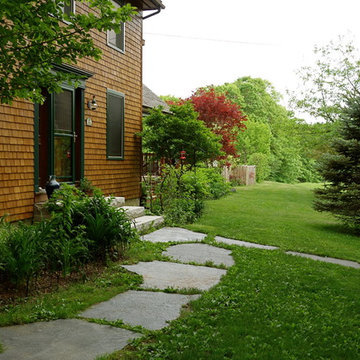
The path leads to the front door (and to a lower parking area at right), but the eye is drawn to the open field beyond the house and pool fence. Blue Spruce and Spirea Japonica at right define the edge of the front lawn "room", with mixed trees, shrubs, and flowers along the front of the house for seasonal colors and fragrance. This photo taken with nothing obviously in bloom, but a lot of color and tone variation showing nevertheless. Note the Japanese Maple in center, with red leaves, behind the dark green of the small Magnolia tree. This landscape would cost a fair amount if built in one phase, but we picked away at if for a number of years to save money and to enjoy the process...
 Moore House Design
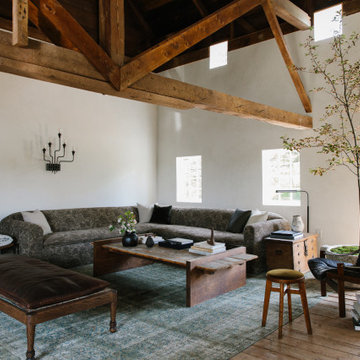
A Full scale Design, Renovation & Furnishings project for our Coasters Chance Cottage in Cutler, Maine. This story was featured on Magnolia Network & Discovery Plus On The Show “A Designers Profile” Season 2 Episode 5.
This showcase is full of the start to finish within a renovation and the design & attention to detail that Moore House Design Creates. Full of rich tones, textural plaster, and plenty of Custom Moore House Designed Furnishings.
FEATURED ON TV: MAGNOLIA NETWORK & DISCOVERY PLUS
TV SHOW: A DESIGNERS PROFILE - SEASON 2 -EPISODE 5
Find the right local pro for your project
 Four Brothers Design + Build
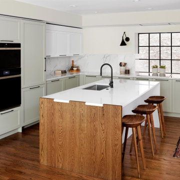
Large trendy l-shaped medium tone wood floor and brown floor open concept kitchen photo in DC Metro with an undermount sink, recessed-panel cabinets, gray cabinets, quartz countertops, white backsplash, porcelain backsplash, black appliances, an island and white countertops


 Revival House
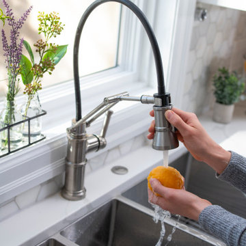
A close up of the Brizo Artesso Articulating Kitchen Faucet in Stainless 632225LF-SS and the Stainless Steel
Franke Vector Triple Bowl Sink HFT4322-2. Note the air switch to the right of the faucet in brushed nickel.
 Elevate Outdoor
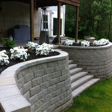
A combination of practicality and beauty. Two serpentine retaining walls culminate into a grand staircase that connects living space and yard.
Design ideas for a mid-sized traditional shade backyard retaining wall landscape in St Louis.
Design ideas for a mid-sized traditional shade backyard retaining wall landscape in St Louis.
 Almesedoors
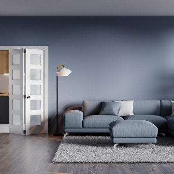
FINISH: PRIMED
The advantages of this approach – of this type of interior door finish – are fairly obvious. Pick a color, any color that suits your projects best. Mix and apply. Re- coat whenever you feel it is necessary to do so. Touch it up. It gives you, the proud owner of these interior doors, complete freedom of choice, and the significant savings, especially where it comes to bulk orders, can be a true source of joy.
As Kurt Vonnegut mentions in one of his novels (Bluebeard, unless I’m mistaken … check it out when you get a chance), the thrill of laying on colors is a large part of the artist’s professional satisfaction. In other words, a keen pleasure.
When back in the remote past visual arts became a field dominated by professionals rather than hobbyists, the main problem of “just laying on paint” became obvious: you can’t.
The medium of choice back then was egg tempera, a permanent, fast-drying substance consisting of colored pigments mixed with a water-soluble binder medium, usually glutinous material such as egg yolk. Portraits and ornaments were executed in this medium, and the wood panel was the surface of choice. One of tempera’s interesting features is that it is not as easily absorbed by wood as other mediums. Some sort of primer was necessary, of course, but pretty much any substance that dried evenly could be used.
The drawbacks of tempera, or pintura al temple, as the Spanish call it, only became obvious with the advent of the Renaissance, when the leading representatives of the trade turned to oil (and interior doors suddenly became a great deal less crude, but that’s a story for another day).
Oil painting is the process of “painting with pigments with a medium of drying oil as the binder.” Commonly used types include linseed (highly preferable in art, though not necessarily in interior doors, mind you), poppy seed, walnut, and safflower.
Today, five hundred years later, it is safe to say that oil is more versatile than pintura al temple – by orders of magnitude. Specifically, the contrasts achieved through the former are much greater, the darks are far deeper, and three- dimensional, highly realistic images are much easier to achieve. Next time you visit a museum, take a closer look at pintura al temple portraits. All of them, without exception, come off as a bit “flat” as opposed to their latter-day counterparts.
Also, where glazing is concerned …
Glazing: a painting technique in which a transparent layer, with just a touch of pigment, is laid over a previously painted surface, allowing light to travel through the glaze and be reflected back off of the opaque layer below. Gentle shadows, subtle changes of color, smooth transitions – all these can be achieved through glazing, which was used by all artists up until the middle of the Nineteenth Century, when artist tubes were invented, revolutionizing the field, and other techniques began to be explored.
Tempera enthusiasts (it takes all kinds to make a world) will assure you that glazing is not just possible in pintura al temple but is actually the basis of the whole enterprise. Well, what are you going to do? They’re enthusiasts.
Anyway, la peinture à l'huile, as the French call it, re-introduced the ancient problem of most surface’s propensity to absorb dipingere, as the Italians call the stuff. Wood or canvas, it is all the same: you’re not going to get very far without a good primer.
Experiments were conducted, and soon rabbit skin glue emerged as the least expensive and most effective solution. It was easy to apply. It dried evenly. It made the application of the l’huile stuff on top of it a walk in the park.
There were drawbacks. Today, rabbit skin glue is considered to be a major cause of cracking by most modern conservators. (Remember, when you visited the Metropolitan Museum of Art – and did you see those interior doors? … some of them are quite something … - most “old masters” pictures are completely covered with a cobweb of cracks? There you go). Because the glue is hygroscopic, it continually absorbs moisture from the atmosphere, causing the glue to swell and shrink as ambient humidity levels change. Over many humidity cycles, this repeated flexing causes the brittle oily layers to crack.
To combat this problem, modern primers are made of acrylic materials which are guaranteed not to cause any damage to the dipingere. No bubbling, no cracks. Your interior doors are safe.
 Sarah Barnard Design LLC
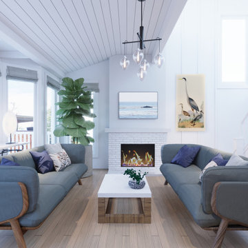
In this first option for the living room, material elements and colors from the entryway are reflected in the the blue Vegan-friendly upholstery and Danish oiled walnut of the sofa. The fine artisanal quality of the exposed wood frame gives the sofa lightness and elegance. At the same time, their shape and placement create an enclosed and intimate environment perfect for relaxation or small social gatherings. The artwork incorporates natural imagery such as water birds and ocean scapes. These elements carry through in the coffee table made from reclaimed hardwood, which features plant life embossed into the concrete surface of the tabletop, all underneath rain drop shaped pendant lighting.
 Bilotta Kitchen & Home
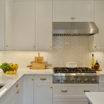
For this kitchen, designed by Peter Bittner, the client had a very clear idea of what she wanted right from the start. She did her research. The mother of a fast growing, young family, she wanted something as efficient as it was beautiful – on the simple, yet elegant side. Her requests were straightforward: white and light grey Bilotta cabinetry in a transitional style so as not to compete with the detailing inside her 1950s Tudor-style home; a heated tile floor (By Rye Ridge Tile); stainless appliances; white subway tile backsplash by Walker Zanger (again to keep it clean and not compete with its surroundings); and seating at the island for snacks and homework. The “pop” suggested by Peter was done through the satin brass hardware and lighting fixtures. The real challenge with this space was to fit as much as possible into the existing footprint which was overall on the smaller side. The solution was eliminating a doorway (with a swinging door that opened into the kitchen) and stairs from the kitchen to the basement. By moving the stairs and doorway, the usable space increased considerably. The typical working triangle became the focus for one side of the kitchen and the island overhang and seating became available on the other side. To make up for the limited amount of wall cabinets Peter designed shallow pantry-style cabinets along the back wall. Quartz Countertops by Rom Stone Fabrication. Designer: Peter Bittner Photographer: Peter Krupenye
 Protech Home Improvements LLC
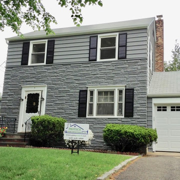
The client wanted a little more curb appeal to his new home. New to the neighborhood, they found Protech online. We provided them with a complete transformation. We started by power washing the existing siding and stone, filled all imperfections, nail holes, seems and cracks. We used Sherwin Williams Duration paint to get the job done right.
Client said:
"I moved into a home that needed some WORK. I met with John and Luis from ProTech and hired them to do some projects. I have to say from the beginning that these guys were upfront, honest, responsive and most importantly they got the work done quickly and nicely. No surprises, no "extra material" costs, nothing at all like that. The pricing was very fair and it was obvious from our first meeting that these guys understood contracting and how the process should work. They were more than happy to meet with me to discuss the projects and make sure everything was done just how I wanted it. I would 100% recommend them."
Matt L. Westfield, NJ
 Tile Doctor Ltd
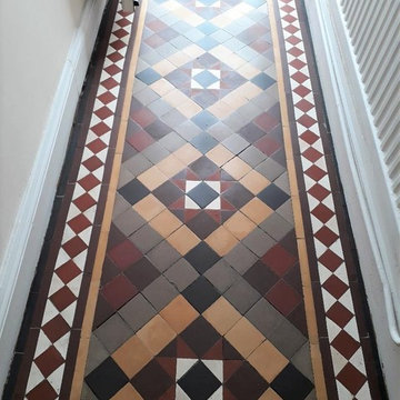
As is often the case in years past and for whatever reason many homeowners covered their decorative Victorian hallway tiles in a variety of products from carpet to laminate flooring. These days the trend has reversed and quite rightly many homeowners now realise the value a tiled floor can bring to a property and look to us to have it restored.
Our client had purchased a property in Norfolk seaport of Kings Lynn and, on lifting the dirty old carpet and decaying underlay in the hallway, discovered a beautiful tiled entrance hall. It was obvious that a previous owner had decided to lay carpet over the tiles as an easy way of hiding the result of careless renovation and decorating which had resulted in a thick coating of plaster, paint, carpet tape glue and various other contaminants which had become firmly stuck to the surface. There were also two small rectangular black and brown tiles missing behind the front door which had been damaged during the removal of some old lead pipes.
This was clearly a job which would need somewhat more than a scrubbing brush and a bottle of Flash!
Our first job was to remove as much of the solid contaminants as possible by hand with floor scrapers and a steamer which softened the more stubborn lumps. We then applied Tile Doctor Remove & Go which is a powerful alkaline stripper to the whole area, left it to dwell on the surface for twenty minutes and then scrubbed it in using a rotary machine fitted with a black scrubbing pad. The resulting slurry was then power rinsed and extracted away using our Ninja machine which is a high-power industrial vacuum. Any remaining patches where the carpet tape had been stuck down were spot treated using Tile Doctor Nanotech HBU which made short work of the hardened glue.
The result was a clean floor, but the surface still felt slightly rough and pitted, a problem which we resolved using the rotary machine fitted with a 200-grit diamond burnishing pad followed by a 400-grit pad with a little 400 grit honing powder which left the surface smooth, silky and ready for the application of a sealer.
Finally, we acid washed the whole area using Tile Doctor Acid Gel, a slow release product which would neutralise any remaining chemicals, improve new sealer adhesion and inhibit the future production of any efflorescence salts. We had used a fair amount of water during the cleaning process, so we left the floor to dry off thoroughly overnight with assistance from our commercial dehumidifier.
On our return the following day, we discussed the sealer options with the client and recommended using microporous Tile Doctor Colour Grow which is an impregnating sealer that seeps into the pores of the stone protecting it from within. It will provide an excellent fluid resistant seal whilst enhancing the natural colours in the stone, additionally it’s fully breathable thereby enabling any moisture trapped under the floor to rise through the floor and evaporate. This is important on old floors like this where no damp-proof membrane was installed. The sealer was applied with a paint pad in tow coats and allowed to dry for an hour before buffing the floor with a hog’s hair pad to give a rich natural-look sheen finish.
The Victorian tiles responded well to the treatments which were completed in two consecutive days. My client was extremely pleased with the results and left the following comment:
“My floor was in poor condition after being buried under carpet as well as many, many years of paint and muck. I enjoyed the time they spent at my home and wouldn’t hesitate to use (or recommend) the Tile Doctor service in the future.”
Nick White
Norfolk Tile Doctor
 Tile Doctor Ltd
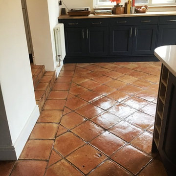
We were contacted by the owner of a property in Moulton with a problematic Terracotta tiled kitchen floor. She was seriously considering ripping up the entire area of tiling and replacing it as she was having a new kitchen installed. Both her and her husband were concerned that unless I could restore this floor to somewhere near to its original condition, they would need to replace it.
I went over to inspect the Terracotta tiles and could see the entire surface was deeply ingrained with soiling and the grout lines were filthy. After carrying out a test it became obvious that the previous sealer had been applied very sparingly and had mostly worn away, leaving the stone prone to staining. Terracotta is a very porous tile and dirt had become ingrained in the pores leaving it looking very dull and difficult to clean.
I completed the test on a small part of the floor and the customer could see the results which could be achieved. Happy with the result they agreed my quote and we set a date for my return to complete the floor.
The tiles turned out to be made of a fairly soft Terracotta which meant that we were able to deep clean them extremely effectively using a strong dilution of Tile Doctor Pro-Clean. We used Tile Doctor Remove and Go in particularly stubborn areas.
The process I use is to spray the Pro-Clean onto the floor and leave it to soak in for about ten minutes before being worked in using a heavy rotary machine fitted with a black scrubbing pad. The resulting slurry is removed using a wet pick up vacuum. All the dirt and virtually all of the old sealer was removed at this stage; the remaining patches around the edges of the area being finished by hand with a 200-grit burnishing block. The grout lines were then cleaned by hand with an angled grout brush.
Finally, the deep-seated oil stains in front of the cooker were brought out using Tile Doctor Oxy-Gel which was left to dwell on the marks for an hour before being agitated with a diamond burnishing pad and rinsed away with a wet pick up machine. The floor was rinsed with water and allowed to dry off overnight.
The following day I inspected the floor and checked it was ready to be sealed. All was well so I applied an initial coat of Tile Doctor Colour Grow which is an impregnating sealer that occupies the pores in the tile enhancing the natural colours of the Terracotta and provide a base layer of protection from staining.
I returned at a convenient time once the kitchen was completely installed to finish the job. This involves carrying out a light maintenance clean with Tile Doctor Neutral Cleaner and once the floor was dry, I applied 5 further coats of Tile Doctor Seal and Go which provides a pleasing satin finish which is really suited to this type of floor.
The customer was very happy with the results and has left the following feedback.
“We were really pleased with the results, thank you!”
Phil Vissian
Northamptonshire Tile Doctor

 Simply Home Decorating
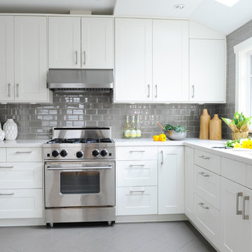
Our goal on this project was to make the main floor of this lovely early 20th century home in a popular Vancouver neighborhood work for a growing family of four. We opened up the space, both literally and aesthetically, with windows and skylights, an efficient layout, some carefully selected furniture pieces and a soft colour palette that lends a light and playful feel to the space. Our clients can hardly believe that their once small, dark, uncomfortable main floor has become a bright, functional and beautiful space where they can now comfortably host friends and hang out as a family. Interior Design by Lori Steeves of Simply Home Decorating Inc. Photos by Tracey Ayton Photography.
 Protech Home Improvements LLC
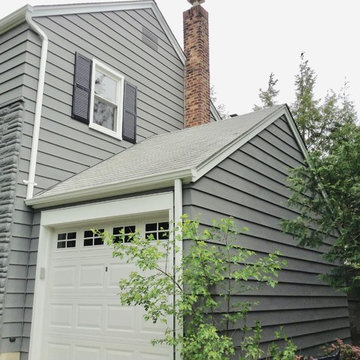
The client wanted a little more curb appeal to his new home. New to the neighborhood, they found Protech online. We provided them with a complete transformation. We started by power washing the existing siding and stone, filled all imperfections, nail holes, seems and cracks. We used Sherwin Williams Duration paint to get the job done right.
Client said:
"I moved into a home that needed some WORK. I met with John and Luis from ProTech and hired them to do some projects. I have to say from the beginning that these guys were upfront, honest, responsive and most importantly they got the work done quickly and nicely. No surprises, no "extra material" costs, nothing at all like that. The pricing was very fair and it was obvious from our first meeting that these guys understood contracting and how the process should work. They were more than happy to meet with me to discuss the projects and make sure everything was done just how I wanted it. I would 100% recommend them."
Matt L. Westfield, NJ
2