
Search results for "Features emerged" in Home Design Ideas
 Jarrett Design
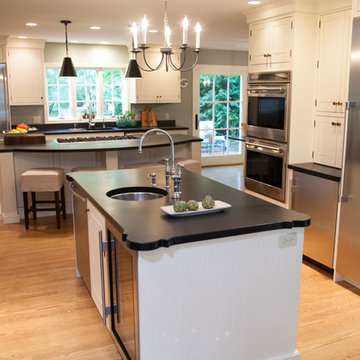
This timeless, traditional kitchen served as the original ‘showroom’ for Jarrett Design. As many small businesses start in the homes of their owners, Jarrett Design did, too. Home studios have their challenges, as one can imagine. In this case, the ‘showroom’ had to serve as inspiration for clients while also meeting the needs of the owner’s bustling family of nine!
Cooking and baking together were an integral part of family life, so the kitchen was designed accordingly. The opening between the family room and kitchen was expanded to unite the spaces and to bring the fireplace into view from the kitchen. A galley plan emerged featuring a 36” all refrigerator, a 48” pro range top, an advantium microwave, a roomy sink with a dishwasher under an enlarged window . A tall pull out for spices, oils, and vinegars along with roll out shelves and lots of cutlery dividers provides ample organization for items used most frequently. A wall was removed between the children’s study and the kitchen to make way for the large cooking island with seating and a second prep island with a sink, dishwasher and wine refrigerator. A wall with double ovens, coffee center with a beverage refrigerator below and a 30” freezer column rounds out the appliance list. Large, hand painted armoire-style pantries and a message center flank a rustic cherry hutch for glassware and pottery. A freestanding bookshelf houses the extensive cookbook collection. Pretty lighting and an array of different hardware pieces add the finishing touches.
Fun fact, these photos were taken in 2017. The kitchen was designed and installed over ten years prior! Proof that smart design, classic selections and quality custom cabinetry truly do stand the test of time even in the hardest working kitchens.
Matthew Villano Photography
 Zola European Windows
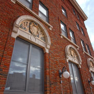
McKeesport Downtown Housing, formerly a YMCA, is an 84-unit SRO for people at risk of homelessness. The old brick and terracotta building was important historically for McKeesport. The decision to design the project to Passive House criteria actually went a long way to making the pro-forma work. This project was the first large scale retrofit to be designed to meet Passive House Standards in the US. Another major concern of the project team was to maintain the historic charm of the building.
Space was at a premium and a reorganization of space allowed for making larger resident rooms. Through a community process with various stakeholders, amenities were identified and added to the project, including a community room, a bike storage area, exterior smoking balconies, single-user rest rooms, a bed bug room for non-toxic treatment of bed bugs, and communal kitchens to provide healthy options for food. The renovation includes new additional lighting, air-conditioning, make-up air and ventilation systems, an elevator, and cooking facilities. A cold-weather shelter, 60-day emergency housing, bridge housing, and section 8 apartment rentals make up the housing programs within the shelter. Thoughtful Balance designed the interiors, and selected the furniture for durability and resistance to bed bugs.
The project team worked closely with Zola Windows to specify a unique uPVC window that not only offers passive house performance levels at an affordable cost, but also harmonizes with the building’s historic aesthetic. Zola’s American Heritage SDH (simulated double hung) from the popular, budget-friendly Thermo uPVC line was specified for the project. The windows implemented in this project feature a lower tilt & turn window and a fixed upper for maximum airtightness and thermal performance. The implementation of these windows helped the project team achieve a very significant energy consumption reduction of at least 75%.
Photographer: Alexander Denmarsh
 Through The Garden, Inc.
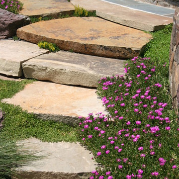
Stone steppers can be used to create a naturalistic aesthetic. Succulents and groundcover plants emerging between the cracks add color and life to the design, and the chosen plants do not inhibit movement on the path.
Find the right local pro for your project
 PINE TREE LANE
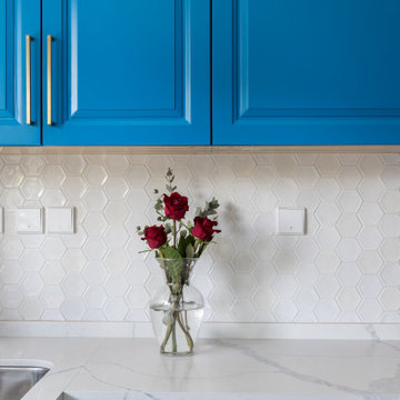
This stunning blue kitchen, made for our clients living in Emirates Living Dubai, features a customized color palette in our fast selling classic panel design with brass handles.
A supermarket pantry system within the cabinets has tall tandem pull-out allowing a clear view of the stored items and easy access.
A functional magic corner within the base cabinets allows for maximum use of the corner cabinet space and easy access as the accessory emerges from the inside.
Our clients enclosed this previously open plan kitchen allowing more room for storage within the kitchen space.
The windows and floral floor tiles makes this kitchen look bright and cozy.
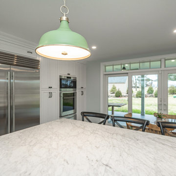
 Milex Residential
Read the who story, complete with video: https://bucks.happeningmag.com/preserving-history-crafting-dreams/
Initially envisioned solely as a home addition, the project evolved into a complete renovation. The owner's priorities, such as a spacious kitchen, a bathroom with ample closet space, and the addition of a garage, expanded the scope. The entire house, including the old section, underwent a metamorphosis, emerging as a harmonious blend of old-world charm and contemporary comfort. The kitchen, a focal point of the owner's vision, features custom inset cabinetry crafted locally in Bucks County. The second floor encompasses a luxurious primary bathroom and closet, showcasing the meticulous attention to detail. A highlight is the transformation of the third floor into an inviting living space, where historical elements like mortise and tenant joint beams are preserved and refinished.

 The Cultural Landscape Foundation
Saturday, August 22, 9:30am to 5:30pm | Vancouver, Canada | Villa Maris by Cornelia Hahn Oberlander, with Eva Matsuzaki and Bryce Gauthier of Enns Gauthier Landscape Architects, Inc.
A collaboration with emerging firm Enns Gauthier Landscape Architects Inc., this project features a newly completed green roof at the iconic Villa Maris -- a 15-story, 101 unit, seaside resort-style, 1960s apartment building known locally as the Pink Palace, a nod to the vibrant color of its exterior. Here undulating mounds mimic the waves of the seaside visible in the distance.
Photo courtesy Enns Gauthier Landscape Architects, Inc.
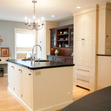 Jarrett Design
This timeless, traditional kitchen served as the original ‘showroom’ for Jarrett Design. As many small businesses start in the homes of their owners, Jarrett Design did, too. Home studios have their challenges, as one can imagine. In this case, the ‘showroom’ had to serve as inspiration for clients while also meeting the needs of the owner’s bustling family of nine!
Cooking and baking together were an integral part of family life, so the kitchen was designed accordingly. The opening between the family room and kitchen was expanded to unite the spaces and to bring the fireplace into view from the kitchen. A galley plan emerged featuring a 36” all refrigerator, a 48” pro range top, an advantium microwave, a roomy sink with a dishwasher under an enlarged window . A tall pull out for spices, oils, and vinegars along with roll out shelves and lots of cutlery dividers provides ample organization for items used most frequently. A wall was removed between the children’s study and the kitchen to make way for the large cooking island with seating and a second prep island with a sink, dishwasher and wine refrigerator. A wall with double ovens, coffee center with a beverage refrigerator below and a 30” freezer column rounds out the appliance list. Large, hand painted armoire-style pantries and a message center flank a rustic cherry hutch for glassware and pottery. A freestanding bookshelf houses the extensive cookbook collection. Pretty lighting and an array of different hardware pieces add the finishing touches.
Fun fact, these photos were taken in 2017. The kitchen was designed and installed over ten years prior! Proof that smart design, classic selections and quality custom cabinetry truly do stand the test of time even in the hardest working kitchens.
Matthew Villano Photography
Sponsored
Delaware, OH

Buckeye Basements, Inc.
Central Ohio's Basement Finishing ExpertsBest Of Houzz '13-'21
 Furniture Row
What is Contemporary Style?
During the 1990s and 2010s, the word contemporary was commonly used to describe an interior style that was centered around rooms with neutral-toned color palettes and furniture with simple, straight-lined appeal. Many contemporary living rooms featured cream-colored walls with light brown wood floors, or off-white carpeted floors, as well as upholstered furniture with track arms, or perhaps recliners with pillowy cushions and pillow-top arms.
In recent years – well, really since we all were forced to actually live in our homes during the Covid-19 pandemic - there have been many changes happening within the world of contemporary style. The contemporary style that has been emerging since 2020 still favors straight-lined foundational pieces, but now it’s more and more about blending in traditional pieces, opposing styles, and maximalist color motifs.
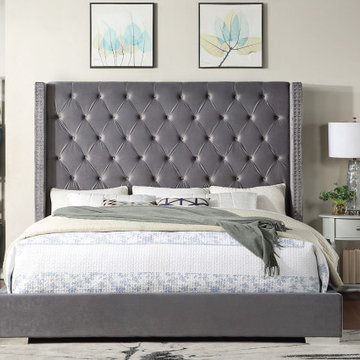
With the Bennett Upholstered Bed’s winged velvet-adorned headboard and tufted detailing, your room will revitalize with contemporary appeal and high-end taste.
 Milex Residential
Read the who story, complete with video: https://bucks.happeningmag.com/preserving-history-crafting-dreams/
Initially envisioned solely as a home addition, the project evolved into a complete renovation. The owner's priorities, such as a spacious kitchen, a bathroom with ample closet space, and the addition of a garage, expanded the scope. The entire house, including the old section, underwent a metamorphosis, emerging as a harmonious blend of old-world charm and contemporary comfort. The kitchen, a focal point of the owner's vision, features custom inset cabinetry crafted locally in Bucks County. The second floor encompasses a luxurious primary bathroom and closet, showcasing the meticulous attention to detail. A highlight is the transformation of the third floor into an inviting living space, where historical elements like mortise and tenant joint beams are preserved and refinished.
 Masterworks Window Fashions & Design, LLC
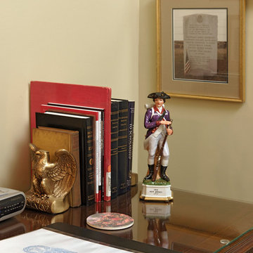
In each room, a guest book was created, with information about the history represented in the space, as well as helpful guest information such as emergency numbers, transportation, and nearby restaurants. Coasters pertinent to the history of each room were located and purchased, and each room has a unique statue of a 3rd New Jersey (New Jersey Blues) soldier. The coaster shown features Molly Pitcher. Eagle bookends hold books about the history of the battle commemorated in the space, as well as the history of the Society of the Cincinnati in New Jersey. Bob Narod, Photographer. Design by Linda H. Bassert, Masterworks Window Fashions & Design, LLC.
 Klopf Architecture
From Mid-Century Classic to the Present
An iconic design updated with comfort, function, and flow for today.
A Remodel That Balances Past and Present
What started as a desire to update a classic Eichler soon became an exploration of how Mid-Century Modern design can successfully evolve for today. The client, a tech professional with a passion for scuba diving and underwater photography, wanted a home that would both honor its original character and feel tailored to his daily life. A lifelong technology enthusiast, he still owns the very first Mac desktop he saved up for as a teenager working at Radio Shack, a detail that underscores his appreciation for design that melds function and form.
Honoring Separation While Expanding Possibility
Unlike many contemporary remodels where walls are opened up to create expansive living spaces, this project took a more restrained approach. The client valued the defined rooms of the original plan and wanted to preserve as much wall space as possible for displaying his large-format underwater photography. The emphasis was not on dramatic spatial reinvention, but on thoughtful refinements. Klopf Architecture shaped a gallery-like backdrop while also expanding the primary suite, modernizing materials and fixtures throughout the home, and improving the functionality and layout of the kitchen. The finished home feels at once timeless and renewed, an Eichler that continues to inspire while fully supporting the lifestyle of its present-day owner.
A major turning point came mid-design. The original project brief had not included an addition, but as the reconfiguration of the primary bedroom and bath unfolded, it became clear that an expansion was the best approach to achieve the client’s vision of a more spacious suite. Fortunately, the adjustment came at a stage when revisions were still manageable and was integrated seamlessly, showing how thoughtful course corrections can strengthen a project rather than hinder it.
Navigating Challenges With Precision
The design development included multiple conceptual rounds, balancing preservation with subtle expansion. During construction, an existing post previously thought to be load-bearing turned out not to be. The structural engineer was able to pivot quickly, and both the post and the cross beam that had been intended to replace it could be omitted, allowing the original rhythm of the Eichler beam bays to be preserved.
Sustainability was not just a checklist item, but a way to align the home with the client’s values of simplicity, efficiency, and long-term functionality. R-38 roof insulation reduced energy usage, solar panels with battery storage provided independence and resilience, and passive comfort strategies eliminated the need forenergy-intensive air conditioning. An electric vehicle charger and an on-demand hot water recirculation system (with call buttons as opposed to having constant circulation) add to the home’s long-term efficiency factors. Together, these moves created a home that is quieter, more comfortable, and better equipped for the future, qualities that supported the client’s pragmatic approach to design and living lightly.
Details That Respect the Eichler DNA
The remodel carries forward the Eichler’s original spirit while introducing new layers of modern livability. Originally, the house was approached along a deep, narrow walk, with the garage on one side and the house on the other, leaving the front door tucked far back within this chasm-like space. By pulling the entry forward, the design reshaped the arrival experience, creating a clearer threshold and a natural drop-off zone for bags, shoes, and keys. This shift also made room for a custom bench at the entry that extends seamlessly through the glass sidelight. The bench and drop-off zone now work together as a single, integrated sequence that supports everyday living while offering a tactile reminder of Eichler’s philosophy of connectedness.
At the client’s request, Klopf reintroduced a classic Eichler gesture by extending the exterior siding into the entry and living room. The detail reinforces a sense of indoor/outdoor continuity while providing a subtle architectural surface that allows the client’s photography to take visual precedence.
The signature concrete masonry wall at the front was reconstructed using blocks sourced to match the originals, now strengthened with rebar for seismic resilience while maintaining a private outdoor courtyard, visually extending the kitchen outward. A decorative trellis element, a detail borrowed from a neighboring Eichler, restores a familiar mid-century modern architectural motif. At the courtyard entry door, a custom etched glass sidelight with an ocean-themed design featuring kelp and jellyfish serves as a subtle homage to the client’s passion for deep-sea diving.
Landscaping became an integral part of the overall transformation. The homeowner engaged landscape architect Randi Johnsen of Third Nature Studio to shape a series of calm, inviting outdoor rooms that read as a natural extension of the interiors. While technically outside of the core construction scope, the landscape design proved central to achieving a sense of completeness and connectedness across the property. Such whole-property considerations often emerge as design ideas take shape, underscoring the importance of flexibility in planning and budgeting, as well as close collaboration among the design team starting early in the process.
The Value of Evolving Scope
As with many custom residential projects, the scope evolved during the design process. What began as a targeted remodel grew to include a new/expanded primary suite, a rebuilt CMU patio wall for strength and longevity, and a solar panel array and battery storage for energy resilience and carbon-reduction. Each thoughtful decision represented a conscious investment in the home’s performance and character, rather than a cost overrun.
The result was a project delivered on schedule, tailored precisely to the client’s lifestyle, and positioned to add long-term value both functionally and aesthetically. By embracing scope evolution as an opportunity rather than a challenge, and relying on good design paired with transparent communication, this remodel demonstrates how Eichler homes can be adapted for contemporary living without erasing their DNA.
Klopf Architecture project team: John Klopf, AIA, and Klara Kevane, Elise Webb and Nicholas LaNasa.
Contractor: Golden Cove Construction
Landscape Design: Third Nature Studio
Structural Engineer: Daniel Bastiao Design
Photography: ©2025 Mariko Reed
Year Completed: 2024
Location: Sunnyvale, CA
 Liberty Windoors Corp.
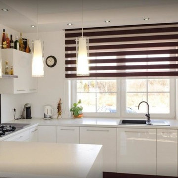
The Tilt Turn window is a European-style window with two distinct functions: swing it in like a door or tilt the top of the sash into your room for ventilation. One handle controls both operations. The tilt turn is a great window for unique situations where you want additional ventilation or access.
Features
• A popular European Style window
• Dual-functioning: Swing like a door or tilt the top sash for ventilation using the same handle for both (or each) operation/s
• Great for emergency exit access
• Low-e argon
• Double Glaze
• U Factor = 0.19
• SHGC = 0.23
• Thermal Transmission = 0.21
• Modular turn-tilt fitting system with visible hinge side
• Simple and intuitive operation
• Versatile and simple adjustment
• Individual design matching due to powder-coated hinge parts or caps in different colors
• Large central reinforcing chamber for optimum static performance.
• Robust walls guarantee greater stability and durability of windows, as well as increased protection against noise and temperature changes.
• System reinforcement profile made of galvanized steel, ensuring stiffness, and correct functioning.
• Compact design, delicate bevels and slants give the profiles a modern and elegant look.
• Extremely durable and modern gaskets ensure that windows are tight and reliable.
• Five-chamber construction provides ideal thermal protection
How It Works
1. Turn the handle 90 degrees to open the sash like an inswing door
2. Turn the handle 180 degrees and it locks the bottom sash into the frame, tilting the top in to allow air exchange
Visit Our Online Shop To Browse and Shop Our In Stock Selection Available Now : www.shop.libertywindoors.com
To Learn About Custom Window Orders and For More Information About The Tilt and Turn Windows Visit : www.libertywindoors.com
TEL : (973) 773-2188
EMAIL: infonj@libertywindoors.com
 CHRISTOPHER STROM ARCHITECTS
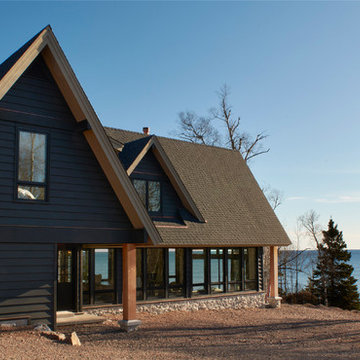
Perched on a 16-acre property in Norther Minnesota, this home offers expansive views of Lake Superior’s rugged coastline.
A single view takes precedence: During storm events, a micro-island of solid rock experiences dramatic cross-currents and explosive waves. In fair weather the island is a picturesque monolith emerging from dark waters. Core living spaces (Entry, Kitchen, Dining, Living) share this view by establishing lower relative floor planes; rooms step down in reverence to this ever-changing landscape feature.

 Save home
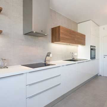
Choosing between American framed cabinets and European frameless renditions often boils down to personal preference.
While the American framed counterpart emerges as an immensely popular choice, classic white European kitchen cabinets exhibit a timeless charm that one can't ignore.
It's pretty easy to distinguish a framed and a frameless cabinet as one pays close attention.
The American framed cabinets typically have wide gaps around the doors showing the face of the wood.
In comparison, the European frameless cabinets have much smaller gaps (less than a quarter-inch or more). Moreover, they also carry a matching edge band which is visible on the cabinet box, when its doors are left open.
Well, that's there with the basics and many more subtle differences that distinguish one kind from another.
In this post, we take a closer look at both frameless and framed cabinet styles, their merits and demerits, and help you make an informed decision to buy one.
The American Style Face Frames
As the name suggests, face frame cabinets dominate the structure of a cabinet and use comparatively thinner materials for the cabinet box.
One can find additional frame pieces (mullions) that rest right between the door and the face of the drawer.
One of the standout features of American framed cabinets is the doors that remain attached to the face frame and carry hinges concealed within. In such structures, the shelves are generally of half depth and can be hung side up or down according to one’s need.
Face frame cabinets are known to sport doors that are not classic or pure square in shape. Also, they use a trim mold for their finish which measures just about an inch, but wide enough to press on the wall contours. Thus, they are nailed right on the face of the cabinet as well as to the sides to even out the gaps following the installation.
In essence, this particular style of cabinetry is geared towards keeping things under budget and allows the makers to work persistently and create a specific line of products.
The European Frameless Style
Taking a different stance from American face frame cabinets, we have the European Frameless style that views the cabinet box as the main structure.
It goes to work with a thin edge connected to the cabinet box matching the exteriors. The material used for the cabinet box is also thicker and carries quite a bit of weight.
Also, instead of the face frame, the glides for the door and the drawers stay attached to the cabinet box itself. The white European kitchen cabinets also use concealed hinges, which is again chunkier compared to its American counterpart.
While such frameless cabinets can be easily ordered by referring to a catalog, most buyers opt for a custom made product.
Another glaring difference between the two cabinetry styles is how the European frameless renditions work with cabinet doors that are perfect squares, and all lines between the drawers and doors are straight, imparting consistency throughout.
Furthermore, the finishing detail instead of using trim molds are scribed and further cut to fit within the walls.
Delightful enough, one can have a European frameless cabinets customized to their liking, mood, and style. White European kitchen cabinets, unlike framed ones, can be made to look rustic, transitional, modern, or traditional, and could be even a blend of any two styles.
How Do You Know Which Is The Right Style For You?
As mentioned earlier, choosing a particular style of cabinetry is all dependent on your personal preference. However, there are a few merits and demerits to each style.
For instance, the white European kitchen cabinets are extremely high in demand and can offer a rich look and elegant feel to any space.
Even if you go for any other color other than the classic ones, it is the flexibility, the visually stunning appearance, and precise carpentry that goes in its favor.
Come-of-age cabinet makers have a wide range of white kitchen cabinets for sale to choose from. Cabinet DIY is one such professional and passionate cabinet maker that has helped many homeowners pick the right piece for their place. One can order from their website and get it shipped to their doorstep.
It's only evident why this carefully cut and sculpted cabinetry finds its place across leading home decor magazines and websites around the world.
The American face frame cabinets can seldom claim to match the elegance and timeless beauty of white European kitchen cabinets. Also, given the choice, European frameless cabinets have multiple doors and wide drawer banks offering adequate room for storage.
Most importantly, the hardware that goes into the making of a frameless cabinet has everything attached to the cabinet box which promises more longevity, compared to face frame renditions. While the former is more likely to stay the same over several years, the latter is prone to cracks appearing in places now and then, with slides and hinges fitted with screws.
Nevertheless, one of the standout reasons that might give American face frame cabinets an upper hand over European frameless cabinetry is budget.
American framed cabinets using much thinner finish material attributes to lower pricing. Also, given the fact that there isn't much room for exquisite designs, the budget is often an overpowering factor for many buyers.
Wrap up
For anyone who would like to order a cabinet that is aesthetically pleasing and promises endless customization and longevity will side with European frameless cabinets.
In doing so, it is quite probable that pricing won't be a hindrance as one wages the investment for the value the furniture adds to a living space. Something that American face framed cabinets can't seem to match up.
While the American framed counterpart emerges as an immensely popular choice, classic white European kitchen cabinets exhibit a timeless charm that one can't ignore.
It's pretty easy to distinguish a framed and a frameless cabinet as one pays close attention.
The American framed cabinets typically have wide gaps around the doors showing the face of the wood.
In comparison, the European frameless cabinets have much smaller gaps (less than a quarter-inch or more). Moreover, they also carry a matching edge band which is visible on the cabinet box, when its doors are left open.
Well, that's there with the basics and many more subtle differences that distinguish one kind from another.
In this post, we take a closer look at both frameless and framed cabinet styles, their merits and demerits, and help you make an informed decision to buy one.
The American Style Face Frames
As the name suggests, face frame cabinets dominate the structure of a cabinet and use comparatively thinner materials for the cabinet box.
One can find additional frame pieces (mullions) that rest right between the door and the face of the drawer.
One of the standout features of American framed cabinets is the doors that remain attached to the face frame and carry hinges concealed within. In such structures, the shelves are generally of half depth and can be hung side up or down according to one’s need.
Face frame cabinets are known to sport doors that are not classic or pure square in shape. Also, they use a trim mold for their finish which measures just about an inch, but wide enough to press on the wall contours. Thus, they are nailed right on the face of the cabinet as well as to the sides to even out the gaps following the installation.
In essence, this particular style of cabinetry is geared towards keeping things under budget and allows the makers to work persistently and create a specific line of products.
The European Frameless Style
Taking a different stance from American face frame cabinets, we have the European Frameless style that views the cabinet box as the main structure.
It goes to work with a thin edge connected to the cabinet box matching the exteriors. The material used for the cabinet box is also thicker and carries quite a bit of weight.
Also, instead of the face frame, the glides for the door and the drawers stay attached to the cabinet box itself. The white European kitchen cabinets also use concealed hinges, which is again chunkier compared to its American counterpart.
While such frameless cabinets can be easily ordered by referring to a catalog, most buyers opt for a custom made product.
Another glaring difference between the two cabinetry styles is how the European frameless renditions work with cabinet doors that are perfect squares, and all lines between the drawers and doors are straight, imparting consistency throughout.
Furthermore, the finishing detail instead of using trim molds are scribed and further cut to fit within the walls.
Delightful enough, one can have a European frameless cabinets customized to their liking, mood, and style. White European kitchen cabinets, unlike framed ones, can be made to look rustic, transitional, modern, or traditional, and could be even a blend of any two styles.
How Do You Know Which Is The Right Style For You?
As mentioned earlier, choosing a particular style of cabinetry is all dependent on your personal preference. However, there are a few merits and demerits to each style.
For instance, the white European kitchen cabinets are extremely high in demand and can offer a rich look and elegant feel to any space.
Even if you go for any other color other than the classic ones, it is the flexibility, the visually stunning appearance, and precise carpentry that goes in its favor.
Come-of-age cabinet makers have a wide range of white kitchen cabinets for sale to choose from. Cabinet DIY is one such professional and passionate cabinet maker that has helped many homeowners pick the right piece for their place. One can order from their website and get it shipped to their doorstep.
It's only evident why this carefully cut and sculpted cabinetry finds its place across leading home decor magazines and websites around the world.
The American face frame cabinets can seldom claim to match the elegance and timeless beauty of white European kitchen cabinets. Also, given the choice, European frameless cabinets have multiple doors and wide drawer banks offering adequate room for storage.
Most importantly, the hardware that goes into the making of a frameless cabinet has everything attached to the cabinet box which promises more longevity, compared to face frame renditions. While the former is more likely to stay the same over several years, the latter is prone to cracks appearing in places now and then, with slides and hinges fitted with screws.
Nevertheless, one of the standout reasons that might give American face frame cabinets an upper hand over European frameless cabinetry is budget.
American framed cabinets using much thinner finish material attributes to lower pricing. Also, given the fact that there isn't much room for exquisite designs, the budget is often an overpowering factor for many buyers.
Wrap up
For anyone who would like to order a cabinet that is aesthetically pleasing and promises endless customization and longevity will side with European frameless cabinets.
In doing so, it is quite probable that pricing won't be a hindrance as one wages the investment for the value the furniture adds to a living space. Something that American face framed cabinets can't seem to match up.
 Morpurgo Architects
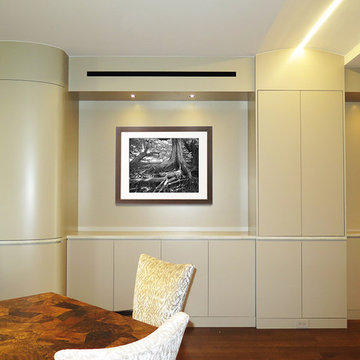
It is always a welcome opportunity to design a home for clients with whom we have enjoyed collaborating in the past. And, fun, too, to create at both ends of the spectrum of our residential work … from the renovation of their traditional French Provincial house in Greenwich, Connecticut, to gutting their Park Avenue apartment that has emerged as the epitome of elegant contemporary design.
Morpurgo Architects’ renovation of this 2,000 sf coop, with confining areas, has led to a flowing series of spaces that includes an open living/dining area, two bedroom suites, each with an en-suite bathroom, a library/guest room and bathroom, a powder room, and an eat-in kitchen.
Our clients’ new home is distinguished by high ceilings and recessed LED lighting, immediately apparent in the entry, with its striking oval, light cove, which leads to a large gathering space, punctuated by hidden light sources and curved, sculptural cabinetry designed by our firm.
Photography by Ann Ginsburgh Hofkin, featured in our images of this apartment, can be viewed at www.aghofkin.com
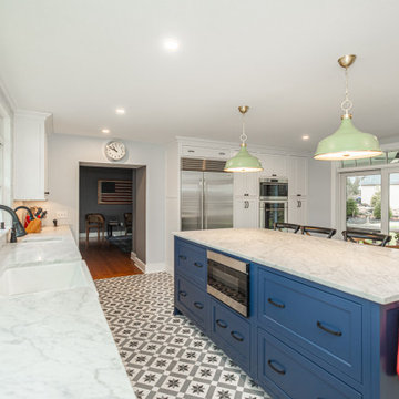 Milex Residential
Read the who story, complete with video: https://bucks.happeningmag.com/preserving-history-crafting-dreams/
Initially envisioned solely as a home addition, the project evolved into a complete renovation. The owner's priorities, such as a spacious kitchen, a bathroom with ample closet space, and the addition of a garage, expanded the scope. The entire house, including the old section, underwent a metamorphosis, emerging as a harmonious blend of old-world charm and contemporary comfort. The kitchen, a focal point of the owner's vision, features custom inset cabinetry crafted locally in Bucks County. The second floor encompasses a luxurious primary bathroom and closet, showcasing the meticulous attention to detail. A highlight is the transformation of the third floor into an inviting living space, where historical elements like mortise and tenant joint beams are preserved and refinished.
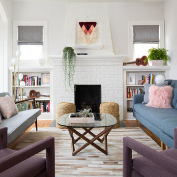
 Monika Merchant Design Studio
A curated and collected living room featuring a mix of high and low, emerging artists, and vintage furnishings.
1960s living room photo in Dallas
1960s living room photo in Dallas
Sponsored
Columbus, OH
Free consultation for landscape design!

Peabody Landscape Group
Franklin County's Reliable Landscape Design & Contracting
 Jane Kim Architect
Located in an 1890 Wells Fargo stable and warehouse in the Hamilton Park historic district, this intervention focused on creating a personal, comfortable home in an unusually tall loft space. The living room features 45’ high ceilings. The mezzanine level was conceived as a porous, space-making element that allowed pockets of closed storage, open display, and living space to emerge from pushing and pulling the floor plane.
The newly cantilevered mezzanine breaks up the immense height of the loft and creates a new TV nook and work space. An updated master suite and kitchen streamline the core functions of this loft while the addition of a new window adds much needed daylight to the space. Photo by Nick Glimenakis.
 Luxury Elements
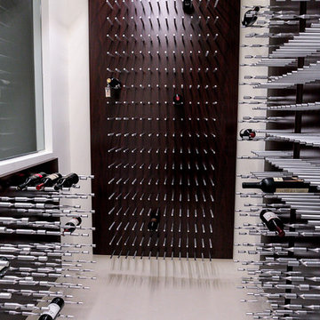
Located in Chicago, Illinois, this contemporary styled custom wine cellar is a great looking, yet functional addition to the home. Wine rooms like this that store wine properly also create an impressive back lit display and are emerging as the “must have” home feature for a high end home owner. The client’s goal was to be able to store somewhere around 800 bottles of wine in a modern looking, but limited space. In designing this wine cellar, the walls were created in imitation of a wood finish, horizontal, and clean looking display racks.
 Klopf Architecture
Malibu Glass Box House by Klopf Architecture
Following the devastating Woolsey Fire of 2018, the site in Malibu offered a unique opportunity to rebuild not just a home, but a new architectural composition that highlighted the property’s potential while navigating strict fire-rebuild codes in the area. Designed by Klopf Architecture, this project embraced a set of limitations and translated them into an architectural asset.
The city’s fire-rebuild process required the new structure to remain close to the original footprint, size and bulk, a constraint that ultimately clarified the architectural direction. Perched near the front of a long, narrow lot, the new home frames and overlooks a private, park-like rear expanse, an uncommon luxury especially in this part of Malibu .
Without a fixed program, the design process allowed for a different kind of creative focus allowing Klopf Architecture the opportunity to explore how a modernist home could best respond to this site. The team approached the project not with a list of requirements, but with a question: How might a modernist live here? What spatial qualities would inspire calm, connection, and a sense of wonder in this setting? The process became less about problem-solving and more about architectural storytelling—letting the site, the light, and the principles of modern design guide the form and flow of the home.
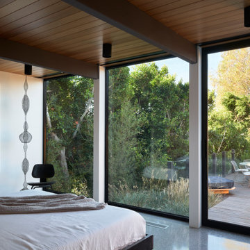
The response emerged in the form of a glass-box pavilion, an open, Mid-Century Modern inspired living, dining, and kitchen space that floats at the edge of the property’s natural descent. Connected to the more enclosed, private areas of the home by a glass-walled hallway, the living pavilion becomes a distinct centerpiece of the design. It opens on all four sides to the landscape with decks and patios on the flanks, an internal garden and water feature to the north, and a dramatic unguarded view of the expansive backyard and ocean horizon to the south.
Because of the mandated footprint, careful planning was required to ensure every space could still engage with light, landscape, or both. Strategic voids in the form of atriums and courtyards allow daylight to filter deep into the home’s core, while offering moments of surprise and retreat. These design gestures allow natural light to filter deep into the interior, creating a sense of brightness and openness throughout the day. At the same time, they expand the perceptual boundaries between inside and out, making the home feel more expansive while anchoring its connection to the surrounding landscape.
The siting of the house is what gives it its unique character. Rather than receding into the backyard like the neighboring homes, the house holds a slight prominence. From the central living pavilion, stepping down into the landscape feels more like entering a secluded park where a separate existing accessory structure, trail, and recreational areas await. The home’s modest street presence gives way to this unfolding drama of space, view, and nature.
Fire-resilient materials and assemblies are integrated seamlessly throughout including triple-pane glazing, under-slab and roof insulation, and locally sourced fire-rated cladding ensure the house not only meets Calfornia’s rigorous wildland-urban interface (WUI) standards, but feels effortlessly aligned with them. While technical decisions like fire-hardening and mechanical systems presented some construction challenges, particularly around the cantilevered glass box, the team found a functional compromise that preserved the integrity of the design.
Inside, a restrained palette and exposed post and beam design celebrate the ethos of mid-century modernism. A central circulation spine extends from the entry to the rear glass wall, offering a continuous visual link from street to ocean. Spaces such as the library and office, though more intimate in scale, are never cut off from nature as each opens to its own unique courtyard or garden view.
Though born out of a strict regulatory framework and developed without a specific client, the rebuild design unfolded with remarkable clarity. Grounded in site logic, refined by limitations and an emphasis on timeless spatial relationships – light, proportion, and a strong connection to nature, the resulting design feels both effortless and uplifting. The home lives lightly on the land, opens generously to its surroundings, and strikes a careful balance between privacy, openness, and calm. For Klopf Architecture, it stands as a compelling case study in how site, code, and circumstantial constraints can inspire enduring, modernist architecture. With years of experience reimagining mid-century modern design for how people live today, the firm took the project’s limitations as an opportunity. The result is a home shaped by open, flowing spaces, strong indoor-outdoor connections, and a calm, clear sense of structure. It’s a good reminder that even with strict constraints, there’s still room for architecture to breathe—and for modernism to keep moving forward.
Klopf Architecture project team: Geoff Campen, John Klopf, AIA, and Sherry Tan
Structural Engineer: ZFA
Contractor: Maison D’Artiste
Photography: ©2025 Mariko Reed
Year Completed: 2023
27