
Search results for "Feel active" in Home Design Ideas
 Lars Remodeling & Design
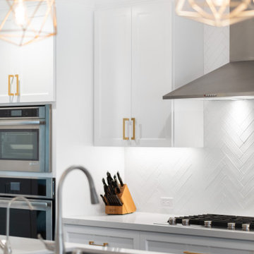
The goal for this Point Loma home was to transform it from the adorable beach bungalow it already was by expanding its footprint and giving it distinctive Craftsman characteristics while achieving a comfortable, modern aesthetic inside that perfectly caters to the active young family who lives here. By extending and reconfiguring the front portion of the home, we were able to not only add significant square footage, but create much needed usable space for a home office and comfortable family living room that flows directly into a large, open plan kitchen and dining area. A custom built-in entertainment center accented with shiplap is the focal point for the living room and the light color of the walls are perfect with the natural light that floods the space, courtesy of strategically placed windows and skylights. The kitchen was redone to feel modern and accommodate the homeowners busy lifestyle and love of entertaining. Beautiful white kitchen cabinetry sets the stage for a large island that packs a pop of color in a gorgeous teal hue. A Sub-Zero classic side by side refrigerator and Jenn-Air cooktop, steam oven, and wall oven provide the power in this kitchen while a white subway tile backsplash in a sophisticated herringbone pattern, gold pulls and stunning pendant lighting add the perfect design details. Another great addition to this project is the use of space to create separate wine and coffee bars on either side of the doorway. A large wine refrigerator is offset by beautiful natural wood floating shelves to store wine glasses and house a healthy Bourbon collection. The coffee bar is the perfect first top in the morning with a coffee maker and floating shelves to store coffee and cups. Luxury Vinyl Plank (LVP) flooring was selected for use throughout the home, offering the warm feel of hardwood, with the benefits of being waterproof and nearly indestructible - two key factors with young kids!
For the exterior of the home, it was important to capture classic Craftsman elements including the post and rock detail, wood siding, eves, and trimming around windows and doors. We think the porch is one of the cutest in San Diego and the custom wood door truly ties the look and feel of this beautiful home together.
 Spin Design Limited
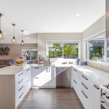
Designing a home that caters to the needs of the entire family is so important, as it fosters harmony, encourages bonding, and creates a welcoming sanctuary where each member, including pets, feels valued and content. Designing for families involves creating spaces that facilitate togetherness and encourage shared activities. Open floor plans that seamlessly connect living areas, dining spaces, and kitchens promote interaction among family members. A home should not only be aesthetically pleasing, but it should also be comfortable, family-friendly, and pet-friendly.
This home truly reflects the people and pets who reside within it. Each space has carefully chosen artwork and furniture pieces to enhance the living experience.
The indoor-outdoor flow maximizes the penetration of natural light into the home. The glazed areas not only brighten the interior but also create a sense of openness and spaciousness. The extended deck becomes an extension of the interior, providing additional areas for relaxation, entertaining guests, or engaging in various activities. Being able to easily access and enjoy outdoor spaces promotes a sense of tranquility, relaxation, and well-being. It also encourages outdoor activities, such as outdoor dining, or simply unwinding in nature, fostering a healthier and more balanced lifestyle.
 Rochman Design Build
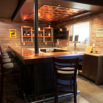
In this project, Rochman Design Build converted an unfinished basement of a new Ann Arbor home into a stunning home pub and entertaining area, with commercial grade space for the owners' craft brewing passion. The feel is that of a speakeasy as a dark and hidden gem found in prohibition time. The materials include charcoal stained concrete floor, an arched wall veneered with red brick, and an exposed ceiling structure painted black. Bright copper is used as the sparkling gem with a pressed-tin-type ceiling over the bar area, which seats 10, copper bar top and concrete counters. Old style light fixtures with bare Edison bulbs, well placed LED accent lights under the bar top, thick shelves, steel supports and copper rivet connections accent the feel of the 6 active taps old-style pub. Meanwhile, the brewing room is splendidly modern with large scale brewing equipment, commercial ventilation hood, wash down facilities and specialty equipment. A large window allows a full view into the brewing room from the pub sitting area. In addition, the space is large enough to feel cozy enough for 4 around a high-top table or entertain a large gathering of 50. The basement remodel also includes a wine cellar, a guest bathroom and a room that can be used either as guest room or game room, and a storage area.
Find the right local pro for your project
 Rochman Design Build
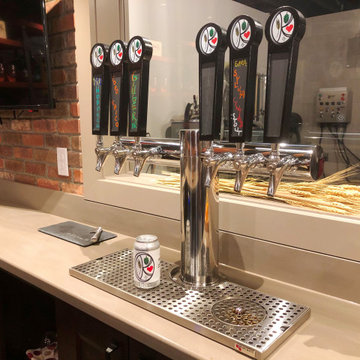
In this project, Rochman Design Build converted an unfinished basement of a new Ann Arbor home into a stunning home pub and entertaining area, with commercial grade space for the owners' craft brewing passion. The feel is that of a speakeasy as a dark and hidden gem found in prohibition time. The materials include charcoal stained concrete floor, an arched wall veneered with red brick, and an exposed ceiling structure painted black. Bright copper is used as the sparkling gem with a pressed-tin-type ceiling over the bar area, which seats 10, copper bar top and concrete counters. Old style light fixtures with bare Edison bulbs, well placed LED accent lights under the bar top, thick shelves, steel supports and copper rivet connections accent the feel of the 6 active taps old-style pub. Meanwhile, the brewing room is splendidly modern with large scale brewing equipment, commercial ventilation hood, wash down facilities and specialty equipment. A large window allows a full view into the brewing room from the pub sitting area. In addition, the space is large enough to feel cozy enough for 4 around a high-top table or entertain a large gathering of 50. The basement remodel also includes a wine cellar, a guest bathroom and a room that can be used either as guest room or game room, and a storage area.
 Kitchen Magic
Some remodeling customers are uncertain about the best way to change the look of their space, and turn to us at Kitchen Magic for guidance; other homeowners already have a clear idea of what they want, and ask us to make their vision a reality. The latter was very much the case in a recent remodeling project we completed in Milford, New Jersey.
The home had been designed by the homeowner, who was clearly accustomed to creating and implementing an artistic vision for their living space. By the time Kitchen Magic arrived on the scene, the homeowner already had clear ideas about the colors and materials that would go into creating the look of their new kitchen. Cabinet refacing was the perfect solution for staying within budget, yet still having the kitchen they had always dreamed of.
Building on the Existing Decor is Key
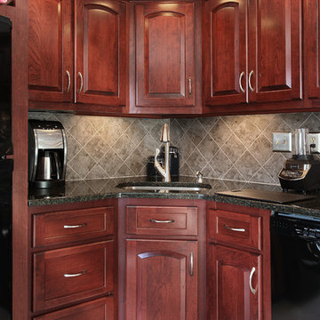
The sleek, black appliances already in place demanded a bold complement, and the rich, deep hue of Cordovan on Cherry stain fit the bill perfectly. The arched cabinet doors add a classic touch of elegance, but one that blends seamlessly with the modern feel of the other design elements. The clean lines and chrome finish of the cabinet hardware serve to unite the vivid cherry cabinetry with the gray toned counters and backsplash.
That backsplash, a custom design envisioned by the homeowner, brings both unity and contrast to the entire space. The splashes of lighter values brighten the deep red tones of the cabinets, keeping the room from feeling too dark. The use of texture and varied tonal values create a unique piece that adds dimension to the kitchen's personality and reflects the creative energy of the homeowners.
The luxury of the deep cherry-red cabinets and the sleekly modern lines of the furnishings create a timeless and bold back drop for the counters, and only one stone perfectly fits that bill: granite! The black Uba Tuba granite countertops chosen by the homeowners have the visual weight and richness to pair with the Cordovan on Cherry, and the marbling of lighter and darker values echo of the custom-designed backsplash over the range, completing the new design.
Taken together, the effect of the homeowners' choices create a striking, elegant, and almost decadent feel without any heavy or dark characters. The sleek lines and organic look created by the arched cabinet doors give the room a sense of grace and motion that is entirely appropriate to the homeowners' aesthetic, given their fondness for the adventure of hot-air ballooning and active life style.
David Glasofer
 Rochman Design Build
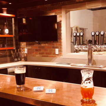
In this project, Rochman Design Build converted an unfinished basement of a new Ann Arbor home into a stunning home pub and entertaining area, with commercial grade space for the owners' craft brewing passion. The feel is that of a speakeasy as a dark and hidden gem found in prohibition time. The materials include charcoal stained concrete floor, an arched wall veneered with red brick, and an exposed ceiling structure painted black. Bright copper is used as the sparkling gem with a pressed-tin-type ceiling over the bar area, which seats 10, copper bar top and concrete counters. Old style light fixtures with bare Edison bulbs, well placed LED accent lights under the bar top, thick shelves, steel supports and copper rivet connections accent the feel of the 6 active taps old-style pub. Meanwhile, the brewing room is splendidly modern with large scale brewing equipment, commercial ventilation hood, wash down facilities and specialty equipment. A large window allows a full view into the brewing room from the pub sitting area. In addition, the space is large enough to feel cozy enough for 4 around a high-top table or entertain a large gathering of 50. The basement remodel also includes a wine cellar, a guest bathroom and a room that can be used either as guest room or game room, and a storage area.
 Regan Baker Design Inc.
Intentional. Elevated. Artisanal.
With three children under the age of 5, our clients were starting to feel the confines of their Pacific Heights home when the expansive 1902 Italianate across the street went on the market. After learning the home had been recently remodeled, they jumped at the chance to purchase a move-in ready property. We worked with them to infuse the already refined, elegant living areas with subtle edginess and handcrafted details, and also helped them reimagine unused space to delight their little ones.
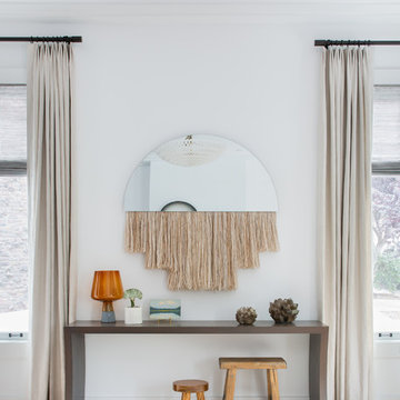
Elevated furnishings on the main floor complement the home’s existing high ceilings, modern brass bannisters and extensive walnut cabinetry. In the living room, sumptuous emerald upholstery on a velvet side chair balances the deep wood tones of the existing baby grand. Minimally and intentionally accessorized, the room feels formal but still retains a sharp edge—on the walls moody portraiture gets irreverent with a bold paint stroke, and on the the etagere, jagged crystals and metallic sculpture feel rugged and unapologetic. Throughout the main floor handcrafted, textured notes are everywhere—a nubby jute rug underlies inviting sofas in the family room and a half-moon mirror in the living room mixes geometric lines with flax-colored fringe.
On the home’s lower level, we repurposed an unused wine cellar into a well-stocked craft room, with a custom chalkboard, art-display area and thoughtful storage. In the adjoining space, we installed a custom climbing wall and filled the balance of the room with low sofas, plush area rugs, poufs and storage baskets, creating the perfect space for active play or a quiet reading session. The bold colors and playful attitudes apparent in these spaces are echoed upstairs in each of the children’s imaginative bedrooms.
Architect + Developer: McMahon Architects + Studio, Photographer: Suzanna Scott Photography


 Rochman Design Build
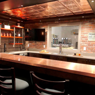
In this project, Rochman Design Build converted an unfinished basement of a new Ann Arbor home into a stunning home pub and entertaining area, with commercial grade space for the owners' craft brewing passion. The feel is that of a speakeasy as a dark and hidden gem found in prohibition time. The materials include charcoal stained concrete floor, an arched wall veneered with red brick, and an exposed ceiling structure painted black. Bright copper is used as the sparkling gem with a pressed-tin-type ceiling over the bar area, which seats 10, copper bar top and concrete counters. Old style light fixtures with bare Edison bulbs, well placed LED accent lights under the bar top, thick shelves, steel supports and copper rivet connections accent the feel of the 6 active taps old-style pub. Meanwhile, the brewing room is splendidly modern with large scale brewing equipment, commercial ventilation hood, wash down facilities and specialty equipment. A large window allows a full view into the brewing room from the pub sitting area. In addition, the space is large enough to feel cozy enough for 4 around a high-top table or entertain a large gathering of 50. The basement remodel also includes a wine cellar, a guest bathroom and a room that can be used either as guest room or game room, and a storage area.
 Williamsons Kitchens
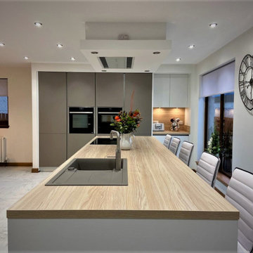
The client approached us with a clear vision in mind for their kitchen in Fraserburgh: an open-plan, modern design that would accommodate their large family. Essential to this vision was the integration of an island, complete with a secondary eating area. This space was not only to be visually appealing but also functionally efficient, as it would need to cater to family gatherings and daily activities. The desire for ample seating and a spacious table, along with additional specific storage solutions, set the stage for our design choices.
Drawing inspiration from the client's requirements, we opted for the Nolte Feel range, complemented by Silver MatrixArt handleless trims. The primary colour for the furniture was chosen as white, with a contrasting accent in Feel Lava to add a touch of modern sophistication. To further enhance the open feel, we made structural modifications: the existing kitchen window was lowered to usher in more natural light and provide an improved viewing angle. Additionally, the entrance to the sun lounge was broadened to foster a more expansive atmosphere.
A kitchen's functionality is determined largely by its worktops and appliances. For this space, we used a sturdy 40mm thick Nolte Silver Ash worktop, providing both durability and style. In terms of appliances, we decided upon NEFF's range, which included a single oven, combination microwave, induction hob, and ceiling extraction, ensuring the client's culinary needs were well catered for.
Recognising the family's unique requirements, we introduced several bespoke features. The Blanco Metra sink in Tartufo and the Quooker Fusion Square Stainless Steel instant boiling water tap combined functionality with modern aesthetics. With the client's large family in mind, we constructed a matching Nolte table and a built-in seating bench replete with storage drawers, maximising both seating and storage. Additionally, a custom-built unit for log storage was designed, mirroring the style of the kitchen, to serve their log-burning stove. The flooring, using Quickstep Arte, tied everything together, adding a touch of elegance to the room.
Experience your dream kitchen with us. Reach out today to start your bespoke kitchen journey.

 Drury Design
The Setup
The homeowners of this Barrington Hills residence approached Drury Design with a clear vision: transform their existing kitchen into a space that would better serve their active family of four. With two young children who are homeschooled and love to bake with their mom, plus two dogs, this kitchen needed to function as the true heart of the home.
The existing kitchen was functional but didn’t maximize the potential of the beautiful natural light and scenic views available through the floor-to-ceiling windows. The space was locked between the dining room and family room, which limited structural modifications, but the homeowners wanted to create a more family-friendly environment that would complement the warm walnut built-ins and furnishings in the adjacent dining room while staying true to the home’s overall aesthetic.
Design Objectives:
Create a highly functional workspace that accommodates multiple family members cooking and gathering simultaneously
Maximize the connection to the beautiful outdoor scenery and natural light through thoughtful design choices
Establish a cohesive color palette that complements the existing walnut elements in the adjacent dining room without becoming too tone-on-tone (aka “matchy matchy”)
Improve the seating arrangement to take advantage of the stunning views (rather than facing away from the windows)
Work within the existing architectural constraints, including a curved soffit that could not be removed
Increase storage capacity while maintaining clean, uncluttered sightlines throughout the space
Design Challenges:
The curved soffit presented a design dilemma of whether to echo the curve throughout the kitchen or work with it in a more subtle way
The relatively low ceiling height required careful consideration to avoid making the space feel cramped or cave-like
The existing hardwood floor could not be refinished, which meant the new kitchen footprint had to match or exceed the original layout exactly
Finding the right balance of warm and neutral tones to complement both the existing walnut elements nearby and the natural outdoor views proved challenging
The refrigerator placement was constrained by door swing requirements, which affected the entire layout and prevented centering the sink on the back wall
Rethinking the original seating, which faced inward toward the kitchen (turning backs to the beautiful windows and outdoor views)
Pendant lighting from the previous kitchen obstructed views to the outdoors despite the abundant natural light available
The Renewed Space
Design Solutions:
The curved soffit was embraced subtly through the full slab backsplash, which echoes the curve without requiring curved cabinetry or architectural elements that might feel forced
Low ceiling challenges were addressed by using lighter painted cabinets for some tall elements, including the double oven, pantries, and refrigerator area, creating an airy feel while reserving the darker stained walnut for the center section and island
The floor constraint was managed by designing the new layout to cover all previously unfinished areas while maintaining the exact footprint, with only minor touch-ups needed in a few areas
The color palette balances warm walnut stain (harmonizing with the dining room built-ins) with soft, neutral painted cabinets – avoiding stark white that wouldn’t complement the home’s warm aesthetic
Refrigerator placement was optimized with a slim pullout pantry to the left, allowing proper door clearance while maintaining the desired layout flow and enabling the main pantry to be positioned adjacently
The seating was completely reimagined with a built-in banquette facing the windows, allowing diners to enjoy the outdoor views while providing flexible seating for two to four people
Decorative pendant lighting was eliminated in favor of recessed can lights, preserving the unobstructed views to the beautiful outdoor scenery
This kitchen transformation demonstrates how thoughtful design can dramatically improve functionality for a busy family while honoring existing architectural elements. The children immediately began cooking and baking with their mother in the new space, and the window-facing banquette has become a favorite gathering spot where the family can enjoy both meals and the beautiful outdoor views.
 Rochman Design Build
In this project, Rochman Design Build converted an unfinished basement of a new Ann Arbor home into a stunning home pub and entertaining area, with commercial grade space for the owners' craft brewing passion. The feel is that of a speakeasy as a dark and hidden gem found in prohibition time. The materials include charcoal stained concrete floor, an arched wall veneered with red brick, and an exposed ceiling structure painted black. Bright copper is used as the sparkling gem with a pressed-tin-type ceiling over the bar area, which seats 10, copper bar top and concrete counters. Old style light fixtures with bare Edison bulbs, well placed LED accent lights under the bar top, thick shelves, steel supports and copper rivet connections accent the feel of the 6 active taps old-style pub. Meanwhile, the brewing room is splendidly modern with large scale brewing equipment, commercial ventilation hood, wash down facilities and specialty equipment. A large window allows a full view into the brewing room from the pub sitting area. In addition, the space is large enough to feel cozy enough for 4 around a high-top table or entertain a large gathering of 50. The basement remodel also includes a wine cellar, a guest bathroom and a room that can be used either as guest room or game room, and a storage area.
 Regan Baker Design Inc.
Intentional. Elevated. Artisanal.
With three children under the age of 5, our clients were starting to feel the confines of their Pacific Heights home when the expansive 1902 Italianate across the street went on the market. After learning the home had been recently remodeled, they jumped at the chance to purchase a move-in ready property. We worked with them to infuse the already refined, elegant living areas with subtle edginess and handcrafted details, and also helped them reimagine unused space to delight their little ones.
Elevated furnishings on the main floor complement the home’s existing high ceilings, modern brass bannisters and extensive walnut cabinetry. In the living room, sumptuous emerald upholstery on a velvet side chair balances the deep wood tones of the existing baby grand. Minimally and intentionally accessorized, the room feels formal but still retains a sharp edge—on the walls moody portraiture gets irreverent with a bold paint stroke, and on the the etagere, jagged crystals and metallic sculpture feel rugged and unapologetic. Throughout the main floor handcrafted, textured notes are everywhere—a nubby jute rug underlies inviting sofas in the family room and a half-moon mirror in the living room mixes geometric lines with flax-colored fringe.
On the home’s lower level, we repurposed an unused wine cellar into a well-stocked craft room, with a custom chalkboard, art-display area and thoughtful storage. In the adjoining space, we installed a custom climbing wall and filled the balance of the room with low sofas, plush area rugs, poufs and storage baskets, creating the perfect space for active play or a quiet reading session. The bold colors and playful attitudes apparent in these spaces are echoed upstairs in each of the children’s imaginative bedrooms.
Architect + Developer: McMahon Architects + Studio, Photographer: Suzanna Scott Photography
 Drury Design
The Setup
The homeowners of this Barrington Hills residence approached Drury Design with a clear vision: transform their existing kitchen into a space that would better serve their active family of four. With two young children who are homeschooled and love to bake with their mom, plus two dogs, this kitchen needed to function as the true heart of the home.
The existing kitchen was functional but didn’t maximize the potential of the beautiful natural light and scenic views available through the floor-to-ceiling windows. The space was locked between the dining room and family room, which limited structural modifications, but the homeowners wanted to create a more family-friendly environment that would complement the warm walnut built-ins and furnishings in the adjacent dining room while staying true to the home’s overall aesthetic.
Design Objectives:
Create a highly functional workspace that accommodates multiple family members cooking and gathering simultaneously
Maximize the connection to the beautiful outdoor scenery and natural light through thoughtful design choices
Establish a cohesive color palette that complements the existing walnut elements in the adjacent dining room without becoming too tone-on-tone (aka “matchy matchy”)
Improve the seating arrangement to take advantage of the stunning views (rather than facing away from the windows)
Work within the existing architectural constraints, including a curved soffit that could not be removed
Increase storage capacity while maintaining clean, uncluttered sightlines throughout the space
Design Challenges:
The curved soffit presented a design dilemma of whether to echo the curve throughout the kitchen or work with it in a more subtle way
The relatively low ceiling height required careful consideration to avoid making the space feel cramped or cave-like
The existing hardwood floor could not be refinished, which meant the new kitchen footprint had to match or exceed the original layout exactly
Finding the right balance of warm and neutral tones to complement both the existing walnut elements nearby and the natural outdoor views proved challenging
The refrigerator placement was constrained by door swing requirements, which affected the entire layout and prevented centering the sink on the back wall
Rethinking the original seating, which faced inward toward the kitchen (turning backs to the beautiful windows and outdoor views)
Pendant lighting from the previous kitchen obstructed views to the outdoors despite the abundant natural light available
The Renewed Space
Design Solutions:
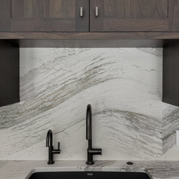
The curved soffit was embraced subtly through the full slab backsplash, which echoes the curve without requiring curved cabinetry or architectural elements that might feel forced
Low ceiling challenges were addressed by using lighter painted cabinets for some tall elements, including the double oven, pantries, and refrigerator area, creating an airy feel while reserving the darker stained walnut for the center section and island
The floor constraint was managed by designing the new layout to cover all previously unfinished areas while maintaining the exact footprint, with only minor touch-ups needed in a few areas
The color palette balances warm walnut stain (harmonizing with the dining room built-ins) with soft, neutral painted cabinets – avoiding stark white that wouldn’t complement the home’s warm aesthetic
Refrigerator placement was optimized with a slim pullout pantry to the left, allowing proper door clearance while maintaining the desired layout flow and enabling the main pantry to be positioned adjacently
The seating was completely reimagined with a built-in banquette facing the windows, allowing diners to enjoy the outdoor views while providing flexible seating for two to four people
Decorative pendant lighting was eliminated in favor of recessed can lights, preserving the unobstructed views to the beautiful outdoor scenery
This kitchen transformation demonstrates how thoughtful design can dramatically improve functionality for a busy family while honoring existing architectural elements. The children immediately began cooking and baking with their mother in the new space, and the window-facing banquette has become a favorite gathering spot where the family can enjoy both meals and the beautiful outdoor views.

Sponsored
Delaware, OH

Buckeye Basements, Inc.
Central Ohio's Basement Finishing ExpertsBest Of Houzz '13-'21
 Rochman Design Build
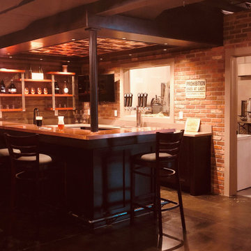
In this project, Rochman Design Build converted an unfinished basement of a new Ann Arbor home into a stunning home pub and entertaining area, with commercial grade space for the owners' craft brewing passion. The feel is that of a speakeasy as a dark and hidden gem found in prohibition time. The materials include charcoal stained concrete floor, an arched wall veneered with red brick, and an exposed ceiling structure painted black. Bright copper is used as the sparkling gem with a pressed-tin-type ceiling over the bar area, which seats 10, copper bar top and concrete counters. Old style light fixtures with bare Edison bulbs, well placed LED accent lights under the bar top, thick shelves, steel supports and copper rivet connections accent the feel of the 6 active taps old-style pub. Meanwhile, the brewing room is splendidly modern with large scale brewing equipment, commercial ventilation hood, wash down facilities and specialty equipment. A large window allows a full view into the brewing room from the pub sitting area. In addition, the space is large enough to feel cozy enough for 4 around a high-top table or entertain a large gathering of 50. The basement remodel also includes a wine cellar, a guest bathroom and a room that can be used either as guest room or game room, and a storage area.
 Rochman Design Build
In this project, Rochman Design Build converted an unfinished basement of a new Ann Arbor home into a stunning home pub and entertaining area, with commercial grade space for the owners' craft brewing passion. The feel is that of a speakeasy as a dark and hidden gem found in prohibition time. The materials include charcoal stained concrete floor, an arched wall veneered with red brick, and an exposed ceiling structure painted black. Bright copper is used as the sparkling gem with a pressed-tin-type ceiling over the bar area, which seats 10, copper bar top and concrete counters. Old style light fixtures with bare Edison bulbs, well placed LED accent lights under the bar top, thick shelves, steel supports and copper rivet connections accent the feel of the 6 active taps old-style pub. Meanwhile, the brewing room is splendidly modern with large scale brewing equipment, commercial ventilation hood, wash down facilities and specialty equipment. A large window allows a full view into the brewing room from the pub sitting area. In addition, the space is large enough to feel cozy enough for 4 around a high-top table or entertain a large gathering of 50. The basement remodel also includes a wine cellar, a guest bathroom and a room that can be used either as guest room or game room, and a storage area.
 Rochman Design Build
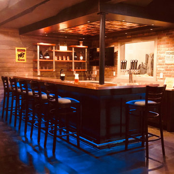
In this project, Rochman Design Build converted an unfinished basement of a new Ann Arbor home into a stunning home pub and entertaining area, with commercial grade space for the owners' craft brewing passion. The feel is that of a speakeasy as a dark and hidden gem found in prohibition time. The materials include charcoal stained concrete floor, an arched wall veneered with red brick, and an exposed ceiling structure painted black. Bright copper is used as the sparkling gem with a pressed-tin-type ceiling over the bar area, which seats 10, copper bar top and concrete counters. Old style light fixtures with bare Edison bulbs, well placed LED accent lights under the bar top, thick shelves, steel supports and copper rivet connections accent the feel of the 6 active taps old-style pub. Meanwhile, the brewing room is splendidly modern with large scale brewing equipment, commercial ventilation hood, wash down facilities and specialty equipment. A large window allows a full view into the brewing room from the pub sitting area. In addition, the space is large enough to feel cozy enough for 4 around a high-top table or entertain a large gathering of 50. The basement remodel also includes a wine cellar, a guest bathroom and a room that can be used either as guest room or game room, and a storage area.

 safe ZOnea
Ask a kitchen designer in Chicago which countertop question comes up most and you will hear the same answer: white or off-white quartz, and which shade. Homeowners walk into showrooms with a photo saved on their phone, usually a bright, veined slab from a magazine spread, and leave an hour later realizing there are a dozen versions of that same look. The confusion is not about taste. It is about the fact that "white quartz" covers a huge range of patterns, undertones, and price points, and nobody explains the differences before the sale.
Older bungalows and newer builds alike are getting stripped of their dated laminate and butcher block in favor of quartz, and the reasons are practical rather than trendy. Quartz does not need sealing, resists the kind of staining that granite can suffer over decades, and holds up to the freeze-thaw humidity swings that Chicago basements and kitchens go through every year. Once a homeowner commits to quartz, though, the real decision starts: which white, and does the pattern justify the difference in cost.
This piece walks through three specific slabs that keep showing up in Chicago renovation projects, why designers reach for them in different rooms, and what actually separates a flat white surface from one with real depth. None of this requires a design background to follow. It is mostly about paying attention to how a slab behaves under kitchen lighting, how busy the vending gets, and how it photographs versus how it looks in person.
Why White Quartz Took Over Chicago Kitchens
Ten years ago, granite dominated Chicago kitchen remodels almost by default. It was durable, it looked expensive, and every fabricator in the metro area carried a wide range of colors. Quartz has since taken over that position, and the shift happened faster than most contractors expected. Engineered stone gave homeowners a more predictable surface, since natural granite varies slab to slab while quartz is manufactured to a consistent pattern batch after batch.
The other driver is light. Chicago winters are long and gray, and a lot of kitchens, especially in older two-flats and courtyard buildings, do not get much direct sun. A dark granite countertop in a dim kitchen can make the whole room feel smaller. White and light-toned quartz reflects what little natural light comes through the windows, and it makes a galley kitchen or a north-facing space feel noticeably brighter without touching the cabinetry or the layout.
There is also a resale argument that local real estate agents bring up constantly. White quartz photographs well for listings, reads as updated and low-maintenance to buyers touring in person, and does not compete visually with whatever cabinet color the next owner might prefer. It is a safer bet than a bold veined marble look or a colored quartz that might feel dated in five years.
Arctic White and the Cost Question
Among the flatter, more uniform whites, arctic white quartz price comes up constantly in budget conversations because the slab sits at a more approachable point than the heavily veined Italian-marble-inspired patterns. It reads as clean and bright without the busy movement that some homeowners find overwhelming in a small kitchen. Fabricators in the Chicago area tend to keep it in stock precisely because demand stays steady across both new construction and remodel projects.
Part of what keeps this slab affordable relative to its heavily patterned cousins comes down to manufacturing complexity. A quartz surface with minimal veining and a consistent white base is simpler to produce at scale than one that mimics the irregular, high-contrast movement of natural Calacatta marble. That production difference shows up directly in what a homeowner pays per square foot, and it is worth asking a fabricator to walk through that pricing before assuming every white quartz costs the same.
Homeowners planning a full kitchen, including an island, backsplash, and perimeter counters, often use a flatter white like this specifically because it lets other elements carry the visual interest. A patterned tile backsplash or a bold cabinet color reads more clearly against a calm countertop than against one already fighting for attention with heavy veining. Designers frequently pair simpler whites with statement lighting fixtures for exactly this reason.
What Makes Calacatta Patterns Different
Calacatta refers to a family of marble originally quarried in Italy, known for a bright white background broken up by bold, often gold-toned veining that moves in thick, dramatic streaks rather than thin gray lines. Natural Calacatta marble is soft, porous, and expensive to maintain, which is exactly why quartz manufacturers spent years developing engineered versions that replicate the look without the upkeep headaches.
The challenge with any Calacatta-style quartz is getting the veining to look organic instead of printed. Early generations of engineered stone struggled with repetitive patterns that gave away the fact the slab was manufactured rather than cut from actual marble. Modern digital printing and layering techniques have closed that gap considerably, and the better Calacatta-inspired quartz lines now vary the veining across each slab batch so two counters in the same kitchen do not look identical.
Chicago designers gravitate toward Calacatta patterns for kitchens that function as the visual centerpiece of an open floor plan, which describes a large share of the gut renovations happening in neighborhoods like Lincoln Park, Roscoe Village, and the North Shore suburbs. When the kitchen island is visible from the living room and dining area, a dramatic veined surface becomes part of the home's overall design language rather than a purely functional work surface.
Calacatta Arno Under Kitchen Lighting
One of the more popular options in this category, calacatta arno quartz, balances a warm white base with soft gray and gold veining that avoids looking too stark under the cooler LED lighting common in newer Chicago builds. Homeowners touring showrooms sometimes make the mistake of judging a slab entirely under warm incandescent lighting, then get surprised when the same surface looks slightly different once installed under their kitchen's actual fixtures.
What separates this particular pattern from flatter competitors is how the veining clusters rather than spreading evenly across the slab. That clustering mimics the way real quarried marble forms, with denser mineral deposits in some sections and cleaner stretches in others. Fabricators cutting a large island slab from a single piece will often orient the pattern intentionally so the busiest veining lands somewhere visually interesting rather than getting cut off at an edge.
Because the background reads warmer than a stark white, this pattern tends to pair well with brass or matte gold hardware, a combination that has been showing up repeatedly in Chicago kitchen remodels over the past few renovation seasons. Cabinet painters report a similar trend, with more clients requesting warm white or greige cabinet colors specifically because they complement this kind of veined quartz better than a cooler, blue-toned white would.
Silestone's Version of the Calacatta Look
Manufacturers compete directly in this Calacatta-inspired category, and silestone eternal calacatta gold represents one brand's specific take on the pattern, distinguished by richer gold veining set against a brighter white base than some competing slabs in the same family. Silestone has built a reputation around anti-bacterial surface treatments in addition to the standard quartz durability, a detail some homeowners specifically ask about for kitchens used heavily by families with young children.
The veining in this particular slab tends to run in longer, more continuous lines compared to the clustered pattern found in some other Calacatta-style options, which gives large island surfaces a sense of visual flow from one end to the other. Fabricators working with bigger islands, the kind increasingly common in open-concept Chicago remodels, often favor patterns like this because there is less need to worry about seams interrupting a busy, disconnected pattern.
Price positioning for this slab tends to sit toward the upper end of the engineered quartz category, reflecting both the brand's manufacturing process and the complexity of replicating that continuous gold veining consistently across production batches. Homeowners weighing this option against other Calacatta-style quartz should ask their fabricator directly about batch availability, since premium patterns sometimes have longer lead times than standard stock colors.
Living With Quartz Day to Day
Beyond how a slab looks in a showroom or a listing photo, the daily experience of owning quartz countertops matters more once the renovation dust settles. Quartz resists scratching far better than laminate and holds up to the acidic spills, hot pans, and general abuse of an active kitchen without the sealing maintenance that natural stone requires every year or two. That low-maintenance reputation is a large part of why quartz overtook granite in the first place.
Heat resistance is a detail that gets less attention than it should. While quartz handles moderate heat well, manufacturers generally recommend using a trivet or pad for very hot pots straight off the stove, since sudden temperature shock can occasionally cause stress marks in the resin binder that holds the engineered stone together. This is a minor precaution rather than a major limitation, but it is worth mentioning to anyone assuming quartz is entirely indestructible.
Cleaning routines stay simple across almost every pattern in this category. A damp cloth and mild soap handle daily messes, and the nonporous surface means wine, coffee, and tomato-based sauces do not soak in the way they can with unsealed granite or marble. Homeowners moving from an older stone counter often mention how much less they worry about everyday spills once quartz is installed, which is a quality-of-life change that rarely makes it into the initial design conversation.
Choosing Between the Three
There is no single correct answer among these three slabs, and that is exactly why they keep coming up together in the same design conversations across Chicago renovation projects. A flatter white with minimal veining suits kitchens where other elements need to carry the visual interest, while a bolder Calacatta-inspired pattern makes sense when the countertop itself is meant to be the centerpiece of an open floor plan.
Budget matters too, and it is worth having a direct conversation with a fabricator about where each option lands before falling in love with a specific slab in a showroom. Lighting, cabinet color, and how the kitchen connects to the rest of the home all play into which pattern will actually look right once installation is finished rather than just in a photo.
Whatever direction a homeowner leans, seeing a full slab in person under actual kitchen lighting remains the single most useful step before signing off. Photos only go so far once the countertop is sitting in the room it will live in for years.

Sponsored
Columbus, OH
Free consultation for landscape design!

Peabody Landscape Group
Columbus' Reliable Landscape Design & Contracting
 Rochman Design Build
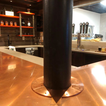
In this project, Rochman Design Build converted an unfinished basement of a new Ann Arbor home into a stunning home pub and entertaining area, with commercial grade space for the owners' craft brewing passion. The feel is that of a speakeasy as a dark and hidden gem found in prohibition time. The materials include charcoal stained concrete floor, an arched wall veneered with red brick, and an exposed ceiling structure painted black. Bright copper is used as the sparkling gem with a pressed-tin-type ceiling over the bar area, which seats 10, copper bar top and concrete counters. Old style light fixtures with bare Edison bulbs, well placed LED accent lights under the bar top, thick shelves, steel supports and copper rivet connections accent the feel of the 6 active taps old-style pub. Meanwhile, the brewing room is splendidly modern with large scale brewing equipment, commercial ventilation hood, wash down facilities and specialty equipment. A large window allows a full view into the brewing room from the pub sitting area. In addition, the space is large enough to feel cozy enough for 4 around a high-top table or entertain a large gathering of 50. The basement remodel also includes a wine cellar, a guest bathroom and a room that can be used either as guest room or game room, and a storage area.
 Kitchen Magic
Some remodeling customers are uncertain about the best way to change the look of their space, and turn to us at Kitchen Magic for guidance; other homeowners already have a clear idea of what they want, and ask us to make their vision a reality. The latter was very much the case in a recent remodeling project we completed in Milford, New Jersey.
The home had been designed by the homeowner, who was clearly accustomed to creating and implementing an artistic vision for their living space. By the time Kitchen Magic arrived on the scene, the homeowner already had clear ideas about the colors and materials that would go into creating the look of their new kitchen. Cabinet refacing was the perfect solution for staying within budget, yet still having the kitchen they had always dreamed of.
Building on the Existing Decor is Key
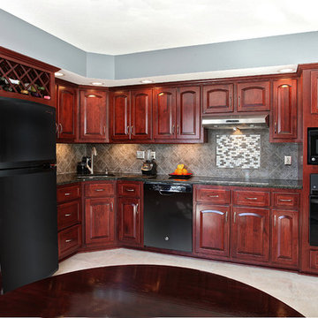
The sleek, black appliances already in place demanded a bold complement, and the rich, deep hue of Cordovan on Cherry stain fit the bill perfectly. The arched cabinet doors add a classic touch of elegance, but one that blends seamlessly with the modern feel of the other design elements. The clean lines and chrome finish of the cabinet hardware serve to unite the vivid cherry cabinetry with the gray toned counters and backsplash.
That backsplash, a custom design envisioned by the homeowner, brings both unity and contrast to the entire space. The splashes of lighter values brighten the deep red tones of the cabinets, keeping the room from feeling too dark. The use of texture and varied tonal values create a unique piece that adds dimension to the kitchen's personality and reflects the creative energy of the homeowners.
The luxury of the deep cherry-red cabinets and the sleekly modern lines of the furnishings create a timeless and bold back drop for the counters, and only one stone perfectly fits that bill: granite! The black Uba Tuba granite countertops chosen by the homeowners have the visual weight and richness to pair with the Cordovan on Cherry, and the marbling of lighter and darker values echo of the custom-designed backsplash over the range, completing the new design.
Taken together, the effect of the homeowners' choices create a striking, elegant, and almost decadent feel without any heavy or dark characters. The sleek lines and organic look created by the arched cabinet doors give the room a sense of grace and motion that is entirely appropriate to the homeowners' aesthetic, given their fondness for the adventure of hot-air ballooning and active life style.
David Glasofer
 Regan Baker Design Inc.
Intentional. Elevated. Artisanal.
With three children under the age of 5, our clients were starting to feel the confines of their Pacific Heights home when the expansive 1902 Italianate across the street went on the market. After learning the home had been recently remodeled, they jumped at the chance to purchase a move-in ready property. We worked with them to infuse the already refined, elegant living areas with subtle edginess and handcrafted details, and also helped them reimagine unused space to delight their little ones.
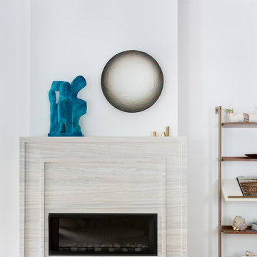
Elevated furnishings on the main floor complement the home’s existing high ceilings, modern brass bannisters and extensive walnut cabinetry. In the living room, sumptuous emerald upholstery on a velvet side chair balances the deep wood tones of the existing baby grand. Minimally and intentionally accessorized, the room feels formal but still retains a sharp edge—on the walls moody portraiture gets irreverent with a bold paint stroke, and on the the etagere, jagged crystals and metallic sculpture feel rugged and unapologetic. Throughout the main floor handcrafted, textured notes are everywhere—a nubby jute rug underlies inviting sofas in the family room and a half-moon mirror in the living room mixes geometric lines with flax-colored fringe.
On the home’s lower level, we repurposed an unused wine cellar into a well-stocked craft room, with a custom chalkboard, art-display area and thoughtful storage. In the adjoining space, we installed a custom climbing wall and filled the balance of the room with low sofas, plush area rugs, poufs and storage baskets, creating the perfect space for active play or a quiet reading session. The bold colors and playful attitudes apparent in these spaces are echoed upstairs in each of the children’s imaginative bedrooms.
Architect + Developer: McMahon Architects + Studio, Photographer: Suzanna Scott Photography
38