
Search results for "Feel active" in Home Design Ideas
 Smith & Sons Renovations & Extensions Australia
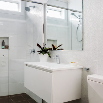
A humble yet stunning small home extension and renovation by Smith & Sons Illawarra North. Painted in a gorgeous tone of grey this quaint family home has all the cosy charm of a well kept farm cottage, with all the modern amenities of a contemporary home. Beautifully executed finishes, this home boast rich wood flooring and open plan living with seamless access to the outdoors and alfresco dining area. This classic old home has certainly benefited from a little TLC by Smith & Sons; breathing new life into the walls and creating the perfect spaces for entertaining and family activities. With a feel of 'simple country' this home really lends itself to a charming young family lifestyle offering plenty of space in the backyard and a homey feel all round.
 Leo Dowell Designs
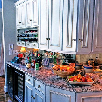
How do you add the wow factor to a kitchen? Leo designed a makeover for an existing house that would make it up to date, while at the same time add some unexpected interest. The client wanted a comfortable mix of pieces they had collected and a fresh dramatic touch to keep the feel exciting, yes we are talking about the kitchen. The kitchen doubles as a bar area,a place where all guest feel comfortable standing talking so why not encourage these activities. Leo added new doors with a heavy raised applied molding, added a wine rack section and wine cooler where a desk area was before. A antique French mirror backsplash adds sparkle and reflects light from the windows on the other side og the room.
 TKS Design Group
Download our free ebook, Creating the Ideal Kitchen. DOWNLOAD NOW
As with most projects, it all started with the kitchen layout. The home owners came to us wanting to upgrade their kitchen and overall aesthetic in their suburban home, with a combination of fresh paint, updated finishes, and improved flow for more ease when doing everyday activities.
A monochromatic, earth-toned palette left the kitchen feeling uninspired. It lacked the brightness they wanted from their space. An eat-in table underutilized the available square footage. The butler’s pantry was out of the way and hard to access, and the dining room felt detached from the kitchen.
Lead Designer, Stephanie Cole, saw an improved layout for the spaces that were no longer working for this family. By eliminating an existing wall between the kitchen and dining room, and relocating the bar area to the dining room, we opened up the kitchen, providing all the space we needed to create a dreamy and functional layout. A new perimeter configuration promoted circulation while also making space for a large and functional island loaded with seating – a must for any family. Because an island that isn’t big enough for everyone (and a few more) is a recipe for disaster. The light white cabinetry is fresh and contrasts with the deeper tones in the wood flooring, creating a modern aesthetic that is elevated, yet approachable for everyday living.
With better flow as the overarching goal, we made some structural changes too. To remove a bottleneck in the entryway, we angled one of the dining room walls to create more natural separation between rooms and facilitate ease of movement throughout the large space.
At The Kitchen Studio, we believe a well-designed kitchen uses every square inch to the fullest. By starting from scratch, it was possible to rethink the entire kitchen layout and design the space according to how it is used, because the kitchen shouldn’t make it harder to feed the family. A new location for the existing range, flanked by a new column refrigerator and freezer on each side, worked to anchor the space. The very large and very spacious island (a dream island if we do say so ourselves) now houses the primary sink and provides ample space for food prep and family gathering.
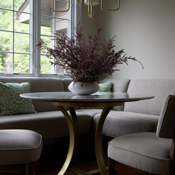
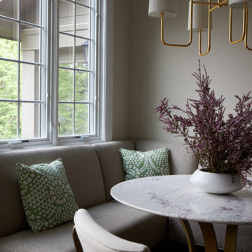
The new kitchen table and coordinating banquette seating provide a cozy nook for quick breakfasts before school or work, and evening homework sessions. Elegant gold details catch the natural light, elevating the aesthetic.
The dining room was transformed into one of this client’s favorite spaces and we couldn’t agree more. We saw an opportunity to give the dining room a more distinguished identity by closing off the entrance from the foyer. The relocated wet bar enhances the sophisticated vibe of this gathering space, complete with beautiful antique mirror tiles and open shelving encased by moody built-in cabinets.
Updated furnishings add warmth. A rich walnut table is paired with custom chairs in a muted coral fabric. The large, transitional chandelier grounds the room, pairing beautifully with the gold finishes prevalent in the faucet and cabinet hardware. Linen-inspired wallpaper and cream-toned window treatments add to the glamorous feel of this entertainment space.
There is no way around it. The laundry room was cramped. The large washer and dryer blocked access to the sink and left little room for the space to serve its other essential function – as a mudroom. Because we reworked the kitchen layout to create more space overall, we could rethink the mudroom too – an essential for any busy family. The first step was moving the washer and dryer to an existing area on the second floor, where most of the family’s laundry lives (no one wants to carry laundry up and down the stairs if they don’t have to anyway). This is a more functional solution and opened up the space for all the mudroom necessities – including the existing kitchen refrigerator, loads of built-in cubbies, and a bench.
It’s hard to not fall in love with every detail of a new space, especially when it serves your day-to-day life. But that doesn’t mean the clients didn’t have their favorite features they use on the daily. This remodel was focused largely on function with a new kitchen layout. And it’s the functional features that have the biggest impact. The large island provides much needed workspace in the kitchen and is a spot where everyone gathers together – it grounds the space and the family. And the custom counter stools are the icing on the cake. The nearby mudroom has everything their previous space was lacking – ample storage, space for everyone’s essentials, and the beloved cement floor tiles that are both durable and artistic.
Find the right local pro for your project
 Shearon Design Collective
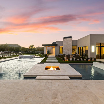
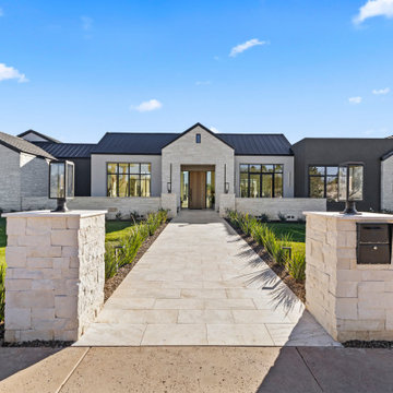
Set on Camelback Country Club with sweeping views to the golf course and surrounding peaks—Camelback, Piestewa, and Mummy Mountain—this Paradise Valley estate was designed with one clear priority: make the view the main event. Every line of the pool and landscape plan was meticulously composed to pull your eye outward, enhance the architecture, and create an atmosphere that feels singular to this property.
The backyard is anchored by a custom resort-style pool and spa composition that reads like a modern water courtyard—clean geometry, natural stone surfaces, and layered water movement. Bubblers and deck jets add sound and sparkle without interrupting sightlines, while a low-profile fire element and lawn panels soften the hardscape and keep the space feeling livable, not just a showpiece.
Beyond the resort core, the property expands into an estate-scale recreation zone, including a full sport court framed in stone paving, structured planting beds, and evening lighting that keeps the grounds active after sunset. The perimeter is finished with privacy hedging and layered plantings—lush, controlled, and intentionally quiet—so the mountains and fairways remain the star.
This home set a record-breaking sale, closing $1M higher than any home north of DoubleTree, and it sold in a single day. The developer, builder, and buyer all echoed the same thing: the pool and landscape sold the home, and then the record number followed. It’s the kind of project that proves what we believe: when outdoor living is designed at the highest level, it doesn’t just complement a home—it defines it.
 Housing & Building Association of Colorado Springs
The Home
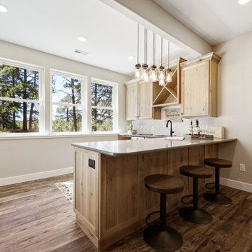
Nestled in Jackson Ranch, Thurston House welcomes you to experience the solace and comfort of this warm and peaceful home.
As you step past the barnwood accented exterior, you enter a refined rustic interior with a barnwood wall and century-old beams
gracing the great room. Durable, luxury, vinyl, tile flooring leads you further in, past a front office with ample sunlight. Relax as you gaze upon the Front Range, through the pines, from the great room - while a wood-burning fire crackles nearby. Continue into the spacious kitchen, complete with custom cabinets and more amazing views. An expansive walk-in pantry gives way to an oversized garage, a builder and hobbyist’s dream space. Steps away from the kitchen, the master bedroom envelops you, providing those awe-inspiring views, while balancing privacy in the pines.
Whether you seek to entertain or to escape, the downstairs of Thurston House delivers. The stairs open to a lounge, complete with a
wood-burning fireplace and abundant screen space, while a wet bar is tucked away for close conversation. Additional bedrooms offer
comfort and privacy for overnight guests. A home gym leads to the privacy of your backyard among the pines, with mountain views to
motivate you.
The Builder
Custom Design Builders (CDB) provides a relational partnership aimed at building the home that exists in your mind. Founder and president, Ben Woody, draws on the practical creativity of his nearly 30 years of construction experience, along with the safety consciousness he acquired as a firefighter. Ben is skillful at building according to your desires, incorporating a thoughtful design that balances safety and functionality in a dynamic process. CDB relies on the expertise acquired from years of building partnerships with the most reliable tradesmen in the area. Our team of partners consistently delivers the highest quality products and services, which has helped drive our exponential growth via word-of-mouth referrals.
As a family-owned and operated business, CDB understands relationships. Engaging in a partnership with CDB is to take on an active role in designing and defining your project, while relying on the comfort and security that can only come from decades of experience.
The Interior Design
Thurston House brings a feeling of warmth, comfort and hospitality. Modern accents elevate your living experience by highlighting the character of century-old, hand-hewn beams and barnwood. A luxurious freestanding bathtub and Euro-style shower in the master bathroom encourage you to relax and recharge in your own spa-like retreat. Energy efficient HVAC and water systems, appliances and windows minimize your footprint. Durable flooring offers stability and longevity, and hand trowel-finished drywall with reclaimed wood accents provide a warm background for your life. The open floor plan lends itself to entertaining, and the views of the Front Range through the pines are enticing. These same spaces also feel private and individual. Whether training in the home gym for your next marathon, building your dream canoe in the garage, or relaxing while you listen to the crackle of a fire in your fireplace accented by those hand-hewn beams, Thurston House is a stunning place to call home.
 TKS Design Group
Download our free ebook, Creating the Ideal Kitchen. DOWNLOAD NOW
As with most projects, it all started with the kitchen layout. The home owners came to us wanting to upgrade their kitchen and overall aesthetic in their suburban home, with a combination of fresh paint, updated finishes, and improved flow for more ease when doing everyday activities.
A monochromatic, earth-toned palette left the kitchen feeling uninspired. It lacked the brightness they wanted from their space. An eat-in table underutilized the available square footage. The butler’s pantry was out of the way and hard to access, and the dining room felt detached from the kitchen.
Lead Designer, Stephanie Cole, saw an improved layout for the spaces that were no longer working for this family. By eliminating an existing wall between the kitchen and dining room, and relocating the bar area to the dining room, we opened up the kitchen, providing all the space we needed to create a dreamy and functional layout. A new perimeter configuration promoted circulation while also making space for a large and functional island loaded with seating – a must for any family. Because an island that isn’t big enough for everyone (and a few more) is a recipe for disaster. The light white cabinetry is fresh and contrasts with the deeper tones in the wood flooring, creating a modern aesthetic that is elevated, yet approachable for everyday living.
With better flow as the overarching goal, we made some structural changes too. To remove a bottleneck in the entryway, we angled one of the dining room walls to create more natural separation between rooms and facilitate ease of movement throughout the large space.
At The Kitchen Studio, we believe a well-designed kitchen uses every square inch to the fullest. By starting from scratch, it was possible to rethink the entire kitchen layout and design the space according to how it is used, because the kitchen shouldn’t make it harder to feed the family. A new location for the existing range, flanked by a new column refrigerator and freezer on each side, worked to anchor the space. The very large and very spacious island (a dream island if we do say so ourselves) now houses the primary sink and provides ample space for food prep and family gathering.
The new kitchen table and coordinating banquette seating provide a cozy nook for quick breakfasts before school or work, and evening homework sessions. Elegant gold details catch the natural light, elevating the aesthetic.
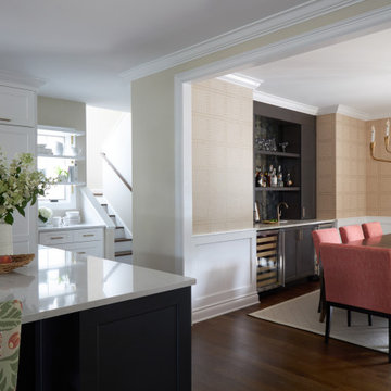
The dining room was transformed into one of this client’s favorite spaces and we couldn’t agree more. We saw an opportunity to give the dining room a more distinguished identity by closing off the entrance from the foyer. The relocated wet bar enhances the sophisticated vibe of this gathering space, complete with beautiful antique mirror tiles and open shelving encased by moody built-in cabinets.
Updated furnishings add warmth. A rich walnut table is paired with custom chairs in a muted coral fabric. The large, transitional chandelier grounds the room, pairing beautifully with the gold finishes prevalent in the faucet and cabinet hardware. Linen-inspired wallpaper and cream-toned window treatments add to the glamorous feel of this entertainment space.
There is no way around it. The laundry room was cramped. The large washer and dryer blocked access to the sink and left little room for the space to serve its other essential function – as a mudroom. Because we reworked the kitchen layout to create more space overall, we could rethink the mudroom too – an essential for any busy family. The first step was moving the washer and dryer to an existing area on the second floor, where most of the family’s laundry lives (no one wants to carry laundry up and down the stairs if they don’t have to anyway). This is a more functional solution and opened up the space for all the mudroom necessities – including the existing kitchen refrigerator, loads of built-in cubbies, and a bench.
It’s hard to not fall in love with every detail of a new space, especially when it serves your day-to-day life. But that doesn’t mean the clients didn’t have their favorite features they use on the daily. This remodel was focused largely on function with a new kitchen layout. And it’s the functional features that have the biggest impact. The large island provides much needed workspace in the kitchen and is a spot where everyone gathers together – it grounds the space and the family. And the custom counter stools are the icing on the cake. The nearby mudroom has everything their previous space was lacking – ample storage, space for everyone’s essentials, and the beloved cement floor tiles that are both durable and artistic.
 RAJ Kitchen and Bath, LLC
**Check out the video of this transformation on our website**
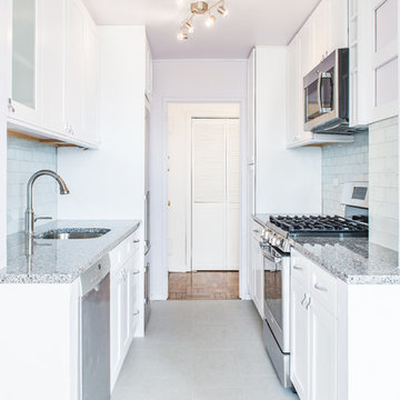
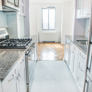
This small kitchen was way too small for this 2 bedrooms, 2 bathrooms apartment. Not only was it a very small kitchen, but the physical location of it made it very difficult to make it any bigger. There wasn't much that could have been done without incurring astronomical cost, which would get little or no return on the investment. The client wanted a kitchen that can be optimized in its current location to add a ton of value for resale.
This was difficult to do, because there was no moving of any mechanical around in the kitchen and even if we wanted to, the management of the building would not allow. For those of you who live in condos, co-ops or apartment building, you know how difficult it is to rework these foot prints. When we showed up, we saw the problems, but we also saw a huge opportunity where we can achieve those goals in the small space. This was accomplished by making some key changes and to incorporate some new things that was not possible when this kitchen was built years ago.
The crucial part of the design that would drive the entire new layout, was selecting the only appliance; that was the Refrigerator. Once we nailed down that refrigerator, we then proceeded to design the kitchen around it. We moved it to the other side of the wall where the sink was so that we can tap into the water line from the sink plumbing. It was crucial that it stays exactly 24" deep, not an inch more because we had to keep the entry as open as possible. Also, it was going to be directly in front of another big storage unit - The pantry. It is not ideal in most cases, but we needed the rest of the space to ramp up the design and open feel towards the side where all of the activities would take place, which happend to be the dining room and the view.
Once all that was figured out, we re-positioned the sink, dishwasher and the range and proceeded to wrap the cabinets around the columns to integrate them into the space. Thirty- six inches cabinets height was used so that they can be installed higher towards the ceiling height to give more room rather than the standard 18" required height between the counter tops. This was done to make the room feel a lot bigger than it really was. Not to mention, we also didn't want the faucet to be buried under the cabinets so that was also a necessary design detail for the space.
We then lowered both knee walls so that the counter top can sit on top of them, by removing that stop point that would have otherwise defined the kitchen area. This allowed us to pick up that extra footprint into the room for added prep space and enabled us to create the illusion of a kitchen that is looking longer than it really is. Every inch mattered when designing this kitchen and we made a conscious decision to use every one of that inch.
White cabinets were selected to do just what white cabinets are design to do; make a small or dark room appear bigger, brighter and more open. In this kitchen, this was amplified the more because of the kitchen location. It was perfect! We knew we did justice to the space because while we were there taking some photos, a few potential buyers walked in and went straight for the kitchen! They said its design just to fit the apartment.
Pantry roll out shelving, Double recycle bin, fancy handles, LED lighting, Quartz counter top, beautiful backslash tiles and grey linen floors finished off the kitchen which looked over a beautiful view of the George Washington Bridge from the top of this lovely 4th floor apartment.
Credit to Masterpiece Tile and Marble (Annmarie on the selection of Tiles and countertop and Val on the Construction to complete this project).
Davor Kokic Photography

Sponsored
Delaware, OH

Buckeye Basements, Inc.
Central Ohio's Basement Finishing ExpertsBest Of Houzz '13-'21
 Sullivan Building & Design Group
As part of an overall renovation of an old farmhouse the bathrooms are always a little more di cult to plan. In this case our client wanted to create a real “masculine” overall feel but with enough class to make it comfortable for a woman. Bold forms and solid lines needed to be o set by subtle softness in the design.
THE RESULTS
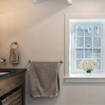
The overall bathroom is both handsome and bold. We custom built the walnut vanity from wall to wall of the existing space. We used wall mounted faucets with just a bit of a rounded profile to soften the square edges of the soapstone tops and walnut mirror.
The shower is a combination of very bold blackened steel framed glass around a clean white subway tile background. The black and white theme is quite typical in this period home. Our client was an active participant in the overall design process and was thrilled with the result.
This bathroom is a total remake of a small bathroom that existed in an old stone farmhouse in which the whole house was totally renovated. As this was a bachelor pad of sorts there was a real desire to blend bold forms and dark colors with a touch of class and sophistication. Bold walnut vanity with soft baskets for storage blended perfectly with black metal shower frame and clean white subway tile. A very cozy modern bath with a charming old world feel.
 RAJ Kitchen and Bath, LLC
**Check out the video of this transformation on our website**
This small kitchen was way too small for this 2 bedrooms, 2 bathrooms apartment. Not only was it a very small kitchen, but the physical location of it made it very difficult to make it any bigger. There wasn't much that could have been done without incurring astronomical cost, which would get little or no return on the investment. The client wanted a kitchen that can be optimized in its current location to add a ton of value for resale.
This was difficult to do, because there was no moving of any mechanical around in the kitchen and even if we wanted to, the management of the building would not allow. For those of you who live in condos, co-ops or apartment building, you know how difficult it is to rework these foot prints. When we showed up, we saw the problems, but we also saw a huge opportunity where we can achieve those goals in the small space. This was accomplished by making some key changes and to incorporate some new things that was not possible when this kitchen was built years ago.
The crucial part of the design that would drive the entire new layout, was selecting the only appliance; that was the Refrigerator. Once we nailed down that refrigerator, we then proceeded to design the kitchen around it. We moved it to the other side of the wall where the sink was so that we can tap into the water line from the sink plumbing. It was crucial that it stays exactly 24" deep, not an inch more because we had to keep the entry as open as possible. Also, it was going to be directly in front of another big storage unit - The pantry. It is not ideal in most cases, but we needed the rest of the space to ramp up the design and open feel towards the side where all of the activities would take place, which happend to be the dining room and the view.
Once all that was figured out, we re-positioned the sink, dishwasher and the range and proceeded to wrap the cabinets around the columns to integrate them into the space. Thirty- six inches cabinets height was used so that they can be installed higher towards the ceiling height to give more room rather than the standard 18" required height between the counter tops. This was done to make the room feel a lot bigger than it really was. Not to mention, we also didn't want the faucet to be buried under the cabinets so that was also a necessary design detail for the space.
We then lowered both knee walls so that the counter top can sit on top of them, by removing that stop point that would have otherwise defined the kitchen area. This allowed us to pick up that extra footprint into the room for added prep space and enabled us to create the illusion of a kitchen that is looking longer than it really is. Every inch mattered when designing this kitchen and we made a conscious decision to use every one of that inch.
White cabinets were selected to do just what white cabinets are design to do; make a small or dark room appear bigger, brighter and more open. In this kitchen, this was amplified the more because of the kitchen location. It was perfect! We knew we did justice to the space because while we were there taking some photos, a few potential buyers walked in and went straight for the kitchen! They said its design just to fit the apartment.
Pantry roll out shelving, Double recycle bin, fancy handles, LED lighting, Quartz counter top, beautiful backslash tiles and grey linen floors finished off the kitchen which looked over a beautiful view of the George Washington Bridge from the top of this lovely 4th floor apartment.
Credit to Masterpiece Tile and Marble (Annmarie on the selection of Tiles and countertop and Val on the Construction to complete this project).
Davor Kokic Photography
 RMW Team
Designing a Health-Focused Home Living Space
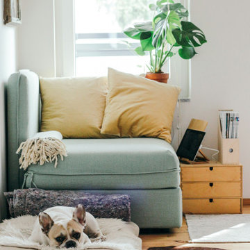
Designing a health-focused home living space is more than just arranging furniture and choosing colors; it's about creating an environment that promotes physical well-being, mental clarity, and overall wellness. As we spend more time at home, especially in the wake of recent global shifts towards remote work and lifestyle changes, the importance of our living spaces in supporting our health has never been greater. Here are some key considerations when designing a health-oriented home.
Natural Light and Air Quality
Natural light plays a crucial role in our health, affecting everything from our sleep patterns to our mood. When designing your home, prioritize spaces that allow for ample sunlight. Large windows, skylights, and strategically placed mirrors can help maximize natural light. In rooms where natural light is limited, consider using full-spectrum lighting that mimics daylight to support your circadian rhythms.
Air quality is another critical factor in a health-focused home. Indoor air can be more polluted than outdoor air due to various factors like off-gassing from furniture, household cleaners, and poor ventilation. Incorporating plants that are known to purify air, such as spider plants, snake plants, and peace lilies, can help improve indoor air quality. Additionally, ensure your home is well-ventilated by using exhaust fans in kitchens and bathrooms, and consider investing in air purifiers, especially if you live in an area with high pollution levels.
Ergonomic Furniture and Movement Spaces
The furniture you choose and how you arrange it can significantly impact your physical health. Ergonomic furniture, especially in workspaces, can help prevent strain and injury. Adjustable desks, supportive chairs, and monitor stands can contribute to better posture and reduced risk of musculoskeletal issues.
Incorporating spaces that encourage movement is also important. For example, a small home gym or a yoga corner can serve as a dedicated area for physical activity. Even in smaller spaces, you can create movement opportunities by ensuring there’s enough room to stretch or do simple exercises. Open floor plans or multipurpose spaces that can be easily reconfigured for different activities can help integrate movement into daily life.
Mindful and Minimalist Design
A clutter-free environment is conducive to mental clarity and relaxation. Mindful and minimalist design principles focus on creating spaces that are both functional and aesthetically pleasing without being overwhelming. Start by decluttering and organizing your belongings, keeping only what you need and what brings you joy.
Choose furniture and decor that are simple, natural, and calming. Materials like wood, stone, and natural fibers not only add a touch of nature to your home but also tend to have fewer chemicals than synthetic materials. Neutral color palettes with accents of soothing colors like blues and greens can help create a tranquil atmosphere.
Sleep and Restful Areas
A significant part of health-focused design is creating spaces that promote restful sleep. Your bedroom should be a sanctuary that encourages relaxation. Invest in a good-quality mattress and pillows that support your body. Blackout curtains, soundproofing, and maintaining a cool room temperature can also contribute to better sleep quality.
In addition to the bedroom, consider creating other restful areas in your home where you can unwind, meditate, or practice mindfulness. A cozy reading nook, a meditation space, or even a comfortable chair by a window can serve as your personal retreat.
Incorporating Nature and Green Spaces
Finally, integrating elements of nature into your living space can have a profound impact on your health. Biophilic design, which connects indoor environments with nature, has been shown to reduce stress and increase feelings of well-being. This can be as simple as adding more houseplants, incorporating natural materials, or even installing a small indoor water feature.
If you have outdoor space, create a garden or a patio where you can relax and enjoy fresh air. Even a small balcony can be transformed into a green oasis with the right plants and seating.
By thoughtfully designing your living space with health in mind, you create an environment that not only looks beautiful but also supports your physical and mental well-being.
 Shearon Design Collective
Set on Camelback Country Club with sweeping views to the golf course and surrounding peaks—Camelback, Piestewa, and Mummy Mountain—this Paradise Valley estate was designed with one clear priority: make the view the main event. Every line of the pool and landscape plan was meticulously composed to pull your eye outward, enhance the architecture, and create an atmosphere that feels singular to this property.
The backyard is anchored by a custom resort-style pool and spa composition that reads like a modern water courtyard—clean geometry, natural stone surfaces, and layered water movement. Bubblers and deck jets add sound and sparkle without interrupting sightlines, while a low-profile fire element and lawn panels soften the hardscape and keep the space feeling livable, not just a showpiece.
Beyond the resort core, the property expands into an estate-scale recreation zone, including a full sport court framed in stone paving, structured planting beds, and evening lighting that keeps the grounds active after sunset. The perimeter is finished with privacy hedging and layered plantings—lush, controlled, and intentionally quiet—so the mountains and fairways remain the star.
This home set a record-breaking sale, closing $1M higher than any home north of DoubleTree, and it sold in a single day. The developer, builder, and buyer all echoed the same thing: the pool and landscape sold the home, and then the record number followed. It’s the kind of project that proves what we believe: when outdoor living is designed at the highest level, it doesn’t just complement a home—it defines it.
 TKS Design Group
Download our free ebook, Creating the Ideal Kitchen. DOWNLOAD NOW
As with most projects, it all started with the kitchen layout. The home owners came to us wanting to upgrade their kitchen and overall aesthetic in their suburban home, with a combination of fresh paint, updated finishes, and improved flow for more ease when doing everyday activities.
A monochromatic, earth-toned palette left the kitchen feeling uninspired. It lacked the brightness they wanted from their space. An eat-in table underutilized the available square footage. The butler’s pantry was out of the way and hard to access, and the dining room felt detached from the kitchen.
Lead Designer, Stephanie Cole, saw an improved layout for the spaces that were no longer working for this family. By eliminating an existing wall between the kitchen and dining room, and relocating the bar area to the dining room, we opened up the kitchen, providing all the space we needed to create a dreamy and functional layout. A new perimeter configuration promoted circulation while also making space for a large and functional island loaded with seating – a must for any family. Because an island that isn’t big enough for everyone (and a few more) is a recipe for disaster. The light white cabinetry is fresh and contrasts with the deeper tones in the wood flooring, creating a modern aesthetic that is elevated, yet approachable for everyday living.
With better flow as the overarching goal, we made some structural changes too. To remove a bottleneck in the entryway, we angled one of the dining room walls to create more natural separation between rooms and facilitate ease of movement throughout the large space.
At The Kitchen Studio, we believe a well-designed kitchen uses every square inch to the fullest. By starting from scratch, it was possible to rethink the entire kitchen layout and design the space according to how it is used, because the kitchen shouldn’t make it harder to feed the family. A new location for the existing range, flanked by a new column refrigerator and freezer on each side, worked to anchor the space. The very large and very spacious island (a dream island if we do say so ourselves) now houses the primary sink and provides ample space for food prep and family gathering.
The new kitchen table and coordinating banquette seating provide a cozy nook for quick breakfasts before school or work, and evening homework sessions. Elegant gold details catch the natural light, elevating the aesthetic.
The dining room was transformed into one of this client’s favorite spaces and we couldn’t agree more. We saw an opportunity to give the dining room a more distinguished identity by closing off the entrance from the foyer. The relocated wet bar enhances the sophisticated vibe of this gathering space, complete with beautiful antique mirror tiles and open shelving encased by moody built-in cabinets.
Updated furnishings add warmth. A rich walnut table is paired with custom chairs in a muted coral fabric. The large, transitional chandelier grounds the room, pairing beautifully with the gold finishes prevalent in the faucet and cabinet hardware. Linen-inspired wallpaper and cream-toned window treatments add to the glamorous feel of this entertainment space.
There is no way around it. The laundry room was cramped. The large washer and dryer blocked access to the sink and left little room for the space to serve its other essential function – as a mudroom. Because we reworked the kitchen layout to create more space overall, we could rethink the mudroom too – an essential for any busy family. The first step was moving the washer and dryer to an existing area on the second floor, where most of the family’s laundry lives (no one wants to carry laundry up and down the stairs if they don’t have to anyway). This is a more functional solution and opened up the space for all the mudroom necessities – including the existing kitchen refrigerator, loads of built-in cubbies, and a bench.
It’s hard to not fall in love with every detail of a new space, especially when it serves your day-to-day life. But that doesn’t mean the clients didn’t have their favorite features they use on the daily. This remodel was focused largely on function with a new kitchen layout. And it’s the functional features that have the biggest impact. The large island provides much needed workspace in the kitchen and is a spot where everyone gathers together – it grounds the space and the family. And the custom counter stools are the icing on the cake. The nearby mudroom has everything their previous space was lacking – ample storage, space for everyone’s essentials, and the beloved cement floor tiles that are both durable and artistic.
 RAJ Kitchen and Bath, LLC
**Check out the video of this transformation on our website**
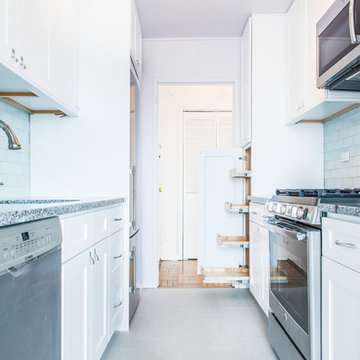
This small kitchen was way too small for this 2 bedrooms, 2 bathrooms apartment. Not only was it a very small kitchen, but the physical location of it made it very difficult to make it any bigger. There wasn't much that could have been done without incurring astronomical cost, which would get little or no return on the investment. The client wanted a kitchen that can be optimized in its current location to add a ton of value for resale.
This was difficult to do, because there was no moving of any mechanical around in the kitchen and even if we wanted to, the management of the building would not allow. For those of you who live in condos, co-ops or apartment building, you know how difficult it is to rework these foot prints. When we showed up, we saw the problems, but we also saw a huge opportunity where we can achieve those goals in the small space. This was accomplished by making some key changes and to incorporate some new things that was not possible when this kitchen was built years ago.
The crucial part of the design that would drive the entire new layout, was selecting the only appliance; that was the Refrigerator. Once we nailed down that refrigerator, we then proceeded to design the kitchen around it. We moved it to the other side of the wall where the sink was so that we can tap into the water line from the sink plumbing. It was crucial that it stays exactly 24" deep, not an inch more because we had to keep the entry as open as possible. Also, it was going to be directly in front of another big storage unit - The pantry. It is not ideal in most cases, but we needed the rest of the space to ramp up the design and open feel towards the side where all of the activities would take place, which happend to be the dining room and the view.
Once all that was figured out, we re-positioned the sink, dishwasher and the range and proceeded to wrap the cabinets around the columns to integrate them into the space. Thirty- six inches cabinets height was used so that they can be installed higher towards the ceiling height to give more room rather than the standard 18" required height between the counter tops. This was done to make the room feel a lot bigger than it really was. Not to mention, we also didn't want the faucet to be buried under the cabinets so that was also a necessary design detail for the space.
We then lowered both knee walls so that the counter top can sit on top of them, by removing that stop point that would have otherwise defined the kitchen area. This allowed us to pick up that extra footprint into the room for added prep space and enabled us to create the illusion of a kitchen that is looking longer than it really is. Every inch mattered when designing this kitchen and we made a conscious decision to use every one of that inch.
White cabinets were selected to do just what white cabinets are design to do; make a small or dark room appear bigger, brighter and more open. In this kitchen, this was amplified the more because of the kitchen location. It was perfect! We knew we did justice to the space because while we were there taking some photos, a few potential buyers walked in and went straight for the kitchen! They said its design just to fit the apartment.
Pantry roll out shelving, Double recycle bin, fancy handles, LED lighting, Quartz counter top, beautiful backslash tiles and grey linen floors finished off the kitchen which looked over a beautiful view of the George Washington Bridge from the top of this lovely 4th floor apartment.
Credit to Masterpiece Tile and Marble (Annmarie on the selection of Tiles and countertop and Val on the Construction to complete this project).
Davor Kokic Photography


 In Detail Interiors
Cozy and Colorful Beach House Remodel!
When you think funky little house by the beach – images like what you are about to see may not be what you would have anticipated. This furnishings project aimed to capture a colorful, fun, active space for a family who wanted to feel at home .Thus, creating casual and comfortable but not boring in the least. A little traveled, a lot of texture, and not much clutter!
From the start, the space was not much to write home about!
The common living areas were boxy with lower ceilings. Quirky ins and outs needed to be optimized. Overall, this project was a prime opportunity for us to really dig in. From treating each room top to bottom and finding the client’s mojo when it came to wallcoverings. Selecting funky lighting and the right mix and match of bold colors and more natural, organic textures.
We came in too late to get involved with the kitchen but helped the client with a few little accents and color choices. Thus, acting as a jumping off point for the large dining space featuring a beautiful (and resilient!) wooden trestle table. We created a mix of seating that offers a little funk, and the fun additional cabinet storage to each end which offered a hideaway. We loved that this vista had such opportunity for great lighting and art, also!
A Colorful, Cozy Living Room
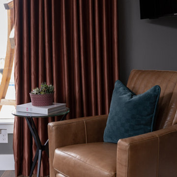
We knew we needed a cozy, lower profile seating area but also some sort of great reading nook by the fireplace. With the large windows and the main entry just off this space, a traffic pattern was delianted that helped guide decisions with the furniture. A funky, nubbier woven fabric on the sectional that hinted towards mid-century modern. The irregular shaped, petrified wood coffee table. The bold statement and colors carried through in the wallcovering and area rug. Jumping to the fireplace area where you can lounge or read with those gorgeous cognac leather recliners. This space needed to feel separate and the same all at once. The balance of scale and colors really helped achieve this!
Can’t forget the bedrooms!
Of course we can’t get by without mentioning a little bedroom love, either.
In the master the overall designs dictated by a bold, saturated woven wood cloth on the headboard wall. We love the mix of color and pattern in here. The bold, sexier mood is 100% a byproduct of the level of rich colors and unusual combinations. Those bold hand-glazed ceramic lamps against those strict geo-pattern bed pillows – so good!
Our sweet tween bedroom that should grow with her for a good, long time. All in all, filled with original art and layered in a softer palette. There was a lot of matching in here at first, but once we convinced her to trust us she started to understand why adding in the unexpected hit of bright coral and spring green made everything sing!
 Housing & Building Association of Colorado Springs
The Home
Nestled in Jackson Ranch, Thurston House welcomes you to experience the solace and comfort of this warm and peaceful home.
As you step past the barnwood accented exterior, you enter a refined rustic interior with a barnwood wall and century-old beams
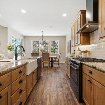
gracing the great room. Durable, luxury, vinyl, tile flooring leads you further in, past a front office with ample sunlight. Relax as you gaze upon the Front Range, through the pines, from the great room - while a wood-burning fire crackles nearby. Continue into the spacious kitchen, complete with custom cabinets and more amazing views. An expansive walk-in pantry gives way to an oversized garage, a builder and hobbyist’s dream space. Steps away from the kitchen, the master bedroom envelops you, providing those awe-inspiring views, while balancing privacy in the pines.
Whether you seek to entertain or to escape, the downstairs of Thurston House delivers. The stairs open to a lounge, complete with a
wood-burning fireplace and abundant screen space, while a wet bar is tucked away for close conversation. Additional bedrooms offer
comfort and privacy for overnight guests. A home gym leads to the privacy of your backyard among the pines, with mountain views to
motivate you.
The Builder
Custom Design Builders (CDB) provides a relational partnership aimed at building the home that exists in your mind. Founder and president, Ben Woody, draws on the practical creativity of his nearly 30 years of construction experience, along with the safety consciousness he acquired as a firefighter. Ben is skillful at building according to your desires, incorporating a thoughtful design that balances safety and functionality in a dynamic process. CDB relies on the expertise acquired from years of building partnerships with the most reliable tradesmen in the area. Our team of partners consistently delivers the highest quality products and services, which has helped drive our exponential growth via word-of-mouth referrals.
As a family-owned and operated business, CDB understands relationships. Engaging in a partnership with CDB is to take on an active role in designing and defining your project, while relying on the comfort and security that can only come from decades of experience.
The Interior Design
Thurston House brings a feeling of warmth, comfort and hospitality. Modern accents elevate your living experience by highlighting the character of century-old, hand-hewn beams and barnwood. A luxurious freestanding bathtub and Euro-style shower in the master bathroom encourage you to relax and recharge in your own spa-like retreat. Energy efficient HVAC and water systems, appliances and windows minimize your footprint. Durable flooring offers stability and longevity, and hand trowel-finished drywall with reclaimed wood accents provide a warm background for your life. The open floor plan lends itself to entertaining, and the views of the Front Range through the pines are enticing. These same spaces also feel private and individual. Whether training in the home gym for your next marathon, building your dream canoe in the garage, or relaxing while you listen to the crackle of a fire in your fireplace accented by those hand-hewn beams, Thurston House is a stunning place to call home.
 Honour Creative
Our job was to enhance the character and comfort of this communal space, where our vibrant village residents come together for a diverse range of activities throughout the week. From spirited games of darts and cozy movie nights to lively coffee group gatherings and the eagerly anticipated Friday happy hour, our design aimed to create a welcoming haven for this active and sociable group of retirees.
Wainuiomata has a strong sense of community in which the locals take great pride in being a part of. Responding to this was essential to the brief by paying close attention to the geographic features, history and cultural significance of Wainuiomata as a place.
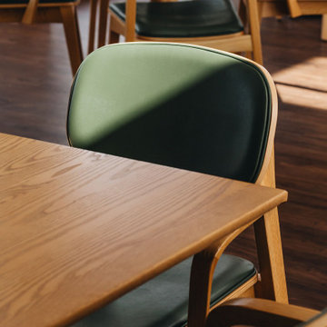
To complement these features, the interior design works as an extension of the outside; the palette is inspired by the raw materials, colours and robust forms seen in the nearby natural environment. Moments of forest greens are featured in the joinery and wall colours, paired with warm timber accents and stony textures on the servery benchtops and fireplace surrounds. Grooved details on the wall panelling and intricately woven textures in the furniture upholstery further add to the refined rustic feel.
 Sharon Scharrer Design, LLC
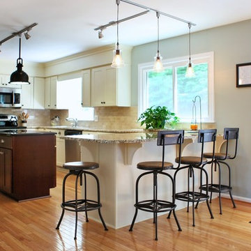
Transitional space for a young active family with children. This kitchen presented a design challenge due to long, narrow space which was solved with a very practical peninsula layout with center work island, which connects frig, range and sink. Two tone cabinetry and granite add to visual interest, while utilitarian track lights and bar stools add an urban feel. Existing soffits were camouflaged with crown molding and painted to match cabinets, helping to hold down construction costs. photos by Tommie Milacci Photograpy


 Spaces Renewed
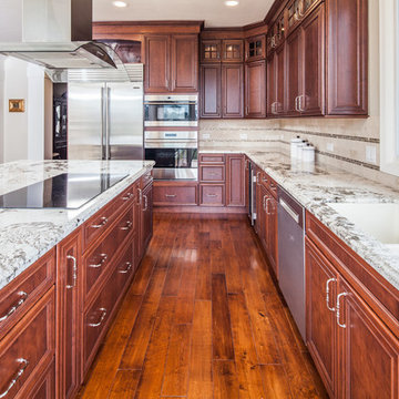
The rich cherry cabinets and creamy natural stone create a traditional statement, while maintaining a light and bright overall feel. The stacked cabinets have glass inserts at the top which allows the cabinets to extend to the ceiling without feeling top heavy. The marble backsplash is complimented by glass tile accents that add to the space without overwhelming it. The glass brings a bit of whimsy to the overall traditional space. The large windows and patio doors bring in a great presence of natural light and take advantage of the sweeping ocean views. High end appliances, including a wine cooler and an induction cook top allow this family to cook with ease. Ample storage and counter space allow for large gatherings of family and friends, or just a quiet evening at home.
 Nicole Arnold Interiors
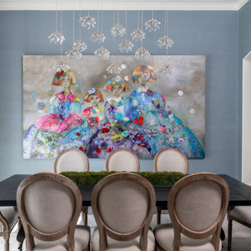
Refurnishing this Melshire Estates home with a fresh, transitional look and feel was just what this client wanted. We mainly leveraged neutrals and some blues to keep things visually calm and then it was all about delivering comfort for their active family. The fireplace was updated with a cast stone surround, giving this family room focal point a much needed facelift. The powder bath received a sophisticated renovation and light fixtures throughout the home were replaced with fixtures that uniquely reflect the client’s personality in every room. The star of the show in this home is the dining room, featuring a large, commissioned original art piece as well as the most stunning ceiling light fixture. It’s impossible to feel anything but cheery when you walk by this room!
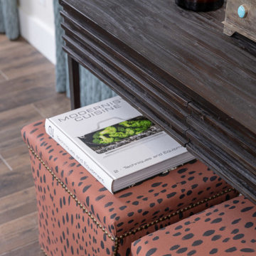 In Detail Interiors
Cozy and Colorful Beach House Remodel!
When you think funky little house by the beach – images like what you are about to see may not be what you would have anticipated. This furnishings project aimed to capture a colorful, fun, active space for a family who wanted to feel at home .Thus, creating casual and comfortable but not boring in the least. A little traveled, a lot of texture, and not much clutter!
From the start, the space was not much to write home about!
The common living areas were boxy with lower ceilings. Quirky ins and outs needed to be optimized. Overall, this project was a prime opportunity for us to really dig in. From treating each room top to bottom and finding the client’s mojo when it came to wallcoverings. Selecting funky lighting and the right mix and match of bold colors and more natural, organic textures.
We came in too late to get involved with the kitchen but helped the client with a few little accents and color choices. Thus, acting as a jumping off point for the large dining space featuring a beautiful (and resilient!) wooden trestle table. We created a mix of seating that offers a little funk, and the fun additional cabinet storage to each end which offered a hideaway. We loved that this vista had such opportunity for great lighting and art, also!
A Colorful, Cozy Living Room
We knew we needed a cozy, lower profile seating area but also some sort of great reading nook by the fireplace. With the large windows and the main entry just off this space, a traffic pattern was delianted that helped guide decisions with the furniture. A funky, nubbier woven fabric on the sectional that hinted towards mid-century modern. The irregular shaped, petrified wood coffee table. The bold statement and colors carried through in the wallcovering and area rug. Jumping to the fireplace area where you can lounge or read with those gorgeous cognac leather recliners. This space needed to feel separate and the same all at once. The balance of scale and colors really helped achieve this!
Can’t forget the bedrooms!
Of course we can’t get by without mentioning a little bedroom love, either.
In the master the overall designs dictated by a bold, saturated woven wood cloth on the headboard wall. We love the mix of color and pattern in here. The bold, sexier mood is 100% a byproduct of the level of rich colors and unusual combinations. Those bold hand-glazed ceramic lamps against those strict geo-pattern bed pillows – so good!
Our sweet tween bedroom that should grow with her for a good, long time. All in all, filled with original art and layered in a softer palette. There was a lot of matching in here at first, but once we convinced her to trust us she started to understand why adding in the unexpected hit of bright coral and spring green made everything sing!
50