
Search results for "Feel lost" in Home Design Ideas
 Jarrett Design
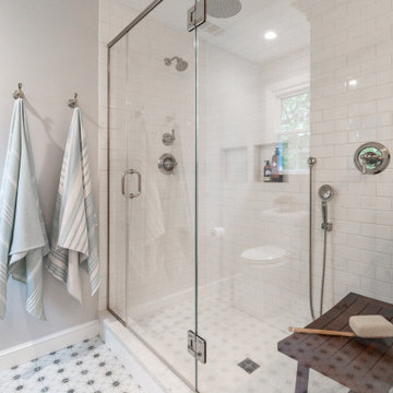
This bathroom needed help as it was tired, dated and cramped! The vanity area was open to the master bedroom and sandwiched between a closet and existing bathroom wall. Behind the bathroom wall, was a second sink, a small walk-in shower and the commode. A poorly placed linen closet ate into the area and there was a soffit over the shower adding to the cramped feeling. The ceiling was cluttered with old-school heating lamps, flush-mount fixtures and ventilation grills. The “movie star” lighting meant to add some glamour only made the bathroom feel dated and sad. Our clients wanted to bring this bathroom to life.
We built a wall and added a door between the bedroom and bathroom to ensure more privacy and define the space. In addition, we removed the wall separating the actual bathroom and vanity area to make the master bathroom larger. The linen closet was also taken out so the shower could be expanded significantly. Our homeowner had recently suffered a knee injury so they were looking for future solutions that would work for them as they continued to age. We made the shower large enough to include a bench and installed a handheld sprayer located near the seat. Shower walls were reinforced so that when the day came that a grab bar was needed, they would be ready.
We added a tall cabinet that featured two, deep rollouts and interior shelving to keep linens and bathroom supplies organized. Beneath the sinks, we included rollout drawers so items would not get lost in those dark areas under the plumbing. Everything that had been cluttering the ceiling was removed including the shower soffit and heat lamp. With those gone, we added evenly-spaced, recessed ceiling lights to help brighten the space making it safer and more practical.
We chose a custom blue-green paint for the cabinets which was understated enough to provide a sense of serenity while still offering a splash of color to help liven up the room. Walnut-framed mirrors added a touch of warmth and the patterned floor tile made the whole room fun! An old bathroom came alive!
 The Jack + Mare | Portland Design & Build
Split Level 1970 home of a young and active family of four. The main public spaces in this home were remodeled to create a fresh, clean look.
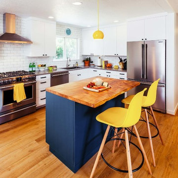
The Jack + Mare demo'd the kitchen and dining room down to studs and removed the wall between the kitchen/dining and living room to create an open concept space with a clean and fresh new kitchen and dining with ample storage. Now the family can all be together and enjoy one another's company even if mom or dad is busy in the kitchen prepping the next meal.
The custom white cabinets and the blue accent island (and walls) really give a nice clean and fun feel to the space. The island has a gorgeous local solid slab of wood on top. A local artisan salvaged and milled up the big leaf maple for this project. In fact, the tree was from the University of Portland's campus located right where the client once rode the bus to school when she was a child. So it's an extra special custom piece! (fun fact: there is a bullet lodged in the wood that is visible...we estimate it was shot into the tree 30-35 years ago!)
The 'public' spaces were given a brand new waterproof luxury vinyl wide plank tile. With 2 young daughters, a large golden retriever and elderly cat, the durable floor was a must.
project scope at quick glance:
- demo'd and rebuild kitchen and dining room.
- removed wall separating kitchen/dining and living room
- removed carpet and installed new flooring in public spaces
- removed stair carpet and gave fresh black and white paint
- painted all public spaces
- new hallway doorknob harware
- all new LED lighting (kitchen, dining, living room and hallway)
Jason Quigley Photography
 San Luis Kitchen Co.
The owners of a charming home in the hills west of Paso Robles recently decided to remodel their not-so-charming kitchen. Referred to San Luis Kitchen by several of their friends, the homeowners visited our showroom and soon decided we were the best people to design a kitchen fitting the style of their home. We were delighted to get to work on the project right away.
When we arrived at the house, we found a small, cramped and out-dated kitchen. The ceiling was low, the cabinets old fashioned and painted a stark dead white, and the best view in the house was neglected in a seldom-used breakfast nook (sequestered behind the kitchen peninsula). This kitchen was also handicapped by white tile counters with dark grout, odd-sized and cluttered cabinets, and small ‘desk’ tacked on to the side of the oven cabinet. Due to a marked lack of counter space & inadequate storage the homeowner had resorted to keeping her small appliances on a little cart parked in the corner and the garbage was just sitting by the wall in full view of everything! On the plus side, the kitchen opened into a nice dining room and had beautiful saltillo tile floors.
Mrs. Homeowner loves to entertain and often hosts dinner parties for her friends. She enjoys visiting with her guests in the kitchen while putting the finishing touches on the evening’s meal. Sadly, her small kitchen really limited her interactions with her guests – she often felt left out of the mix at her own parties! This savvy homeowner dreamed big – a new kitchen that would accommodate multiple workstations, have space for guests to gather but not be in the way, and maybe a prettier transition from the kitchen to the dining (wine service area or hutch?) – while managing the remodel budget by reusing some of her major appliances and keeping (patching as needed) her existing floors.
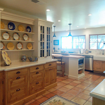
Responding to the homeowner’s stated wish list and the opportunities presented by the home's setting and existing architecture, the designers at San Luis Kitchen decided to expand the kitchen into the breakfast nook. This change allowed the work area to be reoriented to take advantage of the great view – we replaced the existing window and added another while moving the door to gain space. A second sink and set of refrigerator drawers (housing fresh fruits & veggies) were included for the convenience of this mainly vegetarian cook – her prep station. The clean-up area now boasts a farmhouse style single bowl sink – adding to the ‘cottage’ charm. We located a new gas cook-top between the two workstations for easy access from each. Also tucked in here is a pullout trash/recycle cabinet for convenience and additional drawers for storage.
Running parallel to the work counter we added a long butcher-block island with easy-to-access open shelves for the avid cook and seating for friendly guests placed just right to take in the view. A counter-top garage is used to hide excess small appliances. Glass door cabinets and open shelves are now available to display the owners beautiful dishware. The microwave was placed inconspicuously on the end of the island facing the refrigerator – easy access for guests (and extraneous family members) to help themselves to drinks and snacks while staying out of the cook’s way.
We also moved the pantry storage away from the dining room (putting it on the far wall and closer to the work triangle) and added a furniture-like hutch in its place allowing the more formal dining area to flow seamlessly into the up-beat work area of the kitchen. This space is now also home (opposite wall) to an under counter wine refrigerator, a liquor cabinet and pretty glass door wall cabinet for stemware storage – meeting Mr. Homeowner’s desire for a bar service area.
And then the aesthetic: an old-world style country cottage theme. The homeowners wanted the kitchen to have a warm feel while still loving the look of white cabinetry. San Luis Kitchen melded country-casual knotty pine base cabinets with vintage hand-brushed creamy white wall cabinets to create the desired cottage look. We also added bead board and mullioned glass doors for charm, used an inset doorstyle on the cabinets for authenticity, and mixed stone and wood counters to create an eclectic nuance in the space. All in all, the happy homeowners now boast a charming county cottage kitchen with plenty of space for entertaining their guests while creating gourmet meals to feed them.
Credits:
Custom cabinetry by Wood-Mode Fine Custom Cabinetry
Contracting by Michael Pezzato of Lost Coast Construction
Stone counters by Pyramid M.T.M.
Find the right local pro for your project
 User
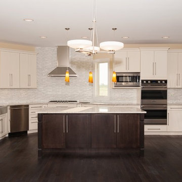
UserExample of a mid-sized minimalist u-shaped dark wood floor eat-in kitchen design in Chicago with a farmhouse sink, shaker cabinets, white cabinets, granite countertops, white backsplash, glass sheet backsplash, stainless steel appliances and an island
 Hillcrest Construction
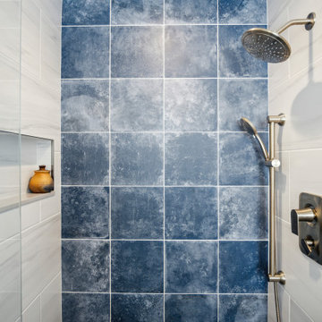
Hillcrest Construction designed and executed a complete facelift for these West Chester clients’ master bathroom. The sink/toilet/shower layout stayed relatively unchanged due to the limitations of the small space, but major changes were slated for the overall functionality and aesthetic appeal.
The bathroom was gutted completely, the wiring was updated, and minor plumbing alterations were completed for code compliance.
Bathroom waterproofing was installed utilizing the state-of-the-industry Schluter substrate products, and the feature wall of the shower is tiled with a striking blue 12x12 tile set in a stacked pattern, which is a departure of color and layout from the staggered gray-tome wall tile and floor tile.
The original bathroom lacked storage, and what little storage it had lacked practicality.
The original 1’ wide by 4’ deep “reach-in closet” was abandoned and replaced with a custom cabinetry unit that featured six 30” drawers to hold a world of personal bathroom items which could pulled out for easy access. The upper cubbie was shallower at 13” and was sized right to hold a few spare towels without the towels being lost to an unreachable area. The custom furniture-style vanity, also built and finished at the Hillcrest custom shop facilitated a clutter-free countertop with its two deep drawers, one with a u-shaped cut out for the sink plumbing. Considering the relatively small size of the bathroom, and the vanity’s proximity to the toilet, the drawer design allows for greater access to the storage area as compared to a vanity door design that would only be accessed from the front. The custom niche in the shower serves and a consolidated home for soap, shampoo bottles, and all other shower accessories.
Moen fixtures at the sink and in the shower and a Toto toilet complete the contemporary feel. The controls at the shower allow the user to easily switch between the fixed rain head, the hand shower, or both. And for a finishing touch, the client chose between a number for shower grate color and design options to complete their tailor-made sanctuary.
 Designers Point
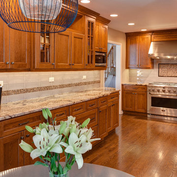
This overall shot of the kitchen shows the large counter expanse, glass fronted cabinets, and stainless steel range. There are many unique elements in this design.
Photos by Thomas Miller
 AGEK CONTRACTING COMPANY INC.
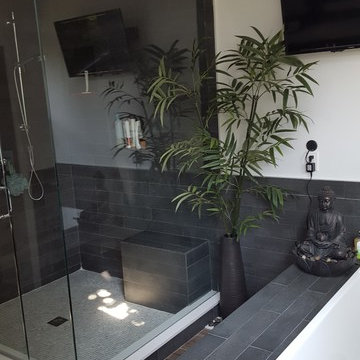
Beautiful Toronto Bathroom Renovations
Mostly, people choose design of room from the way they like and feel it should be. If room made in a wrong way, it can leave you not satisfied at all. In case people use room more often than other rooms, if there is a chance to renovate, bathroom should be the first room to be renovated. Our specialists can help you to plan and design renovation of one of the main rooms in your house to make you satisfied and happy.
Our excellent experienced team will use their skills to make bathroom on time, perfectly handling all difficulties which can be faced. As a result, you won’t leave your new bathroom. What’s more, we will do our best to plan your bathroom to save your budget and time, but still to satisfy you. Our clients are working as a part of the team: we give a chance to choose the best and give us the best ideas to make the most often-use room in house very comfortable and great. At our design center you will have a chance to see final look of the project. We will provide you lost of additional space to use for your needs.
Samet AGMA


 Lynne Barton Bier - Home on the Range Interiors
Tim Murphy Photography, Joe Robbins AIA, Beck Construction, CBNTCO, Steamboat Curtain Factory, Interiors with Altitude
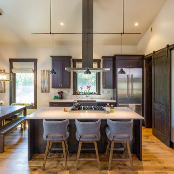
Eat-in kitchen - rustic galley medium tone wood floor and brown floor eat-in kitchen idea in Denver with a farmhouse sink, dark wood cabinets, quartz countertops, stone tile backsplash, stainless steel appliances, an island, white countertops and gray backsplash
Eat-in kitchen - rustic galley medium tone wood floor and brown floor eat-in kitchen idea in Denver with a farmhouse sink, dark wood cabinets, quartz countertops, stone tile backsplash, stainless steel appliances, an island, white countertops and gray backsplash
 Care Free Homes, Inc.
After Photo.
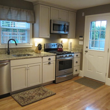
Once upon time, there was a 50-year-old kitchen who was to be banished from the culinary kingdom. Despite several face lifts and cosmetic repairs, it still could not live up to royal standards. Its appliances were ho-hum, storage capacity limited, and counter space non-existent. To make things worse, an undesireable wall separated the kitchen from its long lost love, the dining room. The two spaces were completely estranged from one another, resulting in an awkward situation for the two rooms and the royal family who inhabited them.
After years of feeling inadequate for its master, the kitchen was finally rescued from a knight in shining armour named Sir Care Free. The brave and capable hero came galloping into the castle and declared that he could, indeed, grant the kitchen its wish of being beautiful and functional once again. But it was Sir Care Free’s final words that brought the most joy – the kitchen would finally be united with the dining room. Sir Care Free courageously removed the ghastly wall that once stood between the two living spaces. Now restored to its rightful place, the King and the Queen have proclaimed the kitchen as the official heart of the home and lived happily ever after. The end.
For your happily ever after, do have Sir Care Free call upon your castle. He and his craftsmen would be delighted to serve you. You may beckon us by telephone at (508) 997-1111 Ext. 102 or by email at info@carefreehomescompany.com.
 Viridis Design Studio, Inc.
Tahvory Bunting, Denver Image Photography
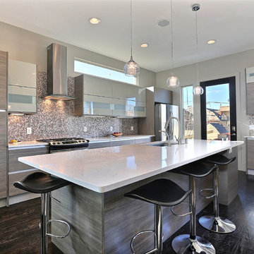
Inspiration for a mid-sized contemporary galley dark wood floor open concept kitchen remodel in Denver with a single-bowl sink, flat-panel cabinets, gray cabinets, quartz countertops, gray backsplash, stainless steel appliances, gray walls and an island
Inspiration for a mid-sized contemporary galley dark wood floor open concept kitchen remodel in Denver with a single-bowl sink, flat-panel cabinets, gray cabinets, quartz countertops, gray backsplash, stainless steel appliances, gray walls and an island
 Hillcrest Construction
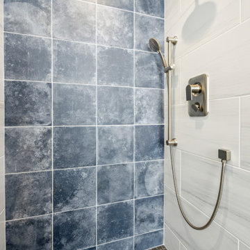
Hillcrest Construction designed and executed a complete facelift for these West Chester clients’ master bathroom. The sink/toilet/shower layout stayed relatively unchanged due to the limitations of the small space, but major changes were slated for the overall functionality and aesthetic appeal.
The bathroom was gutted completely, the wiring was updated, and minor plumbing alterations were completed for code compliance.
Bathroom waterproofing was installed utilizing the state-of-the-industry Schluter substrate products, and the feature wall of the shower is tiled with a striking blue 12x12 tile set in a stacked pattern, which is a departure of color and layout from the staggered gray-tome wall tile and floor tile.
The original bathroom lacked storage, and what little storage it had lacked practicality.
The original 1’ wide by 4’ deep “reach-in closet” was abandoned and replaced with a custom cabinetry unit that featured six 30” drawers to hold a world of personal bathroom items which could pulled out for easy access. The upper cubbie was shallower at 13” and was sized right to hold a few spare towels without the towels being lost to an unreachable area. The custom furniture-style vanity, also built and finished at the Hillcrest custom shop facilitated a clutter-free countertop with its two deep drawers, one with a u-shaped cut out for the sink plumbing. Considering the relatively small size of the bathroom, and the vanity’s proximity to the toilet, the drawer design allows for greater access to the storage area as compared to a vanity door design that would only be accessed from the front. The custom niche in the shower serves and a consolidated home for soap, shampoo bottles, and all other shower accessories.
Moen fixtures at the sink and in the shower and a Toto toilet complete the contemporary feel. The controls at the shower allow the user to easily switch between the fixed rain head, the hand shower, or both. And for a finishing touch, the client chose between a number for shower grate color and design options to complete their tailor-made sanctuary.
 TKS Design Group
Download our free ebook, Creating the Ideal Kitchen. DOWNLOAD NOW
This homeowner’s daughter originally contacted us on behalf of her parents who were reluctant to begin the remodeling process in their home due to the inconvenience and dust. Once we met and they dipped their toes into the process, we were off to the races. The existing bathroom in this beautiful historical 1920’s home, had not been updated since the 70’/80’s as evidenced by the blue carpeting, mirrored walls and dropped ceilings. In addition, there was very little storage, and some health setbacks had made the bathroom difficult to maneuver with its tub shower.
Once we demoed, we discovered everything we expected to find in a home that had not been updated for many years. We got to work bringing all the electrical and plumbing up to code, and it was just as dusty and dirty as the homeowner’s anticipated! Once the space was demoed, we got to work building our new plan. We eliminated the existing tub and created a large walk-in curb-less shower.
An existing closet was eliminated and in its place, we planned a custom built in with spots for linens, jewelry and general storage. Because of the small space, we had to be very creative with the shower footprint, so we clipped one of the walls for more clearance behind the sink. The bathroom features a beautiful custom mosaic floor tile as well as tiled walls throughout the space. This required lots of coordination between the carpenter and tile setter to make sure that the framing and tile design were all properly aligned. We worked around an existing radiator and a unique original leaded window that was architecturally significant to the façade of the home. We had a lot of extra depth behind the original toilet location, so we built the wall out a bit, moved the toilet forward and then created some extra storage space behind the commode. We settled on mirrored mullioned doors to bounce lots of light around the smaller space.
We also went back and forth on deciding between a single and double vanity, and in the end decided the single vanity allowed for more counter space, more storage below and for the design to breath a bit in the smaller space. I’m so happy with this decision! To build on the luxurious feel of the space, we added a heated towel bar and heated flooring.
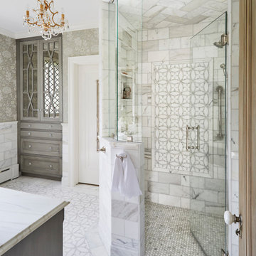
One of the concerns the homeowners had was having a comfortable floor to walk on. They realized that carpet was not a very practical solution but liked the comfort it had provided. Heated floors are the perfect solution. The room is decidedly traditional from its intricate mosaic marble floor to the calacutta marble clad walls. Elegant gold chandelier style fixtures, marble countertops and Morris & Co. beaded wallpaper provide an opulent feel to the space.
The gray monochromatic pallet keeps it feeling fresh and up-to-date. The beautiful leaded glass window is an important architectural feature at the front of the house. In the summertime, the homeowners love having the window open for fresh air and ventilation. We love it too!
The curb-less shower features a small fold down bench that can be used if needed and folded up when not. The shower also features a custom niche for storing shampoo and other hair products. The linear drain is built into the tilework and is barely visible. A frameless glass door that swings both in and out completes the luxurious feel.
Designed by: Susan Klimala, CKD, CBD
Photography by: Michael Kaskel
For more information on kitchen and bath design ideas go to: www.kitchenstudio-ge.com


Sponsored
Columbus, OH
Free consultation for landscape design!

Peabody Landscape Group
Franklin County's Reliable Landscape Design & Contracting
 Hillcrest Construction
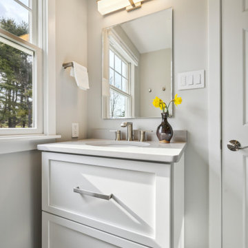
Hillcrest Construction designed and executed a complete facelift for these West Chester clients’ master bathroom. The sink/toilet/shower layout stayed relatively unchanged due to the limitations of the small space, but major changes were slated for the overall functionality and aesthetic appeal.
The bathroom was gutted completely, the wiring was updated, and minor plumbing alterations were completed for code compliance.
Bathroom waterproofing was installed utilizing the state-of-the-industry Schluter substrate products, and the feature wall of the shower is tiled with a striking blue 12x12 tile set in a stacked pattern, which is a departure of color and layout from the staggered gray-tome wall tile and floor tile.
The original bathroom lacked storage, and what little storage it had lacked practicality.
The original 1’ wide by 4’ deep “reach-in closet” was abandoned and replaced with a custom cabinetry unit that featured six 30” drawers to hold a world of personal bathroom items which could pulled out for easy access. The upper cubbie was shallower at 13” and was sized right to hold a few spare towels without the towels being lost to an unreachable area. The custom furniture-style vanity, also built and finished at the Hillcrest custom shop facilitated a clutter-free countertop with its two deep drawers, one with a u-shaped cut out for the sink plumbing. Considering the relatively small size of the bathroom, and the vanity’s proximity to the toilet, the drawer design allows for greater access to the storage area as compared to a vanity door design that would only be accessed from the front. The custom niche in the shower serves and a consolidated home for soap, shampoo bottles, and all other shower accessories.
Moen fixtures at the sink and in the shower and a Toto toilet complete the contemporary feel. The controls at the shower allow the user to easily switch between the fixed rain head, the hand shower, or both. And for a finishing touch, the client chose between a number for shower grate color and design options to complete their tailor-made sanctuary.
 Klopf Architecture
The Roger Lee designed house from 1962 was purchased by the current homeowners in almost original condition, as the previous owners elected to defer most maintenance projects over the years. The clients were able to see beyond the dated materials and finishes, single-paned glass and uninsulated walls and they approached Klopf Architecture to help them expand and update the entire home, one the family could settle into and enjoy for years to come. It was important that the new designs were aligned with Lee's original intent not only because of the client's appreciation for mid-century modern architecture, but also because the house was deemed historical. The Stanford Real Estate Office requires a stringent design review which safeguards the integrity of the community, which Klopf Architecture was happy to oblige going into their updated designs.
As with many original mid-century modern homes, the house was scaled to the 1960s lifestyle where rooms were smaller and openings to views were limited and tightly framed. The original conditions defined the direction the family of four would take in updating the house and making it comfortable for their modern lifestyle. Klopf designed a full gut remodel and major addition to bring the house into the 21st century and provide the living area needed for the client's family. The newly expanded house added just about 1,100 sf to create an airy, comfortable and family friendly house, taking full advantage of the beautiful southwestern views that extend out to the hills beyond. The enclosed garage created an additional 240 sf of covered space for long-term storage.
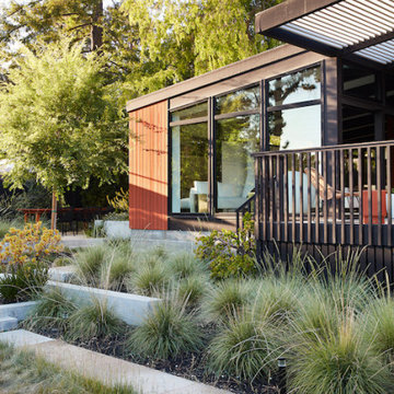
A cracked swimming pool created an eyesore taking up a majority of the backyard landscape, so it was one of the first elements to go during the transformation. Working with Outer Space Landscape Architects, the family asked for a mix of relaxing outdoor patio spaces that eventually blend into the native landscaping, extending their views outward toward the natural greenery of the trees beyond their property. Filling in the old pool was a smart way to expand the living spaces outward. The orientation of the house was designed to enjoy the views, but the original architecture provided the first homeowners with mere glimpses of the landscape outside.
Klopf was able to broaden those views, continuing and extending on the original architecture to take full advantage of the unobstructed natural views across the rear facade of the house. Small horizontal openings in the primary bedroom and office were replaced with much taller windows that now follow the angled roof line upward, extending across almost all of the facade. We worked with Western Windows, whose designs included an oblique-shaped, operable casement that allowed our design to rise with the slope. A new corner office added to the primary suite, offers a bright and functional work-from-home solution that looks out at the distant views and added natural light from the expanded window configuration that now wraps around the corner.
The existing lower level was designed by Lee as a utilitarian space, serving as a wet pool room with a drain in the center of the floor, bathroom, laundry and storage areas. Without the need for a pool room, Klopf was able to convert the area into a much more comfortable and functional living space with a new family room and guest suite. The new spaces enjoy easy access to a new outdoor patio through floor to ceiling, full-width glass sliders.
Continuing along the rear facade, a previously exposed deck extending from the living room and hallway provided access to the backyard through a single set of stairs leading toward the side of the house which made sense when the pool was in place. The new deck was re-envisioned as an extension of the main living room and now serves as a second outdoor living room. A new slatted pergola above provides the homeowners welcome relief from the hot afternoon sun. A second set of stairs now creates a better connection to the redesigned lower level. Klopf was able to reconfigure the spaces, extending the living room outward toward the views, where the family now claims it as the heart of the home, spending a large majority of their time outdoors.
Back inside, the original wood-burning Malm fireplace was beautifully restored and a gas burner installed to comply with California's strict air standards. It now rests in front of a wall of Heath accent tiles where a dated red brick wall used to stand. A new taller window brings more light and views into the refreshed interior living room. The original glass doors opposite the fireplace were replaced by larger sliders that when fully opened, create a seamless transition to the new outdoor living area so the two spaces feel like one connected space. The original utilitarian kitchen was needlessly tucked into the far back corner and closed-off, out of sight from the living room, so the clients asked Klopf to open it up and expand the kitchen forward so it felt more connected. Today the much larger kitchen is connected to the living area where a short wall with a cutout offers a visual glimpse into the kitchen and a handy pass-through counter for serving guests. A new breakfast nook was also added to create another spot where the family can gather for casual meals. Just outside, a new built-in outdoor grill and prep area extends the kitchen outside and connects to a new outdoor dining spot nestled amongst the trees, taking advantage of the views out back.
Klopf was able to expand the other two bedrooms, add a new laundry room and half-bath and convert the carport to an enclosed garage to add more storage areas which was lost when the pool house was converted to the family and guest room.
To maintain a historical connection to the original designs, the exterior siding was repeated on all exterior walls, a full-height stained glass window at the front entryway restored, and an interior slatted screen element repeated outside at the exterior entry courtyard and over the new outdoor living room to create a shade trellis. The new house stands proudly and shines against it's new landscaping features, while respecting and expanding on the original intent of Roger Lee's designs epitomizing the comforts of indoor-outdoor living in Northern California.
Completion year: 2020
Klopf Architecture project team: John Klopf, Klara Kevane, Noel Andrade
Contractor: ORB Construction, Brendan O'Reilly
Structural engineer: Sezen and Moon
Landscape architect: Outer space
Furnishings and decoration: Urbanism Designs
Photographer: Mariko Reed
 Hillcrest Construction
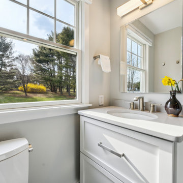
Hillcrest Construction designed and executed a complete facelift for these West Chester clients’ master bathroom. The sink/toilet/shower layout stayed relatively unchanged due to the limitations of the small space, but major changes were slated for the overall functionality and aesthetic appeal.
The bathroom was gutted completely, the wiring was updated, and minor plumbing alterations were completed for code compliance.
Bathroom waterproofing was installed utilizing the state-of-the-industry Schluter substrate products, and the feature wall of the shower is tiled with a striking blue 12x12 tile set in a stacked pattern, which is a departure of color and layout from the staggered gray-tome wall tile and floor tile.
The original bathroom lacked storage, and what little storage it had lacked practicality.
The original 1’ wide by 4’ deep “reach-in closet” was abandoned and replaced with a custom cabinetry unit that featured six 30” drawers to hold a world of personal bathroom items which could pulled out for easy access. The upper cubbie was shallower at 13” and was sized right to hold a few spare towels without the towels being lost to an unreachable area. The custom furniture-style vanity, also built and finished at the Hillcrest custom shop facilitated a clutter-free countertop with its two deep drawers, one with a u-shaped cut out for the sink plumbing. Considering the relatively small size of the bathroom, and the vanity’s proximity to the toilet, the drawer design allows for greater access to the storage area as compared to a vanity door design that would only be accessed from the front. The custom niche in the shower serves and a consolidated home for soap, shampoo bottles, and all other shower accessories.
Moen fixtures at the sink and in the shower and a Toto toilet complete the contemporary feel. The controls at the shower allow the user to easily switch between the fixed rain head, the hand shower, or both. And for a finishing touch, the client chose between a number for shower grate color and design options to complete their tailor-made sanctuary.
 Designs By Gia Interior Design and Renovation
In this recent kitchen design and renovation project, these long time clients came to me originally, several years ago to start discussing the design of their kitchen. At that time, the kitchen in this 1800’s home included a kitchen that had been poorly remodeled in the 1980’s, so the kitchen had already lost most of it’s original charm. I created a design plan creating a beautiful large kitchen expanding the space into the adjacent rooms. My clients loved this design plan, but other home issues took precedence, so after a few additional years, my clients were now ready to start their kitchen project.
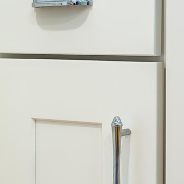
Their overall goals for the property did change since we first looked at this project, my clients decided that they did not want to enlarge or expand the small kitchen by opening it up to the adjacent rooms. So, I went back to the drawing board to create a kitchen in the existing kitchen space that fulfilled their new goals and created a beautiful functional space within the existing kitchen space. This new design, like my former design, honored this home’s traditional architecture, but added a light, fresh feel to the space using updated colors and material selections. This design consisted of additional storage and cabinetry, additional countertop space, and a small space to sit. We added new cabinetry, appliances, electrical, plumbing, beautiful quartz countertops, glass backsplash tile, traditional lighting fixtures, and finished everything off using beautiful classic hardware elements.
My clients are now in love with this new renovated kitchen space. It contains many of the elements of a much larger kitchen, and melds beautifully with the rest of the house which we have also designed renovated over the last few years. Finally my client’s get to enjoy their new kitchen space as much as they enjoy the rest of this beautiful home!
Sponsored
Columbus, OH
Free consultation for landscape design!
Peabody Landscape Group
Franklin County's Reliable Landscape Design & Contracting
 M Studio
Open plan kitchen in a modern farmhouse style home in the heart of wine country, Northern CA. The home is set on 7 acres of pinot noir vineyard. The modern take on the traditional farmhouse is built to let in glorious views of the outside environment.
Herringbone pattern back splash mimics the tile layout of the fireplace opposite. The kitchen table leaves the space visibly open with a functional rolling bar at counter height to keep the space usable for the chef.
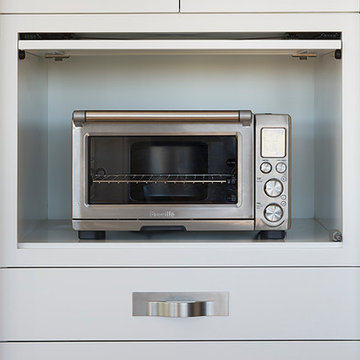
White, shaker style doors keep a traditional feel with a modern, simple twist. A-symmetrical floating shelves offer visual interest and extra storage. Counter top clutter is kept at a minimum with the corner niche and a hidden appliance garage.
 Miller-Roodell Architects Ltd
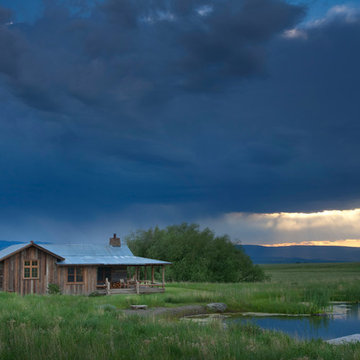
Set in Montana's tranquil Shields River Valley, the Shilo Ranch Compound is a collection of structures that were specifically built on a relatively smaller scale, to maximize efficiency. The main house has two bedrooms, a living area, dining and kitchen, bath and adjacent greenhouse, while two guest homes within the compound can sleep a total of 12 friends and family. There's also a common gathering hall, for dinners, games, and time together. The overall feel here is of sophisticated simplicity, with plaster walls, concrete and wood floors, and weathered boards for exteriors. The placement of each building was considered closely when envisioning how people would move through the property, based on anticipated needs and interests. Sustainability and consumption was also taken into consideration, as evidenced by the photovoltaic panels on roof of the garage, and the capability to shut down any of the compound's buildings when not in use.
 User
UserThis Greek Revival row house in Boerum Hill was previously owned by a local architect who renovated it several times, including the addition of a two-story steel and glass extension at the rear. The new owners came to us seeking to restore the house and its original formality, while adapting it to the modern needs of a family of five. The detailing of the 25 x 36 foot structure had been lost and required some sleuthing into the history of Greek Revival style in historic Brooklyn neighborhoods.
In addition to completely re-framing the interior, the house also required a new south-facing brick façade due to significant deterioration. The modern extension was replaced with a more traditionally detailed wood and copper- clad bay, still open to natural light and the garden view without sacrificing comfort. The kitchen was relocated from the first floor to the garden level with an adjacent formal dining room. Both rooms were enlarged from their previous iterations to accommodate weekly dinners with extended family. The kitchen includes a home office and breakfast nook that doubles as a homework station. The cellar level was further excavated to accommodate finished storage space and a playroom where activity can be monitored from the kitchen workspaces.
The parlor floor is now reserved for entertaining. New pocket doors can be closed to separate the formal front parlor from the more relaxed back portion, where the family plays games or watches TV together. At the end of the hall, a powder room with brass details, and a luxe bar with antique mirrored backsplash and stone tile flooring, leads to the deck and direct garden access. Because of the property width, the house is able to provide ample space for the interior program within a shorter footprint. This allows the garden to remain expansive, with a small lawn for play, an outdoor food preparation area with a cast-in-place concrete bench, and a place for entertaining towards the rear. The newly designed landscaping will continue to develop, further enhancing the yard’s feeling of escape, and filling-in the views from the kitchen and back parlor above. A less visible, but equally as conscious, addition is a rooftop PV solar array that provides nearly 100% of the daily electrical usage, with the exception of the AC system on hot summer days.
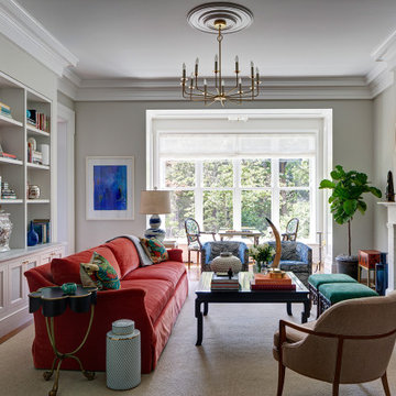
The well-appointed interiors connect the traditional backdrop of the home to a youthful take on classic design and functionality. The materials are elegant without being precious, accommodating a young, growing family. Unique colors and patterns provide a feeling of luxury while inviting inhabitants and guests to relax and enjoy this classic Brooklyn brownstone.
This project won runner-up in the architecture category for the 2017 NYC&G Innovation in Design Awards and was featured in The American House: 100 Contemporary Homes.
Photography by Francis Dzikowski / OTTO
32