
Search results for "Feels softer" in Home Design Ideas
 Skill Construction & Design, LLC
Last week we featured an incredible new kitchen with an open floor plan and unique architectural interest. I alluded to a change in the staircase and here it is. Part of designing a new kitchen or bath is looking at surrounding spaces and how the remodel will affect them. Will the current master bedroom seem dated as an entrance to the new bath? Is the dining room that adjoins the kitchen badly in need of flooring and lighting? Some projects might have to wait. But if the immediate area has an adverse affect on the newly remodeled kitchen it might be just as important to address these areas within your remodel.
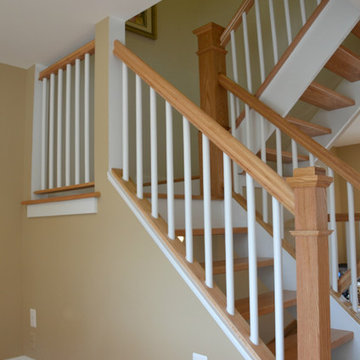
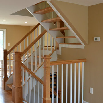
Although the staircase was in harmony with the homes existing era and colors, it simply didn’t work with the new kitchen. Despite its open risers, the existing balusters and railings with their colonial turnings and dark stain, were the opposite of the finished kitchen. With the carpeting gone from the floors, it looked dated and out-of-place on the stairs.
We carried our kitchen theme to the staircase. We used the natural oak of our flooring for the treads, handrails and posts, but kept the balusters and trim crisp white. The effect perfectly reflects the feel of the kitchen, light and airy.
Before, the dark wood details drew the eye up, ultimately to the textured ceiling in the dining room. The darker tone created a dramatic ending as it traveled up to die into the wall.
Now, as the eye travels up, the staircase seems to soar. The textured ceiling was replaced with a smooth white one and the wall color is a soft warm contrast. The handrail still ends at the wall, but with white balusters and the light oak handrail, the ending is softer.
It isn’t a lighting change, the staircase simply lets the light shine through. The treads are slim and sleek, while the white walls, trim and balusters reflect the light for an overall brighter feel.
The newel posts were a great choice. The larger size and square craftsman like features add substance and architecture without seeming heavy or bulky.
The final touch completes the look. From front door to back, up and down, this remodel is finished. This home now bursts with sunshine the minute you enter and stays bright and sunny no matter where you turn. From the architectural details that are the center of attention, to the modern stainless steel appliance, this space is perfect for entertaining, or any day.
http://www.designsbyskill.com/
http://www.rjkconstructioninc.com/
 Cooperman & Co. Luxury Interior Design
The Petal & Poppy Home is a vibrant, collected family residence defined by bold color, layered pattern, and a confident sense of personality. Designed over several years as the young family grew, the home reflects an evolving story rooted in warmth, creativity, and a love of expressive interiors.
Color guided the design from the outset. A blue grasscloth dining room and an existing pink Persian rug in the formal living room became the foundation for a palette that unfolded organically throughout the home. With clients eager to mix patterns and embrace saturated hues, the design process focused on contrast, cohesion, and joyful self-expression.
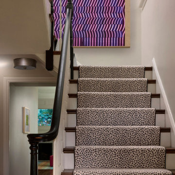
The entry makes an immediate statement with a playful spotted stair runner, oversized artwork, and a high-gloss black handrail that introduces graphic contrast. The formal living room, designed for entertaining, is the moodiest space in the home. Dark garnet walls and a commissioned piece by local artist Carrie Gillen create a dramatic backdrop, while pink tweed swivel chairs and a tailored charcoal sofa complete a space designed for lingering.
Beyond French doors, the home office is an immersive mix of pattern and color, with wallpaper wrapping both walls and ceiling. A leopard carpet and modern crystal chandelier add a touch of glamour, resulting in a space that feels energizing and personal. The dining room continues the confident use of blue, layering patterns around a custom round pedestal table designed for everyday meals and gatherings alike.
At the heart of the home, the family room was designed for togetherness. A bright blue sectional anchors the space, complemented by custom ottomans on hidden casters and softened with tailored throw pillows. Existing bookshelves are refreshed with a Peter Fasano wallcovering, creating a collected, lived-in backdrop.
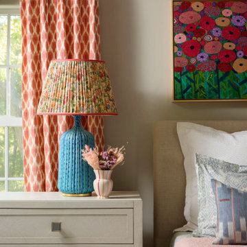
Upstairs, the primary suite offers a softer expression of color, blending blues, oranges, and pinks, while built-in window benches add moments of comfort. The children’s bedrooms balance playfulness with longevity, layered with color and texture designed to grow alongside them.
The Petal & Poppy Home is a celebration of color, creativity, and family life—an interior that feels intentionally layered, expressive, and deeply personal, designed to evolve over time.
 In Detail Interiors
Cozy and Colorful Beach House Remodel!
When you think funky little house by the beach – images like what you are about to see may not be what you would have anticipated. This furnishings project aimed to capture a colorful, fun, active space for a family who wanted to feel at home .Thus, creating casual and comfortable but not boring in the least. A little traveled, a lot of texture, and not much clutter!
From the start, the space was not much to write home about!
The common living areas were boxy with lower ceilings. Quirky ins and outs needed to be optimized. Overall, this project was a prime opportunity for us to really dig in. From treating each room top to bottom and finding the client’s mojo when it came to wallcoverings. Selecting funky lighting and the right mix and match of bold colors and more natural, organic textures.
We came in too late to get involved with the kitchen but helped the client with a few little accents and color choices. Thus, acting as a jumping off point for the large dining space featuring a beautiful (and resilient!) wooden trestle table. We created a mix of seating that offers a little funk, and the fun additional cabinet storage to each end which offered a hideaway. We loved that this vista had such opportunity for great lighting and art, also!
A Colorful, Cozy Living Room
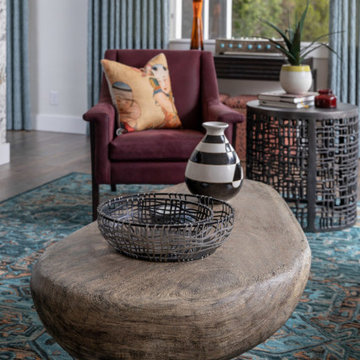
We knew we needed a cozy, lower profile seating area but also some sort of great reading nook by the fireplace. With the large windows and the main entry just off this space, a traffic pattern was delianted that helped guide decisions with the furniture. A funky, nubbier woven fabric on the sectional that hinted towards mid-century modern. The irregular shaped, petrified wood coffee table. The bold statement and colors carried through in the wallcovering and area rug. Jumping to the fireplace area where you can lounge or read with those gorgeous cognac leather recliners. This space needed to feel separate and the same all at once. The balance of scale and colors really helped achieve this!
Can’t forget the bedrooms!
Of course we can’t get by without mentioning a little bedroom love, either.
In the master the overall designs dictated by a bold, saturated woven wood cloth on the headboard wall. We love the mix of color and pattern in here. The bold, sexier mood is 100% a byproduct of the level of rich colors and unusual combinations. Those bold hand-glazed ceramic lamps against those strict geo-pattern bed pillows – so good!
Our sweet tween bedroom that should grow with her for a good, long time. All in all, filled with original art and layered in a softer palette. There was a lot of matching in here at first, but once we convinced her to trust us she started to understand why adding in the unexpected hit of bright coral and spring green made everything sing!
Find the right local pro for your project
 Lemon Remodeling & Services
Planning a Modern Kitchen Remodel
Every successful kitchen remodeling project begins with careful planning. Before construction starts, it is important to evaluate the existing layout, cabinet storage, lighting conditions, appliance placement, and how the kitchen connects to surrounding living spaces.
For this project, the primary design goals included:
Creating a brighter open concept kitchen
Improving functionality and circulation
Increasing pantry and cabinet storage
Maximizing natural light with skylight integration
Creating a clean and timeless design aesthetic
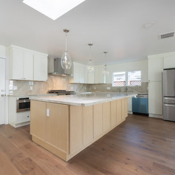
The final layout centered around a large kitchen island that functions as both a workspace and gathering area. Open concept kitchens remain highly desirable because they improve communication between living areas while helping the home feel larger and more connected.
Importance of Natural Light
Natural lighting plays a major role in modern kitchen remodeling. In this renovation, the skylight significantly improved brightness throughout the space and helped create a softer, more inviting atmosphere during the day.
Combined with recessed lighting and pendant fixtures above the island, the layered lighting design provides both functional task lighting and balanced ambient illumination.
Construction and Material Selection
Kitchen remodeling projects require coordination between multiple construction trades including demolition, framing, electrical, plumbing, drywall, flooring, cabinetry, countertops, and finish carpentry.
Bi-Color Kitchen Remodel Design
One of the standout features of this project is the bi-color kitchen remodel design. The warm natural wood island creates contrast against the surrounding white cabinetry while maintaining a clean and balanced appearance.
This approach helps:
Add visual depth to the kitchen
Create separation between functional zones
Prevent the space from feeling overly monochromatic
Introduce warmth into modern kitchen designs
The oversized island also provides additional storage, countertop workspace, and seating opportunities for everyday use and entertaining.
Countertops, Cabinetry, and Finishes
The kitchen includes:
Quartz countertops with waterfall-style edges
Custom shaker-style cabinetry
Stainless steel appliances
Modern pendant lighting
Wide plank engineered hardwood flooring
Full-height backsplash surfaces
The neutral color palette was selected to create a timeless appearance while allowing flexibility for future décor and furniture changes.
Pantry Kitchen Renovation
Storage planning is one of the most important aspects of kitchen remodeling. The pantry kitchen renovation focused on improving organization and accessibility while maximizing usable storage space.
Modern pantry systems help homeowners:
Reduce countertop clutter
Improve kitchen organization
Store small appliances more efficiently
Increase long-term functionality
Thoughtful storage design can significantly improve the daily usability of a kitchen without increasing square footage.
Real Estate Value and Long-Term Benefits
Kitchen remodeling remains one of the highest-value residential renovation projects in the Bay Area real estate market. A professionally designed open concept kitchen can improve buyer perception, increase property appeal, and modernize outdated layouts.
Features such as large islands, skylights, pantry storage, and bi-color cabinetry continue to remain highly desirable among homeowners and future buyers alike.
Common Kitchen Remodeling Mistakes
Some common mistakes homeowners should avoid include:
Insufficient lighting design
Poor circulation planning
Limited storage solutions
Choosing low-durability materials
Overcrowded layouts
Inadequate electrical preparation
Working with experienced remodeling professionals can help avoid costly design and construction issues later in the process.
Common Questions
How long does a kitchen remodel usually take?
Most kitchen remodeling projects take approximately 6–12 weeks depending on the project scope, inspections, material lead times, and structural modifications.
Do kitchen remodels require permits?
Permits are often required when plumbing, electrical, structural, or layout changes are involved. Requirements vary depending on the city and scope of work.
What is a bi-color kitchen remodel?
A bi-color kitchen remodel uses two cabinet finishes or tones to create visual contrast and a more customized design appearance.
Does an open concept kitchen increase home value?
Open concept kitchens are highly desirable because they improve functionality, natural lighting, and overall flow throughout the home.
Conclusion
A well-planned kitchen remodeling project combines thoughtful design, quality craftsmanship, and durable materials to create a space that is both functional and visually appealing. Features such as skylight integration, open concept layouts, pantry kitchen renovations, and bi-color cabinetry continue to remain popular among Bay Area homeowners seeking timeless and practical kitchen designs.
Careful planning, professional coordination, and attention to detail are essential for creating a kitchen that performs well aesthetically and functionally for many years.
------->
If you’re planning a kitchen remodeling project, consulting with an experienced contractor can help simplify the design and construction process while avoiding costly mistakes.
Book a consultation:
calendly.com/lemonremodeling
 Cooperman & Co. Luxury Interior Design
The Petal & Poppy Home is a vibrant, collected family residence defined by bold color, layered pattern, and a confident sense of personality. Designed over several years as the young family grew, the home reflects an evolving story rooted in warmth, creativity, and a love of expressive interiors.
Color guided the design from the outset. A blue grasscloth dining room and an existing pink Persian rug in the formal living room became the foundation for a palette that unfolded organically throughout the home. With clients eager to mix patterns and embrace saturated hues, the design process focused on contrast, cohesion, and joyful self-expression.
The entry makes an immediate statement with a playful spotted stair runner, oversized artwork, and a high-gloss black handrail that introduces graphic contrast. The formal living room, designed for entertaining, is the moodiest space in the home. Dark garnet walls and a commissioned piece by local artist Carrie Gillen create a dramatic backdrop, while pink tweed swivel chairs and a tailored charcoal sofa complete a space designed for lingering.
Beyond French doors, the home office is an immersive mix of pattern and color, with wallpaper wrapping both walls and ceiling. A leopard carpet and modern crystal chandelier add a touch of glamour, resulting in a space that feels energizing and personal. The dining room continues the confident use of blue, layering patterns around a custom round pedestal table designed for everyday meals and gatherings alike.
At the heart of the home, the family room was designed for togetherness. A bright blue sectional anchors the space, complemented by custom ottomans on hidden casters and softened with tailored throw pillows. Existing bookshelves are refreshed with a Peter Fasano wallcovering, creating a collected, lived-in backdrop.
Upstairs, the primary suite offers a softer expression of color, blending blues, oranges, and pinks, while built-in window benches add moments of comfort. The children’s bedrooms balance playfulness with longevity, layered with color and texture designed to grow alongside them.
The Petal & Poppy Home is a celebration of color, creativity, and family life—an interior that feels intentionally layered, expressive, and deeply personal, designed to evolve over time.
 uncommon nest interiors
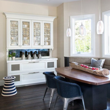
This is the banquet area that was inspired by a banquet we saw at KD showroom in Denver before my client selected a fabricator. EKD ended up being CHOSEN and designed the table. I sourced and selected the pendant lighting, replaced and enlarged the windows, sourced the chairs and accessories etc. If I were to do anything differently I would have made the table top have a living edge. I feel that this would have been a softer transition with the leather and would have made the space feel more organic.
 Skill Construction & Design, LLC
Last week we featured an incredible new kitchen with an open floor plan and unique architectural interest. I alluded to a change in the staircase and here it is. Part of designing a new kitchen or bath is looking at surrounding spaces and how the remodel will affect them. Will the current master bedroom seem dated as an entrance to the new bath? Is the dining room that adjoins the kitchen badly in need of flooring and lighting? Some projects might have to wait. But if the immediate area has an adverse affect on the newly remodeled kitchen it might be just as important to address these areas within your remodel.
Although the staircase was in harmony with the homes existing era and colors, it simply didn’t work with the new kitchen. Despite its open risers, the existing balusters and railings with their colonial turnings and dark stain, were the opposite of the finished kitchen. With the carpeting gone from the floors, it looked dated and out-of-place on the stairs.
We carried our kitchen theme to the staircase. We used the natural oak of our flooring for the treads, handrails and posts, but kept the balusters and trim crisp white. The effect perfectly reflects the feel of the kitchen, light and airy.
Before, the dark wood details drew the eye up, ultimately to the textured ceiling in the dining room. The darker tone created a dramatic ending as it traveled up to die into the wall.
Now, as the eye travels up, the staircase seems to soar. The textured ceiling was replaced with a smooth white one and the wall color is a soft warm contrast. The handrail still ends at the wall, but with white balusters and the light oak handrail, the ending is softer.
It isn’t a lighting change, the staircase simply lets the light shine through. The treads are slim and sleek, while the white walls, trim and balusters reflect the light for an overall brighter feel.
The newel posts were a great choice. The larger size and square craftsman like features add substance and architecture without seeming heavy or bulky.
The final touch completes the look. From front door to back, up and down, this remodel is finished. This home now bursts with sunshine the minute you enter and stays bright and sunny no matter where you turn. From the architectural details that are the center of attention, to the modern stainless steel appliance, this space is perfect for entertaining, or any day.
http://www.designsbyskill.com/
http://www.rjkconstructioninc.com/

Sponsored
Columbus, OH

Wannemacher Interiors
Customized Award-Winning Interior Design Solutions in Franklin Cnty OH
 Cooperman & Co. Luxury Interior Design
The Petal & Poppy Home is a vibrant, collected family residence defined by bold color, layered pattern, and a confident sense of personality. Designed over several years as the young family grew, the home reflects an evolving story rooted in warmth, creativity, and a love of expressive interiors.
Color guided the design from the outset. A blue grasscloth dining room and an existing pink Persian rug in the formal living room became the foundation for a palette that unfolded organically throughout the home. With clients eager to mix patterns and embrace saturated hues, the design process focused on contrast, cohesion, and joyful self-expression.
The entry makes an immediate statement with a playful spotted stair runner, oversized artwork, and a high-gloss black handrail that introduces graphic contrast. The formal living room, designed for entertaining, is the moodiest space in the home. Dark garnet walls and a commissioned piece by local artist Carrie Gillen create a dramatic backdrop, while pink tweed swivel chairs and a tailored charcoal sofa complete a space designed for lingering.
Beyond French doors, the home office is an immersive mix of pattern and color, with wallpaper wrapping both walls and ceiling. A leopard carpet and modern crystal chandelier add a touch of glamour, resulting in a space that feels energizing and personal. The dining room continues the confident use of blue, layering patterns around a custom round pedestal table designed for everyday meals and gatherings alike.
At the heart of the home, the family room was designed for togetherness. A bright blue sectional anchors the space, complemented by custom ottomans on hidden casters and softened with tailored throw pillows. Existing bookshelves are refreshed with a Peter Fasano wallcovering, creating a collected, lived-in backdrop.
Upstairs, the primary suite offers a softer expression of color, blending blues, oranges, and pinks, while built-in window benches add moments of comfort. The children’s bedrooms balance playfulness with longevity, layered with color and texture designed to grow alongside them.
The Petal & Poppy Home is a celebration of color, creativity, and family life—an interior that feels intentionally layered, expressive, and deeply personal, designed to evolve over time.
 In Detail Interiors
Cozy and Colorful Beach House Remodel!
When you think funky little house by the beach – images like what you are about to see may not be what you would have anticipated. This furnishings project aimed to capture a colorful, fun, active space for a family who wanted to feel at home .Thus, creating casual and comfortable but not boring in the least. A little traveled, a lot of texture, and not much clutter!
From the start, the space was not much to write home about!
The common living areas were boxy with lower ceilings. Quirky ins and outs needed to be optimized. Overall, this project was a prime opportunity for us to really dig in. From treating each room top to bottom and finding the client’s mojo when it came to wallcoverings. Selecting funky lighting and the right mix and match of bold colors and more natural, organic textures.
We came in too late to get involved with the kitchen but helped the client with a few little accents and color choices. Thus, acting as a jumping off point for the large dining space featuring a beautiful (and resilient!) wooden trestle table. We created a mix of seating that offers a little funk, and the fun additional cabinet storage to each end which offered a hideaway. We loved that this vista had such opportunity for great lighting and art, also!
A Colorful, Cozy Living Room
We knew we needed a cozy, lower profile seating area but also some sort of great reading nook by the fireplace. With the large windows and the main entry just off this space, a traffic pattern was delianted that helped guide decisions with the furniture. A funky, nubbier woven fabric on the sectional that hinted towards mid-century modern. The irregular shaped, petrified wood coffee table. The bold statement and colors carried through in the wallcovering and area rug. Jumping to the fireplace area where you can lounge or read with those gorgeous cognac leather recliners. This space needed to feel separate and the same all at once. The balance of scale and colors really helped achieve this!
Can’t forget the bedrooms!
Of course we can’t get by without mentioning a little bedroom love, either.
In the master the overall designs dictated by a bold, saturated woven wood cloth on the headboard wall. We love the mix of color and pattern in here. The bold, sexier mood is 100% a byproduct of the level of rich colors and unusual combinations. Those bold hand-glazed ceramic lamps against those strict geo-pattern bed pillows – so good!
Our sweet tween bedroom that should grow with her for a good, long time. All in all, filled with original art and layered in a softer palette. There was a lot of matching in here at first, but once we convinced her to trust us she started to understand why adding in the unexpected hit of bright coral and spring green made everything sing!
 Skill Construction & Design, LLC
Last week we featured an incredible new kitchen with an open floor plan and unique architectural interest. I alluded to a change in the staircase and here it is. Part of designing a new kitchen or bath is looking at surrounding spaces and how the remodel will affect them. Will the current master bedroom seem dated as an entrance to the new bath? Is the dining room that adjoins the kitchen badly in need of flooring and lighting? Some projects might have to wait. But if the immediate area has an adverse affect on the newly remodeled kitchen it might be just as important to address these areas within your remodel.
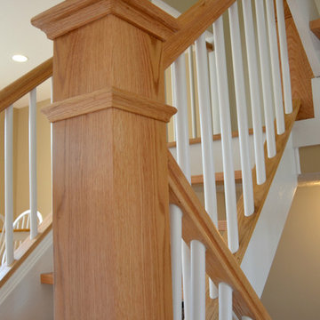
Although the staircase was in harmony with the homes existing era and colors, it simply didn’t work with the new kitchen. Despite its open risers, the existing balusters and railings with their colonial turnings and dark stain, were the opposite of the finished kitchen. With the carpeting gone from the floors, it looked dated and out-of-place on the stairs.
We carried our kitchen theme to the staircase. We used the natural oak of our flooring for the treads, handrails and posts, but kept the balusters and trim crisp white. The effect perfectly reflects the feel of the kitchen, light and airy.
Before, the dark wood details drew the eye up, ultimately to the textured ceiling in the dining room. The darker tone created a dramatic ending as it traveled up to die into the wall.
Now, as the eye travels up, the staircase seems to soar. The textured ceiling was replaced with a smooth white one and the wall color is a soft warm contrast. The handrail still ends at the wall, but with white balusters and the light oak handrail, the ending is softer.
It isn’t a lighting change, the staircase simply lets the light shine through. The treads are slim and sleek, while the white walls, trim and balusters reflect the light for an overall brighter feel.
The newel posts were a great choice. The larger size and square craftsman like features add substance and architecture without seeming heavy or bulky.
The final touch completes the look. From front door to back, up and down, this remodel is finished. This home now bursts with sunshine the minute you enter and stays bright and sunny no matter where you turn. From the architectural details that are the center of attention, to the modern stainless steel appliance, this space is perfect for entertaining, or any day.
http://www.designsbyskill.com/
http://www.rjkconstructioninc.com/
 In Detail Interiors
Cozy and Colorful Beach House Remodel!
When you think funky little house by the beach – images like what you are about to see may not be what you would have anticipated. This furnishings project aimed to capture a colorful, fun, active space for a family who wanted to feel at home .Thus, creating casual and comfortable but not boring in the least. A little traveled, a lot of texture, and not much clutter!
From the start, the space was not much to write home about!
The common living areas were boxy with lower ceilings. Quirky ins and outs needed to be optimized. Overall, this project was a prime opportunity for us to really dig in. From treating each room top to bottom and finding the client’s mojo when it came to wallcoverings. Selecting funky lighting and the right mix and match of bold colors and more natural, organic textures.
We came in too late to get involved with the kitchen but helped the client with a few little accents and color choices. Thus, acting as a jumping off point for the large dining space featuring a beautiful (and resilient!) wooden trestle table. We created a mix of seating that offers a little funk, and the fun additional cabinet storage to each end which offered a hideaway. We loved that this vista had such opportunity for great lighting and art, also!
A Colorful, Cozy Living Room
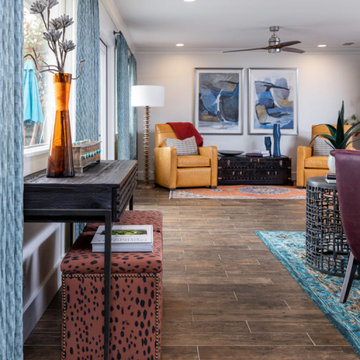
We knew we needed a cozy, lower profile seating area but also some sort of great reading nook by the fireplace. With the large windows and the main entry just off this space, a traffic pattern was delianted that helped guide decisions with the furniture. A funky, nubbier woven fabric on the sectional that hinted towards mid-century modern. The irregular shaped, petrified wood coffee table. The bold statement and colors carried through in the wallcovering and area rug. Jumping to the fireplace area where you can lounge or read with those gorgeous cognac leather recliners. This space needed to feel separate and the same all at once. The balance of scale and colors really helped achieve this!
Can’t forget the bedrooms!
Of course we can’t get by without mentioning a little bedroom love, either.
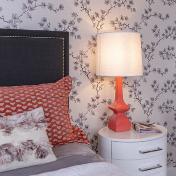
In the master the overall designs dictated by a bold, saturated woven wood cloth on the headboard wall. We love the mix of color and pattern in here. The bold, sexier mood is 100% a byproduct of the level of rich colors and unusual combinations. Those bold hand-glazed ceramic lamps against those strict geo-pattern bed pillows – so good!
Our sweet tween bedroom that should grow with her for a good, long time. All in all, filled with original art and layered in a softer palette. There was a lot of matching in here at first, but once we convinced her to trust us she started to understand why adding in the unexpected hit of bright coral and spring green made everything sing!
 In Detail Interiors
Cozy and Colorful Beach House Remodel!
When you think funky little house by the beach – images like what you are about to see may not be what you would have anticipated. This furnishings project aimed to capture a colorful, fun, active space for a family who wanted to feel at home .Thus, creating casual and comfortable but not boring in the least. A little traveled, a lot of texture, and not much clutter!
From the start, the space was not much to write home about!
The common living areas were boxy with lower ceilings. Quirky ins and outs needed to be optimized. Overall, this project was a prime opportunity for us to really dig in. From treating each room top to bottom and finding the client’s mojo when it came to wallcoverings. Selecting funky lighting and the right mix and match of bold colors and more natural, organic textures.
We came in too late to get involved with the kitchen but helped the client with a few little accents and color choices. Thus, acting as a jumping off point for the large dining space featuring a beautiful (and resilient!) wooden trestle table. We created a mix of seating that offers a little funk, and the fun additional cabinet storage to each end which offered a hideaway. We loved that this vista had such opportunity for great lighting and art, also!
A Colorful, Cozy Living Room
We knew we needed a cozy, lower profile seating area but also some sort of great reading nook by the fireplace. With the large windows and the main entry just off this space, a traffic pattern was delianted that helped guide decisions with the furniture. A funky, nubbier woven fabric on the sectional that hinted towards mid-century modern. The irregular shaped, petrified wood coffee table. The bold statement and colors carried through in the wallcovering and area rug. Jumping to the fireplace area where you can lounge or read with those gorgeous cognac leather recliners. This space needed to feel separate and the same all at once. The balance of scale and colors really helped achieve this!
Can’t forget the bedrooms!
Of course we can’t get by without mentioning a little bedroom love, either.
In the master the overall designs dictated by a bold, saturated woven wood cloth on the headboard wall. We love the mix of color and pattern in here. The bold, sexier mood is 100% a byproduct of the level of rich colors and unusual combinations. Those bold hand-glazed ceramic lamps against those strict geo-pattern bed pillows – so good!
Our sweet tween bedroom that should grow with her for a good, long time. All in all, filled with original art and layered in a softer palette. There was a lot of matching in here at first, but once we convinced her to trust us she started to understand why adding in the unexpected hit of bright coral and spring green made everything sing!
 Pizzale Design Inc.
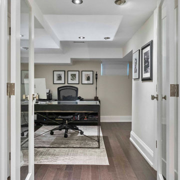
We tucked away a quiet home office framed by glass doors. The mirror-topped desk, layered rug, framed artwork, and clean white trim give the space a polished, professional feel, while the softer neutral palette keeps it calm and connected to the rest of the home. It feels private and purposeful without being closed off.


 Cooperman & Co. Luxury Interior Design
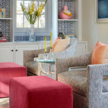
The Petal & Poppy Home is a vibrant, collected family residence defined by bold color, layered pattern, and a confident sense of personality. Designed over several years as the young family grew, the home reflects an evolving story rooted in warmth, creativity, and a love of expressive interiors.
Color guided the design from the outset. A blue grasscloth dining room and an existing pink Persian rug in the formal living room became the foundation for a palette that unfolded organically throughout the home. With clients eager to mix patterns and embrace saturated hues, the design process focused on contrast, cohesion, and joyful self-expression.
The entry makes an immediate statement with a playful spotted stair runner, oversized artwork, and a high-gloss black handrail that introduces graphic contrast. The formal living room, designed for entertaining, is the moodiest space in the home. Dark garnet walls and a commissioned piece by local artist Carrie Gillen create a dramatic backdrop, while pink tweed swivel chairs and a tailored charcoal sofa complete a space designed for lingering.
Beyond French doors, the home office is an immersive mix of pattern and color, with wallpaper wrapping both walls and ceiling. A leopard carpet and modern crystal chandelier add a touch of glamour, resulting in a space that feels energizing and personal. The dining room continues the confident use of blue, layering patterns around a custom round pedestal table designed for everyday meals and gatherings alike.
At the heart of the home, the family room was designed for togetherness. A bright blue sectional anchors the space, complemented by custom ottomans on hidden casters and softened with tailored throw pillows. Existing bookshelves are refreshed with a Peter Fasano wallcovering, creating a collected, lived-in backdrop.
Upstairs, the primary suite offers a softer expression of color, blending blues, oranges, and pinks, while built-in window benches add moments of comfort. The children’s bedrooms balance playfulness with longevity, layered with color and texture designed to grow alongside them.
The Petal & Poppy Home is a celebration of color, creativity, and family life—an interior that feels intentionally layered, expressive, and deeply personal, designed to evolve over time.
 In Detail Interiors
Cozy and Colorful Beach House Remodel!
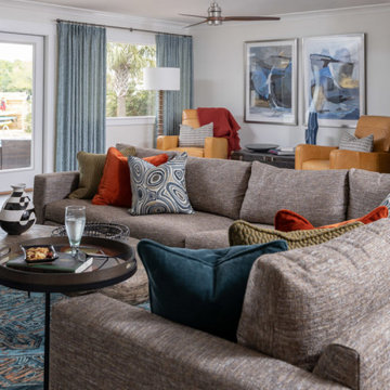
When you think funky little house by the beach – images like what you are about to see may not be what you would have anticipated. This furnishings project aimed to capture a colorful, fun, active space for a family who wanted to feel at home .Thus, creating casual and comfortable but not boring in the least. A little traveled, a lot of texture, and not much clutter!
From the start, the space was not much to write home about!
The common living areas were boxy with lower ceilings. Quirky ins and outs needed to be optimized. Overall, this project was a prime opportunity for us to really dig in. From treating each room top to bottom and finding the client’s mojo when it came to wallcoverings. Selecting funky lighting and the right mix and match of bold colors and more natural, organic textures.
We came in too late to get involved with the kitchen but helped the client with a few little accents and color choices. Thus, acting as a jumping off point for the large dining space featuring a beautiful (and resilient!) wooden trestle table. We created a mix of seating that offers a little funk, and the fun additional cabinet storage to each end which offered a hideaway. We loved that this vista had such opportunity for great lighting and art, also!
A Colorful, Cozy Living Room
We knew we needed a cozy, lower profile seating area but also some sort of great reading nook by the fireplace. With the large windows and the main entry just off this space, a traffic pattern was delianted that helped guide decisions with the furniture. A funky, nubbier woven fabric on the sectional that hinted towards mid-century modern. The irregular shaped, petrified wood coffee table. The bold statement and colors carried through in the wallcovering and area rug. Jumping to the fireplace area where you can lounge or read with those gorgeous cognac leather recliners. This space needed to feel separate and the same all at once. The balance of scale and colors really helped achieve this!
Can’t forget the bedrooms!
Of course we can’t get by without mentioning a little bedroom love, either.
In the master the overall designs dictated by a bold, saturated woven wood cloth on the headboard wall. We love the mix of color and pattern in here. The bold, sexier mood is 100% a byproduct of the level of rich colors and unusual combinations. Those bold hand-glazed ceramic lamps against those strict geo-pattern bed pillows – so good!
Our sweet tween bedroom that should grow with her for a good, long time. All in all, filled with original art and layered in a softer palette. There was a lot of matching in here at first, but once we convinced her to trust us she started to understand why adding in the unexpected hit of bright coral and spring green made everything sing!
 Kathleen Jennison
An Arts & Crafts Bungalow is one of my favorite styles of homes. We have quite a few of them in our Stockton Mid-Town area. And when C&L called us to help them remodel their 1923 American Bungalow, I was beyond thrilled.
As per usual, when we get a new inquiry, we quickly Google the project location while we are talking to you on the phone. My excitement escalated when I saw the Google Earth Image of the sweet Sage Green bungalow in Mid-Town Stockton. "Yes, we would be interested in working with you," I said trying to keep my cool.
But what made it even better was meeting C&L and touring their home, because they are the nicest young couple, eager to make their home period perfect. Unfortunately, it had been slightly molested by some bad house-flippers, and we needed to bring the bathroom back to it "roots."
We knew we had to banish the hideous brown tile and cheap vanity quickly. But C&L complained about the condensation problems and the constant fight with mold. This immediately told me that improper remodeling had occurred and we needed to remedy that right away.
The Before: Frustrations with a Botched Remodel
The bathroom needed to be brought back to period appropriate design with all the functionality of a modern bathroom. We thought of things like marble countertop, white mosaic floor tiles, white subway tile, board and batten molding, and of course a fabulous wallpaper.
This small (and only) bathroom on a tight budget required a little bit of design sleuthing to figure out how we could get the proper look and feel. Our goal was to determine where to splurge and where to economize and how to complete the remodel as quickly as possible because C&L would have to move out while construction was going on.
The Process: Hard Work to Remedy Design and Function
During our initial design study, (which included 2 hours in the owners’ home), we noticed framed images of William Morris Arts and Crafts textile patterns and knew this would be our design inspiration. We presented C&L with three options and they quickly selected the Pimpernel Design Concept.
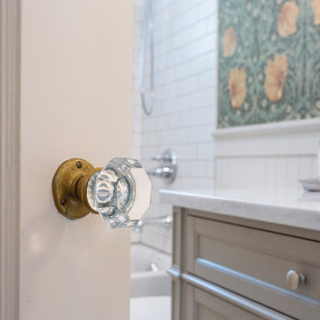
We had originally selected the Black and Olive colors with a black vanity, mirror, and black and white floor tile. C&L liked it but weren’t quite sure about the black, We went back to the drawing board and decided the William & Co Pimpernel Wallpaper in Bayleaf and Manilla color with a softer gray painted vanity and mirror and white floor tile was more to their liking.
After the Design Concept was approved, we went to work securing the building permit, procuring all the elements, and scheduling our trusted tradesmen to perform the work.
We did uncover some shoddy work by the flippers such as live electrical wires hidden behind the wall, plumbing venting cut-off and buried in the walls (hence the constant dampness), the tub barely balancing on two fence boards across the floor joist, and no insulation on the exterior wall.
All of the previous blunders were fixed and the bathroom put back to its previous glory. We could feel the house thanking us for making it pretty again.
The After Reveal: Cohesive Design Decisions
We selected a simple white subway tile for the tub/shower. This is always classic and in keeping with the style of the house.
We selected a pre-fab vanity and mirror, but they look rich with the quartz countertop. There is much more storage in this small vanity than you would think.
The Transformation: A Period Perfect Refresh
We began the remodel just as the pandemic reared and stay-in-place orders went into effect. As C&L were already moved out and living with relatives, we got the go-ahead from city officials to get the work done (after all, how can you shelter in place without a bathroom?).
All our tradesmen were scheduled to work so that only one crew was on the job site at a time. We stayed on the original schedule with only a one week delay.
The end result is the sweetest little bathroom I've ever seen (and I can't wait to start work on C&L's kitchen next).
Thank you for joining me in this project transformation. I hope this inspired you to think about being creative with your design projects, determining what works best in keeping with the architecture of your space, and carefully assessing how you can have the best life in your home.
 By Two Studio
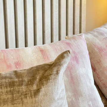
This close-up detail from the Refined Family Home project highlights the soft layering, tactile finishes and subtle tonal contrasts that define By Two Studio’s approach to quiet luxury interior design. Set within the principal bedroom, the combination of textured velvet cushions, soft blush accents and the bespoke upholstered headboard creates a warm and inviting atmosphere while maintaining a refined, contemporary aesthetic.
The carefully curated palette introduces depth without overwhelming the space, allowing natural textures and understated detailing to become the focal point. Thoughtful styling choices, including layered fabrics and muted neutral tones, help create a bedroom that feels calm, elegant and timeless for modern family living.
Throughout this luxury bedroom design, every element was selected to contribute to a cohesive and restful environment, balancing comfort with elevated interior styling. The result is a sophisticated principal bedroom that reflects contemporary London interior design with a softer, more personal feel.

Sponsored
Columbus, OH
Free consultation for landscape design!

Peabody Landscape Group
Franklin County's Reliable Landscape Design & Contracting
 ig. design & interiors
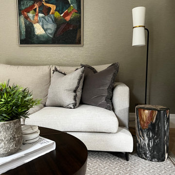
This solid petrified log from Andrew Martin serves as a striking and sculptural side table, perfectly positioned beside the contemporary Camerich sofa. Upholstered in a soft linen-effect fabric with a stain-resistant Teflon finish, the sofa offers a beautiful balance of comfort, durability, and understated elegance.
A bold Cubist artwork provides the focal point for the room, its layered geometry and earthy tones forming the foundation of the palette. Rich hues of rust and moss have been thoughtfully drawn from the piece and layered throughout the space—bringing warmth, depth, and a quiet vibrancy that feels entirely in tune with the room’s organic yet sophisticated feel.
The floor lamp, also from Andrew Martin, introduces a softer, more fluid form. Its curvaceous silhouette gently references the rounded edges of the coffee table and the bouclé armchair in the opposite corner, adding a sense of balance and visual rhythm. The result is a space where contrasting forms and textures are thoughtfully harmonised—grounded in nature, yet refined in execution.
 Golden Visions Design
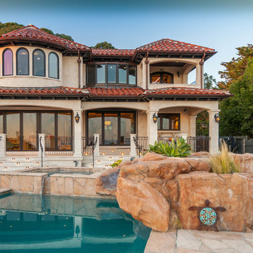
This home was originally built in the 1980s in a very modern style. Much of the existing home was in need of repair or replacement. The owner preferred the softer look and feel of the Mediterranean style, with lots of arches and curves, pillars, stonework, and a hand-wrought feel. We added a small amount of new floor area and re-worked the entire home into a new Mediterranean style.
Golden Visions Design
Santa Cruz, CA 95062
 In Detail Interiors
Cozy and Colorful Beach House Remodel!
When you think funky little house by the beach – images like what you are about to see may not be what you would have anticipated. This furnishings project aimed to capture a colorful, fun, active space for a family who wanted to feel at home .Thus, creating casual and comfortable but not boring in the least. A little traveled, a lot of texture, and not much clutter!
From the start, the space was not much to write home about!
The common living areas were boxy with lower ceilings. Quirky ins and outs needed to be optimized. Overall, this project was a prime opportunity for us to really dig in. From treating each room top to bottom and finding the client’s mojo when it came to wallcoverings. Selecting funky lighting and the right mix and match of bold colors and more natural, organic textures.
We came in too late to get involved with the kitchen but helped the client with a few little accents and color choices. Thus, acting as a jumping off point for the large dining space featuring a beautiful (and resilient!) wooden trestle table. We created a mix of seating that offers a little funk, and the fun additional cabinet storage to each end which offered a hideaway. We loved that this vista had such opportunity for great lighting and art, also!
A Colorful, Cozy Living Room
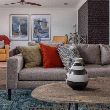
We knew we needed a cozy, lower profile seating area but also some sort of great reading nook by the fireplace. With the large windows and the main entry just off this space, a traffic pattern was delianted that helped guide decisions with the furniture. A funky, nubbier woven fabric on the sectional that hinted towards mid-century modern. The irregular shaped, petrified wood coffee table. The bold statement and colors carried through in the wallcovering and area rug. Jumping to the fireplace area where you can lounge or read with those gorgeous cognac leather recliners. This space needed to feel separate and the same all at once. The balance of scale and colors really helped achieve this!
Can’t forget the bedrooms!
Of course we can’t get by without mentioning a little bedroom love, either.
In the master the overall designs dictated by a bold, saturated woven wood cloth on the headboard wall. We love the mix of color and pattern in here. The bold, sexier mood is 100% a byproduct of the level of rich colors and unusual combinations. Those bold hand-glazed ceramic lamps against those strict geo-pattern bed pillows – so good!
Our sweet tween bedroom that should grow with her for a good, long time. All in all, filled with original art and layered in a softer palette. There was a lot of matching in here at first, but once we convinced her to trust us she started to understand why adding in the unexpected hit of bright coral and spring green made everything sing!
22