
Search results for "Feels softer" in Home Design Ideas
 Ashley Salmons Interiors
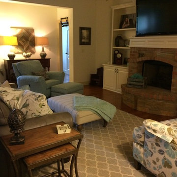
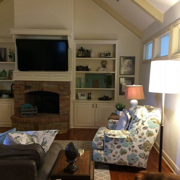
Here's an after of the fully furnished new living room! The dark-stained built-ins and darker gold paint that once graced this living room just made the room feel cave-like. I suggested painting the built-ins a light ivory/white along with the mantle piece, and suggested a softer wall color to help brighten this once-dark room! The before picture shows the dark built-ins, but we had already painted over the old gold paint. The lighter paint finishes along with the cheery light blues and greys in the fabrics we chose really brought the cottage feel to this space!
 Tricia Fortin Interiors
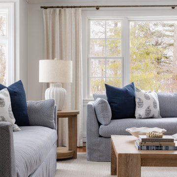
Designed with gathering at its core, the family room at our Windswept in Wellesley project was created to comfortably accommodate a large, active household. Two oversized sofas provide ample seating, anchored by a generous coffee table that invites everything from casual lounging to puzzles and games spread out for the afternoon.
While the adjoining living room embraces lighter greens and blues, the family room leans into a richer, more saturated palette. Deep blues are balanced with softer earth tones, creating a space that feels both grounded and welcoming. A large custom rug anchors the room, thoughtfully selected for its durability and ability to stand up to daily life.
Layered details bring warmth and character—plaid on an accent chair, custom pillows in varied patterns, and subtly striped curtains add depth without overwhelming the space. The result is a room that feels relaxed yet refined, designed for real life and ready to be lived in every day.
 Kathleen Jennison
An Arts & Crafts Bungalow is one of my favorite styles of homes. We have quite a few of them in our Stockton Mid-Town area. And when C&L called us to help them remodel their 1923 American Bungalow, I was beyond thrilled.
As per usual, when we get a new inquiry, we quickly Google the project location while we are talking to you on the phone. My excitement escalated when I saw the Google Earth Image of the sweet Sage Green bungalow in Mid-Town Stockton. "Yes, we would be interested in working with you," I said trying to keep my cool.
But what made it even better was meeting C&L and touring their home, because they are the nicest young couple, eager to make their home period perfect. Unfortunately, it had been slightly molested by some bad house-flippers, and we needed to bring the bathroom back to it "roots."
We knew we had to banish the hideous brown tile and cheap vanity quickly. But C&L complained about the condensation problems and the constant fight with mold. This immediately told me that improper remodeling had occurred and we needed to remedy that right away.
The Before: Frustrations with a Botched Remodel
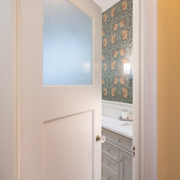
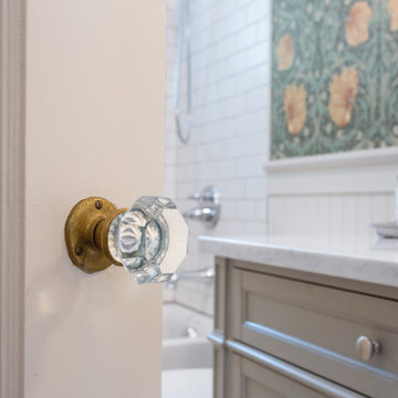
The bathroom needed to be brought back to period appropriate design with all the functionality of a modern bathroom. We thought of things like marble countertop, white mosaic floor tiles, white subway tile, board and batten molding, and of course a fabulous wallpaper.
This small (and only) bathroom on a tight budget required a little bit of design sleuthing to figure out how we could get the proper look and feel. Our goal was to determine where to splurge and where to economize and how to complete the remodel as quickly as possible because C&L would have to move out while construction was going on.
The Process: Hard Work to Remedy Design and Function
During our initial design study, (which included 2 hours in the owners’ home), we noticed framed images of William Morris Arts and Crafts textile patterns and knew this would be our design inspiration. We presented C&L with three options and they quickly selected the Pimpernel Design Concept.
We had originally selected the Black and Olive colors with a black vanity, mirror, and black and white floor tile. C&L liked it but weren’t quite sure about the black, We went back to the drawing board and decided the William & Co Pimpernel Wallpaper in Bayleaf and Manilla color with a softer gray painted vanity and mirror and white floor tile was more to their liking.
After the Design Concept was approved, we went to work securing the building permit, procuring all the elements, and scheduling our trusted tradesmen to perform the work.
We did uncover some shoddy work by the flippers such as live electrical wires hidden behind the wall, plumbing venting cut-off and buried in the walls (hence the constant dampness), the tub barely balancing on two fence boards across the floor joist, and no insulation on the exterior wall.
All of the previous blunders were fixed and the bathroom put back to its previous glory. We could feel the house thanking us for making it pretty again.
The After Reveal: Cohesive Design Decisions
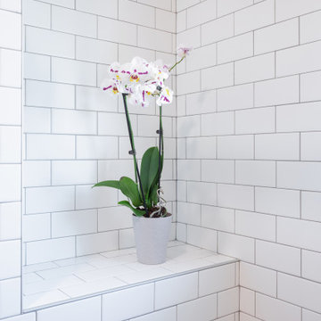
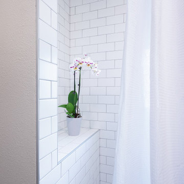
We selected a simple white subway tile for the tub/shower. This is always classic and in keeping with the style of the house.
We selected a pre-fab vanity and mirror, but they look rich with the quartz countertop. There is much more storage in this small vanity than you would think.
The Transformation: A Period Perfect Refresh
We began the remodel just as the pandemic reared and stay-in-place orders went into effect. As C&L were already moved out and living with relatives, we got the go-ahead from city officials to get the work done (after all, how can you shelter in place without a bathroom?).
All our tradesmen were scheduled to work so that only one crew was on the job site at a time. We stayed on the original schedule with only a one week delay.
The end result is the sweetest little bathroom I've ever seen (and I can't wait to start work on C&L's kitchen next).
Thank you for joining me in this project transformation. I hope this inspired you to think about being creative with your design projects, determining what works best in keeping with the architecture of your space, and carefully assessing how you can have the best life in your home.
Find the right local pro for your project
 In Detail Interiors
Cozy and Colorful Beach House Remodel!
When you think funky little house by the beach – images like what you are about to see may not be what you would have anticipated. This furnishings project aimed to capture a colorful, fun, active space for a family who wanted to feel at home .Thus, creating casual and comfortable but not boring in the least. A little traveled, a lot of texture, and not much clutter!
From the start, the space was not much to write home about!
The common living areas were boxy with lower ceilings. Quirky ins and outs needed to be optimized. Overall, this project was a prime opportunity for us to really dig in. From treating each room top to bottom and finding the client’s mojo when it came to wallcoverings. Selecting funky lighting and the right mix and match of bold colors and more natural, organic textures.
We came in too late to get involved with the kitchen but helped the client with a few little accents and color choices. Thus, acting as a jumping off point for the large dining space featuring a beautiful (and resilient!) wooden trestle table. We created a mix of seating that offers a little funk, and the fun additional cabinet storage to each end which offered a hideaway. We loved that this vista had such opportunity for great lighting and art, also!
A Colorful, Cozy Living Room
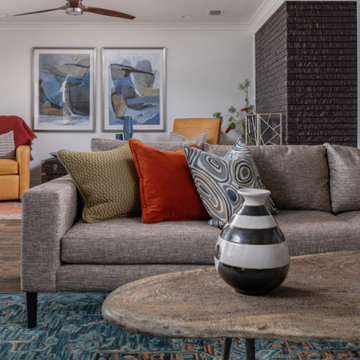
We knew we needed a cozy, lower profile seating area but also some sort of great reading nook by the fireplace. With the large windows and the main entry just off this space, a traffic pattern was delianted that helped guide decisions with the furniture. A funky, nubbier woven fabric on the sectional that hinted towards mid-century modern. The irregular shaped, petrified wood coffee table. The bold statement and colors carried through in the wallcovering and area rug. Jumping to the fireplace area where you can lounge or read with those gorgeous cognac leather recliners. This space needed to feel separate and the same all at once. The balance of scale and colors really helped achieve this!
Can’t forget the bedrooms!
Of course we can’t get by without mentioning a little bedroom love, either.
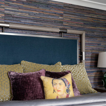
In the master the overall designs dictated by a bold, saturated woven wood cloth on the headboard wall. We love the mix of color and pattern in here. The bold, sexier mood is 100% a byproduct of the level of rich colors and unusual combinations. Those bold hand-glazed ceramic lamps against those strict geo-pattern bed pillows – so good!
Our sweet tween bedroom that should grow with her for a good, long time. All in all, filled with original art and layered in a softer palette. There was a lot of matching in here at first, but once we convinced her to trust us she started to understand why adding in the unexpected hit of bright coral and spring green made everything sing!
 Kathleen Jennison
An Arts & Crafts Bungalow is one of my favorite styles of homes. We have quite a few of them in our Stockton Mid-Town area. And when C&L called us to help them remodel their 1923 American Bungalow, I was beyond thrilled.
As per usual, when we get a new inquiry, we quickly Google the project location while we are talking to you on the phone. My excitement escalated when I saw the Google Earth Image of the sweet Sage Green bungalow in Mid-Town Stockton. "Yes, we would be interested in working with you," I said trying to keep my cool.
But what made it even better was meeting C&L and touring their home, because they are the nicest young couple, eager to make their home period perfect. Unfortunately, it had been slightly molested by some bad house-flippers, and we needed to bring the bathroom back to it "roots."
We knew we had to banish the hideous brown tile and cheap vanity quickly. But C&L complained about the condensation problems and the constant fight with mold. This immediately told me that improper remodeling had occurred and we needed to remedy that right away.
The Before: Frustrations with a Botched Remodel
The bathroom needed to be brought back to period appropriate design with all the functionality of a modern bathroom. We thought of things like marble countertop, white mosaic floor tiles, white subway tile, board and batten molding, and of course a fabulous wallpaper.
This small (and only) bathroom on a tight budget required a little bit of design sleuthing to figure out how we could get the proper look and feel. Our goal was to determine where to splurge and where to economize and how to complete the remodel as quickly as possible because C&L would have to move out while construction was going on.
The Process: Hard Work to Remedy Design and Function
During our initial design study, (which included 2 hours in the owners’ home), we noticed framed images of William Morris Arts and Crafts textile patterns and knew this would be our design inspiration. We presented C&L with three options and they quickly selected the Pimpernel Design Concept.
We had originally selected the Black and Olive colors with a black vanity, mirror, and black and white floor tile. C&L liked it but weren’t quite sure about the black, We went back to the drawing board and decided the William & Co Pimpernel Wallpaper in Bayleaf and Manilla color with a softer gray painted vanity and mirror and white floor tile was more to their liking.
After the Design Concept was approved, we went to work securing the building permit, procuring all the elements, and scheduling our trusted tradesmen to perform the work.
We did uncover some shoddy work by the flippers such as live electrical wires hidden behind the wall, plumbing venting cut-off and buried in the walls (hence the constant dampness), the tub barely balancing on two fence boards across the floor joist, and no insulation on the exterior wall.
All of the previous blunders were fixed and the bathroom put back to its previous glory. We could feel the house thanking us for making it pretty again.
The After Reveal: Cohesive Design Decisions
We selected a simple white subway tile for the tub/shower. This is always classic and in keeping with the style of the house.
We selected a pre-fab vanity and mirror, but they look rich with the quartz countertop. There is much more storage in this small vanity than you would think.
The Transformation: A Period Perfect Refresh
We began the remodel just as the pandemic reared and stay-in-place orders went into effect. As C&L were already moved out and living with relatives, we got the go-ahead from city officials to get the work done (after all, how can you shelter in place without a bathroom?).
All our tradesmen were scheduled to work so that only one crew was on the job site at a time. We stayed on the original schedule with only a one week delay.
The end result is the sweetest little bathroom I've ever seen (and I can't wait to start work on C&L's kitchen next).
Thank you for joining me in this project transformation. I hope this inspired you to think about being creative with your design projects, determining what works best in keeping with the architecture of your space, and carefully assessing how you can have the best life in your home.
 Cooperman & Co. Luxury Interior Design
The Petal & Poppy Home is a vibrant, collected family residence defined by bold color, layered pattern, and a confident sense of personality. Designed over several years as the young family grew, the home reflects an evolving story rooted in warmth, creativity, and a love of expressive interiors.
Color guided the design from the outset. A blue grasscloth dining room and an existing pink Persian rug in the formal living room became the foundation for a palette that unfolded organically throughout the home. With clients eager to mix patterns and embrace saturated hues, the design process focused on contrast, cohesion, and joyful self-expression.
The entry makes an immediate statement with a playful spotted stair runner, oversized artwork, and a high-gloss black handrail that introduces graphic contrast. The formal living room, designed for entertaining, is the moodiest space in the home. Dark garnet walls and a commissioned piece by local artist Carrie Gillen create a dramatic backdrop, while pink tweed swivel chairs and a tailored charcoal sofa complete a space designed for lingering.
Beyond French doors, the home office is an immersive mix of pattern and color, with wallpaper wrapping both walls and ceiling. A leopard carpet and modern crystal chandelier add a touch of glamour, resulting in a space that feels energizing and personal. The dining room continues the confident use of blue, layering patterns around a custom round pedestal table designed for everyday meals and gatherings alike.
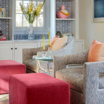
At the heart of the home, the family room was designed for togetherness. A bright blue sectional anchors the space, complemented by custom ottomans on hidden casters and softened with tailored throw pillows. Existing bookshelves are refreshed with a Peter Fasano wallcovering, creating a collected, lived-in backdrop.
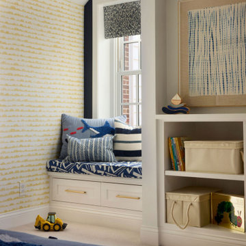
Upstairs, the primary suite offers a softer expression of color, blending blues, oranges, and pinks, while built-in window benches add moments of comfort. The children’s bedrooms balance playfulness with longevity, layered with color and texture designed to grow alongside them.
The Petal & Poppy Home is a celebration of color, creativity, and family life—an interior that feels intentionally layered, expressive, and deeply personal, designed to evolve over time.
 Golden Visions Design
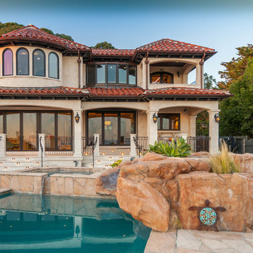
This home was originally built in the 1980s in a very modern style. Much of the existing home was in need of repair or replacement. The owner preferred the softer look and feel of the Mediterranean style, with lots of arches and curves, pillars, stonework, and a hand-wrought feel. We added a small amount of new floor area and re-worked the entire home into a new Mediterranean style.
Golden Visions Design
Santa Cruz, CA 95062


 In Detail Interiors
Cozy and Colorful Beach House Remodel!
When you think funky little house by the beach – images like what you are about to see may not be what you would have anticipated. This furnishings project aimed to capture a colorful, fun, active space for a family who wanted to feel at home .Thus, creating casual and comfortable but not boring in the least. A little traveled, a lot of texture, and not much clutter!
From the start, the space was not much to write home about!
The common living areas were boxy with lower ceilings. Quirky ins and outs needed to be optimized. Overall, this project was a prime opportunity for us to really dig in. From treating each room top to bottom and finding the client’s mojo when it came to wallcoverings. Selecting funky lighting and the right mix and match of bold colors and more natural, organic textures.
We came in too late to get involved with the kitchen but helped the client with a few little accents and color choices. Thus, acting as a jumping off point for the large dining space featuring a beautiful (and resilient!) wooden trestle table. We created a mix of seating that offers a little funk, and the fun additional cabinet storage to each end which offered a hideaway. We loved that this vista had such opportunity for great lighting and art, also!
A Colorful, Cozy Living Room
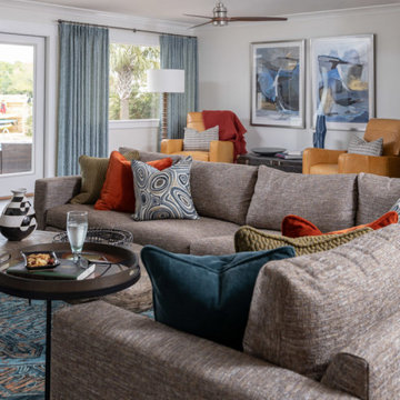
We knew we needed a cozy, lower profile seating area but also some sort of great reading nook by the fireplace. With the large windows and the main entry just off this space, a traffic pattern was delianted that helped guide decisions with the furniture. A funky, nubbier woven fabric on the sectional that hinted towards mid-century modern. The irregular shaped, petrified wood coffee table. The bold statement and colors carried through in the wallcovering and area rug. Jumping to the fireplace area where you can lounge or read with those gorgeous cognac leather recliners. This space needed to feel separate and the same all at once. The balance of scale and colors really helped achieve this!
Can’t forget the bedrooms!
Of course we can’t get by without mentioning a little bedroom love, either.
In the master the overall designs dictated by a bold, saturated woven wood cloth on the headboard wall. We love the mix of color and pattern in here. The bold, sexier mood is 100% a byproduct of the level of rich colors and unusual combinations. Those bold hand-glazed ceramic lamps against those strict geo-pattern bed pillows – so good!
Our sweet tween bedroom that should grow with her for a good, long time. All in all, filled with original art and layered in a softer palette. There was a lot of matching in here at first, but once we convinced her to trust us she started to understand why adding in the unexpected hit of bright coral and spring green made everything sing!
 Kathleen Jennison
An Arts & Crafts Bungalow is one of my favorite styles of homes. We have quite a few of them in our Stockton Mid-Town area. And when C&L called us to help them remodel their 1923 American Bungalow, I was beyond thrilled.
As per usual, when we get a new inquiry, we quickly Google the project location while we are talking to you on the phone. My excitement escalated when I saw the Google Earth Image of the sweet Sage Green bungalow in Mid-Town Stockton. "Yes, we would be interested in working with you," I said trying to keep my cool.
But what made it even better was meeting C&L and touring their home, because they are the nicest young couple, eager to make their home period perfect. Unfortunately, it had been slightly molested by some bad house-flippers, and we needed to bring the bathroom back to it "roots."
We knew we had to banish the hideous brown tile and cheap vanity quickly. But C&L complained about the condensation problems and the constant fight with mold. This immediately told me that improper remodeling had occurred and we needed to remedy that right away.
The Before: Frustrations with a Botched Remodel
The bathroom needed to be brought back to period appropriate design with all the functionality of a modern bathroom. We thought of things like marble countertop, white mosaic floor tiles, white subway tile, board and batten molding, and of course a fabulous wallpaper.
This small (and only) bathroom on a tight budget required a little bit of design sleuthing to figure out how we could get the proper look and feel. Our goal was to determine where to splurge and where to economize and how to complete the remodel as quickly as possible because C&L would have to move out while construction was going on.
The Process: Hard Work to Remedy Design and Function
During our initial design study, (which included 2 hours in the owners’ home), we noticed framed images of William Morris Arts and Crafts textile patterns and knew this would be our design inspiration. We presented C&L with three options and they quickly selected the Pimpernel Design Concept.
We had originally selected the Black and Olive colors with a black vanity, mirror, and black and white floor tile. C&L liked it but weren’t quite sure about the black, We went back to the drawing board and decided the William & Co Pimpernel Wallpaper in Bayleaf and Manilla color with a softer gray painted vanity and mirror and white floor tile was more to their liking.
After the Design Concept was approved, we went to work securing the building permit, procuring all the elements, and scheduling our trusted tradesmen to perform the work.
We did uncover some shoddy work by the flippers such as live electrical wires hidden behind the wall, plumbing venting cut-off and buried in the walls (hence the constant dampness), the tub barely balancing on two fence boards across the floor joist, and no insulation on the exterior wall.
All of the previous blunders were fixed and the bathroom put back to its previous glory. We could feel the house thanking us for making it pretty again.
The After Reveal: Cohesive Design Decisions
We selected a simple white subway tile for the tub/shower. This is always classic and in keeping with the style of the house.
We selected a pre-fab vanity and mirror, but they look rich with the quartz countertop. There is much more storage in this small vanity than you would think.
The Transformation: A Period Perfect Refresh
We began the remodel just as the pandemic reared and stay-in-place orders went into effect. As C&L were already moved out and living with relatives, we got the go-ahead from city officials to get the work done (after all, how can you shelter in place without a bathroom?).
All our tradesmen were scheduled to work so that only one crew was on the job site at a time. We stayed on the original schedule with only a one week delay.
The end result is the sweetest little bathroom I've ever seen (and I can't wait to start work on C&L's kitchen next).
Thank you for joining me in this project transformation. I hope this inspired you to think about being creative with your design projects, determining what works best in keeping with the architecture of your space, and carefully assessing how you can have the best life in your home.
 In Detail Interiors
Cozy and Colorful Beach House Remodel!
When you think funky little house by the beach – images like what you are about to see may not be what you would have anticipated. This furnishings project aimed to capture a colorful, fun, active space for a family who wanted to feel at home .Thus, creating casual and comfortable but not boring in the least. A little traveled, a lot of texture, and not much clutter!
From the start, the space was not much to write home about!
The common living areas were boxy with lower ceilings. Quirky ins and outs needed to be optimized. Overall, this project was a prime opportunity for us to really dig in. From treating each room top to bottom and finding the client’s mojo when it came to wallcoverings. Selecting funky lighting and the right mix and match of bold colors and more natural, organic textures.
We came in too late to get involved with the kitchen but helped the client with a few little accents and color choices. Thus, acting as a jumping off point for the large dining space featuring a beautiful (and resilient!) wooden trestle table. We created a mix of seating that offers a little funk, and the fun additional cabinet storage to each end which offered a hideaway. We loved that this vista had such opportunity for great lighting and art, also!
A Colorful, Cozy Living Room
We knew we needed a cozy, lower profile seating area but also some sort of great reading nook by the fireplace. With the large windows and the main entry just off this space, a traffic pattern was delianted that helped guide decisions with the furniture. A funky, nubbier woven fabric on the sectional that hinted towards mid-century modern. The irregular shaped, petrified wood coffee table. The bold statement and colors carried through in the wallcovering and area rug. Jumping to the fireplace area where you can lounge or read with those gorgeous cognac leather recliners. This space needed to feel separate and the same all at once. The balance of scale and colors really helped achieve this!
Can’t forget the bedrooms!
Of course we can’t get by without mentioning a little bedroom love, either.
In the master the overall designs dictated by a bold, saturated woven wood cloth on the headboard wall. We love the mix of color and pattern in here. The bold, sexier mood is 100% a byproduct of the level of rich colors and unusual combinations. Those bold hand-glazed ceramic lamps against those strict geo-pattern bed pillows – so good!
Our sweet tween bedroom that should grow with her for a good, long time. All in all, filled with original art and layered in a softer palette. There was a lot of matching in here at first, but once we convinced her to trust us she started to understand why adding in the unexpected hit of bright coral and spring green made everything sing!
 Ashley Salmons Interiors
Here's an after of the fully furnished new living room! The dark-stained built-ins and darker gold paint that once graced this living room just made the room feel cave-like. I suggested painting the built-ins a light ivory/white along with the mantle piece, and suggested a softer wall color to help brighten this once-dark room! The before picture shows the dark built-ins, but we had already painted over the old gold paint. The lighter paint finishes along with the cheery light blues and greys in the fabrics we chose really brought the cottage feel to this space!
 Kathleen Jennison
An Arts & Crafts Bungalow is one of my favorite styles of homes. We have quite a few of them in our Stockton Mid-Town area. And when C&L called us to help them remodel their 1923 American Bungalow, I was beyond thrilled.
As per usual, when we get a new inquiry, we quickly Google the project location while we are talking to you on the phone. My excitement escalated when I saw the Google Earth Image of the sweet Sage Green bungalow in Mid-Town Stockton. "Yes, we would be interested in working with you," I said trying to keep my cool.
But what made it even better was meeting C&L and touring their home, because they are the nicest young couple, eager to make their home period perfect. Unfortunately, it had been slightly molested by some bad house-flippers, and we needed to bring the bathroom back to it "roots."
We knew we had to banish the hideous brown tile and cheap vanity quickly. But C&L complained about the condensation problems and the constant fight with mold. This immediately told me that improper remodeling had occurred and we needed to remedy that right away.
The Before: Frustrations with a Botched Remodel
The bathroom needed to be brought back to period appropriate design with all the functionality of a modern bathroom. We thought of things like marble countertop, white mosaic floor tiles, white subway tile, board and batten molding, and of course a fabulous wallpaper.
This small (and only) bathroom on a tight budget required a little bit of design sleuthing to figure out how we could get the proper look and feel. Our goal was to determine where to splurge and where to economize and how to complete the remodel as quickly as possible because C&L would have to move out while construction was going on.
The Process: Hard Work to Remedy Design and Function
During our initial design study, (which included 2 hours in the owners’ home), we noticed framed images of William Morris Arts and Crafts textile patterns and knew this would be our design inspiration. We presented C&L with three options and they quickly selected the Pimpernel Design Concept.
We had originally selected the Black and Olive colors with a black vanity, mirror, and black and white floor tile. C&L liked it but weren’t quite sure about the black, We went back to the drawing board and decided the William & Co Pimpernel Wallpaper in Bayleaf and Manilla color with a softer gray painted vanity and mirror and white floor tile was more to their liking.
After the Design Concept was approved, we went to work securing the building permit, procuring all the elements, and scheduling our trusted tradesmen to perform the work.
We did uncover some shoddy work by the flippers such as live electrical wires hidden behind the wall, plumbing venting cut-off and buried in the walls (hence the constant dampness), the tub barely balancing on two fence boards across the floor joist, and no insulation on the exterior wall.
All of the previous blunders were fixed and the bathroom put back to its previous glory. We could feel the house thanking us for making it pretty again.
The After Reveal: Cohesive Design Decisions
We selected a simple white subway tile for the tub/shower. This is always classic and in keeping with the style of the house.
We selected a pre-fab vanity and mirror, but they look rich with the quartz countertop. There is much more storage in this small vanity than you would think.
The Transformation: A Period Perfect Refresh
We began the remodel just as the pandemic reared and stay-in-place orders went into effect. As C&L were already moved out and living with relatives, we got the go-ahead from city officials to get the work done (after all, how can you shelter in place without a bathroom?).
All our tradesmen were scheduled to work so that only one crew was on the job site at a time. We stayed on the original schedule with only a one week delay.
The end result is the sweetest little bathroom I've ever seen (and I can't wait to start work on C&L's kitchen next).
Thank you for joining me in this project transformation. I hope this inspired you to think about being creative with your design projects, determining what works best in keeping with the architecture of your space, and carefully assessing how you can have the best life in your home.
 Chester County Kitchen & Bath
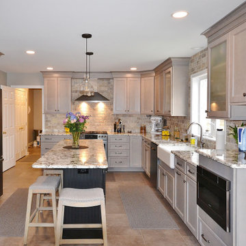
Avondale PA full kitchen remodel. Echelon cabinetry in the Addison door with Graystone finish were used on the perimeter along with a contrasting island in Onyx finish. Doing some slight design changes and some reduced depth cabinetry we were able to design an island with seating into this new kitchen. Luxury vinyl tile was chosen for the flooring it looks just like tile and is very durable as well as being softer and warmer under foot. Granite countertops in Orion White and tumbled Silver Travertine backsplash tie all the colors together. New LED recessed and under cabinetry lights provide great general and task lighting. The new picture looks like a beautiful framed painting but it also doubles as a new TV.
Sponsored
Sunbury, OH

J.Holderby - Renovations
Franklin County's Leading General Contractors - 2X Best of Houzz!
 Cooperman & Co. Luxury Interior Design
The Petal & Poppy Home is a vibrant, collected family residence defined by bold color, layered pattern, and a confident sense of personality. Designed over several years as the young family grew, the home reflects an evolving story rooted in warmth, creativity, and a love of expressive interiors.
Color guided the design from the outset. A blue grasscloth dining room and an existing pink Persian rug in the formal living room became the foundation for a palette that unfolded organically throughout the home. With clients eager to mix patterns and embrace saturated hues, the design process focused on contrast, cohesion, and joyful self-expression.
The entry makes an immediate statement with a playful spotted stair runner, oversized artwork, and a high-gloss black handrail that introduces graphic contrast. The formal living room, designed for entertaining, is the moodiest space in the home. Dark garnet walls and a commissioned piece by local artist Carrie Gillen create a dramatic backdrop, while pink tweed swivel chairs and a tailored charcoal sofa complete a space designed for lingering.
Beyond French doors, the home office is an immersive mix of pattern and color, with wallpaper wrapping both walls and ceiling. A leopard carpet and modern crystal chandelier add a touch of glamour, resulting in a space that feels energizing and personal. The dining room continues the confident use of blue, layering patterns around a custom round pedestal table designed for everyday meals and gatherings alike.
At the heart of the home, the family room was designed for togetherness. A bright blue sectional anchors the space, complemented by custom ottomans on hidden casters and softened with tailored throw pillows. Existing bookshelves are refreshed with a Peter Fasano wallcovering, creating a collected, lived-in backdrop.
Upstairs, the primary suite offers a softer expression of color, blending blues, oranges, and pinks, while built-in window benches add moments of comfort. The children’s bedrooms balance playfulness with longevity, layered with color and texture designed to grow alongside them.
The Petal & Poppy Home is a celebration of color, creativity, and family life—an interior that feels intentionally layered, expressive, and deeply personal, designed to evolve over time.
 Ashley Salmons Interiors
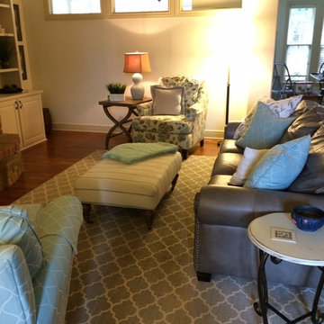
Here's an after of the fully furnished new living room! The dark-stained built-ins and darker gold paint that once graced this living room just made the room feel cave-like. I suggested painting the built-ins a light ivory/white along with the mantle piece, and suggested a softer wall color to help brighten this once-dark room! The before picture shows the dark built-ins, but we had already painted over the old gold paint. The lighter paint finishes along with the cheery light blues and greys in the fabrics we chose really brought the cottage feel to this space!
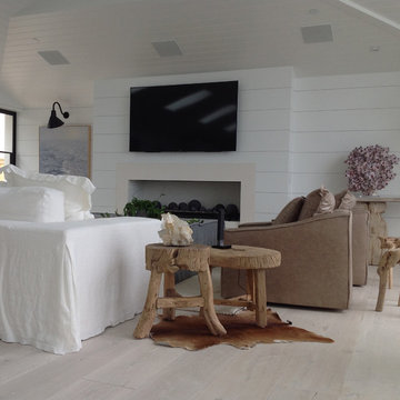
 Beauxbois Custom Wood Flooring
Appalachian oak wide plank low VOC custom stain
Large minimalist formal and open concept light wood floor and brown floor living room photo in Los Angeles with a wall-mounted tv, white walls, a ribbon fireplace and a tile fireplace
Large minimalist formal and open concept light wood floor and brown floor living room photo in Los Angeles with a wall-mounted tv, white walls, a ribbon fireplace and a tile fireplace
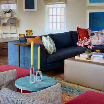 Cooperman & Co. Luxury Interior Design
The Petal & Poppy Home is a vibrant, collected family residence defined by bold color, layered pattern, and a confident sense of personality. Designed over several years as the young family grew, the home reflects an evolving story rooted in warmth, creativity, and a love of expressive interiors.
Color guided the design from the outset. A blue grasscloth dining room and an existing pink Persian rug in the formal living room became the foundation for a palette that unfolded organically throughout the home. With clients eager to mix patterns and embrace saturated hues, the design process focused on contrast, cohesion, and joyful self-expression.
The entry makes an immediate statement with a playful spotted stair runner, oversized artwork, and a high-gloss black handrail that introduces graphic contrast. The formal living room, designed for entertaining, is the moodiest space in the home. Dark garnet walls and a commissioned piece by local artist Carrie Gillen create a dramatic backdrop, while pink tweed swivel chairs and a tailored charcoal sofa complete a space designed for lingering.
Beyond French doors, the home office is an immersive mix of pattern and color, with wallpaper wrapping both walls and ceiling. A leopard carpet and modern crystal chandelier add a touch of glamour, resulting in a space that feels energizing and personal. The dining room continues the confident use of blue, layering patterns around a custom round pedestal table designed for everyday meals and gatherings alike.
At the heart of the home, the family room was designed for togetherness. A bright blue sectional anchors the space, complemented by custom ottomans on hidden casters and softened with tailored throw pillows. Existing bookshelves are refreshed with a Peter Fasano wallcovering, creating a collected, lived-in backdrop.
Upstairs, the primary suite offers a softer expression of color, blending blues, oranges, and pinks, while built-in window benches add moments of comfort. The children’s bedrooms balance playfulness with longevity, layered with color and texture designed to grow alongside them.
The Petal & Poppy Home is a celebration of color, creativity, and family life—an interior that feels intentionally layered, expressive, and deeply personal, designed to evolve over time.

Sponsored
Columbus, OH
Free consultation for landscape design!

Peabody Landscape Group
Columbus' Reliable Landscape Design & Contracting
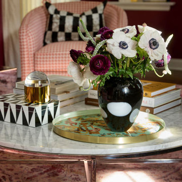 Cooperman & Co. Luxury Interior Design
The Petal & Poppy Home is a vibrant, collected family residence defined by bold color, layered pattern, and a confident sense of personality. Designed over several years as the young family grew, the home reflects an evolving story rooted in warmth, creativity, and a love of expressive interiors.
Color guided the design from the outset. A blue grasscloth dining room and an existing pink Persian rug in the formal living room became the foundation for a palette that unfolded organically throughout the home. With clients eager to mix patterns and embrace saturated hues, the design process focused on contrast, cohesion, and joyful self-expression.
The entry makes an immediate statement with a playful spotted stair runner, oversized artwork, and a high-gloss black handrail that introduces graphic contrast. The formal living room, designed for entertaining, is the moodiest space in the home. Dark garnet walls and a commissioned piece by local artist Carrie Gillen create a dramatic backdrop, while pink tweed swivel chairs and a tailored charcoal sofa complete a space designed for lingering.
Beyond French doors, the home office is an immersive mix of pattern and color, with wallpaper wrapping both walls and ceiling. A leopard carpet and modern crystal chandelier add a touch of glamour, resulting in a space that feels energizing and personal. The dining room continues the confident use of blue, layering patterns around a custom round pedestal table designed for everyday meals and gatherings alike.
At the heart of the home, the family room was designed for togetherness. A bright blue sectional anchors the space, complemented by custom ottomans on hidden casters and softened with tailored throw pillows. Existing bookshelves are refreshed with a Peter Fasano wallcovering, creating a collected, lived-in backdrop.
Upstairs, the primary suite offers a softer expression of color, blending blues, oranges, and pinks, while built-in window benches add moments of comfort. The children’s bedrooms balance playfulness with longevity, layered with color and texture designed to grow alongside them.
The Petal & Poppy Home is a celebration of color, creativity, and family life—an interior that feels intentionally layered, expressive, and deeply personal, designed to evolve over time.
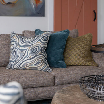 In Detail Interiors
Cozy and Colorful Beach House Remodel!
When you think funky little house by the beach – images like what you are about to see may not be what you would have anticipated. This furnishings project aimed to capture a colorful, fun, active space for a family who wanted to feel at home .Thus, creating casual and comfortable but not boring in the least. A little traveled, a lot of texture, and not much clutter!
From the start, the space was not much to write home about!
The common living areas were boxy with lower ceilings. Quirky ins and outs needed to be optimized. Overall, this project was a prime opportunity for us to really dig in. From treating each room top to bottom and finding the client’s mojo when it came to wallcoverings. Selecting funky lighting and the right mix and match of bold colors and more natural, organic textures.
We came in too late to get involved with the kitchen but helped the client with a few little accents and color choices. Thus, acting as a jumping off point for the large dining space featuring a beautiful (and resilient!) wooden trestle table. We created a mix of seating that offers a little funk, and the fun additional cabinet storage to each end which offered a hideaway. We loved that this vista had such opportunity for great lighting and art, also!
A Colorful, Cozy Living Room
We knew we needed a cozy, lower profile seating area but also some sort of great reading nook by the fireplace. With the large windows and the main entry just off this space, a traffic pattern was delianted that helped guide decisions with the furniture. A funky, nubbier woven fabric on the sectional that hinted towards mid-century modern. The irregular shaped, petrified wood coffee table. The bold statement and colors carried through in the wallcovering and area rug. Jumping to the fireplace area where you can lounge or read with those gorgeous cognac leather recliners. This space needed to feel separate and the same all at once. The balance of scale and colors really helped achieve this!
Can’t forget the bedrooms!
Of course we can’t get by without mentioning a little bedroom love, either.
In the master the overall designs dictated by a bold, saturated woven wood cloth on the headboard wall. We love the mix of color and pattern in here. The bold, sexier mood is 100% a byproduct of the level of rich colors and unusual combinations. Those bold hand-glazed ceramic lamps against those strict geo-pattern bed pillows – so good!
Our sweet tween bedroom that should grow with her for a good, long time. All in all, filled with original art and layered in a softer palette. There was a lot of matching in here at first, but once we convinced her to trust us she started to understand why adding in the unexpected hit of bright coral and spring green made everything sing!
 Kathleen Jennison
An Arts & Crafts Bungalow is one of my favorite styles of homes. We have quite a few of them in our Stockton Mid-Town area. And when C&L called us to help them remodel their 1923 American Bungalow, I was beyond thrilled.
As per usual, when we get a new inquiry, we quickly Google the project location while we are talking to you on the phone. My excitement escalated when I saw the Google Earth Image of the sweet Sage Green bungalow in Mid-Town Stockton. "Yes, we would be interested in working with you," I said trying to keep my cool.
But what made it even better was meeting C&L and touring their home, because they are the nicest young couple, eager to make their home period perfect. Unfortunately, it had been slightly molested by some bad house-flippers, and we needed to bring the bathroom back to it "roots."
We knew we had to banish the hideous brown tile and cheap vanity quickly. But C&L complained about the condensation problems and the constant fight with mold. This immediately told me that improper remodeling had occurred and we needed to remedy that right away.
The Before: Frustrations with a Botched Remodel
The bathroom needed to be brought back to period appropriate design with all the functionality of a modern bathroom. We thought of things like marble countertop, white mosaic floor tiles, white subway tile, board and batten molding, and of course a fabulous wallpaper.
This small (and only) bathroom on a tight budget required a little bit of design sleuthing to figure out how we could get the proper look and feel. Our goal was to determine where to splurge and where to economize and how to complete the remodel as quickly as possible because C&L would have to move out while construction was going on.
The Process: Hard Work to Remedy Design and Function
During our initial design study, (which included 2 hours in the owners’ home), we noticed framed images of William Morris Arts and Crafts textile patterns and knew this would be our design inspiration. We presented C&L with three options and they quickly selected the Pimpernel Design Concept.
We had originally selected the Black and Olive colors with a black vanity, mirror, and black and white floor tile. C&L liked it but weren’t quite sure about the black, We went back to the drawing board and decided the William & Co Pimpernel Wallpaper in Bayleaf and Manilla color with a softer gray painted vanity and mirror and white floor tile was more to their liking.
After the Design Concept was approved, we went to work securing the building permit, procuring all the elements, and scheduling our trusted tradesmen to perform the work.
We did uncover some shoddy work by the flippers such as live electrical wires hidden behind the wall, plumbing venting cut-off and buried in the walls (hence the constant dampness), the tub barely balancing on two fence boards across the floor joist, and no insulation on the exterior wall.
All of the previous blunders were fixed and the bathroom put back to its previous glory. We could feel the house thanking us for making it pretty again.
The After Reveal: Cohesive Design Decisions
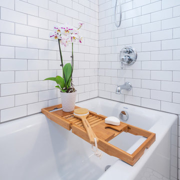
We selected a simple white subway tile for the tub/shower. This is always classic and in keeping with the style of the house.
We selected a pre-fab vanity and mirror, but they look rich with the quartz countertop. There is much more storage in this small vanity than you would think.
The Transformation: A Period Perfect Refresh
We began the remodel just as the pandemic reared and stay-in-place orders went into effect. As C&L were already moved out and living with relatives, we got the go-ahead from city officials to get the work done (after all, how can you shelter in place without a bathroom?).
All our tradesmen were scheduled to work so that only one crew was on the job site at a time. We stayed on the original schedule with only a one week delay.
The end result is the sweetest little bathroom I've ever seen (and I can't wait to start work on C&L's kitchen next).
Thank you for joining me in this project transformation. I hope this inspired you to think about being creative with your design projects, determining what works best in keeping with the architecture of your space, and carefully assessing how you can have the best life in your home.
23