
Search results for "Flat rate" in Home Design Ideas
 Arlington Designer Homes, Inc.
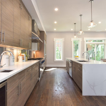
Example of a large trendy galley dark wood floor and brown floor eat-in kitchen design in DC Metro with a single-bowl sink, flat-panel cabinets, brown cabinets, quartzite countertops, multicolored backsplash, glass tile backsplash, stainless steel appliances, an island and white countertops
 JKC Inc General Contractor
K Love
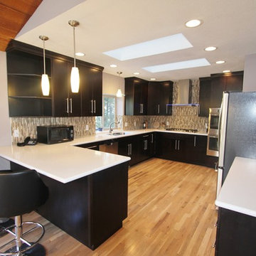
Mid-sized trendy u-shaped kitchen photo in Phoenix with flat-panel cabinets, dark wood cabinets, solid surface countertops and a peninsula
Mid-sized trendy u-shaped kitchen photo in Phoenix with flat-panel cabinets, dark wood cabinets, solid surface countertops and a peninsula
 Drury Design
THE SETUP
The original primary bathroom was characterized by a disjointed and segmented layout. The shower featured a bulky glass-block enclosure that overwhelmed the space visually. There was a considerable amount of open, unused space, and despite having a his and hers vanity, the arrangement lacked personal space for each user, as they shared the conjoined space between the sinks. The toilet was inconveniently located right by the door, with a half-wall partition meant to provide privacy but instead contributing to a cramped and unbalanced feel. Overall, the bathroom’s layout and design were fragmented, failing to make the most of the available space and lacking adequate storage solutions.
Design objectives:
- Reconfigure the layout to enhance functionality and flow.
- Create an elegant, upscale aesthetic that is light and bright.
- Incorporate specialized storage solutions for female hair care needs.
- Increase overall storage capacity.
- Develop a spa-like shower experience.
- Provide a significant wow factor to the space.
THE REMODEL
Design challenges to be solved:
- Repositioning the toilet to a more suitable location.
- Designing hair care storage solutions without cluttering the elegant space.
- Balancing an upscale, elegant design with a feminine touch in the color palette.
- Increasing the brightness of the room without adding windows.
- Completely replacing the existing shower to create a spa-like experience.
- Planning new storage solutions without adding bulkiness or clutter to the cabinetry.
THE RENEWED SPACE
Design solutions:
Toilet Relocation: Moved the toilet by the window, creating a better overall layout that also opened up two full walls for cabinetry and storage solutions.
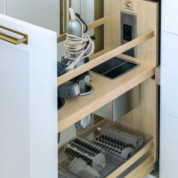
Specialized Vanity Storage: The left side of the left vanity is the wife’s. Open shelves facing across the vanity can be used for decorative or daily needs items. Pull-out docking drawers with power outlets and metal basins handle hot hair appliances.
Bright and Elegant Color Scheme: White cabinets, countertops, floors, and shower walls keep the space bright. The just-off-white wall color with a hint of pink adds a feminine touch. Thin wainscoting with white trim offers traditional-leaning elegance.
Layered Lighting Strategy: Ceiling can lights, sconces, lighted mirrors, and toe-kick lighting were installed. Natural light-rated bulbs keep the space bright and natural-feeling.
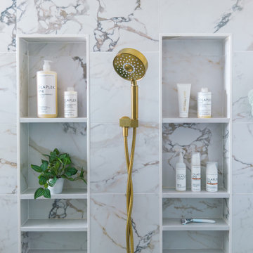
Spa-Like Shower: An extra-large shower was created using the same floor tile materials for continuity. Equipped with a Kohler Anthem system with a shower head, hand-held, and four body sprays. His and Hers niches for separate body care product storage.
Enhanced Storage Solutions: Added a linen cabinet within the vanity area for efficient storage of towels and bathroom essentials.
This elegant bathroom feels incredibly spacious now. The color palette and lights keep the room bright and cheery. Gold fixtures, the herringbone pattern on the floor, and exquisite trim work add an elegant touch. With the husband and wife having their own vanity wall sections joined at the corner, each user truly has their own space within the space. The clients are very happy with the final result.
Find the right local pro for your project
 Consolid
Job done:
Demolition of the old kitchen and all drywall
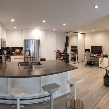
Installation of 20+ ft steel structural I-beam, increasing kitchen size, new electrical, plumbing, Quiet Rock Sheetrock (to boost sound insulation), 33 fire-rated and sound insulated recessed lights (in the entire apartment).
Design and installation of new cabinets, countertop, backsplash, floor tile, wooden floors and appliances.
 Naikoon Contracting Ltd
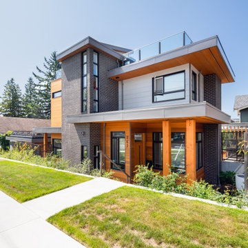
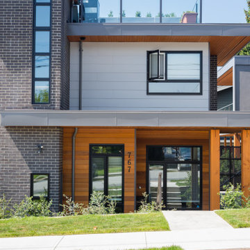
The Missing Middle. A unique development in the Moodyville neighbourhood of North Vancouver.
Working with Tina Hubert Architect, and Design Studio 8, we’ve completed a development project that fits the Missing Middle to a tee, and mix in our unique flavour of energy-efficient building.
We’ve subdivided a 66′ wide, duplex-zoned lot into two new lots. One lot has a 700 sq. foot laneway home and a 2600 square foot main home.
The other lot has two detached 1800 square foot homes, and a shared garage.
We’re up to our usual tricks here: each of the homes we have built is 40% better than building code in terms of energy efficiency, and we’re aiming to have them certified Built Green Platinum, and three of the four homes have received the Energy Star rating.
We’re excited to have brought together energy-efficient housing with a building style that revitalizes neighbourhoods and promotes diversity!
 Drury Design
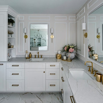
THE SETUP
The original primary bathroom was characterized by a disjointed and segmented layout. The shower featured a bulky glass-block enclosure that overwhelmed the space visually. There was a considerable amount of open, unused space, and despite having a his and hers vanity, the arrangement lacked personal space for each user, as they shared the conjoined space between the sinks. The toilet was inconveniently located right by the door, with a half-wall partition meant to provide privacy but instead contributing to a cramped and unbalanced feel. Overall, the bathroom’s layout and design were fragmented, failing to make the most of the available space and lacking adequate storage solutions.
Design objectives:
- Reconfigure the layout to enhance functionality and flow.
- Create an elegant, upscale aesthetic that is light and bright.
- Incorporate specialized storage solutions for female hair care needs.
- Increase overall storage capacity.
- Develop a spa-like shower experience.
- Provide a significant wow factor to the space.
THE REMODEL
Design challenges to be solved:
- Repositioning the toilet to a more suitable location.
- Designing hair care storage solutions without cluttering the elegant space.
- Balancing an upscale, elegant design with a feminine touch in the color palette.
- Increasing the brightness of the room without adding windows.
- Completely replacing the existing shower to create a spa-like experience.
- Planning new storage solutions without adding bulkiness or clutter to the cabinetry.
THE RENEWED SPACE
Design solutions:
Toilet Relocation: Moved the toilet by the window, creating a better overall layout that also opened up two full walls for cabinetry and storage solutions.
Specialized Vanity Storage: The left side of the left vanity is the wife’s. Open shelves facing across the vanity can be used for decorative or daily needs items. Pull-out docking drawers with power outlets and metal basins handle hot hair appliances.
Bright and Elegant Color Scheme: White cabinets, countertops, floors, and shower walls keep the space bright. The just-off-white wall color with a hint of pink adds a feminine touch. Thin wainscoting with white trim offers traditional-leaning elegance.
Layered Lighting Strategy: Ceiling can lights, sconces, lighted mirrors, and toe-kick lighting were installed. Natural light-rated bulbs keep the space bright and natural-feeling.
Spa-Like Shower: An extra-large shower was created using the same floor tile materials for continuity. Equipped with a Kohler Anthem system with a shower head, hand-held, and four body sprays. His and Hers niches for separate body care product storage.
Enhanced Storage Solutions: Added a linen cabinet within the vanity area for efficient storage of towels and bathroom essentials.
This elegant bathroom feels incredibly spacious now. The color palette and lights keep the room bright and cheery. Gold fixtures, the herringbone pattern on the floor, and exquisite trim work add an elegant touch. With the husband and wife having their own vanity wall sections joined at the corner, each user truly has their own space within the space. The clients are very happy with the final result.
 Distinctive Kitchens
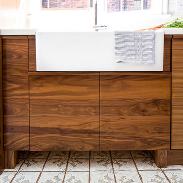
Designed by Distinctive Kitchens Seattle.
For the Admiral Tudor kitchen, we wanted a rich, textured feel with exquisite detail and carefully considered construction. The custom walnut cabinetry plays beautifully with the Lacanche range in Armor, and the simple backsplash allows the calacatta marble countertop to take top billing The end result is one of the most unique, gorgeous and functional kitchens we've ever designed.
Photo by Wynne Earle Photography

 Drury Design
THE SETUP
The original primary bathroom was characterized by a disjointed and segmented layout. The shower featured a bulky glass-block enclosure that overwhelmed the space visually. There was a considerable amount of open, unused space, and despite having a his and hers vanity, the arrangement lacked personal space for each user, as they shared the conjoined space between the sinks. The toilet was inconveniently located right by the door, with a half-wall partition meant to provide privacy but instead contributing to a cramped and unbalanced feel. Overall, the bathroom’s layout and design were fragmented, failing to make the most of the available space and lacking adequate storage solutions.
Design objectives:
- Reconfigure the layout to enhance functionality and flow.
- Create an elegant, upscale aesthetic that is light and bright.
- Incorporate specialized storage solutions for female hair care needs.
- Increase overall storage capacity.
- Develop a spa-like shower experience.
- Provide a significant wow factor to the space.
THE REMODEL
Design challenges to be solved:
- Repositioning the toilet to a more suitable location.
- Designing hair care storage solutions without cluttering the elegant space.
- Balancing an upscale, elegant design with a feminine touch in the color palette.
- Increasing the brightness of the room without adding windows.
- Completely replacing the existing shower to create a spa-like experience.
- Planning new storage solutions without adding bulkiness or clutter to the cabinetry.
THE RENEWED SPACE
Design solutions:
Toilet Relocation: Moved the toilet by the window, creating a better overall layout that also opened up two full walls for cabinetry and storage solutions.
Specialized Vanity Storage: The left side of the left vanity is the wife’s. Open shelves facing across the vanity can be used for decorative or daily needs items. Pull-out docking drawers with power outlets and metal basins handle hot hair appliances.
Bright and Elegant Color Scheme: White cabinets, countertops, floors, and shower walls keep the space bright. The just-off-white wall color with a hint of pink adds a feminine touch. Thin wainscoting with white trim offers traditional-leaning elegance.
Layered Lighting Strategy: Ceiling can lights, sconces, lighted mirrors, and toe-kick lighting were installed. Natural light-rated bulbs keep the space bright and natural-feeling.
Spa-Like Shower: An extra-large shower was created using the same floor tile materials for continuity. Equipped with a Kohler Anthem system with a shower head, hand-held, and four body sprays. His and Hers niches for separate body care product storage.
Enhanced Storage Solutions: Added a linen cabinet within the vanity area for efficient storage of towels and bathroom essentials.
This elegant bathroom feels incredibly spacious now. The color palette and lights keep the room bright and cheery. Gold fixtures, the herringbone pattern on the floor, and exquisite trim work add an elegant touch. With the husband and wife having their own vanity wall sections joined at the corner, each user truly has their own space within the space. The clients are very happy with the final result.
 Naikoon Contracting Ltd
The Missing Middle. A unique development in the Moodyville neighbourhood of North Vancouver.
Working with Tina Hubert Architect, and Design Studio 8, we’ve completed a development project that fits the Missing Middle to a tee, and mix in our unique flavour of energy-efficient building.
We’ve subdivided a 66′ wide, duplex-zoned lot into two new lots. One lot has a 700 sq. foot laneway home and a 2600 square foot main home.
The other lot has two detached 1800 square foot homes, and a shared garage.
We’re up to our usual tricks here: each of the homes we have built is 40% better than building code in terms of energy efficiency, and we’re aiming to have them certified Built Green Platinum, and three of the four homes have received the Energy Star rating.
We’re excited to have brought together energy-efficient housing with a building style that revitalizes neighbourhoods and promotes diversity!
 We Got Lites
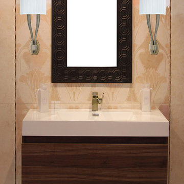
Add instant style to any room with this transitional cast brass wall sconce from the Sterling Collection. Adding to its refined look is a pleated white fabric shade.
Measurements and Information:
Width: 10.25"
Height: 22.25"
Depth: 4.5"
Approximate hanging weight: 8 pounds
Finish: Antique Brass
2 Lights
Accommodates 2 x 40 watt (max.) candelabra base bulbs
Safety Rating: UL and CUL listed
 Naikoon Contracting Ltd
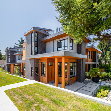
The Missing Middle. A unique development in the Moodyville neighbourhood of North Vancouver.
Working with Tina Hubert Architect, and Design Studio 8, we’ve completed a development project that fits the Missing Middle to a tee, and mix in our unique flavour of energy-efficient building.
We’ve subdivided a 66′ wide, duplex-zoned lot into two new lots. One lot has a 700 sq. foot laneway home and a 2600 square foot main home.
The other lot has two detached 1800 square foot homes, and a shared garage.
We’re up to our usual tricks here: each of the homes we have built is 40% better than building code in terms of energy efficiency, and we’re aiming to have them certified Built Green Platinum, and three of the four homes have received the Energy Star rating.
We’re excited to have brought together energy-efficient housing with a building style that revitalizes neighbourhoods and promotes diversity!
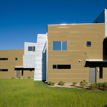
 Dynia Architects
This mixed-income housing development on six acres in town is adjacent to national forest. Conservation concerns restricted building south of the creek and budgets led to efficient layouts.
All of the units have decks and primary spaces facing south for sun and mountain views; an orientation reflected in the building forms. The seven detached market-rate duplexes along the creek subsidized the deed restricted two- and three-story attached duplexes along the street and west boundary which can be entered through covered access from street and courtyard. This arrangement of the units forms a courtyard and thus unifies them into a single community.
The use of corrugated, galvanized metal and fiber cement board – requiring limited maintenance – references ranch and agricultural buildings. These vernacular references, combined with the arrangement of units, integrate the housing development into the fabric of the region.
A.I.A. Wyoming Chapter Design Award of Citation 2008
Project Year: 2009
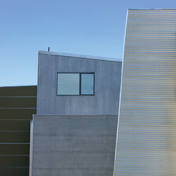 Dynia Architects
This mixed-income housing development on six acres in town is adjacent to national forest. Conservation concerns restricted building south of the creek and budgets led to efficient layouts.
All of the units have decks and primary spaces facing south for sun and mountain views; an orientation reflected in the building forms. The seven detached market-rate duplexes along the creek subsidized the deed restricted two- and three-story attached duplexes along the street and west boundary which can be entered through covered access from street and courtyard. This arrangement of the units forms a courtyard and thus unifies them into a single community.
The use of corrugated, galvanized metal and fiber cement board – requiring limited maintenance – references ranch and agricultural buildings. These vernacular references, combined with the arrangement of units, integrate the housing development into the fabric of the region.
A.I.A. Wyoming Chapter Design Award of Citation 2008
Project Year: 2009

Sponsored
Columbus, OH

Wannemacher Interiors
Customized Award-Winning Interior Design Solutions in Franklin Cnty OH
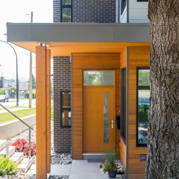 Naikoon Contracting Ltd
The Missing Middle. A unique development in the Moodyville neighbourhood of North Vancouver.
Working with Tina Hubert Architect, and Design Studio 8, we’ve completed a development project that fits the Missing Middle to a tee, and mix in our unique flavour of energy-efficient building.
We’ve subdivided a 66′ wide, duplex-zoned lot into two new lots. One lot has a 700 sq. foot laneway home and a 2600 square foot main home.
The other lot has two detached 1800 square foot homes, and a shared garage.
We’re up to our usual tricks here: each of the homes we have built is 40% better than building code in terms of energy efficiency, and we’re aiming to have them certified Built Green Platinum, and three of the four homes have received the Energy Star rating.
We’re excited to have brought together energy-efficient housing with a building style that revitalizes neighbourhoods and promotes diversity!
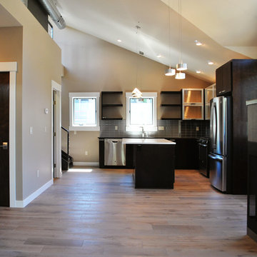
 REYNOLDS ASH + ASSOCIATES
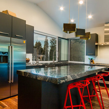
The second floor (main living level) has vaulted ceilings, following the roof lines. The great room includes a 3-sided gas fireplace, with tile and reclaimed timber trim. The kitchen contains contemporary European cabinets with base cabinets of flush horizontal maple in a charcoal finish, with stainless steel upper cabinets. The counter tops are Silestone and all appliances are GE Profile series, stainless steel and are EnergyStar* rated. Photography by Heather Mace of RA+A.
 Alliance Green Builders
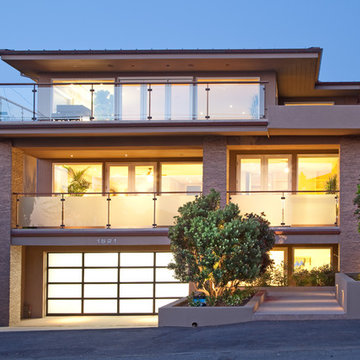
This 5,347' was the third San Diego county custom home to be rewarded LEED Platinum certification. LEED-certified homes complete a technically rigorous process that includes a home energy (HERS) rating and onsite inspections to verify that the home is built to be energy and water efficient, environmentally sound, and a healthier place to live.
 Naikoon Contracting Ltd
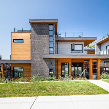
The Missing Middle. A unique development in the Moodyville neighbourhood of North Vancouver.
Working with Tina Hubert Architect, and Design Studio 8, we’ve completed a development project that fits the Missing Middle to a tee, and mix in our unique flavour of energy-efficient building.
We’ve subdivided a 66′ wide, duplex-zoned lot into two new lots. One lot has a 700 sq. foot laneway home and a 2600 square foot main home.
The other lot has two detached 1800 square foot homes, and a shared garage.
We’re up to our usual tricks here: each of the homes we have built is 40% better than building code in terms of energy efficiency, and we’re aiming to have them certified Built Green Platinum, and three of the four homes have received the Energy Star rating.
We’re excited to have brought together energy-efficient housing with a building style that revitalizes neighbourhoods and promotes diversity!

 Dream Design Build
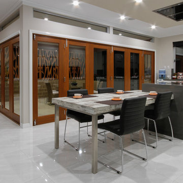
Display home designed by Dream Design Build for Pocock Building Company. This home achieved an 8 Star Energy Efficiency Rating and provides a wonderfully open indoor/outdoor living experience.
 Chelsea Building Group
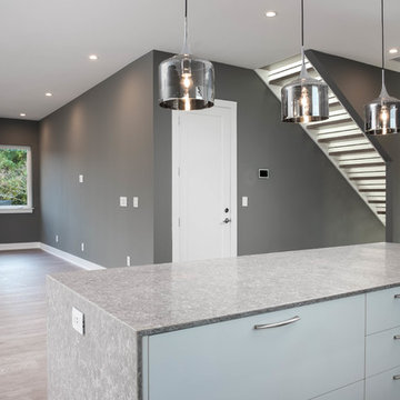
This spacious modern kitchen boasts an oversized island with engineered quartz waterfall counters. A cool color palette and streamlined cabinets and fixtures makes this kitchen a minimalists’ dream. Open to the living room and dining room, this kitchen is fabulous for entertaining. With ReAlta, we are introducing for the first time in Charlotte a fully solar community. Each beautifully detailed home will incorporate low profile solar panels that will collect the sun’s rays to significantly offset the home’s energy usage. Combined with our industry-leading Home Efficiency Ratings (HERS), these solar systems will save a ReAlta homeowner thousands over the life of the home. Credit: Brendan Kahm
 Zola European Windows
Located in, Summit Park, Park City UT lies one of the most efficient houses in the country. The Summit Haus – designed and built by Chris Price of PCD+B, is an exploration in design and construction of advanced high performance housing. Seeing a rising demand for sustainable housing along with rising Carbon emissions leading to global warming, this house strives to show that sensible, good design can create spaces adequate for today’s housing demands while adhering to strict standards. The house was designed to meet the very rigid Passiv House rating system – 90% more efficient than a typical home in the area.
The house itself was intended to nestle neatly into the 45 degree sloped site and to take full advantage of the limited solar access and views. The views range from short, highly wooded views to a long corridor out towards the Uinta Mountain range towards the east. The house was designed and built based off Passiv Haus standards, and the framing and ventilation became critical elements to maintain such minimal energy requirements.
Zola triple-pane, tilt-and-turn Thermo uPVC windows contribute substantially to the home’s energy efficiency, and takes advantage of the beautiful surrounding of the location, including forrest views from the deck off of the kitchen.
Photographer: City Home Collective
32