
Search results for "Forward thinking approach" in Home Design Ideas

 Mottram Architecture
Timber frame homes offer unique challenges during a remodel. What often makes them beautiful and attractive to most homeowners, also makes them challenging for space requirements.
Context: The lovely couple that owned this home were struggling with some interesting floor plan challenges that just didn't work for their family. The loved the beautiful timbers and woodwork of their home, but the dramatically sloping ceilings on the second floor, particularly in the bathroom, just didn't work for this 1 1/2 bath home. Needing to use the skylight to approach the toilet was a less then ideal scenario. Although the bathroom footprint was more then adequate, the sloped ceiling only made half of the space useable. Check out the Before/After post on our blog to see the photos of the house pre-renovation. As much as they loved all the wood features in their home, another challenge they had was light. The wood ceiling made everything inside the house darker, even with a fantastic array of south facing windows, there were spaces in the home that felt dark and small. When they contacted us they wanted to know how could they make their brighter and more inviting, were there solutions to the 2nd floor sloped ceiling issues, and if they were going to do all of this work, how could they make their home more comfortable and efficient. A nagging water leak in the upstairs bathroom spurred them into action and here is how we solved their dilemma.
Conclusion: First, we added a little dormer to the rear of the house so we could get full headroom in nearly all of the upstairs bathroom! Then we decided to extend that dormer one more timber bay over to create a walk in closet with natural light and plenty of space. Since we were contemplating energy efficiency, we resolved a nagging issue that is present in a lot of timber frame construction, air tightness. Commonly found in timber frame construction, fiberglass insulation is installed in the rafter bays and board ceilings are installed over top. Unfortunately, board ceilings are anything but air tight, and fiberglass insulation needs to be in an airtight cavity for maximum effectiveness. So we were able to solve two issues at the same time for this homeowner. We removed the board ceiling and fiberglass insulation, we dense packed the rafter bays with cellulose insulation, and installed sheetrock in place of the boards. The boards were salvaged for re-use by the homeowner, and the space and light quality was dramatically improved. Some may think that losing the board ceiling took something away from the space, but what you'll see in the pictures is that it highly accentuates the heavy timbers and really makes them stand out in a beautiful way. Now with this added airtightness, better insulation, and brighter space, the homeowner hardly runs their wood stove, and it's so quiet in the space, an added bonus from changing the insulation. It became necessary to also add a sheetrock ceiling to the living room to hide the plumbing from the new bathroom layout above. Changing this ceiling gave the homeowner some real quality lighting that was lacking in the living room before. The brighter ceiling and new lighting layout completely transforms the living room into a space you want to hang out, even though the layout didn't change at all. When the homeowner saw the finished spaces she said "I can't believe this is my house, I want to live in this house"
Energy Efficiency: I touched a little on the efficiency above, but like all projects done with Mottram Architecture, we always want to leave you with a little extra. Timber frame construction with board ceilings and fiberglass insulation are notoriously leaky! If you want to know what we think about fiberglass insulation, check our our blog post on Why Fiberglass Insulation Sucks. By installing cellulose insulation and covering it with sheetrock we were able to greatly reduce the heat flowing out of this home. It not only improves cashflow it improves the comfort level in the space. Who wants to sit in their living room and feel a draft? Let us remind you, we are not saying cellulose insulation is an air barrier, we use the sheetrock to help with that, but it does significantly reduce the air flow over fiberglass insulation. And when we reduce the airflow, we reduce the heat flow. And when we reduce the heat flow, we reduce the need to re-heat that drafty air from outside. When it comes to energy efficiency the first and best place to start is air infiltration. We greatly reduced the air infiltration with the new insulation, but we also added a hat and warm boots. What I mean by that is, we improved the insulation in the roof, and we installed insulation in the basement. Maybe it's a silly analogy, but when you think about keeping warm, we always start with the hat and boots! With sustainability in mind, the next project will be to add a deck to the front of this house with rain catchment barrels from the metal roof. They are planning to plant a garden in the spring and the rain catchment system will help to irrigate the new garden.
Builder: East Shore Builders
Photographer: Michael Eric Berube

 Gallery KBNY
In this Manhattan pied-à-terre renovation, Gallery tackled the entire apartment. A true full renovation, we updated the kitchen, master bathroom, and powder room, installed new flooring throughout the entire space, and built the entertainment center in the living room.
DESIGN DETAILS
The clients wanted their pied-à-terre to have some modern touches, but not too sleek or contemporary. Since it combines a number of styles and elements, transitional turned out to be their ideal aesthetic. Whites, grays, and earthy tones carried this color theme throughout the apartment.
One of the clients is an artist and wanted wall space to display their original work, visible in the dining area and powder room in the photos below. The entertainment center is another highlight, with its white mosaic brick tile accent wall and glass open shelves to display family photos on both sides.
Instead of tiles, the new powder room walls received a textured concrete application, resulting in an almost industrial vibe. In the master bathroom renovation, glass mosaic tile accent walls bring a touch of personality to both the shower and a storage nook opposite the vanity.
UNIQUELY-SHAPED ROOMS
We specialize in adapting to every potential challenge, including uniquely-shaped rooms like the nearly-triangular kitchen in this Manhattan pied-à-terre renovation.
It’s important to design an uncommonly-shaped space as practically as possible, including specs seemingly as small as sink positioning. Every little detail counts tenfold in a room that’s not rectangular!
Other design details in the kitchen renovation include the classic combination of Shaker-style cabinets and quartz countertops, with a glass mosaic backsplash that matches the one used in the bathroom.
VISIBILITY = TRUST
Communication is always a core value at Gallery, but it’s even more vital when working with bi-coastal clients who were in another state throughout almost the entire process. We met with them once; everything else was done virtually thanks to JobTracker, our project management system.
The client had complete visibility into the renovation, including all design renderings, scheduled installations, and daily progress videos and photos. Even though they were 3000 miles away, they had a direct line to everyone on the team at all times.
SOME HIGHLIGHTS
- Entertainment center designed and built to serve as focal point, with white brick mosaic accent wall and open shelves made of glass
- Track lighting for ease of displaying art and to preserve ceiling height instead of the dropped ceiling that recessed lighting would necessitate
- Deliberate consideration of space in the unusually-shaped, nearly triangular kitchen
- Glass mosaic tile accent walls in the master bathroom with matching tile for the backsplash in the kitchen
Thinking about renovating your bathroom? Contact us today to find out how you can benefit from our expertise in remodeling New York City bathrooms. As a design-and-build firm with a full-scale approach, we handle every single aspect of your home renovation from start to finish.

 Cantoni Irvine
When Irvine designer, Richard Bustos’ client decided to remodel his Orange County 4,900 square foot home into a contemporary space, he immediately thought of Cantoni. His main concern though was based on the assumption that our luxurious modern furnishings came with an equally luxurious price tag. It was only after a visit to our Irvine store, where the client and Richard connected that the client realized our extensive collection of furniture and accessories was well within his reach.
“Richard was very thorough and straight forward as far as pricing,” says the client. "I became very intrigued that he was able to offer high quality products that I was looking for within my budget.”
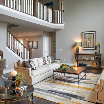
The next phases of the project involved looking over floor plans and discussing the client’s vision as far as design. The goal was to create a comfortable, yet stylish and modern layout for the client, his wife, and their three kids. In addition to creating a cozy and contemporary space, the client wanted his home to exude a tranquil atmosphere. Drawing most of his inspiration from Houzz, (the leading online platform for home remodeling and design) the client incorporated a Zen-like ambiance through the distressed greyish brown flooring, organic bamboo wall art, and with Richard’s help, earthy wall coverings, found in both the master bedroom and bathroom.
Over the span of approximately two years, Richard helped his client accomplish his vision by selecting pieces of modern furniture that possessed the right colors, earthy tones, and textures so as to complement the home’s pre-existing features.
The first room the duo tackled was the great room, and later continued furnishing the kitchen and master bedroom. Living up to its billing, the great room not only opened up to a breathtaking view of the Newport coast, it also was one great space. Richard decided that the best option to maximize the space would be to break the room into two separate yet distinct areas for living and dining.
While exploring our online collections, the client discovered the Jasper Shag rug in a bold and vibrant green. The grassy green rug paired with the sleek Italian made Montecarlo glass dining table added just the right amount of color and texture to compliment the natural beauty of the bamboo sculpture. The client happily adds, “I’m always receiving complements on the green rug!”
Once the duo had completed the dining area, they worked on furnishing the living area, and later added pieces like the classic Renoir bed to the master bedroom and Crescent Console to the kitchen, which adds both balance and sophistication. The living room, also known as the family room was the central area where Richard’s client and his family would spend quality time. As a fellow family man, Richard understood that that meant creating an inviting space with comfortable and durable pieces of furniture that still possessed a modern flare. The client loved the look and design of the Mercer sectional. With Cantoni’s ability to customize furniture, Richard was able to special order the sectional in a fabric that was both durable and aesthetically pleasing.
Selecting the color scheme for the living room was also greatly influenced by the client’s pre-existing artwork as well as unique distressed floors. Richard recommended adding dark pieces of furniture as seen in the Mercer sectional along with the Viera area rug. He explains, “The darker colors and contrast of the rug’s material worked really well with the distressed wood floor.” Furthermore, the comfortable American Leather Recliner, which was customized in red leather not only maximized the space, but also tied in the client’s picturesque artwork beautifully. The client adds gratefully, “Richard was extremely helpful with color; He was great at seeing if I was taking it too far or not enough.”
It is apparent that Richard and his client made a great team. With the client’s passion for great design and Richard’s design expertise, together they transformed the home into a modern sanctuary. Working with this particular client was a very rewarding experience for Richard. He adds, “My client and his family were so easy and fun to work with. Their enthusiasm, focus, and involvement are what helped me bring their ideas to life. I think we created a unique environment that their entire family can enjoy for many years to come.”
https://www.cantoni.com/project/a-contemporary-sanctuary
Find the right local pro for your project
 Gallery KBNY
In this Manhattan pied-à-terre renovation, Gallery tackled the entire apartment. A true full renovation, we updated the kitchen, master bathroom, and powder room, installed new flooring throughout the entire space, and built the entertainment center in the living room.
DESIGN DETAILS
The clients wanted their pied-à-terre to have some modern touches, but not too sleek or contemporary. Since it combines a number of styles and elements, transitional turned out to be their ideal aesthetic. Whites, grays, and earthy tones carried this color theme throughout the apartment.
One of the clients is an artist and wanted wall space to display their original work, visible in the dining area and powder room in the photos below. The entertainment center is another highlight, with its white mosaic brick tile accent wall and glass open shelves to display family photos on both sides.
Instead of tiles, the new powder room walls received a textured concrete application, resulting in an almost industrial vibe. In the master bathroom renovation, glass mosaic tile accent walls bring a touch of personality to both the shower and a storage nook opposite the vanity.
UNIQUELY-SHAPED ROOMS
We specialize in adapting to every potential challenge, including uniquely-shaped rooms like the nearly-triangular kitchen in this Manhattan pied-à-terre renovation.
It’s important to design an uncommonly-shaped space as practically as possible, including specs seemingly as small as sink positioning. Every little detail counts tenfold in a room that’s not rectangular!
Other design details in the kitchen renovation include the classic combination of Shaker-style cabinets and quartz countertops, with a glass mosaic backsplash that matches the one used in the bathroom.
VISIBILITY = TRUST
Communication is always a core value at Gallery, but it’s even more vital when working with bi-coastal clients who were in another state throughout almost the entire process. We met with them once; everything else was done virtually thanks to JobTracker, our project management system.
The client had complete visibility into the renovation, including all design renderings, scheduled installations, and daily progress videos and photos. Even though they were 3000 miles away, they had a direct line to everyone on the team at all times.
SOME HIGHLIGHTS
- Entertainment center designed and built to serve as focal point, with white brick mosaic accent wall and open shelves made of glass
- Track lighting for ease of displaying art and to preserve ceiling height instead of the dropped ceiling that recessed lighting would necessitate
- Deliberate consideration of space in the unusually-shaped, nearly triangular kitchen
- Glass mosaic tile accent walls in the master bathroom with matching tile for the backsplash in the kitchen
Thinking about renovating your bathroom? Contact us today to find out how you can benefit from our expertise in remodeling New York City bathrooms. As a design-and-build firm with a full-scale approach, we handle every single aspect of your home renovation from start to finish.
 Mottram Architecture
The builder laid custom wide plank flooring in the upstairs hall and flex space stained to match the existing woodwork of the timber frame construction.
Timber frame homes offer unique challenges during a remodel. What often makes them beautiful and attractive to most homeowners, also makes them challenging for space requirements.
Context: The lovely couple that owned this home were struggling with some interesting floor plan challenges that just didn't work for their family. The loved the beautiful timbers and woodwork of their home, but the dramatically sloping ceilings on the second floor, particularly in the bathroom, just didn't work for this 1 1/2 bath home. Needing to use the skylight to approach the toilet was a less then ideal scenario. Although the bathroom footprint was more then adequate, the sloped ceiling only made half of the space useable. Check out the Before/After post on our blog to see the photos of the house pre-renovation. As much as they loved all the wood features in their home, another challenge they had was light. The wood ceiling made everything inside the house darker, even with a fantastic array of south facing windows, there were spaces in the home that felt dark and small. When they contacted us they wanted to know how could they make their brighter and more inviting, were there solutions to the 2nd floor sloped ceiling issues, and if they were going to do all of this work, how could they make their home more comfortable and efficient. A nagging water leak in the upstairs bathroom spurred them into action and here is how we solved their dilemma.
Conclusion: First, we added a little dormer to the rear of the house so we could get full headroom in nearly all of the upstairs bathroom! Then we decided to extend that dormer one more timber bay over to create a walk in closet with natural light and plenty of space. Since we were contemplating energy efficiency, we resolved a nagging issue that is present in a lot of timber frame construction, air tightness. Commonly found in timber frame construction, fiberglass insulation is installed in the rafter bays and board ceilings are installed over top. Unfortunately, board ceilings are anything but air tight, and fiberglass insulation needs to be in an airtight cavity for maximum effectiveness. So we were able to solve two issues at the same time for this homeowner. We removed the board ceiling and fiberglass insulation, we dense packed the rafter bays with cellulose insulation, and installed sheetrock in place of the boards. The boards were salvaged for re-use by the homeowner, and the space and light quality was dramatically improved. Some may think that losing the board ceiling took something away from the space, but what you'll see in the pictures is that it highly accentuates the heavy timbers and really makes them stand out in a beautiful way. Now with this added airtightness, better insulation, and brighter space, the homeowner hardly runs their wood stove, and it's so quiet in the space, an added bonus from changing the insulation. It became necessary to also add a sheetrock ceiling to the living room to hide the plumbing from the new bathroom layout above. Changing this ceiling gave the homeowner some real quality lighting that was lacking in the living room before. The brighter ceiling and new lighting layout completely transforms the living room into a space you want to hang out, even though the layout didn't change at all. When the homeowner saw the finished spaces she said "I can't believe this is my house, I want to live in this house"
Energy Efficiency: I touched a little on the efficiency above, but like all projects done with Mottram Architecture, we always want to leave you with a little extra. Timber frame construction with board ceilings and fiberglass insulation are notoriously leaky! If you want to know what we think about fiberglass insulation, check our our blog post on Why Fiberglass Insulation Sucks. By installing cellulose insulation and covering it with sheetrock we were able to greatly reduce the heat flowing out of this home. It not only improves cashflow it improves the comfort level in the space. Who wants to sit in their living room and feel a draft? Let us remind you, we are not saying cellulose insulation is an air barrier, we use the sheetrock to help with that, but it does significantly reduce the air flow over fiberglass insulation. And when we reduce the airflow, we reduce the heat flow. And when we reduce the heat flow, we reduce the need to re-heat that drafty air from outside. When it comes to energy efficiency the first and best place to start is air infiltration. We greatly reduced the air infiltration with the new insulation, but we also added a hat and warm boots. What I mean by that is, we improved the insulation in the roof, and we installed insulation in the basement. Maybe it's a silly analogy, but when you think about keeping warm, we always start with the hat and boots! With sustainability in mind, the next project will be to add a deck to the front of this house with rain catchment barrels from the metal roof. They are planning to plant a garden in the spring and the rain catchment system will help to irrigate the new garden.
Builder: East Shore Builders
Photographer: Michael Eric Berube
 Mottram Architecture
Timber frame homes offer unique challenges during a remodel. What often makes them beautiful and attractive to most homeowners, also makes them challenging for space requirements.
Context: The lovely couple that owned this home were struggling with some interesting floor plan challenges that just didn't work for their family. The loved the beautiful timbers and woodwork of their home, but the dramatically sloping ceilings on the second floor, particularly in the bathroom, just didn't work for this 1 1/2 bath home. Needing to use the skylight to approach the toilet was a less then ideal scenario. Although the bathroom footprint was more then adequate, the sloped ceiling only made half of the space useable. Check out the Before/After post on our blog to see the photos of the house pre-renovation. As much as they loved all the wood features in their home, another challenge they had was light. The wood ceiling made everything inside the house darker, even with a fantastic array of south facing windows, there were spaces in the home that felt dark and small. When they contacted us they wanted to know how could they make their brighter and more inviting, were there solutions to the 2nd floor sloped ceiling issues, and if they were going to do all of this work, how could they make their home more comfortable and efficient. A nagging water leak in the upstairs bathroom spurred them into action and here is how we solved their dilemma.
Conclusion: First, we added a little dormer to the rear of the house so we could get full headroom in nearly all of the upstairs bathroom! Then we decided to extend that dormer one more timber bay over to create a walk in closet with natural light and plenty of space. Since we were contemplating energy efficiency, we resolved a nagging issue that is present in a lot of timber frame construction, air tightness. Commonly found in timber frame construction, fiberglass insulation is installed in the rafter bays and board ceilings are installed over top. Unfortunately, board ceilings are anything but air tight, and fiberglass insulation needs to be in an airtight cavity for maximum effectiveness. So we were able to solve two issues at the same time for this homeowner. We removed the board ceiling and fiberglass insulation, we dense packed the rafter bays with cellulose insulation, and installed sheetrock in place of the boards. The boards were salvaged for re-use by the homeowner, and the space and light quality was dramatically improved. Some may think that losing the board ceiling took something away from the space, but what you'll see in the pictures is that it highly accentuates the heavy timbers and really makes them stand out in a beautiful way. Now with this added airtightness, better insulation, and brighter space, the homeowner hardly runs their wood stove, and it's so quiet in the space, an added bonus from changing the insulation. It became necessary to also add a sheetrock ceiling to the living room to hide the plumbing from the new bathroom layout above. Changing this ceiling gave the homeowner some real quality lighting that was lacking in the living room before. The brighter ceiling and new lighting layout completely transforms the living room into a space you want to hang out, even though the layout didn't change at all. When the homeowner saw the finished spaces she said "I can't believe this is my house, I want to live in this house"
Energy Efficiency: I touched a little on the efficiency above, but like all projects done with Mottram Architecture, we always want to leave you with a little extra. Timber frame construction with board ceilings and fiberglass insulation are notoriously leaky! If you want to know what we think about fiberglass insulation, check our our blog post on Why Fiberglass Insulation Sucks. By installing cellulose insulation and covering it with sheetrock we were able to greatly reduce the heat flowing out of this home. It not only improves cashflow it improves the comfort level in the space. Who wants to sit in their living room and feel a draft? Let us remind you, we are not saying cellulose insulation is an air barrier, we use the sheetrock to help with that, but it does significantly reduce the air flow over fiberglass insulation. And when we reduce the airflow, we reduce the heat flow. And when we reduce the heat flow, we reduce the need to re-heat that drafty air from outside. When it comes to energy efficiency the first and best place to start is air infiltration. We greatly reduced the air infiltration with the new insulation, but we also added a hat and warm boots. What I mean by that is, we improved the insulation in the roof, and we installed insulation in the basement. Maybe it's a silly analogy, but when you think about keeping warm, we always start with the hat and boots! With sustainability in mind, the next project will be to add a deck to the front of this house with rain catchment barrels from the metal roof. They are planning to plant a garden in the spring and the rain catchment system will help to irrigate the new garden.
Builder: East Shore Builders
Photographer: Michael Eric Berube
 Cantoni Irvine
When Irvine designer, Richard Bustos’ client decided to remodel his Orange County 4,900 square foot home into a contemporary space, he immediately thought of Cantoni. His main concern though was based on the assumption that our luxurious modern furnishings came with an equally luxurious price tag. It was only after a visit to our Irvine store, where the client and Richard connected that the client realized our extensive collection of furniture and accessories was well within his reach.
“Richard was very thorough and straight forward as far as pricing,” says the client. "I became very intrigued that he was able to offer high quality products that I was looking for within my budget.”
The next phases of the project involved looking over floor plans and discussing the client’s vision as far as design. The goal was to create a comfortable, yet stylish and modern layout for the client, his wife, and their three kids. In addition to creating a cozy and contemporary space, the client wanted his home to exude a tranquil atmosphere. Drawing most of his inspiration from Houzz, (the leading online platform for home remodeling and design) the client incorporated a Zen-like ambiance through the distressed greyish brown flooring, organic bamboo wall art, and with Richard’s help, earthy wall coverings, found in both the master bedroom and bathroom.
Over the span of approximately two years, Richard helped his client accomplish his vision by selecting pieces of modern furniture that possessed the right colors, earthy tones, and textures so as to complement the home’s pre-existing features.
The first room the duo tackled was the great room, and later continued furnishing the kitchen and master bedroom. Living up to its billing, the great room not only opened up to a breathtaking view of the Newport coast, it also was one great space. Richard decided that the best option to maximize the space would be to break the room into two separate yet distinct areas for living and dining.
While exploring our online collections, the client discovered the Jasper Shag rug in a bold and vibrant green. The grassy green rug paired with the sleek Italian made Montecarlo glass dining table added just the right amount of color and texture to compliment the natural beauty of the bamboo sculpture. The client happily adds, “I’m always receiving complements on the green rug!”
Once the duo had completed the dining area, they worked on furnishing the living area, and later added pieces like the classic Renoir bed to the master bedroom and Crescent Console to the kitchen, which adds both balance and sophistication. The living room, also known as the family room was the central area where Richard’s client and his family would spend quality time. As a fellow family man, Richard understood that that meant creating an inviting space with comfortable and durable pieces of furniture that still possessed a modern flare. The client loved the look and design of the Mercer sectional. With Cantoni’s ability to customize furniture, Richard was able to special order the sectional in a fabric that was both durable and aesthetically pleasing.
Selecting the color scheme for the living room was also greatly influenced by the client’s pre-existing artwork as well as unique distressed floors. Richard recommended adding dark pieces of furniture as seen in the Mercer sectional along with the Viera area rug. He explains, “The darker colors and contrast of the rug’s material worked really well with the distressed wood floor.” Furthermore, the comfortable American Leather Recliner, which was customized in red leather not only maximized the space, but also tied in the client’s picturesque artwork beautifully. The client adds gratefully, “Richard was extremely helpful with color; He was great at seeing if I was taking it too far or not enough.”
It is apparent that Richard and his client made a great team. With the client’s passion for great design and Richard’s design expertise, together they transformed the home into a modern sanctuary. Working with this particular client was a very rewarding experience for Richard. He adds, “My client and his family were so easy and fun to work with. Their enthusiasm, focus, and involvement are what helped me bring their ideas to life. I think we created a unique environment that their entire family can enjoy for many years to come.”
https://www.cantoni.com/project/a-contemporary-sanctuary
Sponsored
Sunbury, OH

J.Holderby - Renovations
Franklin County's Leading General Contractors - 2X Best of Houzz!
 Gallery KBNY
In this Manhattan pied-à-terre renovation, Gallery tackled the entire apartment. A true full renovation, we updated the kitchen, master bathroom, and powder room, installed new flooring throughout the entire space, and built the entertainment center in the living room.
DESIGN DETAILS
The clients wanted their pied-à-terre to have some modern touches, but not too sleek or contemporary. Since it combines a number of styles and elements, transitional turned out to be their ideal aesthetic. Whites, grays, and earthy tones carried this color theme throughout the apartment.
One of the clients is an artist and wanted wall space to display their original work, visible in the dining area and powder room in the photos below. The entertainment center is another highlight, with its white mosaic brick tile accent wall and glass open shelves to display family photos on both sides.
Instead of tiles, the new powder room walls received a textured concrete application, resulting in an almost industrial vibe. In the master bathroom renovation, glass mosaic tile accent walls bring a touch of personality to both the shower and a storage nook opposite the vanity.
UNIQUELY-SHAPED ROOMS
We specialize in adapting to every potential challenge, including uniquely-shaped rooms like the nearly-triangular kitchen in this Manhattan pied-à-terre renovation.
It’s important to design an uncommonly-shaped space as practically as possible, including specs seemingly as small as sink positioning. Every little detail counts tenfold in a room that’s not rectangular!
Other design details in the kitchen renovation include the classic combination of Shaker-style cabinets and quartz countertops, with a glass mosaic backsplash that matches the one used in the bathroom.
VISIBILITY = TRUST
Communication is always a core value at Gallery, but it’s even more vital when working with bi-coastal clients who were in another state throughout almost the entire process. We met with them once; everything else was done virtually thanks to JobTracker, our project management system.
The client had complete visibility into the renovation, including all design renderings, scheduled installations, and daily progress videos and photos. Even though they were 3000 miles away, they had a direct line to everyone on the team at all times.
SOME HIGHLIGHTS
- Entertainment center designed and built to serve as focal point, with white brick mosaic accent wall and open shelves made of glass
- Track lighting for ease of displaying art and to preserve ceiling height instead of the dropped ceiling that recessed lighting would necessitate
- Deliberate consideration of space in the unusually-shaped, nearly triangular kitchen
- Glass mosaic tile accent walls in the master bathroom with matching tile for the backsplash in the kitchen
Thinking about renovating your bathroom? Contact us today to find out how you can benefit from our expertise in remodeling New York City bathrooms. As a design-and-build firm with a full-scale approach, we handle every single aspect of your home renovation from start to finish.
 Cantoni Irvine
When Irvine designer, Richard Bustos’ client decided to remodel his Orange County 4,900 square foot home into a contemporary space, he immediately thought of Cantoni. His main concern though was based on the assumption that our luxurious modern furnishings came with an equally luxurious price tag. It was only after a visit to our Irvine store, where the client and Richard connected that the client realized our extensive collection of furniture and accessories was well within his reach.
“Richard was very thorough and straight forward as far as pricing,” says the client. "I became very intrigued that he was able to offer high quality products that I was looking for within my budget.”
The next phases of the project involved looking over floor plans and discussing the client’s vision as far as design. The goal was to create a comfortable, yet stylish and modern layout for the client, his wife, and their three kids. In addition to creating a cozy and contemporary space, the client wanted his home to exude a tranquil atmosphere. Drawing most of his inspiration from Houzz, (the leading online platform for home remodeling and design) the client incorporated a Zen-like ambiance through the distressed greyish brown flooring, organic bamboo wall art, and with Richard’s help, earthy wall coverings, found in both the master bedroom and bathroom.
Over the span of approximately two years, Richard helped his client accomplish his vision by selecting pieces of modern furniture that possessed the right colors, earthy tones, and textures so as to complement the home’s pre-existing features.
The first room the duo tackled was the great room, and later continued furnishing the kitchen and master bedroom. Living up to its billing, the great room not only opened up to a breathtaking view of the Newport coast, it also was one great space. Richard decided that the best option to maximize the space would be to break the room into two separate yet distinct areas for living and dining.
While exploring our online collections, the client discovered the Jasper Shag rug in a bold and vibrant green. The grassy green rug paired with the sleek Italian made Montecarlo glass dining table added just the right amount of color and texture to compliment the natural beauty of the bamboo sculpture. The client happily adds, “I’m always receiving complements on the green rug!”
Once the duo had completed the dining area, they worked on furnishing the living area, and later added pieces like the classic Renoir bed to the master bedroom and Crescent Console to the kitchen, which adds both balance and sophistication. The living room, also known as the family room was the central area where Richard’s client and his family would spend quality time. As a fellow family man, Richard understood that that meant creating an inviting space with comfortable and durable pieces of furniture that still possessed a modern flare. The client loved the look and design of the Mercer sectional. With Cantoni’s ability to customize furniture, Richard was able to special order the sectional in a fabric that was both durable and aesthetically pleasing.
Selecting the color scheme for the living room was also greatly influenced by the client’s pre-existing artwork as well as unique distressed floors. Richard recommended adding dark pieces of furniture as seen in the Mercer sectional along with the Viera area rug. He explains, “The darker colors and contrast of the rug’s material worked really well with the distressed wood floor.” Furthermore, the comfortable American Leather Recliner, which was customized in red leather not only maximized the space, but also tied in the client’s picturesque artwork beautifully. The client adds gratefully, “Richard was extremely helpful with color; He was great at seeing if I was taking it too far or not enough.”
It is apparent that Richard and his client made a great team. With the client’s passion for great design and Richard’s design expertise, together they transformed the home into a modern sanctuary. Working with this particular client was a very rewarding experience for Richard. He adds, “My client and his family were so easy and fun to work with. Their enthusiasm, focus, and involvement are what helped me bring their ideas to life. I think we created a unique environment that their entire family can enjoy for many years to come.”
https://www.cantoni.com/project/a-contemporary-sanctuary
 Drury Design
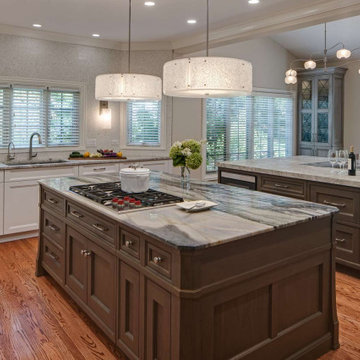
Maybe you can relate to these empty nesters who reached out to us to design and build a new kitchen for their current and long term needs. They do lots of entertaining, have an extensive wine collection and enjoy welcoming more grandchildren into the family. Both cook, although he prefers his grill. They wanted their new kitchen to be an open space that is easier to move around in. They were also looking forward to more storage and new, state-of-the-art appliances.
Design objectives:
-New layout to accommodate large groups for frequent entertaining
-Big island to seat as many people as possible
Improve traffic flow by omitting a counter peninsula by the family room and other cabinet barriers
-Main cooktop to face visitors with point-of-use spices, utensils, pots & pans nearby
-Multiple cooking & refrigeration appliances
-Plan for as much countertop space as possible for multiple cooks
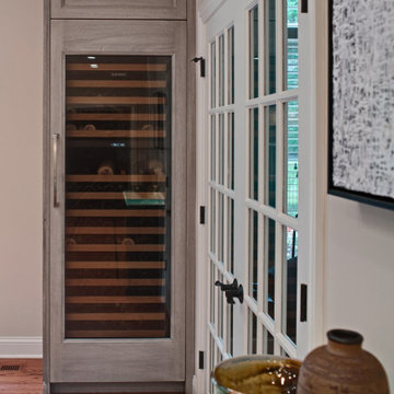
-Dedicated spaces needed for wine, liquor, cold drinks & decorative glassware
-Incorporate special details such as thick or waterfall countertops, unique backsplash, wood accents
-Need better task, ambient and general lighting
-Make it beautiful – a kitchen the homeowners could be proud of
-Seamlessly join kitchen with breakfast room, given load-bearing wall & various ceiling heights
-Ensure the large, newly opened space remains intimate and inclusive
-Determine how to best utilize the breakfast room, given limited availability of wall space with two sets of French doors and a large window
-Relocating two ventilation ducts currently in a wall to be removed
-Incorporate multiple appliances while adding functional storage
-Integrate special details that wouldn’t be lost in a large room
-Utilize multiple finishes and colors that provide continuity
Design solutions:
-The wall between the kitchen & breakfast nook was completely removed – the structural beam was shortened, providing the largest opening possible
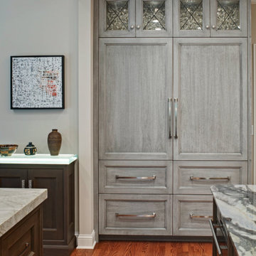
-One small wall section remained intact to relocate ductwork, which conveniently created an alcove for the dual refrigerator armoire
-Two islands in the same finish visually join the elongated room
-The cooking island includes necessary point-of-use storage along with a steam oven and additional storage on the opposite side
The wide cooking island allows for two cooks to comfortably share the counter space, allowing casual interaction
-The second island fills the center of the former breakfast room; tall cabinets in a contrasting finish flank the French doors and provide visual balance
-The sizable second island provides seating for six on a conversation-conducive curve. It houses freezer drawers, a microwave drawer, an under-counter refrigerator, plus additional storage
-Docking station inside drawer
-Two cabinet styles in three finishes provide continuity, balance and interest in the large room
While the clients didn’t have a specific vision of the remodeled space, they were completely open to new ideas and knew which features they wanted when they saw them. They were truly doing the project for their own enjoyment and that of their family and guests. We’re happy to know they are thrilled with the end result. In fact, we had so much fun working together we’re now talking about a new project!
 Drury Design
Maybe you can relate to these empty nesters who reached out to us to design and build a new kitchen for their current and long term needs. They do lots of entertaining, have an extensive wine collection and enjoy welcoming more grandchildren into the family. Both cook, although he prefers his grill. They wanted their new kitchen to be an open space that is easier to move around in. They were also looking forward to more storage and new, state-of-the-art appliances.
Design objectives:
-New layout to accommodate large groups for frequent entertaining
-Big island to seat as many people as possible
Improve traffic flow by omitting a counter peninsula by the family room and other cabinet barriers
-Main cooktop to face visitors with point-of-use spices, utensils, pots & pans nearby
-Multiple cooking & refrigeration appliances
-Plan for as much countertop space as possible for multiple cooks
-Dedicated spaces needed for wine, liquor, cold drinks & decorative glassware
-Incorporate special details such as thick or waterfall countertops, unique backsplash, wood accents
-Need better task, ambient and general lighting
-Make it beautiful – a kitchen the homeowners could be proud of
-Seamlessly join kitchen with breakfast room, given load-bearing wall & various ceiling heights
-Ensure the large, newly opened space remains intimate and inclusive
-Determine how to best utilize the breakfast room, given limited availability of wall space with two sets of French doors and a large window
-Relocating two ventilation ducts currently in a wall to be removed
-Incorporate multiple appliances while adding functional storage
-Integrate special details that wouldn’t be lost in a large room
-Utilize multiple finishes and colors that provide continuity
Design solutions:
-The wall between the kitchen & breakfast nook was completely removed – the structural beam was shortened, providing the largest opening possible
-One small wall section remained intact to relocate ductwork, which conveniently created an alcove for the dual refrigerator armoire
-Two islands in the same finish visually join the elongated room
-The cooking island includes necessary point-of-use storage along with a steam oven and additional storage on the opposite side
The wide cooking island allows for two cooks to comfortably share the counter space, allowing casual interaction
-The second island fills the center of the former breakfast room; tall cabinets in a contrasting finish flank the French doors and provide visual balance
-The sizable second island provides seating for six on a conversation-conducive curve. It houses freezer drawers, a microwave drawer, an under-counter refrigerator, plus additional storage
-Docking station inside drawer
-Two cabinet styles in three finishes provide continuity, balance and interest in the large room
While the clients didn’t have a specific vision of the remodeled space, they were completely open to new ideas and knew which features they wanted when they saw them. They were truly doing the project for their own enjoyment and that of their family and guests. We’re happy to know they are thrilled with the end result. In fact, we had so much fun working together we’re now talking about a new project!

 Donna Livingston Design
Sag Harbor’s location in the Hamptons on New York’s long island provides an aquatic backdrop for this stately home. Incorporating that light and airy ambience into the interior design of this home, white, accompanied by shades of beige, became the signature colors of this design, enriched by texture as well as the contrast of understated hues. The result is an atmosphere of sophisticated livability, making this home the peer of those in the Architectural Digest Top 100.
Part of the overall appeal of this top interior is the interplay of natural light with the equally natural materials of wood and stone, highlighted in the floors, counters and built-in cabinetry. From the remodeling of the kitchen and bathrooms, with their cream-colored cabinets and floors, to the elegant combination of warm wood floors and plush area rugs, the subtlety of the tones celebrates the beauty of this home’s architectural interior.
 Mottram Architecture
Michael Eric Berube, Maine Virtual Home ToursTimber frame homes offer unique challenges during a remodel. What often makes them beautiful and attractive to most homeowners, also makes them challenging for space requirements.
Context: The lovely couple that owned this home were struggling with some interesting floor plan challenges that just didn't work for their family. The loved the beautiful timbers and woodwork of their home, but the dramatically sloping ceilings on the second floor, particularly in the bathroom, just didn't work for this 1 1/2 bath home. Needing to use the skylight to approach the toilet was a less then ideal scenario. Although the bathroom footprint was more then adequate, the sloped ceiling only made half of the space useable. Check out the Before/After post on our blog to see the photos of the house pre-renovation. As much as they loved all the wood features in their home, another challenge they had was light. The wood ceiling made everything inside the house darker, even with a fantastic array of south facing windows, there were spaces in the home that felt dark and small. When they contacted us they wanted to know how could they make their brighter and more inviting, were there solutions to the 2nd floor sloped ceiling issues, and if they were going to do all of this work, how could they make their home more comfortable and efficient. A nagging water leak in the upstairs bathroom spurred them into action and here is how we solved their dilemma.
Conclusion: First, we added a little dormer to the rear of the house so we could get full headroom in nearly all of the upstairs bathroom! Then we decided to extend that dormer one more timber bay over to create a walk in closet with natural light and plenty of space. Since we were contemplating energy efficiency, we resolved a nagging issue that is present in a lot of timber frame construction, air tightness. Commonly found in timber frame construction, fiberglass insulation is installed in the rafter bays and board ceilings are installed over top. Unfortunately, board ceilings are anything but air tight, and fiberglass insulation needs to be in an airtight cavity for maximum effectiveness. So we were able to solve two issues at the same time for this homeowner. We removed the board ceiling and fiberglass insulation, we dense packed the rafter bays with cellulose insulation, and installed sheetrock in place of the boards. The boards were salvaged for re-use by the homeowner, and the space and light quality was dramatically improved. Some may think that losing the board ceiling took something away from the space, but what you'll see in the pictures is that it highly accentuates the heavy timbers and really makes them stand out in a beautiful way. Now with this added airtightness, better insulation, and brighter space, the homeowner hardly runs their wood stove, and it's so quiet in the space, an added bonus from changing the insulation. It became necessary to also add a sheetrock ceiling to the living room to hide the plumbing from the new bathroom layout above. Changing this ceiling gave the homeowner some real quality lighting that was lacking in the living room before. The brighter ceiling and new lighting layout completely transforms the living room into a space you want to hang out, even though the layout didn't change at all. When the homeowner saw the finished spaces she said "I can't believe this is my house, I want to live in this house"
Energy Efficiency: I touched a little on the efficiency above, but like all projects done with Mottram Architecture, we always want to leave you with a little extra. Timber frame construction with board ceilings and fiberglass insulation are notoriously leaky! If you want to know what we think about fiberglass insulation, check our our blog post on Why Fiberglass Insulation Sucks. By installing cellulose insulation and covering it with sheetrock we were able to greatly reduce the heat flowing out of this home. It not only improves cashflow it improves the comfort level in the space. Who wants to sit in their living room and feel a draft? Let us remind you, we are not saying cellulose insulation is an air barrier, we use the sheetrock to help with that, but it does significantly reduce the air flow over fiberglass insulation. And when we reduce the airflow, we reduce the heat flow. And when we reduce the heat flow, we reduce the need to re-heat that drafty air from outside. When it comes to energy efficiency the first and best place to start is air infiltration. We greatly reduced the air infiltration with the new insulation, but we also added a hat and warm boots. What I mean by that is, we improved the insulation in the roof, and we installed insulation in the basement. Maybe it's a silly analogy, but when you think about keeping warm, we always start with the hat and boots! With sustainability in mind, the next project will be to add a deck to the front of this house with rain catchment barrels from the metal roof. They are planning to plant a garden in the spring and the rain catchment system will help to irrigate the new garden.
Builder: East Shore Builders
Photographer: Michael Eric Berube

 Drury Design
Maybe you can relate to these empty nesters who reached out to us to design and build a new kitchen for their current and long term needs. They do lots of entertaining, have an extensive wine collection and enjoy welcoming more grandchildren into the family. Both cook, although he prefers his grill. They wanted their new kitchen to be an open space that is easier to move around in. They were also looking forward to more storage and new, state-of-the-art appliances.
Design objectives:
-New layout to accommodate large groups for frequent entertaining
-Big island to seat as many people as possible
Improve traffic flow by omitting a counter peninsula by the family room and other cabinet barriers
-Main cooktop to face visitors with point-of-use spices, utensils, pots & pans nearby
-Multiple cooking & refrigeration appliances
-Plan for as much countertop space as possible for multiple cooks
-Dedicated spaces needed for wine, liquor, cold drinks & decorative glassware
-Incorporate special details such as thick or waterfall countertops, unique backsplash, wood accents
-Need better task, ambient and general lighting
-Make it beautiful – a kitchen the homeowners could be proud of
-Seamlessly join kitchen with breakfast room, given load-bearing wall & various ceiling heights
-Ensure the large, newly opened space remains intimate and inclusive
-Determine how to best utilize the breakfast room, given limited availability of wall space with two sets of French doors and a large window
-Relocating two ventilation ducts currently in a wall to be removed
-Incorporate multiple appliances while adding functional storage
-Integrate special details that wouldn’t be lost in a large room
-Utilize multiple finishes and colors that provide continuity
Design solutions:
-The wall between the kitchen & breakfast nook was completely removed – the structural beam was shortened, providing the largest opening possible
-One small wall section remained intact to relocate ductwork, which conveniently created an alcove for the dual refrigerator armoire
-Two islands in the same finish visually join the elongated room
-The cooking island includes necessary point-of-use storage along with a steam oven and additional storage on the opposite side
The wide cooking island allows for two cooks to comfortably share the counter space, allowing casual interaction
-The second island fills the center of the former breakfast room; tall cabinets in a contrasting finish flank the French doors and provide visual balance
-The sizable second island provides seating for six on a conversation-conducive curve. It houses freezer drawers, a microwave drawer, an under-counter refrigerator, plus additional storage
-Docking station inside drawer
-Two cabinet styles in three finishes provide continuity, balance and interest in the large room
While the clients didn’t have a specific vision of the remodeled space, they were completely open to new ideas and knew which features they wanted when they saw them. They were truly doing the project for their own enjoyment and that of their family and guests. We’re happy to know they are thrilled with the end result. In fact, we had so much fun working together we’re now talking about a new project!
 Mottram Architecture
This half bath was converted into a full bath by adding a shower and changing the location of the existing fixtures. Now these homeowners have a first floor bedroom/bath space.
Timber frame homes offer unique challenges during a remodel. What often makes them beautiful and attractive to most homeowners, also makes them challenging for space requirements.
Context: The lovely couple that owned this home were struggling with some interesting floor plan challenges that just didn't work for their family. The loved the beautiful timbers and woodwork of their home, but the dramatically sloping ceilings on the second floor, particularly in the bathroom, just didn't work for this 1 1/2 bath home. Needing to use the skylight to approach the toilet was a less then ideal scenario. Although the bathroom footprint was more then adequate, the sloped ceiling only made half of the space useable. Check out the Before/After post on our blog to see the photos of the house pre-renovation. As much as they loved all the wood features in their home, another challenge they had was light. The wood ceiling made everything inside the house darker, even with a fantastic array of south facing windows, there were spaces in the home that felt dark and small. When they contacted us they wanted to know how could they make their brighter and more inviting, were there solutions to the 2nd floor sloped ceiling issues, and if they were going to do all of this work, how could they make their home more comfortable and efficient. A nagging water leak in the upstairs bathroom spurred them into action and here is how we solved their dilemma.
Conclusion: First, we added a little dormer to the rear of the house so we could get full headroom in nearly all of the upstairs bathroom! Then we decided to extend that dormer one more timber bay over to create a walk in closet with natural light and plenty of space. Since we were contemplating energy efficiency, we resolved a nagging issue that is present in a lot of timber frame construction, air tightness. Commonly found in timber frame construction, fiberglass insulation is installed in the rafter bays and board ceilings are installed over top. Unfortunately, board ceilings are anything but air tight, and fiberglass insulation needs to be in an airtight cavity for maximum effectiveness. So we were able to solve two issues at the same time for this homeowner. We removed the board ceiling and fiberglass insulation, we dense packed the rafter bays with cellulose insulation, and installed sheetrock in place of the boards. The boards were salvaged for re-use by the homeowner, and the space and light quality was dramatically improved. Some may think that losing the board ceiling took something away from the space, but what you'll see in the pictures is that it highly accentuates the heavy timbers and really makes them stand out in a beautiful way. Now with this added airtightness, better insulation, and brighter space, the homeowner hardly runs their wood stove, and it's so quiet in the space, an added bonus from changing the insulation. It became necessary to also add a sheetrock ceiling to the living room to hide the plumbing from the new bathroom layout above. Changing this ceiling gave the homeowner some real quality lighting that was lacking in the living room before. The brighter ceiling and new lighting layout completely transforms the living room into a space you want to hang out, even though the layout didn't change at all. When the homeowner saw the finished spaces she said "I can't believe this is my house, I want to live in this house"
Energy Efficiency: I touched a little on the efficiency above, but like all projects done with Mottram Architecture, we always want to leave you with a little extra. Timber frame construction with board ceilings and fiberglass insulation are notoriously leaky! If you want to know what we think about fiberglass insulation, check our our blog post on Why Fiberglass Insulation Sucks. By installing cellulose insulation and covering it with sheetrock we were able to greatly reduce the heat flowing out of this home. It not only improves cashflow it improves the comfort level in the space. Who wants to sit in their living room and feel a draft? Let us remind you, we are not saying cellulose insulation is an air barrier, we use the sheetrock to help with that, but it does significantly reduce the air flow over fiberglass insulation. And when we reduce the airflow, we reduce the heat flow. And when we reduce the heat flow, we reduce the need to re-heat that drafty air from outside. When it comes to energy efficiency the first and best place to start is air infiltration. We greatly reduced the air infiltration with the new insulation, but we also added a hat and warm boots. What I mean by that is, we improved the insulation in the roof, and we installed insulation in the basement. Maybe it's a silly analogy, but when you think about keeping warm, we always start with the hat and boots! With sustainability in mind, the next project will be to add a deck to the front of this house with rain catchment barrels from the metal roof. They are planning to plant a garden in the spring and the rain catchment system will help to irrigate the new garden.
Builder: East Shore Builders
Photographer: Michael Eric Berube
Michael Eric Berube, Maine Virtual Home Tours
 Mottram Architecture
Timber frame homes offer unique challenges during a remodel. What often makes them beautiful and attractive to most homeowners, also makes them challenging for space requirements.
Context: The lovely couple that owned this home were struggling with some interesting floor plan challenges that just didn't work for their family. The loved the beautiful timbers and woodwork of their home, but the dramatically sloping ceilings on the second floor, particularly in the bathroom, just didn't work for this 1 1/2 bath home. Needing to use the skylight to approach the toilet was a less then ideal scenario. Although the bathroom footprint was more then adequate, the sloped ceiling only made half of the space useable. Check out the Before/After post on our blog to see the photos of the house pre-renovation. As much as they loved all the wood features in their home, another challenge they had was light. The wood ceiling made everything inside the house darker, even with a fantastic array of south facing windows, there were spaces in the home that felt dark and small. When they contacted us they wanted to know how could they make their brighter and more inviting, were there solutions to the 2nd floor sloped ceiling issues, and if they were going to do all of this work, how could they make their home more comfortable and efficient. A nagging water leak in the upstairs bathroom spurred them into action and here is how we solved their dilemma.
Conclusion: First, we added a little dormer to the rear of the house so we could get full headroom in nearly all of the upstairs bathroom! Then we decided to extend that dormer one more timber bay over to create a walk in closet with natural light and plenty of space. Since we were contemplating energy efficiency, we resolved a nagging issue that is present in a lot of timber frame construction, air tightness. Commonly found in timber frame construction, fiberglass insulation is installed in the rafter bays and board ceilings are installed over top. Unfortunately, board ceilings are anything but air tight, and fiberglass insulation needs to be in an airtight cavity for maximum effectiveness. So we were able to solve two issues at the same time for this homeowner. We removed the board ceiling and fiberglass insulation, we dense packed the rafter bays with cellulose insulation, and installed sheetrock in place of the boards. The boards were salvaged for re-use by the homeowner, and the space and light quality was dramatically improved. Some may think that losing the board ceiling took something away from the space, but what you'll see in the pictures is that it highly accentuates the heavy timbers and really makes them stand out in a beautiful way. Now with this added airtightness, better insulation, and brighter space, the homeowner hardly runs their wood stove, and it's so quiet in the space, an added bonus from changing the insulation. It became necessary to also add a sheetrock ceiling to the living room to hide the plumbing from the new bathroom layout above. Changing this ceiling gave the homeowner some real quality lighting that was lacking in the living room before. The brighter ceiling and new lighting layout completely transforms the living room into a space you want to hang out, even though the layout didn't change at all. When the homeowner saw the finished spaces she said "I can't believe this is my house, I want to live in this house"
Energy Efficiency: I touched a little on the efficiency above, but like all projects done with Mottram Architecture, we always want to leave you with a little extra. Timber frame construction with board ceilings and fiberglass insulation are notoriously leaky! If you want to know what we think about fiberglass insulation, check our our blog post on Why Fiberglass Insulation Sucks. By installing cellulose insulation and covering it with sheetrock we were able to greatly reduce the heat flowing out of this home. It not only improves cashflow it improves the comfort level in the space. Who wants to sit in their living room and feel a draft? Let us remind you, we are not saying cellulose insulation is an air barrier, we use the sheetrock to help with that, but it does significantly reduce the air flow over fiberglass insulation. And when we reduce the airflow, we reduce the heat flow. And when we reduce the heat flow, we reduce the need to re-heat that drafty air from outside. When it comes to energy efficiency the first and best place to start is air infiltration. We greatly reduced the air infiltration with the new insulation, but we also added a hat and warm boots. What I mean by that is, we improved the insulation in the roof, and we installed insulation in the basement. Maybe it's a silly analogy, but when you think about keeping warm, we always start with the hat and boots! With sustainability in mind, the next project will be to add a deck to the front of this house with rain catchment barrels from the metal roof. They are planning to plant a garden in the spring and the rain catchment system will help to irrigate the new garden.
Builder: East Shore Builders
Photographer: Michael Eric Berube
 Gallery KBNY
In this Manhattan pied-à-terre renovation, Gallery tackled the entire apartment. A true full renovation, we updated the kitchen, master bathroom, and powder room, installed new flooring throughout the entire space, and built the entertainment center in the living room.
DESIGN DETAILS
The clients wanted their pied-à-terre to have some modern touches, but not too sleek or contemporary. Since it combines a number of styles and elements, transitional turned out to be their ideal aesthetic. Whites, grays, and earthy tones carried this color theme throughout the apartment.
One of the clients is an artist and wanted wall space to display their original work, visible in the dining area and powder room in the photos below. The entertainment center is another highlight, with its white mosaic brick tile accent wall and glass open shelves to display family photos on both sides.
Instead of tiles, the new powder room walls received a textured concrete application, resulting in an almost industrial vibe. In the master bathroom renovation, glass mosaic tile accent walls bring a touch of personality to both the shower and a storage nook opposite the vanity.
UNIQUELY-SHAPED ROOMS
We specialize in adapting to every potential challenge, including uniquely-shaped rooms like the nearly-triangular kitchen in this Manhattan pied-à-terre renovation.
It’s important to design an uncommonly-shaped space as practically as possible, including specs seemingly as small as sink positioning. Every little detail counts tenfold in a room that’s not rectangular!
Other design details in the kitchen renovation include the classic combination of Shaker-style cabinets and quartz countertops, with a glass mosaic backsplash that matches the one used in the bathroom.
VISIBILITY = TRUST
Communication is always a core value at Gallery, but it’s even more vital when working with bi-coastal clients who were in another state throughout almost the entire process. We met with them once; everything else was done virtually thanks to JobTracker, our project management system.
The client had complete visibility into the renovation, including all design renderings, scheduled installations, and daily progress videos and photos. Even though they were 3000 miles away, they had a direct line to everyone on the team at all times.
SOME HIGHLIGHTS
- Entertainment center designed and built to serve as focal point, with white brick mosaic accent wall and open shelves made of glass
- Track lighting for ease of displaying art and to preserve ceiling height instead of the dropped ceiling that recessed lighting would necessitate
- Deliberate consideration of space in the unusually-shaped, nearly triangular kitchen
- Glass mosaic tile accent walls in the master bathroom with matching tile for the backsplash in the kitchen
Thinking about renovating your bathroom? Contact us today to find out how you can benefit from our expertise in remodeling New York City bathrooms. As a design-and-build firm with a full-scale approach, we handle every single aspect of your home renovation from start to finish.

 Gallery KBNY
In this Manhattan pied-à-terre renovation, Gallery tackled the entire apartment. A true full renovation, we updated the kitchen, master bathroom, and powder room, installed new flooring throughout the entire space, and built the entertainment center in the living room.
DESIGN DETAILS
The clients wanted their pied-à-terre to have some modern touches, but not too sleek or contemporary. Since it combines a number of styles and elements, transitional turned out to be their ideal aesthetic. Whites, grays, and earthy tones carried this color theme throughout the apartment.
One of the clients is an artist and wanted wall space to display their original work, visible in the dining area and powder room in the photos below. The entertainment center is another highlight, with its white mosaic brick tile accent wall and glass open shelves to display family photos on both sides.
Instead of tiles, the new powder room walls received a textured concrete application, resulting in an almost industrial vibe. In the master bathroom renovation, glass mosaic tile accent walls bring a touch of personality to both the shower and a storage nook opposite the vanity.
UNIQUELY-SHAPED ROOMS
We specialize in adapting to every potential challenge, including uniquely-shaped rooms like the nearly-triangular kitchen in this Manhattan pied-à-terre renovation.
It’s important to design an uncommonly-shaped space as practically as possible, including specs seemingly as small as sink positioning. Every little detail counts tenfold in a room that’s not rectangular!
Other design details in the kitchen renovation include the classic combination of Shaker-style cabinets and quartz countertops, with a glass mosaic backsplash that matches the one used in the bathroom.
VISIBILITY = TRUST
Communication is always a core value at Gallery, but it’s even more vital when working with bi-coastal clients who were in another state throughout almost the entire process. We met with them once; everything else was done virtually thanks to JobTracker, our project management system.
The client had complete visibility into the renovation, including all design renderings, scheduled installations, and daily progress videos and photos. Even though they were 3000 miles away, they had a direct line to everyone on the team at all times.
SOME HIGHLIGHTS
- Entertainment center designed and built to serve as focal point, with white brick mosaic accent wall and open shelves made of glass
- Track lighting for ease of displaying art and to preserve ceiling height instead of the dropped ceiling that recessed lighting would necessitate
- Deliberate consideration of space in the unusually-shaped, nearly triangular kitchen
- Glass mosaic tile accent walls in the master bathroom with matching tile for the backsplash in the kitchen
Thinking about renovating your bathroom? Contact us today to find out how you can benefit from our expertise in remodeling New York City bathrooms. As a design-and-build firm with a full-scale approach, we handle every single aspect of your home renovation from start to finish.
 Drury Design
Maybe you can relate to these empty nesters who reached out to us to design and build a new kitchen for their current and long term needs. They do lots of entertaining, have an extensive wine collection and enjoy welcoming more grandchildren into the family. Both cook, although he prefers his grill. They wanted their new kitchen to be an open space that is easier to move around in. They were also looking forward to more storage and new, state-of-the-art appliances.
Design objectives:
-New layout to accommodate large groups for frequent entertaining
-Big island to seat as many people as possible
Improve traffic flow by omitting a counter peninsula by the family room and other cabinet barriers
-Main cooktop to face visitors with point-of-use spices, utensils, pots & pans nearby
-Multiple cooking & refrigeration appliances
-Plan for as much countertop space as possible for multiple cooks
-Dedicated spaces needed for wine, liquor, cold drinks & decorative glassware
-Incorporate special details such as thick or waterfall countertops, unique backsplash, wood accents
-Need better task, ambient and general lighting
-Make it beautiful – a kitchen the homeowners could be proud of
-Seamlessly join kitchen with breakfast room, given load-bearing wall & various ceiling heights
-Ensure the large, newly opened space remains intimate and inclusive
-Determine how to best utilize the breakfast room, given limited availability of wall space with two sets of French doors and a large window
-Relocating two ventilation ducts currently in a wall to be removed
-Incorporate multiple appliances while adding functional storage
-Integrate special details that wouldn’t be lost in a large room
-Utilize multiple finishes and colors that provide continuity
Design solutions:
-The wall between the kitchen & breakfast nook was completely removed – the structural beam was shortened, providing the largest opening possible
-One small wall section remained intact to relocate ductwork, which conveniently created an alcove for the dual refrigerator armoire
-Two islands in the same finish visually join the elongated room
-The cooking island includes necessary point-of-use storage along with a steam oven and additional storage on the opposite side
The wide cooking island allows for two cooks to comfortably share the counter space, allowing casual interaction
-The second island fills the center of the former breakfast room; tall cabinets in a contrasting finish flank the French doors and provide visual balance
-The sizable second island provides seating for six on a conversation-conducive curve. It houses freezer drawers, a microwave drawer, an under-counter refrigerator, plus additional storage
-Docking station inside drawer
-Two cabinet styles in three finishes provide continuity, balance and interest in the large room
While the clients didn’t have a specific vision of the remodeled space, they were completely open to new ideas and knew which features they wanted when they saw them. They were truly doing the project for their own enjoyment and that of their family and guests. We’re happy to know they are thrilled with the end result. In fact, we had so much fun working together we’re now talking about a new project!
 J Design Group - Interior Designers Miami - Modern
MIAMI HOME AND DECOR MAGAZINE selected our client’s luxury house in Key west Florida to publish it in their issue and they Said:
A LIFE IN PARADISE
ONE NEWLYWED COUPLE’S HOME MARRIES ELEMENTS OF SAND AND SEA IN KEY WEST
NTERIOR DESIGN BY JENNIFER CORREDOR,
J DESIGN GROUP, CORAL GABLES, FL
TEXT BY CHRISTINE DAVIS
PHOTOGRAPHY BY DANIEL NEWCOMB,
PALM BEACH GARDENS, FL
Homeowner Kirk Holland bought a piece of paradise in Key West’s historic Casa Marina neighborhood after retiring and relocating from Atlanta, Ga. He commissioned architect Matthew Stratton, interior designer Jennifer Corredor, builder Denis Savoie and landscape architect Craig Reynolds to create his dream home. The plan: to set the stage for his proposal to then girlfriend, Judy, and embark on a new phase of his life.
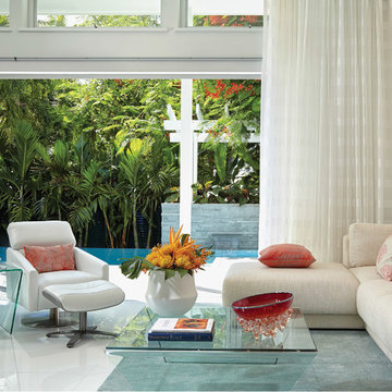
Embracing a modern take on the Key West style famed for its pastel-hued, conch-style houses and laid-back attitude, Corredor designed a simple, elegant and unpretentious interior scheme for this 3,900-square-foot home. A tropical sensation flows freely with natural materials and a color palette that reflect the island’s backdrop of sandy beaches, brilliant skies and cresting ocean waves.
Polished white-glass tile flooring downstairs contrasts with African teak wood flooring upstairs, while cherry wood paneling and custom wall treatments create texture. To the breezy blue and white theme throughout, the designer added a zest of coral, inspired by the Royal Poinciana tree that frames the arbor by the pool. “The whole idea with ocean hues and wood tones is to emulate the surroundings,” Corredor says. “I think these elements add character to a space, as well as warmth.”
The great room reflects Corredor’s light airy approach. In the living area, accent pillows with a coral-print fabric and an “Axiom Glass Thorn” coral-hued bowl, both from Coconut Grove Gallery, add a dash of color as well as organic curves that augment the lines of the sofa and contrast with the angular glass tables. An ode to the home’s Key West atmosphere, Flower In Movement, a painting by artist Martha Dominguez, combines a floral motif with a wavy dimension that echoes the gardens as well as the ocean. “The architect used a NanaWall, which is a special feature,” Corredor says. “It can be pulled all the way back, entirely open, to create a seamless feel that the room carries on from inside to outside.”
“SET AMIDST LUSH BOTANICAL GARDENS, THE HOUSE HAS A BEACHY,
SPA-LIKE ATMOSPHERE THAT MAKES YOU FEEL LIKE YOU ARE FLOATING,” INTERIOR DESIGNER JENNIFER CORREDOR SAYS.
Key west, Florida
New York,
Miami modern,
Contemporary Interior Designers,
Modern Interior Designers,
Coco Plum Interior Designers,
Sunny Isles Interior Designers,
Pinecrest Interior Designers,
J Design Group interiors,
South Florida designers,
Best Miami Designers,
Miami interiors,
Miami décor,
Miami Beach Designers,
Best Miami Interior Designers,
Miami Beach Interiors,
Luxurious Design in Miami,
Top designers,
Deco Miami,
Luxury interiors,
Miami Beach Luxury Interiors,
Miami Interior Design,
Miami Interior Design Firms,
Beach front,
Top Interior Designers,
top decor,
Top Miami Decorators,
Miami luxury condos,
modern interiors,
Modern,
Pent house design,
white interiors,
Top Miami Interior Decorators,
Top Miami Interior Designers,
Modern Designers in Miami.
J Design Group has created a beautiful interior design in this beautiful house in Key west Florida.
Well selected spaces, are very comfortable all along this beautiful 3900 square feet house in Key west Florida.
150