
Search results for "Forward thinking approach" in Home Design Ideas
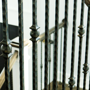
 NSPJ Architects
 / Cathy Kudelko
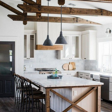
Home design - transitional home design idea in Kansas City
Home design - transitional home design idea in Kansas City
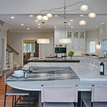
 Drury Design
Maybe you can relate to these empty nesters who reached out to us to design and build a new kitchen for their current and long term needs. They do lots of entertaining, have an extensive wine collection and enjoy welcoming more grandchildren into the family. Both cook, although he prefers his grill. They wanted their new kitchen to be an open space that is easier to move around in. They were also looking forward to more storage and new, state-of-the-art appliances.
Design objectives:
-New layout to accommodate large groups for frequent entertaining
-Big island to seat as many people as possible
Improve traffic flow by omitting a counter peninsula by the family room and other cabinet barriers
-Main cooktop to face visitors with point-of-use spices, utensils, pots & pans nearby
-Multiple cooking & refrigeration appliances
-Plan for as much countertop space as possible for multiple cooks
-Dedicated spaces needed for wine, liquor, cold drinks & decorative glassware
-Incorporate special details such as thick or waterfall countertops, unique backsplash, wood accents
-Need better task, ambient and general lighting
-Make it beautiful – a kitchen the homeowners could be proud of
-Seamlessly join kitchen with breakfast room, given load-bearing wall & various ceiling heights
-Ensure the large, newly opened space remains intimate and inclusive
-Determine how to best utilize the breakfast room, given limited availability of wall space with two sets of French doors and a large window
-Relocating two ventilation ducts currently in a wall to be removed
-Incorporate multiple appliances while adding functional storage
-Integrate special details that wouldn’t be lost in a large room
-Utilize multiple finishes and colors that provide continuity
Design solutions:
-The wall between the kitchen & breakfast nook was completely removed – the structural beam was shortened, providing the largest opening possible
-One small wall section remained intact to relocate ductwork, which conveniently created an alcove for the dual refrigerator armoire
-Two islands in the same finish visually join the elongated room
-The cooking island includes necessary point-of-use storage along with a steam oven and additional storage on the opposite side
The wide cooking island allows for two cooks to comfortably share the counter space, allowing casual interaction
-The second island fills the center of the former breakfast room; tall cabinets in a contrasting finish flank the French doors and provide visual balance
-The sizable second island provides seating for six on a conversation-conducive curve. It houses freezer drawers, a microwave drawer, an under-counter refrigerator, plus additional storage
-Docking station inside drawer
-Two cabinet styles in three finishes provide continuity, balance and interest in the large room
While the clients didn’t have a specific vision of the remodeled space, they were completely open to new ideas and knew which features they wanted when they saw them. They were truly doing the project for their own enjoyment and that of their family and guests. We’re happy to know they are thrilled with the end result. In fact, we had so much fun working together we’re now talking about a new project!

 safe ZOnea
Every year, the same thing happens. The first real snowfall arrives, demand for de-icing materials spikes overnight, and the businesses that waited too long find themselves scrambling for supply at the worst possible moment. Facility managers, property owners, contractors, and municipalities all depend on a steady supply of salt and ice melt to keep their properties safe and operational through winter. The ones who plan ahead sail through. The ones who don't pay more, wait longer, and take on real risk.
Sourcing de-icing materials well is not complicated, but it does require thinking ahead and understanding the options. The choices you make about what to buy, how to buy it, and who to buy it from have a direct effect on your costs, your reliability, and your ability to keep people safe when conditions turn dangerous. This article lays out what matters.
Why Your Choice of Supplier Matters More Than You Think
It is easy to treat de-icing material as a commodity, something you grab whenever you need it without much thought about where it comes from. That works fine until the moment it doesn't, usually in the middle of a storm when everyone needs supply at once and the casual sources have run dry. At that point, the relationships you built before the season become the difference between staying stocked and being stuck.
Reliable supply is the whole game in winter operations. A property that runs out of ice melt during a storm faces safety hazards, liability exposure, and disruption, none of which can wait for a back-ordered shipment. This is why establishing relationships with dependable rock salt suppliers before the season starts is one of the smartest moves a facility manager or contractor can make. It locks in supply, often locks in better pricing, and removes a major source of mid-winter stress.
The lesson here is to treat sourcing as a planning decision rather than a last-minute errand. The businesses that come through winter smoothly are almost always the ones that secured their supply chain early, chose suppliers who could actually deliver when it counted, and never had to gamble on finding material during a shortage. Reliability bought in advance is far cheaper than scarcity paid for in a crisis.
Bagged or Bulk: Matching the Material to the Job
One of the first practical decisions is whether to buy de-icing material in bags or in bulk, and the right answer depends entirely on the operation. Each format has clear advantages, and many operations end up using both for different purposes.
Bagged material offers convenience, control, and easy storage. It is simple to handle, easy to distribute to different locations or crews, straightforward to store without special equipment, and convenient for spot application by hand. It suits smaller properties, businesses without bulk storage, and situations where portion control and tidiness matter. Bulk material, on the other hand, tends to make sense for large operations that go through high volumes, where buying in quantity lowers the per-unit cost and the operation has the equipment and space to store and handle it. The tradeoff is between the convenience and flexibility of bags and the volume economics of bulk.
For many operations, the right approach is a mix: bulk for the high-volume core of the work and bags for flexibility, spot treatment, and locations where bulk handling is impractical. The key is to match the format to how the material will actually be stored, moved, and applied, rather than defaulting to one or the other out of habit. Thinking this through in advance avoids both the waste of over-buying bulk you can't handle and the expense of relying entirely on bags for a large operation.
Rock Salt Is Not Your Only Option
Rock salt, or sodium chloride, is the workhorse of winter de-icing for good reason. It is effective, widely available, and cost-efficient, which makes it the default choice for most operations most of the time. But it has limits, and understanding the alternatives helps you choose the right material for the conditions you actually face.
The most important limitation is temperature. Rock salt becomes less effective as temperatures drop, and in genuinely cold conditions it can struggle to do the job at all. This is where alternatives come in. Calcium chloride, for instance, works at much lower temperatures than rock salt and acts quickly, which makes it valuable when conditions are severe or when fast melting matters. Operations that face hard freezes or need dependable performance in extreme cold often keep calcium chloride for sale on hand for exactly those situations, using it alongside rock salt rather than instead of it.
The practical approach is to understand the conditions your property faces and stock accordingly. For many operations, rock salt handles the bulk of the work while a faster, colder-rated material like calcium chloride covers the extreme days when ordinary salt falls short. Matching the material to the temperature and the urgency of the situation is what separates an operation that stays ahead of winter from one that is constantly reacting to it.
Securing Your Supply Before the Season
Knowing what to buy is only half the equation. The other half is making sure you can actually get it when you need it, which means securing your supply before winter arrives rather than after it has already started. Timing is one of the most underrated factors in winter operations.
The logic is simple. Demand for de-icing materials is highly seasonal and spikes sharply during storms, when everyone needs supply simultaneously. Prices and availability both move against the buyer at exactly those moments. By contrast, planning ahead, estimating your needs and arranging supply before the season, puts you in a far stronger position. Working with established rock salt suppliers ahead of time means your material is accounted for before the rush, often at better pricing and with the confidence that it will be there when the first storm hits.
This kind of planning also lets you think clearly rather than react under pressure. You can estimate your seasonal needs based on your property and past winters, decide on the right mix of materials and formats, and arrange storage in advance. Operations that do this consistently spend less, worry less, and never find themselves making frantic calls during a storm. The effort of planning ahead is modest, and the payoff in reliability and cost savings is substantial.
Storing and Handling What You Buy
Securing supply is not much use if the material degrades before you can use it, which makes proper storage and handling an important and often overlooked part of the equation. De-icing materials are sensitive to moisture, and poor storage can turn a good supply into a clumped, hardened mess that is difficult to apply.
The fundamentals are straightforward. Keep material dry and protected from moisture, since salt and ice melt readily absorb water and can harden if exposed. Store it in a way that suits the format, whether that means a proper bulk storage area or a dry space for stacked bags. Keep it accessible, so crews can get to it quickly when a storm hits and time is short. And handle it with the right equipment for the format and volume, which protects both the material and the people working with it. None of this is complicated, but neglecting it can undermine even a well-planned supply.
Good storage practices protect the investment you made in securing supply early. There is little point in arranging your materials ahead of the season only to have them degrade before use. Treating storage and handling as part of the overall plan, rather than an afterthought, ensures that the material you secured is actually usable when the moment comes. It is the final link in a supply chain built to perform under winter conditions.
Estimating How Much You Actually Need
One question trips up operations of every size: how much de-icing material to buy. Order too little and you risk running short during a storm. Order too much and you tie up money and storage space in material you may not use. Getting the estimate reasonably right is a meaningful part of sourcing well.
Several factors shape the answer. The size and type of the areas you treat, sidewalks, lots, entrances, and drive lanes, set the baseline for how much material each application consumes. The local climate matters too, since colder regions and those with frequent snowfall go through far more material than milder ones. Application frequency depends on how often storms hit and how quickly surfaces need to be cleared, which varies with the kind of property and the expectations of the people who use it. And the type of material plays a role, since different products are applied at different rates.
Past experience is often the best guide. Operations that track what they used in previous winters, adjusted for the size of the property and the severity of the season, can estimate their needs with reasonable confidence. For newer operations without that history, it helps to plan conservatively and to work with a supplier who can replenish stock reliably, so that a low estimate does not turn into a mid-storm shortage.
The goal is not perfect precision but a sound, slightly cautious estimate paired with a dependable supply relationship. That combination lets an operation keep enough material on hand to handle the season without over-committing to volume it cannot store or use. Thinking this through before winter, rather than guessing during it, is one more way that planning ahead pays off when the snow starts to fall.
The Bottom Line
Sourcing de-icing materials well comes down to a few straightforward principles: plan ahead, choose reliable suppliers before the season, match your materials and formats to your actual needs and conditions, and store what you buy properly. The operations that follow these principles move through winter with confidence, while those that improvise pay more and take on needless risk.
Winter is predictable in one respect: it arrives every year, and demand for de-icing material spikes the moment it does. The businesses that prepare for that reality, rather than being surprised by it, are the ones that keep their properties safe, their costs controlled, and their operations running no matter what the season throws at them. A little foresight before the first snowfall pays off through every storm that follows.
Find the right local pro for your project
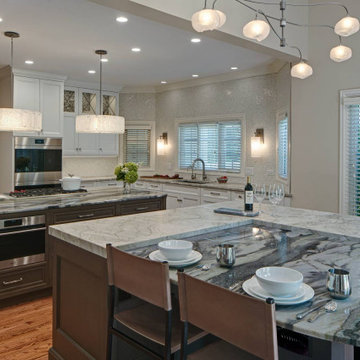 Drury Design
Maybe you can relate to these empty nesters who reached out to us to design and build a new kitchen for their current and long term needs. They do lots of entertaining, have an extensive wine collection and enjoy welcoming more grandchildren into the family. Both cook, although he prefers his grill. They wanted their new kitchen to be an open space that is easier to move around in. They were also looking forward to more storage and new, state-of-the-art appliances.
Design objectives:
-New layout to accommodate large groups for frequent entertaining
-Big island to seat as many people as possible
Improve traffic flow by omitting a counter peninsula by the family room and other cabinet barriers
-Main cooktop to face visitors with point-of-use spices, utensils, pots & pans nearby
-Multiple cooking & refrigeration appliances
-Plan for as much countertop space as possible for multiple cooks
-Dedicated spaces needed for wine, liquor, cold drinks & decorative glassware
-Incorporate special details such as thick or waterfall countertops, unique backsplash, wood accents
-Need better task, ambient and general lighting
-Make it beautiful – a kitchen the homeowners could be proud of
-Seamlessly join kitchen with breakfast room, given load-bearing wall & various ceiling heights
-Ensure the large, newly opened space remains intimate and inclusive
-Determine how to best utilize the breakfast room, given limited availability of wall space with two sets of French doors and a large window
-Relocating two ventilation ducts currently in a wall to be removed
-Incorporate multiple appliances while adding functional storage
-Integrate special details that wouldn’t be lost in a large room
-Utilize multiple finishes and colors that provide continuity
Design solutions:
-The wall between the kitchen & breakfast nook was completely removed – the structural beam was shortened, providing the largest opening possible
-One small wall section remained intact to relocate ductwork, which conveniently created an alcove for the dual refrigerator armoire
-Two islands in the same finish visually join the elongated room
-The cooking island includes necessary point-of-use storage along with a steam oven and additional storage on the opposite side
The wide cooking island allows for two cooks to comfortably share the counter space, allowing casual interaction
-The second island fills the center of the former breakfast room; tall cabinets in a contrasting finish flank the French doors and provide visual balance
-The sizable second island provides seating for six on a conversation-conducive curve. It houses freezer drawers, a microwave drawer, an under-counter refrigerator, plus additional storage
-Docking station inside drawer
-Two cabinet styles in three finishes provide continuity, balance and interest in the large room
While the clients didn’t have a specific vision of the remodeled space, they were completely open to new ideas and knew which features they wanted when they saw them. They were truly doing the project for their own enjoyment and that of their family and guests. We’re happy to know they are thrilled with the end result. In fact, we had so much fun working together we’re now talking about a new project!

 Imbue Design
Small minimalist front door photo in Salt Lake City with a medium wood front door
Small minimalist front door photo in Salt Lake City with a medium wood front door

 Mottram Architecture
Timber frame homes offer unique challenges during a remodel. What often makes them beautiful and attractive to most homeowners, also makes them challenging for space requirements.
Context: The lovely couple that owned this home were struggling with some interesting floor plan challenges that just didn't work for their family. The loved the beautiful timbers and woodwork of their home, but the dramatically sloping ceilings on the second floor, particularly in the bathroom, just didn't work for this 1 1/2 bath home. Needing to use the skylight to approach the toilet was a less then ideal scenario. Although the bathroom footprint was more then adequate, the sloped ceiling only made half of the space useable. Check out the Before/After post on our blog to see the photos of the house pre-renovation. As much as they loved all the wood features in their home, another challenge they had was light. The wood ceiling made everything inside the house darker, even with a fantastic array of south facing windows, there were spaces in the home that felt dark and small. When they contacted us they wanted to know how could they make their brighter and more inviting, were there solutions to the 2nd floor sloped ceiling issues, and if they were going to do all of this work, how could they make their home more comfortable and efficient. A nagging water leak in the upstairs bathroom spurred them into action and here is how we solved their dilemma.
Conclusion: First, we added a little dormer to the rear of the house so we could get full headroom in nearly all of the upstairs bathroom! Then we decided to extend that dormer one more timber bay over to create a walk in closet with natural light and plenty of space. Since we were contemplating energy efficiency, we resolved a nagging issue that is present in a lot of timber frame construction, air tightness. Commonly found in timber frame construction, fiberglass insulation is installed in the rafter bays and board ceilings are installed over top. Unfortunately, board ceilings are anything but air tight, and fiberglass insulation needs to be in an airtight cavity for maximum effectiveness. So we were able to solve two issues at the same time for this homeowner. We removed the board ceiling and fiberglass insulation, we dense packed the rafter bays with cellulose insulation, and installed sheetrock in place of the boards. The boards were salvaged for re-use by the homeowner, and the space and light quality was dramatically improved. Some may think that losing the board ceiling took something away from the space, but what you'll see in the pictures is that it highly accentuates the heavy timbers and really makes them stand out in a beautiful way. Now with this added airtightness, better insulation, and brighter space, the homeowner hardly runs their wood stove, and it's so quiet in the space, an added bonus from changing the insulation. It became necessary to also add a sheetrock ceiling to the living room to hide the plumbing from the new bathroom layout above. Changing this ceiling gave the homeowner some real quality lighting that was lacking in the living room before. The brighter ceiling and new lighting layout completely transforms the living room into a space you want to hang out, even though the layout didn't change at all. When the homeowner saw the finished spaces she said "I can't believe this is my house, I want to live in this house"
Energy Efficiency: I touched a little on the efficiency above, but like all projects done with Mottram Architecture, we always want to leave you with a little extra. Timber frame construction with board ceilings and fiberglass insulation are notoriously leaky! If you want to know what we think about fiberglass insulation, check our our blog post on Why Fiberglass Insulation Sucks. By installing cellulose insulation and covering it with sheetrock we were able to greatly reduce the heat flowing out of this home. It not only improves cashflow it improves the comfort level in the space. Who wants to sit in their living room and feel a draft? Let us remind you, we are not saying cellulose insulation is an air barrier, we use the sheetrock to help with that, but it does significantly reduce the air flow over fiberglass insulation. And when we reduce the airflow, we reduce the heat flow. And when we reduce the heat flow, we reduce the need to re-heat that drafty air from outside. When it comes to energy efficiency the first and best place to start is air infiltration. We greatly reduced the air infiltration with the new insulation, but we also added a hat and warm boots. What I mean by that is, we improved the insulation in the roof, and we installed insulation in the basement. Maybe it's a silly analogy, but when you think about keeping warm, we always start with the hat and boots! With sustainability in mind, the next project will be to add a deck to the front of this house with rain catchment barrels from the metal roof. They are planning to plant a garden in the spring and the rain catchment system will help to irrigate the new garden.
Builder: East Shore Builders
Photographer: Michael Eric Berube
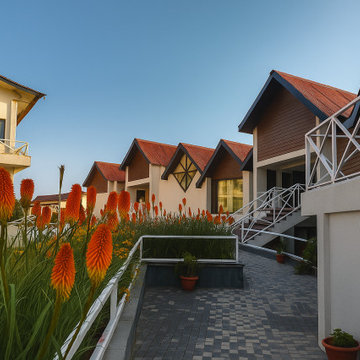
 Metamorphosis Design
Koti Resorts
(Hotel Project)
Constructed commenced 1991
Location : Baldeyan, Himachal Pradesh
GENESIS OF A HOTEL PROJECT - KOTI RESORTS, NALDHERA, SHIMLA
How does a Newbie make an entry into the HOSPITALITY INDUSTRY.......???
Or, to be specific – HOW DOES ONE MAKE A HOTEL...... GET INTO THE HOTEL BUSINESS...???
Agreed, the business of teaching/learning of getting into this mammoth Industry is also BIG BUSINESS. Considering that almost each and every city in the country has several institutes/colleges/ and even University departments have jumped onto the band wagon of this reasonably popular academic course.
So when a long time friend from the neighbourhood wanted to start a new business/career on a family held plot in the hills – it smelled like a good opportunity. As a student of the University, he was also accidentally pushed into the “business” of running the University Cafeteria – which was on contract to some people. The student leaders (he was part of the Association) were dared to take over the Cafeteria and run it themselves if they had a problem with the then management.
Obviously, EGOS got hurt, and one doesn’t DARE a bunch of University leaders of the Student body running the roost.
So initial experience taught them supply chain management, financial acumen, human resource management, and of course – all about food. All components of running a ‘dicey operation’ such as a Student cafeteria in a volatile environment were experienced and the nut and bolts of the business learnt the hard way.
So it was full confidence and a positive gut feeling that this friend took that momentous decision. And the idea germinated.
Remember when we (almost the entire extended family from here in the plains + the rest from the hills) took off to Shimla to case the joint – to put mildly. Would’ve been summertime then – is all that I can remember.
Caught up with the ‘hill party’ at Shimla for further going towards the Naldhera Golf Course, where we were booked for lunch. The site was en route – a few strokes short, as ad people would put it, of the Golf Course...
On a hilltop called Baldeyan.
Anyway, after the family divisions of the land parcel ownership was settled, we (my friend and yours truly) spent some time at the site to figure out the way ahead. Ideas flew back and forth, including some number crunching – and just like that we zeroed in onto making a Resort Hotel. In the middle of a wild nowhere – with great views all around.
Shimla town visible at 7 o’clock (S/SW), and the snow capped peaks of the Upper Himalayas ranging from the North to the ESE (say 4 o’clock) the radio mast tower dead North, and the Craignano peak due South (that’s where Shimla’s water supply tanks are located}.
The location was a gift from heaven.
And the matter was settled – we all agreed that it was so......!!!!
So the next step – what kind of hotel do we plan for??? What kind of target customer, tariff, rooms, program...........and a thousand other questions befuddled us. I suggested going to a Hotel Consultant.
No ego!
So the both of us drove down to Delhi after zeroing in to the offices of Mr. AN Haksar (the recently retd Chairman of the ITC) – who had only recently set up this office. It hurt when we agreed to pay 1/2 a lakh as consultancy fees – in spite of me being the designated Architect for the job. But then.........cie la vie..........!!!!
Such is life!!!
We got into a quick learning curve of hotel industry terms, and practices. Of things like Occupancy rates, the ARR, peak season rates, and various depts. like F&B, Housekeeping, etc. But what the heck – we both were in our thirties.......!!!
And lapped up the learning without any fuss. And joyfully agreed when they said they’d do the hand holding for a while after the hotel started business.
Of course we’d agree – after all AN Haksar was the Chairman Emeritus of the ITC group – that super successful upstart in the Hotel Industry. With the Hotel Mughal Agra, the ITC Chola, the ITC Maurya, and the ITC Grand Kakatiya, amongst other successful Iconic properties under their belt.
I had already made up my mind on NOT DESTROYING THE ENVIRONMENT with a multi-floor frame structure that was standard pattern in the desecration of the hills. So a low rise low floor concept was a given. And that’s what we did – to achieve what we’d like to think of as the pioneer of hill resort hotel design character.........
We were already in competition with another resort being planned some distance away near Chail – another great resort hotel, and the game was on.
After getting sanctions and a starter loan from the HP SIDC, we borrowed money from family and friends, and – in a small Maruti 800 – took off for the site one summer morning. Also in the car back seat was my old mistri (now appointed thekedar) and his ‘brother mistri’......from their village in UP.
Stopped for a quick lunch immediately after crossing the Dhalli Tunnel, and the on to the site.
Now after throwing all tenets of site planning and architecture down the hill, one walked around to locate the point where we would start CONSTRUCTION OF THE RESORT HOTEL.
Took a few minutes (remember we were freshers in our thirties) and within the hour had laid out the foundation plan for the 1 st Block. Another added advantage – there were no site boundaries and no benchmarks to go by – excepting an old stone water tank used by the village below. And a few pipes going down from there.
Meanwhile left the contractor there in the wilderness for him to locate his construction huts, approach roads, material dump spaces, etc. No idea how he managed.
Within a month we were well into the making of the first ‘residential hut’ that one had envisaged. A block of four rooms – with outer rooms a bit larger with a separate dining space. And a vestibule as one entered. The toilets were located between the dining & bedroom spaces – and well ventilated. There was also an open lobby between the four rooms – giving safe access to all. And interesting approaches planned as per site conditions. With built in housekeeping stores, etc under the staircase landings. And space for 2-3 kilo-liters of water tanks
for the 8 rooms/suites per block.
One also planned for a central heating system – with insulated pipes servicing each block. A/C s were not even in our minds – but we were forced to install them later because of global warming and climate change. Neither were the ubiquitous ceiling fans - which are nowadays a must have in the towns of Shimla and Solan. Among other hill stations.....!!!
In fact one got insulated cavity walls made under duress...........a fact appreciated much later in life.
Incidentally, I think the cost of petrol was around Re. 8/50 or something those days, and it was easier on the pocket to drive up to the site beyond Shimla than stay over night in a hotel. And the Mandal Commission agitation had made us night birds on the highways to Shimla.
VP Singh was the PM, and globalisation of the economy had yet to take birth...........!!!!
The hotel had a soft opening in 1991, I think.
And the first customer stayed for a week. And then came back after a sort while to stay for a month. We felt vindicated.
And the Hotel has never looked back ever since.
designed by www.MetamorphosisDesign.org
Struggling to bring clarity to your vision before starting your dream project?
Let us help you refine your ideas and align them seamlessly with your budget.
Schedule your design consultation today - call - 9316511166
Sponsored
Sunbury, OH

J.Holderby - Renovations
Franklin County's Leading General Contractors - 2X Best of Houzz!
 Klopf Architecture
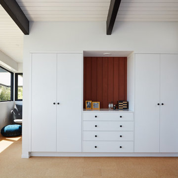
The Roger Lee designed house from 1962 was purchased by the current homeowners in almost original condition, as the previous owners elected to defer most maintenance projects over the years. The clients were able to see beyond the dated materials and finishes, single-paned glass and uninsulated walls and they approached Klopf Architecture to help them expand and update the entire home, one the family could settle into and enjoy for years to come. It was important that the new designs were aligned with Lee's original intent not only because of the client's appreciation for mid-century modern architecture, but also because the house was deemed historical. The Stanford Real Estate Office requires a stringent design review which safeguards the integrity of the community, which Klopf Architecture was happy to oblige going into their updated designs.
As with many original mid-century modern homes, the house was scaled to the 1960s lifestyle where rooms were smaller and openings to views were limited and tightly framed. The original conditions defined the direction the family of four would take in updating the house and making it comfortable for their modern lifestyle. Klopf designed a full gut remodel and major addition to bring the house into the 21st century and provide the living area needed for the client's family. The newly expanded house added just about 1,100 sf to create an airy, comfortable and family friendly house, taking full advantage of the beautiful southwestern views that extend out to the hills beyond. The enclosed garage created an additional 240 sf of covered space for long-term storage.
A cracked swimming pool created an eyesore taking up a majority of the backyard landscape, so it was one of the first elements to go during the transformation. Working with Outer Space Landscape Architects, the family asked for a mix of relaxing outdoor patio spaces that eventually blend into the native landscaping, extending their views outward toward the natural greenery of the trees beyond their property. Filling in the old pool was a smart way to expand the living spaces outward. The orientation of the house was designed to enjoy the views, but the original architecture provided the first homeowners with mere glimpses of the landscape outside.
Klopf was able to broaden those views, continuing and extending on the original architecture to take full advantage of the unobstructed natural views across the rear facade of the house. Small horizontal openings in the primary bedroom and office were replaced with much taller windows that now follow the angled roof line upward, extending across almost all of the facade. We worked with Western Windows, whose designs included an oblique-shaped, operable casement that allowed our design to rise with the slope. A new corner office added to the primary suite, offers a bright and functional work-from-home solution that looks out at the distant views and added natural light from the expanded window configuration that now wraps around the corner.
The existing lower level was designed by Lee as a utilitarian space, serving as a wet pool room with a drain in the center of the floor, bathroom, laundry and storage areas. Without the need for a pool room, Klopf was able to convert the area into a much more comfortable and functional living space with a new family room and guest suite. The new spaces enjoy easy access to a new outdoor patio through floor to ceiling, full-width glass sliders.
Continuing along the rear facade, a previously exposed deck extending from the living room and hallway provided access to the backyard through a single set of stairs leading toward the side of the house which made sense when the pool was in place. The new deck was re-envisioned as an extension of the main living room and now serves as a second outdoor living room. A new slatted pergola above provides the homeowners welcome relief from the hot afternoon sun. A second set of stairs now creates a better connection to the redesigned lower level. Klopf was able to reconfigure the spaces, extending the living room outward toward the views, where the family now claims it as the heart of the home, spending a large majority of their time outdoors.
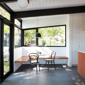
Back inside, the original wood-burning Malm fireplace was beautifully restored and a gas burner installed to comply with California's strict air standards. It now rests in front of a wall of Heath accent tiles where a dated red brick wall used to stand. A new taller window brings more light and views into the refreshed interior living room. The original glass doors opposite the fireplace were replaced by larger sliders that when fully opened, create a seamless transition to the new outdoor living area so the two spaces feel like one connected space. The original utilitarian kitchen was needlessly tucked into the far back corner and closed-off, out of sight from the living room, so the clients asked Klopf to open it up and expand the kitchen forward so it felt more connected. Today the much larger kitchen is connected to the living area where a short wall with a cutout offers a visual glimpse into the kitchen and a handy pass-through counter for serving guests. A new breakfast nook was also added to create another spot where the family can gather for casual meals. Just outside, a new built-in outdoor grill and prep area extends the kitchen outside and connects to a new outdoor dining spot nestled amongst the trees, taking advantage of the views out back.
Klopf was able to expand the other two bedrooms, add a new laundry room and half-bath and convert the carport to an enclosed garage to add more storage areas which was lost when the pool house was converted to the family and guest room.
To maintain a historical connection to the original designs, the exterior siding was repeated on all exterior walls, a full-height stained glass window at the front entryway restored, and an interior slatted screen element repeated outside at the exterior entry courtyard and over the new outdoor living room to create a shade trellis. The new house stands proudly and shines against it's new landscaping features, while respecting and expanding on the original intent of Roger Lee's designs epitomizing the comforts of indoor-outdoor living in Northern California.
Completion year: 2020
Klopf Architecture project team: John Klopf, Klara Kevane, Noel Andrade
Contractor: ORB Construction, Brendan O'Reilly
Structural engineer: Sezen and Moon
Landscape architect: Outer space
Furnishings and decoration: Urbanism Designs
Photographer: Mariko Reed
 Drury Design
Maybe you can relate to these empty nesters who reached out to us to design and build a new kitchen for their current and long term needs. They do lots of entertaining, have an extensive wine collection and enjoy welcoming more grandchildren into the family. Both cook, although he prefers his grill. They wanted their new kitchen to be an open space that is easier to move around in. They were also looking forward to more storage and new, state-of-the-art appliances.
Design objectives:
-New layout to accommodate large groups for frequent entertaining
-Big island to seat as many people as possible
Improve traffic flow by omitting a counter peninsula by the family room and other cabinet barriers
-Main cooktop to face visitors with point-of-use spices, utensils, pots & pans nearby
-Multiple cooking & refrigeration appliances
-Plan for as much countertop space as possible for multiple cooks
-Dedicated spaces needed for wine, liquor, cold drinks & decorative glassware
-Incorporate special details such as thick or waterfall countertops, unique backsplash, wood accents
-Need better task, ambient and general lighting
-Make it beautiful – a kitchen the homeowners could be proud of
-Seamlessly join kitchen with breakfast room, given load-bearing wall & various ceiling heights
-Ensure the large, newly opened space remains intimate and inclusive
-Determine how to best utilize the breakfast room, given limited availability of wall space with two sets of French doors and a large window
-Relocating two ventilation ducts currently in a wall to be removed
-Incorporate multiple appliances while adding functional storage
-Integrate special details that wouldn’t be lost in a large room
-Utilize multiple finishes and colors that provide continuity
Design solutions:
-The wall between the kitchen & breakfast nook was completely removed – the structural beam was shortened, providing the largest opening possible
-One small wall section remained intact to relocate ductwork, which conveniently created an alcove for the dual refrigerator armoire
-Two islands in the same finish visually join the elongated room
-The cooking island includes necessary point-of-use storage along with a steam oven and additional storage on the opposite side
The wide cooking island allows for two cooks to comfortably share the counter space, allowing casual interaction
-The second island fills the center of the former breakfast room; tall cabinets in a contrasting finish flank the French doors and provide visual balance
-The sizable second island provides seating for six on a conversation-conducive curve. It houses freezer drawers, a microwave drawer, an under-counter refrigerator, plus additional storage
-Docking station inside drawer
-Two cabinet styles in three finishes provide continuity, balance and interest in the large room
While the clients didn’t have a specific vision of the remodeled space, they were completely open to new ideas and knew which features they wanted when they saw them. They were truly doing the project for their own enjoyment and that of their family and guests. We’re happy to know they are thrilled with the end result. In fact, we had so much fun working together we’re now talking about a new project!
 Advance Design Studio, Ltd.
Richard and Monica of Huntley, IL, needed to make better use of their kitchen as well as more storage for pots, pans, and countertop appliances. Their space was laid out unconventionally, making cooking a challenge. A triangular nook held their refrigerator, hard-to-reach cabinets, and a cramped pantry. They needed to find a solution, so they searched Facebook for home remodeling companies in their area. Soon they found Advance Design Studio’s profile and were immediately impressed.
“Advance Design was the first and last studio I contacted,” Richard said.
Richard called Advance Design and felt an immediate connection with Project Designer Nicole. She was knowledgeable and thorough and offered many unique solutions to their kitchen layout problem.
A week later, Nicole came out to their home to meet the couple. They talked about their kitchen remodeling project and told Nicole what they wanted in their dream kitchen. Nicole saw that the kitchen had weird angles that hindered the cabinets you could use. She knew that designing a space that met both the client’s needs and dreams would be challenging.
Nicole worked with Richard and Monica to create an innovative design. When the couple came out to Advance Design Studio in Gilberts, they were blown away by the 3D illustrations Nicole showed them.
“I incorporated a hidden pantry cabinet to not only be a cool feature but also allowed me to square off the walls to gain more cabinet space,” Nicole said.
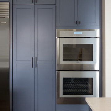
The hidden pantry added storage and squared off the strange triangular nook, creating a more traditional and functional kitchen layout. With the layout problems solved, they worked together to select materials. Richard and Monica wanted something brighter than their previous dark brown kitchen. They chose a combination of blue and white cabinetry with a white subway tile backsplash and white quartz countertops. The design was finalized, the materials were selected. It was time to begin construction.
One fear most homeowners have when beginning a home remodel is dust. Advance Design uses BuildClean HEPA filters to eliminate dust throughout the house while construction is going on. Project Manager Jason and his crew created temporary walls and cleaned up after every day of work.
“We were very impressed with how clean and organized the crew kept things while the remodeling process was underway,” Richard said.
The result is just what Richard and Monica envisioned when they began the process. Richard’s love for cooking can be explored through all-new Thermador appliances, featuring an easy-to-use induction cooktop, built-in double oven, and spacious refrigerator. Matte black hardware contrasts the bright white backsplash, countertops, and cabinets, while the stunning blue cabinets complement the dark hardwood floor and stainless-steel appliances. The dual pendant light fixtures over the reconfigured island are eye-catching and add necessary lighting.
This Huntley kitchen renovation turned out better than Richard and Monica hoped. Their experience with Advance Design’s Common Sense Remodeling process has them thinking about other projects they could do in the future.
Our award-winning design team would love to create a beautiful, functional, and spacious place for you and your family. With our “Common Sense Remodeling” approach, the process of renovating your home has never been easier. Contact us today at 847-665-1711 or schedule an appointment.
 Mottram Architecture
Timber frame homes offer unique challenges during a remodel. What often makes them beautiful and attractive to most homeowners, also makes them challenging for space requirements.
Context: The lovely couple that owned this home were struggling with some interesting floor plan challenges that just didn't work for their family. The loved the beautiful timbers and woodwork of their home, but the dramatically sloping ceilings on the second floor, particularly in the bathroom, just didn't work for this 1 1/2 bath home. Needing to use the skylight to approach the toilet was a less then ideal scenario. Although the bathroom footprint was more then adequate, the sloped ceiling only made half of the space useable. Check out the Before/After post on our blog to see the photos of the house pre-renovation. As much as they loved all the wood features in their home, another challenge they had was light. The wood ceiling made everything inside the house darker, even with a fantastic array of south facing windows, there were spaces in the home that felt dark and small. When they contacted us they wanted to know how could they make their brighter and more inviting, were there solutions to the 2nd floor sloped ceiling issues, and if they were going to do all of this work, how could they make their home more comfortable and efficient. A nagging water leak in the upstairs bathroom spurred them into action and here is how we solved their dilemma.
Conclusion: First, we added a little dormer to the rear of the house so we could get full headroom in nearly all of the upstairs bathroom! Then we decided to extend that dormer one more timber bay over to create a walk in closet with natural light and plenty of space. Since we were contemplating energy efficiency, we resolved a nagging issue that is present in a lot of timber frame construction, air tightness. Commonly found in timber frame construction, fiberglass insulation is installed in the rafter bays and board ceilings are installed over top. Unfortunately, board ceilings are anything but air tight, and fiberglass insulation needs to be in an airtight cavity for maximum effectiveness. So we were able to solve two issues at the same time for this homeowner. We removed the board ceiling and fiberglass insulation, we dense packed the rafter bays with cellulose insulation, and installed sheetrock in place of the boards. The boards were salvaged for re-use by the homeowner, and the space and light quality was dramatically improved. Some may think that losing the board ceiling took something away from the space, but what you'll see in the pictures is that it highly accentuates the heavy timbers and really makes them stand out in a beautiful way. Now with this added airtightness, better insulation, and brighter space, the homeowner hardly runs their wood stove, and it's so quiet in the space, an added bonus from changing the insulation. It became necessary to also add a sheetrock ceiling to the living room to hide the plumbing from the new bathroom layout above. Changing this ceiling gave the homeowner some real quality lighting that was lacking in the living room before. The brighter ceiling and new lighting layout completely transforms the living room into a space you want to hang out, even though the layout didn't change at all. When the homeowner saw the finished spaces she said "I can't believe this is my house, I want to live in this house"
Energy Efficiency: I touched a little on the efficiency above, but like all projects done with Mottram Architecture, we always want to leave you with a little extra. Timber frame construction with board ceilings and fiberglass insulation are notoriously leaky! If you want to know what we think about fiberglass insulation, check our our blog post on Why Fiberglass Insulation Sucks. By installing cellulose insulation and covering it with sheetrock we were able to greatly reduce the heat flowing out of this home. It not only improves cashflow it improves the comfort level in the space. Who wants to sit in their living room and feel a draft? Let us remind you, we are not saying cellulose insulation is an air barrier, we use the sheetrock to help with that, but it does significantly reduce the air flow over fiberglass insulation. And when we reduce the airflow, we reduce the heat flow. And when we reduce the heat flow, we reduce the need to re-heat that drafty air from outside. When it comes to energy efficiency the first and best place to start is air infiltration. We greatly reduced the air infiltration with the new insulation, but we also added a hat and warm boots. What I mean by that is, we improved the insulation in the roof, and we installed insulation in the basement. Maybe it's a silly analogy, but when you think about keeping warm, we always start with the hat and boots! With sustainability in mind, the next project will be to add a deck to the front of this house with rain catchment barrels from the metal roof. They are planning to plant a garden in the spring and the rain catchment system will help to irrigate the new garden.
Builder: East Shore Builders
Photographer: Michael Eric Berube
 Drury Design
Maybe you can relate to these empty nesters who reached out to us to design and build a new kitchen for their current and long term needs. They do lots of entertaining, have an extensive wine collection and enjoy welcoming more grandchildren into the family. Both cook, although he prefers his grill. They wanted their new kitchen to be an open space that is easier to move around in. They were also looking forward to more storage and new, state-of-the-art appliances.
Design objectives:
-New layout to accommodate large groups for frequent entertaining
-Big island to seat as many people as possible
Improve traffic flow by omitting a counter peninsula by the family room and other cabinet barriers
-Main cooktop to face visitors with point-of-use spices, utensils, pots & pans nearby
-Multiple cooking & refrigeration appliances
-Plan for as much countertop space as possible for multiple cooks
-Dedicated spaces needed for wine, liquor, cold drinks & decorative glassware
-Incorporate special details such as thick or waterfall countertops, unique backsplash, wood accents
-Need better task, ambient and general lighting
-Make it beautiful – a kitchen the homeowners could be proud of
-Seamlessly join kitchen with breakfast room, given load-bearing wall & various ceiling heights
-Ensure the large, newly opened space remains intimate and inclusive
-Determine how to best utilize the breakfast room, given limited availability of wall space with two sets of French doors and a large window
-Relocating two ventilation ducts currently in a wall to be removed
-Incorporate multiple appliances while adding functional storage
-Integrate special details that wouldn’t be lost in a large room
-Utilize multiple finishes and colors that provide continuity
Design solutions:
-The wall between the kitchen & breakfast nook was completely removed – the structural beam was shortened, providing the largest opening possible
-One small wall section remained intact to relocate ductwork, which conveniently created an alcove for the dual refrigerator armoire
-Two islands in the same finish visually join the elongated room
-The cooking island includes necessary point-of-use storage along with a steam oven and additional storage on the opposite side
The wide cooking island allows for two cooks to comfortably share the counter space, allowing casual interaction
-The second island fills the center of the former breakfast room; tall cabinets in a contrasting finish flank the French doors and provide visual balance
-The sizable second island provides seating for six on a conversation-conducive curve. It houses freezer drawers, a microwave drawer, an under-counter refrigerator, plus additional storage
-Docking station inside drawer
-Two cabinet styles in three finishes provide continuity, balance and interest in the large room
While the clients didn’t have a specific vision of the remodeled space, they were completely open to new ideas and knew which features they wanted when they saw them. They were truly doing the project for their own enjoyment and that of their family and guests. We’re happy to know they are thrilled with the end result. In fact, we had so much fun working together we’re now talking about a new project!
 User
Detail of Iridescent Venetian plaster finish on all walls in Living Room by Christianson Lee Studios
Example of a transitional home design design in New York
Example of a transitional home design design in New York

 Klopf Architecture
The Roger Lee designed house from 1962 was purchased by the current homeowners in almost original condition, as the previous owners elected to defer most maintenance projects over the years. The clients were able to see beyond the dated materials and finishes, single-paned glass and uninsulated walls and they approached Klopf Architecture to help them expand and update the entire home, one the family could settle into and enjoy for years to come. It was important that the new designs were aligned with Lee's original intent not only because of the client's appreciation for mid-century modern architecture, but also because the house was deemed historical. The Stanford Real Estate Office requires a stringent design review which safeguards the integrity of the community, which Klopf Architecture was happy to oblige going into their updated designs.
As with many original mid-century modern homes, the house was scaled to the 1960s lifestyle where rooms were smaller and openings to views were limited and tightly framed. The original conditions defined the direction the family of four would take in updating the house and making it comfortable for their modern lifestyle. Klopf designed a full gut remodel and major addition to bring the house into the 21st century and provide the living area needed for the client's family. The newly expanded house added just about 1,100 sf to create an airy, comfortable and family friendly house, taking full advantage of the beautiful southwestern views that extend out to the hills beyond. The enclosed garage created an additional 240 sf of covered space for long-term storage.
A cracked swimming pool created an eyesore taking up a majority of the backyard landscape, so it was one of the first elements to go during the transformation. Working with Outer Space Landscape Architects, the family asked for a mix of relaxing outdoor patio spaces that eventually blend into the native landscaping, extending their views outward toward the natural greenery of the trees beyond their property. Filling in the old pool was a smart way to expand the living spaces outward. The orientation of the house was designed to enjoy the views, but the original architecture provided the first homeowners with mere glimpses of the landscape outside.
Klopf was able to broaden those views, continuing and extending on the original architecture to take full advantage of the unobstructed natural views across the rear facade of the house. Small horizontal openings in the primary bedroom and office were replaced with much taller windows that now follow the angled roof line upward, extending across almost all of the facade. We worked with Western Windows, whose designs included an oblique-shaped, operable casement that allowed our design to rise with the slope. A new corner office added to the primary suite, offers a bright and functional work-from-home solution that looks out at the distant views and added natural light from the expanded window configuration that now wraps around the corner.
The existing lower level was designed by Lee as a utilitarian space, serving as a wet pool room with a drain in the center of the floor, bathroom, laundry and storage areas. Without the need for a pool room, Klopf was able to convert the area into a much more comfortable and functional living space with a new family room and guest suite. The new spaces enjoy easy access to a new outdoor patio through floor to ceiling, full-width glass sliders.
Continuing along the rear facade, a previously exposed deck extending from the living room and hallway provided access to the backyard through a single set of stairs leading toward the side of the house which made sense when the pool was in place. The new deck was re-envisioned as an extension of the main living room and now serves as a second outdoor living room. A new slatted pergola above provides the homeowners welcome relief from the hot afternoon sun. A second set of stairs now creates a better connection to the redesigned lower level. Klopf was able to reconfigure the spaces, extending the living room outward toward the views, where the family now claims it as the heart of the home, spending a large majority of their time outdoors.
Back inside, the original wood-burning Malm fireplace was beautifully restored and a gas burner installed to comply with California's strict air standards. It now rests in front of a wall of Heath accent tiles where a dated red brick wall used to stand. A new taller window brings more light and views into the refreshed interior living room. The original glass doors opposite the fireplace were replaced by larger sliders that when fully opened, create a seamless transition to the new outdoor living area so the two spaces feel like one connected space. The original utilitarian kitchen was needlessly tucked into the far back corner and closed-off, out of sight from the living room, so the clients asked Klopf to open it up and expand the kitchen forward so it felt more connected. Today the much larger kitchen is connected to the living area where a short wall with a cutout offers a visual glimpse into the kitchen and a handy pass-through counter for serving guests. A new breakfast nook was also added to create another spot where the family can gather for casual meals. Just outside, a new built-in outdoor grill and prep area extends the kitchen outside and connects to a new outdoor dining spot nestled amongst the trees, taking advantage of the views out back.
Klopf was able to expand the other two bedrooms, add a new laundry room and half-bath and convert the carport to an enclosed garage to add more storage areas which was lost when the pool house was converted to the family and guest room.
To maintain a historical connection to the original designs, the exterior siding was repeated on all exterior walls, a full-height stained glass window at the front entryway restored, and an interior slatted screen element repeated outside at the exterior entry courtyard and over the new outdoor living room to create a shade trellis. The new house stands proudly and shines against it's new landscaping features, while respecting and expanding on the original intent of Roger Lee's designs epitomizing the comforts of indoor-outdoor living in Northern California.
Completion year: 2020
Klopf Architecture project team: John Klopf, Klara Kevane, Noel Andrade
Contractor: ORB Construction, Brendan O'Reilly
Structural engineer: Sezen and Moon
Landscape architect: Outer space
Furnishings and decoration: Urbanism Designs
Photographer: Mariko Reed
 Drury Design
Maybe you can relate to these empty nesters who reached out to us to design and build a new kitchen for their current and long term needs. They do lots of entertaining, have an extensive wine collection and enjoy welcoming more grandchildren into the family. Both cook, although he prefers his grill. They wanted their new kitchen to be an open space that is easier to move around in. They were also looking forward to more storage and new, state-of-the-art appliances.
Design objectives:
-New layout to accommodate large groups for frequent entertaining
-Big island to seat as many people as possible
Improve traffic flow by omitting a counter peninsula by the family room and other cabinet barriers
-Main cooktop to face visitors with point-of-use spices, utensils, pots & pans nearby
-Multiple cooking & refrigeration appliances
-Plan for as much countertop space as possible for multiple cooks
-Dedicated spaces needed for wine, liquor, cold drinks & decorative glassware
-Incorporate special details such as thick or waterfall countertops, unique backsplash, wood accents
-Need better task, ambient and general lighting
-Make it beautiful – a kitchen the homeowners could be proud of
-Seamlessly join kitchen with breakfast room, given load-bearing wall & various ceiling heights
-Ensure the large, newly opened space remains intimate and inclusive
-Determine how to best utilize the breakfast room, given limited availability of wall space with two sets of French doors and a large window
-Relocating two ventilation ducts currently in a wall to be removed
-Incorporate multiple appliances while adding functional storage
-Integrate special details that wouldn’t be lost in a large room
-Utilize multiple finishes and colors that provide continuity
Design solutions:
-The wall between the kitchen & breakfast nook was completely removed – the structural beam was shortened, providing the largest opening possible
-One small wall section remained intact to relocate ductwork, which conveniently created an alcove for the dual refrigerator armoire
-Two islands in the same finish visually join the elongated room
-The cooking island includes necessary point-of-use storage along with a steam oven and additional storage on the opposite side
The wide cooking island allows for two cooks to comfortably share the counter space, allowing casual interaction
-The second island fills the center of the former breakfast room; tall cabinets in a contrasting finish flank the French doors and provide visual balance
-The sizable second island provides seating for six on a conversation-conducive curve. It houses freezer drawers, a microwave drawer, an under-counter refrigerator, plus additional storage
-Docking station inside drawer
-Two cabinet styles in three finishes provide continuity, balance and interest in the large room
While the clients didn’t have a specific vision of the remodeled space, they were completely open to new ideas and knew which features they wanted when they saw them. They were truly doing the project for their own enjoyment and that of their family and guests. We’re happy to know they are thrilled with the end result. In fact, we had so much fun working together we’re now talking about a new project!
 Mottram Architecture
Timber frame homes offer unique challenges during a remodel. What often makes them beautiful and attractive to most homeowners, also makes them challenging for space requirements.
Context: The lovely couple that owned this home were struggling with some interesting floor plan challenges that just didn't work for their family. The loved the beautiful timbers and woodwork of their home, but the dramatically sloping ceilings on the second floor, particularly in the bathroom, just didn't work for this 1 1/2 bath home. Needing to use the skylight to approach the toilet was a less then ideal scenario. Although the bathroom footprint was more then adequate, the sloped ceiling only made half of the space useable. Check out the Before/After post on our blog to see the photos of the house pre-renovation. As much as they loved all the wood features in their home, another challenge they had was light. The wood ceiling made everything inside the house darker, even with a fantastic array of south facing windows, there were spaces in the home that felt dark and small. When they contacted us they wanted to know how could they make their brighter and more inviting, were there solutions to the 2nd floor sloped ceiling issues, and if they were going to do all of this work, how could they make their home more comfortable and efficient. A nagging water leak in the upstairs bathroom spurred them into action and here is how we solved their dilemma.
Conclusion: First, we added a little dormer to the rear of the house so we could get full headroom in nearly all of the upstairs bathroom! Then we decided to extend that dormer one more timber bay over to create a walk in closet with natural light and plenty of space. Since we were contemplating energy efficiency, we resolved a nagging issue that is present in a lot of timber frame construction, air tightness. Commonly found in timber frame construction, fiberglass insulation is installed in the rafter bays and board ceilings are installed over top. Unfortunately, board ceilings are anything but air tight, and fiberglass insulation needs to be in an airtight cavity for maximum effectiveness. So we were able to solve two issues at the same time for this homeowner. We removed the board ceiling and fiberglass insulation, we dense packed the rafter bays with cellulose insulation, and installed sheetrock in place of the boards. The boards were salvaged for re-use by the homeowner, and the space and light quality was dramatically improved. Some may think that losing the board ceiling took something away from the space, but what you'll see in the pictures is that it highly accentuates the heavy timbers and really makes them stand out in a beautiful way. Now with this added airtightness, better insulation, and brighter space, the homeowner hardly runs their wood stove, and it's so quiet in the space, an added bonus from changing the insulation. It became necessary to also add a sheetrock ceiling to the living room to hide the plumbing from the new bathroom layout above. Changing this ceiling gave the homeowner some real quality lighting that was lacking in the living room before. The brighter ceiling and new lighting layout completely transforms the living room into a space you want to hang out, even though the layout didn't change at all. When the homeowner saw the finished spaces she said "I can't believe this is my house, I want to live in this house"
Energy Efficiency: I touched a little on the efficiency above, but like all projects done with Mottram Architecture, we always want to leave you with a little extra. Timber frame construction with board ceilings and fiberglass insulation are notoriously leaky! If you want to know what we think about fiberglass insulation, check our our blog post on Why Fiberglass Insulation Sucks. By installing cellulose insulation and covering it with sheetrock we were able to greatly reduce the heat flowing out of this home. It not only improves cashflow it improves the comfort level in the space. Who wants to sit in their living room and feel a draft? Let us remind you, we are not saying cellulose insulation is an air barrier, we use the sheetrock to help with that, but it does significantly reduce the air flow over fiberglass insulation. And when we reduce the airflow, we reduce the heat flow. And when we reduce the heat flow, we reduce the need to re-heat that drafty air from outside. When it comes to energy efficiency the first and best place to start is air infiltration. We greatly reduced the air infiltration with the new insulation, but we also added a hat and warm boots. What I mean by that is, we improved the insulation in the roof, and we installed insulation in the basement. Maybe it's a silly analogy, but when you think about keeping warm, we always start with the hat and boots! With sustainability in mind, the next project will be to add a deck to the front of this house with rain catchment barrels from the metal roof. They are planning to plant a garden in the spring and the rain catchment system will help to irrigate the new garden.
Builder: East Shore Builders
Photographer: Michael Eric Berube

 Just the Thing
This large open-concept living space functions as sitting area, media room, home office, dining room, and kitchen. The client's own art deco swivel chair (upper left of photo) was the inspiration for the furniture selection, and her artwork the inspiration for the blue and pink accents.
The sitting area is a mix of upholstered pieces, pulled together by a patchwork cowhide rug. Instead of the usual dining table, we have a bistro table and counter stools tucked to one side of the fireplace. More of the counter stools sit at the breakfast counter in the kitchen area. On the other side of the fireplace, we have a home office set up, with a pretty chrome and glass desk. A TV sits on a remote-controlled lift behind the lacquered sideboard, out of sight when not in use.


 Cantoni Irvine
When Irvine designer, Richard Bustos’ client decided to remodel his Orange County 4,900 square foot home into a contemporary space, he immediately thought of Cantoni. His main concern though was based on the assumption that our luxurious modern furnishings came with an equally luxurious price tag. It was only after a visit to our Irvine store, where the client and Richard connected that the client realized our extensive collection of furniture and accessories was well within his reach.
“Richard was very thorough and straight forward as far as pricing,” says the client. "I became very intrigued that he was able to offer high quality products that I was looking for within my budget.”
The next phases of the project involved looking over floor plans and discussing the client’s vision as far as design. The goal was to create a comfortable, yet stylish and modern layout for the client, his wife, and their three kids. In addition to creating a cozy and contemporary space, the client wanted his home to exude a tranquil atmosphere. Drawing most of his inspiration from Houzz, (the leading online platform for home remodeling and design) the client incorporated a Zen-like ambiance through the distressed greyish brown flooring, organic bamboo wall art, and with Richard’s help, earthy wall coverings, found in both the master bedroom and bathroom.
Over the span of approximately two years, Richard helped his client accomplish his vision by selecting pieces of modern furniture that possessed the right colors, earthy tones, and textures so as to complement the home’s pre-existing features.
The first room the duo tackled was the great room, and later continued furnishing the kitchen and master bedroom. Living up to its billing, the great room not only opened up to a breathtaking view of the Newport coast, it also was one great space. Richard decided that the best option to maximize the space would be to break the room into two separate yet distinct areas for living and dining.
While exploring our online collections, the client discovered the Jasper Shag rug in a bold and vibrant green. The grassy green rug paired with the sleek Italian made Montecarlo glass dining table added just the right amount of color and texture to compliment the natural beauty of the bamboo sculpture. The client happily adds, “I’m always receiving complements on the green rug!”
Once the duo had completed the dining area, they worked on furnishing the living area, and later added pieces like the classic Renoir bed to the master bedroom and Crescent Console to the kitchen, which adds both balance and sophistication. The living room, also known as the family room was the central area where Richard’s client and his family would spend quality time. As a fellow family man, Richard understood that that meant creating an inviting space with comfortable and durable pieces of furniture that still possessed a modern flare. The client loved the look and design of the Mercer sectional. With Cantoni’s ability to customize furniture, Richard was able to special order the sectional in a fabric that was both durable and aesthetically pleasing.
Selecting the color scheme for the living room was also greatly influenced by the client’s pre-existing artwork as well as unique distressed floors. Richard recommended adding dark pieces of furniture as seen in the Mercer sectional along with the Viera area rug. He explains, “The darker colors and contrast of the rug’s material worked really well with the distressed wood floor.” Furthermore, the comfortable American Leather Recliner, which was customized in red leather not only maximized the space, but also tied in the client’s picturesque artwork beautifully. The client adds gratefully, “Richard was extremely helpful with color; He was great at seeing if I was taking it too far or not enough.”
It is apparent that Richard and his client made a great team. With the client’s passion for great design and Richard’s design expertise, together they transformed the home into a modern sanctuary. Working with this particular client was a very rewarding experience for Richard. He adds, “My client and his family were so easy and fun to work with. Their enthusiasm, focus, and involvement are what helped me bring their ideas to life. I think we created a unique environment that their entire family can enjoy for many years to come.”
https://www.cantoni.com/project/a-contemporary-sanctuary
 Mottram Architecture
Timber frame homes offer unique challenges during a remodel. What often makes them beautiful and attractive to most homeowners, also makes them challenging for space requirements.
Context: The lovely couple that owned this home were struggling with some interesting floor plan challenges that just didn't work for their family. The loved the beautiful timbers and woodwork of their home, but the dramatically sloping ceilings on the second floor, particularly in the bathroom, just didn't work for this 1 1/2 bath home. Needing to use the skylight to approach the toilet was a less then ideal scenario. Although the bathroom footprint was more then adequate, the sloped ceiling only made half of the space useable. Check out the Before/After post on our blog to see the photos of the house pre-renovation. As much as they loved all the wood features in their home, another challenge they had was light. The wood ceiling made everything inside the house darker, even with a fantastic array of south facing windows, there were spaces in the home that felt dark and small. When they contacted us they wanted to know how could they make their brighter and more inviting, were there solutions to the 2nd floor sloped ceiling issues, and if they were going to do all of this work, how could they make their home more comfortable and efficient. A nagging water leak in the upstairs bathroom spurred them into action and here is how we solved their dilemma.
Conclusion: First, we added a little dormer to the rear of the house so we could get full headroom in nearly all of the upstairs bathroom! Then we decided to extend that dormer one more timber bay over to create a walk in closet with natural light and plenty of space. Since we were contemplating energy efficiency, we resolved a nagging issue that is present in a lot of timber frame construction, air tightness. Commonly found in timber frame construction, fiberglass insulation is installed in the rafter bays and board ceilings are installed over top. Unfortunately, board ceilings are anything but air tight, and fiberglass insulation needs to be in an airtight cavity for maximum effectiveness. So we were able to solve two issues at the same time for this homeowner. We removed the board ceiling and fiberglass insulation, we dense packed the rafter bays with cellulose insulation, and installed sheetrock in place of the boards. The boards were salvaged for re-use by the homeowner, and the space and light quality was dramatically improved. Some may think that losing the board ceiling took something away from the space, but what you'll see in the pictures is that it highly accentuates the heavy timbers and really makes them stand out in a beautiful way. Now with this added airtightness, better insulation, and brighter space, the homeowner hardly runs their wood stove, and it's so quiet in the space, an added bonus from changing the insulation. It became necessary to also add a sheetrock ceiling to the living room to hide the plumbing from the new bathroom layout above. Changing this ceiling gave the homeowner some real quality lighting that was lacking in the living room before. The brighter ceiling and new lighting layout completely transforms the living room into a space you want to hang out, even though the layout didn't change at all. When the homeowner saw the finished spaces she said "I can't believe this is my house, I want to live in this house"
Energy Efficiency: I touched a little on the efficiency above, but like all projects done with Mottram Architecture, we always want to leave you with a little extra. Timber frame construction with board ceilings and fiberglass insulation are notoriously leaky! If you want to know what we think about fiberglass insulation, check our our blog post on Why Fiberglass Insulation Sucks. By installing cellulose insulation and covering it with sheetrock we were able to greatly reduce the heat flowing out of this home. It not only improves cashflow it improves the comfort level in the space. Who wants to sit in their living room and feel a draft? Let us remind you, we are not saying cellulose insulation is an air barrier, we use the sheetrock to help with that, but it does significantly reduce the air flow over fiberglass insulation. And when we reduce the airflow, we reduce the heat flow. And when we reduce the heat flow, we reduce the need to re-heat that drafty air from outside. When it comes to energy efficiency the first and best place to start is air infiltration. We greatly reduced the air infiltration with the new insulation, but we also added a hat and warm boots. What I mean by that is, we improved the insulation in the roof, and we installed insulation in the basement. Maybe it's a silly analogy, but when you think about keeping warm, we always start with the hat and boots! With sustainability in mind, the next project will be to add a deck to the front of this house with rain catchment barrels from the metal roof. They are planning to plant a garden in the spring and the rain catchment system will help to irrigate the new garden.
Builder: East Shore Builders
Photographer: Michael Eric Berube

 Alair Homes Scarborough
This rear addition was completed to provide additional bedrooms for a growing family. The master bedroom has a walk-in closet with sliding barn door and a ensuite bathroom. Two additional bedrooms provide the additional space required for future family. A family room at the rear of the addition has cathedral ceilings, large 4 panel sliding door and windows above the sliding door to create a lovely sanctuary for the family to enjoy. The exterior of the home has been completely modernized with the use of Maibec and HardiePanel. The home was designed with future consideration for a garage, upgrade the kitchen with adjacent dining room addition.
151