
Search results for "Fostering increased" in Home Design Ideas
 FormLA Landscaping
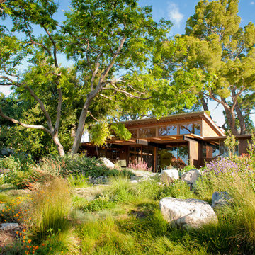
A vibrant meadow filled with California native foliage provides a beautiful view from the home. Can you see the retaining wall? An abundance of tree canopy, the only pre-existing foliage, cools both the home and garden.

 Drury Design
THE SETUP
Client Background: Our clients, a couple who have transitioned into the empty nest phase, have cherished their home for over three decades without undergoing any significant renovations. With a newfound desire to adapt their living space to better suit their current lifestyle, they’ve embarked on a journey to reimagine their kitchen — the heart of their home. Their aspiration is to cultivate a serene, neutral-toned sanctuary on the first floor that seamlessly merges with their family room, ensuring a harmonious and inviting environment.
Design Inspiration: The renovation is inspired by the couple’s penchant for soft, calming neutrals, using their cherished family room and the kitchen’s existing tile flooring as the cornerstone for the color scheme. This approach aims to foster a sense of warmth and tranquility throughout.
Design Objectives:
Harmonize the kitchen with the family room by adopting a soothing, neutral color scheme, ensuring a seamless flow across the first floor.
Enhance kitchen functionality with thoughtfully designed cabinetry, providing a designated place for every item and maximizing storage efficiency.
Cultivate an inviting and comfortable atmosphere that reflects the homeowners’ desire for a calm and relaxing space.
Design Challenges:
The homeowners wish to retain the existing kitchen tile flooring and integrate it into a refreshed, modern design.
Accommodating a dining area spacious enough for family visits without compromising the kitchen’s open feel or functional layout.
Despite liking the current placement of plumbing and appliances, the homeowners aspire for a more open floor plan to facilitate better movement and interaction.
The need to amplify natural light in the kitchen, especially around the sink area, where existing lighting is insufficient.
Preserving the half-wall between the kitchen and family room, a feature the homeowners want to keep, while ensuring it complements the new design.
THE RENEWED SPACE
Design Solutions:
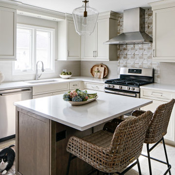
By choosing a neutral color palette that complements the existing tile, the design unifies the kitchen with the adjacent spaces. The tile’s grout was cleaned and restored, enhancing the floor’s appearance and integrating it seamlessly with the new kitchen aesthetic.
The inclusion of a larger island with seating for two, alongside maintaining a substantial dining table, was achieved by optimizing the spatial layout. This allowed for a sociable yet functional kitchen, accommodating large family gatherings without feeling crowded.
Minor adjustments to the kitchen’s layout maintained the preferred locations for plumbing and appliances while introducing an ‘open’ design concept. Strategic modifications, such as angling the pantry wall, improved the flow and accessibility within the space.
Replacing the garden window with a broader, standard window significantly increased natural light, transforming the sink area into a bright, welcoming space with enhanced views of the outdoors.
The decision to keep the half-wall was ingeniously leveraged to define the dining area while maintaining an open connection to the family room. This feature not only serves as a visual separator but also ties the two spaces together through the shared color scheme and design elements.
The homeowners are thrilled with their newly remodeled kitchen, which has become a hub of warmth and hospitality. Hosting a wedding shower and a birthday party, they have shared their renewed space with friends and family, who have been equally enamored. This remodel has not only met their functional and aesthetic desires but has also enriched their home with a fresh sense of serenity and joy.
The upstairs part of the home is shaping up nicely. Here’s their newly remodeled primary bathroom.
Find the right local pro for your project
 Paradise Found Construction
The homes in Heritage Hills in Chapel Hill, NC are representative of the popularity and explosive growth of American Home Ownership that occurred during the economic expansion that followed the end of WW II. They were designed and built to foster the benefits and sense of “community”, where families could come together and share theirs and their children’s lives. They are typically in very desirable locations within their larger communities, and remodeling them with modern amenities, increasing the performance and efficiency of them, and having them Green Certified (independent third-party verified) makes them extremely attractive to buyers, and helps to raise other property values within the neighborhood.
Green Certified Remodeled Homes offer significant value and advantage in the marketplace over similar homes in their area, which is especially important as a new, younger era of home buyers enter the market. Current trends suggest that younger (as well as many “seasoned”) homeowners are interested in smaller, more efficient (and thus affordable) homes situated closer to shopping, their work, entertainment opportunities, and access to the economic and environmental benefits of mass transit.
These older homes also offer an additional value that is continuing to gain visibility and appreciation in the market place. They were built from lumber from slower-growth trees (denser and harder wood), and as such offer superior structural support compared to the same home built using lumber from today’s faster-growing (softer and less-dense wood) trees.
Robin and Kent had lived in their 2-story Gambrel Roof home in Heritage Hills since 1994. The house was structurally sound, due in large part to the old-growth (and denser) yellow pine that was used in its framing. They loved the quiet neighborhood, its sense of community and amenities, and their home. It suited their life-style and needs; and they had decided that they would remain in the home. It was showing its age, and was in need of general repairs and maintenance, and its energy, water, and indoor air quality performance was continuing to increase their ongoing cost of ownership.
Robin loved the screen porch that looked out on their private and nicely landscaped back yard, but she wanted to be able to use it in the colder months of the year. She was unsatisfied with the kitchen and the mud room / laundry room, and the darkness of other living spaces. A previous water leak in the laundry room had resulted in a large patch of mold that had compromised flooring, wall board, and insulation and contributed to the homes reduced indoor air quality.
The home lacked insulation in the crawl, and inadequate insulation in the attic. The single HVAC unit had been replaced a few years earlier with a more efficient unit, but with a single programmable thermostat control on the first floor and aging and un-insulated ducting, the second floor was often over-heated in the summer months.
The original wood windows had begun to deteriorate and were drafty and inefficient, and the original wood-burning fireplace was an open conduit for escaping conditioned air as well as an inlet for wood-smoke smelling air being pulled into the home. The siding had been replaced a few years earlier with a cement-fiber product, but the exterior wood trim was compromised and beginning to look unsightly. Its original architecture had been altered over the years in ways that presented ongoing maintenance and durability issues, as well as disrupting the elegance of the original design.
Kent has worked for over 30 years in the Environmental Sciences field, and is considered to be a national expert in understanding the sources of, and human exposure to pollutants in indoor environments. He had always been very conscious and cautious about the effects on indoor air quality that the construction, furnishings, and products used in home had on him and his family.
Project Goals
Increase the performance of their home by improving energy efficiency by at least 40% and lowering their natural gas and electric utility costs.
Increase the performance of their home by reducing water usage by at least 40% and lowering the water utility costs.
Increase the comfort of their home that was being compromised by an inadequate HVAC design, inadequate insulation, inefficient and compromised wood windows, and copious air intrusions and drafts.
Improve the healthiness of the homes indoor air quality that was being compromised by an open wood-burning fireplace, and prior water intrusion that had allowed colonies of mold to thrive.
Create a new Kitchen, Family Room, Home Office, Mudroom, and Laundry Room that featured some of the latest designs and trends and harmonized with the rest of the homes charm.
Increase the usefulness and aesthetics of the screened porch by creating a warm and inviting semi-conditioned 3-Season Room that extended the times during the year that it was comfortable.
Introduce day-lighting into areas of the home that were dark and uninviting.
Brighten and harmonize all of the interior finishes.
Protect and restore the exterior of the home with superior-performing products and finishes.
Achieve Gold Level Green Home Certification in conformance with the ICC 700-2012 National Green Building Standards (NGBS).
 The Brooklyn Studio
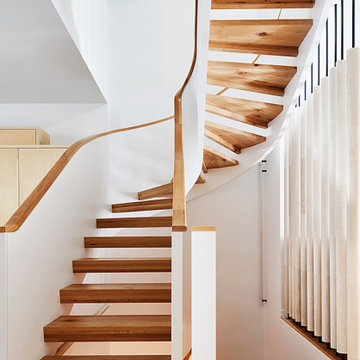
This residence was a complete gut renovation of a 4-story row house in Park Slope, and included a new rear extension and penthouse addition. The owners wished to create a warm, family home using a modern language that would act as a clean canvas to feature rich textiles and items from their world travels. As with most Brooklyn row houses, the existing house suffered from a lack of natural light and connection to exterior spaces, an issue that Principal Brendan Coburn is acutely aware of from his experience re-imagining historic structures in the New York area. The resulting architecture is designed around moments featuring natural light and views to the exterior, of both the private garden and the sky, throughout the house, and a stripped-down language of detailing and finishes allows for the concept of the modern-natural to shine.
Upon entering the home, the kitchen and dining space draw you in with views beyond through the large glazed opening at the rear of the house. An extension was built to allow for a large sunken living room that provides a family gathering space connected to the kitchen and dining room, but remains distinctly separate, with a strong visual connection to the rear garden. The open sculptural stair tower was designed to function like that of a traditional row house stair, but with a smaller footprint. By extending it up past the original roof level into the new penthouse, the stair becomes an atmospheric shaft for the spaces surrounding the core. All types of weather – sunshine, rain, lightning, can be sensed throughout the home through this unifying vertical environment. The stair space also strives to foster family communication, making open living spaces visible between floors. At the upper-most level, a free-form bench sits suspended over the stair, just by the new roof deck, which provides at-ease entertaining. Oak was used throughout the home as a unifying material element. As one travels upwards within the house, the oak finishes are bleached to further degrees as a nod to how light enters the home.
The owners worked with CWB to add their own personality to the project. The meter of a white oak and blackened steel stair screen was designed by the family to read “I love you” in Morse Code, and tile was selected throughout to reference places that hold special significance to the family. To support the owners’ comfort, the architectural design engages passive house technologies to reduce energy use, while increasing air quality within the home – a strategy which aims to respect the environment while providing a refuge from the harsh elements of urban living.
This project was published by Wendy Goodman as her Space of the Week, part of New York Magazine’s Design Hunting on The Cut.
Photography by Kevin Kunstadt
 Drury Design
THE SETUP
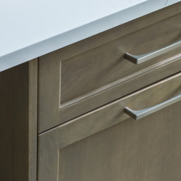
Client Background: Our clients, a couple who have transitioned into the empty nest phase, have cherished their home for over three decades without undergoing any significant renovations. With a newfound desire to adapt their living space to better suit their current lifestyle, they’ve embarked on a journey to reimagine their kitchen — the heart of their home. Their aspiration is to cultivate a serene, neutral-toned sanctuary on the first floor that seamlessly merges with their family room, ensuring a harmonious and inviting environment.
Design Inspiration: The renovation is inspired by the couple’s penchant for soft, calming neutrals, using their cherished family room and the kitchen’s existing tile flooring as the cornerstone for the color scheme. This approach aims to foster a sense of warmth and tranquility throughout.
Design Objectives:
Harmonize the kitchen with the family room by adopting a soothing, neutral color scheme, ensuring a seamless flow across the first floor.
Enhance kitchen functionality with thoughtfully designed cabinetry, providing a designated place for every item and maximizing storage efficiency.
Cultivate an inviting and comfortable atmosphere that reflects the homeowners’ desire for a calm and relaxing space.
Design Challenges:
The homeowners wish to retain the existing kitchen tile flooring and integrate it into a refreshed, modern design.
Accommodating a dining area spacious enough for family visits without compromising the kitchen’s open feel or functional layout.
Despite liking the current placement of plumbing and appliances, the homeowners aspire for a more open floor plan to facilitate better movement and interaction.
The need to amplify natural light in the kitchen, especially around the sink area, where existing lighting is insufficient.
Preserving the half-wall between the kitchen and family room, a feature the homeowners want to keep, while ensuring it complements the new design.
THE RENEWED SPACE
Design Solutions:
By choosing a neutral color palette that complements the existing tile, the design unifies the kitchen with the adjacent spaces. The tile’s grout was cleaned and restored, enhancing the floor’s appearance and integrating it seamlessly with the new kitchen aesthetic.
The inclusion of a larger island with seating for two, alongside maintaining a substantial dining table, was achieved by optimizing the spatial layout. This allowed for a sociable yet functional kitchen, accommodating large family gatherings without feeling crowded.
Minor adjustments to the kitchen’s layout maintained the preferred locations for plumbing and appliances while introducing an ‘open’ design concept. Strategic modifications, such as angling the pantry wall, improved the flow and accessibility within the space.
Replacing the garden window with a broader, standard window significantly increased natural light, transforming the sink area into a bright, welcoming space with enhanced views of the outdoors.
The decision to keep the half-wall was ingeniously leveraged to define the dining area while maintaining an open connection to the family room. This feature not only serves as a visual separator but also ties the two spaces together through the shared color scheme and design elements.
The homeowners are thrilled with their newly remodeled kitchen, which has become a hub of warmth and hospitality. Hosting a wedding shower and a birthday party, they have shared their renewed space with friends and family, who have been equally enamored. This remodel has not only met their functional and aesthetic desires but has also enriched their home with a fresh sense of serenity and joy.
The upstairs part of the home is shaping up nicely. Here’s their newly remodeled primary bathroom.
 Drury Design
THE SETUP
Client Background: Our clients, a couple who have transitioned into the empty nest phase, have cherished their home for over three decades without undergoing any significant renovations. With a newfound desire to adapt their living space to better suit their current lifestyle, they’ve embarked on a journey to reimagine their kitchen — the heart of their home. Their aspiration is to cultivate a serene, neutral-toned sanctuary on the first floor that seamlessly merges with their family room, ensuring a harmonious and inviting environment.
Design Inspiration: The renovation is inspired by the couple’s penchant for soft, calming neutrals, using their cherished family room and the kitchen’s existing tile flooring as the cornerstone for the color scheme. This approach aims to foster a sense of warmth and tranquility throughout.
Design Objectives:
Harmonize the kitchen with the family room by adopting a soothing, neutral color scheme, ensuring a seamless flow across the first floor.
Enhance kitchen functionality with thoughtfully designed cabinetry, providing a designated place for every item and maximizing storage efficiency.
Cultivate an inviting and comfortable atmosphere that reflects the homeowners’ desire for a calm and relaxing space.
Design Challenges:
The homeowners wish to retain the existing kitchen tile flooring and integrate it into a refreshed, modern design.
Accommodating a dining area spacious enough for family visits without compromising the kitchen’s open feel or functional layout.
Despite liking the current placement of plumbing and appliances, the homeowners aspire for a more open floor plan to facilitate better movement and interaction.
The need to amplify natural light in the kitchen, especially around the sink area, where existing lighting is insufficient.
Preserving the half-wall between the kitchen and family room, a feature the homeowners want to keep, while ensuring it complements the new design.
THE RENEWED SPACE
Design Solutions:
By choosing a neutral color palette that complements the existing tile, the design unifies the kitchen with the adjacent spaces. The tile’s grout was cleaned and restored, enhancing the floor’s appearance and integrating it seamlessly with the new kitchen aesthetic.
The inclusion of a larger island with seating for two, alongside maintaining a substantial dining table, was achieved by optimizing the spatial layout. This allowed for a sociable yet functional kitchen, accommodating large family gatherings without feeling crowded.
Minor adjustments to the kitchen’s layout maintained the preferred locations for plumbing and appliances while introducing an ‘open’ design concept. Strategic modifications, such as angling the pantry wall, improved the flow and accessibility within the space.
Replacing the garden window with a broader, standard window significantly increased natural light, transforming the sink area into a bright, welcoming space with enhanced views of the outdoors.
The decision to keep the half-wall was ingeniously leveraged to define the dining area while maintaining an open connection to the family room. This feature not only serves as a visual separator but also ties the two spaces together through the shared color scheme and design elements.
The homeowners are thrilled with their newly remodeled kitchen, which has become a hub of warmth and hospitality. Hosting a wedding shower and a birthday party, they have shared their renewed space with friends and family, who have been equally enamored. This remodel has not only met their functional and aesthetic desires but has also enriched their home with a fresh sense of serenity and joy.
The upstairs part of the home is shaping up nicely. Here’s their newly remodeled primary bathroom.
 Drury Design
THE SETUP
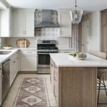
Client Background: Our clients, a couple who have transitioned into the empty nest phase, have cherished their home for over three decades without undergoing any significant renovations. With a newfound desire to adapt their living space to better suit their current lifestyle, they’ve embarked on a journey to reimagine their kitchen — the heart of their home. Their aspiration is to cultivate a serene, neutral-toned sanctuary on the first floor that seamlessly merges with their family room, ensuring a harmonious and inviting environment.
Design Inspiration: The renovation is inspired by the couple’s penchant for soft, calming neutrals, using their cherished family room and the kitchen’s existing tile flooring as the cornerstone for the color scheme. This approach aims to foster a sense of warmth and tranquility throughout.
Design Objectives:
Harmonize the kitchen with the family room by adopting a soothing, neutral color scheme, ensuring a seamless flow across the first floor.
Enhance kitchen functionality with thoughtfully designed cabinetry, providing a designated place for every item and maximizing storage efficiency.
Cultivate an inviting and comfortable atmosphere that reflects the homeowners’ desire for a calm and relaxing space.
Design Challenges:
The homeowners wish to retain the existing kitchen tile flooring and integrate it into a refreshed, modern design.
Accommodating a dining area spacious enough for family visits without compromising the kitchen’s open feel or functional layout.
Despite liking the current placement of plumbing and appliances, the homeowners aspire for a more open floor plan to facilitate better movement and interaction.
The need to amplify natural light in the kitchen, especially around the sink area, where existing lighting is insufficient.
Preserving the half-wall between the kitchen and family room, a feature the homeowners want to keep, while ensuring it complements the new design.
THE RENEWED SPACE
Design Solutions:
By choosing a neutral color palette that complements the existing tile, the design unifies the kitchen with the adjacent spaces. The tile’s grout was cleaned and restored, enhancing the floor’s appearance and integrating it seamlessly with the new kitchen aesthetic.
The inclusion of a larger island with seating for two, alongside maintaining a substantial dining table, was achieved by optimizing the spatial layout. This allowed for a sociable yet functional kitchen, accommodating large family gatherings without feeling crowded.
Minor adjustments to the kitchen’s layout maintained the preferred locations for plumbing and appliances while introducing an ‘open’ design concept. Strategic modifications, such as angling the pantry wall, improved the flow and accessibility within the space.
Replacing the garden window with a broader, standard window significantly increased natural light, transforming the sink area into a bright, welcoming space with enhanced views of the outdoors.
The decision to keep the half-wall was ingeniously leveraged to define the dining area while maintaining an open connection to the family room. This feature not only serves as a visual separator but also ties the two spaces together through the shared color scheme and design elements.
The homeowners are thrilled with their newly remodeled kitchen, which has become a hub of warmth and hospitality. Hosting a wedding shower and a birthday party, they have shared their renewed space with friends and family, who have been equally enamored. This remodel has not only met their functional and aesthetic desires but has also enriched their home with a fresh sense of serenity and joy.
The upstairs part of the home is shaping up nicely. Here’s their newly remodeled primary bathroom.
 Drury Design
THE SETUP
Client Background: Our clients, a couple who have transitioned into the empty nest phase, have cherished their home for over three decades without undergoing any significant renovations. With a newfound desire to adapt their living space to better suit their current lifestyle, they’ve embarked on a journey to reimagine their kitchen — the heart of their home. Their aspiration is to cultivate a serene, neutral-toned sanctuary on the first floor that seamlessly merges with their family room, ensuring a harmonious and inviting environment.
Design Inspiration: The renovation is inspired by the couple’s penchant for soft, calming neutrals, using their cherished family room and the kitchen’s existing tile flooring as the cornerstone for the color scheme. This approach aims to foster a sense of warmth and tranquility throughout.
Design Objectives:
Harmonize the kitchen with the family room by adopting a soothing, neutral color scheme, ensuring a seamless flow across the first floor.
Enhance kitchen functionality with thoughtfully designed cabinetry, providing a designated place for every item and maximizing storage efficiency.
Cultivate an inviting and comfortable atmosphere that reflects the homeowners’ desire for a calm and relaxing space.
Design Challenges:
The homeowners wish to retain the existing kitchen tile flooring and integrate it into a refreshed, modern design.
Accommodating a dining area spacious enough for family visits without compromising the kitchen’s open feel or functional layout.
Despite liking the current placement of plumbing and appliances, the homeowners aspire for a more open floor plan to facilitate better movement and interaction.
The need to amplify natural light in the kitchen, especially around the sink area, where existing lighting is insufficient.
Preserving the half-wall between the kitchen and family room, a feature the homeowners want to keep, while ensuring it complements the new design.
THE RENEWED SPACE
Design Solutions:
By choosing a neutral color palette that complements the existing tile, the design unifies the kitchen with the adjacent spaces. The tile’s grout was cleaned and restored, enhancing the floor’s appearance and integrating it seamlessly with the new kitchen aesthetic.
The inclusion of a larger island with seating for two, alongside maintaining a substantial dining table, was achieved by optimizing the spatial layout. This allowed for a sociable yet functional kitchen, accommodating large family gatherings without feeling crowded.
Minor adjustments to the kitchen’s layout maintained the preferred locations for plumbing and appliances while introducing an ‘open’ design concept. Strategic modifications, such as angling the pantry wall, improved the flow and accessibility within the space.
Replacing the garden window with a broader, standard window significantly increased natural light, transforming the sink area into a bright, welcoming space with enhanced views of the outdoors.
The decision to keep the half-wall was ingeniously leveraged to define the dining area while maintaining an open connection to the family room. This feature not only serves as a visual separator but also ties the two spaces together through the shared color scheme and design elements.
The homeowners are thrilled with their newly remodeled kitchen, which has become a hub of warmth and hospitality. Hosting a wedding shower and a birthday party, they have shared their renewed space with friends and family, who have been equally enamored. This remodel has not only met their functional and aesthetic desires but has also enriched their home with a fresh sense of serenity and joy.
The upstairs part of the home is shaping up nicely. Here’s their newly remodeled primary bathroom.
 Klopf Architecture
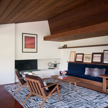
Nestled in the hills of Orinda, California, this 1951 residence is one of only seven extant homes, now known as “The Magnificent Seven”, designed by architect Olof Dahlstrand, a protégé of Frank Lloyd Wright. With its low-slung rooflines, natural materials, and deep integration with the sloping landscape, the home is a pristine example of mid-century modern design inspired by Wright’s organic principles. Over the years, prior homeowners have emphasized preservation, ensuring that the house remained relatively untouched. Each owner has respected the original architecture and stayed true to Dahlstrand’s intent. When a family of five—two college-aged sons and a middle school-aged daughter—acquired the property, they were captivated by its history, legacy of care, and architectural significance. While they appreciated Dahlstrand’s original vision, they also recognized the need to adapt the home for contemporary living while preserving its design integrity.
The remodel was conceived as a thoughtful response to the past—an effort to bring the house into the 21st century without compromising its soul. The primary mandate was to maintain architectural continuity while improving the functionality, comfort, and livability for a modern family. The design team—architects and contractor alike—worked with a shared reverence for the original architecture, allowing that mindset to guide even the most technical or pragmatic decisions.
A key objective was to increase natural light in the kitchen—a departure from Wrightian principles of enclosed, intimate cooking spaces—while maintaining the home’s architectural language. The kitchen was reconfigured to foster a stronger connection to adjacent living spaces while retaining the underlying concept of spatial separation. One of the most transformative architectural changes was the removal of a ridge beam that was originally planned to remain visible through the kitchen. During construction, the team collaborated on a better solution: a wide-flanged steel beam concealed within the roof envelope. This subtle move preserved the clean lines and ceiling continuity, a modern update carried out with utmost respect for the existing framework.
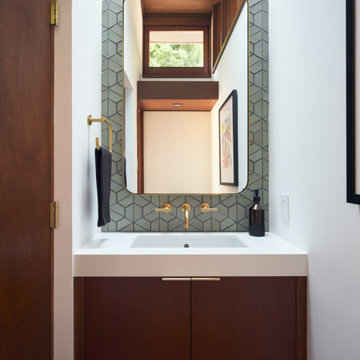
The home’s original powder room, previously accessible only through the kitchen, was relocated for better flow and privacy. A new powder room was carved out of former kitchen cabinetry—a narrow, interior space that could have felt dark and enclosed. To avoid this, the design extended the line of original transom windows into the new powder room and added a skylight above the vanity. The result is a bright and airy space that feels consistent with the rest of the home. Other updates included the installation of new solid-core interior doors with veneers carefully matched to the original mahogany, enhancing the continuity of the interiors. Even smaller decisions, such as placing the door knobs at 42 inches high, mirrored the original proportions. Every choice reflected a shared belief between the architect, contractor, and client: that new work should serve the integrity of the old.
The home’s extensive interior redwood millwork and paneling was meticulously restored. Where new materials were introduced—such as the replacement redwood soffit paneling—the contractor took pains to find finish nails that matched the original, rather than using modern equivalents. This level of craftsmanship and collaboration defined the project. It extended even to the detailing of a blind door to the new powder room, which had to disappear into the existing redwood board-and-batten wall. It was a team effort: the owner found a suitable handle, the architects devised the custom in-swing mechanism, and the contractor executed it so the door aligned precisely with the battens. Throughout, the homeowners were deeply engaged in the design process. One, a meticulous design enthusiast, focused on aesthetic integrity and historic detail. The other brought a practical and function-driven perspective, ensuring that new fixtures and materials would be durable and require minimal maintenance.
While the home’s location posed no major site challenges, sustainability was a key concern. The team upgraded the roof insulation, installed solar panels with battery storage, and added ductless mini-split cooling systems. Lighting was another area where modern technology was woven into a historic framework: new square LED fixtures echo the original custom perimeter soffit lights, maintaining the design language while offering advanced performance.
A planned expansion of a bedroom into suite with a bathroom had to be shelved due to budget constraints and the high cost of below-grade foundation work. Still, the team focused their efforts on making the most of the existing footprint, resolving constraints through design ingenuity rather than adding square footage. This renovation represents a collaborative achievement in preserving and evolving a historically significant home. Every decision was shaped by a shared ethos among clients, architects, and contractor: to maintain the home’s architectural soul while updating it for contemporary life. The result is a timeless modernist residence that continues Olof Dahlstrand’s legacy, remaining grounded in nature, craftsmanship, and human-scale design.
Klopf Architecture Team: John Klopf, AIA, Klara Kevane, Fernanda Bernardes
Interior Architectural Design: Klopf Architecture
Structural Engineer: Daniel Bastiao
Contractor: Don Larwood, Larwood Construction
Photography: Mariko Reed
Year Completed: 2022
 Klopf Architecture
Nestled in the hills of Orinda, California, this 1951 residence is one of only seven extant homes, now known as “The Magnificent Seven”, designed by architect Olof Dahlstrand, a protégé of Frank Lloyd Wright. With its low-slung rooflines, natural materials, and deep integration with the sloping landscape, the home is a pristine example of mid-century modern design inspired by Wright’s organic principles. Over the years, prior homeowners have emphasized preservation, ensuring that the house remained relatively untouched. Each owner has respected the original architecture and stayed true to Dahlstrand’s intent. When a family of five—two college-aged sons and a middle school-aged daughter—acquired the property, they were captivated by its history, legacy of care, and architectural significance. While they appreciated Dahlstrand’s original vision, they also recognized the need to adapt the home for contemporary living while preserving its design integrity.
The remodel was conceived as a thoughtful response to the past—an effort to bring the house into the 21st century without compromising its soul. The primary mandate was to maintain architectural continuity while improving the functionality, comfort, and livability for a modern family. The design team—architects and contractor alike—worked with a shared reverence for the original architecture, allowing that mindset to guide even the most technical or pragmatic decisions.
A key objective was to increase natural light in the kitchen—a departure from Wrightian principles of enclosed, intimate cooking spaces—while maintaining the home’s architectural language. The kitchen was reconfigured to foster a stronger connection to adjacent living spaces while retaining the underlying concept of spatial separation. One of the most transformative architectural changes was the removal of a ridge beam that was originally planned to remain visible through the kitchen. During construction, the team collaborated on a better solution: a wide-flanged steel beam concealed within the roof envelope. This subtle move preserved the clean lines and ceiling continuity, a modern update carried out with utmost respect for the existing framework.
The home’s original powder room, previously accessible only through the kitchen, was relocated for better flow and privacy. A new powder room was carved out of former kitchen cabinetry—a narrow, interior space that could have felt dark and enclosed. To avoid this, the design extended the line of original transom windows into the new powder room and added a skylight above the vanity. The result is a bright and airy space that feels consistent with the rest of the home. Other updates included the installation of new solid-core interior doors with veneers carefully matched to the original mahogany, enhancing the continuity of the interiors. Even smaller decisions, such as placing the door knobs at 42 inches high, mirrored the original proportions. Every choice reflected a shared belief between the architect, contractor, and client: that new work should serve the integrity of the old.
The home’s extensive interior redwood millwork and paneling was meticulously restored. Where new materials were introduced—such as the replacement redwood soffit paneling—the contractor took pains to find finish nails that matched the original, rather than using modern equivalents. This level of craftsmanship and collaboration defined the project. It extended even to the detailing of a blind door to the new powder room, which had to disappear into the existing redwood board-and-batten wall. It was a team effort: the owner found a suitable handle, the architects devised the custom in-swing mechanism, and the contractor executed it so the door aligned precisely with the battens. Throughout, the homeowners were deeply engaged in the design process. One, a meticulous design enthusiast, focused on aesthetic integrity and historic detail. The other brought a practical and function-driven perspective, ensuring that new fixtures and materials would be durable and require minimal maintenance.
While the home’s location posed no major site challenges, sustainability was a key concern. The team upgraded the roof insulation, installed solar panels with battery storage, and added ductless mini-split cooling systems. Lighting was another area where modern technology was woven into a historic framework: new square LED fixtures echo the original custom perimeter soffit lights, maintaining the design language while offering advanced performance.
A planned expansion of a bedroom into suite with a bathroom had to be shelved due to budget constraints and the high cost of below-grade foundation work. Still, the team focused their efforts on making the most of the existing footprint, resolving constraints through design ingenuity rather than adding square footage. This renovation represents a collaborative achievement in preserving and evolving a historically significant home. Every decision was shaped by a shared ethos among clients, architects, and contractor: to maintain the home’s architectural soul while updating it for contemporary life. The result is a timeless modernist residence that continues Olof Dahlstrand’s legacy, remaining grounded in nature, craftsmanship, and human-scale design.
Klopf Architecture Team: John Klopf, AIA, Klara Kevane, Fernanda Bernardes
Interior Architectural Design: Klopf Architecture
Structural Engineer: Daniel Bastiao
Contractor: Don Larwood, Larwood Construction
Photography: Mariko Reed
Year Completed: 2022
 The Brooklyn Studio
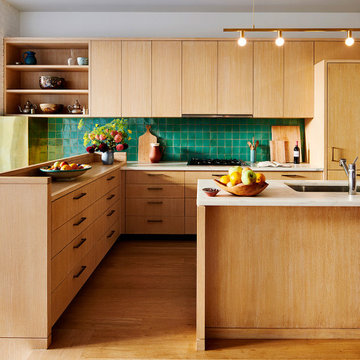
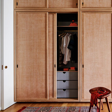
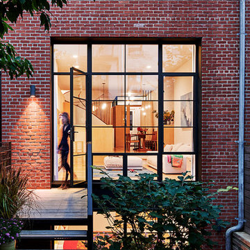
This residence was a complete gut renovation of a 4-story row house in Park Slope, and included a new rear extension and penthouse addition. The owners wished to create a warm, family home using a modern language that would act as a clean canvas to feature rich textiles and items from their world travels. As with most Brooklyn row houses, the existing house suffered from a lack of natural light and connection to exterior spaces, an issue that Principal Brendan Coburn is acutely aware of from his experience re-imagining historic structures in the New York area. The resulting architecture is designed around moments featuring natural light and views to the exterior, of both the private garden and the sky, throughout the house, and a stripped-down language of detailing and finishes allows for the concept of the modern-natural to shine.
Upon entering the home, the kitchen and dining space draw you in with views beyond through the large glazed opening at the rear of the house. An extension was built to allow for a large sunken living room that provides a family gathering space connected to the kitchen and dining room, but remains distinctly separate, with a strong visual connection to the rear garden. The open sculptural stair tower was designed to function like that of a traditional row house stair, but with a smaller footprint. By extending it up past the original roof level into the new penthouse, the stair becomes an atmospheric shaft for the spaces surrounding the core. All types of weather – sunshine, rain, lightning, can be sensed throughout the home through this unifying vertical environment. The stair space also strives to foster family communication, making open living spaces visible between floors. At the upper-most level, a free-form bench sits suspended over the stair, just by the new roof deck, which provides at-ease entertaining. Oak was used throughout the home as a unifying material element. As one travels upwards within the house, the oak finishes are bleached to further degrees as a nod to how light enters the home.
The owners worked with CWB to add their own personality to the project. The meter of a white oak and blackened steel stair screen was designed by the family to read “I love you” in Morse Code, and tile was selected throughout to reference places that hold special significance to the family. To support the owners’ comfort, the architectural design engages passive house technologies to reduce energy use, while increasing air quality within the home – a strategy which aims to respect the environment while providing a refuge from the harsh elements of urban living.
This project was published by Wendy Goodman as her Space of the Week, part of New York Magazine’s Design Hunting on The Cut.
Photography by Kevin Kunstadt
 The Brooklyn Studio
This residence was a complete gut renovation of a 4-story row house in Park Slope, and included a new rear extension and penthouse addition. The owners wished to create a warm, family home using a modern language that would act as a clean canvas to feature rich textiles and items from their world travels. As with most Brooklyn row houses, the existing house suffered from a lack of natural light and connection to exterior spaces, an issue that Principal Brendan Coburn is acutely aware of from his experience re-imagining historic structures in the New York area. The resulting architecture is designed around moments featuring natural light and views to the exterior, of both the private garden and the sky, throughout the house, and a stripped-down language of detailing and finishes allows for the concept of the modern-natural to shine.
Upon entering the home, the kitchen and dining space draw you in with views beyond through the large glazed opening at the rear of the house. An extension was built to allow for a large sunken living room that provides a family gathering space connected to the kitchen and dining room, but remains distinctly separate, with a strong visual connection to the rear garden. The open sculptural stair tower was designed to function like that of a traditional row house stair, but with a smaller footprint. By extending it up past the original roof level into the new penthouse, the stair becomes an atmospheric shaft for the spaces surrounding the core. All types of weather – sunshine, rain, lightning, can be sensed throughout the home through this unifying vertical environment. The stair space also strives to foster family communication, making open living spaces visible between floors. At the upper-most level, a free-form bench sits suspended over the stair, just by the new roof deck, which provides at-ease entertaining. Oak was used throughout the home as a unifying material element. As one travels upwards within the house, the oak finishes are bleached to further degrees as a nod to how light enters the home.
The owners worked with CWB to add their own personality to the project. The meter of a white oak and blackened steel stair screen was designed by the family to read “I love you” in Morse Code, and tile was selected throughout to reference places that hold special significance to the family. To support the owners’ comfort, the architectural design engages passive house technologies to reduce energy use, while increasing air quality within the home – a strategy which aims to respect the environment while providing a refuge from the harsh elements of urban living.
This project was published by Wendy Goodman as her Space of the Week, part of New York Magazine’s Design Hunting on The Cut.
Photography by Kevin Kunstadt
 The Brooklyn Studio
This residence was a complete gut renovation of a 4-story row house in Park Slope, and included a new rear extension and penthouse addition. The owners wished to create a warm, family home using a modern language that would act as a clean canvas to feature rich textiles and items from their world travels. As with most Brooklyn row houses, the existing house suffered from a lack of natural light and connection to exterior spaces, an issue that Principal Brendan Coburn is acutely aware of from his experience re-imagining historic structures in the New York area. The resulting architecture is designed around moments featuring natural light and views to the exterior, of both the private garden and the sky, throughout the house, and a stripped-down language of detailing and finishes allows for the concept of the modern-natural to shine.
Upon entering the home, the kitchen and dining space draw you in with views beyond through the large glazed opening at the rear of the house. An extension was built to allow for a large sunken living room that provides a family gathering space connected to the kitchen and dining room, but remains distinctly separate, with a strong visual connection to the rear garden. The open sculptural stair tower was designed to function like that of a traditional row house stair, but with a smaller footprint. By extending it up past the original roof level into the new penthouse, the stair becomes an atmospheric shaft for the spaces surrounding the core. All types of weather – sunshine, rain, lightning, can be sensed throughout the home through this unifying vertical environment. The stair space also strives to foster family communication, making open living spaces visible between floors. At the upper-most level, a free-form bench sits suspended over the stair, just by the new roof deck, which provides at-ease entertaining. Oak was used throughout the home as a unifying material element. As one travels upwards within the house, the oak finishes are bleached to further degrees as a nod to how light enters the home.
The owners worked with CWB to add their own personality to the project. The meter of a white oak and blackened steel stair screen was designed by the family to read “I love you” in Morse Code, and tile was selected throughout to reference places that hold special significance to the family. To support the owners’ comfort, the architectural design engages passive house technologies to reduce energy use, while increasing air quality within the home – a strategy which aims to respect the environment while providing a refuge from the harsh elements of urban living.
This project was published by Wendy Goodman as her Space of the Week, part of New York Magazine’s Design Hunting on The Cut.
Photography by Kevin Kunstadt
 TJ Glidden Construction
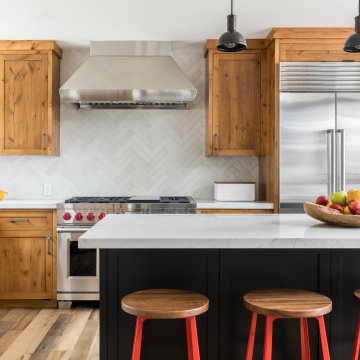
Kitchen - large rustic kitchen idea in Other with shaker cabinets and an island

 The Brooklyn Studio
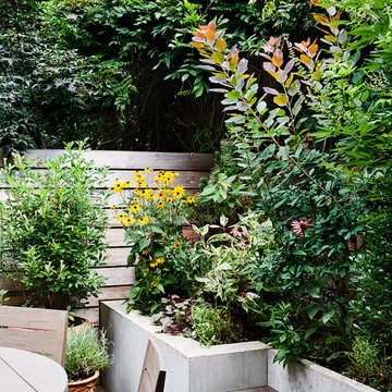
This residence was a complete gut renovation of a 4-story row house in Park Slope, and included a new rear extension and penthouse addition. The owners wished to create a warm, family home using a modern language that would act as a clean canvas to feature rich textiles and items from their world travels. As with most Brooklyn row houses, the existing house suffered from a lack of natural light and connection to exterior spaces, an issue that Principal Brendan Coburn is acutely aware of from his experience re-imagining historic structures in the New York area. The resulting architecture is designed around moments featuring natural light and views to the exterior, of both the private garden and the sky, throughout the house, and a stripped-down language of detailing and finishes allows for the concept of the modern-natural to shine.
Upon entering the home, the kitchen and dining space draw you in with views beyond through the large glazed opening at the rear of the house. An extension was built to allow for a large sunken living room that provides a family gathering space connected to the kitchen and dining room, but remains distinctly separate, with a strong visual connection to the rear garden. The open sculptural stair tower was designed to function like that of a traditional row house stair, but with a smaller footprint. By extending it up past the original roof level into the new penthouse, the stair becomes an atmospheric shaft for the spaces surrounding the core. All types of weather – sunshine, rain, lightning, can be sensed throughout the home through this unifying vertical environment. The stair space also strives to foster family communication, making open living spaces visible between floors. At the upper-most level, a free-form bench sits suspended over the stair, just by the new roof deck, which provides at-ease entertaining. Oak was used throughout the home as a unifying material element. As one travels upwards within the house, the oak finishes are bleached to further degrees as a nod to how light enters the home.
The owners worked with CWB to add their own personality to the project. The meter of a white oak and blackened steel stair screen was designed by the family to read “I love you” in Morse Code, and tile was selected throughout to reference places that hold special significance to the family. To support the owners’ comfort, the architectural design engages passive house technologies to reduce energy use, while increasing air quality within the home – a strategy which aims to respect the environment while providing a refuge from the harsh elements of urban living.
This project was published by Wendy Goodman as her Space of the Week, part of New York Magazine’s Design Hunting on The Cut.
Photography by Kevin Kunstadt
 The Brooklyn Studio
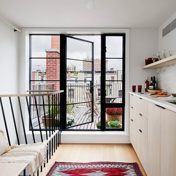
This residence was a complete gut renovation of a 4-story row house in Park Slope, and included a new rear extension and penthouse addition. The owners wished to create a warm, family home using a modern language that would act as a clean canvas to feature rich textiles and items from their world travels. As with most Brooklyn row houses, the existing house suffered from a lack of natural light and connection to exterior spaces, an issue that Principal Brendan Coburn is acutely aware of from his experience re-imagining historic structures in the New York area. The resulting architecture is designed around moments featuring natural light and views to the exterior, of both the private garden and the sky, throughout the house, and a stripped-down language of detailing and finishes allows for the concept of the modern-natural to shine.
Upon entering the home, the kitchen and dining space draw you in with views beyond through the large glazed opening at the rear of the house. An extension was built to allow for a large sunken living room that provides a family gathering space connected to the kitchen and dining room, but remains distinctly separate, with a strong visual connection to the rear garden. The open sculptural stair tower was designed to function like that of a traditional row house stair, but with a smaller footprint. By extending it up past the original roof level into the new penthouse, the stair becomes an atmospheric shaft for the spaces surrounding the core. All types of weather – sunshine, rain, lightning, can be sensed throughout the home through this unifying vertical environment. The stair space also strives to foster family communication, making open living spaces visible between floors. At the upper-most level, a free-form bench sits suspended over the stair, just by the new roof deck, which provides at-ease entertaining. Oak was used throughout the home as a unifying material element. As one travels upwards within the house, the oak finishes are bleached to further degrees as a nod to how light enters the home.
The owners worked with CWB to add their own personality to the project. The meter of a white oak and blackened steel stair screen was designed by the family to read “I love you” in Morse Code, and tile was selected throughout to reference places that hold special significance to the family. To support the owners’ comfort, the architectural design engages passive house technologies to reduce energy use, while increasing air quality within the home – a strategy which aims to respect the environment while providing a refuge from the harsh elements of urban living.
This project was published by Wendy Goodman as her Space of the Week, part of New York Magazine’s Design Hunting on The Cut.
Photography by Kevin Kunstadt
 foster design farm
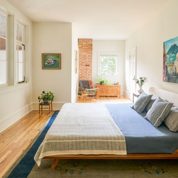
The primary suite at the old choir loft with a bay window extension and windows into the main space.
Inspiration for an eclectic bedroom remodel in Philadelphia
Inspiration for an eclectic bedroom remodel in Philadelphia
 The Brooklyn Studio
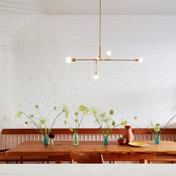
This residence was a complete gut renovation of a 4-story row house in Park Slope, and included a new rear extension and penthouse addition. The owners wished to create a warm, family home using a modern language that would act as a clean canvas to feature rich textiles and items from their world travels. As with most Brooklyn row houses, the existing house suffered from a lack of natural light and connection to exterior spaces, an issue that Principal Brendan Coburn is acutely aware of from his experience re-imagining historic structures in the New York area. The resulting architecture is designed around moments featuring natural light and views to the exterior, of both the private garden and the sky, throughout the house, and a stripped-down language of detailing and finishes allows for the concept of the modern-natural to shine.
Upon entering the home, the kitchen and dining space draw you in with views beyond through the large glazed opening at the rear of the house. An extension was built to allow for a large sunken living room that provides a family gathering space connected to the kitchen and dining room, but remains distinctly separate, with a strong visual connection to the rear garden. The open sculptural stair tower was designed to function like that of a traditional row house stair, but with a smaller footprint. By extending it up past the original roof level into the new penthouse, the stair becomes an atmospheric shaft for the spaces surrounding the core. All types of weather – sunshine, rain, lightning, can be sensed throughout the home through this unifying vertical environment. The stair space also strives to foster family communication, making open living spaces visible between floors. At the upper-most level, a free-form bench sits suspended over the stair, just by the new roof deck, which provides at-ease entertaining. Oak was used throughout the home as a unifying material element. As one travels upwards within the house, the oak finishes are bleached to further degrees as a nod to how light enters the home.
The owners worked with CWB to add their own personality to the project. The meter of a white oak and blackened steel stair screen was designed by the family to read “I love you” in Morse Code, and tile was selected throughout to reference places that hold special significance to the family. To support the owners’ comfort, the architectural design engages passive house technologies to reduce energy use, while increasing air quality within the home – a strategy which aims to respect the environment while providing a refuge from the harsh elements of urban living.
This project was published by Wendy Goodman as her Space of the Week, part of New York Magazine’s Design Hunting on The Cut.
Photography by Kevin Kunstadt
1