
Search results for "Free short" in Home Design Ideas
 Joy Martin Architecture
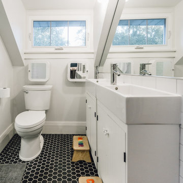
Renovation of a classic Minneapolis bungalow included this family bathroom. An adjacent closet was converted to a walk-in glass shower and small sinks allowed room for two vanities. The mirrored wall and simple palette helps make the room feel larger. Playful accents like cow head towel hooks from CB2 and custom children's step stools add interest and function to this bathroom. The hexagon floor tile was selected to be in keeping with the original 1920's era of the home.
This bathroom used to be tiny and was the only bathroom on the 2nd floor. We chose to spend the budget on making a very functional family bathroom now and add a master bathroom when the children get bigger. Maybe there is a space in your home that needs a transformation - message me to set up a free consultation today.
Photos: Peter Atkins Photography
 TKS Design Group
Download our free ebook, Creating the Ideal Kitchen. DOWNLOAD NOW
Lakefront property in the northwest suburbs of Chicago is hard to come by, so when we were hired by this young family with exactly that, we were immediately inspired by not just the unusually large footprint of this 1950’s colonial revival but also the lovely views of the manmade lake it was sited on. The large 5-bedroom home was solidly stuck in the 1980’s, but we saw tons of potential. We started out by updating the existing staircase with a fresh coat of paint and adding new herringbone slate to the entry hall.
The powder room off the entryway also got a refresh - new flooring, new cabinets and fixtures. We ran the new slate right through into this space for some consistency. A fun wallpaper and shiplap trim add a welcoming feel and set the tone for the home.
Next, we tackled the kitchen. Located away from the rest of the first floor, the kitchen felt a little isolated, so we immediately began planning for how to better connect it to the rest of the first floor. We landed on removing the wall between the kitchen and dining room and designed a modified galley style space with separate cooking and clean up zones. The cooking zone consists of the refrigerator, prep sink and cooktop, along with a nice long run of prep space at the island. The cleanup side of the kitchen consists of the main sink and dishwasher. Both areas are situated so that the user can view the lake during prep work and cleanup!
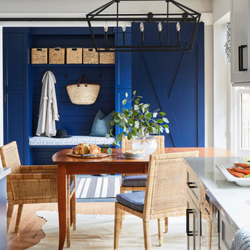
One of the home’s main puzzles was how to incorporate the mudroom and area in front of the patio doors at the back of the house. We already had a breakfast table area, so the space by the patio doors was a bit of a no man’s land. We decided to separate the kitchen proper from what became the new mudroom with a large set of barn doors. That way you can quickly hide any mudroom messes but have easy access to the light coming in through the patio doors as well as the outdoor grilling station. We also love the impact the barn doors add to the overall space.
The homeowners’ first words to us were “it’s time to ditch the brown,” so we did! We chose a lovely blue pallet that reflects the home’s location on the lake which is also vibrant yet easy on the eye. Countertops are white quartz, and the natural oak floor works well with the other honey accents. The breakfast table was given a refresh with new chairs, chandelier and window treatments that frame the gorgeous views of the lake out the back.
We coordinated the slate mudroom flooring with that used in the home’s main entrance for a consistent feel. The storage area consists of open and closed storage to allow for some clutter control as needed.
Next on our “to do” list was revamping the dated brown bar area in the neighboring dining room. We eliminated the clutter by adding some closed cabinets and did some easy updates to help the space feel more current. One snag we ran into here was the discovery of a beam above the existing open shelving that had to be modified with a smaller structural beam to allow for our new design to work. This was an unexpected surprise, but in the end we think it was well worth it!
We kept the colors here a bit more muted to blend with the homeowner’s existing furnishings. Open shelving and polished nickel hardware add some simple detail to the new entertainment zone which also looks out onto the lake!
Next we tackled the upstairs starting with the homeowner’s son’s bath. The bath originally had both a tub shower and a separate shower, so we decided to swap out the shower for a new laundry area. This freed up some space downstairs in what used to be the mudroom/laundry room and is much more convenient for daily laundry needs.
We continued the blue palette here with navy cabinetry and the navy tile in the shower. Porcelain floor tile and chrome fixtures keep maintenance to a minimum while matte black mirrors and lighting add some depth the design. A low maintenance runner adds some warmth underfoot and ties the whole space together.
We added a pocket door to the bathroom to minimize interference with the door swings. The left door of the laundry closet is on a 180 degree hinge to allow for easy full access to the machines. Next we tackled the master bath which is an en suite arrangement. The original was typical of the 1980’s with the vanity outside of the bathroom, situated near the master closet. And the brown theme continued here with multiple shades of brown.
Our first move was to segment off the bath and the closet from the master bedroom. We created a short hall from the bedroom to the bathroom with his and hers walk-in closets on the left and right as well as a separate toilet closet outside of the main bathroom for privacy and flexibility.
The original bathroom had a giant soaking tub with steps (dangerous!) as well as a small shower that did not work well for our homeowner who is 6’3”. With other bathtubs in the home, they decided to eliminate the tub and create an oversized shower which takes up the space where the old tub was located. The double vanity is on the opposite wall and a bench is located under the window for morning conversations and a place to set a couple of towels.
The pallet in here is light and airy with a mix of blond wood, creamy porcelain and marble tile, and brass accents. A simple roman shade adds some texture and it’s top-down mechanism allows for light and privacy.
This large whole house remodel gave our homeowners not only the ability to maximize the potential of their home but also created a lovely new frame from which to view their fabulous lake views.
Designed by: Susan Klimala, CKD, CBD
Photography by: Michael Kaskel
For more information on kitchen and bath design ideas go to: www.kitchenstudio-ge.com
 Progressive Design Build
Transforming a Master Bathroom
When our clients purchased their beautiful home in South Fort Myers, FL they fell in love with the expansive, sweeping space. It wasn’t long, however, before they realized the master bathroom just didn’t suit their taste. The large walk-in shower was practically cave-like. Consequentially, it completely dwarfed the bathroom. Along with bland colors, outdated finishes, and a dividing wall in the middle of the room, the whole space felt smaller than its ample dimensions implied. There was no question about it – the bathroom needed an update.
Making Room for More
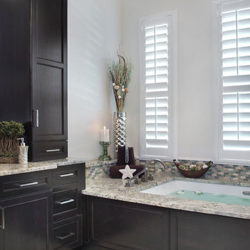
First, we demolished the existing finishes and cut the concrete slab for new underground plumbing. We minimized the imposing shower and moved it to the other side of the room. Moving the shower also allowed for the installation of our Dura Supreme Alectra style cabinetry in cocoa brown. For increased functionality, we created split his-and-hers vanities. Then we added towers to match the cabinets. With interior outlets, the towers added smart storage for bathroom appliances, helping to keep the counters clutter-free. For a finishing touch, we outlined the large mirrors with crown molding trim in a complimentary finish – an essential detail to tie all the cabinetry together.
The Spa
To bring the feel of the spa to this gorgeous home, we installed our luxurious drop-in 72”x42” Kohler Air Massage bathtub. We completely surrounded it with 3cm granite countertops in Delicatus green and added a tub deck with tile backsplashes for a sumptuous ambiance.
Lighting
On either side of the his-and-hers vanity, we installed George Kovach tube sconces. Vertical placement of the sconces provided ample lighting while enhancing the contemporary style of the space. To frame the room, we added a drop ceiling with recessed lighting and outlined the tray ceiling with crown molding to match the rest of the design. To complete the bath remodel, we installed the final element – a stunningly unique 10-light polished chrome chandelier from Maxim lighting.
A Complete Transformation
When we met with our clients, it was instantly clear to us why they were unhappy with their master bathroom. The cave-like shower and cumbersome dividing wall overpowered a room in dire need of a modernizing. Furthermore, with two small children and a busy lifestyle, we could sense our clients not only desired a bathroom renovation, they needed a relaxing retreat.
Ultimately, this project was nothing less than a complete transformation of space. In fact, by the time we had finished, the only original fixtures left were the windows! With beautifully updated finishes and an improved layout, we were able to achieve the functionality our clients craved along with a new, spa-like feel. The end result was nothing short of a haven at home – the perfect spot to recharge at the end of a long day.
Find the right local pro for your project
 TKS Design Group
Free ebook, Creating the Ideal Kitchen. DOWNLOAD NOW
The Klimala’s and their three kids are no strangers to moving, this being their fifth house in the same town over the 20-year period they have lived there. “It must be the 7-year itch, because every seven years, we seem to find ourselves antsy for a new project or a new environment. I think part of it is being a designer, I see my own taste evolve and I want my environment to reflect that. Having easy access to wonderful tradesmen and a knowledge of the process makes it that much easier”.
This time, Klimala’s fell in love with a somewhat unlikely candidate. The 1950’s ranch turned cape cod was a bit of a mutt, but it’s location 5 minutes from their design studio and backing up to the high school where their kids can roll out of bed and walk to school, coupled with the charm of its location on a private road and lush landscaping made it an appealing choice for them.
“The bones of the house were really charming. It was typical 1,500 square foot ranch that at some point someone added a second floor to. Its sloped roofline and dormered bedrooms gave it some charm.” With the help of architect Maureen McHugh, Klimala’s gutted and reworked the layout to make the house work for them. An open concept kitchen and dining room allows for more frequent casual family dinners and dinner parties that linger. A dingy 3-season room off the back of the original house was insulated, given a vaulted ceiling with skylights and now opens up to the kitchen. This room now houses an 8’ raw edge white oak dining table and functions as an informal dining room. “One of the challenges with these mid-century homes is the 8’ ceilings. I had to have at least one room that had a higher ceiling so that’s how we did it” states Klimala.
The kitchen features a 10’ island which houses a 5’0” Galley Sink. The Galley features two faucets, and double tiered rail system to which accessories such as cutting boards and stainless steel bowls can be added for ease of cooking. Across from the large sink is an induction cooktop. “My two teen daughters and I enjoy cooking, and the Galley and induction cooktop make it so easy.” A wall of tall cabinets features a full size refrigerator, freezer, double oven and built in coffeemaker. The area on the opposite end of the kitchen features a pantry with mirrored glass doors and a beverage center below.
The rest of the first floor features an entry way, a living room with views to the front yard’s lush landscaping, a family room where the family hangs out to watch TV, a back entry from the garage with a laundry room and mudroom area, one of the home’s four bedrooms and a full bath. There is a double sided fireplace between the family room and living room. The home features pops of color from the living room’s peach grass cloth to purple painted wall in the family room. “I’m definitely a traditionalist at heart but because of the home’s Midcentury roots, I wanted to incorporate some of those elements into the furniture, lighting and accessories which also ended up being really fun. We are not formal people so I wanted a house that my kids would enjoy, have their friends over and feel comfortable.”
The second floor houses the master bedroom suite, two of the kids’ bedrooms and a back room nicknamed “the library” because it has turned into a quiet get away area where the girls can study or take a break from the rest of the family. The area was originally unfinished attic, and because the home was short on closet space, this Jack and Jill area off the girls’ bedrooms houses two large walk-in closets and a small sitting area with a makeup vanity. “The girls really wanted to keep the exposed brick of the fireplace that runs up the through the space, so that’s what we did, and I think they feel like they are in their own little loft space in the city when they are up there” says Klimala.
Designed by: Susan Klimala, CKD, CBD
Photography by: Carlos Vergara
For more information on kitchen and bath design ideas go to: www.kitchenstudio-ge.com
 TKS Design Group
Download our free ebook, Creating the Ideal Kitchen. DOWNLOAD NOW
Lakefront property in the northwest suburbs of Chicago is hard to come by, so when we were hired by this young family with exactly that, we were immediately inspired by not just the unusually large footprint of this 1950’s colonial revival but also the lovely views of the manmade lake it was sited on. The large 5-bedroom home was solidly stuck in the 1980’s, but we saw tons of potential. We started out by updating the existing staircase with a fresh coat of paint and adding new herringbone slate to the entry hall.
The powder room off the entryway also got a refresh - new flooring, new cabinets and fixtures. We ran the new slate right through into this space for some consistency. A fun wallpaper and shiplap trim add a welcoming feel and set the tone for the home.
Next, we tackled the kitchen. Located away from the rest of the first floor, the kitchen felt a little isolated, so we immediately began planning for how to better connect it to the rest of the first floor. We landed on removing the wall between the kitchen and dining room and designed a modified galley style space with separate cooking and clean up zones. The cooking zone consists of the refrigerator, prep sink and cooktop, along with a nice long run of prep space at the island. The cleanup side of the kitchen consists of the main sink and dishwasher. Both areas are situated so that the user can view the lake during prep work and cleanup!
One of the home’s main puzzles was how to incorporate the mudroom and area in front of the patio doors at the back of the house. We already had a breakfast table area, so the space by the patio doors was a bit of a no man’s land. We decided to separate the kitchen proper from what became the new mudroom with a large set of barn doors. That way you can quickly hide any mudroom messes but have easy access to the light coming in through the patio doors as well as the outdoor grilling station. We also love the impact the barn doors add to the overall space.
The homeowners’ first words to us were “it’s time to ditch the brown,” so we did! We chose a lovely blue pallet that reflects the home’s location on the lake which is also vibrant yet easy on the eye. Countertops are white quartz, and the natural oak floor works well with the other honey accents. The breakfast table was given a refresh with new chairs, chandelier and window treatments that frame the gorgeous views of the lake out the back.
We coordinated the slate mudroom flooring with that used in the home’s main entrance for a consistent feel. The storage area consists of open and closed storage to allow for some clutter control as needed.
Next on our “to do” list was revamping the dated brown bar area in the neighboring dining room. We eliminated the clutter by adding some closed cabinets and did some easy updates to help the space feel more current. One snag we ran into here was the discovery of a beam above the existing open shelving that had to be modified with a smaller structural beam to allow for our new design to work. This was an unexpected surprise, but in the end we think it was well worth it!
We kept the colors here a bit more muted to blend with the homeowner’s existing furnishings. Open shelving and polished nickel hardware add some simple detail to the new entertainment zone which also looks out onto the lake!
Next we tackled the upstairs starting with the homeowner’s son’s bath. The bath originally had both a tub shower and a separate shower, so we decided to swap out the shower for a new laundry area. This freed up some space downstairs in what used to be the mudroom/laundry room and is much more convenient for daily laundry needs.
We continued the blue palette here with navy cabinetry and the navy tile in the shower. Porcelain floor tile and chrome fixtures keep maintenance to a minimum while matte black mirrors and lighting add some depth the design. A low maintenance runner adds some warmth underfoot and ties the whole space together.
We added a pocket door to the bathroom to minimize interference with the door swings. The left door of the laundry closet is on a 180 degree hinge to allow for easy full access to the machines. Next we tackled the master bath which is an en suite arrangement. The original was typical of the 1980’s with the vanity outside of the bathroom, situated near the master closet. And the brown theme continued here with multiple shades of brown.
Our first move was to segment off the bath and the closet from the master bedroom. We created a short hall from the bedroom to the bathroom with his and hers walk-in closets on the left and right as well as a separate toilet closet outside of the main bathroom for privacy and flexibility.
The original bathroom had a giant soaking tub with steps (dangerous!) as well as a small shower that did not work well for our homeowner who is 6’3”. With other bathtubs in the home, they decided to eliminate the tub and create an oversized shower which takes up the space where the old tub was located. The double vanity is on the opposite wall and a bench is located under the window for morning conversations and a place to set a couple of towels.
The pallet in here is light and airy with a mix of blond wood, creamy porcelain and marble tile, and brass accents. A simple roman shade adds some texture and it’s top-down mechanism allows for light and privacy.
This large whole house remodel gave our homeowners not only the ability to maximize the potential of their home but also created a lovely new frame from which to view their fabulous lake views.
Designed by: Susan Klimala, CKD, CBD
Photography by: Michael Kaskel
For more information on kitchen and bath design ideas go to: www.kitchenstudio-ge.com
 Shuler Architecture
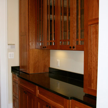
Mid-sized arts and crafts u-shaped medium tone wood floor enclosed kitchen photo in DC Metro with an undermount sink, shaker cabinets, medium tone wood cabinets, granite countertops, black backsplash, stone slab backsplash and stainless steel appliances
 Walker Architects
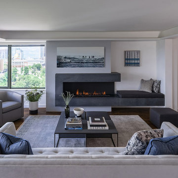
A modern fireplace becomes the focal point of this Boston mid-rise renovation.
Eric Roth Photography
Inspiration for a modern open concept medium tone wood floor, brown floor and tray ceiling living room remodel in Boston with a ribbon fireplace, gray walls and a stone fireplace
Inspiration for a modern open concept medium tone wood floor, brown floor and tray ceiling living room remodel in Boston with a ribbon fireplace, gray walls and a stone fireplace

Sponsored
Delaware, OH

Buckeye Basements, Inc.
Central Ohio's Basement Finishing ExpertsBest Of Houzz '13-'21

 TKS Design Group
Download our free ebook, Creating the Ideal Kitchen. DOWNLOAD NOW
Lakefront property in the northwest suburbs of Chicago is hard to come by, so when we were hired by this young family with exactly that, we were immediately inspired by not just the unusually large footprint of this 1950’s colonial revival but also the lovely views of the manmade lake it was sited on. The large 5-bedroom home was solidly stuck in the 1980’s, but we saw tons of potential. We started out by updating the existing staircase with a fresh coat of paint and adding new herringbone slate to the entry hall.
The powder room off the entryway also got a refresh - new flooring, new cabinets and fixtures. We ran the new slate right through into this space for some consistency. A fun wallpaper and shiplap trim add a welcoming feel and set the tone for the home.
Next, we tackled the kitchen. Located away from the rest of the first floor, the kitchen felt a little isolated, so we immediately began planning for how to better connect it to the rest of the first floor. We landed on removing the wall between the kitchen and dining room and designed a modified galley style space with separate cooking and clean up zones. The cooking zone consists of the refrigerator, prep sink and cooktop, along with a nice long run of prep space at the island. The cleanup side of the kitchen consists of the main sink and dishwasher. Both areas are situated so that the user can view the lake during prep work and cleanup!
One of the home’s main puzzles was how to incorporate the mudroom and area in front of the patio doors at the back of the house. We already had a breakfast table area, so the space by the patio doors was a bit of a no man’s land. We decided to separate the kitchen proper from what became the new mudroom with a large set of barn doors. That way you can quickly hide any mudroom messes but have easy access to the light coming in through the patio doors as well as the outdoor grilling station. We also love the impact the barn doors add to the overall space.
The homeowners’ first words to us were “it’s time to ditch the brown,” so we did! We chose a lovely blue pallet that reflects the home’s location on the lake which is also vibrant yet easy on the eye. Countertops are white quartz, and the natural oak floor works well with the other honey accents. The breakfast table was given a refresh with new chairs, chandelier and window treatments that frame the gorgeous views of the lake out the back.
We coordinated the slate mudroom flooring with that used in the home’s main entrance for a consistent feel. The storage area consists of open and closed storage to allow for some clutter control as needed.
Next on our “to do” list was revamping the dated brown bar area in the neighboring dining room. We eliminated the clutter by adding some closed cabinets and did some easy updates to help the space feel more current. One snag we ran into here was the discovery of a beam above the existing open shelving that had to be modified with a smaller structural beam to allow for our new design to work. This was an unexpected surprise, but in the end we think it was well worth it!
We kept the colors here a bit more muted to blend with the homeowner’s existing furnishings. Open shelving and polished nickel hardware add some simple detail to the new entertainment zone which also looks out onto the lake!
Next we tackled the upstairs starting with the homeowner’s son’s bath. The bath originally had both a tub shower and a separate shower, so we decided to swap out the shower for a new laundry area. This freed up some space downstairs in what used to be the mudroom/laundry room and is much more convenient for daily laundry needs.
We continued the blue palette here with navy cabinetry and the navy tile in the shower. Porcelain floor tile and chrome fixtures keep maintenance to a minimum while matte black mirrors and lighting add some depth the design. A low maintenance runner adds some warmth underfoot and ties the whole space together.
We added a pocket door to the bathroom to minimize interference with the door swings. The left door of the laundry closet is on a 180 degree hinge to allow for easy full access to the machines. Next we tackled the master bath which is an en suite arrangement. The original was typical of the 1980’s with the vanity outside of the bathroom, situated near the master closet. And the brown theme continued here with multiple shades of brown.
Our first move was to segment off the bath and the closet from the master bedroom. We created a short hall from the bedroom to the bathroom with his and hers walk-in closets on the left and right as well as a separate toilet closet outside of the main bathroom for privacy and flexibility.
The original bathroom had a giant soaking tub with steps (dangerous!) as well as a small shower that did not work well for our homeowner who is 6’3”. With other bathtubs in the home, they decided to eliminate the tub and create an oversized shower which takes up the space where the old tub was located. The double vanity is on the opposite wall and a bench is located under the window for morning conversations and a place to set a couple of towels.
The pallet in here is light and airy with a mix of blond wood, creamy porcelain and marble tile, and brass accents. A simple roman shade adds some texture and it’s top-down mechanism allows for light and privacy.
This large whole house remodel gave our homeowners not only the ability to maximize the potential of their home but also created a lovely new frame from which to view their fabulous lake views.
Designed by: Susan Klimala, CKD, CBD
Photography by: Michael Kaskel
For more information on kitchen and bath design ideas go to: www.kitchenstudio-ge.com
 Jula Cole Design
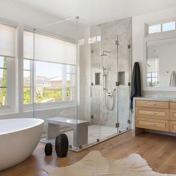
Ground up master bathroom, quartzite slab shower and waterfall countertops, custom floating cabinetry
Example of a large minimalist master beige tile and stone slab light wood floor freestanding bathtub design in San Diego with louvered cabinets, beige cabinets, a one-piece toilet, an undermount sink, quartzite countertops and beige countertops
Example of a large minimalist master beige tile and stone slab light wood floor freestanding bathtub design in San Diego with louvered cabinets, beige cabinets, a one-piece toilet, an undermount sink, quartzite countertops and beige countertops
 Casabella Interiors
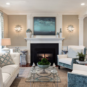
Inspiration for a mid-sized transitional formal and open concept medium tone wood floor living room remodel in Boston with beige walls, a standard fireplace, a plaster fireplace and no tv
 Ergo Beds
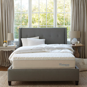
Tempur-Pedic Cloud Supreme Breeze shown here. Breeze technology is perfect for "hot sleepers" or people who normally sleep warm in memory foam beds. Tempur-Pedic is the most recommended bed in America by doctors and consumers alike. Tempur-Pedics are of the highest quality and are the longest lasting "memory foam" mattress available today. 90-day sleep trial at Ergo Bedroom.
 MLM Custom Homes & Renovations
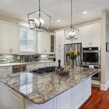
Historic, 1940's house kitchen and den renovation featuring:
- two tone counter tops
- glass back splash,
- custom painted wood cabinetry
- antique heart pine wood floors
- SS appliances
Project performed in 6 weeks time, on budget and desired timeline.
For free estimate call or click 504-322-7050 or www.mlm-inc.com

 TKS Design Group
Free ebook, Creating the Ideal Kitchen. DOWNLOAD NOW
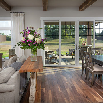
The Klimala’s and their three kids are no strangers to moving, this being their fifth house in the same town over the 20-year period they have lived there. “It must be the 7-year itch, because every seven years, we seem to find ourselves antsy for a new project or a new environment. I think part of it is being a designer, I see my own taste evolve and I want my environment to reflect that. Having easy access to wonderful tradesmen and a knowledge of the process makes it that much easier”.
This time, Klimala’s fell in love with a somewhat unlikely candidate. The 1950’s ranch turned cape cod was a bit of a mutt, but it’s location 5 minutes from their design studio and backing up to the high school where their kids can roll out of bed and walk to school, coupled with the charm of its location on a private road and lush landscaping made it an appealing choice for them.
“The bones of the house were really charming. It was typical 1,500 square foot ranch that at some point someone added a second floor to. Its sloped roofline and dormered bedrooms gave it some charm.” With the help of architect Maureen McHugh, Klimala’s gutted and reworked the layout to make the house work for them. An open concept kitchen and dining room allows for more frequent casual family dinners and dinner parties that linger. A dingy 3-season room off the back of the original house was insulated, given a vaulted ceiling with skylights and now opens up to the kitchen. This room now houses an 8’ raw edge white oak dining table and functions as an informal dining room. “One of the challenges with these mid-century homes is the 8’ ceilings. I had to have at least one room that had a higher ceiling so that’s how we did it” states Klimala.
The kitchen features a 10’ island which houses a 5’0” Galley Sink. The Galley features two faucets, and double tiered rail system to which accessories such as cutting boards and stainless steel bowls can be added for ease of cooking. Across from the large sink is an induction cooktop. “My two teen daughters and I enjoy cooking, and the Galley and induction cooktop make it so easy.” A wall of tall cabinets features a full size refrigerator, freezer, double oven and built in coffeemaker. The area on the opposite end of the kitchen features a pantry with mirrored glass doors and a beverage center below.
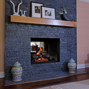
The rest of the first floor features an entry way, a living room with views to the front yard’s lush landscaping, a family room where the family hangs out to watch TV, a back entry from the garage with a laundry room and mudroom area, one of the home’s four bedrooms and a full bath. There is a double sided fireplace between the family room and living room. The home features pops of color from the living room’s peach grass cloth to purple painted wall in the family room. “I’m definitely a traditionalist at heart but because of the home’s Midcentury roots, I wanted to incorporate some of those elements into the furniture, lighting and accessories which also ended up being really fun. We are not formal people so I wanted a house that my kids would enjoy, have their friends over and feel comfortable.”
The second floor houses the master bedroom suite, two of the kids’ bedrooms and a back room nicknamed “the library” because it has turned into a quiet get away area where the girls can study or take a break from the rest of the family. The area was originally unfinished attic, and because the home was short on closet space, this Jack and Jill area off the girls’ bedrooms houses two large walk-in closets and a small sitting area with a makeup vanity. “The girls really wanted to keep the exposed brick of the fireplace that runs up the through the space, so that’s what we did, and I think they feel like they are in their own little loft space in the city when they are up there” says Klimala.
Designed by: Susan Klimala, CKD, CBD
Photography by: Carlos Vergara
For more information on kitchen and bath design ideas go to: www.kitchenstudio-ge.com
 TKS Design Group
Download our free ebook, Creating the Ideal Kitchen. DOWNLOAD NOW
Lakefront property in the northwest suburbs of Chicago is hard to come by, so when we were hired by this young family with exactly that, we were immediately inspired by not just the unusually large footprint of this 1950’s colonial revival but also the lovely views of the manmade lake it was sited on. The large 5-bedroom home was solidly stuck in the 1980’s, but we saw tons of potential. We started out by updating the existing staircase with a fresh coat of paint and adding new herringbone slate to the entry hall.
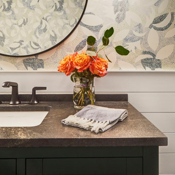
The powder room off the entryway also got a refresh - new flooring, new cabinets and fixtures. We ran the new slate right through into this space for some consistency. A fun wallpaper and shiplap trim add a welcoming feel and set the tone for the home.
Next, we tackled the kitchen. Located away from the rest of the first floor, the kitchen felt a little isolated, so we immediately began planning for how to better connect it to the rest of the first floor. We landed on removing the wall between the kitchen and dining room and designed a modified galley style space with separate cooking and clean up zones. The cooking zone consists of the refrigerator, prep sink and cooktop, along with a nice long run of prep space at the island. The cleanup side of the kitchen consists of the main sink and dishwasher. Both areas are situated so that the user can view the lake during prep work and cleanup!
One of the home’s main puzzles was how to incorporate the mudroom and area in front of the patio doors at the back of the house. We already had a breakfast table area, so the space by the patio doors was a bit of a no man’s land. We decided to separate the kitchen proper from what became the new mudroom with a large set of barn doors. That way you can quickly hide any mudroom messes but have easy access to the light coming in through the patio doors as well as the outdoor grilling station. We also love the impact the barn doors add to the overall space.
The homeowners’ first words to us were “it’s time to ditch the brown,” so we did! We chose a lovely blue pallet that reflects the home’s location on the lake which is also vibrant yet easy on the eye. Countertops are white quartz, and the natural oak floor works well with the other honey accents. The breakfast table was given a refresh with new chairs, chandelier and window treatments that frame the gorgeous views of the lake out the back.
We coordinated the slate mudroom flooring with that used in the home’s main entrance for a consistent feel. The storage area consists of open and closed storage to allow for some clutter control as needed.
Next on our “to do” list was revamping the dated brown bar area in the neighboring dining room. We eliminated the clutter by adding some closed cabinets and did some easy updates to help the space feel more current. One snag we ran into here was the discovery of a beam above the existing open shelving that had to be modified with a smaller structural beam to allow for our new design to work. This was an unexpected surprise, but in the end we think it was well worth it!
We kept the colors here a bit more muted to blend with the homeowner’s existing furnishings. Open shelving and polished nickel hardware add some simple detail to the new entertainment zone which also looks out onto the lake!
Next we tackled the upstairs starting with the homeowner’s son’s bath. The bath originally had both a tub shower and a separate shower, so we decided to swap out the shower for a new laundry area. This freed up some space downstairs in what used to be the mudroom/laundry room and is much more convenient for daily laundry needs.
We continued the blue palette here with navy cabinetry and the navy tile in the shower. Porcelain floor tile and chrome fixtures keep maintenance to a minimum while matte black mirrors and lighting add some depth the design. A low maintenance runner adds some warmth underfoot and ties the whole space together.
We added a pocket door to the bathroom to minimize interference with the door swings. The left door of the laundry closet is on a 180 degree hinge to allow for easy full access to the machines. Next we tackled the master bath which is an en suite arrangement. The original was typical of the 1980’s with the vanity outside of the bathroom, situated near the master closet. And the brown theme continued here with multiple shades of brown.
Our first move was to segment off the bath and the closet from the master bedroom. We created a short hall from the bedroom to the bathroom with his and hers walk-in closets on the left and right as well as a separate toilet closet outside of the main bathroom for privacy and flexibility.
The original bathroom had a giant soaking tub with steps (dangerous!) as well as a small shower that did not work well for our homeowner who is 6’3”. With other bathtubs in the home, they decided to eliminate the tub and create an oversized shower which takes up the space where the old tub was located. The double vanity is on the opposite wall and a bench is located under the window for morning conversations and a place to set a couple of towels.
The pallet in here is light and airy with a mix of blond wood, creamy porcelain and marble tile, and brass accents. A simple roman shade adds some texture and it’s top-down mechanism allows for light and privacy.
This large whole house remodel gave our homeowners not only the ability to maximize the potential of their home but also created a lovely new frame from which to view their fabulous lake views.
Designed by: Susan Klimala, CKD, CBD
Photography by: Michael Kaskel
For more information on kitchen and bath design ideas go to: www.kitchenstudio-ge.com
 Coty Construction
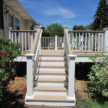
This deck was built with Azek brownstone decking and white railing. It has a short stair way accented with white posts, fascia and railings.
Example of a mid-sized classic backyard deck design in Minneapolis with no cover
Example of a mid-sized classic backyard deck design in Minneapolis with no cover

Sponsored
Columbus, OH

Hope Restoration & General Contracting
Columbus Design-Build, Kitchen & Bath Remodeling, Historic Renovations
 Treescapes
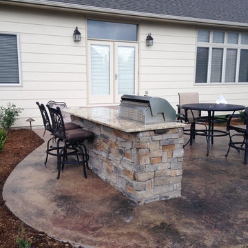
Custom Landscape Design By Treescapes including custom stamped concrete patio, seat wall, and outdoor grill island/countertop.
Example of a mid-sized transitional stamped concrete patio kitchen design in Wichita
Example of a mid-sized transitional stamped concrete patio kitchen design in Wichita
 Chestnut Grove Design Studio
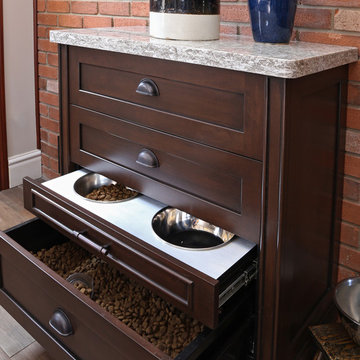
With two large dogs at home, our clients requested a custom cabinet for housing food and water bowls for their dogs. The spacious lower drawer makes a great kibble storage container. The upper drawer pulls out revealing two stainless steel bowls that fit into the cabinet, making feeding time easy and mess free. The top drawers are fully functional and can be used as extra kitchen storage space.
 Chalk Hill LLC
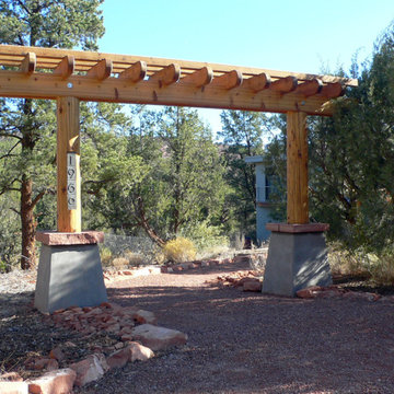
Free-standing pergola at guest parking signals a short stroll to the front door. LED lighting recessed into the beam illuminates the entry after dark.
Recycled western red cedar timbers announce the hidden house.
Photo: Chalk Hill
21