
Search results for "Frequent play" in Home Design Ideas
 Crystal Kitchen + Bath
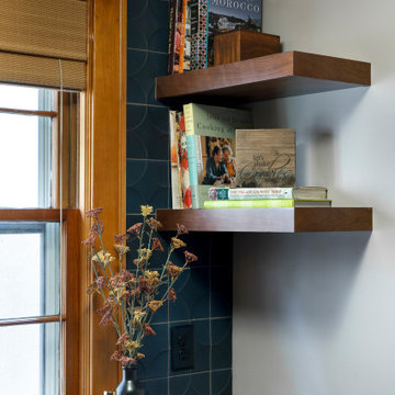
The goal for this 1939 Tudor-style story-and-a-half home was to create a kitchen that offered the conveniences, storage, and performance of a modern workspace while preserving the warmth, craftsmanship, and vintage charm that made the home special. The client, an avid home cook, wanted the room to feel as though it had always belonged to the house, with thoughtful upgrades that respected the original architecture rather than competing with it. Just as important, she needed a more efficient layout with enough storage for small appliances, so everyday cooking would no longer require carrying items up from the lower level.
Several existing conditions shaped the design approach. The kitchen retained original, amber-stained birch woodwork that the client wished to keep, and the compact footprint was interrupted by six doorways and two windows, none of which were to be moved, altered, or replaced. A previous flooring update had left the door casings undercut too short, creating visible gaps where the casing met the floor. The existing vintage 40-inch range also lacked proper ventilation, yet the client wished to accommodate a refrigerator, dishwasher, cooktop, double ovens, built-in microwave, and effective venting above the cooktop into the new kitchen layout.
To honor the original millwork, beaded inset-style cherry cabinetry was selected in a soft, hand-rubbed finish that will deepen over time and develop a natural patina. Charcoal-gray soapstone countertops complement the cabinetry while reinforcing the historic character of the home with an organic, timeworn texture. The former breakfast nook was transformed into a butler’s pantry, adding valuable base cabinet storage and expanded work surfaces for frequently used small appliances. Also in the butler’s pantry, a single upper cabinet was paired with open shelves to give an open, airy feeling while adding character and practical storage. A classic single-bowl apron-front workstation sink contributes both period-appropriate character and practical prep and cleanup function.
Because the home’s openings were such a defining feature, the design worked within the existing architecture instead of altering it. Custom plinth blocks were created for each doorway to extend the original casing gracefully down to the new natural red oak flooring, resolving the earlier construction issue while adding a detail that feels authentic to the age of the house. Despite the number of door and window openings, the new layout provides a significantly more functional, built-in kitchen with an improved work triangle for serious cooking.
Appliance placement was carefully planned to deliver the requested performance without overwhelming the small room. Three cooking functions (double ovens & microwave) were consolidated into one location with a GE Café double oven featuring Advantium Technology, while the client’s compact 31-inch refrigerator was reused to preserve space. A sleek 30-inch induction cooktop provides efficient cooking, and a Vent-A-Hood ARS ductless vent hood supplies needed ventilation without requiring a duct run to the exterior.
The finish palette balances richness, texture, and historical sensitivity. A deeply textured navy backsplash tile adds depth and dramatic shadow play against the soapstone, while wallpaper in the back entry echoes the tile’s geometric pattern to visually connect the adjoining spaces. Oil-rubbed bronze cabinet hardware and light fixtures enhance the warmth of the cherry cabinetry and complete the antique-inspired feel.
Lighting was layered to make the compact kitchen brighter, more useful, and more inviting. Vintage-style semi-flush ceiling fixtures establish the overall tone, while dimmable puck lights highlight select areas and undercabinet task lighting keeps work surfaces well illuminated.
The completed kitchen now feels both highly functional and deeply rooted in the home’s history. Rich cherry cabinetry, velvety soapstone, natural red oak flooring, navy tile, bronze accents, and carefully preserved birch trim work together to create a warm, cohesive space that celebrates timeless craftsmanship. By increasing storage, improving workflow, integrating modern appliances, and respecting the Tudor home’s original character, the design achieves the client’s vision: a kitchen that feels personal, practical, historically appropriate, and as though it has always been there.
 Powell Construction
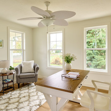
These homeowners came to us wanting to upgrade the curb appeal of their home and improve the layout of the interior. They hoped for an entry that would welcome guests to their home both inside and out, while also creating more defined and purposeful space within the home. The main goals of the project were to add a covered wrap around porch, add more windows for natural light, create a formal entry that housed the client’s baby grand piano, and add a home office for the clients to work from home.
With a dated exterior and facade that lacked dimension, there was little charm to be had. The front door was hidden from visitors and a lack of windows made the exterior unoriginal. We approached the exterior design pulling inspiration from the farmhouse style, southern porches, and craftsman style homes. Eventually we landed on a design that added numerous windows to the front façade, reminiscent of a farmhouse, and turned a Dutch hipped roof into an extended gable roof, creating a large front porch and adding curb appeal interest. By relocating the entry door to the front of the house and adding a gable accent over this new door, it created a focal point for guests and passersby. In addition to those design elements, we incorporated some exterior shutters rated for our northwest climate that echoed the southern style homes our client loved. A greige paint color (Benjamin Moore Cape May Cobblestone) accented with a white trim (Benjamin Moore Swiss Coffee) and a black front door, shutters, and window box (Sherwin Williams Black Magic) all work together to create a charming and welcoming façade.
On the interior we removed a half wall and coat closet that separated the original cramped entryway from the front room. The front room was a multipurpose space that didn’t have a designated use for the family, it became a catch-all space that was easily cluttered. Through the design process we came up with a plan to split the spaces into 2 rooms, a large open semi-formal entryway and a home office. The semi-formal entryway was intentionally designed to house the homeowner’s baby grand piano – a real showstopper. The flow created by this entryway is welcoming and ushers you into a beautifully curated home.
A new office now sits right off the entryway with beautiful French doors, built-in cabinetry, and an abundance of natural light – everything that one dreams of for their home office. The home office looks out to the front porch and front yard as well as the pastural side yard where the children frequently play. The office is an ideal location for a moment of inspiration, reflection, and focus. A warm white paint (Benjamin Moore Swiss Coffee) combined with the newly installed light oak luxury vinyl plank flooring runs throughout the home, creating continuity and a neutral canvas. Traditional and schoolhouse style statement light fixtures coordinate with the black door hardware for an added level of contrast.
There is one more improvement that made a big difference to this family. In the family room, we added a built-in window seat. This created a cozy nook that is used by all for reading and extra seating. This relatively small improvement had a big impact on how the family uses and enjoys the space.

 Charmean Neithart Interiors
The homeowners of this California Cottage wanted a beach vibe in their 1700 sq. ft. home. They wanted to make the most of their spaces by widening doorways, adding wood floors throughout the house, and adding a skylight. The result is cozy, casual California living at its best with frequent family dinners and celebrations with friends.
Photos by Erika Bierman www.erikabiermanphotography.com
Find the right local pro for your project
 NanaWall
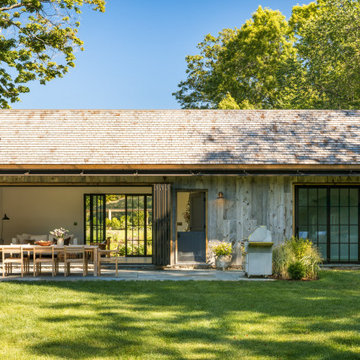
Nestled in the lush landscape, a modern reinterpretation of a once-fallen barn now features a charming guest cottage with stylish details and contemporary amenities. Situated along a narrow lot in Germantown, New York, the cottage completes a cluster of existing buildings, forming an intimate courtyard on one side. Steel effect folding patio doors fully open the living areas to the expansive fields and the Catskill Mountains beyond.
The homeowners, a young family with parents living abroad, envisioned a cozy yet modern ADU for extended stays. Designed by Lauren Cawse, AIA, architect and partner at The Art of Building, the year-round retreat draws inspiration from traditional local barns while embracing a seamless indoor-outdoor connection.
Captivating Guest Cottage Design Enhances the Senses with Steel Effect Folding Patio Doors
The modern ADU design started with the site itself. Positioned between residential and commercial neighbors, the elongated property required a careful balance of privacy and openness. Architect Lauren Cawse approached the layout by redefining the existing house and garage as the east and west sides of an outdoor room, with the new cottage forming its southern boundary. This arrangement created a clear courtyard near the main residence while directing the 800-square-foot guest house toward the open meadow and the distant Catskill Mountains.
“The unique character of the site and its history inspired the architectural direction,” says Cawse. “The intent was to create a secondary structure in the compound in clear contrast to the modern farmhouse style of the house and garage.”
A Barn-Inspired Exterior Adds Visual Flair
The exterior envelope evokes a traditional barn with a simple gable shape, weathered wood siding, cedar shingles, and a foundation veneer made of local fieldstone. A large sliding barn door adds a complementary feature to the courtyard-facing side, creating a dynamic opening that maintains uninterrupted views through the cottage to the meadow beyond.
Steel effect folding patio doors surrounding the structure add a modern touch of transparency, and simulated divided lites allow the contemporary glass wall systems to harmonize with the traditional elements of the modern ADU design.
“The goal was to fully open the living areas to the outdoors, framing views to the meadows and mountains,” says Cawse. “The positioning of the NanaWall systems frames the views and, when open, dissolves the boundary between inside and out.”
Interior Design That Mirrors Nature’s Tranquility
Inside, the design program features a simple layout with one bedroom, a full bath, a kitchenette, and a living area with a wood-burning stove. The interior, a collaboration between The Art of Building and the homeowners, is defined by an understated palette and tactile materials that reflect the natural setting. Color is introduced through the framed glass views on all sides of the structure. Reclaimed timber collar ties span the ceiling overhead, while stone surfaces and naturally patinated metal accents add quiet texture throughout.
Custom hand-painted Delft tiles along the kitchen backsplash add personal detail, and terra cotta flooring in the bathroom brings warmth and old-world charm. Soaring ceilings and abundant daylight create a peaceful play of light and shadow, shifting subtly with the seasons and emphasizing the cottage’s connection to the natural landscape outside.
Sleek Steel Effect Folding Patio Doors Elevate the Modern ADU Design Aesthetic
Three customized steel effect folding patio doors define the living space, each aligned to respond to a different edge of the site. The largest, spanning nearly 20 feet wide and just under eight feet tall, opens directly onto the stone patio, allowing the main gathering area to extend fully into the landscape. Along the side of the living room, a smaller 10-foot-wide system introduces more light and ventilation, nearly creating an open corner condition if not for the structural post that supports the façade and roofline.
At the rear, a fourth ten-foot-wide system features a French door swing panel configuration that opens toward the courtyard, strengthening the design connection to the main residence. All steel effect folding patio doors were specified with a low-maintenance, water-rated Performance Sill to safeguard against inclement weather while providing a seamless, barrier-free transition to the outdoor patio.
Unique Customizations for Visual Appeal and a Steel Effect
Each folding patio door system is configured to open outward, maximizing usable floor space in the compact interior and allowing furniture placement to remain uninterrupted. By stacking outward, the steel effect folding patio doors, specified in a SE Classic Bronze powder coat, ensure every inch of the cottage is optimized. Simulated divided lites create a consistent rhythm across windows and doors, maintaining alignment with the traditional barn-inspired exterior.
In the bedroom, a three-panel, 10-foot-wide system mirrors these customizations, matching the steel effect divided-lite pattern and outward-opening configuration, extending the indoor-outdoor connection while preserving visual continuity throughout the ADU.
“The divided lites were crucial to the architectural vision, and while budget prohibited a steel and glass system, NanaWall Systems’ thin frames provide the open and airy feeling we hoped to attain,” says Cawse. “Simulated divided lites transition the thoroughly modern element of the glass walls to remain in harmony with the otherwise traditional palette.”
Matching Windows and Doors: Create a Cohesive Design Program
Alongside the larger openings in the living areas and bedroom, a smaller 3-foot-tall NanaWall tilt turn window was added to the bathroom. This window-sized NanaWall system perfectly matches the divided lite panels and sleek frames of the steel effect folding patio doors, creating a cohesive modern ADU design throughout. The compact opening provides ventilation and natural light, enhancing the spa-like atmosphere along with natural stone flooring. The matching glass lines and sleek profiles of the NanaWall Generation 4 comprehensive product line further unify visual consistency, allowing each system to fit into the architectural style seamlessly.
“This project had three bifold glass walls, a pair of double French doors with sidelites, and a single tilt turn window,” says architect Lauren Cawse. “Being able to work with a single manufacturer provided aesthetic cohesiveness and simplified coordination.”
Sustainability Where It Matters Most
New York weather can vary from hot 85-degree summers to cold 26-degree winters. Creating an efficient living space was a primary goal. To achieve this, the design included Timber HP-insulated walls and floors with a heat pump system for effective heating and cooling. Additionally, the steel effect folding patio doors and windows were specified with double-glazed panels to ensure a tight building envelope.
Indoor-Outdoor Living Spaces for Relaxing and Entertaining
In-house landscape designer Liz Pulver worked closely with the team to conceive open-air spaces that enhanced the connection between inside and outside. To the south end of the lot, the landscape transitions into an “enhanced meadow,” allowing the cottage to feel embedded within the surrounding fields rather than set apart from them. A circular pool was designed to mimic a natural pond with a modest footprint. Around it, a minimalist fence and sunken stone ha-ha wall offer discreet safety for young children.
Limited space due to existing infrastructure and zoning setbacks left only a small footprint for the swimming pool, prompting the designer to propose a circular form that maximized the usable swimming area. “We felt that the perfect way to integrate a pool into the property and to honor the landscape would be to treat the pool as a piece of art itself,” says Pulver. “The result is a beautiful round pool that serves as both a functional retreat and a sculptural moment.”
Final Thoughts: A Barn-Inspired Design for Contemporary Living
This modern ADU design skillfully combines modern features with the enduring charm of traditional barns. The outcome is a welcoming living space that stands out amid a stunning landscape. Natural materials that mimic the beauty of the outdoors, expansive steel effect folding patio doors that fill the space with fresh air and natural light, and a restrained interior design work together to create an inviting retreat for everyday living, throughout the seasons.
“When entering the site, the cottage feels as though it was always there,” says Cawse. “It achieves its two opposing goals by creating a feeling of intimacy and enclosure near the house while also functioning as a threshold to the expansive fields and views beyond.”
Explore how NanaWall folding patio doors elevate other ADU spaces in our inspiring project photo gallery!
Frequently Asked Questions (FAQs)
What is Slimline Steel Effect?
Steel Effect is a folding patio door design option that replicates the appearance of traditional steel-framed glass doors. It combines the look of steel with the performance benefits of aluminum, including energy efficiency, low maintenance, greater design flexibility, and lower cost.
How does a NanaWall Steel Effect aluminum system compare to traditional steel-framed glass doors?
NanaWall Slimline Steel Effect folding patio doors replicate the narrow frames of traditional steel doors with improved weather and thermal performance and easier operation. They are lighter, more corrosion-resistant, and feature a thermally broken design for better energy efficiency and lower long-term maintenance.
What are the benefits of Steel Effect folding glass walls?
Steel Effect folding glass walls deliver the narrow sightlines and grid patterns of traditional steel, combined with the performance and low maintenance of aluminum. The slimline steel effect option offers all the benefits of our Generation 4 product line, including the FourFold / SixFold floating panel set option and smooth operation with Gothic arch stainless steel rollers on a stainless steel track.
Can Slimline Steel Effect glass walls be customized?
Yes, these systems offer a high level of customization to suit different architectural styles, including simulated divided lites specified in various patterns, popular SE colors for a true steel effect look, and a contemporary glass stop option for a refined look. Contact your local NanaWall representative for additional options here.
How energy-efficient and weather-resistant are Slimline Steel Effect folding patio doors?
Steel effect folding systems are engineered for strong thermal and weather performance. Thermally broken frames and high-performance glazing help improve energy efficiency. Each NanaWall system has been independently tested for air, water, structural integrity, and forced entry with excellent results.

 cobykane
Water Treatment and Wastewater Recycling Plant in Oil and Gas Production
WATERMAN ENGINEERS AUSTRALIA
Introduction
Water is a critical component in oil and gas processing, playing a crucial role in various stages of exploration, production, and refining. However, water handling in such processes poses serious challenges, mainly in connection with treating high TDS and salinity water. The situation is even more serious in oilfield sites, gas field sites, and exploratory sites where the need for water recycling and treatment is always necessary to minimize the impact on the environment and to keep operational costs at a minimum.
The oil and gas industry has seen a growing concern toward water treatment and recycling. These processes underline the sustainability of operations, license to operate, and low environmental footprint. This paper discusses the roles water treatment plants can play in mitigating the problems of high TDS and salinity during oil and gas production by recycling and reusing water to minimize waste and environmental harm.
The Water Challenges in Oil and Gas Production
Water finds its application on a large scale in the oil and gas industry for several purposes, such as in drilling, hydraulic fracturing, cooling, and hydrocarbon processing. The water used in these aforementioned processes frequently comes into contact with a wide array of contaminants, among which are hydrocarbons, heavy metals, several various chemicals, and high concentrations of dissolved salts. This contaminated water, often referred to as produced water, produces a great environmental risk if not properly treated.
Produced water typically contains high TDS concentrations, including salts, minerals, and other dissolved solids. Reservoir location and depth can make the salinity of this water vary widely. For many produced waters, these TDS values are very high and not suitable for direct discharge or reuse without treatment. The presence of salts and other dissolved solids can result in scaling, corrosion, and other operational problems of equipment, pipelines, and storage vessels.
For details visit: https://watermanaustralia.com/water-treatment-and-wastewater-recycling-plant-in-oil-and-gas-production/
 Tile Club
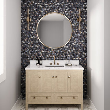
Create a mesmerizing dance of dimension and depth with our Prism Storm Beveled Hexagon Mosaic Tile. Inspired by the allure of dark skies, this 3D tile will add a touch of mystery and modern elegance to your wall and backsplash projects. It€™s crafted in timeless hexagon shapes that form a captivating geometric appeal for interior design projects where visual depth is desired. Embrace the trend of dimensional tiles in your home, as they become a statement piece that elevates the aesthetic of your rooms!
Get ready to experience a luminous glow with these iridescent glass tiles. Add depth to small showers, infuse office spaces with a unique charm, or create striking contrast within a light kitchen space; these hexagon tiles offer an inspired choice for any space. Transform your bathroom walls into modern marvels, where the play of light and shadow creates an immersive experience.
Adorn your contemporary living room walls with an artistic flair, as the interlocking hexagons weave a mesmerizing tapestry of texture! You can use this tile to elevate your ultra-modern kitchens with stainless steel appliances and shiny fixtures, as the gray reflective palette provides the perfect complement. What€™s more, glass mosaic tiles simplify your cleaning routine - perfect for busy areas where spills occur frequently. Get ready to discover the transformative power of our gray hexagon tile in your next design project and bring extraordinary beauty into your space!
We recommend using glass adhesive and an unsanded grout to ensure the best life for this tile material and finish!
 Crystal Kitchen + Bath
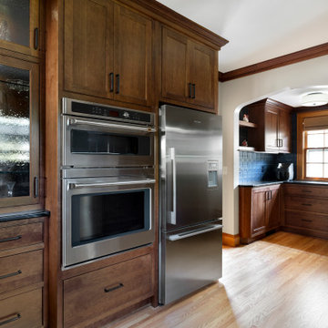
The goal for this 1939 Tudor-style story-and-a-half home was to create a kitchen that offered the conveniences, storage, and performance of a modern workspace while preserving the warmth, craftsmanship, and vintage charm that made the home special. The client, an avid home cook, wanted the room to feel as though it had always belonged to the house, with thoughtful upgrades that respected the original architecture rather than competing with it. Just as important, she needed a more efficient layout with enough storage for small appliances, so everyday cooking would no longer require carrying items up from the lower level.
Several existing conditions shaped the design approach. The kitchen retained original, amber-stained birch woodwork that the client wished to keep, and the compact footprint was interrupted by six doorways and two windows, none of which were to be moved, altered, or replaced. A previous flooring update had left the door casings undercut too short, creating visible gaps where the casing met the floor. The existing vintage 40-inch range also lacked proper ventilation, yet the client wished to accommodate a refrigerator, dishwasher, cooktop, double ovens, built-in microwave, and effective venting above the cooktop into the new kitchen layout.
To honor the original millwork, beaded inset-style cherry cabinetry was selected in a soft, hand-rubbed finish that will deepen over time and develop a natural patina. Charcoal-gray soapstone countertops complement the cabinetry while reinforcing the historic character of the home with an organic, timeworn texture. The former breakfast nook was transformed into a butler’s pantry, adding valuable base cabinet storage and expanded work surfaces for frequently used small appliances. Also in the butler’s pantry, a single upper cabinet was paired with open shelves to give an open, airy feeling while adding character and practical storage. A classic single-bowl apron-front workstation sink contributes both period-appropriate character and practical prep and cleanup function.
Because the home’s openings were such a defining feature, the design worked within the existing architecture instead of altering it. Custom plinth blocks were created for each doorway to extend the original casing gracefully down to the new natural red oak flooring, resolving the earlier construction issue while adding a detail that feels authentic to the age of the house. Despite the number of door and window openings, the new layout provides a significantly more functional, built-in kitchen with an improved work triangle for serious cooking.
Appliance placement was carefully planned to deliver the requested performance without overwhelming the small room. Three cooking functions (double ovens & microwave) were consolidated into one location with a GE Café double oven featuring Advantium Technology, while the client’s compact 31-inch refrigerator was reused to preserve space. A sleek 30-inch induction cooktop provides efficient cooking, and a Vent-A-Hood ARS ductless vent hood supplies needed ventilation without requiring a duct run to the exterior.
The finish palette balances richness, texture, and historical sensitivity. A deeply textured navy backsplash tile adds depth and dramatic shadow play against the soapstone, while wallpaper in the back entry echoes the tile’s geometric pattern to visually connect the adjoining spaces. Oil-rubbed bronze cabinet hardware and light fixtures enhance the warmth of the cherry cabinetry and complete the antique-inspired feel.
Lighting was layered to make the compact kitchen brighter, more useful, and more inviting. Vintage-style semi-flush ceiling fixtures establish the overall tone, while dimmable puck lights highlight select areas and undercabinet task lighting keeps work surfaces well illuminated.
The completed kitchen now feels both highly functional and deeply rooted in the home’s history. Rich cherry cabinetry, velvety soapstone, natural red oak flooring, navy tile, bronze accents, and carefully preserved birch trim work together to create a warm, cohesive space that celebrates timeless craftsmanship. By increasing storage, improving workflow, integrating modern appliances, and respecting the Tudor home’s original character, the design achieves the client’s vision: a kitchen that feels personal, practical, historically appropriate, and as though it has always been there.


 safe ZOnea
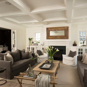
Ask a kitchen designer in Chicago which countertop question comes up most and you will hear the same answer: white or off-white quartz, and which shade. Homeowners walk into showrooms with a photo saved on their phone, usually a bright, veined slab from a magazine spread, and leave an hour later realizing there are a dozen versions of that same look. The confusion is not about taste. It is about the fact that "white quartz" covers a huge range of patterns, undertones, and price points, and nobody explains the differences before the sale.
Older bungalows and newer builds alike are getting stripped of their dated laminate and butcher block in favor of quartz, and the reasons are practical rather than trendy. Quartz does not need sealing, resists the kind of staining that granite can suffer over decades, and holds up to the freeze-thaw humidity swings that Chicago basements and kitchens go through every year. Once a homeowner commits to quartz, though, the real decision starts: which white, and does the pattern justify the difference in cost.
This piece walks through three specific slabs that keep showing up in Chicago renovation projects, why designers reach for them in different rooms, and what actually separates a flat white surface from one with real depth. None of this requires a design background to follow. It is mostly about paying attention to how a slab behaves under kitchen lighting, how busy the vending gets, and how it photographs versus how it looks in person.
Why White Quartz Took Over Chicago Kitchens
Ten years ago, granite dominated Chicago kitchen remodels almost by default. It was durable, it looked expensive, and every fabricator in the metro area carried a wide range of colors. Quartz has since taken over that position, and the shift happened faster than most contractors expected. Engineered stone gave homeowners a more predictable surface, since natural granite varies slab to slab while quartz is manufactured to a consistent pattern batch after batch.
The other driver is light. Chicago winters are long and gray, and a lot of kitchens, especially in older two-flats and courtyard buildings, do not get much direct sun. A dark granite countertop in a dim kitchen can make the whole room feel smaller. White and light-toned quartz reflects what little natural light comes through the windows, and it makes a galley kitchen or a north-facing space feel noticeably brighter without touching the cabinetry or the layout.
There is also a resale argument that local real estate agents bring up constantly. White quartz photographs well for listings, reads as updated and low-maintenance to buyers touring in person, and does not compete visually with whatever cabinet color the next owner might prefer. It is a safer bet than a bold veined marble look or a colored quartz that might feel dated in five years.
Arctic White and the Cost Question
Among the flatter, more uniform whites, arctic white quartz price comes up constantly in budget conversations because the slab sits at a more approachable point than the heavily veined Italian-marble-inspired patterns. It reads as clean and bright without the busy movement that some homeowners find overwhelming in a small kitchen. Fabricators in the Chicago area tend to keep it in stock precisely because demand stays steady across both new construction and remodel projects.
Part of what keeps this slab affordable relative to its heavily patterned cousins comes down to manufacturing complexity. A quartz surface with minimal veining and a consistent white base is simpler to produce at scale than one that mimics the irregular, high-contrast movement of natural Calacatta marble. That production difference shows up directly in what a homeowner pays per square foot, and it is worth asking a fabricator to walk through that pricing before assuming every white quartz costs the same.
Homeowners planning a full kitchen, including an island, backsplash, and perimeter counters, often use a flatter white like this specifically because it lets other elements carry the visual interest. A patterned tile backsplash or a bold cabinet color reads more clearly against a calm countertop than against one already fighting for attention with heavy veining. Designers frequently pair simpler whites with statement lighting fixtures for exactly this reason.
What Makes Calacatta Patterns Different
Calacatta refers to a family of marble originally quarried in Italy, known for a bright white background broken up by bold, often gold-toned veining that moves in thick, dramatic streaks rather than thin gray lines. Natural Calacatta marble is soft, porous, and expensive to maintain, which is exactly why quartz manufacturers spent years developing engineered versions that replicate the look without the upkeep headaches.
The challenge with any Calacatta-style quartz is getting the veining to look organic instead of printed. Early generations of engineered stone struggled with repetitive patterns that gave away the fact the slab was manufactured rather than cut from actual marble. Modern digital printing and layering techniques have closed that gap considerably, and the better Calacatta-inspired quartz lines now vary the veining across each slab batch so two counters in the same kitchen do not look identical.
Chicago designers gravitate toward Calacatta patterns for kitchens that function as the visual centerpiece of an open floor plan, which describes a large share of the gut renovations happening in neighborhoods like Lincoln Park, Roscoe Village, and the North Shore suburbs. When the kitchen island is visible from the living room and dining area, a dramatic veined surface becomes part of the home's overall design language rather than a purely functional work surface.
Calacatta Arno Under Kitchen Lighting
One of the more popular options in this category, calacatta arno quartz, balances a warm white base with soft gray and gold veining that avoids looking too stark under the cooler LED lighting common in newer Chicago builds. Homeowners touring showrooms sometimes make the mistake of judging a slab entirely under warm incandescent lighting, then get surprised when the same surface looks slightly different once installed under their kitchen's actual fixtures.
What separates this particular pattern from flatter competitors is how the veining clusters rather than spreading evenly across the slab. That clustering mimics the way real quarried marble forms, with denser mineral deposits in some sections and cleaner stretches in others. Fabricators cutting a large island slab from a single piece will often orient the pattern intentionally so the busiest veining lands somewhere visually interesting rather than getting cut off at an edge.
Because the background reads warmer than a stark white, this pattern tends to pair well with brass or matte gold hardware, a combination that has been showing up repeatedly in Chicago kitchen remodels over the past few renovation seasons. Cabinet painters report a similar trend, with more clients requesting warm white or greige cabinet colors specifically because they complement this kind of veined quartz better than a cooler, blue-toned white would.
Silestone's Version of the Calacatta Look
Manufacturers compete directly in this Calacatta-inspired category, and silestone eternal calacatta gold represents one brand's specific take on the pattern, distinguished by richer gold veining set against a brighter white base than some competing slabs in the same family. Silestone has built a reputation around anti-bacterial surface treatments in addition to the standard quartz durability, a detail some homeowners specifically ask about for kitchens used heavily by families with young children.
The veining in this particular slab tends to run in longer, more continuous lines compared to the clustered pattern found in some other Calacatta-style options, which gives large island surfaces a sense of visual flow from one end to the other. Fabricators working with bigger islands, the kind increasingly common in open-concept Chicago remodels, often favor patterns like this because there is less need to worry about seams interrupting a busy, disconnected pattern.
Price positioning for this slab tends to sit toward the upper end of the engineered quartz category, reflecting both the brand's manufacturing process and the complexity of replicating that continuous gold veining consistently across production batches. Homeowners weighing this option against other Calacatta-style quartz should ask their fabricator directly about batch availability, since premium patterns sometimes have longer lead times than standard stock colors.
Living With Quartz Day to Day
Beyond how a slab looks in a showroom or a listing photo, the daily experience of owning quartz countertops matters more once the renovation dust settles. Quartz resists scratching far better than laminate and holds up to the acidic spills, hot pans, and general abuse of an active kitchen without the sealing maintenance that natural stone requires every year or two. That low-maintenance reputation is a large part of why quartz overtook granite in the first place.
Heat resistance is a detail that gets less attention than it should. While quartz handles moderate heat well, manufacturers generally recommend using a trivet or pad for very hot pots straight off the stove, since sudden temperature shock can occasionally cause stress marks in the resin binder that holds the engineered stone together. This is a minor precaution rather than a major limitation, but it is worth mentioning to anyone assuming quartz is entirely indestructible.
Cleaning routines stay simple across almost every pattern in this category. A damp cloth and mild soap handle daily messes, and the nonporous surface means wine, coffee, and tomato-based sauces do not soak in the way they can with unsealed granite or marble. Homeowners moving from an older stone counter often mention how much less they worry about everyday spills once quartz is installed, which is a quality-of-life change that rarely makes it into the initial design conversation.
Choosing Between the Three
There is no single correct answer among these three slabs, and that is exactly why they keep coming up together in the same design conversations across Chicago renovation projects. A flatter white with minimal veining suits kitchens where other elements need to carry the visual interest, while a bolder Calacatta-inspired pattern makes sense when the countertop itself is meant to be the centerpiece of an open floor plan.
Budget matters too, and it is worth having a direct conversation with a fabricator about where each option lands before falling in love with a specific slab in a showroom. Lighting, cabinet color, and how the kitchen connects to the rest of the home all play into which pattern will actually look right once installation is finished rather than just in a photo.
Whatever direction a homeowner leans, seeing a full slab in person under actual kitchen lighting remains the single most useful step before signing off. Photos only go so far once the countertop is sitting in the room it will live in for years.
 Karv One Design
The Mid-Levels of Hong Kong Island is one of the most prominent luxury residential areas. This project - Estoril Court in Mid-Levels Central is one of the rare heritage mansions in Hong Kong with a "thousand-year lease," comprising a total of 240 units.
The young couple, with their two daughters, have settled here. For the wide experience husband, the most important aspect of a home is that it carries the "depth of love." His wife's preferences and the children's interests were frequently mentioned during this project. "I hope the design can break through conventions and avoid falling into the trap of popular but clichéd styles. Kyle and I resonate deeply on this point; we both pursue a 'more personal expression.' Family life should be relaxing, natural, and bringing joy to my family members."
This residence features a square layout and excellent natural lighting, with a practicality rate of nearly 90%. However, its over 40-year-old structure poses numerous constraints on renovations. Adhering to the existing structure and the wisdom of geomancy, Karv One Design has re-examined the relationship among the landscape, windows, and functional flow within the home. They have integrated practicality, beauty, and self-expression into every corner, enhancing the happiness of living.
Once stepping into the living room, you are greeted by Hong Kong's most spectacular vistas. The ever-changing scenery of Victoria Harbour, both day and night, the immense skyscrapers of different banks and commercial buildings and the panoramic views of the Peak are all within sight. The expansive dimensions of the living room are a response to the surrounding environment, providing ample space for family bonding and companionship, while also allowing the breathtaking skyline views to seamlessly integrate into daily life.
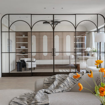
Unlike traditional whole-house decoration, the design of Hong Kong homes emphasizes collage and customization. The minimalist aesthetic of the space corresponds to the luxurious craftsmanship and time costs involved. Elements such as natural stone, artistic paint, parquet flooring, wood veneer, and leather have all been meticulously coordinated in terms of color and proportion, while a significant amount of storage space has been cleverly concealed within the walls.
The study room is deliberately positioned to one side of the living room, embracing the gentle stretch of sunlight. The arched iron partition, exuding a vintage flavor and traces of time, not only serves as a natural divider of space but also becomes a highlight of the interior decoration with its unique artistic form, creating a serene yet stylish atmosphere. It ensures privacy without compromising on openness, allowing the home owner to work in the study room while still keeping an eye on the children playing in the living room.
Custom-made artisanal furniture offers a whole new expression of comfort and practicality to the space. The Giorgetti HUG armchair combines a sculptural sense of form with a flowing sense of shape. When natural light filters in, a rich artistic atmosphere permeates and grows within, making the home a place of tranquility and peace of mind.
The fireplace plays a significant role in the dining room. In the warm climate of Hong Kong, the fireplace rarely serves a practical purpose; it is designed to create a cozy atmosphere for family gatherings. During the winter Christmas season, it will be adorned with gifts wrapped in beautiful paper, serving as a nostalgic reminder of memories and expressions of love.
The original open-plan layout of the master bedroom has been reconfigured and divided. The ultimate goal of the enclosed space is to provide comfort and ease of sleep. The pale green color is also carefully coordinated, focusing on creating a serene and pleasant atmosphere. The combination of "green," "wood," and "metal elements" is based on Feng Shui considerations, serving to stabilize and concentrate the energy flow.
The children's room is simple yet cozy, where sunlight awakens the space and transparent glass windows bring in the ocean view. The palette of pale blue and white adds warmth and vitality to the space, inspiring children's boundless imagination about the unknown world and giving them the courage to see mountains, seas, and the world beyond.
The unique, customized storage design is cleverly hidden within the space, blending handicraft and industrial design. Adorned with delicate textures such as rounded corners and layered elements, the craftsmanship is meticulous and exquisite, demonstrating exceptional ingenuity. It adds a sense of depth and artistry to the visual experience.
The lighting system in the space brings more enjoyable experiences to "living as you desire." The smart system caters to various states of living scenarios at different times, as well as to the subtle needs of ambient temperature, brightness, and tactile atmosphere. Whether it's solo time or family moments, day or night, everyone has a comfortable place to be.
The "Estoril Court" project is a full-service case that last for 12 months. We had hundreds of communications and exchanges with the home owner, and continuously coordinated and collaborated with the property management, on-site construction and installation workers, manufacturers, and various suppliers, striving for perfection in craftsmanship and meticulous attention to detail in execution. Finally, seeing the satisfied expressions of the home owner and their family, we felt that it was an ideal conveyance.
 The Conscious Builder Inc.
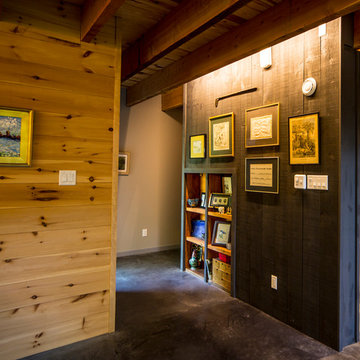
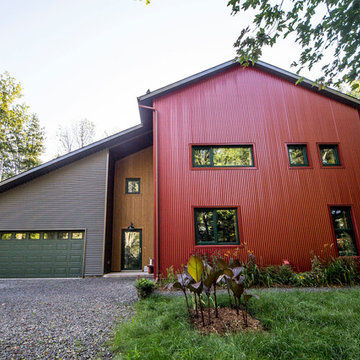
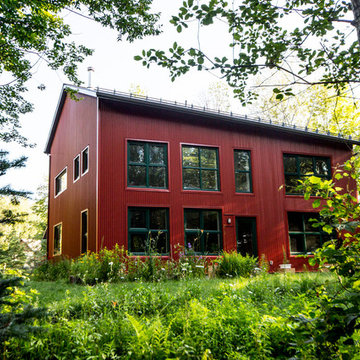
For this project, the goals were straight forward - a low energy, low maintenance home that would allow the "60 something couple” time and money to enjoy all their interests. Accessibility was also important since this is likely their last home. In the end the style is minimalist, but the raw, natural materials add texture that give the home a warm, inviting feeling.
The home has R-67.5 walls, R-90 in the attic, is extremely air tight (0.4 ACH) and is oriented to work with the sun throughout the year. As a result, operating costs of the home are minimal. The HVAC systems were chosen to work efficiently, but not to be complicated. They were designed to perform to the highest standards, but be simple enough for the owners to understand and manage.
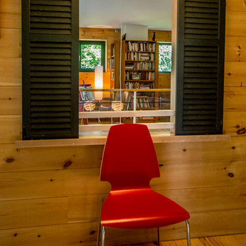
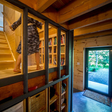
The owners spend a lot of time camping and traveling and wanted the home to capture the same feeling of freedom that the outdoors offers. The spaces are practical, easy to keep clean and designed to create a free flowing space that opens up to nature beyond the large triple glazed Passive House windows. Built-in cubbies and shelving help keep everything organized and there is no wasted space in the house - Enough space for yoga, visiting family, relaxing, sculling boats and two home offices.
The most frequent comment of visitors is how relaxed they feel. This is a result of the unique connection to nature, the abundance of natural materials, great air quality, and the play of light throughout the house.
The exterior of the house is simple, but a striking reflection of the local farming environment. The materials are low maintenance, as is the landscaping. The siting of the home combined with the natural landscaping gives privacy and encourages the residents to feel close to local flora and fauna.
Photo Credit: Leon T. Switzer/Front Page Media Group
 The Conscious Builder Inc.
For this project, the goals were straight forward - a low energy, low maintenance home that would allow the "60 something couple” time and money to enjoy all their interests. Accessibility was also important since this is likely their last home. In the end the style is minimalist, but the raw, natural materials add texture that give the home a warm, inviting feeling.
The home has R-67.5 walls, R-90 in the attic, is extremely air tight (0.4 ACH) and is oriented to work with the sun throughout the year. As a result, operating costs of the home are minimal. The HVAC systems were chosen to work efficiently, but not to be complicated. They were designed to perform to the highest standards, but be simple enough for the owners to understand and manage.
The owners spend a lot of time camping and traveling and wanted the home to capture the same feeling of freedom that the outdoors offers. The spaces are practical, easy to keep clean and designed to create a free flowing space that opens up to nature beyond the large triple glazed Passive House windows. Built-in cubbies and shelving help keep everything organized and there is no wasted space in the house - Enough space for yoga, visiting family, relaxing, sculling boats and two home offices.
The most frequent comment of visitors is how relaxed they feel. This is a result of the unique connection to nature, the abundance of natural materials, great air quality, and the play of light throughout the house.
The exterior of the house is simple, but a striking reflection of the local farming environment. The materials are low maintenance, as is the landscaping. The siting of the home combined with the natural landscaping gives privacy and encourages the residents to feel close to local flora and fauna.
Photo Credit: Leon T. Switzer/Front Page Media Group
 The Conscious Builder Inc.
For this project, the goals were straight forward - a low energy, low maintenance home that would allow the "60 something couple” time and money to enjoy all their interests. Accessibility was also important since this is likely their last home. In the end the style is minimalist, but the raw, natural materials add texture that give the home a warm, inviting feeling.
The home has R-67.5 walls, R-90 in the attic, is extremely air tight (0.4 ACH) and is oriented to work with the sun throughout the year. As a result, operating costs of the home are minimal. The HVAC systems were chosen to work efficiently, but not to be complicated. They were designed to perform to the highest standards, but be simple enough for the owners to understand and manage.
The owners spend a lot of time camping and traveling and wanted the home to capture the same feeling of freedom that the outdoors offers. The spaces are practical, easy to keep clean and designed to create a free flowing space that opens up to nature beyond the large triple glazed Passive House windows. Built-in cubbies and shelving help keep everything organized and there is no wasted space in the house - Enough space for yoga, visiting family, relaxing, sculling boats and two home offices.
The most frequent comment of visitors is how relaxed they feel. This is a result of the unique connection to nature, the abundance of natural materials, great air quality, and the play of light throughout the house.
The exterior of the house is simple, but a striking reflection of the local farming environment. The materials are low maintenance, as is the landscaping. The siting of the home combined with the natural landscaping gives privacy and encourages the residents to feel close to local flora and fauna.
Photo Credit: Leon T. Switzer/Front Page Media Groupp
 The Conscious Builder Inc.
For this project, the goals were straight forward - a low energy, low maintenance home that would allow the "60 something couple” time and money to enjoy all their interests. Accessibility was also important since this is likely their last home. In the end the style is minimalist, but the raw, natural materials add texture that give the home a warm, inviting feeling.
The home has R-67.5 walls, R-90 in the attic, is extremely air tight (0.4 ACH) and is oriented to work with the sun throughout the year. As a result, operating costs of the home are minimal. The HVAC systems were chosen to work efficiently, but not to be complicated. They were designed to perform to the highest standards, but be simple enough for the owners to understand and manage.
The owners spend a lot of time camping and traveling and wanted the home to capture the same feeling of freedom that the outdoors offers. The spaces are practical, easy to keep clean and designed to create a free flowing space that opens up to nature beyond the large triple glazed Passive House windows. Built-in cubbies and shelving help keep everything organized and there is no wasted space in the house - Enough space for yoga, visiting family, relaxing, sculling boats and two home offices.
The most frequent comment of visitors is how relaxed they feel. This is a result of the unique connection to nature, the abundance of natural materials, great air quality, and the play of light throughout the house.
The exterior of the house is simple, but a striking reflection of the local farming environment. The materials are low maintenance, as is the landscaping. The siting of the home combined with the natural landscaping gives privacy and encourages the residents to feel close to local flora and fauna.
Photo Credit: Leon T. Switzer/Front Page Media Group
 The Conscious Builder Inc.
For this project, the goals were straight forward - a low energy, low maintenance home that would allow the "60 something couple” time and money to enjoy all their interests. Accessibility was also important since this is likely their last home. In the end the style is minimalist, but the raw, natural materials add texture that give the home a warm, inviting feeling.
The home has R-67.5 walls, R-90 in the attic, is extremely air tight (0.4 ACH) and is oriented to work with the sun throughout the year. As a result, operating costs of the home are minimal. The HVAC systems were chosen to work efficiently, but not to be complicated. They were designed to perform to the highest standards, but be simple enough for the owners to understand and manage.
The owners spend a lot of time camping and traveling and wanted the home to capture the same feeling of freedom that the outdoors offers. The spaces are practical, easy to keep clean and designed to create a free flowing space that opens up to nature beyond the large triple glazed Passive House windows. Built-in cubbies and shelving help keep everything organized and there is no wasted space in the house - Enough space for yoga, visiting family, relaxing, sculling boats and two home offices.
The most frequent comment of visitors is how relaxed they feel. This is a result of the unique connection to nature, the abundance of natural materials, great air quality, and the play of light throughout the house.
The exterior of the house is simple, but a striking reflection of the local farming environment. The materials are low maintenance, as is the landscaping. The siting of the home combined with the natural landscaping gives privacy and encourages the residents to feel close to local flora and fauna.
Photo Credit: Leon T. Switzer/Front Page Media Group
 The Conscious Builder Inc.
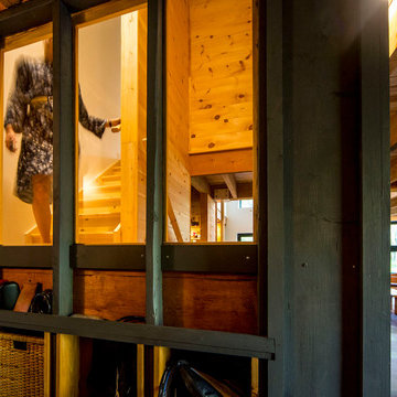
For this project, the goals were straight forward - a low energy, low maintenance home that would allow the "60 something couple” time and money to enjoy all their interests. Accessibility was also important since this is likely their last home. In the end the style is minimalist, but the raw, natural materials add texture that give the home a warm, inviting feeling.
The home has R-67.5 walls, R-90 in the attic, is extremely air tight (0.4 ACH) and is oriented to work with the sun throughout the year. As a result, operating costs of the home are minimal. The HVAC systems were chosen to work efficiently, but not to be complicated. They were designed to perform to the highest standards, but be simple enough for the owners to understand and manage.
The owners spend a lot of time camping and traveling and wanted the home to capture the same feeling of freedom that the outdoors offers. The spaces are practical, easy to keep clean and designed to create a free flowing space that opens up to nature beyond the large triple glazed Passive House windows. Built-in cubbies and shelving help keep everything organized and there is no wasted space in the house - Enough space for yoga, visiting family, relaxing, sculling boats and two home offices.
The most frequent comment of visitors is how relaxed they feel. This is a result of the unique connection to nature, the abundance of natural materials, great air quality, and the play of light throughout the house.
The exterior of the house is simple, but a striking reflection of the local farming environment. The materials are low maintenance, as is the landscaping. The siting of the home combined with the natural landscaping gives privacy and encourages the residents to feel close to local flora and fauna.
Photo Credit: Leon T. Switzer/Front Page Media Group
 The Conscious Builder Inc.
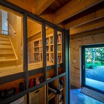
For this project, the goals were straight forward - a low energy, low maintenance home that would allow the "60 something couple” time and money to enjoy all their interests. Accessibility was also important since this is likely their last home. In the end the style is minimalist, but the raw, natural materials add texture that give the home a warm, inviting feeling.
The home has R-67.5 walls, R-90 in the attic, is extremely air tight (0.4 ACH) and is oriented to work with the sun throughout the year. As a result, operating costs of the home are minimal. The HVAC systems were chosen to work efficiently, but not to be complicated. They were designed to perform to the highest standards, but be simple enough for the owners to understand and manage.
The owners spend a lot of time camping and traveling and wanted the home to capture the same feeling of freedom that the outdoors offers. The spaces are practical, easy to keep clean and designed to create a free flowing space that opens up to nature beyond the large triple glazed Passive House windows. Built-in cubbies and shelving help keep everything organized and there is no wasted space in the house - Enough space for yoga, visiting family, relaxing, sculling boats and two home offices.
The most frequent comment of visitors is how relaxed they feel. This is a result of the unique connection to nature, the abundance of natural materials, great air quality, and the play of light throughout the house.
The exterior of the house is simple, but a striking reflection of the local farming environment. The materials are low maintenance, as is the landscaping. The siting of the home combined with the natural landscaping gives privacy and encourages the residents to feel close to local flora and fauna.
Photo Credit: Leon T. Switzer/Front Page Media Group
 Paradox Interior Design Inc.
Challenge:
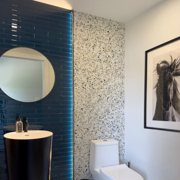
Our clients needed a functional powder room in the basement of their lake house, positioned strategically next to the entrance for swimmers and guests. The space required materials that could withstand high moisture and frequent use while maintaining an inviting, modern aesthetic that would complement the relaxed lakeside lifestyle.
Solution:
We designed a vibrant, practical powder room that balances durability with playful sophistication. The design centers around selecting materials specifically chosen for their ability to handle moisture and heavy use without sacrificing style. By incorporating bold color elements and modern finishes, we created a space that feels fresh and energizing—perfect for the lakeside setting.
Highlights:
• Durable terrazzo tile flooring that withstands moisture and heavy foot traffic
• Bright blue illuminated glass tile feature that adds modern vibrancy and visual interest
• Strategic material selection prioritizing both functionality and aesthetic appeal
• Fun, contemporary design that complements the relaxed lake house atmosphere
Results:
The transformed powder room now serves as a practical yet stylish transition space for swimmers and guests, combining the durability needed for lakeside living with a modern, vibrant aesthetic. This project showcases our ability to create functional spaces that don't compromise on style, proving that high-traffic areas can still deliver visual impact and personality.
 Chervin Kitchen & Bath Inc.
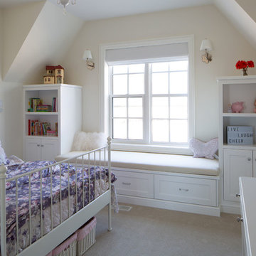
This bedroom made one little girl very happy! An adorable space to begin with, featuring a partial vaulted ceiling over the window, this room is positively dreamy with it’s all-white furniture and cabinetry, and soft pink and purple accent colours. The custom-built window seat provides additional storage space for bedding, toys, or seasonal clothes, while offering a comfy place for reading, playing, or even afternoon naps! The cabinets are balanced and spacious with exposed shelving for decorative or frequently accessed items, as well as closed-in shelving, to avoid clutter. The traditional style of this bed frame completes the look of the room, and sits in the perfect place to be bathed in sun during the day and in place for stargazing at night.
PC: Fred Huntsberger
 The Conscious Builder Inc.
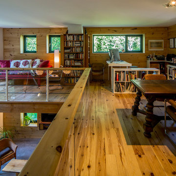
For this project, the goals were straight forward - a low energy, low maintenance home that would allow the "60 something couple” time and money to enjoy all their interests. Accessibility was also important since this is likely their last home. In the end the style is minimalist, but the raw, natural materials add texture that give the home a warm, inviting feeling.
The home has R-67.5 walls, R-90 in the attic, is extremely air tight (0.4 ACH) and is oriented to work with the sun throughout the year. As a result, operating costs of the home are minimal. The HVAC systems were chosen to work efficiently, but not to be complicated. They were designed to perform to the highest standards, but be simple enough for the owners to understand and manage.
The owners spend a lot of time camping and traveling and wanted the home to capture the same feeling of freedom that the outdoors offers. The spaces are practical, easy to keep clean and designed to create a free flowing space that opens up to nature beyond the large triple glazed Passive House windows. Built-in cubbies and shelving help keep everything organized and there is no wasted space in the house - Enough space for yoga, visiting family, relaxing, sculling boats and two home offices.
The most frequent comment of visitors is how relaxed they feel. This is a result of the unique connection to nature, the abundance of natural materials, great air quality, and the play of light throughout the house.
The exterior of the house is simple, but a striking reflection of the local farming environment. The materials are low maintenance, as is the landscaping. The siting of the home combined with the natural landscaping gives privacy and encourages the residents to feel close to local flora and fauna.
Photo Credit: Leon T. Switzer/Front Page Media Group
 The Conscious Builder Inc.
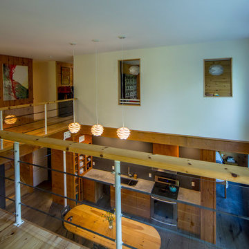
For this project, the goals were straight forward - a low energy, low maintenance home that would allow the "60 something couple” time and money to enjoy all their interests. Accessibility was also important since this is likely their last home. In the end the style is minimalist, but the raw, natural materials add texture that give the home a warm, inviting feeling.
The home has R-67.5 walls, R-90 in the attic, is extremely air tight (0.4 ACH) and is oriented to work with the sun throughout the year. As a result, operating costs of the home are minimal. The HVAC systems were chosen to work efficiently, but not to be complicated. They were designed to perform to the highest standards, but be simple enough for the owners to understand and manage.
The owners spend a lot of time camping and traveling and wanted the home to capture the same feeling of freedom that the outdoors offers. The spaces are practical, easy to keep clean and designed to create a free flowing space that opens up to nature beyond the large triple glazed Passive House windows. Built-in cubbies and shelving help keep everything organized and there is no wasted space in the house - Enough space for yoga, visiting family, relaxing, sculling boats and two home offices.
The most frequent comment of visitors is how relaxed they feel. This is a result of the unique connection to nature, the abundance of natural materials, great air quality, and the play of light throughout the house.
The exterior of the house is simple, but a striking reflection of the local farming environment. The materials are low maintenance, as is the landscaping. The siting of the home combined with the natural landscaping gives privacy and encourages the residents to feel close to local flora and fauna.
Photo Credit: Leon T. Switzer/Front Page Media Group
8