
Search results for "Grade update" in Home Design Ideas
 mackmiller design+build
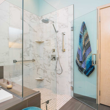
Ms. Homeowner’s townhome Primary Bathroom was a cookie-cutter, builder-grade space that she wanted upgraded and updated. The shower tile was discolored and mildewed; the traditional vanity tile floor and tub deck were also outdated. Our client wanted an accessible bathroom she could age in place in featuring an updated, modern yet timeless and elegant design, with better storage all within a conservative budget.
The main challenge in this project was to transform the space and raise the design quotient within the requested budget. We kept the basic footprint, preserved the existing maple doors and trim, saved and re-used the bathtub, purchased a sleek pre-fabricated, vanity which included the countertop and sinks. We reserved some of the budget for high impact items, upgrading fixtures and finishes in every area. We made the shower safer and more visually open by installing a curbless, barrier-free floor, and a frameless glass shower door and panels. We extended the tub deck into the shower area which is a functioning bench and product shelf. We replaced all of the tile, faucets, hardware and accessories with sleek chrome components. A client-requested, high quality commode with a remote controlled Toto washlet seat was installed. The eye-catching color scheme, based on the new vanity and countertop is a balance of rich, dark neutrals paired with crisp whites, bright chrome fixtures, and turquoise wall paint which beautifully coordinates with the existing natural maple doors and trim.

 CITYDESKSTUDIO, Inc.
Built in 1949, this Edina home had a strong horizontal presence on the site, but through subsequent renovations the overall massing was lacking clarity and refinement and the entry was diminutive and uninviting. The roof and siding materials were aging, and important interior spaces were cramped and closed in. The house needed better light, better connection internally and out, and exterior updates to clarify and enhance the strengths of the home.
The primary design evolved out of a celebration of the existing horizontality of the home and a recognition that a bigger home was not needed. By layering materiality and color, a new identity was created. A new cedar entry canopy slips out from under the previous roof line, extending further towards the street. This added warmth at the entry is echoed along the facade, creating a graceful rhythm and texture. The previous additions were re-clad with a darker material palette in order to anchor and unify the ends of the home. As the grade slopes down towards the back yard, horizontal bands are exposed, revealing the layering top to bottom. Combined, these few shifts in color and materiality allowed for a complete transformation of the home.
The interior is reflective of the material and color palette used outside. The main living spaces are opened up and connected while strengthening the original symmetry of the more formal linear alignment of rooms. A whole new kitchen relocates the center of the home and makes more fluid the daily life of this young family. The house is fully transformed inside and out, all without adding more square feet.
Project Team:
Ben Awes, AIA, Principal-in-Charge
Nate Dodge
 Melissa Hardwick Design
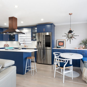
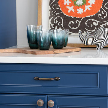
A gorgeous kitchen remodeled from a builder’s basic, incorporating a palette of bright blue, soft grey and pops of warm copper. As a multi-generational home, it was really important to create smooth transitions, allowing ease of accessibility, and the client’s favourite colour, blue! We started, with removing a wall in the kitchen, that opened up the space to the much-used family room. We created an island with overhang for conversations with the cook, and a rest stop for Grandma. As all three adults have different dietary demands, a set of wall ovens was added, and a commercial grade range hood for lots of yummy food prep.
Additional functional design features a new built-in buffet with storage, and a window bench seat. By adding a pendant light over the kitchen table, along with the beautiful big window, this space has been lovingly updated, showcasing the family’s personality and has now earned the most popular spot in the house.
Designed by Melissa Hardwick Design serving Vancouver, and the Lower Mainland. For more information about Melissa Hardwick Design, click here: https://www.melissahardwick.com/
Find the right local pro for your project
 Phoenix Home Remodeling
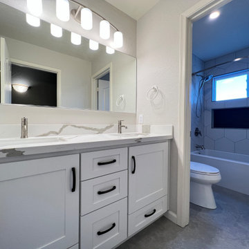
Working with Casey & Tom in their guest bathroom was such an honor. This bathroom was the first stage of their home remodel. They wanted to change the look of the builder grade bathroom and fixtures.
We started out by selecting an oversized white matte hex tile for the walls. This tile selection was a perfect match to the personalities that will be using this bathroom. This oversized niche complimented the hex tile. We used a large format navy blue tile in the niche for easy maintenance.
The old flooring was gutted and installed a concrete look porcelain tile. We also painted the wall a neutral grey to compliment the pops in colors. We also installed new white shaker cabinets with a striking large, veined quartz.
To keep with the rectangle profile, we installed a new Kohler tub, 2 new rectangle sinks, and a modern rectangle mirror. With all these features we paired with the Delta Trinsic faucet and shower fixtures in the Brilliance Stainless finish.
Lastly, we updated all the lighting fixtures in the room. Removing the old light above the vanity and replacing it with a larger fixture. We also removed the old dome light in the shower room and replaced it will a recessed can light to force light more evenly throughout the room.

 Pro-Land Landscape Construction Inc.
With a lengthy list of ideas about how to transform their backyard, the clients were excited to see what we could do. Existing features on site needed to be updated and in-cooperated within the design. The view from each angle of the property was already outstanding and we didn't want the design to feel out of place. We had to make the grade changes work to our advantage, each separate space had to have a purpose. The client wanted to use the property for charity events, so a large flat turf area was constructed at the back of the property, perfect for setting up tables, chairs and a stage if needed. It also created the perfect look out point into the back of the property, dropping off into a ravine. A lot of focus throughout the project was the plant selection. With a large amount of garden beds, we wanted to maintain a clean and formal look, while still offering seasonal interest. We did this by edging the beds with boxwoods, adding white hydrangeas throughout the beds for constant colour, and subtle pops of purple and yellow. This along with the already breathtaking natural backdrop of the space, is more than enough to make this project stand out.
Photographer: Jason Hartog Photography

 Progressive Design Build
Challenge
As part-time residents of this Bonita Springs home, our clients were looking to update their outdoor entertainment area. They also planned to be away for the summer during the remodel and needed their renovation project to be finished prior to their return for the winter.
Their needs included:
Changing the color pallet to a monochromatic scheme, removing the yellow brick pavers, adding an outdoor kitchen area, adding an outdoor fireplace, resurfacing the pool and updating the tile, installing a new screen enclosure, and creating privacy from the neighbors, particularly the main sitting areas, pool and outdoor kitchen.
Although there was already a 1,221 sq. ft. lanai under the roof, it lacked functionality needed by the homeowners. Most of its amenities were located at one end of the lanai, and lacked privacy that the homeowners valued.
Solution
The final project design required two additions to the lanai area adding an accumulative 265 sq. ft. to the existing space expanding their sitting area and accommodating a much-needed outdoor kitchen. The new additions also needed to blend with the home’s existing style.
Addition #1—Sitting Area:
The first addition added approximately 145 sq. ft. to the end of the lanai. This allowed Progressive Design Build to tie into the existing gable room for the new space and create privacy from the neighbors.
Addition #2—Outdoor Kitchen:
The second addition was a bump out that added approximately 120 sq. ft. to the end of the house close to the interior kitchen. This allowed the client to add an outdoor over and 52” Viking grill (with a side burner) to their outdoor living space. Other amenities included a new sink and under counter fridge, granite countertops, tumbled stone stile and Cypress cabinetry, custom-fabricated with marine grade plywood boxes and marine grade finishes to withstand moisture, common in the Bonita Bay community.
Special attention was given to the preparation area on either side of the stove, the landing area next to the oven and the serving counter behind the bar. Bar seating was added to the outdoor kitchen, allowing guests to visit with the cook comfortably and easily.
Brick Pavers
During the design phase, we discovered that the original brick pavers were set in sand, with no concrete pad below. Consequently, the retaining wall and several pavers were starting to fail, caused by the shifting sands. To remedy the problem, we installed a new concrete deck and laid new nonslip pavers on top of the deck—ideal for wet area applications.
Pool Renovations
To dramatically improve the enjoyment and ambiance of their pool, Progressive Design Build completely re-plumbed it, putting in additional lighting and new water features. New decorative pool tile, coping, and a paver deck were also installed around the pool. The pool finish chosen by our clients was a nice tropical blue color.
Screen Enclosure
A new screen enclosure was installed in compliance with new local building codes, making it more stable and solid than the existing one. The color change from white to bronze coordinated well with the homeowners’ new color scheme; and the location of the service door and stairs provided convenient access to the new pool equipment.
Results
This project was completed on time and within budget before these homeowners returned for their winter holiday. They were thrilled with the weekly communication, which included two-way phone calls and email photo sharing. They always knew where their project was in the construction process and what was happening at all times—providing security and peace of mind.
 CITYDESKSTUDIO, Inc.
Built in 1949, this Edina home had a strong horizontal presence on the site, but through subsequent renovations the overall massing was lacking clarity and refinement and the entry was diminutive and uninviting. The roof and siding materials were aging, and important interior spaces were cramped and closed in. The house needed better light, better connection internally and out, and exterior updates to clarify and enhance the strengths of the home.
The primary design evolved out of a celebration of the existing horizontality of the home and a recognition that a bigger home was not needed. By layering materiality and color, a new identity was created. A new cedar entry canopy slips out from under the previous roof line, extending further towards the street. This added warmth at the entry is echoed along the facade, creating a graceful rhythm and texture. The previous additions were re-clad with a darker material palette in order to anchor and unify the ends of the home. As the grade slopes down towards the back yard, horizontal bands are exposed, revealing the layering top to bottom. Combined, these few shifts in color and materiality allowed for a complete transformation of the home.
The interior is reflective of the material and color palette used outside. The main living spaces are opened up and connected while strengthening the original symmetry of the more formal linear alignment of rooms. A whole new kitchen relocates the center of the home and makes more fluid the daily life of this young family. The house is fully transformed inside and out, all without adding more square feet.
Project Team:
Ben Awes, AIA, Principal-in-Charge
Nate Dodge

 W.L. Construction Inc.
Mid-sized arts and crafts u-shaped medium tone wood floor and brown floor eat-in kitchen photo in Portland with an undermount sink, shaker cabinets, medium tone wood cabinets, granite countertops, blue backsplash, ceramic backsplash, stainless steel appliances, an island and multicolored countertops

 Amanda Martocchio Architecture
Time had stood still at this 1970s ranch in Armonk when the owners invited us to collaborate with them to transform it into a modern, light-filled home for their young family. The budget was lean, so economy was a primary consideration for every design decision. The challenge was to identify the modest home’s virtues – vaulted ceilings and a lovely backyard – and accentuate them by strategically optimizing available funds.
We were tasked with rectifying a dysfunctional interior stair, connecting to the outdoors with new large windows, and updating the exterior. We focused our attention on a finite set of architectural moves which would have the biggest impact and improve our clients’ daily experience of the home. Detailing was kept simple, using common grade materials and standard components. All exterior walls were revamped with new windows and siding. Although these materials were not particularly costly, thoughtful layout of boards, battens, and openings produced a cohesive, rigorous composition at each facade.
Since the budget would not cover the homeowners’ complete wish list, some items were bracketed for subsequent phases. The challenge was to establish a framework that would allow future work – including a new roof and kitchen renovation – to proceed smoothly.
The homeowners, both scientists, were enthusiastic collaborators, contributing their outstanding design sensibilities to selection of fixtures and finishes. Construction ended just in time for the arrival of their baby – and with that, the transformation of their family home was complete.
 CITYDESKSTUDIO, Inc.
Built in 1949, this Edina home had a strong horizontal presence on the site, but through subsequent renovations the overall massing was lacking clarity and refinement and the entry was diminutive and uninviting. The roof and siding materials were aging, and important interior spaces were cramped and closed in. The house needed better light, better connection internally and out, and exterior updates to clarify and enhance the strengths of the home.
The primary design evolved out of a celebration of the existing horizontality of the home and a recognition that a bigger home was not needed. By layering materiality and color, a new identity was created. A new cedar entry canopy slips out from under the previous roof line, extending further towards the street. This added warmth at the entry is echoed along the facade, creating a graceful rhythm and texture. The previous additions were re-clad with a darker material palette in order to anchor and unify the ends of the home. As the grade slopes down towards the back yard, horizontal bands are exposed, revealing the layering top to bottom. Combined, these few shifts in color and materiality allowed for a complete transformation of the home.
The interior is reflective of the material and color palette used outside. The main living spaces are opened up and connected while strengthening the original symmetry of the more formal linear alignment of rooms. A whole new kitchen relocates the center of the home and makes more fluid the daily life of this young family. The house is fully transformed inside and out, all without adding more square feet.
Project Team:
Ben Awes, AIA, Principal-in-Charge
Nate Dodge
 Melissa Hardwick Design
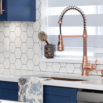
A gorgeous kitchen remodeled from a builder’s basic, incorporating a palette of bright blue, soft grey and pops of warm copper. As a multi-generational home, it was really important to create smooth transitions, allowing ease of accessibility, and the client’s favourite colour, blue! We started, with removing a wall in the kitchen, that opened up the space to the much-used family room. We created an island with overhang for conversations with the cook, and a rest stop for Grandma. As all three adults have different dietary demands, a set of wall ovens was added, and a commercial grade range hood for lots of yummy food prep.
Additional functional design features a new built-in buffet with storage, and a window bench seat. By adding a pendant light over the kitchen table, along with the beautiful big window, this space has been lovingly updated, showcasing the family’s personality and has now earned the most popular spot in the house.
Designed by Melissa Hardwick Design serving Vancouver, and the Lower Mainland. For more information about Melissa Hardwick Design, click here: https://www.melissahardwick.com/
 Massey Design Group
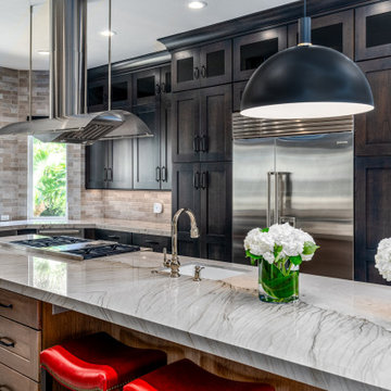
We tailored this major kitchen update to meet the needs of our client for whom regularly gathering her adult children and their families for home cooked meals is a tradition hailing from her southern heritage. The Wolf range, Sub Zero refrigerator and freezer, commercial grade range hood and strategically placed prep sink were designed to support her love of cooking and large scale meal preparation. By replacing a smaller island and peninsula with an expansive sixteen foot island we greatly increased both the storage and the seating capacity, providing plenty of space for family and friends to comfortably gather in this true heart of the home. Other must haves like the built in coffee maker, dedicated wine refrigerators and bar area, and a built in buffet niche for storing several dish collections make this a modern kitchen with traditional roots that is ideal for entertaining and relaxing.
 Massey Design Group
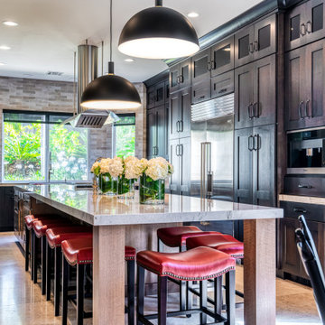
We tailored this major kitchen update to meet the needs of our client for whom regularly gathering her adult children and their families for home cooked meals is a tradition hailing from her southern heritage. The Wolf range, Sub Zero refrigerator and freezer, commercial grade range hood and strategically placed prep sink were designed to support her love of cooking and large scale meal preparation. By replacing a smaller island and peninsula with an expansive sixteen foot island we greatly increased both the storage and the seating capacity, providing plenty of space for family and friends to comfortably gather in this true heart of the home. Other must haves like the built in coffee maker, dedicated wine refrigerators and bar area, and a built in buffet niche for storing several dish collections make this a modern kitchen with traditional roots that is ideal for entertaining and relaxing.
 Phoenix Home Remodeling
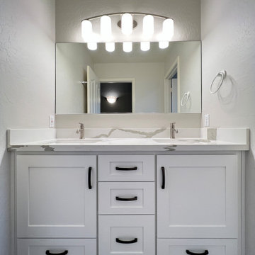
Working with Casey & Tom in their guest bathroom was such an honor. This bathroom was the first stage of their home remodel. They wanted to change the look of the builder grade bathroom and fixtures.
We started out by selecting an oversized white matte hex tile for the walls. This tile selection was a perfect match to the personalities that will be using this bathroom. This oversized niche complimented the hex tile. We used a large format navy blue tile in the niche for easy maintenance.
The old flooring was gutted and installed a concrete look porcelain tile. We also painted the wall a neutral grey to compliment the pops in colors. We also installed new white shaker cabinets with a striking large, veined quartz.
To keep with the rectangle profile, we installed a new Kohler tub, 2 new rectangle sinks, and a modern rectangle mirror. With all these features we paired with the Delta Trinsic faucet and shower fixtures in the Brilliance Stainless finish.
Lastly, we updated all the lighting fixtures in the room. Removing the old light above the vanity and replacing it with a larger fixture. We also removed the old dome light in the shower room and replaced it will a recessed can light to force light more evenly throughout the room.
 CITYDESKSTUDIO, Inc.
Built in 1949, this Edina home had a strong horizontal presence on the site, but through subsequent renovations the overall massing was lacking clarity and refinement and the entry was diminutive and uninviting. The roof and siding materials were aging, and important interior spaces were cramped and closed in. The house needed better light, better connection internally and out, and exterior updates to clarify and enhance the strengths of the home.
The primary design evolved out of a celebration of the existing horizontality of the home and a recognition that a bigger home was not needed. By layering materiality and color, a new identity was created. A new cedar entry canopy slips out from under the previous roof line, extending further towards the street. This added warmth at the entry is echoed along the facade, creating a graceful rhythm and texture. The previous additions were re-clad with a darker material palette in order to anchor and unify the ends of the home. As the grade slopes down towards the back yard, horizontal bands are exposed, revealing the layering top to bottom. Combined, these few shifts in color and materiality allowed for a complete transformation of the home.
The interior is reflective of the material and color palette used outside. The main living spaces are opened up and connected while strengthening the original symmetry of the more formal linear alignment of rooms. A whole new kitchen relocates the center of the home and makes more fluid the daily life of this young family. The house is fully transformed inside and out, all without adding more square feet.
Project Team:
Ben Awes, AIA, Principal-in-Charge
Nate Dodge
 CITYDESKSTUDIO, Inc.
Built in 1949, this Edina home had a strong horizontal presence on the site, but through subsequent renovations the overall massing was lacking clarity and refinement and the entry was diminutive and uninviting. The roof and siding materials were aging, and important interior spaces were cramped and closed in. The house needed better light, better connection internally and out, and exterior updates to clarify and enhance the strengths of the home.
The primary design evolved out of a celebration of the existing horizontality of the home and a recognition that a bigger home was not needed. By layering materiality and color, a new identity was created. A new cedar entry canopy slips out from under the previous roof line, extending further towards the street. This added warmth at the entry is echoed along the facade, creating a graceful rhythm and texture. The previous additions were re-clad with a darker material palette in order to anchor and unify the ends of the home. As the grade slopes down towards the back yard, horizontal bands are exposed, revealing the layering top to bottom. Combined, these few shifts in color and materiality allowed for a complete transformation of the home.
The interior is reflective of the material and color palette used outside. The main living spaces are opened up and connected while strengthening the original symmetry of the more formal linear alignment of rooms. A whole new kitchen relocates the center of the home and makes more fluid the daily life of this young family. The house is fully transformed inside and out, all without adding more square feet.
Project Team:
Ben Awes, AIA, Principal-in-Charge
Nate Dodge
 Art of Home Team
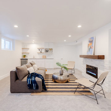
Just Listed in Park Hill! Showings begin Thurs, Feb 10th. You will love this semi-custom from the studs up remodel, with 4 bedrooms & 5 bathrooms. Many updates: new electrical, HVAC, plumbing, landscaping, fencing, concrete, windows, and carpet. Fresh interior & exterior paint, refinished hardwoods, concrete roof, and concrete window wells. Three bright bedrooms conveniently on main level. Every bedroom has an ensuite, with heated floors + 2nd laundry hookup in the primary bath. Finished basement, complete with fireplace insert & wet bar. Perfect for game nights & entertaining guests.
OPEN HOUSE:
- Sat 12-2 pm
- Sun 1-3 pm
For Photos and More Info: https://bit.ly/34NZz7e
2820 Monaco Parkway | 4 br 5 ba | 3,184 sq ft | $1,200,000
#ParkHillHomes #DenverParkHill #StunningRemodel #ArtofHome
 Melissa Hardwick Design
A gorgeous kitchen remodeled from a builder’s basic, incorporating a palette of bright blue, soft grey and pops of warm copper. As a multi-generational home, it was really important to create smooth transitions, allowing ease of accessibility, and the client’s favourite colour, blue! We started, with removing a wall in the kitchen, that opened up the space to the much-used family room. We created an island with overhang for conversations with the cook, and a rest stop for Grandma. As all three adults have different dietary demands, a set of wall ovens was added, and a commercial grade range hood for lots of yummy food prep.
Additional functional design features a new built-in buffet with storage, and a window bench seat. By adding a pendant light over the kitchen table, along with the beautiful big window, this space has been lovingly updated, showcasing the family’s personality and has now earned the most popular spot in the house.
Designed by Melissa Hardwick Design serving Vancouver, and the Lower Mainland. For more information about Melissa Hardwick Design, click here: https://www.melissahardwick.com/
 Pro-Land Landscape Construction Inc.
With a lengthy list of ideas about how to transform their backyard, the clients were excited to see what we could do. Existing features on site needed to be updated and in-cooperated within the design. The view from each angle of the property was already outstanding and we didn't want the design to feel out of place. We had to make the grade changes work to our advantage, each separate space had to have a purpose. The client wanted to use the property for charity events, so a large flat turf area was constructed at the back of the property, perfect for setting up tables, chairs and a stage if needed. It also created the perfect look out point into the back of the property, dropping off into a ravine. A lot of focus throughout the project was the plant selection. With a large amount of garden beds, we wanted to maintain a clean and formal look, while still offering seasonal interest. We did this by edging the beds with boxwoods, adding white hydrangeas throughout the beds for constant colour, and subtle pops of purple and yellow. This along with the already breathtaking natural backdrop of the space, is more than enough to make this project stand out.
Photographer: Jason Hartog Photography
 Pro-Land Landscape Construction Inc.
With a lengthy list of ideas about how to transform their backyard, the clients were excited to see what we could do. Existing features on site needed to be updated and in-cooperated within the design. The view from each angle of the property was already outstanding and we didn't want the design to feel out of place. We had to make the grade changes work to our advantage, each separate space had to have a purpose. The client wanted to use the property for charity events, so a large flat turf area was constructed at the back of the property, perfect for setting up tables, chairs and a stage if needed. It also created the perfect look out point into the back of the property, dropping off into a ravine. A lot of focus throughout the project was the plant selection. With a large amount of garden beds, we wanted to maintain a clean and formal look, while still offering seasonal interest. We did this by edging the beds with boxwoods, adding white hydrangeas throughout the beds for constant colour, and subtle pops of purple and yellow. This along with the already breathtaking natural backdrop of the space, is more than enough to make this project stand out.
Photographer: Jason Hartog Photography
64