
Search results for "Grade update" in Home Design Ideas

 Nicole Arnold Interiors
This 1990s home needed some updates in key areas of the home. We refreshed the family room mantel with a new profile and designer tile to liven up the living space, then took the home’s multiple bathrooms to a whole new level. In the master bathroom, we took out the builder grade tub and added a sleek soaker tub with more functional his and her vanities. For less maintenance, we used ceramic porcelain tile that replicates the marble the homeowners admired. In a smaller secondary bathroom, the floor is the star of the show and is appropriately complemented by the undulating quasi subway tile revealing subtle variations. We also repurposed their existing vanity and maintained a craftsman feel with clean-lined accessories to stay pristine. The third bathroom embraces simplicity with subtle texture, from the navy concrete looking floors to the unique ombre coloration in the 4×8” shower tile. We kept the overall design simple, leaving all the design details to exude from the variation in the tiles themselves.

 sirboom
Owner designed and remodeled small half-bathroom in south Atlanta suburb. Gut remodel with updated (corrected) electrical, updated (corrected) plumbing, Kohler toilet, IKEA Silveran vanity (partial-wall mount; mounted to be 37" high to top of sink, my preference), IKEA Silveran medicine cabinet, IKEA Silveran cabinet, and retrofitted an IKEA Lillangen sink (which normally goes with a different vanity). Paint is Olympic One "Thin Ice" (paint not recommended, was disappointing for the "best" Olympic sells at Lowe's; color is great, though). Chrome fixtures with faucet by Glacier Bay (unknown model; Home Depot clearance find) and chrome door knobs (also from Home Depot). Blinds are from SelectBlinds.com and are Bamboo 1" faux wood. Wall art is from Etsy.com (look up dictionary prints if you want to find similar). Tile is from Lowe's, by Style Selections, and called Skyros Gray (highly recommended, good quality). Grout color is Silver by MAPEI (Lowe's). Silver MAPEI grout-look cauking along top and bottom of baseboard tiles (upper floor home so can't use grout). Unfortunately the sink and toilet were a different shade of white but the toilets were all fairly new and it's more noticeable in the photo than in real life. Used 3 LED new work IC recessed lights, LED under-cabinet light from Home Depot off of same switch as the lights but with a switch on-board, and a basic contractor-grade ceiling fan with some Dynamat-like material applied to the casing which reduces its noise significantly off of its own switch. GFCI outlet has a nightlight built in and, not shown, is another GFCI outlet retrofitted into the medicine cabinet. Don't worry, that silicone caulking around the toilet has been improved to a professional look with the Silver caulking over it to blend better since this photo, so don't hold that against me! In fact, don't hold anything you don't like against me... just posting this to give folks some ideas WITH the actual units used, unlike most postings on Houzz.
©Kil|Photography

 Regan Baker Design Inc.
First home, savvy art owners, decided to hire RBD to design their recently purchased two story, four bedroom, midcentury Diamond Heights home to merge their new parenthood and love for entertaining lifestyles. Hired two months prior to the arrival of their baby boy, RBD was successful in installing the nursery just in time. The home required little architectural spatial reconfiguration given the previous owner was an architect, allowing RBD to focus mainly on furniture, fixtures and accessories while updating only a few finishes. New paint grade paneling added a needed midcentury texture to the entry, while an existing site for sore eyes radiator, received a new walnut cover creating a built-in mid-century custom headboard for the guest room, perfect for large art and plant decoration. RBD successfully paired furniture and art selections to connect the existing material finishes by keeping fabrics neutral and complimentary to the existing finishes. The backyard, an SF rare oasis, showcases a hanging chair and custom outdoor floor cushions for easy lounging, while a stylish midcentury heated bench allows easy outdoor entertaining in the SF climate.
Photography Credit: Scott Hargis Photography
Find the right local pro for your project

 Progressive Design Build
Challenge
As part-time residents of this Bonita Springs home, our clients were looking to update their outdoor entertainment area. They also planned to be away for the summer during the remodel and needed their renovation project to be finished prior to their return for the winter.
Their needs included:
Changing the color pallet to a monochromatic scheme, removing the yellow brick pavers, adding an outdoor kitchen area, adding an outdoor fireplace, resurfacing the pool and updating the tile, installing a new screen enclosure, and creating privacy from the neighbors, particularly the main sitting areas, pool and outdoor kitchen.
Although there was already a 1,221 sq. ft. lanai under the roof, it lacked functionality needed by the homeowners. Most of its amenities were located at one end of the lanai, and lacked privacy that the homeowners valued.
Solution
The final project design required two additions to the lanai area adding an accumulative 265 sq. ft. to the existing space expanding their sitting area and accommodating a much-needed outdoor kitchen. The new additions also needed to blend with the home’s existing style.
Addition #1—Sitting Area:
The first addition added approximately 145 sq. ft. to the end of the lanai. This allowed Progressive Design Build to tie into the existing gable room for the new space and create privacy from the neighbors.
Addition #2—Outdoor Kitchen:
The second addition was a bump out that added approximately 120 sq. ft. to the end of the house close to the interior kitchen. This allowed the client to add an outdoor over and 52” Viking grill (with a side burner) to their outdoor living space. Other amenities included a new sink and under counter fridge, granite countertops, tumbled stone stile and Cypress cabinetry, custom-fabricated with marine grade plywood boxes and marine grade finishes to withstand moisture, common in the Bonita Bay community.
Special attention was given to the preparation area on either side of the stove, the landing area next to the oven and the serving counter behind the bar. Bar seating was added to the outdoor kitchen, allowing guests to visit with the cook comfortably and easily.
Brick Pavers
During the design phase, we discovered that the original brick pavers were set in sand, with no concrete pad below. Consequently, the retaining wall and several pavers were starting to fail, caused by the shifting sands. To remedy the problem, we installed a new concrete deck and laid new nonslip pavers on top of the deck—ideal for wet area applications.
Pool Renovations
To dramatically improve the enjoyment and ambiance of their pool, Progressive Design Build completely re-plumbed it, putting in additional lighting and new water features. New decorative pool tile, coping, and a paver deck were also installed around the pool. The pool finish chosen by our clients was a nice tropical blue color.
Screen Enclosure
A new screen enclosure was installed in compliance with new local building codes, making it more stable and solid than the existing one. The color change from white to bronze coordinated well with the homeowners’ new color scheme; and the location of the service door and stairs provided convenient access to the new pool equipment.
Results
This project was completed on time and within budget before these homeowners returned for their winter holiday. They were thrilled with the weekly communication, which included two-way phone calls and email photo sharing. They always knew where their project was in the construction process and what was happening at all times—providing security and peace of mind.
 Progressive Design Build
Challenge
As part-time residents of this Bonita Springs home, our clients were looking to update their outdoor entertainment area. They also planned to be away for the summer during the remodel and needed their renovation project to be finished prior to their return for the winter.
Their needs included:
Changing the color pallet to a monochromatic scheme, removing the yellow brick pavers, adding an outdoor kitchen area, adding an outdoor fireplace, resurfacing the pool and updating the tile, installing a new screen enclosure, and creating privacy from the neighbors, particularly the main sitting areas, pool and outdoor kitchen.
Although there was already a 1,221 sq. ft. lanai under the roof, it lacked functionality needed by the homeowners. Most of its amenities were located at one end of the lanai, and lacked privacy that the homeowners valued.
Solution
The final project design required two additions to the lanai area adding an accumulative 265 sq. ft. to the existing space expanding their sitting area and accommodating a much-needed outdoor kitchen. The new additions also needed to blend with the home’s existing style.
Addition #1—Sitting Area:
The first addition added approximately 145 sq. ft. to the end of the lanai. This allowed Progressive Design Build to tie into the existing gable room for the new space and create privacy from the neighbors.
Addition #2—Outdoor Kitchen:
The second addition was a bump out that added approximately 120 sq. ft. to the end of the house close to the interior kitchen. This allowed the client to add an outdoor over and 52” Viking grill (with a side burner) to their outdoor living space. Other amenities included a new sink and under counter fridge, granite countertops, tumbled stone stile and Cypress cabinetry, custom-fabricated with marine grade plywood boxes and marine grade finishes to withstand moisture, common in the Bonita Bay community.
Special attention was given to the preparation area on either side of the stove, the landing area next to the oven and the serving counter behind the bar. Bar seating was added to the outdoor kitchen, allowing guests to visit with the cook comfortably and easily.
Brick Pavers
During the design phase, we discovered that the original brick pavers were set in sand, with no concrete pad below. Consequently, the retaining wall and several pavers were starting to fail, caused by the shifting sands. To remedy the problem, we installed a new concrete deck and laid new nonslip pavers on top of the deck—ideal for wet area applications.
Pool Renovations
To dramatically improve the enjoyment and ambiance of their pool, Progressive Design Build completely re-plumbed it, putting in additional lighting and new water features. New decorative pool tile, coping, and a paver deck were also installed around the pool. The pool finish chosen by our clients was a nice tropical blue color.
Screen Enclosure
A new screen enclosure was installed in compliance with new local building codes, making it more stable and solid than the existing one. The color change from white to bronze coordinated well with the homeowners’ new color scheme; and the location of the service door and stairs provided convenient access to the new pool equipment.
Results
This project was completed on time and within budget before these homeowners returned for their winter holiday. They were thrilled with the weekly communication, which included two-way phone calls and email photo sharing. They always knew where their project was in the construction process and what was happening at all times—providing security and peace of mind.

 Pro-Land Landscape Construction Inc.
With a lengthy list of ideas about how to transform their backyard, the clients were excited to see what we could do. Existing features on site needed to be updated and in-cooperated within the design. The view from each angle of the property was already outstanding and we didn't want the design to feel out of place. We had to make the grade changes work to our advantage, each separate space had to have a purpose. The client wanted to use the property for charity events, so a large flat turf area was constructed at the back of the property, perfect for setting up tables, chairs and a stage if needed. It also created the perfect look out point into the back of the property, dropping off into a ravine. A lot of focus throughout the project was the plant selection. With a large amount of garden beds, we wanted to maintain a clean and formal look, while still offering seasonal interest. We did this by edging the beds with boxwoods, adding white hydrangeas throughout the beds for constant colour, and subtle pops of purple and yellow. This along with the already breathtaking natural backdrop of the space, is more than enough to make this project stand out.
Photographer: Jason Hartog Photography
 Nicole Arnold Interiors
This 1990s home needed some updates in key areas of the home. We refreshed the family room mantel with a new profile and designer tile to liven up the living space, then took the home’s multiple bathrooms to a whole new level. In the master bathroom, we took out the builder grade tub and added a sleek soaker tub with more functional his and her vanities. For less maintenance, we used ceramic porcelain tile that replicates the marble the homeowners admired. In a smaller secondary bathroom, the floor is the star of the show and is appropriately complemented by the undulating quasi subway tile revealing subtle variations. We also repurposed their existing vanity and maintained a craftsman feel with clean-lined accessories to stay pristine. The third bathroom embraces simplicity with subtle texture, from the navy concrete looking floors to the unique ombre coloration in the 4×8” shower tile. We kept the overall design simple, leaving all the design details to exude from the variation in the tiles themselves.
 Progressive Design Build
Challenge
As part-time residents of this Bonita Springs home, our clients were looking to update their outdoor entertainment area. They also planned to be away for the summer during the remodel and needed their renovation project to be finished prior to their return for the winter.
Their needs included:
Changing the color pallet to a monochromatic scheme, removing the yellow brick pavers, adding an outdoor kitchen area, adding an outdoor fireplace, resurfacing the pool and updating the tile, installing a new screen enclosure, and creating privacy from the neighbors, particularly the main sitting areas, pool and outdoor kitchen.
Although there was already a 1,221 sq. ft. lanai under the roof, it lacked functionality needed by the homeowners. Most of its amenities were located at one end of the lanai, and lacked privacy that the homeowners valued.
Solution
The final project design required two additions to the lanai area adding an accumulative 265 sq. ft. to the existing space expanding their sitting area and accommodating a much-needed outdoor kitchen. The new additions also needed to blend with the home’s existing style.
Addition #1—Sitting Area:
The first addition added approximately 145 sq. ft. to the end of the lanai. This allowed Progressive Design Build to tie into the existing gable room for the new space and create privacy from the neighbors.
Addition #2—Outdoor Kitchen:
The second addition was a bump out that added approximately 120 sq. ft. to the end of the house close to the interior kitchen. This allowed the client to add an outdoor over and 52” Viking grill (with a side burner) to their outdoor living space. Other amenities included a new sink and under counter fridge, granite countertops, tumbled stone stile and Cypress cabinetry, custom-fabricated with marine grade plywood boxes and marine grade finishes to withstand moisture, common in the Bonita Bay community.
Special attention was given to the preparation area on either side of the stove, the landing area next to the oven and the serving counter behind the bar. Bar seating was added to the outdoor kitchen, allowing guests to visit with the cook comfortably and easily.
Brick Pavers
During the design phase, we discovered that the original brick pavers were set in sand, with no concrete pad below. Consequently, the retaining wall and several pavers were starting to fail, caused by the shifting sands. To remedy the problem, we installed a new concrete deck and laid new nonslip pavers on top of the deck—ideal for wet area applications.
Pool Renovations
To dramatically improve the enjoyment and ambiance of their pool, Progressive Design Build completely re-plumbed it, putting in additional lighting and new water features. New decorative pool tile, coping, and a paver deck were also installed around the pool. The pool finish chosen by our clients was a nice tropical blue color.
Screen Enclosure
A new screen enclosure was installed in compliance with new local building codes, making it more stable and solid than the existing one. The color change from white to bronze coordinated well with the homeowners’ new color scheme; and the location of the service door and stairs provided convenient access to the new pool equipment.
Results
This project was completed on time and within budget before these homeowners returned for their winter holiday. They were thrilled with the weekly communication, which included two-way phone calls and email photo sharing. They always knew where their project was in the construction process and what was happening at all times—providing security and peace of mind.

 Michael Nash Design, Build & Homes
2013 NARI CAPITAL COTY, MERIT AWARD WINNER, GREEN REMODELING INTERIOR
This couple wanted to update their kitchen and first floor, using environmentally-friendly products in the process. Making it green, safe and contemporary were the goals of this renovation.
The new kitchen layout with the center island has made getting around this central kitchen more possible. Taller, custom cabinetry has improved the overall storage and accessibility. The open concept design makes the space the hub of the home.
Green, safe and contemporary features make this project the jewel of the neighborhood. These features include:
• Use of custom-made Douglas Fir slab cabinetry (engineered wood veneer from younger growth trees) with low shin finish (low VOC water based finish) and kilned dried select hardwood frames construction without use of any formaldehyde glues.
• Use of no VOC paint on entire interior and exterior.
• Manufacturing and installing 12” x 12 ft x ¾” solid birch hardwood floor for entire first floor. This was finished with Low-VOC water based finish.
• Reuse of some of the existing lumber and plywood in the same project was essential.
• Installing LED recess lighting and task lighting with Lurton Home system lighting management and controllable low voltage dimmers.
• Installing high efficiency with the highest rating of Energy Star appliances.
• Installing high grade closed cell insulation in walls and open space, caulking and sealing all open gaps.
• Install large double pane-low E, argon filled gas windows.
• Use of air tight insulated duct chases on all new ducts.
The homeowners, who are active members of wildlife preservations, are pleased with green and environmentally safe kitchen and entire first floor project.

 The Cabinet Store + Culina Design
This project had both visual and practical components. The family was not only interested in updating the look of their kitchen, but also in creating a more efficient cabinet solution.
Over the course of a month we installed several cabinets from the Showplace Wood product line, replacing the family’s existing oak, builder grade cabinets. The clients opted for the Covington W door style with a full overlay composed of cherry wood in autumn stain. This combination gave the kitchen a warm and welcoming feel, while still maintaining the modern aesthetic the family craved.
Next, we replaced the family’s outdated Corian counters with beautiful Cambria countertops. They chose contrasting colors, placing Brownhill on the room’s perimeter spaces and Cambrian Black on the kitchen island. All of the countertops were finished with a three centimeter FS edge.
In the end we walked away from the home very proud of the transformation that we had completed. We were even more proud to learn that the happy homeowners shared our pride and excitement over their beautiful new space!

 CITYDESKSTUDIO, Inc.
Built in 1949, this Edina home had a strong horizontal presence on the site, but through subsequent renovations the overall massing was lacking clarity and refinement and the entry was diminutive and uninviting. The roof and siding materials were aging, and important interior spaces were cramped and closed in. The house needed better light, better connection internally and out, and exterior updates to clarify and enhance the strengths of the home.
The primary design evolved out of a celebration of the existing horizontality of the home and a recognition that a bigger home was not needed. By layering materiality and color, a new identity was created. A new cedar entry canopy slips out from under the previous roof line, extending further towards the street. This added warmth at the entry is echoed along the facade, creating a graceful rhythm and texture. The previous additions were re-clad with a darker material palette in order to anchor and unify the ends of the home. As the grade slopes down towards the back yard, horizontal bands are exposed, revealing the layering top to bottom. Combined, these few shifts in color and materiality allowed for a complete transformation of the home.
The interior is reflective of the material and color palette used outside. The main living spaces are opened up and connected while strengthening the original symmetry of the more formal linear alignment of rooms. A whole new kitchen relocates the center of the home and makes more fluid the daily life of this young family. The house is fully transformed inside and out, all without adding more square feet.
Project Team:
Ben Awes, AIA, Principal-in-Charge
Nate Dodge
 mackmiller design+build
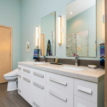
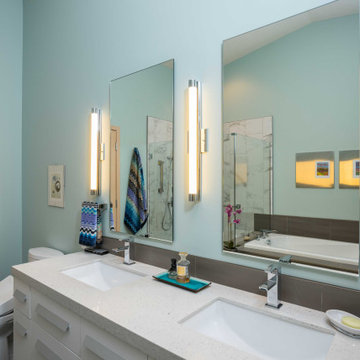
Ms. Homeowner’s townhome Primary Bathroom was a cookie-cutter, builder-grade space that she wanted upgraded and updated. The shower tile was discolored and mildewed; the traditional vanity tile floor and tub deck were also outdated. Our client wanted an accessible bathroom she could age in place in featuring an updated, modern yet timeless and elegant design, with better storage all within a conservative budget.
The main challenge in this project was to transform the space and raise the design quotient within the requested budget. We kept the basic footprint, preserved the existing maple doors and trim, saved and re-used the bathtub, purchased a sleek pre-fabricated, vanity which included the countertop and sinks. We reserved some of the budget for high impact items, upgrading fixtures and finishes in every area. We made the shower safer and more visually open by installing a curbless, barrier-free floor, and a frameless glass shower door and panels. We extended the tub deck into the shower area which is a functioning bench and product shelf. We replaced all of the tile, faucets, hardware and accessories with sleek chrome components. A client-requested, high quality commode with a remote controlled Toto washlet seat was installed. The eye-catching color scheme, based on the new vanity and countertop is a balance of rich, dark neutrals paired with crisp whites, bright chrome fixtures, and turquoise wall paint which beautifully coordinates with the existing natural maple doors and trim.
 CITYDESKSTUDIO, Inc.
Built in 1949, this Edina home had a strong horizontal presence on the site, but through subsequent renovations the overall massing was lacking clarity and refinement and the entry was diminutive and uninviting. The roof and siding materials were aging, and important interior spaces were cramped and closed in. The house needed better light, better connection internally and out, and exterior updates to clarify and enhance the strengths of the home.
The primary design evolved out of a celebration of the existing horizontality of the home and a recognition that a bigger home was not needed. By layering materiality and color, a new identity was created. A new cedar entry canopy slips out from under the previous roof line, extending further towards the street. This added warmth at the entry is echoed along the facade, creating a graceful rhythm and texture. The previous additions were re-clad with a darker material palette in order to anchor and unify the ends of the home. As the grade slopes down towards the back yard, horizontal bands are exposed, revealing the layering top to bottom. Combined, these few shifts in color and materiality allowed for a complete transformation of the home.
The interior is reflective of the material and color palette used outside. The main living spaces are opened up and connected while strengthening the original symmetry of the more formal linear alignment of rooms. A whole new kitchen relocates the center of the home and makes more fluid the daily life of this young family. The house is fully transformed inside and out, all without adding more square feet.
Project Team:
Ben Awes, AIA, Principal-in-Charge
Nate Dodge
 Melissa Hardwick Design
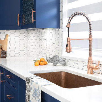
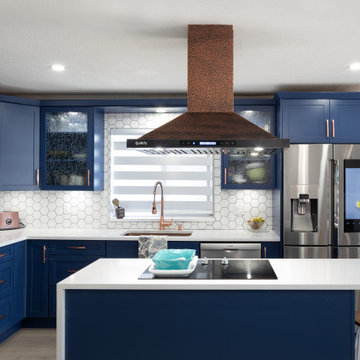
A gorgeous kitchen remodeled from a builder’s basic, incorporating a palette of bright blue, soft grey and pops of warm copper. As a multi-generational home, it was really important to create smooth transitions, allowing ease of accessibility, and the client’s favourite colour, blue! We started, with removing a wall in the kitchen, that opened up the space to the much-used family room. We created an island with overhang for conversations with the cook, and a rest stop for Grandma. As all three adults have different dietary demands, a set of wall ovens was added, and a commercial grade range hood for lots of yummy food prep.
Additional functional design features a new built-in buffet with storage, and a window bench seat. By adding a pendant light over the kitchen table, along with the beautiful big window, this space has been lovingly updated, showcasing the family’s personality and has now earned the most popular spot in the house.
Designed by Melissa Hardwick Design serving Vancouver, and the Lower Mainland. For more information about Melissa Hardwick Design, click here: https://www.melissahardwick.com/
 Pro-Land Landscape Construction Inc.
With a lengthy list of ideas about how to transform their backyard, the clients were excited to see what we could do. Existing features on site needed to be updated and in-cooperated within the design. The view from each angle of the property was already outstanding and we didn't want the design to feel out of place. We had to make the grade changes work to our advantage, each separate space had to have a purpose. The client wanted to use the property for charity events, so a large flat turf area was constructed at the back of the property, perfect for setting up tables, chairs and a stage if needed. It also created the perfect look out point into the back of the property, dropping off into a ravine. A lot of focus throughout the project was the plant selection. With a large amount of garden beds, we wanted to maintain a clean and formal look, while still offering seasonal interest. We did this by edging the beds with boxwoods, adding white hydrangeas throughout the beds for constant colour, and subtle pops of purple and yellow. This along with the already breathtaking natural backdrop of the space, is more than enough to make this project stand out.
Photographer: Jason Hartog Photography
 Melissa Hardwick Design
A gorgeous kitchen remodeled from a builder’s basic, incorporating a palette of bright blue, soft grey and pops of warm copper. As a multi-generational home, it was really important to create smooth transitions, allowing ease of accessibility, and the client’s favourite colour, blue! We started, with removing a wall in the kitchen, that opened up the space to the much-used family room. We created an island with overhang for conversations with the cook, and a rest stop for Grandma. As all three adults have different dietary demands, a set of wall ovens was added, and a commercial grade range hood for lots of yummy food prep.
Additional functional design features a new built-in buffet with storage, and a window bench seat. By adding a pendant light over the kitchen table, along with the beautiful big window, this space has been lovingly updated, showcasing the family’s personality and has now earned the most popular spot in the house.
Designed by Melissa Hardwick Design serving Vancouver, and the Lower Mainland. For more information about Melissa Hardwick Design, click here: https://www.melissahardwick.com/
 The Cabinet Store + Culina Design
This project had both visual and practical components. The family was not only interested in updating the look of their kitchen, but also in creating a more efficient cabinet solution.
Over the course of a month we installed several cabinets from the Showplace Wood product line, replacing the family’s existing oak, builder grade cabinets. The clients opted for the Covington W door style with a full overlay composed of cherry wood in autumn stain. This combination gave the kitchen a warm and welcoming feel, while still maintaining the modern aesthetic the family craved.
Next, we replaced the family’s outdated Corian counters with beautiful Cambria countertops. They chose contrasting colors, placing Brownhill on the room’s perimeter spaces and Cambrian Black on the kitchen island. All of the countertops were finished with a three centimeter FS edge.
In the end we walked away from the home very proud of the transformation that we had completed. We were even more proud to learn that the happy homeowners shared our pride and excitement over their beautiful new space!
 mackmiller design+build
Ms. Homeowner’s townhome Primary Bathroom was a cookie-cutter, builder-grade space that she wanted upgraded and updated. The shower tile was discolored and mildewed; the traditional vanity tile floor and tub deck were also outdated. Our client wanted an accessible bathroom she could age in place in featuring an updated, modern yet timeless and elegant design, with better storage all within a conservative budget.
The main challenge in this project was to transform the space and raise the design quotient within the requested budget. We kept the basic footprint, preserved the existing maple doors and trim, saved and re-used the bathtub, purchased a sleek pre-fabricated, vanity which included the countertop and sinks. We reserved some of the budget for high impact items, upgrading fixtures and finishes in every area. We made the shower safer and more visually open by installing a curbless, barrier-free floor, and a frameless glass shower door and panels. We extended the tub deck into the shower area which is a functioning bench and product shelf. We replaced all of the tile, faucets, hardware and accessories with sleek chrome components. A client-requested, high quality commode with a remote controlled Toto washlet seat was installed. The eye-catching color scheme, based on the new vanity and countertop is a balance of rich, dark neutrals paired with crisp whites, bright chrome fixtures, and turquoise wall paint which beautifully coordinates with the existing natural maple doors and trim.
 Tamra Provines, The Carnahan Group ReeceNichols
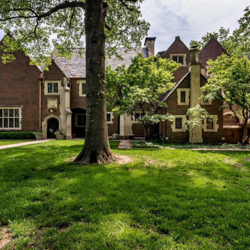
Loads of character in this one of a kind two story with so much history...It is the RDW Clapp House which is one of Wichita's Historic
Landmarks and features many woodwork pieces imported from Belgium/England, majestic great room with vaulted wood beamed ceiling
, floor to ceiling windows overlooking the backyard, custom front bookcases, and 3 large chandeliers, formal dining room with custom
dining table and chairs to remain and China and linen closet, beautifully updated kitchen with fine Quartzite counter tops, professional
grade appliances including two dishwashers, new cabinetry system with cushion close drawers, custom built range hood, custom stone
backsplash, elevator, den, and two office spaces. Spend peaceful nights in this spacious master suite with hardwood flooring, large
windows, crown molding, closets rebuilt with antique architectural materials, and updated private bathroom with heated tile flooring, claw
foot tub, two pedestal sinks, and tile shower. This second level also features two additional bedrooms, loft area, walk-in cedar closet,
and full bathroom. The third level features two additional bedrooms (one being used as an exercise room), a sitting area, and a full
remodeled bathroom. Outdoor entertaining will be a pleasure in this spectacular and private backyard with great patio areas, pergola,
inground pool with automatic cover, lush landscaping, and an enclosed pool room with tile flooring, large windows, sliding glass doors to
the patio, vaulted ceiling, and chandelier. You do not want to miss this opportunity to own history. Welcome Home! Tarma Provines The Carnahan Gorup ReeceNichosl 316-655-1818 www.ownitwichita.com
 mackmiller design+build
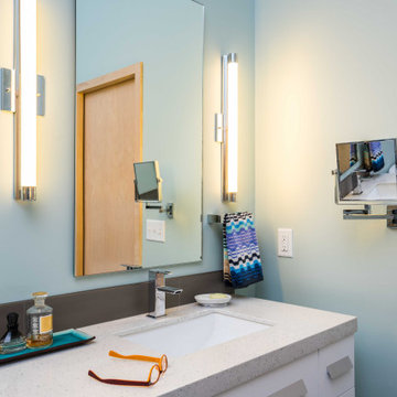
Ms. Homeowner’s townhome Primary Bathroom was a cookie-cutter, builder-grade space that she wanted upgraded and updated. The shower tile was discolored and mildewed; the traditional vanity tile floor and tub deck were also outdated. Our client wanted an accessible bathroom she could age in place in featuring an updated, modern yet timeless and elegant design, with better storage all within a conservative budget.
The main challenge in this project was to transform the space and raise the design quotient within the requested budget. We kept the basic footprint, preserved the existing maple doors and trim, saved and re-used the bathtub, purchased a sleek pre-fabricated, vanity which included the countertop and sinks. We reserved some of the budget for high impact items, upgrading fixtures and finishes in every area. We made the shower safer and more visually open by installing a curbless, barrier-free floor, and a frameless glass shower door and panels. We extended the tub deck into the shower area which is a functioning bench and product shelf. We replaced all of the tile, faucets, hardware and accessories with sleek chrome components. A client-requested, high quality commode with a remote controlled Toto washlet seat was installed. The eye-catching color scheme, based on the new vanity and countertop is a balance of rich, dark neutrals paired with crisp whites, bright chrome fixtures, and turquoise wall paint which beautifully coordinates with the existing natural maple doors and trim.
63