
Search results for "Grill effectively" in Home Design Ideas
 MCDW + Architecture
Kitchen Cube 1
Upper East- Residence
Work: Full Gut renovation- 2 apartments- in the same ‘S’ line
Size: 650 Sq Ft of space in both apartments, 5S and 4S
Using the Frankfurt Kitchen of 1926 for inspiration, Ms.Cianfaglione began asking herself how the typology of the NYC kitchenette for her building, in the ‘S’ line, needed to be upgraded to fit today’s physical and aesthetic needs. The Frankfurt Kitchen was the forerunner of modern fitted kitchens and had an unified concept to enable efficient work, consolidating a woman’s efforts and allowing her more time to spend else ware. But unlike the Frankfurt kitchen, Ms. Cianfaglione wanted to take this a step further and open it up rather than concealing it, and its user, inside a room. This would showcase the designer’s evolved notion of “cooking”,that would now become an orchestrated dance to be put on display.
Ms. Cianfaglione had a typical NYC kitchenette, a small room with an air grille for ventilation, and in this case, there was a small window that was currently blocked by a refrigerator. There was also the problem of the foyer space, which was just a waste in an apartment this small, and the structural wall that could not be removed. Ms. Cianfaglione responded to these conditions by designing the kitchen to become a wrap around condition, in an ‘L’ shape, that would use the foyer more effectively and at the same time, face the living area, and all the while concealing the structural wall that separates them.
The interesting thing about the ‘L’ shape was that it allows for a beautifully orchestrated flow that makes cooking look like a beautiful dance that moves back and forth along the’ L.’
The appliances are designed within the cabinetry to give a tailored look that does not allow for distraction, and you instead focus on the user. This renovation made the otherwise small, unused foyer and ineffective kitchen, now a focal point that dictates movement throughout. The kitchen has unified and designed an otherwise standard one bedroom apartment and seeks to become a new standard in this building’s typology.
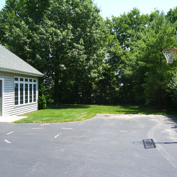
 River Valley Landscapes
Before - After many years of having no outdoor living space and dealing with overgrown plants and trees the owner’s decided it was time to revitalize their backyard. They knew they wanted a large sitting area with a wood burning fireplace, room for outdoor dining and a place for the grill. A connecting walk would be needed to get guests from the driveway to the outdoor space. Last but not least, the owners wanted the ability to and a reason for stepping out of their unusable patio doors.
The designers decided from the start the fireplace would be the prominent feature and focal point for the entire project. A large fireplace accented with sitting walls and arbors was positioned to anchor the corner of the patio. Stone was chosen to set the fireplace apart as its own element. Brick was used for the sitting walls and brick accents were added to the fireplace to tie into the house. An inlaid herringbone brick detail was incorporated above the stone mantle to simulate artwork which is typically found above indoor fireplaces. Flagstone was used for the wall caps and hearth to match the patio and thicker flagstone tread stock was used for the mantle and top. The arbors were added to visually balance the pergolas at the opposite side of the patio.
For the patio the designers created a series of offset spaces to help subtly divide the space into two areas, sitting and dining. Two large existing trees also help dictate the shape of the patio. Cut flagstone was chosen for the surface bordered by a double soldier edge of brick. The brick edging also surrounds a decorative gravel area topped with an urn fountain which provides a secondary focal point and the sound of water. Large flagstone treads were used for the steps leading to the previously unused patio doors. Opposite the fireplace a short walk leads to a square transition area with a statue chosen by the owner. The statue provides a strong focal point when entering from the driveway. A longer walk leads from this space along the house to the driveway.
The pergolas and arbors were designed by the landscape designer as part of this project but were ultimately contracted separately by the owner. The larger square pergola was intended as an area for a bench or two separate from the main patio. The longer pergola was added later in the design phase to help provide shade to the interior of the house. The arbors at the fireplace were added to balance out the wood elements at the opposite side while adding additional architectural interest to the fireplace.
While this project was predominantly hardscaping, planting and lighting were also incorporated into the design. Several large existing trees were retained and serious of smaller understory trees were added to help enclose the space. The designer’s took advantage of the large trees to place down lights on the branches to achieve a moonlight effect at night. Additional lighting was used on the pergola, to accent focal points, to up light the smaller trees and around the patio. Massed planting of Japanese forest grass provides bold foliage color for the shady garden. A mulch path leads off behind the fireplace to another garden and a secluded area ideal for a bench or small table and chairs. Additional plantings were added along the rear property line to screen and unsightly fence.
This project has obviously completely changed the way the owners use their backyard. They now have a seamless transition from indoors to outdoors with the use of the patio doors. The large patio allows for entertaining small gatherings outdoors for the first time. The fireplace has definitely become the primary gathering place for family and friends.
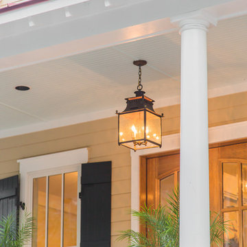
 Copper Lantern Tim Baratelle
Battery Park Hanging LIght - new product! Note the beautiful lighting effect created by the grill work at the top of the fixture. Product H3585G
Elegant porch photo in Atlanta
Elegant porch photo in Atlanta
Find the right local pro for your project
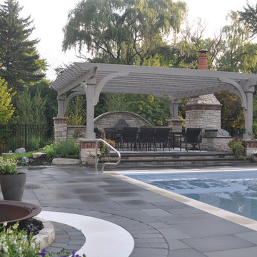

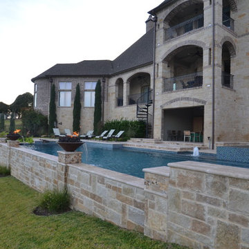
 Mike Farley Pool Designer, SWD, ASLA
This gorgeous Bartonville project has a Geometric swimming pool with a glass tile raised perimeter overflow spa (vanishing edge). There is also a custom cabana with kitchen, big screen tv, fireplace, Primo grill, overhead fan, cam lights all for enjoyment & relaxation. The diving board is recessed and there is lighting around the steps for safety. Fire/water bowls were used for focal points in both the daytime & nighttime. Designed by Mike Farley.
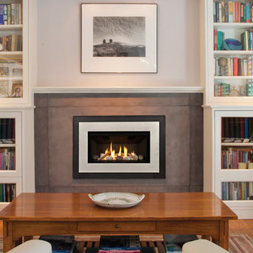
 Maple Mountain Fireplaces
Since introducing the first Valor Legend insert model in 1991, we continue to adapt and improve on all aspects of our flagship line. With constant innovation in product design and function, our objective is to exceed the expectations of Valor customers on every level.
Easy-to-use, energy saving features position the Valor G3 insert as a leader in efficient, effective zone heating - a true upgrade in heat control, product reliability and overall home comfort.
Update your existing living space with a wide selection of stunning fireplace designs in both traditional and contemporary appeal. A diverse collection of fronts, trims and hearth accessories provide endless installation opportunities for your dated, inefficient fireplace.
Embodying over 100 years of Valor tradition accompanied by the latest in state-of-the-art technology, the Legend G3 continues to be the industries number one selling radiant gas insert.
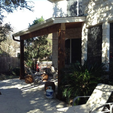
 Archadeck of Austin
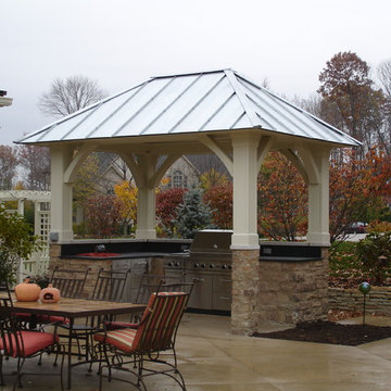
This new addition is cozy and quaint and proves that an outdoor living space addition doesn’t necessarily have to be large to be effective. This project consists of a covered porch area with a convenient outdoor grilling/smoking kitchen area that sits parallel with the covered area. The design is loaded with upscale amenities and high-quality materials in a size that is dictated by the scale of the existing home and surrounding landscape
Sponsored
Columbus, OH
Free consultation for landscape design!

Peabody Landscape Group
Columbus' Reliable Landscape Design & Contracting
 Brett Berry
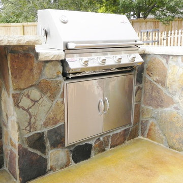
Stained concrete patio with a built-in Beef Eater grill and cabinet doors. Natural flagstone veneer with a custom-quarried limestone countertop set in a beautiful landscape.
Landscape Contractor Values:
Any given Landscape Contractor may have a different approach, but Landscape Contractor, Brett Berry of Berry Outdoor Living creates living areas that feel connected to the home. As a Landscape Designer and Landscape Contractor working with a Landscape Architect, we try to create the space so it feels relaxed. It should feel like it's been in place with the home for years and not an "add-on".
As a Landscape Contractor that merges old and new construction into the landscape design, the goal is to build a space people want to spend time, whether at the bar of the outdoor kitchen, fire pit, patio, or covered porch. When a space becomes a large part of the homeowners' daily life, as a Landscape Contractor, that's when I know a project has been completed with excellence. I work closely with a Landscape Architect through the design process to ensure the space has the correct "feel".
A Landscape Contractor must build the space to flow from the inside of the home out. The patio and outdoor living space feels like an extension of the home, or another "room" of the home and feels wrapped with fresh, low-maintenance landscaping.
In Kansas City patio, and landscaping design, there is a clear trend toward a cleaner, more defined look influenced by a more modern era viewpoint that values a non-cluttered look and feel. So, as a Landscape Contractor, in our circle of clients, we've seen a definite shift toward cleaner, artisan-crafted backyards and fewer "boxy", shrub-heavy yards. A Landscape Contractor with a keen sense designs this effect.
 Skill Construction & Design, LLC
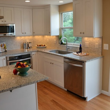
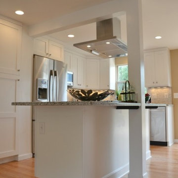
There are so many design elements to this kitchen, I almost don’t know where to start. Bright and airy with crisp clean white cabinets, the kitchen is open and welcoming. Still crisp but gently contrasting, the stainless steel appliance add depth amid the white. To keep this kitchen warm, natural oak covers the floors and a toasted wheat color washes the walls. And then there is the architectural elements. You know. That post and beam in the middle of the room. It’s the center of attention.
When you walk into a room your eyes roam around, establishing the size and shape of the room as your feet take you forward. From the front door of this home straight ahead you encountered this wall. The dining area to the right gives you a glimpse of things to come. Where there is a dining room you will usually find a kitchen.
The architecture of years gone by consistently hides the kitchen, the heart of the home, behind walls. I sympathize with my Mom, and all the other Moms, who have had to spend so much time tucked into a tight kitchen, away from the family. This wall had to go, but it was structural. We needed its support but not its bulk.
So we got rid of the bulk and only the bulk. Instead of a wall we have a post and beam, offering all of the structure we need. We could have installed a huge steel beam and reconfigure the joists to upset the beam, but why? The small beam and post add an incredible architectural element. It’s turning lemons into lemon, we simply made the most of what we had. It may be functional but it’s so fantastic. It looks like we created the effect just for the drama.
The original kitchen may have had a working triangle and some counter space, but it was fairly small, with each area only a step or two away. The dark cabinets made the space feel even smaller and the butcher block patterned laminate counter tops were very dated. The appliances were feeling their age as well, from a coil burner electric stove to a top freezer refrigerator. To keep this kitchen within its space, a half wall separated it from the dining area.
With the wall gone we borrowed some space from the living room and extended what was a U shaped kitchen into an L. At the living room window we start our new kitchen. We kept a small part of the wall to support the other end of our decorative beam. Sandwiched between a large pantry and our new French door refrigerator, the wall disappears. With our new open floor plan a sizable island was in order.
We split our cooking areas and installed a continuous grill gas cooktop into the island. A sleek island hood takes care of exhaust and adds an extra element to our architectural feature. Under the cooktop we added over-sized drawers for pots and pan storage. The frameless cabinets from New River Cabinetry are maple, painted white, with the Herndon door style. With the cooktop safely nestled into our island, we still had to add an oven.
We used the space where the old range sat for a large single oven of stainless steel and glass. If it worked for one, why not two? We created a home for a microwave in the wall cabinets. It’s perfect for heating leftovers so close to the refrigerator.
An important consideration for hot spots in your kitchen is landing zones. Each of our cooking areas have generous landing zones, one on each side of the cooktop and an entire counter area above or below the ovens, depending on which one you’re using.
We wanted to give the sink area more room so the half wall had to come out. We moved the trash and recycle cans into a cabinet, removed the heavy soffits and kept the sink under the window.
With that little bit of extra space we were able to add a larger cabinet above the dishwasher and slide it all down. This used to be where the carpeting met the vinyl floor, but all of it is gone. Long oak planks eliminate that final divide between the kitchen and the dining area, while adding visual length to the area. White wall cabinets on each side of the window reflect the sunlight for a brighter view.
With all of the darker cabinetry the backsplash walls had been painted white. Even still, there was a darkness in the corners and it wasn’t very exciting. We wanted to add visual interest and reflect the new under-cabinet lighting, eliminating the shadows in this corner.
With 1″x 2″ Arabescato Honed marble mosaics and those under-cabinet lights, we achieved the perfect balance. The marble has subtle swirls in gray and beige on a clean white background, but with the honed finish the light is softly reflected instead of glaring. For granite, we chose the soft gray tones of Luna Pearl. The speckles of gray and beige are a gentle contrast to the white cabinets and emulate the color of the stainless steel.
Between the carpet, red half wall, dark railing and dated light fixture, the dining area felt tired. Since the kitchen lacked sufficient storage, a large utility cabinet crowded the table space without adding any decorate elements.
Although it didn’t get any bigger, our dining area feels fresher and more open too. With the oak flooring joining the area to the rest of our space and the toasted wheat on the walls, the white table and chairs compliment the cabinetry while contrasting the warmer colors. We replaced the chandelier with recessed lighting and changed that railing too.
With our new open floor plan, we ended up with a fairly open area in between our foyer closet and the living room window. Not one to miss an opportunity, we filled the space with a multi-functional work space.
With the sunlight streaming in this bright corner works for anything this family needs.
There’s plenty of space for a chair under this large desk drawer. A closed cabinet below, glass doors above and lots of open shelving let you store and or showcase your belongings. We added a lite area at the top to keep away the darker corners.
The transformation is complete. This kitchen and all of its features are truly the center of attention in this home.
http://www.designsbyskill.com/
http://www.rjkconstructioninc.com/
 Mike Farley Pool Designer, SWD, ASLA
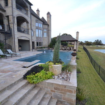
This gorgeous Bartonville project has a Geometric swimming pool with a glass tile raised perimeter overflow spa (vanishing edge). There is also a custom cabana with kitchen, big screen tv, fireplace, Primo grill, overhead fan, cam lights all for enjoyment & relaxation. The diving board is recessed and there is lighting around the steps for safety. Fire/water bowls were used for focal points in both the daytime & nighttime. Designed by Mike Farley.
 Skill Construction & Design, LLC
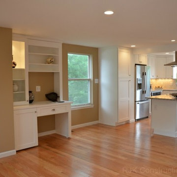
There are so many design elements to this kitchen, I almost don’t know where to start. Bright and airy with crisp clean white cabinets, the kitchen is open and welcoming. Still crisp but gently contrasting, the stainless steel appliance add depth amid the white. To keep this kitchen warm, natural oak covers the floors and a toasted wheat color washes the walls. And then there is the architectural elements. You know. That post and beam in the middle of the room. It’s the center of attention.
When you walk into a room your eyes roam around, establishing the size and shape of the room as your feet take you forward. From the front door of this home straight ahead you encountered this wall. The dining area to the right gives you a glimpse of things to come. Where there is a dining room you will usually find a kitchen.
The architecture of years gone by consistently hides the kitchen, the heart of the home, behind walls. I sympathize with my Mom, and all the other Moms, who have had to spend so much time tucked into a tight kitchen, away from the family. This wall had to go, but it was structural. We needed its support but not its bulk.
So we got rid of the bulk and only the bulk. Instead of a wall we have a post and beam, offering all of the structure we need. We could have installed a huge steel beam and reconfigure the joists to upset the beam, but why? The small beam and post add an incredible architectural element. It’s turning lemons into lemon, we simply made the most of what we had. It may be functional but it’s so fantastic. It looks like we created the effect just for the drama.
The original kitchen may have had a working triangle and some counter space, but it was fairly small, with each area only a step or two away. The dark cabinets made the space feel even smaller and the butcher block patterned laminate counter tops were very dated. The appliances were feeling their age as well, from a coil burner electric stove to a top freezer refrigerator. To keep this kitchen within its space, a half wall separated it from the dining area.
With the wall gone we borrowed some space from the living room and extended what was a U shaped kitchen into an L. At the living room window we start our new kitchen. We kept a small part of the wall to support the other end of our decorative beam. Sandwiched between a large pantry and our new French door refrigerator, the wall disappears. With our new open floor plan a sizable island was in order.
We split our cooking areas and installed a continuous grill gas cooktop into the island. A sleek island hood takes care of exhaust and adds an extra element to our architectural feature. Under the cooktop we added over-sized drawers for pots and pan storage. The frameless cabinets from New River Cabinetry are maple, painted white, with the Herndon door style. With the cooktop safely nestled into our island, we still had to add an oven.
We used the space where the old range sat for a large single oven of stainless steel and glass. If it worked for one, why not two? We created a home for a microwave in the wall cabinets. It’s perfect for heating leftovers so close to the refrigerator.
An important consideration for hot spots in your kitchen is landing zones. Each of our cooking areas have generous landing zones, one on each side of the cooktop and an entire counter area above or below the ovens, depending on which one you’re using.
We wanted to give the sink area more room so the half wall had to come out. We moved the trash and recycle cans into a cabinet, removed the heavy soffits and kept the sink under the window.
With that little bit of extra space we were able to add a larger cabinet above the dishwasher and slide it all down. This used to be where the carpeting met the vinyl floor, but all of it is gone. Long oak planks eliminate that final divide between the kitchen and the dining area, while adding visual length to the area. White wall cabinets on each side of the window reflect the sunlight for a brighter view.
With all of the darker cabinetry the backsplash walls had been painted white. Even still, there was a darkness in the corners and it wasn’t very exciting. We wanted to add visual interest and reflect the new under-cabinet lighting, eliminating the shadows in this corner.
With 1″x 2″ Arabescato Honed marble mosaics and those under-cabinet lights, we achieved the perfect balance. The marble has subtle swirls in gray and beige on a clean white background, but with the honed finish the light is softly reflected instead of glaring. For granite, we chose the soft gray tones of Luna Pearl. The speckles of gray and beige are a gentle contrast to the white cabinets and emulate the color of the stainless steel.
Between the carpet, red half wall, dark railing and dated light fixture, the dining area felt tired. Since the kitchen lacked sufficient storage, a large utility cabinet crowded the table space without adding any decorate elements.
Although it didn’t get any bigger, our dining area feels fresher and more open too. With the oak flooring joining the area to the rest of our space and the toasted wheat on the walls, the white table and chairs compliment the cabinetry while contrasting the warmer colors. We replaced the chandelier with recessed lighting and changed that railing too.
With our new open floor plan, we ended up with a fairly open area in between our foyer closet and the living room window. Not one to miss an opportunity, we filled the space with a multi-functional work space.
With the sunlight streaming in this bright corner works for anything this family needs.
There’s plenty of space for a chair under this large desk drawer. A closed cabinet below, glass doors above and lots of open shelving let you store and or showcase your belongings. We added a lite area at the top to keep away the darker corners.
The transformation is complete. This kitchen and all of its features are truly the center of attention in this home.
http://www.designsbyskill.com/
http://www.rjkconstructioninc.com/
 Skill Construction & Design, LLC
There are so many design elements to this kitchen, I almost don’t know where to start. Bright and airy with crisp clean white cabinets, the kitchen is open and welcoming. Still crisp but gently contrasting, the stainless steel appliance add depth amid the white. To keep this kitchen warm, natural oak covers the floors and a toasted wheat color washes the walls. And then there is the architectural elements. You know. That post and beam in the middle of the room. It’s the center of attention.
When you walk into a room your eyes roam around, establishing the size and shape of the room as your feet take you forward. From the front door of this home straight ahead you encountered this wall. The dining area to the right gives you a glimpse of things to come. Where there is a dining room you will usually find a kitchen.
The architecture of years gone by consistently hides the kitchen, the heart of the home, behind walls. I sympathize with my Mom, and all the other Moms, who have had to spend so much time tucked into a tight kitchen, away from the family. This wall had to go, but it was structural. We needed its support but not its bulk.
So we got rid of the bulk and only the bulk. Instead of a wall we have a post and beam, offering all of the structure we need. We could have installed a huge steel beam and reconfigure the joists to upset the beam, but why? The small beam and post add an incredible architectural element. It’s turning lemons into lemon, we simply made the most of what we had. It may be functional but it’s so fantastic. It looks like we created the effect just for the drama.
The original kitchen may have had a working triangle and some counter space, but it was fairly small, with each area only a step or two away. The dark cabinets made the space feel even smaller and the butcher block patterned laminate counter tops were very dated. The appliances were feeling their age as well, from a coil burner electric stove to a top freezer refrigerator. To keep this kitchen within its space, a half wall separated it from the dining area.
With the wall gone we borrowed some space from the living room and extended what was a U shaped kitchen into an L. At the living room window we start our new kitchen. We kept a small part of the wall to support the other end of our decorative beam. Sandwiched between a large pantry and our new French door refrigerator, the wall disappears. With our new open floor plan a sizable island was in order.
We split our cooking areas and installed a continuous grill gas cooktop into the island. A sleek island hood takes care of exhaust and adds an extra element to our architectural feature. Under the cooktop we added over-sized drawers for pots and pan storage. The frameless cabinets from New River Cabinetry are maple, painted white, with the Herndon door style. With the cooktop safely nestled into our island, we still had to add an oven.
We used the space where the old range sat for a large single oven of stainless steel and glass. If it worked for one, why not two? We created a home for a microwave in the wall cabinets. It’s perfect for heating leftovers so close to the refrigerator.
An important consideration for hot spots in your kitchen is landing zones. Each of our cooking areas have generous landing zones, one on each side of the cooktop and an entire counter area above or below the ovens, depending on which one you’re using.
We wanted to give the sink area more room so the half wall had to come out. We moved the trash and recycle cans into a cabinet, removed the heavy soffits and kept the sink under the window.
With that little bit of extra space we were able to add a larger cabinet above the dishwasher and slide it all down. This used to be where the carpeting met the vinyl floor, but all of it is gone. Long oak planks eliminate that final divide between the kitchen and the dining area, while adding visual length to the area. White wall cabinets on each side of the window reflect the sunlight for a brighter view.
With all of the darker cabinetry the backsplash walls had been painted white. Even still, there was a darkness in the corners and it wasn’t very exciting. We wanted to add visual interest and reflect the new under-cabinet lighting, eliminating the shadows in this corner.
With 1″x 2″ Arabescato Honed marble mosaics and those under-cabinet lights, we achieved the perfect balance. The marble has subtle swirls in gray and beige on a clean white background, but with the honed finish the light is softly reflected instead of glaring. For granite, we chose the soft gray tones of Luna Pearl. The speckles of gray and beige are a gentle contrast to the white cabinets and emulate the color of the stainless steel.
Between the carpet, red half wall, dark railing and dated light fixture, the dining area felt tired. Since the kitchen lacked sufficient storage, a large utility cabinet crowded the table space without adding any decorate elements.
Although it didn’t get any bigger, our dining area feels fresher and more open too. With the oak flooring joining the area to the rest of our space and the toasted wheat on the walls, the white table and chairs compliment the cabinetry while contrasting the warmer colors. We replaced the chandelier with recessed lighting and changed that railing too.
With our new open floor plan, we ended up with a fairly open area in between our foyer closet and the living room window. Not one to miss an opportunity, we filled the space with a multi-functional work space.
With the sunlight streaming in this bright corner works for anything this family needs.
There’s plenty of space for a chair under this large desk drawer. A closed cabinet below, glass doors above and lots of open shelving let you store and or showcase your belongings. We added a lite area at the top to keep away the darker corners.
The transformation is complete. This kitchen and all of its features are truly the center of attention in this home.
http://www.designsbyskill.com/
http://www.rjkconstructioninc.com/
 Archadeck of Austin
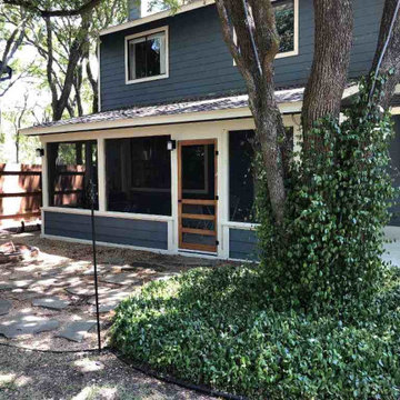
Screened porch designer Archadeck of Austin designed a picture-perfect screened porch, small but effective. It provides everything these homeowners were looking for without disturbing any more of their back yard. We designed a simple shed roof for the porch to avoid the second-story windows. While creating an outdoor room where none existed, we were able to build it without disturbing the flagstone grilling area and fire pit nearby.
Sponsored
Columbus, OH
Free consultation for landscape design!
Peabody Landscape Group
Columbus' Reliable Landscape Design & Contracting
 Neave Group Outdoor Solutions
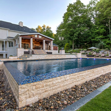
Pool:
- 22’ x 44’ infinity edge pool (66’ infinity edge)
- shallow-end sun shelf with five LED bubblers for light and water effect
- three laminar jets out of the patio to put a jet of water into each corner of the pool
- star field on pool floor with 100 points of light provided by four LED fixtures through fiber-optic cables (25 cables per fixture), subtle constellation within the hundred points of light star field
- additional LED lights, glass tile trim, including glass edge tiles
- hot tub on top of a raised marble stone wall perimeter overflow at the same height as the Brazilian teak wood deck; there is an under deck gutter 1/8 wide
- hot tub is all glass tile with a recessed toe-kick that hides the drains and light fixtures
- glass railing / barrier
Living space:
- travertine stone with marble veneer and Brazilian teak trim throughout
- custom-built wood benches, mantle, pizza oven, grill, refrigerated drawers, sink
- recessed screens that lower from the roof to enclose the entire living space when needed
Landscape:
- putting green, landscape lighting, under-cap lights
- outdoor speakers and subwoofer
 Mike Farley Pool Designer, SWD, ASLA
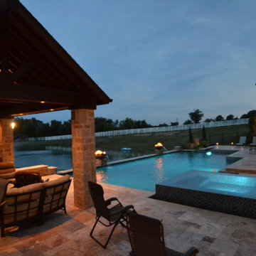
This gorgeous Bartonville project has a Geometric swimming pool with a glass tile raised perimeter overflow spa (vanishing edge). There is also a custom cabana with kitchen, big screen tv, fireplace, Primo grill, overhead fan, cam lights all for enjoyment & relaxation. The diving board is recessed and there is lighting around the steps for safety. Fire/water bowls were used for focal points in both the daytime & nighttime. Designed by Mike Farley.
 Fiano Landscapes
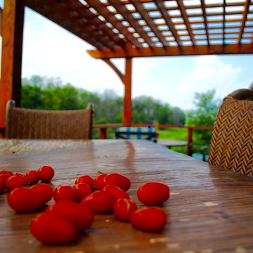
Not everyone has the backyard that suits a hardscape patio. Those situations sometimes call for a different approach....especially in this case! We built a second-level deck and pergola for this family outside of Greenfield. Cedar all around! They also wanted to retain their beautiful views. So we used a cable railing system that is safe and effective at preventing falls, but also perfect for maximizing those views. I think it turned out well, don't you? Sun-Dried tomatoes anyone?
 MCDW + Architecture
Kitchen Cube 1
Upper East- Residence
Work: Full Gut renovation- 2 apartments- in the same ‘S’ line
Size: 650 Sq Ft of space in both apartments, 5S and 4S
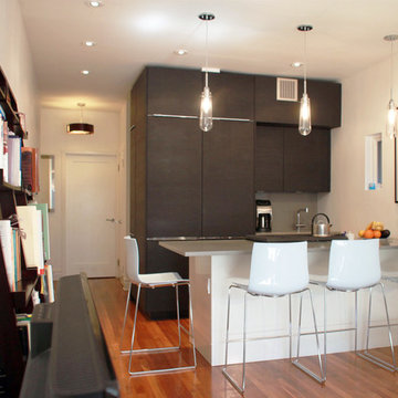
Using the Frankfurt Kitchen of 1926 for inspiration, Ms.Cianfaglione began asking herself how the typology of the NYC kitchenette for her building, in the ‘S’ line, needed to be upgraded to fit today’s physical and aesthetic needs. The Frankfurt Kitchen was the forerunner of modern fitted kitchens and had an unified concept to enable efficient work, consolidating a woman’s efforts and allowing her more time to spend else ware. But unlike the Frankfurt kitchen, Ms. Cianfaglione wanted to take this a step further and open it up rather than concealing it, and its user, inside a room. This would showcase the designer’s evolved notion of “cooking”,that would now become an orchestrated dance to be put on display.
Ms. Cianfaglione had a typical NYC kitchenette, a small room with an air grille for ventilation, and in this case, there was a small window that was currently blocked by a refrigerator. There was also the problem of the foyer space, which was just a waste in an apartment this small, and the structural wall that could not be removed. Ms. Cianfaglione responded to these conditions by designing the kitchen to become a wrap around condition, in an ‘L’ shape, that would use the foyer more effectively and at the same time, face the living area, and all the while concealing the structural wall that separates them.
The interesting thing about the ‘L’ shape was that it allows for a beautifully orchestrated flow that makes cooking look like a beautiful dance that moves back and forth along the’ L.’
The appliances are designed within the cabinetry to give a tailored look that does not allow for distraction, and you instead focus on the user. This renovation made the otherwise small, unused foyer and ineffective kitchen, now a focal point that dictates movement throughout. The kitchen has unified and designed an otherwise standard one bedroom apartment and seeks to become a new standard in this building’s typology.
Sponsored
Columbus, OH
Free consultation for landscape design!
Peabody Landscape Group
Columbus' Reliable Landscape Design & Contracting
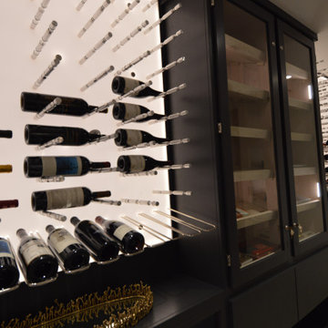
 Custom Wine Cellars San Francisco
In the upper-right corner of the photo, you can see the WhisperKool wine cellar cooling unit. This is a split-type air conditioning unit and it’s very popular among small or compact wine cellars. It doesn’t take up space and all you can see are the hex grills that hide the evaporator and air filter. Together with our cost-effective humidifier (hidden inside the center drawer), they help keep the temperature and humidity at optimum level for the preservation of the wines and the cigars.
Learn more about the project here: https://www.customwinecellarssanfrancisco.com/adding-a-humidor-to-beautiful-small-wine-cellars/
Custom Wine Cellars San Francisco
San Francisco, California, 94109
+1 (415) 508 – 8419
https://www.customwinecellarssanfrancisco.com/
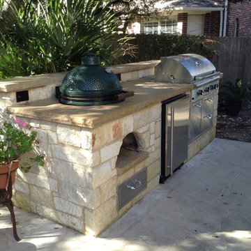 Archadeck of Austin
This new addition is cozy and quaint and proves that an outdoor living space addition doesn’t necessarily have to be large to be effective. This project consists of a covered porch area with a convenient outdoor grilling/smoking kitchen area that sits parallel with the covered area. The design is loaded with upscale amenities and high-quality materials in a size that is dictated by the scale of the existing home and surrounding landscape
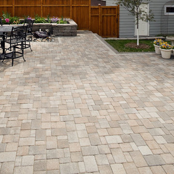
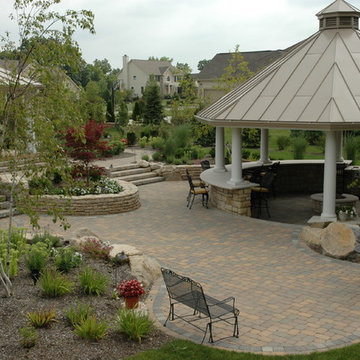
 Villa Landscapes
Willow Creek Cobblestone paving stones create a low-maintenance, cost-effective choice for creating a beautiful backyard outdoor living space.
Example of a mid-sized transitional backyard concrete paver patio kitchen design in Minneapolis with no cover
Example of a mid-sized transitional backyard concrete paver patio kitchen design in Minneapolis with no cover
18