
Search results for "Grill effectively" in Home Design Ideas
 Skill Construction & Design, LLC
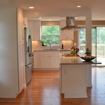
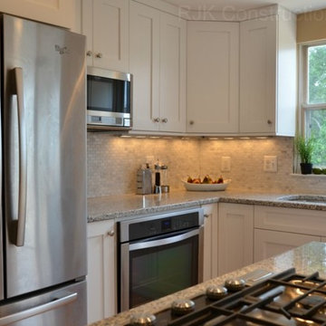
There are so many design elements to this kitchen, I almost don’t know where to start. Bright and airy with crisp clean white cabinets, the kitchen is open and welcoming. Still crisp but gently contrasting, the stainless steel appliance add depth amid the white. To keep this kitchen warm, natural oak covers the floors and a toasted wheat color washes the walls. And then there is the architectural elements. You know. That post and beam in the middle of the room. It’s the center of attention.
When you walk into a room your eyes roam around, establishing the size and shape of the room as your feet take you forward. From the front door of this home straight ahead you encountered this wall. The dining area to the right gives you a glimpse of things to come. Where there is a dining room you will usually find a kitchen.
The architecture of years gone by consistently hides the kitchen, the heart of the home, behind walls. I sympathize with my Mom, and all the other Moms, who have had to spend so much time tucked into a tight kitchen, away from the family. This wall had to go, but it was structural. We needed its support but not its bulk.
So we got rid of the bulk and only the bulk. Instead of a wall we have a post and beam, offering all of the structure we need. We could have installed a huge steel beam and reconfigure the joists to upset the beam, but why? The small beam and post add an incredible architectural element. It’s turning lemons into lemon, we simply made the most of what we had. It may be functional but it’s so fantastic. It looks like we created the effect just for the drama.
The original kitchen may have had a working triangle and some counter space, but it was fairly small, with each area only a step or two away. The dark cabinets made the space feel even smaller and the butcher block patterned laminate counter tops were very dated. The appliances were feeling their age as well, from a coil burner electric stove to a top freezer refrigerator. To keep this kitchen within its space, a half wall separated it from the dining area.
With the wall gone we borrowed some space from the living room and extended what was a U shaped kitchen into an L. At the living room window we start our new kitchen. We kept a small part of the wall to support the other end of our decorative beam. Sandwiched between a large pantry and our new French door refrigerator, the wall disappears. With our new open floor plan a sizable island was in order.
We split our cooking areas and installed a continuous grill gas cooktop into the island. A sleek island hood takes care of exhaust and adds an extra element to our architectural feature. Under the cooktop we added over-sized drawers for pots and pan storage. The frameless cabinets from New River Cabinetry are maple, painted white, with the Herndon door style. With the cooktop safely nestled into our island, we still had to add an oven.
We used the space where the old range sat for a large single oven of stainless steel and glass. If it worked for one, why not two? We created a home for a microwave in the wall cabinets. It’s perfect for heating leftovers so close to the refrigerator.
An important consideration for hot spots in your kitchen is landing zones. Each of our cooking areas have generous landing zones, one on each side of the cooktop and an entire counter area above or below the ovens, depending on which one you’re using.
We wanted to give the sink area more room so the half wall had to come out. We moved the trash and recycle cans into a cabinet, removed the heavy soffits and kept the sink under the window.
With that little bit of extra space we were able to add a larger cabinet above the dishwasher and slide it all down. This used to be where the carpeting met the vinyl floor, but all of it is gone. Long oak planks eliminate that final divide between the kitchen and the dining area, while adding visual length to the area. White wall cabinets on each side of the window reflect the sunlight for a brighter view.
With all of the darker cabinetry the backsplash walls had been painted white. Even still, there was a darkness in the corners and it wasn’t very exciting. We wanted to add visual interest and reflect the new under-cabinet lighting, eliminating the shadows in this corner.
With 1″x 2″ Arabescato Honed marble mosaics and those under-cabinet lights, we achieved the perfect balance. The marble has subtle swirls in gray and beige on a clean white background, but with the honed finish the light is softly reflected instead of glaring. For granite, we chose the soft gray tones of Luna Pearl. The speckles of gray and beige are a gentle contrast to the white cabinets and emulate the color of the stainless steel.
Between the carpet, red half wall, dark railing and dated light fixture, the dining area felt tired. Since the kitchen lacked sufficient storage, a large utility cabinet crowded the table space without adding any decorate elements.
Although it didn’t get any bigger, our dining area feels fresher and more open too. With the oak flooring joining the area to the rest of our space and the toasted wheat on the walls, the white table and chairs compliment the cabinetry while contrasting the warmer colors. We replaced the chandelier with recessed lighting and changed that railing too.
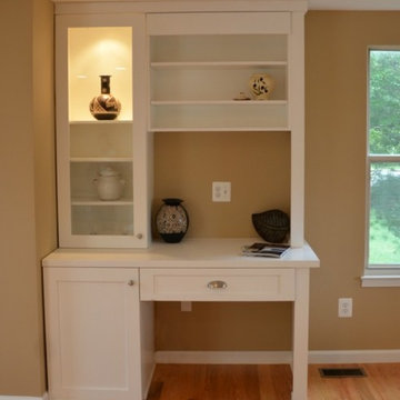
With our new open floor plan, we ended up with a fairly open area in between our foyer closet and the living room window. Not one to miss an opportunity, we filled the space with a multi-functional work space.
With the sunlight streaming in this bright corner works for anything this family needs.
There’s plenty of space for a chair under this large desk drawer. A closed cabinet below, glass doors above and lots of open shelving let you store and or showcase your belongings. We added a lite area at the top to keep away the darker corners.
The transformation is complete. This kitchen and all of its features are truly the center of attention in this home.
http://www.designsbyskill.com/
http://www.rjkconstructioninc.com/
 Archadeck of Austin
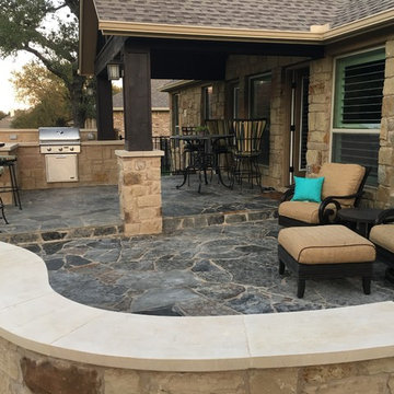
This project, located in the Berry Creek area of Georgetown, TX, was awarded an Archadeck Outdoor Living national Design Excellence Award for the patio category.
Archadeck of Austin transformed the home’s original patio into a beautiful and more functional multi-purpose outdoor living space. The design included an outdoor kitchen at one end and a sweeping stone seating bench at the other end. The homeowners selected an unusual, stunning flagstone for the patio surface and steps, and the effect is gorgeous.
Photos courtesy Archadeck of Austin
 Archadeck of Austin
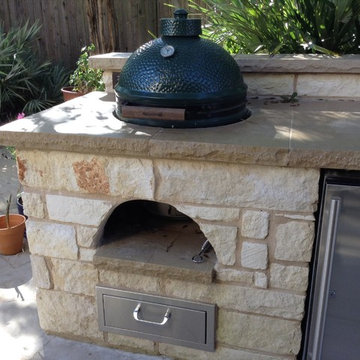
This new addition is cozy and quaint and proves that an outdoor living space addition doesn’t necessarily have to be large to be effective. This project consists of a covered porch area with a convenient outdoor grilling/smoking kitchen area that sits parallel with the covered area. The design is loaded with upscale amenities and high-quality materials in a size that is dictated by the scale of the existing home and surrounding landscape
Find the right local pro for your project
 Elite Landscaping Omaha
Elite Landscaping's construction management team designed and built this high-end pool house and outdoor kitchen. Customized for luxury poolside living, a beautiful paver pathway leads down to an outdoor seating area that beckons, "come sit down and stay awhile." The outdoor dining area features a massive triple waterfall as its backdrop, which creates the sound and effect of sitting beside a rolling stream. The uniquely shaped outdoor kitchen features a sink, storage area, and ample counter space. Equipped with high-end outdoor appliances such as a stainless steel grill and refrigerator, there is plenty of room for cooking and storing everyone's favorite foods - from gourmet meals to convenient snacks. The pergola next to the outdoor kitchen offers a comfortable shady retreat on hot, sunny days.
 Sonoran Dreams Landscape LLC
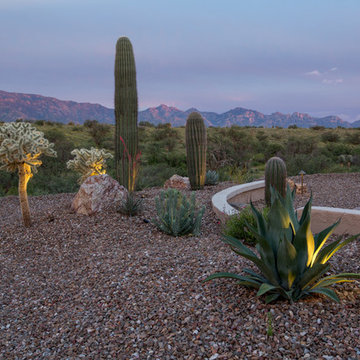
This is an example of a large modern full sun backyard gravel retaining wall landscape in Phoenix.
 Gear Landscape, LLC
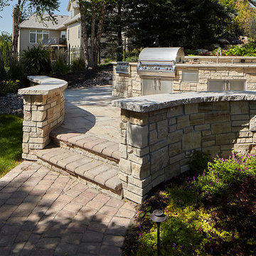
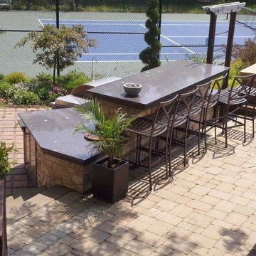
Upper view of grill/ bar island, 'Egra stone' permeable paving below, Belgard 'Dublin Cobble' pavers above. Designed and installed by Scott Gear
Inspiration for a contemporary home design remodel in Other
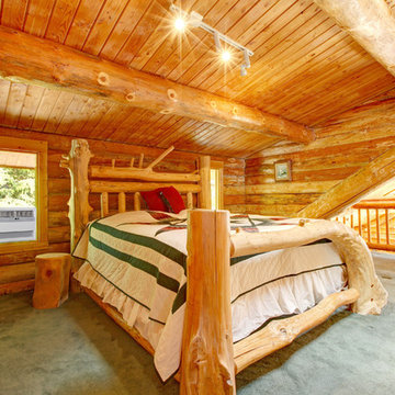
Inspiration for a contemporary home design remodel in Other

Sponsored
Columbus, OH
Free consultation for landscape design!

Peabody Landscape Group
Columbus' Reliable Landscape Design & Contracting
 Skill Construction & Design, LLC
There are so many design elements to this kitchen, I almost don’t know where to start. Bright and airy with crisp clean white cabinets, the kitchen is open and welcoming. Still crisp but gently contrasting, the stainless steel appliance add depth amid the white. To keep this kitchen warm, natural oak covers the floors and a toasted wheat color washes the walls. And then there is the architectural elements. You know. That post and beam in the middle of the room. It’s the center of attention.
When you walk into a room your eyes roam around, establishing the size and shape of the room as your feet take you forward. From the front door of this home straight ahead you encountered this wall. The dining area to the right gives you a glimpse of things to come. Where there is a dining room you will usually find a kitchen.
The architecture of years gone by consistently hides the kitchen, the heart of the home, behind walls. I sympathize with my Mom, and all the other Moms, who have had to spend so much time tucked into a tight kitchen, away from the family. This wall had to go, but it was structural. We needed its support but not its bulk.
So we got rid of the bulk and only the bulk. Instead of a wall we have a post and beam, offering all of the structure we need. We could have installed a huge steel beam and reconfigure the joists to upset the beam, but why? The small beam and post add an incredible architectural element. It’s turning lemons into lemon, we simply made the most of what we had. It may be functional but it’s so fantastic. It looks like we created the effect just for the drama.
The original kitchen may have had a working triangle and some counter space, but it was fairly small, with each area only a step or two away. The dark cabinets made the space feel even smaller and the butcher block patterned laminate counter tops were very dated. The appliances were feeling their age as well, from a coil burner electric stove to a top freezer refrigerator. To keep this kitchen within its space, a half wall separated it from the dining area.
With the wall gone we borrowed some space from the living room and extended what was a U shaped kitchen into an L. At the living room window we start our new kitchen. We kept a small part of the wall to support the other end of our decorative beam. Sandwiched between a large pantry and our new French door refrigerator, the wall disappears. With our new open floor plan a sizable island was in order.
We split our cooking areas and installed a continuous grill gas cooktop into the island. A sleek island hood takes care of exhaust and adds an extra element to our architectural feature. Under the cooktop we added over-sized drawers for pots and pan storage. The frameless cabinets from New River Cabinetry are maple, painted white, with the Herndon door style. With the cooktop safely nestled into our island, we still had to add an oven.
We used the space where the old range sat for a large single oven of stainless steel and glass. If it worked for one, why not two? We created a home for a microwave in the wall cabinets. It’s perfect for heating leftovers so close to the refrigerator.
An important consideration for hot spots in your kitchen is landing zones. Each of our cooking areas have generous landing zones, one on each side of the cooktop and an entire counter area above or below the ovens, depending on which one you’re using.
We wanted to give the sink area more room so the half wall had to come out. We moved the trash and recycle cans into a cabinet, removed the heavy soffits and kept the sink under the window.
With that little bit of extra space we were able to add a larger cabinet above the dishwasher and slide it all down. This used to be where the carpeting met the vinyl floor, but all of it is gone. Long oak planks eliminate that final divide between the kitchen and the dining area, while adding visual length to the area. White wall cabinets on each side of the window reflect the sunlight for a brighter view.
With all of the darker cabinetry the backsplash walls had been painted white. Even still, there was a darkness in the corners and it wasn’t very exciting. We wanted to add visual interest and reflect the new under-cabinet lighting, eliminating the shadows in this corner.
With 1″x 2″ Arabescato Honed marble mosaics and those under-cabinet lights, we achieved the perfect balance. The marble has subtle swirls in gray and beige on a clean white background, but with the honed finish the light is softly reflected instead of glaring. For granite, we chose the soft gray tones of Luna Pearl. The speckles of gray and beige are a gentle contrast to the white cabinets and emulate the color of the stainless steel.
Between the carpet, red half wall, dark railing and dated light fixture, the dining area felt tired. Since the kitchen lacked sufficient storage, a large utility cabinet crowded the table space without adding any decorate elements.
Although it didn’t get any bigger, our dining area feels fresher and more open too. With the oak flooring joining the area to the rest of our space and the toasted wheat on the walls, the white table and chairs compliment the cabinetry while contrasting the warmer colors. We replaced the chandelier with recessed lighting and changed that railing too.
With our new open floor plan, we ended up with a fairly open area in between our foyer closet and the living room window. Not one to miss an opportunity, we filled the space with a multi-functional work space.
With the sunlight streaming in this bright corner works for anything this family needs.
There’s plenty of space for a chair under this large desk drawer. A closed cabinet below, glass doors above and lots of open shelving let you store and or showcase your belongings. We added a lite area at the top to keep away the darker corners.
The transformation is complete. This kitchen and all of its features are truly the center of attention in this home.
http://www.designsbyskill.com/
http://www.rjkconstructioninc.com/
 Mike Farley Pool Designer, SWD, ASLA
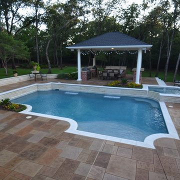
This Grapevine project was designed to damage a minimum amount of trees on a nice hillside. A raised wall was incorporated on the back of the pool that acts as a retaining wall to provide a flat spot for the pool. On the upper terrace above we built the cabana. Two inch sawcut Limestone was used for all the veneer to give a clean tailored look to the project. The spa was elevated and white precast coping was used along with the pool. A dark pattern concrete was used for the deck color to contrast. On the cabana we tried to match the existing house style, precast columns were used instead of typical stone columns. The cabana was done in pine and painted white instead of the typical cedar application. A comp roof was used. Built in bar & cabinets to recess existing grill carts were installed. A fire pit was placed to the side of the cabana at the pool level. A finger ledge was used on the raised wall to provide safety. Sheer rain was used on the project to provide a focal point - It provides more of a visual effect against the white Austin stone vs. a sheer descent. A vaulted ceiling was done in the cabana to match the existing home. Patio was capped in pattern concrete to match the new pool deck as well.
 Nathan Winchester Designs
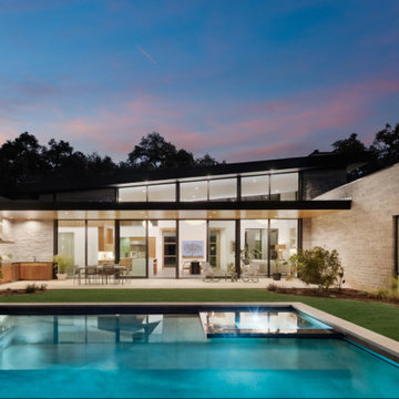
A remarkable one-story 3,290 square feet residence that stands apart from the world of builder-grade spec homes. The impressive entrance, a custom ten-foot-tall architectural pivot door acts as the inviting focal point of the property, which leads you into the open plan living-dining-kitchen behind it. The great room features Herman Miller Nelson pendants and rich terrazzo-like porcelain tile floors flowing seamlessly to a spacious courtyard with a 50-foot cantilevered veranda, a luxurious pool and spa, outdoor kitchen and grill, and pool bath and outdoor shower--ideal for entertaining or unwinding at home. Large clerestory windows above Western sliding glass doors enhance the indoor-outdoor experience. A strategically positioned wet bar, complete with a secondary sink, beverage fridge, and wall-mounted oven and microwave, is surrounded by walnut cabinetry to create a convenient butler's pantry effect near the garage entrance for easy unloading. The spacious two-car garage accommodates large vehicles with space leftover. The U-shaped floor plan comprises two wings: one housing a media room and a spacious primary suite with a secondary laundry, while the other includes a utility room, ample closets, two bathrooms, and three generously sized bedrooms. Level 5 wall board, hidden hinges, flush baseboards, trimless door jambs, and two 16-SEER variable speed HVACs with combustion heat, deliver a one-of-a-kind offering in Central Austin.
 Christine Donner Kitchen Design Inc.
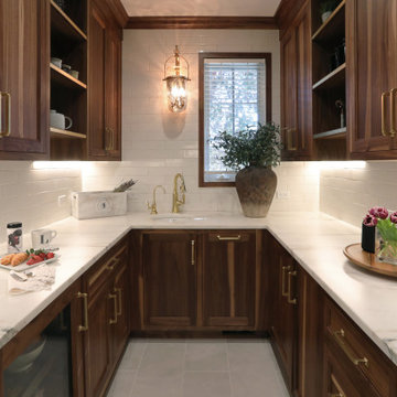
The wall tiles are a soft white with gray crackle, for a vintage effect.
Example of a small transitional u-shaped ceramic tile kitchen pantry design in New York with a single-bowl sink, flat-panel cabinets, dark wood cabinets, marble countertops, white backsplash, ceramic backsplash, paneled appliances and white countertops
Example of a small transitional u-shaped ceramic tile kitchen pantry design in New York with a single-bowl sink, flat-panel cabinets, dark wood cabinets, marble countertops, white backsplash, ceramic backsplash, paneled appliances and white countertops
 MCDW + Architecture
Kitchen Cube 1
Upper East- Residence
Work: Full Gut renovation- 2 apartments- in the same ‘S’ line
Size: 650 Sq Ft of space in both apartments, 5S and 4S
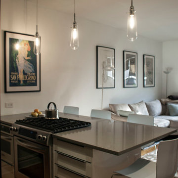
Using the Frankfurt Kitchen of 1926 for inspiration, Ms.Cianfaglione began asking herself how the typology of the NYC kitchenette for her building, in the ‘S’ line, needed to be upgraded to fit today’s physical and aesthetic needs. The Frankfurt Kitchen was the forerunner of modern fitted kitchens and had an unified concept to enable efficient work, consolidating a woman’s efforts and allowing her more time to spend else ware. But unlike the Frankfurt kitchen, Ms. Cianfaglione wanted to take this a step further and open it up rather than concealing it, and its user, inside a room. This would showcase the designer’s evolved notion of “cooking”,that would now become an orchestrated dance to be put on display.
Ms. Cianfaglione had a typical NYC kitchenette, a small room with an air grille for ventilation, and in this case, there was a small window that was currently blocked by a refrigerator. There was also the problem of the foyer space, which was just a waste in an apartment this small, and the structural wall that could not be removed. Ms. Cianfaglione responded to these conditions by designing the kitchen to become a wrap around condition, in an ‘L’ shape, that would use the foyer more effectively and at the same time, face the living area, and all the while concealing the structural wall that separates them.
The interesting thing about the ‘L’ shape was that it allows for a beautifully orchestrated flow that makes cooking look like a beautiful dance that moves back and forth along the’ L.’
The appliances are designed within the cabinetry to give a tailored look that does not allow for distraction, and you instead focus on the user. This renovation made the otherwise small, unused foyer and ineffective kitchen, now a focal point that dictates movement throughout. The kitchen has unified and designed an otherwise standard one bedroom apartment and seeks to become a new standard in this building’s typology.
 Archadeck of Chicagoland
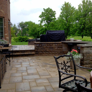
With two different levels uniquely designed, this beautiful multi-level patio creates four different outdoor living spaces that blend together smoothly. The lower level consists of a dining area with space for a table and chairs as well as a section for entertaining at their new custom limestone bar. The second level has a space for grilling and a peaceful area for relaxing in the hot tub. The patio was created with Lafitt Pavers. A Holland Stone soldier’s course and circle inset add an attractive detail, and the Belair walls create a stunning effect while helping to define the different outdoor living spaces.
Sponsored
Columbus, OH
Free consultation for landscape design!
Peabody Landscape Group
Columbus' Reliable Landscape Design & Contracting
 Tulsa Design Therapy
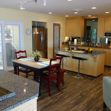
The new, open space now has access to the new deck through the sliding doors. Perfect for grilling. And, the sliders offer a quick way to unload supplies directly to the kitchen when arriving for a long lake weekend. The addition to the kitchen was a cost-effective way to incorporate the refrigerator so it doesn't have such a huge imprint on the small space...and provide what they needed most: a large pantry for all of the bulk food, drinks, coolers, dog food, paper supplies. The kitchen now offers views through the living room to the deck and lake.
 Skill Construction & Design, LLC
There are so many design elements to this kitchen, I almost don’t know where to start. Bright and airy with crisp clean white cabinets, the kitchen is open and welcoming. Still crisp but gently contrasting, the stainless steel appliance add depth amid the white. To keep this kitchen warm, natural oak covers the floors and a toasted wheat color washes the walls. And then there is the architectural elements. You know. That post and beam in the middle of the room. It’s the center of attention.
When you walk into a room your eyes roam around, establishing the size and shape of the room as your feet take you forward. From the front door of this home straight ahead you encountered this wall. The dining area to the right gives you a glimpse of things to come. Where there is a dining room you will usually find a kitchen.
The architecture of years gone by consistently hides the kitchen, the heart of the home, behind walls. I sympathize with my Mom, and all the other Moms, who have had to spend so much time tucked into a tight kitchen, away from the family. This wall had to go, but it was structural. We needed its support but not its bulk.
So we got rid of the bulk and only the bulk. Instead of a wall we have a post and beam, offering all of the structure we need. We could have installed a huge steel beam and reconfigure the joists to upset the beam, but why? The small beam and post add an incredible architectural element. It’s turning lemons into lemon, we simply made the most of what we had. It may be functional but it’s so fantastic. It looks like we created the effect just for the drama.
The original kitchen may have had a working triangle and some counter space, but it was fairly small, with each area only a step or two away. The dark cabinets made the space feel even smaller and the butcher block patterned laminate counter tops were very dated. The appliances were feeling their age as well, from a coil burner electric stove to a top freezer refrigerator. To keep this kitchen within its space, a half wall separated it from the dining area.
With the wall gone we borrowed some space from the living room and extended what was a U shaped kitchen into an L. At the living room window we start our new kitchen. We kept a small part of the wall to support the other end of our decorative beam. Sandwiched between a large pantry and our new French door refrigerator, the wall disappears. With our new open floor plan a sizable island was in order.
We split our cooking areas and installed a continuous grill gas cooktop into the island. A sleek island hood takes care of exhaust and adds an extra element to our architectural feature. Under the cooktop we added over-sized drawers for pots and pan storage. The frameless cabinets from New River Cabinetry are maple, painted white, with the Herndon door style. With the cooktop safely nestled into our island, we still had to add an oven.
We used the space where the old range sat for a large single oven of stainless steel and glass. If it worked for one, why not two? We created a home for a microwave in the wall cabinets. It’s perfect for heating leftovers so close to the refrigerator.
An important consideration for hot spots in your kitchen is landing zones. Each of our cooking areas have generous landing zones, one on each side of the cooktop and an entire counter area above or below the ovens, depending on which one you’re using.
We wanted to give the sink area more room so the half wall had to come out. We moved the trash and recycle cans into a cabinet, removed the heavy soffits and kept the sink under the window.
With that little bit of extra space we were able to add a larger cabinet above the dishwasher and slide it all down. This used to be where the carpeting met the vinyl floor, but all of it is gone. Long oak planks eliminate that final divide between the kitchen and the dining area, while adding visual length to the area. White wall cabinets on each side of the window reflect the sunlight for a brighter view.
With all of the darker cabinetry the backsplash walls had been painted white. Even still, there was a darkness in the corners and it wasn’t very exciting. We wanted to add visual interest and reflect the new under-cabinet lighting, eliminating the shadows in this corner.
With 1″x 2″ Arabescato Honed marble mosaics and those under-cabinet lights, we achieved the perfect balance. The marble has subtle swirls in gray and beige on a clean white background, but with the honed finish the light is softly reflected instead of glaring. For granite, we chose the soft gray tones of Luna Pearl. The speckles of gray and beige are a gentle contrast to the white cabinets and emulate the color of the stainless steel.
Between the carpet, red half wall, dark railing and dated light fixture, the dining area felt tired. Since the kitchen lacked sufficient storage, a large utility cabinet crowded the table space without adding any decorate elements.
Although it didn’t get any bigger, our dining area feels fresher and more open too. With the oak flooring joining the area to the rest of our space and the toasted wheat on the walls, the white table and chairs compliment the cabinetry while contrasting the warmer colors. We replaced the chandelier with recessed lighting and changed that railing too.
With our new open floor plan, we ended up with a fairly open area in between our foyer closet and the living room window. Not one to miss an opportunity, we filled the space with a multi-functional work space.
With the sunlight streaming in this bright corner works for anything this family needs.
There’s plenty of space for a chair under this large desk drawer. A closed cabinet below, glass doors above and lots of open shelving let you store and or showcase your belongings. We added a lite area at the top to keep away the darker corners.
The transformation is complete. This kitchen and all of its features are truly the center of attention in this home.
http://www.designsbyskill.com/
http://www.rjkconstructioninc.com/
 Mike Farley Pool Designer, SWD, ASLA
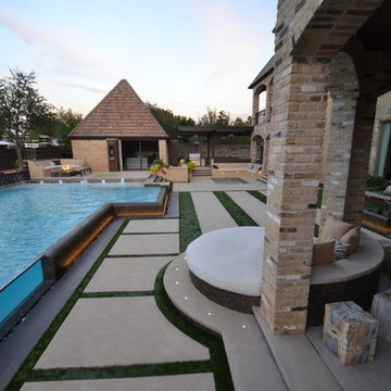
This Completely Contemporary Environment has many details. An acrylic glass wall that enables the family to watch underwater in the deep end from the house. It also has a Vanishing edge gutter pool with rolled tile edges. LED lighted gushers & a ripple effect water feature/bar are on the far end by a firebar/lounge area. Closer in is the perimeter overflow fountain that has 2 stainless steel Bobe fire pots floating on the water. A giant daybed (center) was enstalled replacing a fireplace that used to block the view from the house. Project designed by Mike Farley and constructed by Claffey Pools. Photo by Mike Farley
 Archadeck of Austin
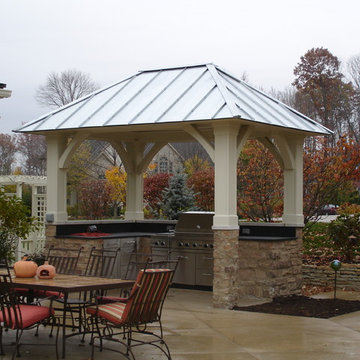
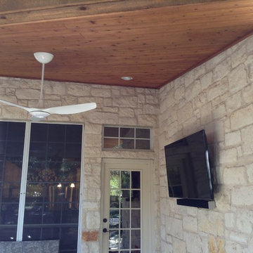
This new addition is cozy and quaint and proves that an outdoor living space addition doesn’t necessarily have to be large to be effective. This project consists of a covered porch area with a convenient outdoor grilling/smoking kitchen area that sits parallel with the covered area. The design is loaded with upscale amenities and high-quality materials in a size that is dictated by the scale of the existing home and surrounding landscape

Sponsored
Columbus, OH
Free consultation for landscape design!
Peabody Landscape Group
Columbus' Reliable Landscape Design & Contracting

 Skill Construction & Design, LLC
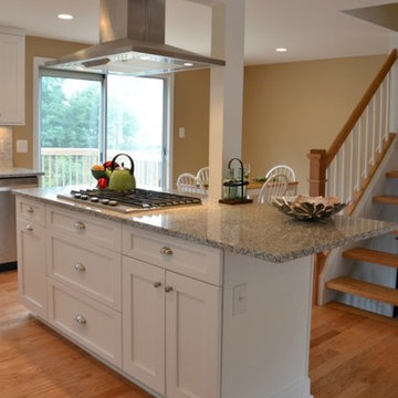
There are so many design elements to this kitchen, I almost don’t know where to start. Bright and airy with crisp clean white cabinets, the kitchen is open and welcoming. Still crisp but gently contrasting, the stainless steel appliance add depth amid the white. To keep this kitchen warm, natural oak covers the floors and a toasted wheat color washes the walls. And then there is the architectural elements. You know. That post and beam in the middle of the room. It’s the center of attention.
When you walk into a room your eyes roam around, establishing the size and shape of the room as your feet take you forward. From the front door of this home straight ahead you encountered this wall. The dining area to the right gives you a glimpse of things to come. Where there is a dining room you will usually find a kitchen.
The architecture of years gone by consistently hides the kitchen, the heart of the home, behind walls. I sympathize with my Mom, and all the other Moms, who have had to spend so much time tucked into a tight kitchen, away from the family. This wall had to go, but it was structural. We needed its support but not its bulk.
So we got rid of the bulk and only the bulk. Instead of a wall we have a post and beam, offering all of the structure we need. We could have installed a huge steel beam and reconfigure the joists to upset the beam, but why? The small beam and post add an incredible architectural element. It’s turning lemons into lemon, we simply made the most of what we had. It may be functional but it’s so fantastic. It looks like we created the effect just for the drama.
The original kitchen may have had a working triangle and some counter space, but it was fairly small, with each area only a step or two away. The dark cabinets made the space feel even smaller and the butcher block patterned laminate counter tops were very dated. The appliances were feeling their age as well, from a coil burner electric stove to a top freezer refrigerator. To keep this kitchen within its space, a half wall separated it from the dining area.
With the wall gone we borrowed some space from the living room and extended what was a U shaped kitchen into an L. At the living room window we start our new kitchen. We kept a small part of the wall to support the other end of our decorative beam. Sandwiched between a large pantry and our new French door refrigerator, the wall disappears. With our new open floor plan a sizable island was in order.
We split our cooking areas and installed a continuous grill gas cooktop into the island. A sleek island hood takes care of exhaust and adds an extra element to our architectural feature. Under the cooktop we added over-sized drawers for pots and pan storage. The frameless cabinets from New River Cabinetry are maple, painted white, with the Herndon door style. With the cooktop safely nestled into our island, we still had to add an oven.
We used the space where the old range sat for a large single oven of stainless steel and glass. If it worked for one, why not two? We created a home for a microwave in the wall cabinets. It’s perfect for heating leftovers so close to the refrigerator.
An important consideration for hot spots in your kitchen is landing zones. Each of our cooking areas have generous landing zones, one on each side of the cooktop and an entire counter area above or below the ovens, depending on which one you’re using.
We wanted to give the sink area more room so the half wall had to come out. We moved the trash and recycle cans into a cabinet, removed the heavy soffits and kept the sink under the window.
With that little bit of extra space we were able to add a larger cabinet above the dishwasher and slide it all down. This used to be where the carpeting met the vinyl floor, but all of it is gone. Long oak planks eliminate that final divide between the kitchen and the dining area, while adding visual length to the area. White wall cabinets on each side of the window reflect the sunlight for a brighter view.
With all of the darker cabinetry the backsplash walls had been painted white. Even still, there was a darkness in the corners and it wasn’t very exciting. We wanted to add visual interest and reflect the new under-cabinet lighting, eliminating the shadows in this corner.
With 1″x 2″ Arabescato Honed marble mosaics and those under-cabinet lights, we achieved the perfect balance. The marble has subtle swirls in gray and beige on a clean white background, but with the honed finish the light is softly reflected instead of glaring. For granite, we chose the soft gray tones of Luna Pearl. The speckles of gray and beige are a gentle contrast to the white cabinets and emulate the color of the stainless steel.
Between the carpet, red half wall, dark railing and dated light fixture, the dining area felt tired. Since the kitchen lacked sufficient storage, a large utility cabinet crowded the table space without adding any decorate elements.
Although it didn’t get any bigger, our dining area feels fresher and more open too. With the oak flooring joining the area to the rest of our space and the toasted wheat on the walls, the white table and chairs compliment the cabinetry while contrasting the warmer colors. We replaced the chandelier with recessed lighting and changed that railing too.
With our new open floor plan, we ended up with a fairly open area in between our foyer closet and the living room window. Not one to miss an opportunity, we filled the space with a multi-functional work space.
With the sunlight streaming in this bright corner works for anything this family needs.
There’s plenty of space for a chair under this large desk drawer. A closed cabinet below, glass doors above and lots of open shelving let you store and or showcase your belongings. We added a lite area at the top to keep away the darker corners.
The transformation is complete. This kitchen and all of its features are truly the center of attention in this home.
http://www.designsbyskill.com/
http://www.rjkconstructioninc.com/
 Neave Group Outdoor Solutions
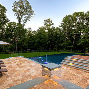
Pool:
- 22’ x 44’ infinity edge pool (66’ infinity edge)
- shallow-end sun shelf with five LED bubblers for light and water effect
- three laminar jets out of the patio to put a jet of water into each corner of the pool
- star field on pool floor with 100 points of light provided by four LED fixtures through fiber-optic cables (25 cables per fixture), subtle constellation within the hundred points of light star field
- additional LED lights, glass tile trim, including glass edge tiles
- hot tub on top of a raised marble stone wall perimeter overflow at the same height as the Brazilian teak wood deck; there is an under deck gutter 1/8 wide
- hot tub is all glass tile with a recessed toe-kick that hides the drains and light fixtures
- glass railing / barrier
Living space:
- travertine stone with marble veneer and Brazilian teak trim throughout
- custom-built wood benches, mantle, pizza oven, grill, refrigerated drawers, sink
- recessed screens that lower from the roof to enclose the entire living space when needed
Landscape:
- putting green, landscape lighting, under-cap lights
- outdoor speakers and subwoofer
14