
Search results for "Groups' request" in Home Design Ideas
 Twelve Stones Designs, LLC
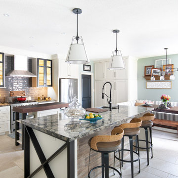
The owners of this kitchen had spent the money to upgrade the finishes in their kitchen upon building the home 12 years ago, but after living in the space for several years they realized how nonfunctional the layout really was. The (then) two preschool aged children had grown into busy, hungry teenagers with many friends who also liked to hang out at the house. So the family needed a more functional kitchen with better traffic flow, space for daily activities revolving around the kitchen at different times of day, and a kitchen that could accommodate cooking for and serving large groups. Furthermore, the dark, traditional finishes no longer reflected the homeowners’ style. They requested a brighter, more relaxed, coastal style that reflected their love of the seaside cities they like to visit.
Originally, the kitchen was U-shaped with a narrow island in the middle. The island created narrow aisles that bottle-necked at the dishwasher, refrigerator, and cooktop areas. There was a pass-through from the foyer into the kitchen, but the owners never liked that the pass-through was also located so close to the powder room. The awkward proximity was unappealing and made guests feel uncomfortable.
The kitchen’s storage was made up of lots of narrow cabinets, apothecary drawers, clipped corner units, and very few drawers. It lacked useful storage for the larger items the family used on a daily basis. And the kitchen’s only pantry was small closet that had only builder-grade, narrow shelving with no illumination to be able to see the contents inside.
Overall, the kitchen’s lighting plan was poorly executed. Only six recessed cans illuminated the entire kitchen and nook areas. The under cabinet lighting was not evenly distributed either. In fact, the builder had mis-placed the under cabinet lighting around the decorative pilasters which made for choppy, dark cubbies. Further, the builder didn’t include any lighting over the sink or the bar area, which meant whoever was doing the dishes was always in their own shadow. That, coupled with the steep overhang of the game room above made the bar area feel like a dim, cavernous space that wasn’t inviting or task oriented. The kitchen looked out into the main living space, but the raised bar and a narrow wall (which held the only large cabinet in the kitchen) created more of a barrier than a relationship to the living room or breakfast nook. In fact, one couldn’t even see the breakfast nook from the cooktop or sink areas due to its orientation. The raised bar top was too narrow to comfortably sit to either dine at or chat from due to the lack of knee space. The the homeowners confided that the kitchen felt more like a dark, dirty prison than place where the family, or their guests, wanted to gather and commune.
The clients' needs and desires were:
➢ to create a kitchen that would be a space the family loved to be in; to relate to the adjacent spaces all around, and to have better flow for entertaining large groups
➢ to remove the walls between the breakfast nook and living area and to be able to utilize the natural light from the windows in both those areas
➢ to incorporate a functional chopping block for prepping fresh food for home cooked meals, an island with a large sink and drain board, 2 pull out trash cans, and seating for at least the 2 teens to eat or do homework
➢ to design a kitchen and breakfast nook with an airy, coastal, relaxed vibe that blended with the rest of the house's coastal theme
➢ to integrate a layered lighting plan which would include ample general illumination, specific task lighting, decorative lighting, and lots of illuminated storage
➢ to design a kitchen with not only more storage for all the husband’s kitchen gadgets and collection of oils and spices, but smart storage, including a coffee/breakfast bar and a place to store and conceal the toaster oven and microwave
➢ to find a way to utilize the large open space between the kitchen, pantry area, and breakfast nook
Twelve Stones Designs achieved the owner's goals by:
➢ removing the walls between the kitchen and living room to allow the natural light to filter in from the adjacent rooms and to create a connection between the kitchen, nook, and living spaces for a sense of unity and communion
➢ removing the existing pantry and designing 3 large pantry style cabinets with LED tape lights and rollout drawers to house lots of kitchen appliances, gadgets, and tons of groceries. We also took the cabinets all the way up to the 9’ ceiling for additional storage for seasonal items and bulk storage.
➢ designing 2 islands - 1 with a gorgeous black walnut chopping block that houses a drawer for chopping and carving knives and a custom double pull out trash unit for point of use utilization - and 1 that houses the dishwasher, a large Blanco Gourmet sink with integrated drain board, woven baskets for fresh root vegetables and kitchen towels, plenty of drawer storage for kitchen items, and bar seating for up to 4 diners.
➢ closing off the space between the kitchen and the powder room to create a beautiful new private alcove for the powder room as well as adding some decorative storage. This also gave us space to include more tall storage near the new range for precision placement of the husband’s extensive oil and spice collection as well as a location for a combo-steam oven the wife wanted for baking and cooking healthy meals.
The project is enhanced functionally by:
➢ incorporated USB and standard receptacles for the kids’ laptops and phone charging in the large island
➢ designing the small island to include additional open shelving for items used on a daily basis such as a variety of bowls, plates, and colanders. This set up also works well for the husband who prefers to “plate” his dinners in restaurant-style fashion before presenting them to the table.
➢ the integration of specific storage units, such as double stacked cutlery drawers, a custom spice pull-out, a Kuerig coffee and tea pod drawer, and custom double stacked utensil drawers
➢ moving the refrigerator to the old oven location - this eliminated the bottle neck as well as created a better relationship to the eating table. It also utilizes the floor space between the pantry, nook, and kitchen
➢ creating a banquet style breakfast nook - this banquette seating not only doubles the amount of seating for large gatherings but it better utilizes the odd space between the kitchen and the previous nook area. It also helps to create a distinct pathway from the mudroom room through the pantry area, kitchen, nook, and living room.
➢ the coffee/breakfast bar area which includes the perfect location for the concealed microwave and toaster oven, convenient storage for the coffee pods and tea accoutrements. Roll-out drawers below also house the smoothie maker, hot water kettle, and a plethora of smoothie-making ingredients such as protein powders, smoothie additives, etc. Furthermore, the drawers below the Keurig house measuring utensil, cutlery, baking supplies and tupperware storage.
➢ incorporating lots of wide drawers and pullouts to accommodate large cookware.
➢ utilizing as much vertical space as possible by building storage to the ceiling which accommodates the family’s abundant amount of serving platters, baking sheets, bakeware, casserole dishes, and additional cutting boards.
The project is enhanced aesthetically by:
➢ new 5-piece Versailles pattern porcelain tile that now seamlessly joins the entire down stairs area together creating a bright, cohesiveness feeling instead of choppy separated spaces - it also adds a coastal feeling
➢ designing a cabinet to conceal the microwave and toaster oven
➢ the coastal influenced light fixtures over the nook table and island
➢ the sandy colors of the Langdon Cambria countertops. The swirling pattern and sparkling quartz pieces remind the homeowner of black-and-tan sandy beaches
➢ the striped banquet seating whose creamy white background and blue-green stripes were the inspiration for the cabinet and wall colors.
➢ All the interior doors were painted black to coordinate with the blacks and grays in the backsplash tile and countertop. This also adds a hint of tailored formality to an otherwise casual space.
➢ the use of WAC's Oculux small aperture LED units for the overhead lighting complimented with Diode LED strips for task lighting under the cabinets and inside the pantry and glass wall cabinets. All of the lighting applications are on separate dimmer switches.
Innovative uses of materials or construction methods by Realty Restoration LLC:
➢ Each 1-1/2” x 3” block of reclaimed end-grain black walnut that makes up the center island chopping block was hand milled and built in the shop. It was designed to look substantial and proportional to the surrounding elements, executed by creating the 4 inch tall top with a solid wood chamfered edge band.
➢ The metal doors on either side of the vent hood were also custom designed for this project and built in the Realty Restoration LLC shop. They are made 1x2, 11-gauge mild steel with ribbed glass. Weighing 60 lbs a piece, heavy duty cabinet hinges were added to support the weight of the door and keep them from sagging.
➢ Under-cabinet receptacles were added along the range wall in order to have a clean, uninterrupted backsplash.
Design obstacles to overcome:
➢ Because we were removing the demising walls between the kitchen and living room, we had to find a way to plumb and vent the new island. We did this by tunneling through the slab (the slab had post tension cables which prevented us from just trenching) to run a new wet vent through a nearby structural wall. We pulled the existing hot and cold lines between upper floor joists and ran them down the structural wall as well and up through a conduit in the tunnel.
➢ Since we were converting from wall overs to a gas range it allowed us to utilize the 220 feed for the wall ovens to provide a new sub panel for all the new kitchen circuits
➢ Due to framing deficiencies inherited from the original build there was a 1-1/2” differential in the floor-to-ceiling height over a 20 foot span; by utilizing the process of cutting and furring coupled with the crown moulding details on the cabinet elevations we were able to mask the problem and provide seamless transitions between the cabinet components.
Evidence of superior craftsmanship:
➢ uniquely designed, one-of-a-kind metal “X” end panels on the large island. The end panels were custom made in the Realty Restoration LLC shop and fitted to the exact dimensions of the island. The welding seams are completely indistinguishable - the posts look like they are cut from a single sheet of metal
➢ square metal posts on the small island were also custom made and designed to compliment and carry through the metal element s throughout the kitchen
➢ the beautiful, oversized end panels on the pantry cabinets which give the breakfast nook a tailored look
➢ integrating a large format 5 piece Versailles tile pattern to seamlessly flow from the existing spaces into the new kitchen space
➢ By constructing a custom cabinet that jogged around a corner we could not remodel (housing the entry way coat closet) we were able to camouflage the adjacent wall offset within the upper and lower cabinets. By designing around the existing jog in the structural walls we accomplished a few things: we were able to find the space to house, and hide, the microwave and toaster oven yet still have a clean cohesive appearance from the kitchen side. Additionally, the owners were able to keep their much needed coat closet and we didn’t have to increase the budget with unnecessary structural work.
 Tiffany Brooks, HGTV Host & Interior Designer
Inquire About Our Design Services
What we did:
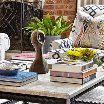
I started with color. With the current state of the room covered in red I knew they were so over it. Carol requesting warmth in their home so I had to do it with adding textiles while using a cooler color palette.
Upon digging deeper I realized that both Carol and John were exactly 2 opposites of the style spectrum. Carol loved the beach she loved anything Cape Cod she liked the grays the beiges the neutrals while John had a more modern condo bachelor city style to him. The toughest part was finding the furniture style balance that complemented both of them, so that they can live in this house comfortably and enjoy forever.
Here are the highlights of the rest of the project:
Came up with a spacial plan, color, and fabric scheme that worked for where the couple is today.
Used seating groupings to break up a otherwise large room
Reused a couple pieces of furniture and accessories.
Selected all furnishings, accessories, and art.
Customized an entertainment piece that has since kept John in the living room and out of the basement.
What I love:
They gave me the go ahead to mix up styles, all while keeping the palette fresh and clean.
Those damn rugs. I have since ordered 1 for my own home
The art on the fireplace. We were able to go BIG and dramatic since we had the ceiling height
Marcel Page Photography
 Sandra Costa Design Group
A kitchen by award-winning designer and licensed general contractor Sandra Costa is never simply built—it is composed, curated, and brought to life as a complete experience.
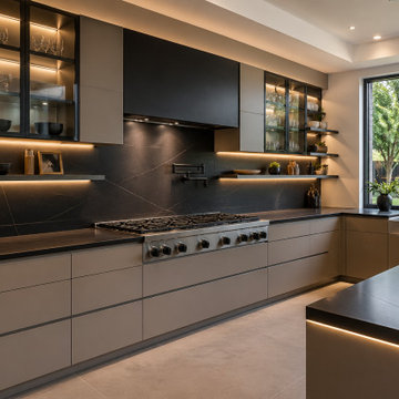
In this new construction, the client’s request was clear: earth tones, warmth, and a space that feels both inviting and refined. Sandra Costa translated that vision into a layered design where natural hues meet architectural precision. Soft browns, warm taupes, and subtle textured finishes create a grounded palette, allowing the kitchen to feel calm, welcoming, and effortlessly sophisticated.
At the heart of the space sits a statement La Cornue range—more than an appliance, it is a centerpiece. Paired with integrated double refrigerators, the kitchen balances luxury with function, ensuring the space performs as beautifully as it presents. Every element is intentional, from the flow of movement to the placement of each surface.
LED lighting is used not as a feature, but as an invisible layer of atmosphere. Carefully positioned, it washes the cabinetry, highlights textures, and enhances depth—creating a warm glow that evolves from day to evening. The lighting elevates the materials, allowing the tones to shift subtly throughout the day, adding life and dimension to the room.
What defines this kitchen is its refusal to follow trends. There are no fleeting design statements here—only enduring choices. Proportion, materiality, and balance take precedence over fashion. The result is a space that feels as relevant years from now as it does today.
This is not a “designed kitchen” in the conventional sense. It is a timeless composition—an art piece built for living.
Find the right local pro for your project
 Tiffany Brooks, HGTV Host & Interior Designer
Inquire About Our Design Services
What we did:
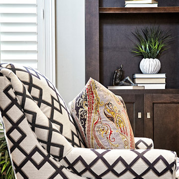
I started with color. With the current state of the room covered in red I knew they were so over it. Carol requesting warmth in their home so I had to do it with adding textiles while using a cooler color palette.
Upon digging deeper I realized that both Carol and John were exactly 2 opposites of the style spectrum. Carol loved the beach she loved anything Cape Cod she liked the grays the beiges the neutrals while John had a more modern condo bachelor city style to him. The toughest part was finding the furniture style balance that complemented both of them, so that they can live in this house comfortably and enjoy forever.
Here are the highlights of the rest of the project:
Came up with a spacial plan, color, and fabric scheme that worked for where the couple is today.
Used seating groupings to break up a otherwise large room
Reused a couple pieces of furniture and accessories.
Selected all furnishings, accessories, and art.
Customized an entertainment piece that has since kept John in the living room and out of the basement.
What I love:
They gave me the go ahead to mix up styles, all while keeping the palette fresh and clean.
Those damn rugs. I have since ordered 1 for my own home
The art on the fireplace. We were able to go BIG and dramatic since we had the ceiling height
Marcel Page Photography
 Zelaya Properties LLC
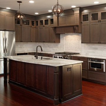
We used: Custom cherry cabinetry in Arts & Crafts Shaker style by Kabinart in Boulder and Espresso stains. Liberty Hardware Venetian bronze 1-1/2" cabinet knobs. KitchenAid Architect II Series 22 CF counter-depth French door refrigerator. KitchenAid Architect Series II 27" convection single wall oven. KitchenAid 36" 6-burner dual fuel freestanding commercial-style range. KitchenAid Architect II Series 24" dishwasher. Sharp Insight Pro Series 24" built-in microwave drawer (Model #KB6524PS). Crystorama Solaris 12" wide pendant lights in English bronze. Granite countertops in Brown Fantasy. 3"x6" polished marble backsplash.
Paint colors:
Walls: Glidden Silver Cloud 30YY 63/024
Ceilings/Trims/Doors: Glidden Swan White GLC23
Robert B. Narod Photography
 Capozzi Design Build
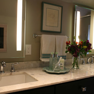
Originally built in the 1950's this Cape Cod style home needed a space more useful in the upstairs attic. Our mission was to create an appealing master bathroom from an unfinished attic space that is 6’ x 14’ long. The newly renovated bathroom features Dura Supreme cabinetry, double bowl sink, back lit LED mirrors, a built-in linen cabinet, and additional storage for laundry baskets. The angled ceiling draws your eye down to the glass shower creating a seamlessly transition into the shower area. With the shower not having a threshold it creates visual interest exposing the window and the floor and wall tile. Not only is the space now functional for the homeowners but it offers a classic yet sophisticated design style!!
Interested in speaking with a Capozzi designer today? Visit our website today to request a consultation!!!
https://capozzidesigngroup.com
 E. F. San Juan
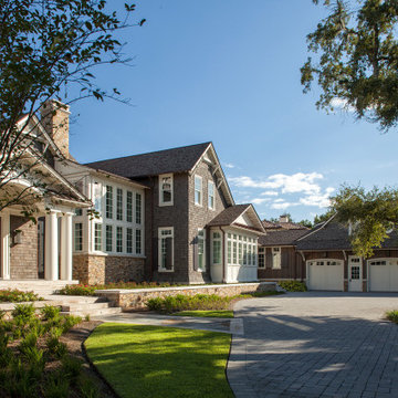
Coastal Shingle Style on St. Andrew Bay
Private Residence / Panama City Beach, Florida
Architect: Eric Watson
Builder: McIntosh-Myers Construction
For this lovely Coastal Shingle–style home, E. F. San Juan supplied Loewen impact-rated windows and doors, E. F. San Juan Invincia® impact-rated custom mahogany entry doors, exterior board-and-batten siding, exterior shingles, and exterior trim and millwork. We also supplied all the interior doors, stair parts, paneling, mouldings, and millwork.
Challenges:
At over 10,000 square feet, the sheer size of this home—coupled with the extensive amount of materials we produced and provided—made for a great scheduling challenge. Another significant challenge for the E. F. San Juan team was the homeowner’s desire for an electronic locking system on numerous Invincia® doors we custom manufactured for the home. This was a first-time request for us, but a challenge we gladly accepted!
Solution:
We worked closely with the builder, Cliff Myers of McIntosh-Myers Construction, as well as the architect, Eric Watson, to ensure the timeliness of decisions as they related to the home’s critical production timeline. We also worked closely with our design engineer and the home’s engineer of record, Allen Barnes of Apex Engineering Group, to provide a solution that allowed for an electronic lock on our custom Invincia® mahogany doors. The completed home is a stunning example of coastal architecture that is as safe and secure as it is beautiful.
---
Photography by Jack Gardner
Sponsored
Westerville, OH

The Steele Group
Industry Leading General Contractors in Franklin County, Ohio
 TKS Design Group
Free ebook, Creating the Ideal Kitchen. DOWNLOAD NOW
This client wanted a complete update of their kitchen and came to us with several objectives. They wanted a larger island and easier access to the dining room. They also wanted to eliminate the existing cooktop location from the island and make the island larger. Because the existing space was not able to accommodate all those requests, we decided to eliminate the breakfast area and incorporate that space into the kitchen. By eliminating an existing bay window and making the kitchen sink window larger, we were able to make the new layout work without sacrificing any natural light. A French door to the newly added and adjoining sunroom and casual outdoor dining spot still allows for multiple dining options. And by enlarging the opening to the dining room, it allows for easier access to this space on a daily basis versus for special occasions only.
The client already had a large desk in the kitchen and spends a lot of time at this area. We were able to make the new desk even larger by moving the refrigerator to another area. The refrigerator is covered in decorative panels so that it blends nicely into the furniture look of the room. The larger island can now seat several people comfortably.
The room’s traditional feel was achieved by providing different finishes on the perimeter, island and desk cabinetry. Handmade gray backsplash tile, a combination of soapstone and Carrera marble give the space a classic appeal. Details provide interest – custom glass mullions, decorative wood hood and bronze hardware give the space character and charm.
Designed by: Susan Klimala, CKD, CBD
Interior Design by: Rachel Alcorn
Architect: Rick Rearick
Contractor: KJN Renovations
Photography by: Mike Kaskel
For more information on kitchen and bath design ideas go to: www.kitchenstudio-ge.com
 HU-235072162
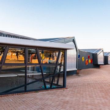
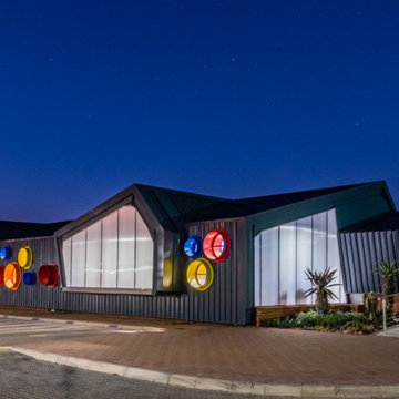
The site is located on the Mitchell House preparatory school campus in Polokwane. The client's brief
called for an early childhood development centre which would accommodate 122 learners and
requested that the building be evident of it's young and playful users.
Curiosity, wonder and intrigue would become defining criteria in an attempt to create a conducive
learning environment for young learners to grow, a building where children would be encouraged to
interact with their environment. The construction methodology of the building would remain apparent,
allowing its users to analyse the assembly of components.
Due to the age group of the users, the building would need to function semi-autonomously from the
rest of the school, while allowing for controlled interaction and inclusivity as is the norm for Mitchell
House. A linear plan which coincides with the developmental progress of the learners was identified
as the appropriate building typology. The spatial constraints of the site required this plan to be
moulded into the available space between the existing infrastructure, however the linear process was
maintained.
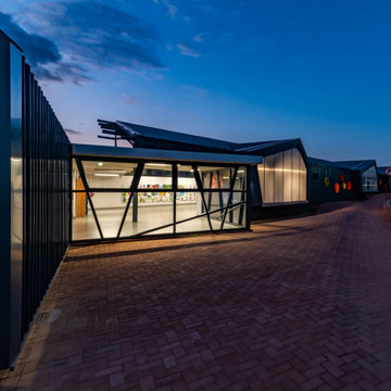
From the access-controlled reception and administration area one would move past the creative arts
and exhibition space towards the Northern wing where the youngest learners are taught. These would
share connected ablutions and storerooms between classes to enable fluid movement and
assistance throughout the teaching and service spaces. The East wing of the centre would house the
elder learners who would be in the process of being integrated with the fabric of the main school
campus. These classrooms include storage areas, however, have separate ablution facilities. The two
wings of the building surround a courtyard where play and interaction are in abundance.
 TKS Design Group
Free ebook, Creating the Ideal Kitchen. DOWNLOAD NOW
This Chicago client was tired of living with her outdated and not-so-functional kitchen and came in for an update. The goals were to update the look of the space, enclose the washer/dryer, upgrade the appliances and the cabinets.
The space is located in turn-of-the-century brownstone, so we tried to stay in keeping with that era but provide an updated and functional space.
One of the primary challenges of this project was a chimney that jutted into the space. The old configuration meandered around the chimney creating some strange configurations and odd depths for the countertop.
We finally decided that just flushing out the wall along the chimney instead would create a cleaner look and in the end a better functioning space. It also created the opportunity to access those new pockets of space behind the wall with appliance garages to create a unique and functional feature.
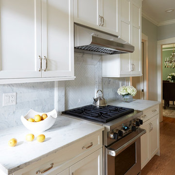
The new galley kitchen has the sink on one side and the range opposite with the refrigerator on the end of the run. This very functional layout also provides large runs of counter space and plenty of storage. The washer/dryer were relocated to the opposite side of the kitchen per the client's request, and hide behind a large custom bi-fold door when not in use.
A wine fridge and microwave are tucked under the counter so that the primary visual is the custom mullioned doors with antique glass and custom marble backsplash design. White cabinetry, Carrera countertops and an apron sink complete the vintage feel of the space, and polished nickel hardware and light fixtures add a little bit of bling.
Designed by: Susan Klimala, CKD, CBD
Photography by: Carlos Vergara
For more information on kitchen and bath design ideas go to: www.kitchenstudio-ge.com
 TKS Design Group
Download our free ebook, Creating the Ideal Kitchen. DOWNLOAD NOW
A tired primary bathroom, with varying ceiling heights and a beige-on-beige color scheme, was screaming for love. Squaring the room and adding natural materials erased the memory of the lack luster space and converted it to a bright and welcoming spa oasis. The home was a new build in 2005 and it looked like all the builder’s material choices remained. The client was clear on their design direction but were challenged by the differing ceiling heights and were looking to hire a design-build firm that could resolve that issue.
This local Glen Ellyn couple found us on Instagram (@kitchenstudioge, follow us ?). They loved our designs and felt like we fit their style. They requested a full primary bath renovation to include a large shower, soaking tub, double vanity with storage options, and heated floors. The wife also really wanted a separate make-up vanity. The biggest challenge presented to us was to architecturally marry the various ceiling heights and deliver a streamlined design.
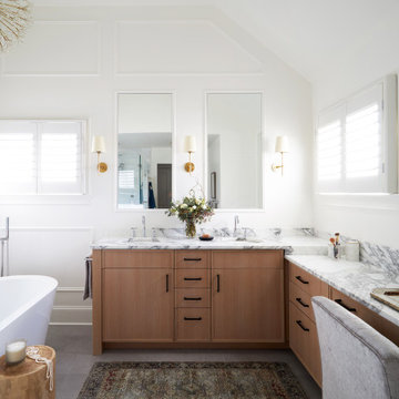
The existing layout worked well for the couple, so we kept everything in place, except we enlarged the shower and replaced the built-in tub with a lovely free-standing model. We also added a sitting make-up vanity. We were able to eliminate the awkward ceiling lines by extending all the walls to the highest level. Then, to accommodate the sprinklers and HVAC, lowered the ceiling height over the entrance and shower area which then opens to the 2-story vanity and tub area. Very dramatic!
This high-end home deserved high-end fixtures. The homeowners also quickly realized they loved the look of natural marble and wanted to use as much of it as possible in their new bath. They chose a marble slab from the stone yard for the countertops and back splash, and we found complimentary marble tile for the shower. The homeowners also liked the idea of mixing metals in their new posh bathroom and loved the look of black, gold, and chrome.
Although our clients were very clear on their style, they were having a difficult time pulling it all together and envisioning the final product. As interior designers it is our job to translate and elevate our clients’ ideas into a deliverable design. We presented the homeowners with mood boards and 3D renderings of our modern, clean, white marble design. Since the color scheme was relatively neutral, at the homeowner’s request, we decided to add of interest with the patterns and shapes in the room.
We were first inspired by the shower floor tile with its circular/linear motif. We designed the cabinetry, floor and wall tiles, mirrors, cabinet pulls, and wainscoting to have a square or rectangular shape, and then to create interest we added perfectly placed circles to contrast with the rectangular shapes. The globe shaped chandelier against the square wall trim is a delightful yet subtle juxtaposition.
The clients were overjoyed with our interpretation of their vision and impressed with the level of detail we brought to the project. It’s one thing to know how you want a space to look, but it takes a special set of skills to create the design and see it thorough to implementation. Could hiring The Kitchen Studio be the first step to making your home dreams come to life?
 HU-235072162
The site is located on the Mitchell House preparatory school campus in Polokwane. The client's brief
called for an early childhood development centre which would accommodate 122 learners and
requested that the building be evident of it's young and playful users.
Curiosity, wonder and intrigue would become defining criteria in an attempt to create a conducive
learning environment for young learners to grow, a building where children would be encouraged to
interact with their environment. The construction methodology of the building would remain apparent,
allowing its users to analyse the assembly of components.
Due to the age group of the users, the building would need to function semi-autonomously from the
rest of the school, while allowing for controlled interaction and inclusivity as is the norm for Mitchell
House. A linear plan which coincides with the developmental progress of the learners was identified
as the appropriate building typology. The spatial constraints of the site required this plan to be
moulded into the available space between the existing infrastructure, however the linear process was
maintained.
From the access-controlled reception and administration area one would move past the creative arts
and exhibition space towards the Northern wing where the youngest learners are taught. These would
share connected ablutions and storerooms between classes to enable fluid movement and
assistance throughout the teaching and service spaces. The East wing of the centre would house the
elder learners who would be in the process of being integrated with the fabric of the main school
campus. These classrooms include storage areas, however, have separate ablution facilities. The two
wings of the building surround a courtyard where play and interaction are in abundance.
 HU-235072162
The site is located on the Mitchell House preparatory school campus in Polokwane. The client's brief
called for an early childhood development centre which would accommodate 122 learners and
requested that the building be evident of it's young and playful users.
Curiosity, wonder and intrigue would become defining criteria in an attempt to create a conducive
learning environment for young learners to grow, a building where children would be encouraged to
interact with their environment. The construction methodology of the building would remain apparent,
allowing its users to analyse the assembly of components.
Due to the age group of the users, the building would need to function semi-autonomously from the
rest of the school, while allowing for controlled interaction and inclusivity as is the norm for Mitchell
House. A linear plan which coincides with the developmental progress of the learners was identified
as the appropriate building typology. The spatial constraints of the site required this plan to be
moulded into the available space between the existing infrastructure, however the linear process was
maintained.
From the access-controlled reception and administration area one would move past the creative arts
and exhibition space towards the Northern wing where the youngest learners are taught. These would
share connected ablutions and storerooms between classes to enable fluid movement and
assistance throughout the teaching and service spaces. The East wing of the centre would house the
elder learners who would be in the process of being integrated with the fabric of the main school
campus. These classrooms include storage areas, however, have separate ablution facilities. The two
wings of the building surround a courtyard where play and interaction are in abundance.

Sponsored
Columbus, OH

Wannemacher Interiors
Customized Award-Winning Interior Design Solutions in Franklin Cnty OH
 HU-235072162
The site is located on the Mitchell House preparatory school campus in Polokwane. The client's brief
called for an early childhood development centre which would accommodate 122 learners and
requested that the building be evident of it's young and playful users.
Curiosity, wonder and intrigue would become defining criteria in an attempt to create a conducive
learning environment for young learners to grow, a building where children would be encouraged to
interact with their environment. The construction methodology of the building would remain apparent,
allowing its users to analyse the assembly of components.
Due to the age group of the users, the building would need to function semi-autonomously from the
rest of the school, while allowing for controlled interaction and inclusivity as is the norm for Mitchell
House. A linear plan which coincides with the developmental progress of the learners was identified
as the appropriate building typology. The spatial constraints of the site required this plan to be
moulded into the available space between the existing infrastructure, however the linear process was
maintained.
From the access-controlled reception and administration area one would move past the creative arts
and exhibition space towards the Northern wing where the youngest learners are taught. These would
share connected ablutions and storerooms between classes to enable fluid movement and
assistance throughout the teaching and service spaces. The East wing of the centre would house the
elder learners who would be in the process of being integrated with the fabric of the main school
campus. These classrooms include storage areas, however, have separate ablution facilities. The two
wings of the building surround a courtyard where play and interaction are in abundance.
 Moderne Builders
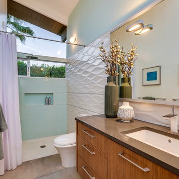
Gorgeous master bath with dramatic retro "wave" tile. Peak Photography
Example of a 1950s bathroom design in Los Angeles
Example of a 1950s bathroom design in Los Angeles
 TKS Design Group
Free ebook, Creating the Ideal Kitchen. DOWNLOAD NOW
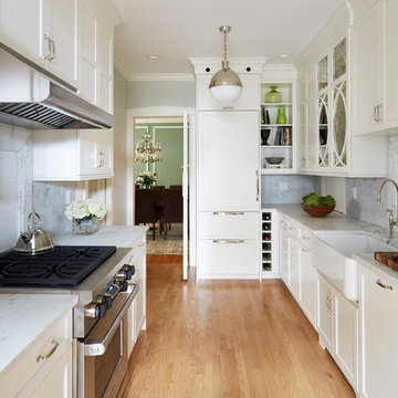
This Chicago client was tired of living with her outdated and not-so-functional kitchen and came in for an update. The goals were to update the look of the space, enclose the washer/dryer, upgrade the appliances and the cabinets.
The space is located in turn-of-the-century brownstone, so we tried to stay in keeping with that era but provide an updated and functional space.
One of the primary challenges of this project was a chimney that jutted into the space. The old configuration meandered around the chimney creating some strange configurations and odd depths for the countertop.
We finally decided that just flushing out the wall along the chimney instead would create a cleaner look and in the end a better functioning space. It also created the opportunity to access those new pockets of space behind the wall with appliance garages to create a unique and functional feature.
The new galley kitchen has the sink on one side and the range opposite with the refrigerator on the end of the run. This very functional layout also provides large runs of counter space and plenty of storage. The washer/dryer were relocated to the opposite side of the kitchen per the client's request, and hide behind a large custom bi-fold door when not in use.
A wine fridge and microwave are tucked under the counter so that the primary visual is the custom mullioned doors with antique glass and custom marble backsplash design. White cabinetry, Carrera countertops and an apron sink complete the vintage feel of the space, and polished nickel hardware and light fixtures add a little bit of bling.
Designed by: Susan Klimala, CKD, CBD
Photography by: Carlos Vergara
For more information on kitchen and bath design ideas go to: www.kitchenstudio-ge.com
 Tiffany Brooks, HGTV Host & Interior Designer
Inquire About Our Design Services
What we did:
I started with color. With the current state of the room covered in red I knew they were so over it. Carol requesting warmth in their home so I had to do it with adding textiles while using a cooler color palette.
Upon digging deeper I realized that both Carol and John were exactly 2 opposites of the style spectrum. Carol loved the beach she loved anything Cape Cod she liked the grays the beiges the neutrals while John had a more modern condo bachelor city style to him. The toughest part was finding the furniture style balance that complemented both of them, so that they can live in this house comfortably and enjoy forever.
Here are the highlights of the rest of the project:
Came up with a spacial plan, color, and fabric scheme that worked for where the couple is today.
Used seating groupings to break up a otherwise large room
Reused a couple pieces of furniture and accessories.
Selected all furnishings, accessories, and art.
Customized an entertainment piece that has since kept John in the living room and out of the basement.
What I love:
They gave me the go ahead to mix up styles, all while keeping the palette fresh and clean.
Those damn rugs. I have since ordered 1 for my own home
The art on the fireplace. We were able to go BIG and dramatic since we had the ceiling height
Marcel Page Photography
Sponsored
Columbus, OH
Free consultation for landscape design!

Peabody Landscape Group
Franklin County's Reliable Landscape Design & Contracting
 Cabinet Supreme by Adair
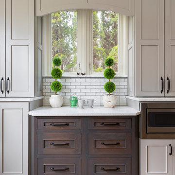
Durasupreme silverton panel door in cherry smoke stain finish, low gloss sheen used for the island, wet bar, and coffee area. Perimeter grey tone painted cabinets in a custom color match per client’s request was specified. Shadow storm granite and cambria whitney quartz were used in combination to set off the cabinet colors. The existing floors were refinished during the project in a neutral tone. The ceiling was detailed in a classic tongue and groove board in a white paint finish as well as the wainscot wall panels and window trim.
Expert installation is always a must for projects that entail stack crowned molding as elaborate as this installation. When working in historical homes, or homes of age that have leveling issues, stacked crown molding can hide the fact the ceilings may not be parallel to the floor.
 Pennsylvania Landscape & Nursery Association
PA Landscape Group INC http://www.palandscapegroup.com
Project Entry: Yellow Breeches Residence
2014 PLNA Awards for Landscape Excellence Winner
Category: Hardscaping-Residential $60,000-$120,000
Award Level: Bronze
Photo Description:
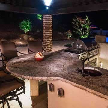
At this Yellow Breeches Residence our hardscape project went hand in hand with an addition to the back of the house, not uncommon. However, the new addition was designed in such a way that it created one opportunity to integrate an outdoor kitchen and living area into the design. With the pool already in place and the location of the house against a mountain side, after the addition was built it would cut off all access to add out living space in the future. So with careful thought and planning we set out to make sure that nothing was forgotten, from a kitchen area for congregating and preparing meals, to creating adequate patio space for entertaining, to assuring that the area was drained properly. The materials for the project were staged 6 months in advance of them being installed while the addition was being constructed and drainage work and base preparation for paving happened before the construction for the addition started.
The homeowners’ goal was to add an outdoor living space that had an updated feel, while still feeling as if it fit behind this mountainside home. The blending of the refined look of the Unilock Umbriano paver with the border of natural river stone was our way of meeting their request. Gravel-lock was applied to the gravel border so that it could act as spill over patio space when entertaining large groups.
Boulders where used to retain grade where needed and keep with the natural feel. Accent boulders were added to the slope to blend existing with the new. Natural slab step where used as the transition between the upper patio space and pool surround.
LED low voltage lighting was used to accent the plant material and structures as well as make the space usable for the evening hours. The lighting was installed up the mountainside to stretch out the landscape at night and give the landscape depth.
In the end the project exceeded the homeowners’ expectations and it is the most used room in the house we are told.
Photo Credit: Dimitri Ganas
 Renovations Group Inc
Our homeowner had dreamt about one day redoing her beyond outdated kitchen since they day her husband carried her over the threshold. Vinyl flooring used for a backsplash, dingy carpeting, laminate with no sheen left to speak of and mismatched cabinetry…. it was time to make it happen. A year’s worth of planning later, her time capsule became one dreamy kitchen.
Functionality reigns supreme in this small, but efficient kitchen where every cabinet has a story to tell and a place to store it. Countertop space to the right of the stove was an added necessity for function and safety. The raised snack bar is perfect for day to day meals and the lowered countertop was a must for this petite baker. A new lighting plan includes recessed lights, under-cabinet and accent lights, while new lighting fixtures reflect the client’s sense of style. Dingy brick patterned carpet was removed making way for new hardwood floors toothed in from the dining room.
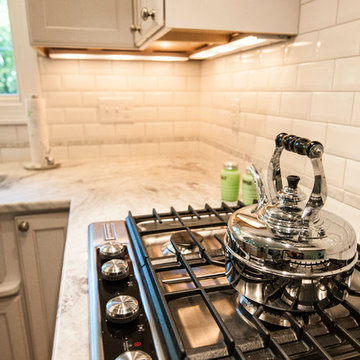
An airy palette gained some weight with the use of larger details; the oversized hood, beefy turned posts, prominent apron front sink and a grouping of tall cabinets on the refrigerator wall. Glass cabinet fronts, shiny beveled subway tile, and granite countertops allow light to dance around the space.
Zachary Seib Photography
27