
Search results for "Grow comfortable" in Home Design Ideas
 k+co LIVING - Interiors by Karen B Wolf
Christian Garibaldi
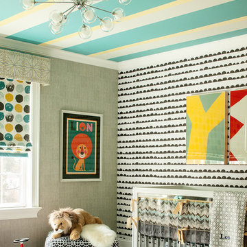
Mid-sized trendy gender-neutral dark wood floor nursery photo in New York with multicolored walls
Mid-sized trendy gender-neutral dark wood floor nursery photo in New York with multicolored walls
 Megan Hansen
Photo: Megan Hansen © 2017 Houzz
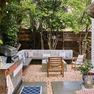
Inspiration for a contemporary backyard patio remodel in San Francisco with no cover and a bbq area
Inspiration for a contemporary backyard patio remodel in San Francisco with no cover and a bbq area
 Mehditash Design
John Gruen
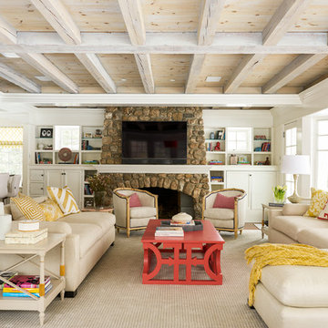
Inspiration for a large transitional open concept medium tone wood floor living room remodel in New York with white walls, a wall-mounted tv, a standard fireplace and a stone fireplace
Inspiration for a large transitional open concept medium tone wood floor living room remodel in New York with white walls, a wall-mounted tv, a standard fireplace and a stone fireplace
Find the right local pro for your project
 Casework Inter Design
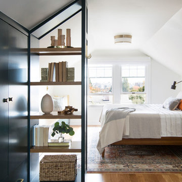
When Casework first met this 550 square foot attic space in a 1912 Seattle Craftsman home, it was dated and not functional. The homeowners wanted to transform their existing master bedroom and bathroom to include more practical closet and storage space as well as add a nursery. The renovation created a purposeful division of space for a growing family, including a cozy master with built-in bench storage, a spacious his and hers dressing room, open and bright master bath with brass and black details, and a nursery perfect for a growing child. Through clever built-ins and a minimal but effective color palette, Casework was able to turn this wasted attic space into a comfortable, inviting and purposeful sanctuary.
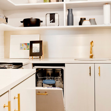
 Pamela Dailey Design
This 400 s.f. studio apartment in NYC’s Greenwich Village serves as a pied-a-terre
for clients whose primary residence is on the West Coast.
Although the clients do not reside here full-time, this tiny space accommodates
all the creature comforts of home.
Bleached hardwood floors, crisp white walls, and high ceilings are the backdrop to
a custom blackened steel and glass partition, layered with raw silk sheer draperies,
to create a private sleeping area, replete with custom built-in closets.
Simple headboard and crisp linens are balanced with a lightly-metallic glazed
duvet and a vintage textile pillow.
The living space boasts a custom Belgian linen sectional sofa that pulls out into a
full-size bed for the couple’s young children who sometimes accompany them.
Efficient and inexpensive dining furniture sits comfortably in the main living space
and lends clean, Scandinavian functionality for sharing meals. The sculptural
handrafted metal ceiling mobile offsets the architecture’s clean lines, defining the
space while accentuating the tall ceilings.
The kitchenette combines custom cool grey lacquered cabinets with brass fittings,
white beveled subway tile, and a warm brushed brass backsplash; an antique
Boucherouite runner and textural woven stools that pull up to the kitchen’s
coffee counter punctuate the clean palette with warmth and the human scale.
The under-counter freezer and refrigerator, along with the 18” dishwasher, are all
panelled to match the cabinets, and open shelving to the ceiling maximizes the
feeling of the space’s volume.
The entry closet doubles as home for a combination washer/dryer unit.
The custom bathroom vanity, with open brass legs sitting against floor-to-ceiling
marble subway tile, boasts a honed gray marble countertop, with an undermount
sink offset to maximize precious counter space and highlight a pendant light. A
tall narrow cabinet combines closed and open storage, and a recessed mirrored
medicine cabinet conceals additional necessaries.
The stand-up shower is kept minimal, with simple white beveled subway tile and
frameless glass doors, and is large enough to host a teak and stainless bench for
comfort; black sink and bath fittings ground the otherwise light palette.
What had been a generic studio apartment became a rich landscape for living.
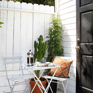
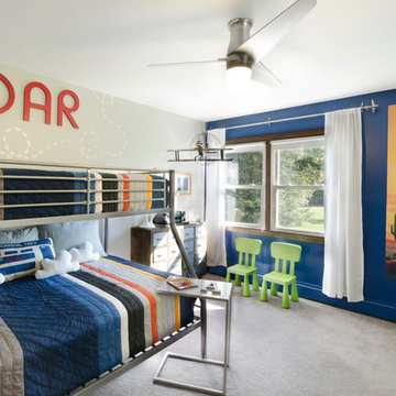
 Taylor Design Studio
Asher's Aviation Room, this room is ready for take off! This custom room was designed for a toddler boy with plenty of years to grow. The large airplane poster was the start of the inspiration for this fun, primary color, clean line space. Photography by David Berlekamp

Sponsored
Columbus, OH

Snider & Metcalf Interior Design, LTD
Leading Interior Designers in Columbus, Ohio & Ponte Vedra, Florida
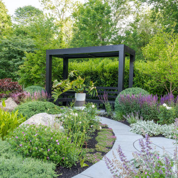
 Amy Martin Landscape Design
Design ideas for a transitional partial sun landscaping in Boston with a pergola.
 Richard Best Architect, Inc.
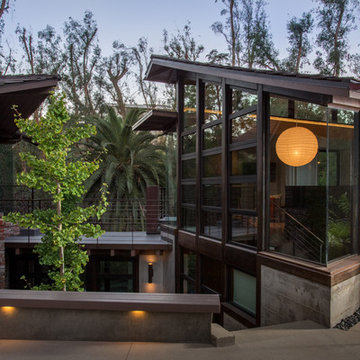
Hillside Modernism In Context.
The owners of this modern hillside home sought to have a home in a nice Los Angeles neighborhood wherein they could raise their burgeoning family. The owners purchased a 1948 2000sf, single story, 2 bedroom English Cottage styled home (believed to have been originally owned by Yul Brynner) on a ½ acre hillside site in the exclusive Brentwood area of Los Angeles. The property slopes downward away from the street and overlooks a mini eucalyptus arroyo. The owners love their new location but are now faced-with having to raise their new and growing family on a hillside with extremely limited yard spaces for children to play and in a location where nature is very close – deer as well as coyotes wander the arroyo.
In 2000 the owners commissioned architect Richard Best to add 2500sf to the cottage and transform it into a home more fitting to their growing family’s needs. Subsequently, in 2014/15, the owners again commissioned Richard to create a 2-story master suite addition. Living in or visiting the completed project - the original 1948 home remodeled + the 2000 addition + the 2014/15 addition, one goes through an unexpected and delightful experience as the spaces of the home “unfold” to reveal intimacy and environmental immersion.
It was important to Richard and to the owners that their remodels and additions be appropriately designed to fit into the neighborhood and have the feel, scale, and soul of the original cottage. With this in-mind, Richard has interpreted the design intentions of the original cottage - “modernizing” the architectural vocabulary and creating open-plan, 2-story additions which promote site “engagement” at various floor levels and openness to the outdoors in a manner clearly inspired by the original cottage, yet modern.
At the front door of the original (still remains as it was) 1948 structure, one is presented with a quaint a low-slung entry which establishes a very comfortable sense of scale. Inside, the remodeled spaces of the original cottage exude comfort and a cozy sensibility evoked by the reuse of the original home’s exposed timber framing structure, open-plan circulation, and an inventive two-sided steel fireplace which acts as a room divider between the living room and a home office. Accordion wood doors connect these rooms to a newly formed outdoor rear patio. At this point one also gets ones first hint that something very interesting is happening just beyond – a glimpse of the 2000 & 2014/15 additions.
Moving from the original 1948 structure into the 2-story 2000 addition, one is greeted by a modern and open linear floor plan arrangement – a kitchen, casual dining and family room extend perpendicularly from the 1948 structure into the rear yard and down the hillside. The open framed cathedral ceiling and wood roof trusses establish a lofty feeling and a rhythm discretely separating the open rooms one from the other. Extensive use of windows and French doors connect the indoors to the outdoors and provide abundant natural lighting. This new appendage ends with a symmetrical family room which has no corners – it is a geometry composed of two overlapped squares - one rotated 45 degrees atop the other to create double opportunities for bay windows. The design not only connects the home to the desired exterior flat yards spaces, but it also takes full advantage of the sloping terrain by adding a floor below the original level so as to maintain a scale appropriate to the neighborhood. The exterior materials were chosen taking “hints” from the original 1948 structure – natural redwood siding, reused brick veneer and wood doors/windows all serving to aesthetically connect the addition back-to the spirit of the original structure.
By 2014/15 the owners’ family has fully blossomed - the children are now teenagers and there is a need for additional space. However, the owners are very content with their remodeled cottage and Richard’s 2000 addition – unsure how to add to a home which they feel is quite perfect as it is … wanting whatever changes are to be made to be sympathetic to it. They are also concerned about potential additions blocking-out their views of the eucalyptus arroyo. The owners approached Richard with trepidation – we love our perfect house but we need it to be a bit bigger and we don’t want to block-out the arroyo views or create a hemmed-in feeling – how can we add but still see the arroyo.
In response Richard created a private yet connected 2-story master suite, which by its positioning, dynamic geometries and extensive glazing create the fourth side of the former rear patio, making it into exterior courtyard with views around and through the new addition into the arroyo. A dynamic angularity in the new master addition (inspired by the 2000 addition) simultaneously reduces the apparent size/presence of the master suite addition on the edge of the eucalyptus arroyo while creating framed views into the arroyo from the newly formed courtyard. The new master suite - a master bathroom, master closet and a master sleeping loft each having exterior decks and/or patios, is connected back to the 2000 addition via a glazed hallway which provides a sense of connectedness and privacy. A modern rustic aesthetic of exposed board-formed concrete, natural finished Corten steel exterior cladding, frameless metal windows, and clear finished Douglas Fir planks serve to “extend” the soul of the original cottage into the master suite.
The project is a highly sustainable design as well. Energy use is reduced by employing a high efficiency heat pump heating and cooling system, dual paned/gasketed metal window/door systems, natural lighting through a Kalwall skylight and generous exterior glazing with extensive eaves for shading, rigid roof insulation, and earthen backing – the lower floor is up-against the hillside which tends to even-out the day/night temperature differential.
Credits:
Architecture & Interior Design: Richard Best Architect Inc.
Structural Engineering: Dan Echeto & David Choi Associates
Interior Decor: Noelle Schoop
Landscape: Connie Heitzman
Photos: Carmel McFayden and Adriano Sarmento / James Porschen
 Megan Hickman Design
Cynthia Lynn
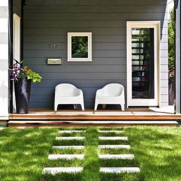
Small trendy front porch photo in Chicago with decking and a roof extension
Small trendy front porch photo in Chicago with decking and a roof extension
 MOTIV Interiors
Interior Designer: MOTIV Interiors LLC
Photographer: Sam Angel Photography
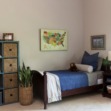
Design Challenge: This 8 year-old boy and girl were outgrowing their existing setup and needed to update their rooms with a plan that would carry them forward into middle school and beyond. In addition to gaining storage and study areas, could these twins show off their big personalities? Absolutely, we said! MOTIV Interiors tackled the rooms of these youngsters living in Nashville's 12th South Neighborhood and created an environment where the dynamic duo can learn, create, and grow together for years to come.
Design Solution:
In his room, we wanted to continue the feature wall fun, but with a different approach. Since our young explorer loves outer space, being a boy scout, and building with legos, we created a dynamic geometric wall that serves as the backdrop for our young hero’s control center. We started with a neutral mushroom color for the majority of the walls in the room, while our feature wall incorporated a deep indigo and sky blue that are as classic as your favorite pair of jeans. We focused on indoor air quality and used Sherwin Williams’ Duration paint in a satin sheen, which is a scrubbable/no-VOC coating.
We wanted to create a great reading corner, so we placed a comfortable denim lounge chair next to the window and made sure to feature a self-portrait created by our young client. For night time reading, we included a super-stellar floor lamp with white globes and a sleek satin nickel finish. Metal details are found throughout the space (such as the lounge chair base and nautical desk clock), and lend a utilitarian feel to the room. In order to balance the metal and keep the room from feeling too cold, we also snuck in woven baskets that work double-duty as decorative pieces and functional storage bins.
The large north-facing window got the royal treatment and was dressed with a relaxed roman shade in a shiitake linen blend. We added a fabulous fabric trim from F. Schumacher and echoed the look by using the same fabric for the bolster on the bed. Royal blue bedding brings a bit of color into the space, and is complimented by the rich chocolate wood tones seen in the furniture throughout. Additional storage was a must, so we brought in a glossy blue storage unit that can accommodate legos, encyclopedias, pinewood derby cars, and more!
Comfort and creativity converge in this space, and we were excited to get a big smile when we turned it over to its new commander.
 Skapa Design
This lovely transitional home in Minnesota's lake country pairs industrial elements with softer formal touches. It uses an eclectic mix of materials and design elements to create a beautiful yet comfortable family home.
 Rhodes Architecture + Light
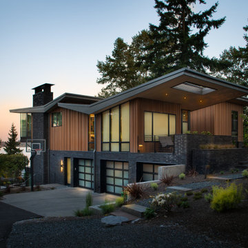
Material expression and exterior finishes were carefully selected to reduce the apparent size of the house, last through many years, and add warmth and human scale to the home. The unique siding system is made up of different widths and depths of western red cedar, complementing the vision of the structure's wings which are balanced, not symmetrical. The exterior materials include a burn brick base, powder-coated steel, cedar, acid-washed concrete and Corten steel planters.
Sponsored
Sunbury, OH

J.Holderby - Renovations
Franklin County's Leading General Contractors - 2X Best of Houzz!
 Seed Studio Landscape Design
image: Travis Rhoads Photography
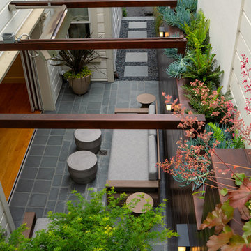
Inspiration for a small contemporary shade side yard stone formal garden in San Francisco.
Inspiration for a small contemporary shade side yard stone formal garden in San Francisco.
 Kimberly Barr Interior Design
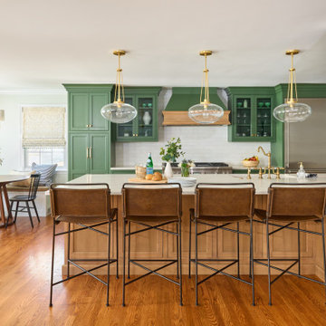
Large elegant l-shaped light wood floor and brown floor eat-in kitchen photo in Philadelphia with a drop-in sink, beaded inset cabinets, green cabinets, quartz countertops, white backsplash, marble backsplash, stainless steel appliances, an island and white countertops
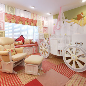
 Thinkterior LLC
THEME Created for a baby girl, this
room is magical, feminine and very
pink. At its heart is the Carriage Crib,
surrounded by a large oak tree with
delightful animals, baby blocks, a cozy
window seat and an upholstered play
area on the floor.
FOCUS The eye-catching size and
detail of the Carriage Crib, with
a dainty canopy held in place by
woodland creatures immediately
catches a visitor’s attention, and is
enhanced by the piece’s fascinating
colors and textures. Wall murals,
fabrics, accent furniture and lighting
accent the beauty of the crib. A
handsome Dutch door with a minientrance
just for her ensures that this
princess feels at home as soon as she
steps in the room.
STORAGE The room has closet
organizers for everyday items, and
cubicle storage is beautifully hidden
behind the wall letter blocks.
GROWTH As the room’s occupant
grows from baby to toddler to
child and ‘tween, the room is easily
transformed with age-appropriate
toys, pictures, bedding and fabrics.
The crib portion of the carriage can
be removed and fitted with a larger
mattress, saving both time and money
in the future. Letter blocks are easily
updated by simply removing the letters
and replacing them with mirrors, colors
or other images.
SAFETY Standard precautions are
taken to secure power outlets and keep
exposed shelving out of reach. Thickly
padded upholstered squares featuring
colors and patterns that coordinate
with the fabrics on the window seat
and valance create a visually inviting,
comfortable and safe place to play.

Sponsored
Sunbury, OH
J.Holderby - Renovations
Franklin County's Leading General Contractors - 2X Best of Houzz!
 Laura U Design Collective
Julie Soefer
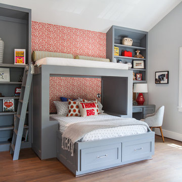
Kids' bedroom - transitional medium tone wood floor kids' bedroom idea in Houston with gray walls
Kids' bedroom - transitional medium tone wood floor kids' bedroom idea in Houston with gray walls
 KitchenLab Interiors
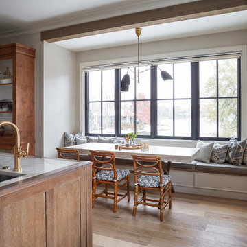
KitchenLab Interiors’ first, entirely new construction project in collaboration with GTH architects who designed the residence. KLI was responsible for all interior finishes, fixtures, furnishings, and design including the stairs, casework, interior doors, moldings and millwork. KLI also worked with the client on selecting the roof, exterior stucco and paint colors, stone, windows, and doors. The homeowners had purchased the existing home on a lakefront lot of the Valley Lo community in Glenview, thinking that it would be a gut renovation, but when they discovered a host of issues including mold, they decided to tear it down and start from scratch. The minute you look out the living room windows, you feel as though you're on a lakeside vacation in Wisconsin or Michigan. We wanted to help the homeowners achieve this feeling throughout the house - merging the causal vibe of a vacation home with the elegance desired for a primary residence. This project is unique and personal in many ways - Rebekah and the homeowner, Lorie, had grown up together in a small suburb of Columbus, Ohio. Lorie had been Rebekah's babysitter and was like an older sister growing up. They were both heavily influenced by the style of the late 70's and early 80's boho/hippy meets disco and 80's glam, and both credit their moms for an early interest in anything related to art, design, and style. One of the biggest challenges of doing a new construction project is that it takes so much longer to plan and execute and by the time tile and lighting is installed, you might be bored by the selections of feel like you've seen them everywhere already. “I really tried to pull myself, our team and the client away from the echo-chamber of Pinterest and Instagram. We fell in love with counter stools 3 years ago that I couldn't bring myself to pull the trigger on, thank god, because then they started showing up literally everywhere", Rebekah recalls. Lots of one of a kind vintage rugs and furnishings make the home feel less brand-spanking new. The best projects come from a team slightly outside their comfort zone. One of the funniest things Lorie says to Rebekah, "I gave you everything you wanted", which is pretty hilarious coming from a client to a designer.
 EL Studio
Pepper Watkins
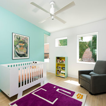
Nursery - mid-sized scandinavian gender-neutral light wood floor and beige floor nursery idea in DC Metro with blue walls
Nursery - mid-sized scandinavian gender-neutral light wood floor and beige floor nursery idea in DC Metro with blue walls
4