
Search results for "Heart shaped" in Home Design Ideas
 Meg B. Frank Interiors
Tyler Mark Henderson
www.tylermarkhenderson.com
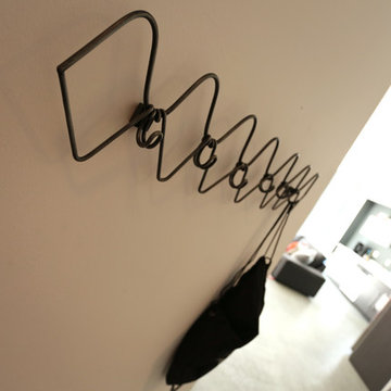
Home design - small industrial concrete floor home design idea in San Luis Obispo with white walls and a metal front door
Home design - small industrial concrete floor home design idea in San Luis Obispo with white walls and a metal front door

 Karla Trincanello, CID, Interior Decisions, Inc.
This well used but dreary bathroom was ready for an update but this time, materials were selected that not only looked great but would stand the test of time. The large steam shower (6x6') was like a dark cave with one glass door allowing light. To create a brighter shower space and the feel of an even larger shower, the wall was removed and full glass panels now allowed full sunlight streaming into the shower which avoids the growth of mold and mildew in this newly brighter space which also expands the bathroom by showing all the spaces. Originally the dark shower was permeated with cracks in the marble marble material and bench seat so mold and mildew had a home. The designer specified Porcelain slabs for a carefree un-penetrable material that had fewer grouted seams and added luxury to the new bath. Although Quartz is a hard material and fine to use in a shower, it is not suggested for steam showers because there is some porosity. A free standing bench was fabricated from quartz which works well. A new free
standing, hydrotherapy tub was installed allowing more free space around the tub area and instilling luxury with the use of beautiful marble for the walls and flooring. A lovely crystal chandelier emphasizes the height of the room and the lovely tall window.. Two smaller vanities were replaced by a larger U shaped vanity allotting two corner lazy susan cabinets for storing larger items. The center cabinet was used to store 3 laundry bins that roll out, one for towels and one for his and one for her delicates. Normally this space would be a makeup dressing table but since we were able to design a large one in her closet, she felt laundry bins were more needed in this bathroom. Instead of constructing a closet in the bathroom, the designer suggested an elegant glass front French Armoire to not encumber the space with a wall for the closet.The new bathroom is stunning and stops the heart on entering with all the luxurious amenities.
 Designs by KS
Project: Kitsilano House
Builder: Grenor Homes
About this Project
When our clients asked us to design their new house in the heart of Kitsilano, they wanted a space that showcased their personalities, travels, and experiences. Naturally, our team was instantly excited and eager to make this house a home.
Layout:
Prior to the renovation, the family room was adjacent to the kitchen and the formal living room at the other end of the space; in the middle was the dinning area. We looked at the main floor as an entire space and decided to combine the two living spaces into one and move the dining area towards the kitchen.
The Kitchen:
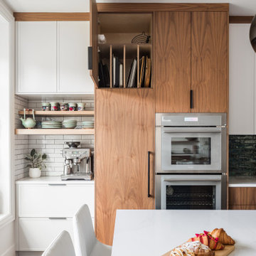
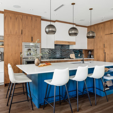
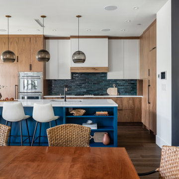
had always been an L shape with an island; previously there was a kitchen table by the windows. In the space planning period, we decided to eliminate the kitchen table to increase the overall size of the kitchen, giving us a bigger island for casual eating.
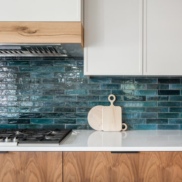
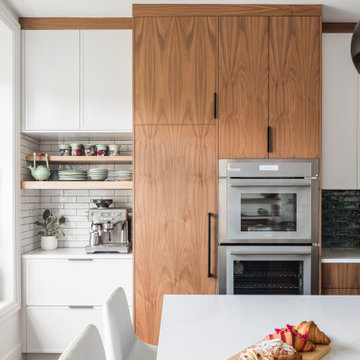
The perimeter of the kitchen has many great features; a coffee nook, a freezer column, double ovens, a cooktop with drawers below, an appliance garage in the awkward corner, a pantry with ample storage and free-standing fridge.
The Island also has many key features; a built-in unit for garbage/recycling/compost, a slide out tray underneath the sink for easy access to cleaning products, a dishwasher, and a bank of four drawer. On the outside of the island is an open shelf for cookbooks and display items. Below the countertop overhang is additional hidden storage for the items not accessed frequently.
Dinning Area:
we utilized the pre-existing niche by incorporating floating shelves in an asymmetrical design, which became the perfect area for the clients to display the art collected during their travels.
Bar Area:
The space between the kitchen and powder room became the perfect place to add a bar. Storage, counter space, and 2 bar fridges brought this little entertaining area to life.
Fireplace:
Using existing fireplace unit we cladded the surround with Dekton material, paneled the wall above with Walnut and a mantel made from Quarkus. These materials repeat them selves through the entire space.
Find the right local pro for your project
 Designs by KS
Project: Kitsilano House
Builder: Grenor Homes
About this Project
When our clients asked us to design their new house in the heart of Kitsilano, they wanted a space that showcased their personalities, travels, and experiences. Naturally, our team was instantly excited and eager to make this house a home.
Layout:
Prior to the renovation, the family room was adjacent to the kitchen and the formal living room at the other end of the space; in the middle was the dinning area. We looked at the main floor as an entire space and decided to combine the two living spaces into one and move the dining area towards the kitchen.
The Kitchen:
had always been an L shape with an island; previously there was a kitchen table by the windows. In the space planning period, we decided to eliminate the kitchen table to increase the overall size of the kitchen, giving us a bigger island for casual eating.
The perimeter of the kitchen has many great features; a coffee nook, a freezer column, double ovens, a cooktop with drawers below, an appliance garage in the awkward corner, a pantry with ample storage and free-standing fridge.
The Island also has many key features; a built-in unit for garbage/recycling/compost, a slide out tray underneath the sink for easy access to cleaning products, a dishwasher, and a bank of four drawer. On the outside of the island is an open shelf for cookbooks and display items. Below the countertop overhang is additional hidden storage for the items not accessed frequently.
Dinning Area:
we utilized the pre-existing niche by incorporating floating shelves in an asymmetrical design, which became the perfect area for the clients to display the art collected during their travels.
Bar Area:
The space between the kitchen and powder room became the perfect place to add a bar. Storage, counter space, and 2 bar fridges brought this little entertaining area to life.
Fireplace:
Using existing fireplace unit we cladded the surround with Dekton material, paneled the wall above with Walnut and a mantel made from Quarkus. These materials repeat them selves through the entire space.
 Designs by KS
Project: Kitsilano House
Builder: Grenor Homes
About this Project
When our clients asked us to design their new house in the heart of Kitsilano, they wanted a space that showcased their personalities, travels, and experiences. Naturally, our team was instantly excited and eager to make this house a home.
Layout:
Prior to the renovation, the family room was adjacent to the kitchen and the formal living room at the other end of the space; in the middle was the dinning area. We looked at the main floor as an entire space and decided to combine the two living spaces into one and move the dining area towards the kitchen.
The Kitchen:
had always been an L shape with an island; previously there was a kitchen table by the windows. In the space planning period, we decided to eliminate the kitchen table to increase the overall size of the kitchen, giving us a bigger island for casual eating.
The perimeter of the kitchen has many great features; a coffee nook, a freezer column, double ovens, a cooktop with drawers below, an appliance garage in the awkward corner, a pantry with ample storage and free-standing fridge.
The Island also has many key features; a built-in unit for garbage/recycling/compost, a slide out tray underneath the sink for easy access to cleaning products, a dishwasher, and a bank of four drawer. On the outside of the island is an open shelf for cookbooks and display items. Below the countertop overhang is additional hidden storage for the items not accessed frequently.
Dinning Area:
we utilized the pre-existing niche by incorporating floating shelves in an asymmetrical design, which became the perfect area for the clients to display the art collected during their travels.
Bar Area:
The space between the kitchen and powder room became the perfect place to add a bar. Storage, counter space, and 2 bar fridges brought this little entertaining area to life.
Fireplace:
Using existing fireplace unit we cladded the surround with Dekton material, paneled the wall above with Walnut and a mantel made from Quarkus. These materials repeat them selves through the entire space.
 Designs by KS
Project: Kitsilano House
Builder: Grenor Homes
About this Project
When our clients asked us to design their new house in the heart of Kitsilano, they wanted a space that showcased their personalities, travels, and experiences. Naturally, our team was instantly excited and eager to make this house a home.
Layout:
Prior to the renovation, the family room was adjacent to the kitchen and the formal living room at the other end of the space; in the middle was the dinning area. We looked at the main floor as an entire space and decided to combine the two living spaces into one and move the dining area towards the kitchen.
The Kitchen:
had always been an L shape with an island; previously there was a kitchen table by the windows. In the space planning period, we decided to eliminate the kitchen table to increase the overall size of the kitchen, giving us a bigger island for casual eating.
The perimeter of the kitchen has many great features; a coffee nook, a freezer column, double ovens, a cooktop with drawers below, an appliance garage in the awkward corner, a pantry with ample storage and free-standing fridge.
The Island also has many key features; a built-in unit for garbage/recycling/compost, a slide out tray underneath the sink for easy access to cleaning products, a dishwasher, and a bank of four drawer. On the outside of the island is an open shelf for cookbooks and display items. Below the countertop overhang is additional hidden storage for the items not accessed frequently.
Dinning Area:
we utilized the pre-existing niche by incorporating floating shelves in an asymmetrical design, which became the perfect area for the clients to display the art collected during their travels.
Bar Area:
The space between the kitchen and powder room became the perfect place to add a bar. Storage, counter space, and 2 bar fridges brought this little entertaining area to life.
Fireplace:
Using existing fireplace unit we cladded the surround with Dekton material, paneled the wall above with Walnut and a mantel made from Quarkus. These materials repeat them selves through the entire space.
 Designs by KS
Project: Kitsilano House
Builder: Grenor Homes
About this Project
When our clients asked us to design their new house in the heart of Kitsilano, they wanted a space that showcased their personalities, travels, and experiences. Naturally, our team was instantly excited and eager to make this house a home.
Layout:
Prior to the renovation, the family room was adjacent to the kitchen and the formal living room at the other end of the space; in the middle was the dinning area. We looked at the main floor as an entire space and decided to combine the two living spaces into one and move the dining area towards the kitchen.
The Kitchen:
had always been an L shape with an island; previously there was a kitchen table by the windows. In the space planning period, we decided to eliminate the kitchen table to increase the overall size of the kitchen, giving us a bigger island for casual eating.
The perimeter of the kitchen has many great features; a coffee nook, a freezer column, double ovens, a cooktop with drawers below, an appliance garage in the awkward corner, a pantry with ample storage and free-standing fridge.
The Island also has many key features; a built-in unit for garbage/recycling/compost, a slide out tray underneath the sink for easy access to cleaning products, a dishwasher, and a bank of four drawer. On the outside of the island is an open shelf for cookbooks and display items. Below the countertop overhang is additional hidden storage for the items not accessed frequently.
Dinning Area:
we utilized the pre-existing niche by incorporating floating shelves in an asymmetrical design, which became the perfect area for the clients to display the art collected during their travels.
Bar Area:
The space between the kitchen and powder room became the perfect place to add a bar. Storage, counter space, and 2 bar fridges brought this little entertaining area to life.
Fireplace:
Using existing fireplace unit we cladded the surround with Dekton material, paneled the wall above with Walnut and a mantel made from Quarkus. These materials repeat them selves through the entire space.

 Urbanology Designs
A captivating transformation in the coveted neighborhood of University Park, Dallas
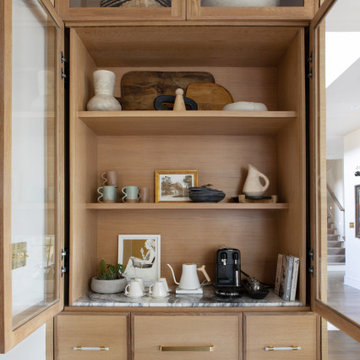
The heart of this home lies in the kitchen, where we embarked on a design endeavor that would leave anyone speechless. By opening up the main kitchen wall, we created a magnificent window system that floods the space with natural light and offers a breathtaking view of the picturesque surroundings. Suspended from the ceiling, a steel-framed marble vent hood floats a few inches from the window, showcasing a mesmerizing Lilac Marble. The same marble is skillfully applied to the backsplash and island, featuring a bold combination of color and pattern that exudes elegance.
Adding to the kitchen's allure is the Italian range, which not only serves as a showstopper but offers robust culinary features for even the savviest of cooks. However, the true masterpiece of the kitchen lies in the honed reeded marble-faced island. Each marble strip was meticulously cut and crafted by artisans to achieve a half-rounded profile, resulting in an island that is nothing short of breathtaking. This intricate process took several months, but the end result speaks for itself.
To complement the grandeur of the kitchen, we designed a combination of stain-grade and paint-grade cabinets in a thin raised panel door style. This choice adds an elegant yet simple look to the overall design. Inside each cabinet and drawer, custom interiors were meticulously designed to provide maximum functionality and organization for the day-to-day cooking activities. A vintage Turkish runner dating back to the 1960s, evokes a sense of history and character.
The breakfast nook boasts a stunning, vivid, and colorful artwork created by one of Dallas' top artist, Kyle Steed, who is revered for his mastery of his craft. Some of our favorite art pieces from the inspiring Haylee Yale grace the coffee station and media console, adding the perfect moment to pause and loose yourself in the story of her art.
The project extends beyond the kitchen into the living room, where the family's changing needs and growing children demanded a new design approach. Accommodating their new lifestyle, we incorporated a large sectional for family bonding moments while watching TV. The living room now boasts bolder colors, striking artwork a coffered accent wall, and cayenne velvet curtains that create an inviting atmosphere. Completing the room is a custom 22' x 15' rug, adding warmth and comfort to the space. A hidden coat closet door integrated into the feature wall adds an element of surprise and functionality.
This project is not just about aesthetics; it's about pushing the boundaries of design and showcasing the possibilities. By curating an out-of-the-box approach, we bring texture and depth to the space, employing different materials and original applications. The layered design achieved through repeated use of the same material in various forms, shapes, and locations demonstrates that unexpected elements can create breathtaking results.
The reason behind this redesign and remodel was the homeowners' desire to have a kitchen that not only provided functionality but also served as a beautiful backdrop to their cherished family moments. The previous kitchen lacked the "wow" factor they desired, prompting them to seek our expertise in creating a space that would be a source of joy and inspiration.
Inspired by well-curated European vignettes, sculptural elements, clean lines, and a natural color scheme with pops of color, this design reflects an elegant organic modern style. Mixing metals, contrasting textures, and utilizing clean lines were key elements in achieving the desired aesthetic. The living room introduces bolder moments and a carefully chosen color scheme that adds character and personality.
The client's must-haves were clear: they wanted a show stopping centerpiece for their home, enhanced natural light in the kitchen, and a design that reflected their family's dynamic. With the transformation of the range wall into a wall of windows, we fulfilled their desire for abundant natural light and breathtaking views of the surrounding landscape.
Our favorite rooms and design elements are numerous, but the kitchen remains a standout feature. The painstaking process of hand-cutting and crafting each reeded panel in the island to match the marble's veining resulted in a labor of love that emanates warmth and hospitality to all who enter.
In conclusion, this tastefully lux project in University Park, Dallas is an extraordinary example of a full gut remodel that has surpassed all expectations. The meticulous attention to detail, the masterful use of materials, and the seamless blend of functionality and aesthetics create an unforgettable space. It serves as a testament to the power of design and the transformative impact it can have on a home and its inhabitants.
Project by Texas' Urbanology Designs. Their North Richland Hills-based interior design studio serves Dallas, Highland Park, University Park, Fort Worth, and upscale clients nationwide.
 Designs by KS
Project: Kitsilano House
Builder: Grenor Homes
About this Project
When our clients asked us to design their new house in the heart of Kitsilano, they wanted a space that showcased their personalities, travels, and experiences. Naturally, our team was instantly excited and eager to make this house a home.
Layout:
Prior to the renovation, the family room was adjacent to the kitchen and the formal living room at the other end of the space; in the middle was the dinning area. We looked at the main floor as an entire space and decided to combine the two living spaces into one and move the dining area towards the kitchen.
The Kitchen:
had always been an L shape with an island; previously there was a kitchen table by the windows. In the space planning period, we decided to eliminate the kitchen table to increase the overall size of the kitchen, giving us a bigger island for casual eating.
The perimeter of the kitchen has many great features; a coffee nook, a freezer column, double ovens, a cooktop with drawers below, an appliance garage in the awkward corner, a pantry with ample storage and free-standing fridge.
The Island also has many key features; a built-in unit for garbage/recycling/compost, a slide out tray underneath the sink for easy access to cleaning products, a dishwasher, and a bank of four drawer. On the outside of the island is an open shelf for cookbooks and display items. Below the countertop overhang is additional hidden storage for the items not accessed frequently.
Dinning Area:
we utilized the pre-existing niche by incorporating floating shelves in an asymmetrical design, which became the perfect area for the clients to display the art collected during their travels.
Bar Area:
The space between the kitchen and powder room became the perfect place to add a bar. Storage, counter space, and 2 bar fridges brought this little entertaining area to life.
Fireplace:
Using existing fireplace unit we cladded the surround with Dekton material, paneled the wall above with Walnut and a mantel made from Quarkus. These materials repeat them selves through the entire space.

 Visbeen Architects
Inspired by historic homes in America’s grand old neighborhoods, the Wainsborough combines the rich character and architectural craftsmanship of the past with contemporary conveniences. Perfect for today’s busy lifestyles, the home is the perfect blend of past and present. Touches of the ever-popular Shingle Style – from the cedar lap siding to the pitched roof – imbue the home with all-American charm without sacrificing modern convenience.
Exterior highlights include stone detailing, multiple entries, transom windows and arched doorways. Inside, the home features a livable open floor plan as well as 10-foot ceilings. The kitchen, dining room and family room flow together, with a large fireplace and an inviting nearby deck. A children’s wing over the garage, a luxurious master suite and adaptable design elements give the floor plan the flexibility to adapt as a family’s needs change. “Right-size” rooms live large, but feel cozy. While the floor plan reflects a casual, family-friendly lifestyle, craftsmanship throughout includes interesting nooks and window seats, all hallmarks of the past.
The main level includes a kitchen with a timeless character and architectural flair. Designed to function as a modern gathering room reflecting the trend toward the kitchen serving as the heart of the home, it features raised panel, hand-finished cabinetry and hidden, state-of-the-art appliances. Form is as important as function, with a central square-shaped island serving as a both entertaining and workspace. Custom-designed features include a pull-out bookshelf for cookbooks as well as a pull-out table for extra seating. Other first-floor highlights include a dining area with a bay window, a welcoming hearth room with fireplace, a convenient office and a handy family mud room near the side entrance. A music room off the great room adds an elegant touch to this otherwise comfortable, casual home.
Upstairs, a large master suite and master bath ensures privacy. Three additional children’s bedrooms are located in a separate wing over the garage. The lower level features a large family room and adjacent home theater, a guest room and bath and a convenient wine and wet bar.

 Michael Nash Design, Build & Homes
2011 CAPITAL COTY AWARD HONORABLE MENTION AWARD WINNER
Built circa 1980, a young couple with three children originally purchased this home for their growing family. After four years of karate, soccer, piano and other activities, however, the home was becoming too small to meet their needs.
Problems started upon entering the front foyer. A 25-foot long dark hallway separated the family room and the kitchen, ending in a tiny powder room stuck in the middle of the layout. The kitchen was especially isolated, a cramped L-shaped design with a box bay breakfast bump out that was literally falling apart.
The new design started with the core of the problem—the maze and separation created by the long hallways.
First, the 25’ load bearing wall separating the foyer from family room was totally taken out and replaced with a long supporting beam. A French door replaced a small door and window leading to a screen porch . This action allowed lots of light to get into family and foyer. Then, the powder room was removed and the partition wall between the kitchen and family room was taken down. This created a large open concept design and greatly increased the size of the kitchen.
The box bay was demolished and replaced with new walls and a large window. The plumbing for main sink and dishwasher got relocated into this box bay allowing a total transformation of the space. Now there are cabinets and counters on all sides.
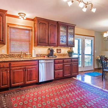
The doorway to the dining room was reconfigured to allow a butler area on its left. While the right side was occupied with new 36” gas range top with a decorative wood hood above it. The refrigerator, microwave/oven and pantries—the space’s tall elements—occupy one wall..
A large Island with a prep sink and beverage center for the kids occupies the center of the layout. Capable of seating up to four, family and friends can now keep the cook company. A large built-in desk area lets the kids do their homework so the parents can supervise while they prepare meals.
Light cabinetry with a touch of caramel glazing and exotic granite countertops by our designers contributed to this kitchen’s elegant design. The contrasting distressed island’s darker finish matches the dinette set and other furnishings.
New hardwood floors were installed throughout the first floor for a seamless look, while recess, pendant and task lighting make the space even brighter. Importantly, there’s plenty of space for parents and kids to hang out together. The kitchen is truly the heart of their home.

 Klopf Architecture
 and Jesse Ososki Art remodeled an existing Eichler atrium home into a brighter, more open, and more functional version of its original self.
The goals were to preserve the Eichler look and feel without the need to strictly adhere to it. The scope of work included re-configuring the master bedroom/bath, the kitchen, and the hall bath/laundry area, as well as updating interior finishes throughout to be more sophisticated.
The owners are detail-oriented and were very involved in the design process, down to the selection of lighting controls and stainless steel faceplates.Their design aesthetic leans toward the Scandinavian — light and bright, with simple straight lines and pure geometric shapes.
The finish flooring is large porcelain tile (24” x 24”) in a neutral grey tone, providing a uniform backdrop against which other materials can stand out. The same tile continues into the shower floor (with a different finish texture for slip-resistance) and up the shower/tub walls (in a smaller size). Heath Classic Field ceramic tile in Modern Blue was used sparingly, to add color at the hall bath vanity backsplash and at the shampoo niches in both bathrooms. Back-painted soda glass in pale blue to match the Heath tile was used at the kitchen backsplash. This same accent color was also used at the front entry atrium door. Kitchen cabinetry, countertops, appliances, and light fixtures are all white, making the kitchen feel more airy and light. Countertops are Caesarstone Blizzard.
The owners chose to keep some of the original Eichler elements: the concrete masonry fireplace; the stained tongue-and-groove redwood ceiling decking; and the luan wall paneling. The luan paneling was lightly sanded, cleaned, and re-stained. The owners also kept an added element that was installed by a previous owner: sliding shoji panels at all bedroom windows and sliding glass doors, for both privacy and sun control. Grooves were cut into the new tile flooring for the shoji panels to slide in, creating a more integrated look. Walnut was used to add warmth and contrast at the kitchen bar top and niche, the bathroom vanities, and the window sill/ledge under the kitchen window.
This Burlingame Eichler Remodel is a 2,121 sf, 4 bedroom/2 bath home located in the heart of Silicon Valley.
Klopf Architecture Project Team: John Klopf, Klara Kevane and Yegvenia Torres Zavala
Contractor: Jesse Ososki Art
Structural Engineer: Emmanuel Pun
Photography ©2018 Mariko Reed
Location: Burlingame, CA
Year completed: 2017
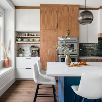 Designs by KS
Project: Kitsilano House
Builder: Grenor Homes
About this Project
When our clients asked us to design their new house in the heart of Kitsilano, they wanted a space that showcased their personalities, travels, and experiences. Naturally, our team was instantly excited and eager to make this house a home.
Layout:
Prior to the renovation, the family room was adjacent to the kitchen and the formal living room at the other end of the space; in the middle was the dinning area. We looked at the main floor as an entire space and decided to combine the two living spaces into one and move the dining area towards the kitchen.
The Kitchen:
had always been an L shape with an island; previously there was a kitchen table by the windows. In the space planning period, we decided to eliminate the kitchen table to increase the overall size of the kitchen, giving us a bigger island for casual eating.
The perimeter of the kitchen has many great features; a coffee nook, a freezer column, double ovens, a cooktop with drawers below, an appliance garage in the awkward corner, a pantry with ample storage and free-standing fridge.
The Island also has many key features; a built-in unit for garbage/recycling/compost, a slide out tray underneath the sink for easy access to cleaning products, a dishwasher, and a bank of four drawer. On the outside of the island is an open shelf for cookbooks and display items. Below the countertop overhang is additional hidden storage for the items not accessed frequently.
Dinning Area:
we utilized the pre-existing niche by incorporating floating shelves in an asymmetrical design, which became the perfect area for the clients to display the art collected during their travels.
Bar Area:
The space between the kitchen and powder room became the perfect place to add a bar. Storage, counter space, and 2 bar fridges brought this little entertaining area to life.
Fireplace:
Using existing fireplace unit we cladded the surround with Dekton material, paneled the wall above with Walnut and a mantel made from Quarkus. These materials repeat them selves through the entire space.
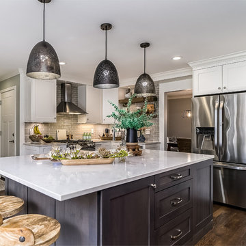
Sponsored
Columbus, OH

Trish Takacs Design
Award Winning & Highly Skilled Kitchen & Bath Designer in Columbus
 Karla Trincanello, CID, Interior Decisions, Inc.
This well used but dreary bathroom was ready for an update but this time, materials were selected that not only looked great but would stand the test of time. The large steam shower (6x6') was like a dark cave with one glass door allowing light. To create a brighter shower space and the feel of an even larger shower, the wall was removed and full glass panels now allowed full sunlight streaming into the shower which avoids the growth of mold and mildew in this newly brighter space which also expands the bathroom by showing all the spaces. Originally the dark shower was permeated with cracks in the marble marble material and bench seat so mold and mildew had a home. The designer specified Porcelain slabs for a carefree un-penetrable material that had fewer grouted seams and added luxury to the new bath. Although Quartz is a hard material and fine to use in a shower, it is not suggested for steam showers because there is some porosity. A free standing bench was fabricated from quartz which works well. A new free
standing, hydrotherapy tub was installed allowing more free space around the tub area and instilling luxury with the use of beautiful marble for the walls and flooring. A lovely crystal chandelier emphasizes the height of the room and the lovely tall window.. Two smaller vanities were replaced by a larger U shaped vanity allotting two corner lazy susan cabinets for storing larger items. The center cabinet was used to store 3 laundry bins that roll out, one for towels and one for his and one for her delicates. Normally this space would be a makeup dressing table but since we were able to design a large one in her closet, she felt laundry bins were more needed in this bathroom. Instead of constructing a closet in the bathroom, the designer suggested an elegant glass front French Armoire to not encumber the space with a wall for the closet.The new bathroom is stunning and stops the heart on entering with all the luxurious amenities.
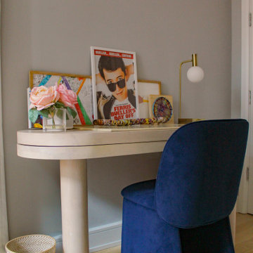
 Dominique Michelle Vidal
Nestled within the bustling heart of Manhattan's Seaport District, my latest project unfolded in the form of a kid's bedroom, reflecting both a playful spirit and thoughtful practicality. The client's love for travel and a shared vision for a space that grows with their child guided the creative process, transforming the room into a haven of warmth, comfort, and character.
The journey began with the selection of a twin-size daybed in off-white, a transitional piece that resonates with the room's flexibility. Perfect for lounging or sleepovers, this piece stands ready to evolve into a bed when the time is right. The side table, equipped with a handy charging port, offers the dual function of storage now and a nightstand later, reflecting the room's readiness to adapt to its occupant's changing needs.
Adding to the room's multifunctionality, the chosen console table can either grace the space in simplicity or rotate into an L-shaped desk. From craft time to study hours, it's a piece that speaks to the creativity and growth of the child. Paired with a velvet-upholstered chair, a fashionable yet unobtrusive addition, it brings a contrasting pop of color to balance the room's light palette.
The leather lounge chair and globe pouf introduce a casual feel, enhancing the room's welcoming ambiance. Inspired by the family's months-long travel experience, the global-themed pouf stands as a tangible reminder of adventures shared and the world waiting to be explored.
With the final touch of a well-positioned bookcase at the foot of the daybed sofa, organization and accessibility became part of the room's charm. The careful addition of lighting with gold, white, and rattan elements, along with a uniquely textured blue rug, brings the design together in a harmonious blend of style and personality.
This project, situated in one of New York's most vibrant neighborhoods, was more than just a room transformation; it was a labor of love. Building a space that can effortlessly transition with the child's growth, filled with memories and inspiration from family experiences, was a challenge embraced with enthusiasm. Their child's bedroom is not merely a room; it's a carefully curated environment where dreams take flight, comfort reigns, and the future holds endless possibilities.
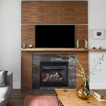 Designs by KS
Project: Kitsilano House
Builder: Grenor Homes
About this Project
When our clients asked us to design their new house in the heart of Kitsilano, they wanted a space that showcased their personalities, travels, and experiences. Naturally, our team was instantly excited and eager to make this house a home.
Layout:
Prior to the renovation, the family room was adjacent to the kitchen and the formal living room at the other end of the space; in the middle was the dinning area. We looked at the main floor as an entire space and decided to combine the two living spaces into one and move the dining area towards the kitchen.
The Kitchen:
had always been an L shape with an island; previously there was a kitchen table by the windows. In the space planning period, we decided to eliminate the kitchen table to increase the overall size of the kitchen, giving us a bigger island for casual eating.
The perimeter of the kitchen has many great features; a coffee nook, a freezer column, double ovens, a cooktop with drawers below, an appliance garage in the awkward corner, a pantry with ample storage and free-standing fridge.
The Island also has many key features; a built-in unit for garbage/recycling/compost, a slide out tray underneath the sink for easy access to cleaning products, a dishwasher, and a bank of four drawer. On the outside of the island is an open shelf for cookbooks and display items. Below the countertop overhang is additional hidden storage for the items not accessed frequently.
Dinning Area:
we utilized the pre-existing niche by incorporating floating shelves in an asymmetrical design, which became the perfect area for the clients to display the art collected during their travels.
Bar Area:
The space between the kitchen and powder room became the perfect place to add a bar. Storage, counter space, and 2 bar fridges brought this little entertaining area to life.
Fireplace:
Using existing fireplace unit we cladded the surround with Dekton material, paneled the wall above with Walnut and a mantel made from Quarkus. These materials repeat them selves through the entire space.

 Cure Design Group
BABY BOY NURSERY // HE’S ONE HAPPY CAMPER
When we found out our second child is a boy, it took me a minute to get going on his nursery plans. For those who know me, this is very unusual. Why? Because I one-hundred-and-ten-percent thought I was having a girl. (I still can’t believe I have a boy!) I know, I know, statistically there’s a fifty-fifty percent chance; but I had NO DOUBT in my mind this baby was going to be a girl. I mean, I had 3 Pinterest boards created with different girl themes, and NONE for a boy! So, once I wrapped my head around the gender of our new family member, I just needed to find my piece of passion: the design inspiration that would set the wheels in motion… I was looking for a print, a color, a piece of art or something to inspire the rest of the room. For me, it’s usually fabric or a rug, and in this case it was the former. And I should’ve known, the Land of Nod did it again! When I came across their “Nature Trail” bedding collection, I was a smitten kitten. Heart-shaped pupils and all. This is a perfect theme for our new little man’s room because our family (on my husband’s dad’s side) goes camping for a week at the end of July e v e r y . s i n g l e . y e a r . for over the last 50 years. It’s kind of a big deal and this bedding couldn’t be more spot-on.
Moving our daughter to a different bedroom and reusing her old nursery as his new nursery should have been an easy switch. But (ask my husband), I make nothing easy. Regardless of how we got there and how long it took – we got it done before baby arrived and I think it turned out adorable (ah hem, if I don’t say so myself). It certainly takes the sting out of rocking a screaming newborn back to sleep at 3 am, that’s for sure.
Sponsored
Columbus, OH
Trish Takacs Design
Award Winning & Highly Skilled Kitchen & Bath Designer in Columbus
 User
In the heart of Cottingham Street, a journey began—an endeavor to transform a tired, outdated kitchen into a space of modern charm and functional elegance. It all started with a dream, perhaps born over Sunday breakfast conversations or inspired by glossy magazine spreads. You imagined more than just a room; you envisioned a hub, a place where culinary creativity and family gatherings intertwine seamlessly.
First came the consultations, where ideas danced between you and skilled designers, each conversation weaving threads of imagination and practicality. With blueprints in hand and dreams in mind, you ventured into the world of permits and regulations, navigating the bureaucratic maze to ensure your vision could take shape within the constraints of the law.
Demolition day arrived with a symphony of hammers and saws, marking the end of an era and the dawn of a new one. Out went the old, worn cabinets and outdated appliances, making space for the promise of something fresh and exciting. Dust danced in the sunlight filtering through the windows, a metaphor for the transformation unfolding before your eyes.
Amidst the rubble, craftsmen toiled, laying the groundwork for your culinary sanctuary. Pipes were rerouted, wires reconfigured, and walls reshaped, each task bringing you closer to the realization of your dream. It was a dance of precision and expertise, a symphony of progress conducted by skilled hands.
And then, like magic, the pieces began to fall into place. Cabinets rose from the floor like sentinels of style, countertops gleamed with the promise of countless meals shared, and appliances hummed with the anticipation of culinary adventures yet to come. Light flooded the space, casting shadows of possibility across every surface.
With a fresh coat of paint and a flourish of finishing touches, your kitchen emerged from its cocoon of renovation, transformed into a space that felt uniquely yours. It was more than just a room; it was a reflection of your personality, your taste, and your vision for the future.
As the final inspections were conducted and the last details attended to, you stood in the doorway of your new kitchen, a smile spreading across your face. Here, in this space of beauty and functionality, memories would be made, meals shared, and laughter echoed off the walls. It was a journey from start to finish, a testament to the power of vision and the magic of transformation. And it all began on Cottingham Street.
 Designs by KS
Project: Kitsilano House
Builder: Grenor Homes
About this Project
When our clients asked us to design their new house in the heart of Kitsilano, they wanted a space that showcased their personalities, travels, and experiences. Naturally, our team was instantly excited and eager to make this house a home.
Layout:
Prior to the renovation, the family room was adjacent to the kitchen and the formal living room at the other end of the space; in the middle was the dinning area. We looked at the main floor as an entire space and decided to combine the two living spaces into one and move the dining area towards the kitchen.
The Kitchen:
had always been an L shape with an island; previously there was a kitchen table by the windows. In the space planning period, we decided to eliminate the kitchen table to increase the overall size of the kitchen, giving us a bigger island for casual eating.
The perimeter of the kitchen has many great features; a coffee nook, a freezer column, double ovens, a cooktop with drawers below, an appliance garage in the awkward corner, a pantry with ample storage and free-standing fridge.
The Island also has many key features; a built-in unit for garbage/recycling/compost, a slide out tray underneath the sink for easy access to cleaning products, a dishwasher, and a bank of four drawer. On the outside of the island is an open shelf for cookbooks and display items. Below the countertop overhang is additional hidden storage for the items not accessed frequently.
Dinning Area:
we utilized the pre-existing niche by incorporating floating shelves in an asymmetrical design, which became the perfect area for the clients to display the art collected during their travels.
Bar Area:
The space between the kitchen and powder room became the perfect place to add a bar. Storage, counter space, and 2 bar fridges brought this little entertaining area to life.
Fireplace:
Using existing fireplace unit we cladded the surround with Dekton material, paneled the wall above with Walnut and a mantel made from Quarkus. These materials repeat them selves through the entire space.
 User
In the heart of Cottingham Street, a journey began—an endeavor to transform a tired, outdated kitchen into a space of modern charm and functional elegance. It all started with a dream, perhaps born over Sunday breakfast conversations or inspired by glossy magazine spreads. You imagined more than just a room; you envisioned a hub, a place where culinary creativity and family gatherings intertwine seamlessly.
First came the consultations, where ideas danced between you and skilled designers, each conversation weaving threads of imagination and practicality. With blueprints in hand and dreams in mind, you ventured into the world of permits and regulations, navigating the bureaucratic maze to ensure your vision could take shape within the constraints of the law.
Demolition day arrived with a symphony of hammers and saws, marking the end of an era and the dawn of a new one. Out went the old, worn cabinets and outdated appliances, making space for the promise of something fresh and exciting. Dust danced in the sunlight filtering through the windows, a metaphor for the transformation unfolding before your eyes.
Amidst the rubble, craftsmen toiled, laying the groundwork for your culinary sanctuary. Pipes were rerouted, wires reconfigured, and walls reshaped, each task bringing you closer to the realization of your dream. It was a dance of precision and expertise, a symphony of progress conducted by skilled hands.
And then, like magic, the pieces began to fall into place. Cabinets rose from the floor like sentinels of style, countertops gleamed with the promise of countless meals shared, and appliances hummed with the anticipation of culinary adventures yet to come. Light flooded the space, casting shadows of possibility across every surface.
With a fresh coat of paint and a flourish of finishing touches, your kitchen emerged from its cocoon of renovation, transformed into a space that felt uniquely yours. It was more than just a room; it was a reflection of your personality, your taste, and your vision for the future.
As the final inspections were conducted and the last details attended to, you stood in the doorway of your new kitchen, a smile spreading across your face. Here, in this space of beauty and functionality, memories would be made, meals shared, and laughter echoed off the walls. It was a journey from start to finish, a testament to the power of vision and the magic of transformation. And it all began on Cottingham Street.
138