
Search results for "Helps increase" in Home Design Ideas
 Integrated Home Improvement
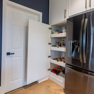
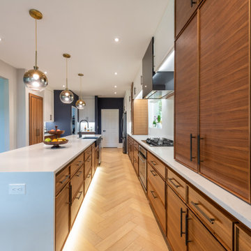
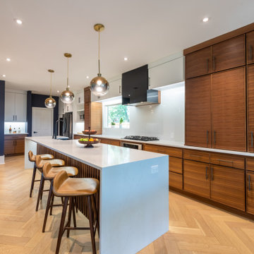
Both the design and construction teams put their heart into making sure we worked with the client to achieve this gorgeous vision. The client was sensitive to both aesthetic and functionality goals, so we set out to improve their old, dated cramped kitchen, with an open concept that facilitates cooking workflow, and dazzles the eye with its mid century modern design. One of their biggest items was their need for increased storage space. We certainly achieved that with ample cabinet space and doubling their pantry space.
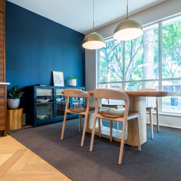
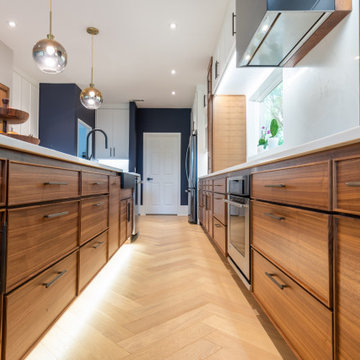
The 13 foot waterfall island is the centerpiece, which is heavily utilized for cooking, eating, playing board games and hanging out. The pantry behind the walnut doors used to be the fridge space, and there's an extra pantry now to the left of the current fridge. We moved the sink from the counter to the island, which really helped workflow (we created triangle between cooktop, sink and fridge/pantry 2). To make the cabinets flow linearly at the top we moved and replaced the window. The beige paint is called alpaca from Sherwin Williams and the blue is charcoal blue from sw.
Everything was carefully selected, from the horizontal grain on the walnut cabinets, to the subtly veined white quartz from Arizona tile, to the black glass paneled luxury hood from Futuro Futuro. The pendants and chandelier are from West Elm. The flooring is from karastan; a gorgeous engineered, white oak in herringbone pattern. The recessed lights are decorative from Lumens. The pulls are antique brass from plank hardware (in London). We sourced the door handles and cooktop (Empava) from Houzz. The faucet is Rohl and the sink is Bianco.

 Advance Design Studio, Ltd.
After six years of living in their Huntley IL home, Chris and Meghan were tired of their dark, dingy, outdated kitchen and it was finally time for a long-anticipated change. “The kitchen is the place where we live, it’s where we do everything,” Meghan said. “It was important that it be a space where we wanted to be.” Meghan loves cooking and enjoys including their girls in healthy meal prepping, this led them to want a brighter, more enjoyable kitchen with increased functionality and improved storage.
For Chris especially, the laundry room was an entirely dysfunctional eyesore. “We had a washer and a dryer, but it was all kind-of cobbled together!” Chris said. “There were always laundry piles everywhere, we weren’t really sure what we wanted to do in there, but it was time for us to make a change.” The mess of the space was stressful every time they walked in the door from the garage each day. Kids’ backpacks and shoes piled up haphazardly in the makeshift boot-bench closet left the family feeling disorganized and stressed. They needed space for folding clothes and locker cubbies to help keep the family organized.
Having known Christine and Todd in the Huntley community for years, Chris and Meghan were familiar with their work. “We already trusted them personally and having seen their projects for years we knew they did top notch work. After we reviewed the initial round of designs, we knew that hiring them was definitely the right choice,” Meghan and Chris said. Although Chris had done a lot of work in their home himself, the kitchen and laundry room renovation was such a large undertaking that he didn’t want to steal time away from his family to spend what would surely be many long weekends doing the job himself. “That would not have been a wise choice for us,” Chris laughed.
“Our designer, Michelle was very, very, easy to work with; anything we wanted to see or weren’t sure about, she went above and beyond to make this easy for us. She was easy to get hold of and always quick to respond,” the couple said. Michelle pulled ideas that mirrored the couple’s taste and style and was adept at directing the couple to limited choices that didn’t overwhelm them and kept the process moving. “I have a hard time making decisions. Michelle made the decision-making process so easy. I loved how she listened to what I liked and then presented three great options for me to choose from,” Meghan said.
The main objectives for the kitchen were better storage solutions, they wanted the space to reflect their lifestyle and taste, and they wanted it to last for years with low maintenance. One of the first steps in creating a more functional kitchen was relocating the refrigerator, creating an improved workflow for the busy family.
“We didn’t know that we could even move the refrigerator to a new location where it is now, that was something that we never would have thought of,” Chris said. “The new refrigerator location makes the kitchen feel so much bigger. We didn’t add any space, but our whole kitchen with the new design just seems like it’s so much larger than before!” Meghan said.
The perimeter mist colored cabinets helped warm and brighten the entire room, while the graphite colored cabinets on the island added contrast. Using this fresh, clean color palette satisfied the couple’s desire for a bright space that was the exact opposite of what they had before. Organization accessories were also added to the cabinets such as a spice drawer tray and roll outs to create hidden convenience.
“I absolutely love the hidden spices – it makes cooking so much more enjoyable!” Chris said. “And all the pull outs, and the double trash bin, who would think you could get so excited about organization!” the couple said in unison.
One thing they hated in their original kitchen was how dark the space felt. Added lighting on the ceiling with the new light fixtures combined with the lighter cabinetry colors throughout solved this problem. “Our new kitchen has this warm, almost cozy feeling that our old kitchen never had, it’s just a space that I love spending my time in now,” Meghan said. The light airy feeling was accentuated with the use of floating white shelves on either side of the decorative range hood. “We have so much cabinetry space, the new design is amazing we actually have more storage space than we will ever need,” Meghan said.
The island was extended to create more work surface and added space for stool seating. “The new island changes how we live. Now the kids can be in the kitchen with us, doing homework, eating breakfast, and the three of us have special dinners there when Chris is working late,” Meghan said.
The Carrara Marmi Quartz countertops were chosen because they are, not only beautiful, but are made from hard-working material that doesn’t require maintenance. The white subway tile backsplash that wraps to the ceiling behind the focal point cooktop range/hood compliments the crisp white countertops perfectly, while brushed brass hardware and light fixtures keep the design fresh and new.
The couple had a few fears at the beginning of the project, as most homeowners do. Their biggest fear was being out of their kitchen and laundry room for an extended time. The crew made it very easy for the family to work in a limited space keeping the washer and dryer hooked up the majority of the time, and also getting appliances working with minimal downtime.
“They above and beyond accommodated us to get us through the process,” Meghan said. “They did a great job making sure we were as comfortable as possible throughout the process,” Chris added.
“Our project manager DJ did a great job. He was very good at updating us on schedule changes, getting guys in as quickly as possible. Everyone that stepped in the house was nice and did great work,” said Chris. They thought Advance’s carpenter was phenomenal and were impressed when he took a conceptual idea from a photograph and worked with designer Michelle to create a one of a kind range/hood that has become the topic of conversation with friends and family who visit the new kitchen. “He was in our house literally every day for several weeks. He was easy to work with and good at what he did,” Meghan and Chris said.
The focal point of the kitchen; a hand-crafted, custom-built ventilation hood was clad with handpicked reclaimed barnwood. Advance Design’s carpenter built the framework and the cladding to create a one-of-a-kind design element that the couple loves.
“I think it was especially fun for him to create something unique from scratch, showcasing his talent in this area,” Meghan said. “I love that my kitchen is not like everyone else’s. I got to pick out the wood on my hood and watch it being built and was able to choose what pieces of wood went where on it. It’s totally unique.”
Red Oak flooring was toothed-in throughout the kitchen and the rest of the first floor anywhere changes were made. Then the whole floor was refinished to tone down the orange undertones in the existing floor stain, ultimately changing the color complexion of the entire first floor. The result is a completely new feeling to the entire home.
Renovating the laundry room was extremely important to Meghan and Chris, but they had trouble visualizing what the possibilities were for the seemingly small space. Michelle produced beautiful 3D illustrations that helped them envision the space in a whole new way.
“I must have told Michelle 100 times that I am a visual person, seeing the designs in 3D made it so easy to make decisions and see what we could really do with our space,” Meghan said.
A dividing wall and doorway were removed between the existing laundry room and hallway formerly containing a coat closet, providing space to design specialized graphite colored cabinetry matching the kitchen island to house custom storage cubbies for each family member. Adding the tall utility cabinetry in the new laundry area helped solve the storage issue, tucking away cleaning supplies, household items, and even the cat got its own cubby.
“I love how everything is now hidden in its own space. I can’t tell you how much I hated coming home and seeing everything sitting around on counters,” Chris said.
Electrical outlets were planned for the inside of utility cabinets, so devices could charge in hidden locations. Stacking the washer and dryer allowed for wider countertop space to provide a folding area and a special space for clothes to hang. “The way I do laundry has been completely transformed! I can actually fold clothes and hang them now right out of the washer and dryer,” Meghan said.
“The end result in the kitchen and the laundry/mud room was an updated light and bright space, with a smarter work flow that better meets the needs of this family,” Michelle said.
“I would totally recommend Advance Design,” Meghan said. “Sometimes I sit and just look at my kitchen and laundry room and think ‘Wow, I can’t believe I get to live here!’ It’s an understatement to say we love our new space.”

 KOZAK Hauling and Junk Removal
#1 Dumpster Rental Hudson, FL - Best Residential Roll-Off Dumpster Service in PASCO FL 727-455-5144
With the help of our New Port Richey FL residential dumpster rental, you’ll be able to spruce up your yard in no time. Clean out your gutters, trim trees, shrubs, and hedges, replace your worn-out deck, and remove the old swing set with our easy-to-load, open-top bins. Our containers can manage brush, tree stumps, yard trimmings, and general waste. Please contact our company before loading dirt into the bin.
Book our small dumpster rental New Port Richey FL homeowners can count on to handle the scope of your outdoor project and create a yard you will be proud of. Increase your curb appeal with a complete landscaping overhaul or clean up after a brutal storm with the added support of our roll-offs. Schedule a delivery online today at https://kozakrolloffdumpsterrentals.com/.../20-yard-roll...
Book the Dumpster Rental New Port Richey, FL Contractors and Homeowners Use for All Projects
Use the local professionals and the best dumpster rental New Port Richey, FL homeowners, contractors, and businesses depend on for a variety of projects. No matter what your project looks like at your residence, office, or construction site, you can depend on our quality services for all of your waste management needs.
Our team at KOZAK Roll Off Dumpster Rental will deliver a heavy-duty dumpster to your location on schedule so you can get your cleanout and decluttering efforts started and completed efficiently. Keep your job site streamlined and on the right track with the help of our professional, friendly, and dependable team.
Our easy-to-load containers are the perfect tool for your landscaping project, garden cleanout, and disposal of any broken or discarded items outside of your home. When you have a driveway-friendly dumpster rental New Port Richey, FL residents trust in your yard or driveway, your trips to the dump are a thing of the past.
We work with business owners and contractors for a broad scope of single-use or ongoing waste removal needs. Our flexible scheduling works on your behalf, saving you time and energy in the process.
We partner directly with the Pinellas County Solid Waste Landfill to ensure that all waste is disposed of responsibly and according to city, county, and state regulations, so you can rest assured that when you work with KOZAK Roll Off Dumpster Rental, we’ll manage the waste in an ethical and eco-conscious manner.
We specialize in: Refrigerator Disposal Garbage Removal Mattress Disposal Foreclosure Clean Outs Construction Waste Removal Yard Waste Removal Trash Removal Appliance Removal
Television Disposal & Recycling Furniture Removal E-Waste Disposal Hot Tub Disposal
#dumpsterrental #dumpster #junkremoval #junkremovalservice #wastemanagement #newportrichey
Find the right local pro for your project
 Integrated Home Improvement
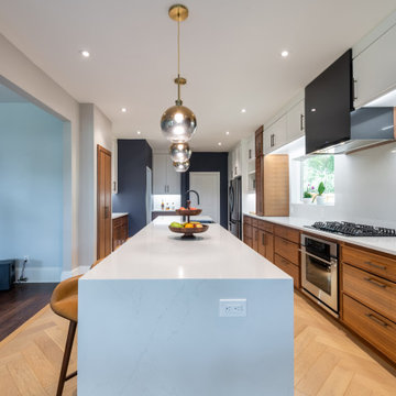
Both the design and construction teams put their heart into making sure we worked with the client to achieve this gorgeous vision. The client was sensitive to both aesthetic and functionality goals, so we set out to improve their old, dated cramped kitchen, with an open concept that facilitates cooking workflow, and dazzles the eye with its mid century modern design. One of their biggest items was their need for increased storage space. We certainly achieved that with ample cabinet space and doubling their pantry space.
The 13 foot waterfall island is the centerpiece, which is heavily utilized for cooking, eating, playing board games and hanging out. The pantry behind the walnut doors used to be the fridge space, and there's an extra pantry now to the left of the current fridge. We moved the sink from the counter to the island, which really helped workflow (we created triangle between cooktop, sink and fridge/pantry 2). To make the cabinets flow linearly at the top we moved and replaced the window. The beige paint is called alpaca from Sherwin Williams and the blue is charcoal blue from sw.
Everything was carefully selected, from the horizontal grain on the walnut cabinets, to the subtly veined white quartz from Arizona tile, to the black glass paneled luxury hood from Futuro Futuro. The pendants and chandelier are from West Elm. The flooring is from karastan; a gorgeous engineered, white oak in herringbone pattern. The recessed lights are decorative from Lumens. The pulls are antique brass from plank hardware (in London). We sourced the door handles and cooktop (Empava) from Houzz. The faucet is Rohl and the sink is Bianco.
 Integrated Home Improvement
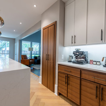
Both the design and construction teams put their heart into making sure we worked with the client to achieve this gorgeous vision. The client was sensitive to both aesthetic and functionality goals, so we set out to improve their old, dated cramped kitchen, with an open concept that facilitates cooking workflow, and dazzles the eye with its mid century modern design. One of their biggest items was their need for increased storage space. We certainly achieved that with ample cabinet space and doubling their pantry space.
The 13 foot waterfall island is the centerpiece, which is heavily utilized for cooking, eating, playing board games and hanging out. The pantry behind the walnut doors used to be the fridge space, and there's an extra pantry now to the left of the current fridge. We moved the sink from the counter to the island, which really helped workflow (we created triangle between cooktop, sink and fridge/pantry 2). To make the cabinets flow linearly at the top we moved and replaced the window. The beige paint is called alpaca from Sherwin Williams and the blue is charcoal blue from sw.
Everything was carefully selected, from the horizontal grain on the walnut cabinets, to the subtly veined white quartz from Arizona tile, to the black glass paneled luxury hood from Futuro Futuro. The pendants and chandelier are from West Elm. The flooring is from karastan; a gorgeous engineered, white oak in herringbone pattern. The recessed lights are decorative from Lumens. The pulls are antique brass from plank hardware (in London). We sourced the door handles and cooktop (Empava) from Houzz. The faucet is Rohl and the sink is Bianco.
 Integrated Home Improvement
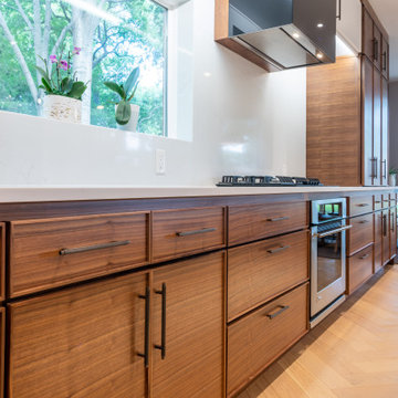
Both the design and construction teams put their heart into making sure we worked with the client to achieve this gorgeous vision. The client was sensitive to both aesthetic and functionality goals, so we set out to improve their old, dated cramped kitchen, with an open concept that facilitates cooking workflow, and dazzles the eye with its mid century modern design. One of their biggest items was their need for increased storage space. We certainly achieved that with ample cabinet space and doubling their pantry space.
The 13 foot waterfall island is the centerpiece, which is heavily utilized for cooking, eating, playing board games and hanging out. The pantry behind the walnut doors used to be the fridge space, and there's an extra pantry now to the left of the current fridge. We moved the sink from the counter to the island, which really helped workflow (we created triangle between cooktop, sink and fridge/pantry 2). To make the cabinets flow linearly at the top we moved and replaced the window. The beige paint is called alpaca from Sherwin Williams and the blue is charcoal blue from sw.
Everything was carefully selected, from the horizontal grain on the walnut cabinets, to the subtly veined white quartz from Arizona tile, to the black glass paneled luxury hood from Futuro Futuro. The pendants and chandelier are from West Elm. The flooring is from karastan; a gorgeous engineered, white oak in herringbone pattern. The recessed lights are decorative from Lumens. The pulls are antique brass from plank hardware (in London). We sourced the door handles and cooktop (Empava) from Houzz. The faucet is Rohl and the sink is Bianco.

 San Luis Kitchen Co.
This kitchen started life as a wide-open and airy space with somewhat drab cabinets. Its bones were great, some of the details were interesting – the pendant lights, the high vaulted ceiling and the soffit bridges, but the blonde oak cabinets, white tile counters, and vinyl flooring dragged the space back into the realm of the mundane.
When the homeowners came to San Luis Kitchen they were seeking to add a bold richness to their home. They fell in love with our cherry cabinets in a deep red finish called ‘Fireside Heirloom Black’ which has black glaze and fleck distressing to bring out the details of the style.
Our designers helped them to organize the kitchen – changing the cook-top to a range and sliding it to the left for symmetry and increased work space (eliminating the combo wall oven/microwave), adding an arched valance over the window to tie the halves of the kitchen together, and reconfiguring the refrigerator and microwave thus gaining 24” of counter in the corner.
San Luis Kitchen explored several island layouts with the homeowners – we wanted to add a prep sink, a double trash cabinet, more storage, display cabinetry for glassware and crystal, and a seating/eating bar. We added buffet cabinets to the bay window, replaced the white appliances with stainless, and added a copper hood and apron sink for rich detailing.
Now the homeowners have a great room that includes a GREAT kitchen. Life’s good!
Credits:
Kitchen design by San Luis Kitchen Co.
Custom cabinetry by Wood-Mode Fine Custom Cabinetry: Brookhaven's Andover
Contracting by Ayers Construction
Window treatments by Laura Powers
Sponsored
Columbus, OH

Hope Restoration & General Contracting
Columbus Design-Build, Kitchen & Bath Remodeling, Historic Renovations
 Juxtaposed Interiors
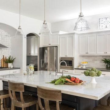
Gorgeous Open Kitchen Features A Large Island, A separate Alcove Space For The Cook Top, Lots Of Gorgeous Counter Space and A Butlers Pantry.
Example of a large classic u-shaped vinyl floor and brown floor open concept kitchen design in Sacramento with an undermount sink, shaker cabinets, white cabinets, quartz countertops, multicolored backsplash, subway tile backsplash, stainless steel appliances, an island and gray countertops
Example of a large classic u-shaped vinyl floor and brown floor open concept kitchen design in Sacramento with an undermount sink, shaker cabinets, white cabinets, quartz countertops, multicolored backsplash, subway tile backsplash, stainless steel appliances, an island and gray countertops
 Integrated Home Improvement
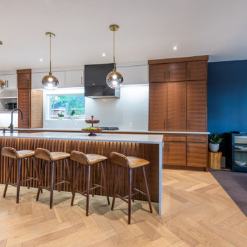
Both the design and construction teams put their heart into making sure we worked with the client to achieve this gorgeous vision. The client was sensitive to both aesthetic and functionality goals, so we set out to improve their old, dated cramped kitchen, with an open concept that facilitates cooking workflow, and dazzles the eye with its mid century modern design. One of their biggest items was their need for increased storage space. We certainly achieved that with ample cabinet space and doubling their pantry space.
The 13 foot waterfall island is the centerpiece, which is heavily utilized for cooking, eating, playing board games and hanging out. The pantry behind the walnut doors used to be the fridge space, and there's an extra pantry now to the left of the current fridge. We moved the sink from the counter to the island, which really helped workflow (we created triangle between cooktop, sink and fridge/pantry 2). To make the cabinets flow linearly at the top we moved and replaced the window. The beige paint is called alpaca from Sherwin Williams and the blue is charcoal blue from sw.
Everything was carefully selected, from the horizontal grain on the walnut cabinets, to the subtly veined white quartz from Arizona tile, to the black glass paneled luxury hood from Futuro Futuro. The pendants and chandelier are from West Elm. The flooring is from karastan; a gorgeous engineered, white oak in herringbone pattern. The recessed lights are decorative from Lumens. The pulls are antique brass from plank hardware (in London). We sourced the door handles and cooktop (Empava) from Houzz. The faucet is Rohl and the sink is Bianco.
 Integrated Home Improvement
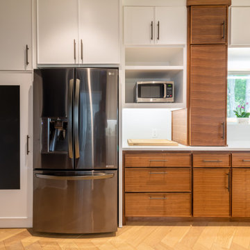
Both the design and construction teams put their heart into making sure we worked with the client to achieve this gorgeous vision. The client was sensitive to both aesthetic and functionality goals, so we set out to improve their old, dated cramped kitchen, with an open concept that facilitates cooking workflow, and dazzles the eye with its mid century modern design. One of their biggest items was their need for increased storage space. We certainly achieved that with ample cabinet space and doubling their pantry space.
The 13 foot waterfall island is the centerpiece, which is heavily utilized for cooking, eating, playing board games and hanging out. The pantry behind the walnut doors used to be the fridge space, and there's an extra pantry now to the left of the current fridge. We moved the sink from the counter to the island, which really helped workflow (we created triangle between cooktop, sink and fridge/pantry 2). To make the cabinets flow linearly at the top we moved and replaced the window. The beige paint is called alpaca from Sherwin Williams and the blue is charcoal blue from sw.
Everything was carefully selected, from the horizontal grain on the walnut cabinets, to the subtly veined white quartz from Arizona tile, to the black glass paneled luxury hood from Futuro Futuro. The pendants and chandelier are from West Elm. The flooring is from karastan; a gorgeous engineered, white oak in herringbone pattern. The recessed lights are decorative from Lumens. The pulls are antique brass from plank hardware (in London). We sourced the door handles and cooktop (Empava) from Houzz. The faucet is Rohl and the sink is Bianco.
 Integrated Home Improvement
Both the design and construction teams put their heart into making sure we worked with the client to achieve this gorgeous vision. The client was sensitive to both aesthetic and functionality goals, so we set out to improve their old, dated cramped kitchen, with an open concept that facilitates cooking workflow, and dazzles the eye with its mid century modern design. One of their biggest items was their need for increased storage space. We certainly achieved that with ample cabinet space and doubling their pantry space.
The 13 foot waterfall island is the centerpiece, which is heavily utilized for cooking, eating, playing board games and hanging out. The pantry behind the walnut doors used to be the fridge space, and there's an extra pantry now to the left of the current fridge. We moved the sink from the counter to the island, which really helped workflow (we created triangle between cooktop, sink and fridge/pantry 2). To make the cabinets flow linearly at the top we moved and replaced the window. The beige paint is called alpaca from Sherwin Williams and the blue is charcoal blue from sw.
Everything was carefully selected, from the horizontal grain on the walnut cabinets, to the subtly veined white quartz from Arizona tile, to the black glass paneled luxury hood from Futuro Futuro. The pendants and chandelier are from West Elm. The flooring is from karastan; a gorgeous engineered, white oak in herringbone pattern. The recessed lights are decorative from Lumens. The pulls are antique brass from plank hardware (in London). We sourced the door handles and cooktop (Empava) from Houzz. The faucet is Rohl and the sink is Bianco.

 Progressive Design Build
Transforming a Master Bathroom
When our clients purchased their beautiful home in South Fort Myers, FL they fell in love with the expansive, sweeping space. It wasn’t long, however, before they realized the master bathroom just didn’t suit their taste. The large walk-in shower was practically cave-like. Consequentially, it completely dwarfed the bathroom. Along with bland colors, outdated finishes, and a dividing wall in the middle of the room, the whole space felt smaller than its ample dimensions implied. There was no question about it – the bathroom needed an update.
Making Room for More
First, we demolished the existing finishes and cut the concrete slab for new underground plumbing. We minimized the imposing shower and moved it to the other side of the room. Moving the shower also allowed for the installation of our Dura Supreme Alectra style cabinetry in cocoa brown. For increased functionality, we created split his-and-hers vanities. Then we added towers to match the cabinets. With interior outlets, the towers added smart storage for bathroom appliances, helping to keep the counters clutter-free. For a finishing touch, we outlined the large mirrors with crown molding trim in a complimentary finish – an essential detail to tie all the cabinetry together.
The Spa
To bring the feel of the spa to this gorgeous home, we installed our luxurious drop-in 72”x42” Kohler Air Massage bathtub. We completely surrounded it with 3cm granite countertops in Delicatus green and added a tub deck with tile backsplashes for a sumptuous ambiance.
Lighting
On either side of the his-and-hers vanity, we installed George Kovach tube sconces. Vertical placement of the sconces provided ample lighting while enhancing the contemporary style of the space. To frame the room, we added a drop ceiling with recessed lighting and outlined the tray ceiling with crown molding to match the rest of the design. To complete the bath remodel, we installed the final element – a stunningly unique 10-light polished chrome chandelier from Maxim lighting.
A Complete Transformation
When we met with our clients, it was instantly clear to us why they were unhappy with their master bathroom. The cave-like shower and cumbersome dividing wall overpowered a room in dire need of a modernizing. Furthermore, with two small children and a busy lifestyle, we could sense our clients not only desired a bathroom renovation, they needed a relaxing retreat.
Ultimately, this project was nothing less than a complete transformation of space. In fact, by the time we had finished, the only original fixtures left were the windows! With beautifully updated finishes and an improved layout, we were able to achieve the functionality our clients craved along with a new, spa-like feel. The end result was nothing short of a haven at home – the perfect spot to recharge at the end of a long day.
 Integrated Home Improvement
Both the design and construction teams put their heart into making sure we worked with the client to achieve this gorgeous vision. The client was sensitive to both aesthetic and functionality goals, so we set out to improve their old, dated cramped kitchen, with an open concept that facilitates cooking workflow, and dazzles the eye with its mid century modern design. One of their biggest items was their need for increased storage space. We certainly achieved that with ample cabinet space and doubling their pantry space.
The 13 foot waterfall island is the centerpiece, which is heavily utilized for cooking, eating, playing board games and hanging out. The pantry behind the walnut doors used to be the fridge space, and there's an extra pantry now to the left of the current fridge. We moved the sink from the counter to the island, which really helped workflow (we created triangle between cooktop, sink and fridge/pantry 2). To make the cabinets flow linearly at the top we moved and replaced the window. The beige paint is called alpaca from Sherwin Williams and the blue is charcoal blue from sw.
Everything was carefully selected, from the horizontal grain on the walnut cabinets, to the subtly veined white quartz from Arizona tile, to the black glass paneled luxury hood from Futuro Futuro. The pendants and chandelier are from West Elm. The flooring is from karastan; a gorgeous engineered, white oak in herringbone pattern. The recessed lights are decorative from Lumens. The pulls are antique brass from plank hardware (in London). We sourced the door handles and cooktop (Empava) from Houzz. The faucet is Rohl and the sink is Bianco.
Sponsored
Columbus, OH
Hope Restoration & General Contracting
Columbus Design-Build, Kitchen & Bath Remodeling, Historic Renovations
 Integrated Home Improvement
Both the design and construction teams put their heart into making sure we worked with the client to achieve this gorgeous vision. The client was sensitive to both aesthetic and functionality goals, so we set out to improve their old, dated cramped kitchen, with an open concept that facilitates cooking workflow, and dazzles the eye with its mid century modern design. One of their biggest items was their need for increased storage space. We certainly achieved that with ample cabinet space and doubling their pantry space.
The 13 foot waterfall island is the centerpiece, which is heavily utilized for cooking, eating, playing board games and hanging out. The pantry behind the walnut doors used to be the fridge space, and there's an extra pantry now to the left of the current fridge. We moved the sink from the counter to the island, which really helped workflow (we created triangle between cooktop, sink and fridge/pantry 2). To make the cabinets flow linearly at the top we moved and replaced the window. The beige paint is called alpaca from Sherwin Williams and the blue is charcoal blue from sw.
Everything was carefully selected, from the horizontal grain on the walnut cabinets, to the subtly veined white quartz from Arizona tile, to the black glass paneled luxury hood from Futuro Futuro. The pendants and chandelier are from West Elm. The flooring is from karastan; a gorgeous engineered, white oak in herringbone pattern. The recessed lights are decorative from Lumens. The pulls are antique brass from plank hardware (in London). We sourced the door handles and cooktop (Empava) from Houzz. The faucet is Rohl and the sink is Bianco.
 Integrated Home Improvement
Both the design and construction teams put their heart into making sure we worked with the client to achieve this gorgeous vision. The client was sensitive to both aesthetic and functionality goals, so we set out to improve their old, dated cramped kitchen, with an open concept that facilitates cooking workflow, and dazzles the eye with its mid century modern design. One of their biggest items was their need for increased storage space. We certainly achieved that with ample cabinet space and doubling their pantry space.
The 13 foot waterfall island is the centerpiece, which is heavily utilized for cooking, eating, playing board games and hanging out. The pantry behind the walnut doors used to be the fridge space, and there's an extra pantry now to the left of the current fridge. We moved the sink from the counter to the island, which really helped workflow (we created triangle between cooktop, sink and fridge/pantry 2). To make the cabinets flow linearly at the top we moved and replaced the window. The beige paint is called alpaca from Sherwin Williams and the blue is charcoal blue from sw.
Everything was carefully selected, from the horizontal grain on the walnut cabinets, to the subtly veined white quartz from Arizona tile, to the black glass paneled luxury hood from Futuro Futuro. The pendants and chandelier are from West Elm. The flooring is from karastan; a gorgeous engineered, white oak in herringbone pattern. The recessed lights are decorative from Lumens. The pulls are antique brass from plank hardware (in London). We sourced the door handles and cooktop (Empava) from Houzz. The faucet is Rohl and the sink is Bianco.
 Integrated Home Improvement
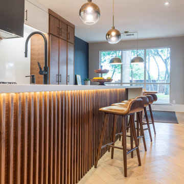
Both the design and construction teams put their heart into making sure we worked with the client to achieve this gorgeous vision. The client was sensitive to both aesthetic and functionality goals, so we set out to improve their old, dated cramped kitchen, with an open concept that facilitates cooking workflow, and dazzles the eye with its mid century modern design. One of their biggest items was their need for increased storage space. We certainly achieved that with ample cabinet space and doubling their pantry space.
The 13 foot waterfall island is the centerpiece, which is heavily utilized for cooking, eating, playing board games and hanging out. The pantry behind the walnut doors used to be the fridge space, and there's an extra pantry now to the left of the current fridge. We moved the sink from the counter to the island, which really helped workflow (we created triangle between cooktop, sink and fridge/pantry 2). To make the cabinets flow linearly at the top we moved and replaced the window. The beige paint is called alpaca from Sherwin Williams and the blue is charcoal blue from sw.
Everything was carefully selected, from the horizontal grain on the walnut cabinets, to the subtly veined white quartz from Arizona tile, to the black glass paneled luxury hood from Futuro Futuro. The pendants and chandelier are from West Elm. The flooring is from karastan; a gorgeous engineered, white oak in herringbone pattern. The recessed lights are decorative from Lumens. The pulls are antique brass from plank hardware (in London). We sourced the door handles and cooktop (Empava) from Houzz. The faucet is Rohl and the sink is Bianco.
 Integrated Home Improvement
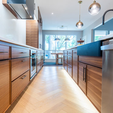
Both the design and construction teams put their heart into making sure we worked with the client to achieve this gorgeous vision. The client was sensitive to both aesthetic and functionality goals, so we set out to improve their old, dated cramped kitchen, with an open concept that facilitates cooking workflow, and dazzles the eye with its mid century modern design. One of their biggest items was their need for increased storage space. We certainly achieved that with ample cabinet space and doubling their pantry space.
The 13 foot waterfall island is the centerpiece, which is heavily utilized for cooking, eating, playing board games and hanging out. The pantry behind the walnut doors used to be the fridge space, and there's an extra pantry now to the left of the current fridge. We moved the sink from the counter to the island, which really helped workflow (we created triangle between cooktop, sink and fridge/pantry 2). To make the cabinets flow linearly at the top we moved and replaced the window. The beige paint is called alpaca from Sherwin Williams and the blue is charcoal blue from sw.
Everything was carefully selected, from the horizontal grain on the walnut cabinets, to the subtly veined white quartz from Arizona tile, to the black glass paneled luxury hood from Futuro Futuro. The pendants and chandelier are from West Elm. The flooring is from karastan; a gorgeous engineered, white oak in herringbone pattern. The recessed lights are decorative from Lumens. The pulls are antique brass from plank hardware (in London). We sourced the door handles and cooktop (Empava) from Houzz. The faucet is Rohl and the sink is Bianco.
Sponsored
Delaware, OH

Buckeye Basements, Inc.
Central Ohio's Basement Finishing ExpertsBest Of Houzz '13-'21
 Integrated Home Improvement
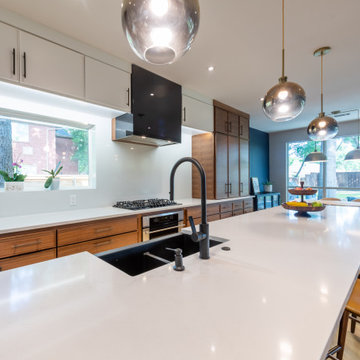
Both the design and construction teams put their heart into making sure we worked with the client to achieve this gorgeous vision. The client was sensitive to both aesthetic and functionality goals, so we set out to improve their old, dated cramped kitchen, with an open concept that facilitates cooking workflow, and dazzles the eye with its mid century modern design. One of their biggest items was their need for increased storage space. We certainly achieved that with ample cabinet space and doubling their pantry space.
The 13 foot waterfall island is the centerpiece, which is heavily utilized for cooking, eating, playing board games and hanging out. The pantry behind the walnut doors used to be the fridge space, and there's an extra pantry now to the left of the current fridge. We moved the sink from the counter to the island, which really helped workflow (we created triangle between cooktop, sink and fridge/pantry 2). To make the cabinets flow linearly at the top we moved and replaced the window. The beige paint is called alpaca from Sherwin Williams and the blue is charcoal blue from sw.
Everything was carefully selected, from the horizontal grain on the walnut cabinets, to the subtly veined white quartz from Arizona tile, to the black glass paneled luxury hood from Futuro Futuro. The pendants and chandelier are from West Elm. The flooring is from karastan; a gorgeous engineered, white oak in herringbone pattern. The recessed lights are decorative from Lumens. The pulls are antique brass from plank hardware (in London). We sourced the door handles and cooktop (Empava) from Houzz. The faucet is Rohl and the sink is Bianco.
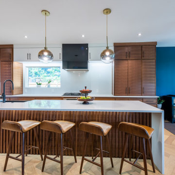 Integrated Home Improvement
Both the design and construction teams put their heart into making sure we worked with the client to achieve this gorgeous vision. The client was sensitive to both aesthetic and functionality goals, so we set out to improve their old, dated cramped kitchen, with an open concept that facilitates cooking workflow, and dazzles the eye with its mid century modern design. One of their biggest items was their need for increased storage space. We certainly achieved that with ample cabinet space and doubling their pantry space.
The 13 foot waterfall island is the centerpiece, which is heavily utilized for cooking, eating, playing board games and hanging out. The pantry behind the walnut doors used to be the fridge space, and there's an extra pantry now to the left of the current fridge. We moved the sink from the counter to the island, which really helped workflow (we created triangle between cooktop, sink and fridge/pantry 2). To make the cabinets flow linearly at the top we moved and replaced the window. The beige paint is called alpaca from Sherwin Williams and the blue is charcoal blue from sw.
Everything was carefully selected, from the horizontal grain on the walnut cabinets, to the subtly veined white quartz from Arizona tile, to the black glass paneled luxury hood from Futuro Futuro. The pendants and chandelier are from West Elm. The flooring is from karastan; a gorgeous engineered, white oak in herringbone pattern. The recessed lights are decorative from Lumens. The pulls are antique brass from plank hardware (in London). We sourced the door handles and cooktop (Empava) from Houzz. The faucet is Rohl and the sink is Bianco.

 MLB Design Group
Simplifying the room included re-planning the ceiling over the tub and shower. Previously it was a small dropped soffit over the shower with a large angled section looming over the window. We minimized the angled section as much as possible, then extended the soffit all the way across the room. Now the kintsugi tile detail captures our interest and, of course, that natural light is magnificent. The platforms are polished porcelain tile, but the shower floor is the same tile in a matte finish. Don't tell anybody, but we've used both Kohler and Brizo fitings in the room! Notice the floor tile detail again -- you'll see this more clearly in an upcoming photo.
103