
Search results for "High traffic" in Home Design Ideas

 ZeroEnergy Design
OVERVIEW
Set into a mature Boston area neighborhood, this sophisticated 2900SF home offers efficient use of space, expression through form, and myriad of green features.
MULTI-GENERATIONAL LIVING
Designed to accommodate three family generations, paired living spaces on the first and second levels are architecturally expressed on the facade by window systems that wrap the front corners of the house. Included are two kitchens, two living areas, an office for two, and two master suites.
CURB APPEAL
The home includes both modern form and materials, using durable cedar and through-colored fiber cement siding, permeable parking with an electric charging station, and an acrylic overhang to shelter foot traffic from rain.
FEATURE STAIR
An open stair with resin treads and glass rails winds from the basement to the third floor, channeling natural light through all the home’s levels.
LEVEL ONE
The first floor kitchen opens to the living and dining space, offering a grand piano and wall of south facing glass. A master suite and private ‘home office for two’ complete the level.
LEVEL TWO
The second floor includes another open concept living, dining, and kitchen space, with kitchen sink views over the green roof. A full bath, bedroom and reading nook are perfect for the children.
LEVEL THREE
The third floor provides the second master suite, with separate sink and wardrobe area, plus a private roofdeck.
ENERGY
The super insulated home features air-tight construction, continuous exterior insulation, and triple-glazed windows. The walls and basement feature foam-free cavity & exterior insulation. On the rooftop, a solar electric system helps offset energy consumption.
WATER
Cisterns capture stormwater and connect to a drip irrigation system. Inside the home, consumption is limited with high efficiency fixtures and appliances.
TEAM
Architecture & Mechanical Design – ZeroEnergy Design
Contractor – Aedi Construction
Photos – Eric Roth Photography

 Dream Kitchens
The kitchen in this contemporary style home seemed to be an afterthought. While the rest of the house is open and expansive, the kitchen was small and detached, especially for a couple who loves to entertain. The very large and adjacent dining room seemed a more likely location for a kitchen, but they resisted the thought of swapping the two spaces. So their designer created a layout that allowed for a second – and larger – opening to the dining room and the expansive, light-filled living space beyond.
A peninsula attaches to the wall that remained between the two openings. There the sink is located so that during food preparation or cleanup there is a view through the windows and the opportunity to socialize with people gathered at the countertop. The seating area is curved to encourage people to gather and chat. The granite countertop choice was a case of love at first sight for this homeowner since it brought his favorite shade of blue into the kitchen.
The cooking center is spread out along the wall at the back of the house. There the eye-catching stainless steel hood creates a focal point above the sleek, low-profile cooktop. Glass tile pulls color from the countertops onto the wall where it glimmers in the light. One oven combined with a microwave/convection oven meet their cooking needs and the stainless steel adds brightness to the room.
The stainless steel refrigerator is just a few steps away from the work center and the seating area and is easily accessible from other parts of the house. The original kitchen featured only one small window in addition to the sliding glass doors. Since it was almost new and the house had been resided, a second window was joined to the first, and cabinetry beneath them anchors them in the space. A tall pantry cabinet completes the kitchen, providing high quality storage and visual balance in this redesign.
Sleek cherry cabinets give this kitchen a decidedly contemporary style. They were stained just enough to add warmth and color and are enhanced with oversized stainless steel pulls.
From this redesigned space you can see into the main house and see out through the many windows there. When combined with a new layout that provides better traffic flow, there’s a new feeling of spaciousness to the kitchen. It’s no longer an afterthought. It’s an integral part of this home’s living space, enhancing the home and the lifestyle of its owners.
Photography By Scott Sherman

 Jarrett Design
Our clients immediately recognized the potential of the home located in a highly sought-after section of Allentown. The dated kitchen needed significant rethinking but our clients knew it could be turned into something beautiful and inspiring. And, indeed, they were right.
Busy professionals with an active social life, our clients wanted an inviting space to host both intimate dinner parties and large social gatherings. With this in mind, we worked to reimagine the flow of traffic from one room to another. Extraneous walls and a desk inconveniently positioned in the middle of the main kitchen thoroughfare needed to be removed and tight workspace aisles and narrow passageways demanded widening to help alleviate the problem.
In addition to the kitchen’s flow concerns, the dark and dated space needed brightening. The wall between the kitchen and family room was opened up to unite the two spaces allowing more light into both rooms. Windows were also added at the sink wall so the room could be flooded with bright morning sun, while also offering a beautiful view of the park below. All-white cabinetry was selected to help reflect the additional light.
An unfortunate challenge of expanding the windows meant there were fewer wall cabinets to store dishes. We turned to the island where we installed large dish drawers featuring wood pegged interiors. We also relied on wall-to-counter cabinets for additional storage to help keep the room clutter-free as appliances were neatly tucked behind doors. A new, built-in pantry was also added.
The finished kitchen unites traditional with today and elegance with comfort to ensure perfection. We are thrilled for our clients who have an abundance of good taste, an eye for what is possible and a drive to see it accomplished.
Jacqueline Powell Photography
Find the right local pro for your project

 Michael Nash Design, Build & Homes
2010 REGIONAL AWARD WINNER
Built in 2000, this center hall colonial in Fairfax Station, Virginia had a kitchen that was neither functional nor aesthetically pleasing.
First, the floor plan was poorly rationalized. The work triangle was inefficient, a large pantry took up too much floor space, and a series of railings between the kitchen and family room obstructed traffic flow.
Aesthetically, the space was dated. Dutch cabinetry, floral wallpaper and a faux Victorian chandelier all cried for an update. Additionally, the homeowners wanted to incorporate high-end appliances and other amenities like a wine cooler and steam cooker.
Overall, the owners were seeking to replace worn out-of-style kitchen with a substantially upgraded “open” facility that combines traditional and contemporary features configured to support multiple social and culinary needs.
Working with Michael Nash Design, Build & Homes, they decided to implement a series of strategic revisions that would support their new use goals.
First, they removed an obstructive bearing wall between the existing kitchen and mudroom, creating a recessed niche for a new 48” gas range with custom hood. An unused desk taken out provided a spot for the new 48” two-drawer refrigerator/freezer.
A custom-designed L-shaped granite-surfaced island with bar sink, icemaker and mini-drawer refrigerator takes center stage in the space and offers seating for six. Now the chef can entertain guests while preparing the meal.
From an aesthetic point of view, the interior features are nothing less than stunning. Softly painted walls, decorative ceramic tile backsplashes and granite surfaces combine with custom made cabinets to create an elegant space. Antiqued soft-opaque cabinet facings, wood panel refrigerator door inserts, glass-facing display cabinets and a custom mantle range hood are true works of craftsmanship. Fine detail is expressed with flutes and corbels. Beauty is truly in the details of this award-winning kitchen.
 Jarrett Design
Our clients immediately recognized the potential of the home located in a highly sought-after section of Allentown. The dated kitchen needed significant rethinking but our clients knew it could be turned into something beautiful and inspiring. And, indeed, they were right.
Busy professionals with an active social life, our clients wanted an inviting space to host both intimate dinner parties and large social gatherings. With this in mind, we worked to reimagine the flow of traffic from one room to another. Extraneous walls and a desk inconveniently positioned in the middle of the main kitchen thoroughfare needed to be removed and tight workspace aisles and narrow passageways demanded widening to help alleviate the problem.
In addition to the kitchen’s flow concerns, the dark and dated space needed brightening. The wall between the kitchen and family room was opened up to unite the two spaces allowing more light into both rooms. Windows were also added at the sink wall so the room could be flooded with bright morning sun, while also offering a beautiful view of the park below. All-white cabinetry was selected to help reflect the additional light.
An unfortunate challenge of expanding the windows meant there were fewer wall cabinets to store dishes. We turned to the island where we installed large dish drawers featuring wood pegged interiors. We also relied on wall-to-counter cabinets for additional storage to help keep the room clutter-free as appliances were neatly tucked behind doors. A new, built-in pantry was also added.
The finished kitchen unites traditional with today and elegance with comfort to ensure perfection. We are thrilled for our clients who have an abundance of good taste, an eye for what is possible and a drive to see it accomplished.
Jacqueline Powell Photography
 Jarrett Design
Our clients immediately recognized the potential of the home located in a highly sought-after section of Allentown. The dated kitchen needed significant rethinking but our clients knew it could be turned into something beautiful and inspiring. And, indeed, they were right.
Busy professionals with an active social life, our clients wanted an inviting space to host both intimate dinner parties and large social gatherings. With this in mind, we worked to reimagine the flow of traffic from one room to another. Extraneous walls and a desk inconveniently positioned in the middle of the main kitchen thoroughfare needed to be removed and tight workspace aisles and narrow passageways demanded widening to help alleviate the problem.
In addition to the kitchen’s flow concerns, the dark and dated space needed brightening. The wall between the kitchen and family room was opened up to unite the two spaces allowing more light into both rooms. Windows were also added at the sink wall so the room could be flooded with bright morning sun, while also offering a beautiful view of the park below. All-white cabinetry was selected to help reflect the additional light.
An unfortunate challenge of expanding the windows meant there were fewer wall cabinets to store dishes. We turned to the island where we installed large dish drawers featuring wood pegged interiors. We also relied on wall-to-counter cabinets for additional storage to help keep the room clutter-free as appliances were neatly tucked behind doors. A new, built-in pantry was also added.
The finished kitchen unites traditional with today and elegance with comfort to ensure perfection. We are thrilled for our clients who have an abundance of good taste, an eye for what is possible and a drive to see it accomplished.
Jacqueline Powell Photography
 Designs by BSB
This project aimed to cater to a multigenerational family that occupies the main floor of their home, with the kitchen being the central hub. With four adults passionate about cooking and entertaining, it was staged to be a unique project!
The primary aim was to enhance kitchen traffic flow and functionality, which was accomplished by introducing a nine-foot island with various features: trash/recycle, microwave, and storage for mixing bowls, utensils, and knives.
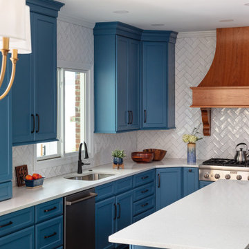
The range top was elegantly positioned at the kitchen's end, framed by a stylish cherry hood with sweeping curves and a classic herringbone tile pattern. This naturally formed a captivating focal point in the room. During the construction, we faced a hurdle due to a cross beam obstructing ceiling venting.
The formal dining room had two closely spaced doors, one from the kitchen and one from the hallway. To create a more functional pantry space and provide space for wall ovens, the kitchen entry was closed off. A highly efficient scullery-style pantry was designed with a 96” opening with 48" wide bi-passing doors; it features dedicated countertop zones for various large appliances that would be challenging to lift out of a cabinet.
The bookshelves were carefully designed to emphasize balance between the refrigerator and ovens, enhancing the flow and overall continuity of the expanded kitchen. The homeowner's vast cookbook collection, along with a few tchotchkes, adds personal character and color to the space. While this design element removed the option for a countertop next to the refrigerator and ovens, the homeowners were very comfortable with the sizeable adjacent island, which provides an ample landing zone.
Finally, the most daring choice is a bold blue hue. This topped with crisp white quartz countertops and warm cherry features, beautifully reflects the vibrant and joyful life of the family.
The spacious nook area transformed into an ideal indoor entertainment space that seamlessly complements gatherings inside and out. The choice of cherry cabinets, paired with striking black quartz countertops, was deliberate, as it added warmth to the area and established a solid connection to the stunning outdoor views.
Articulating arm sconces not only provided illumination but also highlighted the eclectic tiki-style glassware displayed on the floating shelves. Pendant lights strategically placed in front of each window improved countertop functionality, while the ceiling fan's light served as ambient illumination. The arm sconces, together with the brass-finished pendants, contributed to a cohesive design, extending the lighting theme from the adjacent nook area.

 Jarrett Design
Our clients immediately recognized the potential of the home located in a highly sought-after section of Allentown. The dated kitchen needed significant rethinking but our clients knew it could be turned into something beautiful and inspiring. And, indeed, they were right.
Busy professionals with an active social life, our clients wanted an inviting space to host both intimate dinner parties and large social gatherings. With this in mind, we worked to reimagine the flow of traffic from one room to another. Extraneous walls and a desk inconveniently positioned in the middle of the main kitchen thoroughfare needed to be removed and tight workspace aisles and narrow passageways demanded widening to help alleviate the problem.
In addition to the kitchen’s flow concerns, the dark and dated space needed brightening. The wall between the kitchen and family room was opened up to unite the two spaces allowing more light into both rooms. Windows were also added at the sink wall so the room could be flooded with bright morning sun, while also offering a beautiful view of the park below. All-white cabinetry was selected to help reflect the additional light.
An unfortunate challenge of expanding the windows meant there were fewer wall cabinets to store dishes. We turned to the island where we installed large dish drawers featuring wood pegged interiors. We also relied on wall-to-counter cabinets for additional storage to help keep the room clutter-free as appliances were neatly tucked behind doors. A new, built-in pantry was also added.
The finished kitchen unites traditional with today and elegance with comfort to ensure perfection. We are thrilled for our clients who have an abundance of good taste, an eye for what is possible and a drive to see it accomplished.
Jacqueline Powell Photography


 Dream Kitchens
The kitchen in this contemporary style home seemed to be an afterthought. While the rest of the house is open and expansive, the kitchen was small and detached, especially for a couple who loves to entertain. The very large and adjacent dining room seemed a more likely location for a kitchen, but they resisted the thought of swapping the two spaces. So their designer created a layout that allowed for a second – and larger – opening to the dining room and the expansive, light-filled living space beyond.
A peninsula attaches to the wall that remained between the two openings. There the sink is located so that during food preparation or cleanup there is a view through the windows and the opportunity to socialize with people gathered at the countertop. The seating area is curved to encourage people to gather and chat. The granite countertop choice was a case of love at first sight for this homeowner since it brought his favorite shade of blue into the kitchen.
The cooking center is spread out along the wall at the back of the house. There the eye-catching stainless steel hood creates a focal point above the sleek, low-profile cooktop. Glass tile pulls color from the countertops onto the wall where it glimmers in the light. One oven combined with a microwave/convection oven meet their cooking needs and the stainless steel adds brightness to the room.
The stainless steel refrigerator is just a few steps away from the work center and the seating area and is easily accessible from other parts of the house. The original kitchen featured only one small window in addition to the sliding glass doors. Since it was almost new and the house had been resided, a second window was joined to the first, and cabinetry beneath them anchors them in the space. A tall pantry cabinet completes the kitchen, providing high quality storage and visual balance in this redesign.
Sleek cherry cabinets give this kitchen a decidedly contemporary style. They were stained just enough to add warmth and color and are enhanced with oversized stainless steel pulls.
From this redesigned space you can see into the main house and see out through the many windows there. When combined with a new layout that provides better traffic flow, there’s a new feeling of spaciousness to the kitchen. It’s no longer an afterthought. It’s an integral part of this home’s living space, enhancing the home and the lifestyle of its owners.
Photography By Scott Sherman
 Michael Nash Design, Build & Homes
When the homeowners purchased this traditional colonial in Vienna, Virginia, they were already planning on making some serious changes. The home’s original floor plan was boxy and closed in, making traffic flow from one room to the next virtually non-existent. Additionally, the existing décor left a lot to be desired. Their vision was to open up the layout and create a more contemporary look using lots of light, soft colors and high end materials.
They decided to add a two-story addition to the back of the home’s existing breakfast room and the small upstairs bedroom above it. The old breakfast area was too small for their daily meals and their teenage son needed more space in his bedroom. They also decided to add a sunroom/family room to the left side of their old family room. This new room offers a vaulted ceiling with four skylights and lots of windows with a better view of the side and backyard.
To create a more open floor plan, the team at Michael Nash Design, Build & Homes removed the load bearing wall between the kitchen and family room and installed a large beam to handle the second floor load. Not only did this open up the space, but it allowed for the addition of a breakfast bar.
The right side bearing wall of the old family room was also removed and replaced with structural beams. This action created a continuous flow between the new sunroom and old family room. Separated by a double-sided stone fireplace, this new sunroom is connected to a new outside sun deck built using a maintenance-free decking material. The old family room with new lighting now serves as a casual seating area. It also features an eight-foot long built-in desk.
The newly updated kitchen features granite countertops with matching tile backsplash, professional-quality appliances, a porcelain tile floor and custom cabinets, including a large pantry. The new breakfast room is more spacious and gets daylight from three different angles.
Upstairs, a new 12’ x 20’ bedroom is a great place for this teenage football fan to hang out. It provides significantly more closet space than the old room and lets in more sunlight as well.
The old laundry room was converted to a new mudroom with locker style cabinetry and a place for kids to store their bag packs. New plumbing and electrical were implemented in a new closet in an upper hallway to facilitate the new washer and dryer.
In this remodel, form and function have come together in an open concept design that meets the needs of the entire family.
 Michael Nash Design, Build & Homes
2010 REGIONAL AWARD WINNER
Built in 2000, this center hall colonial in Fairfax Station, Virginia had a kitchen that was neither functional nor aesthetically pleasing.
First, the floor plan was poorly rationalized. The work triangle was inefficient, a large pantry took up too much floor space, and a series of railings between the kitchen and family room obstructed traffic flow.
Aesthetically, the space was dated. Dutch cabinetry, floral wallpaper and a faux Victorian chandelier all cried for an update. Additionally, the homeowners wanted to incorporate high-end appliances and other amenities like a wine cooler and steam cooker.
Overall, the owners were seeking to replace worn out-of-style kitchen with a substantially upgraded “open” facility that combines traditional and contemporary features configured to support multiple social and culinary needs.
Working with Michael Nash Design, Build & Homes, they decided to implement a series of strategic revisions that would support their new use goals.
First, they removed an obstructive bearing wall between the existing kitchen and mudroom, creating a recessed niche for a new 48” gas range with custom hood. An unused desk taken out provided a spot for the new 48” two-drawer refrigerator/freezer.
A custom-designed L-shaped granite-surfaced island with bar sink, icemaker and mini-drawer refrigerator takes center stage in the space and offers seating for six. Now the chef can entertain guests while preparing the meal.
From an aesthetic point of view, the interior features are nothing less than stunning. Softly painted walls, decorative ceramic tile backsplashes and granite surfaces combine with custom made cabinets to create an elegant space. Antiqued soft-opaque cabinet facings, wood panel refrigerator door inserts, glass-facing display cabinets and a custom mantle range hood are true works of craftsmanship. Fine detail is expressed with flutes and corbels. Beauty is truly in the details of this award-winning kitchen.
 Vitralum Glass Solutions Inc
Elevate Your Space with Glass Partitions: A Boundaryless Solution for Enhanced Aesthetics and Functionality
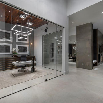
Transform your commercial or residential space with the elegance and versatility of glass partitions. Our meticulously crafted glass partitions seamlessly divide and define any area without compromising the overall openness and flow of your environment. Whether you're seeking to create private enclaves in your office or enhance the visual appeal of your home, our glass partitions offer an unparalleled solution.
Unleash the Beauty of Tempered Glass
At the heart of our glass partitions lies the exceptional quality of our tempered glass. This robust material undergoes a rigorous heat treatment process, resulting in enhanced strength and durability. Our tempered glass partitions are:
Impact-resistant: Withstand accidental bumps and collisions, ensuring safety and longevity.
Heat-resistant: Can endure extreme temperature fluctuations without warping or cracking.
Scratch-resistant: Maintain their pristine appearance, even in high-traffic areas.
Aesthetics and Functionality in Harmony
Our glass partitions go beyond mere room dividers; they serve as architectural masterpieces that elevate the visual appeal of any space. The transparency of glass allows natural light to permeate throughout, creating a sense of spaciousness and fostering a brighter, more welcoming ambiance.
Why Choose Glass Partitions?
Enhanced privacy: Create designated workspaces or private areas without sacrificing an open layout.
Improved noise reduction: Minimize distractions and maintain a focused work environment.
Versatility: Adapt to any interior design style, from modern minimalism to classic elegance.
Low maintenance: Easy to clean and maintain, ensuring a lasting shine.
Unlock the Potential of Your Space
Whether you're a business owner seeking to optimize your office space or a homeowner looking to enhance the functionality and aesthetics of your residence, our glass partitions offer a transformative solution. Contact us today to discover how our glass partitions can elevate your space to new heights.
 Jarrett Design
Our clients immediately recognized the potential of the home located in a highly sought-after section of Allentown. The dated kitchen needed significant rethinking but our clients knew it could be turned into something beautiful and inspiring. And, indeed, they were right.
Busy professionals with an active social life, our clients wanted an inviting space to host both intimate dinner parties and large social gatherings. With this in mind, we worked to reimagine the flow of traffic from one room to another. Extraneous walls and a desk inconveniently positioned in the middle of the main kitchen thoroughfare needed to be removed and tight workspace aisles and narrow passageways demanded widening to help alleviate the problem.
In addition to the kitchen’s flow concerns, the dark and dated space needed brightening. The wall between the kitchen and family room was opened up to unite the two spaces allowing more light into both rooms. Windows were also added at the sink wall so the room could be flooded with bright morning sun, while also offering a beautiful view of the park below. All-white cabinetry was selected to help reflect the additional light.
An unfortunate challenge of expanding the windows meant there were fewer wall cabinets to store dishes. We turned to the island where we installed large dish drawers featuring wood pegged interiors. We also relied on wall-to-counter cabinets for additional storage to help keep the room clutter-free as appliances were neatly tucked behind doors. A new, built-in pantry was also added.
The finished kitchen unites traditional with today and elegance with comfort to ensure perfection. We are thrilled for our clients who have an abundance of good taste, an eye for what is possible and a drive to see it accomplished.
Jacqueline Powell Photography
 Michael Nash Design, Build & Homes
2010 REGIONAL AWARD WINNER
Built in 2000, this center hall colonial in Fairfax Station, Virginia had a kitchen that was neither functional nor aesthetically pleasing.
First, the floor plan was poorly rationalized. The work triangle was inefficient, a large pantry took up too much floor space, and a series of railings between the kitchen and family room obstructed traffic flow.
Aesthetically, the space was dated. Dutch cabinetry, floral wallpaper and a faux Victorian chandelier all cried for an update. Additionally, the homeowners wanted to incorporate high-end appliances and other amenities like a wine cooler and steam cooker.
Overall, the owners were seeking to replace worn out-of-style kitchen with a substantially upgraded “open” facility that combines traditional and contemporary features configured to support multiple social and culinary needs.
Working with Michael Nash Design, Build & Homes, they decided to implement a series of strategic revisions that would support their new use goals.
First, they removed an obstructive bearing wall between the existing kitchen and mudroom, creating a recessed niche for a new 48” gas range with custom hood. An unused desk taken out provided a spot for the new 48” two-drawer refrigerator/freezer.
A custom-designed L-shaped granite-surfaced island with bar sink, icemaker and mini-drawer refrigerator takes center stage in the space and offers seating for six. Now the chef can entertain guests while preparing the meal.
From an aesthetic point of view, the interior features are nothing less than stunning. Softly painted walls, decorative ceramic tile backsplashes and granite surfaces combine with custom made cabinets to create an elegant space. Antiqued soft-opaque cabinet facings, wood panel refrigerator door inserts, glass-facing display cabinets and a custom mantle range hood are true works of craftsmanship. Fine detail is expressed with flutes and corbels. Beauty is truly in the details of this award-winning kitchen.
 Tile Doctor Ltd
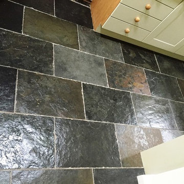
This small rough Chinese Slate floor in the kitchen of a house in the village of Cheadle near Stockport in Greater Manchester had not had any sealer put on it for many years and was very grubby (dishevelled as described by the customer) looking even after the customer had tried to clean it.
Sealers do take a lot of punishment, especially in a high traffic area such as a small kitchen and will wear off over time and once this happens the floor will start to lose its appearance as dirt becomes ingrained in the stone and it can no longer be cleaned effectively.
As we have to apply a liberal amount of water with this sort of work, the first step was to remove the Kicker boards at the bottom of the Kitchen units and silicone the Kitchen units that were fixed; this stops water seeping in and blowing the MDF allowing us to concentrate on cleaning the Slate without causing any damage.
I started the cleaning process by applying a strong dilution of Tile Doctor Pro-Clean to get rid of the built up dirt and any remaining sealer, leaving it to soak into the Slate before scrubbing the floor with a black scrub pad fitted to buffing machine running at slow speed. Tile Doctor Pro-Clean is a strong alkaline cleaner/stripper that is safe to use on natural stone, we do have stronger products available if required but in this case a strong dilution of Pro-Clean was sufficient to tackle any remaining sealer.
This process gave the Slate and grout lines a good deep clean and after rinsing the floor with water which was then extracted using a wet vacuum I repeated the process on stubborn areas until satisfied the floor was as clean and free of old sealer. Last stage of the cleaning process was to give the floor a final rinse and then get it as dry as possible using the wet vacuum to soak up the moisture.
The floor was quite small so I was able to leave the floor to dry off over lunch time and then on my return managed to get it fully dry with a little heat from a heat gun. The customer wanted a mat finish so once dry I applied Tile Doctor Colour Grow sealer which impregnates into the pores of the natural stone protecting it from within and enhancing the natural colours of the Slate at the same time.
For general cleaning of Sealed stone floors, we recommend the use of a PH Neutral Cleaner as anything with a strong PH will degrade the life of the sealer over time.
Steve Keary
Greater Manchester Tile Doctor

 Bingham Lumber, Inc
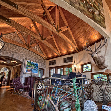
This flooring is a Beam Sawn Reclaimed Oak Flooring finished with a clear tung oil finish. The beams sawn oak is characterized by having a more consistent color than flooring run from barn board but maintains the patina and grain, only possible with reclaimed materials.
Sponsored
Columbus, OH

Structural Remodeling
Franklin County's Heavy Timber Specialists | Best of Houzz 2020!

 ETO Doors
Please Note: White Oak French Doors are supplied unfinished (images may depict a finished door).
Premium White Oak French Doors – Timeless Elegance & Lasting Durability
Enhance your home or office with the 1-Lite White Oak French Door, meticulously crafted from a solid white oak core for exceptional durability and natural beauty. Featuring a full-lite glass panel, this door maximizes natural light while offering a sophisticated and timeless aesthetic. Whether used as a patio door, interior divider, or exterior entry, this versatile exterior white oak 1-lite full view french door with square sticking glass stop seamlessly complements modern, contemporary, and traditional designs.
Designed for residential and commercial applications, our 1-lite white oak French doors are the perfect solution for high-traffic environments, including multifamily homes, offices, and hotels.
Why Choose ETO Doors?
✔ Free Samples: Request a French Door Corner Sample to experience the superior quality of ETO Doors.
✔ Trade Discounts: Exclusive pricing available for contractors, architects, and designers.
✔ Best Prices Nationwide: We leverage mass production to manufacture high-quality solid core white oak French doors at the most competitive prices, passing significant savings directly to you.
✔ Versatile Applications: Our white oak French doors are ideal for new construction, renovations, and remodeling projects in both residential and commercial spaces.
✔ Customization Available: We offer custom sizing and design options to ensure the perfect fit for your project.
Upgrade Your White Oak French Door with These Optional Features (Available at an Additional Cost)
Low-E Glass: Choose dual-tempered Low-E glass to enhance energy efficiency, reduce noise, and lower heating and cooling costs.
Pre-Hanging: Available pre-hung for interior or exterior use, with engineered white oak jambs or finger-jointed primed jambs. Offered in single or double pre-hung door units, with optional side-lites.
Hurricane Impact Certification: Our Miami-Dade approved impact-rated white oak French doors provide superior storm protection. Designed to meet Florida Building Code Compliance, these hurricane-resistant doors offer maximum durability and safety.


 Corvus Construction
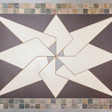
Sometimes great things come from small things and this entryway project was exactly like that. This very small yet interesting project started almost by accident.
Entryway TileI had completed a tile job a few months before and had some high quality porcelain tile left over. It was nice tile so I was hesitant to toss it out but after moving the pile around my shop for several months I finally decided to throw it away. While loading my pickup with miscellaneous construction garbage – and this great tile – one of my neighbors stopped by for a chat about some of my recent projects.
I showed him the great left over tile that I was throwing away and asked him if he had any interest in taking it off my hands – for free. He said he was actually thinking about replacing his existing tile landing at his house because although it had been redone just a few years ago, it had cracked. We went over and took a look at his landing and decided the scrap tile might be a perfect solution.
tile floorI told my neighbor “you come up with any design you want, and I’ll bring that to life.” He came up with an idea and sketched out the idea within a couple of days. As soon as I looked at the sketches, I knew it was going to be a very challenging project, but I also knew it would be a rewarding project I would be proud to put the Corvus name on.
We took the final sketch and imported it into a graphics design program to make the focal point of the design work within the existing space and fine tune the look of the project to fit the available space of the entryway. This was going to be a highly customized undertaking that was going to be all about the details.
Because every tile had to be custom cut, I printed out the final design from the program to create a stencil to trace the outline on each tile. After all of the painstaking tile cutting, I laid it out in a mock-up on the entry floor. Then we were ready to overcome our next challenge – the flexing and moving sub floor.
The existing tile landing that we were replacing had been installed just a few years earlier but had already cracked down the center. This fracture made me realize that we needed to find a way to somehow decouple the substrate from the finished tile surface to prevent the same problem from cropping up again.
tile floor entrywayI decided to go with a Schluter-DITRA™ tile underlay for this job. Working with DITRA™ was surprisingly simple. The only thing you need to remember is to use unmodified thinset mortar when setting tile over this substrate, because modified thinset would take a very long time to cure. We also decided to use QuartzLock™ urethane grout for the floor because it expands and contracts when the floor flexes under foot traffic and could help prevent future cracking.
In the end the project came out great! My neighbor is thrilled and can’t wait to show it off to anyone that stops by. This is a great example of how custom work can really amp up the appeal of your home and how a small change can make a big difference in the look of your home.
145