
Search results for "Hinting" in Home Design Ideas

 Dura Supreme Cabinetry
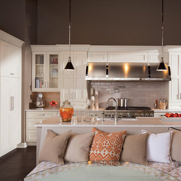
This white-on-white kitchen design has a transitional style and incorporates beautiful clean lines. It features a Personal Paint Match finish on the Kitchen Island matched to Sherwin-Williams "Threshold Taupe" SW7501 and a mix of light tan paint and vibrant orange décor. These colors really pop out on the “white canvas” of this design. The designer chose a beautiful combination of white Dura Supreme cabinetry (in "Classic White" paint), white subway tile backsplash, white countertops, white trim, and a white sink. The built-in breakfast nook (L-shaped banquette bench seating) attached to the kitchen island was the perfect choice to give this kitchen seating for entertaining and a kitchen island that will still have free counter space while the homeowner entertains.
Design by Studio M Kitchen & Bath, Plymouth, Minnesota.
Request a FREE Dura Supreme Brochure Packet:
https://www.durasupreme.com/request-brochures/
Find a Dura Supreme Showroom near you today:
https://www.durasupreme.com/request-brochures
Want to become a Dura Supreme Dealer? Go to:
https://www.durasupreme.com/become-a-cabinet-dealer-request-form/
 Allen Construction
Architect: Thompson Naylor; Landscape: everGREEN Landscape Architects; Photography: Jim Bartsch Photography
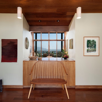
Inspiration for a mid-century modern dark wood floor foyer remodel in Santa Barbara with white walls
Inspiration for a mid-century modern dark wood floor foyer remodel in Santa Barbara with white walls
Find the right local pro for your project
 Charlie & Co. Design, Ltd
Design: Charlie & Co. Design | Builder: John Kraemer & Sons | Interiors & Photo Styling: Lucy Interior Design | Susan Gilmore Photography
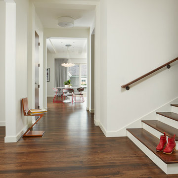
Example of a trendy medium tone wood floor entry hall design in Minneapolis with white walls
Example of a trendy medium tone wood floor entry hall design in Minneapolis with white walls
 James Michael Howard
Eric Piasecki and Josh Gibson
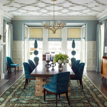
Great room - large traditional dark wood floor great room idea in New York with blue walls, a standard fireplace and a stone fireplace
Great room - large traditional dark wood floor great room idea in New York with blue walls, a standard fireplace and a stone fireplace

 Rellion Homes
This is a remodel of small home in Pacific Palisades, Los Angeles, just off Sunset Blvd. The goals of this project are to reconfigure the floor plan and to meet current homeowner's needs and update its aesthetics to current tastes suitable in that area. To achieve these goals, the interior of the house was completely gutted and reconfigured and the exterior was removed and wrapped with new siding. Since the house is close to ocean and surrounded by celebrities' mansions, the interior design is slightly eclectic with a mix of coastal casual with a hint of modern Hollywood glam.


 The Lifestyle Lab
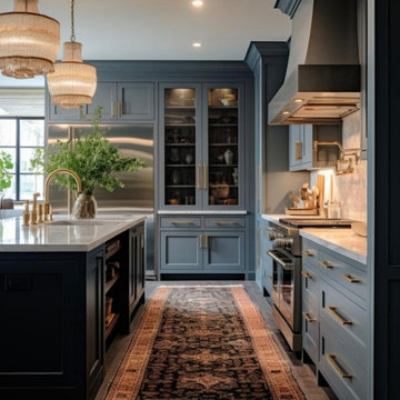
Smokey Blue Kitchen: A Blend of Classic Elegance and Modern Flair
This kitchen design showcases a harmonious balance of sophistication and warmth, where smokey blue cabinetry sets the tone for an inviting yet stylish space. Thoughtful details such as brass hardware and a striking black island create depth and visual interest, while natural stone countertops bring a touch of organic beauty.
Key Features of This Kitchen Design:
Smokey Blue Cabinets: The cabinetry’s soft, smoky blue color adds a layer of elegance and tranquility, making the kitchen feel welcoming and refined. This hue serves as the perfect backdrop for other design elements, exuding both charm and contemporary appeal.
Natural Stone Countertops: Luxurious, natural stone countertops with subtle veining offer durability and timeless beauty. Their organic patterns pair perfectly with the blue cabinets, adding texture and a natural touch that grounds the space.
Brass Hardware: Polished brass handles and knobs introduce warmth and a hint of luxury, standing out against the smokey blue and complementing the black island. The brass accents elevate the overall design and tie in seamlessly with transitional or traditional styles.
Black Island: The bold, black island serves as a dramatic centerpiece, providing a striking contrast to the softer tones of the surrounding cabinets. This focal point not only enhances the color palette but also adds a touch of modernity.
Pops of Color: Thoughtfully chosen decorative elements, patterned textiles, add personality and liveliness without overpowering the sophisticated color scheme.
Glass Elegance: Glass-front cabinets or pendant lights with glass detailing contribute to an airy, open feel while adding a touch of refinement. These elements subtly reflect light and elevate the kitchen’s ambiance.
This smokey blue kitchen is a masterful blend of classic and contemporary design. The use of brass hardware, natural stone, and a bold black island alongside glass details creates a space that is not only elegant but also rich with character and warmth.
 Artistic Kitchens - Kristi Hodson
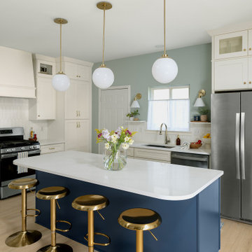
Inspired by the colors and relaxed beauty of the coast, this kitchen combines creamy white cabinets with white countertops and backsplash for a casual yet refined feel. A deep navy island and brass accents bring contrast and personality while keeping the look timeless. The original layout included a dysfunctional pantry, an angled peninsula, and a small pass-through to the living room that blocked most of the view. By removing those elements and opening the wall completely, the kitchen now feels bright, open, and connected. A new island with seating for four gives this family a place to gather for breakfast or evening conversation. Every detail, from the warm cabinet tones to the soft lighting and tailored hardware, was chosen to create a space that feels both comfortable and elevated, bringing a hint of the Amalfi Coast to everyday life.
 Pizzale Design Inc.
A person’s home is the place where their personality can flourish. In this client’s case, it was their love for their native homeland of Kenya, Africa. One of the main challenges with these space was to remain within the client’s budget. It was important to give this home lots of character, so hiring a faux finish artist to hand-paint the walls in an African inspired pattern for powder room to emphasizing their existing pieces was the perfect solution to staying within their budget needs. Each room was carefully planned to showcase their African heritage in each aspect of the home. The main features included deep wood tones paired with light walls, and dark finishes. A hint of gold was used throughout the house, to complement the spaces and giving the space a bit of a softer feel.
 Lola Cwikowski Studio
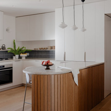
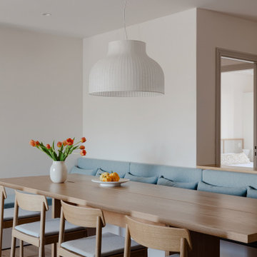
An Ohio family in search of a place to enjoy the Portuguese coast acquired a four-bedroom apartment just outside the center of Cascais. Our studio was engaged to turn a compartmented interior into a holiday residence for a household that gathers in numbers: one that could seat everyone at once and still hold the ease and lightness of a home by the beach.
The original plan included a kitchen and laundry room sealed off from the living room, floor finishes and levels that changed from threshold to threshold, and bathrooms in varying styles. Work began by redefining the alignments and circulation. The principal transformation was the opening of the kitchen, creating a more generous social setting centered on a bespoke island fitted with storage and seating.
The interior takes its cues from the building’s geometric façade, which projects and recedes in volumes and voids. Bespoke joinery in oak and lacquer carries continuity and order through the apartment. Concealed storage runs throughout: at the entrance, in the dining area, along the living area, and beneath built-in benches. The laundry is merged into the kitchen behind perforated doors for ventilation while keeping the service area discreet. Behind the sofa, a console slips a workspace into the living area without conceding its openness.
Curved elements answer the rectilinear architecture; artisanal glazed vertical tiles repeat from the backsplashes onto custom side tables. The palette stays deliberately narrow; the muted oak and lacquer are joined by a softened timber floor, Portuguese Lioz stone, and walls painted to the color of bare plaster. Existing doors and baseboards were repainted in a warm light gray that draws the original elements into the language of the new interior. Upholstery and decorative accents hint at the terracotta, sky blue, and yellow of the façade.
The bedrooms are set with upholstered headboards on oak frames, bedside tables that extend those outlines, and wardrobes fit for a long stay. Locally made rugs, bedcovers, and throw pillows soften the composition. In the bathrooms, the plans were reorganized and the showers enlarged. Lioz was used for the counters and sinks, shelves, shower bases, and bathtub surround, with microcement bringing a soothing warmth to the walls, and storage in floating cabinets. Deeper in tone than the rest of the apartment yet never dim, they are quietly elegant rooms made for lingering — taking one’s time getting ready, or unwinding at the end of a day.
PHOTOGRAPHY: © ALEXANDER BOGORODSKIY
 Lola Cwikowski Studio
An Ohio family in search of a place to enjoy the Portuguese coast acquired a four-bedroom apartment just outside the center of Cascais. Our studio was engaged to turn a compartmented interior into a holiday residence for a household that gathers in numbers: one that could seat everyone at once and still hold the ease and lightness of a home by the beach.
The original plan included a kitchen and laundry room sealed off from the living room, floor finishes and levels that changed from threshold to threshold, and bathrooms in varying styles. Work began by redefining the alignments and circulation. The principal transformation was the opening of the kitchen, creating a more generous social setting centered on a bespoke island fitted with storage and seating.
The interior takes its cues from the building’s geometric façade, which projects and recedes in volumes and voids. Bespoke joinery in oak and lacquer carries continuity and order through the apartment. Concealed storage runs throughout: at the entrance, in the dining area, along the living area, and beneath built-in benches. The laundry is merged into the kitchen behind perforated doors for ventilation while keeping the service area discreet. Behind the sofa, a console slips a workspace into the living area without conceding its openness.
Curved elements answer the rectilinear architecture; artisanal glazed vertical tiles repeat from the backsplashes onto custom side tables. The palette stays deliberately narrow; the muted oak and lacquer are joined by a softened timber floor, Portuguese Lioz stone, and walls painted to the color of bare plaster. Existing doors and baseboards were repainted in a warm light gray that draws the original elements into the language of the new interior. Upholstery and decorative accents hint at the terracotta, sky blue, and yellow of the façade.
The bedrooms are set with upholstered headboards on oak frames, bedside tables that extend those outlines, and wardrobes fit for a long stay. Locally made rugs, bedcovers, and throw pillows soften the composition. In the bathrooms, the plans were reorganized and the showers enlarged. Lioz was used for the counters and sinks, shelves, shower bases, and bathtub surround, with microcement bringing a soothing warmth to the walls, and storage in floating cabinets. Deeper in tone than the rest of the apartment yet never dim, they are quietly elegant rooms made for lingering — taking one’s time getting ready, or unwinding at the end of a day.
PHOTOGRAPHY: © ALEXANDER BOGORODSKIY
 Windle Design & Construction
David Woodall- Kingdom Works Media
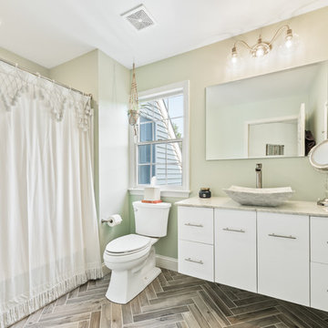
Inspiration for a transitional 3/4 gray floor bathroom remodel in Philadelphia with flat-panel cabinets, white cabinets, a two-piece toilet, green walls, a vessel sink and gray countertops
Inspiration for a transitional 3/4 gray floor bathroom remodel in Philadelphia with flat-panel cabinets, white cabinets, a two-piece toilet, green walls, a vessel sink and gray countertops
 Flourish Interiors by Vanessa C Smith
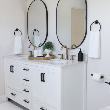
Just a small touch of greenery, real or faux, can add a lot of depth to a design. While we always prefer fresh blooms and stems, even high quality artificial greenery still adds visual interest. In Indiana, where the winter days are short and sunshine is hard to find...the added organic detail is a welcome hint of nature.
 DEANE Inc | Distinctive Design & Cabinetry
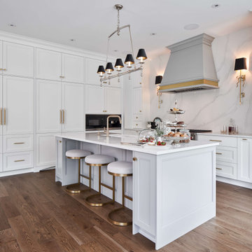
The second home of a California-based family was intended to use as an East-coast gathering place for their extended family. It was important to deliver elegant, indoor-outdoor living. The kitchen was designed to be the center of this newly renovated home, with a good flow for entertaining and celebrations. The homeowner wanted the cooktop to be in the island facing outward to see everyone. The seating area at the island has a thick, walnut wood countertop that delineates it from the rest of the island's workspace. Both the countertops and backsplash feature a Polished Naica Quartzite for a cohesive effect, while white custom cabinetry and satin brass hardware add subtle hints of glamour. The decision was made to panel the SubZero appliances for a seamless look, while intelligent space planning relocated the door to the butler's pantry/mudroom, where the wine unit and additional sink/dishwasher for large-scale entertaining needs were housed out of sight.
 Astro Design Inc.
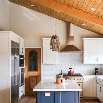
The client wished to have a kitchen that was elegant but still proved to be an ideal space to raise their family.
An open concept living, dining and kitchen with large windows looking out into the forest welcomes plenty of natural light into the space. This layout allows the designer to work more freely and design
a kitchen that is simple yet elegant.
Through the use of a neutral colour palette with a hint of a blue under tone on the finish of the island cabinetry and hood, the designer further opens up the space and emphasizes the high ceiling.
This helps draw and welcome guests and family into the kitchen. The detail of the double shaker door style on the cabinets offers a contemporary or transitional style. This gives a sense of familiarity making the space feel more at home.
 Alicia Paley Home Interiors
This whole house renovation went from 1960's dated, to easy farmhouse style. Hints of blue are found throughout.
Inspiration for a large country kitchen remodel in Los Angeles
Inspiration for a large country kitchen remodel in Los Angeles
 Fiori Interior Design, LLC
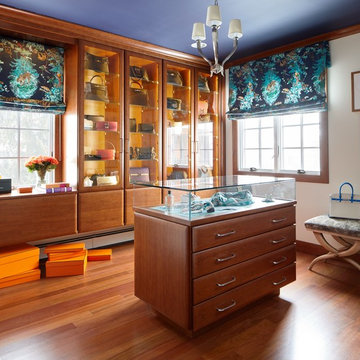
Our “challenge” facing these empty nesters was what to do with that one last lonely bedroom once the kids had left the nest. Actually not so much of a challenge as this client knew exactly what she wanted for her growing collection of new and vintage handbags and shoes! Carpeting was removed and wood floors were installed to minimize dust.
We added a UV film to the windows as an initial layer of protection against fading, then the Hermes fabric “Equateur Imprime” for the window treatments. (A hint of what is being collected in this space).
Our goal was to utilize every inch of this space. Our floor to ceiling cabinetry maximized storage on two walls while on the third wall we removed two doors of a closet and added mirrored doors with drawers beneath to match the cabinetry. This built-in maximized space for shoes with roll out shelving while allowing for a chandelier to be centered perfectly above.
91