
Search results for "Ideal spot" in Home Design Ideas
 Talon Construction Inc.
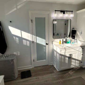
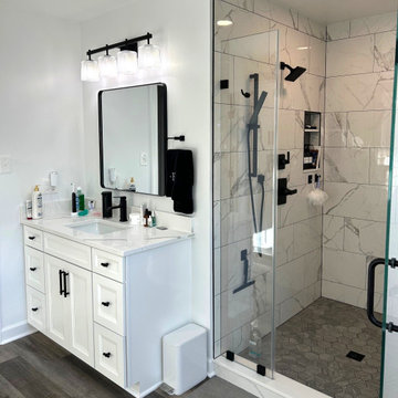
This primary bathroom remodel in Olney, Maryland, showcases a sophisticated transition from traditional architecture to a clean, modern aesthetic. The design centers on a high-contrast palette of crisp whites, deep blacks, and warm wood tones, creating a bright and functional sanctuary.
Design Highlights
Walk-In Shower: The curbless shower features large-format marble-veined wall tiles paired with a dark grey hexagonal mosaic floor. Matte black hardware, including a rain showerhead and a handheld wand, provides a bold, contemporary finish.
Vanity & Storage: Dual white shaker-style vanities are topped with white quartz counters featuring subtle grey veining. Minimalist matte black faucets and pulls tie the look together. A custom window bench with drawer storage sits beneath the large arched window, maximizing utility and seating.
Lighting & Fixtures: Modern four-light vanity fixtures with textured glass shades provide ample illumination. Rounded-corner black framed mirrors add a soft geometric touch to the workspace.
Flooring: Durable luxury vinyl plank (LVP) flooring in a multi-tonal wood finish adds warmth to the space and balances the cooler tones of the cabinetry and tile.
Architectural Features: The original arched window and vaulted ceiling were preserved and enhanced with custom plantation shutters, allowing for privacy without sacrificing the room's natural light.
Frequently Asked Questions
What are the benefits of using large-format tile in a shower?
Large-format tiles create a more seamless appearance by reducing the number of grout lines. This not only makes the space feel larger and more open but also significantly reduces the surface area where mold and mildew can accumulate, making the shower easier to clean.
Why choose matte black hardware over chrome or brushed nickel?
Matte black serves as a strong "anchor" in a white bathroom, providing a high-contrast, modern look that hides water spots and fingerprints more effectively than polished finishes. It pairs exceptionally well with various wood tones and stone patterns.
Is luxury vinyl plank (LVP) a good choice for a bathroom?
Yes, high-quality LVP is 100% waterproof, making it an ideal choice for bathrooms. It offers the aesthetic warmth of hardwood—which is susceptible to moisture damage—with the durability and slip resistance needed for a wet environment.
How does a custom window bench improve a bathroom layout?
Beyond providing a place to sit, a custom bench utilizes the often-underused space beneath a window for extra storage. It creates a cohesive, "built-in" look that ties the vanities together and adds a high-end, furniture-like quality to the room.
What is the advantage of a "design-build" approach for a remodel like this?
The design-build model integrates both the design and construction phases into a single contract. This ensures that the aesthetic vision stays within the established budget and allows for better communication between the designers and the craftsmen during the actual renovation.
 Sosna Inc
Our clients, a vibrant young family with two energetic kids and a playful dog, were feeling the constraints of their outdated, cramped house. The Main Floor was divided by walls, fragmenting the Kitchen, Dining Room, and living areas, making family time and entertaining a bit of a struggle.
The Kitchen was small and dim, lacking counter space and storage. The kids' study/play table was squeezed into a tight corner, emphasizing the lack of space. The dark hardwood floors were scratched and worn, and the foyer felt cramped and uninviting. The powder room was also
The idea of a major renovation brought both excitement and a bit of anxiety. The couple was unsure about design decisions and worried about the challenges of dealing with structural columns and beams.
Collaborating with Sosna designer Camila, the family embarked on a journey to transform their outdated house into a bright, functional home.
To open up the space, walls were removed, creating a seamless flow between the foyer, living room, dining room, and kitchen.
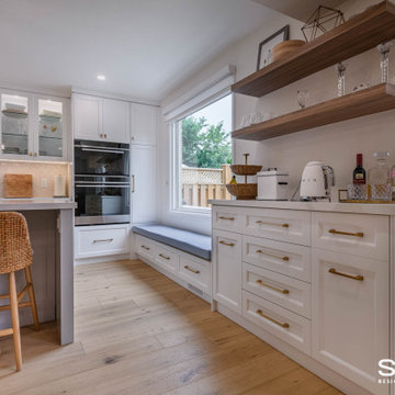
The kitchen was relocated and expanded to include generous counter space and a large island, providing the ideal spot for the kids to help prepare meals—a task they’ve come to enjoy since the renovation—or work on their homework. Additionally, the addition of a cozy window bench offers extra seating for hanging out with the family. It’s also the perfect place to curl up with a good book.
The once dark and gloomy powder room was completely refreshed with new fixtures, a white oak vanity, and beautiful floor tiles, which significantly brightened it up.
Additionally, the dark hardwood floors were replaced with a lighter, more modern option, brightening the entire main floor.
The renovation wasn't without its hiccups. A mix-up with the hardwood flooring led to a last-minute scramble for a replacement. But in the end, the family fell in love with the new flooring, proving that sometimes unexpected changes can lead to even better outcomes.
The renovation completely transformed the home. What was once a cramped and segmented main floor is now a bright, open space perfectly suited to the family's lifestyle. The new kitchen island became the heart of the home, providing a place for the kids to do homework while their parents cooked, fostering a sense of togetherness. The open layout also made hosting gatherings effortless.
Throughout the renovation, the kids and their dog brought a playful energy to the construction site, forming a special bond with the crew. Despite the challenges of living through a renovation, the family managed to maintain a sense of normalcy, working from home when possible and appreciating the crew's efforts to keep things tidy.
What started as a simple update turned into a full-scale transformation that reflects the family’s needs and personal style. Their willingness to embrace bold design choices, such as blush pink tiles and bright floral patterns, adds a unique touch to the space. And that hardwood flooring mix-up? It turned out to be a happy accident, resulting in a floor they love even more.
In the end, this renovation was more than just a home makeover; it was about creating a space that truly feels like home, nurturing family connections, and bringing joy to everyday life.
 Sosna Inc
Our clients, a vibrant young family with two energetic kids and a playful dog, were feeling the constraints of their outdated, cramped house. The Main Floor was divided by walls, fragmenting the Kitchen, Dining Room, and living areas, making family time and entertaining a bit of a struggle.
The Kitchen was small and dim, lacking counter space and storage. The kids' study/play table was squeezed into a tight corner, emphasizing the lack of space. The dark hardwood floors were scratched and worn, and the foyer felt cramped and uninviting. The powder room was also
The idea of a major renovation brought both excitement and a bit of anxiety. The couple was unsure about design decisions and worried about the challenges of dealing with structural columns and beams.
Collaborating with Sosna designer Camila, the family embarked on a journey to transform their outdated house into a bright, functional home.
To open up the space, walls were removed, creating a seamless flow between the foyer, living room, dining room, and kitchen.
The kitchen was relocated and expanded to include generous counter space and a large island, providing the ideal spot for the kids to help prepare meals—a task they’ve come to enjoy since the renovation—or work on their homework. Additionally, the addition of a cozy window bench offers extra seating for hanging out with the family. It’s also the perfect place to curl up with a good book.
The once dark and gloomy powder room was completely refreshed with new fixtures, a white oak vanity, and beautiful floor tiles, which significantly brightened it up.
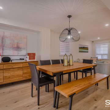
Additionally, the dark hardwood floors were replaced with a lighter, more modern option, brightening the entire main floor.
The renovation wasn't without its hiccups. A mix-up with the hardwood flooring led to a last-minute scramble for a replacement. But in the end, the family fell in love with the new flooring, proving that sometimes unexpected changes can lead to even better outcomes.
The renovation completely transformed the home. What was once a cramped and segmented main floor is now a bright, open space perfectly suited to the family's lifestyle. The new kitchen island became the heart of the home, providing a place for the kids to do homework while their parents cooked, fostering a sense of togetherness. The open layout also made hosting gatherings effortless.
Throughout the renovation, the kids and their dog brought a playful energy to the construction site, forming a special bond with the crew. Despite the challenges of living through a renovation, the family managed to maintain a sense of normalcy, working from home when possible and appreciating the crew's efforts to keep things tidy.
What started as a simple update turned into a full-scale transformation that reflects the family’s needs and personal style. Their willingness to embrace bold design choices, such as blush pink tiles and bright floral patterns, adds a unique touch to the space. And that hardwood flooring mix-up? It turned out to be a happy accident, resulting in a floor they love even more.
In the end, this renovation was more than just a home makeover; it was about creating a space that truly feels like home, nurturing family connections, and bringing joy to everyday life.
Find the right local pro for your project
 Sosna Inc
Our clients, a vibrant young family with two energetic kids and a playful dog, were feeling the constraints of their outdated, cramped house. The Main Floor was divided by walls, fragmenting the Kitchen, Dining Room, and living areas, making family time and entertaining a bit of a struggle.
The Kitchen was small and dim, lacking counter space and storage. The kids' study/play table was squeezed into a tight corner, emphasizing the lack of space. The dark hardwood floors were scratched and worn, and the foyer felt cramped and uninviting. The powder room was also
The idea of a major renovation brought both excitement and a bit of anxiety. The couple was unsure about design decisions and worried about the challenges of dealing with structural columns and beams.
Collaborating with Sosna designer Camila, the family embarked on a journey to transform their outdated house into a bright, functional home.
To open up the space, walls were removed, creating a seamless flow between the foyer, living room, dining room, and kitchen.
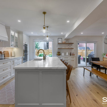
The kitchen was relocated and expanded to include generous counter space and a large island, providing the ideal spot for the kids to help prepare meals—a task they’ve come to enjoy since the renovation—or work on their homework. Additionally, the addition of a cozy window bench offers extra seating for hanging out with the family. It’s also the perfect place to curl up with a good book.
The once dark and gloomy powder room was completely refreshed with new fixtures, a white oak vanity, and beautiful floor tiles, which significantly brightened it up.
Additionally, the dark hardwood floors were replaced with a lighter, more modern option, brightening the entire main floor.
The renovation wasn't without its hiccups. A mix-up with the hardwood flooring led to a last-minute scramble for a replacement. But in the end, the family fell in love with the new flooring, proving that sometimes unexpected changes can lead to even better outcomes.
The renovation completely transformed the home. What was once a cramped and segmented main floor is now a bright, open space perfectly suited to the family's lifestyle. The new kitchen island became the heart of the home, providing a place for the kids to do homework while their parents cooked, fostering a sense of togetherness. The open layout also made hosting gatherings effortless.
Throughout the renovation, the kids and their dog brought a playful energy to the construction site, forming a special bond with the crew. Despite the challenges of living through a renovation, the family managed to maintain a sense of normalcy, working from home when possible and appreciating the crew's efforts to keep things tidy.
What started as a simple update turned into a full-scale transformation that reflects the family’s needs and personal style. Their willingness to embrace bold design choices, such as blush pink tiles and bright floral patterns, adds a unique touch to the space. And that hardwood flooring mix-up? It turned out to be a happy accident, resulting in a floor they love even more.
In the end, this renovation was more than just a home makeover; it was about creating a space that truly feels like home, nurturing family connections, and bringing joy to everyday life.
 Talon Construction Inc.
This primary bathroom remodel in Olney, Maryland, showcases a sophisticated transition from traditional architecture to a clean, modern aesthetic. The design centers on a high-contrast palette of crisp whites, deep blacks, and warm wood tones, creating a bright and functional sanctuary.
Design Highlights
Walk-In Shower: The curbless shower features large-format marble-veined wall tiles paired with a dark grey hexagonal mosaic floor. Matte black hardware, including a rain showerhead and a handheld wand, provides a bold, contemporary finish.
Vanity & Storage: Dual white shaker-style vanities are topped with white quartz counters featuring subtle grey veining. Minimalist matte black faucets and pulls tie the look together. A custom window bench with drawer storage sits beneath the large arched window, maximizing utility and seating.
Lighting & Fixtures: Modern four-light vanity fixtures with textured glass shades provide ample illumination. Rounded-corner black framed mirrors add a soft geometric touch to the workspace.
Flooring: Durable luxury vinyl plank (LVP) flooring in a multi-tonal wood finish adds warmth to the space and balances the cooler tones of the cabinetry and tile.
Architectural Features: The original arched window and vaulted ceiling were preserved and enhanced with custom plantation shutters, allowing for privacy without sacrificing the room's natural light.
Frequently Asked Questions
What are the benefits of using large-format tile in a shower?
Large-format tiles create a more seamless appearance by reducing the number of grout lines. This not only makes the space feel larger and more open but also significantly reduces the surface area where mold and mildew can accumulate, making the shower easier to clean.
Why choose matte black hardware over chrome or brushed nickel?
Matte black serves as a strong "anchor" in a white bathroom, providing a high-contrast, modern look that hides water spots and fingerprints more effectively than polished finishes. It pairs exceptionally well with various wood tones and stone patterns.
Is luxury vinyl plank (LVP) a good choice for a bathroom?
Yes, high-quality LVP is 100% waterproof, making it an ideal choice for bathrooms. It offers the aesthetic warmth of hardwood—which is susceptible to moisture damage—with the durability and slip resistance needed for a wet environment.
How does a custom window bench improve a bathroom layout?
Beyond providing a place to sit, a custom bench utilizes the often-underused space beneath a window for extra storage. It creates a cohesive, "built-in" look that ties the vanities together and adds a high-end, furniture-like quality to the room.
What is the advantage of a "design-build" approach for a remodel like this?
The design-build model integrates both the design and construction phases into a single contract. This ensures that the aesthetic vision stays within the established budget and allows for better communication between the designers and the craftsmen during the actual renovation.
 TKS Design Group
Download our free ebook, Creating the Ideal Kitchen. DOWNLOAD NOW
As with most projects, it all started with the kitchen layout. The home owners came to us wanting to upgrade their kitchen and overall aesthetic in their suburban home, with a combination of fresh paint, updated finishes, and improved flow for more ease when doing everyday activities.
A monochromatic, earth-toned palette left the kitchen feeling uninspired. It lacked the brightness they wanted from their space. An eat-in table underutilized the available square footage. The butler’s pantry was out of the way and hard to access, and the dining room felt detached from the kitchen.
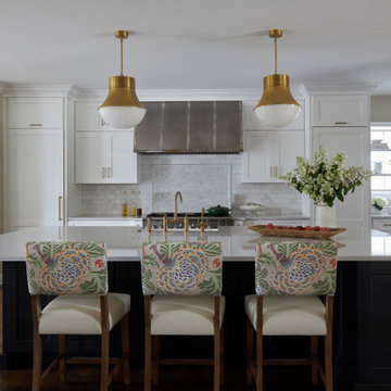
Lead Designer, Stephanie Cole, saw an improved layout for the spaces that were no longer working for this family. By eliminating an existing wall between the kitchen and dining room, and relocating the bar area to the dining room, we opened up the kitchen, providing all the space we needed to create a dreamy and functional layout. A new perimeter configuration promoted circulation while also making space for a large and functional island loaded with seating – a must for any family. Because an island that isn’t big enough for everyone (and a few more) is a recipe for disaster. The light white cabinetry is fresh and contrasts with the deeper tones in the wood flooring, creating a modern aesthetic that is elevated, yet approachable for everyday living.
With better flow as the overarching goal, we made some structural changes too. To remove a bottleneck in the entryway, we angled one of the dining room walls to create more natural separation between rooms and facilitate ease of movement throughout the large space.
At The Kitchen Studio, we believe a well-designed kitchen uses every square inch to the fullest. By starting from scratch, it was possible to rethink the entire kitchen layout and design the space according to how it is used, because the kitchen shouldn’t make it harder to feed the family. A new location for the existing range, flanked by a new column refrigerator and freezer on each side, worked to anchor the space. The very large and very spacious island (a dream island if we do say so ourselves) now houses the primary sink and provides ample space for food prep and family gathering.
The new kitchen table and coordinating banquette seating provide a cozy nook for quick breakfasts before school or work, and evening homework sessions. Elegant gold details catch the natural light, elevating the aesthetic.
The dining room was transformed into one of this client’s favorite spaces and we couldn’t agree more. We saw an opportunity to give the dining room a more distinguished identity by closing off the entrance from the foyer. The relocated wet bar enhances the sophisticated vibe of this gathering space, complete with beautiful antique mirror tiles and open shelving encased by moody built-in cabinets.
Updated furnishings add warmth. A rich walnut table is paired with custom chairs in a muted coral fabric. The large, transitional chandelier grounds the room, pairing beautifully with the gold finishes prevalent in the faucet and cabinet hardware. Linen-inspired wallpaper and cream-toned window treatments add to the glamorous feel of this entertainment space.
There is no way around it. The laundry room was cramped. The large washer and dryer blocked access to the sink and left little room for the space to serve its other essential function – as a mudroom. Because we reworked the kitchen layout to create more space overall, we could rethink the mudroom too – an essential for any busy family. The first step was moving the washer and dryer to an existing area on the second floor, where most of the family’s laundry lives (no one wants to carry laundry up and down the stairs if they don’t have to anyway). This is a more functional solution and opened up the space for all the mudroom necessities – including the existing kitchen refrigerator, loads of built-in cubbies, and a bench.
It’s hard to not fall in love with every detail of a new space, especially when it serves your day-to-day life. But that doesn’t mean the clients didn’t have their favorite features they use on the daily. This remodel was focused largely on function with a new kitchen layout. And it’s the functional features that have the biggest impact. The large island provides much needed workspace in the kitchen and is a spot where everyone gathers together – it grounds the space and the family. And the custom counter stools are the icing on the cake. The nearby mudroom has everything their previous space was lacking – ample storage, space for everyone’s essentials, and the beloved cement floor tiles that are both durable and artistic.
 TKS Design Group
Download our free ebook, Creating the Ideal Kitchen. DOWNLOAD NOW
This homeowner’s daughter originally contacted us on behalf of her parents who were reluctant to begin the remodeling process in their home due to the inconvenience and dust. Once we met and they dipped their toes into the process, we were off to the races. The existing bathroom in this beautiful historical 1920’s home, had not been updated since the 70’/80’s as evidenced by the blue carpeting, mirrored walls and dropped ceilings. In addition, there was very little storage, and some health setbacks had made the bathroom difficult to maneuver with its tub shower.
Once we demoed, we discovered everything we expected to find in a home that had not been updated for many years. We got to work bringing all the electrical and plumbing up to code, and it was just as dusty and dirty as the homeowner’s anticipated! Once the space was demoed, we got to work building our new plan. We eliminated the existing tub and created a large walk-in curb-less shower.
An existing closet was eliminated and in its place, we planned a custom built in with spots for linens, jewelry and general storage. Because of the small space, we had to be very creative with the shower footprint, so we clipped one of the walls for more clearance behind the sink. The bathroom features a beautiful custom mosaic floor tile as well as tiled walls throughout the space. This required lots of coordination between the carpenter and tile setter to make sure that the framing and tile design were all properly aligned. We worked around an existing radiator and a unique original leaded window that was architecturally significant to the façade of the home. We had a lot of extra depth behind the original toilet location, so we built the wall out a bit, moved the toilet forward and then created some extra storage space behind the commode. We settled on mirrored mullioned doors to bounce lots of light around the smaller space.
We also went back and forth on deciding between a single and double vanity, and in the end decided the single vanity allowed for more counter space, more storage below and for the design to breath a bit in the smaller space. I’m so happy with this decision! To build on the luxurious feel of the space, we added a heated towel bar and heated flooring.
One of the concerns the homeowners had was having a comfortable floor to walk on. They realized that carpet was not a very practical solution but liked the comfort it had provided. Heated floors are the perfect solution. The room is decidedly traditional from its intricate mosaic marble floor to the calacutta marble clad walls. Elegant gold chandelier style fixtures, marble countertops and Morris & Co. beaded wallpaper provide an opulent feel to the space.
The gray monochromatic pallet keeps it feeling fresh and up-to-date. The beautiful leaded glass window is an important architectural feature at the front of the house. In the summertime, the homeowners love having the window open for fresh air and ventilation. We love it too!
The curb-less shower features a small fold down bench that can be used if needed and folded up when not. The shower also features a custom niche for storing shampoo and other hair products. The linear drain is built into the tilework and is barely visible. A frameless glass door that swings both in and out completes the luxurious feel.
Designed by: Susan Klimala, CKD, CBD
Photography by: Michael Kaskel
For more information on kitchen and bath design ideas go to: www.kitchenstudio-ge.com
Sponsored
Fredericksburg, OH

High Point Cabinets
Columbus' Experienced Custom Cabinet Builder | 4x Best of Houzz Winner

 Mariane Wheatley-Miller
Wild flower meadow next to the lake and apple orchards showcasing Upstate New York apple production. Some areas mowed for entertaining and tents.
Inspiration for a huge rustic drought-tolerant and partial sun front yard stone vegetable garden landscape in New York for spring.
Inspiration for a huge rustic drought-tolerant and partial sun front yard stone vegetable garden landscape in New York for spring.

 JM Carpets
Large country u-shaped medium tone wood floor kitchen photo in Milwaukee with white cabinets and a peninsula
 TKS Design Group
Download our free ebook, Creating the Ideal Kitchen. DOWNLOAD NOW
This homeowner’s daughter originally contacted us on behalf of her parents who were reluctant to begin the remodeling process in their home due to the inconvenience and dust. Once we met and they dipped their toes into the process, we were off to the races. The existing bathroom in this beautiful historical 1920’s home, had not been updated since the 70’/80’s as evidenced by the blue carpeting, mirrored walls and dropped ceilings. In addition, there was very little storage, and some health setbacks had made the bathroom difficult to maneuver with its tub shower.
Once we demoed, we discovered everything we expected to find in a home that had not been updated for many years. We got to work bringing all the electrical and plumbing up to code, and it was just as dusty and dirty as the homeowner’s anticipated! Once the space was demoed, we got to work building our new plan. We eliminated the existing tub and created a large walk-in curb-less shower.
An existing closet was eliminated and in its place, we planned a custom built in with spots for linens, jewelry and general storage. Because of the small space, we had to be very creative with the shower footprint, so we clipped one of the walls for more clearance behind the sink. The bathroom features a beautiful custom mosaic floor tile as well as tiled walls throughout the space. This required lots of coordination between the carpenter and tile setter to make sure that the framing and tile design were all properly aligned. We worked around an existing radiator and a unique original leaded window that was architecturally significant to the façade of the home. We had a lot of extra depth behind the original toilet location, so we built the wall out a bit, moved the toilet forward and then created some extra storage space behind the commode. We settled on mirrored mullioned doors to bounce lots of light around the smaller space.
We also went back and forth on deciding between a single and double vanity, and in the end decided the single vanity allowed for more counter space, more storage below and for the design to breath a bit in the smaller space. I’m so happy with this decision! To build on the luxurious feel of the space, we added a heated towel bar and heated flooring.
One of the concerns the homeowners had was having a comfortable floor to walk on. They realized that carpet was not a very practical solution but liked the comfort it had provided. Heated floors are the perfect solution. The room is decidedly traditional from its intricate mosaic marble floor to the calacutta marble clad walls. Elegant gold chandelier style fixtures, marble countertops and Morris & Co. beaded wallpaper provide an opulent feel to the space.
The gray monochromatic pallet keeps it feeling fresh and up-to-date. The beautiful leaded glass window is an important architectural feature at the front of the house. In the summertime, the homeowners love having the window open for fresh air and ventilation. We love it too!
The curb-less shower features a small fold down bench that can be used if needed and folded up when not. The shower also features a custom niche for storing shampoo and other hair products. The linear drain is built into the tilework and is barely visible. A frameless glass door that swings both in and out completes the luxurious feel.
Designed by: Susan Klimala, CKD, CBD
Photography by: Michael Kaskel
For more information on kitchen and bath design ideas go to: www.kitchenstudio-ge.com
 TKS Design Group
Free ebook, Creating the Ideal Kitchen. DOWNLOAD NOW
Sometimes it take a few tries to get a space to work how you want it to and that’s exactly what happened with this Hinsdale client. Their desire for a family friendly, open floor plan had them reworking an opening between the kitchen and family room and relocating some pantry cabinets in an attempt to make their home’s flow more suitable to their lifestyle. After living with this small change for a few years, they decided that a full kitchen remodel was really what was needed to make their home function the way they desired.
They came in with the stereotypical “sketch on a napkin” done by an architect friend, and we proceeded to make that design come to life with a few tweaks along the way. The space was quite unique and also a bit challenging because of its multiple angled walls. While interesting, angles can be a challenge when trying make a space functional.
The new kitchen has a great lineup of large appliances, including a large built-in fridge, steam oven and Galley workstation, which is a large prep sink that utilizes several inserts such as strainers and cutting boards and acts as a very large prep space. The new induction cooktop is easy to keep clean and a microwave drawer in the island is located away from the main prep space for convenient access.
The main perimeter has tons of countertop space, with additional prep space available at the island and a slightly raised peninsula for casual meals and nice homework spot for the couple’s teenaged children. The kitchen also included a large shallow depth pantry and a large counter height desk area for keeping track of paperwork.
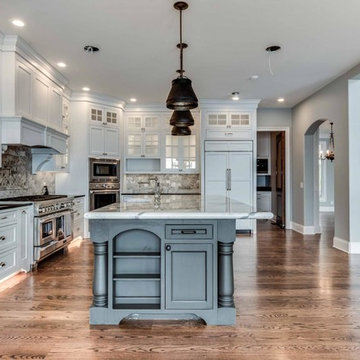
The weathered finish on the cabinets and custom metal hood are a nice juxtaposition to the more sleek glass mosaic backsplash and waterfall countertops. The pendants and cabinet hardware provide modern details that provide an overall casual yet sophisticated feel in this transitional design.
Designed by: Susan Klimala, CKD, CBD
Photography by: Mike Kaskel
For more information on kitchen and bath design ideas go to: www.kitchenstudio-ge.com
 TKS Design Group
Free ebook, Creating the Ideal Kitchen. DOWNLOAD NOW
Sometimes it take a few tries to get a space to work how you want it to and that’s exactly what happened with this Hinsdale client. Their desire for a family friendly, open floor plan had them reworking an opening between the kitchen and family room and relocating some pantry cabinets in an attempt to make their home’s flow more suitable to their lifestyle. After living with this small change for a few years, they decided that a full kitchen remodel was really what was needed to make their home function the way they desired.
They came in with the stereotypical “sketch on a napkin” done by an architect friend, and we proceeded to make that design come to life with a few tweaks along the way. The space was quite unique and also a bit challenging because of its multiple angled walls. While interesting, angles can be a challenge when trying make a space functional.
The new kitchen has a great lineup of large appliances, including a large built-in fridge, steam oven and Galley workstation, which is a large prep sink that utilizes several inserts such as strainers and cutting boards and acts as a very large prep space. The new induction cooktop is easy to keep clean and a microwave drawer in the island is located away from the main prep space for convenient access.
The main perimeter has tons of countertop space, with additional prep space available at the island and a slightly raised peninsula for casual meals and nice homework spot for the couple’s teenaged children. The kitchen also included a large shallow depth pantry and a large counter height desk area for keeping track of paperwork.
The weathered finish on the cabinets and custom metal hood are a nice juxtaposition to the more sleek glass mosaic backsplash and waterfall countertops. The pendants and cabinet hardware provide modern details that provide an overall casual yet sophisticated feel in this transitional design.
Designed by: Susan Klimala, CKD, CBD
Photography by: Mike Kaskel
For more information on kitchen and bath design ideas go to: www.kitchenstudio-ge.com
 Windy City Painters
ver look at your iron fence and wonder how rust crept up so fast? For homeowners across Chicago's North Side and Near West Side, that moment of recognition often comes too late. Windy City Painters built this project guide to help you understand exactly what a professional iron fence restoration involves, what products matter, and what Chicago's climate demands from every coat of paint applied to exposed metal.
PROJECT OVERVIEW
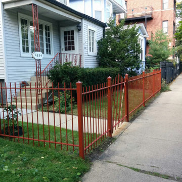
This iron fence restoration involved a multi-unit property featuring an ornamental iron perimeter fence typical of Chicago's greystone and courtyard building streetscape. The fence presented moderate-to-severe surface rust, multiple areas of paint delamination, and two sections with deep pitting requiring needle gun descaling before any coating could be applied. The goal was full rust remediation and a durable topcoat finish built for Chicago's demanding climate. Windy City Painters completed the project in two days with zero damage to surrounding hardscape.
MATERIALS AND PRODUCTS
Ospho Rust Converter - A phosphoric acid-based treatment that chemically transforms iron oxide into iron phosphate, halting active corrosion before primer is applied. Essential on Chicago iron exposed to decades of salt air and freeze-thaw cycling.
Corroseal Rust-Inhibitive Primer - A water-based latex primer with built-in rust inhibitors, applied over converted surfaces to seal and prepare metal for topcoating.
Sherwin-Williams DTM Acrylic Coating - Direct-to-Metal formulation delivering exceptional adhesion, flexibility, and corrosion resistance. Available in satin and semi-gloss, ideal for ornamental iron fence painting across Chicago properties.
THE PROCESS
Step 1 - Mechanical Surface Preparation: Wire wheel grinding with angle grinder attachments removed all loose rust scale, failing paint, and surface contamination. Heavily pitted sections received needle gun descaling to expose clean stable metal beneath. This step determines everything. No primer or topcoat performs correctly over compromised metal, regardless of product quality. Windy City Painters treats prep as the primary investment on every iron fence project.
Step 2 - Rust Conversion: Ospho was applied liberally to all areas showing active rust. The phosphoric acid reaction was allowed to complete fully before any priming began. On severely oxidized sections, a second Ospho application ensured complete conversion. This step is non-negotiable in Chicago where freeze-thaw cycles push moisture into every surface irregularity.
Step 3 - Priming with Corroseal: Full coverage Corroseal primer coat sealed the converted surface and established adhesion for the finish coats. Corroseal's rust-inhibitive chemistry adds a secondary barrier against moisture penetration, extending the effective life of the topcoat by years in Chicago's humid lakefront environment.
Step 4 - DTM Topcoat Application: Two coats of Sherwin-Williams DTM acrylic in satin black were applied by brush to ensure full penetration into ornamental detail. DTM's flexibility accommodates the metal expansion and contraction Chicago temperatures demand, from minus-15 winters to 95-degree July afternoons. Final coverage was uniform and true to color.
CHICAGO-SPECIFIC CHALLENGES
Chicago iron faces challenges most other markets do not. Lake Michigan humidity accelerates surface oxidation year-round. Road salt from winter de-icing migrates to fence bases and lower rails. Freeze-thaw cycling cracks poorly adhered coatings within a single winter. Greystones, two-flats, and Victorian brownstones often feature original ornamental ironwork with decades of layered paint that must be assessed before any new coating is added. Windy City Painters factors all of these conditions into every iron fence estimate and material selection.
WHAT TO EXPECT LONG-TERM
A properly prepared and coated iron fence using the Ospho, Corroseal, and Sherwin-Williams DTM system should deliver 5-8 years of performance in Chicago conditions. Annual visual inspection for chips or scratches, followed by prompt spot priming, extends that timeline significantly. Full refinishing cycles become less frequent when the initial prep work is done correctly.
PRO TIPS
Tip 1 - Never skip the rust converter. Painting over active rust with even the best topcoat guarantees early failure. Ospho or a comparable phosphoric acid treatment must precede any primer on iron showing orange or brown oxidation.
Tip 2 - Assess for weld repairs before scheduling painting. If rust has eaten through the metal creating structural voids or broken sections, a welder must address those areas before painting begins. Windy City Painters identifies weld repair needs during the free estimate.
Tip 3 - Choose satin or semi-gloss finish on iron. Flat finishes on metal hold moisture and show wear faster. Satin DTM provides enough sheen to shed water while maintaining the traditional look Chicago ornamental iron demands.
Ready to restore your iron fence the right way? Visit windypainters.com to schedule your free estimate with Windy City Painters.
FAQ
Q: What does iron fence painting cost in Chicago?
A: Most residential iron fence projects range from $500 to $1,800 depending on linear footage, rust severity, and prep requirements. Windy City Painters provides free detailed on-site estimates for accurate iron fence painting cost in Chicago.
Q: How do I know if my fence needs rust conversion or just repainting?
A: Any visible orange or brown rust requires chemical conversion before priming. Windy City Painters evaluates every fence during the estimate to determine whether Ospho, mechanical prep, or weld repair is needed before coating begins.
Q: Can you paint iron in cold Chicago weather?
A: DTM coatings have lower application temperature thresholds than standard exterior paint, but we avoid application below 35 degrees Fahrenheit. Windy City Painters schedules iron fence projects for appropriate weather windows throughout the season.
Q: How long does iron fence paint last in Chicago?
A: With complete rust conversion, Corroseal priming, and Sherwin-Williams DTM topcoat, iron fence painting in Chicago lasts 5-8 years. Annual inspections and prompt touch-ups of chips extend that timeline further.
Q: Do I need a welder before an iron fence can be painted?
A: Only if rust has created structural voids or breaks in the metal. Windy City Painters assesses this during the free estimate and can coordinate with welders when needed before our painting crew begins.
Q: What is the difference between Ospho and Corroseal?
A: Ospho is a rust converter applied directly to active rust to chemically neutralize it. Corroseal is a rust-inhibitive primer applied over converted or clean metal. Windy City Painters often uses both in sequence for maximum protection on Chicago iron.
Q: How often should Chicago iron fences be inspected?
A: Annual inspection is recommended, ideally in early spring after winter salt and freeze-thaw exposure. Catching small chips and bare spots early allows simple touch-up rather than full iron fence repainting, saving significant cost.
Sponsored
Columbus, OH

Hope Restoration & General Contracting
Columbus Design-Build, Kitchen & Bath Remodeling, Historic Renovations

 The Bodily Works
Example of a mid-sized transitional enclosed carpeted and beige floor home theater design in Salt Lake City with gray walls and a wall-mounted tv

 Simply Perfect
With Pinterest, Houzz and HGTV, homeowners have more sources for inspiration than ever before. You may have found, however, that replicating what you see online or on TV isn’t always that simple. Mastering proportion and scale can be especially challenging.
Let’s say you fall in love with an oversized vase which looks like it will fit with the colors and textures in your living room. But once it’s there, the vase doesn’t look the way you expected and you don’t know now to make it work.
Fortunately, designers are experienced not only in dealing with proportion and scale, but in handling multiple elements at once.
In the meantime, here are a few tips to help you understand some of the considerations regarding size.
Proportion Tips
1. Less is more
In the home shown here, the rooms are on the smaller side, where it would seem counterintuitive to use oversized pieces. But using smaller pieces can look busy—and can actually make the rooms feel smaller, especially when you add personal belongings to the space.
2. Keep it simple
Several oversized pieces can create clean, simple lines. We put this principle to work using oversized items as anchors on both sides of the fireplace in the living room.
On one side, we have two oversized blown-glass vases with amber, silver and purple tones. The irregular shapes in these beautiful pieces create interest and contrast; you can see through them and you can see the room reflected in them.
On the other side of the fireplace sit two oversized brass lanterns filled with driftwood and greenery; the contents can be switched out seasonally, as well.
The vases on one side and lanterns on the other side establish pattern (two of each, in descending order), balance and simplicity.
3. Embrace the unexpected
On the mantle above the fireplace rests another oversized piece—a painting of a barn. Its neutral colors pick up the tones in the stone behind it and again, it works to bring simplicity to the space, rather than overly fussy detail.
Nearby, just up the stairs, is an unusually spacious landing. A bench and pillows transform it into a special reading or conversation spot. The pair of hammered nickel vases on the window sill repeats the pattern established on either side of the fireplace. Using oversized vases in lieu of a window treatment is unexpected—as is incorporating sleek, modern-shaped vases like these in a farmhouse-style home. Yet because of the other oversized objects nearby, the vases feel distinctive and delightful.
4. Coordinate pattern and rhythm
Another oversized item is the table lamp in the living room. It’s a powerful light; aside from the overhead can lights, it’s the room’s only light source. The ridges on its ceramic base echo the pieces of wicker in the stunning basket behind the sofa.
This oversized wicker basket, which we’re a bit in love with, features a very large weave along with elegant leather straps. It’s ideal for storing throws, cushions, board games or anything else you want out of sight.
5. Proximity matters
This home’s dining room is just to the right of the entry. An immense floor mirror—double-framed in weathered wood—is placed opposite the front windows. Measuring seven feet high, it’s a bold piece. And it works perfectly in this space to reflect light and make the room feel larger.
An oversized ceramic vase, with a porous, matte-stone finish, sits atop a table next to the mirror. Other regular-sized items share the small table, including a bottle of wine and a glass vase. But because of the enormous mirror, it was important to have one oversized item on that table, for balance.

 Bi-State Pool & Spa
Vinyl Liner Gemini Blue Mosaic in-ground swimming pool with vinyl liner instep, tanning ledge and deep end bench. Custom handrail, pool umbrellas, stamped cantilevered coping and jumping rock proves to be the perfect backyard oasis.

 Complete Ponds
25' Pondless waterfall stream
Inspiration for a large traditional partial sun backyard stone water fountain landscape in Sacramento.
Inspiration for a large traditional partial sun backyard stone water fountain landscape in Sacramento.
Sponsored
Columbus, OH
Hope Restoration & General Contracting
Columbus Design-Build, Kitchen & Bath Remodeling, Historic Renovations

 Northwest Granite & Flooring
Bench made of LG Viatera 3cm quartz. 12x24 Wall tile is Tierra Sol "Eramosa". Floor done in Tierra Sol's Borneo pebbles.
Inspiration for a large contemporary 3/4 gray tile and ceramic tile porcelain tile alcove shower remodel in Seattle with a two-piece toilet, beige walls and a vessel sink
Inspiration for a large contemporary 3/4 gray tile and ceramic tile porcelain tile alcove shower remodel in Seattle with a two-piece toilet, beige walls and a vessel sink
 TKS Design Group
Free ebook, Creating the Ideal Kitchen. DOWNLOAD NOW
Sometimes it take a few tries to get a space to work how you want it to and that’s exactly what happened with this Hinsdale client. Their desire for a family friendly, open floor plan had them reworking an opening between the kitchen and family room and relocating some pantry cabinets in an attempt to make their home’s flow more suitable to their lifestyle. After living with this small change for a few years, they decided that a full kitchen remodel was really what was needed to make their home function the way they desired.
They came in with the stereotypical “sketch on a napkin” done by an architect friend, and we proceeded to make that design come to life with a few tweaks along the way. The space was quite unique and also a bit challenging because of its multiple angled walls. While interesting, angles can be a challenge when trying make a space functional.
The new kitchen has a great lineup of large appliances, including a large built-in fridge, steam oven and Galley workstation, which is a large prep sink that utilizes several inserts such as strainers and cutting boards and acts as a very large prep space. The new induction cooktop is easy to keep clean and a microwave drawer in the island is located away from the main prep space for convenient access.
The main perimeter has tons of countertop space, with additional prep space available at the island and a slightly raised peninsula for casual meals and nice homework spot for the couple’s teenaged children. The kitchen also included a large shallow depth pantry and a large counter height desk area for keeping track of paperwork.
The weathered finish on the cabinets and custom metal hood are a nice juxtaposition to the more sleek glass mosaic backsplash and waterfall countertops. The pendants and cabinet hardware provide modern details that provide an overall casual yet sophisticated feel in this transitional design.
Designed by: Susan Klimala, CKD, CBD
Photography by: Mike Kaskel
For more information on kitchen and bath design ideas go to: www.kitchenstudio-ge.com
 Simply Perfect
With Pinterest, Houzz and HGTV, homeowners have more sources for inspiration than ever before. You may have found, however, that replicating what you see online or on TV isn’t always that simple. Mastering proportion and scale can be especially challenging.
Let’s say you fall in love with an oversized vase which looks like it will fit with the colors and textures in your living room. But once it’s there, the vase doesn’t look the way you expected and you don’t know now to make it work.
Fortunately, designers are experienced not only in dealing with proportion and scale, but in handling multiple elements at once.
In the meantime, here are a few tips to help you understand some of the considerations regarding size.
Proportion Tips
1. Less is more
In the home shown here, the rooms are on the smaller side, where it would seem counterintuitive to use oversized pieces. But using smaller pieces can look busy—and can actually make the rooms feel smaller, especially when you add personal belongings to the space.
2. Keep it simple
Several oversized pieces can create clean, simple lines. We put this principle to work using oversized items as anchors on both sides of the fireplace in the living room.
On one side, we have two oversized blown-glass vases with amber, silver and purple tones. The irregular shapes in these beautiful pieces create interest and contrast; you can see through them and you can see the room reflected in them.
On the other side of the fireplace sit two oversized brass lanterns filled with driftwood and greenery; the contents can be switched out seasonally, as well.
The vases on one side and lanterns on the other side establish pattern (two of each, in descending order), balance and simplicity.
3. Embrace the unexpected
On the mantle above the fireplace rests another oversized piece—a painting of a barn. Its neutral colors pick up the tones in the stone behind it and again, it works to bring simplicity to the space, rather than overly fussy detail.
Nearby, just up the stairs, is an unusually spacious landing. A bench and pillows transform it into a special reading or conversation spot. The pair of hammered nickel vases on the window sill repeats the pattern established on either side of the fireplace. Using oversized vases in lieu of a window treatment is unexpected—as is incorporating sleek, modern-shaped vases like these in a farmhouse-style home. Yet because of the other oversized objects nearby, the vases feel distinctive and delightful.
4. Coordinate pattern and rhythm
Another oversized item is the table lamp in the living room. It’s a powerful light; aside from the overhead can lights, it’s the room’s only light source. The ridges on its ceramic base echo the pieces of wicker in the stunning basket behind the sofa.
This oversized wicker basket, which we’re a bit in love with, features a very large weave along with elegant leather straps. It’s ideal for storing throws, cushions, board games or anything else you want out of sight.
5. Proximity matters
This home’s dining room is just to the right of the entry. An immense floor mirror—double-framed in weathered wood—is placed opposite the front windows. Measuring seven feet high, it’s a bold piece. And it works perfectly in this space to reflect light and make the room feel larger.
An oversized ceramic vase, with a porous, matte-stone finish, sits atop a table next to the mirror. Other regular-sized items share the small table, including a bottle of wine and a glass vase. But because of the enormous mirror, it was important to have one oversized item on that table, for balance.
134