
Search results for "Impersonating" in Home Design Ideas
 Alexis Bednyak Design
Alyssa Rosenheck Photography
Searl Lamaster Howe Architects
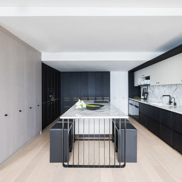
Kitchen - mid-sized contemporary light wood floor and beige floor kitchen idea in Chicago with a single-bowl sink, flat-panel cabinets, black cabinets, marble countertops, white backsplash, marble backsplash and an island
Kitchen - mid-sized contemporary light wood floor and beige floor kitchen idea in Chicago with a single-bowl sink, flat-panel cabinets, black cabinets, marble countertops, white backsplash, marble backsplash and an island
 Theresa Seabaugh Interior Design
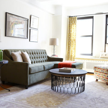
Living room with soft wool carpet, slate top tables and custom furniture and draperies.
Photo by Kaysh Shinn
Living room - mid-sized eclectic medium tone wood floor living room idea in New York with white walls
Living room - mid-sized eclectic medium tone wood floor living room idea in New York with white walls

Find the right local pro for your project
 H2D Architecture + Design
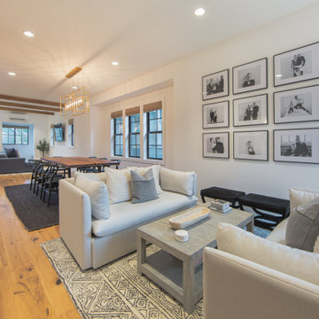
The main floor of this Queen Anne Seattle home is designed with an open floor plan for the living, dining, and kitchen areas. The extremely narrow lot was challenging to work with, but despite these challenges, the spaces feel open and welcoming.
Architecture + Design: H2D Architecture + Design
www.h2darchitects.com
#seattlearchitect
 Ferriss - Architectural Renderings
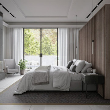
7 mistakes in bedroom design and ways to avoid them.
ERROR # 1 - Incorrect bed size.
This is a problem with any furniture in principle. When, according to the plan and ergonomic calculations, it becomes size to size, but in fact, it looks cumbersome, visually overflowing the space or, on the contrary, turns out to be too small and looks awkward.
How to avoid: Always be guided by the proportions of the size of the furniture in the room. Try to choose as big a bed as possible, but stay realistic. The main thing is that the width of the passageways in the bedroom should not be less than 70cm, and for comfortable movement, it is better to do everything 100cm.
ERROR # 2 - Poor lighting and switches.
Even in a small bedroom, you need multiple light sources. A single chandelier in the center of the ceiling is not enough, because it creates the effect of darkening the corners, and the room seems uncomfortable.
How to avoid: Hang a sconce over your headboard. Don't forget to light up the space next to the mirror and wardrobe. And be sure to place switches close to the bed so that you don't have to go to the other end of the room after an evening with a book in bed.
Do not forget about a sufficient number of outlets, this should be done even at the planning stage.
ERROR # 3 - Few storage locations
The fewer well-thought-out cabinets and shelving, the more things are visible. And the clutter spoils even the most stylish and expensive interior.
How to avoid: In addition to bedside tables, a chest of drawers (for storing small things) and a built-in wardrobe can be placed in a small bedroom: unlike a usual one, it takes up space from floor to ceiling, thereby accommodating more items. In addition, the built-in structure looks more solid and often merges with the walls, making the setting complete.
ERROR # 4 - Carpet of the wrong size.
The carpet in the bedroom is a great addition, and sometimes the final touch of the whole composition. But often people choose the wrong size or do not use it at all.
How to avoid: Choosing the right size can be guided by the unspoken rule, according to which the carpet should be 1 meter larger than the bed, both lengthwise and across. If the room is large, then it is recommended that the indentation of the carpet from the wall is 45-50 cm, if it is small, then 20-30 cm can be dispensed with.
ERROR # 5 Typical design.
If you buy a typical bed, bedside tables, and wardrobe from one manufacturer, then the interior will turn out to be formulaic and impersonal. No accessories and color schemes will help him.
How to avoid: The interior should reflect the character of its owner, and the person living in it will feel comfortable. Explore different collections of furniture and try to assemble a capsule in the same color scheme, but at the same time different in texture and shape.
ERROR # 6 Empty walls.
Even if the bedroom is a room for relaxation, it would be a mistake to make a space out of it that is intended solely for sleeping. Ascetic furnishings, unadorned walls, boring furniture, and bed linen - all this does not improve the mood at all, but, on the contrary, creates a gloomy mood.
How to avoid: The walls in the bedroom are a blank slate that you can transform into something original, beautiful, and unique to your liking. Even if you just paint one of the walls in a contrasting color, and decorate the other with several photos from the Internet, printed and inserted into frames, you can transform the atmosphere of the room as a whole.
ERROR # 7 Too dark interior.
One should not be deceived by the beauty of the thick dark tones of interior paint. It has long been known that dark blue, burgundy, blueberry, chocolate, and black for the bedroom should not be used in large quantities, since such an environment will have a tangible effect and interfere with a vigorous awakening in the morning.
How to avoid: If you like a rich range, try choosing derived shades a few tones lighter, for example, instead of black or graphite, choose gray-brown, dove-gray for the walls, and blue can be replaced with cornflower blue or azure.
Don't forget to combine dark tones with lots of whites, creams, complementing shimmery accessories, and vibrant décor.
https://www.ferriss.co/
#ferriss #We_bring_objects_to_life #3drendering #architecture #San_Francisco
 Kitchen Innovations
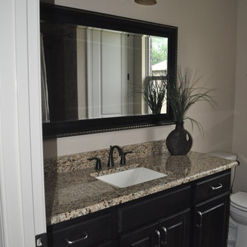
This is a simple vanity but the black stain makes it current and elegant without busting the budget.
Bathroom - mid-sized traditional bathroom idea in Miami with an undermount sink, raised-panel cabinets, black cabinets and granite countertops
Bathroom - mid-sized traditional bathroom idea in Miami with an undermount sink, raised-panel cabinets, black cabinets and granite countertops
 Foster Remodeling Solutions, Inc.
J. Larry Golfer Photography
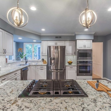
Inspiration for a mid-sized u-shaped eat-in kitchen remodel in DC Metro with an undermount sink, raised-panel cabinets, white cabinets, granite countertops, white backsplash, mosaic tile backsplash, stainless steel appliances, a peninsula and multicolored countertops
Inspiration for a mid-sized u-shaped eat-in kitchen remodel in DC Metro with an undermount sink, raised-panel cabinets, white cabinets, granite countertops, white backsplash, mosaic tile backsplash, stainless steel appliances, a peninsula and multicolored countertops
 Susan Tully Interiors
We love when our clients trust us enough to do a second project for them. In the case of this couple looking for a NYC Pied-a-Terre – this was our 4th! After designing their homes in Bernardsville, NJ and San Diego, CA and a home for their daughter in Orange County, CA, we were called up for duty on the search for a NYC apartment which would accommodate this couple with room enough for their four children as well!
What we cherish most about working with clients is the trust that develops over time. In this case, not only were we asked to come on board for design and project coordination, but we also helped with the actual apartment selection decision between locations in TriBeCa, Upper West Side and the West Village. The TriBeCa building didn’t have enough services in the building; the Upper West Side neighborhood was too busy and impersonal; and, the West Village apartment was just right.
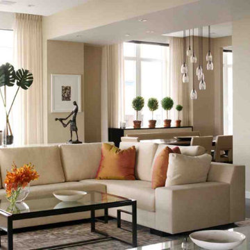
Our work on this apartment was to oversee the design and build-out of the combination of a 3,000 square foot 3-bedroom unit with a 1,000 square foot 1-bedroom unit. We reorganized the space to accommodate this family of 6. The living room in the 1 bedroom became the media room; the kitchen became a bar; and the bedroom became a guest suite.
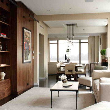
The most amazing feature of this apartment are its views – uptown to the Empire State Building, downtown to the Statue of Liberty and west for the most vibrant sunsets. We opened up the space to create view lines through the apartment all the way back into the home office.
Customizing New York City apartments takes creativity and patience. In order to install recessed lighting, Ray devised a floating ceiling situated below the existing concrete ceiling to accept the wiring and housing.
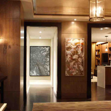
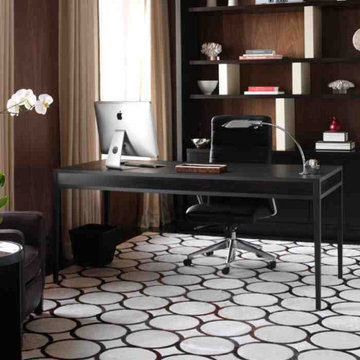
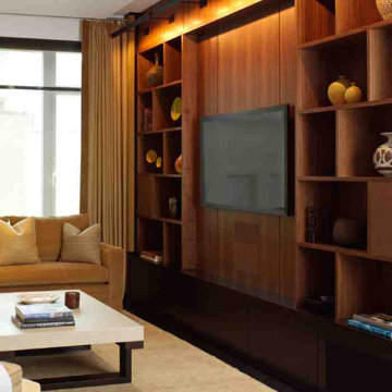
In the design of the space, we wanted to create a flow and continuity between the public spaces. To do this, we designed walnut panels which run from the center hall through the media room into the office and on to the sitting room. The richness of the wood helps ground the space and draws your eye to the lightness of the gorgeous views. For additional light capture, we designed a 9 foot by 10 foot metal and mirror wall treatment in the living room. The purpose is to catch the light and reflect it back into the living space creating expansiveness and brightness.
Adding unique and meaningful art pieces is the critical final stage of design. For the master bedroom, we commissioned Ira Lohan, a Santa Fe, NM artist we know, to create a totem with glass feathers. This piece was inspired by folklore from his Native American roots which says home is defined by where an eagle’s feathers land. Ira drove this piece across the country and delivered and installed it himself!!
 Susan Tully Interiors
We love when our clients trust us enough to do a second project for them. In the case of this couple looking for a NYC Pied-a-Terre – this was our 4th! After designing their homes in Bernardsville, NJ and San Diego, CA and a home for their daughter in Orange County, CA, we were called up for duty on the search for a NYC apartment which would accommodate this couple with room enough for their four children as well!
What we cherish most about working with clients is the trust that develops over time. In this case, not only were we asked to come on board for design and project coordination, but we also helped with the actual apartment selection decision between locations in TriBeCa, Upper West Side and the West Village. The TriBeCa building didn’t have enough services in the building; the Upper West Side neighborhood was too busy and impersonal; and, the West Village apartment was just right.
Our work on this apartment was to oversee the design and build-out of the combination of a 3,000 square foot 3-bedroom unit with a 1,000 square foot 1-bedroom unit. We reorganized the space to accommodate this family of 6. The living room in the 1 bedroom became the media room; the kitchen became a bar; and the bedroom became a guest suite.
The most amazing feature of this apartment are its views – uptown to the Empire State Building, downtown to the Statue of Liberty and west for the most vibrant sunsets. We opened up the space to create view lines through the apartment all the way back into the home office.
Customizing New York City apartments takes creativity and patience. In order to install recessed lighting, Ray devised a floating ceiling situated below the existing concrete ceiling to accept the wiring and housing.
In the design of the space, we wanted to create a flow and continuity between the public spaces. To do this, we designed walnut panels which run from the center hall through the media room into the office and on to the sitting room. The richness of the wood helps ground the space and draws your eye to the lightness of the gorgeous views. For additional light capture, we designed a 9 foot by 10 foot metal and mirror wall treatment in the living room. The purpose is to catch the light and reflect it back into the living space creating expansiveness and brightness.
Adding unique and meaningful art pieces is the critical final stage of design. For the master bedroom, we commissioned Ira Lohan, a Santa Fe, NM artist we know, to create a totem with glass feathers. This piece was inspired by folklore from his Native American roots which says home is defined by where an eagle’s feathers land. Ira drove this piece across the country and delivered and installed it himself!!
 Susan Tully Interiors
We love when our clients trust us enough to do a second project for them. In the case of this couple looking for a NYC Pied-a-Terre – this was our 4th! After designing their homes in Bernardsville, NJ and San Diego, CA and a home for their daughter in Orange County, CA, we were called up for duty on the search for a NYC apartment which would accommodate this couple with room enough for their four children as well!
What we cherish most about working with clients is the trust that develops over time. In this case, not only were we asked to come on board for design and project coordination, but we also helped with the actual apartment selection decision between locations in TriBeCa, Upper West Side and the West Village. The TriBeCa building didn’t have enough services in the building; the Upper West Side neighborhood was too busy and impersonal; and, the West Village apartment was just right.
Our work on this apartment was to oversee the design and build-out of the combination of a 3,000 square foot 3-bedroom unit with a 1,000 square foot 1-bedroom unit. We reorganized the space to accommodate this family of 6. The living room in the 1 bedroom became the media room; the kitchen became a bar; and the bedroom became a guest suite.
The most amazing feature of this apartment are its views – uptown to the Empire State Building, downtown to the Statue of Liberty and west for the most vibrant sunsets. We opened up the space to create view lines through the apartment all the way back into the home office.
Customizing New York City apartments takes creativity and patience. In order to install recessed lighting, Ray devised a floating ceiling situated below the existing concrete ceiling to accept the wiring and housing.
In the design of the space, we wanted to create a flow and continuity between the public spaces. To do this, we designed walnut panels which run from the center hall through the media room into the office and on to the sitting room. The richness of the wood helps ground the space and draws your eye to the lightness of the gorgeous views. For additional light capture, we designed a 9 foot by 10 foot metal and mirror wall treatment in the living room. The purpose is to catch the light and reflect it back into the living space creating expansiveness and brightness.
Adding unique and meaningful art pieces is the critical final stage of design. For the master bedroom, we commissioned Ira Lohan, a Santa Fe, NM artist we know, to create a totem with glass feathers. This piece was inspired by folklore from his Native American roots which says home is defined by where an eagle’s feathers land. Ira drove this piece across the country and delivered and installed it himself!!
 Fratantoni Interior Designers
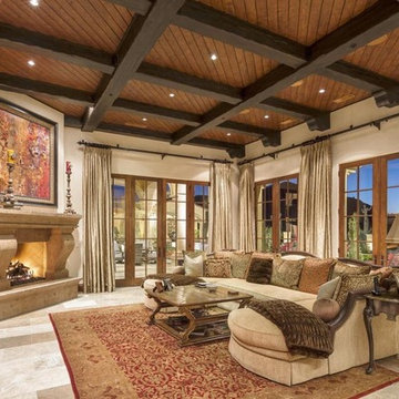
This family room has an exposed wood beam ceiling and a custom cast stone fireplace. As well as a built-in shelving unit for the television placement.
 Susan Tully Interiors
We love when our clients trust us enough to do a second project for them. In the case of this couple looking for a NYC Pied-a-Terre – this was our 4th! After designing their homes in Bernardsville, NJ and San Diego, CA and a home for their daughter in Orange County, CA, we were called up for duty on the search for a NYC apartment which would accommodate this couple with room enough for their four children as well!
What we cherish most about working with clients is the trust that develops over time. In this case, not only were we asked to come on board for design and project coordination, but we also helped with the actual apartment selection decision between locations in TriBeCa, Upper West Side and the West Village. The TriBeCa building didn’t have enough services in the building; the Upper West Side neighborhood was too busy and impersonal; and, the West Village apartment was just right.
Our work on this apartment was to oversee the design and build-out of the combination of a 3,000 square foot 3-bedroom unit with a 1,000 square foot 1-bedroom unit. We reorganized the space to accommodate this family of 6. The living room in the 1 bedroom became the media room; the kitchen became a bar; and the bedroom became a guest suite.
The most amazing feature of this apartment are its views – uptown to the Empire State Building, downtown to the Statue of Liberty and west for the most vibrant sunsets. We opened up the space to create view lines through the apartment all the way back into the home office.
Customizing New York City apartments takes creativity and patience. In order to install recessed lighting, Ray devised a floating ceiling situated below the existing concrete ceiling to accept the wiring and housing.
In the design of the space, we wanted to create a flow and continuity between the public spaces. To do this, we designed walnut panels which run from the center hall through the media room into the office and on to the sitting room. The richness of the wood helps ground the space and draws your eye to the lightness of the gorgeous views. For additional light capture, we designed a 9 foot by 10 foot metal and mirror wall treatment in the living room. The purpose is to catch the light and reflect it back into the living space creating expansiveness and brightness.
Adding unique and meaningful art pieces is the critical final stage of design. For the master bedroom, we commissioned Ira Lohan, a Santa Fe, NM artist we know, to create a totem with glass feathers. This piece was inspired by folklore from his Native American roots which says home is defined by where an eagle’s feathers land. Ira drove this piece across the country and delivered and installed it himself!!
 Susan Tully Interiors
We love when our clients trust us enough to do a second project for them. In the case of this couple looking for a NYC Pied-a-Terre – this was our 4th! After designing their homes in Bernardsville, NJ and San Diego, CA and a home for their daughter in Orange County, CA, we were called up for duty on the search for a NYC apartment which would accommodate this couple with room enough for their four children as well!
What we cherish most about working with clients is the trust that develops over time. In this case, not only were we asked to come on board for design and project coordination, but we also helped with the actual apartment selection decision between locations in TriBeCa, Upper West Side and the West Village. The TriBeCa building didn’t have enough services in the building; the Upper West Side neighborhood was too busy and impersonal; and, the West Village apartment was just right.
Our work on this apartment was to oversee the design and build-out of the combination of a 3,000 square foot 3-bedroom unit with a 1,000 square foot 1-bedroom unit. We reorganized the space to accommodate this family of 6. The living room in the 1 bedroom became the media room; the kitchen became a bar; and the bedroom became a guest suite.
The most amazing feature of this apartment are its views – uptown to the Empire State Building, downtown to the Statue of Liberty and west for the most vibrant sunsets. We opened up the space to create view lines through the apartment all the way back into the home office.
Customizing New York City apartments takes creativity and patience. In order to install recessed lighting, Ray devised a floating ceiling situated below the existing concrete ceiling to accept the wiring and housing.
In the design of the space, we wanted to create a flow and continuity between the public spaces. To do this, we designed walnut panels which run from the center hall through the media room into the office and on to the sitting room. The richness of the wood helps ground the space and draws your eye to the lightness of the gorgeous views. For additional light capture, we designed a 9 foot by 10 foot metal and mirror wall treatment in the living room. The purpose is to catch the light and reflect it back into the living space creating expansiveness and brightness.
Adding unique and meaningful art pieces is the critical final stage of design. For the master bedroom, we commissioned Ira Lohan, a Santa Fe, NM artist we know, to create a totem with glass feathers. This piece was inspired by folklore from his Native American roots which says home is defined by where an eagle’s feathers land. Ira drove this piece across the country and delivered and installed it himself!!
 Gore Design Co., LLC
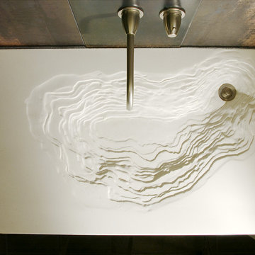
The Erosion Sink is a defining design for Gore Design Co. First created for a client in 2004 and shortly thereafter published in Dwell Magazine™, the Erosion Sink remains special to us.
Each one is unique, no two are the same. All aspects of this topographic sink can be customized, from color and size to the shape and layout of the erosion pattern. Brandon Gore personally creates each concrete Erosion Sink, spending more than 40 hours on the form and 200-300% more time hand-finishing the cast sink.
This original design is often imitated but never duplicated as the essence and nuance cannot be gained by impersonation. If you want to learn more, please visit our website at www.goredesignco.com
 Schuyler Pond Home & Garden
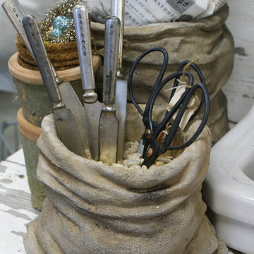
Cement planter impersonating a burlap sack.
This is an example of a landscaping in Boston.
This is an example of a landscaping in Boston.
 Gore Design Co., LLC
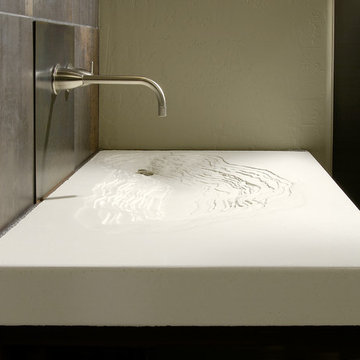
The Erosion Sink is a defining design for Gore Design Co. First created for a client in 2004 and shortly thereafter published in Dwell Magazine™, the Erosion Sink remains special to us.
Each one is unique, no two are the same. All aspects of this topographic sink can be customized, from color and size to the shape and layout of the erosion pattern. Brandon Gore personally creates each concrete Erosion Sink, spending more than 40 hours on the form and 200-300% more time hand-finishing the cast sink.
This original design is often imitated but never duplicated as the essence and nuance cannot be gained by impersonation. If you want to learn more, please visit our website at www.goredesignco.com
 Hurst Design Build Remodel
Darren Sinnett
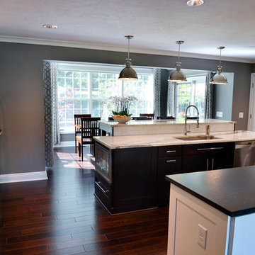
Inspiration for a transitional dark wood floor kitchen remodel in Cleveland with a drop-in sink, recessed-panel cabinets, white backsplash, ceramic backsplash, stainless steel appliances and an island
Inspiration for a transitional dark wood floor kitchen remodel in Cleveland with a drop-in sink, recessed-panel cabinets, white backsplash, ceramic backsplash, stainless steel appliances and an island
 David Heide Design Studio
Architecture & Interior Design: David Heide Design Studio
Photography: Karen Melvin
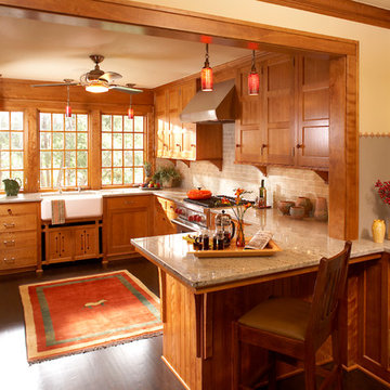
Example of an arts and crafts u-shaped dark wood floor eat-in kitchen design in Minneapolis with a farmhouse sink, recessed-panel cabinets, medium tone wood cabinets, granite countertops, subway tile backsplash, stainless steel appliances and a peninsula
Example of an arts and crafts u-shaped dark wood floor eat-in kitchen design in Minneapolis with a farmhouse sink, recessed-panel cabinets, medium tone wood cabinets, granite countertops, subway tile backsplash, stainless steel appliances and a peninsula
 Davis Home Pros
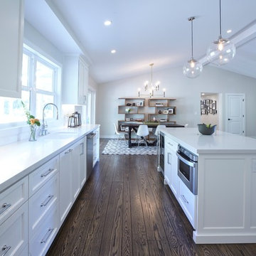
Inspiration for a large 1950s galley dark wood floor eat-in kitchen remodel in San Francisco with an undermount sink, shaker cabinets, white cabinets, quartz countertops, white backsplash, subway tile backsplash, stainless steel appliances and an island

 Irene Designs
This dream bathroom has everything one can wish for an ideal bathroom escape. It doesn’t just look fabulous – it works well and it is built to stand the test of time.
This bathroom was designed as a private oasis, a place to relax and unwind. Spa-like environment is created by expansive double-sink custom vanity, an elegant free standing tub, and a spacious two-person barrier-free shower with a floating bench. Toilet is concealed within a separate nook behind a pocket door.
Main bathroom area is outlined by a tray ceiling perimeter. The room looks open, airy and spacious. Nothing interferes with the ceiling design and overall space configuration. It hasn’t always been that way. Former layout had serious pitfalls that made the room look much smaller. The shower concealed behind solid walls protruded into the main area clashing with the tray ceiling geometry. Massive shower stall took up significant amount of the room leaving no continuous wall space for a double sink vanity. There were two separate vanities with a dead corner space between them. At the same time, the toilet room was quite spacious with just one fixture in the far end.
New layout not only looks better, it allows for a better functionality and fully reveals the space potential. The toilet was relocated to occupy the former linen closet space slightly expanded into adjacent walk-in closet. Shower was moved into the bigger alcove, away from the tray ceiling area. It opened up the room while giving space for a gorgeous wall-to-wall vanity. Having a full glass wall, the shower extends the space even further. Sparkling glass creates no barrier to the eyesight. The room feels clean, breezy and extra spacious. Gorgeous frameless shower enclosure with glass-to-glass clamps and hinges shows off premium tile designs of the accent shower wall.
Free standing tub remained in its original place in front of the window. With no solid shower walls nearby, it became a focal point adorned with the new crystal chandelier above it. This two-tier gorgeous chandelier makes the bathroom feel incredibly grand. A touch of luxury is showing up in timeless polished chrome faucet finish selections as well.
New expansive custom vanity has his and her full height linen towers, his and her sink cabinets with two individual banks of drawers on the sides and one shared drawer cabinet in the middle containing a charging station in the upper drawer.
Vanity counter tops and floating shower seat top are made of high-end quartz.
Vessel sinks resemble the shape and style of the free-standing tub.
To make the room feel even more spacious and to showcase the shower area in the reflection, a full size mirror is installed over the vanity. Crystal sconces are installed directly into the mirror.
Crisp classic white tile gives the room a timeless sense of polish and luxury. Walls around the perimeter of the entire bathroom are tiled half way. Three rows of 12”x 24” porcelain tile resembling white marble are crowned with a thin row of intricate glass tiles with marble accents, and a chair rail tile.
Tile design flows into a spacious barrier-free two-person walk-in shower. Two more tile patterns of the same tile collection are brought into play. Rear wall is adorned with a picture frame made out of 12”x12” tiles laid at 45 degree angle within the same chair rail and glass tile border. Shower floor is made of small hexagon tiles for proper drainage.
Shower area has two hidden from plain sight niches to contain shampoo bottles and toiletries. The rear side of the niches is made of glass mosaics for a waterfall effect.
To showcase the picture frame inside the shower, the accent shower wall is washed with cascading light from a discrete LED strip tucked in a cove behind “floating” shower ceiling platform.
Multiple shower heads (two ceiling-mount rain heads, one multi-functional wall mount shower head, and a handheld shower) are able to provide a fully customizable shower experience.
Despite of many hard surfaces and shiny finishes, which can sometimes lead to a cold impersonal feeling, this bathroom is cozy and truly welcoming. This sense of warms is maintained by exclusive multi-functional layered lighting. Carefully designed groups of lights (all having a dimmer control) can be used simultaneously, in various combinations, or separately to create numerous different effects and perfect atmosphere for every mood and occasion. Some lights have smart controls and can be operated remotely.
Amazing effect can be achieved by dimmable toe kick perimeter lighting. With the ceiling lights turned off, the vanity looks as if it is floating in the air. Multifaceted crystal fixtures produce cascades of sparkling rainbow reflections dancing around the room and creating an illusion of a starry sky.
Programmable radiant heating floor offers additional warmth and comfort to the room.
This bathroom is well suited for either a quick morning shower or a night in for ultimate relaxation with a champagne toast and a long soak in the freestanding tub.
2