
Search results for "Important note" in Home Design Ideas
 Maraya Interior Design
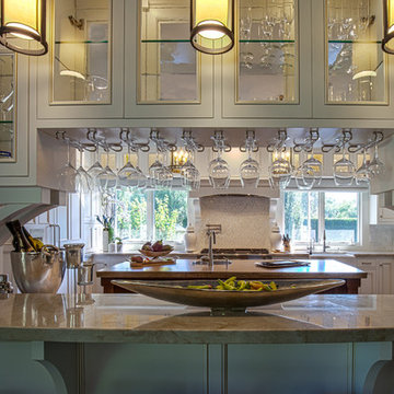
Old world charm, modern styles and color with this craftsman styled kitchen. Plank parquet wood flooring is porcelain tile throughout the bar, kitchen and laundry areas. Marble mosaic behind the range. Featuring white painted cabinets with 2 islands, one island is the bar with glass cabinetry above, and hanging glasses. On the middle island, a complete large natural pine slab, with lighting pendants over both. Laundry room has a folding counter backed by painted tonque and groove planks, as well as a built in seat with storage on either side. Lots of natural light filters through this beautiful airy space, as the windows reach the white quartzite counters.
Project Location: Santa Barbara, California. Project designed by Maraya Interior Design. From their beautiful resort town of Ojai, they serve clients in Montecito, Hope Ranch, Malibu, Westlake and Calabasas, across the tri-county areas of Santa Barbara, Ventura and Los Angeles, south to Hidden Hills- north through Solvang and more.
Vance Simms, Contractor
 Robin's Nest Interiors
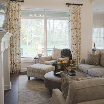
These homeowners who were downsizing to a patio home in Floyds Fork area came to us after they had made all of their selections in paint colors, fixtures and finishes and asked us to put together a comprehensive plan for their new home including space planning, furniture selections, and finishing touches in window treatments, rugs, accent lighting and accessories. Although this is a well laid out floor plan, we asked a lot of questions to make sure each area functioned for the homeowners as well as looked good. For instance, the floor plan included a Dining Area and small Breakfast Nook. The homeowners knew they would spend most of their time at the island, so we invested in quality custom bar stools, we selected fully upholstered chairs for the dining area which will be used, and turned the Breakfast Nook into a seating area for morning coffee or afternoon reading. That took care of the functional, now for the fun. Our color palette comprised of creams, grays, tans and mustard yellow is so pleasing. We kept our furnishings neutral while popping our color with window treatments and accessories. Please note we used 3 different fabrics on the 3 different windows in the Living Area. As long as the fabrics coordinate and support your color palette, you can use multiple fabrics in the same space. Since our palette was neutral, we made sure our finishing touches had a lot of texture and interest.
There is so much to look at and love in the large open space, and this is definitely one of my favorite color palettes. And as striking as this home looks, it is laid out so well. Every piece of furniture fits and functions perfectly. This is visual proof of the importance of a comprehensive plan. Enjoy!
 Byggmeister Inc
Photo by Jim Raycroft
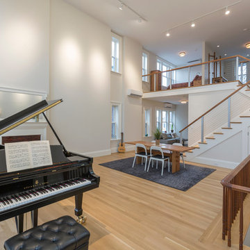
Our client for this project, an amateur pianist, wanted to create a music room for a nice new piano he was planning to purchase. The project scope would also include a new kitchen, bathroom, bedroom and living space, but the new piano was the priority.
LIFTING THE CEILING
The client was moving into a row house, and hoped to accommodate occasional gatherings of musician friends for informal recitals. Because acoustics were important we asked sound engineers from Acentech to visit the site. They noted that the ideal space would have higher ceilings and would be more like a cube than the “half a cube” we were dealing with. “How can we raise the ceiling and make the space a cube?” our client asked.
Designer Josy Raycroft started to explore the possibility of combining the second and third floor units by removing the front half of second floor ceiling, thereby opening up a 2-story music space in the shape of a nearly perfect cube. Thus, the project turned from a straightforward floor plan modification into a complete reimagining of the whole row house, with the client’s new Steinway D as the focal point. Josy and the client started with the piano and created the space around it.
ADDRESSING EVERYDAY NEEDS
For the client’s more mundane needs, Josy switched the location of the bathroom and kitchen—moving the bathroom towards the middle of the second floor where it would be convenient to the rest of the spaces, and placing the kitchen towards the back. The remainder of the third floor was transformed into bedroom and office space open to the music room below.
Products and finishes coordinator Karin Mahdavi worked with the client to select understated finishes for the living spaces so that they would support the piano room without competing with it. As a result the living spaces flow seamlessly into the piano space, creating a coherent whole out of the different parts, kind of like a Schubert piano sonata.
Find the right local pro for your project
 Smithwood Builders Inc.
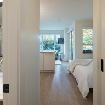
A small and elegant condominium rises out of a 90’s era building. Turning a dated studio apartment into a luxury short-term rental property alleviates the stress that tourists experience when booking accommodations in Vancouver. Rivaling any 5-star downtown hotel this gem, across from the Seabreeze Walkway, was renovated to attract tourists from all over the world.
The floor plan was kept intact and given a much-needed facelift. The dated flooring was removed and durable vinyl-plank flooring was put in its place. The custom cabinetry in the kitchen has a fresh feel with ivory flush doors juxtaposed with walnut cubbies and accents. Quartz, Stratuarietto counters with an elegant waterfall peninsula partition the kitchen from the living room. The peninsula island was deepened to accommodate seating. “It’s important to use the same materials throughout a small space, notes the designer, as you don’t want to overstimulate the senses”. The same walnut millwork and quartz are seen again in the bathroom. The tub was removed to make way for a walk-in shower, tiled in a floral and herringbone pattern. Plumbing fixtures and accessories are in brass or flat black finishes giving this space the perfect balance of femininity and masculinity. Complete with a washer and dryer and storage room, a small space designed right, can feel grandiose.
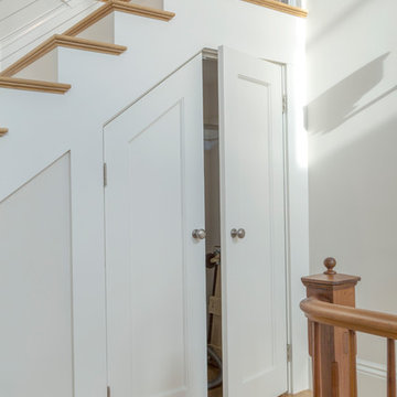 Byggmeister Inc
Photo by Jim Raycroft
Our client for this project, an amateur pianist, wanted to create a music room for a nice new piano he was planning to purchase. The project scope would also include a new kitchen, bathroom, bedroom and living space, but the new piano was the priority.
LIFTING THE CEILING
The client was moving into a row house, and hoped to accommodate occasional gatherings of musician friends for informal recitals. Because acoustics were important we asked sound engineers from Acentech to visit the site. They noted that the ideal space would have higher ceilings and would be more like a cube than the “half a cube” we were dealing with. “How can we raise the ceiling and make the space a cube?” our client asked.
Designer Josy Raycroft started to explore the possibility of combining the second and third floor units by removing the front half of second floor ceiling, thereby opening up a 2-story music space in the shape of a nearly perfect cube. Thus, the project turned from a straightforward floor plan modification into a complete reimagining of the whole row house, with the client’s new Steinway D as the focal point. Josy and the client started with the piano and created the space around it.
ADDRESSING EVERYDAY NEEDS
For the client’s more mundane needs, Josy switched the location of the bathroom and kitchen—moving the bathroom towards the middle of the second floor where it would be convenient to the rest of the spaces, and placing the kitchen towards the back. The remainder of the third floor was transformed into bedroom and office space open to the music room below.
Products and finishes coordinator Karin Mahdavi worked with the client to select understated finishes for the living spaces so that they would support the piano room without competing with it. As a result the living spaces flow seamlessly into the piano space, creating a coherent whole out of the different parts, kind of like a Schubert piano sonata.
 Otogawa-Anschel Design-Build
There is always an easy way out. A simple, uninteresting solution that neither challenges nor engages the mind or the soul. The 50s rambler is a simple structure that lacks character and charm. Its greatest contribution to architecture was the single floor living concept. We came to this project because the homeowners believed their home had the potential to be something more and had invested their time and creativity into developing ideas for what it could become. We embraced the opportunity to collaborate with the homeowner to create a home that was unique, thoughtful, customized for their use, and cared for.
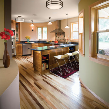
The curved exterior shell of this addition wraps around to accommodate a screen porch under a lifted peak. Inside, the new kitchen follows the curve with custom cabinets and honed granite creating a dynamite space for a chef. Shade tree, bamboo and honed slate flooring weave the living room, dining room, bathroom and kitchen together. Walls jog and jump with color and dimension.
One of the major challenges was to ensure that the space could accommodate large family gatherings of 12 – 16 people yet still feel intimate and comfortable for two people when guests were not present. As you move through the home you will notice that none of the spaces feel cavernous or restrictive. Careful attention was paid to mapping out the space to create areas that were cozy and appropriate while taking traffic patterns into consideration. The dining room entrances are staggered which creates the illusion of two separate spaces. The warm red halogen lights further encourage a sense of scale. One can easily extend the dining room table to accommodate a large crowd without causing guests to feel uncomfortable or confined.
The use of color is an often noted feature in our projects. Our philosophy is that the selection of color for the walls is as important as the selection of all the other materials. Color influences everything we do and gives us direction for how to feel, where to go, where to stop, and how to interact. It is the binding component between all the elements in a design. It bends, bounces, twists, manipulates light and the eye, and is required to fully develop and design a space.
This project was an exciting and rewarding challenge, and we are grateful to the homeowners for asking us to be a part of it and to opening up their home to the public. We hope that you will enjoy your time visiting this remarkably transformed home.
highlights
Re-use of existing housing stock
Icynene insulation
Super-insulated ceilings
Remnant granite countertops
Energy Star windows
Shade tree floors
Bamboo floors
Hardishingle siding
Halogen lights
Dimmers and separated task lighting
Energy efficient Panasonic fans
Locally manufactured cabinets
FSC certified millwork
Energy Star appliances
Dual flush toilet
 The Conscious Builder Inc.
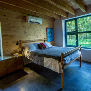
For this project, the goals were straight forward - a low energy, low maintenance home that would allow the "60 something couple” time and money to enjoy all their interests. Accessibility was also important since this is likely their last home. In the end the style is minimalist, but the raw, natural materials add texture that give the home a warm, inviting feeling.
The home has R-67.5 walls, R-90 in the attic, is extremely air tight (0.4 ACH) and is oriented to work with the sun throughout the year. As a result, operating costs of the home are minimal. The HVAC systems were chosen to work efficiently, but not to be complicated. They were designed to perform to the highest standards, but be simple enough for the owners to understand and manage.
The owners spend a lot of time camping and traveling and wanted the home to capture the same feeling of freedom that the outdoors offers. The spaces are practical, easy to keep clean and designed to create a free flowing space that opens up to nature beyond the large triple glazed Passive House windows. Built-in cubbies and shelving help keep everything organized and there is no wasted space in the house - Enough space for yoga, visiting family, relaxing, sculling boats and two home offices.
The most frequent comment of visitors is how relaxed they feel. This is a result of the unique connection to nature, the abundance of natural materials, great air quality, and the play of light throughout the house.
The exterior of the house is simple, but a striking reflection of the local farming environment. The materials are low maintenance, as is the landscaping. The siting of the home combined with the natural landscaping gives privacy and encourages the residents to feel close to local flora and fauna.
Photo Credit: Leon T. Switzer/Front Page Media Group
Sponsored
Fredericksburg, OH

High Point Cabinets
Columbus' Experienced Custom Cabinet Builder | 4x Best of Houzz Winner
 Signature Kitchens Additions & Baths
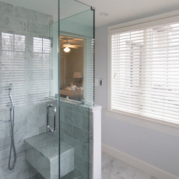
Multiple layers of Carrara Marble make this bathroom renovations so appealing. Note the floating bench seat. Its not that hard to do. It is important that the floating bench seat be complete on the bottom to avoid mold.
 Byggmeister Inc
Photo by Jim Raycroft
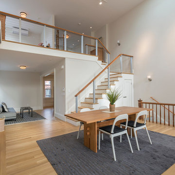
Our client for this project, an amateur pianist, wanted to create a music room for a nice new piano he was planning to purchase. The project scope would also include a new kitchen, bathroom, bedroom and living space, but the new piano was the priority.
LIFTING THE CEILING
The client was moving into a row house, and hoped to accommodate occasional gatherings of musician friends for informal recitals. Because acoustics were important we asked sound engineers from Acentech to visit the site. They noted that the ideal space would have higher ceilings and would be more like a cube than the “half a cube” we were dealing with. “How can we raise the ceiling and make the space a cube?” our client asked.
Designer Josy Raycroft started to explore the possibility of combining the second and third floor units by removing the front half of second floor ceiling, thereby opening up a 2-story music space in the shape of a nearly perfect cube. Thus, the project turned from a straightforward floor plan modification into a complete reimagining of the whole row house, with the client’s new Steinway D as the focal point. Josy and the client started with the piano and created the space around it.
ADDRESSING EVERYDAY NEEDS
For the client’s more mundane needs, Josy switched the location of the bathroom and kitchen—moving the bathroom towards the middle of the second floor where it would be convenient to the rest of the spaces, and placing the kitchen towards the back. The remainder of the third floor was transformed into bedroom and office space open to the music room below.
Products and finishes coordinator Karin Mahdavi worked with the client to select understated finishes for the living spaces so that they would support the piano room without competing with it. As a result the living spaces flow seamlessly into the piano space, creating a coherent whole out of the different parts, kind of like a Schubert piano sonata.

 DESIGN SOLUTIONS
The interiors of the Duomo di Siena are a masterclass in rhythm and restraint—striped marble columns, sculptural saints, and gilded detailing all lead the eye upward. Ceilings play an equally important role. “A plain white ceiling can feel unfinished,” Luciana notes. “There’s something about giving the ceiling character that transforms the room."
 Designs by Cheryl
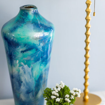
Unique blue vase with other various light colors brings a contemporary style to this family room. The fresh flowers works all the time for the perfect accents. Styling and accessorizing is so important. The gold console table lamp in simple and minimal perfect size to balance off the larger decorative vase.
 Danze & Davis Architects, Inc.
Ana Swanson
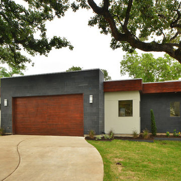
Example of a large minimalist one-story mixed siding exterior home design in Austin
Example of a large minimalist one-story mixed siding exterior home design in Austin
 Jay-Quinones Contracting Inc.
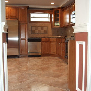
This Kitchen remodel has a great look without breaking the bank. We tried to keep the price reasonable on this project so we went with a middle of the line cabinet and a Formica deck mount countertop. A full tile backsplash is important when installing Formica to give it that high end look. A light ceramic tile floor was installed to give the room a nice light, open feel.
Jay-Quin Contracting Inc.

Sponsored
Delaware, OH

Buckeye Basements, Inc.
Central Ohio's Basement Finishing ExpertsBest Of Houzz '13-'21
 Best Hot Tubs "Hot Tub and Spa Experts"
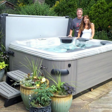
— The right hot tub cover is not only important for energy efficiency and keeping your spa clean, it can be a snap to tilt upright for immediate added privacy. (Note: Best Hot Tubs’ experts will help you choose the perfect hot tub cover (size/color etc.) for your portable spa as it is is part of all our hot tub packages.)
www.besthottubs.com
 Amy Pearson Design
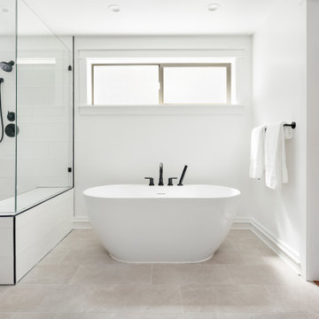
While the majority of APD designs are created to meet the specific and unique needs of the client, this whole home remodel was completed in partnership with Black Sheep Construction as a high end house flip. From space planning to cabinet design, finishes to fixtures, appliances to plumbing, cabinet finish to hardware, paint to stone, siding to roofing; Amy created a design plan within the contractor’s remodel budget focusing on the details that would be important to the future home owner. What was a single story house that had fallen out of repair became a stunning Pacific Northwest modern lodge nestled in the woods!
 Amiglia Design Group, LLC
PLEASE NOTE: All “related,” “similar,” and “sponsored” products tagged or listed by Houzz are not actual products pictured. They have not been approved by Amiglia Designs nor any of the professionals credited. For information about our work, please contact amy@amigliadesign.com.
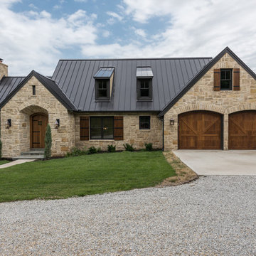
This English Country weekend home was custom designed for the clients lifestyle and taste. The Interior Design includes many upscale features such as 2" granite steps, custom designed rod iron rails and hand made light fixtures.
 Valentini's Custom Wine Cellars
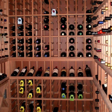
This office off a living room area was converted into a custom wine cellar. Three walls featured lighted display bottles. Note the importance of using blending paint color on walls instead of leaving it white. Custom Wine Cellar Orange County . Newport Beach, CA. Corona Del Mar, CA. Laguna Beach, CA. Dana Point, CA. San Clemente, CA.

Sponsored
Columbus, OH
Free consultation for landscape design!

Peabody Landscape Group
Franklin County's Reliable Landscape Design & Contracting
 Robin's Nest Interiors
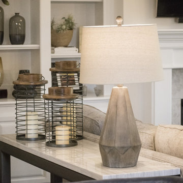
These homeowners who were downsizing to a patio home in Floyds Fork area came to us after they had made all of their selections in paint colors, fixtures and finishes and asked us to put together a comprehensive plan for their new home including space planning, furniture selections, and finishing touches in window treatments, rugs, accent lighting and accessories. Although this is a well laid out floor plan, we asked a lot of questions to make sure each area functioned for the homeowners as well as looked good. For instance, the floor plan included a Dining Area and small Breakfast Nook. The homeowners knew they would spend most of their time at the island, so we invested in quality custom bar stools, we selected fully upholstered chairs for the dining area which will be used, and turned the Breakfast Nook into a seating area for morning coffee or afternoon reading. That took care of the functional, now for the fun. Our color palette comprised of creams, grays, tans and mustard yellow is so pleasing. We kept our furnishings neutral while popping our color with window treatments and accessories. Please note we used 3 different fabrics on the 3 different windows in the Living Area. As long as the fabrics coordinate and support your color palette, you can use multiple fabrics in the same space. Since our palette was neutral, we made sure our finishing touches had a lot of texture and interest.
There is so much to look at and love in the large open space, and this is definitely one of my favorite color palettes. And as striking as this home looks, it is laid out so well. Every piece of furniture fits and functions perfectly. This is visual proof of the importance of a comprehensive plan. Enjoy!
 Smithwood Builders Inc.
A small and elegant condominium rises out of a 90’s era building. Turning a dated studio apartment into a luxury short-term rental property alleviates the stress that tourists experience when booking accommodations in Vancouver. Rivaling any 5-star downtown hotel this gem, across from the Seabreeze Walkway, was renovated to attract tourists from all over the world.
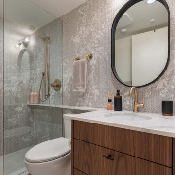
The floor plan was kept intact and given a much-needed facelift. The dated flooring was removed and durable vinyl-plank flooring was put in its place. The custom cabinetry in the kitchen has a fresh feel with ivory flush doors juxtaposed with walnut cubbies and accents. Quartz, Stratuarietto counters with an elegant waterfall peninsula partition the kitchen from the living room. The peninsula island was deepened to accommodate seating. “It’s important to use the same materials throughout a small space, notes the designer, as you don’t want to overstimulate the senses”. The same walnut millwork and quartz are seen again in the bathroom. The tub was removed to make way for a walk-in shower, tiled in a floral and herringbone pattern. Plumbing fixtures and accessories are in brass or flat black finishes giving this space the perfect balance of femininity and masculinity. Complete with a washer and dryer and storage room, a small space designed right, can feel grandiose.

 Kleinlighting
Ken Kozminiski made this important light sculpture for Jane and me. Please note that Ken was using these clips long before Ingo Maurer. It has been in every residence we've ever lived in. One of our many treasures. Thanks Ken!!
29