
Search results for "Improving range" in Home Design Ideas
 Drury Design
THE SETUP
Multiple ovens, multiple workspaces, multiple sinks – when you think about it, non-jewish kitchens have been adapting the criteria of kosher kitchens for years.
Gladys’ clients in West Rogers Park are Orthodox Jewish. The house they bought already had a kosher kitchen – it just wasn’t done that well. It needed some more things to be duplicated for the dairy side and the meat side. Plus, it was dark and the configuration wasn’t very conducive for a family of eight.
It was time for a remodel.
Design Objectives
Improve kosher kitchen
Add more storage in the island
Better lighting
More open, lighter feel
Change the wood floor in the kitchen to tile
THE REMODEL
Design Challenges
- We had originally planned on removing a wing wall by the breakfast area. During demolition, we learned it contained a support beam.
- The kitchen is a substantial size, but having two sinks, dishwashers, and ovens presented a challenge – how do we fit it all in and make it flow with the storage still accessible near the work areas?
Where do you stop the materials for the new space? - -- The right tile, paint, lighting, etc. would be needed to make the remodeled area cohesive with the rest of the main floor.
- An existing column limited cabinet options and thus, storage capacity. Could we conceal it without disrupting the cabinetry flow?
Design Solutions
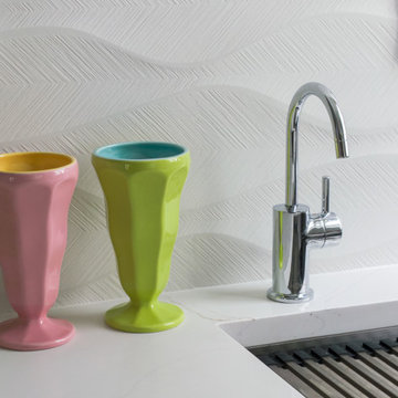
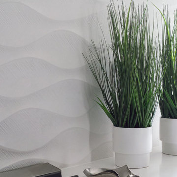
- We had to keep the wing wall, but decided to continue the tile on the sides of the cabinets and maintain the height of the tile to line up with the rest of the backsplash. This actually presented a very nice and cohesive look, especially since the opposite side has a wing wall to the left of the refrigerator.
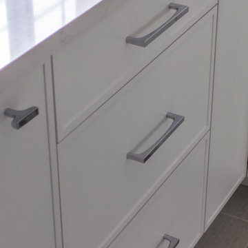
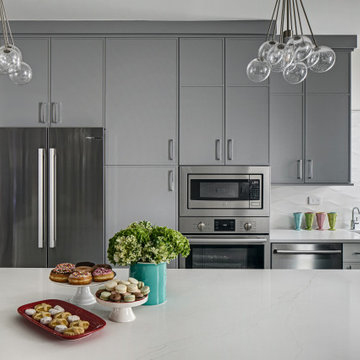
- We used “L-shaped” corner sinks instead of the rectangular ones set on an angle. This gave us more of the legs of the triangles versus the hypotenuse, which allowed for the two dishwashers, and the pullout utensil canisters and spice pullouts while still keeping the 3-drawer cabinets on either side of the range (by the sinks). The old island had the recess for stools which the family never used. By extending the width of the island 6” and utilizing this leg space, we were able to fit 18”-deep cabinets on this side – adding lots of accessible storage. The family can now work simultaneously on the dairy side (the side with the fridge) and the meat side (opposite) without getting in each other’s way. We separated the cooking by using the range oven for the meat and a built-in microwave in the base cabinet. The wall oven with built-in microwave on top is for dairy.
- Corner sinks opened up the middle area for a wider range – we went from a 30” to a 36”. Removing all the wall cabinets (on the range wall) made a big difference. That opened up the entire space while adding some visual impact. (Not pictured: We also made the cabinets directly opposite the range wall tall and removed the countertop, resulting in more room for rollouts and even more storage!) The kitchen now has more storage than it did before.
- We ended up painting the ceiling of the kitchen into the hallway that leads to the foyer. The living and dining rooms were separated by a soffit, so that became a natural boundary. We kept the tile in the kitchen by stopping it short of the hallway and lining it up with the pantry wall. This creates a border between the breakfast area and family room. The rest of the existing wood floors were refinished to refresh and make the hue darker. We also painted a dark accent wall and carried it into the breakfast area to make the rooms look deeper.
- The in-the-way column housed plumbing and couldn’t be moved. We still built cabinets in that spot – we just had to build a chase inside it to conceal the pipes. There was still plenty of room for new storage. We also took the cabinets all the way to the ceiling. The continuous tall cabinets added a functional elegance to the space.
THE RENEWED SPACE
The client’s long-awaited dream of a better kosher kitchen has finally been achieved, beautifully combining enhanced storage solutions with adherence to the family’s orthodox dietary laws. The kitchen’s standout feature, an expanded island, now offers a spacious and efficient workspace. This allows several family members to cook together comfortably, without the inconvenience of bumping into each other, ensuring a harmonious and productive cooking environment.
 Drury Design
THE SETUP
Multiple ovens, multiple workspaces, multiple sinks – when you think about it, non-jewish kitchens have been adapting the criteria of kosher kitchens for years.
Gladys’ clients in West Rogers Park are Orthodox Jewish. The house they bought already had a kosher kitchen – it just wasn’t done that well. It needed some more things to be duplicated for the dairy side and the meat side. Plus, it was dark and the configuration wasn’t very conducive for a family of eight.
It was time for a remodel.
Design Objectives
Improve kosher kitchen
Add more storage in the island
Better lighting
More open, lighter feel
Change the wood floor in the kitchen to tile
THE REMODEL
Design Challenges
- We had originally planned on removing a wing wall by the breakfast area. During demolition, we learned it contained a support beam.
- The kitchen is a substantial size, but having two sinks, dishwashers, and ovens presented a challenge – how do we fit it all in and make it flow with the storage still accessible near the work areas?
Where do you stop the materials for the new space? - -- The right tile, paint, lighting, etc. would be needed to make the remodeled area cohesive with the rest of the main floor.
- An existing column limited cabinet options and thus, storage capacity. Could we conceal it without disrupting the cabinetry flow?
Design Solutions
- We had to keep the wing wall, but decided to continue the tile on the sides of the cabinets and maintain the height of the tile to line up with the rest of the backsplash. This actually presented a very nice and cohesive look, especially since the opposite side has a wing wall to the left of the refrigerator.
- We used “L-shaped” corner sinks instead of the rectangular ones set on an angle. This gave us more of the legs of the triangles versus the hypotenuse, which allowed for the two dishwashers, and the pullout utensil canisters and spice pullouts while still keeping the 3-drawer cabinets on either side of the range (by the sinks). The old island had the recess for stools which the family never used. By extending the width of the island 6” and utilizing this leg space, we were able to fit 18”-deep cabinets on this side – adding lots of accessible storage. The family can now work simultaneously on the dairy side (the side with the fridge) and the meat side (opposite) without getting in each other’s way. We separated the cooking by using the range oven for the meat and a built-in microwave in the base cabinet. The wall oven with built-in microwave on top is for dairy.
- Corner sinks opened up the middle area for a wider range – we went from a 30” to a 36”. Removing all the wall cabinets (on the range wall) made a big difference. That opened up the entire space while adding some visual impact. (Not pictured: We also made the cabinets directly opposite the range wall tall and removed the countertop, resulting in more room for rollouts and even more storage!) The kitchen now has more storage than it did before.
- We ended up painting the ceiling of the kitchen into the hallway that leads to the foyer. The living and dining rooms were separated by a soffit, so that became a natural boundary. We kept the tile in the kitchen by stopping it short of the hallway and lining it up with the pantry wall. This creates a border between the breakfast area and family room. The rest of the existing wood floors were refinished to refresh and make the hue darker. We also painted a dark accent wall and carried it into the breakfast area to make the rooms look deeper.
- The in-the-way column housed plumbing and couldn’t be moved. We still built cabinets in that spot – we just had to build a chase inside it to conceal the pipes. There was still plenty of room for new storage. We also took the cabinets all the way to the ceiling. The continuous tall cabinets added a functional elegance to the space.
THE RENEWED SPACE
The client’s long-awaited dream of a better kosher kitchen has finally been achieved, beautifully combining enhanced storage solutions with adherence to the family’s orthodox dietary laws. The kitchen’s standout feature, an expanded island, now offers a spacious and efficient workspace. This allows several family members to cook together comfortably, without the inconvenience of bumping into each other, ensuring a harmonious and productive cooking environment.
 Drury Design
THE SETUP
Multiple ovens, multiple workspaces, multiple sinks – when you think about it, non-jewish kitchens have been adapting the criteria of kosher kitchens for years.
Gladys’ clients in West Rogers Park are Orthodox Jewish. The house they bought already had a kosher kitchen – it just wasn’t done that well. It needed some more things to be duplicated for the dairy side and the meat side. Plus, it was dark and the configuration wasn’t very conducive for a family of eight.
It was time for a remodel.
Design Objectives
Improve kosher kitchen
Add more storage in the island
Better lighting
More open, lighter feel
Change the wood floor in the kitchen to tile
THE REMODEL
Design Challenges
- We had originally planned on removing a wing wall by the breakfast area. During demolition, we learned it contained a support beam.
- The kitchen is a substantial size, but having two sinks, dishwashers, and ovens presented a challenge – how do we fit it all in and make it flow with the storage still accessible near the work areas?
Where do you stop the materials for the new space? - -- The right tile, paint, lighting, etc. would be needed to make the remodeled area cohesive with the rest of the main floor.
- An existing column limited cabinet options and thus, storage capacity. Could we conceal it without disrupting the cabinetry flow?
Design Solutions
- We had to keep the wing wall, but decided to continue the tile on the sides of the cabinets and maintain the height of the tile to line up with the rest of the backsplash. This actually presented a very nice and cohesive look, especially since the opposite side has a wing wall to the left of the refrigerator.
- We used “L-shaped” corner sinks instead of the rectangular ones set on an angle. This gave us more of the legs of the triangles versus the hypotenuse, which allowed for the two dishwashers, and the pullout utensil canisters and spice pullouts while still keeping the 3-drawer cabinets on either side of the range (by the sinks). The old island had the recess for stools which the family never used. By extending the width of the island 6” and utilizing this leg space, we were able to fit 18”-deep cabinets on this side – adding lots of accessible storage. The family can now work simultaneously on the dairy side (the side with the fridge) and the meat side (opposite) without getting in each other’s way. We separated the cooking by using the range oven for the meat and a built-in microwave in the base cabinet. The wall oven with built-in microwave on top is for dairy.
- Corner sinks opened up the middle area for a wider range – we went from a 30” to a 36”. Removing all the wall cabinets (on the range wall) made a big difference. That opened up the entire space while adding some visual impact. (Not pictured: We also made the cabinets directly opposite the range wall tall and removed the countertop, resulting in more room for rollouts and even more storage!) The kitchen now has more storage than it did before.
- We ended up painting the ceiling of the kitchen into the hallway that leads to the foyer. The living and dining rooms were separated by a soffit, so that became a natural boundary. We kept the tile in the kitchen by stopping it short of the hallway and lining it up with the pantry wall. This creates a border between the breakfast area and family room. The rest of the existing wood floors were refinished to refresh and make the hue darker. We also painted a dark accent wall and carried it into the breakfast area to make the rooms look deeper.
- The in-the-way column housed plumbing and couldn’t be moved. We still built cabinets in that spot – we just had to build a chase inside it to conceal the pipes. There was still plenty of room for new storage. We also took the cabinets all the way to the ceiling. The continuous tall cabinets added a functional elegance to the space.
THE RENEWED SPACE
The client’s long-awaited dream of a better kosher kitchen has finally been achieved, beautifully combining enhanced storage solutions with adherence to the family’s orthodox dietary laws. The kitchen’s standout feature, an expanded island, now offers a spacious and efficient workspace. This allows several family members to cook together comfortably, without the inconvenience of bumping into each other, ensuring a harmonious and productive cooking environment.
Find the right local pro for your project
 Drury Design
THE SETUP
Multiple ovens, multiple workspaces, multiple sinks – when you think about it, non-jewish kitchens have been adapting the criteria of kosher kitchens for years.
Gladys’ clients in West Rogers Park are Orthodox Jewish. The house they bought already had a kosher kitchen – it just wasn’t done that well. It needed some more things to be duplicated for the dairy side and the meat side. Plus, it was dark and the configuration wasn’t very conducive for a family of eight.
It was time for a remodel.
Design Objectives
Improve kosher kitchen
Add more storage in the island
Better lighting
More open, lighter feel
Change the wood floor in the kitchen to tile
THE REMODEL
Design Challenges
- We had originally planned on removing a wing wall by the breakfast area. During demolition, we learned it contained a support beam.
- The kitchen is a substantial size, but having two sinks, dishwashers, and ovens presented a challenge – how do we fit it all in and make it flow with the storage still accessible near the work areas?
Where do you stop the materials for the new space? - -- The right tile, paint, lighting, etc. would be needed to make the remodeled area cohesive with the rest of the main floor.
- An existing column limited cabinet options and thus, storage capacity. Could we conceal it without disrupting the cabinetry flow?
Design Solutions
- We had to keep the wing wall, but decided to continue the tile on the sides of the cabinets and maintain the height of the tile to line up with the rest of the backsplash. This actually presented a very nice and cohesive look, especially since the opposite side has a wing wall to the left of the refrigerator.
- We used “L-shaped” corner sinks instead of the rectangular ones set on an angle. This gave us more of the legs of the triangles versus the hypotenuse, which allowed for the two dishwashers, and the pullout utensil canisters and spice pullouts while still keeping the 3-drawer cabinets on either side of the range (by the sinks). The old island had the recess for stools which the family never used. By extending the width of the island 6” and utilizing this leg space, we were able to fit 18”-deep cabinets on this side – adding lots of accessible storage. The family can now work simultaneously on the dairy side (the side with the fridge) and the meat side (opposite) without getting in each other’s way. We separated the cooking by using the range oven for the meat and a built-in microwave in the base cabinet. The wall oven with built-in microwave on top is for dairy.
- Corner sinks opened up the middle area for a wider range – we went from a 30” to a 36”. Removing all the wall cabinets (on the range wall) made a big difference. That opened up the entire space while adding some visual impact. (Not pictured: We also made the cabinets directly opposite the range wall tall and removed the countertop, resulting in more room for rollouts and even more storage!) The kitchen now has more storage than it did before.
- We ended up painting the ceiling of the kitchen into the hallway that leads to the foyer. The living and dining rooms were separated by a soffit, so that became a natural boundary. We kept the tile in the kitchen by stopping it short of the hallway and lining it up with the pantry wall. This creates a border between the breakfast area and family room. The rest of the existing wood floors were refinished to refresh and make the hue darker. We also painted a dark accent wall and carried it into the breakfast area to make the rooms look deeper.
- The in-the-way column housed plumbing and couldn’t be moved. We still built cabinets in that spot – we just had to build a chase inside it to conceal the pipes. There was still plenty of room for new storage. We also took the cabinets all the way to the ceiling. The continuous tall cabinets added a functional elegance to the space.
THE RENEWED SPACE
The client’s long-awaited dream of a better kosher kitchen has finally been achieved, beautifully combining enhanced storage solutions with adherence to the family’s orthodox dietary laws. The kitchen’s standout feature, an expanded island, now offers a spacious and efficient workspace. This allows several family members to cook together comfortably, without the inconvenience of bumping into each other, ensuring a harmonious and productive cooking environment.
 Drury Design
THE SETUP
Multiple ovens, multiple workspaces, multiple sinks – when you think about it, non-jewish kitchens have been adapting the criteria of kosher kitchens for years.
Gladys’ clients in West Rogers Park are Orthodox Jewish. The house they bought already had a kosher kitchen – it just wasn’t done that well. It needed some more things to be duplicated for the dairy side and the meat side. Plus, it was dark and the configuration wasn’t very conducive for a family of eight.
It was time for a remodel.
Design Objectives
Improve kosher kitchen
Add more storage in the island
Better lighting
More open, lighter feel
Change the wood floor in the kitchen to tile
THE REMODEL
Design Challenges
- We had originally planned on removing a wing wall by the breakfast area. During demolition, we learned it contained a support beam.
- The kitchen is a substantial size, but having two sinks, dishwashers, and ovens presented a challenge – how do we fit it all in and make it flow with the storage still accessible near the work areas?
Where do you stop the materials for the new space? - -- The right tile, paint, lighting, etc. would be needed to make the remodeled area cohesive with the rest of the main floor.
- An existing column limited cabinet options and thus, storage capacity. Could we conceal it without disrupting the cabinetry flow?
Design Solutions
- We had to keep the wing wall, but decided to continue the tile on the sides of the cabinets and maintain the height of the tile to line up with the rest of the backsplash. This actually presented a very nice and cohesive look, especially since the opposite side has a wing wall to the left of the refrigerator.
- We used “L-shaped” corner sinks instead of the rectangular ones set on an angle. This gave us more of the legs of the triangles versus the hypotenuse, which allowed for the two dishwashers, and the pullout utensil canisters and spice pullouts while still keeping the 3-drawer cabinets on either side of the range (by the sinks). The old island had the recess for stools which the family never used. By extending the width of the island 6” and utilizing this leg space, we were able to fit 18”-deep cabinets on this side – adding lots of accessible storage. The family can now work simultaneously on the dairy side (the side with the fridge) and the meat side (opposite) without getting in each other’s way. We separated the cooking by using the range oven for the meat and a built-in microwave in the base cabinet. The wall oven with built-in microwave on top is for dairy.
- Corner sinks opened up the middle area for a wider range – we went from a 30” to a 36”. Removing all the wall cabinets (on the range wall) made a big difference. That opened up the entire space while adding some visual impact. (Not pictured: We also made the cabinets directly opposite the range wall tall and removed the countertop, resulting in more room for rollouts and even more storage!) The kitchen now has more storage than it did before.
- We ended up painting the ceiling of the kitchen into the hallway that leads to the foyer. The living and dining rooms were separated by a soffit, so that became a natural boundary. We kept the tile in the kitchen by stopping it short of the hallway and lining it up with the pantry wall. This creates a border between the breakfast area and family room. The rest of the existing wood floors were refinished to refresh and make the hue darker. We also painted a dark accent wall and carried it into the breakfast area to make the rooms look deeper.
- The in-the-way column housed plumbing and couldn’t be moved. We still built cabinets in that spot – we just had to build a chase inside it to conceal the pipes. There was still plenty of room for new storage. We also took the cabinets all the way to the ceiling. The continuous tall cabinets added a functional elegance to the space.
THE RENEWED SPACE
The client’s long-awaited dream of a better kosher kitchen has finally been achieved, beautifully combining enhanced storage solutions with adherence to the family’s orthodox dietary laws. The kitchen’s standout feature, an expanded island, now offers a spacious and efficient workspace. This allows several family members to cook together comfortably, without the inconvenience of bumping into each other, ensuring a harmonious and productive cooking environment.
 Drury Design
THE SETUP
Multiple ovens, multiple workspaces, multiple sinks – when you think about it, non-jewish kitchens have been adapting the criteria of kosher kitchens for years.
Gladys’ clients in West Rogers Park are Orthodox Jewish. The house they bought already had a kosher kitchen – it just wasn’t done that well. It needed some more things to be duplicated for the dairy side and the meat side. Plus, it was dark and the configuration wasn’t very conducive for a family of eight.
It was time for a remodel.
Design Objectives
Improve kosher kitchen
Add more storage in the island
Better lighting
More open, lighter feel
Change the wood floor in the kitchen to tile
THE REMODEL
Design Challenges
- We had originally planned on removing a wing wall by the breakfast area. During demolition, we learned it contained a support beam.
- The kitchen is a substantial size, but having two sinks, dishwashers, and ovens presented a challenge – how do we fit it all in and make it flow with the storage still accessible near the work areas?
Where do you stop the materials for the new space? - -- The right tile, paint, lighting, etc. would be needed to make the remodeled area cohesive with the rest of the main floor.
- An existing column limited cabinet options and thus, storage capacity. Could we conceal it without disrupting the cabinetry flow?
Design Solutions
- We had to keep the wing wall, but decided to continue the tile on the sides of the cabinets and maintain the height of the tile to line up with the rest of the backsplash. This actually presented a very nice and cohesive look, especially since the opposite side has a wing wall to the left of the refrigerator.
- We used “L-shaped” corner sinks instead of the rectangular ones set on an angle. This gave us more of the legs of the triangles versus the hypotenuse, which allowed for the two dishwashers, and the pullout utensil canisters and spice pullouts while still keeping the 3-drawer cabinets on either side of the range (by the sinks). The old island had the recess for stools which the family never used. By extending the width of the island 6” and utilizing this leg space, we were able to fit 18”-deep cabinets on this side – adding lots of accessible storage. The family can now work simultaneously on the dairy side (the side with the fridge) and the meat side (opposite) without getting in each other’s way. We separated the cooking by using the range oven for the meat and a built-in microwave in the base cabinet. The wall oven with built-in microwave on top is for dairy.
- Corner sinks opened up the middle area for a wider range – we went from a 30” to a 36”. Removing all the wall cabinets (on the range wall) made a big difference. That opened up the entire space while adding some visual impact. (Not pictured: We also made the cabinets directly opposite the range wall tall and removed the countertop, resulting in more room for rollouts and even more storage!) The kitchen now has more storage than it did before.
- We ended up painting the ceiling of the kitchen into the hallway that leads to the foyer. The living and dining rooms were separated by a soffit, so that became a natural boundary. We kept the tile in the kitchen by stopping it short of the hallway and lining it up with the pantry wall. This creates a border between the breakfast area and family room. The rest of the existing wood floors were refinished to refresh and make the hue darker. We also painted a dark accent wall and carried it into the breakfast area to make the rooms look deeper.
- The in-the-way column housed plumbing and couldn’t be moved. We still built cabinets in that spot – we just had to build a chase inside it to conceal the pipes. There was still plenty of room for new storage. We also took the cabinets all the way to the ceiling. The continuous tall cabinets added a functional elegance to the space.
THE RENEWED SPACE
The client’s long-awaited dream of a better kosher kitchen has finally been achieved, beautifully combining enhanced storage solutions with adherence to the family’s orthodox dietary laws. The kitchen’s standout feature, an expanded island, now offers a spacious and efficient workspace. This allows several family members to cook together comfortably, without the inconvenience of bumping into each other, ensuring a harmonious and productive cooking environment.

 Michael Nash Design, Build & Homes
2013 CHRYSALIS AWARD NATIONAL WINNER, KITCHEN REMODEL $50,000 TO $75,000
“Crowded and disturbing” is how the woman of the house described this kitchen. A big peninsula with a huge range hood blocked the kitchen off from the breakfast room, a chimney style wall blocked off another side of the space and the doorways were too narrow. The result was a cramped feel with no traffic flow and a lack of usable storage.
To remedy these issues, the remodeling plan called for regrouping all tall kitchen elements into a low visibility wall, eliminating the peninsula and then creating a natural path through the space using a middle island.
Relocating the stove against the room’s back wall allowed the installation of a beautiful wood mantel hood and improved the work triangle. The side walls house beautiful custom white cabinets; one side housing the pantry, refrigerator and double wall ovens, the other the kitchen sink and dishwasher.
The center island features a mahogany wood countertop and provides plenty of workspace above and storage below. Contrasting with the glazed cabinets, the woodwork is a highlight of the project and a key part of delivering on the homeowner’s desire for a bright, clean kitchen.
They installed exotic mahogany floors to complement center wood Island. The floors also had created a casual ambiance, especially against the soft lemon chiffon wall paint. The ultimate French country style kitchen was completed by furnishing the old breakfast area with casual seating rather than a formal table.


 Chester County Kitchen & Bath
Awesome Norristown PA bi-level home remodel. We gutted the whole first level of this home down to the bare bones. We redesigned the space to an open floorplan. New structural framing, insulation, windows and doors, and all mechanicals were relocated and improved. Lighting! Lighting! Lighting! everywhere and it makes all the difference. Led lighting and smart switches were used for up lighting above cabinetry, task lighting under cabinetry, general room lighting, accent lighting under bar top, and all decorative fixtures as well. The kitchen was designed around a central island with elevated seating that is designed around the new structural columns required to open the whole area. Fabuwood cabinetry in Galaxy Horizon finish make up the perimeter cabinets accented by Galaxy Cobblestone finish used for the island cabinetry. Both cabinetry tones coordinate perfect with the new Luxury vinyl plank flooring in Uptown Chic Forever Friends. I’ve said it before and I’ll say it again, luxury vinyl is Awesome! It looks great its ultra durable and even water proof as well as less expensive than true hardwood. New stair treads, railings, and posts were installed stained to match by us; giving the steps new life. An accent wall of nickel gap boards was installed on the fireplace wall giving it some interest along with being a great clean look. The recessed niche behind the range, the dry stacked stone tile at the islands seating area, the new tile entry in a herringbone pattern just add to all the great details of this project. The New River White granite countertops are a show stopper as well; not only is it a beautiful stone the installation and seaming is excellent considering the pattern of the stone. I could go on forever we did so much. The clients were terrific and a pleasure to work with. I am glad we were able to be involved in making this dream come true.

 Kinney and Associates
Photo by Mike Force.
A first time residential developer approa-ched Kinney & Associates to help him design an addition and remodel to an existing 1100-square-foot residence in East Austin. The program was simple -- he wanted a 3 bedroom, 2.5 bath house that could be sold easily or lived in should he decide to keep it for a while. Kinney & Associates endeavored to keep as much of the existing structure as feasible while delivering a very marketable product that would appeal to a wide range of potential buyers. The final product included a Game/Media Room adjacent a courtyard space that can be used for entertaining or for kids. The Master Bedroom atop the Game/Media lends itself to privacy and seclusion so that the owners can use it as a retreat. The final product is a 2400-square-foot residence that appears to be a small bungalow from the street, but lends itself to downtown views in the rear.
 Michael Nash Design, Build & Homes
2013 CHRYSALIS AWARD NATIONAL WINNER, KITCHEN REMODEL $50,000 TO $75,000
“Crowded and disturbing” is how the woman of the house described this kitchen. A big peninsula with a huge range hood blocked the kitchen off from the breakfast room, a chimney style wall blocked off another side of the space and the doorways were too narrow. The result was a cramped feel with no traffic flow and a lack of usable storage.
To remedy these issues, the remodeling plan called for regrouping all tall kitchen elements into a low visibility wall, eliminating the peninsula and then creating a natural path through the space using a middle island.
Relocating the stove against the room’s back wall allowed the installation of a beautiful wood mantel hood and improved the work triangle. The side walls house beautiful custom white cabinets; one side housing the pantry, refrigerator and double wall ovens, the other the kitchen sink and dishwasher.
The center island features a mahogany wood countertop and provides plenty of workspace above and storage below. Contrasting with the glazed cabinets, the woodwork is a highlight of the project and a key part of delivering on the homeowner’s desire for a bright, clean kitchen.
They installed exotic mahogany floors to complement center wood Island. The floors also had created a casual ambiance, especially against the soft lemon chiffon wall paint. The ultimate French country style kitchen was completed by furnishing the old breakfast area with casual seating rather than a formal table.

 Chi Renovation & Design
A new and improved kitchen layout that is perfect for this young family of four. With ample storage in the kitchen island and upper cabinets, we were able to keep the design low-maintenance and easy to keep clean, as clutter would have taken away from the light and airy aesthetic. A light gray kitchen island and subway tile backsplash paired with the bright white countertops and cabinets gave the space a refreshing contemporary look. Darker gray contrasts with the lighter color palette through the stainless steel appliances and unique pendant lights.
To the corner of the kitchen, you'll find a discreet built-in study. Fully equipped for those who work from home or for the children to finish school projects. This small office-kitchen space duo is perfect for bringing the whole family together, for meals and throughout the day.
Designed by Chi Renovation & Design who serve Chicago and it's surrounding suburbs, with an emphasis on the North Side and North Shore. You'll find their work from the Loop through Lincoln Park, Skokie, Wilmette, and all the way up to Lake Forest.
For more about Chi Renovation & Design, click here: https://www.chirenovation.com/
To learn more about this project, click here: https://www.chirenovation.com/portfolio/contemporary-kitchen-remodel/#kitchen-remodeling

 McAdams Remodeling & Design
Photos courtesy of Jesse Young, Jesse Young Property and Real Estate Photography
Large elegant u-shaped dark wood floor eat-in kitchen photo in Seattle with a farmhouse sink, flat-panel cabinets, white cabinets, quartzite countertops, beige backsplash, porcelain backsplash, stainless steel appliances and an island
Large elegant u-shaped dark wood floor eat-in kitchen photo in Seattle with a farmhouse sink, flat-panel cabinets, white cabinets, quartzite countertops, beige backsplash, porcelain backsplash, stainless steel appliances and an island

 Crystal Kitchen + Bath
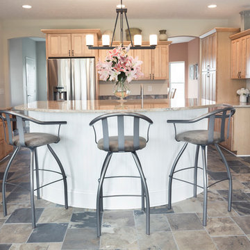
When Lisa told me she loved midcentury modern design, we instantly connected! I love bringing homes up-to-date while keeping a sense of midcentury style. This kitchen needed an improved layout and, by simply moving the refrigerator, we achieved a more open space with added storage, including a banquette for sipping morning coffee. Warm wood tones are true to the style. The cabinetry, paired with creamy Cambria countertops and gold hardware, creates a warm and inviting space.
Sponsored
Plain City, OH

The Creative Kitchen Company
Columbus Area Kitchen Remodeling and Refacing Professional

 617 Home Improvement Inc.
Large transitional l-shaped medium tone wood floor and brown floor kitchen photo in Boston with a farmhouse sink, shaker cabinets, white cabinets, marble countertops, gray backsplash, subway tile backsplash, stainless steel appliances, an island and gray countertops
 Chester County Kitchen & Bath
Awesome Norristown PA bi-level home remodel. We gutted the whole first level of this home down to the bare bones. We redesigned the space to an open floorplan. New structural framing, insulation, windows and doors, and all mechanicals were relocated and improved. Lighting! Lighting! Lighting! everywhere and it makes all the difference. Led lighting and smart switches were used for up lighting above cabinetry, task lighting under cabinetry, general room lighting, accent lighting under bar top, and all decorative fixtures as well. The kitchen was designed around a central island with elevated seating that is designed around the new structural columns required to open the whole area. Fabuwood cabinetry in Galaxy Horizon finish make up the perimeter cabinets accented by Galaxy Cobblestone finish used for the island cabinetry. Both cabinetry tones coordinate perfect with the new Luxury vinyl plank flooring in Uptown Chic Forever Friends. I’ve said it before and I’ll say it again, luxury vinyl is Awesome! It looks great its ultra durable and even water proof as well as less expensive than true hardwood. New stair treads, railings, and posts were installed stained to match by us; giving the steps new life. An accent wall of nickel gap boards was installed on the fireplace wall giving it some interest along with being a great clean look. The recessed niche behind the range, the dry stacked stone tile at the islands seating area, the new tile entry in a herringbone pattern just add to all the great details of this project. The New River White granite countertops are a show stopper as well; not only is it a beautiful stone the installation and seaming is excellent considering the pattern of the stone. I could go on forever we did so much. The clients were terrific and a pleasure to work with. I am glad we were able to be involved in making this dream come true.
 Chester County Kitchen & Bath
Awesome Norristown PA bi-level home remodel. We gutted the whole first level of this home down to the bare bones. We redesigned the space to an open floorplan. New structural framing, insulation, windows and doors, and all mechanicals were relocated and improved. Lighting! Lighting! Lighting! everywhere and it makes all the difference. Led lighting and smart switches were used for up lighting above cabinetry, task lighting under cabinetry, general room lighting, accent lighting under bar top, and all decorative fixtures as well. The kitchen was designed around a central island with elevated seating that is designed around the new structural columns required to open the whole area. Fabuwood cabinetry in Galaxy Horizon finish make up the perimeter cabinets accented by Galaxy Cobblestone finish used for the island cabinetry. Both cabinetry
tones coordinate perfect with the new Luxury vinyl plank flooring in Uptown Chic Forever Friends. I’ve said it before and I’ll say it again. Luxury vinyl is Awesome! It looks great its ultra durable and even water proof as well as less expensive than true hardwood. New stair treads, railings, and posts were installed stained to match by us; giving the steps new life. An accent wall of nickel gap boards was installed on the fireplace wall giving it some interest along with being a great clean look. The recessed niche behind the range, the dry stacked stone tile at the islands seating area, the new tile entry in a herringbone pattern just add to all the great details of this project. The New River White granite countertops are a show stopper as well; not only is it a beautiful stone the installation and seaming is excellent considering the pattern of the stone. I could go on forever we did so much. The clients were terrific and a pleasure to work with. I am glad we were able to be involved in making this dream come true.
 Chester County Kitchen & Bath
Awesome Norristown PA bi-level home remodel. We gutted the whole first level of this home down to the bare bones. We redesigned the space to an open floorplan. New structural framing, insulation, windows and doors, and all mechanicals were relocated and improved. Lighting! Lighting! Lighting! everywhere and it makes all the difference. Led lighting and smart switches were used for up lighting above cabinetry, task lighting under cabinetry, general room lighting, accent lighting under bar top, and all decorative fixtures as well. The kitchen was designed around a central island with elevated seating that is designed around the new structural columns required to open the whole area. Fabuwood cabinetry in Galaxy Horizon finish make up the perimeter cabinets accented by Galaxy Cobblestone finish used for the island cabinetry. Both cabinetry tones coordinate perfect with the new Luxury vinyl plank flooring in Uptown Chic Forever Friends. I’ve said it before and I’ll say it again, luxury vinyl is Awesome! It looks great its ultra durable and even water proof as well as less expensive than true hardwood. New stair treads, railings, and posts were installed stained to match by us; giving the steps new life. An accent wall of nickel gap boards was installed on the fireplace wall giving it some interest along with being a great clean look. The recessed niche behind the range, the dry stacked stone tile at the islands seating area, the new tile entry in a herringbone pattern just add to all the great details of this project. The New River White granite countertops are a show stopper as well; not only is it a beautiful stone the installation and seaming is excellent considering the pattern of the stone. I could go on forever we did so much. The clients were terrific and a pleasure to work with. I am glad we were able to be involved in making this dream come true.


 Advance Design Studio, Ltd.
After six years of living in their Huntley IL home, Chris and Meghan were tired of their dark, dingy, outdated kitchen and it was finally time for a long-anticipated change. “The kitchen is the place where we live, it’s where we do everything,” Meghan said. “It was important that it be a space where we wanted to be.” Meghan loves cooking and enjoys including their girls in healthy meal prepping, this led them to want a brighter, more enjoyable kitchen with increased functionality and improved storage.
For Chris especially, the laundry room was an entirely dysfunctional eyesore. “We had a washer and a dryer, but it was all kind-of cobbled together!” Chris said. “There were always laundry piles everywhere, we weren’t really sure what we wanted to do in there, but it was time for us to make a change.” The mess of the space was stressful every time they walked in the door from the garage each day. Kids’ backpacks and shoes piled up haphazardly in the makeshift boot-bench closet left the family feeling disorganized and stressed. They needed space for folding clothes and locker cubbies to help keep the family organized.
Having known Christine and Todd in the Huntley community for years, Chris and Meghan were familiar with their work. “We already trusted them personally and having seen their projects for years we knew they did top notch work. After we reviewed the initial round of designs, we knew that hiring them was definitely the right choice,” Meghan and Chris said. Although Chris had done a lot of work in their home himself, the kitchen and laundry room renovation was such a large undertaking that he didn’t want to steal time away from his family to spend what would surely be many long weekends doing the job himself. “That would not have been a wise choice for us,” Chris laughed.
“Our designer, Michelle was very, very, easy to work with; anything we wanted to see or weren’t sure about, she went above and beyond to make this easy for us. She was easy to get hold of and always quick to respond,” the couple said. Michelle pulled ideas that mirrored the couple’s taste and style and was adept at directing the couple to limited choices that didn’t overwhelm them and kept the process moving. “I have a hard time making decisions. Michelle made the decision-making process so easy. I loved how she listened to what I liked and then presented three great options for me to choose from,” Meghan said.
The main objectives for the kitchen were better storage solutions, they wanted the space to reflect their lifestyle and taste, and they wanted it to last for years with low maintenance. One of the first steps in creating a more functional kitchen was relocating the refrigerator, creating an improved workflow for the busy family.
“We didn’t know that we could even move the refrigerator to a new location where it is now, that was something that we never would have thought of,” Chris said. “The new refrigerator location makes the kitchen feel so much bigger. We didn’t add any space, but our whole kitchen with the new design just seems like it’s so much larger than before!” Meghan said.
The perimeter mist colored cabinets helped warm and brighten the entire room, while the graphite colored cabinets on the island added contrast. Using this fresh, clean color palette satisfied the couple’s desire for a bright space that was the exact opposite of what they had before. Organization accessories were also added to the cabinets such as a spice drawer tray and roll outs to create hidden convenience.
“I absolutely love the hidden spices – it makes cooking so much more enjoyable!” Chris said. “And all the pull outs, and the double trash bin, who would think you could get so excited about organization!” the couple said in unison.
One thing they hated in their original kitchen was how dark the space felt. Added lighting on the ceiling with the new light fixtures combined with the lighter cabinetry colors throughout solved this problem. “Our new kitchen has this warm, almost cozy feeling that our old kitchen never had, it’s just a space that I love spending my time in now,” Meghan said. The light airy feeling was accentuated with the use of floating white shelves on either side of the decorative range hood. “We have so much cabinetry space, the new design is amazing we actually have more storage space than we will ever need,” Meghan said.
The island was extended to create more work surface and added space for stool seating. “The new island changes how we live. Now the kids can be in the kitchen with us, doing homework, eating breakfast, and the three of us have special dinners there when Chris is working late,” Meghan said.
The Carrara Marmi Quartz countertops were chosen because they are, not only beautiful, but are made from hard-working material that doesn’t require maintenance. The white subway tile backsplash that wraps to the ceiling behind the focal point cooktop range/hood compliments the crisp white countertops perfectly, while brushed brass hardware and light fixtures keep the design fresh and new.
The couple had a few fears at the beginning of the project, as most homeowners do. Their biggest fear was being out of their kitchen and laundry room for an extended time. The crew made it very easy for the family to work in a limited space keeping the washer and dryer hooked up the majority of the time, and also getting appliances working with minimal downtime.
“They above and beyond accommodated us to get us through the process,” Meghan said. “They did a great job making sure we were as comfortable as possible throughout the process,” Chris added.
“Our project manager DJ did a great job. He was very good at updating us on schedule changes, getting guys in as quickly as possible. Everyone that stepped in the house was nice and did great work,” said Chris. They thought Advance’s carpenter was phenomenal and were impressed when he took a conceptual idea from a photograph and worked with designer Michelle to create a one of a kind range/hood that has become the topic of conversation with friends and family who visit the new kitchen. “He was in our house literally every day for several weeks. He was easy to work with and good at what he did,” Meghan and Chris said.
The focal point of the kitchen; a hand-crafted, custom-built ventilation hood was clad with handpicked reclaimed barnwood. Advance Design’s carpenter built the framework and the cladding to create a one-of-a-kind design element that the couple loves.
“I think it was especially fun for him to create something unique from scratch, showcasing his talent in this area,” Meghan said. “I love that my kitchen is not like everyone else’s. I got to pick out the wood on my hood and watch it being built and was able to choose what pieces of wood went where on it. It’s totally unique.”
Red Oak flooring was toothed-in throughout the kitchen and the rest of the first floor anywhere changes were made. Then the whole floor was refinished to tone down the orange undertones in the existing floor stain, ultimately changing the color complexion of the entire first floor. The result is a completely new feeling to the entire home.
Renovating the laundry room was extremely important to Meghan and Chris, but they had trouble visualizing what the possibilities were for the seemingly small space. Michelle produced beautiful 3D illustrations that helped them envision the space in a whole new way.
“I must have told Michelle 100 times that I am a visual person, seeing the designs in 3D made it so easy to make decisions and see what we could really do with our space,” Meghan said.
A dividing wall and doorway were removed between the existing laundry room and hallway formerly containing a coat closet, providing space to design specialized graphite colored cabinetry matching the kitchen island to house custom storage cubbies for each family member. Adding the tall utility cabinetry in the new laundry area helped solve the storage issue, tucking away cleaning supplies, household items, and even the cat got its own cubby.
“I love how everything is now hidden in its own space. I can’t tell you how much I hated coming home and seeing everything sitting around on counters,” Chris said.
Electrical outlets were planned for the inside of utility cabinets, so devices could charge in hidden locations. Stacking the washer and dryer allowed for wider countertop space to provide a folding area and a special space for clothes to hang. “The way I do laundry has been completely transformed! I can actually fold clothes and hang them now right out of the washer and dryer,” Meghan said.
“The end result in the kitchen and the laundry/mud room was an updated light and bright space, with a smarter work flow that better meets the needs of this family,” Michelle said.
“I would totally recommend Advance Design,” Meghan said. “Sometimes I sit and just look at my kitchen and laundry room and think ‘Wow, I can’t believe I get to live here!’ It’s an understatement to say we love our new space.”

 Ideal Home Improvement
Open concept kitchen - large traditional dark wood floor and brown floor open concept kitchen idea in Phoenix with raised-panel cabinets, dark wood cabinets, granite countertops, beige backsplash, stone tile backsplash, stainless steel appliances and a peninsula

 French Creek Designs Kitchen & Bath Design Center
Successful Master Bathroom Shower Surround Completed!
The challenge was to incorporate the master bath shower with the existing decor in this beautiful rustic mountain home. Existing exterior rock and a river rock fireplace and tub surround were the starting point for the choice of materials. The existing rock colors were grays with hints of blue undertones.
Pebble mosaics with the same color range were the perfect answer. The large format gray porcelain tiles look like natural stone with their realistic white veining. The results were stunning and create a seamless feeling withing the existing decor. This shower provides a brand new, updated, spacious space for the new home owners.
Client shares testimonial and review on Google: "Karen was so helpful in picking tile for my new shower. She took the time to come to my house to make sure the samples we picked out matched. The shower looks fantastic. We will definitely use French Creek again."
- See more reviews on Facebook and Google.
Making Your Home Beautiful One Room at a Time…
French Creek Designs Kitchen & Bath Design Studio - where selections begin. Let us design and dream with you. Overwhelmed on where to start that Home Improvement, Kitchen or Bath Project? Let our Designers video conference or sit down with you, take the overwhelming out of the picture and assist in choosing your materials. Whether new construction, full remodel or just a partial remodel, we can help you to make it an enjoyable experience to design your dream space. Call to schedule a free design consultation with one of our exceptional designers today! 307-337-4500
#openforbusiness #casper #wyoming #casperbusiness #frenchcreekdesigns #shoplocal #casperwyoming #bathremodeling #bathdesigners #pebbles #niche #showersurround #showertiles #showerdrains #showerbench #cabinets #countertops #knobsandpulls #sinksandfaucets #flooring #tileandmosiacs #laundryremodel #homeimprovement
194