
Search results for "Improving range" in Home Design Ideas
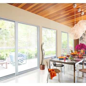
 Ross Howard Designs
Hunter Douglas | Duette®
Duette®
The original single- and double-honeycomb Duette® shades come in multiple cell sizes, a horizontal or Vertiglide™ vertical orientation, and a range of light-control options from sheer to opaque.
Energy Efficiency
COOL IN THE SUMMER, WARM IN THE WINTER
Did you know that up to 50% of a home’s heating and cooling energy can be lost through its windows? That’s why we designed this unique cellular shade that traps air in distinct pockets to help keep your house cool in the summer and warm in the winter.
And while the honeycomb design is praised for its efficiency, its shape and overall aesthetic are nothing short of beautiful.
Double Honeycomb
EVEN GREATER EFFICIENCIES
Our double-honeycomb construction traps air even more efficiently than our single honeycomb by sandwiching two honeycomb cells between your room and the window.
Absorb Sound
REDUCE OUTSIDE NOISE
Improve your room’s acoustics while reducing the intensity of outside sound. It starts at the windows.
The degree of sound control will depend on the fabric you choose, so if this is an important feature to you, be sure to discuss it with your sales expert.
Top-Down/Bottom-Up
PRIVACY WITH A VIEW
The Top-Down/Bottom-Up feature offers a more versatile approach to light control. Open from the top, from the bottom, or find somewhere in-between–for the perfect balance of privacy and light.
Energy Efficiency
COOL IN THE SUMMER, WARM IN THE WINTER
Did you know that up to 50% of a home’s heating and cooling energy can be lost through its windows? That’s why we designed this unique cellular shade that traps air in distinct pockets to help keep your house cool in the summer and warm in the winter.
And while the honeycomb design is praised for its efficiency, its shape and overall aesthetic are nothing short of beautiful.
Double Honeycomb
EVEN GREATER EFFICIENCIES
Our double-honeycomb construction traps air even more efficiently than our single honeycomb by sandwiching two honeycomb cells between your room and the window.
Absorb Sound
REDUCE OUTSIDE NOISE
Improve your room’s acoustics while reducing the intensity of outside sound. It starts at the windows.
The degree of sound control will depend on the fabric you choose, so if this is an important feature to you, be sure to discuss it with your sales expert.
Vertiglide™
FOR LARGE WINDOWS AND SLIDING DOORS
Vertiglide™ offers an exceptional, energy-efficient vertical solution for large expanses of windows and sliding glass doors.
Top-Down/Bottom-Up
PRIVACY WITH A VIEW
The Top-Down/Bottom-Up feature offers a more versatile approach to light control. Open from the top, from the bottom, or find somewhere in-between–for the perfect balance of privacy and light.
UV protection
SUNSCREEN FOR YOUR VALUABLES
Protect your furniture, flooring and artwork from fading with at least 75% protection from harmful UV rays
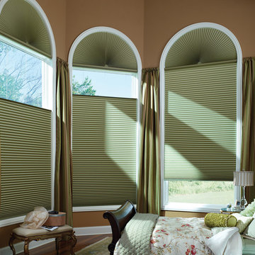 Ross Howard Designs
Hunter Douglas | Duette®
Duette®
The original single- and double-honeycomb Duette® shades come in multiple cell sizes, a horizontal or Vertiglide™ vertical orientation, and a range of light-control options from sheer to opaque.
Energy Efficiency
COOL IN THE SUMMER, WARM IN THE WINTER
Did you know that up to 50% of a home’s heating and cooling energy can be lost through its windows? That’s why we designed this unique cellular shade that traps air in distinct pockets to help keep your house cool in the summer and warm in the winter.
And while the honeycomb design is praised for its efficiency, its shape and overall aesthetic are nothing short of beautiful.
Double Honeycomb
EVEN GREATER EFFICIENCIES
Our double-honeycomb construction traps air even more efficiently than our single honeycomb by sandwiching two honeycomb cells between your room and the window.
Absorb Sound
REDUCE OUTSIDE NOISE
Improve your room’s acoustics while reducing the intensity of outside sound. It starts at the windows.
The degree of sound control will depend on the fabric you choose, so if this is an important feature to you, be sure to discuss it with your sales expert.
Top-Down/Bottom-Up
PRIVACY WITH A VIEW
The Top-Down/Bottom-Up feature offers a more versatile approach to light control. Open from the top, from the bottom, or find somewhere in-between–for the perfect balance of privacy and light.
Energy Efficiency
COOL IN THE SUMMER, WARM IN THE WINTER
Did you know that up to 50% of a home’s heating and cooling energy can be lost through its windows? That’s why we designed this unique cellular shade that traps air in distinct pockets to help keep your house cool in the summer and warm in the winter.
And while the honeycomb design is praised for its efficiency, its shape and overall aesthetic are nothing short of beautiful.
Double Honeycomb
EVEN GREATER EFFICIENCIES
Our double-honeycomb construction traps air even more efficiently than our single honeycomb by sandwiching two honeycomb cells between your room and the window.
Absorb Sound
REDUCE OUTSIDE NOISE
Improve your room’s acoustics while reducing the intensity of outside sound. It starts at the windows.
The degree of sound control will depend on the fabric you choose, so if this is an important feature to you, be sure to discuss it with your sales expert.
Vertiglide™
FOR LARGE WINDOWS AND SLIDING DOORS
Vertiglide™ offers an exceptional, energy-efficient vertical solution for large expanses of windows and sliding glass doors.
Top-Down/Bottom-Up
PRIVACY WITH A VIEW
The Top-Down/Bottom-Up feature offers a more versatile approach to light control. Open from the top, from the bottom, or find somewhere in-between–for the perfect balance of privacy and light.
UV protection
SUNSCREEN FOR YOUR VALUABLES
Protect your furniture, flooring and artwork from fading with at least 75% protection from harmful UV rays

 Victor Mulbauer
New Installation of Red Oak Wood, 3 1/4 in width. White-washed Bona Stain was used, Bona Finish, as well as Bona Traffic HD.
**This photo is of the Red Oak Wood (3 1/4 inch) prior to the application of the white-washed Bona Stain.
Find the right local pro for your project

 Chester County Kitchen & Bath
Awesome Norristown PA bi-level home remodel. We gutted the whole first level of this home down to the bare bones. We redesigned the space to an open floorplan. New structural framing, insulation, windows and doors, and all mechanicals were relocated and improved. Lighting! Lighting! Lighting! everywhere and it makes all the difference. Led lighting and smart switches were used for up lighting above cabinetry, task lighting under cabinetry, general room lighting, accent lighting under bar top, and all decorative fixtures as well. The kitchen was designed around a central island with elevated seating that is designed around the new structural columns required to open the whole area. Fabuwood cabinetry in Galaxy Horizon finish make up the perimeter cabinets accented by Galaxy Cobblestone finish used for the island cabinetry. Both cabinetry
tones coordinate perfect with the new Luxury vinyl plank flooring in Uptown Chic Forever Friends. I’ve said it before and I’ll say it again. Luxury vinyl is Awesome! It looks great its ultra durable and even water proof as well as less expensive than true hardwood. New stair treads, railings, and posts were installed stained to match by us; giving the steps new life. An accent wall of nickel gap boards was installed on the fireplace wall giving it some interest along with being a great clean look. The recessed niche behind the range, the dry stacked stone tile at the islands seating area, the new tile entry in a herringbone pattern just add to all the great details of this project. The New River White granite countertops are a show stopper as well; not only is it a beautiful stone the installation and seaming is excellent considering the pattern of the stone. I could go on forever we did so much. The clients were terrific and a pleasure to work with. I am glad we were able to be involved in making this dream come true.
 MANDARINA STUDIO interior design
LOCATION: MILTON, MASSACHUSETTS
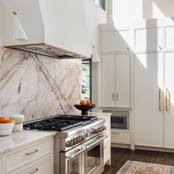
The renovation of this midcentury home centers on a complete transformation of the kitchen, which reshaped how the house functions and connects to its surroundings. The original layout relied on low cabinetry that failed to take advantage of the room’s generous volume. Mandarina Studio reworked the plan to improve circulation and take full advantage of the home’s soaring height and natural light.
The redesigned kitchen replaces a dated peninsula with a generously scaled island that supports both everyday use and entertaining. Cabinetry was reimagined vertically as well as horizontally, allowing storage and display to extend upward and reinforce the room’s proportions. A custom china cabinet with tall glass doors framed in blackened iron and finished in white oak adds presence and refinement.
At one end of the kitchen, a dedicated bar introduces a more intimate moment. Art, layered lighting, and wall-mounted sconces give this area its own identity, offering contrast to the openness of the main kitchen while supporting entertaining. Clerestory windows introduce shifting daylight throughout the day, bringing depth and movement to the quartzite focal wall at the range. Pendant lights reference midcentury forms in a refined, contemporary way. The completed kitchen was featured on the cover of Modern Luxury Interiors.
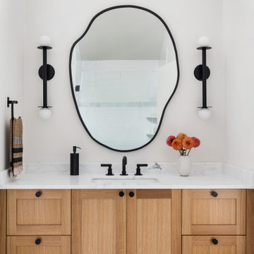
The renovation extended beyond the kitchen to include a new primary bath, a refreshed guest bath, and updated furnishings throughout the living and dining rooms. In the primary bath, marble with expressive veining is paired with a custom floating white oak vanity, balancing warmth and restraint. In the living room, a new picture window frames wooded views, while the furniture plan grounds the space. A turquoise Murano glass chandelier introduces color and artistry, adding a distinctive, personal note to the interior.
 MANDARINA STUDIO interior design
LOCATION: MILTON, MASSACHUSETTS
The renovation of this midcentury home centers on a complete transformation of the kitchen, which reshaped how the house functions and connects to its surroundings. The original layout relied on low cabinetry that failed to take advantage of the room’s generous volume. Mandarina Studio reworked the plan to improve circulation and take full advantage of the home’s soaring height and natural light.
The redesigned kitchen replaces a dated peninsula with a generously scaled island that supports both everyday use and entertaining. Cabinetry was reimagined vertically as well as horizontally, allowing storage and display to extend upward and reinforce the room’s proportions. A custom china cabinet with tall glass doors framed in blackened iron and finished in white oak adds presence and refinement.
At one end of the kitchen, a dedicated bar introduces a more intimate moment. Art, layered lighting, and wall-mounted sconces give this area its own identity, offering contrast to the openness of the main kitchen while supporting entertaining. Clerestory windows introduce shifting daylight throughout the day, bringing depth and movement to the quartzite focal wall at the range. Pendant lights reference midcentury forms in a refined, contemporary way. The completed kitchen was featured on the cover of Modern Luxury Interiors.
The renovation extended beyond the kitchen to include a new primary bath, a refreshed guest bath, and updated furnishings throughout the living and dining rooms. In the primary bath, marble with expressive veining is paired with a custom floating white oak vanity, balancing warmth and restraint. In the living room, a new picture window frames wooded views, while the furniture plan grounds the space. A turquoise Murano glass chandelier introduces color and artistry, adding a distinctive, personal note to the interior.

 Jarrett Design
 is grateful for repeat clients, especially when they have impeccable taste.
In this case, we started with their guest bath. An antique-inspired, hand-pegged vanity from our Nest collection, in hand-planed quarter-sawn cherry with metal capped feet, sets the tone. Calcutta Gold marble warms the room while being complimented by a white marble top and traditional backsplash. Polished nickel fixtures, lighting, and hardware selected by the client add elegance. A special bathroom for special guests.
Next on the list were the laundry area, bar and fireplace. The laundry area greets those who enter through the casual back foyer of the home. It also backs up to the kitchen and breakfast nook. The clients wanted this area to be as beautiful as the other areas of the home and the visible washer and dryer were detracting from their vision. They also were hoping to allow this area to serve double duty as a buffet when they were entertaining. So, the decision was made to hide the washer and dryer with pocket doors. The new cabinetry had to match the existing wall cabinets in style and finish, which is no small task. Our Nest artist came to the rescue. A five-piece soapstone sink and distressed counter top complete the space with a nod to the past.
Our clients wished to add a beverage refrigerator to the existing bar. The wall cabinets were kept in place again. Inspired by a beloved antique corner cupboard also in this sitting room, we decided to use stained cabinetry for the base and refrigerator panel. Soapstone was used for the top and new fireplace surround, bringing continuity from the nearby back foyer.
Last, but definitely not least, the kitchen, banquette and powder room were addressed. The clients removed a glass door in lieu of a wide window to create a cozy breakfast nook featuring a Nest banquette base and table. Brackets for the bench were designed in keeping with the traditional details of the home. A handy drawer was incorporated. The double vase pedestal table with breadboard ends seats six comfortably.
The powder room was updated with another antique reproduction vanity and beautiful vessel sink.
While the kitchen was beautifully done, it was showing its age and functional improvements were desired. This room, like the laundry room, was a project that included existing cabinetry mixed with matching new cabinetry. Precision was necessary. For better function and flow, the cooking surface was relocated from the island to the side wall. Instead of a cooktop with separate wall ovens, the clients opted for a pro style range. These design changes not only make prepping and cooking in the space much more enjoyable, but also allow for a wood hood flanked by bracketed glass cabinets to act a gorgeous focal point. Other changes included removing a small desk in lieu of a dresser style counter height base cabinet. This provided improved counter space and storage. The new island gave better storage, uninterrupted counter space and a perch for the cook or company. Calacatta Gold quartz tops are complimented by a natural limestone floor. A classic apron sink and faucet along with thoughtful cabinetry details are the icing on the cake. Don’t miss the clients’ fabulous collection of serving and display pieces! We told you they have impeccable taste!
Sponsored
Fredericksburg, OH

High Point Cabinets
Columbus' Experienced Custom Cabinet Builder | 4x Best of Houzz Winner
 MANDARINA STUDIO interior design
LOCATION: MILTON, MASSACHUSETTS
The renovation of this midcentury home centers on a complete transformation of the kitchen, which reshaped how the house functions and connects to its surroundings. The original layout relied on low cabinetry that failed to take advantage of the room’s generous volume. Mandarina Studio reworked the plan to improve circulation and take full advantage of the home’s soaring height and natural light.
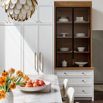
The redesigned kitchen replaces a dated peninsula with a generously scaled island that supports both everyday use and entertaining. Cabinetry was reimagined vertically as well as horizontally, allowing storage and display to extend upward and reinforce the room’s proportions. A custom china cabinet with tall glass doors framed in blackened iron and finished in white oak adds presence and refinement.
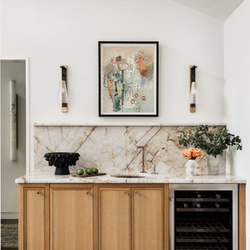
At one end of the kitchen, a dedicated bar introduces a more intimate moment. Art, layered lighting, and wall-mounted sconces give this area its own identity, offering contrast to the openness of the main kitchen while supporting entertaining. Clerestory windows introduce shifting daylight throughout the day, bringing depth and movement to the quartzite focal wall at the range. Pendant lights reference midcentury forms in a refined, contemporary way. The completed kitchen was featured on the cover of Modern Luxury Interiors.
The renovation extended beyond the kitchen to include a new primary bath, a refreshed guest bath, and updated furnishings throughout the living and dining rooms. In the primary bath, marble with expressive veining is paired with a custom floating white oak vanity, balancing warmth and restraint. In the living room, a new picture window frames wooded views, while the furniture plan grounds the space. A turquoise Murano glass chandelier introduces color and artistry, adding a distinctive, personal note to the interior.
 Jarrett Design
 is grateful for repeat clients, especially when they have impeccable taste.
In this case, we started with their guest bath. An antique-inspired, hand-pegged vanity from our Nest collection, in hand-planed quarter-sawn cherry with metal capped feet, sets the tone. Calcutta Gold marble warms the room while being complimented by a white marble top and traditional backsplash. Polished nickel fixtures, lighting, and hardware selected by the client add elegance. A special bathroom for special guests.
Next on the list were the laundry area, bar and fireplace. The laundry area greets those who enter through the casual back foyer of the home. It also backs up to the kitchen and breakfast nook. The clients wanted this area to be as beautiful as the other areas of the home and the visible washer and dryer were detracting from their vision. They also were hoping to allow this area to serve double duty as a buffet when they were entertaining. So, the decision was made to hide the washer and dryer with pocket doors. The new cabinetry had to match the existing wall cabinets in style and finish, which is no small task. Our Nest artist came to the rescue. A five-piece soapstone sink and distressed counter top complete the space with a nod to the past.
Our clients wished to add a beverage refrigerator to the existing bar. The wall cabinets were kept in place again. Inspired by a beloved antique corner cupboard also in this sitting room, we decided to use stained cabinetry for the base and refrigerator panel. Soapstone was used for the top and new fireplace surround, bringing continuity from the nearby back foyer.
Last, but definitely not least, the kitchen, banquette and powder room were addressed. The clients removed a glass door in lieu of a wide window to create a cozy breakfast nook featuring a Nest banquette base and table. Brackets for the bench were designed in keeping with the traditional details of the home. A handy drawer was incorporated. The double vase pedestal table with breadboard ends seats six comfortably.
The powder room was updated with another antique reproduction vanity and beautiful vessel sink.
While the kitchen was beautifully done, it was showing its age and functional improvements were desired. This room, like the laundry room, was a project that included existing cabinetry mixed with matching new cabinetry. Precision was necessary. For better function and flow, the cooking surface was relocated from the island to the side wall. Instead of a cooktop with separate wall ovens, the clients opted for a pro style range. These design changes not only make prepping and cooking in the space much more enjoyable, but also allow for a wood hood flanked by bracketed glass cabinets to act a gorgeous focal point. Other changes included removing a small desk in lieu of a dresser style counter height base cabinet. This provided improved counter space and storage. The new island gave better storage, uninterrupted counter space and a perch for the cook or company. Calacatta Gold quartz tops are complimented by a natural limestone floor. A classic apron sink and faucet along with thoughtful cabinetry details are the icing on the cake. Don’t miss the clients’ fabulous collection of serving and display pieces! We told you they have impeccable taste!

 Specialty Home Improvement
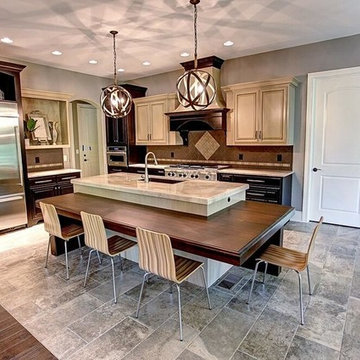
Eat-in kitchen - large transitional galley ceramic tile and beige floor eat-in kitchen idea in San Diego with an undermount sink, recessed-panel cabinets, dark wood cabinets, granite countertops, white backsplash, stainless steel appliances, a peninsula and subway tile backsplash
 MANDARINA STUDIO interior design
LOCATION: MILTON, MASSACHUSETTS
The renovation of this midcentury home centers on a complete transformation of the kitchen, which reshaped how the house functions and connects to its surroundings. The original layout relied on low cabinetry that failed to take advantage of the room’s generous volume. Mandarina Studio reworked the plan to improve circulation and take full advantage of the home’s soaring height and natural light.
The redesigned kitchen replaces a dated peninsula with a generously scaled island that supports both everyday use and entertaining. Cabinetry was reimagined vertically as well as horizontally, allowing storage and display to extend upward and reinforce the room’s proportions. A custom china cabinet with tall glass doors framed in blackened iron and finished in white oak adds presence and refinement.
At one end of the kitchen, a dedicated bar introduces a more intimate moment. Art, layered lighting, and wall-mounted sconces give this area its own identity, offering contrast to the openness of the main kitchen while supporting entertaining. Clerestory windows introduce shifting daylight throughout the day, bringing depth and movement to the quartzite focal wall at the range. Pendant lights reference midcentury forms in a refined, contemporary way. The completed kitchen was featured on the cover of Modern Luxury Interiors.
The renovation extended beyond the kitchen to include a new primary bath, a refreshed guest bath, and updated furnishings throughout the living and dining rooms. In the primary bath, marble with expressive veining is paired with a custom floating white oak vanity, balancing warmth and restraint. In the living room, a new picture window frames wooded views, while the furniture plan grounds the space. A turquoise Murano glass chandelier introduces color and artistry, adding a distinctive, personal note to the interior.

 Specialty Home Improvement
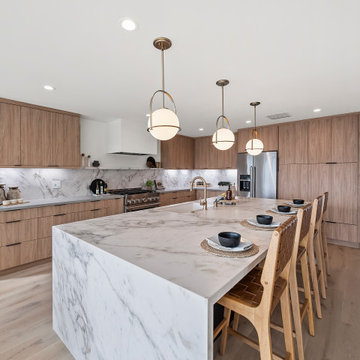
Inspiration for a large transitional galley ceramic tile and beige floor eat-in kitchen remodel in San Diego with an undermount sink, recessed-panel cabinets, dark wood cabinets, granite countertops, white backsplash, stainless steel appliances, a peninsula and subway tile backsplash


 Renovisions
These South Shore of Boston homeowners desired a larger kitchen as their existing had limited space to host family events and entertain guests – they turned to Renovisions to help transform their small, outdated kitchen with separate walk-in pantry into a beautiful, open and spacious inspirational room.
Choosing the right cabinetry for the room and how to meet the needs of the client was critical to the overall success of this design. A traditional style was the framework of the home and the flat paneled doors on the white painted cabinetry support this aspect. Going vertical as possible with cabinets is a trend here to stay; keeping with that idea, we recommended the graceful tall pantry cabinet that flanks one side of the kitchen. This not only lends to an eye-appealing furniture-look, but adds significant storage space, allowing the cabinets to store items they may not use on a regular basis. In this case, the clients are amazed with the amount of storage they’ve gained and one that provides easy access to all interior items. Every inch of space was key to create this optimally functional kitchen. Must-haves such as tray dividers above the refrigerator are handy and the double pull-out trash/recycling bins on the right side of the sink were a simple and clean way to gain floor space and conceal unsightly trash.
The focal point of this kitchen is the expansive, soft-grey colored contrasting island with larger, deeper drawers for pots, pans and platters. The client was excited to switch to an induction chef-series range that featured a divided oven that can accommodate two different temperatures.
Fit and finish is important in any renovation and this certainly holds true in this kitchen project to personalize their space. The custom recessed panel columns with wainscot details add an architectural element that ties into the kitchen cabinet design and Carrera-look quartz countertops which provide a stunning classical look that ties nicely with the overall traditional style. These homeowners are excited to show off their open and spacious Renovision!
“We really enjoyed our new kitchen and it’s amazing improvement over the holidays. We got rave reviews from all of our guests!”
Steve & Mary S. (Duxbury)


 Story Homes
This is the story about a kitchen that was showing it’s age with white countertops and dark oak cabinets on a dark oak floor. It all worked once, but now the kitchen felt dark, cramped and dysfunctional. The owners were looking for a total kitchen transformation.
After a disastrous beginning with a contractor taking their money and vanishing into thin air, the owners were left with a completely gutted kitchen that consisted of only the walls. They hired Rick Jacobson to rescue them and restart the project.
The new kitchen design began with the idea of using Cobalt Blue as a primary color. The blue seen on many glassware pieces is Cobalt Blue, and it was decided to use it in the tile for the kitchen, as well as the pendant lights. Another goal was to make the kitchen brighter with an easier traffic flow, as well as completely updated cabinetry. And there were traffic patterns to improve, a refrigerator to move, and exhaust vents to reroute.
Rick Jacobson listened to the owners and worked to create the kitchen that the owners imagined. He began by thinking through the traffic flow patterns. He noted that the doorway from the dining room needed to be widened. He added rounded doorway headers to match the home’s existing décor.
He carefully thought through where the kitchen island should be, including how opening the oven doors would be in relation to people sitting at the kitchen island at a family gathering. Kitchen cabinet touches include off edge flat panel doors, soft close wooden drawers, and a spice cabinet with two slide-out racks. The new longer center island features a drawer microwave that opens and closes automatically with the push of a button. The center island also features two recycling bins and seating for four. Rick even thought of adding decorative elements to the existing half wall to make it look in line with the kitchen island. The kitchen’s black granite countertops offer an unusually appealing view: There are lots of interesting reflections throughout the kitchen.
Another of Rick’s touches is that all of the lights, including recessed ceiling lights, three cobalt blue pendant lights and below cabinet lights are on dimmers which work to balance daytime and nighttime lighting.
The under mounted stainless steel single sink is complemented with a gooseneck faucet. The stainless steel gas range is thin enough to allow for a wide drawer below for utensils, and the stainless steel vent hood is vented through the ceiling to outdoors, allowing additional storage space in the top cabinets. Double ovens with white doors are the perfect match to the cabinets, with a location that makes baking and roasting easier with the two large vertical storage for baking sheets and supplies nearby.
The result: A functional, open, bright and Cobalt blue kitchen.
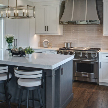
 Drury Design
Design objectives for the remodel were aimed at giving the kitchen a larger feel, more room for cooking and extra seating for entertaining:
-Island with seating
-Space for a larger range/cooking area
-More storage with cabinets to the ceiling
-Making the original dining room blend with the kitchen so it all feels like one space
Design challenges to be solved:
-Making the header between the kitchen and the old dining room make sense as we combined the two spaces
-Avoid feeling crammed – a large island with seating still needed space for people walking around the space
-Refrigerator location – the header and window placements needed to stay, so finding a new and functional place for the fridge was a priority
-Add a large hood for wow-factor appeal
Design solutions fell into place as the overall layout came together:
-A large island to seat their four-person family comfortably. -Seating on two sides of the island improves conversation and has a great look.
-Knocking out a dining room wall gave us more room for the island. The leftover part of the dining was perfect for a dry bar/beverage area.
-The refrigerator needed to blend in and also be easily accessible. We removed the built-in pantry and used this space to house the refrigerator/freezer. Then we added tall pantry cabinets throughout the kitchen to make up for the loss of space.
-A large metal hood broke up the space and made for a fun statement piece
The new space is perfect for family time when the kids are back. It’s more conducive for being together, hanging out together, and entertaining with different friend groups together… the family simply spends more time together when they’re together in their new space.
“It’s the design and the openness,” the mom says. “Everybody loves it and gathers around the island all the time. It’s the lighting, too – it’s brighter in here. It’s just more open. We love it!”
Sponsored
Fredericksburg, OH
High Point Cabinets
Columbus' Experienced Custom Cabinet Builder | 4x Best of Houzz Winner
 Specialty Home Improvement
Large transitional galley ceramic tile and beige floor eat-in kitchen photo in San Diego with recessed-panel cabinets, dark wood cabinets, a peninsula, an undermount sink, granite countertops, white backsplash, stainless steel appliances and subway tile backsplash
 Renovisions
These South Shore of Boston homeowners desired a larger kitchen as their existing had limited space to host family events and entertain guests – they turned to Renovisions to help transform their small, outdated kitchen with separate walk-in pantry into a beautiful, open and spacious inspirational room.
Choosing the right cabinetry for the room and how to meet the needs of the client was critical to the overall success of this design. A traditional style was the framework of the home and the flat paneled doors on the white painted cabinetry support this aspect. Going vertical as possible with cabinets is a trend here to stay; keeping with that idea, we recommended the graceful tall pantry cabinet that flanks one side of the kitchen. This not only lends to an eye-appealing furniture-look, but adds significant storage space, allowing the cabinets to store items they may not use on a regular basis. In this case, the clients are amazed with the amount of storage they’ve gained and one that provides easy access to all interior items. Every inch of space was key to create this optimally functional kitchen. Must-haves such as tray dividers above the refrigerator are handy and the double pull-out trash/recycling bins on the right side of the sink were a simple and clean way to gain floor space and conceal unsightly trash.
The focal point of this kitchen is the expansive, soft-grey colored contrasting island with larger, deeper drawers for pots, pans and platters. The client was excited to switch to an induction chef-series range that featured a divided oven that can accommodate two different temperatures.
Fit and finish is important in any renovation and this certainly holds true in this kitchen project to personalize their space. The custom recessed panel columns with wainscot details add an architectural element that ties into the kitchen cabinet design and Carrera-look quartz countertops which provide a stunning classical look that ties nicely with the overall traditional style. These homeowners are excited to show off their open and spacious Renovision!
“We really enjoyed our new kitchen and it’s amazing improvement over the holidays. We got rave reviews from all of our guests!”
Steve & Mary S. (Duxbury)
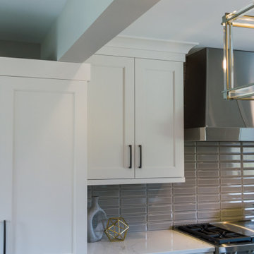 Drury Design
Design objectives for the remodel were aimed at giving the kitchen a larger feel, more room for cooking and extra seating for entertaining:
-Island with seating
-Space for a larger range/cooking area
-More storage with cabinets to the ceiling
-Making the original dining room blend with the kitchen so it all feels like one space
Design challenges to be solved:
-Making the header between the kitchen and the old dining room make sense as we combined the two spaces
-Avoid feeling crammed – a large island with seating still needed space for people walking around the space
-Refrigerator location – the header and window placements needed to stay, so finding a new and functional place for the fridge was a priority
-Add a large hood for wow-factor appeal
Design solutions fell into place as the overall layout came together:
-A large island to seat their four-person family comfortably. -Seating on two sides of the island improves conversation and has a great look.
-Knocking out a dining room wall gave us more room for the island. The leftover part of the dining was perfect for a dry bar/beverage area.
-The refrigerator needed to blend in and also be easily accessible. We removed the built-in pantry and used this space to house the refrigerator/freezer. Then we added tall pantry cabinets throughout the kitchen to make up for the loss of space.
-A large metal hood broke up the space and made for a fun statement piece
The new space is perfect for family time when the kids are back. It’s more conducive for being together, hanging out together, and entertaining with different friend groups together… the family simply spends more time together when they’re together in their new space.
“It’s the design and the openness,” the mom says. “Everybody loves it and gathers around the island all the time. It’s the lighting, too – it’s brighter in here. It’s just more open. We love it!”
203