
Search results for "Inadequately" in Home Design Ideas
 sixty nine EDGE DESIGN
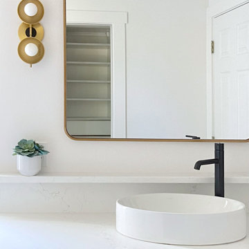
The renovation was to create a spa retreat for a single mother who wanted a bright and relaxing space with a more storage. Her old bathroom was dark, divided by a wall, and had double sinks she did not need with inadequate storage. All builder grade and original to the home.
To see design renders of this project please click on my website page or use the link below which will take you directly to the project: https://www.instagram.com/p/Ce6JeKcuX-K/?utm_source=ig_web_copy_link&igsh=MzRlODBiNWFlZA==
 Renovisions
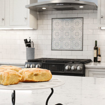
This client requested that we design her new kitchen space to look and function with her and her family’s usage in mind. She was not happy with her existing kitchen due to builder-grade ceramic flooring, lack of countertop space, poor lighting, inadequate and unorganized storage and the closed off feel of the area. Renovisions resolved all of these issues by designing and building an impressive, transitional styled kitchen; delivering a beautifully well thought-out space that provides a multi-functional approach and meets the needs of this busy and dynamic household.
Typically, we encounter challenges in every project, and this was no different. The upstairs bathroom plumbing ran across the entire length of the kitchen sink wall and it was necessary to work with it by moving the plumbing as far up as possible and then building a soffit to hide it.
Creating a space that has a more open feel was top of mind for our client. Installing a new wood floor that matched the existing dining room floor helped with this and in addition, warmed up the room. By relocating the refrigerator to the opposite wall and adding a bar area at the end toward the family room, the flow of traffic for family members and guests became more managed.
The open floor plan allowed for additional island cabinets to accommodate smart storage and better functionality when prepping meals, sitting to eat or gathering with friends and family. We believe having ample countertop surface space is a critical improvement in any renovation and this particular project now boasts a large countertop area with a stunning wide vein pattern that accentuates the design instead of overpowering it. The soft look of the Blanco Arabescato quartz enhances the space and looks lovely with the white inset styled cabinetry.
Beauty and function go hand-in-hand in this kitchen with several exceptional elements such as under-cabinet lighting with dimmers to control the mood light. Glass doors were added to the wall cabinets which flank the wine rack for displaying their decorative glassware and a beverage cooler below provided added convenience and access to cold beverages. The GE Café line of appliances in ‘Slate’ and ‘Stainless Steel’ finishes are a stunning contrast here.
The sensational looking decorative marble 6”x6” backsplash tile over the gas range and in the bar area creates nice focal points by creating a unique look for her that family and guests love.
Convenient and functional elements were added such as a blind corner pull-out for easier pot/pan storage, a sweep-o-vac under cabinet vacuum system for those constant quick clean-ups, a pull-out caddy under the sink base for storage of cleaning products and a protective mat to collect potential spills.
Our client let us know it was time for a change and we listened. She shared a few pictures she loved from a home magazine, we shared our insight and then designed/built the kitchen of her dreams! … A fabulous and functional space.
 Irene Designs
Mudroom — Project Description (Bolton, CT)
(Reconfiguration • Custom Storage • Functional Entry Design)
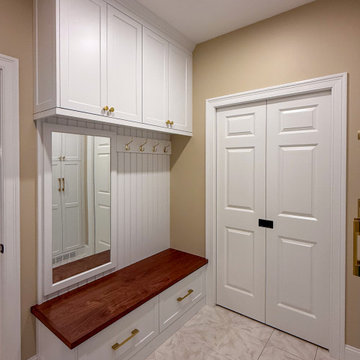
The original mudroom layout was cramped and inefficient, offering minimal storage and poor traffic flow. The garage door opened directly into a wall, the single corner closet provided limited accessibility to its sides, and there was no place for shoes, coats, or everyday landing items. The space lacked both organization and visual appeal.
Key Issues in the Old Layout
Garage door swung into a side wall, restricting movement
Small corner closet with poor left/right access and inadequate capacity
No dedicated shoe storage
No seating or landing surface
No mirror, making the space feel smaller and less functional
Overall layout did not support daily use or family workflow
New Layout & Built-In Storage Solutions
The mudroom was completely reconfigured to create a balanced, efficient, and visually cohesive entry zone that supports everyday routines and maximizes available space.
Wall-to-Wall Back Closet
Full-width custom closet spans the entire back wall
Equipped with double pocket doors for effortless access without blocking circulation
Interior fitted with coat hanging space and top shelving for seasonal items
Full-Height Shoe & Accessory Storage
A dedicated tall cabinet provides:
Bottom half: organized shoe storage
Top half: adjustable shelves for accessories, baskets, or household essentials
Built-In Combo Opposite the Closet
A custom multifunctional unit includes:
Walnut bench top for warmth, texture, and a natural design element
Two deep drawers beneath the bench for gloves, hats, pet items, etc.
Full-height mirror strategically placed to visually expand the room
Open hanging storage for quick-access items
Upper enclosed cabinet with adjustable shelving for concealed storage
Additional Enhancements
The garage door swing was reversed for proper ergonomics and easier entry
Added crown molding throughout the space for a cohesive, finished look consistent with the rest of the renovation
Upgraded lighting brightens the room and enhances the sense of cleanliness and order
Find the right local pro for your project
 Remodelers Council of Greater DSM
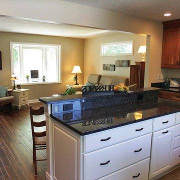
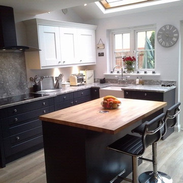
You see them all over town - and you may even have one. Split level houses with small and inadequate kitchens. Rollie Clarkson of Remodeling Contractors worked magic on this kitchen.
 RFK Kitchens
Objectives
Having lived with the kitchen as supplied by the builder since buying the property new they had finally had enough of its poor and inadequate design that provided only a basic L shape layout, no dining area and only a single built under oven.
At our initial design brief meeting it became clear that the Gardner’s wanted more light in the kitchen, more useable work surface, more storage, high level built in cooking appliances, an island with somewhere to sit and socialise but not to compromise on the aesthetic which was all important.
What We Did
They liked the whole look of the Second Nature 1909 in frame painted style but were concerned about price.
We suggested breaking into the pitched roof and introducing a long bank of Velux’s to create a much lighter, airier feel to the whole room; he also suggested removing the existing radiator and replacing it with a plinth heater thus freeing up an otherwise difficult to use wall.
To keep cost down he also suggested using the Second Nature Milbourne painted foil wrapped shaker door in contrasting colour ways shown.
The Result
We created the desired look but keeping within the budget. As you can see from the photos, the room is much lighter.
Testimonial
We were planning to renew our kitchen and had already visited some of the usual DIY stores to get ideas and estimates.
We then went along to Rugby Fitted Kitchens to see what they could offer and were immediately impressed by the showroom; the variety of kitchen styles and design ideas on display were inspirational and brought the prospect of a new kitchen to life, far better than flicking through brochures.
Trevor understood our requirements and guided us through the design process suggesting options for the cupboard configurations and fitments that maximised our storage space, in addition to which the pricing for the Neff appliances was second to none either matching or bettering the best buys I could find online.
The installation was expertly undertaken by Daniel & Daniel (yes they really do have the same Christian names!!) and nothing was too much trouble for them.
We are absolutely delighted with the finished product and would have no hesitation in recommending RFK to our friends.”
 Renovisions
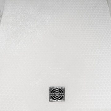
This South Shore of Boston client approached the team of Renovisions to remodel her existing basement bathroom. This bath, with an outdated fiberglass shower stall was cracked and leaking into the concrete floor below. The room had inadequate storage, was dark and did not boost this home’s overall market value.
It was definitely time for a Renovision and the client was excited to get started! She was looking forward to sharing the new space with guests that stay at her home and use the bathroom often.
Working alongside this client was fun and productive as great design and product choices were selected together. In the design process, Renovisions presented a unique idea; using the basement foundation ledge for a shelf that ran into the shower area, gaining extra space for shampoos and soaps, eliminating the need for a niche. Another great idea was to implement a Grohe Smart Control valve which brings this shower experience to another level; they can choose ways to spray with the right degree of warmth. The stunning stream-lined shower trims in brushed nickel finish match the style and finish on the single-lever vanity faucet.
The contrasting dark grey, large format porcelain floor tile’s texture resembles a linen-look pattern the client requested while complimenting the darker veining in the quartz curb, shelf and vanity countertop.
The Carrera-look porcelain shower wall tiles boast no-maintenance and provides a clean, brighter appeal seen through the beautiful custom shower glass enclosure. We lightened up the bath with a light blue paint color which added a fresh look, giving the illusion of a bigger space.
As you can see, with the right colors, textures and accessories, we transformed this basement bath from Drab to Fab. The client was thrilled with her basement Renovision, a true Breath of Fresh Flair’!
 Byggmeister Inc
Photo by Jim Raycroft
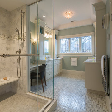
When these homeowners first came to us in 2011, they had a list of major projects to adapt their Victorian home to the needs of their growing family. The first phase of work was a basement renovation to provide informal hang out space. The second was a garage. Finally they turned their attention to the master bedroom and bathroom.
FROM BALCONY TO BATHROOM
At one end of the suite was a cramped and outdated bathroom. At the other end was an underutilized, high-maintenance, exterior balcony. A leaky door to the balcony, as well as inadequate insulation and air-sealing and a poorly designed heating system, made the bedroom difficult to keep comfortable in the winter.
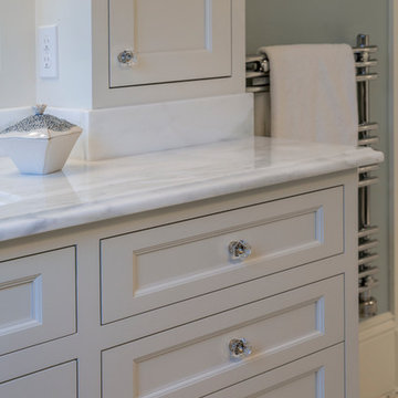
We chose to capture the old balcony as indoor space and relocate the bathroom to that end of the master suite. This strategy not only gave us the opportunity to install much better insulation and good, tight windows, it created enough new floor area that we were able to include a large walk-in shower, separate vanities, a toilet room, and a make-up counter in the new master bathroom.
ADAPTING AND UPDATING
The project allowed us to find a prominent place for an old leaded glass window sash that the homeowners had been hanging onto for several years in anticipation of this project.
The flow and layout of the master suite are now much better suited to a 21st century lifestyle. But best of all (to us, anyway), the homeowners report that the bathroom—where the old balcony had been—is now the most comfortable room in the house.
 Renovisions
This kitchen had not been renovated since the salt box colonial house was built in the 1960’s. The new owner felt it was time for a complete refresh with some traditional details and adding in the owner’s contemporary tastes.
At initial observation, we determined the house had good bones; including high ceilings and abundant natural light from a double-hung window and three skylights overhead recently installed by our client. Mixing the homeowners desires required the skillful eyes of Cathy and Ed from Renovisions. The original kitchen had dark stained, worn cabinets, in-adequate lighting and a non-functional coat closet off the kitchen space. In order to achieve a true transitional look, Renovisions incorporated classic details with subtle, simple and cleaner line touches. For example, the backsplash mix of honed and polished 2” x 3” stone-look subway tile is outlined in brushed stainless steel strips creating an edgy feel, especially at the niche above the range. Removing the existing wall that shared the coat closet opened up the kitchen to allow adding an island for seating and entertaining guests.
We chose natural maple, shaker style flat panel cabinetry with longer stainless steel pulls instead of knobs, keeping in line with the clients desire for a sleeker design. This kitchen had to be gutted to accommodate the new layout featuring an island with pull-out trash and recycling and deeper drawers for utensils. Spatial constraints were top of mind and incorporating a convection microwave above the slide-in range made the most sense. Our client was thrilled with the ability to bake, broil and microwave from GE’s advantium oven – how convenient! A custom pull-out cabinet was built for his extensive array of spices and oils. The sink base cabinet provides plenty of area for the large rectangular stainless steel sink, single-lever multi-sprayer faucet and matching filtered water dispenser faucet. The natural, yet sleek green soapstone countertop with distinct white veining created a dynamic visual and principal focal point for the now open space.
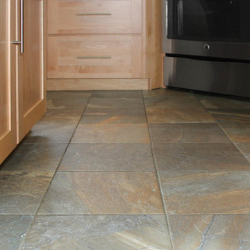
While oak wood flooring existed in the entire first floor, as an added element of color and interest we installed multi-color slate-look porcelain tiles in the kitchen area. We also installed a fully programmable floor heating system for those chilly New England days. Overall, out client was thrilled with his Mission Transition.
 Byggmeister Inc
Photo by Jim Raycroft
When these homeowners first came to us in 2011, they had a list of major projects to adapt their Victorian home to the needs of their growing family. The first phase of work was a basement renovation to provide informal hang out space. The second was a garage. Finally they turned their attention to the master bedroom and bathroom.
FROM BALCONY TO BATHROOM
At one end of the suite was a cramped and outdated bathroom. At the other end was an underutilized, high-maintenance, exterior balcony. A leaky door to the balcony, as well as inadequate insulation and air-sealing and a poorly designed heating system, made the bedroom difficult to keep comfortable in the winter.
We chose to capture the old balcony as indoor space and relocate the bathroom to that end of the master suite. This strategy not only gave us the opportunity to install much better insulation and good, tight windows, it created enough new floor area that we were able to include a large walk-in shower, separate vanities, a toilet room, and a make-up counter in the new master bathroom.
ADAPTING AND UPDATING
The project allowed us to find a prominent place for an old leaded glass window sash that the homeowners had been hanging onto for several years in anticipation of this project.
The flow and layout of the master suite are now much better suited to a 21st century lifestyle. But best of all (to us, anyway), the homeowners report that the bathroom—where the old balcony had been—is now the most comfortable room in the house.
 Schedio Spaces
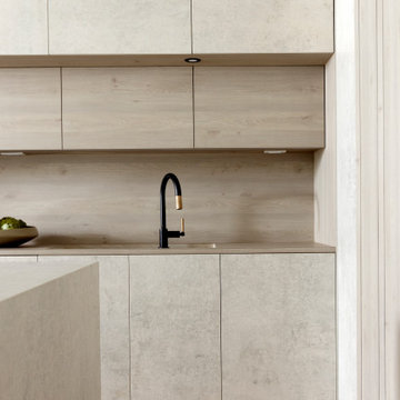
Starting its life as a dark, walled in space with inadequate cabinetry and multiple awkward components, I knew the only way forward with this penthouse kitchen, was for it to undergo a complete rebuild.
The clients were hoping to welcome a child in the years following this renovation, however they love to entertain so also wanted a modern and sophisticated kitchen. Therefore, the task became marrying functional
indestructibility with clean, elevated design, resulting in a timeless, architecturally forward kitchen with sensible storage and innovated finishes.
The first and most important task when addressing the modernization of this kitchen, was to remove the existing walls that closed off the space. Accomplishing this allowed for a more free-flowing feel and opened the sightline to the rest of the unit. This also invited the opportunity for a new, more welcoming floor plan including the addition of a large island with
ample counter space and optional eat-in functionality.
In order to maximize functional efficiency and overall aesthetic value, I knew the plumbing required substantial relocation. However, with concrete ceilings and floors, combined with a strata unwilling to allow trenching of
the slab, moving the plumbing to the most effective location was no easy feat.
Ultimately, I was able to accomplish this by creating a hidden channel inside the cabinetry that allowed the plumbing to be redirected to the ideal location without visible detection.
Creatively, I was inspired by the idea of injecting dimension, by way of juxtaposing materials that wouldn’t necessarily be found together in nature,
yet worked harmonious when combined. You’ll notice the cabinet fronts are all made of solid Dekton – a manmade stone that while costly, is nearly indestructible. This created the base in which we inset the countertop,
backsplash and surround, all made in a wood-like material. As if a huge ice-cream scoop glided into a slab of solid stone, uncovering beautiful layered depths of wood. I worked with a local company to custom
manufacture this is a high impact, one-of-a-kind laminate specifically for this project. It’s nonporous, fingerprint resistant and antimicrobial. It offers a matte finish which has a beautiful hand-feel resembling real wood but because it’s manmade, it’s not subjected to the same expansion and contraction of natural wood, making it an exceptional choice for this application.
Final details also include a touchless kitchen faucet, integrated appliances, hidden storage, Italian lighting, delicate Australian hardware and smart switches and plugs.
 Rolf Schroeder General Contractors, Inc.
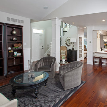
The layout of this early 90’s home was adequate for the husband when he was just living there. However, now the family of three and their loving cat live there together; the space quickly became confined and inadequate. The Clients contacted us to discuss what their options may be to help the home feel more spacious. After a few weeks of design and engineering, we went to work on opening up the first floor to increase the size of the rooms while creating continuity with the adjoining rooms. A once tired and confined layout became a spacious, comfortable, & aesthetically pleasing space to live and entertain.
 Renovisions
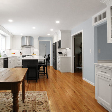
This client requested that we design her new kitchen space to look and function with her and her family’s usage in mind. She was not happy with her existing kitchen due to builder-grade ceramic flooring, lack of countertop space, poor lighting, inadequate and unorganized storage and the closed off feel of the area. Renovisions resolved all of these issues by designing and building an impressive, transitional styled kitchen; delivering a beautifully well thought-out space that provides a multi-functional approach and meets the needs of this busy and dynamic household.
Typically, we encounter challenges in every project, and this was no different. The upstairs bathroom plumbing ran across the entire length of the kitchen sink wall and it was necessary to work with it by moving the plumbing as far up as possible and then building a soffit to hide it.
Creating a space that has a more open feel was top of mind for our client. Installing a new wood floor that matched the existing dining room floor helped with this and in addition, warmed up the room. By relocating the refrigerator to the opposite wall and adding a bar area at the end toward the family room, the flow of traffic for family members and guests became more managed.
The open floor plan allowed for additional island cabinets to accommodate smart storage and better functionality when prepping meals, sitting to eat or gathering with friends and family. We believe having ample countertop surface space is a critical improvement in any renovation and this particular project now boasts a large countertop area with a stunning wide vein pattern that accentuates the design instead of overpowering it. The soft look of the Blanco Arabescato quartz enhances the space and looks lovely with the white inset styled cabinetry.
Beauty and function go hand-in-hand in this kitchen with several exceptional elements such as under-cabinet lighting with dimmers to control the mood light. Glass doors were added to the wall cabinets which flank the wine rack for displaying their decorative glassware and a beverage cooler below provided added convenience and access to cold beverages. The GE Café line of appliances in ‘Slate’ and ‘Stainless Steel’ finishes are a stunning contrast here.
The sensational looking decorative marble 6”x6” backsplash tile over the gas range and in the bar area creates nice focal points by creating a unique look for her that family and guests love.
Convenient and functional elements were added such as a blind corner pull-out for easier pot/pan storage, a sweep-o-vac under cabinet vacuum system for those constant quick clean-ups, a pull-out caddy under the sink base for storage of cleaning products and a protective mat to collect potential spills.
Our client let us know it was time for a change and we listened. She shared a few pictures she loved from a home magazine, we shared our insight and then designed/built the kitchen of her dreams! … A fabulous and functional space.
 Renovisions
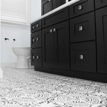
Perectly balanced, this dramatic black and white bathroom is a stunner. Thoughtful design was top of mind for these clients as they approached the Renovisions team to help narrow down their choices and bring it to life. Finding balance while mixing darker, heavier black finishes and lighter, white finishes was the task at hand and the goal was to create a modern look with an industrial/rustic feel.
The challenge on this project was incorporating all the desired elements and products in a tight spatial constraint of 9’ x 7.5’. The clients biggest concern in the old bathroom was inadequate storage, tired and under-utilized bathtub and they also needed an additional sink for their two daughters who often share this space. Renovisions recommended removing the wall between the shower and closet to gain additional floor space as you enter the bath, while providing wall space for the three towel bars.
Collaborating with the clients and searching to find the right fixtures paid off nicely. This newly remodeled Renovision accommodated two rectangular sinks, a walk-in shower with hand-held shower, wall-mounted shower head and two soft spray body jets. The oil-rubbed bronze fixtures not only provided a luxurious spa experience, but also added warmth and softness to the vintage feel. The glass shower enclosure is trimmed in a matte black grid that boasts an industrial aesthetic with retro feel while delivering modernistic function. It’s unique in appearance while allowing the chic white subway and black and white diamond tile to peek through.
The beautifully designed cabinetry in a matte black painted finish provides plenty of storage. This smart configuration included two banks of three drawers for toiletries and accessories, two towers with adjustable shelves for towels and two ‘garage’ doors for hair dryers.
Another unique design detail to capture attention was the black and white curvy geometric floor tile which plays off the straight lines of the cabinets and square grids of the shower enclosure.
The clients are thrilled with the results and their modern, high-contrast styled digs – a true customized relaxation sanctuary for the entire family.
 Interiors By Melody
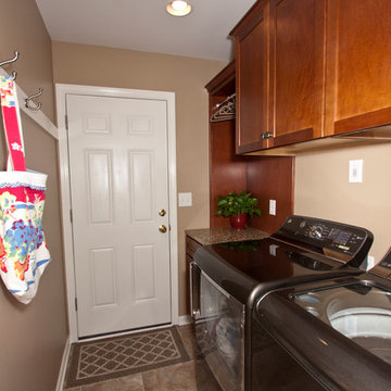
Before
The laundry storage was inadequate Lighting was poor
The hookups pushed the appliances too far into the room
After
Though the new appliances were deeper we were able to recess the hook ups and the venting into the walls to offer a clearer walk-thru. The new cabinets meant clutter could be hidden. Additional lighting and a wall hung coat rack add even more functional space.
 Design Connection, Inc.
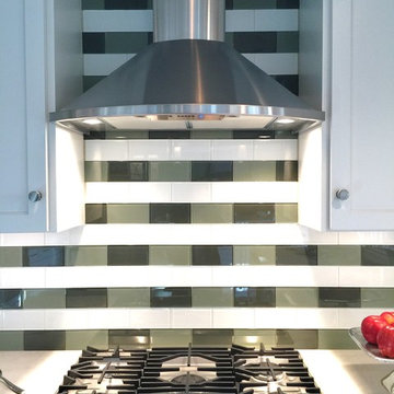
Prior to the remodel, this kitchen had dated oak cabinets, old counters, antiquated appliances, and inadequate storage. Ladegaard considered the client’s desire to lighten the kitchen, and transformed the space with the aid of Brackman Construction. A load bearing wall was removed to open the space to the great room, and a new large island was added… perfect for entertaining.
 New England Design & Construction
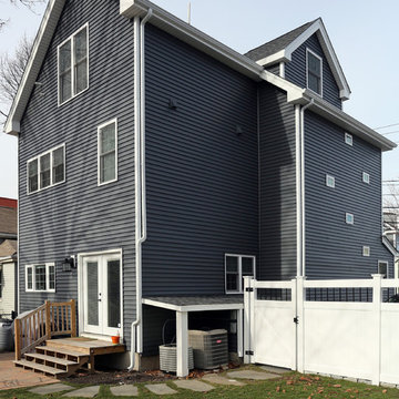
This project enabled the client to stay in a thriving neighborhood that they loved by growing the size their 1836 home to accommodate the needs of a modern family. NEDC accomplished this by razing an existing inadequate second story that housed two bedrooms and constructing one and a half new stories above the existing first floor -- creating a four bedroom + Office/2.5 bath home from a 2 bedroom/1 bath home.
Photography by Jay Groccia at OnSite Studios
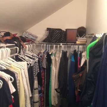
 LauraLee Kavanagh • California Closets
Older homes are notorious for having inadequate closets and California Closets provides the perfect solution to organize all your belongings while creating a beautiful space.
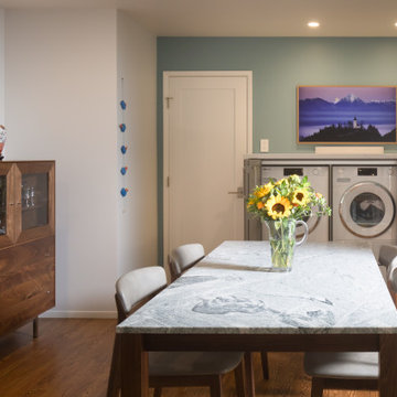
 Design Set Match
This kitchen included an odd-sized double-oven with shattered glass and appliance interference, wasted soffit space, inadequate lighting, and more. The client also faced issues with the laundry closet, storage, and countertops.
We addressed these concerns by adjusting the layout. Featured changes include an integrated micro-convection double-oven, a counter-depth refrigerator, the removal of soffits, an expanded cabinetry footprint, a built-in laundry, relocating the electrical panel, and adding solid-surface countertops.
Design elements include cabinet-mounted remote switches, a built-in wine refrigerator, two-tone cabinetry, all LED lighting, a pull-down swivel faucet, fully functional storage, and virtually seamless countertops.
These changes addressed all of the clients’ pain points and improved the kitchen’s functionality, efficiency, and aesthetic.
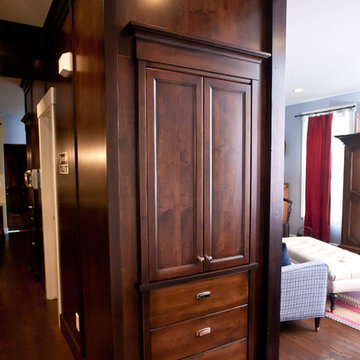
 Deco Design
This area of the house enclosed a powder bath, entry closet and pantry closet for the kitchen and seperates the living room from the kitchen side of the main floor. The storage space for the pantry and closet were inadequate and boring so I decided to make them more interesting by making them look like armoires tucked into the wall and wrapped the walls with panels to match.
photos by Kimball Ungerman
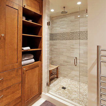
 Sturman Architects
This project included the addition of a new entry, circulation space, powder room and office spaces. The addition fixed the inadequate flow of the house and the new stair and railing design was the focal point of the project. All bathrooms and kitchens were remodeled.
11