
Search results for "Inadequately" in Home Design Ideas
 sixty nine EDGE DESIGN
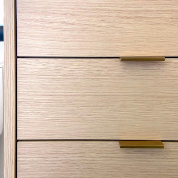
The renovation was to create a spa retreat for a single mother who wanted a bright and relaxing space with a more storage. Her old bathroom was dark, divided by a wall, and had double sinks she did not need with inadequate storage. All builder grade and original to the home.
To see design renders of this project please click on my website page or use the link below which will take you directly to the project: https://www.instagram.com/p/Ce6JeKcuX-K/?utm_source=ig_web_copy_link&igsh=MzRlODBiNWFlZA==
 Murphy Bros. Design | Build | Remodel
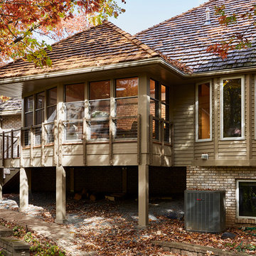
This retired couple had waited a long time to fix a whole host of outdated and inadequate aspects of their New Brighton home. Among the things remodeled in this whole house project were a complete gut and redo of the master bedroom, three baths, a walk-in closet and a front entry. But the main relaxation attraction for this couple was their new 3-season porch. Previously they had just a small wrap-around deck off the back of the home, ending at the bay window, which exposed them to an idyllic setting, along with plenty of mosquitoes and Minnesota weather. They loved the forested setting and wanted to enjoy the outdoors without being, well, in the outdoors. And with the unusually long, warm, dry fall, they’ve got the perfect solution—stunning on the outside, warm and cozy on the inside.
Project Lead — Jonah Smith • Project Manager Drew Johnston
Photography by Alyssa Lee
 Sturman Architects
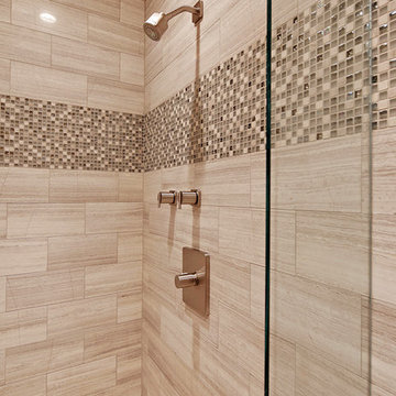
This project included the addition of a new entry, circulation space, powder room and office spaces. The addition fixed the inadequate flow of the house and the new stair and railing design was the focal point of the project. All bathrooms and kitchens were remodeled.
Find the right local pro for your project
 Sturman Architects
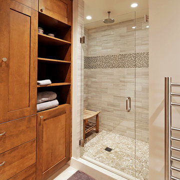
This project included the addition of a new entry, circulation space, powder room and office spaces. The addition fixed the inadequate flow of the house and the new stair and railing design was the focal point of the project. All bathrooms and kitchens were remodeled.
 Irene Designs
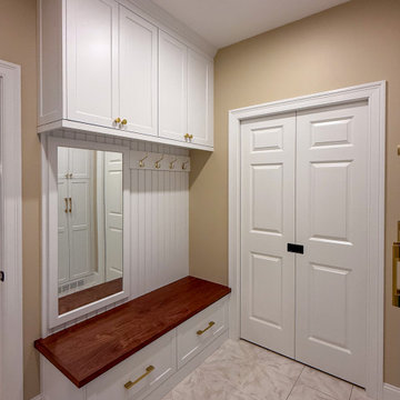
Mudroom — Project Description (Bolton, CT)
(Reconfiguration • Custom Storage • Functional Entry Design)
The original mudroom layout was cramped and inefficient, offering minimal storage and poor traffic flow. The garage door opened directly into a wall, the single corner closet provided limited accessibility to its sides, and there was no place for shoes, coats, or everyday landing items. The space lacked both organization and visual appeal.
Key Issues in the Old Layout
Garage door swung into a side wall, restricting movement
Small corner closet with poor left/right access and inadequate capacity
No dedicated shoe storage
No seating or landing surface
No mirror, making the space feel smaller and less functional
Overall layout did not support daily use or family workflow
New Layout & Built-In Storage Solutions
The mudroom was completely reconfigured to create a balanced, efficient, and visually cohesive entry zone that supports everyday routines and maximizes available space.
Wall-to-Wall Back Closet
Full-width custom closet spans the entire back wall
Equipped with double pocket doors for effortless access without blocking circulation
Interior fitted with coat hanging space and top shelving for seasonal items
Full-Height Shoe & Accessory Storage
A dedicated tall cabinet provides:
Bottom half: organized shoe storage
Top half: adjustable shelves for accessories, baskets, or household essentials
Built-In Combo Opposite the Closet
A custom multifunctional unit includes:
Walnut bench top for warmth, texture, and a natural design element
Two deep drawers beneath the bench for gloves, hats, pet items, etc.
Full-height mirror strategically placed to visually expand the room
Open hanging storage for quick-access items
Upper enclosed cabinet with adjustable shelving for concealed storage
Additional Enhancements
The garage door swing was reversed for proper ergonomics and easier entry
Added crown molding throughout the space for a cohesive, finished look consistent with the rest of the renovation
Upgraded lighting brightens the room and enhances the sense of cleanliness and order
 Sturman Architects
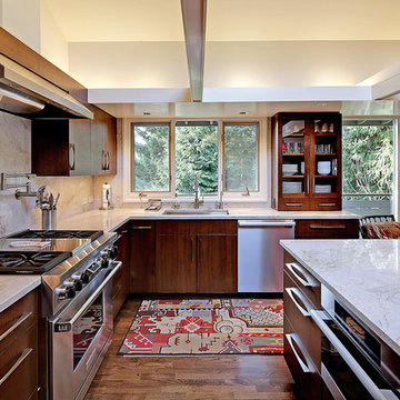
This project included the addition of a new entry, circulation space, powder room and office spaces. The addition fixed the inadequate flow of the house and the new stair and railing design was the focal point of the project. All bathrooms and kitchens were remodeled.
 Sturman Architects
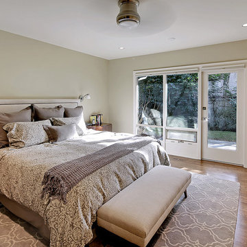
This project included the addition of a new entry, circulation space, powder room and office spaces. The addition fixed the inadequate flow of the house and the new stair and railing design was the focal point of the project. All bathrooms and kitchens were remodeled.
 Michael Nash Design, Build & Homes
2011 NARI CAPITAL COTY FINALIST AWARD WINNER
Project Scope--
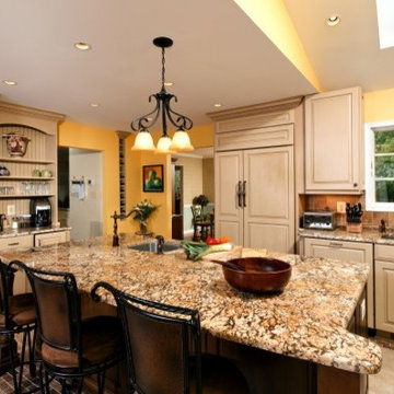
The owners of this 1990’s colonial home were seeking to convert the existing space-constricted builder-grade kitchen into a generously-apportioned Tuscan-style country kitchen with lots of natural light, high-end appointments and a warmly textured interior design concept. Among other features they sought a mid-room island that would house critical appliances, complete the work triangle and provide dining counter space for three. They also wanted to include a professional-grade gas range.
Challenges--
Situated between dining room and family room, the existing kitchen was small and poorly planned. The sink faced a blank wall and the appliances were inadequate for the owner’s gourmet cooking ambitions.
To create the desired footprint, the contractor, Michael Nash Design, Build & Homes, created a plan that called for consolidating square footage in several rooms adjacent to the kitchen. This entailed removing two load bearing walls– one between the kitchen and dining room, a second separating the kitchen and family room– and shifting loads to newly installed structural supports carefully concealed within the resultant “open” floor plan.
To accommodate new appliances (and work efficiencies) called for by this radically altered space plan, the design located the new professional gas range and other key features in the footprint formerly occupied by the breakfast room, a change that takes advantage of opportunities for a higher cathedral ceiling, better natural lighting and greater space.
Solutions--
With this space plan resolved, the design team could now eliminate a picture window on the west elevation, designing a new elevation to accommodate a stucco cooktop flanked by a pair of custom Palladium windows. A side elevation slider was replaced with a French door.
Infrastructure considerations included introducing gas lines needed for the 48” Viking cooktop range and re-routing plumbing. The 5’ x 9’ granite-surfaced custom designed island includes the primary kitchen sink, a dishwasher, microwave and dining overhang that provided seating for up to four.
On another wall, the design called for installing ceiling flush “beaded” display pantries with open bookcases, and routed-in plumbing for a water fountain, a faucet and an ice-making machine.
Glazed maple and cherry cabinetry increased available storage by over 50%. A recessed space was also created for a built-in vertical wine rack. Style-appropriate terra cotta tiling with mosaic bordering detailing extends into the home’s foyer. Other finishing work elements include crown molding with rounded turn posts and corbels.
 Renovisions
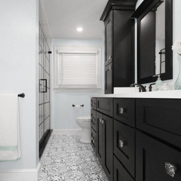
Perectly balanced, this dramatic black and white bathroom is a stunner. Thoughtful design was top of mind for these clients as they approached the Renovisions team to help narrow down their choices and bring it to life. Finding balance while mixing darker, heavier black finishes and lighter, white finishes was the task at hand and the goal was to create a modern look with an industrial/rustic feel.
The challenge on this project was incorporating all the desired elements and products in a tight spatial constraint of 9’ x 7.5’. The clients biggest concern in the old bathroom was inadequate storage, tired and under-utilized bathtub and they also needed an additional sink for their two daughters who often share this space. Renovisions recommended removing the wall between the shower and closet to gain additional floor space as you enter the bath, while providing wall space for the three towel bars.
Collaborating with the clients and searching to find the right fixtures paid off nicely. This newly remodeled Renovision accommodated two rectangular sinks, a walk-in shower with hand-held shower, wall-mounted shower head and two soft spray body jets. The oil-rubbed bronze fixtures not only provided a luxurious spa experience, but also added warmth and softness to the vintage feel. The glass shower enclosure is trimmed in a matte black grid that boasts an industrial aesthetic with retro feel while delivering modernistic function. It’s unique in appearance while allowing the chic white subway and black and white diamond tile to peek through.
The beautifully designed cabinetry in a matte black painted finish provides plenty of storage. This smart configuration included two banks of three drawers for toiletries and accessories, two towers with adjustable shelves for towels and two ‘garage’ doors for hair dryers.
Another unique design detail to capture attention was the black and white curvy geometric floor tile which plays off the straight lines of the cabinets and square grids of the shower enclosure.
The clients are thrilled with the results and their modern, high-contrast styled digs – a true customized relaxation sanctuary for the entire family.
 Murphy Bros. Design | Build | Remodel
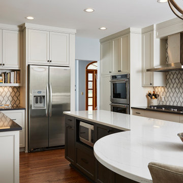
At 30 years of age honey oak trim and cabinetry easily goes from dated to unsightly. Such was the case with these homeowners who had wanted to chuck the traditional look of oak for more years than they care to think about.
“It wasn’t just about the honey oak,” explains Murphy Bros. design/build consultant Courtney Cartee, “Although that was a big part of it. The overall end goal was a lighter, brighter ambiance, better workflow and a complete rethink on dinning space.”
Most kitchens of that 90’s era featured inadequate lighting and small islands or peninsulas. In this particular case, the homeowners even wanted to eliminate the traditional family breakfast table.
 Byggmeister Inc
Photo by Jim Raycroft
When these homeowners first came to us in 2011, they had a list of major projects to adapt their Victorian home to the needs of their growing family. The first phase of work was a basement renovation to provide informal hang out space. The second was a garage. Finally they turned their attention to the master bedroom and bathroom.
FROM BALCONY TO BATHROOM
At one end of the suite was a cramped and outdated bathroom. At the other end was an underutilized, high-maintenance, exterior balcony. A leaky door to the balcony, as well as inadequate insulation and air-sealing and a poorly designed heating system, made the bedroom difficult to keep comfortable in the winter.
We chose to capture the old balcony as indoor space and relocate the bathroom to that end of the master suite. This strategy not only gave us the opportunity to install much better insulation and good, tight windows, it created enough new floor area that we were able to include a large walk-in shower, separate vanities, a toilet room, and a make-up counter in the new master bathroom.
ADAPTING AND UPDATING
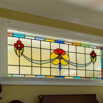
The project allowed us to find a prominent place for an old leaded glass window sash that the homeowners had been hanging onto for several years in anticipation of this project.
The flow and layout of the master suite are now much better suited to a 21st century lifestyle. But best of all (to us, anyway), the homeowners report that the bathroom—where the old balcony had been—is now the most comfortable room in the house.
 Deco Design
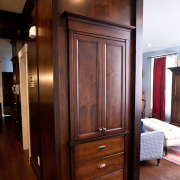
This area of the house enclosed a powder bath, entry closet and pantry closet for the kitchen and seperates the living room from the kitchen side of the main floor. The storage space for the pantry and closet were inadequate and boring so I decided to make them more interesting by making them look like armoires tucked into the wall and wrapped the walls with panels to match.
photos by Kimball Ungerman
 Renovisions
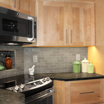
This kitchen had not been renovated since the salt box colonial house was built in the 1960’s. The new owner felt it was time for a complete refresh with some traditional details and adding in the owner’s contemporary tastes.
At initial observation, we determined the house had good bones; including high ceilings and abundant natural light from a double-hung window and three skylights overhead recently installed by our client. Mixing the homeowners desires required the skillful eyes of Cathy and Ed from Renovisions. The original kitchen had dark stained, worn cabinets, in-adequate lighting and a non-functional coat closet off the kitchen space. In order to achieve a true transitional look, Renovisions incorporated classic details with subtle, simple and cleaner line touches. For example, the backsplash mix of honed and polished 2” x 3” stone-look subway tile is outlined in brushed stainless steel strips creating an edgy feel, especially at the niche above the range. Removing the existing wall that shared the coat closet opened up the kitchen to allow adding an island for seating and entertaining guests.
We chose natural maple, shaker style flat panel cabinetry with longer stainless steel pulls instead of knobs, keeping in line with the clients desire for a sleeker design. This kitchen had to be gutted to accommodate the new layout featuring an island with pull-out trash and recycling and deeper drawers for utensils. Spatial constraints were top of mind and incorporating a convection microwave above the slide-in range made the most sense. Our client was thrilled with the ability to bake, broil and microwave from GE’s advantium oven – how convenient! A custom pull-out cabinet was built for his extensive array of spices and oils. The sink base cabinet provides plenty of area for the large rectangular stainless steel sink, single-lever multi-sprayer faucet and matching filtered water dispenser faucet. The natural, yet sleek green soapstone countertop with distinct white veining created a dynamic visual and principal focal point for the now open space.
While oak wood flooring existed in the entire first floor, as an added element of color and interest we installed multi-color slate-look porcelain tiles in the kitchen area. We also installed a fully programmable floor heating system for those chilly New England days. Overall, out client was thrilled with his Mission Transition.
 Renovisions
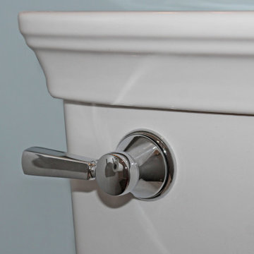
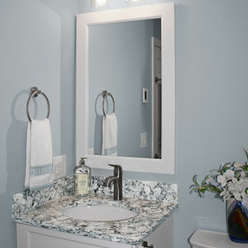
This South Shore of Boston client approached the team of Renovisions to remodel her existing basement bathroom. This bath, with an outdated fiberglass shower stall was cracked and leaking into the concrete floor below. The room had inadequate storage, was dark and did not boost this home’s overall market value.
It was definitely time for a Renovision and the client was excited to get started! She was looking forward to sharing the new space with guests that stay at her home and use the bathroom often.
Working alongside this client was fun and productive as great design and product choices were selected together. In the design process, Renovisions presented a unique idea; using the basement foundation ledge for a shelf that ran into the shower area, gaining extra space for shampoos and soaps, eliminating the need for a niche. Another great idea was to implement a Grohe Smart Control valve which brings this shower experience to another level; they can choose ways to spray with the right degree of warmth. The stunning stream-lined shower trims in brushed nickel finish match the style and finish on the single-lever vanity faucet.
The contrasting dark grey, large format porcelain floor tile’s texture resembles a linen-look pattern the client requested while complimenting the darker veining in the quartz curb, shelf and vanity countertop.
The Carrera-look porcelain shower wall tiles boast no-maintenance and provides a clean, brighter appeal seen through the beautiful custom shower glass enclosure. We lightened up the bath with a light blue paint color which added a fresh look, giving the illusion of a bigger space.
As you can see, with the right colors, textures and accessories, we transformed this basement bath from Drab to Fab. The client was thrilled with her basement Renovision, a true Breath of Fresh Flair’!

 Tile Doctor Ltd
If you have a tiled shower area in your home, it’s very likely you’ve experienced problems with the grout becoming excessively dirty and ridden with displeasing black spots of mould. The underlying issue is due to inadequate ventilation which can be a real problem in modern insulated houses and occasionally the grout can get so imbued with contamination that the problem needs to be resolved professionally.
In the case of this Ceramic tiled shower area, located at a property in Galgate, Lancashire, mould had turned the grout black and had got into the sealant strip around the base. The property owner had tried using the run-of-the-mill cleaning products you can buy in superstores, but they simply couldn’t get the job done. So, she contacted me to see what could be done.
At Tile Doctor, we come across the problem of mouldy shower tiles very often. Excess soaps and shampoos – many of which contain chemicals that harmful to the grout – can quickly build-up if not removed, causing mould and soap scum to emerge quickly, and before you know it, you have a problem like this one.
Thankfully, with the right strength product and cleaning methods, mould can be removed quite easily. The cleaning product used here was Tile Doctor Mould Away, which does what it says on the bottle and can quickly remove mould and black spots from grout and silicone. I applied Mould Away to the grout and surrounding Ceramic tiles and left it to dwell for a short period, before starting to clean the affected areas carefully using soft nail brushes and a small amount of water.
Sometimes it is necessary to repeat this process several times to achieve the best possible results, but in this case two attempts was all it took to get the grout looking like new once again.
Following the cleaning, the area was rinsed thoroughly with water, before bring dried off quickly with a heat gun on a low setting. I then sealed the grout with a single coat of Tile Doctor Wall Grout Sealer, which is a water-based sealer designed to protect against water, oil and acid-based contaminants, and stop them from spoiling the appearance of the grout. It also provides a transparent finish that does not diminish the original colouring of the grout. To add the finishing touches, I polished off the Ceramic tiles as these were already fully glazed and did not require any extra sealer.
The before and after photos are a testament to how significantly the condition and appearance of the grout was quickly improved and needless to say, the customer was very satisfied with the result.
Russell Taylor
Lancashire Tile Doctor
 Renovisions
This South Shore of Boston client approached the team of Renovisions to remodel her existing basement bathroom. This bath, with an outdated fiberglass shower stall was cracked and leaking into the concrete floor below. The room had inadequate storage, was dark and did not boost this home’s overall market value.
It was definitely time for a Renovision and the client was excited to get started! She was looking forward to sharing the new space with guests that stay at her home and use the bathroom often.
Working alongside this client was fun and productive as great design and product choices were selected together. In the design process, Renovisions presented a unique idea; using the basement foundation ledge for a shelf that ran into the shower area, gaining extra space for shampoos and soaps, eliminating the need for a niche. Another great idea was to implement a Grohe Smart Control valve which brings this shower experience to another level; they can choose ways to spray with the right degree of warmth. The stunning stream-lined shower trims in brushed nickel finish match the style and finish on the single-lever vanity faucet.
The contrasting dark grey, large format porcelain floor tile’s texture resembles a linen-look pattern the client requested while complimenting the darker veining in the quartz curb, shelf and vanity countertop.
The Carrera-look porcelain shower wall tiles boast no-maintenance and provides a clean, brighter appeal seen through the beautiful custom shower glass enclosure. We lightened up the bath with a light blue paint color which added a fresh look, giving the illusion of a bigger space.
As you can see, with the right colors, textures and accessories, we transformed this basement bath from Drab to Fab. The client was thrilled with her basement Renovision, a true Breath of Fresh Flair’!
 Renovisions
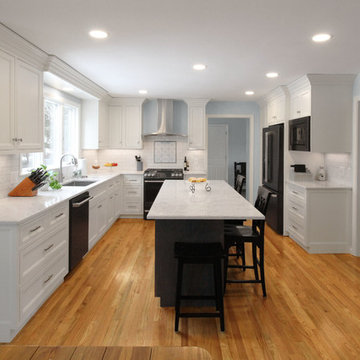
This client requested that we design her new kitchen space to look and function with her and her family’s usage in mind. She was not happy with her existing kitchen due to builder-grade ceramic flooring, lack of countertop space, poor lighting, inadequate and unorganized storage and the closed off feel of the area. Renovisions resolved all of these issues by designing and building an impressive, transitional styled kitchen; delivering a beautifully well thought-out space that provides a multi-functional approach and meets the needs of this busy and dynamic household.
Typically, we encounter challenges in every project, and this was no different. The upstairs bathroom plumbing ran across the entire length of the kitchen sink wall and it was necessary to work with it by moving the plumbing as far up as possible and then building a soffit to hide it.
Creating a space that has a more open feel was top of mind for our client. Installing a new wood floor that matched the existing dining room floor helped with this and in addition, warmed up the room. By relocating the refrigerator to the opposite wall and adding a bar area at the end toward the family room, the flow of traffic for family members and guests became more managed.
The open floor plan allowed for additional island cabinets to accommodate smart storage and better functionality when prepping meals, sitting to eat or gathering with friends and family. We believe having ample countertop surface space is a critical improvement in any renovation and this particular project now boasts a large countertop area with a stunning wide vein pattern that accentuates the design instead of overpowering it. The soft look of the Blanco Arabescato quartz enhances the space and looks lovely with the white inset styled cabinetry.
Beauty and function go hand-in-hand in this kitchen with several exceptional elements such as under-cabinet lighting with dimmers to control the mood light. Glass doors were added to the wall cabinets which flank the wine rack for displaying their decorative glassware and a beverage cooler below provided added convenience and access to cold beverages. The GE Café line of appliances in ‘Slate’ and ‘Stainless Steel’ finishes are a stunning contrast here.
The sensational looking decorative marble 6”x6” backsplash tile over the gas range and in the bar area creates nice focal points by creating a unique look for her that family and guests love.
Convenient and functional elements were added such as a blind corner pull-out for easier pot/pan storage, a sweep-o-vac under cabinet vacuum system for those constant quick clean-ups, a pull-out caddy under the sink base for storage of cleaning products and a protective mat to collect potential spills.
Our client let us know it was time for a change and we listened. She shared a few pictures she loved from a home magazine, we shared our insight and then designed/built the kitchen of her dreams! … A fabulous and functional space.
 Eheart Interior Solutions
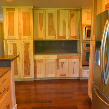
A bulky refrigerator and inadequate run of cabinets is replaced by dual wall convection ovens and a large pantry with roll out shelves.
Kitchen - contemporary kitchen idea in Denver
Kitchen - contemporary kitchen idea in Denver
 San Luis Kitchen Co.
The owners of a charming home in the hills west of Paso Robles recently decided to remodel their not-so-charming kitchen. Referred to San Luis Kitchen by several of their friends, the homeowners visited our showroom and soon decided we were the best people to design a kitchen fitting the style of their home. We were delighted to get to work on the project right away.
When we arrived at the house, we found a small, cramped and out-dated kitchen. The ceiling was low, the cabinets old fashioned and painted a stark dead white, and the best view in the house was neglected in a seldom-used breakfast nook (sequestered behind the kitchen peninsula). This kitchen was also handicapped by white tile counters with dark grout, odd-sized and cluttered cabinets, and small ‘desk’ tacked on to the side of the oven cabinet. Due to a marked lack of counter space & inadequate storage the homeowner had resorted to keeping her small appliances on a little cart parked in the corner and the garbage was just sitting by the wall in full view of everything! On the plus side, the kitchen opened into a nice dining room and had beautiful saltillo tile floors.
Mrs. Homeowner loves to entertain and often hosts dinner parties for her friends. She enjoys visiting with her guests in the kitchen while putting the finishing touches on the evening’s meal. Sadly, her small kitchen really limited her interactions with her guests – she often felt left out of the mix at her own parties! This savvy homeowner dreamed big – a new kitchen that would accommodate multiple workstations, have space for guests to gather but not be in the way, and maybe a prettier transition from the kitchen to the dining (wine service area or hutch?) – while managing the remodel budget by reusing some of her major appliances and keeping (patching as needed) her existing floors.
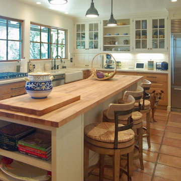
Responding to the homeowner’s stated wish list and the opportunities presented by the home's setting and existing architecture, the designers at San Luis Kitchen decided to expand the kitchen into the breakfast nook using Wood-Mode cabinetry. This change allowed the work area to be reoriented to take advantage of the great view – we replaced the existing window and added another while moving the door to gain space. A second sink and set of refrigerator drawers (housing fresh fruits & veggies) were included for the convenience of this mainly vegetarian cook – her prep station. The clean-up area now boasts a farmhouse style single bowl sink – adding to the ‘cottage’ charm. We located a new gas cook-top between the two workstations for easy access from each. Also tucked in here is a pullout trash/recycle cabinet for convenience and additional drawers for storage.
Running parallel to the work counter we added a long butcher-block island with easy-to-access open shelves for the avid cook and seating for friendly guests placed just right to take in the view. A counter-top garage is used to hide excess small appliances. Glass door cabinets and open shelves are now available to display the owners beautiful dishware. The microwave was placed inconspicuously on the end of the island facing the refrigerator – easy access for guests (and extraneous family members) to help themselves to drinks and snacks while staying out of the cook’s way.
We also moved the pantry storage away from the dining room (putting it on the far wall and closer to the work triangle) and added a furniture-like hutch in its place allowing the more formal dining area to flow seamlessly into the up-beat work area of the kitchen. This space is now also home (opposite wall) to an under counter wine refrigerator, a liquor cabinet and pretty glass door wall cabinet for stemware storage – meeting Mr. Homeowner’s desire for a bar service area.
And then the aesthetic: an old-world style country cottage theme. The homeowners wanted the kitchen to have a warm feel while still loving the look of white cabinetry. San Luis Kitchen melded country-casual knotty pine base cabinets with vintage hand-brushed creamy white wall cabinets to create the desired cottage look. We also added bead board and mullioned glass doors for charm, used an inset doorstyle on the cabinets for authenticity, and mixed stone and wood counters to create an eclectic nuance in the space. All in all, the happy homeowners now boast a charming county cottage kitchen with plenty of space for entertaining their guests while creating gourmet meals to feed them.
 Renovisions
Perectly balanced, this dramatic black and white bathroom is a stunner. Thoughtful design was top of mind for these clients as they approached the Renovisions team to help narrow down their choices and bring it to life. Finding balance while mixing darker, heavier black finishes and lighter, white finishes was the task at hand and the goal was to create a modern look with an industrial/rustic feel.
The challenge on this project was incorporating all the desired elements and products in a tight spatial constraint of 9’ x 7.5’. The clients biggest concern in the old bathroom was inadequate storage, tired and under-utilized bathtub and they also needed an additional sink for their two daughters who often share this space. Renovisions recommended removing the wall between the shower and closet to gain additional floor space as you enter the bath, while providing wall space for the three towel bars.
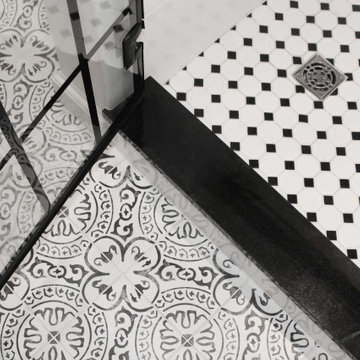
Collaborating with the clients and searching to find the right fixtures paid off nicely. This newly remodeled Renovision accommodated two rectangular sinks, a walk-in shower with hand-held shower, wall-mounted shower head and two soft spray body jets. The oil-rubbed bronze fixtures not only provided a luxurious spa experience, but also added warmth and softness to the vintage feel. The glass shower enclosure is trimmed in a matte black grid that boasts an industrial aesthetic with retro feel while delivering modernistic function. It’s unique in appearance while allowing the chic white subway and black and white diamond tile to peek through.
The beautifully designed cabinetry in a matte black painted finish provides plenty of storage. This smart configuration included two banks of three drawers for toiletries and accessories, two towers with adjustable shelves for towels and two ‘garage’ doors for hair dryers.
Another unique design detail to capture attention was the black and white curvy geometric floor tile which plays off the straight lines of the cabinets and square grids of the shower enclosure.
The clients are thrilled with the results and their modern, high-contrast styled digs – a true customized relaxation sanctuary for the entire family.
12