
Search results for "Including processes" in Home Design Ideas

 NEW THEME Inc.
Photo by Alen Lin
Tub/shower combo - modern concrete floor tub/shower combo idea in Los Angeles with flat-panel cabinets, medium tone wood cabinets and white countertops
Tub/shower combo - modern concrete floor tub/shower combo idea in Los Angeles with flat-panel cabinets, medium tone wood cabinets and white countertops
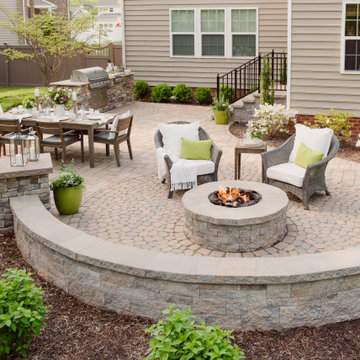
 Outdoor Dreams
Inspiration for a mid-sized timeless backyard concrete paver patio remodel in Richmond with a fire pit and no cover


Find the right local pro for your project

 Advance Design Studio, Ltd.
Mike and Michelle of Lake Barrington knew they needed extra space. Their home was becoming too crowded for their family with blossoming teenagers, so a basement renovation offered the perfect solution for more space for the kids and more room to entertain for the adults.
“Our project consisted of expanding our laundry room, putting in a first floor wet bar so we had adult space upstairs, while also renovating our basement for a family-friendly and teen-functional area as well,” Michelle says.
They found Advance Design Studio through a neighbor who gave a glowing recommendation, giving Michelle and Mike the confidence they needed to move forward with a major home renovation. They felt like they knew Advance Design before they even worked together. When they met with the owner Todd Jurs and designer Nicole Ryan, Mike and Michelle knew they were getting a trustworthy, dependable team that could create the project they had been dreaming about for 7 years.
Having virtually no natural light to work with, one of the biggest design challenges was creating a basement that did not feel dark and depressing. The Advance team got to work creating architectural archways and custom detailed dry-stack stone columns artfully designed into the space, adding a dramatic element that made the space feel less like a basement or more like a relaxing family room. Color 3D renderings were created to portray what the space would look like so Mike and Michelle could visualize the space in advance.
Detailed trim and crown moldings grace the built in buffet and wet bar making for an amazingly functional space that lacks nothing in style and visual interest. Cherry wood cabinetry by Dura Supreme is featured in the space with a “Cocoa Brown” finish and includes beautiful mirrored glass doors embellished with unique elliptical mullion details. A built-in microwave, dishwasher and mini fridge add practicality to the ample entertainment mecca. An under mounted sink finishes the space joined with a intricate mosaic tile backsplash and “Ventisca Polished” quartz countertops.
The basement is absolutely perfect for hosting friends and family with expertly designed key areas such as a game space for the kids, a movie area for the family, an ample workout room with luxurious full bath, and even built in wine storage. The family absolutely loves the new basement living space, and has already enjoyed numerous family movie nights and sleep-overs with friends.
While custom cabinets made by Dura Supreme were used to create unique spaces that lived up to Mike and Michelle’s expectations., heated flooring under the 16”x16” “Mongolian Spring” tile was installed giving all tiled areas of the basement a much cozier feel, eliminating that cold hard surface most of us hate in our basements!
The new basement must-have requirement list included a new bath space, which was incorporated adjacent to the work out room. The sleek shower door and cabinets in the new bathroom make guests and family feel like they are in an elegant hotel. The new guest bath features 4”x36” “Silver Screen” honed marble tile in a brick pattern on the shower walls and 2”x2” “Chenille” limestone tile in a hexagon mosaic pattern on the shower floor.
“I came in with very specific requirements for our three project areas,” Michelle says. “There was not one time that I felt like I was asking for something that was not going to turn out how I anticipated.”
Tying in multiple rooms during a renovation if you have can do it makes a lot of sense and saves money in the long run. A fully functional laundry room as well was a must on this family’s wish list. Michelle wanted to add space to the existing cramped and awkward laundry room, and Mike wanted to make sure they could still park a car in the garage. Reconfiguring interior walls required borrowing unused space cleverly from the garage in order to enlarge the laundry room space.
Drawers under the stairs added beautiful hidden storage created almost magically out of dead space. White painted Dura Supreme cabinets bring additional light into the small space; while the 16”x16” cleft slate tile flooring provides excellent contrast and the naturally earthy feel Michelle wanted. Quartz countertops with a 3”x12” “Debut Dew” subway tile backsplash add elegance to the now upliftingly bright laundry room.
The extra space makes doing laundry much more pleasurable and the added storage is a great for all those little things like winter hats and gloves, umbrellas and the like. “The Advance Design project team was phenomenal to work with,” Michelle says. “They came in, shared the plans with us and walked us through the expectations. We always knew what was coming next.”
Converting an existing closet space, the wet bar upstairs was challenging because they wanted a functional area that didn’t look or feel like cabinets just sticking out of a closet. So the Advance team transformed this ordinary closet space into a stunning wet bar that architecturally appears as if it’s always been there. Traditional, elegant hand carved custom molding matching the adjacent fireplace ties the new entertainment bar area in nicely with the existing family room and kitchen area.
Featuring a built in wine refrigerator, Dura Supreme cabinetry in deep cherry wood elegantly displays wine bottles and etched glass mullion doors that fill with soft light in the evening hours. Cambria “Windermere” quartz countertops with a sophisticated hammered copper sink and a glimmering backsplash round out the stunning wet bar. Hosting parties and family functions has become much more enjoyable now that they have a dedicated beverage serving area large enough to include hors devours.
All three projects were designed and constructed together at the same time, making for a cohesive project that was administered smoothly and easily both for the design team and for the family. Disruption to the home was minimal as each phase was completed in each project conclusively, and design and meeting time for the homeowner was efficient and organized making for an enjoyable process.
“Advance Design was great to work with,” Michelle says. “I would highly recommend them to anyone considering a home improvement project. They took the time at the beginning to understand our needs, our budget, and our vision for our home. The field team was great, attentive, on time, cleaned up each day and made the overall experience very positive. We couldn't be happier with the finished product.”
With the help of our talented, award winning design team you can create the basement, laundry room, or any other home renovation that you have been dreaming of. With our “Common Sense Remodeling” approach, the process of renovating you home has never been easier. Contact us today at 847-836-2600 or schedule an appointment to talk with us about that kitchen remodeling project.
Joe Nowak

 Sarah Greenman
Photo: Sarah Greenman © 2014 Houzz
Eclectic dining room photo in Dallas with beige walls
Eclectic dining room photo in Dallas with beige walls

 RW Anderson Homes
Interior Design by ecd Design LLC
This newly remodeled home was transformed top to bottom. It is, as all good art should be “A little something of the past and a little something of the future.” We kept the old world charm of the Tudor style, (a popular American theme harkening back to Great Britain in the 1500’s) and combined it with the modern amenities and design that many of us have come to love and appreciate. In the process, we created something truly unique and inspiring.
RW Anderson Homes is the premier home builder and remodeler in the Seattle and Bellevue area. Distinguished by their excellent team, and attention to detail, RW Anderson delivers a custom tailored experience for every customer. Their service to clients has earned them a great reputation in the industry for taking care of their customers.
Working with RW Anderson Homes is very easy. Their office and design team work tirelessly to maximize your goals and dreams in order to create finished spaces that aren’t only beautiful, but highly functional for every customer. In an industry known for false promises and the unexpected, the team at RW Anderson is professional and works to present a clear and concise strategy for every project. They take pride in their references and the amount of direct referrals they receive from past clients.
RW Anderson Homes would love the opportunity to talk with you about your home or remodel project today. Estimates and consultations are always free. Call us now at 206-383-8084 or email Ryan@rwandersonhomes.com.

 Sunbrella
In a tonal world, it’s all about texture.
This loft’s main living area is a blend of tonal greys and charcoals. The look is a perfect fit within the loft’s cool, masculine and industrial aesthetic.
When creating this space with tonal fabrics, texture played a key role in providing depth, warmth and a feeling of home. And, the nearly 20-foot-long plunging draperies layered over sheers provide a sense of grandeur and cohesion throughout the loft.
When designing, you don’t always have to use bright colors and ornate patterns to create interest. Smartly mixing textures and different types of fabrics also creates depth and interest in a room. And by including a piece of art (like the moon series) or reupholstering a vintage chair, you can add authentic stories and character that make the end result over the moon.
You can watch designer Alex Gaston’s transformation of the entire loft at perspective.sunbrella.com. Included on the site are eight episodes chronicling Alex’s design process, design tip videos, articles about the project, a photo gallery and a full décor guide.

Sponsored
Delaware, OH

Buckeye Basements, Inc.
Central Ohio's Basement Finishing ExpertsBest Of Houzz '13-'21

 HOBBS INC
Architect: Amanda Martocchio Architecture & Design
Photography: Michael Moran
Project Year:2016
This LEED-certified project was a substantial rebuild of a 1960's home, preserving the original foundation to the extent possible, with a small amount of new area, a reconfigured floor plan, and newly envisioned massing. The design is simple and modern, with floor to ceiling glazing along the rear, connecting the interior living spaces to the landscape. The design process was informed by building science best practices, including solar orientation, triple glazing, rain-screen exterior cladding, and a thermal envelope that far exceeds code requirements.
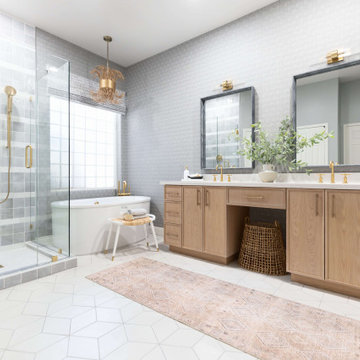
 Living with Lolo
Bathroom in Lexington Ave | Room Type:
Primary Bathroom (Master Bath Remodel) |
Project Name:
Lexington Ave |
Key Feature:
A modern, luxury bathroom with a subtle boho influence, featuring unique tile placement, statement lighting, and layered materials that create visual interest in a compact footprint.
Challenge:
The client wanted a full bathroom transformation while keeping all plumbing in its existing locations to minimize renovation costs, requiring creative design solutions within structural limitations.
Solution:
The design team reimagined the space by introducing updated finishes, distinctive tile layouts, wallpaper, and statement lighting to elevate the bathroom while working within the existing layout. The project was executed entirely remotely, demonstrating a seamless virtual design process.
Materials:
Bedrosians tile, Thibaut wallpaper, Arteriors lighting, Kohler plumbing fixtures, Jaipur Living rugs, Made Goods bath mirrors, and Bungalow5 bath stool.
Budget:
Not specified
Timeline:
Completed April 2021.

 Twelve Stones Designs, LLC
The owners of this kitchen had spent the money to upgrade the finishes in their kitchen upon building the home 12 years ago, but after living in the space for several years they realized how nonfunctional the layout really was. The (then) two preschool aged children had grown into busy, hungry teenagers with many friends who also liked to hang out at the house. So the family needed a more functional kitchen with better traffic flow, space for daily activities revolving around the kitchen at different times of day, and a kitchen that could accommodate cooking for and serving large groups. Furthermore, the dark, traditional finishes no longer reflected the homeowners’ style. They requested a brighter, more relaxed, coastal style that reflected their love of the seaside cities they like to visit.
Originally, the kitchen was U-shaped with a narrow island in the middle. The island created narrow aisles that bottle-necked at the dishwasher, refrigerator, and cooktop areas. There was a pass-through from the foyer into the kitchen, but the owners never liked that the pass-through was also located so close to the powder room. The awkward proximity was unappealing and made guests feel uncomfortable.
The kitchen’s storage was made up of lots of narrow cabinets, apothecary drawers, clipped corner units, and very few drawers. It lacked useful storage for the larger items the family used on a daily basis. And the kitchen’s only pantry was small closet that had only builder-grade, narrow shelving with no illumination to be able to see the contents inside.
Overall, the kitchen’s lighting plan was poorly executed. Only six recessed cans illuminated the entire kitchen and nook areas. The under cabinet lighting was not evenly distributed either. In fact, the builder had mis-placed the under cabinet lighting around the decorative pilasters which made for choppy, dark cubbies. Further, the builder didn’t include any lighting over the sink or the bar area, which meant whoever was doing the dishes was always in their own shadow. That, coupled with the steep overhang of the game room above made the bar area feel like a dim, cavernous space that wasn’t inviting or task oriented. The kitchen looked out into the main living space, but the raised bar and a narrow wall (which held the only large cabinet in the kitchen) created more of a barrier than a relationship to the living room or breakfast nook. In fact, one couldn’t even see the breakfast nook from the cooktop or sink areas due to its orientation. The raised bar top was too narrow to comfortably sit to either dine at or chat from due to the lack of knee space. The the homeowners confided that the kitchen felt more like a dark, dirty prison than place where the family, or their guests, wanted to gather and commune.
The clients' needs and desires were:
➢ to create a kitchen that would be a space the family loved to be in; to relate to the adjacent spaces all around, and to have better flow for entertaining large groups
➢ to remove the walls between the breakfast nook and living area and to be able to utilize the natural light from the windows in both those areas
➢ to incorporate a functional chopping block for prepping fresh food for home cooked meals, an island with a large sink and drain board, 2 pull out trash cans, and seating for at least the 2 teens to eat or do homework
➢ to design a kitchen and breakfast nook with an airy, coastal, relaxed vibe that blended with the rest of the house's coastal theme
➢ to integrate a layered lighting plan which would include ample general illumination, specific task lighting, decorative lighting, and lots of illuminated storage
➢ to design a kitchen with not only more storage for all the husband’s kitchen gadgets and collection of oils and spices, but smart storage, including a coffee/breakfast bar and a place to store and conceal the toaster oven and microwave
➢ to find a way to utilize the large open space between the kitchen, pantry area, and breakfast nook
Twelve Stones Designs achieved the owner's goals by:
➢ removing the walls between the kitchen and living room to allow the natural light to filter in from the adjacent rooms and to create a connection between the kitchen, nook, and living spaces for a sense of unity and communion
➢ removing the existing pantry and designing 3 large pantry style cabinets with LED tape lights and rollout drawers to house lots of kitchen appliances, gadgets, and tons of groceries. We also took the cabinets all the way up to the 9’ ceiling for additional storage for seasonal items and bulk storage.
➢ designing 2 islands - 1 with a gorgeous black walnut chopping block that houses a drawer for chopping and carving knives and a custom double pull out trash unit for point of use utilization - and 1 that houses the dishwasher, a large Blanco Gourmet sink with integrated drain board, woven baskets for fresh root vegetables and kitchen towels, plenty of drawer storage for kitchen items, and bar seating for up to 4 diners.
➢ closing off the space between the kitchen and the powder room to create a beautiful new private alcove for the powder room as well as adding some decorative storage. This also gave us space to include more tall storage near the new range for precision placement of the husband’s extensive oil and spice collection as well as a location for a combo-steam oven the wife wanted for baking and cooking healthy meals.
The project is enhanced functionally by:
➢ incorporated USB and standard receptacles for the kids’ laptops and phone charging in the large island
➢ designing the small island to include additional open shelving for items used on a daily basis such as a variety of bowls, plates, and colanders. This set up also works well for the husband who prefers to “plate” his dinners in restaurant-style fashion before presenting them to the table.
➢ the integration of specific storage units, such as double stacked cutlery drawers, a custom spice pull-out, a Kuerig coffee and tea pod drawer, and custom double stacked utensil drawers
➢ moving the refrigerator to the old oven location - this eliminated the bottle neck as well as created a better relationship to the eating table. It also utilizes the floor space between the pantry, nook, and kitchen
➢ creating a banquet style breakfast nook - this banquette seating not only doubles the amount of seating for large gatherings but it better utilizes the odd space between the kitchen and the previous nook area. It also helps to create a distinct pathway from the mudroom room through the pantry area, kitchen, nook, and living room.
➢ the coffee/breakfast bar area which includes the perfect location for the concealed microwave and toaster oven, convenient storage for the coffee pods and tea accoutrements. Roll-out drawers below also house the smoothie maker, hot water kettle, and a plethora of smoothie-making ingredients such as protein powders, smoothie additives, etc. Furthermore, the drawers below the Keurig house measuring utensil, cutlery, baking supplies and tupperware storage.
➢ incorporating lots of wide drawers and pullouts to accommodate large cookware.
➢ utilizing as much vertical space as possible by building storage to the ceiling which accommodates the family’s abundant amount of serving platters, baking sheets, bakeware, casserole dishes, and additional cutting boards.
The project is enhanced aesthetically by:
➢ new 5-piece Versailles pattern porcelain tile that now seamlessly joins the entire down stairs area together creating a bright, cohesiveness feeling instead of choppy separated spaces - it also adds a coastal feeling
➢ designing a cabinet to conceal the microwave and toaster oven
➢ the coastal influenced light fixtures over the nook table and island
➢ the sandy colors of the Langdon Cambria countertops. The swirling pattern and sparkling quartz pieces remind the homeowner of black-and-tan sandy beaches
➢ the striped banquet seating whose creamy white background and blue-green stripes were the inspiration for the cabinet and wall colors.
➢ All the interior doors were painted black to coordinate with the blacks and grays in the backsplash tile and countertop. This also adds a hint of tailored formality to an otherwise casual space.
➢ the use of WAC's Oculux small aperture LED units for the overhead lighting complimented with Diode LED strips for task lighting under the cabinets and inside the pantry and glass wall cabinets. All of the lighting applications are on separate dimmer switches.
Innovative uses of materials or construction methods by Realty Restoration LLC:
➢ Each 1-1/2” x 3” block of reclaimed end-grain black walnut that makes up the center island chopping block was hand milled and built in the shop. It was designed to look substantial and proportional to the surrounding elements, executed by creating the 4 inch tall top with a solid wood chamfered edge band.
➢ The metal doors on either side of the vent hood were also custom designed for this project and built in the Realty Restoration LLC shop. They are made 1x2, 11-gauge mild steel with ribbed glass. Weighing 60 lbs a piece, heavy duty cabinet hinges were added to support the weight of the door and keep them from sagging.
➢ Under-cabinet receptacles were added along the range wall in order to have a clean, uninterrupted backsplash.
Design obstacles to overcome:
➢ Because we were removing the demising walls between the kitchen and living room, we had to find a way to plumb and vent the new island. We did this by tunneling through the slab (the slab had post tension cables which prevented us from just trenching) to run a new wet vent through a nearby structural wall. We pulled the existing hot and cold lines between upper floor joists and ran them down the structural wall as well and up through a conduit in the tunnel.
➢ Since we were converting from wall overs to a gas range it allowed us to utilize the 220 feed for the wall ovens to provide a new sub panel for all the new kitchen circuits
➢ Due to framing deficiencies inherited from the original build there was a 1-1/2” differential in the floor-to-ceiling height over a 20 foot span; by utilizing the process of cutting and furring coupled with the crown moulding details on the cabinet elevations we were able to mask the problem and provide seamless transitions between the cabinet components.
Evidence of superior craftsmanship:
➢ uniquely designed, one-of-a-kind metal “X” end panels on the large island. The end panels were custom made in the Realty Restoration LLC shop and fitted to the exact dimensions of the island. The welding seams are completely indistinguishable - the posts look like they are cut from a single sheet of metal
➢ square metal posts on the small island were also custom made and designed to compliment and carry through the metal element s throughout the kitchen
➢ the beautiful, oversized end panels on the pantry cabinets which give the breakfast nook a tailored look
➢ integrating a large format 5 piece Versailles tile pattern to seamlessly flow from the existing spaces into the new kitchen space
➢ By constructing a custom cabinet that jogged around a corner we could not remodel (housing the entry way coat closet) we were able to camouflage the adjacent wall offset within the upper and lower cabinets. By designing around the existing jog in the structural walls we accomplished a few things: we were able to find the space to house, and hide, the microwave and toaster oven yet still have a clean cohesive appearance from the kitchen side. Additionally, the owners were able to keep their much needed coat closet and we didn’t have to increase the budget with unnecessary structural work.
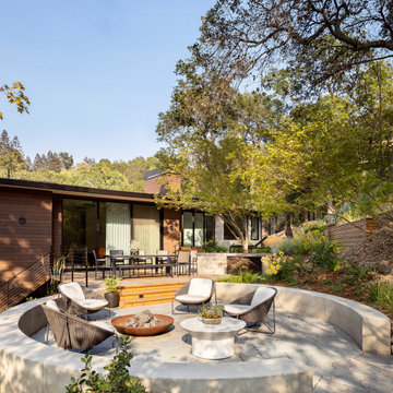
 ODS Architecture
In a wooded area of Lafayette, a mid-century home was re-imagined for a graphic designer and kindergarten teacher couple and their three children. A major new design feature is a high ceiling great room that wraps from the front to the back yard, turning a corner at the kitchen and ending at the family room fireplace. This room was designed with a high flat roof to work in conjunction with existing roof forms to create a unified whole, and raise interior ceiling heights from eight to over ten feet. All new lighting and large floor to ceiling Fleetwood aluminum windows expand views of the trees beyond.
The existing home was enlarged by 700 square feet with a small exterior addition enlarging the kitchen over an existing deck, and a larger amount by excavating out crawlspace at the garage level to create a new home office with full bath, and separate laundry utility room. The remodeled residence became 3,847 square feet in total area including the garage.
Exterior curb appeal was improved with all new Fleetwood windows, stained wood siding and stucco. New steel railing and concrete steps lead up to the front entry. Front and rear yard new landscape design by Huettl Landscape Architecture dramatically alters the site. New planting was added at the front yard with landscape lighting and modern concrete pavers and the rear yard has multiple decks for family gatherings with the focal point a concrete conversation circle with central fire feature.
Everything revolves around the corner kitchen, large windows to the backyard, quartz countertops and cabinetry in painted and walnut finishes. The homeowners enjoyed the process of selecting Heath Tile for the kitchen backsplash and white oval tiles at the family room fireplace. Black brick tiles by Fireclay were used on the living room hearth. The kitchen flows into the family room all with views to the beautifully landscaped yards.
The primary suite has a built-in window seat with large windows overlooking the garden, walnut cabinetry in a skylit walk-in closet, and a large dramatic skylight bouncing light into the shower. The kid’s bath also has a skylight slot with light angling downward over double sinks. More colorful tile shows up in these spaces, as does a geometric patterned tile in the downstairs office bath shower.
The large yard is taken full advantage of with concrete paved walkways, stairs and firepit circle. New retaining walls in the rear yard helped to add more level usable outdoor space, with wood slats to visually blend them into the overall design.
The end result is a beautiful transformation of a mid-century home, that both captures the client’s personalities and elevates the house into the modern age.

 Middlefork Luxury Home Builders
Rising amidst the grand homes of North Howe Street, this stately house has more than 6,600 SF. In total, the home has seven bedrooms, six full bathrooms and three powder rooms. Designed with an extra-wide floor plan (21'-2"), achieved through side-yard relief, and an attached garage achieved through rear-yard relief, it is a truly unique home in a truly stunning environment.
The centerpiece of the home is its dramatic, 11-foot-diameter circular stair that ascends four floors from the lower level to the roof decks where panoramic windows (and views) infuse the staircase and lower levels with natural light. Public areas include classically-proportioned living and dining rooms, designed in an open-plan concept with architectural distinction enabling them to function individually. A gourmet, eat-in kitchen opens to the home's great room and rear gardens and is connected via its own staircase to the lower level family room, mud room and attached 2-1/2 car, heated garage.
The second floor is a dedicated master floor, accessed by the main stair or the home's elevator. Features include a groin-vaulted ceiling; attached sun-room; private balcony; lavishly appointed master bath; tremendous closet space, including a 120 SF walk-in closet, and; an en-suite office. Four family bedrooms and three bathrooms are located on the third floor.
This home was sold early in its construction process.
Nathan Kirkman

 Paradise Restored Landscaping & Exterior Design
Outdoor Living Spaces, Seat Wall, Firepit, Outdoor Fireplaces, Gazebo, Covered Wood Structures, Wood Fire Oven, Pizza Over, Custom Wood Decking, Ambient Landscape Lighting, Concrete Paver Hardscape
 Advance Design Studio, Ltd.
After six years of living in their Huntley IL home, Chris and Meghan were tired of their dark, dingy, outdated kitchen and it was finally time for a long-anticipated change. “The kitchen is the place where we live, it’s where we do everything,” Meghan said. “It was important that it be a space where we wanted to be.” Meghan loves cooking and enjoys including their girls in healthy meal prepping, this led them to want a brighter, more enjoyable kitchen with increased functionality and improved storage.
For Chris especially, the laundry room was an entirely dysfunctional eyesore. “We had a washer and a dryer, but it was all kind-of cobbled together!” Chris said. “There were always laundry piles everywhere, we weren’t really sure what we wanted to do in there, but it was time for us to make a change.” The mess of the space was stressful every time they walked in the door from the garage each day. Kids’ backpacks and shoes piled up haphazardly in the makeshift boot-bench closet left the family feeling disorganized and stressed. They needed space for folding clothes and locker cubbies to help keep the family organized.
Having known Christine and Todd in the Huntley community for years, Chris and Meghan were familiar with their work. “We already trusted them personally and having seen their projects for years we knew they did top notch work. After we reviewed the initial round of designs, we knew that hiring them was definitely the right choice,” Meghan and Chris said. Although Chris had done a lot of work in their home himself, the kitchen and laundry room renovation was such a large undertaking that he didn’t want to steal time away from his family to spend what would surely be many long weekends doing the job himself. “That would not have been a wise choice for us,” Chris laughed.
“Our designer, Michelle was very, very, easy to work with; anything we wanted to see or weren’t sure about, she went above and beyond to make this easy for us. She was easy to get hold of and always quick to respond,” the couple said. Michelle pulled ideas that mirrored the couple’s taste and style and was adept at directing the couple to limited choices that didn’t overwhelm them and kept the process moving. “I have a hard time making decisions. Michelle made the decision-making process so easy. I loved how she listened to what I liked and then presented three great options for me to choose from,” Meghan said.
The main objectives for the kitchen were better storage solutions, they wanted the space to reflect their lifestyle and taste, and they wanted it to last for years with low maintenance. One of the first steps in creating a more functional kitchen was relocating the refrigerator, creating an improved workflow for the busy family.
“We didn’t know that we could even move the refrigerator to a new location where it is now, that was something that we never would have thought of,” Chris said. “The new refrigerator location makes the kitchen feel so much bigger. We didn’t add any space, but our whole kitchen with the new design just seems like it’s so much larger than before!” Meghan said.
The perimeter mist colored cabinets helped warm and brighten the entire room, while the graphite colored cabinets on the island added contrast. Using this fresh, clean color palette satisfied the couple’s desire for a bright space that was the exact opposite of what they had before. Organization accessories were also added to the cabinets such as a spice drawer tray and roll outs to create hidden convenience.
“I absolutely love the hidden spices – it makes cooking so much more enjoyable!” Chris said. “And all the pull outs, and the double trash bin, who would think you could get so excited about organization!” the couple said in unison.
One thing they hated in their original kitchen was how dark the space felt. Added lighting on the ceiling with the new light fixtures combined with the lighter cabinetry colors throughout solved this problem. “Our new kitchen has this warm, almost cozy feeling that our old kitchen never had, it’s just a space that I love spending my time in now,” Meghan said. The light airy feeling was accentuated with the use of floating white shelves on either side of the decorative range hood. “We have so much cabinetry space, the new design is amazing we actually have more storage space than we will ever need,” Meghan said.
The island was extended to create more work surface and added space for stool seating. “The new island changes how we live. Now the kids can be in the kitchen with us, doing homework, eating breakfast, and the three of us have special dinners there when Chris is working late,” Meghan said.
The Carrara Marmi Quartz countertops were chosen because they are, not only beautiful, but are made from hard-working material that doesn’t require maintenance. The white subway tile backsplash that wraps to the ceiling behind the focal point cooktop range/hood compliments the crisp white countertops perfectly, while brushed brass hardware and light fixtures keep the design fresh and new.
The couple had a few fears at the beginning of the project, as most homeowners do. Their biggest fear was being out of their kitchen and laundry room for an extended time. The crew made it very easy for the family to work in a limited space keeping the washer and dryer hooked up the majority of the time, and also getting appliances working with minimal downtime.
“They above and beyond accommodated us to get us through the process,” Meghan said. “They did a great job making sure we were as comfortable as possible throughout the process,” Chris added.
“Our project manager DJ did a great job. He was very good at updating us on schedule changes, getting guys in as quickly as possible. Everyone that stepped in the house was nice and did great work,” said Chris. They thought Advance’s carpenter was phenomenal and were impressed when he took a conceptual idea from a photograph and worked with designer Michelle to create a one of a kind range/hood that has become the topic of conversation with friends and family who visit the new kitchen. “He was in our house literally every day for several weeks. He was easy to work with and good at what he did,” Meghan and Chris said.
The focal point of the kitchen; a hand-crafted, custom-built ventilation hood was clad with handpicked reclaimed barnwood. Advance Design’s carpenter built the framework and the cladding to create a one-of-a-kind design element that the couple loves.
“I think it was especially fun for him to create something unique from scratch, showcasing his talent in this area,” Meghan said. “I love that my kitchen is not like everyone else’s. I got to pick out the wood on my hood and watch it being built and was able to choose what pieces of wood went where on it. It’s totally unique.”
Red Oak flooring was toothed-in throughout the kitchen and the rest of the first floor anywhere changes were made. Then the whole floor was refinished to tone down the orange undertones in the existing floor stain, ultimately changing the color complexion of the entire first floor. The result is a completely new feeling to the entire home.
Renovating the laundry room was extremely important to Meghan and Chris, but they had trouble visualizing what the possibilities were for the seemingly small space. Michelle produced beautiful 3D illustrations that helped them envision the space in a whole new way.
“I must have told Michelle 100 times that I am a visual person, seeing the designs in 3D made it so easy to make decisions and see what we could really do with our space,” Meghan said.
A dividing wall and doorway were removed between the existing laundry room and hallway formerly containing a coat closet, providing space to design specialized graphite colored cabinetry matching the kitchen island to house custom storage cubbies for each family member. Adding the tall utility cabinetry in the new laundry area helped solve the storage issue, tucking away cleaning supplies, household items, and even the cat got its own cubby.
“I love how everything is now hidden in its own space. I can’t tell you how much I hated coming home and seeing everything sitting around on counters,” Chris said.
Electrical outlets were planned for the inside of utility cabinets, so devices could charge in hidden locations. Stacking the washer and dryer allowed for wider countertop space to provide a folding area and a special space for clothes to hang. “The way I do laundry has been completely transformed! I can actually fold clothes and hang them now right out of the washer and dryer,” Meghan said.
“The end result in the kitchen and the laundry/mud room was an updated light and bright space, with a smarter work flow that better meets the needs of this family,” Michelle said.
“I would totally recommend Advance Design,” Meghan said. “Sometimes I sit and just look at my kitchen and laundry room and think ‘Wow, I can’t believe I get to live here!’ It’s an understatement to say we love our new space.”

 Kaplan Thompson Architects
A young family with a wooded, triangular lot in Ipswich, Massachusetts wanted to take on a highly creative, organic, and unrushed process in designing their new home. The parents of three boys had contemporary ideas for living, including phasing the construction of different structures over time as the kids grew so they could maximize the options for use on their land.
They hoped to build a net zero energy home that would be cozy on the very coldest days of winter, using cost-efficient methods of home building. The house needed to be sited to minimize impact on the land and trees, and it was critical to respect a conservation easement on the south border of the lot.
Finally, the design would be contemporary in form and feel, but it would also need to fit into a classic New England context, both in terms of materials used and durability. We were asked to honor the notions of “surprise and delight,” and that inspired everything we designed for the family.
The highly unique home consists of a three-story form, composed mostly of bedrooms and baths on the top two floors and a cross axis of shared living spaces on the first level. This axis extends out to an oversized covered porch, open to the south and west. The porch connects to a two-story garage with flex space above, used as a guest house, play room, and yoga studio depending on the day.
A floor-to-ceiling ribbon of glass wraps the south and west walls of the lower level, bringing in an abundance of natural light and linking the entire open plan to the yard beyond. The master suite takes up the entire top floor, and includes an outdoor deck with a shower. The middle floor has extra height to accommodate a variety of multi-level play scenarios in the kids’ rooms.
Many of the materials used in this house are made from recycled or environmentally friendly content, or they come from local sources. The high performance home has triple glazed windows and all materials, adhesives, and sealants are low toxicity and safe for growing kids.
Photographer credit: Irvin Serrano

 Fiberon Decking
This wooded deck retreat features composite decking material by Fiberon, shown here in the Horizon line in 'Ipe'. The Ipe color reflects the beauty of natural and exotic hardwoods, complete with subtle streaking and varied wood grain patterns. Fiberon hidden fasteners were also used to create a polished, seamless deck surface.

 Gallery KBNY
The owner of this historic and landmarked town-home renovation in Hudson Square, originally built in 1826, hired Gallery Kitchen and Bath to fully gut-renovate this 3-unit row-home. The scope of work included a full-scale renovation of the owners unit, including the renovation of the kitchen, one 4-piece master ensuite bathroom, one 3-piece bathroom with a walk-in steam shower, and a beautiful powder room. Additional work in the owners unit also included flooring, electrical upgrade, major plumbing work, new HVAC system, restoration of a fireplace, installation of a fully integrated smart home system and landmarked approved windows.
CELLAR RENOVATION IN NYC LANDMARKED TOWN-HOME
Rounding out the owners unit we renovated the cellar, which was converted into an entertainment space and featured a custom glass curtain wall, along with a custom staircase with an exposed brick wall. During the demolition phase of the cellar, our team discovered 56 wine jugs filled with wine from the prohibition era, leading us to name this project the prohibition house. For the two tenant units, Gallery Kitchen and Bath undertook the renovation of 2 kitchens, 4 bathrooms, new hardwood flooring throughout, along with detailed carpentry work in the entire home.
WHY GALLERY KITCHEN AND BATH
After interviewing multiple contractors, our client decided on Gallery Kitchen and Bath primarily because of our turnkey design, selection, and build process. In a renovation of this magnitude it is crucial to have a centralized full service contractor under one roof to handle all of the aspects and simultaneous moving parts of the project. Decentralizing the entire process by having multiple unaffiliated vendors handle various parts of the process can easily become chaotic, time consuming, and costly.
Because Gallery Kitchen and Bath undertook the entire process, from the design of the entire space to the selection and procurement of all finishes and fixtures, down to the procurement of all permits and LPC filings, it made a seemingly chaotic project a’lot more manageable.
PHASE 1: DESIGN, SELECTION, PROCUREMENT
Our client wanted the renovation to incorporate a fully modern design into his Hudson Square town-house. Being that this is a landmarked property, the exterior facade had to be restored and kept with the original aesthetic, the interior of the home however was a whole different story.
In keeping up with the modern aesthetic, our designers went to work to design a custom kitchen that included fully custom flat panel base cabinets in a white high gloss finish and an absolute matte black appliance/pantry wall. The kitchen design also included a white quartz countertop and backsplash with a waterfall edge island. To bring warmth to the modern kitchen, our designers incorporated a rifted and quartered select oak wood floor in a herringbone pattern, and custom blended stain with matte polyurethane finish. For continuity, the wood floor was also extended throughout the entire owners unit.
In the ensuite bathroom we created a “wet area” which houses a standalone soaking tub as well as a beautiful rainfall shower, completely leveled with the rest of the floor in the bathroom. Some highlights within this space include a tiled square drain, large niche cutouts with a carrera marble accents. Once again, to bring warmth to this modern bathroom, our designers incorporated a floating rustic oak vanity and carrera marble mosaic floor tile.
Last on the list on the owners unit floor was the cellar, which our client wanted to utilize as an entertainment space for his friends and family. During the design phase, we incorporated an open concept layout, wedding the indoor and outdoor space with a custom glass curtain wall. The design also included custom walnut built-ins that serve as a custom wet bar and storage piece.
With the design approved and selections made our office liaisons moved to procure all of the material selections and finishes.
PHASE 2: DEMO
Because this home is almost two centuries old, we had to take extra precaution during the interior demolition phase of the project. One specific area that we had to pay special attention to was the existing brick. Over time the mortar in old brick homes deteriorates and turns into dust – for this reason it was extremely important that a thorough and ongoing inspection of the exteriors and interior walls took place during the demolition of the space.
After 14 30-yard debris containers and 56 wine filled jugs from the prohibition era later , the demolition of this historic Hudson Square town-home came to an end. If you are wondering whether we tried the wine? After notifying the owner we agreed to open one of the jugs and try them together – nothing but vinegar.
PHASE 3: BUILD
One of the challenges in a renovation project of this scope is nailing down the logistics and delivery of fixtures and finish material. Adding to this challenge was a narrow entry door that required us to use a boom truck in order to deliver some of the larger materials on site. To ensure a succinct time schedule, we boomed all of the materials through the 3rd floor for the entire project and worked our renovation work from top floor to cellar. This technique also insured that any unexpected water issues during the renovation process would not damage a finished floor.
With all roughing and framing complete, the Gallery KBNY team proceeded to execute on the design plan.
THE REVEAL
From what was once a dilapidated town-home with nothing but potential, to a glamorous and luxurious modern interior space – the prohibition house was complete. Ready to speak with us about your renovation project? Contact us to schedule your free consultation and let Gallery KBNY show you why our all-inclusive approach to your renovation is the smartest way to renovating in NYC.

 Tomecek Studio Architecture
Project by Studio H:T principal in charge Brad Tomecek (now with Tomecek Studio Architecture). This project tests the theory of bringing high quality design to a prefabricated factory setting. Enrolled in the LEED-Home Pilot, this residence completed certification. The modular home was conceived as two boxes that slide above one another to create outdoor living space and a lower covered rear entry. The passive solar design invites large amounts of light from the south while minimizing openings to the east and west. Factory construction saves both time and costs while reducing waste and using a controlled labor force.
Built in a factory north of Denver, the home arrived by flatbed truck in two pieces and was craned into place in about 4 hours providing a fast, sustainable, cost effective alternative to traditional homebuilding techniques. Upgraded lighting fixtures, plumbing fixtures, doors, door hardware, windows, tile and bamboo flooring were incorporated into the design. 80% of the residence was completed in the factory in less than 3 weeks and other items were finished on site including the exterior stucco, garage, metal railing and stair.
Stack-Slide-Stitch describes the conceptual process of how to tie together two distinct modular boxes. Stack refers to setting one modular directly on top of the other. Slide refers to the action that creates an upper southern deck area while simultaneously providing a covered rear entry area. The stitching or interlocking occurs with the upward extension of the lower volume with the front deck walls and with the rear two story vertical.


 Brion Jeannette Architecture
Corona del Mar, California
Mid-sized trendy open concept carpeted family room photo in Orange County with white walls, no fireplace and a wall-mounted tv
Mid-sized trendy open concept carpeted family room photo in Orange County with white walls, no fireplace and a wall-mounted tv
3