
Search results for "Incorporating local" in Home Design Ideas

 ZeroEnergy Design
This renovated brick rowhome in Boston’s South End offers a modern aesthetic within a historic structure, creative use of space, exceptional thermal comfort, a reduced carbon footprint, and a passive stream of income.
DESIGN PRIORITIES. The goals for the project were clear - design the primary unit to accommodate the family’s modern lifestyle, rework the layout to create a desirable rental unit, improve thermal comfort and introduce a modern aesthetic. We designed the street-level entry as a shared entrance for both the primary and rental unit. The family uses it as their everyday entrance - we planned for bike storage and an open mudroom with bench and shoe storage to facilitate the change from shoes to slippers or bare feet as they enter their home. On the main level, we expanded the kitchen into the dining room to create an eat-in space with generous counter space and storage, as well as a comfortable connection to the living space. The second floor serves as master suite for the couple - a bedroom with a walk-in-closet and ensuite bathroom, and an adjacent study, with refinished original pumpkin pine floors. The upper floor, aside from a guest bedroom, is the child's domain with interconnected spaces for sleeping, work and play. In the play space, which can be separated from the work space with new translucent sliding doors, we incorporated recreational features inspired by adventurous and competitive television shows, at their son’s request.
MODERN MEETS TRADITIONAL. We left the historic front facade of the building largely unchanged - the security bars were removed from the windows and the single pane windows were replaced with higher performing historic replicas. We designed the interior and rear facade with a vision of warm modernism, weaving in the notable period features. Each element was either restored or reinterpreted to blend with the modern aesthetic. The detailed ceiling in the living space, for example, has a new matte monochromatic finish, and the wood stairs are covered in a dark grey floor paint, whereas the mahogany doors were simply refinished. New wide plank wood flooring with a neutral finish, floor-to-ceiling casework, and bold splashes of color in wall paint and tile, and oversized high-performance windows (on the rear facade) round out the modern aesthetic.
RENTAL INCOME. The existing rowhome was zoned for a 2-family dwelling but included an undesirable, single-floor studio apartment at the garden level with low ceiling heights and questionable emergency egress. In order to increase the quality and quantity of space in the rental unit, we reimagined it as a two-floor, 1 or 2 bedroom, 2 bathroom apartment with a modern aesthetic, increased ceiling height on the lowest level and provided an in-unit washer/dryer. The apartment was listed with Jackie O'Connor Real Estate and rented immediately, providing the owners with a source of passive income.
ENCLOSURE WITH BENEFITS. The homeowners sought a minimal carbon footprint, enabled by their urban location and lifestyle decisions, paired with the benefits of a high-performance home. The extent of the renovation allowed us to implement a deep energy retrofit (DER) to address air tightness, insulation, and high-performance windows. The historic front facade is insulated from the interior, while the rear facade is insulated on the exterior. Together with these building enclosure improvements, we designed an HVAC system comprised of continuous fresh air ventilation, and an efficient, all-electric heating and cooling system to decouple the house from natural gas. This strategy provides optimal thermal comfort and indoor air quality, improved acoustic isolation from street noise and neighbors, as well as a further reduced carbon footprint. We also took measures to prepare the roof for future solar panels, for when the South End neighborhood’s aging electrical infrastructure is upgraded to allow them.
URBAN LIVING. The desirable neighborhood location allows the both the homeowners and tenant to walk, bike, and use public transportation to access the city, while each charging their respective plug-in electric cars behind the building to travel greater distances.
OVERALL. The understated rowhouse is now ready for another century of urban living, offering the owners comfort and convenience as they live life as an expression of their values.

 TVL Creative Ltd.
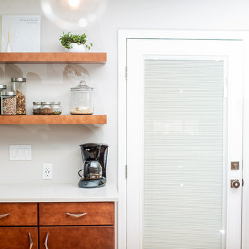
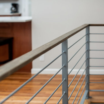
There’s nothing as wonderful as walking into a mid-century gem with clients who love the character of their new home. Our goal for this project was to incorporate the mid-century bones of this home into a new design that would better meet the contemporary needs of our clients. We started by taking down the walls that had separated this kitchen from the rest of the home and creating a welcoming space that blended seamlessly with the new open concept. The new kitchen design was a win for our clients with increased storage, more work surfaces, and a peninsula with plenty of seating. We utilized wood finishes through out this space with light wood flooring, medium-tones on the cabinetry, and darker wood accents throughout giving us a beautiful balance and a calm backdrop. This home had beautiful horizontal lines that we wanted to accentuate, so we selected a dark wood finish for the central beam and tied it in with the dark finish on the wood fireplace mantel and the stair handrail to emphasize the horizontal features. But we never miss an opportunity for a fun mid-century pop, and this home provided plenty of inspiration! The boomerang hardware on the cabinets and escher backsplash tiles give us great geometric elements to break up the clean lines of the rest of the space. One of our favorite features of this home was the original plaster ceilings with the custom hand troweled texture. We knew from the beginning that this was an element we wanted to maintain and accentuate, so when we opened up the kitchen and added recessed lighting we reached out to a local plaster artisan to carry the texture throughout the space, and we couldn’t be happier with the results. This design brings together the mid-century aesthetics of clean lines and fun patterns with the modern-day functionality our clients were looking for in their new kitchen.

 Savvy Giving by Design
From our Go Fund me Page Feb. 2016
Princess Kaylee is only two and a half years old and was recently diagnosed with cancer. We need your generosity so that we can give her the enchanted room of her dreams as she endures 2.5 years of treatments. We're breaking out our magic wands and designing a gorgeous room for this sweet little girl. With your assistance, we can create a fairy tale space for Kaylee and her family to rest and recover.
Kaylee's story hits especially close to home in our tight-knit community. Her mother, Kelly, is an oncology nurse at Rady Children's Hospital. Yes, you read that correctly - her mother has spent the last 8 years compassionately caring after children who have been diagnosed with cancer. In fact, she was one of the dedicated nurses who so wonderfully cared for Savvy Giving by Design's very first recipient, Kasey Harvey.
And Kelly is not the only hero in this family. Kaylee's father, Jared, is a local CHP officer who keeps our streets safe and not long ago rescued multiple children after a lengthy stand-off with their abductor.
http://www.10news.com/news/chp-officers-relive-moments-in-highway-standoff-121214
Jared and Kelly have two beautiful children. Their son Drew is 5 years-old and daughter Kaylee will turn 3 in August. Kaylee's diagnosis, Acute Lymphoblastic Leukemia, turned this family's world upside down. While her prognosis is, thankfully, very good (with a 93% cure rate), the treatment will be incredibly arduous. Kaylee is facing 2.5 years of ongoing treatment with periods of intense chemotherapy followed by "maintenance" chemo. As hard as it is to believe, Kaylee's treatment will not be complete until she is 5 years-old and preparing to enter kindergarten.
Given the ongoing and onerous treatment regimen that Kaylee faces, Savvy Giving by Design knows that she will need a beautiful and comfortable room where she can rest and be visited by family and friends. Kaylee is currently transitioning out of her crib and we have big intentions for this princess-loving little girl. Our plan is to combine fun and functionality with details and personal touches that will show Kaylee that there is an entire community rallying behind her. We will incorporate Kaylee's favorite colors (pink and purple) and turn her fantasies into reality by installing a built-in castle bed that makes her room feel magical and shows this little girl that anything is possible.
This room will have some very personal special touches incorporated into it to pay tribute to Kaylee's fairy godmother. When Kelly was 13, she lost her very best friend, Jessica, to cancer. Kelly paid tribute to her dear friend by naming her daughter Kaylee Jessica and she wholeheartedly believes that Jessica will be watching over her little girl as she travels this difficult road.
With sufficient funding, we will also be able to do a little makeover for Kaylee's knight in shining armor, her big brother Drew. We recognize and appreciate that Drew faces a struggle all his own as his little sister battles this disease.
Savvy Giving by Design is a the philanthropic arm of Savvy Interiors, Inc. We are registered with the state of California as a nonprofit and awaiting our "formal" 501(c)(3) designation by the IRS. Your donations are tax-deductible. All monies collected will go directly to this space! Any excess funds will be distributed directly to the family. Since late 2014, Savvy Giving by Design has transformed 8 spaces and our ultimate goal is to have sufficient funding to take on one project each month.
As stated in our founding documents, "Our mission is to provide comfort, support, and healing to families with a child facing a medical crisis by transforming the interior spaces of their homes at no cost to them".
We hope you will support our mission to makeover these two rooms for this very deserving family and give Kaylee and Drew's loving parents the gift of knowing that their children are happy, safe, and ready to take on the battle of a lifetime. If you would like to join and follow Kaylee's team page, "Tutu's and Chemo drips," you can do so here: https://www.facebook.com/groups/158667784506286/
To join our ongoing grass roots efforts, please join our Savvy Giving closed group page. https://www.facebook.com/groups/SavvyGivingbyDesign/
Find the right local pro for your project
 TVL Creative Ltd.
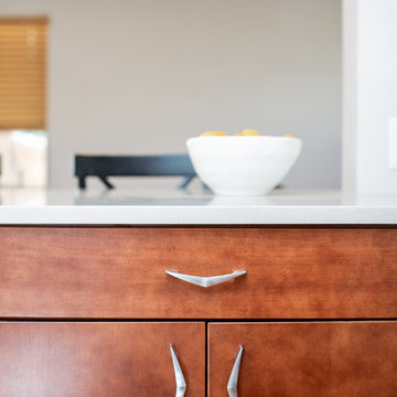
There’s nothing as wonderful as walking into a mid-century gem with clients who love the character of their new home. Our goal for this project was to incorporate the mid-century bones of this home into a new design that would better meet the contemporary needs of our clients. We started by taking down the walls that had separated this kitchen from the rest of the home and creating a welcoming space that blended seamlessly with the new open concept. The new kitchen design was a win for our clients with increased storage, more work surfaces, and a peninsula with plenty of seating. We utilized wood finishes through out this space with light wood flooring, medium-tones on the cabinetry, and darker wood accents throughout giving us a beautiful balance and a calm backdrop. This home had beautiful horizontal lines that we wanted to accentuate, so we selected a dark wood finish for the central beam and tied it in with the dark finish on the wood fireplace mantel and the stair handrail to emphasize the horizontal features. But we never miss an opportunity for a fun mid-century pop, and this home provided plenty of inspiration! The boomerang hardware on the cabinets and escher backsplash tiles give us great geometric elements to break up the clean lines of the rest of the space. One of our favorite features of this home was the original plaster ceilings with the custom hand troweled texture. We knew from the beginning that this was an element we wanted to maintain and accentuate, so when we opened up the kitchen and added recessed lighting we reached out to a local plaster artisan to carry the texture throughout the space, and we couldn’t be happier with the results. This design brings together the mid-century aesthetics of clean lines and fun patterns with the modern-day functionality our clients were looking for in their new kitchen.
 TVL Creative Ltd.
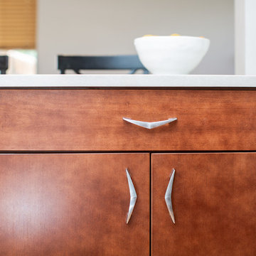
There’s nothing as wonderful as walking into a mid-century gem with clients who love the character of their new home. Our goal for this project was to incorporate the mid-century bones of this home into a new design that would better meet the contemporary needs of our clients. We started by taking down the walls that had separated this kitchen from the rest of the home and creating a welcoming space that blended seamlessly with the new open concept. The new kitchen design was a win for our clients with increased storage, more work surfaces, and a peninsula with plenty of seating. We utilized wood finishes through out this space with light wood flooring, medium-tones on the cabinetry, and darker wood accents throughout giving us a beautiful balance and a calm backdrop. This home had beautiful horizontal lines that we wanted to accentuate, so we selected a dark wood finish for the central beam and tied it in with the dark finish on the wood fireplace mantel and the stair handrail to emphasize the horizontal features. But we never miss an opportunity for a fun mid-century pop, and this home provided plenty of inspiration! The boomerang hardware on the cabinets and escher backsplash tiles give us great geometric elements to break up the clean lines of the rest of the space. One of our favorite features of this home was the original plaster ceilings with the custom hand troweled texture. We knew from the beginning that this was an element we wanted to maintain and accentuate, so when we opened up the kitchen and added recessed lighting we reached out to a local plaster artisan to carry the texture throughout the space, and we couldn’t be happier with the results. This design brings together the mid-century aesthetics of clean lines and fun patterns with the modern-day functionality our clients were looking for in their new kitchen.

 River Valley Landscapes
The property is one of the original farm houses located on the main street of a small town. It has been in the family for many years and our client just inherited the property. They were trying to have balance of preserving the old while realizing modern day living has its benefits too. The house had a large addition added using mostly old style materials, but designed with function and modern day luxuries. Our goal was to carry that theme to the outside.
Our first problem we had to address was how to transition between the first floor elevation changes. The lower room was the husband’s office. He stated in the future he may have clients over and it would be nice to have an area to sit outside. The wife’s main concern was to renew the four corner garden. She also felt it was very important to be able to see it from the kitchen area. Finally there was an old wishing well stuck right outside the kitchen. They both felt it would be neat to be able to incorporate this in some how. They wanted a patio area with a built in grill to accommodate there family and friends. They also wanted to keep a large play area for the kids.
We were able to pull this off successfully. We addressed the first issue by having a small lower level flagstone area. This area is large enough for 1 to 2 people to sit comfortably. It also provides a transition from his office to the larger patio area. We installed a simple small gravel sitting area opposite of the main patio. This provides our client a secluded place to relax or do business. Mrs.... told me she is amazed how much her and her husband enjoys this area. It is so peaceful looking at the small creek over a glass of wine.
We built a natural limestone retaining wall to create the patio terrace. The stone was chosen to extend the houses architectural elements into the landscape. Irregular broken flagstone was used to give it a more casual feel. We installed three Serviceberries into the patio terrace to replace some trees that were taken down during the remodeling. She was very concern that they would block the view of the four corner garden. We new they were crucial to nestle in the terrace, so we placed them for a couple days for her to decide. Fortunately she agreed they not only kept the view open, but helped frame the garden.
The four corner garden was designed to be viewed from afar and experienced up close. We wanted the space to have some formal structure while keeping with the casual farm house feel. Another natural limestone retaining wall was created. This leveled the garden terrace and helped associate it with the rest of the property. The four corner garden is nestled into the existing woods edge. This provides three distinct experiences to entering the garden; a more formal from the driveway, an open feel from the lower lawn, and a more natural / casual experience from the wooded area. The Plymouth brown gravel was used for the center of the garden. This helped highlight the stone post that was found during construction. The gravel also brings the sense of sound into the garden space. Lamb’s ear was chosen as a fun way to get kids interest in horticulture.
The balance of using the new to create the old feel is what makes this project a success. The property has already hosted a local historical society event and won an award for its preservation efforts. When Mrs.... can’t find her husband, she knows he is either reading the newspaper by the grill or resting in the hammock along the wood’s path.
 TVL Creative Ltd.
There’s nothing as wonderful as walking into a mid-century gem with clients who love the character of their new home. Our goal for this project was to incorporate the mid-century bones of this home into a new design that would better meet the contemporary needs of our clients. We started by taking down the walls that had separated this kitchen from the rest of the home and creating a welcoming space that blended seamlessly with the new open concept. The new kitchen design was a win for our clients with increased storage, more work surfaces, and a peninsula with plenty of seating. We utilized wood finishes through out this space with light wood flooring, medium-tones on the cabinetry, and darker wood accents throughout giving us a beautiful balance and a calm backdrop. This home had beautiful horizontal lines that we wanted to accentuate, so we selected a dark wood finish for the central beam and tied it in with the dark finish on the wood fireplace mantel and the stair handrail to emphasize the horizontal features. But we never miss an opportunity for a fun mid-century pop, and this home provided plenty of inspiration! The boomerang hardware on the cabinets and escher backsplash tiles give us great geometric elements to break up the clean lines of the rest of the space. One of our favorite features of this home was the original plaster ceilings with the custom hand troweled texture. We knew from the beginning that this was an element we wanted to maintain and accentuate, so when we opened up the kitchen and added recessed lighting we reached out to a local plaster artisan to carry the texture throughout the space, and we couldn’t be happier with the results. This design brings together the mid-century aesthetics of clean lines and fun patterns with the modern-day functionality our clients were looking for in their new kitchen.

 TVL Creative Ltd.
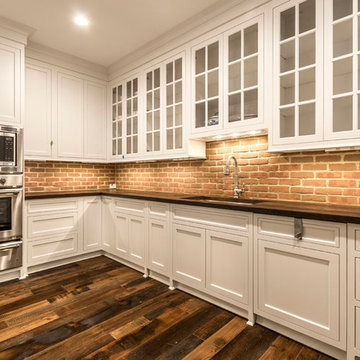
There’s nothing as wonderful as walking into a mid-century gem with clients who love the character of their new home. Our goal for this project was to incorporate the mid-century bones of this home into a new design that would better meet the contemporary needs of our clients. We started by taking down the walls that had separated this kitchen from the rest of the home and creating a welcoming space that blended seamlessly with the new open concept. The new kitchen design was a win for our clients with increased storage, more work surfaces, and a peninsula with plenty of seating. We utilized wood finishes through out this space with light wood flooring, medium-tones on the cabinetry, and darker wood accents throughout giving us a beautiful balance and a calm backdrop. This home had beautiful horizontal lines that we wanted to accentuate, so we selected a dark wood finish for the central beam and tied it in with the dark finish on the wood fireplace mantel and the stair handrail to emphasize the horizontal features. But we never miss an opportunity for a fun mid-century pop, and this home provided plenty of inspiration! The boomerang hardware on the cabinets and escher backsplash tiles give us great geometric elements to break up the clean lines of the rest of the space. One of our favorite features of this home was the original plaster ceilings with the custom hand troweled texture. We knew from the beginning that this was an element we wanted to maintain and accentuate, so when we opened up the kitchen and added recessed lighting we reached out to a local plaster artisan to carry the texture throughout the space, and we couldn’t be happier with the results. This design brings together the mid-century aesthetics of clean lines and fun patterns with the modern-day functionality our clients were looking for in their new kitchen.

 InnovationLand
This Houston kitchen remodel and whole-house redesign was nothing less than a time machine – zooming a 40-year-old living space into 2017!
“The kitchen had formica countertops, old wood cabinets, a strange layout and low ceilings,” says Lisha Maxey, lead designer for Outdoor Homescapes of Houston and owner of LGH Design Services. “We basically took it down to the studs to create the new space. It even had original terrazzo tile in the foyer! Almost never see that anymore.”
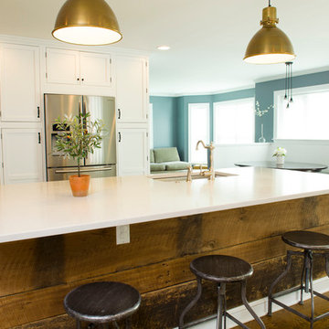
The new look is all 2017, starting with a pure white maple wood for the new kitchen cabinetry and a 13-foot butcher block island. The china hutch, beam and columns are walnut.
The small kitchen countertop (on fridge side) is Corian. The flooring is solid hickory with a natural stain. The backsplash is Moroccan blue glass.
In the island, Outdoor Homescapes added a small, stainless steel prep sink and a large porcelain sink. All finishes are brushed stainless steel except for the pot filler, which is copper.
“The look is very transitional, with a hearty mix of antiques the client wanted incorporated and the contemporary open concept look of today,” says Lisha. “The bar stools are actually reclaimed science class stools that my client picked up at a local fair. It was an awesome find!”
In addition to the kitchen, the home’s first-floor half bath, living room and den also got an update.
Outdoor Homescapes also built storage into the space under the stairs and warmed up the entry with custom blue and beige wallpaper.
“In the half bath, we used the client’s favorite color, orange,” says Lisha. “We added a vessel bowl that was also found at a fair and an antique chandelier to top it off.”
The paint in that room was textured by running a dry brush vertically while the paint was still wet. “It appears to be wallpaper, but not!” explains Lisha. Outdoor Homescapes also used black/white custom tiles in the bath and laundry room to tie it all in.
Lisha used antique pieces in the laundry room with a custom black/white porcelain floor. To open up the wall between the old kitchen and living room, we had to install a 26’ steel I-beam to support the second floor. It was an engineering feat! Took six men to get it into place!
“The client – an empty nester couple – had already done their upstairs remodel and they knew the first floor would be a gut-out,” continues Lisha. “The home was in very poor condition prior to the remodel, and everything needed to go. Basically, wife told husband, we either do this remodel or we sell the house. And Mr. inherited it from his Mom, so it has sentimental value to him.”
Lisha loves how original it turned out, noting the refreshing department from the usual all-white kitchen with black/white flooring, Carrera marble or granite countertops and subway tile. “The clients were open to mixing up styles and working with me to make it come together,” she says. “I think there’s a new excitement in mixing the decades and finding a way to allow clients to hold on to treasured antiques or special pieces while incorporating them in a more modern space.
Her favorite area is the large island.
“I love that they will spend holidays and regular days around that space,” she says. “It’s just so welcoming!”

 Sweet Smiling Landscape Design
These clients bought a Mid-century house with a vintage landscape that left something to be desired. Both the clients as well as myself have a great appreciation for midcentury design and its clean lines but the majority of the landscapes found in Mid-century housing developments across America miss the mark when it comes to more current sensibilities. The midcentury American philosophy was that man should exert dominance over the land and that hedge trimmers and lawn mowers are mans best friends.
Today more enlighten landscape designers strive to create landscapes that work with nature and not dominate it. In this project we did just that. These home owners loved the view of the mountains from their back yard in Santa Barbara, the way the warm colored sand stone boulders peak through muted greens of the Chaparral. We designed this landscape to be of its place. Sourcing local sandstone boulders like to ones found in the mountains behind the house we used then to build a low retaining wall. By breaking the sloping land into two flatter sections we are able to slow down the speed at which water evacuates the property giving it a chance to soak into the soil. This allows the landscape to work like a natural mini water shed, keeping the storm drains and then the oceans overwhelmed with polluted water and providing more water to the plants with less irrigation.
When it came to the plants, the clients wanted low water color and texture. To celebrate the fact that the house is located in Santa Barbara county we wanted to incorporate the muted green tones, with pops of colorful foliage. Using a mix of course lots of California native plants and Mediterranean adapted plants we created a plant plate that is beautiful, low maintenance and flutters with native fauna such as bird, and butterflies and bees.
 TVL Creative Ltd.
There’s nothing as wonderful as walking into a mid-century gem with clients who love the character of their new home. Our goal for this project was to incorporate the mid-century bones of this home into a new design that would better meet the contemporary needs of our clients. We started by taking down the walls that had separated this kitchen from the rest of the home and creating a welcoming space that blended seamlessly with the new open concept. The new kitchen design was a win for our clients with increased storage, more work surfaces, and a peninsula with plenty of seating. We utilized wood finishes through out this space with light wood flooring, medium-tones on the cabinetry, and darker wood accents throughout giving us a beautiful balance and a calm backdrop. This home had beautiful horizontal lines that we wanted to accentuate, so we selected a dark wood finish for the central beam and tied it in with the dark finish on the wood fireplace mantel and the stair handrail to emphasize the horizontal features. But we never miss an opportunity for a fun mid-century pop, and this home provided plenty of inspiration! The boomerang hardware on the cabinets and escher backsplash tiles give us great geometric elements to break up the clean lines of the rest of the space. One of our favorite features of this home was the original plaster ceilings with the custom hand troweled texture. We knew from the beginning that this was an element we wanted to maintain and accentuate, so when we opened up the kitchen and added recessed lighting we reached out to a local plaster artisan to carry the texture throughout the space, and we couldn’t be happier with the results. This design brings together the mid-century aesthetics of clean lines and fun patterns with the modern-day functionality our clients were looking for in their new kitchen.
 Sweet Smiling Landscape Design
These clients bought a Mid-century house with a vintage landscape that left something to be desired. Both the clients as well as myself have a great appreciation for midcentury design and its clean lines but the majority of the landscapes found in Mid-century housing developments across America miss the mark when it comes to more current sensibilities. The midcentury American philosophy was that man should exert dominance over the land and that hedge trimmers and lawn mowers are mans best friends.
Today more enlighten landscape designers strive to create landscapes that work with nature and not dominate it. In this project we did just that. These home owners loved the view of the mountains from their back yard in Santa Barbara, the way the warm colored sand stone boulders peak through muted greens of the Chaparral. We designed this landscape to be of its place. Sourcing local sandstone boulders like to ones found in the mountains behind the house we used then to build a low retaining wall. By breaking the sloping land into two flatter sections we are able to slow down the speed at which water evacuates the property giving it a chance to soak into the soil. This allows the landscape to work like a natural mini water shed, keeping the storm drains and then the oceans overwhelmed with polluted water and providing more water to the plants with less irrigation.
When it came to the plants, the clients wanted low water color and texture. To celebrate the fact that the house is located in Santa Barbara county we wanted to incorporate the muted green tones, with pops of colorful foliage. Using a mix of course lots of California native plants and Mediterranean adapted plants we created a plant plate that is beautiful, low maintenance and flutters with native fauna such as bird, and butterflies and bees.
 TVL Creative Ltd.
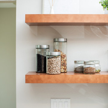
There’s nothing as wonderful as walking into a mid-century gem with clients who love the character of their new home. Our goal for this project was to incorporate the mid-century bones of this home into a new design that would better meet the contemporary needs of our clients. We started by taking down the walls that had separated this kitchen from the rest of the home and creating a welcoming space that blended seamlessly with the new open concept. The new kitchen design was a win for our clients with increased storage, more work surfaces, and a peninsula with plenty of seating. We utilized wood finishes through out this space with light wood flooring, medium-tones on the cabinetry, and darker wood accents throughout giving us a beautiful balance and a calm backdrop. This home had beautiful horizontal lines that we wanted to accentuate, so we selected a dark wood finish for the central beam and tied it in with the dark finish on the wood fireplace mantel and the stair handrail to emphasize the horizontal features. But we never miss an opportunity for a fun mid-century pop, and this home provided plenty of inspiration! The boomerang hardware on the cabinets and escher backsplash tiles give us great geometric elements to break up the clean lines of the rest of the space. One of our favorite features of this home was the original plaster ceilings with the custom hand troweled texture. We knew from the beginning that this was an element we wanted to maintain and accentuate, so when we opened up the kitchen and added recessed lighting we reached out to a local plaster artisan to carry the texture throughout the space, and we couldn’t be happier with the results. This design brings together the mid-century aesthetics of clean lines and fun patterns with the modern-day functionality our clients were looking for in their new kitchen.
Sponsored
Plain City, OH

The Creative Kitchen Company
Columbus Area Kitchen Remodeling and Refacing Professional
 TVL Creative Ltd.
There’s nothing as wonderful as walking into a mid-century gem with clients who love the character of their new home. Our goal for this project was to incorporate the mid-century bones of this home into a new design that would better meet the contemporary needs of our clients. We started by taking down the walls that had separated this kitchen from the rest of the home and creating a welcoming space that blended seamlessly with the new open concept. The new kitchen design was a win for our clients with increased storage, more work surfaces, and a peninsula with plenty of seating. We utilized wood finishes through out this space with light wood flooring, medium-tones on the cabinetry, and darker wood accents throughout giving us a beautiful balance and a calm backdrop. This home had beautiful horizontal lines that we wanted to accentuate, so we selected a dark wood finish for the central beam and tied it in with the dark finish on the wood fireplace mantel and the stair handrail to emphasize the horizontal features. But we never miss an opportunity for a fun mid-century pop, and this home provided plenty of inspiration! The boomerang hardware on the cabinets and escher backsplash tiles give us great geometric elements to break up the clean lines of the rest of the space. One of our favorite features of this home was the original plaster ceilings with the custom hand troweled texture. We knew from the beginning that this was an element we wanted to maintain and accentuate, so when we opened up the kitchen and added recessed lighting we reached out to a local plaster artisan to carry the texture throughout the space, and we couldn’t be happier with the results. This design brings together the mid-century aesthetics of clean lines and fun patterns with the modern-day functionality our clients were looking for in their new kitchen.
 Sweet Smiling Landscape Design
These clients bought a Mid-century house with a vintage landscape that left something to be desired. Both the clients as well as myself have a great appreciation for midcentury design and its clean lines but the majority of the landscapes found in Mid-century housing developments across America miss the mark when it comes to more current sensibilities. The midcentury American philosophy was that man should exert dominance over the land and that hedge trimmers and lawn mowers are mans best friends.
Today more enlighten landscape designers strive to create landscapes that work with nature and not dominate it. In this project we did just that. These home owners loved the view of the mountains from their back yard in Santa Barbara, the way the warm colored sand stone boulders peak through muted greens of the Chaparral. We designed this landscape to be of its place. Sourcing local sandstone boulders like to ones found in the mountains behind the house we used then to build a low retaining wall. By breaking the sloping land into two flatter sections we are able to slow down the speed at which water evacuates the property giving it a chance to soak into the soil. This allows the landscape to work like a natural mini water shed, keeping the storm drains and then the oceans overwhelmed with polluted water and providing more water to the plants with less irrigation.
When it came to the plants, the clients wanted low water color and texture. To celebrate the fact that the house is located in Santa Barbara county we wanted to incorporate the muted green tones, with pops of colorful foliage. Using a mix of course lots of California native plants and Mediterranean adapted plants we created a plant plate that is beautiful, low maintenance and flutters with native fauna such as bird, and butterflies and bees.

 Haven Design Workshop
Great Room with recessed recessed entertainment center and built in space for wood storage for the wood burning fireplace and super insulated concrete floors.
 TVL Creative Ltd.
There’s nothing as wonderful as walking into a mid-century gem with clients who love the character of their new home. Our goal for this project was to incorporate the mid-century bones of this home into a new design that would better meet the contemporary needs of our clients. We started by taking down the walls that had separated this kitchen from the rest of the home and creating a welcoming space that blended seamlessly with the new open concept. The new kitchen design was a win for our clients with increased storage, more work surfaces, and a peninsula with plenty of seating. We utilized wood finishes through out this space with light wood flooring, medium-tones on the cabinetry, and darker wood accents throughout giving us a beautiful balance and a calm backdrop. This home had beautiful horizontal lines that we wanted to accentuate, so we selected a dark wood finish for the central beam and tied it in with the dark finish on the wood fireplace mantel and the stair handrail to emphasize the horizontal features. But we never miss an opportunity for a fun mid-century pop, and this home provided plenty of inspiration! The boomerang hardware on the cabinets and escher backsplash tiles give us great geometric elements to break up the clean lines of the rest of the space. One of our favorite features of this home was the original plaster ceilings with the custom hand troweled texture. We knew from the beginning that this was an element we wanted to maintain and accentuate, so when we opened up the kitchen and added recessed lighting we reached out to a local plaster artisan to carry the texture throughout the space, and we couldn’t be happier with the results. This design brings together the mid-century aesthetics of clean lines and fun patterns with the modern-day functionality our clients were looking for in their new kitchen.

 TVL Creative Ltd.
There’s nothing as wonderful as walking into a mid-century gem with clients who love the character of their new home. Our goal for this project was to incorporate the mid-century bones of this home into a new design that would better meet the contemporary needs of our clients. We started by taking down the walls that had separated this kitchen from the rest of the home and creating a welcoming space that blended seamlessly with the new open concept. The new kitchen design was a win for our clients with increased storage, more work surfaces, and a peninsula with plenty of seating. We utilized wood finishes through out this space with light wood flooring, medium-tones on the cabinetry, and darker wood accents throughout giving us a beautiful balance and a calm backdrop. This home had beautiful horizontal lines that we wanted to accentuate, so we selected a dark wood finish for the central beam and tied it in with the dark finish on the wood fireplace mantel and the stair handrail to emphasize the horizontal features. But we never miss an opportunity for a fun mid-century pop, and this home provided plenty of inspiration! The boomerang hardware on the cabinets and escher backsplash tiles give us great geometric elements to break up the clean lines of the rest of the space. One of our favorite features of this home was the original plaster ceilings with the custom hand troweled texture. We knew from the beginning that this was an element we wanted to maintain and accentuate, so when we opened up the kitchen and added recessed lighting we reached out to a local plaster artisan to carry the texture throughout the space, and we couldn’t be happier with the results. This design brings together the mid-century aesthetics of clean lines and fun patterns with the modern-day functionality our clients were looking for in their new kitchen.
 TVL Creative Ltd.
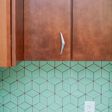
There’s nothing as wonderful as walking into a mid-century gem with clients who love the character of their new home. Our goal for this project was to incorporate the mid-century bones of this home into a new design that would better meet the contemporary needs of our clients. We started by taking down the walls that had separated this kitchen from the rest of the home and creating a welcoming space that blended seamlessly with the new open concept. The new kitchen design was a win for our clients with increased storage, more work surfaces, and a peninsula with plenty of seating. We utilized wood finishes through out this space with light wood flooring, medium-tones on the cabinetry, and darker wood accents throughout giving us a beautiful balance and a calm backdrop. This home had beautiful horizontal lines that we wanted to accentuate, so we selected a dark wood finish for the central beam and tied it in with the dark finish on the wood fireplace mantel and the stair handrail to emphasize the horizontal features. But we never miss an opportunity for a fun mid-century pop, and this home provided plenty of inspiration! The boomerang hardware on the cabinets and escher backsplash tiles give us great geometric elements to break up the clean lines of the rest of the space. One of our favorite features of this home was the original plaster ceilings with the custom hand troweled texture. We knew from the beginning that this was an element we wanted to maintain and accentuate, so when we opened up the kitchen and added recessed lighting we reached out to a local plaster artisan to carry the texture throughout the space, and we couldn’t be happier with the results. This design brings together the mid-century aesthetics of clean lines and fun patterns with the modern-day functionality our clients were looking for in their new kitchen.
 Luxury Antonovich Design AE
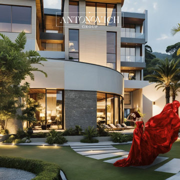
Contemporary luxury villa design has reached new heights of sophistication, and Antonovich Group stands at the forefront of this architectural evolution. Their modern approach to villa exterior and landscape design creates harmonious living environments that seamlessly blend indoor comfort with outdoor elegance, establishing new benchmarks for luxury residential architecture.
Architectural Excellence Through Modern Design
Antonovich Group's modern villa exteriors showcase a masterful understanding of contemporary aesthetics while maintaining timeless appeal. Their designs feature bold, clean lines and expansive glazing that create striking visual statements against carefully curated landscapes. Each project demonstrates how modern architecture can enhance rather than compete with its natural surroundings.
The key to their success lies in the thoughtful balance between dramatic architectural elements and refined details. Expansive terraces, geometric pools, and sculptural outdoor features create outdoor rooms that feel as luxurious and well-appointed as any interior space, establishing a new standard for modern luxury living.
Innovative Exterior Cladding Solutions
The sophistication of Antonovich Group's villa designs is particularly evident in their exterior cladding solutions, which combine premium materials with cutting-edge installation techniques. Their material palette includes natural stone, contemporary metals, and high-performance composites that not only create stunning visual impact but also ensure long-term durability in challenging climates.
These exterior cladding solutions go beyond mere aesthetics, incorporating thermal performance, weather resistance, and maintenance considerations into every selection. The result is facades that maintain their beauty while providing superior protection and energy efficiency. From sleek metal panels that create dramatic shadow play to warm natural stone that grounds the structure in its environment, each material choice serves both form and function.
Garden Landscape Design: Creating Outdoor Sanctuaries
The garden landscape design component of Antonovich Group's projects transforms outdoor spaces into sophisticated extensions of the villa's interior. Their approach to landscaping embraces both the architectural language of the building and the natural characteristics of the site, creating gardens that feel both designed and organic.
Strategic plantings create privacy screens and focal points while maintaining sight lines to key architectural features. Water elements, from reflecting pools to dynamic fountains, add movement and sound that enhance the sensory experience of the outdoor spaces. The garden landscape design incorporates both formal and naturalistic elements, creating varied experiences throughout the property while maintaining visual cohesion.
Sustainable Modern Luxury
Modern luxury doesn't mean abandoning environmental responsibility. Antonovich Group's designs incorporate sustainable practices throughout their exterior and landscape elements, from water-efficient irrigation systems to locally sourced materials that reduce environmental impact while supporting regional craftspeople and suppliers.
Their plant selections prioritize native and adaptive species that thrive with minimal intervention, while hardscape materials are chosen for longevity and low maintenance requirements. This approach ensures that these stunning properties remain beautiful and functional for decades while minimizing their environmental footprint.
The Complete Modern Lifestyle
What distinguishes Antonovich Group's work is their understanding that modern luxury villa design must address the complete lifestyle of their clients. Their exteriors and landscapes aren't just beautiful backdrops—they're functional spaces designed for entertaining, relaxation, and daily living.
From outdoor kitchens that rival their indoor counterparts to wellness areas that promote health and relaxation, every element is designed to enhance the quality of life for residents. The integration of technology, sustainable systems, and artistic elements creates properties that are as smart as they are beautiful, representing the pinnacle of modern luxury villa design.
73