
Search results for "Increase list" in Home Design Ideas

 Lee Edwards - residential design
Situated on the west slope of Mt. Baker Ridge, this remodel takes a contemporary view on traditional elements to maximize space, lightness and spectacular views of downtown Seattle and Puget Sound. We were approached by Vertical Construction Group to help a client bring their 1906 craftsman into the 21st century. The original home had many redeeming qualities that were unfortunately compromised by an early 2000’s renovation. This left the new homeowners with awkward and unusable spaces. After studying numerous space plans and roofline modifications, we were able to create quality interior and exterior spaces that reflected our client’s needs and design sensibilities. The resulting master suite, living space, roof deck(s) and re-invented kitchen are great examples of a successful collaboration between homeowner and design and build teams.

 Living Gardens Landscape Design
This is an example of a mid-sized contemporary full sun backyard gravel landscaping in Orange County for spring.
This is an example of a mid-sized contemporary full sun backyard gravel landscaping in Orange County for spring.

 Michael Hospelt Photography
Polsky Perlstein Architects, Michael Hospelt Photography
Example of a farmhouse living room design in San Francisco
Example of a farmhouse living room design in San Francisco
Find the right local pro for your project

 Su Casa Home Staging & ReDesign
Trish Watson, Owner and Property Stylist with Su Casa Home Staging & ReDesign, is a certified, award-winning staging professional.
She combines her love of style and design to create stunning spaces that sell for above listing every time.
Trish services the Oakville, Mississauga, Burlington and surrounding areas and provides both occupied and vacant home staging services. Her niche is vacant homes because she loves the blank slate upon which she can “tell the story of the home”. She loves to create a lifestyle so any potential buyer walking through the home can envision themselves living in that home.
Su Casa works with both realtors and homeowners to help increase property value and speed of sale. Please do not hesitate to reach out and schedule and appointment with Trish today!

 FA Design Build
To stay or to go? This is the question our clients are still pondering. Yet, as their youngest child heads off to college, they are ready to enjoy their new kitchen or feature it in a real estate listing. Since they were unsure of their plans, we decided a pull and replace renovation was the logical — and most economical—choice. While all appliances remain in their same locations, we were able to make easy adjustments with cabinetry to update the space: convert a desk to a beverage center; increase the size of the island; install an island countertop with overhang for seating; and lengthen the perimeter cabinetry and add a tip-up, on-counter cabinet to house small appliances. The color palette was based on introducing warm grays to the space while ensuring the existing Brazilian cherry floor remained compatible with the new design. A combination of light gray and dark gray painted cabinetry (Medallion, Irish Crème and Frappe) updates the space, along with bronze finishes. A unique hex-patterned white tile backsplash with contrasting gray grout on the perimeter adds interest yet keeps the focus on the island. We installed the understated Cambria Whitehall on the perimeter with the vivid Cambria Skara Brae on the island. We worked closely with the stone fabricator to ensure the Skara Brae’s veining pattern matched the client’s vision. Above the island countertop, we installed two oversized pendants to add intensity and beauty as you enter the room.

 Chango
Interior Design, Interior Architecture, Custom Furniture Design, AV Design, Landscape Architecture, & Art Curation by Chango & Co.
Photography by Ball & Albanese

 TKS Design Group
Free ebook, Creating the Ideal Kitchen. DOWNLOAD NOW
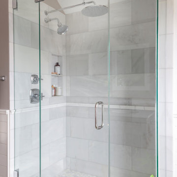
This client came to us wanting some help with updating the master bath in their home. Their primary goals were to increase the size of the shower, add a rain head, add a freestanding tub and overall freshen the feel of the space.
The existing layout of the bath worked well, so we left the basic footprint the same, but increased the size of the shower and added a freestanding tub on a bit of an angle which allowed for some additional storage.
One of the most important things on the wish list was adding a rainhead in the shower, but this was not an easy task with the angled ceiling. We came up with the solution of using an extra long wall-mounted shower arm that was reinforced with a meal bracket attached the ceiling. This did the trick, and no extra framing or insulation was required to make it work.
The materials selected for the space are classic and fresh. Large format white oriental marble is used throughout the bath, on the floor in a herrinbone pattern and in a staggered brick pattern on the walls. Alder cabinets with a gray stain contrast nicely with the white marble, while shiplap detail helps unify the space and gives it a casual and cozy vibe. Storage solutions include an area for towels and other necessities at the foot of the tub, roll out shelves and out storage in the vanities and a custom niche and shaving ledge in the shower. We love how just a few simple changes can make such a great impact!
Designed by: Susan Klimala, CKBD
Photography by: LOMA Studios
For more information on kitchen and bath design ideas go to: www.kitchenstudio-ge.com
Sponsored
Westerville, OH

The Steele Group
Industry Leading General Contractors in Franklin County, Ohio


 CARNEMARK design + build
Also on the wish list were budget-friendly bathrooms for each of their sons to grow into, bathrooms that would complement the rest of the home and increase its resale value. A modern floating gray vanity with white quartz counter and frameless mirror is the perfect low-maintenance solution for their sons in youth—and as future teenagers. Photography by Anice Hoachlander.

 TKS Design Group
Free ebook, Creating the Ideal Kitchen. DOWNLOAD NOW
This client came to us wanting some help with updating the master bath in their home. Their primary goals were to increase the size of the shower, add a rain head, add a freestanding tub and overall freshen the feel of the space.
The existing layout of the bath worked well, so we left the basic footprint the same, but increased the size of the shower and added a freestanding tub on a bit of an angle which allowed for some additional storage.
One of the most important things on the wish list was adding a rainhead in the shower, but this was not an easy task with the angled ceiling. We came up with the solution of using an extra long wall-mounted shower arm that was reinforced with a meal bracket attached the ceiling. This did the trick, and no extra framing or insulation was required to make it work.
The materials selected for the space are classic and fresh. Large format white oriental marble is used throughout the bath, on the floor in a herrinbone pattern and in a staggered brick pattern on the walls. Alder cabinets with a gray stain contrast nicely with the white marble, while shiplap detail helps unify the space and gives it a casual and cozy vibe. Storage solutions include an area for towels and other necessities at the foot of the tub, roll out shelves and out storage in the vanities and a custom niche and shaving ledge in the shower. We love how just a few simple changes can make such a great impact!
Designed by: Susan Klimala, CKBD
Photography by: LOMA Studios
For more information on kitchen and bath design ideas go to: www.kitchenstudio-ge.com


 Adrienne DeRosa
With respect to the notion of old-meets-new, the kitchen strikes a comfortable balance between materials. For the center island, Franklin repurposed original barn siding into cladding for the unit, painting it grey. The Corian counter top and stainless steel backsplash provide a cool contrast.
A set of antique barstools was a fortunate find for the homeowner. Sourced from a local bar that had closed, all they needed was a little elbow grease to realize their full potential. It took days to remove years worth of nicotine stains from them, but as Franklin exclaims, "It was worth it because the old stools found a new home in an old barn!"
The partial wall was designed to address a number of functional and aesthetic concerns. Dividing the workspace from the storage space, it keeps the pantry area out of view, and allows light to carry through this area of the home. Franklin also uses the wall as a means to display his growing teapot collection. "It’s funny," he confesses, "but I think they can entice people to sit down, have a cup of tea and converse (Imagine that in this world of technology!)"
Adrienne DeRosa Photography
 Su Casa Home Staging & ReDesign
Trish Watson, Owner and Property Stylist with Su Casa Home Staging & ReDesign, is a certified, award-winning staging professional.
She combines her love of style and design to create stunning spaces that sell for above listing every time.
Trish services the Oakville, Mississauga, Burlington and surrounding areas and provides both occupied and vacant home staging services. Her niche is vacant homes because she loves the blank slate upon which she can “tell the story of the home”. She loves to create a lifestyle so any potential buyer walking through the home can envision themselves living in that home.
Su Casa works with both realtors and homeowners to help increase property value and speed of sale. Please do not hesitate to reach out and schedule and appointment with Trish today!

 BMB Designs LLC
Original wish list: bump out exterior wall to enlarge existing footprint and increase size of island -- in concert with creation of new "4-seasons" room on deck. My challenge ... eliminating multiple entries from L/R into 4-seasons room. Two designs presented ... adding French door for "single" gateway into 4-seasons room selected ... thereby creating interest, as well as easy access for entertaining and conversation within both areas.

 ZeroEnergy Design
This renovated brick rowhome in Boston’s South End offers a modern aesthetic within a historic structure, creative use of space, exceptional thermal comfort, a reduced carbon footprint, and a passive stream of income.
DESIGN PRIORITIES. The goals for the project were clear - design the primary unit to accommodate the family’s modern lifestyle, rework the layout to create a desirable rental unit, improve thermal comfort and introduce a modern aesthetic. We designed the street-level entry as a shared entrance for both the primary and rental unit. The family uses it as their everyday entrance - we planned for bike storage and an open mudroom with bench and shoe storage to facilitate the change from shoes to slippers or bare feet as they enter their home. On the main level, we expanded the kitchen into the dining room to create an eat-in space with generous counter space and storage, as well as a comfortable connection to the living space. The second floor serves as master suite for the couple - a bedroom with a walk-in-closet and ensuite bathroom, and an adjacent study, with refinished original pumpkin pine floors. The upper floor, aside from a guest bedroom, is the child's domain with interconnected spaces for sleeping, work and play. In the play space, which can be separated from the work space with new translucent sliding doors, we incorporated recreational features inspired by adventurous and competitive television shows, at their son’s request.
MODERN MEETS TRADITIONAL. We left the historic front facade of the building largely unchanged - the security bars were removed from the windows and the single pane windows were replaced with higher performing historic replicas. We designed the interior and rear facade with a vision of warm modernism, weaving in the notable period features. Each element was either restored or reinterpreted to blend with the modern aesthetic. The detailed ceiling in the living space, for example, has a new matte monochromatic finish, and the wood stairs are covered in a dark grey floor paint, whereas the mahogany doors were simply refinished. New wide plank wood flooring with a neutral finish, floor-to-ceiling casework, and bold splashes of color in wall paint and tile, and oversized high-performance windows (on the rear facade) round out the modern aesthetic.
RENTAL INCOME. The existing rowhome was zoned for a 2-family dwelling but included an undesirable, single-floor studio apartment at the garden level with low ceiling heights and questionable emergency egress. In order to increase the quality and quantity of space in the rental unit, we reimagined it as a two-floor, 1 or 2 bedroom, 2 bathroom apartment with a modern aesthetic, increased ceiling height on the lowest level and provided an in-unit washer/dryer. The apartment was listed with Jackie O'Connor Real Estate and rented immediately, providing the owners with a source of passive income.
ENCLOSURE WITH BENEFITS. The homeowners sought a minimal carbon footprint, enabled by their urban location and lifestyle decisions, paired with the benefits of a high-performance home. The extent of the renovation allowed us to implement a deep energy retrofit (DER) to address air tightness, insulation, and high-performance windows. The historic front facade is insulated from the interior, while the rear facade is insulated on the exterior. Together with these building enclosure improvements, we designed an HVAC system comprised of continuous fresh air ventilation, and an efficient, all-electric heating and cooling system to decouple the house from natural gas. This strategy provides optimal thermal comfort and indoor air quality, improved acoustic isolation from street noise and neighbors, as well as a further reduced carbon footprint. We also took measures to prepare the roof for future solar panels, for when the South End neighborhood’s aging electrical infrastructure is upgraded to allow them.
URBAN LIVING. The desirable neighborhood location allows the both the homeowners and tenant to walk, bike, and use public transportation to access the city, while each charging their respective plug-in electric cars behind the building to travel greater distances.
OVERALL. The understated rowhouse is now ready for another century of urban living, offering the owners comfort and convenience as they live life as an expression of their values.
Eric Roth Photo
Sponsored
Westerville, OH
The Steele Group
Industry Leading General Contractors in Franklin County, Ohio

Bedroom - mid-sized contemporary master medium tone wood floor bedroom idea in San Francisco with gray walls
 TKS Design Group
Download our free ebook, Creating the Ideal Kitchen. DOWNLOAD NOW
The homeowners came to us looking to update the kitchen in their historic 1897 home. The home had gone through an extensive renovation several years earlier that added a master bedroom suite and updates to the front façade. The kitchen however was not part of that update and a prior 1990’s update had left much to be desired. The client is an avid cook, and it was just not very functional for the family.
The original kitchen was very choppy and included a large eat in area that took up more than its fair share of the space. On the wish list was a place where the family could comfortably congregate, that was easy and to cook in, that feels lived in and in check with the rest of the home’s décor. They also wanted a space that was not cluttered and dark – a happy, light and airy room. A small powder room off the space also needed some attention so we set out to include that in the remodel as well.
See that arch in the neighboring dining room? The homeowner really wanted to make the opening to the dining room an arch to match, so we incorporated that into the design.
Another unfortunate eyesore was the state of the ceiling and soffits. Turns out it was just a series of shortcuts from the prior renovation, and we were surprised and delighted that we were easily able to flatten out almost the entire ceiling with a couple of little reworks.
Other changes we made were to add new windows that were appropriate to the new design, which included moving the sink window over slightly to give the work zone more breathing room. We also adjusted the height of the windows in what was previously the eat-in area that were too low for a countertop to work. We tried to keep an old island in the plan since it was a well-loved vintage find, but the tradeoff for the function of the new island was not worth it in the end. We hope the old found a new home, perhaps as a potting table.
Designed by: Susan Klimala, CKD, CBD
Photography by: Michael Kaskel
For more information on kitchen and bath design ideas go to: www.kitchenstudio-ge.com
 LEDVANS
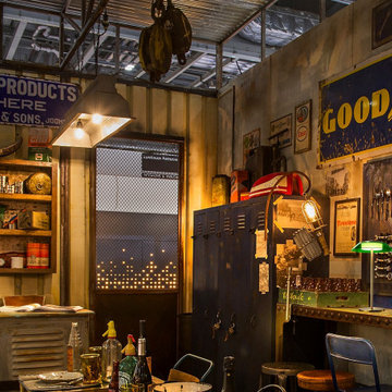
In modern life, a comfortable work environment not only improves work efficiency but also increases work enjoyment. Desk lighting fixtures play a crucial role in providing us with sufficient lighting to better focus on work. Choosing the right banker's lamp and computer screen light has become a necessary step in creating an ideal workstation.
3