Search results for "Increases" in Home Design Ideas
This renovated brick rowhome in Boston’s South End offers a modern aesthetic within a historic structure, creative use of space, exceptional thermal comfort, a reduced carbon footprint, and a passive stream of income.
DESIGN PRIORITIES. The goals for the project were clear - design the primary unit to accommodate the family’s modern lifestyle, rework the layout to create a desirable rental unit, improve thermal comfort and introduce a modern aesthetic. We designed the street-level entry as a shared entrance for both the primary and rental unit. The family uses it as their everyday entrance - we planned for bike storage and an open mudroom with bench and shoe storage to facilitate the change from shoes to slippers or bare feet as they enter their home. On the main level, we expanded the kitchen into the dining room to create an eat-in space with generous counter space and storage, as well as a comfortable connection to the living space. The second floor serves as master suite for the couple - a bedroom with a walk-in-closet and ensuite bathroom, and an adjacent study, with refinished original pumpkin pine floors. The upper floor, aside from a guest bedroom, is the child's domain with interconnected spaces for sleeping, work and play. In the play space, which can be separated from the work space with new translucent sliding doors, we incorporated recreational features inspired by adventurous and competitive television shows, at their son’s request.
MODERN MEETS TRADITIONAL. We left the historic front facade of the building largely unchanged - the security bars were removed from the windows and the single pane windows were replaced with higher performing historic replicas. We designed the interior and rear facade with a vision of warm modernism, weaving in the notable period features. Each element was either restored or reinterpreted to blend with the modern aesthetic. The detailed ceiling in the living space, for example, has a new matte monochromatic finish, and the wood stairs are covered in a dark grey floor paint, whereas the mahogany doors were simply refinished. New wide plank wood flooring with a neutral finish, floor-to-ceiling casework, and bold splashes of color in wall paint and tile, and oversized high-performance windows (on the rear facade) round out the modern aesthetic.
RENTAL INCOME. The existing rowhome was zoned for a 2-family dwelling but included an undesirable, single-floor studio apartment at the garden level with low ceiling heights and questionable emergency egress. In order to increase the quality and quantity of space in the rental unit, we reimagined it as a two-floor, 1 or 2 bedroom, 2 bathroom apartment with a modern aesthetic, increased ceiling height on the lowest level and provided an in-unit washer/dryer. The apartment was listed with Jackie O'Connor Real Estate and rented immediately, providing the owners with a source of passive income.
ENCLOSURE WITH BENEFITS. The homeowners sought a minimal carbon footprint, enabled by their urban location and lifestyle decisions, paired with the benefits of a high-performance home. The extent of the renovation allowed us to implement a deep energy retrofit (DER) to address air tightness, insulation, and high-performance windows. The historic front facade is insulated from the interior, while the rear facade is insulated on the exterior. Together with these building enclosure improvements, we designed an HVAC system comprised of continuous fresh air ventilation, and an efficient, all-electric heating and cooling system to decouple the house from natural gas. This strategy provides optimal thermal comfort and indoor air quality, improved acoustic isolation from street noise and neighbors, as well as a further reduced carbon footprint. We also took measures to prepare the roof for future solar panels, for when the South End neighborhood’s aging electrical infrastructure is upgraded to allow them.
URBAN LIVING. The desirable neighborhood location allows the both the homeowners and tenant to walk, bike, and use public transportation to access the city, while each charging their respective plug-in electric cars behind the building to travel greater distances.
OVERALL. The understated rowhouse is now ready for another century of urban living, offering the owners comfort and convenience as they live life as an expression of their values.

The client requested a kitchen that would not only provide a great space to cook and enjoy family meals but one that would fit in with her unique design sense. An avid collector of contemporary art, she wanted something unexpected in her 100-year-old home in both color and finishes but still providing a great layout with improved lighting, storage, and superior cooking abilities. The existing kitchen was in a closed off space trapped between the family room and the living. If you were in the kitchen, you were isolated from the rest of the house. Making the kitchen an integrated part of the home was a paramount request.
Step one, remove the wall separating the kitchen from the other rooms in the home which allowed the new kitchen to become an integrated space instead of an isolation room for the cook. Next, we relocated the pantry access which was in the family room to the kitchen integrating a poorly used recess which had become a catch all area which did not provide any usable space for storage or working area. To add valuable function in the kitchen we began by capturing unused "cubbies", adding a walk-in pantry from the kitchen, increasing the storage lost to un-needed drop ceilings and bring light and design to the space with a new large awning window, improved lighting, and combining interesting finishes and colors to reflect the artistic attitude of the client.
A bathroom located above the kitchen had been leaking into the plaster ceiling for several years. That along with knob and tube wiring, rotted beams and a brick wall from the back of the fireplace in the adjacent living room all needed to be brought to code. The walls, ceiling and floors in this 100+ year old home were completely out of level and the room’s foot print could not be increased.
The choice of a Sub-Zero wolf product is a standard in my kitchen designs. The quality of the product, its manufacturing and commitment to food preservation is the reason I specify Sub Zero Wolf. For the cook top, the integrated line of the contemporary cooktop and the signature red knobs against the navy blue of the cabinets added to the design vibe of the kitchen. The cooking performance and the large continuous grate on the cooktop makes it an obvious choice for a cook looking for a great cook top with professional results in a more streamlined profile. We selected a Sharp microwave drawer for the island, an XO wine refrigerator, Bosch dishwasher and Kitchen Aid double convection wall ovens to round out the appliance package.
A recess created by the fireplace was outfitted with a cabinet which now holds small appliances within easy reach of my very petite client. Natural maple accents were used inside all the wall cabinets and repeated on the front of the hood and for the sliding door appliance cabinet and the floating shelves. This allows a brighter interior for the painted cabinets instead of the traditional same interior as exterior finish choice. The was an amazing transformation from the old to the new.
The final touches are the honey bronze hardware from Top Knobs, Mitzi pendants from Hudson Valley Lighting group,
a fabulous faucet from Brizo. To eliminate the old freestanding bottled water cooler, we specified a matching water filter faucet.

With tall ceilings, an impressive stone fireplace, and original wooden beams, this home in Glen Ellyn, a suburb of Chicago, had plenty of character and a style that felt coastal. Six months into the purchase of their home, this family of six contacted Alessia Loffredo and Sarah Coscarelli of ReDesign Home to complete their home’s renovation by tackling the kitchen.
“Surprisingly, the kitchen was the one room in the home that lacked interest due to a challenging layout between kitchen, butler pantry, and pantry,” the designer shared, “the cabinetry was not proportionate to the space’s large footprint and height. None of the house’s architectural features were introduced into kitchen aside from the wooden beams crossing the room throughout the main floor including the family room.” She moved the pantry door closer to the prepping and cooking area while converting the former butler pantry a bar. Alessia designed an oversized hood around the stove to counterbalance the impressive stone fireplace located at the opposite side of the living space.
She then wanted to include functionality, using Trim Tech‘s cabinets, featuring a pair with retractable doors, for easy access, flanking both sides of the range. The client had asked for an island that would be larger than the original in their space – Alessia made the smart decision that if it was to increase in size it shouldn’t increase in visual weight and designed it with legs, raised above the floor. Made out of steel, by Wayward Machine Co., along with a marble-replicating porcelain countertop, it was designed with durability in mind to withstand anything that her client’s four children would throw at it. Finally, she added finishing touches to the space in the form of brass hardware from Katonah Chicago, with similar toned wall lighting and faucet.
Find the right local pro for your project
Winner of the 2018 Tour of Homes Best Remodel, this whole house re-design of a 1963 Bennet & Johnson mid-century raised ranch home is a beautiful example of the magic we can weave through the application of more sustainable modern design principles to existing spaces.
We worked closely with our client on extensive updates to create a modernized MCM gem.
Extensive alterations include:
- a completely redesigned floor plan to promote a more intuitive flow throughout
- vaulted the ceilings over the great room to create an amazing entrance and feeling of inspired openness
- redesigned entry and driveway to be more inviting and welcoming as well as to experientially set the mid-century modern stage
- the removal of a visually disruptive load bearing central wall and chimney system that formerly partitioned the homes’ entry, dining, kitchen and living rooms from each other
- added clerestory windows above the new kitchen to accentuate the new vaulted ceiling line and create a greater visual continuation of indoor to outdoor space
- drastically increased the access to natural light by increasing window sizes and opening up the floor plan
- placed natural wood elements throughout to provide a calming palette and cohesive Pacific Northwest feel
- incorporated Universal Design principles to make the home Aging In Place ready with wide hallways and accessible spaces, including single-floor living if needed
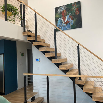
- moved and completely redesigned the stairway to work for the home’s occupants and be a part of the cohesive design aesthetic
- mixed custom tile layouts with more traditional tiling to create fun and playful visual experiences
- custom designed and sourced MCM specific elements such as the entry screen, cabinetry and lighting
- development of the downstairs for potential future use by an assisted living caretaker
- energy efficiency upgrades seamlessly woven in with much improved insulation, ductless mini splits and solar gain

This renovated brick rowhome in Boston’s South End offers a modern aesthetic within a historic structure, creative use of space, exceptional thermal comfort, a reduced carbon footprint, and a passive stream of income.
DESIGN PRIORITIES. The goals for the project were clear - design the primary unit to accommodate the family’s modern lifestyle, rework the layout to create a desirable rental unit, improve thermal comfort and introduce a modern aesthetic. We designed the street-level entry as a shared entrance for both the primary and rental unit. The family uses it as their everyday entrance - we planned for bike storage and an open mudroom with bench and shoe storage to facilitate the change from shoes to slippers or bare feet as they enter their home. On the main level, we expanded the kitchen into the dining room to create an eat-in space with generous counter space and storage, as well as a comfortable connection to the living space. The second floor serves as master suite for the couple - a bedroom with a walk-in-closet and ensuite bathroom, and an adjacent study, with refinished original pumpkin pine floors. The upper floor, aside from a guest bedroom, is the child's domain with interconnected spaces for sleeping, work and play. In the play space, which can be separated from the work space with new translucent sliding doors, we incorporated recreational features inspired by adventurous and competitive television shows, at their son’s request.
MODERN MEETS TRADITIONAL. We left the historic front facade of the building largely unchanged - the security bars were removed from the windows and the single pane windows were replaced with higher performing historic replicas. We designed the interior and rear facade with a vision of warm modernism, weaving in the notable period features. Each element was either restored or reinterpreted to blend with the modern aesthetic. The detailed ceiling in the living space, for example, has a new matte monochromatic finish, and the wood stairs are covered in a dark grey floor paint, whereas the mahogany doors were simply refinished. New wide plank wood flooring with a neutral finish, floor-to-ceiling casework, and bold splashes of color in wall paint and tile, and oversized high-performance windows (on the rear facade) round out the modern aesthetic.
RENTAL INCOME. The existing rowhome was zoned for a 2-family dwelling but included an undesirable, single-floor studio apartment at the garden level with low ceiling heights and questionable emergency egress. In order to increase the quality and quantity of space in the rental unit, we reimagined it as a two-floor, 1 or 2 bedroom, 2 bathroom apartment with a modern aesthetic, increased ceiling height on the lowest level and provided an in-unit washer/dryer. The apartment was listed with Jackie O'Connor Real Estate and rented immediately, providing the owners with a source of passive income.
ENCLOSURE WITH BENEFITS. The homeowners sought a minimal carbon footprint, enabled by their urban location and lifestyle decisions, paired with the benefits of a high-performance home. The extent of the renovation allowed us to implement a deep energy retrofit (DER) to address air tightness, insulation, and high-performance windows. The historic front facade is insulated from the interior, while the rear facade is insulated on the exterior. Together with these building enclosure improvements, we designed an HVAC system comprised of continuous fresh air ventilation, and an efficient, all-electric heating and cooling system to decouple the house from natural gas. This strategy provides optimal thermal comfort and indoor air quality, improved acoustic isolation from street noise and neighbors, as well as a further reduced carbon footprint. We also took measures to prepare the roof for future solar panels, for when the South End neighborhood’s aging electrical infrastructure is upgraded to allow them.
URBAN LIVING. The desirable neighborhood location allows the both the homeowners and tenant to walk, bike, and use public transportation to access the city, while each charging their respective plug-in electric cars behind the building to travel greater distances.
OVERALL. The understated rowhouse is now ready for another century of urban living, offering the owners comfort and convenience as they live life as an expression of their values.
Photography: Eric Roth Photo

 
Free ebook, Creating the Ideal Kitchen. DOWNLOAD NOW
 
This client came to us wanting some help with updating the master bath in their home. Their primary goals were to increase the size of the shower, add a rain head, add a freestanding tub and overall freshen the feel of the space.
The existing layout of the bath worked well, so we left the basic footprint the same, but increased the size of the shower and added a freestanding tub on a bit of an angle which allowed for some additional storage.
One of the most important things on the wish list was adding a rainhead in the shower, but this was not an easy task with the angled ceiling. We came up with the solution of using an extra long wall-mounted shower arm that was reinforced with a meal bracket attached the ceiling. This did the trick, and no extra framing or insulation was required to make it work.
The materials selected for the space are classic and fresh. Large format white oriental marble is used throughout the bath, on the floor in a herrinbone pattern and in a staggered brick pattern on the walls. Alder cabinets with a gray stain contrast nicely with the white marble, while shiplap detail helps unify the space and gives it a casual and cozy vibe. Storage solutions include an area for towels and other necessities at the foot of the tub, roll out shelves and out storage in the vanities and a custom niche and shaving ledge in the shower. We love how just a few simple changes can make such a great impact!
Designed by: Susan Klimala, CKBD
Photography by: LOMA Studios
For more information on kitchen and bath design ideas go to: www.kitchenstudio-ge.com

The client requested a kitchen that would not only provide a great space to cook and enjoy family meals but one that would fit in with her unique design sense. An avid collector of contemporary art, she wanted something unexpected in her 100-year-old home in both color and finishes but still providing a great layout with improved lighting, storage, and superior cooking abilities. The existing kitchen was in a closed off space trapped between the family room and the living. If you were in the kitchen, you were isolated from the rest of the house. Making the kitchen an integrated part of the home was a paramount request.
Step one, remove the wall separating the kitchen from the other rooms in the home which allowed the new kitchen to become an integrated space instead of an isolation room for the cook. Next, we relocated the pantry access which was in the family room to the kitchen integrating a poorly used recess which had become a catch all area which did not provide any usable space for storage or working area. To add valuable function in the kitchen we began by capturing unused "cubbies", adding a walk-in pantry from the kitchen, increasing the storage lost to un-needed drop ceilings and bring light and design to the space with a new large awning window, improved lighting, and combining interesting finishes and colors to reflect the artistic attitude of the client.
A bathroom located above the kitchen had been leaking into the plaster ceiling for several years. That along with knob and tube wiring, rotted beams and a brick wall from the back of the fireplace in the adjacent living room all needed to be brought to code. The walls, ceiling and floors in this 100+ year old home were completely out of level and the room’s foot print could not be increased.
The choice of a Sub-Zero wolf product is a standard in my kitchen designs. The quality of the product, its manufacturing and commitment to food preservation is the reason I specify Sub Zero Wolf. For the cook top, the integrated line of the contemporary cooktop and the signature red knobs against the navy blue of the cabinets added to the design vibe of the kitchen. The cooking performance and the large continuous grate on the cooktop makes it an obvious choice for a cook looking for a great cook top with professional results in a more streamlined profile. We selected a Sharp microwave drawer for the island, an XO wine refrigerator, Bosch dishwasher and Kitchen Aid double convection wall ovens to round out the appliance package.
A recess created by the fireplace was outfitted with a cabinet which now holds small appliances within easy reach of my very petite client. Natural maple accents were used inside all the wall cabinets and repeated on the front of the hood and for the sliding door appliance cabinet and the floating shelves. This allows a brighter interior for the painted cabinets instead of the traditional same interior as exterior finish choice. The was an amazing transformation from the old to the new.
The final touches are the honey bronze hardware from Top Knobs, Mitzi pendants from Hudson Valley Lighting group,
a fabulous faucet from Brizo. To eliminate the old freestanding bottled water cooler, we specified a matching water filter faucet.

This home previously had a very small window above the sink area. We removed the existing window, increased the width,height and shape to add a bay window This addition increased the amount of natural light and the view available. The hand scraped beams were added to enhance the overall essence of the home. The floor is also hand scraped, distressed 3/5/7 mingle with a french bleed.
www.press1photos.com

Designer: Jackie Bayer, ASID, CID, Sadie Sanchez, allied ASID
Photographer: Jamie Sentz
Transitional living room photo in Baltimore

Winner of the 2018 Tour of Homes Best Remodel, this whole house re-design of a 1963 Bennet & Johnson mid-century raised ranch home is a beautiful example of the magic we can weave through the application of more sustainable modern design principles to existing spaces.
We worked closely with our client on extensive updates to create a modernized MCM gem.
Extensive alterations include:
- a completely redesigned floor plan to promote a more intuitive flow throughout
- vaulted the ceilings over the great room to create an amazing entrance and feeling of inspired openness
- redesigned entry and driveway to be more inviting and welcoming as well as to experientially set the mid-century modern stage
- the removal of a visually disruptive load bearing central wall and chimney system that formerly partitioned the homes’ entry, dining, kitchen and living rooms from each other
- added clerestory windows above the new kitchen to accentuate the new vaulted ceiling line and create a greater visual continuation of indoor to outdoor space
- drastically increased the access to natural light by increasing window sizes and opening up the floor plan
- placed natural wood elements throughout to provide a calming palette and cohesive Pacific Northwest feel
- incorporated Universal Design principles to make the home Aging In Place ready with wide hallways and accessible spaces, including single-floor living if needed
- moved and completely redesigned the stairway to work for the home’s occupants and be a part of the cohesive design aesthetic
- mixed custom tile layouts with more traditional tiling to create fun and playful visual experiences
- custom designed and sourced MCM specific elements such as the entry screen, cabinetry and lighting
- development of the downstairs for potential future use by an assisted living caretaker
- energy efficiency upgrades seamlessly woven in with much improved insulation, ductless mini splits and solar gain

Huge mid-century modern dark wood floor and brown floor great room photo in Chicago with gray walls

When a visual artist purchases a mass production home in one of Wilmington, NC’s developing neighborhoods, she quickly realizes that the builder’s standard house plans and amenity options lack the personality she craved. A chance visit to the Kitchen & Bath Design Studio showroom proves to be ‘love at first sight’ when a designer listens to the artist’s needs and immediately produces a tile sample that matches the artist’s vision. Can our designer achieve the client’s vision while respecting the production builder’s restrictions and architectural plans? Of course she can!
To satisfy the client’s wish list, the kitchen design required a larger island, more counter space, and semi-custom cabinetry. The client settled on Brazilian cherry-style flooring, her favorite of the builder-approved upgrades for flooring. Iridescent glass mosaic tile and multiple chandelier pendants brought in the “bling factor” at the top of the client’s list—she has penchant for “bright, shiny objects” and wanted her kitchen to reflect a Farmhouse Chic or Rustic Glam aesthetic. Left to her own devices, the client would have veered toward a more liberal, Liberace-esque application of bling, so the designer introduced a neutral color palette and warm, polished nickel finishes as a counterbalance to all of that sparkle and shine.
Working within the builder’s constraints, the designer made changes to the kitchen’s layout to increase island workspace and nearly double countertop space. The client had to go with an entry-level builder-approved refrigerator available in only one fridge counter depth size. So the designer moved the pantry location, situating it behind the refrigerator and then recessed the refrigerator into the pantry to cheat the counter depth needed to flow seamlessly with the semi-custom cabinetry line. She also maximized drawers and upper cabinets to increase storage space, but did not take the upper cabinets to the ceiling to respect the home’s half crown molding details.
Chris Davis Photography

This project represents an increasingly popular type of project - combining 2 bedrooms into a single master suite. The house is a 1910 craftsman, with 4 bedrooms on the second floor. Typical of older homes, the master bedroom had a very small bathroom, and very little closet space. The owners decided to sacrifice an adjacent guest bedroom to create a spacious master suite. The new rooms include a large bathroom, with hers and his vanities, separate toilet room, custom tile shower and soaking tub. The extra space also allowed us to install a luxurious custom walk-in closet.
Design Criteria:
- Increase size and utility of closet space.
- Create a large, luxury bathroom with distinctly separate hers/his spaces.
Special Features:
- Custom tile shower, with frameless glass door
- Platform soaking tub w/ custom tile deck
- His/Hers vanities with quartz countertops.
- Separate toilet room.
- Room-sized walk-in closet with custom cabinet system.
- Custom 5-Panel doors and built-up mouldings to match the original woodwork.

Our clients came to us wanting to increase the size of the bathroom and reconfigure the closet to create a more functional space. We re-positioned the toilet, squared off the closet, and increased the overall size of the bathroom upon entry/ in front of the vanities. We removed the cultured marble tub and shower and created a zero-threshold, walk-in shower with a gorgeous Kohler “Veil” free standing tub paired with a floor mounted tub filler in a brushed nickel finish. The tile is a 12x24 cemento cassero bianco porceline on the walls and the floor to create seamless, spa-like escape. The focal point as you walk in is the 24-inch Deco column running vertical behind the tub. The vanity features an espresso cabinet with the Britannica Cambria Quartz countertop. This gorgeous Quartz features a waterfall edge and a show stopping 8-inch vanity backsplash with wall mounted vanity faucets.

With tall ceilings, an impressive stone fireplace, and original wooden beams, this home in Glen Ellyn, a suburb of Chicago, had plenty of character and a style that felt coastal. Six months into the purchase of their home, this family of six contacted Alessia Loffredo and Sarah Coscarelli of ReDesign Home to complete their home’s renovation by tackling the kitchen.
“Surprisingly, the kitchen was the one room in the home that lacked interest due to a challenging layout between kitchen, butler pantry, and pantry,” the designer shared, “the cabinetry was not proportionate to the space’s large footprint and height. None of the house’s architectural features were introduced into kitchen aside from the wooden beams crossing the room throughout the main floor including the family room.” She moved the pantry door closer to the prepping and cooking area while converting the former butler pantry a bar. Alessia designed an oversized hood around the stove to counterbalance the impressive stone fireplace located at the opposite side of the living space.
She then wanted to include functionality, using Trim Tech‘s cabinets, featuring a pair with retractable doors, for easy access, flanking both sides of the range. The client had asked for an island that would be larger than the original in their space – Alessia made the smart decision that if it was to increase in size it shouldn’t increase in visual weight and designed it with legs, raised above the floor. Made out of steel, by Wayward Machine Co., along with a marble-replicating porcelain countertop, it was designed with durability in mind to withstand anything that her client’s four children would throw at it. Finally, she added finishing touches to the space in the form of brass hardware from Katonah Chicago, with similar toned wall lighting and faucet.

With tall ceilings, an impressive stone fireplace, and original wooden beams, this home in Glen Ellyn, a suburb of Chicago, had plenty of character and a style that felt coastal. Six months into the purchase of their home, this family of six contacted Alessia Loffredo and Sarah Coscarelli of ReDesign Home to complete their home’s renovation by tackling the kitchen.
“Surprisingly, the kitchen was the one room in the home that lacked interest due to a challenging layout between kitchen, butler pantry, and pantry,” the designer shared, “the cabinetry was not proportionate to the space’s large footprint and height. None of the house’s architectural features were introduced into kitchen aside from the wooden beams crossing the room throughout the main floor including the family room.” She moved the pantry door closer to the prepping and cooking area while converting the former butler pantry a bar. Alessia designed an oversized hood around the stove to counterbalance the impressive stone fireplace located at the opposite side of the living space.
She then wanted to include functionality, using Trim Tech‘s cabinets, featuring a pair with retractable doors, for easy access, flanking both sides of the range. The client had asked for an island that would be larger than the original in their space – Alessia made the smart decision that if it was to increase in size it shouldn’t increase in visual weight and designed it with legs, raised above the floor. Made out of steel, by Wayward Machine Co., along with a marble-replicating porcelain countertop, it was designed with durability in mind to withstand anything that her client’s four children would throw at it. Finally, she added finishing touches to the space in the form of brass hardware from Katonah Chicago, with similar toned wall lighting and faucet.

Winner of the 2018 Tour of Homes Best Remodel, this whole house re-design of a 1963 Bennet & Johnson mid-century raised ranch home is a beautiful example of the magic we can weave through the application of more sustainable modern design principles to existing spaces.
We worked closely with our client on extensive updates to create a modernized MCM gem.
Extensive alterations include:
- a completely redesigned floor plan to promote a more intuitive flow throughout
- vaulted the ceilings over the great room to create an amazing entrance and feeling of inspired openness
- redesigned entry and driveway to be more inviting and welcoming as well as to experientially set the mid-century modern stage
- the removal of a visually disruptive load bearing central wall and chimney system that formerly partitioned the homes’ entry, dining, kitchen and living rooms from each other
- added clerestory windows above the new kitchen to accentuate the new vaulted ceiling line and create a greater visual continuation of indoor to outdoor space
- drastically increased the access to natural light by increasing window sizes and opening up the floor plan
- placed natural wood elements throughout to provide a calming palette and cohesive Pacific Northwest feel
- incorporated Universal Design principles to make the home Aging In Place ready with wide hallways and accessible spaces, including single-floor living if needed
- moved and completely redesigned the stairway to work for the home’s occupants and be a part of the cohesive design aesthetic
- mixed custom tile layouts with more traditional tiling to create fun and playful visual experiences
- custom designed and sourced MCM specific elements such as the entry screen, cabinetry and lighting
- development of the downstairs for potential future use by an assisted living caretaker
- energy efficiency upgrades seamlessly woven in with much improved insulation, ductless mini splits and solar gain
19