Search results for "Increases" in Home Design Ideas
This locker wall design has a butcher-block bench and it stores coats, hats, and recycling, as well as has a phone charging station.
Example of a small transitional galley vinyl floor eat-in kitchen design in Other with recessed-panel cabinets, white cabinets, gray backsplash and stainless steel appliances

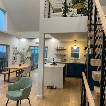
This is a redesigned studio apartment we recently renovated. The goal was to increase function and increase the feeling of separate functions. Luckily, this studio is of an impressive size and we were able to increase function via a large kitchen, dining area, home office, and bedroom area.
Each separated area serves its own purpose and gives the feeling that the apartment, though small, has plenty of space for differing tasks. The result is a highly functioning studio that doesn’t feel cramped, but rather like a one bed apartment.
Designed by Chi Renovation & Design who serve Chicago and its surrounding suburbs, with an emphasis on the North Side and North Shore. You'll find their work from the Loop through Lincoln Park, Skokie, Wilmette, and all the way up to Lake Forest.
For more about Chi Renovation & Design, click here: https://www.chirenovation.com/
To learn more about this project, click here: https://www.chirenovation.com/portfolio/upscale-chicago-studio-renovation-design/
Find the right local pro for your project

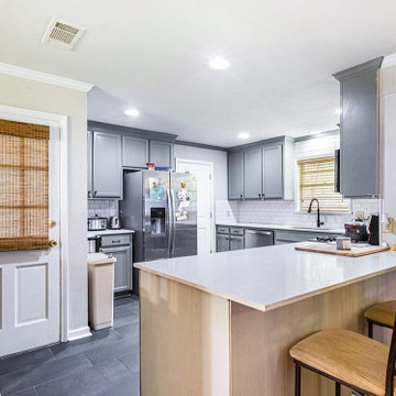
Kitchen Renovation: layout modification and aesthetic upgrades.
Cabinets: Rustic Cherry Natural
Counter tops: Golden Supreme Granite
Back splash: Rittenhouse square bisquit
Appliances: Samsung Black Stainless
This was a traditional ranch style home with a small kitchen that lacked counter top space and had a cramped dining room that blocked access to the garage and back patio. The renovation focused on creating better flow, opening up the walkways, increasing storage and was upgraded to our aesthetic taste.
The island incorporates dining seating for up to 5 while also providing storage for the Microwave, Trash/Recycling and Storage for dog food/board games. We designed a custom hood surround to fit within our limited ceiling height. This simple design added character and visual interest to a simple space plan. Full height pantry storage was added on the end of the kitchen by the patio doors, leaving just enough room before the garage door for the dog food bowls.
Electrical was upgraded for the whole space, going from 2 outlets in the kitchen to 7 has increased the usability of the space. A USB outlet was added to the end of the island so that people can charge their phones. Prior to the renovation there was a lack of lighting, we added can lights and an island pendant to increase visibility for prep.

By removing an external wall and replacing it with a folding glass NanaWall, you'll create a seamless flow between your house and your outside space.
Minimalist living room photo in Los Angeles

Kitchen Renovation: layout modification and aesthetic upgrades.
Cabinets: Rustic Cherry Natural
Counter tops: Golden Supreme Granite
Back splash: Rittenhouse square bisquit
Appliances: Samsung Black Stainless
This was a traditional ranch style home with a small kitchen that lacked counter top space and had a cramped dining room that blocked access to the garage and back patio. The renovation focused on creating better flow, opening up the walkways, increasing storage and was upgraded to our aesthetic taste.
The island incorporates dining seating for up to 5 while also providing storage for the Microwave, Trash/Recycling and Storage for dog food/board games. We designed a custom hood surround to fit within our limited ceiling height. This simple design added character and visual interest to a simple space plan. Full height pantry storage was added on the end of the kitchen by the patio doors, leaving just enough room before the garage door for the dog food bowls.
Electrical was upgraded for the whole space, going from 2 outlets in the kitchen to 7 has increased the usability of the space. A USB outlet was added to the end of the island so that people can charge their phones. Prior to the renovation there was a lack of lighting, we added can lights and an island pendant to increase visibility for prep.

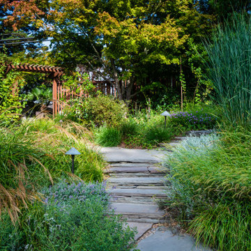
Design ideas for a large hillside landscaping in San Francisco.

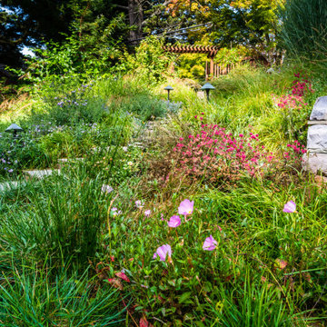
This is an example of a large hillside landscaping in San Francisco.
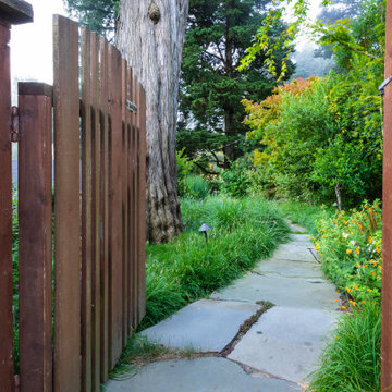
This is an example of a large hillside landscaping in San Francisco.

Photo by Mike Casey
The owners of this 1960s ranch house loved their house but it wasn't configured to meet their needs. The house had only two small bedrooms for the family of four, and there was no casual living space for parents and kids to hang out separately. Neither we nor the clients wanted to increase the home's energy usage. It was a tall order: could we increase the home's size without increasing its energy footprint?
ADDING FUNCTIONALITY
We built two small additions, one at the front of the home and one off the side adjacent to the two existing bedrooms. These new spaces provided an additional bedroom on the main level as well as a new stair down to the basement. At basement level, the additions yielded a guest room, a full bathroom and a laundry area. The existing basement, which is now easily accessible from the main floor, was refinished as a casual family room.
The architect designed the new spaces to be spare and bright, replicating the mid-century aesthetic. Every detail—from the open stair, to the light maple floors, to the detailing of the bathroom vanity—echoes the vintage and character of the original home.
INTEGRATING ENERGY AND DESIGN
The key to meeting this challenge was a rigorous and integrated planning process with early-stage energy modeling accompanying design. As the architect (Anita Rogers) worked out the space plan, the energy consultant (Mike Duclos) analyzed how various scenarios could be combined with envelope and mechanical packages to not only hold the line on energy use but improve performance. We anticipate the plan we settled on will save 25% annually over pre-project energy use.

Our goal was to modernize an outdated spec kitchen by increasing the overall storage capacity and re-configuring the work-space to accommodate more use while increasing the natural light into the kitchen.
We collaborated with the Owners Architect and determined it was necessary to partially remove the wall between the kitchen and dining room. Two small windows along the rear wall were replaced with a new over-sized window bringing in massive amounts of natural light. We removed a breakfast table that previously crowded the kitchen circulation and replaced it with a breakfast counter facing the kitchen and new window.
The semi-open kitchen, delineated by the breakfast counter created a visual buffer for a busy kitchen and maximized the views and natural from the new window. By organizing every cabinet, we maximized the storage capacity and further increased the ergonomics of the kitchen using drawers for dishes and other items.
Jonathan Kolbe Photographer

The original small 2 bedroom dwelling was deconstructed piece by piece, with every element recycled/re-used. The larger, newly built home + studio uses much less energy than the original. In fact, the home and office combined are net zero (the home’s blower door test came in at Passive House levels, though certification was not procured). The transformed home boasts a better functioning layout, increased square footage, and bold accent colors to boot. The multiple level patios book-end the home’s front and rear facades. The added outdoor living with the nearly 13’ sliding doors allows ample natural light into the home. The transom windows create an increased openness with the floor to ceiling glazing. The larger tilt-turn windows throughout the home provide ventilation and open views for the 3-level contemporary home. In addition, the larger overhangs provide increased passive thermal protection from the scattered sunny days. The conglomeration of exterior materials is diverse and playful with dark stained wood, concrete, natural wood finish, and teal horizontal siding. A fearless selection of a bright orange window brings a bold accent to the street-side composition. These elements combined create a dynamic modern design to the inclusive Portland backdrop.

Kitchen Renovation: layout modification and aesthetic upgrades.
Cabinets: Rustic Cherry Natural
Counter tops: Golden Supreme Granite
Back splash: Rittenhouse square bisquit
Appliances: Samsung Black Stainless
This was a traditional ranch style home with a small kitchen that lacked counter top space and had a cramped dining room that blocked access to the garage and back patio. The renovation focused on creating better flow, opening up the walkways, increasing storage and was upgraded to our aesthetic taste.
The island incorporates dining seating for up to 5 while also providing storage for the Microwave, Trash/Recycling and Storage for dog food/board games. We designed a custom hood surround to fit within our limited ceiling height. This simple design added character and visual interest to a simple space plan. Full height pantry storage was added on the end of the kitchen by the patio doors, leaving just enough room before the garage door for the dog food bowls.
Electrical was upgraded for the whole space, going from 2 outlets in the kitchen to 7 has increased the usability of the space. A USB outlet was added to the end of the island so that people can charge their phones. Prior to the renovation there was a lack of lighting, we added can lights and an island pendant to increase visibility for prep.

Photo of a large hillside landscaping in San Francisco.

We designed and built this new kitchen as part of a main floor renovation of this 1891 rowhouse. The kitchen and main floor open plan reflect the homeowner’s contemporary taste, but with a nod to the historic aspect of the home. The clients were especially delighted with our success in achieving a “light and airy” feel.
The client wanted to open up the entire floor to increase the amount of natural light that flowed into the main floor of this rowhouse. He also wanted a visual connection from the front entry to the back door. The new kitchen reflects his contemporary style.
We flipped the original kitchen and dining room, and removed the walls to make the kitchen central to the floor plan. Moving the original kitchen from the back room to a central location in the floorplan allowed us to:
• Place all the storage and appliances on a party wall where no windows would be obscured.
• Increase the size of the kitchen and provide better flow for entertaining
• Increase natural light by doubling the size of the back window and installing two new windows. A new full-light rear door also allows natural light to flow into the space.
HDBros

Kitchen - traditional vinyl floor kitchen idea in Other with a drop-in sink, raised-panel cabinets, light wood cabinets, laminate countertops, green backsplash and white appliances
22