
Search results for "Increasingly integral" in Home Design Ideas
 Western Cabinets
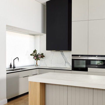
An existing 70’s brick home nestled streets away from the beach, is in dire need of a transformation. The existing home had the bones to accommodate a substantial renovation, some modifications to the layout, adding an extension and exaggerating the existing raked ceilings in the main living area impacts the new home.
The home itself is a relatively disjointed 70’s home, so cleaver planning was imperative to make the most of the interior space. Large open plan living areas with adjoining outdoor entertaining was important. The owners are a young family who enjoy family and entertaining so interaction with the outdoor alfresco was essential not only for quality of living but to appear as a continuation of the main living area to increase the zone visually.
My client’s fresh approach; introduction of modern materials with a hint of Scandinavian and industrial, an improved working area and a functional space for cooking and preparing meals.
 Simply Home Decorating
This beautiful North Vancouver home belongs to a nature-loving and health-conscious couple, Emma and Vince (names changed), their two young children, and their dog, Jasper. When they contacted us about renovating and furnishing their kitchen and family room, we walked in and saw a world of potential waiting to be uncovered.
Before: Larkhall Crescent Home:
Like many original North Vancouver homes, the interior was definitely dated. We encountered late ‘80s finishes in powder pink and teal green, old carpet, and a kitchen that wasn’t maximized to suit this family’s modern-day lifestyle. However, the size of the rooms offered us a ton of space with which to get creative.
Knowing our clients’ love of cooking, need for work spaces (Emma and Vince both work remotely), and growing family, we developed a design concept that would increase usable space, optimize storage, and create intimacy in this large area. As for the style, we were inspired by their European roots, inventing a new and modern take on “Belgian Farmhouse” style. Now, the home is truly one-of-a-kind.
After: Warm & Cozy Family Room:
Fresh, bright, and comfortable, this living area has been transformed! We started with the fireplace as a focal point, selecting aged brick tiles for added texture and a crisp wood mantle. The taupe-coloured sectional infuses the room with visual warmth and serves the added purpose of separating the family room from the kitchen.
Emma and Vince were also keen on using non-toxic materials in their home, and we were happy to oblige. To meet their needs, we sourced natural wood elements and sought out Canadian-made products - that adhere to high health standards - whenever possible.
Look closer at the elements of this space, and you will find this stunning, honeycomb-patterned rug in earthy gold, beige, and charcoal tones. It’s plush to the touch and full of visual texture that brings this room’s colour palette together. We sourced these two-tone chairs with caning, petrified wood side table, black sconces, and botanical prints in greyscale from local artist, Heather Johnston.
We topped off the space with this dark wood and rattan console that offers storage facing the kitchen and presents an opportunity to display cherished items. The result is a cozy lounging space brimming with comfort and functionality. It’s perfect for enjoying quality family time, or Emma can simply slide the coffee table away to make room for her morning yoga practice.
Now, let’s turn around and give some attention to the kitchen. Do you remember what the original kitchen looked like? If not, scroll back up, because the transformation is shocking…
Moody & Welcoming Kitchen for Healthy Living:
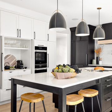
This kitchen looks very different from how it started, right? Though we didn’t touch any walls, the kitchen has almost doubled in usable space! We created a long, extended island with storage, an outlet for small appliances, and seating for comfortable prep, after-school snacking, or mingling among friends.
On the other side of the island, the family has even more storage and an integrated dishwasher within easy reach of the sink, perfect for quick clean-up. From this angle, you can also see the expansive custom Shaker cabinetry in white and the integrated double ovens. These facilitate their cooking experience and gave us the opportunity to add an additional surprise…
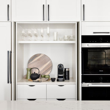
A coffee garage station and more hidden storage! Keeping these items located along the perimeter allows them to be accessed by the family or their guests without someone getting under the cook’s feet. These are the little details that make everyday life easier and more enjoyable.
Moving deeper into the kitchen, the seamless induction cooktop topped with a freestanding concealed hood fan commands attention in a soft yet prominent way. The natural wood accent mirrors the fireplace mantle, and the choice of off-black wood-grain cabinets not only continues our black-and-white colour palette but adds a sense of depth and contrast. The corner sink is located to the right and perfectly positioned with a view of their thriving backyard.
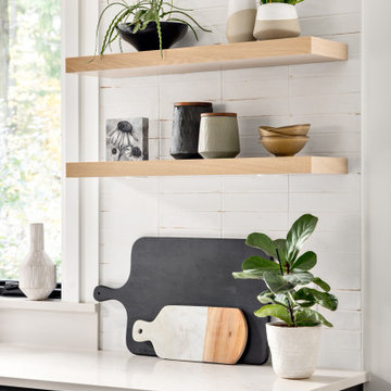
To invite more of this family’s character into the space, we mixed metals for interest — matte black, dark pewter, and warm brass — and created open shelves in white oak for their plants and decor. You can also glimpse the tumbled edge of the backsplash tile, which echoes the rustic brick of the fireplace. It adds that farmhouse charm while still feeling timeless and sophisticated.
Last but not least, we designed this dining banquette in the bay window (with integrated bench storage, of course), where the family can share a meal together, the kids can do homework, or Emma and Vince can work and enjoy a change of scenery from their offices. Like the other spaces in the home, it was designed to be beautiful, multi-functional, and long-lasting.
Praise from Our Clients:
It is clear that we love this home, but what did our clients have to say?
“Lori is a visionary and masters execution to the finest detail all at the same time. When she first met us to know more about who we are and how we live, she could right away envision how we could use the space in our kitchen and living room…The results exceeded our expectations.
Lori and her team were also a delight to work with — coordination with all the trades, fast problem-solving, regular updates, professional and friendly attitude of her entire team — made it the dream team. Thank you SHD for making our space so beautiful!”
In turn, we are so grateful for this family’s trust, their open communication, and for being wonderful people with whom to work. (So, thank you!)
 Simply Home Decorating
This beautiful North Vancouver home belongs to a nature-loving and health-conscious couple, Emma and Vince (names changed), their two young children, and their dog, Jasper. When they contacted us about renovating and furnishing their kitchen and family room, we walked in and saw a world of potential waiting to be uncovered.
Before: Larkhall Crescent Home:
Like many original North Vancouver homes, the interior was definitely dated. We encountered late ‘80s finishes in powder pink and teal green, old carpet, and a kitchen that wasn’t maximized to suit this family’s modern-day lifestyle. However, the size of the rooms offered us a ton of space with which to get creative.
Knowing our clients’ love of cooking, need for work spaces (Emma and Vince both work remotely), and growing family, we developed a design concept that would increase usable space, optimize storage, and create intimacy in this large area. As for the style, we were inspired by their European roots, inventing a new and modern take on “Belgian Farmhouse” style. Now, the home is truly one-of-a-kind.
After: Warm & Cozy Family Room:
Fresh, bright, and comfortable, this living area has been transformed! We started with the fireplace as a focal point, selecting aged brick tiles for added texture and a crisp wood mantle. The taupe-coloured sectional infuses the room with visual warmth and serves the added purpose of separating the family room from the kitchen.
Emma and Vince were also keen on using non-toxic materials in their home, and we were happy to oblige. To meet their needs, we sourced natural wood elements and sought out Canadian-made products - that adhere to high health standards - whenever possible.
Look closer at the elements of this space, and you will find this stunning, honeycomb-patterned rug in earthy gold, beige, and charcoal tones. It’s plush to the touch and full of visual texture that brings this room’s colour palette together. We sourced these two-tone chairs with caning, petrified wood side table, black sconces, and botanical prints in greyscale from local artist, Heather Johnston.
We topped off the space with this dark wood and rattan console that offers storage facing the kitchen and presents an opportunity to display cherished items. The result is a cozy lounging space brimming with comfort and functionality. It’s perfect for enjoying quality family time, or Emma can simply slide the coffee table away to make room for her morning yoga practice.
Now, let’s turn around and give some attention to the kitchen. Do you remember what the original kitchen looked like? If not, scroll back up, because the transformation is shocking…
Moody & Welcoming Kitchen for Healthy Living:
This kitchen looks very different from how it started, right? Though we didn’t touch any walls, the kitchen has almost doubled in usable space! We created a long, extended island with storage, an outlet for small appliances, and seating for comfortable prep, after-school snacking, or mingling among friends.
On the other side of the island, the family has even more storage and an integrated dishwasher within easy reach of the sink, perfect for quick clean-up. From this angle, you can also see the expansive custom Shaker cabinetry in white and the integrated double ovens. These facilitate their cooking experience and gave us the opportunity to add an additional surprise…
A coffee garage station and more hidden storage! Keeping these items located along the perimeter allows them to be accessed by the family or their guests without someone getting under the cook’s feet. These are the little details that make everyday life easier and more enjoyable.
Moving deeper into the kitchen, the seamless induction cooktop topped with a freestanding concealed hood fan commands attention in a soft yet prominent way. The natural wood accent mirrors the fireplace mantle, and the choice of off-black wood-grain cabinets not only continues our black-and-white colour palette but adds a sense of depth and contrast. The corner sink is located to the right and perfectly positioned with a view of their thriving backyard.
To invite more of this family’s character into the space, we mixed metals for interest — matte black, dark pewter, and warm brass — and created open shelves in white oak for their plants and decor. You can also glimpse the tumbled edge of the backsplash tile, which echoes the rustic brick of the fireplace. It adds that farmhouse charm while still feeling timeless and sophisticated.
Last but not least, we designed this dining banquette in the bay window (with integrated bench storage, of course), where the family can share a meal together, the kids can do homework, or Emma and Vince can work and enjoy a change of scenery from their offices. Like the other spaces in the home, it was designed to be beautiful, multi-functional, and long-lasting.
Praise from Our Clients:
It is clear that we love this home, but what did our clients have to say?
“Lori is a visionary and masters execution to the finest detail all at the same time. When she first met us to know more about who we are and how we live, she could right away envision how we could use the space in our kitchen and living room…The results exceeded our expectations.
Lori and her team were also a delight to work with — coordination with all the trades, fast problem-solving, regular updates, professional and friendly attitude of her entire team — made it the dream team. Thank you SHD for making our space so beautiful!”
In turn, we are so grateful for this family’s trust, their open communication, and for being wonderful people with whom to work. (So, thank you!)
Find the right local pro for your project
 Integrated Home Improvement
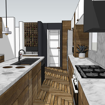
This client was looking to design a mid-century modern kitchen with an industrial touch that would feel bigger and improve its workflow by changing the layout. Additionally, the client was looking to change the laundry room to make it less crowded and more functional. We placed the previously unused pantry in an area, between the kitchen and the powder bathroom on the other side of the wall, increasing their pantry space from very small to 32 SF. We moved the fridge, sink, and cook-top to increase proximity to each other and improve workflow. We still used some of the space from the old pantry to hold spices and other essential cooking ingredients in an accessible-for-cooking area next to the fridge. We opened up the countertop to be a straight line all the way to their dining room, instead of the "L" they had before, which made the space feel smaller. We changed the orientation of their dining room table. We turned their bar, which they were not so keen on, into a wine rack. We created a buffet space in their dining room.
 QBANA DESIGNS PVT LTD
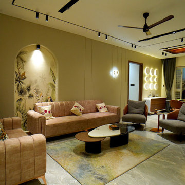
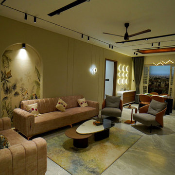
Architecture and Interior Designing has evolved significantly over the years in response to changing lifestyles, rapid urbanisation, and technological advancements. Today, the focus is no longer just on creating visually appealing spaces, but on designing environments that are intelligent, adaptable, sustainable, and deeply human-centric. Elite 18 reflects this evolution through a modern residential narrative that balances functionality, comfort, and emotional well-being.
Designed by Sandeep & Shreya Sahani, the project responds thoughtfully to the demands of contemporary urban living. As cities continue to grow denser, architecture is increasingly shifting towards smarter planning and efficient use of space. Compact yet breathable layouts, multifunctional areas, and vertical living concepts are becoming essential in modern residential developments. At Elite 18, the design approach embraces openness, fluidity, and practicality, ensuring that spaces remain functional while maintaining a sense of luxury and calm.
Changing lifestyles have also transformed the way homes are designed. With remote work and flexible routines becoming part of everyday life, modern residences now require adaptable spaces that can seamlessly support work, leisure, and social interaction. The interiors at Elite 18 are curated with clean lines, soothing tones, and uncluttered layouts that enhance comfort while supporting modern living patterns.
Technology has further reshaped architecture by introducing smarter and more responsive environments. Contemporary buildings increasingly integrate smart lighting, climate control systems, touchless features, and digital planning tools to improve convenience and efficiency. This shift towards intelligent architecture allows spaces to become more personalised and responsive to user behaviour.
Sustainability has also become a defining aspect of modern architectural thinking. With growing environmental awareness and climate concerns, architects are prioritising energy efficiency, natural ventilation, climate-responsive materials, and sustainable construction practices. At Elite 18, strategic placement of openings, balanced natural light, and thoughtful material selection contribute to a more energy-efficient and comfortable indoor environment.
Overall, architecture today is evolving beyond aesthetics to create spaces that are adaptive, environmentally responsible, and emotionally enriching. Elite 18 stands as a reflection of this transformation, where thoughtful design, sustainability, technology, and modern lifestyles come together to shape the future of urban living.
 Simply Home Decorating
This beautiful North Vancouver home belongs to a nature-loving and health-conscious couple, Emma and Vince (names changed), their two young children, and their dog, Jasper. When they contacted us about renovating and furnishing their kitchen and family room, we walked in and saw a world of potential waiting to be uncovered.
Before: Larkhall Crescent Home:
Like many original North Vancouver homes, the interior was definitely dated. We encountered late ‘80s finishes in powder pink and teal green, old carpet, and a kitchen that wasn’t maximized to suit this family’s modern-day lifestyle. However, the size of the rooms offered us a ton of space with which to get creative.
Knowing our clients’ love of cooking, need for work spaces (Emma and Vince both work remotely), and growing family, we developed a design concept that would increase usable space, optimize storage, and create intimacy in this large area. As for the style, we were inspired by their European roots, inventing a new and modern take on “Belgian Farmhouse” style. Now, the home is truly one-of-a-kind.
After: Warm & Cozy Family Room:
Fresh, bright, and comfortable, this living area has been transformed! We started with the fireplace as a focal point, selecting aged brick tiles for added texture and a crisp wood mantle. The taupe-coloured sectional infuses the room with visual warmth and serves the added purpose of separating the family room from the kitchen.
Emma and Vince were also keen on using non-toxic materials in their home, and we were happy to oblige. To meet their needs, we sourced natural wood elements and sought out Canadian-made products - that adhere to high health standards - whenever possible.
Look closer at the elements of this space, and you will find this stunning, honeycomb-patterned rug in earthy gold, beige, and charcoal tones. It’s plush to the touch and full of visual texture that brings this room’s colour palette together. We sourced these two-tone chairs with caning, petrified wood side table, black sconces, and botanical prints in greyscale from local artist, Heather Johnston.
We topped off the space with this dark wood and rattan console that offers storage facing the kitchen and presents an opportunity to display cherished items. The result is a cozy lounging space brimming with comfort and functionality. It’s perfect for enjoying quality family time, or Emma can simply slide the coffee table away to make room for her morning yoga practice.
Now, let’s turn around and give some attention to the kitchen. Do you remember what the original kitchen looked like? If not, scroll back up, because the transformation is shocking…
Moody & Welcoming Kitchen for Healthy Living:
This kitchen looks very different from how it started, right? Though we didn’t touch any walls, the kitchen has almost doubled in usable space! We created a long, extended island with storage, an outlet for small appliances, and seating for comfortable prep, after-school snacking, or mingling among friends.
On the other side of the island, the family has even more storage and an integrated dishwasher within easy reach of the sink, perfect for quick clean-up. From this angle, you can also see the expansive custom Shaker cabinetry in white and the integrated double ovens. These facilitate their cooking experience and gave us the opportunity to add an additional surprise…
A coffee garage station and more hidden storage! Keeping these items located along the perimeter allows them to be accessed by the family or their guests without someone getting under the cook’s feet. These are the little details that make everyday life easier and more enjoyable.
Moving deeper into the kitchen, the seamless induction cooktop topped with a freestanding concealed hood fan commands attention in a soft yet prominent way. The natural wood accent mirrors the fireplace mantle, and the choice of off-black wood-grain cabinets not only continues our black-and-white colour palette but adds a sense of depth and contrast. The corner sink is located to the right and perfectly positioned with a view of their thriving backyard.
To invite more of this family’s character into the space, we mixed metals for interest — matte black, dark pewter, and warm brass — and created open shelves in white oak for their plants and decor. You can also glimpse the tumbled edge of the backsplash tile, which echoes the rustic brick of the fireplace. It adds that farmhouse charm while still feeling timeless and sophisticated.
Last but not least, we designed this dining banquette in the bay window (with integrated bench storage, of course), where the family can share a meal together, the kids can do homework, or Emma and Vince can work and enjoy a change of scenery from their offices. Like the other spaces in the home, it was designed to be beautiful, multi-functional, and long-lasting.
Praise from Our Clients:
It is clear that we love this home, but what did our clients have to say?
“Lori is a visionary and masters execution to the finest detail all at the same time. When she first met us to know more about who we are and how we live, she could right away envision how we could use the space in our kitchen and living room…The results exceeded our expectations.
Lori and her team were also a delight to work with — coordination with all the trades, fast problem-solving, regular updates, professional and friendly attitude of her entire team — made it the dream team. Thank you SHD for making our space so beautiful!”
In turn, we are so grateful for this family’s trust, their open communication, and for being wonderful people with whom to work. (So, thank you!)
 Decus Interiors
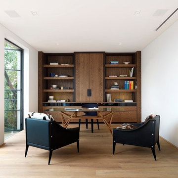
Study room - large contemporary freestanding desk medium tone wood floor study room idea in Sydney with white walls



 David Crosson Design Collective
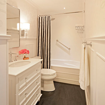
The client decided that she was in her "forever home" and wanted to create a space that felt clean and fresh but referenced elements of a vintage aesthetic. Panel molding, gently swooping paintable wallpaper, a high-contrast palette and gleaming fixtures from Kohler's Artifacts line all contributed to the look. "I'm never leaving this room," she said when we were done--and somehow I believe that might just be true!
Image shot by John Bilodeau
 Integrated Home Improvement
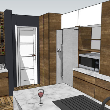
This client was looking to design a mid-century modern kitchen with an industrial touch that would feel bigger and improve its workflow by changing the layout. Additionally, the client was looking to change the laundry room to make it less crowded and more functional. We placed the previously unused pantry in an area, between the kitchen and the powder bathroom on the other side of the wall, increasing their pantry space from very small to 32 SF. We moved the fridge, sink, and cook-top to increase proximity to each other and improve workflow. We still used some of the space from the old pantry to hold spices and other essential cooking ingredients in an accessible-for-cooking area next to the fridge. We opened up the countertop to be a straight line all the way to their dining room, instead of the "L" they had before, which made the space feel smaller. We changed the orientation of their dining room table. We turned their bar, which they were not so keen on, into a wine rack. We created a buffet space in their dining room.
 QBANA DESIGNS PVT LTD
Architecture and Interior Designing has evolved significantly over the years in response to changing lifestyles, rapid urbanisation, and technological advancements. Today, the focus is no longer just on creating visually appealing spaces, but on designing environments that are intelligent, adaptable, sustainable, and deeply human-centric. Elite 18 reflects this evolution through a modern residential narrative that balances functionality, comfort, and emotional well-being.
Designed by Sandeep & Shreya Sahani, the project responds thoughtfully to the demands of contemporary urban living. As cities continue to grow denser, architecture is increasingly shifting towards smarter planning and efficient use of space. Compact yet breathable layouts, multifunctional areas, and vertical living concepts are becoming essential in modern residential developments. At Elite 18, the design approach embraces openness, fluidity, and practicality, ensuring that spaces remain functional while maintaining a sense of luxury and calm.
Changing lifestyles have also transformed the way homes are designed. With remote work and flexible routines becoming part of everyday life, modern residences now require adaptable spaces that can seamlessly support work, leisure, and social interaction. The interiors at Elite 18 are curated with clean lines, soothing tones, and uncluttered layouts that enhance comfort while supporting modern living patterns.
Technology has further reshaped architecture by introducing smarter and more responsive environments. Contemporary buildings increasingly integrate smart lighting, climate control systems, touchless features, and digital planning tools to improve convenience and efficiency. This shift towards intelligent architecture allows spaces to become more personalised and responsive to user behaviour.
Sustainability has also become a defining aspect of modern architectural thinking. With growing environmental awareness and climate concerns, architects are prioritising energy efficiency, natural ventilation, climate-responsive materials, and sustainable construction practices. At Elite 18, strategic placement of openings, balanced natural light, and thoughtful material selection contribute to a more energy-efficient and comfortable indoor environment.
Overall, architecture today is evolving beyond aesthetics to create spaces that are adaptive, environmentally responsible, and emotionally enriching. Elite 18 stands as a reflection of this transformation, where thoughtful design, sustainability, technology, and modern lifestyles come together to shape the future of urban living.

 Wanda Ely Architect Inc.
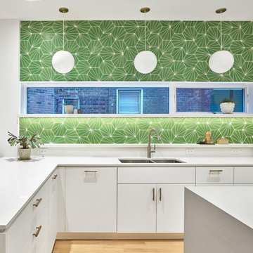
The kitchen is laid out to be comfortable for two people to cook simultaneously. A wide gas range is integrated in the island with a discreet downdraft hood.
 THE Remodel Group
A luxurious en suite bath was created within this classic 1925 Portland bungalow by reconfiguring the second story’s original small bedrooms and tiny half bath. In this welcoming new urban boho space, eclectic finishes mingle harmoniously, integrated through subtle repetition of shapes and materials.
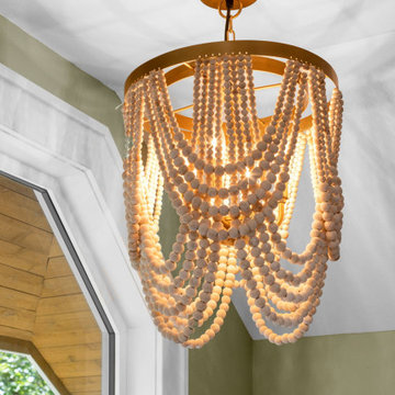
A furniture-style vanity sets the tone for this luxurious space, introducing materials, colors, shapes, and textures that repeat throughout. Individual walnut hexagons join to create distinctive vanity doors, offset beautifully by horizontal-grain drawers. Topping the cabinetry is a simple concrete countertop with integral sinks. An expansive framed mirror above enlarges and brightens the room. Within the mirror, sconces float, their globes a nod to the hexagons below. Champagne bronze fixtures reflect the warm walnut glow. Nestled into the back corner, a stunning shower features waterjet tiles in a double herringbone pattern, each precisely cut and laid to maintain design integrity at every surface transition. Teak floor tiles and a pebbled niche hint at the classic spa experience. Across from the shower, a large hexagonal window provides a treetop view from the free-standing tub below. The gentle oval of the tub and the beaded chandelier above provide a pleasing contrast to the strong lines surrounding it, as do the softly-shaded pebbles in the full-length niche. Shiplap wainscotting wraps the room, creating an illusion of height in the compact space. Subtle flooring and soft green walls create an understated backdrop for the bold mix of materials, unifying them into a serene oasis.
Asking a century-old home to accommodate a modern luxury bath is a tall order. Asbestos-laden plaster and flooring had to be abated. The subfloor had to be leveled and reinforced to increase strength and prevent deflection. Water lines and multiple electrical circuits had to be brought across and up without disturbing a beautifully-paneled ceiling, something we accomplished by firring out stair walls to hide the chases. Our client had visions of a leafy view from her tub, but the new layout eliminated existing windows. Placing a new window was complicated by deep eaves and flat soffits. By pushing the header into the roofline, however, we were able to accommodate a picture window. The flat soffit was replaced by an inverse hip lined with stained tongue and groove cedar, tying it to the bathroom finishes. Bringing materials up a narrow staircase became truly challenging when it was time to install the big items. However, strategic removal of drywall around the landing got the job done. Our attention to detail is showcased in the shower tile, where precise cuts were required at surface transitions to maintain the integrity of a complex double herringbone lay. The project was delivered on time.
Savvy layout choices minimized spending on structural changes. Because we were dealing with dormer space, head height was an issue. Raising the ceiling would have been complex and expensive so our design accommodated the constraints – tub on the low outside wall, shower on the full-height interior wall. The vanity spanned the spread, accommodating our petite client on the exterior side and her taller husband on the interior side. An under-eave closet was closed off to create room for both a freestanding tub and a separate shower. Rather than building replacement storage elsewhere, we simply added a new door into the closet from the primary bedroom. This was made possible by absorbing the short hallway separating the existing bed and bathroom into the primary bedroom. This new layout also created an en suite relationship between the primary bedroom and the new bath. We saved additional dollars by selecting a furniture-style vanity rather than using custom cabinetry, and the countertop with integral sinks provided a cost savings over a more traditional quartz countertop with undermount sinks. Affordable shower tiles allowed us to put more money into a dynamic tile layout. The project was delivered within budget.
 THE Remodel Group
A luxurious en suite bath was created within this classic 1925 Portland bungalow by reconfiguring the second story’s original small bedrooms and tiny half bath. In this welcoming new urban boho space, eclectic finishes mingle harmoniously, integrated through subtle repetition of shapes and materials.
A furniture-style vanity sets the tone for this luxurious space, introducing materials, colors, shapes, and textures that repeat throughout. Individual walnut hexagons join to create distinctive vanity doors, offset beautifully by horizontal-grain drawers. Topping the cabinetry is a simple concrete countertop with integral sinks. An expansive framed mirror above enlarges and brightens the room. Within the mirror, sconces float, their globes a nod to the hexagons below. Champagne bronze fixtures reflect the warm walnut glow. Nestled into the back corner, a stunning shower features waterjet tiles in a double herringbone pattern, each precisely cut and laid to maintain design integrity at every surface transition. Teak floor tiles and a pebbled niche hint at the classic spa experience. Across from the shower, a large hexagonal window provides a treetop view from the free-standing tub below. The gentle oval of the tub and the beaded chandelier above provide a pleasing contrast to the strong lines surrounding it, as do the softly-shaded pebbles in the full-length niche. Shiplap wainscotting wraps the room, creating an illusion of height in the compact space. Subtle flooring and soft green walls create an understated backdrop for the bold mix of materials, unifying them into a serene oasis.
Asking a century-old home to accommodate a modern luxury bath is a tall order. Asbestos-laden plaster and flooring had to be abated. The subfloor had to be leveled and reinforced to increase strength and prevent deflection. Water lines and multiple electrical circuits had to be brought across and up without disturbing a beautifully-paneled ceiling, something we accomplished by firring out stair walls to hide the chases. Our client had visions of a leafy view from her tub, but the new layout eliminated existing windows. Placing a new window was complicated by deep eaves and flat soffits. By pushing the header into the roofline, however, we were able to accommodate a picture window. The flat soffit was replaced by an inverse hip lined with stained tongue and groove cedar, tying it to the bathroom finishes. Bringing materials up a narrow staircase became truly challenging when it was time to install the big items. However, strategic removal of drywall around the landing got the job done. Our attention to detail is showcased in the shower tile, where precise cuts were required at surface transitions to maintain the integrity of a complex double herringbone lay. The project was delivered on time.
Savvy layout choices minimized spending on structural changes. Because we were dealing with dormer space, head height was an issue. Raising the ceiling would have been complex and expensive so our design accommodated the constraints – tub on the low outside wall, shower on the full-height interior wall. The vanity spanned the spread, accommodating our petite client on the exterior side and her taller husband on the interior side. An under-eave closet was closed off to create room for both a freestanding tub and a separate shower. Rather than building replacement storage elsewhere, we simply added a new door into the closet from the primary bedroom. This was made possible by absorbing the short hallway separating the existing bed and bathroom into the primary bedroom. This new layout also created an en suite relationship between the primary bedroom and the new bath. We saved additional dollars by selecting a furniture-style vanity rather than using custom cabinetry, and the countertop with integral sinks provided a cost savings over a more traditional quartz countertop with undermount sinks. Affordable shower tiles allowed us to put more money into a dynamic tile layout. The project was delivered within budget.

 Integrity Home Solutions
Make Your Basement the Best Room in the House!
Integrity Home Solutions has over 30 years of design experience, and we will leverage that expertise to help you bring your vision of the ideal basement to life! The benefits include:
Increased Property Value
More Room and Entertainment for Your Family
Increase of Much-Needed Storage Space
A Safe and Comfortable Environment
 Greystone Custom Homes
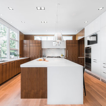
Trendy u-shaped medium tone wood floor and brown floor kitchen photo in Calgary with a double-bowl sink, flat-panel cabinets, medium tone wood cabinets, black appliances, an island and white countertops
 THE Remodel Group
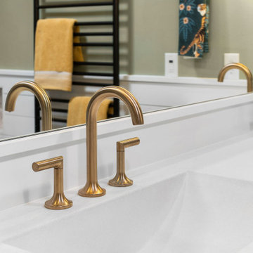
A luxurious en suite bath was created within this classic 1925 Portland bungalow by reconfiguring the second story’s original small bedrooms and tiny half bath. In this welcoming new urban boho space, eclectic finishes mingle harmoniously, integrated through subtle repetition of shapes and materials.
A furniture-style vanity sets the tone for this luxurious space, introducing materials, colors, shapes, and textures that repeat throughout. Individual walnut hexagons join to create distinctive vanity doors, offset beautifully by horizontal-grain drawers. Topping the cabinetry is a simple concrete countertop with integral sinks. An expansive framed mirror above enlarges and brightens the room. Within the mirror, sconces float, their globes a nod to the hexagons below. Champagne bronze fixtures reflect the warm walnut glow. Nestled into the back corner, a stunning shower features waterjet tiles in a double herringbone pattern, each precisely cut and laid to maintain design integrity at every surface transition. Teak floor tiles and a pebbled niche hint at the classic spa experience. Across from the shower, a large hexagonal window provides a treetop view from the free-standing tub below. The gentle oval of the tub and the beaded chandelier above provide a pleasing contrast to the strong lines surrounding it, as do the softly-shaded pebbles in the full-length niche. Shiplap wainscotting wraps the room, creating an illusion of height in the compact space. Subtle flooring and soft green walls create an understated backdrop for the bold mix of materials, unifying them into a serene oasis.
Asking a century-old home to accommodate a modern luxury bath is a tall order. Asbestos-laden plaster and flooring had to be abated. The subfloor had to be leveled and reinforced to increase strength and prevent deflection. Water lines and multiple electrical circuits had to be brought across and up without disturbing a beautifully-paneled ceiling, something we accomplished by firring out stair walls to hide the chases. Our client had visions of a leafy view from her tub, but the new layout eliminated existing windows. Placing a new window was complicated by deep eaves and flat soffits. By pushing the header into the roofline, however, we were able to accommodate a picture window. The flat soffit was replaced by an inverse hip lined with stained tongue and groove cedar, tying it to the bathroom finishes. Bringing materials up a narrow staircase became truly challenging when it was time to install the big items. However, strategic removal of drywall around the landing got the job done. Our attention to detail is showcased in the shower tile, where precise cuts were required at surface transitions to maintain the integrity of a complex double herringbone lay. The project was delivered on time.
Savvy layout choices minimized spending on structural changes. Because we were dealing with dormer space, head height was an issue. Raising the ceiling would have been complex and expensive so our design accommodated the constraints – tub on the low outside wall, shower on the full-height interior wall. The vanity spanned the spread, accommodating our petite client on the exterior side and her taller husband on the interior side. An under-eave closet was closed off to create room for both a freestanding tub and a separate shower. Rather than building replacement storage elsewhere, we simply added a new door into the closet from the primary bedroom. This was made possible by absorbing the short hallway separating the existing bed and bathroom into the primary bedroom. This new layout also created an en suite relationship between the primary bedroom and the new bath. We saved additional dollars by selecting a furniture-style vanity rather than using custom cabinetry, and the countertop with integral sinks provided a cost savings over a more traditional quartz countertop with undermount sinks. Affordable shower tiles allowed us to put more money into a dynamic tile layout. The project was delivered within budget.
 SabaRehman Abdulrehman
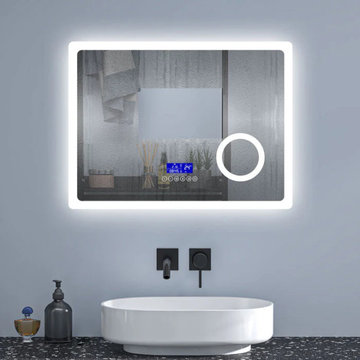
In today’s world of smart interiors and luxury-inspired home décor, LED Mirror backlit designs have become a defining trend. From elegant bathrooms to sophisticated dressing areas and premium commercial spaces, LED Mirrors are now more than just reflective surfaces—they are statement pieces that combine technology, style, and functionality.
Whether you are renovating your home, upgrading a salon, designing a hotel, or creating a modern workspace, investing in a high-quality LED mirror can instantly elevate the atmosphere. The perfect balance of illumination and aesthetics makes these mirrors one of the most sought-after interior additions in contemporary architecture.
This blog explores everything you need to know about LED Mirror backlit solutions, their benefits, applications, features, and why they are becoming essential in modern living spaces.
What Is an LED Mirror Backlit Design?
An LED Mirror backlit system refers to a mirror equipped with LED lighting installed behind the mirror surface. Instead of visible front-facing bulbs, the light gently radiates from the rear edges, producing a soft halo effect around the mirror.
This indirect illumination creates a luxurious and ambient glow while providing practical lighting for everyday tasks such as grooming, makeup application, shaving, and skincare routines.
Unlike traditional mirrors, LED Mirrors offer:
- Energy-efficient illumination
- Elegant visual appeal
- Better light distribution
- Enhanced functionality
- Modern smart features
- Bathrooms
- Bedrooms
- Dressing rooms
- Salons
- Hotels
- Restaurants
- Retail stores
- Reduces harsh shadows
- Improves visibility
- Enhances facial clarity
- Creates a comfortable lighting experience
- Reduce energy bills
- Lower electricity usage
- Support eco-friendly living
- Increase long-term savings
- Turn lights on/off
- Adjust brightness
- Change color temperature
- Bright white light for makeup application
- Warm soft light for relaxation
- Neutral lighting for everyday grooming
- Bluetooth speakers
- Digital clocks
- Temperature displays
- Voice control
- Motion sensors
- Better lighting for shaving and makeup
- Enhanced bathroom aesthetics
- Increased property value
- Luxurious visual appeal
- Salons
- Spas
- Hotels
- Restaurants
- Retail stores
- Compact rectangular mirrors work best
- Oversized backlit mirrors create a dramatic statement
- Rectangular
- Oval
- Round
- Square
- Custom geometric designs
- Warm White (cozy ambiance)
- Cool White (bright and crisp)
- Natural White (balanced daylight effect)
- Improve visual appeal
- Increase perceived luxury
- Enhance property value
- Small bathrooms
- Compact apartments
- Narrow dressing areas
9