
Search results for "Inefficient" in Home Design Ideas
 Thompson Remodeling
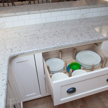
The kitchen in this 1950’s home needed a complete overhaul. It was dark, outdated and inefficient.
The homeowners wanted to give the space a modern feel without losing the 50’s vibe that is consistent throughout the rest of the home.
The homeowner’s needs included:
- Working within a fixed space, though reconfiguring or moving walls was okay
- Incorporating work space for two chefs
- Creating a mudroom
- Maintaining the existing laundry chute
- A concealed trash receptacle
The new kitchen makes use of every inch of space. To maximize counter and cabinet space, we closed in a second exit door and removed a wall between the kitchen and family room. This allowed us to create two L shaped workspaces and an eat-in bar space. A new mudroom entrance was gained by capturing space from an existing closet next to the main exit door.
The industrial lighting fixtures and wrought iron hardware bring a modern touch to this retro space. Inset doors on cabinets and beadboard details replicate details found throughout the rest of this 50’s era house.
 catlin stothers design
Featured in Montreal Home 2015 Kitchen issue.
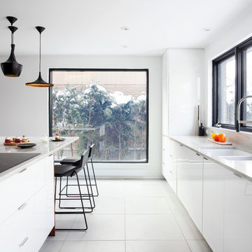
Well situated in Mont Royal, this split-level home had many positives apart from its dated interior, and layout of many small and inefficient rooms. This was all at odds with the owners’ lifestyle and aesthetic.
The client had architectural plans designed for a third floor addition that were to include a master bedroom and ensuite bathroom. The desired look for the entire house influenced all aspects of construction. Apart from the removal most walls on the main floor, everything was stripped back to the most simple and pure of finishing materials.
The existing floors were refinished in a smoked grey matte palette and offset the rich warm walnut accents in the kitchen and soft white walls.
With an abundance of white walls throughout, feature walls were essential in both the master bedroom and ensuite. The deep charcoal wall in the bedroom provides dramatic contrast to the teak headboard and hammered silver light fixture. The ensuite’s feature wall is made of pewter ceramic tiles that add texture and elegance to this simple space.
Materials and furnishings throughout were selected for their simplicity and form.
Photo : Drew Hadley
 Thompson Remodeling
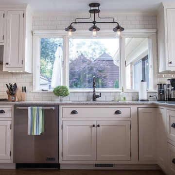
The kitchen in this 1950’s home needed a complete overhaul. It was dark, outdated and inefficient.
The homeowners wanted to give the space a modern feel without losing the 50’s vibe that is consistent throughout the rest of the home.
The homeowner’s needs included:
- Working within a fixed space, though reconfiguring or moving walls was okay
- Incorporating work space for two chefs
- Creating a mudroom
- Maintaining the existing laundry chute
- A concealed trash receptacle
The new kitchen makes use of every inch of space. To maximize counter and cabinet space, we closed in a second exit door and removed a wall between the kitchen and family room. This allowed us to create two L shaped workspaces and an eat-in bar space. A new mudroom entrance was gained by capturing space from an existing closet next to the main exit door.
The industrial lighting fixtures and wrought iron hardware bring a modern touch to this retro space. Inset doors on cabinets and beadboard details replicate details found throughout the rest of this 50’s era house.
Find the right local pro for your project
 User
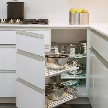
UserOur instructions from the client were to "create a fiercely modern, all-white kitchen, but with humanity."
Working within a ten by fifteen foot space that was originally dark, cramped and inefficient, we created a new kitchen which is bright, open, and highly efficient for cooking. While no walls were moved, the openings to adjacent spaces were relocated and resized, further expanding the appearance of the space. The result is a kitchen which looks and feels dramatically larger than it really is.
Photos © Michael Hospelt
 Corinthian Fine Homes
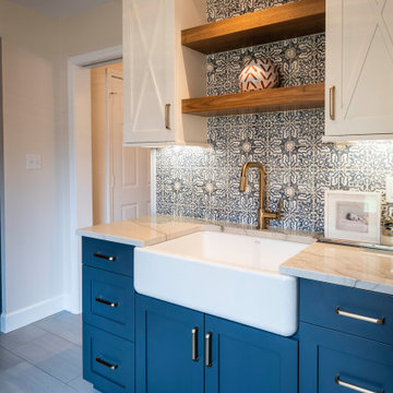
These homeowners came to us to design several areas of their home, including their mudroom and laundry. They were a growing family and needed a "landing" area as they entered their home, either from the garage but also asking for a new entrance from outside. We stole about 24 feet from their oversized garage to create a large mudroom/laundry area. Custom blue cabinets with a large "X" design on the doors of the lockers, a large farmhouse sink and a beautiful cement tile feature wall with floating shelves make this mudroom stylish and luxe. The laundry room now has a pocket door separating it from the mudroom, and houses the washer and dryer with a wood butcher block folding shelf. White tile backsplash and custom white and blue painted cabinetry takes this laundry to the next level. Both areas are stunning and have improved not only the aesthetic of the space, but also the function of what used to be an inefficient use of space.
 Lindye Galloway Interiors
Marisa Vitale Photography
www.marisavitale.com
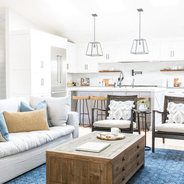
Example of a large cottage formal and open concept light wood floor living room design in Los Angeles with white walls, a standard fireplace, a concrete fireplace and a wall-mounted tv
Example of a large cottage formal and open concept light wood floor living room design in Los Angeles with white walls, a standard fireplace, a concrete fireplace and a wall-mounted tv
 Thompson Remodeling
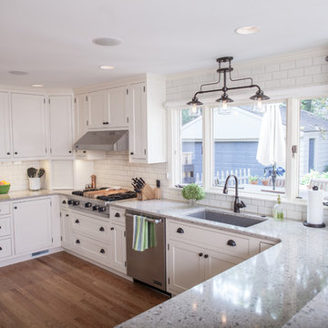
The kitchen in this 1950’s home needed a complete overhaul. It was dark, outdated and inefficient.
The homeowners wanted to give the space a modern feel without losing the 50’s vibe that is consistent throughout the rest of the home.
The homeowner’s needs included:
- Working within a fixed space, though reconfiguring or moving walls was okay
- Incorporating work space for two chefs
- Creating a mudroom
- Maintaining the existing laundry chute
- A concealed trash receptacle
The new kitchen makes use of every inch of space. To maximize counter and cabinet space, we closed in a second exit door and removed a wall between the kitchen and family room. This allowed us to create two L shaped workspaces and an eat-in bar space. A new mudroom entrance was gained by capturing space from an existing closet next to the main exit door.
The industrial lighting fixtures and wrought iron hardware bring a modern touch to this retro space. Inset doors on cabinets and beadboard details replicate details found throughout the rest of this 50’s era house.
 catlin stothers design
Well situated in Mont Royal, this split-level home had many positives apart from its dated interior, and layout of many small and inefficient rooms. This was all at odds with the owners’ lifestyle and aesthetic.
The client had architectural plans designed for a third floor addition that were to include a master bedroom and ensuite bathroom. The desired look for the entire house influenced all aspects of construction. Apart from the removal most walls on the main floor, everything was stripped back to the most simple and pure of finishing materials.
The existing floors were refinished in a smoked grey matte palette and offset the rich warm walnut accents in the kitchen and soft white walls.
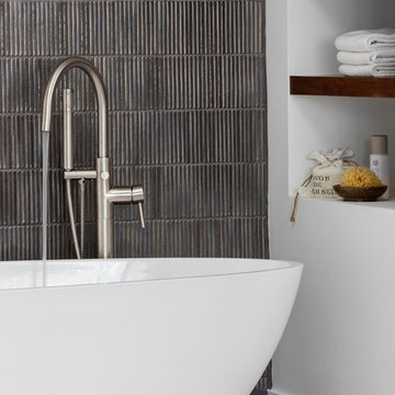
With an abundance of white walls throughout, feature walls were essential in both the master bedroom and ensuite. The deep charcoal wall in the bedroom provides dramatic contrast to the teak headboard and hammered silver light fixture. The ensuite’s feature wall is made of pewter ceramic tiles that add texture and elegance to this simple space.
Materials and furnishings throughout were selected for their simplicity and form.
Photo : Drew Hadley
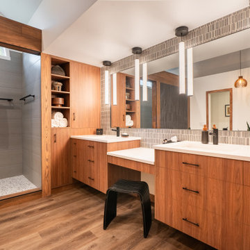
 Lundin Architects LLC
An under used whirlpool tub and inefficient layout were rectified by removing the tub and outdated glass block shower to create a generous walk-in shower area and dual vanity with built ins for storage. Woods and textured materials add warmth and sophistication to the space.

 Zola European Windows
This Boulder, Colorado remodel by fuentesdesign demonstrates the possibility of renewal in American suburbs, and Passive House design principles. Once an inefficient single story 1,000 square-foot ranch house with a forced air furnace, has been transformed into a two-story, solar powered 2500 square-foot three bedroom home ready for the next generation.
The new design for the home is modern with a sustainable theme, incorporating a palette of natural materials including; reclaimed wood finishes, FSC-certified pine Zola windows and doors, and natural earth and lime plasters that soften the interior and crisp contemporary exterior with a flavor of the west. A Ninety-percent efficient energy recovery fresh air ventilation system provides constant filtered fresh air to every room. The existing interior brick was removed and replaced with insulation. The remaining heating and cooling loads are easily met with the highest degree of comfort via a mini-split heat pump, the peak heat load has been cut by a factor of 4, despite the house doubling in size. During the coldest part of the Colorado winter, a wood stove for ambiance and low carbon back up heat creates a special place in both the living and kitchen area, and upstairs loft.
This ultra energy efficient home relies on extremely high levels of insulation, air-tight detailing and construction, and the implementation of high performance, custom made European windows and doors by Zola Windows. Zola’s ThermoPlus Clad line, which boasts R-11 triple glazing and is thermally broken with a layer of patented German Purenit®, was selected for the project. These windows also provide a seamless indoor/outdoor connection, with 9′ wide folding doors from the dining area and a matching 9′ wide custom countertop folding window that opens the kitchen up to a grassy court where mature trees provide shade and extend the living space during the summer months.
With air-tight construction, this home meets the Passive House Retrofit (EnerPHit) air-tightness standard of
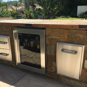
 Hawkeye Landscape Design
Backyard Patio
Mid-sized tuscan backyard stone patio kitchen photo in Los Angeles with no cover
Mid-sized tuscan backyard stone patio kitchen photo in Los Angeles with no cover
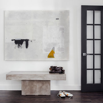 catlin stothers design
Well situated in Mont Royal, this split-level home had many positives apart from its dated interior, and layout of many small and inefficient rooms. This was all at odds with the owners’ lifestyle and aesthetic.
The client had architectural plans designed for a third floor addition that were to include a master bedroom and ensuite bathroom. The desired look for the entire house influenced all aspects of construction. Apart from the removal most walls on the main floor, everything was stripped back to the most simple and pure of finishing materials.
The existing floors were refinished in a smoked grey matte palette and offset the rich warm walnut accents in the kitchen and soft white walls.
With an abundance of white walls throughout, feature walls were essential in both the master bedroom and ensuite. The deep charcoal wall in the bedroom provides dramatic contrast to the teak headboard and hammered silver light fixture. The ensuite’s feature wall is made of pewter ceramic tiles that add texture and elegance to this simple space.
Materials and furnishings throughout were selected for their simplicity and form.
Photo : Drew Hadley
 TVL Creative Ltd.
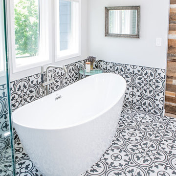
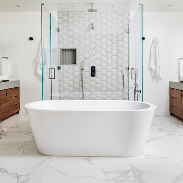
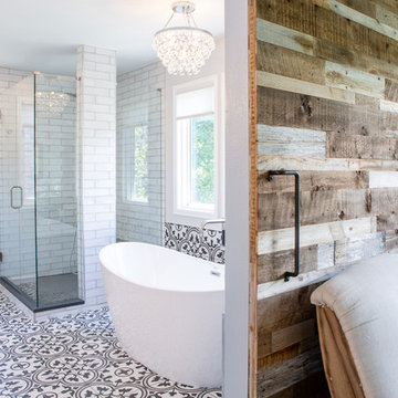
This project is an incredible transformation and the perfect example of successful style mixing! This client, and now a good friend of TVL (as they all become), is a wonderfully eclectic and adventurous one with immense interest in texture play, pops of color, and unique applications. Our scope in this home included a full kitchen renovation, main level powder room renovation, and a master bathroom overhaul. Taking just over a year to complete from the first design phases to final photos, this project was so insanely fun and packs an amazing amount of fun details and lively surprises. The original kitchen was large and fairly functional. However, the cabinetry was dated, the lighting was inefficient and frankly ugly, and the space was lacking personality in general. Our client desired maximized storage and a more personalized aesthetic. The existing cabinets were short and left the nice height of the space under-utilized. We integrated new gray shaker cabinets from Waypoint Living Spaces and ran them to the ceiling to really exaggerate the height of the space and to maximize usable storage as much as possible. The upper cabinets are glass and lit from within, offering display space or functional storage as the client needs. The central feature of this space is the large cobalt blue range from Viking as well as the custom made reclaimed wood range hood floating above. The backsplash along this entire wall is vertical slab of marble look quartz from Pental Surfaces. This matches the expanse of the same countertop that wraps the room. Flanking the range, we installed cobalt blue lantern penny tile from Merola Tile for a playful texture that adds visual interest and class to the entire room. We upgraded the lighting in the ceiling, under the cabinets, and within cabinets--we also installed accent sconces over each window on the sink wall to create cozy and functional illumination. The deep, textured front Whitehaven apron sink is a dramatic nod to the farmhouse aesthetic from KOHLER, and it's paired with the bold and industrial inspired Tournant faucet, also from Kohler. We finalized this space with other gorgeous appliances, a super sexy dining table and chair set from Room & Board, the Paxton dining light from Pottery Barn and a small bar area and pantry on the far end of the space. In the small powder room on the main level, we converted a drab builder-grade space into a super cute, rustic-inspired washroom. We utilized the Bonner vanity from Signature Hardware and paired this with the cute Ashfield faucet from Pfister. The most unique statements in this room include the water-drop light over the vanity from Shades Of Light, the copper-look porcelain floor tile from Pental Surfaces and the gorgeous Cashmere colored Tresham toilet from Kohler. Up in the master bathroom, elegance abounds. Using the same footprint, we upgraded everything in this space to reflect the client's desire for a more bright, patterned and pretty space. Starting at the entry, we installed a custom reclaimed plank barn door with bold large format hardware from Rustica Hardware. In the bathroom, the custom slate blue vanity from Tharp Cabinet Company is an eye catching statement piece. This is paired with gorgeous hardware from Amerock, vessel sinks from Kohler, and Purist faucets also from Kohler. We replaced the old built-in bathtub with a new freestanding soaker from Signature Hardware. The floor tile is a bold, graphic porcelain tile with a classic color scheme. The shower was upgraded with new tile and fixtures throughout: new clear glass, gorgeous distressed subway tile from the Castle line from TileBar, and a sophisticated shower panel from Vigo. We finalized the space with a small crystal chandelier and soft gray paint. This project is a stunning conversion and we are so thrilled that our client can enjoy these personalized spaces for years to come. Special thanks to the amazing Ian Burks of Burks Wurks Construction for bringing this to life!
 Dickerson Hearth Products
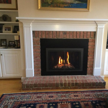
This fireplace was once an old, inefficient wood burning fireplace. The customer wanted large flames, with lots of heat output, and also a contemporary design. Notice the flames dancing through the spa stones inside the fireplace!
 TVL Creative Ltd.
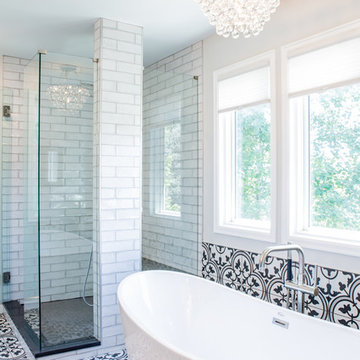
This project is an incredible transformation and the perfect example of successful style mixing! This client, and now a good friend of TVL (as they all become), is a wonderfully eclectic and adventurous one with immense interest in texture play, pops of color, and unique applications. Our scope in this home included a full kitchen renovation, main level powder room renovation, and a master bathroom overhaul. Taking just over a year to complete from the first design phases to final photos, this project was so insanely fun and packs an amazing amount of fun details and lively surprises. The original kitchen was large and fairly functional. However, the cabinetry was dated, the lighting was inefficient and frankly ugly, and the space was lacking personality in general. Our client desired maximized storage and a more personalized aesthetic. The existing cabinets were short and left the nice height of the space under-utilized. We integrated new gray shaker cabinets from Waypoint Living Spaces and ran them to the ceiling to really exaggerate the height of the space and to maximize usable storage as much as possible. The upper cabinets are glass and lit from within, offering display space or functional storage as the client needs. The central feature of this space is the large cobalt blue range from Viking as well as the custom made reclaimed wood range hood floating above. The backsplash along this entire wall is vertical slab of marble look quartz from Pental Surfaces. This matches the expanse of the same countertop that wraps the room. Flanking the range, we installed cobalt blue lantern penny tile from Merola Tile for a playful texture that adds visual interest and class to the entire room. We upgraded the lighting in the ceiling, under the cabinets, and within cabinets--we also installed accent sconces over each window on the sink wall to create cozy and functional illumination. The deep, textured front Whitehaven apron sink is a dramatic nod to the farmhouse aesthetic from KOHLER, and it's paired with the bold and industrial inspired Tournant faucet, also from Kohler. We finalized this space with other gorgeous appliances, a super sexy dining table and chair set from Room & Board, the Paxton dining light from Pottery Barn and a small bar area and pantry on the far end of the space. In the small powder room on the main level, we converted a drab builder-grade space into a super cute, rustic-inspired washroom. We utilized the Bonner vanity from Signature Hardware and paired this with the cute Ashfield faucet from Pfister. The most unique statements in this room include the water-drop light over the vanity from Shades Of Light, the copper-look porcelain floor tile from Pental Surfaces and the gorgeous Cashmere colored Tresham toilet from Kohler. Up in the master bathroom, elegance abounds. Using the same footprint, we upgraded everything in this space to reflect the client's desire for a more bright, patterned and pretty space. Starting at the entry, we installed a custom reclaimed plank barn door with bold large format hardware from Rustica Hardware. In the bathroom, the custom slate blue vanity from Tharp Cabinet Company is an eye catching statement piece. This is paired with gorgeous hardware from Amerock, vessel sinks from Kohler, and Purist faucets also from Kohler. We replaced the old built-in bathtub with a new freestanding soaker from Signature Hardware. The floor tile is a bold, graphic porcelain tile with a classic color scheme. The shower was upgraded with new tile and fixtures throughout: new clear glass, gorgeous distressed subway tile from the Castle line from TileBar, and a sophisticated shower panel from Vigo. We finalized the space with a small crystal chandelier and soft gray paint. This project is a stunning conversion and we are so thrilled that our client can enjoy these personalized spaces for years to come. Special thanks to the amazing Ian Burks of Burks Wurks Construction for bringing this to life!

 TVL Creative Ltd.
This project is an incredible transformation and the perfect example of successful style mixing! This client, and now a good friend of TVL (as they all become), is a wonderfully eclectic and adventurous one with immense interest in texture play, pops of color, and unique applications. Our scope in this home included a full kitchen renovation, main level powder room renovation, and a master bathroom overhaul. Taking just over a year to complete from the first design phases to final photos, this project was so insanely fun and packs an amazing amount of fun details and lively surprises. The original kitchen was large and fairly functional. However, the cabinetry was dated, the lighting was inefficient and frankly ugly, and the space was lacking personality in general. Our client desired maximized storage and a more personalized aesthetic. The existing cabinets were short and left the nice height of the space under-utilized. We integrated new gray shaker cabinets from Waypoint Living Spaces and ran them to the ceiling to really exaggerate the height of the space and to maximize usable storage as much as possible. The upper cabinets are glass and lit from within, offering display space or functional storage as the client needs. The central feature of this space is the large cobalt blue range from Viking as well as the custom made reclaimed wood range hood floating above. The backsplash along this entire wall is vertical slab of marble look quartz from Pental Surfaces. This matches the expanse of the same countertop that wraps the room. Flanking the range, we installed cobalt blue lantern penny tile from Merola Tile for a playful texture that adds visual interest and class to the entire room. We upgraded the lighting in the ceiling, under the cabinets, and within cabinets--we also installed accent sconces over each window on the sink wall to create cozy and functional illumination. The deep, textured front Whitehaven apron sink is a dramatic nod to the farmhouse aesthetic from KOHLER, and it's paired with the bold and industrial inspired Tournant faucet, also from Kohler. We finalized this space with other gorgeous appliances, a super sexy dining table and chair set from Room & Board, the Paxton dining light from Pottery Barn and a small bar area and pantry on the far end of the space. In the small powder room on the main level, we converted a drab builder-grade space into a super cute, rustic-inspired washroom. We utilized the Bonner vanity from Signature Hardware and paired this with the cute Ashfield faucet from Pfister. The most unique statements in this room include the water-drop light over the vanity from Shades Of Light, the copper-look porcelain floor tile from Pental Surfaces and the gorgeous Cashmere colored Tresham toilet from Kohler. Up in the master bathroom, elegance abounds. Using the same footprint, we upgraded everything in this space to reflect the client's desire for a more bright, patterned and pretty space. Starting at the entry, we installed a custom reclaimed plank barn door with bold large format hardware from Rustica Hardware. In the bathroom, the custom slate blue vanity from Tharp Cabinet Company is an eye catching statement piece. This is paired with gorgeous hardware from Amerock, vessel sinks from Kohler, and Purist faucets also from Kohler. We replaced the old built-in bathtub with a new freestanding soaker from Signature Hardware. The floor tile is a bold, graphic porcelain tile with a classic color scheme. The shower was upgraded with new tile and fixtures throughout: new clear glass, gorgeous distressed subway tile from the Castle line from TileBar, and a sophisticated shower panel from Vigo. We finalized the space with a small crystal chandelier and soft gray paint. This project is a stunning conversion and we are so thrilled that our client can enjoy these personalized spaces for years to come. Special thanks to the amazing Ian Burks of Burks Wurks Construction for bringing this to life!
 catlin stothers design
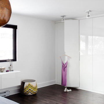
Well situated in Mont Royal, this split-level home had many positives apart from its dated interior, and layout of many small and inefficient rooms. This was all at odds with the owners’ lifestyle and aesthetic.
The client had architectural plans designed for a third floor addition that were to include a master bedroom and ensuite bathroom. The desired look for the entire house influenced all aspects of construction. Apart from the removal most walls on the main floor, everything was stripped back to the most simple and pure of finishing materials.
The existing floors were refinished in a smoked grey matte palette and offset the rich warm walnut accents in the kitchen and soft white walls.
With an abundance of white walls throughout, feature walls were essential in both the master bedroom and ensuite. The deep charcoal wall in the bedroom provides dramatic contrast to the teak headboard and hammered silver light fixture. The ensuite’s feature wall is made of pewter ceramic tiles that add texture and elegance to this simple space.
Materials and furnishings throughout were selected for their simplicity and form.
Photo : Drew Hadley
 Corinthian Fine Homes
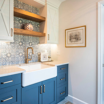
These homeowners came to us to design several areas of their home, including their mudroom and laundry. They were a growing family and needed a "landing" area as they entered their home, either from the garage but also asking for a new entrance from outside. We stole about 24 feet from their oversized garage to create a large mudroom/laundry area. Custom blue cabinets with a large "X" design on the doors of the lockers, a large farmhouse sink and a beautiful cement tile feature wall with floating shelves make this mudroom stylish and luxe. The laundry room now has a pocket door separating it from the mudroom, and houses the washer and dryer with a wood butcher block folding shelf. White tile backsplash and custom white and blue painted cabinetry takes this laundry to the next level. Both areas are stunning and have improved not only the aesthetic of the space, but also the function of what used to be an inefficient use of space.
10