
Search results for "Informed decision" in Home Design Ideas
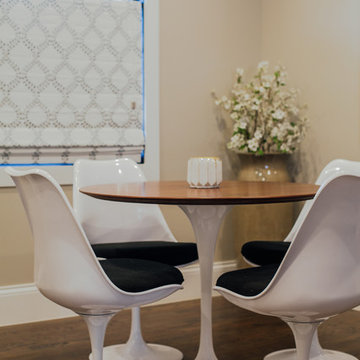
 TVL Creative Ltd.
This project was such an incredible design opportunity, and instilled inspiration and excitement at every turn! Our amazing clients came to us with the challenge of converting their beloved family home into a welcoming haven for all members of the family. At the time that we met our clients, they were struggling with the difficult personal decision of the fate of the home. Their father/father-in-law had passed away and their mother/mother-in-law had recently been admitted into a nursing facility and was fighting Alzheimer’s. Resistant to loss of the home now that both parents were out of it, our clients purchased the home to keep in in the family. Despite their permanent home currently being in New Jersey, these clients dedicated themselves to keeping and revitalizing the house. We were moved by the story and became immediately passionate about bringing this dream to life.
The home was built by the parents of our clients and was only ever owned by them, making this a truly special space to the family. Our goal was to revitalize the home and to bring new energy into every room without losing the special characteristics that were original to the home when it was built. In this way, we were able to develop a house that maintains its own unique personality while offering a space of welcoming neutrality for all members of the family to enjoy over time.
The renovation touched every part of the home: the exterior, foyer, kitchen, living room, sun room, garage, six bedrooms, three bathrooms, the laundry room, and everything in between. The focus was to develop a style that carried consistently from space to space, but allowed for unique expression in the small details in every room.
Starting at the entry, we renovated the front door and entry point to offer more presence and to bring more of the mid-century vibe to the home’s exterior. We integrated a new modern front door, cedar shingle accents, new exterior paint, and gorgeous contemporary house numbers that really allow the home to stand out. Just inside the entry, we renovated the foyer to create a playful entry point worthy of attention. Cement look tile adorns the foyer floor, and we’ve added new lighting and upgraded the entry coat storage.
Upon entering the home, one will immediately be captivated by the stunning kitchen just off the entry. We transformed this space in just about every way. While the footprint of the home ultimately remained almost identical, the aesthetics were completely turned on their head. We re-worked the kitchen to maximize storage and to create an informal dining area that is great for casual hosting or morning coffee.
We removed the entry to the garage that was once in the informal dining, and created a peninsula in its place that offers a unique division between the kitchen/informal dining and the formal dining and living areas. The simple light warm light gray cabinetry offers a bit of traditional elegance, along with the marble backsplash and quartz countertops. We extended the original wood flooring into the kitchen and stained all floors to match for a warmth that truly resonates through all spaces. We upgraded appliances, added lighting everywhere, and finished the space with some gorgeous mid century furniture pieces.
In the formal dining and living room, we really focused on maintaining the original marble fireplace as a focal point. We cleaned the marble, repaired the mortar, and refinished the original fireplace screen to give a new sleek look in black. We then integrated a new gas insert for modern heating and painted the upper portion in a rich navy blue; an accent that is carried through the home consistently as a nod to our client’s love of the color.
The former entry into the old covered porch is now an elegant glass door leading to a stunning finished sunroom. This room was completely upgraded as well. We wrapped the entire space in cozy white shiplap to keep a casual feel with brightness. We tiled the floor with large format concrete look tile, and painted the old brick fireplace a bright white. We installed a new gas burning unit, and integrated transitional style lighting to bring warmth and elegance into the space. The new black-frame windows are adorned with decorative shades that feature hand-sketched bird prints, and we’ve created a dedicated garden-ware “nook” for our client who loves to work in the yard. The far end of this space is completed with two oversized chaise loungers and overhead lights…the most perfect little reading nook!
Just off the dining room, we created an entirely new space to the home: a mudroom. The clients lacked this space and desperately needed a landing spot upon entering the home from the garage. We uniquely planned existing space in the garage to utilize for this purpose, and were able to create a small but functional entry point without losing the ability to park cars in the garage. This new space features cement-look tile, gorgeous deep brown cabinetry, and plenty of storage for all the small items one might need to store while moving in and out of the home.
The remainder of the upstairs level includes massive renovations to the guest hall bathroom and guest bedroom, upstairs master bed/bath suite, and a third bedroom that we converted into a home office for the client.
Some of the largest transformations were made in the basement, where unfinished space and lack of light were converted into gloriously lit, cozy, finished spaces. Our first task was to convert the massive basement living room into the new master bedroom for our clients. We removed existing built-ins, created an entirely new walk-in closet, painted the old brick fireplace, installed a new gas unit, added carpet, introduced new lighting, replaced windows, and upgraded every part of the aesthetic appearance. One of the most incredible features of this space is the custom double sliding barn door made by a Denver artisan. This space is truly a retreat for our clients!
We also completely transformed the laundry room, back storage room, basement master bathroom, and two bedrooms.
This home’s massive scope and ever-evolving challenges were thrilling and exciting to work with, and the result is absolutely amazing. At the end of the day, this home offers a look and feel that the clients love. Above all, though, the clients feel the spirit of their family home and have a welcoming environment for all members of the family to enjoy for years to come!
 Gallery KBNY
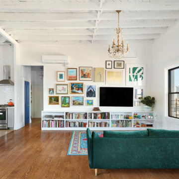
For this Brooklyn condo renovation, Gallery Kitchen and Bath updated the entire kitchen and both bathrooms, as well as painted and laid out new flooring throughout the entire apartment. The owners wanted to unite the seeming medley of the existing space into a cohesive design more representative of their own style. With its ultra-high ceilings and exposed joints and beams, the space already lent itself to the farmhouse look. The end result is a modernized, eclectic farmhouse style that we keenly carried throughout the home.
MORE DETAILS
Compelling textures and color combos reign supreme. The kitchen features semi-custom Shaker-style stone gray cabinets, a white subway tile backsplash running all the way up the wall, and white quartz countertops. We built the island in part to create a pleasing yet efficient flow from the kitchen into the living and dining areas as the space was opened up. We also painted the plumbing stack white to not make it stand out.
We also redesigned the bathrooms, giving each a unique treatment. In the master bath, we took a Victorian-goes-modern approach with coral walls, champagne fixtures, and a clawfoot tub. In the guest bathroom, we stuck to a transitional style that approaches modern without becoming contemporary, pairing herringbone marble floor tiles with a mix of subway and penny tiles on the walls and in the shower. Both maintain elements, such as tiles, fixtures, and colors, that coordinate with the overall eclectic farmhouse look.
HOW WE COLLABORATE
Collaboration with our clients to their desired degree is one of our core pillars. In this condo renovation, the clients wanted central air and were initially considering a true central air system. We advised against it, as not only would it take away from the unique beauty of unusually tall ceilings by adding unsightly ductwork, but it would also significantly detract from the farmhouse look. Instead, we suggested a mini-split system. Our recommended units were both cost-effective and much more complementary to the comprehensive theme. Of course, we ultimately always honor the clients’ choices but it’s just as important to us that we make sure to provide all the necessary information so our clients can make educated decisions that are best for their needs.
SPACE PLANNING
Another key element of the renovation process is space planning. From this perspective, we consider the placement and positioning of objects with regard to the overall flow of space. The building where this renovation took place is U-shaped at one end, which happens to be where this particular apartment is located. Uniquely-shaped spaces naturally require more concentration than those built in the standard rectangular shape. Questions we consider include: Where will people really spend time in this space? What will the flow of foot traffic be? Is there easy access to the kitchen island? Does it flow well into the hallways? Does the island protrude into anything? Working in New York, with its variety of homes and architectural styles, has greatly developed our experience with standard spaces and unconventional ones alike.
SOME HIGHLIGHTS
- Ultra-tall ceilings, allowing for stacked cabinets in the kitchen, as well as long pendant light fixtures and more chandeliers than usual throughout the home
- Completely refurbished cast iron clawfoot tub in one bathroom, with a 270-degree shower curtain around the tub
- Vibrant color choices, including an all-blue bedroom in various shades
- Treated exposed brick walls
Fun Fact: A client once showed us inspiration photos that they sourced online of this exact project, having no idea it was one of ours.
Thinking about renovating your condo? Contact us today to find out how you can benefit from our expertise in remodeling New York City condos. We are a design-and-build firm with a full-scale approach that handles every single aspect of your condo renovation from start to finish.
 Fabco Sanctuary
The architect and designer Guy Derwent was approached by his client with a clear and compelling brief: to completely transform a grand Victorian terrace house they were planning to renovate. The client envisioned something far beyond a standard renovation – this was to be a bold and dramatic reimagining of a family home that could grow with them over time.
With the property having remained largely untouched for more than fifty years, the architects saw an opportunity to unlock its potential and deliver a contemporary design that would contrast beautifully with its Victorian heritage.
The existing layout consisted of a series of small, disconnected rooms to the rear of the house. To respond to the client’s need for openness and flexibility, the architect proposed a radical restructuring of the ground floor:
The rear rooms were completely removed
Suspended timber floors were lowered by up to two metres to align with the garden
Two bold extensions were added
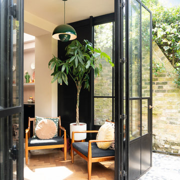
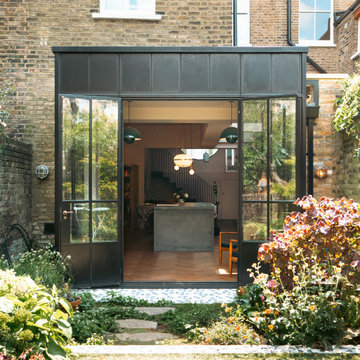
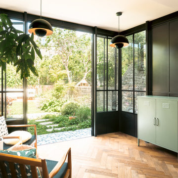
The first extension filled in the side return with a London stock brick facade and a glazed roof, while the second – a striking black steel and glass pavilion was glazed on three sides and placed along the garden elevation.
This new pavilion redefined the building’s relationship with the garden. Its steel-framed glazing created a seamless dialogue between interior and exterior, offering a sense of immersion in the surrounding landscape.
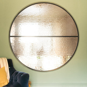
At the heart of the plan sits a dramatic, five-metre-tall dining space that acts as a transition from the original entrance hall into the new addition. A large, circular cast-glass window, framed in steel, provides a visual and spatial link between old and new, allowing light and movement to travel through the depth of the home.
Throughout the project, a series of black metal elements were introduced as sculptural interventions – each marking moments of transformation within the house. These included the bespoke steel framed circular window, a custom metal staircase, a cylindrical support column, and the striking steel and glass garden pavilion. Together, they formed a coherent architectural language that underscored the project’s bold intent.
Our steel windows and doors played a vital role in delivering the project’s vision. The architects chose steel for its refined sight lines and distinctive material character, which helped bridge the gap between the historical context of the building and the bold new additions.
The black steel frames provided a crisp contrast to the pale London stock brick and added definition to the glazed pavilion, reinforcing the sense of architectural precision. In particular, the fine steel profiles of the garden room allowed the extension to feel both lightweight and immersive, blurring the boundary between the house and its garden.
The architect drew inspiration from the Bauhaus Movement, particularly the work of Walter Gropius, whose approach to functional beauty and industrial materials informed the design of the garden pavilion.
Here, our glazing system was used not just for transparency, but as an expressive architectural element. The carefully proportioned panels help to conceal the roof thickness and reinforce the pavilion’s industrial yet abstract character – a deliberate nod to product design and modernist detailing.
Sustainability was an important factor in the selection of materials. Our steel systems, made from 99% recycled content and 100% recyclable, aligned with the project’s broader environmental goals.
The architects noted that this commitment to material longevity and circularity was central to their decision to use steel. The durability and recyclability of the windows and doors ensured the project met both aesthetic and ethical criteria.
This London terrace house now stands as a celebration of contrast – between heritage and innovation, solidity and transparency, tradition and transformation. Our steel windows and doors were not simply components; they were essential tools in crafting a home that is as bold and expressive as it is functional.
The result is a home designed for modern family life, where light, space, and materiality come together in perfect harmony.
Find the right local pro for your project
 SUPERIOR CHIMNEY SERVICES CORPORATION
Let’s be honest. Chimney cleaning probably isn’t the first thing on your spring to-do list. But if you used your fireplace this past winter, scheduling a chimney sweep before warm weather arrives is one of the best home maintenance decisions you can make. Here’s why Spring is the best time to schedule your chimney cleaning.
Your Chimney Just Worked Hard All Winter
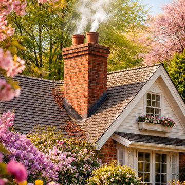
It’s tired, simply burnt out! Every time you burned wood this season, creosote, also known as soot, was clinging to the inner walls of your chimney. It’s a natural byproduct of burning wood, but it’s also highly flammable and the leading cause of chimney fires. The longer it sits, the more it builds up. A professional chimney sweep, such as Superior Chimney, takes a look at your chimney flue liner, damper, and firebox — clearing it all out before that creosote becomes a serious issue.
Spring is the Best Time to Take Care of the Chimney
Fall is when everyone panics. The temperature drops, and the fireplace suddenly seems appealing. By scheduling now, in spring, you get to clean your chimney now so your house doesn’t smell from the creosote left in your fireplace and chimney Superior Chimney includes a FREE 14-Point Certified Written Inspection with photo documentation sent straight to your email with every chimney sweep we do. That’s the kind of full-service you want, and you’re more likely to get it when things aren’t hectic.
Catch Problems Before They Get Expensive
Here’s something homeowners don’t regularly remember: a chimney sweep isn’t just about cleaning. It’s about integrity. When a CSIA Certified Chimney Sweep technician pushes rods and brushes through your chimney system, if pieces of fire clay tile, tile joints, or brick start falling, that tells you exactly where a structural issue exists. That’s critical information for fireworthy, continued use of your fireplace.
Avoid Any Obstructions
Obstruction-free chimney systems is another key reason for a spring chimney sweep. Birds, squirrels, and raccoons love a quiet chimney during the warmer (and definitely the cold) months. Nesting, debris, and feces can create blockages, and a simple cleaning alone won’t remove most of them. Knowing what’s going on inside your chimney before critters move in is a whole lot easier than dealing with it in October.
It’s the National Safety Standard — Not Just a Suggestion
The NFPA 211, CSIA, NCSG, and IRC all recommend annual chimney inspections and cleanings for both wood burning and gas fireplaces. It’s not optional; it’s a safety standard. As the CSIA puts it simply: clean chimneys don’t catch fire. Well put CSIA.
Did You Know?
All of Superior Chimney’s technicians are certified by the CSIA, so you know you’re getting expertise you can trust. Then we take the extra step of taking pictures so you can ‘see’ exactly what’s going on with the chimney. Everything looks good from the ground. We’ll email the pictures to you so you can keep your own records of what we all saw during the last visit. Now you know why spring is the best time to schedule your chimney cleaning.
Contact us or give us a call today at 877-244-6349 to get started.
 TVL Creative Ltd.
This project was such an incredible design opportunity, and instilled inspiration and excitement at every turn! Our amazing clients came to us with the challenge of converting their beloved family home into a welcoming haven for all members of the family. At the time that we met our clients, they were struggling with the difficult personal decision of the fate of the home. Their father/father-in-law had passed away and their mother/mother-in-law had recently been admitted into a nursing facility and was fighting Alzheimer’s. Resistant to loss of the home now that both parents were out of it, our clients purchased the home to keep in in the family. Despite their permanent home currently being in New Jersey, these clients dedicated themselves to keeping and revitalizing the house. We were moved by the story and became immediately passionate about bringing this dream to life.
The home was built by the parents of our clients and was only ever owned by them, making this a truly special space to the family. Our goal was to revitalize the home and to bring new energy into every room without losing the special characteristics that were original to the home when it was built. In this way, we were able to develop a house that maintains its own unique personality while offering a space of welcoming neutrality for all members of the family to enjoy over time.
The renovation touched every part of the home: the exterior, foyer, kitchen, living room, sun room, garage, six bedrooms, three bathrooms, the laundry room, and everything in between. The focus was to develop a style that carried consistently from space to space, but allowed for unique expression in the small details in every room.
Starting at the entry, we renovated the front door and entry point to offer more presence and to bring more of the mid-century vibe to the home’s exterior. We integrated a new modern front door, cedar shingle accents, new exterior paint, and gorgeous contemporary house numbers that really allow the home to stand out. Just inside the entry, we renovated the foyer to create a playful entry point worthy of attention. Cement look tile adorns the foyer floor, and we’ve added new lighting and upgraded the entry coat storage.
Upon entering the home, one will immediately be captivated by the stunning kitchen just off the entry. We transformed this space in just about every way. While the footprint of the home ultimately remained almost identical, the aesthetics were completely turned on their head. We re-worked the kitchen to maximize storage and to create an informal dining area that is great for casual hosting or morning coffee.
We removed the entry to the garage that was once in the informal dining, and created a peninsula in its place that offers a unique division between the kitchen/informal dining and the formal dining and living areas. The simple light warm light gray cabinetry offers a bit of traditional elegance, along with the marble backsplash and quartz countertops. We extended the original wood flooring into the kitchen and stained all floors to match for a warmth that truly resonates through all spaces. We upgraded appliances, added lighting everywhere, and finished the space with some gorgeous mid century furniture pieces.
In the formal dining and living room, we really focused on maintaining the original marble fireplace as a focal point. We cleaned the marble, repaired the mortar, and refinished the original fireplace screen to give a new sleek look in black. We then integrated a new gas insert for modern heating and painted the upper portion in a rich navy blue; an accent that is carried through the home consistently as a nod to our client’s love of the color.
The former entry into the old covered porch is now an elegant glass door leading to a stunning finished sunroom. This room was completely upgraded as well. We wrapped the entire space in cozy white shiplap to keep a casual feel with brightness. We tiled the floor with large format concrete look tile, and painted the old brick fireplace a bright white. We installed a new gas burning unit, and integrated transitional style lighting to bring warmth and elegance into the space. The new black-frame windows are adorned with decorative shades that feature hand-sketched bird prints, and we’ve created a dedicated garden-ware “nook” for our client who loves to work in the yard. The far end of this space is completed with two oversized chaise loungers and overhead lights…the most perfect little reading nook!
Just off the dining room, we created an entirely new space to the home: a mudroom. The clients lacked this space and desperately needed a landing spot upon entering the home from the garage. We uniquely planned existing space in the garage to utilize for this purpose, and were able to create a small but functional entry point without losing the ability to park cars in the garage. This new space features cement-look tile, gorgeous deep brown cabinetry, and plenty of storage for all the small items one might need to store while moving in and out of the home.
The remainder of the upstairs level includes massive renovations to the guest hall bathroom and guest bedroom, upstairs master bed/bath suite, and a third bedroom that we converted into a home office for the client.
Some of the largest transformations were made in the basement, where unfinished space and lack of light were converted into gloriously lit, cozy, finished spaces. Our first task was to convert the massive basement living room into the new master bedroom for our clients. We removed existing built-ins, created an entirely new walk-in closet, painted the old brick fireplace, installed a new gas unit, added carpet, introduced new lighting, replaced windows, and upgraded every part of the aesthetic appearance. One of the most incredible features of this space is the custom double sliding barn door made by a Denver artisan. This space is truly a retreat for our clients!
We also completely transformed the laundry room, back storage room, basement master bathroom, and two bedrooms.
This home’s massive scope and ever-evolving challenges were thrilling and exciting to work with, and the result is absolutely amazing. At the end of the day, this home offers a look and feel that the clients love. Above all, though, the clients feel the spirit of their family home and have a welcoming environment for all members of the family to enjoy for years to come.

 U.S. Green Building Council (USGBC)
LEED certification level: Platinum.
Builder: GCCM Construction Services LLC dba UberGreen Spaces & Homes.
Mark Twain said it best, "If the world were to end today I'd move to Kentucky because they are 20 years behind everyone else."
There is some truth to that because Kentuckians believe that 'if it aint broke dont fix it'.
We designed and built Kentucky's first LEED Platinum Net Zero Energy Net Zero Water home in the private sector. We named the home 'My Green Kentucky Home' playing off the state song 'My Old Kentucky Home'. Our take on a home should have people and the planet in mind. We found LEED to be the best most credible third-party green certification program to address these important challenges today.
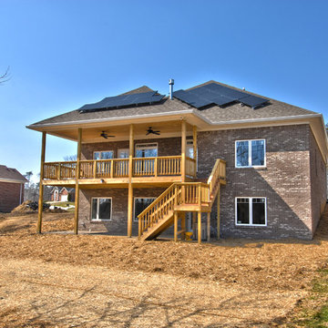
The envelope of the home was designed to minimize energy losses and maximize inside comfort by using Insulated Concrete Form walls from the footers to the roof, spray foam and blown in cellulose in the attic, rigid foam beneath the Lower Level basement slab and triple-pane fully insulated casement windows. The home was oriented with the back facing south to maximize daylighting, passive heating in the winter and solar production. Our HVAC is geothermal with a storage tank to preheat domestic water. A fresh air system was installed in the return side of the HVAC system to filter and then mix with supply air to the home.
All paints were zero VOC. The reclaimed KY horse farm fencing turned into beautiful hardwood floors was finished with a low VOC sealer. Carpets were low VOC and the 100% recycled padding was zero VOC. The custom cabinets for the kitchen and baths were made locally and built with FSC certified plywood with no added formaldehyde.
The home collects 100% of the rainwater that hits the roof into a 3,300 gallon rainwater collection tank. The primary use of the collected water is to irrigate the lawns, landscaped beds and supply the hose bibs. When the tank is low it automatically shuts the tank valve and opens the city water valve to operate with city water pressure until the tank fills past a certain level, saving electricity and wear and tear on the pump. The cistern is designed to service all the homes domestic water needs when KY State Plumbing code will allow it in the future.
All appliances are Energy Star and locally made by GE. The counter tops on all cabinets are recycled materials and durable without requiring sealers or maintenance. We went a step further for indoor air quality and installed AirRenew drywall by Certainteed which works like trees do in the environment by pulling in VOC's into the drywall and making it inert. The Florida Tile was made in Kentucky with recycled content. We monitor all utility usage per electrical circuit and monitor the amount of energy produced by the solar panels as well helping the owners make more informed decisions.
The home was such a hit that it was the catalyst that sparked development in a dormant neighborhood of vacant lots.
We had the home open for three months to the public where hundreds of folks toured it as it was laid out like an art museum. We had actual walls open all the way to the outside layer of ICF insulation where they saw the concrete and steel inside the walls. We also had the lower level basement slab cut open to show how we insulate beneath the concrete and how we drain and mitigate radon. It was a super inspirational project that made people think about people and the planet much differently than before.
We hope to continue making great projects like these to help inspire, educate and create awareness around some of the most important topics and challenges we face today.
Thank you to everyone at the USGBC for helping us make this happen and the great work you do every day!

Sponsored
Sunbury, OH

J.Holderby - Renovations
Franklin County's Leading General Contractors - 2X Best of Houzz!
 TVL Creative Ltd.
This project was such an incredible design opportunity, and instilled inspiration and excitement at every turn! Our amazing clients came to us with the challenge of converting their beloved family home into a welcoming haven for all members of the family. At the time that we met our clients, they were struggling with the difficult personal decision of the fate of the home. Their father/father-in-law had passed away and their mother/mother-in-law had recently been admitted into a nursing facility and was fighting Alzheimer’s. Resistant to loss of the home now that both parents were out of it, our clients purchased the home to keep in in the family. Despite their permanent home currently being in New Jersey, these clients dedicated themselves to keeping and revitalizing the house. We were moved by the story and became immediately passionate about bringing this dream to life.
The home was built by the parents of our clients and was only ever owned by them, making this a truly special space to the family. Our goal was to revitalize the home and to bring new energy into every room without losing the special characteristics that were original to the home when it was built. In this way, we were able to develop a house that maintains its own unique personality while offering a space of welcoming neutrality for all members of the family to enjoy over time.
The renovation touched every part of the home: the exterior, foyer, kitchen, living room, sun room, garage, six bedrooms, three bathrooms, the laundry room, and everything in between. The focus was to develop a style that carried consistently from space to space, but allowed for unique expression in the small details in every room.
Starting at the entry, we renovated the front door and entry point to offer more presence and to bring more of the mid-century vibe to the home’s exterior. We integrated a new modern front door, cedar shingle accents, new exterior paint, and gorgeous contemporary house numbers that really allow the home to stand out. Just inside the entry, we renovated the foyer to create a playful entry point worthy of attention. Cement look tile adorns the foyer floor, and we’ve added new lighting and upgraded the entry coat storage.
Upon entering the home, one will immediately be captivated by the stunning kitchen just off the entry. We transformed this space in just about every way. While the footprint of the home ultimately remained almost identical, the aesthetics were completely turned on their head. We re-worked the kitchen to maximize storage and to create an informal dining area that is great for casual hosting or morning coffee.
We removed the entry to the garage that was once in the informal dining, and created a peninsula in its place that offers a unique division between the kitchen/informal dining and the formal dining and living areas. The simple light warm light gray cabinetry offers a bit of traditional elegance, along with the marble backsplash and quartz countertops. We extended the original wood flooring into the kitchen and stained all floors to match for a warmth that truly resonates through all spaces. We upgraded appliances, added lighting everywhere, and finished the space with some gorgeous mid century furniture pieces.
In the formal dining and living room, we really focused on maintaining the original marble fireplace as a focal point. We cleaned the marble, repaired the mortar, and refinished the original fireplace screen to give a new sleek look in black. We then integrated a new gas insert for modern heating and painted the upper portion in a rich navy blue; an accent that is carried through the home consistently as a nod to our client’s love of the color.
The former entry into the old covered porch is now an elegant glass door leading to a stunning finished sunroom. This room was completely upgraded as well. We wrapped the entire space in cozy white shiplap to keep a casual feel with brightness. We tiled the floor with large format concrete look tile, and painted the old brick fireplace a bright white. We installed a new gas burning unit, and integrated transitional style lighting to bring warmth and elegance into the space. The new black-frame windows are adorned with decorative shades that feature hand-sketched bird prints, and we’ve created a dedicated garden-ware “nook” for our client who loves to work in the yard. The far end of this space is completed with two oversized chaise loungers and overhead lights…the most perfect little reading nook!
Just off the dining room, we created an entirely new space to the home: a mudroom. The clients lacked this space and desperately needed a landing spot upon entering the home from the garage. We uniquely planned existing space in the garage to utilize for this purpose, and were able to create a small but functional entry point without losing the ability to park cars in the garage. This new space features cement-look tile, gorgeous deep brown cabinetry, and plenty of storage for all the small items one might need to store while moving in and out of the home.
The remainder of the upstairs level includes massive renovations to the guest hall bathroom and guest bedroom, upstairs master bed/bath suite, and a third bedroom that we converted into a home office for the client.
Some of the largest transformations were made in the basement, where unfinished space and lack of light were converted into gloriously lit, cozy, finished spaces. Our first task was to convert the massive basement living room into the new master bedroom for our clients. We removed existing built-ins, created an entirely new walk-in closet, painted the old brick fireplace, installed a new gas unit, added carpet, introduced new lighting, replaced windows, and upgraded every part of the aesthetic appearance. One of the most incredible features of this space is the custom double sliding barn door made by a Denver artisan. This space is truly a retreat for our clients!
We also completely transformed the laundry room, back storage room, basement master bathroom, and two bedrooms.
This home’s massive scope and ever-evolving challenges were thrilling and exciting to work with, and the result is absolutely amazing. At the end of the day, this home offers a look and feel that the clients love. Above all, though, the clients feel the spirit of their family home and have a welcoming environment for all members of the family to enjoy for years to come.
 Fabco Sanctuary
The architect and designer Guy Derwent was approached by his client with a clear and compelling brief: to completely transform a grand Victorian terrace house they were planning to renovate. The client envisioned something far beyond a standard renovation – this was to be a bold and dramatic reimagining of a family home that could grow with them over time.
With the property having remained largely untouched for more than fifty years, the architects saw an opportunity to unlock its potential and deliver a contemporary design that would contrast beautifully with its Victorian heritage.
The existing layout consisted of a series of small, disconnected rooms to the rear of the house. To respond to the client’s need for openness and flexibility, the architect proposed a radical restructuring of the ground floor:
The rear rooms were completely removed
Suspended timber floors were lowered by up to two metres to align with the garden
Two bold extensions were added
The first extension filled in the side return with a London stock brick facade and a glazed roof, while the second – a striking black steel and glass pavilion was glazed on three sides and placed along the garden elevation.
This new pavilion redefined the building’s relationship with the garden. Its steel-framed glazing created a seamless dialogue between interior and exterior, offering a sense of immersion in the surrounding landscape.
At the heart of the plan sits a dramatic, five-metre-tall dining space that acts as a transition from the original entrance hall into the new addition. A large, circular cast-glass window, framed in steel, provides a visual and spatial link between old and new, allowing light and movement to travel through the depth of the home.
Throughout the project, a series of black metal elements were introduced as sculptural interventions – each marking moments of transformation within the house. These included the bespoke steel framed circular window, a custom metal staircase, a cylindrical support column, and the striking steel and glass garden pavilion. Together, they formed a coherent architectural language that underscored the project’s bold intent.
Our steel windows and doors played a vital role in delivering the project’s vision. The architects chose steel for its refined sight lines and distinctive material character, which helped bridge the gap between the historical context of the building and the bold new additions.
The black steel frames provided a crisp contrast to the pale London stock brick and added definition to the glazed pavilion, reinforcing the sense of architectural precision. In particular, the fine steel profiles of the garden room allowed the extension to feel both lightweight and immersive, blurring the boundary between the house and its garden.
The architect drew inspiration from the Bauhaus Movement, particularly the work of Walter Gropius, whose approach to functional beauty and industrial materials informed the design of the garden pavilion.
Here, our glazing system was used not just for transparency, but as an expressive architectural element. The carefully proportioned panels help to conceal the roof thickness and reinforce the pavilion’s industrial yet abstract character – a deliberate nod to product design and modernist detailing.
Sustainability was an important factor in the selection of materials. Our steel systems, made from 99% recycled content and 100% recyclable, aligned with the project’s broader environmental goals.
The architects noted that this commitment to material longevity and circularity was central to their decision to use steel. The durability and recyclability of the windows and doors ensured the project met both aesthetic and ethical criteria.
This London terrace house now stands as a celebration of contrast – between heritage and innovation, solidity and transparency, tradition and transformation. Our steel windows and doors were not simply components; they were essential tools in crafting a home that is as bold and expressive as it is functional.
The result is a home designed for modern family life, where light, space, and materiality come together in perfect harmony.
 Drury Design
The Setup:
After purchasing this home, the homeowners faced a unique opportunity to reimagine their kitchen and nearby spaces. Water damage from a burst pipe had left much of the home’s interior in need of repair, and while the existing kitchen was functional and in relatively good shape, it didn’t align with the family’s vision for their new home. The layout included a peninsula that wasn’t ideal, and there were some druthers with the nearby pantry.
Since the space needed to be rebuilt anyway, the homeowners saw this as a chance to create a kitchen that was both highly functional for their four young children and timeless in its design. The project also included a refresh of the adjacent message center and dining room — spaces that play key roles in the family’s daily life. The goal was to create a cohesive flow between these areas, balancing modern functionality with the craftsman-inspired character of the rest of the home.
Design Objectives:
- Replace the outdated peninsula with a large island to maximize counter space and create new seating options.
- Open up the space visually by removing soffits and rethinking the cabinetry layout.
Incorporate concealed refrigeration and freezer units to provide significant storage for the family while maintaining a streamlined aesthetic.
- Integrate black cabinetry into the design without making the space feel harsh or heavy.
- Ensure the lighting plan balances functional task lighting with ambient accent lighting.
- Avoid visual clutter in the cabinetry design while still giving a nod to the craftsman aesthetic.
- Incorporate a slab backsplash as a key design feature.
Design Challenges:
- The outdated peninsula left dead space in the kitchen and lacked sufficient seating for the family.
- The cooktop wall was cramped, with small cabinets flanking the hood, limited storage, and soffits that made the space feel closed-in.
- The family needed significant refrigeration space (two refrigerators and a freezer) but wanted to avoid a cluttered look with visible stainless steel appliances.
- Adding black cabinetry risked making the space feel too dark or heavy.
- The original lighting plan was insufficient, particularly over the dining table where a decorative fixture proved too dim.
- The family wanted shaker-style drawer fronts to match the home’s arts-and-crafts design but worried that too much shaker cabinetry might look overly busy.
- Prioritizing a slab backsplash in the wish list priority planning.
The Renewed Space
Design Solutions:
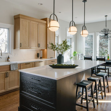
- A functional island: The peninsula was replaced with a large island that provides continuous countertop space for prepping and serving. The island also features seating for four people, creating a central hub for informal meals and activities.
- Streamlined cooktop wall: The soffits were removed, and the upper cabinets on the cooktop wall were eliminated to create a more open, streamlined design. A custom oversized hood became the focal point of the wall, with the blower unit offset inside it to align with the cooktop while maintaining exterior visual symmetry.
- Concealed refrigeration: Two column refrigerators and one freezer were integrated into the cabinetry, concealing them behind wood paneling that blends seamlessly with the overall design.
- Warm black cabinetry: The black cabinetry was crafted from hickory with a visible grain, softening its appearance and adding warmth. The grain detail gives the cabinetry a rich, textured look that avoids feeling stark or overpowering.
- Additional lighting: In the dining area, recessed can lights were added during an additional installation phase to supplement the gorgeous decorative fixture’s dim output. The new lighting plan creates a layered effect, combining functional task lighting with softer ambient lighting.
- Simplified cabinetry details: Slab drawer fronts were used on the upper drawers, while five-piece shaker fronts (with slightly less prominent rail and stile pieces) were reserved for the middle and lower drawers. This approach simplified the overall look while maintaining the craftsman-inspired aesthetic.
- Slab backsplash priority: The slab backsplash was prioritized by making thoughtful adjustments elsewhere, like opting not to extend cabinetry to the ceiling, which also helped visually prioritize the gorgeous slab backsplash. This decision also enhanced the kitchen’s furniture-like feel, aligning with the home’s craftsman character.
- This kitchen perfectly balances practicality with timeless style. By addressing the family’s functional needs — ample seating, smart storage, and effective lighting — while incorporating thoughtful design elements like warm black cabinetry and a striking slab backsplash, Alicia created a space that works beautifully for a busy household. The result is a cohesive, inviting kitchen that honors the home’s craftsman roots and will serve the family well for years to come.
 TVL Creative Ltd.
This project was such an incredible design opportunity, and instilled inspiration and excitement at every turn! Our amazing clients came to us with the challenge of converting their beloved family home into a welcoming haven for all members of the family. At the time that we met our clients, they were struggling with the difficult personal decision of the fate of the home. Their father/father-in-law had passed away and their mother/mother-in-law had recently been admitted into a nursing facility and was fighting Alzheimer’s. Resistant to loss of the home now that both parents were out of it, our clients purchased the home to keep in in the family. Despite their permanent home currently being in New Jersey, these clients dedicated themselves to keeping and revitalizing the house. We were moved by the story and became immediately passionate about bringing this dream to life.
The home was built by the parents of our clients and was only ever owned by them, making this a truly special space to the family. Our goal was to revitalize the home and to bring new energy into every room without losing the special characteristics that were original to the home when it was built. In this way, we were able to develop a house that maintains its own unique personality while offering a space of welcoming neutrality for all members of the family to enjoy over time.
The renovation touched every part of the home: the exterior, foyer, kitchen, living room, sun room, garage, six bedrooms, three bathrooms, the laundry room, and everything in between. The focus was to develop a style that carried consistently from space to space, but allowed for unique expression in the small details in every room.
Starting at the entry, we renovated the front door and entry point to offer more presence and to bring more of the mid-century vibe to the home’s exterior. We integrated a new modern front door, cedar shingle accents, new exterior paint, and gorgeous contemporary house numbers that really allow the home to stand out. Just inside the entry, we renovated the foyer to create a playful entry point worthy of attention. Cement look tile adorns the foyer floor, and we’ve added new lighting and upgraded the entry coat storage.
Upon entering the home, one will immediately be captivated by the stunning kitchen just off the entry. We transformed this space in just about every way. While the footprint of the home ultimately remained almost identical, the aesthetics were completely turned on their head. We re-worked the kitchen to maximize storage and to create an informal dining area that is great for casual hosting or morning coffee.
We removed the entry to the garage that was once in the informal dining, and created a peninsula in its place that offers a unique division between the kitchen/informal dining and the formal dining and living areas. The simple light warm light gray cabinetry offers a bit of traditional elegance, along with the marble backsplash and quartz countertops. We extended the original wood flooring into the kitchen and stained all floors to match for a warmth that truly resonates through all spaces. We upgraded appliances, added lighting everywhere, and finished the space with some gorgeous mid century furniture pieces.
In the formal dining and living room, we really focused on maintaining the original marble fireplace as a focal point. We cleaned the marble, repaired the mortar, and refinished the original fireplace screen to give a new sleek look in black. We then integrated a new gas insert for modern heating and painted the upper portion in a rich navy blue; an accent that is carried through the home consistently as a nod to our client’s love of the color.
The former entry into the old covered porch is now an elegant glass door leading to a stunning finished sunroom. This room was completely upgraded as well. We wrapped the entire space in cozy white shiplap to keep a casual feel with brightness. We tiled the floor with large format concrete look tile, and painted the old brick fireplace a bright white. We installed a new gas burning unit, and integrated transitional style lighting to bring warmth and elegance into the space. The new black-frame windows are adorned with decorative shades that feature hand-sketched bird prints, and we’ve created a dedicated garden-ware “nook” for our client who loves to work in the yard. The far end of this space is completed with two oversized chaise loungers and overhead lights…the most perfect little reading nook!
Just off the dining room, we created an entirely new space to the home: a mudroom. The clients lacked this space and desperately needed a landing spot upon entering the home from the garage. We uniquely planned existing space in the garage to utilize for this purpose, and were able to create a small but functional entry point without losing the ability to park cars in the garage. This new space features cement-look tile, gorgeous deep brown cabinetry, and plenty of storage for all the small items one might need to store while moving in and out of the home.
The remainder of the upstairs level includes massive renovations to the guest hall bathroom and guest bedroom, upstairs master bed/bath suite, and a third bedroom that we converted into a home office for the client.
Some of the largest transformations were made in the basement, where unfinished space and lack of light were converted into gloriously lit, cozy, finished spaces. Our first task was to convert the massive basement living room into the new master bedroom for our clients. We removed existing built-ins, created an entirely new walk-in closet, painted the old brick fireplace, installed a new gas unit, added carpet, introduced new lighting, replaced windows, and upgraded every part of the aesthetic appearance. One of the most incredible features of this space is the custom double sliding barn door made by a Denver artisan. This space is truly a retreat for our clients!
We also completely transformed the laundry room, back storage room, basement master bathroom, and two bedrooms.
This home’s massive scope and ever-evolving challenges were thrilling and exciting to work with, and the result is absolutely amazing. At the end of the day, this home offers a look and feel that the clients love. Above all, though, the clients feel the spirit of their family home and have a welcoming environment for all members of the family to enjoy for years to come.
 Gallery KBNY
For this Brooklyn condo renovation, Gallery Kitchen and Bath updated the entire kitchen and both bathrooms, as well as painted and laid out new flooring throughout the entire apartment. The owners wanted to unite the seeming medley of the existing space into a cohesive design more representative of their own style. With its ultra-high ceilings and exposed joints and beams, the space already lent itself to the farmhouse look. The end result is a modernized, eclectic farmhouse style that we keenly carried throughout the home.
MORE DETAILS
Compelling textures and color combos reign supreme. The kitchen features semi-custom Shaker-style stone gray cabinets, a white subway tile backsplash running all the way up the wall, and white quartz countertops. We built the island in part to create a pleasing yet efficient flow from the kitchen into the living and dining areas as the space was opened up. We also painted the plumbing stack white to not make it stand out.
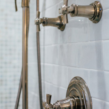
We also redesigned the bathrooms, giving each a unique treatment. In the master bath, we took a Victorian-goes-modern approach with coral walls, champagne fixtures, and a clawfoot tub. In the guest bathroom, we stuck to a transitional style that approaches modern without becoming contemporary, pairing herringbone marble floor tiles with a mix of subway and penny tiles on the walls and in the shower. Both maintain elements, such as tiles, fixtures, and colors, that coordinate with the overall eclectic farmhouse look.
HOW WE COLLABORATE
Collaboration with our clients to their desired degree is one of our core pillars. In this condo renovation, the clients wanted central air and were initially considering a true central air system. We advised against it, as not only would it take away from the unique beauty of unusually tall ceilings by adding unsightly ductwork, but it would also significantly detract from the farmhouse look. Instead, we suggested a mini-split system. Our recommended units were both cost-effective and much more complementary to the comprehensive theme. Of course, we ultimately always honor the clients’ choices but it’s just as important to us that we make sure to provide all the necessary information so our clients can make educated decisions that are best for their needs.
SPACE PLANNING
Another key element of the renovation process is space planning. From this perspective, we consider the placement and positioning of objects with regard to the overall flow of space. The building where this renovation took place is U-shaped at one end, which happens to be where this particular apartment is located. Uniquely-shaped spaces naturally require more concentration than those built in the standard rectangular shape. Questions we consider include: Where will people really spend time in this space? What will the flow of foot traffic be? Is there easy access to the kitchen island? Does it flow well into the hallways? Does the island protrude into anything? Working in New York, with its variety of homes and architectural styles, has greatly developed our experience with standard spaces and unconventional ones alike.
SOME HIGHLIGHTS
- Ultra-tall ceilings, allowing for stacked cabinets in the kitchen, as well as long pendant light fixtures and more chandeliers than usual throughout the home
- Completely refurbished cast iron clawfoot tub in one bathroom, with a 270-degree shower curtain around the tub
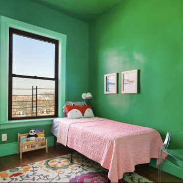
- Vibrant color choices, including an all-blue bedroom in various shades
- Treated exposed brick walls
Fun Fact: A client once showed us inspiration photos that they sourced online of this exact project, having no idea it was one of ours.
Thinking about renovating your condo? Contact us today to find out how you can benefit from our expertise in remodeling New York City condos. We are a design-and-build firm with a full-scale approach that handles every single aspect of your condo renovation from start to finish.
 TVL Creative Ltd.
This project was such an incredible design opportunity, and instilled inspiration and excitement at every turn! Our amazing clients came to us with the challenge of converting their beloved family home into a welcoming haven for all members of the family. At the time that we met our clients, they were struggling with the difficult personal decision of the fate of the home. Their father/father-in-law had passed away and their mother/mother-in-law had recently been admitted into a nursing facility and was fighting Alzheimer’s. Resistant to loss of the home now that both parents were out of it, our clients purchased the home to keep in in the family. Despite their permanent home currently being in New Jersey, these clients dedicated themselves to keeping and revitalizing the house. We were moved by the story and became immediately passionate about bringing this dream to life.
The home was built by the parents of our clients and was only ever owned by them, making this a truly special space to the family. Our goal was to revitalize the home and to bring new energy into every room without losing the special characteristics that were original to the home when it was built. In this way, we were able to develop a house that maintains its own unique personality while offering a space of welcoming neutrality for all members of the family to enjoy over time.
The renovation touched every part of the home: the exterior, foyer, kitchen, living room, sun room, garage, six bedrooms, three bathrooms, the laundry room, and everything in between. The focus was to develop a style that carried consistently from space to space, but allowed for unique expression in the small details in every room.
Starting at the entry, we renovated the front door and entry point to offer more presence and to bring more of the mid-century vibe to the home’s exterior. We integrated a new modern front door, cedar shingle accents, new exterior paint, and gorgeous contemporary house numbers that really allow the home to stand out. Just inside the entry, we renovated the foyer to create a playful entry point worthy of attention. Cement look tile adorns the foyer floor, and we’ve added new lighting and upgraded the entry coat storage.
Upon entering the home, one will immediately be captivated by the stunning kitchen just off the entry. We transformed this space in just about every way. While the footprint of the home ultimately remained almost identical, the aesthetics were completely turned on their head. We re-worked the kitchen to maximize storage and to create an informal dining area that is great for casual hosting or morning coffee.
We removed the entry to the garage that was once in the informal dining, and created a peninsula in its place that offers a unique division between the kitchen/informal dining and the formal dining and living areas. The simple light warm light gray cabinetry offers a bit of traditional elegance, along with the marble backsplash and quartz countertops. We extended the original wood flooring into the kitchen and stained all floors to match for a warmth that truly resonates through all spaces. We upgraded appliances, added lighting everywhere, and finished the space with some gorgeous mid century furniture pieces.
In the formal dining and living room, we really focused on maintaining the original marble fireplace as a focal point. We cleaned the marble, repaired the mortar, and refinished the original fireplace screen to give a new sleek look in black. We then integrated a new gas insert for modern heating and painted the upper portion in a rich navy blue; an accent that is carried through the home consistently as a nod to our client’s love of the color.
The former entry into the old covered porch is now an elegant glass door leading to a stunning finished sunroom. This room was completely upgraded as well. We wrapped the entire space in cozy white shiplap to keep a casual feel with brightness. We tiled the floor with large format concrete look tile, and painted the old brick fireplace a bright white. We installed a new gas burning unit, and integrated transitional style lighting to bring warmth and elegance into the space. The new black-frame windows are adorned with decorative shades that feature hand-sketched bird prints, and we’ve created a dedicated garden-ware “nook” for our client who loves to work in the yard. The far end of this space is completed with two oversized chaise loungers and overhead lights…the most perfect little reading nook!
Just off the dining room, we created an entirely new space to the home: a mudroom. The clients lacked this space and desperately needed a landing spot upon entering the home from the garage. We uniquely planned existing space in the garage to utilize for this purpose, and were able to create a small but functional entry point without losing the ability to park cars in the garage. This new space features cement-look tile, gorgeous deep brown cabinetry, and plenty of storage for all the small items one might need to store while moving in and out of the home.
The remainder of the upstairs level includes massive renovations to the guest hall bathroom and guest bedroom, upstairs master bed/bath suite, and a third bedroom that we converted into a home office for the client.
Some of the largest transformations were made in the basement, where unfinished space and lack of light were converted into gloriously lit, cozy, finished spaces. Our first task was to convert the massive basement living room into the new master bedroom for our clients. We removed existing built-ins, created an entirely new walk-in closet, painted the old brick fireplace, installed a new gas unit, added carpet, introduced new lighting, replaced windows, and upgraded every part of the aesthetic appearance. One of the most incredible features of this space is the custom double sliding barn door made by a Denver artisan. This space is truly a retreat for our clients!
We also completely transformed the laundry room, back storage room, basement master bathroom, and two bedrooms.
This home’s massive scope and ever-evolving challenges were thrilling and exciting to work with, and the result is absolutely amazing. At the end of the day, this home offers a look and feel that the clients love. Above all, though, the clients feel the spirit of their family home and have a welcoming environment for all members of the family to enjoy for years to come.

Sponsored
Delaware, OH

Buckeye Basements, Inc.
Central Ohio's Basement Finishing ExpertsBest Of Houzz '13-'21
 Fabco Sanctuary
The architect and designer Guy Derwent was approached by his client with a clear and compelling brief: to completely transform a grand Victorian terrace house they were planning to renovate. The client envisioned something far beyond a standard renovation – this was to be a bold and dramatic reimagining of a family home that could grow with them over time.
With the property having remained largely untouched for more than fifty years, the architects saw an opportunity to unlock its potential and deliver a contemporary design that would contrast beautifully with its Victorian heritage.
The existing layout consisted of a series of small, disconnected rooms to the rear of the house. To respond to the client’s need for openness and flexibility, the architect proposed a radical restructuring of the ground floor:
The rear rooms were completely removed
Suspended timber floors were lowered by up to two metres to align with the garden
Two bold extensions were added
The first extension filled in the side return with a London stock brick facade and a glazed roof, while the second – a striking black steel and glass pavilion was glazed on three sides and placed along the garden elevation.
This new pavilion redefined the building’s relationship with the garden. Its steel-framed glazing created a seamless dialogue between interior and exterior, offering a sense of immersion in the surrounding landscape.
At the heart of the plan sits a dramatic, five-metre-tall dining space that acts as a transition from the original entrance hall into the new addition. A large, circular cast-glass window, framed in steel, provides a visual and spatial link between old and new, allowing light and movement to travel through the depth of the home.
Throughout the project, a series of black metal elements were introduced as sculptural interventions – each marking moments of transformation within the house. These included the bespoke steel framed circular window, a custom metal staircase, a cylindrical support column, and the striking steel and glass garden pavilion. Together, they formed a coherent architectural language that underscored the project’s bold intent.
Our steel windows and doors played a vital role in delivering the project’s vision. The architects chose steel for its refined sight lines and distinctive material character, which helped bridge the gap between the historical context of the building and the bold new additions.
The black steel frames provided a crisp contrast to the pale London stock brick and added definition to the glazed pavilion, reinforcing the sense of architectural precision. In particular, the fine steel profiles of the garden room allowed the extension to feel both lightweight and immersive, blurring the boundary between the house and its garden.
The architect drew inspiration from the Bauhaus Movement, particularly the work of Walter Gropius, whose approach to functional beauty and industrial materials informed the design of the garden pavilion.
Here, our glazing system was used not just for transparency, but as an expressive architectural element. The carefully proportioned panels help to conceal the roof thickness and reinforce the pavilion’s industrial yet abstract character – a deliberate nod to product design and modernist detailing.
Sustainability was an important factor in the selection of materials. Our steel systems, made from 99% recycled content and 100% recyclable, aligned with the project’s broader environmental goals.
The architects noted that this commitment to material longevity and circularity was central to their decision to use steel. The durability and recyclability of the windows and doors ensured the project met both aesthetic and ethical criteria.
This London terrace house now stands as a celebration of contrast – between heritage and innovation, solidity and transparency, tradition and transformation. Our steel windows and doors were not simply components; they were essential tools in crafting a home that is as bold and expressive as it is functional.
The result is a home designed for modern family life, where light, space, and materiality come together in perfect harmony.
 U.S. Green Building Council (USGBC)
LEED certification level: Platinum.
Builder: GCCM Construction Services LLC dba UberGreen Spaces & Homes.
Mark Twain said it best, "If the world were to end today I'd move to Kentucky because they are 20 years behind everyone else."
There is some truth to that because Kentuckians believe that 'if it aint broke dont fix it'.
We designed and built Kentucky's first LEED Platinum Net Zero Energy Net Zero Water home in the private sector. We named the home 'My Green Kentucky Home' playing off the state song 'My Old Kentucky Home'. Our take on a home should have people and the planet in mind. We found LEED to be the best most credible third-party green certification program to address these important challenges today.
The envelope of the home was designed to minimize energy losses and maximize inside comfort by using Insulated Concrete Form walls from the footers to the roof, spray foam and blown in cellulose in the attic, rigid foam beneath the Lower Level basement slab and triple-pane fully insulated casement windows. The home was oriented with the back facing south to maximize daylighting, passive heating in the winter and solar production. Our HVAC is geothermal with a storage tank to preheat domestic water. A fresh air system was installed in the return side of the HVAC system to filter and then mix with supply air to the home.
All paints were zero VOC. The reclaimed KY horse farm fencing turned into beautiful hardwood floors was finished with a low VOC sealer. Carpets were low VOC and the 100% recycled padding was zero VOC. The custom cabinets for the kitchen and baths were made locally and built with FSC certified plywood with no added formaldehyde.
The home collects 100% of the rainwater that hits the roof into a 3,300 gallon rainwater collection tank. The primary use of the collected water is to irrigate the lawns, landscaped beds and supply the hose bibs. When the tank is low it automatically shuts the tank valve and opens the city water valve to operate with city water pressure until the tank fills past a certain level, saving electricity and wear and tear on the pump. The cistern is designed to service all the homes domestic water needs when KY State Plumbing code will allow it in the future.
All appliances are Energy Star and locally made by GE. The counter tops on all cabinets are recycled materials and durable without requiring sealers or maintenance. We went a step further for indoor air quality and installed AirRenew drywall by Certainteed which works like trees do in the environment by pulling in VOC's into the drywall and making it inert. The Florida Tile was made in Kentucky with recycled content. We monitor all utility usage per electrical circuit and monitor the amount of energy produced by the solar panels as well helping the owners make more informed decisions.
The home was such a hit that it was the catalyst that sparked development in a dormant neighborhood of vacant lots.
We had the home open for three months to the public where hundreds of folks toured it as it was laid out like an art museum. We had actual walls open all the way to the outside layer of ICF insulation where they saw the concrete and steel inside the walls. We also had the lower level basement slab cut open to show how we insulate beneath the concrete and how we drain and mitigate radon. It was a super inspirational project that made people think about people and the planet much differently than before.
We hope to continue making great projects like these to help inspire, educate and create awareness around some of the most important topics and challenges we face today.
Thank you to everyone at the USGBC for helping us make this happen and the great work you do every day!
 Fabco Sanctuary
The architect and designer Guy Derwent was approached by his client with a clear and compelling brief: to completely transform a grand Victorian terrace house they were planning to renovate. The client envisioned something far beyond a standard renovation – this was to be a bold and dramatic reimagining of a family home that could grow with them over time.
With the property having remained largely untouched for more than fifty years, the architects saw an opportunity to unlock its potential and deliver a contemporary design that would contrast beautifully with its Victorian heritage.
The existing layout consisted of a series of small, disconnected rooms to the rear of the house. To respond to the client’s need for openness and flexibility, the architect proposed a radical restructuring of the ground floor:
The rear rooms were completely removed
Suspended timber floors were lowered by up to two metres to align with the garden
Two bold extensions were added
The first extension filled in the side return with a London stock brick facade and a glazed roof, while the second – a striking black steel and glass pavilion was glazed on three sides and placed along the garden elevation.
This new pavilion redefined the building’s relationship with the garden. Its steel-framed glazing created a seamless dialogue between interior and exterior, offering a sense of immersion in the surrounding landscape.
At the heart of the plan sits a dramatic, five-metre-tall dining space that acts as a transition from the original entrance hall into the new addition. A large, circular cast-glass window, framed in steel, provides a visual and spatial link between old and new, allowing light and movement to travel through the depth of the home.
Throughout the project, a series of black metal elements were introduced as sculptural interventions – each marking moments of transformation within the house. These included the bespoke steel framed circular window, a custom metal staircase, a cylindrical support column, and the striking steel and glass garden pavilion. Together, they formed a coherent architectural language that underscored the project’s bold intent.
Our steel windows and doors played a vital role in delivering the project’s vision. The architects chose steel for its refined sight lines and distinctive material character, which helped bridge the gap between the historical context of the building and the bold new additions.
The black steel frames provided a crisp contrast to the pale London stock brick and added definition to the glazed pavilion, reinforcing the sense of architectural precision. In particular, the fine steel profiles of the garden room allowed the extension to feel both lightweight and immersive, blurring the boundary between the house and its garden.
The architect drew inspiration from the Bauhaus Movement, particularly the work of Walter Gropius, whose approach to functional beauty and industrial materials informed the design of the garden pavilion.
Here, our glazing system was used not just for transparency, but as an expressive architectural element. The carefully proportioned panels help to conceal the roof thickness and reinforce the pavilion’s industrial yet abstract character – a deliberate nod to product design and modernist detailing.
Sustainability was an important factor in the selection of materials. Our steel systems, made from 99% recycled content and 100% recyclable, aligned with the project’s broader environmental goals.
The architects noted that this commitment to material longevity and circularity was central to their decision to use steel. The durability and recyclability of the windows and doors ensured the project met both aesthetic and ethical criteria.
This London terrace house now stands as a celebration of contrast – between heritage and innovation, solidity and transparency, tradition and transformation. Our steel windows and doors were not simply components; they were essential tools in crafting a home that is as bold and expressive as it is functional.
The result is a home designed for modern family life, where light, space, and materiality come together in perfect harmony.
 Prestige Custom Building & Construction, Inc.
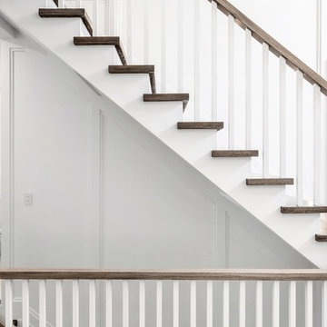
Staircase - mid-sized traditional wooden straight wood railing staircase idea in New York with painted risers


 Fabco Sanctuary
The architect and designer Guy Derwent was approached by his client with a clear and compelling brief: to completely transform a grand Victorian terrace house they were planning to renovate. The client envisioned something far beyond a standard renovation – this was to be a bold and dramatic reimagining of a family home that could grow with them over time.
With the property having remained largely untouched for more than fifty years, the architects saw an opportunity to unlock its potential and deliver a contemporary design that would contrast beautifully with its Victorian heritage.
The existing layout consisted of a series of small, disconnected rooms to the rear of the house. To respond to the client’s need for openness and flexibility, the architect proposed a radical restructuring of the ground floor:
The rear rooms were completely removed
Suspended timber floors were lowered by up to two metres to align with the garden
Two bold extensions were added
The first extension filled in the side return with a London stock brick facade and a glazed roof, while the second – a striking black steel and glass pavilion was glazed on three sides and placed along the garden elevation.
This new pavilion redefined the building’s relationship with the garden. Its steel-framed glazing created a seamless dialogue between interior and exterior, offering a sense of immersion in the surrounding landscape.
At the heart of the plan sits a dramatic, five-metre-tall dining space that acts as a transition from the original entrance hall into the new addition. A large, circular cast-glass window, framed in steel, provides a visual and spatial link between old and new, allowing light and movement to travel through the depth of the home.
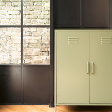
Throughout the project, a series of black metal elements were introduced as sculptural interventions – each marking moments of transformation within the house. These included the bespoke steel framed circular window, a custom metal staircase, a cylindrical support column, and the striking steel and glass garden pavilion. Together, they formed a coherent architectural language that underscored the project’s bold intent.
Our steel windows and doors played a vital role in delivering the project’s vision. The architects chose steel for its refined sight lines and distinctive material character, which helped bridge the gap between the historical context of the building and the bold new additions.
The black steel frames provided a crisp contrast to the pale London stock brick and added definition to the glazed pavilion, reinforcing the sense of architectural precision. In particular, the fine steel profiles of the garden room allowed the extension to feel both lightweight and immersive, blurring the boundary between the house and its garden.
The architect drew inspiration from the Bauhaus Movement, particularly the work of Walter Gropius, whose approach to functional beauty and industrial materials informed the design of the garden pavilion.
Here, our glazing system was used not just for transparency, but as an expressive architectural element. The carefully proportioned panels help to conceal the roof thickness and reinforce the pavilion’s industrial yet abstract character – a deliberate nod to product design and modernist detailing.
Sustainability was an important factor in the selection of materials. Our steel systems, made from 99% recycled content and 100% recyclable, aligned with the project’s broader environmental goals.
The architects noted that this commitment to material longevity and circularity was central to their decision to use steel. The durability and recyclability of the windows and doors ensured the project met both aesthetic and ethical criteria.
This London terrace house now stands as a celebration of contrast – between heritage and innovation, solidity and transparency, tradition and transformation. Our steel windows and doors were not simply components; they were essential tools in crafting a home that is as bold and expressive as it is functional.
The result is a home designed for modern family life, where light, space, and materiality come together in perfect harmony.
 Stonelace Designs
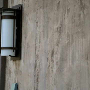
Originally, the exterior of the Napa ranch residence was a standard knocked down stucco finish. We covered over the entire exterior of the house with a natural plaster product that has been made in Italy for centuries, known as Rialto or Vero. This product is a combination of slaked lime mixed with 60% reconstituted crushed marble dust. Quarried from the legendary Carrara marble mines. The finish itself is a vertically combed striated texture embedded into the plaster. While it cures, a transparent group of patinas are applied to the stone-like plaster substance to create a look of an aged villa.

31