
Search results for "Infusing modern" in Home Design Ideas
 Drury Design
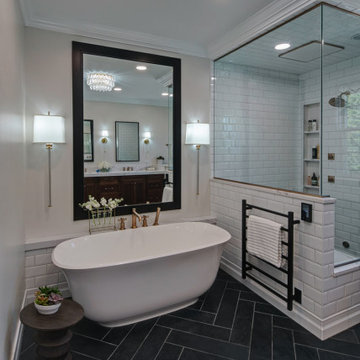
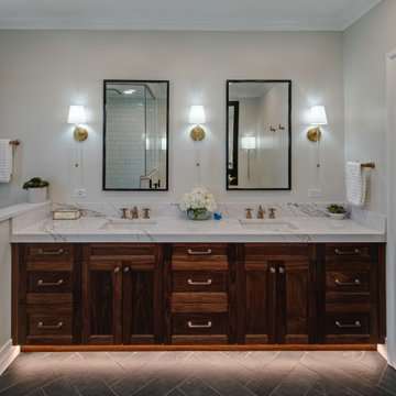
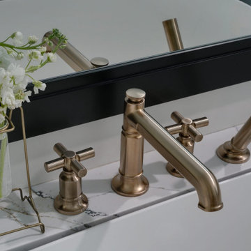
The couple each had their own wish lists. Hers was focused on aesthetics and was very clear: a contrasting combo of dark and crisp-white tile along with warm wood, soft bronze plumbing finishes, and an elegant soaking tub. His list was all about the shower. He wanted to match the experience of a luxury hotel shower.
Design objectives:
-Open up the space and omit heavy millwork details
-Furniture-style vanity in a warm wood finish
-Classic neutral palette
-Ample storage for toiletries and towels
-Luxurious modern technology, especially in the shower
THE REMODEL
“I’m not good at coming up with ideas,” the homeowner focused on the shower told us. “I like it when someone taps into my idea and gives me the options of what I’m looking for. That’s what Diana did for me and the shower while making my wife’s clear vision for everything else happen.”
Once the goals were clear, Diana identified the project’s challenges and solutions so the Drury Design installation team could make the remodel a reality.
Design challenges:
-Expand and open up the shower in a way that lets in more light
-Continue crown molding from the rest of the home – solve for how this could work around the shower
-More storage solutions in the same space
-Create an elegant, streamlined look that unifies all of the new elements
Design solutions:
-Adding a soffit above the shower area allows crown molding to flow continuously
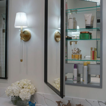
-Large Robern medicine cabinets offer convenient eye-level storage while freeing up vanity space. The mirrors on both sides of the inner medicine cabinet make them bright and sleek without having to be lit.
-Open elegance – spacious tone and feel created by free-standing tub highlighted by a large wall mirror and oversized sconces
-White quartz with black and bronze veining ties all the materials together
-Warm, contrasting character of walnut adds a nice infusion of nature into the spa-like space
THE RENEWED SPACE
This elegant bathroom is all about symmetry and well-thought-out details. A classic, spa-like appeal emanates from simple beveled subway tile, herringbone patterns in the floor and shower niches, and the gorgeous walnut vanity. The result is a beautiful bathroom that checks all the boxes from the homeowners’ original wish lists.


 Love Your Room LLC
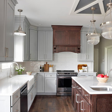
When meeting with our homeowners for this kitchen renovation project, they presented us with a large wish list. This busy family of five loves to cook and entertain for their large extended family. They felt their current kitchen was not functioning to its fullest potential. It felt cramped, dark, outdated, and had no flair. They wanted more room for storage, and convenient areas to hold their cookware. They had an unorganized pantry that wasn’t working for them, and a desk area that had become a clutter zone. They showed us examples of a cool toned color palette that they loved and asked us to bring in some farmhouse style elements with a modern aesthetic. We could not wait to transform this room!
We began by reimagining the flow of the kitchen. In order to give them more counter space to use for food preparation, we moved the fridge to the wall where the desk was. We eliminated the messy pantry closet, and installed a tall cabinet to house an additional oven and built-in microwave. We added a large pantry cabinet to the right of the refrigerator to give them plenty of organized storage space, allowing easy access to snacks from the family room. On the left side of the fridge, we incorporated a drop zone area where they can leave their keys and mail when coming in from the garage. In the island we included a pull-out trash easily accessible from both the sink and the cooking areas, and added a vegetable sink to create an extended area for food prep. For the perimeter of the kitchen, we moved the range down to allow for a corner lazy susan and drawer bank for pots and pans, and provided them with a deep farmhouse sink to aid in washing larger items. By running the cabinetry up to the ceiling, we were able to provide them with additional storage space. We finished the cabinetry off with a beautiful decorative hood surround and capped the cabinets with a large stacked crown molding.
The finishes we chose for the kitchen help modernize the space while keeping the room feeling warm and inviting. We used a soft grey paint on the perimeter cabinets and infused a warm chestnut stain on the island and decorative hood. We incorporated corbel details at both the hood and island to add some depth to the design. We included a very unique focal point to the ceiling above the island; it is a custom trim detail in the shape of an X, with dark paint as an accent. We topped the cabinetry with a luxurious calacatta quartz counter that created movement with large beautiful veining details. Hand-cut high gloss white subway tiles added brightness and sophistication to the space. Touches of silver were brought in with cabinet hardware and gooseneck faucets. We added an abundance of lighting including recessed lights, a farmhouse style silver pendant over the sink, two vintage style pendants at the island with ribbed glass, and a large wood and silver chandelier over the table, giving ample light and making the room feel bright. Adding under cabinet lighting provided our client with much needed task lighting while doing food prep. We finished the room off by using four comfortable upholstered counter stools with distressed white painted legs, adding to the farmhouse feel. New hand scraped oak plank hardwood flooring was added throughout the first floor along with large baseboard trim to tie the rest of the house in with the new kitchen design. Our client now has a large, updated, modernized kitchen to conjure up delicious meals for their family and friends.
Find the right local pro for your project


 TEROTTI Interior Design Studio
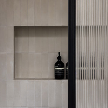
The Tranquility Residence is a mid-century modern home perched amongst the trees in the hills of Suffern, New York. After the homeowners purchased the home in the Spring of 2021, they engaged TEROTTI to reimagine the primary and tertiary bathrooms. The peaceful and subtle material textures of the primary bathroom are rich with depth and balance, providing a calming and tranquil space for daily routines. The terra cotta floor tile in the tertiary bathroom is a nod to the history of the home while the shower walls provide a refined yet playful texture to the room.
 Drury Design
The couple each had their own wish lists. Hers was focused on aesthetics and was very clear: a contrasting combo of dark and crisp-white tile along with warm wood, soft bronze plumbing finishes, and an elegant soaking tub. His list was all about the shower. He wanted to match the experience of a luxury hotel shower.
Design objectives:
-Open up the space and omit heavy millwork details
-Furniture-style vanity in a warm wood finish
-Classic neutral palette
-Ample storage for toiletries and towels
-Luxurious modern technology, especially in the shower
THE REMODEL
“I’m not good at coming up with ideas,” the homeowner focused on the shower told us. “I like it when someone taps into my idea and gives me the options of what I’m looking for. That’s what Diana did for me and the shower while making my wife’s clear vision for everything else happen.”
Once the goals were clear, Diana identified the project’s challenges and solutions so the Drury Design installation team could make the remodel a reality.
Design challenges:
-Expand and open up the shower in a way that lets in more light
-Continue crown molding from the rest of the home – solve for how this could work around the shower
-More storage solutions in the same space
-Create an elegant, streamlined look that unifies all of the new elements
Design solutions:
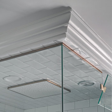
-Adding a soffit above the shower area allows crown molding to flow continuously
-Large Robern medicine cabinets offer convenient eye-level storage while freeing up vanity space. The mirrors on both sides of the inner medicine cabinet make them bright and sleek without having to be lit.
-Open elegance – spacious tone and feel created by free-standing tub highlighted by a large wall mirror and oversized sconces
-White quartz with black and bronze veining ties all the materials together
-Warm, contrasting character of walnut adds a nice infusion of nature into the spa-like space
THE RENEWED SPACE
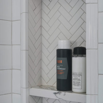
This elegant bathroom is all about symmetry and well-thought-out details. A classic, spa-like appeal emanates from simple beveled subway tile, herringbone patterns in the floor and shower niches, and the gorgeous walnut vanity. The result is a beautiful bathroom that checks all the boxes from the homeowners’ original wish lists.
 Drury Design
The couple each had their own wish lists. Hers was focused on aesthetics and was very clear: a contrasting combo of dark and crisp-white tile along with warm wood, soft bronze plumbing finishes, and an elegant soaking tub. His list was all about the shower. He wanted to match the experience of a luxury hotel shower.
Design objectives:
-Open up the space and omit heavy millwork details
-Furniture-style vanity in a warm wood finish
-Classic neutral palette
-Ample storage for toiletries and towels
-Luxurious modern technology, especially in the shower
THE REMODEL
“I’m not good at coming up with ideas,” the homeowner focused on the shower told us. “I like it when someone taps into my idea and gives me the options of what I’m looking for. That’s what Diana did for me and the shower while making my wife’s clear vision for everything else happen.”
Once the goals were clear, Diana identified the project’s challenges and solutions so the Drury Design installation team could make the remodel a reality.
Design challenges:
-Expand and open up the shower in a way that lets in more light
-Continue crown molding from the rest of the home – solve for how this could work around the shower
-More storage solutions in the same space
-Create an elegant, streamlined look that unifies all of the new elements
Design solutions:
-Adding a soffit above the shower area allows crown molding to flow continuously
-Large Robern medicine cabinets offer convenient eye-level storage while freeing up vanity space. The mirrors on both sides of the inner medicine cabinet make them bright and sleek without having to be lit.
-Open elegance – spacious tone and feel created by free-standing tub highlighted by a large wall mirror and oversized sconces
-White quartz with black and bronze veining ties all the materials together
-Warm, contrasting character of walnut adds a nice infusion of nature into the spa-like space
THE RENEWED SPACE
This elegant bathroom is all about symmetry and well-thought-out details. A classic, spa-like appeal emanates from simple beveled subway tile, herringbone patterns in the floor and shower niches, and the gorgeous walnut vanity. The result is a beautiful bathroom that checks all the boxes from the homeowners’ original wish lists.
Sponsored
Fredericksburg, OH

High Point Cabinets
Columbus' Experienced Custom Cabinet Builder | 4x Best of Houzz Winner
 Drury Design
The couple each had their own wish lists. Hers was focused on aesthetics and was very clear: a contrasting combo of dark and crisp-white tile along with warm wood, soft bronze plumbing finishes, and an elegant soaking tub. His list was all about the shower. He wanted to match the experience of a luxury hotel shower.
Design objectives:
-Open up the space and omit heavy millwork details
-Furniture-style vanity in a warm wood finish
-Classic neutral palette
-Ample storage for toiletries and towels
-Luxurious modern technology, especially in the shower
THE REMODEL
“I’m not good at coming up with ideas,” the homeowner focused on the shower told us. “I like it when someone taps into my idea and gives me the options of what I’m looking for. That’s what Diana did for me and the shower while making my wife’s clear vision for everything else happen.”
Once the goals were clear, Diana identified the project’s challenges and solutions so the Drury Design installation team could make the remodel a reality.
Design challenges:
-Expand and open up the shower in a way that lets in more light
-Continue crown molding from the rest of the home – solve for how this could work around the shower
-More storage solutions in the same space
-Create an elegant, streamlined look that unifies all of the new elements
Design solutions:
-Adding a soffit above the shower area allows crown molding to flow continuously
-Large Robern medicine cabinets offer convenient eye-level storage while freeing up vanity space. The mirrors on both sides of the inner medicine cabinet make them bright and sleek without having to be lit.
-Open elegance – spacious tone and feel created by free-standing tub highlighted by a large wall mirror and oversized sconces
-White quartz with black and bronze veining ties all the materials together
-Warm, contrasting character of walnut adds a nice infusion of nature into the spa-like space
THE RENEWED SPACE
This elegant bathroom is all about symmetry and well-thought-out details. A classic, spa-like appeal emanates from simple beveled subway tile, herringbone patterns in the floor and shower niches, and the gorgeous walnut vanity. The result is a beautiful bathroom that checks all the boxes from the homeowners’ original wish lists.
 Drury Design
The couple each had their own wish lists. Hers was focused on aesthetics and was very clear: a contrasting combo of dark and crisp-white tile along with warm wood, soft bronze plumbing finishes, and an elegant soaking tub. His list was all about the shower. He wanted to match the experience of a luxury hotel shower.
Design objectives:
-Open up the space and omit heavy millwork details
-Furniture-style vanity in a warm wood finish
-Classic neutral palette
-Ample storage for toiletries and towels
-Luxurious modern technology, especially in the shower
THE REMODEL
“I’m not good at coming up with ideas,” the homeowner focused on the shower told us. “I like it when someone taps into my idea and gives me the options of what I’m looking for. That’s what Diana did for me and the shower while making my wife’s clear vision for everything else happen.”
Once the goals were clear, Diana identified the project’s challenges and solutions so the Drury Design installation team could make the remodel a reality.
Design challenges:
-Expand and open up the shower in a way that lets in more light
-Continue crown molding from the rest of the home – solve for how this could work around the shower
-More storage solutions in the same space
-Create an elegant, streamlined look that unifies all of the new elements
Design solutions:
-Adding a soffit above the shower area allows crown molding to flow continuously
-Large Robern medicine cabinets offer convenient eye-level storage while freeing up vanity space. The mirrors on both sides of the inner medicine cabinet make them bright and sleek without having to be lit.
-Open elegance – spacious tone and feel created by free-standing tub highlighted by a large wall mirror and oversized sconces
-White quartz with black and bronze veining ties all the materials together
-Warm, contrasting character of walnut adds a nice infusion of nature into the spa-like space
THE RENEWED SPACE
This elegant bathroom is all about symmetry and well-thought-out details. A classic, spa-like appeal emanates from simple beveled subway tile, herringbone patterns in the floor and shower niches, and the gorgeous walnut vanity. The result is a beautiful bathroom that checks all the boxes from the homeowners’ original wish lists.
 Drury Design
The couple each had their own wish lists. Hers was focused on aesthetics and was very clear: a contrasting combo of dark and crisp-white tile along with warm wood, soft bronze plumbing finishes, and an elegant soaking tub. His list was all about the shower. He wanted to match the experience of a luxury hotel shower.
Design objectives:
-Open up the space and omit heavy millwork details
-Furniture-style vanity in a warm wood finish
-Classic neutral palette
-Ample storage for toiletries and towels
-Luxurious modern technology, especially in the shower
THE REMODEL
“I’m not good at coming up with ideas,” the homeowner focused on the shower told us. “I like it when someone taps into my idea and gives me the options of what I’m looking for. That’s what Diana did for me and the shower while making my wife’s clear vision for everything else happen.”
Once the goals were clear, Diana identified the project’s challenges and solutions so the Drury Design installation team could make the remodel a reality.
Design challenges:
-Expand and open up the shower in a way that lets in more light
-Continue crown molding from the rest of the home – solve for how this could work around the shower
-More storage solutions in the same space
-Create an elegant, streamlined look that unifies all of the new elements
Design solutions:
-Adding a soffit above the shower area allows crown molding to flow continuously
-Large Robern medicine cabinets offer convenient eye-level storage while freeing up vanity space. The mirrors on both sides of the inner medicine cabinet make them bright and sleek without having to be lit.
-Open elegance – spacious tone and feel created by free-standing tub highlighted by a large wall mirror and oversized sconces
-White quartz with black and bronze veining ties all the materials together
-Warm, contrasting character of walnut adds a nice infusion of nature into the spa-like space
THE RENEWED SPACE
This elegant bathroom is all about symmetry and well-thought-out details. A classic, spa-like appeal emanates from simple beveled subway tile, herringbone patterns in the floor and shower niches, and the gorgeous walnut vanity. The result is a beautiful bathroom that checks all the boxes from the homeowners’ original wish lists.

 Love Your Room LLC
When meeting with our homeowners for this kitchen renovation project, they presented us with a large wish list. This busy family of five loves to cook and entertain for their large extended family. They felt their current kitchen was not functioning to its fullest potential. It felt cramped, dark, outdated, and had no flair. They wanted more room for storage, and convenient areas to hold their cookware. They had an unorganized pantry that wasn’t working for them, and a desk area that had become a clutter zone. They showed us examples of a cool toned color palette that they loved and asked us to bring in some farmhouse style elements with a modern aesthetic. We could not wait to transform this room!
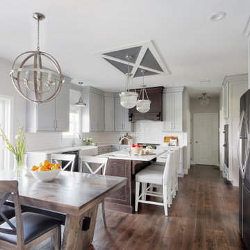
We began by reimagining the flow of the kitchen. In order to give them more counter space to use for food preparation, we moved the fridge to the wall where the desk was. We eliminated the messy pantry closet, and installed a tall cabinet to house an additional oven and built-in microwave. We added a large pantry cabinet to the right of the refrigerator to give them plenty of organized storage space, allowing easy access to snacks from the family room. On the left side of the fridge, we incorporated a drop zone area where they can leave their keys and mail when coming in from the garage. In the island we included a pull-out trash easily accessible from both the sink and the cooking areas, and added a vegetable sink to create an extended area for food prep. For the perimeter of the kitchen, we moved the range down to allow for a corner lazy susan and drawer bank for pots and pans, and provided them with a deep farmhouse sink to aid in washing larger items. By running the cabinetry up to the ceiling, we were able to provide them with additional storage space. We finished the cabinetry off with a beautiful decorative hood surround and capped the cabinets with a large stacked crown molding.
The finishes we chose for the kitchen help modernize the space while keeping the room feeling warm and inviting. We used a soft grey paint on the perimeter cabinets and infused a warm chestnut stain on the island and decorative hood. We incorporated corbel details at both the hood and island to add some depth to the design. We included a very unique focal point to the ceiling above the island; it is a custom trim detail in the shape of an X, with dark paint as an accent. We topped the cabinetry with a luxurious calacatta quartz counter that created movement with large beautiful veining details. Hand-cut high gloss white subway tiles added brightness and sophistication to the space. Touches of silver were brought in with cabinet hardware and gooseneck faucets. We added an abundance of lighting including recessed lights, a farmhouse style silver pendant over the sink, two vintage style pendants at the island with ribbed glass, and a large wood and silver chandelier over the table, giving ample light and making the room feel bright. Adding under cabinet lighting provided our client with much needed task lighting while doing food prep. We finished the room off by using four comfortable upholstered counter stools with distressed white painted legs, adding to the farmhouse feel. New hand scraped oak plank hardwood flooring was added throughout the first floor along with large baseboard trim to tie the rest of the house in with the new kitchen design. Our client now has a large, updated, modernized kitchen to conjure up delicious meals for their family and friends.
 Rhodes Architecture + Light
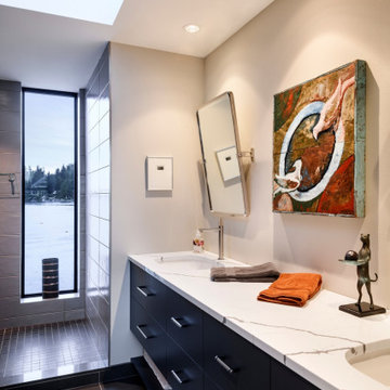
A transformation inspired by the owner’s love of modern architecture, art and color (and the adjacent sand, rock, water, and the northwest landscape), the Indianola House sought to bring the soul of a home to a colorless muted box. The original house was a drab 1990’s-era box with no personality or presence sited on a beautiful secluded bay, facing water and island views, northwest of the City of Seattle. The existing mono-colored stucco-clad exterior and pyramidal glass-block openings had led the neighborhood to dub the structure, unflatteringly, “The Miami Vice House”.
Rhodes Architecture’s Residential Architects careful use of natural light, rich, collaged finishes and ability to open the house to gardens, beach, and outdoor gathering was critical to the design. The house soon became “The Gallery”.
The original home’s grey stucco exterior made the house seem both large and featureless; the introduction of no-maintenance exterior materials that collage and complement each other was a goal of the homeowner and the Seattle Architects who teamed up for this residential design. The bloated scale of the house cried out for the establishment and definition of the parts of the structure, a breaking down of the home’s form and its apparent bland size.
Living, sleeping, and bathing areas that started as staid spaces were in need of opening to the natural environment with additions of large doors, folding glass walls and useable balconies were crucial to each space having a dialogue with the outdoors.
The owner’s extensive art collection was highlighted and became the focus of interior places, well-lit naturally and through a new lighting system. Energy use and sustainable systems were a key component of the design which used high-efficacy lighting, better cladding on a rain-screen system, high-efficiency doors and windows, new insulation and weather barriers, and which added a photovoltaic-generated electrical system. The contemporary design sought to integrate all of these systems, materials, and finishes into a seamless whole that lent interest and drama to a residence which was previously lusterless.
How radically this house was transformed is evident in the exteriors, gardens and the natural spaces the house now opens to, as well as the gallery-like interiors. This home is a stunning testament to what is possible “before-and-after” when remade by Rhodes Architecture + Light.
The clients are an older couple with long professional and political careers, a love of art and a clear desire to connect with the Northwest environment and enliven their daily lives with spaces full of color and natural light.
Rhodes Architecture + Light was hired in 2019 to add new exteriors and interiors, natural light, larger openings to beach and bay, seismic and foundation upgrades to the home, and to infuse life into the house through the re-use of existing space and varied materials, color, textures, and lighting. The only actual change to the exterior “shell” of the house was the introduction of a low “gull-wing” roof with wood soffits above the central atrium space, to add drama and bring natural light into the entry gallery space. Interior spaces, including bedrooms and bathrooms, were re-planned and opened to each other, to greater natural light, to roof decks, and to the incredible views and sea-side environment.
The Builder, Fairbank Construction Company of Bainbridge Island, Washington, met the challenge of the design, first completely deconstructing the finishes inside and out, then precisely interlocking new claddings, windows and doors, cabinetry, finishes and a new gull-wing central roof in a beautiful transformation. The construction was total, thorough, and very detailed, resulting a house that, far from seeming a “remodeling”, is far more present and fitting to the owner’s lives and the natural environment than the house we started with.
Sponsored
Sunbury, OH

J.Holderby - Renovations
Franklin County's Leading General Contractors - 2X Best of Houzz!
 Drury Design
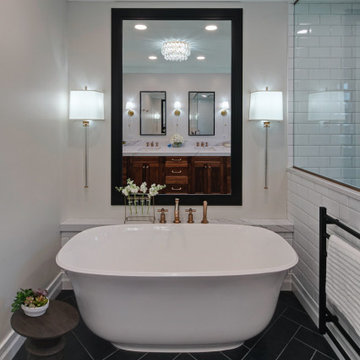
The couple each had their own wish lists. Hers was focused on aesthetics and was very clear: a contrasting combo of dark and crisp-white tile along with warm wood, soft bronze plumbing finishes, and an elegant soaking tub. His list was all about the shower. He wanted to match the experience of a luxury hotel shower.
Design objectives:
-Open up the space and omit heavy millwork details
-Furniture-style vanity in a warm wood finish
-Classic neutral palette
-Ample storage for toiletries and towels
-Luxurious modern technology, especially in the shower
THE REMODEL
“I’m not good at coming up with ideas,” the homeowner focused on the shower told us. “I like it when someone taps into my idea and gives me the options of what I’m looking for. That’s what Diana did for me and the shower while making my wife’s clear vision for everything else happen.”
Once the goals were clear, Diana identified the project’s challenges and solutions so the Drury Design installation team could make the remodel a reality.
Design challenges:
-Expand and open up the shower in a way that lets in more light
-Continue crown molding from the rest of the home – solve for how this could work around the shower
-More storage solutions in the same space
-Create an elegant, streamlined look that unifies all of the new elements
Design solutions:
-Adding a soffit above the shower area allows crown molding to flow continuously
-Large Robern medicine cabinets offer convenient eye-level storage while freeing up vanity space. The mirrors on both sides of the inner medicine cabinet make them bright and sleek without having to be lit.
-Open elegance – spacious tone and feel created by free-standing tub highlighted by a large wall mirror and oversized sconces
-White quartz with black and bronze veining ties all the materials together
-Warm, contrasting character of walnut adds a nice infusion of nature into the spa-like space
THE RENEWED SPACE
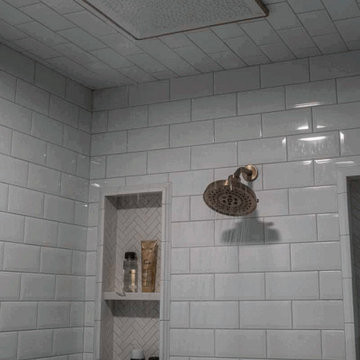
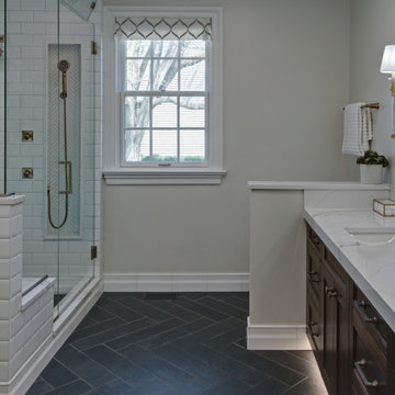
This elegant bathroom is all about symmetry and well-thought-out details. A classic, spa-like appeal emanates from simple beveled subway tile, herringbone patterns in the floor and shower niches, and the gorgeous walnut vanity. The result is a beautiful bathroom that checks all the boxes from the homeowners’ original wish lists.
 Drury Design
The couple each had their own wish lists. Hers was focused on aesthetics and was very clear: a contrasting combo of dark and crisp-white tile along with warm wood, soft bronze plumbing finishes, and an elegant soaking tub. His list was all about the shower. He wanted to match the experience of a luxury hotel shower.
Design objectives:
-Open up the space and omit heavy millwork details
-Furniture-style vanity in a warm wood finish
-Classic neutral palette
-Ample storage for toiletries and towels
-Luxurious modern technology, especially in the shower
THE REMODEL
“I’m not good at coming up with ideas,” the homeowner focused on the shower told us. “I like it when someone taps into my idea and gives me the options of what I’m looking for. That’s what Diana did for me and the shower while making my wife’s clear vision for everything else happen.”
Once the goals were clear, Diana identified the project’s challenges and solutions so the Drury Design installation team could make the remodel a reality.
Design challenges:
-Expand and open up the shower in a way that lets in more light
-Continue crown molding from the rest of the home – solve for how this could work around the shower
-More storage solutions in the same space
-Create an elegant, streamlined look that unifies all of the new elements
Design solutions:
-Adding a soffit above the shower area allows crown molding to flow continuously
-Large Robern medicine cabinets offer convenient eye-level storage while freeing up vanity space. The mirrors on both sides of the inner medicine cabinet make them bright and sleek without having to be lit.
-Open elegance – spacious tone and feel created by free-standing tub highlighted by a large wall mirror and oversized sconces
-White quartz with black and bronze veining ties all the materials together
-Warm, contrasting character of walnut adds a nice infusion of nature into the spa-like space
THE RENEWED SPACE
This elegant bathroom is all about symmetry and well-thought-out details. A classic, spa-like appeal emanates from simple beveled subway tile, herringbone patterns in the floor and shower niches, and the gorgeous walnut vanity. The result is a beautiful bathroom that checks all the boxes from the homeowners’ original wish lists.
 Drury Design
The couple each had their own wish lists. Hers was focused on aesthetics and was very clear: a contrasting combo of dark and crisp-white tile along with warm wood, soft bronze plumbing finishes, and an elegant soaking tub. His list was all about the shower. He wanted to match the experience of a luxury hotel shower.
Design objectives:
-Open up the space and omit heavy millwork details
-Furniture-style vanity in a warm wood finish
-Classic neutral palette
-Ample storage for toiletries and towels
-Luxurious modern technology, especially in the shower
THE REMODEL
“I’m not good at coming up with ideas,” the homeowner focused on the shower told us. “I like it when someone taps into my idea and gives me the options of what I’m looking for. That’s what Diana did for me and the shower while making my wife’s clear vision for everything else happen.”
Once the goals were clear, Diana identified the project’s challenges and solutions so the Drury Design installation team could make the remodel a reality.
Design challenges:
-Expand and open up the shower in a way that lets in more light
-Continue crown molding from the rest of the home – solve for how this could work around the shower
-More storage solutions in the same space
-Create an elegant, streamlined look that unifies all of the new elements
Design solutions:
-Adding a soffit above the shower area allows crown molding to flow continuously
-Large Robern medicine cabinets offer convenient eye-level storage while freeing up vanity space. The mirrors on both sides of the inner medicine cabinet make them bright and sleek without having to be lit.
-Open elegance – spacious tone and feel created by free-standing tub highlighted by a large wall mirror and oversized sconces
-White quartz with black and bronze veining ties all the materials together
-Warm, contrasting character of walnut adds a nice infusion of nature into the spa-like space
THE RENEWED SPACE
This elegant bathroom is all about symmetry and well-thought-out details. A classic, spa-like appeal emanates from simple beveled subway tile, herringbone patterns in the floor and shower niches, and the gorgeous walnut vanity. The result is a beautiful bathroom that checks all the boxes from the homeowners’ original wish lists.
 Simply Home Decorating
This beautiful North Vancouver home belongs to a nature-loving and health-conscious couple, Emma and Vince (names changed), their two young children, and their dog, Jasper. When they contacted us about renovating and furnishing their kitchen and family room, we walked in and saw a world of potential waiting to be uncovered.
Before: Larkhall Crescent Home:
Like many original North Vancouver homes, the interior was definitely dated. We encountered late ‘80s finishes in powder pink and teal green, old carpet, and a kitchen that wasn’t maximized to suit this family’s modern-day lifestyle. However, the size of the rooms offered us a ton of space with which to get creative.
Knowing our clients’ love of cooking, need for work spaces (Emma and Vince both work remotely), and growing family, we developed a design concept that would increase usable space, optimize storage, and create intimacy in this large area. As for the style, we were inspired by their European roots, inventing a new and modern take on “Belgian Farmhouse” style. Now, the home is truly one-of-a-kind.
After: Warm & Cozy Family Room:
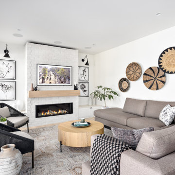
Fresh, bright, and comfortable, this living area has been transformed! We started with the fireplace as a focal point, selecting aged brick tiles for added texture and a crisp wood mantle. The taupe-coloured sectional infuses the room with visual warmth and serves the added purpose of separating the family room from the kitchen.
Emma and Vince were also keen on using non-toxic materials in their home, and we were happy to oblige. To meet their needs, we sourced natural wood elements and sought out Canadian-made products - that adhere to high health standards - whenever possible.
Look closer at the elements of this space, and you will find this stunning, honeycomb-patterned rug in earthy gold, beige, and charcoal tones. It’s plush to the touch and full of visual texture that brings this room’s colour palette together. We sourced these two-tone chairs with caning, petrified wood side table, black sconces, and botanical prints in greyscale from local artist, Heather Johnston.
We topped off the space with this dark wood and rattan console that offers storage facing the kitchen and presents an opportunity to display cherished items. The result is a cozy lounging space brimming with comfort and functionality. It’s perfect for enjoying quality family time, or Emma can simply slide the coffee table away to make room for her morning yoga practice.
Now, let’s turn around and give some attention to the kitchen. Do you remember what the original kitchen looked like? If not, scroll back up, because the transformation is shocking…
Moody & Welcoming Kitchen for Healthy Living:
This kitchen looks very different from how it started, right? Though we didn’t touch any walls, the kitchen has almost doubled in usable space! We created a long, extended island with storage, an outlet for small appliances, and seating for comfortable prep, after-school snacking, or mingling among friends.
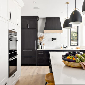
On the other side of the island, the family has even more storage and an integrated dishwasher within easy reach of the sink, perfect for quick clean-up. From this angle, you can also see the expansive custom Shaker cabinetry in white and the integrated double ovens. These facilitate their cooking experience and gave us the opportunity to add an additional surprise…
A coffee garage station and more hidden storage! Keeping these items located along the perimeter allows them to be accessed by the family or their guests without someone getting under the cook’s feet. These are the little details that make everyday life easier and more enjoyable.
Moving deeper into the kitchen, the seamless induction cooktop topped with a freestanding concealed hood fan commands attention in a soft yet prominent way. The natural wood accent mirrors the fireplace mantle, and the choice of off-black wood-grain cabinets not only continues our black-and-white colour palette but adds a sense of depth and contrast. The corner sink is located to the right and perfectly positioned with a view of their thriving backyard.
To invite more of this family’s character into the space, we mixed metals for interest — matte black, dark pewter, and warm brass — and created open shelves in white oak for their plants and decor. You can also glimpse the tumbled edge of the backsplash tile, which echoes the rustic brick of the fireplace. It adds that farmhouse charm while still feeling timeless and sophisticated.
Last but not least, we designed this dining banquette in the bay window (with integrated bench storage, of course), where the family can share a meal together, the kids can do homework, or Emma and Vince can work and enjoy a change of scenery from their offices. Like the other spaces in the home, it was designed to be beautiful, multi-functional, and long-lasting.
Praise from Our Clients:
It is clear that we love this home, but what did our clients have to say?
“Lori is a visionary and masters execution to the finest detail all at the same time. When she first met us to know more about who we are and how we live, she could right away envision how we could use the space in our kitchen and living room…The results exceeded our expectations.
Lori and her team were also a delight to work with — coordination with all the trades, fast problem-solving, regular updates, professional and friendly attitude of her entire team — made it the dream team. Thank you SHD for making our space so beautiful!”
In turn, we are so grateful for this family’s trust, their open communication, and for being wonderful people with whom to work. (So, thank you!)

 Simply Home Decorating
This beautiful North Vancouver home belongs to a nature-loving and health-conscious couple, Emma and Vince (names changed), their two young children, and their dog, Jasper. When they contacted us about renovating and furnishing their kitchen and family room, we walked in and saw a world of potential waiting to be uncovered.
Before: Larkhall Crescent Home:
Like many original North Vancouver homes, the interior was definitely dated. We encountered late ‘80s finishes in powder pink and teal green, old carpet, and a kitchen that wasn’t maximized to suit this family’s modern-day lifestyle. However, the size of the rooms offered us a ton of space with which to get creative.
Knowing our clients’ love of cooking, need for work spaces (Emma and Vince both work remotely), and growing family, we developed a design concept that would increase usable space, optimize storage, and create intimacy in this large area. As for the style, we were inspired by their European roots, inventing a new and modern take on “Belgian Farmhouse” style. Now, the home is truly one-of-a-kind.
After: Warm & Cozy Family Room:
Fresh, bright, and comfortable, this living area has been transformed! We started with the fireplace as a focal point, selecting aged brick tiles for added texture and a crisp wood mantle. The taupe-coloured sectional infuses the room with visual warmth and serves the added purpose of separating the family room from the kitchen.
Emma and Vince were also keen on using non-toxic materials in their home, and we were happy to oblige. To meet their needs, we sourced natural wood elements and sought out Canadian-made products - that adhere to high health standards - whenever possible.
Look closer at the elements of this space, and you will find this stunning, honeycomb-patterned rug in earthy gold, beige, and charcoal tones. It’s plush to the touch and full of visual texture that brings this room’s colour palette together. We sourced these two-tone chairs with caning, petrified wood side table, black sconces, and botanical prints in greyscale from local artist, Heather Johnston.
We topped off the space with this dark wood and rattan console that offers storage facing the kitchen and presents an opportunity to display cherished items. The result is a cozy lounging space brimming with comfort and functionality. It’s perfect for enjoying quality family time, or Emma can simply slide the coffee table away to make room for her morning yoga practice.
Now, let’s turn around and give some attention to the kitchen. Do you remember what the original kitchen looked like? If not, scroll back up, because the transformation is shocking…
Moody & Welcoming Kitchen for Healthy Living:
This kitchen looks very different from how it started, right? Though we didn’t touch any walls, the kitchen has almost doubled in usable space! We created a long, extended island with storage, an outlet for small appliances, and seating for comfortable prep, after-school snacking, or mingling among friends.
On the other side of the island, the family has even more storage and an integrated dishwasher within easy reach of the sink, perfect for quick clean-up. From this angle, you can also see the expansive custom Shaker cabinetry in white and the integrated double ovens. These facilitate their cooking experience and gave us the opportunity to add an additional surprise…
A coffee garage station and more hidden storage! Keeping these items located along the perimeter allows them to be accessed by the family or their guests without someone getting under the cook’s feet. These are the little details that make everyday life easier and more enjoyable.
Moving deeper into the kitchen, the seamless induction cooktop topped with a freestanding concealed hood fan commands attention in a soft yet prominent way. The natural wood accent mirrors the fireplace mantle, and the choice of off-black wood-grain cabinets not only continues our black-and-white colour palette but adds a sense of depth and contrast. The corner sink is located to the right and perfectly positioned with a view of their thriving backyard.
To invite more of this family’s character into the space, we mixed metals for interest — matte black, dark pewter, and warm brass — and created open shelves in white oak for their plants and decor. You can also glimpse the tumbled edge of the backsplash tile, which echoes the rustic brick of the fireplace. It adds that farmhouse charm while still feeling timeless and sophisticated.
Last but not least, we designed this dining banquette in the bay window (with integrated bench storage, of course), where the family can share a meal together, the kids can do homework, or Emma and Vince can work and enjoy a change of scenery from their offices. Like the other spaces in the home, it was designed to be beautiful, multi-functional, and long-lasting.
Praise from Our Clients:
It is clear that we love this home, but what did our clients have to say?
“Lori is a visionary and masters execution to the finest detail all at the same time. When she first met us to know more about who we are and how we live, she could right away envision how we could use the space in our kitchen and living room…The results exceeded our expectations.
Lori and her team were also a delight to work with — coordination with all the trades, fast problem-solving, regular updates, professional and friendly attitude of her entire team — made it the dream team. Thank you SHD for making our space so beautiful!”
In turn, we are so grateful for this family’s trust, their open communication, and for being wonderful people with whom to work. (So, thank you!)
 OMZ Architects
As a Flagstaff custom home architect, our approach to every project is to balance innovative solutions with bold design aesthetics. The Micro Mini, a compact and modern accessory dwelling unit (ADU) nestled in the heart of Flagstaff, is the perfect example of how thoughtful design can solve space constraints while offering a stylish, functional, and delightful living environment.
Our client came to us with a unique challenge: to create an additional living space on their property that was efficient, visually striking, and flexible in its function. They wanted to maximize a small footprint while incorporating pops of vibrant, monochrome color throughout the ADU to give it personality and make it feel like an extension of their larger home. The solution we provided, as your trusted Flagstaff custom home architect, was Micro Mini—a design that offers both efficiency and fun while making a big impact in a small space.
The first challenge we tackled was how to make the most of the limited square footage. Our approach, rooted in the principles of modern architecture, was to keep the floor plan as open and flexible as possible. By eliminating unnecessary walls and creating multifunctional spaces, we were able to design an interior that feels spacious and airy, despite the small footprint.
The living area, kitchen, and bedroom all flow seamlessly into each other, using strategic cabinetry, sliding doors, and built-in storage to keep the space uncluttered. The use of glass for windows and doors amplifies the sense of space, bringing in abundant natural light and connecting the interior to the outdoor landscape—a key consideration in any Flagstaff custom home architect project.
One of the most striking elements of the Micro Mini is its creative use of color. The client wanted each space to feel distinct, while still maintaining a cohesive design language. To achieve this, we incorporated monochrome color schemes in various sections of the ADU, starting with the kitchen.
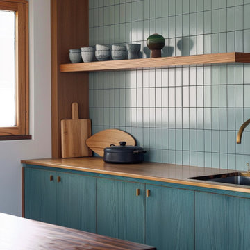
The kitchen is a bold statement in shades of blue, with blue-stained cabinets, blue backsplash tile, and even blue fixtures. This color immersion gives the kitchen a distinctive identity while still blending harmoniously with the rest of the space. In other areas of the ADU, we played with pops of other fun colors—each carefully chosen to complement the modern aesthetic of the home while adding a personalized touch.
As your Flagstaff custom home architect, we believe that color is an integral part of design, and Micro Mini is a testament to how thoughtful color application can elevate a space. The bold monochrome interiors are a fun, creative twist that make this ADU stand out while ensuring it remains functional and inviting.
Beyond the bold use of color, the interior of Micro Mini is designed with simplicity and function in mind. We utilized clean lines, minimal ornamentation, and carefully selected materials to keep the overall look sleek and modern. Light wood floors contrast with the bold color accents and add warmth to the otherwise minimalistic design.
Attention to detail is paramount in all of our projects, and as a Flagstaff custom home architect, we take pride in the craftsmanship and quality materials used throughout the Micro Mini. From the custom-built cabinetry to the thoughtfully designed storage solutions, every inch of the ADU was considered for both aesthetics and practicality.
A key problem we solved for the client was how to make the ADU feel spacious and functional despite its small footprint. As your trusted Flagstaff custom home architect, we used a range of design solutions to achieve this.
First, we incorporated high ceilings to enhance the sense of volume and space, creating an airy feel throughout the ADU. The placement of windows and the strategic use of sliding glass doors allow light to flood in, further opening up the interior and blurring the lines between inside and out. These elements not only make the ADU feel larger but also create a strong connection to the surrounding landscape.
Another key element was the use of built-in furniture and storage solutions to keep the space clutter-free. From hidden storage under the bed to custom cabinetry in the kitchen, every corner of the Micro Mini was designed with functionality in mind. This approach ensured that the ADU met the client’s needs for both comfort and practicality, while still adhering to the modern design aesthetic they desired.
Being based in Northern Arizona, we are acutely aware of how important it is for our designs to harmonize with the surrounding landscape. As a Flagstaff custom home architect, we carefully consider the site’s natural beauty and how our projects can integrate with it.
With Micro Mini, we focused on making sure that the ADU feels like a natural extension of the client’s existing property. The large windows and sliding glass doors bring in views of the surrounding landscape, while the outdoor deck extends the living space, creating a seamless indoor-outdoor experience. Whether you’re standing in the living room or on the deck, you are always connected to the beautiful Flagstaff setting.
In line with our commitment to responsible design, sustainability was a key consideration for Micro Mini. As your Flagstaff custom home architect, we prioritize energy-efficient building methods and materials. The ADU was designed to be energy-efficient, with high-performance windows and insulation that keep it cool in the summer and warm in the winter.
Additionally, the color choices and materials used in the interior were chosen not just for their aesthetic appeal, but also for their durability and sustainability. Low-VOC paints and finishes were used throughout the ADU to ensure good indoor air quality, while the energy-efficient lighting and appliances help minimize the ADU’s overall environmental impact.
At HEY! designs, we believe in a collaborative approach to architecture that puts the client’s needs and vision at the forefront. Whether designing a large custom home or a compact ADU like Micro Mini, we bring the same level of dedication, creativity, and attention to detail to every project.
Our work is rooted in modern design principles but always infused with personality and a sense of fun. Micro Mini exemplifies this approach—a bold, colorful, and efficient ADU that meets the client’s needs while also reflecting their unique style.
If you’re considering a custom home or ADU in Flagstaff, HEY! designs is here to help bring your vision to life. As a Flagstaff custom home architect, we specialize in creating spaces that are not only beautiful and functional but also responsive to the unique qualities of the site and the needs of the client.
Micro Mini is a testament to how small spaces can still be big on style and function. By incorporating bold color schemes, maximizing space efficiency, and maintaining a strong connection to the outdoors, this ADU achieves everything the client wanted—a modern, fun, and functional space.
As your Flagstaff custom home architect, we would be thrilled to help you create a unique and personalized space that meets your needs, no matter the size or scope of your project. Contact us today to learn more about how we can bring your vision to life.
 Drury Design
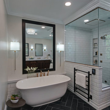
The couple each had their own wish lists. Hers was focused on aesthetics and was very clear: a contrasting combo of dark and crisp-white tile along with warm wood, soft bronze plumbing finishes, and an elegant soaking tub. His list was all about the shower. He wanted to match the experience of a luxury hotel shower.
Design objectives:
-Open up the space and omit heavy millwork details
-Furniture-style vanity in a warm wood finish
-Classic neutral palette
-Ample storage for toiletries and towels
-Luxurious modern technology, especially in the shower
THE REMODEL
“I’m not good at coming up with ideas,” the homeowner focused on the shower told us. “I like it when someone taps into my idea and gives me the options of what I’m looking for. That’s what Diana did for me and the shower while making my wife’s clear vision for everything else happen.”
Once the goals were clear, Diana identified the project’s challenges and solutions so the Drury Design installation team could make the remodel a reality.
Design challenges:
-Expand and open up the shower in a way that lets in more light
-Continue crown molding from the rest of the home – solve for how this could work around the shower
-More storage solutions in the same space
-Create an elegant, streamlined look that unifies all of the new elements
Design solutions:
-Adding a soffit above the shower area allows crown molding to flow continuously
-Large Robern medicine cabinets offer convenient eye-level storage while freeing up vanity space. The mirrors on both sides of the inner medicine cabinet make them bright and sleek without having to be lit.
-Open elegance – spacious tone and feel created by free-standing tub highlighted by a large wall mirror and oversized sconces
-White quartz with black and bronze veining ties all the materials together
-Warm, contrasting character of walnut adds a nice infusion of nature into the spa-like space
THE RENEWED SPACE
This elegant bathroom is all about symmetry and well-thought-out details. A classic, spa-like appeal emanates from simple beveled subway tile, herringbone patterns in the floor and shower niches, and the gorgeous walnut vanity. The result is a beautiful bathroom that checks all the boxes from the homeowners’ original wish lists.
207