
Search results for "Insisting" in Home Design Ideas
 MC Design LLC
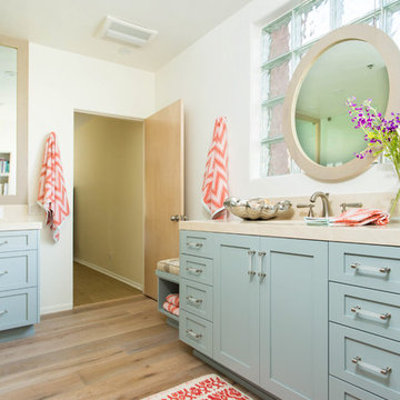
The Jack-and-Jill bathroom was updated in a laid-back beach style for a teenage brother and sister to share, yet feel worlds away from one another with their own separate vanities.


Find the right local pro for your project
 Beach Kitchens, LLC
Woodmode Cabinetry.
Door Style & Finish: Vanguard Plus, European Oak.
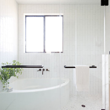
Danish master pebble tile floor and white floor corner shower photo in Los Angeles with flat-panel cabinets, light wood cabinets, white walls, an undermount sink, marble countertops and a hinged shower door
Danish master pebble tile floor and white floor corner shower photo in Los Angeles with flat-panel cabinets, light wood cabinets, white walls, an undermount sink, marble countertops and a hinged shower door
 Mark Brand Architecture
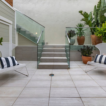
We were approached by a San Francisco firefighter to design a place for him and his girlfriend to live while also creating additional units he could sell to finance the project. He grew up in the house that was built on this site in approximately 1886. It had been remodeled repeatedly since it was first built so that there was only one window remaining that showed any sign of its Victorian heritage. The house had become so dilapidated over the years that it was a legitimate candidate for demolition. Furthermore, the house straddled two legal parcels, so there was an opportunity to build several new units in its place. At our client’s suggestion, we developed the left building as a duplex of which they could occupy the larger, upper unit and the right building as a large single-family residence. In addition to design, we handled permitting, including gathering support by reaching out to the surrounding neighbors and shepherding the project through the Planning Commission Discretionary Review process. The Planning Department insisted that we develop the two buildings so they had different characters and could not be mistaken for an apartment complex. The duplex design was inspired by Albert Frey’s Palm Springs modernism but clad in fibre cement panels and the house design was to be clad in wood. Because the site was steeply upsloping, the design required tall, thick retaining walls that we incorporated into the design creating sunken patios in the rear yards. All floors feature generous 10 foot ceilings and large windows with the upper, bedroom floors featuring 11 and 12 foot ceilings. Open plans are complemented by sleek, modern finishes throughout.
 Mark Brand Architecture
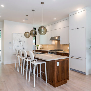
We were approached by a San Francisco firefighter to design a place for him and his girlfriend to live while also creating additional units he could sell to finance the project. He grew up in the house that was built on this site in approximately 1886. It had been remodeled repeatedly since it was first built so that there was only one window remaining that showed any sign of its Victorian heritage. The house had become so dilapidated over the years that it was a legitimate candidate for demolition. Furthermore, the house straddled two legal parcels, so there was an opportunity to build several new units in its place. At our client’s suggestion, we developed the left building as a duplex of which they could occupy the larger, upper unit and the right building as a large single-family residence. In addition to design, we handled permitting, including gathering support by reaching out to the surrounding neighbors and shepherding the project through the Planning Commission Discretionary Review process. The Planning Department insisted that we develop the two buildings so they had different characters and could not be mistaken for an apartment complex. The duplex design was inspired by Albert Frey’s Palm Springs modernism but clad in fibre cement panels and the house design was to be clad in wood. Because the site was steeply upsloping, the design required tall, thick retaining walls that we incorporated into the design creating sunken patios in the rear yards. All floors feature generous 10 foot ceilings and large windows with the upper, bedroom floors featuring 11 and 12 foot ceilings. Open plans are complemented by sleek, modern finishes throughout.
 Mark Brand Architecture
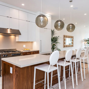
We were approached by a San Francisco firefighter to design a place for him and his girlfriend to live while also creating additional units he could sell to finance the project. He grew up in the house that was built on this site in approximately 1886. It had been remodeled repeatedly since it was first built so that there was only one window remaining that showed any sign of its Victorian heritage. The house had become so dilapidated over the years that it was a legitimate candidate for demolition. Furthermore, the house straddled two legal parcels, so there was an opportunity to build several new units in its place. At our client’s suggestion, we developed the left building as a duplex of which they could occupy the larger, upper unit and the right building as a large single-family residence. In addition to design, we handled permitting, including gathering support by reaching out to the surrounding neighbors and shepherding the project through the Planning Commission Discretionary Review process. The Planning Department insisted that we develop the two buildings so they had different characters and could not be mistaken for an apartment complex. The duplex design was inspired by Albert Frey’s Palm Springs modernism but clad in fibre cement panels and the house design was to be clad in wood. Because the sie was steeply upsloping, the design required tall, thick retaining walls that we incorporated into the design creating sunken patios in the rear yards. All floors feature generous 10 foot ceilings and large windows with the upper, bedroom floors featuring 11 and 12 foot ceilings. Open plans are complemented by sleek, modern finishes throughout.

 User
UserMadeline Tolle
Design by Tandem Designs
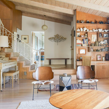
Inspiration for a 1950s living room remodel in Los Angeles with brown walls, a standard fireplace and a stone fireplace
Inspiration for a 1950s living room remodel in Los Angeles with brown walls, a standard fireplace and a stone fireplace
 Jorge Ulibarri Custom Homes
Harvey Smith
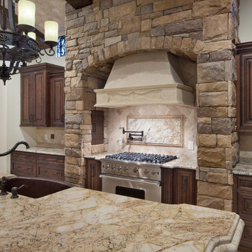
Example of a large tuscan travertine floor open concept kitchen design in Orlando with a farmhouse sink, raised-panel cabinets, dark wood cabinets, granite countertops, beige backsplash, stone tile backsplash, stainless steel appliances and an island
Example of a large tuscan travertine floor open concept kitchen design in Orlando with a farmhouse sink, raised-panel cabinets, dark wood cabinets, granite countertops, beige backsplash, stone tile backsplash, stainless steel appliances and an island
 Arizona Tile
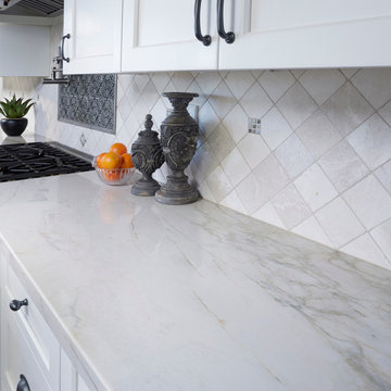
Bianco Venatino Counter, Crema Marfil Marble, Tumbled 4x4 backsplash, @ Arizona Tile, Bianco Venatino, natural stone marble from Italy, has a crisp vibrant white background with pencil-thin veining. It is installed on a countertop and wall. Arizona Tile carries Bianco Venatino in natural stone marble slabs and tiles.
 INSPIRED KITCHEN DESIGN
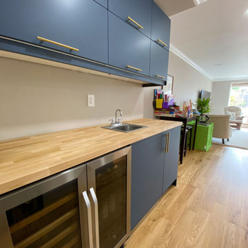
Perhaps the most impressive aspect of this IKEA wetbar is that they cut the butcher block countertops themselves.
She explains: “We started the journey thinking we will get a countertop from IKEA. However, we found out that IKEA doesn’t have a real butcher block and we had to have a specific type of sink for the real butcher block to work.”
Therefore, the couple had to adjust some of their layout plans, including having to reconsider the sink and still find butcher block for their countertops, which they eventually purchased from Home Depot.
To fully understand how to cut the countertops, Nastia’s husband watched YouTube videos and purchased some new tools to do the cutting as well.
“Since we bought an unfinished one, my husband also had to learn how to sand and oil our new butcher block. We used mineral oil on it, per instructions. Oiling it first every day, then once a week, then once a month. It was intimidating at first, to cut the hole for the sink. But, once we started and moved slowly it became less stressful,” she points out.
According to Nastia, the key to a successful IKEA project is simple: Don’t give up.
“The small hiccups we ran into were a bit too much, but it was on top of dealing with a flood. I really insisted on the blue cabinet doors and it was totally worth it, it made a huge difference,” she says.
She concludes: “Overall, I love the custom doors recommended by the designer (I would never have heard about Semihandmade otherwise). And I love the combination of Deep Blue with golden pulls. It creates a certain elegance in the entire space.”
 Clawson Architects, LLC
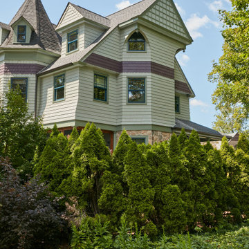
Built in 1884, this is the first house on Main Street one sees when exiting the train station. Its prominent corner location helps define the gateway to the town shopping district. Schematic design sessions for this period home’s renovation were already complete when the news was shared with the design team that one of the owners had been diagnosed with a progressive motor neuron disease.
The homeowners asked us to incorporate universal design features—including wheelchair access to every room on every level of the home—but were insistent that they did not want to create a home that looked or felt institutional.
Due to the home’s high visibility, it was important to the owners that the addition, including the elevator rise, be stylistically seamless and unobtrusive. This was achieved by applying existing character-defining features from the house such as octagonal massing, columned porches, steep roof slopes, and decorative shingle patterns. Complimentary architectural ornamentation was introduced to highlight the Queen Anne style and diminish the scale of the elevator rise. Interior and exterior access challenges were graciously overcome without sacrificing authentic period detailing.
The addition begins with exterior entry at ground level. A half stop down to the basement provides access to a “wheelchair wash/dog wash” station and game room. A half stop up brings the elevator to the first floor followed by traditional stops at the second floor and attic/owner’s suite.
Widened halls and doors make circulation via a wheelchair through the home achievable. Other universal design features and fixtures include the zero-entry shower in the owner’s and guest baths, French-door ovens, induction cooktop, touchless faucet, and refrigerator and freezer drawers. These make the home functional and comfortable for all members of the family.
In collaboration with a landscape architect, we also created a lush pocket of privacy on this very public lot. The new hardscaping creates access around the house, to the grill, fire pit, patio and driveway as well as to the town sidewalks making wheelchair inclusion both possible and effortless. Substantially complete Fall 2021.


 Landis Architects | Builders
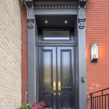
We completely gutted and renovated this historic DC
rowhouse and added a rear addition and a roof deck, accessed by stairs to an enclosed structure.
The client wanted to maintain a formal, traditional feel at the front of the house and add bolder and contemporary design at the back.
We removed the existing partial rear addition, landings, walkways, and retaining walls. The new 3-story rear addition is across the entire width of the house, extending out 24-feet.
Our original front entry design did not have a planter. However, the HPRB insisted on a planting area to maintain that original element of the house.
The charcoal gray color at the trim and the front door had to be approved by HPRB. HPRB also had to review and approve our new code-compliant steps and railings to the front door.
 Wendy Glaister Interiors
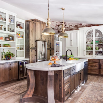
A pause in the craziness of life led our homeowner to consider a change in her kitchen. She wanted a place to display collections and heirlooms, provide ample storage for pantry items and gadgets, and give her a view to her breathtaking backyard. We expanded the footprint, pushing the house line back six feet, installed a picture window with a spectacular copper range and hood centered beneath, and planned her collections display areas for maximum effect.

 Mark Brand Architecture
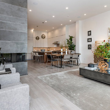
We were approached by a San Francisco firefighter to design a place for him and his girlfriend to live while also creating additional units he could sell to finance the project. He grew up in the house that was built on this site in approximately 1886. It had been remodeled repeatedly since it was first built so that there was only one window remaining that showed any sign of its Victorian heritage. The house had become so dilapidated over the years that it was a legitimate candidate for demolition. Furthermore, the house straddled two legal parcels, so there was an opportunity to build several new units in its place. At our client’s suggestion, we developed the left building as a duplex of which they could occupy the larger, upper unit and the right building as a large single-family residence. In addition to design, we handled permitting, including gathering support by reaching out to the surrounding neighbors and shepherding the project through the Planning Commission Discretionary Review process. The Planning Department insisted that we develop the two buildings so they had different characters and could not be mistaken for an apartment complex. The duplex design was inspired by Albert Frey’s Palm Springs modernism but clad in fibre cement panels and the house design was to be clad in wood. Because the site was steeply upsloping, the design required tall, thick retaining walls that we incorporated into the design creating sunken patios in the rear yards. All floors feature generous 10 foot ceilings and large windows with the upper, bedroom floors featuring 11 and 12 foot ceilings. Open plans are complemented by sleek, modern finishes throughout.
 Sub-Zero, Wolf, and Cove Showroom Columbia
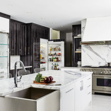
"In a contemporary kitchen, fully integrated dishwashers, refrigeration, and wine storage is a must. I insisted on flush inset installation for all wall ovens, Sub-Zero was the natural choice for refrigeration."
- Justin Cunningham
6