
Search results for "Intentionally non functional" in Home Design Ideas
 Kaplan Thompson Architects
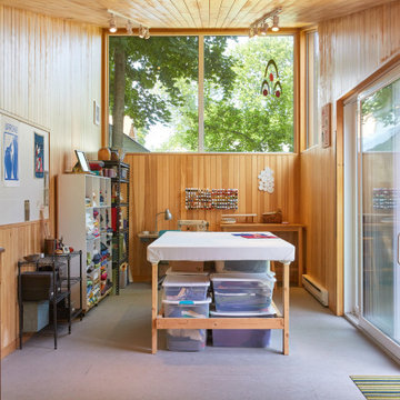
Designed to maximize function with minimal impact, the studio serves up adaptable square footage in a wrapping almost healthy enough to eat.
The open interior space organically transitions from personal to communal with the guidance of an angled roof plane. Beneath the tallest elevation, a sunny workspace awaits creative endeavors. The high ceiling provides room for big ideas in a small space, while a cluster of windows offers a glimpse of the structure’s soaring eave. Solid walls hugging the workspace add both privacy and anchors for wall-mounted storage. Towards the studio’s southern end, the ceiling plane slopes downward into a more intimate gathering space with playfully angled lines.
The building is as sustainable as it is versatile. Its all-wood construction includes interior paneling sourced locally from the Wood Mill of Maine. Lengths of eastern white pine span up to 16 feet to reach from floor to ceiling, creating visual warmth from a material that doubles as a natural insulator. Non-toxic wood fiber insulation, made from sawdust and wax, partners with triple-glazed windows to further insulate against extreme weather. During the winter, the interior temperature is able to reach 70 degrees without any heat on.
As it neared completion, the studio became a family project with Jesse, Betsy, and their kids working together to add the finishing touches. “Our whole life is a bit of an architectural experiment”, says Jesse, “but this has become an incredibly useful space.”
 Sheila Rich Interiors, LLC
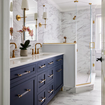
The primary bathroom continues the theme of refined comfort with a navy blue vanity accented by Lucite and brass hardware, adding a bold yet elegant contrast. Soft gold fixtures, hardware, and sconces complement the large porcelain wall tiles, which extend into the spacious angled shower for a seamless, luxurious effect. Matching floor tiles unify the space, while double sinks and mirrored medicine cabinets offer convenience and functionality without sacrificing style. The original bathtub was replaced by a shower with a low curb, a seat, and blocking for future grab bars. The matte tile on the shower floor is non-slip.
 White Sands Coastal Development
In Southern California there are pockets of darling cottages built in the early 20th century that we like to call jewelry boxes. They are quaint, full of charm and usually a bit cramped. Our clients have a growing family and needed a modern, functional home. They opted for a renovation that directly addressed their concerns.
When we first saw this 2,170 square-foot 3-bedroom beach cottage, the front door opened directly into a staircase and a dead-end hallway. The kitchen was cramped, the living room was claustrophobic and everything felt dark and dated.
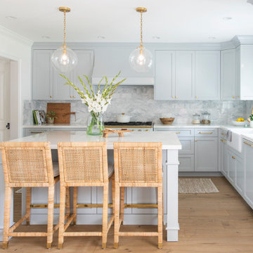
The big picture items included pitching the living room ceiling to create space and taking down a kitchen wall. We added a French oven and luxury range that the wife had always dreamed about, a custom vent hood, and custom-paneled appliances.
We added a downstairs half-bath for guests (entirely designed around its whimsical wallpaper) and converted one of the existing bathrooms into a Jack-and-Jill, connecting the kids’ bedrooms, with double sinks and a closed-off toilet and shower for privacy.
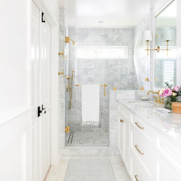
In the bathrooms, we added white marble floors and wainscoting. We created storage throughout the home with custom-cabinets, new closets and built-ins, such as bookcases, desks and shelving.
White Sands Design/Build furnished the entire cottage mostly with commissioned pieces, including a custom dining table and upholstered chairs. We updated light fixtures and added brass hardware throughout, to create a vintage, bo-ho vibe.
The best thing about this cottage is the charming backyard accessory dwelling unit (ADU), designed in the same style as the larger structure. In order to keep the ADU it was necessary to renovate less than 50% of the main home, which took some serious strategy, otherwise the non-conforming ADU would need to be torn out. We renovated the bathroom with white walls and pine flooring, transforming it into a get-away that will grow with the girls.
Find the right local pro for your project
 White Sands Coastal Development
In Southern California there are pockets of darling cottages built in the early 20th century that we like to call jewelry boxes. They are quaint, full of charm and usually a bit cramped. Our clients have a growing family and needed a modern, functional home. They opted for a renovation that directly addressed their concerns.
When we first saw this 2,170 square-foot 3-bedroom beach cottage, the front door opened directly into a staircase and a dead-end hallway. The kitchen was cramped, the living room was claustrophobic and everything felt dark and dated.
The big picture items included pitching the living room ceiling to create space and taking down a kitchen wall. We added a French oven and luxury range that the wife had always dreamed about, a custom vent hood, and custom-paneled appliances.
We added a downstairs half-bath for guests (entirely designed around its whimsical wallpaper) and converted one of the existing bathrooms into a Jack-and-Jill, connecting the kids’ bedrooms, with double sinks and a closed-off toilet and shower for privacy.
In the bathrooms, we added white marble floors and wainscoting. We created storage throughout the home with custom-cabinets, new closets and built-ins, such as bookcases, desks and shelving.
White Sands Design/Build furnished the entire cottage mostly with commissioned pieces, including a custom dining table and upholstered chairs. We updated light fixtures and added brass hardware throughout, to create a vintage, bo-ho vibe.
The best thing about this cottage is the charming backyard accessory dwelling unit (ADU), designed in the same style as the larger structure. In order to keep the ADU it was necessary to renovate less than 50% of the main home, which took some serious strategy, otherwise the non-conforming ADU would need to be torn out. We renovated the bathroom with white walls and pine flooring, transforming it into a get-away that will grow with the girls.
 USI Design & Remodeling
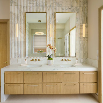
This master bathroom renovation in Frisco was completed for a repeat USI Design & Remodeling client as part of a larger first-floor transformation of the home. The original bathroom reflected a very typical North Texas layout of its era — dark stained cabinetry, granite countertops, compartmentalized vanities, a built-in tub adjoining a framed shower, and separated spaces that no longer aligned with how the homeowners wanted to live. As their aesthetic evolved toward a more transitional and contemporary direction, the goal became less about replacing finishes and more about redefining the experience of the room itself. The project needed to feel calmer, more architectural, and far more intentional in how the space functioned visually and emotionally.
One of the most important changes was removing the original shower curb and pony wall in favor of a fully open curbless shower with ultra-clear ½-inch heavy glass. Achieving that look required recessing the slab, re-floating the shower floor toward a linear drain, and engineering the space so the room would read as visually uninterrupted from end to end. Throughout the project, many of the design decisions were rooted in restraint rather than excess. The oversized 24x48 Porcelanosa flooring carries very little shade variation, creating a quieter visual field, while the cabinetry was executed in rift-sawn white oak specifically because it produces a far more controlled and consistent finish outcome than more common cuts of wood. In luxury projects, consistency itself becomes part of the refinement.
The floating vanity was designed more like custom furniture than traditional cabinetry, utilizing waterfall mitered edges and fully reworked plumbing locations so both homeowners could share in having generous functional countertop space. The original makeup station was repurposed into integrated storage with powered drawers and concealed organization for everyday items such as blow dryers and flat irons. Along the vanity wall, wall-mounted plumbing fixtures were paired with ribbed natural marble surfaces — a detail that required intentional planning long before construction began. Rather than allowing the ribbed material to terminate awkwardly behind the fixtures, the backsplash and stone transitions were specifically designed to resolve those conditions cleanly. Those are the types of details that distinguish highly coordinated design-build work from projects that simply assemble materials together.
While the room contains a significant amount of luxury detailing — from the freestanding tub and geoprism marble focal wall to the custom rift-sawn white oak closet doors and elongated mirrors that leverage the 11-foot ceiling heights — the project was always guided by quiet luxury rather than visual competition. Even the water closet enclosure was handled with restraint through the use of a satin-etched glass door rather than another heavy solid opening. The intent throughout was to create a bathroom that feels restorative and serene rather than overdesigned. In our view, the best luxury spaces are the ones that feel composed long after the initial impression wears off.
 White Sands Coastal Development
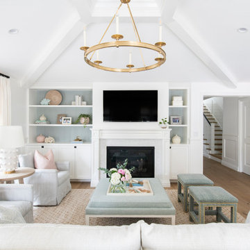
In Southern California there are pockets of darling cottages built in the early 20th century that we like to call jewelry boxes. They are quaint, full of charm and usually a bit cramped. Our clients have a growing family and needed a modern, functional home. They opted for a renovation that directly addressed their concerns.
When we first saw this 2,170 square-foot 3-bedroom beach cottage, the front door opened directly into a staircase and a dead-end hallway. The kitchen was cramped, the living room was claustrophobic and everything felt dark and dated.
The big picture items included pitching the living room ceiling to create space and taking down a kitchen wall. We added a French oven and luxury range that the wife had always dreamed about, a custom vent hood, and custom-paneled appliances.
We added a downstairs half-bath for guests (entirely designed around its whimsical wallpaper) and converted one of the existing bathrooms into a Jack-and-Jill, connecting the kids’ bedrooms, with double sinks and a closed-off toilet and shower for privacy.
In the bathrooms, we added white marble floors and wainscoting. We created storage throughout the home with custom-cabinets, new closets and built-ins, such as bookcases, desks and shelving.
White Sands Design/Build furnished the entire cottage mostly with commissioned pieces, including a custom dining table and upholstered chairs. We updated light fixtures and added brass hardware throughout, to create a vintage, bo-ho vibe.
The best thing about this cottage is the charming backyard accessory dwelling unit (ADU), designed in the same style as the larger structure. In order to keep the ADU it was necessary to renovate less than 50% of the main home, which took some serious strategy, otherwise the non-conforming ADU would need to be torn out. We renovated the bathroom with white walls and pine flooring, transforming it into a get-away that will grow with the girls.
 emma delon
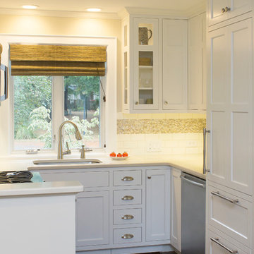
Maximizing the functionality of this space, and coordinating the new kitchen with the beautiful remodel completed previously by the client were the two most important aspects of this project. The existing spaces are elegantly decorated with an open plan, dark hardwood floors, and natural stone accents. The new, lighter, more open kitchen flows beautifully into the client’s existing dining room space. Satin nickel hardware blends with the stainless steel appliances and matches the satin nickel details throughout the home. The fully integrated refrigerator next to the narrow pull-out pantry cabinet, take up less visual weight than a traditional stainless steel appliance and the two combine to provide fantastic storage. The glass cabinet doors and decorative lighting beautifully highlight the client’s glassware and dishes. Finished with white subway tile, Dreamy Marfil quartz countertops, and a warm natural wood blind; the space warm, inviting, elegant, and extremely functional.
copyright 2013 marilyn peryer photography


 Streeter Custom Builder
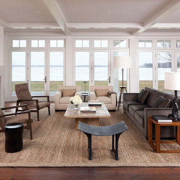
Located on a picturesque setting on Lake Minnetonka, this lakefront home masterfully balances contemporary and traditional sentiments, striving not to design to either extreme.
With team collaboration intentions to combine both form and function — and an eye on simple, beautiful and comfortable solutions, this relaxed elegant design approach honors lakeside living that permeates the residence. This Streeter home also blends in beautifully with surrounding classic lake homes that are reminiscent of timeless architecture and craftsmanship found in Europe and Nantucket.
BUILDER: Streeter & Associates
ARCHITECT: Kurt Baum & Associates
INTERIOR: Alecia Stevens Interior Design
Photography: Steve Henke Photography
 Nomad Soul Interiors
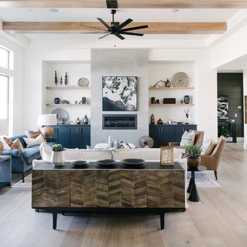
This room was designed with the intent to be functional for family living space, but also carry a clean style of global influence to be the center of the home.
Photo: Jessica White Photography
 Streeter Custom Builder
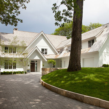
Located on a picturesque setting on Lake Minnetonka, this lakefront home masterfully balances contemporary and traditional sentiments, striving not to design to either extreme.
With team collaboration intentions to combine both form and function — and an eye on simple, beautiful and comfortable solutions, this relaxed elegant design approach honors lakeside living that permeates the residence. This Streeter home also blends in beautifully with surrounding classic lake homes that are reminiscent of timeless architecture and craftsmanship found in Europe and Nantucket.
BUILDER: Streeter & Associates
ARCHITECT: Kurt Baum & Associates
INTERIOR: Alecia Stevens Interior Design
Photography: Steve Henke Photography
 TKS Design Group
Free ebook, Creating the Ideal Kitchen. DOWNLOAD NOW
Having a space for their teenage kids to hang out after school, study and interact with Mom & Dad was at the top of the list for this remodel. The 1928 home, sits in a lovely Glen Ellyn neighborhood, near downtown and near all the action of the local high school and lake. It’s was a great house with great bones but the kitchen was in need of some TLC. The remodel project had been a long time coming, and since both the homeowners work from home, they had been nervous about disrupting their bustling daily schedules to get the project in motion.
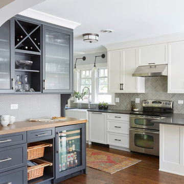
Once we had a plan in place, we dug in and got to work. The first step was to remove a non-load bearing wall between the kitchen and dining room. We then reworked the space a bit, eliminating a redundant passage way to the hall, and reworking a closet to allow for a large galley style kitchen and small bar area open to the dining room. The new kitchen has a small peninsula for the family to have casual meals and for the kids to hang out after school. A window was eliminated to give more space for cabinetry and storage, and another window was made larger to allow for a grander view into the backyard.
We decided upon a layered approach to this space to provide character appropriate to the older home. White painted cabinetry provides a backdrop for interesting touches such as gray herringbone tile, a reeded farmhouse sink and bronze hardware and lighting. The bar has its own unique look featuring gray cabinetry with a patterned cement tile backsplash and walnut top. A bar fridge, glass cabinets and baskets for tucking away homework give this little multi-functional area loads of character. A miniature mudroom area was also added to the dining room so that the new space can be kept neat and tidy.
The stylish result looks both appropriate to the 1928 home and provides loads of functionality for this active family that can now take advantage of every square inch their home.
Designed by: Susan Klimala, CKD, CBD
Photography by: Michael Alan Kaskel
For more information on kitchen and bath design ideas go to: www.kitchenstudio-ge.com
 TKS Design Group
Download our free ebook, Creating the Ideal Kitchen. DOWNLOAD NOW
The homeowners built their traditional Colonial style home 17 years’ ago. It was in great shape but needed some updating. Over the years, their taste had drifted into a more contemporary realm, and they wanted our help to bridge the gap between traditional and modern.
We decided the layout of the kitchen worked well in the space and the cabinets were in good shape, so we opted to do a refresh with the kitchen. The original kitchen had blond maple cabinets and granite countertops. This was also a great opportunity to make some updates to the functionality that they were hoping to accomplish.
After re-finishing all the first floor wood floors with a gray stain, which helped to remove some of the red tones from the red oak, we painted the cabinetry Benjamin Moore “Repose Gray” a very soft light gray. The new countertops are hardworking quartz, and the waterfall countertop to the left of the sink gives a bit of the contemporary flavor.
We reworked the refrigerator wall to create more pantry storage and eliminated the double oven in favor of a single oven and a steam oven. The existing cooktop was replaced with a new range paired with a Venetian plaster hood above. The glossy finish from the hood is echoed in the pendant lights. A touch of gold in the lighting and hardware adds some contrast to the gray and white. A theme we repeated down to the smallest detail illustrated by the Jason Wu faucet by Brizo with its similar touches of white and gold (the arrival of which we eagerly awaited for months due to ripples in the supply chain – but worth it!).
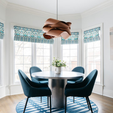
The original breakfast room was pleasant enough with its windows looking into the backyard. Now with its colorful window treatments, new blue chairs and sculptural light fixture, this space flows seamlessly into the kitchen and gives more of a punch to the space.
The original butler’s pantry was functional but was also starting to show its age. The new space was inspired by a wallpaper selection that our client had set aside as a possibility for a future project. It worked perfectly with our pallet and gave a fun eclectic vibe to this functional space. We eliminated some upper cabinets in favor of open shelving and painted the cabinetry in a high gloss finish, added a beautiful quartzite countertop and some statement lighting. The new room is anything but cookie cutter.
Next the mudroom. You can see a peek of the mudroom across the way from the butler’s pantry which got a facelift with new paint, tile floor, lighting and hardware. Simple updates but a dramatic change! The first floor powder room got the glam treatment with its own update of wainscoting, wallpaper, console sink, fixtures and artwork. A great little introduction to what’s to come in the rest of the home.
The whole first floor now flows together in a cohesive pallet of green and blue, reflects the homeowner’s desire for a more modern aesthetic, and feels like a thoughtful and intentional evolution. Our clients were wonderful to work with! Their style meshed perfectly with our brand aesthetic which created the opportunity for wonderful things to happen. We know they will enjoy their remodel for many years to come!
Photography by Margaret Rajic Photography
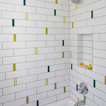
 Jennifer Ott Design
Whit Preston, Photographer
Example of a trendy multicolored tile bathroom design in Austin
Example of a trendy multicolored tile bathroom design in Austin

Sponsored
Columbus, OH

Structural Remodeling
Franklin County's Heavy Timber Specialists | Best of Houzz 2020!
 Pink Door Designs
Bryan Baltzar
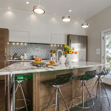
An outdated kitchen get's an over haul with warm finises cool marble, glass accents, stainless steel appliance and a rethink in the overall layout to enhance functionality. All to modernize the design to fit the Client's Santa Fe/Modern style they wanted to achieve.
 Nar Design Group
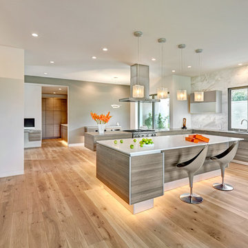
This gorgeous European Poggenpohl Kitchen is the culinary center of this new modern home for a young urban family. The homeowners had an extensive list of objectives for their new kitchen. It needed to accommodate formal and non-formal entertaining of guests and family, intentional storage for a variety of items with specific requirements, and use durable and easy to maintain products while achieving a sleek contemporary look that would be a stage and backdrop for their glorious artwork collection.
Solution: A large central island acts as a gathering place within the great room space. The tall cabinetry items such as the ovens and refrigeration are grouped on the wall to keep the rest of the kitchen very light and open. Luxury Poggenpohl cabinetry and Caesarstone countertops were selected for their supreme durability and easy maintenance.
Warm European oak flooring is contrasted by the gray textured Poggenpohl cabinetry flattered by full width linear Poggenphol hardware. The tall aluminum toe kick on the island is lit from underneath to give it a light and airy luxurious feeling. To further accent the illuminated toe, the surface to the left of the range top is fully suspended 18” above the finished floor.
A large amount of steel and engineering work was needed to achieve the floating of the large Poggenpohl cabinet at the end of the peninsula. The conversation is always, “how did they do that?”
Photo Credit: Fred Donham of PhotographerLink
 Architect Heather Johnston
CASA 1O
Contemporary on a Mid-century Scaffold.
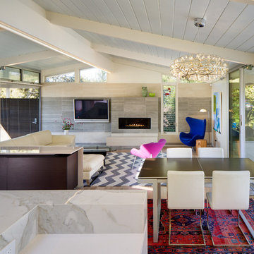
Largely unmodified since its design by Russell Forester and construction in 1957, the structure housed the original family until 2013. An intimate 1,910 square foot space, the house acquired a separate 600 square foot cottage in the 70’s designed by another architect. New owners purchased the house with the idea of keeping the original architect’s intent intact – the simple accommodation of everyday life with a focus on outdoor living only possible in Southern California. At the same time the house needed insulation, new electrical, plumbing, siding – everything but new studs and foundations.
A single roof beam travels south from the north fireplace wall all the way to the bedrooms in the back. Functions occur to either side, with private access to exterior courtyards. How do we accentuate the uncomplicated while enhancing the qualities of the chosen materials? Contemporary applied to a mid-century scaffold.
We focused on reduction, a few things performing many tasks. Each component, material or color performs more than one duty.
Lighting is paramount, enhancing the design’s procession from front to back, north to south, public to private. Strip LED’s reinforce the beam’s linear presence and spot LED’s make punctuation points of the roof purlins. Hidden up and down-lights in the cabinets and elsewhere provide the rooms with a quiet glow.
Exterior grass plantings give the only vertical dimension to the design, waving as the breeze moves them. All else is horizontal: caramelized bamboo siding, porcelain tile, roof line and ocean horizon.
Architect: Heather Johnston Architect
Landscaping: HJA
Photography: Brady Architectural Photography
 Cape Associates, Inc.
The overarching design intent for this 1,455-square-foot West Vine Street condominium was to make the spaces contemporary and functional. The renovation began with an unexpected structural deficiency in the form of a post located in the middle of the living room that was causing a three-inch dip in the floor. It was removed and replaced with steel columns running down through the walls and into a footing pad with a three-foot depth.
The main living spaces underwent significant changes; the kitchen was reconfigured to open up a formerly cramped space, and the removal of a wall made room for a cascading island with Cesarstone countertops—a crowning feature. Additionally, an electrical panel was relocated to be able to wrap the refrigerator with a wood veneer frame. Notable materials include eight-inch-wide ‘Esplanade’ French oak plank floors chosen to complement the reclaimed wood-wrapped ceiling beams, which feature a combination of LED downlighting and uplighting. A sleek gas fireplace with horizontal slate surround and paneled wall backing replaced an old wood-burning stove—furthering the design program.
Pacheco-Robb Architects dismantled an existing spiral stair and replaced it with a cable-rail system—a nautical nod—which is noteworthy for the way it meets code; by running a contiguous oak banister for the entire length of the stair, they were able to avoid having to add a second railing, which would shrink the already narrow stairwell.
Upstairs, a tight bedroom with gabled ceilings was addressed by adding a solar-operated skylight with built-in shade, plus minimalistic furnishings. Structural changes in the master bedroom included eliminating a closest to widen the room, and reconfiguring a bathroom to fit a small walk-in closet in lieu of a long, thin hallway.
The formerly unfinished rooftop deck is now accessed via a six-foot door that opens more than 90 degrees. Azek decking was laid over the rubber roof, and two-inch stanchions were located around the rail’s outer edge. By opening the floor plan and streamlining the aesthetic, the place now breathes.

Sponsored
Columbus, OH
Structural Remodeling
Franklin County's Heavy Timber Specialists | Best of Houzz 2020!
 In Your Space Interior Design
Custom Hoods for One-of-a-Kind Kitchens
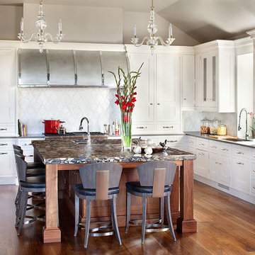
A one-of-a-kind custom hood is the focal-point of any designer kitchen. There is no better way to tie together all of the wood cabinets and granite tops than with a unique custom designed metal hood. Whether the material is copper, zinc, stainless or carbon steel, Runa Novak from In Your Space, Interior Design can provide the perfect solution for all of your custom designed kitchen needs
For this project, Runa chose to design a custom hood to compliment the large wood cabinets and walnut island in a Colorado mountain home. The end result, a zinc barrel hood with straps and rivets, was featured in Colorado Homes and Lifestyle Magazine for their special kitchen issue in Sept/Oct 2013.
Runa Novak can build a custom hood in any style of your choosing as part of her interior design services, including barrel, bell, modern and French country. You can also choose from different custom hood materials: copper and zinc, hammered, non-hammered, strapped, and rivets, etc.
Call Runa Novak for your custom kitchen hood needs.
 JRP Design & Remodel
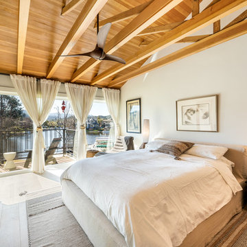
Our client had been living in her beautiful lakeside retreat for about 3 years. All around were stunning views of the lake and mountains, but the view from inside was minimal. It felt dark and closed off from the gorgeous waterfront mere feet away. She desired a bigger kitchen, natural light, and a contemporary look. Referred to JRP by a subcontractor our client walked into the showroom one day, took one look at the modern kitchen in our design center, and was inspired!
After talking about the frustrations of dark spaces and limitations when entertaining groups of friends, the homeowner and the JRP design team emerged with a new vision. Two walls between the living room and kitchen would be eliminated and structural revisions were needed for a common wall shared a wall with a neighbor. With the wall removals and the addition of multiple slider doors, the main level now has an open layout.
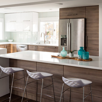
Everything in the home went from dark to luminous as sunlight could now bounce off white walls to illuminate both spaces. Our aim was to create a beautiful modern kitchen which fused the necessities of a functional space with the elegant form of the contemporary aesthetic. The kitchen playfully mixes frameless white upper with horizontal grain oak lower cabinets and a fun diagonal white tile backsplash. Gorgeous grey Cambria quartz with white veining meets them both in the middle. The large island with integrated barstool area makes it functional and a great entertaining space.
The master bedroom received a mini facelift as well. White never fails to give your bedroom a timeless look. The beautiful, bright marble shower shows what's possible when mixing tile shape, size, and color. The marble mosaic tiles in the shower pan are especially bold paired with black matte plumbing fixtures and gives the shower a striking visual.
Layers, light, consistent intention, and fun! - paired with beautiful, unique designs and a personal touch created this beautiful home that does not go unnoticed.
PROJECT DETAILS:
• Style: Contemporary
• Colors: Neutrals
• Countertops: Cambria Quartz, Luxury Series, Queen Anne
• Kitchen Cabinets: Slab, Overlay Frameless
Uppers: Blanco
Base: Horizontal Grain Oak
• Hardware/Plumbing Fixture Finish: Kitchen – Stainless Steel
• Lighting Fixtures:
• Flooring:
Hardwood: Siberian Oak with Fossil Stone finish
• Tile/Backsplash:
Kitchen Backsplash: White/Clear Glass
Master Bath Floor: Ann Sacks Benton Mosaics Marble
Master Bath Surround: Ann Sacks White Thassos Marble
Photographer: Andrew – Open House VC
 Boca do Lobo
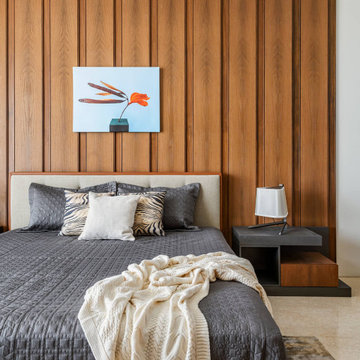
This 28,000 private residence is located in Bicholi, an upcoming exurb of Indore (akin to what the Hamptons are to New York). The North and East Facades of the house were more open to welcome light with large floor to ceiling openings, with deep terraces to cut any glare. The South and West facades are more closed out housing services like the lift & staircase block and store and non-habitable spaces like the Kitchen, Pantry and Bathrooms. Any rooms facing south and west had large overhanging decks and cavity walls. Terracing towards the north and the east to create a comfortable environment for the infinity pool and semi-formal seating areas around it. The result is a Contemporary house with strong Indian roots, that it is Instagrammable yet livable, with Functionality and Aesthetics maintaining a fine balancing act. Photo Credits: Suleiman Merchant @toophotographedu
3