
Search results for "Intentionally non functional" in Home Design Ideas
 Ernesto Santalla PLLC
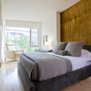
Ernesto Santalla was approached to create a new home for two Washington, DC lawyers wishing to downsize their living space. The move took them from a row house in Washington's historic Dupont Circle neighborhood to a two bedroom apartment in the vibrant, up-and-coming U Street Corridor. Our task was to transform a rather plain and generic apartment into a custom, sophisticated space in a few strategic moves. Ceiling details serve to define functional areas of the living space without creating divisions. Changing some doors from wood to frosted glass, creates a sense of continuity between spaces, and allows light to travel between spaces. Lighting was inserted strategically, to enhance certain functions of the home. The kitchen was partially enclosed with a plane of frosted glass to create visual separation from the main living space while still allowing natural light to filter in from the expansive wall of floor-to-ceiling windows. Color was used to reinforce the architectural intent and simplify spaces, such as the entry, which as many doors and frames. Furniture was selected to blend with the client's collection of heirloom pieces, creating a sophisticated juxtaposition. Statement pieces like a ceiling light from Viabizzuno create impact while maintaining the visual simplicity of our minimal approach.
Photography by Geoffrey Hodgdon
 DANIELLA VILLAMIL INTERIORS
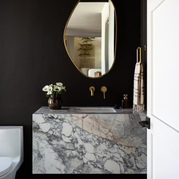
Powder room - modern black floor powder room idea in Las Vegas with black walls, an undermount sink, multicolored countertops and a floating vanity
 Plain & Posh
This stunning home is a combination of the best of traditional styling with clean and modern design, creating a look that will be as fresh tomorrow as it is today. Traditional white painted cabinetry in the kitchen, combined with the slab backsplash, a simpler door style and crown moldings with straight lines add a sleek, non-fussy style. An architectural hood with polished brass accents and stainless steel appliances dress up this painted kitchen for upscale, contemporary appeal. The kitchen islands offers a notable color contrast with their rich, dark, gray finish.
The stunning bar area is the entertaining hub of the home. The second bar allows the homeowners an area for their guests to hang out and keeps them out of the main work zone.
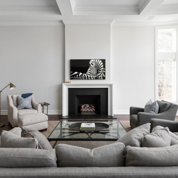
The family room used to be shut off from the kitchen. Opening up the wall between the two rooms allows for the function of modern living. The room was full of built ins that were removed to give the clean esthetic the homeowners wanted. It was a joy to redesign the fireplace to give it the contemporary feel they longed for.
Their used to be a large angled wall in the kitchen (the wall the double oven and refrigerator are on) by straightening that out, the homeowners gained better function in the kitchen as well as allowing for the first floor laundry to now double as a much needed mudroom room as well.
Find the right local pro for your project
 Thistle & Co.
Chad Davies Photography
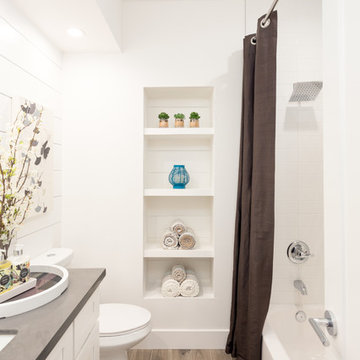
Alcove bathtub - small transitional white tile and ceramic tile ceramic tile alcove bathtub idea in Phoenix with shaker cabinets, white cabinets, white walls, an undermount sink and quartz countertops
Alcove bathtub - small transitional white tile and ceramic tile ceramic tile alcove bathtub idea in Phoenix with shaker cabinets, white cabinets, white walls, an undermount sink and quartz countertops
 USI Design & Remodeling
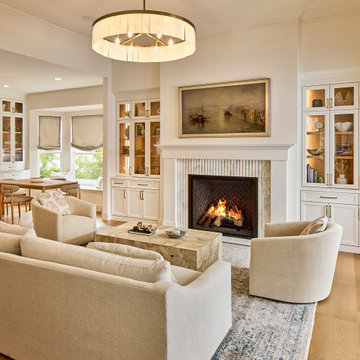
Remodel-Kitchen & Family Room: Quiet Luxury with a Natural Palette
This remodel reimagines the heart of the home by seamlessly integrating the kitchen and family room into a refined yet inviting open-concept space, grounded in a “quiet luxury” aesthetic and a natural palette.
Kitchen Transformation:
The kitchen layout is completely reworked for improved flow and functionality. Major appliances have been reassigned for efficiency:
• The refrigerator is built in and anchors the focal wall providing improved access to both prep and serving areas.
• The range has been centered on the back wall, framed by two- toned cabinetry and a low-profile custom hood accented with brass that blends seamlessly into the wall for an understated look.
• The dishwasher and sink have been relocated to the new central island, allowing for uninterrupted views across the room and better interaction with guests or family.
At the heart of the space is a large central island, topped with Taj Mahal quartzite in soft beige and taupe tones. The island serves as a multi-functional hub.
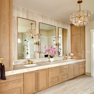
The cabinetry is custom-built in white oak, finished in a matte clear coat that highlights the wood’s natural grain. Hardware is kept minimal, in brushed brass for a touch of subdued elegance.
Natural Palette & Materials:
The entire space embraces a natural color scheme—warm whites, layered pastel beiges and natural wood tones—accented with natural stone. Leathered Taj Mahal backsplash with subtle texture adds quiet visual interest without overpowering the calm atmosphere.
Family Room Integration:
The kitchen flows effortlessly into the family room, unified by wide-plank oak flooring and soft lighting. A fluted marble-clad fireplace anchors the space, surrounded by, built-in shelving with the same oak finish inside as the kitchen cabinetry. Furnishings follow the same philosophy: clean lines, neutral fabrics, and a mix of soft textures. Think boucle armchairs, a deep linen sectional, and a reclaimed wood coffee table.
Lighting & Finishing Touches:
Soft, layered lighting—including recessed lights, sculptural clear pendant lights above the island, and concealed LED strips—enhances the serene mood.
 USI Design & Remodeling
Located in Argyle, Texas, this comprehensive whole-home renovation was conceived by USI Design & Remodeling who reimagined the home's interior architecture, transforming a collection of compartmentalized rooms into a cohesive environment designed for modern living, entertaining, and daily comfort. The project encompassed the kitchen, family room, dining room, lounge, office, primary bathroom, and supporting circulation spaces, creating a unified experience that feels both expansive and intentional. Throughout the home, refined materials, custom millwork, and carefully curated finishes establish a sense of understated luxury while maintaining warmth and livability.
At the heart of the renovation is a completely reconfigured kitchen and gathering space designed around functionality, hospitality, and visual connection. Architectural barriers were removed to improve sightlines and circulation, allowing the kitchen, dining, and family spaces to function as a single integrated living environment. A dramatic five-foot workstation sink anchors the kitchen, while custom cabinetry and furniture-inspired details elevate the space beyond conventional residential design. Adjacent to the kitchen, the former pantry, laundry, and service corridor were reimagined as a hybrid scullery and utility suite, creating a highly functional support space that discreetly accommodates food preparation, storage, organization, and household operations without compromising the elegance of the primary living areas.
The renovation extends beyond aesthetics to create a home tailored to the family's evolving needs. The primary bathroom was transformed into a spa-inspired retreat, while the lounge, office, and dining spaces were redesigned to support both everyday living and entertaining. Consistent architectural detailing, layered textures, and thoughtful proportions establish continuity throughout the residence, allowing each room to feel connected to the larger design narrative. The result is a sophisticated yet approachable home that balances practical performance with timeless design, delivering a renewed living experience that is both highly functional and distinctly luxurious.
 TKS Design Group
Free ebook, Creating the Ideal Kitchen. DOWNLOAD NOW
Having a space for their teenage kids to hang out after school, study and interact with Mom & Dad was at the top of the list for this remodel. The 1928 home, sits in a lovely Glen Ellyn neighborhood, near downtown and near all the action of the local high school and lake. It’s was a great house with great bones but the kitchen was in need of some TLC. The remodel project had been a long time coming, and since both the homeowners work from home, they had been nervous about disrupting their bustling daily schedules to get the project in motion.
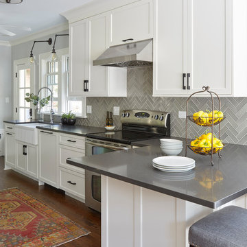
Once we had a plan in place, we dug in and got to work. The first step was to remove a non-load bearing wall between the kitchen and dining room. We then reworked the space a bit, eliminating a redundant passage way to the hall, and reworking a closet to allow for a large galley style kitchen and small bar area open to the dining room. The new kitchen has a small peninsula for the family to have casual meals and for the kids to hang out after school. A window was eliminated to give more space for cabinetry and storage, and another window was made larger to allow for a grander view into the backyard.
We decided upon a layered approach to this space to provide character appropriate to the older home. White painted cabinetry provides a backdrop for interesting touches such as gray herringbone tile, a reeded farmhouse sink and bronze hardware and lighting. The bar has its own unique look featuring gray cabinetry with a patterned cement tile backsplash and walnut top. A bar fridge, glass cabinets and baskets for tucking away homework give this little multi-functional area loads of character. A miniature mudroom area was also added to the dining room so that the new space can be kept neat and tidy.
The stylish result looks both appropriate to the 1928 home and provides loads of functionality for this active family that can now take advantage of every square inch their home.
Designed by: Susan Klimala, CKD, CBD
Photography by: Michael Alan Kaskel
For more information on kitchen and bath design ideas go to: www.kitchenstudio-ge.com

Sponsored
Columbus, OH

Structural Remodeling
Franklin County's Heavy Timber Specialists | Best of Houzz 2020!
 Peltier Interiors
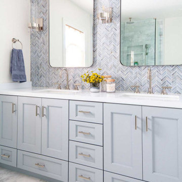
This ranch went from outdated and non functional to bright, airy, and modern. Every surface was updated from the kitchen and bathrooms to the exterior of the home. Classic details keep the style timeless while subtle pops of color add life and personality. The home now has high ceilings and an indoor/outdoor floor plan, perfect for entertaining and living.
 Ana Claudia Design
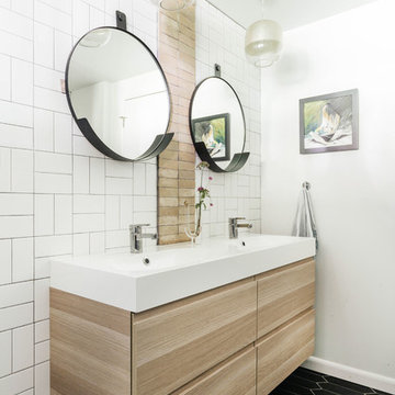
The guest bathroom downstairs was a complete gut reno because it was non-functional (wall to wall carpeting!) and we modified it so it was en-suite bathroom attached to the guest room.
 Bianchi Design
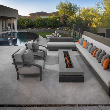
A complete metamorphosis was needed to bring out the buried treasure hidden beneath this yard, and a family of five rattlesnakes had to find a new home!
Here’s the short list of the awkward elements that had to be remedied:
First, the neighbors’ living room window peered perpetually (like, all the time) and directly into the yard with no privacy whatsoever. None.
Second, the vast deep end swallowed up the patio and provided no place for furniture, or walking. Only tripping and treading water was allowed.
Third, the sunken lawn must have been an arena of some sort! Intentionally excavated from natural grade a full -42″ from the patio, for no good reason.
Fourth, the not-worth-a-visit ramada was the focal point for the entire yard. See it up close! It’s gone.
Fifth, the spa was shoved against the farthest wall and provided no invitation. It was so bad, it never had a photo taken! See the statue peeing between the two short columns? It’s over there. Peeing in the corner as all little boys are want to do.
Sixth, the bbq and fire place were non-functional and equally uninviting, and here’s a better view of just how crowded the furniture is. Don’t fall in!
Last, we will not mention the boulder pile droppings distributed around the yard. Oops! Sorry.
The first order of business was to spend several weeks tearing out everything but the pool shell. Then another few weeks were spent wheelbarrowing in a few hundred yards of top soil (there was no access) to fill the matador pit flush to a more relatable -18″. The large gaping trough was then discretely hidden with large removable stones, so it was out of sight but still serviceable.
Second, the neighbor was screened instantly with a row of mature Texas Ebony trees in a raised planter, that also housed a sculptural ironwood tree as the focal point of the property, soon to be reflected in the pool’s richer Midnight Blue pebble tec finish.
A hundred or so yards of shotcrete filled not only the reclaimed deep end, but also created a sun shelf and spa ledge, now the focal jewel in the foreground as a 360 overflow vanishing edge spa clad in Pewter glass tile from Oceanside Glass, and viewed from all the interior living spaces.
The BBQ was tucked around the corner out of sight but still easy access. The fireplace for two gave way to a large inviting built in banco, with a splashes of colorful fabrics to draw one out. The fire pit serves about 10 people easily, for hours at a time.
Last but not least, the foreground of the pool became a sweeping entry shelf extending the full length of the pool, bedecked with fiberoptic starlights and six glowing bubblers set low, to just barely break the surface of the water, giving a lovely and tranquil sound while sleeping away with all retractable doors wide open.
Simple. Serene. Self-evident. That is the remedy.
If your project needs a similar touch, more or less, drop me a line and we’ll figure out a plan.

 Klopf Architecture
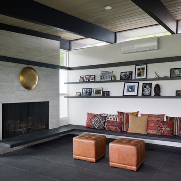
Set in a quiet neighborhood and framed by mature trees, this residence presented a unique opportunity: to thoughtfully evolve a custom mid-century modern home into a space that supports the everyday rhythms of a growing family. With a deep respect for the home’s original architecture, Klopf Architecture reimagined the house to better meet the needs of its owners—introducing functional improvements while preserving the spirit and character of its mid-century roots.
The clients approached Klopf Architecture with a clear vision: refresh their home while seamlessly integrating new programmatic elements. Key goals included clarifying and enhancing the entry sequence; connecting the detached garage to the main house with a practical yet architecturally intentional intervention; adding functional spaces such as a mudroom and laundry room; expanding and remodeling the primary suite’s bathroom and closet; and creating a more engaging outdoor space that capitalized on the site’s impressive views, featuring a fire pit and outdoor kitchen.
As a couple with distinct yet complementary perspectives—one focused on modern functionality and technology, and the other dedicated to preserving the home’s architectural integrity—their collaboration with Klopf Architecture resulted in a solution that harmonized both ideals. Their shared commitment to improving the livability of their home led to a design dialogue rooted in balance. This dynamic partnership shaped the direction of the renovation, ensuring that every decision honored the spirit of the original home while aligning with the practical needs of their growing family.
Designing within the constraints of the sloped site posed one of the project’s central challenges. The detached garage sat at a higher elevation than the main house, requiring a solution that ensured architectural and geometric compatibility between the two structures. Rather than create a purely utilitarian link, Klopf Architecture introduced an intentional connection that contributes to the overall architectural language. A notable pinch point in the plan—where differing geometries converged—was treated as a hinge point, turning a potentially awkward juncture into an architectural feature. This area now functions as both a transition and a moment of design interest that unifies the overall plan.
The design also addressed the underutilized outdoor area, which was located in a shadowed portion of the site with geometrical limitations. A new connection to the rear deck was created in this same area, making the outdoor space more useful and inviting. Klopf Architecture introduced carefully positioned openings and spatial improvements that forged a strong visual and functional connection between indoor and outdoor spaces. The outdoor area now reads as a deliberate extension of the home, embracing natural light and emphasizing the dramatic views.
Working through multiple design iterations, Klopf Architecture crafted a solution that preserved the architectural language of the original home while supporting the functional needs of modern life. The garage-to-house connection became more than a passage—it evolved into an architectural moment of transition. A new mudroom and laundry space enhanced convenience without compromising the clean lines of the design. The primary suite was expanded to create a private, serene retreat. The reimagined backyard, complete with fire pit and kitchen, now plays a vital role in the family’s daily routine and social life.
Outcomes and Lasting Impact
The result is a home that balances heritage with contemporary design, technical precision with design sensibility. The redesign not only met the clients’ initial goals but also exceeded expectations in its ability to seamlessly blend past and present, function and beauty, making the outdoor kitchen a favorite gathering place.
Beyond aesthetics, the renovation has significantly improved daily life for the family. The newly integrated garage connection has streamlined routines, providing a seamless transition between arriving home, storing belongings, and entering the main living spaces. The expanded primary suite offers a retreat-like atmosphere, creating a private space to unwind at the end of the day. The redesigned outdoor areas have also become an extension of their lifestyle—whether it's casual family dinners around the fire pit, entertaining friends in the outdoor kitchen, or simply enjoying the view from the reimagined backyard.
Through a thoughtful and strategic approach, the house has been successfully evolved into a home that remains true to its mid-century modern roots while enhancing livability, functionality, and the overall quality of life for the modern-day owners.
Klopf Architecture Team: Geoffrey Campen, Fernanda Bernardes
Architectural Interior Design: Klopf Architecture
Structural Engineer: Base Design Inc.
Contractor: Golden Snail Builders
Photography: Mariko Reed
Year Completed:2022
 Klopf Architecture
Set in a quiet neighborhood and framed by mature trees, this residence presented a unique opportunity: to thoughtfully evolve a custom mid-century modern home into a space that supports the everyday rhythms of a growing family. With a deep respect for the home’s original architecture, Klopf Architecture reimagined the house to better meet the needs of its owners—introducing functional improvements while preserving the spirit and character of its mid-century roots.
The clients approached Klopf Architecture with a clear vision: refresh their home while seamlessly integrating new programmatic elements. Key goals included clarifying and enhancing the entry sequence; connecting the detached garage to the main house with a practical yet architecturally intentional intervention; adding functional spaces such as a mudroom and laundry room; expanding and remodeling the primary suite’s bathroom and closet; and creating a more engaging outdoor space that capitalized on the site’s impressive views, featuring a fire pit and outdoor kitchen.
As a couple with distinct yet complementary perspectives—one focused on modern functionality and technology, and the other dedicated to preserving the home’s architectural integrity—their collaboration with Klopf Architecture resulted in a solution that harmonized both ideals. Their shared commitment to improving the livability of their home led to a design dialogue rooted in balance. This dynamic partnership shaped the direction of the renovation, ensuring that every decision honored the spirit of the original home while aligning with the practical needs of their growing family.
Designing within the constraints of the sloped site posed one of the project’s central challenges. The detached garage sat at a higher elevation than the main house, requiring a solution that ensured architectural and geometric compatibility between the two structures. Rather than create a purely utilitarian link, Klopf Architecture introduced an intentional connection that contributes to the overall architectural language. A notable pinch point in the plan—where differing geometries converged—was treated as a hinge point, turning a potentially awkward juncture into an architectural feature. This area now functions as both a transition and a moment of design interest that unifies the overall plan.
The design also addressed the underutilized outdoor area, which was located in a shadowed portion of the site with geometrical limitations. A new connection to the rear deck was created in this same area, making the outdoor space more useful and inviting. Klopf Architecture introduced carefully positioned openings and spatial improvements that forged a strong visual and functional connection between indoor and outdoor spaces. The outdoor area now reads as a deliberate extension of the home, embracing natural light and emphasizing the dramatic views.
Working through multiple design iterations, Klopf Architecture crafted a solution that preserved the architectural language of the original home while supporting the functional needs of modern life. The garage-to-house connection became more than a passage—it evolved into an architectural moment of transition. A new mudroom and laundry space enhanced convenience without compromising the clean lines of the design. The primary suite was expanded to create a private, serene retreat. The reimagined backyard, complete with fire pit and kitchen, now plays a vital role in the family’s daily routine and social life.
Outcomes and Lasting Impact
The result is a home that balances heritage with contemporary design, technical precision with design sensibility. The redesign not only met the clients’ initial goals but also exceeded expectations in its ability to seamlessly blend past and present, function and beauty, making the outdoor kitchen a favorite gathering place.
Beyond aesthetics, the renovation has significantly improved daily life for the family. The newly integrated garage connection has streamlined routines, providing a seamless transition between arriving home, storing belongings, and entering the main living spaces. The expanded primary suite offers a retreat-like atmosphere, creating a private space to unwind at the end of the day. The redesigned outdoor areas have also become an extension of their lifestyle—whether it's casual family dinners around the fire pit, entertaining friends in the outdoor kitchen, or simply enjoying the view from the reimagined backyard.
Through a thoughtful and strategic approach, the house has been successfully evolved into a home that remains true to its mid-century modern roots while enhancing livability, functionality, and the overall quality of life for the modern-day owners.
Klopf Architecture Team: Geoffrey Campen, Fernanda Bernardes
Architectural Interior Design: Klopf Architecture
Structural Engineer: Base Design Inc.
Contractor: Golden Snail Builders
Photography: Mariko Reed
Year Completed:2022
 MOTIV Interiors
Interior Designer: MOTIV Interiors LLC
Photographer: Sam Angel Photography
Design Challenge: This 8 year-old boy and girl were outgrowing their existing setup and needed to update their rooms with a plan that would carry them forward into middle school and beyond. In addition to gaining storage and study areas, could these twins show off their big personalities? Absolutely, we said! MOTIV Interiors tackled the rooms of these youngsters living in Nashville's 12th South Neighborhood and created an environment where the dynamic duo can learn, create, and grow together for years to come.
Design Solution:
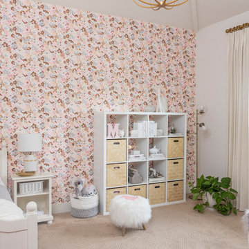
In her room, we wanted to create a fun-filled space that supports softball, sleepovers, science, and anything else a girl might want to get into. The star of the show is a beautiful hand-printed wallpaper by Brooklyn designer Aimee Wilder, whose FSC-certified papers contain no VOC’s (Volatile Organic Compounds). That means that in addition to packing a powerful visual punch, they meet our standard for excellent indoor air quality. We also love this wallpaper because it is composed of so many different neutral colors - this room can organically evolve over time without necessarily replacing the paper (which was installed with a no-VOC adhesive).
We refreshed the remaining walls with a scrubbable no-VOC paint from Sherwin Williams (7008 Alabaster) and gave the carpets in both of the twins’ rooms a good cleaning and simple stretch as opposed to replacing them. In order to provide more functional light in her room, we incorporated a corner floor lamp for reading, a telescoping desk lamp for studying, and an eye-catching LED flower pendant on a dimmer switch sourced from Lightology. Custom window treatments in a linen/cotton blend emphasize the height of the room and bring in a little “bling” with antiqued gold hardware.
Before we even thought about aesthetics, however, MOTIV Interiors got to work right away on increasing functionality. We added a spacious storage unit with plenty of baskets for all of our young client’s animal friends, and we made sure to include ample shelf space for books and hobbies as she finds new passions to explore down the road. We always prefer eco-friendly furnishings that are manufactured responsibly, made with sustainably harvested wood (FSC Certified), and use no glue or non-toxic glues and paints.
The bedding in this project is 100% cotton and contains no synthetic fibers. When purchasing bedding, check for the GOTS Certification (Global Organic Textile Standard). The introduction of a desk and drawer unit created a calming space to study and reflect, or write a letter to a friend. Gold accents add a bit of warmth to the workspace, where she can display her memories, goals, and game plans for a bright future.
We hope you enjoyed this project as much as we did! Each design challenge is an opportunity to push the envelope, by creating a new and exciting aesthetic or finding creative ways to incorporate sustainable design principles.

Sponsored
Columbus, OH
Structural Remodeling
Franklin County's Heavy Timber Specialists | Best of Houzz 2020!
 Klopf Architecture
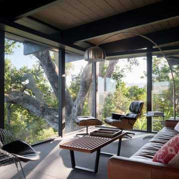
Set in a quiet neighborhood and framed by mature trees, this residence presented a unique opportunity: to thoughtfully evolve a custom mid-century modern home into a space that supports the everyday rhythms of a growing family. With a deep respect for the home’s original architecture, Klopf Architecture reimagined the house to better meet the needs of its owners—introducing functional improvements while preserving the spirit and character of its mid-century roots.
The clients approached Klopf Architecture with a clear vision: refresh their home while seamlessly integrating new programmatic elements. Key goals included clarifying and enhancing the entry sequence; connecting the detached garage to the main house with a practical yet architecturally intentional intervention; adding functional spaces such as a mudroom and laundry room; expanding and remodeling the primary suite’s bathroom and closet; and creating a more engaging outdoor space that capitalized on the site’s impressive views, featuring a fire pit and outdoor kitchen.
As a couple with distinct yet complementary perspectives—one focused on modern functionality and technology, and the other dedicated to preserving the home’s architectural integrity—their collaboration with Klopf Architecture resulted in a solution that harmonized both ideals. Their shared commitment to improving the livability of their home led to a design dialogue rooted in balance. This dynamic partnership shaped the direction of the renovation, ensuring that every decision honored the spirit of the original home while aligning with the practical needs of their growing family.
Designing within the constraints of the sloped site posed one of the project’s central challenges. The detached garage sat at a higher elevation than the main house, requiring a solution that ensured architectural and geometric compatibility between the two structures. Rather than create a purely utilitarian link, Klopf Architecture introduced an intentional connection that contributes to the overall architectural language. A notable pinch point in the plan—where differing geometries converged—was treated as a hinge point, turning a potentially awkward juncture into an architectural feature. This area now functions as both a transition and a moment of design interest that unifies the overall plan.
The design also addressed the underutilized outdoor area, which was located in a shadowed portion of the site with geometrical limitations. A new connection to the rear deck was created in this same area, making the outdoor space more useful and inviting. Klopf Architecture introduced carefully positioned openings and spatial improvements that forged a strong visual and functional connection between indoor and outdoor spaces. The outdoor area now reads as a deliberate extension of the home, embracing natural light and emphasizing the dramatic views.
Working through multiple design iterations, Klopf Architecture crafted a solution that preserved the architectural language of the original home while supporting the functional needs of modern life. The garage-to-house connection became more than a passage—it evolved into an architectural moment of transition. A new mudroom and laundry space enhanced convenience without compromising the clean lines of the design. The primary suite was expanded to create a private, serene retreat. The reimagined backyard, complete with fire pit and kitchen, now plays a vital role in the family’s daily routine and social life.
Outcomes and Lasting Impact
The result is a home that balances heritage with contemporary design, technical precision with design sensibility. The redesign not only met the clients’ initial goals but also exceeded expectations in its ability to seamlessly blend past and present, function and beauty, making the outdoor kitchen a favorite gathering place.
Beyond aesthetics, the renovation has significantly improved daily life for the family. The newly integrated garage connection has streamlined routines, providing a seamless transition between arriving home, storing belongings, and entering the main living spaces. The expanded primary suite offers a retreat-like atmosphere, creating a private space to unwind at the end of the day. The redesigned outdoor areas have also become an extension of their lifestyle—whether it's casual family dinners around the fire pit, entertaining friends in the outdoor kitchen, or simply enjoying the view from the reimagined backyard.
Through a thoughtful and strategic approach, the house has been successfully evolved into a home that remains true to its mid-century modern roots while enhancing livability, functionality, and the overall quality of life for the modern-day owners.
Klopf Architecture Team: Geoffrey Campen, Fernanda Bernardes
Architectural Interior Design: Klopf Architecture
Structural Engineer: Base Design Inc.
Contractor: Golden Snail Builders
Photography: Mariko Reed
Year Completed:2022
 USI Design & Remodeling
Remodel-Kitchen & Family Room: Quiet Luxury with a Natural Palette
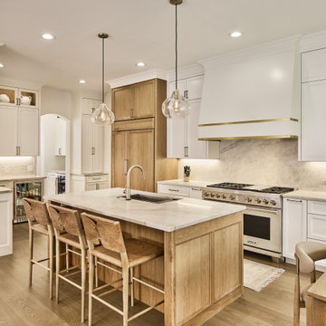
This remodel reimagines the heart of the home by seamlessly integrating the kitchen and family room into a refined yet inviting open-concept space, grounded in a “quiet luxury” aesthetic and a natural palette.
Kitchen Transformation:
The kitchen layout is completely reworked for improved flow and functionality. Major appliances have been reassigned for efficiency:
• The refrigerator is built in and anchors the focal wall providing improved access to both prep and serving areas.
• The range has been centered on the back wall, framed by two- toned cabinetry and a low-profile custom hood accented with brass that blends seamlessly into the wall for an understated look.
• The dishwasher and sink have been relocated to the new central island, allowing for uninterrupted views across the room and better interaction with guests or family.
At the heart of the space is a large central island, topped with Taj Mahal quartzite in soft beige and taupe tones. The island serves as a multi-functional hub.
The cabinetry is custom-built in white oak, finished in a matte clear coat that highlights the wood’s natural grain. Hardware is kept minimal, in brushed brass for a touch of subdued elegance.
Natural Palette & Materials:
The entire space embraces a natural color scheme—warm whites, layered pastel beiges and natural wood tones—accented with natural stone. Leathered Taj Mahal backsplash with subtle texture adds quiet visual interest without overpowering the calm atmosphere.
Family Room Integration:
The kitchen flows effortlessly into the family room, unified by wide-plank oak flooring and soft lighting. A fluted marble-clad fireplace anchors the space, surrounded by, built-in shelving with the same oak finish inside as the kitchen cabinetry. Furnishings follow the same philosophy: clean lines, neutral fabrics, and a mix of soft textures. Think boucle armchairs, a deep linen sectional, and a reclaimed wood coffee table.
Lighting & Finishing Touches:
Soft, layered lighting—including recessed lights, sculptural clear pendant lights above the island, and concealed LED strips—enhances the serene mood.
 StudioLAB
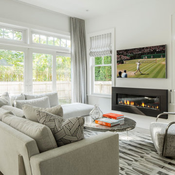
Nestled at the end of a long flag lot driveway in Amagansett, NY, a young couple purchased the property with intentions to construct a second home for their growing family. A home that would not only be comfortable for the immediate family but also serve and grow on busy summer weekends to accommodate extended family, friends, children and guests. The tight lot along with the sizable program culminated in the building envelope being pushed to every limit, restriction and regulation one could imagine. The resulting architecture possesses a traditional Hamptons cottage exterior juxtaposed with modern elements that help break up the single mass. Centered on the entry façade is a large double story window that shrouds the floating switchback staircase on the interior. A bluestone patio wraps three sides of the home, which, in the rear, leads to a small in ground pool with a frameless glass railing. In the interior, custom white washed white oak floors run throughout the home as well as on the floating central staircase. For a more modern style of living, the open living, kitchen and dining area serve as one large entertaining space. In an area surrounded by sprawling Mcmansions, this tightly knit home functions more similar to that of a large NYC apartment by serving the perfect balance between maximized form with the right amount of function given the strict parameters. Large glass sliders open the living and dining rooms to the backyard patio and pool creating harmony between the indoor and outdoor spaces. Shaker style cabinets in the kitchen pair with a more contemporary staircase softened by the warmer wood tones of the vertical slats that surround it.
 TKS Design Group
Download our free ebook, Creating the Ideal Kitchen. DOWNLOAD NOW
The homeowners built their traditional Colonial style home 17 years’ ago. It was in great shape but needed some updating. Over the years, their taste had drifted into a more contemporary realm, and they wanted our help to bridge the gap between traditional and modern.
We decided the layout of the kitchen worked well in the space and the cabinets were in good shape, so we opted to do a refresh with the kitchen. The original kitchen had blond maple cabinets and granite countertops. This was also a great opportunity to make some updates to the functionality that they were hoping to accomplish.
After re-finishing all the first floor wood floors with a gray stain, which helped to remove some of the red tones from the red oak, we painted the cabinetry Benjamin Moore “Repose Gray” a very soft light gray. The new countertops are hardworking quartz, and the waterfall countertop to the left of the sink gives a bit of the contemporary flavor.
We reworked the refrigerator wall to create more pantry storage and eliminated the double oven in favor of a single oven and a steam oven. The existing cooktop was replaced with a new range paired with a Venetian plaster hood above. The glossy finish from the hood is echoed in the pendant lights. A touch of gold in the lighting and hardware adds some contrast to the gray and white. A theme we repeated down to the smallest detail illustrated by the Jason Wu faucet by Brizo with its similar touches of white and gold (the arrival of which we eagerly awaited for months due to ripples in the supply chain – but worth it!).
The original breakfast room was pleasant enough with its windows looking into the backyard. Now with its colorful window treatments, new blue chairs and sculptural light fixture, this space flows seamlessly into the kitchen and gives more of a punch to the space.
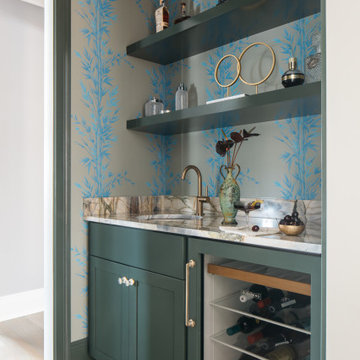
The original butler’s pantry was functional but was also starting to show its age. The new space was inspired by a wallpaper selection that our client had set aside as a possibility for a future project. It worked perfectly with our pallet and gave a fun eclectic vibe to this functional space. We eliminated some upper cabinets in favor of open shelving and painted the cabinetry in a high gloss finish, added a beautiful quartzite countertop and some statement lighting. The new room is anything but cookie cutter.
Next the mudroom. You can see a peek of the mudroom across the way from the butler’s pantry which got a facelift with new paint, tile floor, lighting and hardware. Simple updates but a dramatic change! The first floor powder room got the glam treatment with its own update of wainscoting, wallpaper, console sink, fixtures and artwork. A great little introduction to what’s to come in the rest of the home.
The whole first floor now flows together in a cohesive pallet of green and blue, reflects the homeowner’s desire for a more modern aesthetic, and feels like a thoughtful and intentional evolution. Our clients were wonderful to work with! Their style meshed perfectly with our brand aesthetic which created the opportunity for wonderful things to happen. We know they will enjoy their remodel for many years to come!
Photography by Margaret Rajic Photography


 JRP Design & Remodel
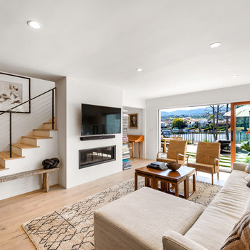
Our client had been living in her beautiful lakeside retreat for about 3 years. All around were stunning views of the lake and mountains, but the view from inside was minimal. It felt dark and closed off from the gorgeous waterfront mere feet away. She desired a bigger kitchen, natural light, and a contemporary look. Referred to JRP by a subcontractor our client walked into the showroom one day, took one look at the modern kitchen in our design center, and was inspired!
After talking about the frustrations of dark spaces and limitations when entertaining groups of friends, the homeowner and the JRP design team emerged with a new vision. Two walls between the living room and kitchen would be eliminated and structural revisions were needed for a common wall shared a wall with a neighbor. With the wall removals and the addition of multiple slider doors, the main level now has an open layout.
Everything in the home went from dark to luminous as sunlight could now bounce off white walls to illuminate both spaces. Our aim was to create a beautiful modern kitchen which fused the necessities of a functional space with the elegant form of the contemporary aesthetic. The kitchen playfully mixes frameless white upper with horizontal grain oak lower cabinets and a fun diagonal white tile backsplash. Gorgeous grey Cambria quartz with white veining meets them both in the middle. The large island with integrated barstool area makes it functional and a great entertaining space.
The master bedroom received a mini facelift as well. White never fails to give your bedroom a timeless look. The beautiful, bright marble shower shows what's possible when mixing tile shape, size, and color. The marble mosaic tiles in the shower pan are especially bold paired with black matte plumbing fixtures and gives the shower a striking visual.
Layers, light, consistent intention, and fun! - paired with beautiful, unique designs and a personal touch created this beautiful home that does not go unnoticed.
PROJECT DETAILS:
• Style: Contemporary
• Colors: Neutrals
• Countertops: Cambria Quartz, Luxury Series, Queen Anne
• Kitchen Cabinets: Slab, Overlay Frameless
Uppers: Blanco
Base: Horizontal Grain Oak
• Hardware/Plumbing Fixture Finish: Kitchen – Stainless Steel
• Lighting Fixtures:
• Flooring:
Hardwood: Siberian Oak with Fossil Stone finish
• Tile/Backsplash:
Kitchen Backsplash: White/Clear Glass
Master Bath Floor: Ann Sacks Benton Mosaics Marble
Master Bath Surround: Ann Sacks White Thassos Marble
Photographer: Andrew – Open House VC
 Tami Smight Interiors
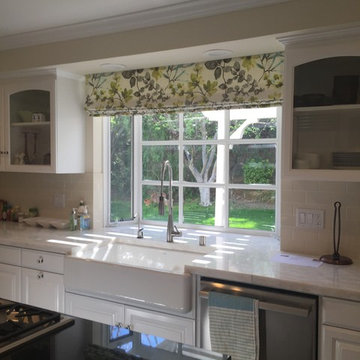
Tight space in this greenhouse window, so we chose a large patterned linen for a short non-functional valance. This frames the window nicely without obstructing the view of the garden.
 Drury Design
THE SETUP
Sam’s client had lived in her downtown townhome home for less than a year when she decided to remodel the spacious second level. This open area consisted of three sections: a TV and fireplace zone, a sparsely furnished dining area, and a dominant central kitchen. The kitchen featured a long back wall with three segmented sections and a massive island housing the cooktop. She found the kitchen’s functionality lacking and its presence overwhelming – it dominated the entire floor, regardless of where you stood.
Design objectives:
- Reconfigure key kitchen elements (sink, cooktop, oven) while minimizing the kitchen’s visual impact
- Optimize the kitchen’s back wall, eliminating existing dead space
- Create a purposeful, well-defined dining area
- Establish a distinct, comfortable living area
- Reuse existing appliances and flooring
- Maintain an overall modern design aesthetic
THE REMODEL
Design challenges to be solved:
- Redesign the island to reduce its overwhelming presence
- Create a comfortable, dedicated living room within the available space
- Establish a distinct, inviting dining area within spatial constraints
- Enhance kitchen functionality and style without dominating the entire floor
THE RENEWED SPACE
Design solutions:
- Sam created raised end caps for the island. This separated the kitchen from adjacent living and dining areas while focusing the kitchen’s functionality. The new sink location offers ample workspace, allowing the cook to interact with guests seated at the island. The redesigned island also provides additional storage.
- For the living area, Sam opted for a functional-yet-minimalist approach. Large-format tile creates a natural stone look for the fireplace and TV wall. The recessed TV and extended fireplace shelf maintain a sleek profile. - Artistic wallpaper adds depth and texture, while the intentional lack of extensive shelving keeps the space open and distinct.
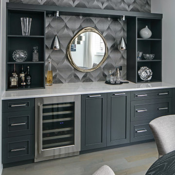
- Sam transformed the dining area’s blank wall into a feature, adding a unique dry bar with counter space, open shelves, cabinet storage and a beverage fridge. - - - Wallpaper behind and above the bar contributes to the area’s personality. A mirror adds depth while pendant lights add style and visual interest.
Relocating the cooktop to the back wall facilitates hidden ventilation, reducing visual clutter. Sam balanced transitional and modern elements for a contemporary yet comfortable feel. The digital control panel on the convection cooktop maintains a sleek look, while the wall oven is now at an easy-to-use height. ----- Mirrored base cabinet fronts and a paneled fridge prevent cabinetry monotony.
The redesign has delighted Sam’s client, achieving her main goal of creating a more inviting and visually appealing space. Each section now has its own visual personality and functionality while harmonizing within a monochromatic palette. The entire floor offers wow-factor pop upon first glance, with each area maintaining its distinct character while contributing to a cohesive, modern aesthetic.
2