
Search results for "Intentionally" in Home Design Ideas

 USI Design & Remodeling
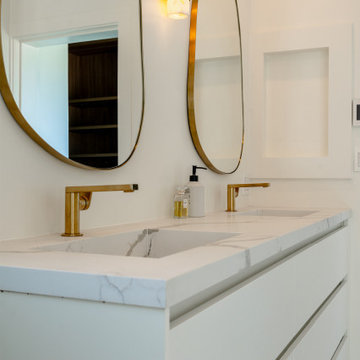
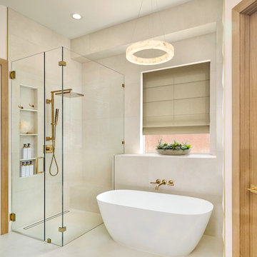
This master bathroom renovation in Frisco was completed for a repeat USI Design & Remodeling client as part of a larger first-floor transformation of the home. The original bathroom reflected a very typical North Texas layout of its era — dark stained cabinetry, granite countertops, compartmentalized vanities, a built-in tub adjoining a framed shower, and separated spaces that no longer aligned with how the homeowners wanted to live. As their aesthetic evolved toward a more transitional and contemporary direction, the goal became less about replacing finishes and more about redefining the experience of the room itself. The project needed to feel calmer, more architectural, and far more intentional in how the space functioned visually and emotionally.
One of the most important changes was removing the original shower curb and pony wall in favor of a fully open curbless shower with ultra-clear ½-inch heavy glass. Achieving that look required recessing the slab, re-floating the shower floor toward a linear drain, and engineering the space so the room would read as visually uninterrupted from end to end. Throughout the project, many of the design decisions were rooted in restraint rather than excess. The oversized 24x48 Porcelanosa flooring carries very little shade variation, creating a quieter visual field, while the cabinetry was executed in rift-sawn white oak specifically because it produces a far more controlled and consistent finish outcome than more common cuts of wood. In luxury projects, consistency itself becomes part of the refinement.
The floating vanity was designed more like custom furniture than traditional cabinetry, utilizing waterfall mitered edges and fully reworked plumbing locations so both homeowners could share in having generous functional countertop space. The original makeup station was repurposed into integrated storage with powered drawers and concealed organization for everyday items such as blow dryers and flat irons. Along the vanity wall, wall-mounted plumbing fixtures were paired with ribbed natural marble surfaces — a detail that required intentional planning long before construction began. Rather than allowing the ribbed material to terminate awkwardly behind the fixtures, the backsplash and stone transitions were specifically designed to resolve those conditions cleanly. Those are the types of details that distinguish highly coordinated design-build work from projects that simply assemble materials together.
While the room contains a significant amount of luxury detailing — from the freestanding tub and geoprism marble focal wall to the custom rift-sawn white oak closet doors and elongated mirrors that leverage the 11-foot ceiling heights — the project was always guided by quiet luxury rather than visual competition. Even the water closet enclosure was handled with restraint through the use of a satin-etched glass door rather than another heavy solid opening. The intent throughout was to create a bathroom that feels restorative and serene rather than overdesigned. In our view, the best luxury spaces are the ones that feel composed long after the initial impression wears off.
 Studio Vice
Ryan Stadler Photography
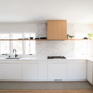
1950s eat-in kitchen photo in Minneapolis with flat-panel cabinets, white cabinets, quartz countertops, multicolored backsplash, stone slab backsplash, stainless steel appliances and no island
1950s eat-in kitchen photo in Minneapolis with flat-panel cabinets, white cabinets, quartz countertops, multicolored backsplash, stone slab backsplash, stainless steel appliances and no island
Find the right local pro for your project
 Wilkinson Design Corporation
Doug Fogelson
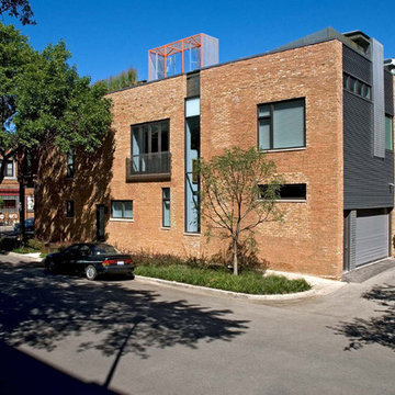
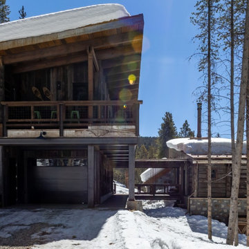
Inspiration for an industrial exterior home remodel in Chicago
Inspiration for an industrial exterior home remodel in Chicago

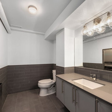
 Blend Interior Design Studio
The restrooms are transformed with new finishes!
Inspiration for a contemporary home design remodel in Seattle
Inspiration for a contemporary home design remodel in Seattle
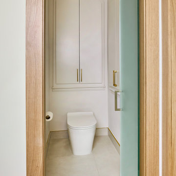 USI Design & Remodeling
This master bathroom renovation in Frisco was completed for a repeat USI Design & Remodeling client as part of a larger first-floor transformation of the home. The original bathroom reflected a very typical North Texas layout of its era — dark stained cabinetry, granite countertops, compartmentalized vanities, a built-in tub adjoining a framed shower, and separated spaces that no longer aligned with how the homeowners wanted to live. As their aesthetic evolved toward a more transitional and contemporary direction, the goal became less about replacing finishes and more about redefining the experience of the room itself. The project needed to feel calmer, more architectural, and far more intentional in how the space functioned visually and emotionally.
One of the most important changes was removing the original shower curb and pony wall in favor of a fully open curbless shower with ultra-clear ½-inch heavy glass. Achieving that look required recessing the slab, re-floating the shower floor toward a linear drain, and engineering the space so the room would read as visually uninterrupted from end to end. Throughout the project, many of the design decisions were rooted in restraint rather than excess. The oversized 24x48 Porcelanosa flooring carries very little shade variation, creating a quieter visual field, while the cabinetry was executed in rift-sawn white oak specifically because it produces a far more controlled and consistent finish outcome than more common cuts of wood. In luxury projects, consistency itself becomes part of the refinement.
The floating vanity was designed more like custom furniture than traditional cabinetry, utilizing waterfall mitered edges and fully reworked plumbing locations so both homeowners could share in having generous functional countertop space. The original makeup station was repurposed into integrated storage with powered drawers and concealed organization for everyday items such as blow dryers and flat irons. Along the vanity wall, wall-mounted plumbing fixtures were paired with ribbed natural marble surfaces — a detail that required intentional planning long before construction began. Rather than allowing the ribbed material to terminate awkwardly behind the fixtures, the backsplash and stone transitions were specifically designed to resolve those conditions cleanly. Those are the types of details that distinguish highly coordinated design-build work from projects that simply assemble materials together.
While the room contains a significant amount of luxury detailing — from the freestanding tub and geoprism marble focal wall to the custom rift-sawn white oak closet doors and elongated mirrors that leverage the 11-foot ceiling heights — the project was always guided by quiet luxury rather than visual competition. Even the water closet enclosure was handled with restraint through the use of a satin-etched glass door rather than another heavy solid opening. The intent throughout was to create a bathroom that feels restorative and serene rather than overdesigned. In our view, the best luxury spaces are the ones that feel composed long after the initial impression wears off.
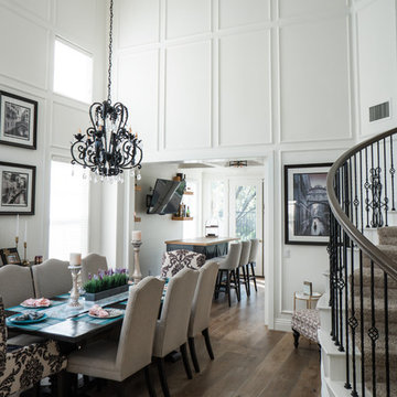
 Kevin Mason, Architect
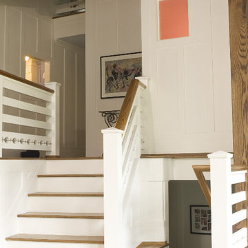
THE RED GLOW OF THE POWDER ROOM shows through electrified privacy glass that automatically becomes opaque when an occupant closes the door.
Mid-sized eclectic staircase photo in New York
Mid-sized eclectic staircase photo in New York

 Hibbs Luxury Homes - St Louis, MO
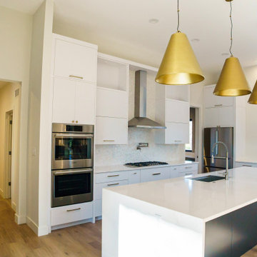
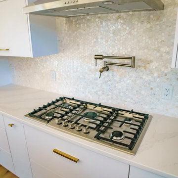
The chic, modern kitchen in this mid-century modern-inspired home features a large central island with waterfall countertops, a beautiful mother-of-pearl backsplash, flat-front cabinets, and a wet bar with additional wine storage.
 George Ocampo
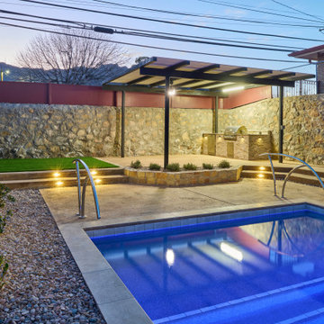
Central El Paso Backyard Renovation:
Fifteen years is a long time for a backyard to quietly wait.
At first, it was full of intention—a pool that promised summers, laughter, and long evenings. But time has a way of settling in. The water turned still, then green. Edges cracked. The space became less of a destination and more of something you looked past. Life moved forward, but the backyard stayed behind.
Then came the decision: it was time.
Not a patch job. Not a quick fix. A complete reset.
The transformation didn’t begin beautifully—it began with demolition. The old pool was drained, exposing years of neglect etched into its surface. Crews stepped in, breaking, clearing, reshaping. What once held stagnant water became an open cavity of possibility. Steel rebar formed a new skeleton, precise and intentional. Every line measured. Every elevation reconsidered.
This wasn’t just construction—it was rethinking how the space should live.
The shell was rebuilt. Surfaces were refined. Plumbing, structure, and flow were corrected at their core. What had once been outdated and failing was now engineered to last.
Then the shift happened.
Hardscape came in—clean, warm-toned concrete replacing worn decking. Stone walls, once just boundaries, were elevated into features. Subtle textures, intentional lines. A visual language that matched the architecture of the home instead of competing with it.
The pool returned—but not as it was.
Now it was sharp, modern, and inviting. A long, clean body of water with a shallow tanning ledge that catches the sun just right. Stainless steel scuppers arc water into the pool—movement, sound, life. Steps are crisp, geometry is balanced, and the water reflects clarity instead of neglect.
Around it, the yard found purpose.
Artificial turf introduced contrast—green, controlled, low-maintenance. A pergola structure rose in the corner, creating a destination within the destination. Beneath it, a built-in outdoor kitchen turned the backyard into a place to gather, not just pass through. Lighting stitched everything together, making the space just as alive at dusk as it is under the midday sun.
By the end, nothing felt accidental.
What was once forgotten is now deliberate. What was once avoided is now the center of attention.
Fifteen years later, the backyard didn’t just come back—it finally became what it was always supposed to be.
 lavish
When a professional office space needs to make a lasting impression on clients and create an inspiring environment for staff, the design details matter just as much as they do at home. This thoughtful commercial interior refresh transformed a dated, purely functional office into a warm, sophisticated, and beautifully layered space — one that feels more like a high-end boutique or luxury residence than a typical workplace.
The guiding philosophy throughout was clear: every space, no matter how utilitarian its purpose, deserves intentional design. From the reception corridor to the staff break room, from the client restrooms to the storage corridor, each area received careful attention to finish, color, and texture.
Restrooms Reimagined
The two client-facing restrooms were the most dramatic transformations in the project. Rather than the builder-grade wallpaper and basic fixtures typically found in commercial spaces, both were treated as true design moments.
The first features floor-to-ceiling wallpaper in a rich taupe with a delicate white botanical branch pattern, creating an immersive, jewel-box feel. A white shaker vanity with dark granite countertop grounds the space, while an arched frameless mirror and brushed gold wall sconce add glamour. A tall gold and glass etagere serves as both decorative storage and a sculptural element, styled with woven baskets, greenery, and stacked accessories. Framed landscape watercolor art adds a serene, organic note, and a freestanding brass toilet paper holder elevates a typically overlooked detail.
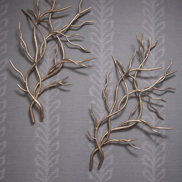
The second restroom takes an entirely different but equally compelling direction — soft, dusty blue-grey grasscloth-style wallpaper printed with a tone-on-tone chevron leaf stripe wraps every wall, creating a calm, spa-like atmosphere. A weathered wood console provides casual charm beneath a large-scale botanical tulip artwork in sage and cream. The wall-mount sink with exposed plumbing adds an intentional, editorial touch. An arched mirror with a sleek multi-bulb bar sconce in brushed nickel completes the look, while a pair of sculptural brass branch wall sculptures mounted directly to the wallpaper serve as unexpected, memorable art.
Storage Made Beautiful
The internal storage corridor received a full wall of custom floor-to-ceiling white shaker cabinetry with chrome pulls, flanked by open shelving sections for accessible display and storage. Clean, crisp, and highly organized — this space proves that even a purely functional corridor can be architectural and refined.
The Break Room & Kitchenette
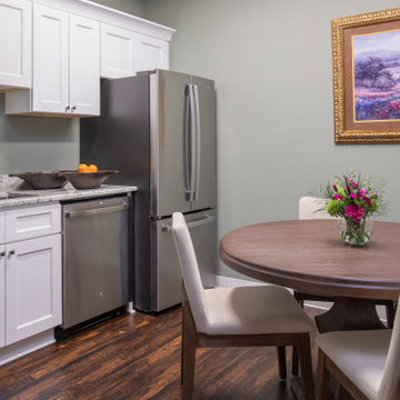
The staff break room was updated with white shaker cabinetry, light speckled granite countertops, stainless appliances — including a French door refrigerator, dishwasher, and over-counter microwave — and warm sage green walls that bring a restful, refreshing energy to the space. Dark hardwood luxury vinyl plank flooring runs throughout the room, warming the look considerably. A round walnut dining table with upholstered chairs creates a proper gathering space for the team, and framed landscape oil art in an ornate gold frame adds a touch of collected character to the room.
Reception & Corridor Details
The reception and corridor spaces were treated with deep navy blue paint — bold, sophisticated, and unexpected in a commercial setting. A large abstract landscape painting in warm blues, blush, and gold hangs in a gilded frame against the navy wall, making an immediate statement. A brass and lucite table lamp sits on a floating brass-trimmed shelf alongside a sculptural art object, creating a vignette that communicates creativity and intentionality from the moment clients arrive.
The result is a professional environment that communicates confidence, taste, and care — one that clients will remember long after their visit, and one that staff will genuinely enjoy working in every day.
 lavish
When a professional office space needs to make a lasting impression on clients and create an inspiring environment for staff, the design details matter just as much as they do at home. This thoughtful commercial interior refresh transformed a dated, purely functional office into a warm, sophisticated, and beautifully layered space — one that feels more like a high-end boutique or luxury residence than a typical workplace.
The guiding philosophy throughout was clear: every space, no matter how utilitarian its purpose, deserves intentional design. From the reception corridor to the staff break room, from the client restrooms to the storage corridor, each area received careful attention to finish, color, and texture.
Restrooms Reimagined
The two client-facing restrooms were the most dramatic transformations in the project. Rather than the builder-grade wallpaper and basic fixtures typically found in commercial spaces, both were treated as true design moments.
The first features floor-to-ceiling wallpaper in a rich taupe with a delicate white botanical branch pattern, creating an immersive, jewel-box feel. A white shaker vanity with dark granite countertop grounds the space, while an arched frameless mirror and brushed gold wall sconce add glamour. A tall gold and glass etagere serves as both decorative storage and a sculptural element, styled with woven baskets, greenery, and stacked accessories. Framed landscape watercolor art adds a serene, organic note, and a freestanding brass toilet paper holder elevates a typically overlooked detail.
The second restroom takes an entirely different but equally compelling direction — soft, dusty blue-grey grasscloth-style wallpaper printed with a tone-on-tone chevron leaf stripe wraps every wall, creating a calm, spa-like atmosphere. A weathered wood console provides casual charm beneath a large-scale botanical tulip artwork in sage and cream. The wall-mount sink with exposed plumbing adds an intentional, editorial touch. An arched mirror with a sleek multi-bulb bar sconce in brushed nickel completes the look, while a pair of sculptural brass branch wall sculptures mounted directly to the wallpaper serve as unexpected, memorable art.
Storage Made Beautiful
The internal storage corridor received a full wall of custom floor-to-ceiling white shaker cabinetry with chrome pulls, flanked by open shelving sections for accessible display and storage. Clean, crisp, and highly organized — this space proves that even a purely functional corridor can be architectural and refined.
The Break Room & Kitchenette
The staff break room was updated with white shaker cabinetry, light speckled granite countertops, stainless appliances — including a French door refrigerator, dishwasher, and over-counter microwave — and warm sage green walls that bring a restful, refreshing energy to the space. Dark hardwood luxury vinyl plank flooring runs throughout the room, warming the look considerably. A round walnut dining table with upholstered chairs creates a proper gathering space for the team, and framed landscape oil art in an ornate gold frame adds a touch of collected character to the room.
Reception & Corridor Details
The reception and corridor spaces were treated with deep navy blue paint — bold, sophisticated, and unexpected in a commercial setting. A large abstract landscape painting in warm blues, blush, and gold hangs in a gilded frame against the navy wall, making an immediate statement. A brass and lucite table lamp sits on a floating brass-trimmed shelf alongside a sculptural art object, creating a vignette that communicates creativity and intentionality from the moment clients arrive.
The result is a professional environment that communicates confidence, taste, and care — one that clients will remember long after their visit, and one that staff will genuinely enjoy working in every day.
 Hibbs Luxury Homes - St Louis, MO
The chic, modern kitchen in this mid-century modern-inspired home features a large central island with waterfall countertops, a beautiful mother-of-pearl backsplash, flat-front cabinets, and a wet bar with additional wine storage.
 Hibbs Luxury Homes - St Louis, MO
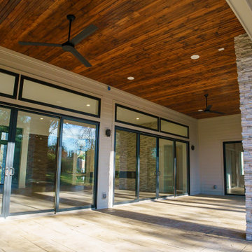
The covered patio is reached through the large double-sliding doors. Stacked stone columns and a wood-finished ceiling compliment the mid-century modern design of the home. The c-shaped floor plan wraps around the outdoor area.

 Studio Vice
Ryan Stadler Photography
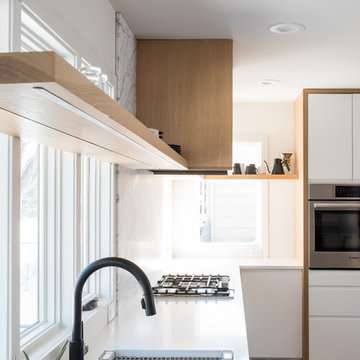
Eat-in kitchen - eat-in kitchen idea in Minneapolis with a single-bowl sink, flat-panel cabinets, white cabinets, quartz countertops, gray backsplash, stone slab backsplash and stainless steel appliances
Eat-in kitchen - eat-in kitchen idea in Minneapolis with a single-bowl sink, flat-panel cabinets, white cabinets, quartz countertops, gray backsplash, stone slab backsplash and stainless steel appliances
53