
Search results for "Intervention" in Home Design Ideas
 Clawson Architects, LLC
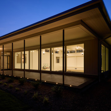
AIA Design Excellence Recognition, this is a refined, light-filled architectural intervention that amplifies space, daylight, and connection while complimenting the site’s integrity. Working entirely within the existing foundation, the design introduces a layered, multifunctional program: two guest rooms, an office, basketball gym, media room, and entertaining kitchen. Each space flows into the next, supporting varied uses without feeling compartmentalized. Skylights above the stair, clerestory windows over the gym, and floor-to-ceiling glass draw daylight deep into the plan, transforming rooms into bright, engaging living spaces.
 Klopf Architecture
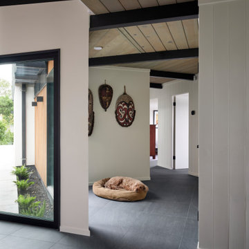
Set in a quiet neighborhood and framed by mature trees, this residence presented a unique opportunity: to thoughtfully evolve a custom mid-century modern home into a space that supports the everyday rhythms of a growing family. With a deep respect for the home’s original architecture, Klopf Architecture reimagined the house to better meet the needs of its owners—introducing functional improvements while preserving the spirit and character of its mid-century roots.
The clients approached Klopf Architecture with a clear vision: refresh their home while seamlessly integrating new programmatic elements. Key goals included clarifying and enhancing the entry sequence; connecting the detached garage to the main house with a practical yet architecturally intentional intervention; adding functional spaces such as a mudroom and laundry room; expanding and remodeling the primary suite’s bathroom and closet; and creating a more engaging outdoor space that capitalized on the site’s impressive views, featuring a fire pit and outdoor kitchen.
As a couple with distinct yet complementary perspectives—one focused on modern functionality and technology, and the other dedicated to preserving the home’s architectural integrity—their collaboration with Klopf Architecture resulted in a solution that harmonized both ideals. Their shared commitment to improving the livability of their home led to a design dialogue rooted in balance. This dynamic partnership shaped the direction of the renovation, ensuring that every decision honored the spirit of the original home while aligning with the practical needs of their growing family.
Designing within the constraints of the sloped site posed one of the project’s central challenges. The detached garage sat at a higher elevation than the main house, requiring a solution that ensured architectural and geometric compatibility between the two structures. Rather than create a purely utilitarian link, Klopf Architecture introduced an intentional connection that contributes to the overall architectural language. A notable pinch point in the plan—where differing geometries converged—was treated as a hinge point, turning a potentially awkward juncture into an architectural feature. This area now functions as both a transition and a moment of design interest that unifies the overall plan.
The design also addressed the underutilized outdoor area, which was located in a shadowed portion of the site with geometrical limitations. A new connection to the rear deck was created in this same area, making the outdoor space more useful and inviting. Klopf Architecture introduced carefully positioned openings and spatial improvements that forged a strong visual and functional connection between indoor and outdoor spaces. The outdoor area now reads as a deliberate extension of the home, embracing natural light and emphasizing the dramatic views.
Working through multiple design iterations, Klopf Architecture crafted a solution that preserved the architectural language of the original home while supporting the functional needs of modern life. The garage-to-house connection became more than a passage—it evolved into an architectural moment of transition. A new mudroom and laundry space enhanced convenience without compromising the clean lines of the design. The primary suite was expanded to create a private, serene retreat. The reimagined backyard, complete with fire pit and kitchen, now plays a vital role in the family’s daily routine and social life.
Outcomes and Lasting Impact
The result is a home that balances heritage with contemporary design, technical precision with design sensibility. The redesign not only met the clients’ initial goals but also exceeded expectations in its ability to seamlessly blend past and present, function and beauty, making the outdoor kitchen a favorite gathering place.
Beyond aesthetics, the renovation has significantly improved daily life for the family. The newly integrated garage connection has streamlined routines, providing a seamless transition between arriving home, storing belongings, and entering the main living spaces. The expanded primary suite offers a retreat-like atmosphere, creating a private space to unwind at the end of the day. The redesigned outdoor areas have also become an extension of their lifestyle—whether it's casual family dinners around the fire pit, entertaining friends in the outdoor kitchen, or simply enjoying the view from the reimagined backyard.
Through a thoughtful and strategic approach, the house has been successfully evolved into a home that remains true to its mid-century modern roots while enhancing livability, functionality, and the overall quality of life for the modern-day owners.
Klopf Architecture Team: Geoffrey Campen, Fernanda Bernardes
Architectural Interior Design: Klopf Architecture
Structural Engineer: Base Design Inc.
Contractor: Golden Snail Builders
Photography: Mariko Reed
Year Completed:2022
 Klopf Architecture
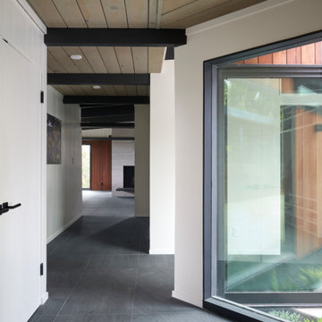
Set in a quiet neighborhood and framed by mature trees, this residence presented a unique opportunity: to thoughtfully evolve a custom mid-century modern home into a space that supports the everyday rhythms of a growing family. With a deep respect for the home’s original architecture, Klopf Architecture reimagined the house to better meet the needs of its owners—introducing functional improvements while preserving the spirit and character of its mid-century roots.
The clients approached Klopf Architecture with a clear vision: refresh their home while seamlessly integrating new programmatic elements. Key goals included clarifying and enhancing the entry sequence; connecting the detached garage to the main house with a practical yet architecturally intentional intervention; adding functional spaces such as a mudroom and laundry room; expanding and remodeling the primary suite’s bathroom and closet; and creating a more engaging outdoor space that capitalized on the site’s impressive views, featuring a fire pit and outdoor kitchen.
As a couple with distinct yet complementary perspectives—one focused on modern functionality and technology, and the other dedicated to preserving the home’s architectural integrity—their collaboration with Klopf Architecture resulted in a solution that harmonized both ideals. Their shared commitment to improving the livability of their home led to a design dialogue rooted in balance. This dynamic partnership shaped the direction of the renovation, ensuring that every decision honored the spirit of the original home while aligning with the practical needs of their growing family.
Designing within the constraints of the sloped site posed one of the project’s central challenges. The detached garage sat at a higher elevation than the main house, requiring a solution that ensured architectural and geometric compatibility between the two structures. Rather than create a purely utilitarian link, Klopf Architecture introduced an intentional connection that contributes to the overall architectural language. A notable pinch point in the plan—where differing geometries converged—was treated as a hinge point, turning a potentially awkward juncture into an architectural feature. This area now functions as both a transition and a moment of design interest that unifies the overall plan.
The design also addressed the underutilized outdoor area, which was located in a shadowed portion of the site with geometrical limitations. A new connection to the rear deck was created in this same area, making the outdoor space more useful and inviting. Klopf Architecture introduced carefully positioned openings and spatial improvements that forged a strong visual and functional connection between indoor and outdoor spaces. The outdoor area now reads as a deliberate extension of the home, embracing natural light and emphasizing the dramatic views.
Working through multiple design iterations, Klopf Architecture crafted a solution that preserved the architectural language of the original home while supporting the functional needs of modern life. The garage-to-house connection became more than a passage—it evolved into an architectural moment of transition. A new mudroom and laundry space enhanced convenience without compromising the clean lines of the design. The primary suite was expanded to create a private, serene retreat. The reimagined backyard, complete with fire pit and kitchen, now plays a vital role in the family’s daily routine and social life.
Outcomes and Lasting Impact
The result is a home that balances heritage with contemporary design, technical precision with design sensibility. The redesign not only met the clients’ initial goals but also exceeded expectations in its ability to seamlessly blend past and present, function and beauty, making the outdoor kitchen a favorite gathering place.
Beyond aesthetics, the renovation has significantly improved daily life for the family. The newly integrated garage connection has streamlined routines, providing a seamless transition between arriving home, storing belongings, and entering the main living spaces. The expanded primary suite offers a retreat-like atmosphere, creating a private space to unwind at the end of the day. The redesigned outdoor areas have also become an extension of their lifestyle—whether it's casual family dinners around the fire pit, entertaining friends in the outdoor kitchen, or simply enjoying the view from the reimagined backyard.
Through a thoughtful and strategic approach, the house has been successfully evolved into a home that remains true to its mid-century modern roots while enhancing livability, functionality, and the overall quality of life for the modern-day owners.
Klopf Architecture Team: Geoffrey Campen, Fernanda Bernardes
Architectural Interior Design: Klopf Architecture
Structural Engineer: Base Design Inc.
Contractor: Golden Snail Builders
Photography: Mariko Reed
Year Completed:2022
Find the right local pro for your project
 Clawson Architects, LLC
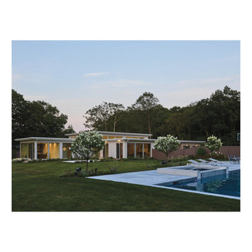
AIA Design Excellence Recognition, this is a refined, light-filled architectural intervention that amplifies space, daylight, and connection while complimenting the site’s integrity. Working entirely within the existing foundation, the design introduces a layered, multifunctional program: two guest rooms, an office, basketball gym, media room, and entertaining kitchen. Each space flows into the next, supporting varied uses without feeling compartmentalized. Skylights above the stair, clerestory windows over the gym, and floor-to-ceiling glass draw daylight deep into the plan, transforming rooms into bright, engaging living spaces.
 Genesis
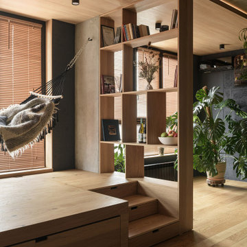
This micro-apartment is more than a dwelling — it's a curated emotional experience. Designed by Genesis Design, the 43 m² loft offers an introspective environment that merges raw, masculine elements with gentle interventions.
The ceiling is raw concrete, anchoring the space in an industrial identity. Below it, soft light spills over textured materials: green tiles, wood cabinetry, botanical structures, and matte black fixtures. A steel-framed canopy above the kitchen holds plants that gently cascade, forming an organic chandelier. The bed, hidden beneath a raised platform, disappears by day. A hammock loft invites idle thought.
“Urban Stillness” is a space that honors time — not just function. Designed for unwinding, pausing, and reconnecting inside the chaos of the city.
 studio romanlvll
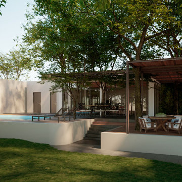
Remodel project aiming to visually connect the existing house with the new intervention. The proposed layout unifies lost spaces in the transition between house and garden. Using dark materials on the floor to create visual contrast, we were able to direct the eyesight to strategic points; the house, the poolhouse, the barbeque pit, and the swimming lane.
To further unify the interior of the house with the exterior, we used a similar material pallette, creating a visual congruence.
Square footage: 4,305.56 ft2
Status: Built project
Year: 2020
 Penza Bailey Architects
This 6-bedroom Baltimore row home's grand exterior overlooks a tree lined street in the historic Bolton Hill neighborhood. The original large pocket doors in the first floor allows for uninterrupted views from the front parlor through the sitting room and into the rear dining room bay window.
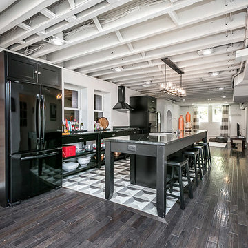
Penza Bailey Architects provided a complete transformation of the walk out garden level. The entire level was renovated to include a new kitchen, family room, mudroom, playroom, full bathroom and a gracious new stair leading to the upper level. The painted brick and exposed structure expresses the original "bones" of the home, while clearly modern interventions stand in contrast to suit the homeowner’s lifestyle. An alcove on the 1st floor was also renovated to provide a serving pantry and bar.
The exterior received restored front and vestibule doors, select window replacements, and new rear french doors, all receiving historical approval.

 m masha wakula
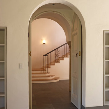
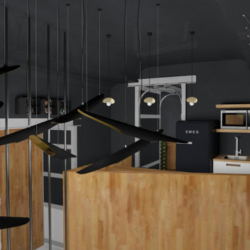
Example of a trendy walk-out concrete floor and gray floor basement design with black walls
 Genesis
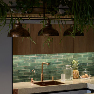
This micro-apartment is more than a dwelling — it's a curated emotional experience. Designed by Genesis Design, the 43 m² loft offers an introspective environment that merges raw, masculine elements with gentle interventions.
The ceiling is raw concrete, anchoring the space in an industrial identity. Below it, soft light spills over textured materials: green tiles, wood cabinetry, botanical structures, and matte black fixtures. A steel-framed canopy above the kitchen holds plants that gently cascade, forming an organic chandelier. The bed, hidden beneath a raised platform, disappears by day. A hammock loft invites idle thought.
“Urban Stillness” is a space that honors time — not just function. Designed for unwinding, pausing, and reconnecting inside the chaos of the city.
 LandFluent Landscape Architecture
Photography
Robin Hill & Chance Stillman
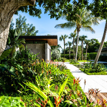
The renovation of this contemporary residence and garden is deeply inspired by its subtropical context, utilizing horizontal lines to ground the home and connect its occupants to nature. When considering how to make the most impactful intervention, the design team focused mainly on horizontal roof planes, subtropical landscaping and an abundance of clerestory windows that would all contribute to the home’s integration with its site. In contrast to the tropes of a Palm Beach traditional vernacular, this home seeks to re-establish itself within nature as a place for a young family.
Architectural strategies included dematerializing the surrounding walls and expanding the roof eaves to connect the interior spaces with the surrounding gardens of the home.
The site plan is organized around four main pavilions: A bedroom pavilion to the south, a cabana pavilion to the west, a garage pavilion to the north, and a central living pavilion. Each of the three pavilions engage with the central living space while still allowing nature to flow between them. The pavilions are organized around the pool deck, equipped with zero-edge detailing and layered subtropical landscaping. In this way the swimming pool doubles as a recreational component to the program but also as a mirror to expand views and reflect the surrounding landscape. A glass bridge serves as the garden threshold between the garage and the home.
The renovated home and garden departs from its former Bahamian style and stands out within the community as a symbol for the future of architecture and landscape architecture within this quiet, ocean-front community. A residence derived from, and in response to, its user and environmental context; thus, re-establishing it with place.
Scale
1 ACRE
Scope
HARDSCAPE, SWIMMING POOL + PLANTING DESIGN
Year
2022
Architecture
KODA
Landscape Architecture
LandFluent
General Contractor
PB Built
Landscape Contractor
Rood Landscape
 Lincoln Lighthill Architect
How do you modernize modernism on a budget? This house had charming midcentury character and lots of potential but had been neglected for many years and was sorely in need of a refresh to bring it up to modern standards of comfort, finish, and sustainability. The tight budget dictated that it would not be a down-to-the-studs, gut remodel, but more of a surgical intervention.
Built in 1955, the house had settled on the downhill side, making the floors slope almost 4” from the front to the back of the house. Using an innovative and inexpensive push-pile method, the foundation was reinforced and the house was jacked back up. It now sits solidly on bedrock and the floor is level to within a half-inch throughout.
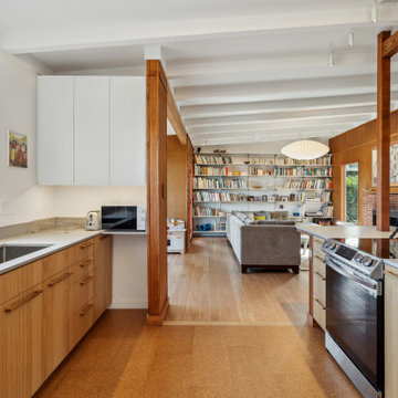
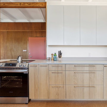
Inside, the original kitchen was worn and needed replacement. This presented an opportunity to remove the walls separating it from the living and dining area and create a wide-open great room with a peninsula counter for guests to gather and an almost continuous wall of windows to take in views of the hills, trees, and bay.
Throughout the rest of the house, most finishes were restored, or replaced when necessary. Wood floors were refinished, and new cork flooring, a slightly less durable but much less expensive alternative to tile and similar materials, was used in all wet areas, with the added benefit of warmth and resiliency. The existing textured walls and ceilings were skim-coated smooth with plaster, dark beams painted white, and existing wood wall paneling in the living room was cleaned and color-matched where new pieces were required. All of the existing frameless, direct-glazed windows were replaced with double pane units, and a new floor-to-ceiling window on the south side of the living room provides a key source of natural light.
In the bathrooms, existing tile and vanities were saved, and a strangely colored tub and sinks were re-glazed. Flooring, toilets, lighting, double medicine cabinets, and paint in each space make these mostly unaltered rooms feel new again.
Sustainability and comfort upgrades include an induction range (step one of an eventual transition to full electrification), spray foam insulation under the floor, spray-in cellulose in the walls, and warm-dim LED lighting throughout on a simple whole-house control system. Combined with a modern thermostat, the house’s systems are all accessible via app from anywhere.
And the most sustainable feature of all? What we didn’t do: tear it down and start over. In a country that demolishes a million homes a year- 1% of our residential housing stock- reusing an existing home is the greenest solution of all.
 Granit Architects + Interiors
We are delighted to have completed the radical transformation of a tired detached property in South Croydon.
When they appointed Granit, our clients were living in the property which had previously been divided into a number of flats.
The historic sub-division had resulted in an extremely poor use of space with redundant staircases, kitchens and bathrooms throughout.
Our clients sought to reconfigure the property back into a single dwelling for his growing family.
Our client had an eye for design and was keen to balance contemporary design whilst maintaining as much of the character of the original house.
Maximising natural light, space and establishing a visual and physical connection were also key drivers for the design. Owing to the size of the property, it became apparent that reconfiguration rather than extension provided the solution to meet the brief.
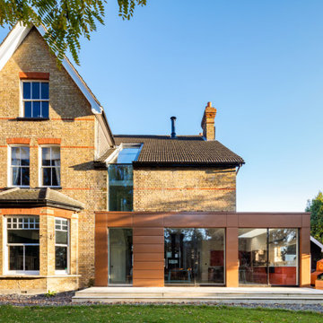
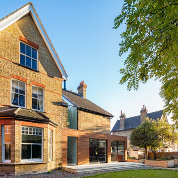
A metal clad ‘intervention’ was introduced to the rear facade. This created a strong horizontal element creating a visual balance with the vertical nature of the three storey gable.
The metal cladding specified echoed the colour of the red brick string courses tying old with new. Slender frame sliding doors provide access and views of the large garden.
The central circulation space was transformed by the introduction of a double height glazed slot wrapping up the rear facade and onto the roof. This allows daylight to permeate into the heart of the otherwise dark deep floor plan. The staircase was reconfigured into a series of landings looking down over the main void space below and out towards the tree canopies at the rear of the garden.
The introduction of double pocket doors throughout the ground floor creates a series of interconnected spaces and the whitewashed Larch flooring flows seamlessly from room to room. A bold palette of colours and materials lends character and texture throughout the property.
The end result is a spacious yet cosy environment for the family to inhabit for years to come.
 Smithouse Design + Build
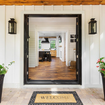
Built in the mid-1700s, this historic home reflects centuries of evolution, with additions made over time to meet changing needs. While each expansion added to the story of the house, the overall layout had become somewhat haphazard. Our challenge was to bring harmony and cohesion to the home while preserving the character and charm that only a centuries-old property can offer. With deep respect for the home’s architectural roots, we approached the renovation with a focus on thoughtful reconfiguration rather than dramatic intervention—creating spaces that feel intentional, balanced, and true to the original spirit of the house.
 Modulor
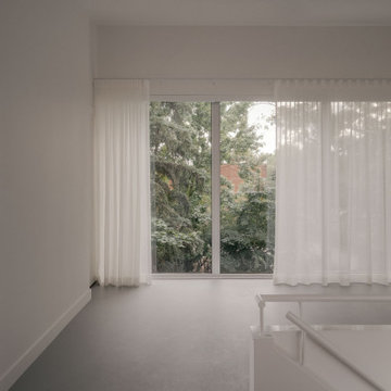
Located in the heart of Montreal, Binôme is an architectural urban densification project built by Modulor. Composed of two distinct buildings connected by an inner courtyard, this new five-unit development stands out through its unique layout, architecture, and exceptional attention to detail. The construction required rigorous planning and precise technical execution, particularly due to major excavation work and underpinning of adjacent buildings. Such interventions in a dense urban environment demand specialized expertise and tight project management at every phase of the build.
Conceived as an income-generating property, the clients benefited from our strategic support to ensure the profitability, efficiency, and optimization of their investment. Modulor worked closely with the team at Appareil Architecture to bring to life a project of high architectural integrity.
Binôme’s architecture draws inspiration from the area's industrial past: clean volumes, red brick, generous openings reminiscent of former workshops, and elegant brick colonnades form a refined and cohesive ensemble. The central courtyard, designed as a luminous and welcoming shared space, becomes the vibrant heart of the project. A colorful metal staircase, crafted by Atomic Soudure, connects both buildings and adds a distinctive, curated touch.
As a finalist for the 2025 Ordre des architectes du Québec Awards of Excellence, Binôme stands as a model of successful urban revitalization. It illustrates how thoughtful, well-executed construction can elevate Montreal’s built environment while addressing today’s densification challenges.
 Zola European Windows
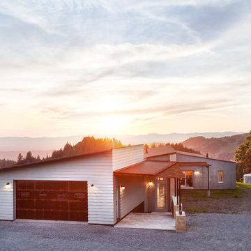
The site was the main point of inspiration for this home which features Zola Thermo Clad windows and doors. Located on a steep site with dramatic views, the house design takes cues from the surrounding topography. The house seeks to integrate into the landscape in a respectful way. It is set into the slope of the ridge, the building “steps down” working to become part of the landscape rather than be an intervention in opposition. The shed-roofed volumes are oriented to mimic the slope of the ridge and designed to provide solar shading. The main living space opens to spectacular landscape to the south and west – sweeping views of golden rolling hills, city lights, and is a perch to watch coast weather movement. On the north side the building is carefully shaped, turning to meet the edge line of a mature oak forest, creating an intimate, protected, courtyard.
 Granit Architects + Interiors
We are delighted to have completed the radical transformation of a tired detached property in South Croydon.
When they appointed Granit, our clients were living in the property which had previously been divided into a number of flats.
The historic sub-division had resulted in an extremely poor use of space with redundant staircases, kitchens and bathrooms throughout.
Our clients sought to reconfigure the property back into a single dwelling for his growing family.
Our client had an eye for design and was keen to balance contemporary design whilst maintaining as much of the character of the original house.
Maximising natural light, space and establishing a visual and physical connection were also key drivers for the design. Owing to the size of the property, it became apparent that reconfiguration rather than extension provided the solution to meet the brief.
A metal clad ‘intervention’ was introduced to the rear facade. This created a strong horizontal element creating a visual balance with the vertical nature of the three storey gable.
The metal cladding specified echoed the colour of the red brick string courses tying old with new. Slender frame sliding doors provide access and views of the large garden.
The central circulation space was transformed by the introduction of a double height glazed slot wrapping up the rear facade and onto the roof. This allows daylight to permeate into the heart of the otherwise dark deep floor plan. The staircase was reconfigured into a series of landings looking down over the main void space below and out towards the tree canopies at the rear of the garden.
The introduction of double pocket doors throughout the ground floor creates a series of interconnected spaces and the whitewashed Larch flooring flows seamlessly from room to room. A bold palette of colours and materials lends character and texture throughout the property.
The end result is a spacious yet cosy environment for the family to inhabit for years to come.
 Form Found Design
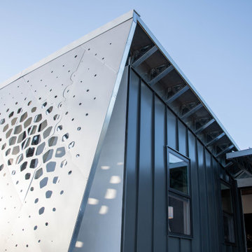
Inspired by the multi-functional performance of a shell structure in nature, the design of this two-bedroom, two-bath ADU explored a performance-based roof geometry that becomes the building façade and privacy screen. Coupled with deep roof overhangs, this second skin allows dappled light to penetrate the interior during the day while reflecting the detrimental UV radiation on the southern exposure. The perforations in the second skin are based on the effects of the sun path on the southern exposure and the location of the windows behind the screen. At night, the interior light glows through the perforations, contributing to the name of the project, “LuminOCity”.
Orange Coast College and UC Irvine formed a partnership called "Team MADE" to enter the 2023 Orange County Sustainability Decathlon. "MADE" is an acronym for Modular, Affordable Dwellings for the Environment. LuminOCity won second place in the competition and 9 awards in various categories. Following the competition, the home was donated to Homeless Intervention Services, Orange County, where it serves as an ADU on an existing property to provide transitional housing for youth experiencing housing insecurities.
This 750sf prefabricated, modular home is built on four, eight foot wide modules that nest together. The building system is predicated on a software-to-manufacturing pipeline called the FrameCAD Machine. This roll-former for light-gauge steel allowed Team MADE to prototype as well as site-manufacture every stud and track in the steel-framed home they would design. Over 100 student volunteers aided in the construction of the steel framing, MEP installation, building envelope, and site work. The use of prefabricated Light Gauge Steel allowed for higher construction tolerances with simplified assembly diagrams that could be followed by student volunteers. Joseph Sarafian, AIA was the lead architect as well as one of four faculty advisors on the project, leading the design of the project from conception to completion.
 Lincoln Lighthill Architect
How do you modernize modernism on a budget? This house had charming midcentury character and lots of potential but had been neglected for many years and was sorely in need of a refresh to bring it up to modern standards of comfort, finish, and sustainability. The tight budget dictated that it would not be a down-to-the-studs, gut remodel, but more of a surgical intervention.
Built in 1955, the house had settled on the downhill side, making the floors slope almost 4” from the front to the back of the house. Using an innovative and inexpensive push-pile method, the foundation was reinforced and the house was jacked back up. It now sits solidly on bedrock and the floor is level to within a half-inch throughout.
Inside, the original kitchen was worn and needed replacement. This presented an opportunity to remove the walls separating it from the living and dining area and create a wide-open great room with a peninsula counter for guests to gather and an almost continuous wall of windows to take in views of the hills, trees, and bay.
Throughout the rest of the house, most finishes were restored, or replaced when necessary. Wood floors were refinished, and new cork flooring, a slightly less durable but much less expensive alternative to tile and similar materials, was used in all wet areas, with the added benefit of warmth and resiliency. The existing textured walls and ceilings were skim-coated smooth with plaster, dark beams painted white, and existing wood wall paneling in the living room was cleaned and color-matched where new pieces were required. All of the existing frameless, direct-glazed windows were replaced with double pane units, and a new floor-to-ceiling window on the south side of the living room provides a key source of natural light.
In the bathrooms, existing tile and vanities were saved, and a strangely colored tub and sinks were re-glazed. Flooring, toilets, lighting, double medicine cabinets, and paint in each space make these mostly unaltered rooms feel new again.
Sustainability and comfort upgrades include an induction range (step one of an eventual transition to full electrification), spray foam insulation under the floor, spray-in cellulose in the walls, and warm-dim LED lighting throughout on a simple whole-house control system. Combined with a modern thermostat, the house’s systems are all accessible via app from anywhere.
And the most sustainable feature of all? What we didn’t do: tear it down and start over. In a country that demolishes a million homes a year- 1% of our residential housing stock- reusing an existing home is the greenest solution of all.
 Miss Pepita Creative Studio
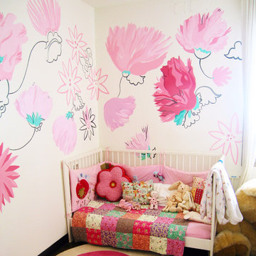
A tiny room needed a big accent intervention to move the soon-to-be-eldest daughter out of her big bedroom and into a smaller one.
Small cottage chic girl nursery photo in Austin with multicolored walls
Small cottage chic girl nursery photo in Austin with multicolored walls
61