
Search results for "Intervention" in Home Design Ideas
 Penza Bailey Architects
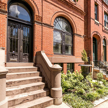
This 6-bedroom Baltimore row home's grand exterior overlooks a tree lined street in the historic Bolton Hill neighborhood. The original large pocket doors in the first floor allows for uninterrupted views from the front parlor through the sitting room and into the rear dining room bay window.
Penza Bailey Architects provided a complete transformation of the walk out garden level. The entire level was renovated to include a new kitchen, family room, mudroom, playroom, full bathroom and a gracious new stair leading to the upper level. The painted brick and exposed structure expresses the original "bones" of the home, while clearly modern interventions stand in contrast to suit the homeowner’s lifestyle. An alcove on the 1st floor was also renovated to provide a serving pantry and bar.
The exterior received restored front and vestibule doors, select window replacements, and new rear french doors, all receiving historical approval.
 Errez Design Inc.
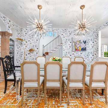
Example of a mid-sized tuscan carpeted, orange floor, shiplap ceiling and wallpaper enclosed dining room design in Miami with multicolored walls
 Studio InSitu Architects
The 300-acre Jewell Hill farm spans a broad hilltop in Ashby, MA. Under the care, now, of the Trustees of Reservations, it's a key piece of a broader 3,500-acre contiguous area permanently protected for public enjoyment.
Our colleagues at Colonial Barn Restoration were asked by The Trustees to find a new home for Jewell Hill's early 19th-century sheep barn, and found a buyer in the hills above Fitchburg just a mile South. On an idyllic hilltop of their own, this buyer's retirement homestead has developed a broad landscape of productive and recreational gardens and fields, all around the remnant foundation of a long-gone larger barn.
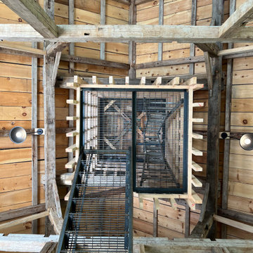
From the Jewell Hill barn's mortise and tenon bones, and the remnant foundation on the Fitchburg site, Studio InSitu designed a new hybrid barn. The restored foundation anchors the smaller timber frame over its West half, and brackets a pair of ramps to Main floor and undercroft in its East half. The ramp down serves storage, and the ramp up serves the barn's main room - which may periodically host social gatherings.
Into this assembly of pedigreed timbers and structural stone, we made one conspicuous intervention. The cupola and observation room penetrate the barn's roof like a periscope. A slender steel stair is suspended and sheathed by a wooden latticework, which provides both a foil for light and a comforting sense of enclosure. The assembly is meant to invite visitors into a tactile and intimate experience of the barn's and the landscape's contrasting volumes and scales, ultimately rewarding climbers with sweeping views of the hillside fields and valley below.
Find the right local pro for your project
 Granit Architects + Interiors
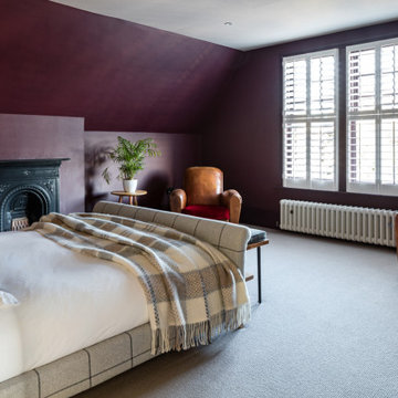
We are delighted to have completed the radical transformation of a tired detached property in South Croydon.
When they appointed Granit, our clients were living in the property which had previously been divided into a number of flats.
The historic sub-division had resulted in an extremely poor use of space with redundant staircases, kitchens and bathrooms throughout.
Our clients sought to reconfigure the property back into a single dwelling for his growing family.
Our client had an eye for design and was keen to balance contemporary design whilst maintaining as much of the character of the original house.
Maximising natural light, space and establishing a visual and physical connection were also key drivers for the design. Owing to the size of the property, it became apparent that reconfiguration rather than extension provided the solution to meet the brief.
A metal clad ‘intervention’ was introduced to the rear facade. This created a strong horizontal element creating a visual balance with the vertical nature of the three storey gable.
The metal cladding specified echoed the colour of the red brick string courses tying old with new. Slender frame sliding doors provide access and views of the large garden.
The central circulation space was transformed by the introduction of a double height glazed slot wrapping up the rear facade and onto the roof. This allows daylight to permeate into the heart of the otherwise dark deep floor plan. The staircase was reconfigured into a series of landings looking down over the main void space below and out towards the tree canopies at the rear of the garden.
The introduction of double pocket doors throughout the ground floor creates a series of interconnected spaces and the whitewashed Larch flooring flows seamlessly from room to room. A bold palette of colours and materials lends character and texture throughout the property.
The end result is a spacious yet cosy environment for the family to inhabit for years to come.
 EAG Studio
Refined Continuity: Bridging Classical Architecture and Modern Living
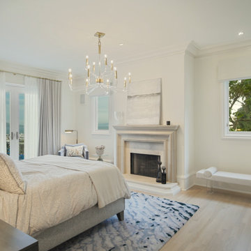
This comprehensive remodel of a grand Cow Hollow residence reimagines a historically expressive envelope through a lens of contemporary livability, precision detailing, and material restraint. The design approach carefully balances the home’s classical proportions and ornamental heritage with a refined, modern sensibility—evident in the disciplined palette of warm neutrals, soft plasters, pale oak flooring, and tailored millwork. Circulation has been clarified and subtly expanded to enhance spatial flow, while openings are leveraged to capture light, garden outlooks, and distant water views. Throughout, architectural interventions are executed with a high level of craft, ensuring that new insertions—whether cabinetry, railings, or apertures—read as seamless continuations of the original structure rather than applied elements.
The kitchen serves as the operational and visual anchor of the home, conceived as a sculptural yet highly functional environment. Custom rift-cut cabinetry, softened through a desaturated finish, is paired with honed stone surfaces and integrated brass hardware to create a quiet, tactile richness. A monolithic island establishes a central gathering point, while perimeter work zones are carefully layered with concealed storage, integrated appliances, and open, backlit shelving that elevates everyday objects into curated displays. The adjacent bar and entertaining areas extend this language, reinforcing a cohesive hospitality-driven program. In parallel, the primary bathroom is designed as a serene, spa-like retreat, where bookmatched stone, frameless glass enclosures, and finely detailed metalwork converge. The composition prioritizes symmetry, clarity, and light—balancing generous volumes with intimate moments through integrated lighting, custom vanities, and a restrained material hierarchy.
The library and ancillary living spaces introduce a more intimate scale, anchored by bespoke built-ins that combine closed storage with illuminated display niches, creating depth and rhythm along the walls. Here, material transitions and furniture integration are handled with particular nuance, allowing the architecture to support both quiet retreat and social gathering. A continuous language of custom railings—executed in refined metal profiles—threads through the interior and extends outward, where the exterior gate and garden elements have been reinterpreted to align with the home’s renewed identity. The entry sequence is now defined by a calibrated interplay of solidity and transparency, with sculptural metalwork and landscape integration establishing a sense of arrival that is both secure and elegant. Collectively, the project reflects a holistic transformation—one that elevates performance, livability, and aesthetic clarity while preserving the inherent dignity of the original architecture.
 Lincoln Lighthill Architect
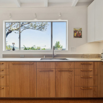
How do you modernize modernism on a budget? This house had charming midcentury character and lots of potential but had been neglected for many years and was sorely in need of a refresh to bring it up to modern standards of comfort, finish, and sustainability. The tight budget dictated that it would not be a down-to-the-studs, gut remodel, but more of a surgical intervention.
Built in 1955, the house had settled on the downhill side, making the floors slope almost 4” from the front to the back of the house. Using an innovative and inexpensive push-pile method, the foundation was reinforced and the house was jacked back up. It now sits solidly on bedrock and the floor is level to within a half-inch throughout.
Inside, the original kitchen was worn and needed replacement. This presented an opportunity to remove the walls separating it from the living and dining area and create a wide-open great room with a peninsula counter for guests to gather and an almost continuous wall of windows to take in views of the hills, trees, and bay.
Throughout the rest of the house, most finishes were restored, or replaced when necessary. Wood floors were refinished, and new cork flooring, a slightly less durable but much less expensive alternative to tile and similar materials, was used in all wet areas, with the added benefit of warmth and resiliency. The existing textured walls and ceilings were skim-coated smooth with plaster, dark beams painted white, and existing wood wall paneling in the living room was cleaned and color-matched where new pieces were required. All of the existing frameless, direct-glazed windows were replaced with double pane units, and a new floor-to-ceiling window on the south side of the living room provides a key source of natural light.
In the bathrooms, existing tile and vanities were saved, and a strangely colored tub and sinks were re-glazed. Flooring, toilets, lighting, double medicine cabinets, and paint in each space make these mostly unaltered rooms feel new again.
Sustainability and comfort upgrades include an induction range (step one of an eventual transition to full electrification), spray foam insulation under the floor, spray-in cellulose in the walls, and warm-dim LED lighting throughout on a simple whole-house control system. Combined with a modern thermostat, the house’s systems are all accessible via app from anywhere.
And the most sustainable feature of all? What we didn’t do: tear it down and start over. In a country that demolishes a million homes a year- 1% of our residential housing stock- reusing an existing home is the greenest solution of all.
 S'ESTEPA DESIGN
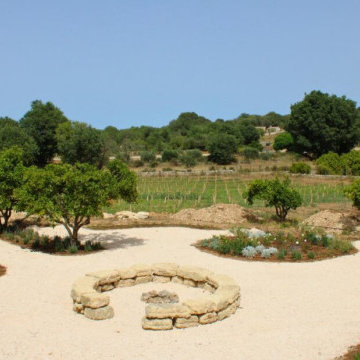
In the Llubí garden, our landscape design focuses on creating an aesthetic, functional, and sustainable space. We have prioritized water conservation by avoiding lawns and meadows in favor of a large gravel area. Next to the house wall, we have installed gravel stabilizers to create an ideal space for placing tables for breakfast or snacks. This area features an umbrella situated at the highest point of the garden, offering a panoramic view and allowing for full enjoyment of the surroundings.
To break the monotony of the gravel, we have introduced islands of rosemary and lavender, alternating these plants in five long and narrow islands, approximately 7 meters by 2 meters each. These plants will grow, partially covering the gravel and providing a contrasting color with the sea gravel.
Additionally, we have created five islands of various wildflowers that will grow and cover the ground, serving as points of flowering. In the center of the garden, we have incorporated a fireplace, creating a perfect space for extraordinary moments with family and friends. Around this central area, we have planted three jacarandas, providing points of shade in the garden.
The garden’s design aims to be low maintenance, highlighting wildflowers and creating areas with a high density of these plants, which gives the space a wild and natural character. This approach allows for the enjoyment of a garden that reflects natural beauty with minimal intervention.
 Fabco Sanctuary
The architect and designer Guy Derwent was approached by his client with a clear and compelling brief: to completely transform a grand Victorian terrace house they were planning to renovate. The client envisioned something far beyond a standard renovation – this was to be a bold and dramatic reimagining of a family home that could grow with them over time.
With the property having remained largely untouched for more than fifty years, the architects saw an opportunity to unlock its potential and deliver a contemporary design that would contrast beautifully with its Victorian heritage.
The existing layout consisted of a series of small, disconnected rooms to the rear of the house. To respond to the client’s need for openness and flexibility, the architect proposed a radical restructuring of the ground floor:
The rear rooms were completely removed
Suspended timber floors were lowered by up to two metres to align with the garden
Two bold extensions were added
The first extension filled in the side return with a London stock brick facade and a glazed roof, while the second – a striking black steel and glass pavilion was glazed on three sides and placed along the garden elevation.
This new pavilion redefined the building’s relationship with the garden. Its steel-framed glazing created a seamless dialogue between interior and exterior, offering a sense of immersion in the surrounding landscape.
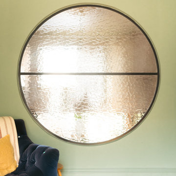
At the heart of the plan sits a dramatic, five-metre-tall dining space that acts as a transition from the original entrance hall into the new addition. A large, circular cast-glass window, framed in steel, provides a visual and spatial link between old and new, allowing light and movement to travel through the depth of the home.
Throughout the project, a series of black metal elements were introduced as sculptural interventions – each marking moments of transformation within the house. These included the bespoke steel framed circular window, a custom metal staircase, a cylindrical support column, and the striking steel and glass garden pavilion. Together, they formed a coherent architectural language that underscored the project’s bold intent.
Our steel windows and doors played a vital role in delivering the project’s vision. The architects chose steel for its refined sight lines and distinctive material character, which helped bridge the gap between the historical context of the building and the bold new additions.
The black steel frames provided a crisp contrast to the pale London stock brick and added definition to the glazed pavilion, reinforcing the sense of architectural precision. In particular, the fine steel profiles of the garden room allowed the extension to feel both lightweight and immersive, blurring the boundary between the house and its garden.
The architect drew inspiration from the Bauhaus Movement, particularly the work of Walter Gropius, whose approach to functional beauty and industrial materials informed the design of the garden pavilion.
Here, our glazing system was used not just for transparency, but as an expressive architectural element. The carefully proportioned panels help to conceal the roof thickness and reinforce the pavilion’s industrial yet abstract character – a deliberate nod to product design and modernist detailing.
Sustainability was an important factor in the selection of materials. Our steel systems, made from 99% recycled content and 100% recyclable, aligned with the project’s broader environmental goals.
The architects noted that this commitment to material longevity and circularity was central to their decision to use steel. The durability and recyclability of the windows and doors ensured the project met both aesthetic and ethical criteria.
This London terrace house now stands as a celebration of contrast – between heritage and innovation, solidity and transparency, tradition and transformation. Our steel windows and doors were not simply components; they were essential tools in crafting a home that is as bold and expressive as it is functional.
The result is a home designed for modern family life, where light, space, and materiality come together in perfect harmony.

 Lithos Design
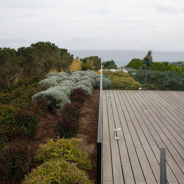
Villa A, says Arch. Alfio Faro, is the result of a double intervention: the re-use and restructuring of an existing house and a new extension close to it, with broad exterior spaces.
Discover our "terra" from the "Pietre Incise" collection: http://bit.ly/LD_Terra
A project by @A-OMA: http://oma.eu/
Project details: Villa A
Architects: Alfio Faro - www.a-oma.eu
Pictures by A-OMA.
All rights reserved.
A project by @A-OMA: http://oma.eu/
Project details: Villa A
Architects: Alfio Faro - www.a-oma.eu
Pictures by A-OMA.
All rights reserved.
 HU-235072162
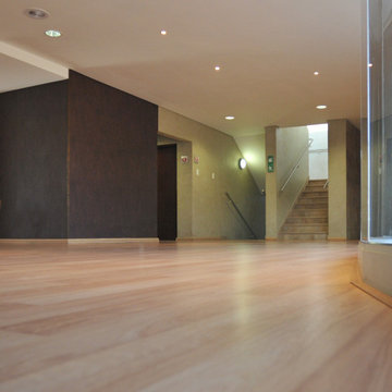
The Dental Studio is a highly intricate building that uniquely links two separate stands of two neighbourhoods and straddling a four metre broad municipal
servitude. The western part of the neighbourhood is an office precinct consisting of low scaled office buildings set around a communal access street and
parking. It was designed for a leading dental practice with state of the art equipment and progressive philosophy of service.
It presents itself as an uncomplicated rectangular structural mass that elegantly characterise an intersection of a major neighbourhood boulevard and is
notable along the eastern end with an upright circulation tower. The western end on the other hand, is characterised with vertical solar control screens
which serve a dual purpose, that is, sifting low down western sun rays as well as giving a serene appeal to the mass. The daring spotless form of the
building is a truthful reflection of the nature of the sterile dental environment that is housed within. This houses the central vestibule and reception with a
visual interface as well as pedestrian movements along the edge of the building.
Healing and healthcare is a paradox that requires architectural intervention. It is this same paradox that informed measures taken towards developing this
project as a revised prototype. Exacerbated by the need to research a building type that can promote healing environment, the Dental Studio attempts
to create a closer harmony with nature through views, landscape and daylight.
 Sanandres Construction
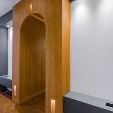
A breathtaking, luxury residence in South Florida’s exclusive Cocoplum neighborhood blends clean, contemporary craftsmanship with warmth and comfort. Sanandres completed extensive structural intervention to improve the flow and function of the award-winning residence’s interior spaces.
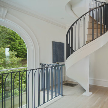 EAG Studio
Refined Continuity: Bridging Classical Architecture and Modern Living
This comprehensive remodel of a grand Cow Hollow residence reimagines a historically expressive envelope through a lens of contemporary livability, precision detailing, and material restraint. The design approach carefully balances the home’s classical proportions and ornamental heritage with a refined, modern sensibility—evident in the disciplined palette of warm neutrals, soft plasters, pale oak flooring, and tailored millwork. Circulation has been clarified and subtly expanded to enhance spatial flow, while openings are leveraged to capture light, garden outlooks, and distant water views. Throughout, architectural interventions are executed with a high level of craft, ensuring that new insertions—whether cabinetry, railings, or apertures—read as seamless continuations of the original structure rather than applied elements.
The kitchen serves as the operational and visual anchor of the home, conceived as a sculptural yet highly functional environment. Custom rift-cut cabinetry, softened through a desaturated finish, is paired with honed stone surfaces and integrated brass hardware to create a quiet, tactile richness. A monolithic island establishes a central gathering point, while perimeter work zones are carefully layered with concealed storage, integrated appliances, and open, backlit shelving that elevates everyday objects into curated displays. The adjacent bar and entertaining areas extend this language, reinforcing a cohesive hospitality-driven program. In parallel, the primary bathroom is designed as a serene, spa-like retreat, where bookmatched stone, frameless glass enclosures, and finely detailed metalwork converge. The composition prioritizes symmetry, clarity, and light—balancing generous volumes with intimate moments through integrated lighting, custom vanities, and a restrained material hierarchy.
The library and ancillary living spaces introduce a more intimate scale, anchored by bespoke built-ins that combine closed storage with illuminated display niches, creating depth and rhythm along the walls. Here, material transitions and furniture integration are handled with particular nuance, allowing the architecture to support both quiet retreat and social gathering. A continuous language of custom railings—executed in refined metal profiles—threads through the interior and extends outward, where the exterior gate and garden elements have been reinterpreted to align with the home’s renewed identity. The entry sequence is now defined by a calibrated interplay of solidity and transparency, with sculptural metalwork and landscape integration establishing a sense of arrival that is both secure and elegant. Collectively, the project reflects a holistic transformation—one that elevates performance, livability, and aesthetic clarity while preserving the inherent dignity of the original architecture.
 Wolf Architects, Inc.
Nick Wheeler
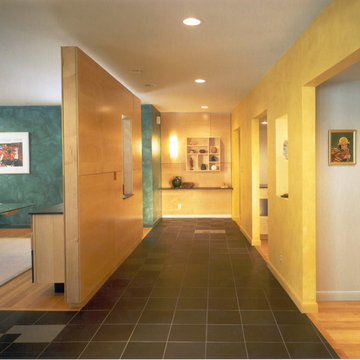
Inspiration for a modern hallway remodel in Boston with yellow walls
Inspiration for a modern hallway remodel in Boston with yellow walls
 Sanandres Construction
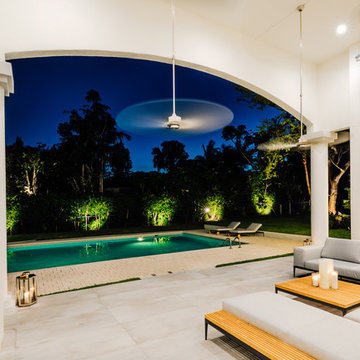
A breathtaking, luxury residence in South Florida’s exclusive Cocoplum neighborhood blends clean, contemporary craftsmanship with warmth and comfort. Sanandres completed extensive structural intervention to improve the flow and function of the award-winning residence’s interior spaces.
 Jeanne Schultz Design Studio
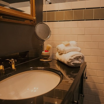
Historically regarded as ‘The Purple House,’ a place where musicians have come and gone, we restored this 1910 historical building in East Nashville to become a boutique bed and breakfast. Developed by native Texans, the home is dubbed The Texas Consulate, a name honored by Nashville’s Mayor, and welcomes travelers and musicians, with a soft spot for Texans. Much of the original structure and details remain, including the wood flooring, trim and casing, architectural niches, fireplaces and tile, brick chimneys, doors and hardware, cast iron tubs, and other special trinkets. We suggested minimal architectural interventions to accommodate the adaptation, in addition to curating hand-selected furniture, fixtures, and objects that celebrate the building’s art deco character.
Architect of Record: David Hunter
Development Team: Taylor Perkins & Will Steakley
Photography: Chris Phelps
 RRA Architects
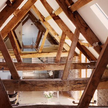
Located in Monmouthshire, this project consisted of careful conservation and conversion of traditional long barn to provide a family home. Harmoniously using contemporary materials and interventions alongside traditional conservation repair; the end result is a project of national success.
Wales continues to promote this project through CADW, as a fine example of good conservation design, as an exemplar welsh project of note.
 Sanandres Construction
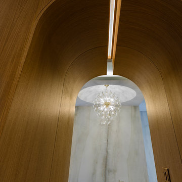
A breathtaking, luxury residence in South Florida’s exclusive Cocoplum neighborhood blends clean, contemporary craftsmanship with warmth and comfort. Sanandres completed extensive structural intervention to improve the flow and function of the award-winning residence’s interior spaces.
 Elevated Outdoors
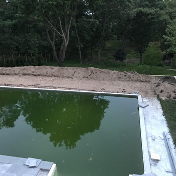
Before terracing, the pool area was constrained by the site’s steep slope. Reshaping the hillside allowed for a significant expansion of the deck, creating a distinct secondary outdoor zone within the larger space. This intervention not only improved circulation and usability, but also introduced a dynamic relationship to sunlight, enabling the area to be enjoyed throughout the day as it follows the sun.
 Modulor
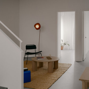
Located in the heart of Montreal, Binôme is an architectural urban densification project built by Modulor. Composed of two distinct buildings connected by an inner courtyard, this new five-unit development stands out through its unique layout, architecture, and exceptional attention to detail. The construction required rigorous planning and precise technical execution, particularly due to major excavation work and underpinning of adjacent buildings. Such interventions in a dense urban environment demand specialized expertise and tight project management at every phase of the build.
Conceived as an income-generating property, the clients benefited from our strategic support to ensure the profitability, efficiency, and optimization of their investment. Modulor worked closely with the team at Appareil Architecture to bring to life a project of high architectural integrity.
Binôme’s architecture draws inspiration from the area's industrial past: clean volumes, red brick, generous openings reminiscent of former workshops, and elegant brick colonnades form a refined and cohesive ensemble. The central courtyard, designed as a luminous and welcoming shared space, becomes the vibrant heart of the project. A colorful metal staircase, crafted by Atomic Soudure, connects both buildings and adds a distinctive, curated touch.
As a finalist for the 2025 Ordre des architectes du Québec Awards of Excellence, Binôme stands as a model of successful urban revitalization. It illustrates how thoughtful, well-executed construction can elevate Montreal’s built environment while addressing today’s densification challenges.
73