
Search results for "Introduction" in Home Design Ideas
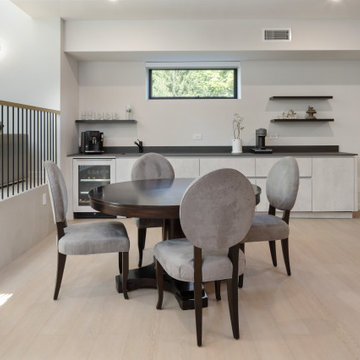
 Leicht Westchester-Greenwich
Designer: Goran Savic
Architect: HAAK Architects
Photographer: Zdravko Cota
Kitchen
Topos - Walnut Natural
Bossa - Walnut Lined
Kiruna-Minera (island)
Dekton Laurent Stone
Back Kitchen/Butler Pantry
Ceres - Olive Grey
Downstairs Bar
Ikono - Keraton
The Beauty of Rich Finishes
The designer instills a dramatic, moody and deeply textured aesthetic in the kitchen space. The walnut wood combined with dark and moody tones, creates an intimate ambiance making this large open space feel grounded, stable, and welcoming. Layered lighting from natural light and track lighting, along with integrated high-end appliances, adds to the striking beauty.
The kitchen exudes warmth and elegance characterized by the luxurious Topos Walnut wood cabinets with their rich color and naturally smooth grain. The walnut palette, combined with the textured dark grey Kiruna cabinets and the marble-like Laurent stone—which showcases a deep brown hue with integrated gold and copper veining—creates a powerful and beautiful atmosphere.
The design is a highly organized layout that focuses on the homeowner’s every day and entertaining lifestyle, emphasizing functionality, efficiency, and streamlined aesthetics.
The back kitchen/butler pantry area was designed to help keep the main kitchen clean and organized. Bulk cooking will take place in the back kitchen area, which has a full suite of appliances. The pantry is accessible yet hidden from the main kitchen via a passage door concealed within the main kitchen.
The downstairs bar area has a sink, dishwasher, beverage fridge and drawer microwave. Designed for easy functionality, it offers ample counter space for small appliances like a juicer, blender, or tea kettle, allowing for refreshment after using the adjacent home gym.
⭐⭐⭐⭐⭐"Goran and his team at Leight Westchester are highly reliable, trustworthy and just fantastic! We were more than satisfied with Goran’s professional advice as well as attention to details. All of our friends who visit our house praise the look and design of our custom kitchen, powder room and basement wet bar. Goran also introduced and coordinated the Dekton and other stone fabrication companies who did an impeccable job in design, color and specifications. Goran even gave us his opinion as to the lighting designs which were of great help. All European seamless cabinet doors with no handle look just impressive. A few of our friends have already started working with Goran on the entire kitchen cabinet system, and all thank us for the introduction!!!"
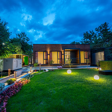
 Ernest M. Ferizi
German Embassy in Pristina - Kosovo, contracted the architecture office “Ferizi + Ferizi Architects” to plan and implement an Annex Office building for their purposes. As detached part of this building is designed the waiting area, as alone standing structure.
This Office Building is constructed by assembling of Eight used office containers that were delivered on trucks and set up after only a few hours on the basis of the LEGO principle, according to the planning on strip foundations.
By removing the flexible exterior wall panels, a large room of 115 m² was created, with the counter wall as a room partition between two office spaces, each with seven workstations as well as three counters for agents on one side and a room for visitors on the other side.
With this system, room solutions can be easily implemented in all dimensions.
The container, seen as a geometric shape, is a simple, octagonal, solid box.
The standardized perfection of its dimensions is striking: 2.44 meters wide, 2.59 meters high and 6.06 meters or 12.19 meters long.
Since its introduction in 1956 by the American transport entrepreneur Malcom McLean, the container has become a standardized transport module worldwide, whether on ships, trucks or construction sites.
The shipping containers have additionally revolutionized the transport industry, pushed the globalization noticeably, and thus directly or indirectly influenced all our lives.
But after only a few years, when the first overseas containers wore out, many engineers recognized the positive properties of used shipping containers for building houses, especially since they are robust, flexible, multifunctional and second-hand relatively inexpensive to purchase. The time has long passed by to treat containers exclusively as transport objects.
As a "measure of all things", containers can hardly be ignored in construction.
Their use is no longer limited to temporary use since school containers, information containers, office containers or entire residential buildings are now part of our everyday life in the construction industry.
However, current examples of the container architecture prove that even the most demanding solutions for container building are feasible. For their specific aesthetic and spatial qualities, containers also serve as design parameters for the development of new forms of architecture and urbanity.
The office building as an extension of the visa section, characterized by modern materials and contemporary aesthetics has been designed and built mainly as a low-energy building.
Extensive insulation to achieve a comfortable and sustainable constant temperature in the interior, high window quality and low energy consumption make the building energy-efficient.
The sophisticated lighting technology, networks, heating systems and air-conditioning systems are also components of this equipment.
It creates an overall harmonic picture and guarantees the highest standard in sustainable construction, taking into consideration the fact that environmentally friendly recycling and reutilization have become an increasingly important issue in our society.
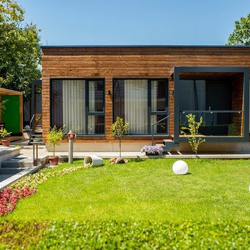
West and East side of the wooden facade is compact and has few openings, while the southern facade is completely open with lot of glass. Its spatial openness ensures a transparent, friendly work environment, which allows a lot of light into the space.
This openness allows an uninterrupted, pleasant and close-to-nature view from interior spaces into the beautiful garden. During the installation of sophisticated light sources in the garden, emphasis was not only put on functionality and security, but also on the beauty of the garden shown through the illumination in the evening.
Large, horizontal white “brisole” serve as external sun protection systems, mounted on the canopies of the entrance areas of the modular construction and the enclosure, adeptly cast shade on these areas and at the same time shape the entire architectural language.
While on one hand, the two quadratic ledges suspended in the air, are docked with steel stairs and match the wooden façade, lead the staff to their office space, the artful modern interior, on the other hand, perfectly unites the functionality, innovative technology, culture and positive effects on the employees' efficiency and wellbeing.
A lot of white, interjected by warm wooden and colored accents, determines the ambience.
In the case of the lighting solution, the mainly linear ceiling lighting is used as the overlapping design element both for the offices of the visa section as well as for the counters and the waiting area for the visitors.
They underline the puristic design in order to create a pleasant light for a desired general illumination and ensure optimal light conditions without causing disturbing reflections on the computer screens.
In addition, precisely positioned pendant luminaires are installed at the workstations, which ensure pleasant room brightness.
In the entrance area, the harmonic and uniform lighting effect from the ground highlights the integration of photography and architecture.
Photographs of landscapes, people, places, expressing unforgettable, impressive moments and memories have been lovingly engraved on 8 x 8cm square oak blocks.
The idea of an effective, impressive environment that stimulates and inspires the work was the premiss on which the whole design concept was based. Consequently, the modular construction was no longer viewed through its history of utilization and scars, but rather as a structure of work ambiance, art and elegance.
FERIZI + FERIZI Architects
Photo: Arben Llapashtica
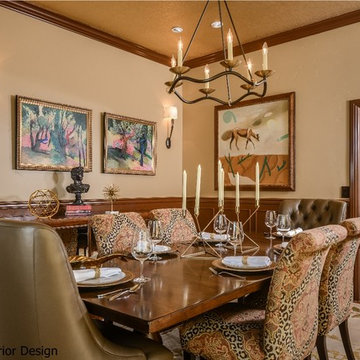
 Fiorito Interior Design
My clients for this project wanted to erase from their newly purchased home the style choices of the previous owners. Eager to make their own impression, we decided to turn the dining room into more of a statement space with elegant wood paneling, a grand carved wooden dining table, and a sense that a feast was about to take place. I thought of it as Modern Medieval! The guest dining chairs are covered in a tapestry-like material of paisley and leopard while the host chairs, bigger and more luxuriously scaled, are covered in a soft olive green leather. Hanging above is a lighting fixture that recalls ancient round candelabras. Below is a rug in camel and gold with an organic pattern of branches and leaves. Wall sconces, a mirrored buffet with iron rings, and custom draperies finish the look. At night during dinner parties, the metallic gold ceiling reflects the chandelier and sconces, giving the room a glamorous, warm glow.
Photo by Bernardo Grijalva
Find the right local pro for your project
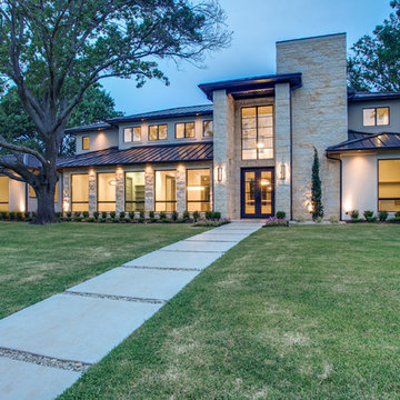
 Ron Davis Custom Homes
This beautiful Dallas Modern Home was just completed in North Dallas near Hockaday and the Lamplighter School. Contact Ron Davis Custom Homes at 972-680-0365 to learn how we can make your dream home a reality in Dallas, University Park, Frisco, Prosper and Southlake.
 Penny Black Interiors LLC.
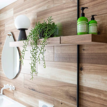
Spa like guest bathroom in a small space,
Example of a mid-sized minimalist kids' white tile and subway tile porcelain tile and gray floor corner shower design in Portland with flat-panel cabinets, medium tone wood cabinets, a wall-mount toilet, brown walls, an undermount sink, quartzite countertops, a hinged shower door and white countertops
Example of a mid-sized minimalist kids' white tile and subway tile porcelain tile and gray floor corner shower design in Portland with flat-panel cabinets, medium tone wood cabinets, a wall-mount toilet, brown walls, an undermount sink, quartzite countertops, a hinged shower door and white countertops

 Ernest M. Ferizi
German Embassy in Pristina - Kosovo, contracted the architecture office “Ferizi + Ferizi Architects” to plan and implement an Annex Office building for their purposes. As detached part of this building is designed the waiting area, as alone standing structure.
This Office Building is constructed by assembling of Eight used office containers that were delivered on trucks and set up after only a few hours on the basis of the LEGO principle, according to the planning on strip foundations.
By removing the flexible exterior wall panels, a large room of 115 m² was created, with the counter wall as a room partition between two office spaces, each with seven workstations as well as three counters for agents on one side and a room for visitors on the other side.
With this system, room solutions can be easily implemented in all dimensions.
The container, seen as a geometric shape, is a simple, octagonal, solid box.
The standardized perfection of its dimensions is striking: 2.44 meters wide, 2.59 meters high and 6.06 meters or 12.19 meters long.
Since its introduction in 1956 by the American transport entrepreneur Malcom McLean, the container has become a standardized transport module worldwide, whether on ships, trucks or construction sites.
The shipping containers have additionally revolutionized the transport industry, pushed the globalization noticeably, and thus directly or indirectly influenced all our lives.
But after only a few years, when the first overseas containers wore out, many engineers recognized the positive properties of used shipping containers for building houses, especially since they are robust, flexible, multifunctional and second-hand relatively inexpensive to purchase. The time has long passed by to treat containers exclusively as transport objects.
As a "measure of all things", containers can hardly be ignored in construction.
Their use is no longer limited to temporary use since school containers, information containers, office containers or entire residential buildings are now part of our everyday life in the construction industry.
However, current examples of the container architecture prove that even the most demanding solutions for container building are feasible. For their specific aesthetic and spatial qualities, containers also serve as design parameters for the development of new forms of architecture and urbanity.
The office building as an extension of the visa section, characterized by modern materials and contemporary aesthetics has been designed and built mainly as a low-energy building.
Extensive insulation to achieve a comfortable and sustainable constant temperature in the interior, high window quality and low energy consumption make the building energy-efficient.
The sophisticated lighting technology, networks, heating systems and air-conditioning systems are also components of this equipment.
It creates an overall harmonic picture and guarantees the highest standard in sustainable construction, taking into consideration the fact that environmentally friendly recycling and reutilization have become an increasingly important issue in our society.
West and East side of the wooden facade is compact and has few openings, while the southern facade is completely open with lot of glass. Its spatial openness ensures a transparent, friendly work environment, which allows a lot of light into the space.
This openness allows an uninterrupted, pleasant and close-to-nature view from interior spaces into the beautiful garden. During the installation of sophisticated light sources in the garden, emphasis was not only put on functionality and security, but also on the beauty of the garden shown through the illumination in the evening.
Large, horizontal white “brisole” serve as external sun protection systems, mounted on the canopies of the entrance areas of the modular construction and the enclosure, adeptly cast shade on these areas and at the same time shape the entire architectural language.
While on one hand, the two quadratic ledges suspended in the air, are docked with steel stairs and match the wooden façade, lead the staff to their office space, the artful modern interior, on the other hand, perfectly unites the functionality, innovative technology, culture and positive effects on the employees' efficiency and wellbeing.
A lot of white, interjected by warm wooden and colored accents, determines the ambience.
In the case of the lighting solution, the mainly linear ceiling lighting is used as the overlapping design element both for the offices of the visa section as well as for the counters and the waiting area for the visitors.
They underline the puristic design in order to create a pleasant light for a desired general illumination and ensure optimal light conditions without causing disturbing reflections on the computer screens.
In addition, precisely positioned pendant luminaires are installed at the workstations, which ensure pleasant room brightness.
In the entrance area, the harmonic and uniform lighting effect from the ground highlights the integration of photography and architecture.
Photographs of landscapes, people, places, expressing unforgettable, impressive moments and memories have been lovingly engraved on 8 x 8cm square oak blocks.
The idea of an effective, impressive environment that stimulates and inspires the work was the premiss on which the whole design concept was based. Consequently, the modular construction was no longer viewed through its history of utilization and scars, but rather as a structure of work ambiance, art and elegance.
FERIZI + FERIZI Architects
Photo: Arben Llapashtica
 Anchor Down Renovations
Introduction
Welcome to the Anchor Down Renovation, where we take pride in sharing our exceptional projects that bring beauty and functionality to living spaces. In this edition, we are thrilled to showcase a remarkable bathroom remodeling project featuring a stunning natural modern terracotta style with exquisite silver accents and a custom vanity. Join us as we dive into the details of this project, which highlights Anchor Down's commitment to craftsmanship, attention to detail, and the creation of exquisite spaces inspired by nature.
Celebrating Nature’s Warmth
The bathroom, once lacking character and warmth, was ready for a complete transformation. Our client approached Anchor Down with a vision of creating a space that embraces the beauty of nature. Inspired by this vision, our team set out to design a bathroom that combines the modern elements of terracotta with the warmth and authenticity of natural materials.
The Timeless Appeal of Terracotta
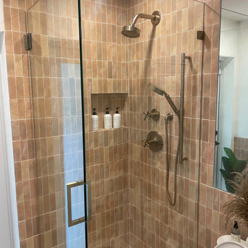
To infuse the bathroom with a natural and modern aesthetic, our design experts recommended a terracotta style as the foundation of this remodel. Terracotta tiles exude a rustic charm that adds character and warmth to any space. Their earthy tones and unique textures create a natural backdrop that sets the tone for a serene and inviting atmosphere.
Silver Accents for Contemporary Elegance
To enhance the modern appeal of the terracotta style, we incorporated stunning silver accents throughout the bathroom. Silver fixtures, such as faucets, towel bars, and hardware, were thoughtfully chosen to add a touch of contemporary elegance. The silver accents create a harmonious contrast against the terracotta backdrop, elevating the overall design with their sleek and sophisticated appeal.
Custom Vanity: Tailored to Perfection
In line with our dedication to creating personalized spaces, we designed and installed a custom vanity for this bathroom remodel. The custom vanity not only enhances the functionality of the space but also serves as a statement piece. Incorporating natural wood elements and exquisite craftsmanship, the custom vanity exudes organic beauty while providing ample storage space for a clutter-free environment.
Illuminating Serenity
Proper lighting is essential in creating a soothing and inviting bathroom atmosphere. In this project, we carefully planned the lighting to highlight the natural beauty of the terracotta tiles and enhance the serene ambiance. Thoughtfully placed fixtures, such as wall sconces, recessed lighting, and accent lights, create a balanced and inviting environment, ensuring a tranquil retreat within the bathroom.
Craftsmanship and Attention to Detail
At Anchor Down, we are committed to delivering the highest level of craftsmanship and attention to detail. From the precise installation of each terracotta tile to the flawless integration of silver accents and the custom vanity, our skilled craftsmen ensured perfection in every element. We paid meticulous attention to the alignment, grout lines, and finishing touches, creating a bathroom that showcases our unwavering dedication to excellence.
 annalynch
At the present level of development of the concept of "quality" is considered as a complex component, which includes the quality of the final product, the quality of management, quality of deliveries or work, the quality of life of people (employees) and society as a whole.
Quality management is coordinated and interconnected management activities, which was built in such a way as to ensure safe and smooth operation of the organization.
Organization Management, with regard to quality means that all activity is subject to the objectives set for quality, and to achieve these goals, the organization has developed a system of plans, have the necessary resources, carried out actions to achieve their goals.
Quality management - a very important element for any business. After all, quality is one of the criteria of the high popularity of a brand among consumers. Besides good quality will save the company from warranty repairs, lawsuits, etc.
Quality management includes four basic components:
• quality control;
• quality assurance;
• quality planning;
• quality improvement.
There are 8 basic principles of quality management system:
• The principle of orientation to the user. Product success primarily depends on how the user takes it. Moreover, this principle directs the company to study the needs of its customers.
• The principle of leadership or leadership role. Quality management in the first place depends directly on the company's management, which should by their actions show his concern for the produced goods, on its quality.
• The principle of staff involvement. From more - in less. If the head of the company must set an example in their interest in the quality of products, the company and each employee must also work to improve the quality of products and must want to improve it.
• The principle of the process approach. Based on the division of the company to suppliers and consumers. Suppliers - material security that comes into the company, and which must comply with certain quality. Consumers - the product, which is depending on the materials, must be of good quality. Because this is a direct product of your company.
• The principle of the system approach. It combines two previously identified types of organization in the common system. Moreover, he claims that this system should be a common goal, and general management.
• The principle of continuous improvement. Or to put it in simple words - "There is no limit to perfection." The principle involves constant monitoring of the quality of products in order to improve it.
• The principle of decision-making based on facts. It implies that all decisions will be taken by research, scientific evidence, public opinion polls, and not on an intuitive level head.
• Mutually beneficial supplier relationships. It's simple - the supplier delivers you high-quality materials and receives respective payment. The lower the quality of the goods, the less the cost.
• It is believed that the introduction of these 8 principles in any company will improve the quality of its products and the improvement of the production process. That, in turn, affect the overall good of the company success.
About Author: Anna Lynch is a freelance writer at http://online-check-in.org/, who creates papers about business and marketing. She has a long practice and great experience in the sphere of economics and now is able to help young people.
 TKS Design Group
Download our free ebook, Creating the Ideal Kitchen. DOWNLOAD NOW
The homeowners built their traditional Colonial style home 17 years’ ago. It was in great shape but needed some updating. Over the years, their taste had drifted into a more contemporary realm, and they wanted our help to bridge the gap between traditional and modern.
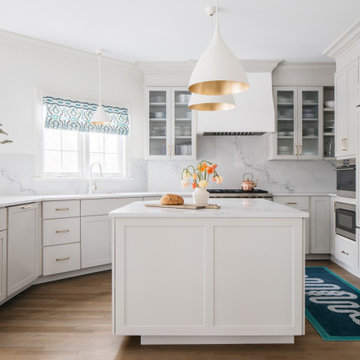
We decided the layout of the kitchen worked well in the space and the cabinets were in good shape, so we opted to do a refresh with the kitchen. The original kitchen had blond maple cabinets and granite countertops. This was also a great opportunity to make some updates to the functionality that they were hoping to accomplish.
After re-finishing all the first floor wood floors with a gray stain, which helped to remove some of the red tones from the red oak, we painted the cabinetry Benjamin Moore “Repose Gray” a very soft light gray. The new countertops are hardworking quartz, and the waterfall countertop to the left of the sink gives a bit of the contemporary flavor.
We reworked the refrigerator wall to create more pantry storage and eliminated the double oven in favor of a single oven and a steam oven. The existing cooktop was replaced with a new range paired with a Venetian plaster hood above. The glossy finish from the hood is echoed in the pendant lights. A touch of gold in the lighting and hardware adds some contrast to the gray and white. A theme we repeated down to the smallest detail illustrated by the Jason Wu faucet by Brizo with its similar touches of white and gold (the arrival of which we eagerly awaited for months due to ripples in the supply chain – but worth it!).
The original breakfast room was pleasant enough with its windows looking into the backyard. Now with its colorful window treatments, new blue chairs and sculptural light fixture, this space flows seamlessly into the kitchen and gives more of a punch to the space.
The original butler’s pantry was functional but was also starting to show its age. The new space was inspired by a wallpaper selection that our client had set aside as a possibility for a future project. It worked perfectly with our pallet and gave a fun eclectic vibe to this functional space. We eliminated some upper cabinets in favor of open shelving and painted the cabinetry in a high gloss finish, added a beautiful quartzite countertop and some statement lighting. The new room is anything but cookie cutter.
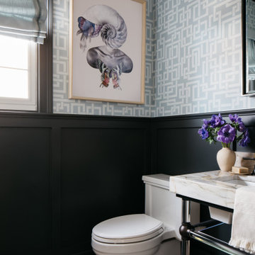
Next the mudroom. You can see a peek of the mudroom across the way from the butler’s pantry which got a facelift with new paint, tile floor, lighting and hardware. Simple updates but a dramatic change! The first floor powder room got the glam treatment with its own update of wainscoting, wallpaper, console sink, fixtures and artwork. A great little introduction to what’s to come in the rest of the home.
The whole first floor now flows together in a cohesive pallet of green and blue, reflects the homeowner’s desire for a more modern aesthetic, and feels like a thoughtful and intentional evolution. Our clients were wonderful to work with! Their style meshed perfectly with our brand aesthetic which created the opportunity for wonderful things to happen. We know they will enjoy their remodel for many years to come!
Photography by Margaret Rajic Photography
 TKS Design Group
Download our free ebook, Creating the Ideal Kitchen. DOWNLOAD NOW
The homeowners built their traditional Colonial style home 17 years’ ago. It was in great shape but needed some updating. Over the years, their taste had drifted into a more contemporary realm, and they wanted our help to bridge the gap between traditional and modern.
We decided the layout of the kitchen worked well in the space and the cabinets were in good shape, so we opted to do a refresh with the kitchen. The original kitchen had blond maple cabinets and granite countertops. This was also a great opportunity to make some updates to the functionality that they were hoping to accomplish.
After re-finishing all the first floor wood floors with a gray stain, which helped to remove some of the red tones from the red oak, we painted the cabinetry Benjamin Moore “Repose Gray” a very soft light gray. The new countertops are hardworking quartz, and the waterfall countertop to the left of the sink gives a bit of the contemporary flavor.
We reworked the refrigerator wall to create more pantry storage and eliminated the double oven in favor of a single oven and a steam oven. The existing cooktop was replaced with a new range paired with a Venetian plaster hood above. The glossy finish from the hood is echoed in the pendant lights. A touch of gold in the lighting and hardware adds some contrast to the gray and white. A theme we repeated down to the smallest detail illustrated by the Jason Wu faucet by Brizo with its similar touches of white and gold (the arrival of which we eagerly awaited for months due to ripples in the supply chain – but worth it!).
The original breakfast room was pleasant enough with its windows looking into the backyard. Now with its colorful window treatments, new blue chairs and sculptural light fixture, this space flows seamlessly into the kitchen and gives more of a punch to the space.
The original butler’s pantry was functional but was also starting to show its age. The new space was inspired by a wallpaper selection that our client had set aside as a possibility for a future project. It worked perfectly with our pallet and gave a fun eclectic vibe to this functional space. We eliminated some upper cabinets in favor of open shelving and painted the cabinetry in a high gloss finish, added a beautiful quartzite countertop and some statement lighting. The new room is anything but cookie cutter.
Next the mudroom. You can see a peek of the mudroom across the way from the butler’s pantry which got a facelift with new paint, tile floor, lighting and hardware. Simple updates but a dramatic change! The first floor powder room got the glam treatment with its own update of wainscoting, wallpaper, console sink, fixtures and artwork. A great little introduction to what’s to come in the rest of the home.
The whole first floor now flows together in a cohesive pallet of green and blue, reflects the homeowner’s desire for a more modern aesthetic, and feels like a thoughtful and intentional evolution. Our clients were wonderful to work with! Their style meshed perfectly with our brand aesthetic which created the opportunity for wonderful things to happen. We know they will enjoy their remodel for many years to come!
Photography by Margaret Rajic Photography
 MOTIV Interiors
Twins on 12th - HER ROOM - View the complete Photo Gallery and project details at motivinteriors.com/portfolio
Design: MOTIV Interiors LLC
Photography: Sam Angel
Design Challenge: This 8 year-old boy and girl were outgrowing their existing setup and needed to update their rooms with a plan that would carry them forward into middle school and beyond. In addition to gaining storage and study areas, could these twins show off their big personalities? Absolutely, we said! MOTIV Interiors tackled the rooms of these youngsters living in Nashville's 12th South Neighborhood and created an environment where the dynamic duo can learn, create, and grow together for years to come.
Design Solution:
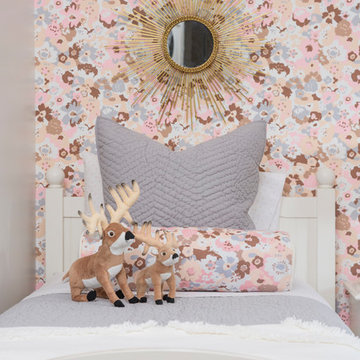
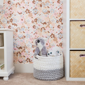
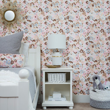
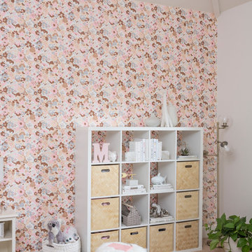
In her room, we wanted to create a fun-filled space that supports softball, sleepovers, science, and anything else a girl might want to get into. The star of the show is a beautiful hand-printed wallpaper by Brooklyn designer Aimee Wilder, whose FSC-certified papers contain no VOC’s (Volatile Organic Compounds). That means that in addition to packing a powerful visual punch, they meet our standard for excellent indoor air quality. We also love this wallpaper because it is composed of so many different neutral colors - this room can organically evolve over time without necessarily replacing the paper (which was installed with a no-VOC adhesive).
We refreshed the remaining walls with a scrubbable no-VOC paint from Sherwin Williams (7008 Alabaster) and gave the carpets in both of the twins’ rooms a good cleaning and simple stretch as opposed to replacing them. In order to provide more functional light in her room, we incorporated a corner floor lamp for reading, a telescoping desk lamp for studying, and an eye-catching LED flower pendant on a dimmer switch sourced from Lightology. Custom window treatments in a linen/cotton blend emphasize the height of the room and bring in a little “bling” with antiqued gold hardware.
Before we even thought about aesthetics, however, MOTIV Interiors got to work right away on increasing functionality. We added a spacious storage unit with plenty of baskets for all of our young client’s animal friends, and we made sure to include ample shelf space for books and hobbies as she finds new passions to explore down the road. We always prefer eco-friendly furnishings that are manufactured responsibly, made with sustainably harvested wood (FSC Certified), and use no glue or non-toxic glues and paints.
The bedding in this project is 100% cotton and contains no synthetic fibers. When purchasing bedding, check for the GOTS Certification (Global Organic Textile Standard). The introduction of a desk and drawer unit created a calming space to study and reflect, or write a letter to a friend. Gold accents add a bit of warmth to the workspace, where she can display her memories, goals, and game plans for a bright future.
We hope you enjoyed this project as much as we did! Each design challenge is an opportunity to push the envelope, by creating a new and exciting aesthetic or finding creative ways to incorporate sustainable design principles.
 MOTIV Interiors
Interior Designer: MOTIV Interiors LLC
Photographer: Sam Angel Photography
Design Challenge: This 8 year-old boy and girl were outgrowing their existing setup and needed to update their rooms with a plan that would carry them forward into middle school and beyond. In addition to gaining storage and study areas, could these twins show off their big personalities? Absolutely, we said! MOTIV Interiors tackled the rooms of these youngsters living in Nashville's 12th South Neighborhood and created an environment where the dynamic duo can learn, create, and grow together for years to come.
Design Solution:
In her room, we wanted to create a fun-filled space that supports softball, sleepovers, science, and anything else a girl might want to get into. The star of the show is a beautiful hand-printed wallpaper by Brooklyn designer Aimee Wilder, whose FSC-certified papers contain no VOC’s (Volatile Organic Compounds). That means that in addition to packing a powerful visual punch, they meet our standard for excellent indoor air quality. We also love this wallpaper because it is composed of so many different neutral colors - this room can organically evolve over time without necessarily replacing the paper (which was installed with a no-VOC adhesive).
We refreshed the remaining walls with a scrubbable no-VOC paint from Sherwin Williams (7008 Alabaster) and gave the carpets in both of the twins’ rooms a good cleaning and simple stretch as opposed to replacing them. In order to provide more functional light in her room, we incorporated a corner floor lamp for reading, a telescoping desk lamp for studying, and an eye-catching LED flower pendant on a dimmer switch sourced from Lightology. Custom window treatments in a linen/cotton blend emphasize the height of the room and bring in a little “bling” with antiqued gold hardware.
Before we even thought about aesthetics, however, MOTIV Interiors got to work right away on increasing functionality. We added a spacious storage unit with plenty of baskets for all of our young client’s animal friends, and we made sure to include ample shelf space for books and hobbies as she finds new passions to explore down the road. We always prefer eco-friendly furnishings that are manufactured responsibly, made with sustainably harvested wood (FSC Certified), and use no glue or non-toxic glues and paints.
The bedding in this project is 100% cotton and contains no synthetic fibers. When purchasing bedding, check for the GOTS Certification (Global Organic Textile Standard). The introduction of a desk and drawer unit created a calming space to study and reflect, or write a letter to a friend. Gold accents add a bit of warmth to the workspace, where she can display her memories, goals, and game plans for a bright future.
We hope you enjoyed this project as much as we did! Each design challenge is an opportunity to push the envelope, by creating a new and exciting aesthetic or finding creative ways to incorporate sustainable design principles.
 Modern Zen Garden
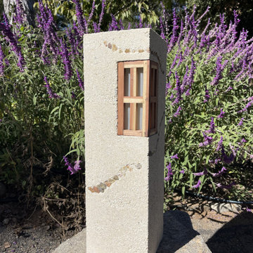
Rammed earth lantern.
"Illuminate Your Space with Elegance and Earthiness:
Welcome to a world where lighting transcends mere functionality to become a masterpiece of
artistry and nature's embrace. Our exclusive collection of rammed earth lanterns is designed
to captivate the discerning tastes of high-end connoisseurs, offering a harmony of earthly
textures and artisanal craftsmanship.
Each lantern in our collection is a testament to the time-honored tradition of rammed earth
construction, where raw materials are transformed into stunning works of functional art. These
lanterns bring the raw beauty of the earth into your living spaces, creating a seamless
connection between your home and the natural world.
Crafted by skilled artisans, our rammed earth lanterns are not just lighting fixtures; they are
statements of luxury and sophistication. Their organic textures, warm earthy tones, and soft,
ambient glow add a touch of serenity and refinement to any environment. Whether it's your
living room, garden, or a high-end restaurant, these lanterns will transform the ambiance,
elevating it to a level of unadulterated elegance.
In a world where authenticity and environmental consciousness are highly valued, our
rammed earth lanterns represent the pinnacle of sustainability and artistic expression.
Discover a unique fusion of ancient building techniques and contemporary design in each
meticulously created piece. Elevate your surroundings and inspire conversations about the
fusion of luxury and nature.
Illuminate your world with rammed earth lanterns - a symbol of opulence, craftsmanship, and
an unbreakable bond with the Earth. Let the radiance of high-end artistry transform your space
into a sanctuary of style and substance. Embrace the future of luxurious lighting with the
timeless essence of the past. Experience the magic of rammed earth lanterns, exclusively for
those who demand nothing but the best."
This introduction combines the concepts of artistry, earthiness, luxury, and sustainability to
attract high-end markets to your rammed earth lanterns.
What is Rammed Earth?
Rammed earth is an ancient construction technique that seamlessly blends the raw beauty of
the Earth with architectural ingenuity. It involves compressing layers of natural raw materials, such
as earth, chalk, lime, or gravel, to create sturdy, durable walls or structures. The result is a stunning
display of the Earth's colors and textures, providing not only a harmonious connection to the
natural world but also exceptional thermal mass properties for energy efficiency.
• This time-honored building method, dating back thousands of years, continues to capture the
imagination of modern architects, environmentalists, and those with a deep appreciation for
sustainable living. Rammed earth structures are renowned for their organic appeal, as the layers of
earth form unique patterns, creating a visual masterpiece in every piece of architecture.
• At “Rammed Earth Graden”, we've harnessed the artistry of rammed earth to craft exquisite
lanterns that not only illuminate your space but also infuse it with the timeless essence of this
extraordinary building technique. Explore our exclusive collection to experience the magic of
rammed earth in a new light
 Babcock Custom Pools & Environments
Elevate Your Pool Experience with Babcock Custom Pools’ Portfolio Pool Equipment
Introduction
When it comes to creating the ultimate backyard oasis, Babcock Custom Pools is the name to trust. With an unwavering commitment to excellence, Babcock Custom Pools brings together cutting-edge technology, superior craftsmanship, and stunning design to transform your dream pool into a reality. In this article, we will explore the remarkable portfolio pool equipment offered by Babcock Custom Pools, highlighting their expertise in delivering straight lines with plumbing precision and a flawless compilation of pool plumbing, all aimed at ensuring your pool not only functions seamlessly but also looks perfect.
Excellence at Every Step
At Babcock Custom Pools, excellence is the cornerstone of their work. From the initial design consultation to the final installation, their team of skilled professionals leaves no stone unturned in delivering exceptional results. Every pool project undertaken by Babcock Custom Pools is treated as a work of art, crafted with attention to detail and a commitment to surpassing customer expectations.
Straight Lines with Plumbing Precision
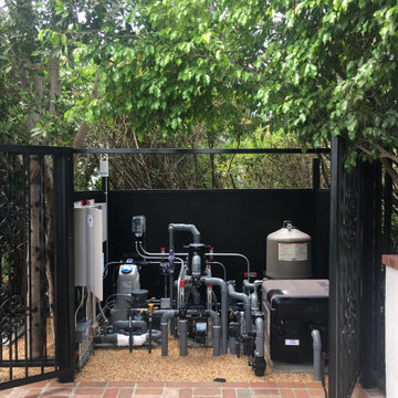
One distinguishing feature of Babcock Custom Pools’ portfolio pool equipment is their unwavering dedication to achieving straight lines with plumbing precision. Proper plumbing is vital for a well-functioning pool, and Babcock Custom Pools understands this importance. They employ experienced technicians who meticulously plan and execute every plumbing aspect, ensuring that your pool’s plumbing system is not only efficient but also aesthetically pleasing.
Babcock Custom Pools takes pride in their ability to seamlessly integrate the plumbing elements into the pool’s design, creating a visually appealing and functional masterpiece. By utilizing the latest technology and employing industry best practices, they guarantee that your pool’s plumbing will not only withstand the test of time but also provide optimal performance.
A Flawless Compilation of Pool Plumbing
The compilation of pool plumbing is an intricate process that requires expertise and finesse. Babcock Custom Pools excels in this area, showcasing their mastery by delivering flawless pool plumbing systems. From the pump and filter setup to the water circulation and drainage, every component is skillfully installed and interconnected, creating a cohesive and efficient plumbing network.
By employing advanced techniques and using high-quality materials, Babcock Custom Pools ensures that your pool’s plumbing operates smoothly, minimizing the risk of leaks, blockages, or other issues that can disrupt your pool experience. Their team’s attention to detail and commitment to perfection guarantees that your pool’s plumbing will be a seamless part of the overall design, enhancing the beauty and functionality of your pool.
Conclusion
When it comes to creating a remarkable pool experience, Babcock Custom Pools stands head and shoulders above the competition. Their portfolio pool equipment exemplifies excellence, with a particular focus on achieving straight lines with plumbing precision and delivering a flawless compilation of pool plumbing. By entrusting Babcock Custom Pools with your pool project, you can rest assured that your pool will not only be a stunning visual centerpiece but also a meticulously engineered and reliable oasis for years to come. Contact Babcock Custom Pools today and let their expertise transform your dream pool into a reality.
 TKS Design Group
Download our free ebook, Creating the Ideal Kitchen. DOWNLOAD NOW
The homeowners built their traditional Colonial style home 17 years’ ago. It was in great shape but needed some updating. Over the years, their taste had drifted into a more contemporary realm, and they wanted our help to bridge the gap between traditional and modern.
We decided the layout of the kitchen worked well in the space and the cabinets were in good shape, so we opted to do a refresh with the kitchen. The original kitchen had blond maple cabinets and granite countertops. This was also a great opportunity to make some updates to the functionality that they were hoping to accomplish.
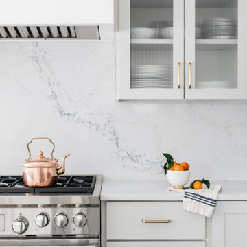
After re-finishing all the first floor wood floors with a gray stain, which helped to remove some of the red tones from the red oak, we painted the cabinetry Benjamin Moore “Repose Gray” a very soft light gray. The new countertops are hardworking quartz, and the waterfall countertop to the left of the sink gives a bit of the contemporary flavor.
We reworked the refrigerator wall to create more pantry storage and eliminated the double oven in favor of a single oven and a steam oven. The existing cooktop was replaced with a new range paired with a Venetian plaster hood above. The glossy finish from the hood is echoed in the pendant lights. A touch of gold in the lighting and hardware adds some contrast to the gray and white. A theme we repeated down to the smallest detail illustrated by the Jason Wu faucet by Brizo with its similar touches of white and gold (the arrival of which we eagerly awaited for months due to ripples in the supply chain – but worth it!).
The original breakfast room was pleasant enough with its windows looking into the backyard. Now with its colorful window treatments, new blue chairs and sculptural light fixture, this space flows seamlessly into the kitchen and gives more of a punch to the space.
The original butler’s pantry was functional but was also starting to show its age. The new space was inspired by a wallpaper selection that our client had set aside as a possibility for a future project. It worked perfectly with our pallet and gave a fun eclectic vibe to this functional space. We eliminated some upper cabinets in favor of open shelving and painted the cabinetry in a high gloss finish, added a beautiful quartzite countertop and some statement lighting. The new room is anything but cookie cutter.
Next the mudroom. You can see a peek of the mudroom across the way from the butler’s pantry which got a facelift with new paint, tile floor, lighting and hardware. Simple updates but a dramatic change! The first floor powder room got the glam treatment with its own update of wainscoting, wallpaper, console sink, fixtures and artwork. A great little introduction to what’s to come in the rest of the home.
The whole first floor now flows together in a cohesive pallet of green and blue, reflects the homeowner’s desire for a more modern aesthetic, and feels like a thoughtful and intentional evolution. Our clients were wonderful to work with! Their style meshed perfectly with our brand aesthetic which created the opportunity for wonderful things to happen. We know they will enjoy their remodel for many years to come!
Photography by Margaret Rajic Photography
 MOTIV Interiors
Interior Designer: MOTIV Interiors LLC
Photographer: Sam Angel Photography
Design Challenge: This 8 year-old boy and girl were outgrowing their existing setup and needed to update their rooms with a plan that would carry them forward into middle school and beyond. In addition to gaining storage and study areas, could these twins show off their big personalities? Absolutely, we said! MOTIV Interiors tackled the rooms of these youngsters living in Nashville's 12th South Neighborhood and created an environment where the dynamic duo can learn, create, and grow together for years to come.
Design Solution:
In her room, we wanted to create a fun-filled space that supports softball, sleepovers, science, and anything else a girl might want to get into. The star of the show is a beautiful hand-printed wallpaper by Brooklyn designer Aimee Wilder, whose FSC-certified papers contain no VOC’s (Volatile Organic Compounds). That means that in addition to packing a powerful visual punch, they meet our standard for excellent indoor air quality. We also love this wallpaper because it is composed of so many different neutral colors - this room can organically evolve over time without necessarily replacing the paper (which was installed with a no-VOC adhesive).
We refreshed the remaining walls with a scrubbable no-VOC paint from Sherwin Williams (7008 Alabaster) and gave the carpets in both of the twins’ rooms a good cleaning and simple stretch as opposed to replacing them. In order to provide more functional light in her room, we incorporated a corner floor lamp for reading, a telescoping desk lamp for studying, and an eye-catching LED flower pendant on a dimmer switch sourced from Lightology. Custom window treatments in a linen/cotton blend emphasize the height of the room and bring in a little “bling” with antiqued gold hardware.
Before we even thought about aesthetics, however, MOTIV Interiors got to work right away on increasing functionality. We added a spacious storage unit with plenty of baskets for all of our young client’s animal friends, and we made sure to include ample shelf space for books and hobbies as she finds new passions to explore down the road. We always prefer eco-friendly furnishings that are manufactured responsibly, made with sustainably harvested wood (FSC Certified), and use no glue or non-toxic glues and paints.
The bedding in this project is 100% cotton and contains no synthetic fibers. When purchasing bedding, check for the GOTS Certification (Global Organic Textile Standard). The introduction of a desk and drawer unit created a calming space to study and reflect, or write a letter to a friend. Gold accents add a bit of warmth to the workspace, where she can display her memories, goals, and game plans for a bright future.
We hope you enjoyed this project as much as we did! Each design challenge is an opportunity to push the envelope, by creating a new and exciting aesthetic or finding creative ways to incorporate sustainable design principles.
 MOTIV Interiors
Interior Designer: MOTIV Interiors LLC
Photographer: Sam Angel Photography
Design Challenge: This 8 year-old boy and girl were outgrowing their existing setup and needed to update their rooms with a plan that would carry them forward into middle school and beyond. In addition to gaining storage and study areas, could these twins show off their big personalities? Absolutely, we said! MOTIV Interiors tackled the rooms of these youngsters living in Nashville's 12th South Neighborhood and created an environment where the dynamic duo can learn, create, and grow together for years to come.
Design Solution:
In her room, we wanted to create a fun-filled space that supports softball, sleepovers, science, and anything else a girl might want to get into. The star of the show is a beautiful hand-printed wallpaper by Brooklyn designer Aimee Wilder, whose FSC-certified papers contain no VOC’s (Volatile Organic Compounds). That means that in addition to packing a powerful visual punch, they meet our standard for excellent indoor air quality. We also love this wallpaper because it is composed of so many different neutral colors - this room can organically evolve over time without necessarily replacing the paper (which was installed with a no-VOC adhesive).
We refreshed the remaining walls with a scrubbable no-VOC paint from Sherwin Williams (7008 Alabaster) and gave the carpets in both of the twins’ rooms a good cleaning and simple stretch as opposed to replacing them. In order to provide more functional light in her room, we incorporated a corner floor lamp for reading, a telescoping desk lamp for studying, and an eye-catching LED flower pendant on a dimmer switch sourced from Lightology. Custom window treatments in a linen/cotton blend emphasize the height of the room and bring in a little “bling” with antiqued gold hardware.
Before we even thought about aesthetics, however, MOTIV Interiors got to work right away on increasing functionality. We added a spacious storage unit with plenty of baskets for all of our young client’s animal friends, and we made sure to include ample shelf space for books and hobbies as she finds new passions to explore down the road. We always prefer eco-friendly furnishings that are manufactured responsibly, made with sustainably harvested wood (FSC Certified), and use no glue or non-toxic glues and paints.
The bedding in this project is 100% cotton and contains no synthetic fibers. When purchasing bedding, check for the GOTS Certification (Global Organic Textile Standard). The introduction of a desk and drawer unit created a calming space to study and reflect, or write a letter to a friend. Gold accents add a bit of warmth to the workspace, where she can display her memories, goals, and game plans for a bright future.
We hope you enjoyed this project as much as we did! Each design challenge is an opportunity to push the envelope, by creating a new and exciting aesthetic or finding creative ways to incorporate sustainable design principles.
 MOTIV Interiors
Interior Designer: MOTIV Interiors LLC
Photographer: Sam Angel Photography
Design Challenge: This 8 year-old boy and girl were outgrowing their existing setup and needed to update their rooms with a plan that would carry them forward into middle school and beyond. In addition to gaining storage and study areas, could these twins show off their big personalities? Absolutely, we said! MOTIV Interiors tackled the rooms of these youngsters living in Nashville's 12th South Neighborhood and created an environment where the dynamic duo can learn, create, and grow together for years to come.
Design Solution:
In her room, we wanted to create a fun-filled space that supports softball, sleepovers, science, and anything else a girl might want to get into. The star of the show is a beautiful hand-printed wallpaper by Brooklyn designer Aimee Wilder, whose FSC-certified papers contain no VOC’s (Volatile Organic Compounds). That means that in addition to packing a powerful visual punch, they meet our standard for excellent indoor air quality. We also love this wallpaper because it is composed of so many different neutral colors - this room can organically evolve over time without necessarily replacing the paper (which was installed with a no-VOC adhesive).
We refreshed the remaining walls with a scrubbable no-VOC paint from Sherwin Williams (7008 Alabaster) and gave the carpets in both of the twins’ rooms a good cleaning and simple stretch as opposed to replacing them. In order to provide more functional light in her room, we incorporated a corner floor lamp for reading, a telescoping desk lamp for studying, and an eye-catching LED flower pendant on a dimmer switch sourced from Lightology. Custom window treatments in a linen/cotton blend emphasize the height of the room and bring in a little “bling” with antiqued gold hardware.
Before we even thought about aesthetics, however, MOTIV Interiors got to work right away on increasing functionality. We added a spacious storage unit with plenty of baskets for all of our young client’s animal friends, and we made sure to include ample shelf space for books and hobbies as she finds new passions to explore down the road. We always prefer eco-friendly furnishings that are manufactured responsibly, made with sustainably harvested wood (FSC Certified), and use no glue or non-toxic glues and paints.
The bedding in this project is 100% cotton and contains no synthetic fibers. When purchasing bedding, check for the GOTS Certification (Global Organic Textile Standard). The introduction of a desk and drawer unit created a calming space to study and reflect, or write a letter to a friend. Gold accents add a bit of warmth to the workspace, where she can display her memories, goals, and game plans for a bright future.
We hope you enjoyed this project as much as we did! Each design challenge is an opportunity to push the envelope, by creating a new and exciting aesthetic or finding creative ways to incorporate sustainable design principles.
 TKS Design Group
Download our free ebook, Creating the Ideal Kitchen. DOWNLOAD NOW
The homeowners built their traditional Colonial style home 17 years’ ago. It was in great shape but needed some updating. Over the years, their taste had drifted into a more contemporary realm, and they wanted our help to bridge the gap between traditional and modern.
We decided the layout of the kitchen worked well in the space and the cabinets were in good shape, so we opted to do a refresh with the kitchen. The original kitchen had blond maple cabinets and granite countertops. This was also a great opportunity to make some updates to the functionality that they were hoping to accomplish.
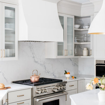
After re-finishing all the first floor wood floors with a gray stain, which helped to remove some of the red tones from the red oak, we painted the cabinetry Benjamin Moore “Repose Gray” a very soft light gray. The new countertops are hardworking quartz, and the waterfall countertop to the left of the sink gives a bit of the contemporary flavor.
We reworked the refrigerator wall to create more pantry storage and eliminated the double oven in favor of a single oven and a steam oven. The existing cooktop was replaced with a new range paired with a Venetian plaster hood above. The glossy finish from the hood is echoed in the pendant lights. A touch of gold in the lighting and hardware adds some contrast to the gray and white. A theme we repeated down to the smallest detail illustrated by the Jason Wu faucet by Brizo with its similar touches of white and gold (the arrival of which we eagerly awaited for months due to ripples in the supply chain – but worth it!).
The original breakfast room was pleasant enough with its windows looking into the backyard. Now with its colorful window treatments, new blue chairs and sculptural light fixture, this space flows seamlessly into the kitchen and gives more of a punch to the space.
The original butler’s pantry was functional but was also starting to show its age. The new space was inspired by a wallpaper selection that our client had set aside as a possibility for a future project. It worked perfectly with our pallet and gave a fun eclectic vibe to this functional space. We eliminated some upper cabinets in favor of open shelving and painted the cabinetry in a high gloss finish, added a beautiful quartzite countertop and some statement lighting. The new room is anything but cookie cutter.
Next the mudroom. You can see a peek of the mudroom across the way from the butler’s pantry which got a facelift with new paint, tile floor, lighting and hardware. Simple updates but a dramatic change! The first floor powder room got the glam treatment with its own update of wainscoting, wallpaper, console sink, fixtures and artwork. A great little introduction to what’s to come in the rest of the home.
The whole first floor now flows together in a cohesive pallet of green and blue, reflects the homeowner’s desire for a more modern aesthetic, and feels like a thoughtful and intentional evolution. Our clients were wonderful to work with! Their style meshed perfectly with our brand aesthetic which created the opportunity for wonderful things to happen. We know they will enjoy their remodel for many years to come!
Photography by Margaret Rajic Photography
79