
Search results for "Involve continued" in Home Design Ideas

 Kitchen Design Concepts
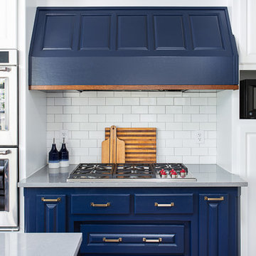
We introduce to you one of our newer services we are providing here at Kitchen Design Concepts: spaces that just need a little reviving! As of recent, we are taking on projects that are in need of minimal updating, as in, spaces that don’t need a full-on remodel. Yes, you heard right! If your space has good bones, you like the layout of your kitchen, and you just need a few cosmetic changes, then today’s feature is for you! Recently, we updated a space where we did just this! The kitchen was in need of a little love, some fresh paint, and new finishes. And if we’re being honest here, the result looks almost as if the kitchen had a full-on remodel! To learn more about this space and how we did our magic, continue reading below:
The Before and After
First, see what an impact new finishes can make! The “before” image shows a kitchen with outdated finishes such as the tile countertops, backsplash, and cabinetry finish. The “after” image, is a kitchen that looks almost as if its brand new, the image speaks for itself!
Cabinetry
With the wooden cabinetry in this kitchen already having great bones, all we needed to do was our refinishing process that involved removing door and drawer fronts, sanding, priming, and painting. The main color of the cabinetry is white (Sherwin Williams Pure White 7005) and as an accent, we applied a deep navy blue that really pops in this space (Sherwin Willaims Naval 6244). As a special design element, we incorporated a natural wooden band across the hood which is subtle but adds an element of surprise.
Countertops
The original countertops in this space were a 12×12 tile with cracks and discolored grout from all the wear and tear. To replace the countertops, we installed a clean and crisp quartz that is not only durable but easy to maintain (no grout here!). The 3cm countertops are a Cambria quartz in a grey-tone color (Carrick).
Backsplash
Keeping things simple, yet classic, we installed a 3×6 subway tile from Interceramic. The crisp white pairs well with all the other finishes of the space and really brighten the space up! To spice things up, we paired the white tile with a contrasting grout color (Cape Grey) that matches the countertop. This is a simple method to add interest to your white backsplash!
Fixtures and Fittings
For the fixtures and fittings of the kitchen, we wanted pieces that made a statement. That’s why we selected this industrial style faucet from Brizo! The faucet is a Brizo LITZE™ PULL-DOWN FAUCET WITH ARC SPOUT AND INDUSTRIAL HANDLE (63044LF-BLGL). The matte black paired with the luxe gold elements really make a statement! To match the gold elements of the faucet, we installed cabinetry hardware from Topknobs in the same gold finish. The hardware is a Channing pull TK743HB. Lastly, the large single bowl sink (who doesn’t want a large sink?!) is a great functional touch to the kitchen. The sink is a Blanco Precision 16″ R10 super single with 16″ Drainer in stainless steel (516216).
 Klopf Architecture
Klopf Architecture and Jesse Ososki Art remodeled an existing Eichler atrium home into a brighter, more open, and more functional version of its original self.
The goals were to preserve the Eichler look and feel without the need to strictly adhere to it. The scope of work included re-configuring the master bedroom/bath, the kitchen, and the hall bath/laundry area, as well as updating interior finishes throughout to be more sophisticated.
The owners are detail-oriented and were very involved in the design process, down to the selection of lighting controls and stainless steel faceplates.Their design aesthetic leans toward the Scandinavian — light and bright, with simple straight lines and pure geometric shapes.
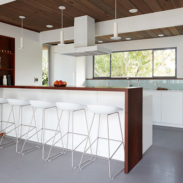
The finish flooring is large porcelain tile (24” x 24”) in a neutral grey tone, providing a uniform backdrop against which other materials can stand out. The same tile continues into the shower floor (with a different finish texture for slip-resistance) and up the shower/tub walls (in a smaller size). Heath Classic Field ceramic tile in Modern Blue was used sparingly, to add color at the hall bath vanity backsplash and at the shampoo niches in both bathrooms. Back-painted soda glass in pale blue to match the Heath tile was used at the kitchen backsplash. This same accent color was also used at the front entry atrium door. Kitchen cabinetry, countertops, appliances, and light fixtures are all white, making the kitchen feel more airy and light. Countertops are Caesarstone Blizzard.
The owners chose to keep some of the original Eichler elements: the concrete masonry fireplace; the stained tongue-and-groove redwood ceiling decking; and the luan wall paneling. The luan paneling was lightly sanded, cleaned, and re-stained. The owners also kept an added element that was installed by a previous owner: sliding shoji panels at all bedroom windows and sliding glass doors, for both privacy and sun control. Grooves were cut into the new tile flooring for the shoji panels to slide in, creating a more integrated look. Walnut was used to add warmth and contrast at the kitchen bar top and niche, the bathroom vanities, and the window sill/ledge under the kitchen window.
This Burlingame Eichler Remodel is a 2,121 sf, 4 bedroom/2 bath home located in the heart of Silicon Valley.
Klopf Architecture Project Team: John Klopf, Klara Kevane and Yegvenia Torres Zavala
Contractor: Jesse Ososki Art
Structural Engineer: Emmanuel Pun
Photography ©2018 Mariko Reed
Location: Burlingame, CA
Year completed: 2017
Find the right local pro for your project
 Vetter Architects
A tea pot, being a vessel, is defined by the space it contains, it is not the tea pot that is important, but the space.
Crispin Sartwell
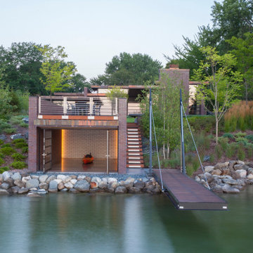
Located on a lake outside of Milwaukee, the Vessel House is the culmination of an intense 5 year collaboration with our client and multiple local craftsmen focused on the creation of a modern analogue to the Usonian Home.
As with most residential work, this home is a direct reflection of it’s owner, a highly educated art collector with a passion for music, fine furniture, and architecture. His interest in authenticity drove the material selections such as masonry, copper, and white oak, as well as the need for traditional methods of construction.
The initial diagram of the house involved a collection of embedded walls that emerge from the site and create spaces between them, which are covered with a series of floating rooves. The windows provide natural light on three sides of the house as a band of clerestories, transforming to a floor to ceiling ribbon of glass on the lakeside.
The Vessel House functions as a gallery for the owner’s art, motorcycles, Tiffany lamps, and vintage musical instruments – offering spaces to exhibit, store, and listen. These gallery nodes overlap with the typical house program of kitchen, dining, living, and bedroom, creating dynamic zones of transition and rooms that serve dual purposes allowing guests to relax in a museum setting.
Through it’s materiality, connection to nature, and open planning, the Vessel House continues many of the Usonian principles Wright advocated for.
Overview
Oconomowoc, WI
Completion Date
August 2015
Services
Architecture, Interior Design, Landscape Architecture
 Morse Constructions
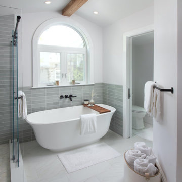
This Somerville, MA bedroom-to-primary-bathroom conversion showcases a freestanding soaking tub beneath a large arched window, paired with soft green stacked tile wainscoting and matte black tub fixtures. The space includes a frameless glass walk-in shower, white marble-look floor tile, recessed lighting, a natural wood ceiling beam, and warm spa-inspired details for a bright, relaxing primary bathroom retreat.
 Kitchen Design Concepts
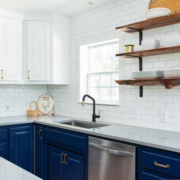
We introduce to you one of our newer services we are providing here at Kitchen Design Concepts: spaces that just need a little reviving! As of recent, we are taking on projects that are in need of minimal updating, as in, spaces that don’t need a full-on remodel. Yes, you heard right! If your space has good bones, you like the layout of your kitchen, and you just need a few cosmetic changes, then today’s feature is for you! Recently, we updated a space where we did just this! The kitchen was in need of a little love, some fresh paint, and new finishes. And if we’re being honest here, the result looks almost as if the kitchen had a full-on remodel! To learn more about this space and how we did our magic, continue reading below:
The Before and After
First, see what an impact new finishes can make! The “before” image shows a kitchen with outdated finishes such as the tile countertops, backsplash, and cabinetry finish. The “after” image, is a kitchen that looks almost as if its brand new, the image speaks for itself!
Cabinetry
With the wooden cabinetry in this kitchen already having great bones, all we needed to do was our refinishing process that involved removing door and drawer fronts, sanding, priming, and painting. The main color of the cabinetry is white (Sherwin Williams Pure White 7005) and as an accent, we applied a deep navy blue that really pops in this space (Sherwin Willaims Naval 6244). As a special design element, we incorporated a natural wooden band across the hood which is subtle but adds an element of surprise.
Countertops
The original countertops in this space were a 12×12 tile with cracks and discolored grout from all the wear and tear. To replace the countertops, we installed a clean and crisp quartz that is not only durable but easy to maintain (no grout here!). The 3cm countertops are a Cambria quartz in a grey-tone color (Carrick).
Backsplash
Keeping things simple, yet classic, we installed a 3×6 subway tile from Interceramic. The crisp white pairs well with all the other finishes of the space and really brighten the space up! To spice things up, we paired the white tile with a contrasting grout color (Cape Grey) that matches the countertop. This is a simple method to add interest to your white backsplash!
Fixtures and Fittings
For the fixtures and fittings of the kitchen, we wanted pieces that made a statement. That’s why we selected this industrial style faucet from Brizo! The faucet is a Brizo LITZE™ PULL-DOWN FAUCET WITH ARC SPOUT AND INDUSTRIAL HANDLE (63044LF-BLGL). The matte black paired with the luxe gold elements really make a statement! To match the gold elements of the faucet, we installed cabinetry hardware from Topknobs in the same gold finish. The hardware is a Channing pull TK743HB. Lastly, the large single bowl sink (who doesn’t want a large sink?!) is a great functional touch to the kitchen. The sink is a Blanco Precision 16″ R10 super single with 16″ Drainer in stainless steel (516216).
 KitchenVisions
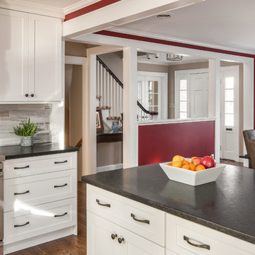
By closing one doorway, a longer run of cabinets allowed for cabinets on the right of the range. We opened the walls to the foyer, and the space is far more open to the rest of the home
 Cabochon Surfaces & Fixtures
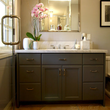
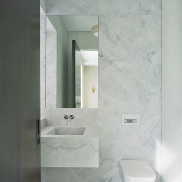
Random flagstone flooring used throughout the home continues into this guest bathroom. Waterworks Henry fittings in chrome sit atop a cararra marble slab. A recessed medicine cabinet original to the home was revived and reused in the space.
 Shenton Architects LLP
Built in 1925, this 15-story neo-Renaissance cooperative building is located on Fifth Avenue at East 93rd Street in Carnegie Hill. The corner penthouse unit has terraces on four sides, with views directly over Central Park and the city skyline beyond.
The project involved a gut renovation inside and out, down to the building structure, to transform the existing one bedroom/two bathroom layout into a two bedroom/three bathroom configuration which was facilitated by relocating the kitchen into the center of the apartment.
The new floor plan employs layers to organize space from living and lounge areas on the West side, through cooking and dining space in the heart of the layout, to sleeping quarters on the East side. A glazed entry foyer and steel clad “pod”, act as a threshold between the first two layers.
All exterior glazing, windows and doors were replaced with modern units to maximize light and thermal performance. This included erecting three new glass conservatories to create additional conditioned interior space for the Living Room, Dining Room and Master Bedroom respectively.
Materials for the living areas include bronzed steel, dark walnut cabinetry and travertine marble contrasted with whitewashed Oak floor boards, honed concrete tile, white painted walls and floating ceilings. The kitchen and bathrooms are formed from white satin lacquer cabinetry, marble, back-painted glass and Venetian plaster. Exterior terraces are unified with the conservatories by large format concrete paving and a continuous steel handrail at the parapet wall.
Photography by www.petermurdockphoto.com
 White Crane Construction
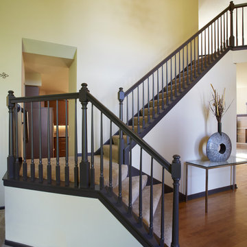
Cohesively updating and modernizing this home built in the 1990s were the goal in this remodel. Several elements throughout the house like the traditional golden oak original stair railing in the main entry were too colonial for the homeowner as their taste was trending more modern. The golden oak used on trim, fireplace mantle, and baseboards trapped this home in a time warp. The original Kitchen had cabinetry with a traditional door style, painted cabinets, and laminate countertops which also caused it to look dated. The clients expressed a desire to integrate more modern elements into their home in a cost effective way without having to rip everything down to the studs. Our design/build team proposed and executed many elegant cost effective design solutions that involved changing paint, cabinetry, finishes, and fixtures to achieve the desired modern feeling throughout the home.
To overcome the difficult obstacle the pervasive use of old fashioned looking woodwork throughout the house we proposed using paint to avoid material waste and save the client money. The main staircase in the entry was transformed and modernized by painting it a dark bronze enamel color. Trim and baseboards were also enameled in this color to carry the modern feeling throughout the home and also creating continuity from one space to another. This solution proved green and cost effective by preserving these elements in the home which prevented unnecessary demolition waste and new material cost while enhancing the existing structure aesthetically.
Photography: Jill Greer
 Kitchen Design Concepts
We introduce to you one of our newer services we are providing here at Kitchen Design Concepts: spaces that just need a little reviving! As of recent, we are taking on projects that are in need of minimal updating, as in, spaces that don’t need a full-on remodel. Yes, you heard right! If your space has good bones, you like the layout of your kitchen, and you just need a few cosmetic changes, then today’s feature is for you! Recently, we updated a space where we did just this! The kitchen was in need of a little love, some fresh paint, and new finishes. And if we’re being honest here, the result looks almost as if the kitchen had a full-on remodel! To learn more about this space and how we did our magic, continue reading below:
The Before and After
First, see what an impact new finishes can make! The “before” image shows a kitchen with outdated finishes such as the tile countertops, backsplash, and cabinetry finish. The “after” image, is a kitchen that looks almost as if its brand new, the image speaks for itself!
Cabinetry
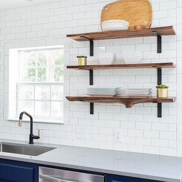
With the wooden cabinetry in this kitchen already having great bones, all we needed to do was our refinishing process that involved removing door and drawer fronts, sanding, priming, and painting. The main color of the cabinetry is white (Sherwin Williams Pure White 7005) and as an accent, we applied a deep navy blue that really pops in this space (Sherwin Willaims Naval 6244). As a special design element, we incorporated a natural wooden band across the hood which is subtle but adds an element of surprise.
Countertops
The original countertops in this space were a 12×12 tile with cracks and discolored grout from all the wear and tear. To replace the countertops, we installed a clean and crisp quartz that is not only durable but easy to maintain (no grout here!). The 3cm countertops are a Cambria quartz in a grey-tone color (Carrick).
Backsplash
Keeping things simple, yet classic, we installed a 3×6 subway tile from Interceramic. The crisp white pairs well with all the other finishes of the space and really brighten the space up! To spice things up, we paired the white tile with a contrasting grout color (Cape Grey) that matches the countertop. This is a simple method to add interest to your white backsplash!
Fixtures and Fittings
For the fixtures and fittings of the kitchen, we wanted pieces that made a statement. That’s why we selected this industrial style faucet from Brizo! The faucet is a Brizo LITZE™ PULL-DOWN FAUCET WITH ARC SPOUT AND INDUSTRIAL HANDLE (63044LF-BLGL). The matte black paired with the luxe gold elements really make a statement! To match the gold elements of the faucet, we installed cabinetry hardware from Topknobs in the same gold finish. The hardware is a Channing pull TK743HB. Lastly, the large single bowl sink (who doesn’t want a large sink?!) is a great functional touch to the kitchen. The sink is a Blanco Precision 16″ R10 super single with 16″ Drainer in stainless steel (516216).
 Klopf Architecture
Klopf Architecture and Jesse Ososki Art remodeled an existing Eichler atrium home into a brighter, more open, and more functional version of its original self.
The goals were to preserve the Eichler look and feel without the need to strictly adhere to it. The scope of work included re-configuring the master bedroom/bath, the kitchen, and the hall bath/laundry area, as well as updating interior finishes throughout to be more sophisticated.
The owners are detail-oriented and were very involved in the design process, down to the selection of lighting controls and stainless steel faceplates.Their design aesthetic leans toward the Scandinavian — light and bright, with simple straight lines and pure geometric shapes.
The finish flooring is large porcelain tile (24” x 24”) in a neutral grey tone, providing a uniform backdrop against which other materials can stand out. The same tile continues into the shower floor (with a different finish texture for slip-resistance) and up the shower/tub walls (in a smaller size). Heath Classic Field ceramic tile in Modern Blue was used sparingly, to add color at the hall bath vanity backsplash and at the shampoo niches in both bathrooms. Back-painted soda glass in pale blue to match the Heath tile was used at the kitchen backsplash. This same accent color was also used at the front entry atrium door. Kitchen cabinetry, countertops, appliances, and light fixtures are all white, making the kitchen feel more airy and light. Countertops are Caesarstone Blizzard.
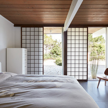
The owners chose to keep some of the original Eichler elements: the concrete masonry fireplace; the stained tongue-and-groove redwood ceiling decking; and the luan wall paneling. The luan paneling was lightly sanded, cleaned, and re-stained. The owners also kept an added element that was installed by a previous owner: sliding shoji panels at all bedroom windows and sliding glass doors, for both privacy and sun control. Grooves were cut into the new tile flooring for the shoji panels to slide in, creating a more integrated look. Walnut was used to add warmth and contrast at the kitchen bar top and niche, the bathroom vanities, and the window sill/ledge under the kitchen window.
This Burlingame Eichler Remodel is a 2,121 sf, 4 bedroom/2 bath home located in the heart of Silicon Valley.
Klopf Architecture Project Team: John Klopf, Klara Kevane and Yegvenia Torres Zavala
Contractor: Jesse Ososki Art
Structural Engineer: Emmanuel Pun
Photography ©2018 Mariko Reed
Location: Burlingame, CA
Year completed: 2017
 Kitchen Design Concepts
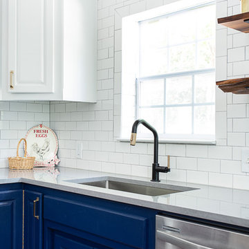
We introduce to you one of our newer services we are providing here at Kitchen Design Concepts: spaces that just need a little reviving! As of recent, we are taking on projects that are in need of minimal updating, as in, spaces that don’t need a full-on remodel. Yes, you heard right! If your space has good bones, you like the layout of your kitchen, and you just need a few cosmetic changes, then today’s feature is for you! Recently, we updated a space where we did just this! The kitchen was in need of a little love, some fresh paint, and new finishes. And if we’re being honest here, the result looks almost as if the kitchen had a full-on remodel! To learn more about this space and how we did our magic, continue reading below:
The Before and After
First, see what an impact new finishes can make! The “before” image shows a kitchen with outdated finishes such as the tile countertops, backsplash, and cabinetry finish. The “after” image, is a kitchen that looks almost as if its brand new, the image speaks for itself!
Cabinetry
With the wooden cabinetry in this kitchen already having great bones, all we needed to do was our refinishing process that involved removing door and drawer fronts, sanding, priming, and painting. The main color of the cabinetry is white (Sherwin Williams Pure White 7005) and as an accent, we applied a deep navy blue that really pops in this space (Sherwin Willaims Naval 6244). As a special design element, we incorporated a natural wooden band across the hood which is subtle but adds an element of surprise.
Countertops
The original countertops in this space were a 12×12 tile with cracks and discolored grout from all the wear and tear. To replace the countertops, we installed a clean and crisp quartz that is not only durable but easy to maintain (no grout here!). The 3cm countertops are a Cambria quartz in a grey-tone color (Carrick).
Backsplash
Keeping things simple, yet classic, we installed a 3×6 subway tile from Interceramic. The crisp white pairs well with all the other finishes of the space and really brighten the space up! To spice things up, we paired the white tile with a contrasting grout color (Cape Grey) that matches the countertop. This is a simple method to add interest to your white backsplash!
Fixtures and Fittings
For the fixtures and fittings of the kitchen, we wanted pieces that made a statement. That’s why we selected this industrial style faucet from Brizo! The faucet is a Brizo LITZE™ PULL-DOWN FAUCET WITH ARC SPOUT AND INDUSTRIAL HANDLE (63044LF-BLGL). The matte black paired with the luxe gold elements really make a statement! To match the gold elements of the faucet, we installed cabinetry hardware from Topknobs in the same gold finish. The hardware is a Channing pull TK743HB. Lastly, the large single bowl sink (who doesn’t want a large sink?!) is a great functional touch to the kitchen. The sink is a Blanco Precision 16″ R10 super single with 16″ Drainer in stainless steel (516216).
 Studio MMA Architecture + Design
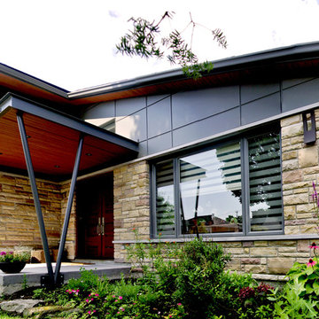
The renovations to this 50-storey half-level home in Mont-Royal include several interventions affecting the appearance of the building. While being part of a conceptual approach respectful of the material qualities, the original proportions of the building and its openings, our intervention rationalizes the distribution of the materials on the facades. The installation of a continuous stone wall above the windows of the ground floor all around the building separates the facades of the DRC with stone or brick from the new coating of anthracite gray fiber cement panels used on all upstairs. The modulation of the panels and the position of the joints aligning with the mullions of the new windows give a coherent and dynamic rhythm to these wall surfaces. The large eaves are highlighted by the replacement of the aluminum soffits with wooden boards dyed in the color of the new mahogany double entry door. A new steel entrance canopy with integrated lighting and a wooden ceiling such as the new soffits complete the sensitive and respectful modernization of the original characteristics of the house.
 Kitchen Design Concepts
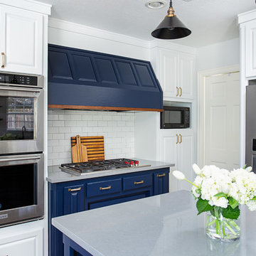
We introduce to you one of our newer services we are providing here at Kitchen Design Concepts: spaces that just need a little reviving! As of recent, we are taking on projects that are in need of minimal updating, as in, spaces that don’t need a full-on remodel. Yes, you heard right! If your space has good bones, you like the layout of your kitchen, and you just need a few cosmetic changes, then today’s feature is for you! Recently, we updated a space where we did just this! The kitchen was in need of a little love, some fresh paint, and new finishes. And if we’re being honest here, the result looks almost as if the kitchen had a full-on remodel! To learn more about this space and how we did our magic, continue reading below:
The Before and After
First, see what an impact new finishes can make! The “before” image shows a kitchen with outdated finishes such as the tile countertops, backsplash, and cabinetry finish. The “after” image, is a kitchen that looks almost as if its brand new, the image speaks for itself!
Cabinetry
With the wooden cabinetry in this kitchen already having great bones, all we needed to do was our refinishing process that involved removing door and drawer fronts, sanding, priming, and painting. The main color of the cabinetry is white (Sherwin Williams Pure White 7005) and as an accent, we applied a deep navy blue that really pops in this space (Sherwin Willaims Naval 6244). As a special design element, we incorporated a natural wooden band across the hood which is subtle but adds an element of surprise.
Countertops
The original countertops in this space were a 12×12 tile with cracks and discolored grout from all the wear and tear. To replace the countertops, we installed a clean and crisp quartz that is not only durable but easy to maintain (no grout here!). The 3cm countertops are a Cambria quartz in a grey-tone color (Carrick).
Backsplash
Keeping things simple, yet classic, we installed a 3×6 subway tile from Interceramic. The crisp white pairs well with all the other finishes of the space and really brighten the space up! To spice things up, we paired the white tile with a contrasting grout color (Cape Grey) that matches the countertop. This is a simple method to add interest to your white backsplash!
Fixtures and Fittings
For the fixtures and fittings of the kitchen, we wanted pieces that made a statement. That’s why we selected this industrial style faucet from Brizo! The faucet is a Brizo LITZE™ PULL-DOWN FAUCET WITH ARC SPOUT AND INDUSTRIAL HANDLE (63044LF-BLGL). The matte black paired with the luxe gold elements really make a statement! To match the gold elements of the faucet, we installed cabinetry hardware from Topknobs in the same gold finish. The hardware is a Channing pull TK743HB. Lastly, the large single bowl sink (who doesn’t want a large sink?!) is a great functional touch to the kitchen. The sink is a Blanco Precision 16″ R10 super single with 16″ Drainer in stainless steel (516216).
 Klopf Architecture
Klopf Architecture and Jesse Ososki Art remodeled an existing Eichler atrium home into a brighter, more open, and more functional version of its original self.
The goals were to preserve the Eichler look and feel without the need to strictly adhere to it. The scope of work included re-configuring the master bedroom/bath, the kitchen, and the hall bath/laundry area, as well as updating interior finishes throughout to be more sophisticated.
The owners are detail-oriented and were very involved in the design process, down to the selection of lighting controls and stainless steel faceplates.Their design aesthetic leans toward the Scandinavian — light and bright, with simple straight lines and pure geometric shapes.
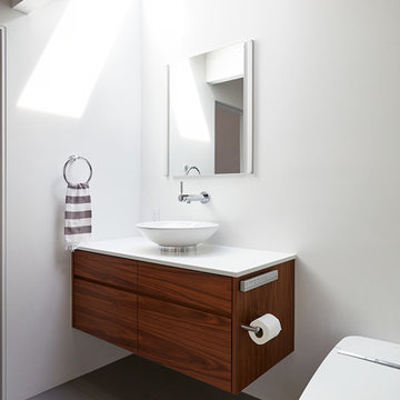
The finish flooring is large porcelain tile (24” x 24”) in a neutral grey tone, providing a uniform backdrop against which other materials can stand out. The same tile continues into the shower floor (with a different finish texture for slip-resistance) and up the shower/tub walls (in a smaller size). Heath Classic Field ceramic tile in Modern Blue was used sparingly, to add color at the hall bath vanity backsplash and at the shampoo niches in both bathrooms. Back-painted soda glass in pale blue to match the Heath tile was used at the kitchen backsplash. This same accent color was also used at the front entry atrium door. Kitchen cabinetry, countertops, appliances, and light fixtures are all white, making the kitchen feel more airy and light. Countertops are Caesarstone Blizzard.
The owners chose to keep some of the original Eichler elements: the concrete masonry fireplace; the stained tongue-and-groove redwood ceiling decking; and the luan wall paneling. The luan paneling was lightly sanded, cleaned, and re-stained. The owners also kept an added element that was installed by a previous owner: sliding shoji panels at all bedroom windows and sliding glass doors, for both privacy and sun control. Grooves were cut into the new tile flooring for the shoji panels to slide in, creating a more integrated look. Walnut was used to add warmth and contrast at the kitchen bar top and niche, the bathroom vanities, and the window sill/ledge under the kitchen window.
This Burlingame Eichler Remodel is a 2,121 sf, 4 bedroom/2 bath home located in the heart of Silicon Valley.
Klopf Architecture Project Team: John Klopf, Klara Kevane and Yegvenia Torres Zavala
Contractor: Jesse Ososki Art
Structural Engineer: Emmanuel Pun
Photography ©2018 Mariko Reed
Location: Burlingame, CA
Year completed: 2017
 Michael Nash Design, Build & Homes
2010 NARI CAPITAL COTY GRAND AWARD WINNER
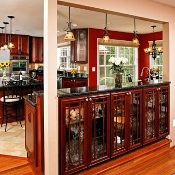
A young couple with toddlers purchased this home and decided to do extensive renovations before they moved in. The existing galley kitchen and dining room were too small and separated by a load bearing wall. The sunken family room floor was less than ideal for small children to have to climb up and down.
The first step in the renovation involved eliminating the load bearing walls and replacing them with a new steel beam capable of handling the load. By doing so, Michael Nash Design, Build & Homes was able to combine the galley kitchen and dining room into one large family kitchen with an eating area.
The focal point of the new space is a large multi-purpose island with a cooktop. Cherry stained cabinetry with a dark granite countertop provides plenty of storage and workspace, as well as bar seating. The same materials are used around the perimeter of the kitchen.
One wall features upper and lower cabinets which surround a stainless steel refrigerator and double wall ovens. A large pantry is included on this wall. The second wall houses the main kitchen sink and built-in dishwasher. A large window sits above the sink area allowing the parents to watch over children playing in the backyard. A butler area features a utility sink and an under-the-counter beverage refrigerator that is easy for the kids to access.
The family room floor was raised to be level with the rest of the first floor and Brazilian cherry wood floors provide continuity and richness throughout the space. Archways were built for style and pleasant viewing from each room.
The end result of the project is that this kitchen is the heart of the home. The living and dining area is now large enough for family gatherings and entertaining.
 SabaRehman Abdulrehman
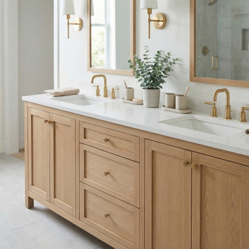
Morning routines shouldn’t involve a traffic jam at the sink. The 2025 Houzz Bathroom Trends Study found that 65 percent of U.S. renovators now choose a double-sink vanity to skip the wait. Designers agree: Titan Builders dubbed 2025 “the year of bigger, storage-packed double vanities,” forecasting dual-basin setups in family, guest, and even powder baths. As KBIS 2025 launches land, prototypes for 2026 layer in spa-grade wood, built-in outlets, and planet-friendly finishes. In this guide, we rank six standout models and show you how to size, install, and enjoy a clutter-free, two-sink future.
Methodology and selection criteria
A well-planned double-sink vanity keeps busy morning routines calm and clutter-free.
Before we crowned any winners, we mapped the entire 2024–2026 double-sink (dual-basin) market. That meant parsing KBIS exhibitor releases, scraping bestseller lists from Home Depot, Lowe’s, and Wayfair, and reviewing designer short lists in trade magazines. The sweep produced 110 candidate vanities, giving us visibility into every style, price tier, and material in play.
We then scored each model against six weighted factors that continue to matter long after installers leave:
- Build quality – 25 percent.Solid hardwood frames, dovetail drawers, and furniture-grade plywood backs, never particleboard in disguise.
- Design versatility – 20 percent.Lines and finishes that suit modern, classic, or farmhouse baths without dating quickly.
- Sustainability – 15 percent.FSC-certified wood, CARB 2 compliance, and low-VOC finishes for healthier air.
- Storage efficiency – 15 percent.Deep drawers, tilt-outs, or power cubbies that corral countertop clutter.
- Value for money – 15 percent.Fair street price for the materials, stone tops, sinks, and soft-close hardware included.
- Brand reputation and warranty – 10 percent.Manufacturers with responsive support and at least a one-year parts guarantee.
- Footprint: 72 W × 22 D × 36 H in. (183 × 56 × 91 cm)
- Crated weight: 506 lb / 230 kg
- Street price: about $2,575 with marble top and basins, Q4 2025
- Footprint: 48 W × 22 D in. (122 × 56 cm)
- Height: 34.8 in. (88 cm) with backsplash
- Sliding barn door plus 3 drawers
- Pre-drilled 8-in. faucet spacing, sinks included
- Footprint: 60 W × 21 D × 34 H in. (152 × 53 × 86 cm)
- Integrated power: 4 AC + 2 USB, UL-listed
- Crated weight: 300 lb / 136 kg
- Street price: about $2,349 at Home Depot, Q4 2025
- Footprint: 72 W × 22 D in. (183 × 56 cm)
- Height: 34 in. (86 cm) plus 4 in. backsplash
- Counter: 1 in. Carrara marble, apron-front sinks included
- Hardware: oil-rubbed bronze, soft-close doors and drawers
- Footprint: 60 W × 22 D × 34 H in. (152 × 56 × 86 cm)
- Construction: solid poplar and plywood, waterfall quartz top
- Integrated slim power bank, soft-close doors and drawers
- Target price: just under $2,300 with top and basins
 Vetter Architects
A tea pot, being a vessel, is defined by the space it contains, it is not the tea pot that is important, but the space.
Crispin Sartwell
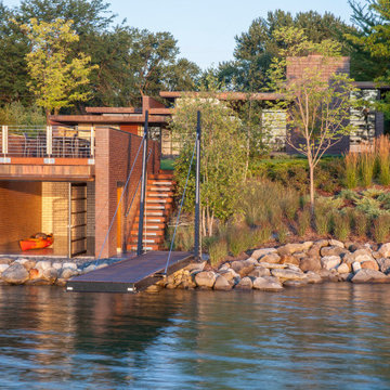
Located on a lake outside of Milwaukee, the Vessel House is the culmination of an intense 5 year collaboration with our client and multiple local craftsmen focused on the creation of a modern analogue to the Usonian Home.
As with most residential work, this home is a direct reflection of it’s owner, a highly educated art collector with a passion for music, fine furniture, and architecture. His interest in authenticity drove the material selections such as masonry, copper, and white oak, as well as the need for traditional methods of construction.
The initial diagram of the house involved a collection of embedded walls that emerge from the site and create spaces between them, which are covered with a series of floating rooves. The windows provide natural light on three sides of the house as a band of clerestories, transforming to a floor to ceiling ribbon of glass on the lakeside.
The Vessel House functions as a gallery for the owner’s art, motorcycles, Tiffany lamps, and vintage musical instruments – offering spaces to exhibit, store, and listen. These gallery nodes overlap with the typical house program of kitchen, dining, living, and bedroom, creating dynamic zones of transition and rooms that serve dual purposes allowing guests to relax in a museum setting.
Through it’s materiality, connection to nature, and open planning, the Vessel House continues many of the Usonian principles Wright advocated for.
Overview
Oconomowoc, WI
Completion Date
August 2015
Services
Architecture, Interior Design, Landscape Architecture
 Vetter Architects
A tea pot, being a vessel, is defined by the space it contains, it is not the tea pot that is important, but the space.
Crispin Sartwell
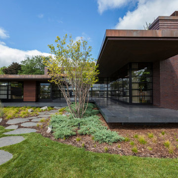
Located on a lake outside of Milwaukee, the Vessel House is the culmination of an intense 5 year collaboration with our client and multiple local craftsmen focused on the creation of a modern analogue to the Usonian Home.
As with most residential work, this home is a direct reflection of it’s owner, a highly educated art collector with a passion for music, fine furniture, and architecture. His interest in authenticity drove the material selections such as masonry, copper, and white oak, as well as the need for traditional methods of construction.
The initial diagram of the house involved a collection of embedded walls that emerge from the site and create spaces between them, which are covered with a series of floating rooves. The windows provide natural light on three sides of the house as a band of clerestories, transforming to a floor to ceiling ribbon of glass on the lakeside.
The Vessel House functions as a gallery for the owner’s art, motorcycles, Tiffany lamps, and vintage musical instruments – offering spaces to exhibit, store, and listen. These gallery nodes overlap with the typical house program of kitchen, dining, living, and bedroom, creating dynamic zones of transition and rooms that serve dual purposes allowing guests to relax in a museum setting.
Through it’s materiality, connection to nature, and open planning, the Vessel House continues many of the Usonian principles Wright advocated for.
Overview
Oconomowoc, WI
Completion Date
August 2015
Services
Architecture, Interior Design, Landscape Architecture
14