
Search results for "Involve continued" in Home Design Ideas
 Bilotta Kitchen & Home
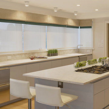
Kitchens with fabulous water views require a design that is central to the view. In this case, Bilotta designer, Randy O’Kane, working with Rachel Laxer of Rachel Laxer Interiors, Robert Keller of Keller Eaton Architects, and the homeowner, quickly established that the focal point would be the outside, thus there are really no wall cabinets. The cooktop and main sink are situated on the island so that they face the water with wall ovens and refrigerator/freezer behind. The lines of the Bilotta Collection cabinetry are sleek and there is little to no hardware; drawers have a channel system in place of hardware. A tall pantry area hugs the wall and disappears with only glass pulls giving it away. The natural quartzite countertops have the undulating feel of moving water. The bar area is tucked away with the same clean lined cabinetry, but with an added touch of antique mercury mirrors to help reflect the lovely views. Soft seating by way of a custom banquette and sectional makes this kitchen not just a place to eat, but a relaxing area to watch the boats go by. Contemporary painted casing trims an extra-large pocket door into a formal dining room beautifully detailed by Rachel Laxer and continues the soft color scheme with added pops of color. This is definitely a great space to entertain in or just enjoy! Additional people involved include Staci Ruiz of Staci Ruiz Lighting Consultant and Bobby Noonan of Noonan Construction. Appliances are a mix of Miele, Sub-Zero and Gaggenau; sinks are Franke and faucets by Dornbracht. Bilotta Designer Randy O’Kane with Rachel Laxer for Rachel Laxer Interiors and Robert Keller of Keller Eaton Architects. Photo Credit: Peter Krupenye
 Tile Doctor Ltd
Terracotta is an interesting type of stone manufactured using a variety of techniques dependant on the country of origin which leads to a number of differences such as Spanish Terracotta being less porous than its Mexican counterpart: the former is semi-hand made and finished in a factory kiln, while the latter is completely handmade. Spanish Terracotta is therefore a lot less than porous and ultimately, of a higher quality.
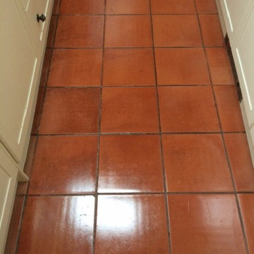
But despite the Spanish Terracotta being less porous, and therefore being less prone to ingrained dirt, it still, like any other stone, needs regular maintenance to keep it looking smart. In the tiling trade, we quite often refer to this as a good old fashioned ‘Clean and Seal’ and this is exactly what was requested by this property owner in Halifax, for their Spanish Terracotta tiled floors in the kitchen and adjacent hallway.
I cleaned both sets of Terracotta tiles using the same process, which involved the application of our reliable alkaline cleaner known as Tile a Doctor Pro Clean, diluted with five parts of warm water. Once the solution had been left to dwell for a short period, it was scrubbed into the tiles to remove all dust, dirt, and general muck. This created a slurry of cleaning residue, which I promptly soaked up using a wet vac. A wet vac machine is an essential tool when it comes to cleaning porous tiles since, unlike a traditional mop and bucket, it sucks the excess trapped dirt out of the clay and thus provides a superior clean.
Following this, I applied a small amount of our heavy duty remover, known as Tile Doctor Remove & Go, to deal with some of the more stubborn stains and paint splashes, before rinsing with clean water and wet vaxing in a similar fashion to before.
Once the clean had been completed I left the tiles to dry completely. This can take 12 to 24 hours depending on numerous factors including whether a Damp proof Membrane and underfloor heating has been installed which can really help reduce drying times. Letting the tiles dry completely before sealing is paramount as moisture can cloud the sealer and affect its performance.
Upon my return to the property I ran some quick damp tests, which revealed the tiles were ready to be sealed. I then applied several coats of Tile Doctor Seal and Go, our topical sealer which provides a satin finish and accentuates colour. A new coat of this product is recommended every six months on Terracotta to ensure the continuous protection of the tiles’ soft clay particles.
My customer was extremely pleased with her refreshed Terracotta tiles. It goes to show what a big difference a bit of regular maintenance can make. I advised the customer that an everyday cleaner called Tile Doctor pH Neutral cleaner can also be used regularly to keep the tiles looking great without damaging the sealer.
Nigel Stoker
North West Yorkshire Tile Doctor
 Sosna Inc
After serving as a rental for some time, this home was ready to be reclaimed by its owner and her son.
Gutting “back to the studs” was an understatement for this one. This transformation involved replanning everything; including the roof, the HVAC system, the entire plumbing system, and relocating the side entrance and staircase to the back of the house. Only the subfloors, the exterior framing structure, and the brick remains from this original 1940’s-built bungalow.
When we’re renovating an old structure, we’re bound to find some surprises. This renovation did not disappoint! From basement to roof, we found more than a few, shall we say, potentially catastrophic surprises along the way.
Let’s start with the basement. The homeowner wanted to update the basement and make it a usable living space for her adult son as well as a spa with a sauna for her. This required bringing the 6 foot ceiling height up to code at 7 feet. To do this, we had to re-think the HVAC system that was in the basement ceiling. When we opened up the basement ceiling to remove the HVAC supply and return trunks, we discovered asbestos! The asbestos had to be removed before we could dismantle and remove the HVAC system.
For the main floor, when we were replanning the existing 2-bedroom layout to create two master bedrooms each with their own ensuites, we looked at the possibility of removing the main load-bearing wall. But our investigations led to the discovery that the load bearing wall was not lined up with the roof or the basement load points, so the load of the house was not continuous throughout. This was a disaster waiting to happen. And as we found out, this lack of alignment was causing major issues with the roof when we went to replace the shingles. We discovered portions of the roof truss in very poor condition, literally moments away from giving out. These were replaced and other truss components were fortified before we went on to re-shingle the roof and replace all the soffits and eavestroughs.
Once the structural and space planning elements were sorted out, we could turn our focus to helping this homeowner select the finishes she and her son wanted for their new spaces. She wanted white all the way, and he wanted bold colours. You will see these color choices reflected in their private bathrooms as well as in the upper kitchen and living area that she will mostly use, and the basement entertainment area that he will mostly use.
To round out the personalization of this made-new-again home, we converted the basement into an entertainment center with a bar for her son, and a sauna and third full bathroom with a jacuzzi tub for a spa-like feel for her.
Without having to build from scratch, this homeowner got the custom home of her dreams.
While you “can’t teach an old dog new tricks”, the sky’s the limit on how you can transform an old home into the home of your dreams. When your “old dog” needs some new tricks, we are the Renovator You Can Count On.
Find the right local pro for your project
 KCBR Design | Remodel
Designed for repeat clients, this Overland Park remodel focused on improving function, flow, and everyday livability across multiple spaces.
In the kitchen, the layout was refined to create a more open and efficient environment. An enlarged island now serves as a central hub for cooking, gathering, and daily use, while ceiling-height cabinetry maximizes storage and creates a clean, built-in aesthetic. New hardwood flooring ties the space together, adding warmth and continuity.
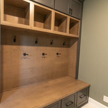
A key transformation involved reconfiguring the layout to better support storage needs. By relocating the laundry room door, a dedicated pantry was introduced, significantly improving organization and accessibility. The adjacent laundry room was also updated, along with the addition of custom cubbies to streamline daily routines.
For a bold contrast, the powder bath was reimagined as a moody, speakeasy-inspired space, bringing depth, character, and a memorable design moment to the home.
The result is a cohesive, thoughtfully redesigned interior that enhances how the family lives day to day, balancing function, storage, and distinctive style.
 Kustom Home Design
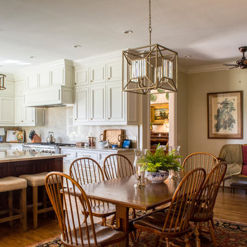
This renovation involved expanding the kitchen space into an adjacent office area, creating a side entry, new kitchen layout that worked well for two cooks, professional grade appliances, oversized island with seating on two sides, eat-in area, sitting area and furniture look cabinets with both stained and painted finishes. We enlarged an existing window by creating a boxed bay at the relocated sink and designed a continuous quartzite counter which serves as planting ledge for herbs and flowers. Some of the appliances were integrated into the cabinetry with panels, while others were designed as impact pieces. Custom designed cabinets include a large mantel style chimney hood with vent insert, furniture grade hutch with leaded glass doors, contrasting stained island with seating on two sides, bar with wine refrigerator and deep drawers, and a galley style butler's pantry which provides secondary prep space and ample storage.
Details such as shaped cabinet feet, upper glass front cabinets, pull-out trash drawer, spice columns and hidden drawers and storage make this newly designed kitchen space feel luxurious and function perfectly. Traditional materials and forms meld seamlessly with industrial accents and modern amenities. Mixed metals are used in a balanced and dynamic way with warm gold tone cabinet hardware, stainless steel and chrome all working in harmony. Antique furnishings blend with the newly designed cabinets and modern lighting.
Photos by: Kimberly Kerl
 Amy Troute Inspired Interior Design
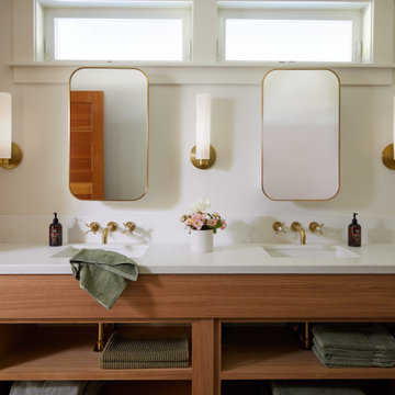
This designer’s ideal is homeowners with a clear vision, set priorities, and values that align seamlessly with ours. These clients, an accomplished artist and the owner of a generational hops growing farm, were collaborative and trusting from the start. They conscientiously selected a team of Architect (Green Hammer), General Contractor (Cellar Ridge) and ATIID for furnishings and finishing touches. Each firm was able to meticulously manage their leg of the project, while collaborating wholistically with each other and the homeowners.
The family farmhouse, lovingly named “Westwood,” was showing the wear one expects after serving a growing family for decades. The owner’s dream was to revive, open up, and breathe modern life into each space, while respecting the home’s heritage.
One of our first collaborations was the light fixture that would grace the main two-story entry hall. HiiH Lights in Astoria, Oregon, was commissioned to bring “the function of light, the craft of paper, and the art of sculpture” to the home. Visiting the maker’s space – a massive barn on his coastal property – was such an inspiring adventure! Original work by the resident artist sets an ethereal tone in the space, and an antique bench handsomely blends the old with the new.
A wall that divided the home’s living room and kitchen was removed, and the breezy and bright gathering room was born. Light walls, warm wood tones, cozy upholstery, clean lines and heritage elements create a welcoming atmosphere and invite lounging and conversation. The sun-drenched nook is the home’s main indoor dining area, with an extension table and sculpted chairs that are just right for family gatherings or morning rituals with the Sunday paper. The kitchen is a chef’s dream with every modern amenity, but its casual attitude is “let’s make a mess and eat!”
The owner’s artwork graces the mantel over the new fireplace that was carved from a tree felled on the property, illustrating the thoughtful consideration of each element. The muted wool area rugs in the entryways and great room are hard-wearing for farm life, and the furniture’s classic lines, bold contrasting colors, deep seating and soft textures encourage cozy conversations or large group gatherings.
The library is undoubtedly our favorite space in this home. Tucked in “speakeasy style” behind a hidden (wallpapered!) door in the moody wet bar, and drenched in deep green, the room offers a quiet retreat that hugs you in an embrace of books and family photos. The cozy settee nestled between the bookcases sits opposite a custom pair of modern cognac leather wing chairs. The area rug continues the storied look without the antique price tag with a piece from Loloi’s “Heritage Collection.”
A little va-va-voom was requested for the powder bath and boy did we deliver! Custom wallpaper plays over original wainscotting and ceilings wrapped in more glorious green. The space evokes joy every time you open the door!
A primary suite that would “transport us to another world” and be “classic yet modern, peaceful, collected and uncluttered” was a tall order. Our new furniture layout takes full advantage of the view of wine country hills and the Willamette River, welcomes fireside lounging, and serves as a calm respite for the lovely owners.
Westwood Farmhouse truly was inspired by family, genuine love for home and graciousness for all who enter. Finishing the job was emotional for all involved because we were truly made to feel like part of the family.
Photography by George Barberis
 Geshtalt homes
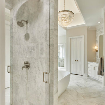
This full-scale remodel transformed a dated traditional home into an elegant, modernized retreat. The project involved reimagining every room—from the formal living spaces to the kitchen, bathrooms, and private suites—blending classic design elements with luxurious modern amenities.
High-end finishes, custom millwork, and thoughtfully curated materials were used throughout to elevate and further develop the home’s character. The kitchen now features elegant lines, marble countertops, and luxury appliances, designed for both beauty and functionality. Bathrooms were reconfigured for spa-like comfort, with features such , focal tiling, and freestanding tubs.
Additional hardwood flooring connects to original, and designer lighting create continuity and sophistication across the spaces. We also enhanced flow and openness by selectively removing and combining islands, and expanding key areas to accommodate contemporary living without sacrificing traditional elegance.
From concept to completion, this project exemplifies USI's design-build approach—seamlessly integrating architecture, interior design, and craftsmanship to deliver a cohesive, upscale home tailored to modern lifestyles.
 Vineuve Construction Inc.
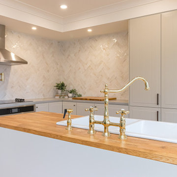
This stunning fully Vineuve designed and renovated kitchen showcases a complete transformation with a subtle grey cabinetry with clean lines, concrete countertops, a prominent central island featuring a maple butcher block waterfall countertop, and an elegant marble herringbone backsplash that adds sophisticated texture to the space. The renovation involved strategically filling in a doorway to create a continuous wall, which now features a seamlessly integrated hidden cabinet door fridge that blends perfectly with the surrounding cabinetry for a clean, uninterrupted look.
 Kustom Home Design
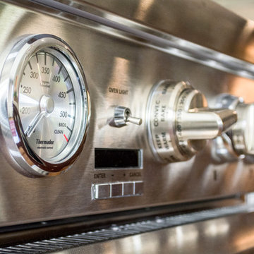
This renovation involved expanding the kitchen space into an adjacent office area, creating a side entry, new kitchen layout that worked well for two cooks, professional grade appliances, oversized island with seating on two sides, eat-in area, sitting area and furniture look cabinets with both stained and painted finishes. We enlarged an existing window by creating a boxed bay at the relocated sink and designed a continuous quartzite counter which serves as planting ledge for herbs and flowers. Some of the appliances were integrated into the cabinetry with panels, while others were designed as impact pieces. Custom designed cabinets include a large mantel style chimney hood with vent insert, furniture grade hutch with leaded glass doors, contrasting stained island with seating on two sides, bar with wine refrigerator and deep drawers, and a galley style butler's pantry which provides secondary prep space and ample storage.
Details such as shaped cabinet feet, upper glass front cabinets, pull-out trash drawer, spice columns and hidden drawers and storage make this newly designed kitchen space feel luxurious and function perfectly. Traditional materials and forms meld seamlessly with industrial accents and modern amenities. Mixed metals are used in a balanced and dynamic way with warm gold tone cabinet hardware, stainless steel and chrome all working in harmony. Antique furnishings blend with the newly designed cabinets and modern lighting.
Photos by: Kimberly Kerl
 KCBR Design | Remodel
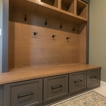
Designed for repeat clients, this Overland Park remodel focused on improving function, flow, and everyday livability across multiple spaces.
In the kitchen, the layout was refined to create a more open and efficient environment. An enlarged island now serves as a central hub for cooking, gathering, and daily use, while ceiling-height cabinetry maximizes storage and creates a clean, built-in aesthetic. New hardwood flooring ties the space together, adding warmth and continuity.
A key transformation involved reconfiguring the layout to better support storage needs. By relocating the laundry room door, a dedicated pantry was introduced, significantly improving organization and accessibility. The adjacent laundry room was also updated, along with the addition of custom cubbies to streamline daily routines.
For a bold contrast, the powder bath was reimagined as a moody, speakeasy-inspired space, bringing depth, character, and a memorable design moment to the home.
The result is a cohesive, thoughtfully redesigned interior that enhances how the family lives day to day, balancing function, storage, and distinctive style.
 Vetter Architects
A tea pot, being a vessel, is defined by the space it contains, it is not the tea pot that is important, but the space.
Crispin Sartwell
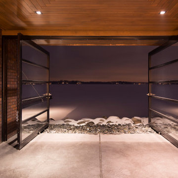
Located on a lake outside of Milwaukee, the Vessel House is the culmination of an intense 5 year collaboration with our client and multiple local craftsmen focused on the creation of a modern analogue to the Usonian Home.
As with most residential work, this home is a direct reflection of it’s owner, a highly educated art collector with a passion for music, fine furniture, and architecture. His interest in authenticity drove the material selections such as masonry, copper, and white oak, as well as the need for traditional methods of construction.
The initial diagram of the house involved a collection of embedded walls that emerge from the site and create spaces between them, which are covered with a series of floating rooves. The windows provide natural light on three sides of the house as a band of clerestories, transforming to a floor to ceiling ribbon of glass on the lakeside.
The Vessel House functions as a gallery for the owner’s art, motorcycles, Tiffany lamps, and vintage musical instruments – offering spaces to exhibit, store, and listen. These gallery nodes overlap with the typical house program of kitchen, dining, living, and bedroom, creating dynamic zones of transition and rooms that serve dual purposes allowing guests to relax in a museum setting.
Through it’s materiality, connection to nature, and open planning, the Vessel House continues many of the Usonian principles Wright advocated for.
Overview
Oconomowoc, WI
Completion Date
August 2015
Services
Architecture, Interior Design, Landscape Architecture
 Shenton Architects LLP
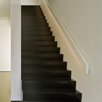
This three bedroom duplex apartment is uniquely located at the corner of Gramercy Park. The project involved the renovation of one apartment and expansion into the unit above. The one bedroom apartment upstairs was converted into a Master Suite, while the original Master Bedroom was absorbed into the living room, creating a larger entertainment space to accommodate a piano and a custom bar with a cantilevered counter.
A new staircase connecting the existing apartment with the Master Suite is tucked away to maximize open social area. The dark wood floors were continued through the stair to suggest that this had always been part of the original design.
Upstairs, the new Master Bedroom faces south overlooking the park with integrated millwork on either side of the fireplace. A built-in bed floats off the floor and adjacent wall. Her closet used space flanking the fireplace for built-in shoe storage, providing a functional yet colorful display when lit. Cove lighting, stretched fabric and frosted glass were employed to provide a warm glow for the spaces when not illuminated by the abundant daylight on both levels.
Project by Richard Meier & Partners, Architects LLP
 Natural Stone Institute
This private residence involved construction of a modern architectural style estate property in Highland Park, Texas. Dee Brown Inc’s role came into play late in the project, when corrections were needed to some specialty stonework.
The home’s center is formed around the main entry. The floorplan is largely open, but parallel core wall areas serve to define the foyer, kitchen, dining, and living areas. As key areas, the architect put special focus on materials selection for the core walls. It was decided that Indiana limestone would be the finish, and that the cladding panels would all have unique continuous horizontal grooves.
Material was received and installed by the original subcontractor. Upon seeing the completed work, it was evident to the architect and owner that grooves in the fabricated material were not consistent, and that the installation process had left numerous chips to the panels. It was at this point that the partially completed work was removed, and the second fabricator/installer was contacted.
Dee Brown Inc ordered the Indiana limestones slabs. There, special care was taken to hold tight tolerances to the horizontal grooves as well as to the typical cut-to-size aspects. Erection of these mechanically set panels was done very carefully. The result was a clean finished product with none of the tolerance and chipping issues of the original installation.
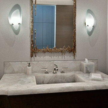
Dee Brown, Inc also created and installed special stone finishes at the adjacent half-bath. Semi-precious white onyx was transformed into a lavatory top/bowl assembly, water-closet wall cladding, and even tissue and towel holders.

 LAUP
LAUPItalain description:
Riqualificazione ambientale-paesaggistica del lago Fontana
Primo premio Ex Aequo | Paysage City’Scape Award
Menzione speciale | Premio Triennale Fare Paesaggio
L’intervento prevede la creazione di un itinerario in dialogo costante con la topografia del territorio che si adatta alla sua naturale configurazione, in modo tale da minimizzare l’impatto ambientale e percettivo. Il frequente alternarsi delle quote di calpestio del terreno ha offerto l’occasione di ottenere una pavimentazione piana continua e di una piccola terrazza panoramica che si colloca circa a metà del percorso.
. . .
English description:
Environmental and landscape renovation of lake Fontana
First prize Ex Aequo | Paysage City’Scape Award
Special mention | Premio Triennale Fare Paesaggio
The intervention involves the creation of an itinerary in constant dialogue with the topography of the area, that adapts to its natural configuration in such a way as to minimize the environmental and perceptive impact. The frequent alternation of the levels of the ground offered the opportunity to obtain a continuous flat pavement and a small panoramic terrace which is located approximately halfway along the route.

 Ollin Stone
Mystery, elegance: this could be a possible description for the Seta Liquorice collection which combines the tactile experience of silk with ceramic technology. Inspired by the softness of fabric and the light reflected in its folds, Laminam slab in Liquorice tone conveys aesthetic and visual continuity when used for flooring and claddings that involve the use of intense and unconventional shades.
 My Kitchen And Bath
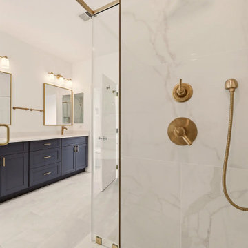
A complete primary bathroom remodel in Springfield, Virginia, designed around three priorities our clients came in with: a real walk-in shower, a freestanding tub by the windows, and a proper double vanity with storage that actually worked.
The original layout had everything in the wrong place. The tub sat against an interior wall away from the natural light. A small stall shower took up real estate across the room. The vanity was squeezed into whatever space was left over. Three windows on the back wall were doing nothing for the room because the layout was fighting them. Our solution involved knocking down the dividing wall between the old shower and vanity area, relocating plumbing for both the tub and the new vanities, and placing the freestanding tub directly under the bay of windows so morning light became part of the experience.
Design Approach
We anchored the room around contrast: deep navy cabinetry against soft white walls, warm brushed gold against cool marble tile, sharp Shaker lines against the curved silhouette of the freestanding tub. Navy was the design decision the rest of the room was built around — the clients knew they wanted color but didn't want anything that would feel dated in five years. Navy reads bold without being loud, pairs with virtually any metal finish, and has staying power that trendier choices don't.
We used Fabuwood Galaxy Indigo for the vanities — all-plywood construction with solid wood doors and drawer fronts, soft close throughout. Shaker-style flat panels keep the navy from feeling heavy. The brushed gold (Jeffrey Alexander 635-96SBZ in satin bronze) shows up across hardware, faucets, lighting, the tub filler, and the shower trim, creating a quiet continuity throughout the room.
The Shower
Removing the wall between the old shower and old vanity area created room for a proper walk-in. We tiled the entire shower floor to ceiling in Decovita Calacatta Suave 24x48" porcelain — large format installed in a 50% offset horizontal pattern, with cement board and redgard underneath. The marble-look porcelain gives the visual depth of natural marble without the maintenance.
A built-in shower bench, custom-built into the corner, is wrapped in the same wall tile on the front with a quartz top matching the vanity counter. The shower niche is detailed with MSI Arabescato Carrara 2" honed hex mosaic at the back, the same tile used on the shower floor. All tile edges are finished with Schluter in satin bronze to match the room's metal finishes. The shower door is custom frameless 3/8" tempered glass with a satin bronze pull — no metal frame interrupting the sight line.
The Vanities and Countertops
The new double vanity gives both clients their own space for morning routines. Counter tops are MSI Calacatta Miraggio Cielo quartz with pencil edging and a 4" backsplash — a soft white with subtle gray veining that reads like real Calacatta marble without the porosity issues. Two undermount square porcelain sinks finish the surface cleanly.
The Tub
A 60" freestanding soaker tub sits under the bay of three windows. The floor-mounted tub filler is satin bronze with a handheld sprayer. We relocated the drain and supply lines to make the centered placement work. The tub is the room's quietest feature and its strongest — clients tell us they use this bathroom differently than they used the old one.
Flooring
MSI Sande Ivory 12x24" matte porcelain runs throughout the bathroom floor in a 50% offset pattern parallel to the vanity wall. Cement board underneath, 4" white wood baseboard, Whisper Grey grout that handles daily use without showing wear.
Paint and Lighting
Walls are Benjamin Moore Chantilly Lace 2121-70 in satin — a true crisp white that doesn't lean cool or warm. The ceiling uses Benjamin Moore Aura Bath and Spa White, which is formulated to resist mildew in high-humidity spaces. Lighting is layered: three new 6" LED recessed lights on a dimmer, two satin bronze vanity sconces above the mirrors, and the existing three windows providing the daytime ambient light.
Project Specs
Location: Springfield, Virginia
Project type: Full primary bathroom remodel
Project duration: Approximately 5 weeks
Style: Modern, Transitional
Color palette: Navy, white, brushed gold, marble
Materials
Cabinetry: Fabuwood Galaxy Indigo, Shaker-style flat panel maple, all-plywood construction
Cabinet hardware: Jeffrey Alexander 635-96SBZ Satin Bronze pulls
Vanity counter and bench top: MSI Calacatta Miraggio Cielo Quartz, pencil edge with 4" backsplash
Sinks: Undermount white porcelain BR-202 square (x2)
Wall tile: Decovita Calacatta Suave 24x48" porcelain
Floor tile: MSI Sande Ivory 12x24" matte porcelain
Shower floor + niche back: MSI Arabescato Carrara 2" honed hex mosaic marble
Edge trim: Schluter satin bronze
Shower door: Custom frameless 3/8" tempered glass
Tub: 60" freestanding acrylic soaker (Ferguson)
Tub filler: Floor-mounted satin bronze (Ferguson)
Vanity faucets, mirrors, sconces, toilet: Satin bronze coordinated finishes (Ferguson)
Wall paint: Benjamin Moore Chantilly Lace 2121-70 Satin
Ceiling paint: Benjamin Moore Aura Bath and Spa White
Grout: Whisper Grey (floor), Standard White (walls and shower)
Designed and built by My Kitchen and Bath out of our Alexandria showroom at 5710 General Washington Drive. We've been designing and building kitchens, bathrooms, and full home renovations across Northern Virginia and the DMV since 1994.
 Natural Stone Institute
This private residence involved construction of a modern architectural style estate property in Highland Park, Texas. Dee Brown Inc’s role came into play late in the project, when corrections were needed to some specialty stonework.
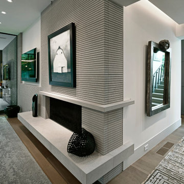
The home’s center is formed around the main entry. The floorplan is largely open, but parallel core wall areas serve to define the foyer, kitchen, dining, and living areas. As key areas, the architect put special focus on materials selection for the core walls. It was decided that Indiana limestone would be the finish, and that the cladding panels would all have unique continuous horizontal grooves.
Material was received and installed by the original subcontractor. Upon seeing the completed work, it was evident to the architect and owner that grooves in the fabricated material were not consistent, and that the installation process had left numerous chips to the panels. It was at this point that the partially completed work was removed, and the second fabricator/installer was contacted.
Dee Brown Inc ordered the Indiana limestones slabs. There, special care was taken to hold tight tolerances to the horizontal grooves as well as to the typical cut-to-size aspects. Erection of these mechanically set panels was done very carefully. The result was a clean finished product with none of the tolerance and chipping issues of the original installation.
Dee Brown, Inc also created and installed special stone finishes at the adjacent half-bath. Semi-precious white onyx was transformed into a lavatory top/bowl assembly, water-closet wall cladding, and even tissue and towel holders.
 Rooftopia, LLC
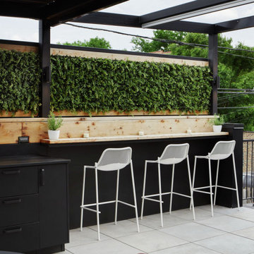
Rooftopia continues to enjoy working with this client on multiple projects, starting with this lovely first collaboration. The clients goals were to use mostly black finishes with a pink statement dining chair! We developed the space with some existing project challenges so our first tasks involved modifications to the existing pergola and flooring tiles. We integrated a retractable fabric shade canopy and several up/down light fixtures into the new space. We designed, built and installed privacy screens made of faux greenery to block out unsightly views toward the alley. We added cedar screens for privacy and to act as a backdrop for an outdoor TV. We also customized and installed a lovely outdoor cabinet system with drawers and a built-in outdoor refrigerator. Their coffee table doubles as an ice bin to top off the overall party vibe!
 Constantine Design Group, Inc.
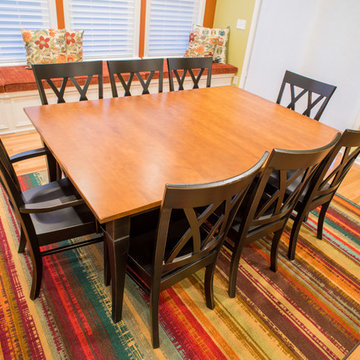
This is a Sunroom Addition. It involved removing the Kitchen's existing exterior wall and adding a new Sunroom Addition, open and connected with the existing Kitchen. A new high counter was added for barstools adjacent the kitchen sink area as well as a new large island accommodating the "kids" while mom prepares dinner. The addition incorporates lots of glass windows, a continuous bench seat (with storage beneath) along an outside wall as well as a table for eight and a special "beverage center" for entertaining. Matching hardwood flooring lets one space smoothly "flow" into the next. All this is carefully designed while maintaining an uninterrupted Kitchen "work triangle" that allows the cook to remain a part of the "event".
 My Kitchen And Bath
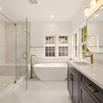
A complete primary bathroom remodel in Springfield, Virginia, designed around three priorities our clients came in with: a real walk-in shower, a freestanding tub by the windows, and a proper double vanity with storage that actually worked.
The original layout had everything in the wrong place. The tub sat against an interior wall away from the natural light. A small stall shower took up real estate across the room. The vanity was squeezed into whatever space was left over. Three windows on the back wall were doing nothing for the room because the layout was fighting them. Our solution involved knocking down the dividing wall between the old shower and vanity area, relocating plumbing for both the tub and the new vanities, and placing the freestanding tub directly under the bay of windows so morning light became part of the experience.
Design Approach
We anchored the room around contrast: deep navy cabinetry against soft white walls, warm brushed gold against cool marble tile, sharp Shaker lines against the curved silhouette of the freestanding tub. Navy was the design decision the rest of the room was built around — the clients knew they wanted color but didn't want anything that would feel dated in five years. Navy reads bold without being loud, pairs with virtually any metal finish, and has staying power that trendier choices don't.
We used Fabuwood Galaxy Indigo for the vanities — all-plywood construction with solid wood doors and drawer fronts, soft close throughout. Shaker-style flat panels keep the navy from feeling heavy. The brushed gold (Jeffrey Alexander 635-96SBZ in satin bronze) shows up across hardware, faucets, lighting, the tub filler, and the shower trim, creating a quiet continuity throughout the room.
The Shower
Removing the wall between the old shower and old vanity area created room for a proper walk-in. We tiled the entire shower floor to ceiling in Decovita Calacatta Suave 24x48" porcelain — large format installed in a 50% offset horizontal pattern, with cement board and redgard underneath. The marble-look porcelain gives the visual depth of natural marble without the maintenance.
A built-in shower bench, custom-built into the corner, is wrapped in the same wall tile on the front with a quartz top matching the vanity counter. The shower niche is detailed with MSI Arabescato Carrara 2" honed hex mosaic at the back, the same tile used on the shower floor. All tile edges are finished with Schluter in satin bronze to match the room's metal finishes. The shower door is custom frameless 3/8" tempered glass with a satin bronze pull — no metal frame interrupting the sight line.
The Vanities and Countertops
The new double vanity gives both clients their own space for morning routines. Counter tops are MSI Calacatta Miraggio Cielo quartz with pencil edging and a 4" backsplash — a soft white with subtle gray veining that reads like real Calacatta marble without the porosity issues. Two undermount square porcelain sinks finish the surface cleanly.
The Tub
A 60" freestanding soaker tub sits under the bay of three windows. The floor-mounted tub filler is satin bronze with a handheld sprayer. We relocated the drain and supply lines to make the centered placement work. The tub is the room's quietest feature and its strongest — clients tell us they use this bathroom differently than they used the old one.
Flooring
MSI Sande Ivory 12x24" matte porcelain runs throughout the bathroom floor in a 50% offset pattern parallel to the vanity wall. Cement board underneath, 4" white wood baseboard, Whisper Grey grout that handles daily use without showing wear.
Paint and Lighting
Walls are Benjamin Moore Chantilly Lace 2121-70 in satin — a true crisp white that doesn't lean cool or warm. The ceiling uses Benjamin Moore Aura Bath and Spa White, which is formulated to resist mildew in high-humidity spaces. Lighting is layered: three new 6" LED recessed lights on a dimmer, two satin bronze vanity sconces above the mirrors, and the existing three windows providing the daytime ambient light.
Project Specs
Location: Springfield, Virginia
Project type: Full primary bathroom remodel
Project duration: Approximately 5 weeks
Style: Modern, Transitional
Color palette: Navy, white, brushed gold, marble
Materials
Cabinetry: Fabuwood Galaxy Indigo, Shaker-style flat panel maple, all-plywood construction
Cabinet hardware: Jeffrey Alexander 635-96SBZ Satin Bronze pulls
Vanity counter and bench top: MSI Calacatta Miraggio Cielo Quartz, pencil edge with 4" backsplash
Sinks: Undermount white porcelain BR-202 square (x2)
Wall tile: Decovita Calacatta Suave 24x48" porcelain
Floor tile: MSI Sande Ivory 12x24" matte porcelain
Shower floor + niche back: MSI Arabescato Carrara 2" honed hex mosaic marble
Edge trim: Schluter satin bronze
Shower door: Custom frameless 3/8" tempered glass
Tub: 60" freestanding acrylic soaker (Ferguson)
Tub filler: Floor-mounted satin bronze (Ferguson)
Vanity faucets, mirrors, sconces, toilet: Satin bronze coordinated finishes (Ferguson)
Wall paint: Benjamin Moore Chantilly Lace 2121-70 Satin
Ceiling paint: Benjamin Moore Aura Bath and Spa White
Grout: Whisper Grey (floor), Standard White (walls and shower)
Designed and built by My Kitchen and Bath out of our Alexandria showroom at 5710 General Washington Drive. We've been designing and building kitchens, bathrooms, and full home renovations across Northern Virginia and the DMV since 1994.
18