
Search results for "Issued internationally" in Home Design Ideas

 Redecorating Vancouver
A modern home with an eclectic mix
My clients in this space were divided. They were split by competing aesthetics. There were Vietnamese art pieces with modern motifs and bold colours mixed with hand-crafted rustic tables and antique Canadiana. I quickly identified a lack of cohesion and an uncomfortable conversation area as the primary issues that were causing my clients stress.
A change was in order. We partitioned their large connected dining room, living and entryway areas using the existing furniture and floor covering. We were able to create several distinct and cohesive areas that each brought out the best of their contents. Each grouping now seemed natural and harmonious. Smooth international contemporary style and rustic heritage pieces now coexisted in the same space without causing my clients decorating headaches. To organize future projects and to summarize personalized decorating tips, Redecorating Vancouver provided them with a written Design Plan at the conclusion of the consultation.
Family is important to me. I recognize that items in my clients' homes have unseen significance. In this instance, I was able to gather items to create a grand-parents nook to honour the couple's family. We took advantage of an heirloom antique radio that belonged to the client's grandfather and a meaningful handmade table. It is both pleasing to the eye and a daily reminder to the couple of who really matters in a home: the family that lives in it.
 Redecorating Vancouver
A modern home with an eclectic mix
My clients in this space were divided. They were split by competing aesthetics. There were Vietnamese art pieces with modern motifs and bold colours mixed with hand-crafted rustic tables and antique Canadiana. I quickly identified a lack of cohesion and an uncomfortable conversation area as the primary issues that were causing my clients stress.
A change was in order. We partitioned their large connected dining room, living and entryway areas using the existing furniture and floor covering. We were able to create several distinct and cohesive areas that each brought out the best of their contents. Each grouping now seemed natural and harmonious. Smooth international contemporary style and rustic heritage pieces now coexisted in the same space without causing my clients decorating headaches. To organize future projects and to summarize personalized decorating tips, Redecorating Vancouver provided them with a written Design Plan at the conclusion of the consultation.
Family is important to me. I recognize that items in my clients' homes have unseen significance. In this instance, I was able to gather items to create a grand-parents nook to honour the couple's family. We took advantage of an heirloom antique radio that belonged to the client's grandfather and a meaningful handmade table. It is both pleasing to the eye and a daily reminder to the couple of who really matters in a home: the family that lives in it.
 Redecorating Vancouver
A modern home with an eclectic mix
My clients in this space were divided. They were split by competing aesthetics. There were Vietnamese art pieces with modern motifs and bold colours mixed with hand-crafted rustic tables and antique Canadiana. I quickly identified a lack of cohesion and an uncomfortable conversation area as the primary issues that were causing my clients stress.
A change was in order. We partitioned their large connected dining room, living and entryway areas using the existing furniture and floor covering. We were able to create several distinct and cohesive areas that each brought out the best of their contents. Each grouping now seemed natural and harmonious. Smooth international contemporary style and rustic heritage pieces now coexisted in the same space without causing my clients decorating headaches. To organize future projects and to summarize personalized decorating tips, Redecorating Vancouver provided them with a written Design Plan at the conclusion of the consultation.
Family is important to me. I recognize that items in my clients' homes have unseen significance. In this instance, I was able to gather items to create a grand-parents nook to honour the couple's family. We took advantage of an heirloom antique radio that belonged to the client's grandfather and a meaningful handmade table. It is both pleasing to the eye and a daily reminder to the couple of who really matters in a home: the family that lives in it.
Find the right local pro for your project
 Schulte Design Build
Our clients recently purchased a beautiful hillside home in Broadview. What started as a simple kitchen refresh turned into a full-scale renovation to address structural issues and achieve a modern aesthetic.
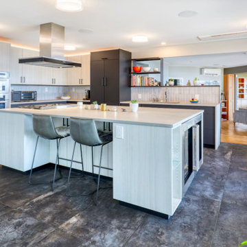
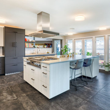
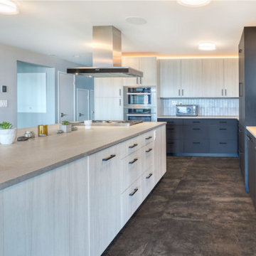
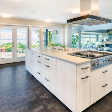
The top priorities for the client’s kitchen were a space for entertaining and to enjoy the sweeping Sound views. The existing late-90s kitchen was outdated and the walls separated the kitchen from the rest of the home. To achieve this, we removed both sides of internal walls and reconfigured plumbing and structural support.
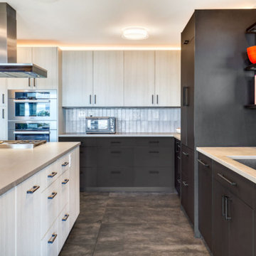
The clients, who are artists and photographers, highly valued aesthetics. Collaborating with their designer, known for using industrial materials in commercial spaces, we aimed to bring these elements into the kitchen. We created a design that maximized the views and integrated industrial and mid-century styles, featuring steel shelving and quartz countertops that resembled concrete.
Instead of using traditional concrete flooring, we opted for concrete tiles. Believe it or not, those tiles are 2x4 feet long! It took two of our team to set each one. Recommended by their designer, large tiles like these are often used in commercial buildings, but the designer knew they were a cost effective (and beautiful) solution for this home.
The renovation also included: A much larger island for cooking and entertaining, custom-made faucets with hot and cold taps, a built-in refrigerator, and a double beverage fridge at the end of the island. We put in two laminated cabinets in two contrasting colors: Wilsonart White Cypress and Wilsonart Black Velvet Traceless. Lastly, we installed hydronic floor heating and AC, ensuring comfort year-round.
The result is a beautifully modern kitchen that is both functional and aesthetically pleasing. This project exceeded the clients' initial expectations, transforming their kitchen into the heart of their home.

 Milgard Windows & Doors
The Kiguchi family moved into their Austin, Texas home in 1994. Built in the 1980’s as part of a neighborhood development, they happily raised their family here but longed for something more contemporary. Once they became empty nesters, they decided it was time for a major remodel. After spending many years visiting Austin AIA Home Tours that highlight contemporary residential architecture, they had a lot of ideas and in 2013 were ready to interview architects and get their renovation underway.
The project turned into a major remodel due to an unstable foundation. Architects Ben Arbib and Ed Hughey, of Arbib Hughey Design were hired to solve the structural issue and look for inspiration in the bones of the house, which sat on top of a hillside and was surrounded by great views.
Unfortunately, with the old floor plan, the beautiful views were hidden by small windows that were poorly placed. In order to bring more natural light into the house the window sizes and configurations had to be addressed, all while keeping in mind the homeowners desire for a modern look and feel.
To achieve a more contemporary and sophisticated front of house, a new entry was designed that included removing a two-story bay window and porch. The entrance of the home also became more integrated with the landscape creating a template for new foliage to be planted. Older exterior materials were updated to incorporate a more muted palette of colors with a metal roof, dark grey siding in the back and white stucco in the front. Deep eaves were added over many of the new large windows for clean lines and sun protection.
“Inside it was about opening up the floor plan, expanding the views throughout the house, and updating the material palette to get a modern look that was also warm and inviting,” said Ben from Arbib Hughey Design. “Prior to the remodel, the house had the typical separation of rooms. We removed the walls between them and changed all of the windows to Milgard Thermally Improved Aluminum to connect the inside with the outside. No matter where you are you get nice views and natural light.”
The architects wanted to create some drama, which they accomplished with the window placement and opening up the interior floor plan to an open concept approach. Cabinetry was used to help delineate intimate spaces. To add warmth to an all-white living room, white-washed oak wood floors were installed and pine planks were used around the fireplace. The large windows served as artwork bringing the color of nature into the space.
An octagon shaped, elevated dining room, (named “the turret”), had a big impact on the design of the house. They architects rounded the corners and added larger window openings overlooking a new sunken garden. The great room was also softened by rounding out the corners and that circular theme continued throughout the house, being picked up in skylight wells and kitchen cabinetry. A staircase leading to a catwalk was added and the result was a two-story window wall that flooded the home with natural light.
When asked why Milgard® Thermally Improved Aluminum windows were selected, the architectural team listed many reasons:
1) Aesthetics: “We liked the slim profiles and narrow sightlines. The window frames never get in the way of the view and that was important to us. They also have a very contemporary look that went well with our design.”
2) Options: “We liked that we could get large sliding doors that matched the windows, giving us a very cohesive look and feel throughout the project.”
3) Cost Effective: “Milgard windows are affordable. You get a good product at a good price.”
4) Custom Sizes: “Milgard windows are customizable, which allowed us to get the right window for each location.”
Ready to take on your own traditional to modern home remodeling project? Arbib Hughey Design advises, “Work with a good architect. That means picking a team that is creative, communicative, listens well and is responsive. We think it’s important for an architect to listen to their clients and give them something they want, not something the architect thinks they should have. At the same time you want an architect who is willing and able to think outside the box and offer up design options that you may not have considered. Design is about a lot of back and forth, trying out ideas, getting feedback and trying again.”
The home was completely transformed into a unique, contemporary house perfectly integrated with its site. Internally the home has a natural flow for the occupants and externally it is integrated with the surroundings taking advantage of great natural light. As a side note, it was highly praised as part of the Austin AIA homes tour.


 User
This is an organic Lime Wash done with a true lime wash product as opposed to a brick mortar or concrete that is often seen on new houses. This product can be applied as a solid coating making the surface completely white, or can be applied and "washed off" in many artistic ways, as seen here. If you hate your brick or just want something unique this is a great option!
Photo credit: Jeff Murrey
 Schulte Design Build
Our clients recently purchased a beautiful hillside home in Broadview. What started as a simple kitchen refresh turned into a full-scale renovation to address structural issues and achieve a modern aesthetic.
The top priorities for the client’s kitchen were a space for entertaining and to enjoy the sweeping Sound views. The existing late-90s kitchen was outdated and the walls separated the kitchen from the rest of the home. To achieve this, we removed both sides of internal walls and reconfigured plumbing and structural support.
The clients, who are artists and photographers, highly valued aesthetics. Collaborating with their designer, known for using industrial materials in commercial spaces, we aimed to bring these elements into the kitchen. We created a design that maximized the views and integrated industrial and mid-century styles, featuring steel shelving and quartz countertops that resembled concrete.
Instead of using traditional concrete flooring, we opted for concrete tiles. Believe it or not, those tiles are 2x4 feet long! It took two of our team to set each one. Recommended by their designer, large tiles like these are often used in commercial buildings, but the designer knew they were a cost effective (and beautiful) solution for this home.
The renovation also included: A much larger island for cooking and entertaining, custom-made faucets with hot and cold taps, a built-in refrigerator, and a double beverage fridge at the end of the island. We put in two laminated cabinets in two contrasting colors: Wilsonart White Cypress and Wilsonart Black Velvet Traceless. Lastly, we installed hydronic floor heating and AC, ensuring comfort year-round.
The result is a beautifully modern kitchen that is both functional and aesthetically pleasing. This project exceeded the clients' initial expectations, transforming their kitchen into the heart of their home.
 Schulte Design Build
Our clients recently purchased a beautiful hillside home in Broadview. What started as a simple kitchen refresh turned into a full-scale renovation to address structural issues and achieve a modern aesthetic.
The top priorities for the client’s kitchen were a space for entertaining and to enjoy the sweeping Sound views. The existing late-90s kitchen was outdated and the walls separated the kitchen from the rest of the home. To achieve this, we removed both sides of internal walls and reconfigured plumbing and structural support.
The clients, who are artists and photographers, highly valued aesthetics. Collaborating with their designer, known for using industrial materials in commercial spaces, we aimed to bring these elements into the kitchen. We created a design that maximized the views and integrated industrial and mid-century styles, featuring steel shelving and quartz countertops that resembled concrete.
Instead of using traditional concrete flooring, we opted for concrete tiles. Believe it or not, those tiles are 2x4 feet long! It took two of our team to set each one. Recommended by their designer, large tiles like these are often used in commercial buildings, but the designer knew they were a cost effective (and beautiful) solution for this home.
The renovation also included: A much larger island for cooking and entertaining, custom-made faucets with hot and cold taps, a built-in refrigerator, and a double beverage fridge at the end of the island. We put in two laminated cabinets in two contrasting colors: Wilsonart White Cypress and Wilsonart Black Velvet Traceless. Lastly, we installed hydronic floor heating and AC, ensuring comfort year-round.
The result is a beautifully modern kitchen that is both functional and aesthetically pleasing. This project exceeded the clients' initial expectations, transforming their kitchen into the heart of their home.
 Schulte Design Build
Our clients recently purchased a beautiful hillside home in Broadview. What started as a simple kitchen refresh turned into a full-scale renovation to address structural issues and achieve a modern aesthetic.
The top priorities for the client’s kitchen were a space for entertaining and to enjoy the sweeping Sound views. The existing late-90s kitchen was outdated and the walls separated the kitchen from the rest of the home. To achieve this, we removed both sides of internal walls and reconfigured plumbing and structural support.
The clients, who are artists and photographers, highly valued aesthetics. Collaborating with their designer, known for using industrial materials in commercial spaces, we aimed to bring these elements into the kitchen. We created a design that maximized the views and integrated industrial and mid-century styles, featuring steel shelving and quartz countertops that resembled concrete.
Instead of using traditional concrete flooring, we opted for concrete tiles. Believe it or not, those tiles are 2x4 feet long! It took two of our team to set each one. Recommended by their designer, large tiles like these are often used in commercial buildings, but the designer knew they were a cost effective (and beautiful) solution for this home.
The renovation also included: A much larger island for cooking and entertaining, custom-made faucets with hot and cold taps, a built-in refrigerator, and a double beverage fridge at the end of the island. We put in two laminated cabinets in two contrasting colors: Wilsonart White Cypress and Wilsonart Black Velvet Traceless. Lastly, we installed hydronic floor heating and AC, ensuring comfort year-round.
The result is a beautifully modern kitchen that is both functional and aesthetically pleasing. This project exceeded the clients' initial expectations, transforming their kitchen into the heart of their home.

 Spiritcraft Design Furniture
Transform a room with a modern built in wall unit of hardwoods that match your interior decor style. Form and function come together in any transitional, modern or contemporary design motif with the use of single or multiple hardwoods in a customize-able built in that allows your personal design style to radiate.
Our use of modern influences from the Mid Century Modern era have allowed us to create an interior design product that can enhance our clients interior decor vision and provide a dramatic visual statement while solving space planning and storage issues. Our Madison Avenue collection of built in modular wall units can be customized to enhance any room in your home or office and provide timeless eye appeal with customized function.
Our Madison Avenue wall units, plinths and casework are available in varying configurations for the bedroom that includes built in floating nightstands along with a vast array of choices for padding in differing shapes and fabric offerings. The wall installations are also available in any custom size and length and in nearly any hardwood imaginable for office, commercial, bathrooms and any other living or work environment.
Installations can be adapted to include shelving, cube arrays, floating plinth elements along with lighting options that include incorporated wall sconce and overhead LED spot lighting. Our lighting options can be controlled with our original touch switch dimmers that are built into the consoles, night stands, walls or shelving.
The pictured Mid-Century influenced console is 93.5" wide by 24" deep and high and offers three internal compartments for media and storage and two outer compartments that are covered in fabric to mimic a classic stereo console. The case is made from solid hardwood while the doors are covered in reconstituted real wood veneer over Meranti marine ply for superb stability and ultimate longevity. The four doors slide effortlessly and conceal adjustable Walnut shelves though open compartments and drawers are options in this console design.
The media console is available in a vast array of solid hardwoods, depths, widths and internal configurations while the appearance can be drastically changed by the choice of veneers for the sliding doors and by adding open compartments or visually apparent drawers to the cabinet face. The Mad Ave console is also available in various leg styles and heights that will adapt this Mid Century influenced case into a dining room sideboard, bedroom dresser or of course into a standalone stereo / media console.
Several designs within our new furniture collection along with other collections, upholstery and window treatments will be on display at our new interior design showroom and furniture gallery, Interior Design Accents located at 7 Jackson Street in East Dundee, IL.
 Schulte Design Build
Our clients recently purchased a beautiful hillside home in Broadview. What started as a simple kitchen refresh turned into a full-scale renovation to address structural issues and achieve a modern aesthetic.
The top priorities for the client’s kitchen were a space for entertaining and to enjoy the sweeping Sound views. The existing late-90s kitchen was outdated and the walls separated the kitchen from the rest of the home. To achieve this, we removed both sides of internal walls and reconfigured plumbing and structural support.
The clients, who are artists and photographers, highly valued aesthetics. Collaborating with their designer, known for using industrial materials in commercial spaces, we aimed to bring these elements into the kitchen. We created a design that maximized the views and integrated industrial and mid-century styles, featuring steel shelving and quartz countertops that resembled concrete.
Instead of using traditional concrete flooring, we opted for concrete tiles. Believe it or not, those tiles are 2x4 feet long! It took two of our team to set each one. Recommended by their designer, large tiles like these are often used in commercial buildings, but the designer knew they were a cost effective (and beautiful) solution for this home.
The renovation also included: A much larger island for cooking and entertaining, custom-made faucets with hot and cold taps, a built-in refrigerator, and a double beverage fridge at the end of the island. We put in two laminated cabinets in two contrasting colors: Wilsonart White Cypress and Wilsonart Black Velvet Traceless. Lastly, we installed hydronic floor heating and AC, ensuring comfort year-round.
The result is a beautifully modern kitchen that is both functional and aesthetically pleasing. This project exceeded the clients' initial expectations, transforming their kitchen into the heart of their home.
 Schulte Design Build
Our clients recently purchased a beautiful hillside home in Broadview. What started as a simple kitchen refresh turned into a full-scale renovation to address structural issues and achieve a modern aesthetic.
The top priorities for the client’s kitchen were a space for entertaining and to enjoy the sweeping Sound views. The existing late-90s kitchen was outdated and the walls separated the kitchen from the rest of the home. To achieve this, we removed both sides of internal walls and reconfigured plumbing and structural support.
The clients, who are artists and photographers, highly valued aesthetics. Collaborating with their designer, known for using industrial materials in commercial spaces, we aimed to bring these elements into the kitchen. We created a design that maximized the views and integrated industrial and mid-century styles, featuring steel shelving and quartz countertops that resembled concrete.
Instead of using traditional concrete flooring, we opted for concrete tiles. Believe it or not, those tiles are 2x4 feet long! It took two of our team to set each one. Recommended by their designer, large tiles like these are often used in commercial buildings, but the designer knew they were a cost effective (and beautiful) solution for this home.
The renovation also included: A much larger island for cooking and entertaining, custom-made faucets with hot and cold taps, a built-in refrigerator, and a double beverage fridge at the end of the island. We put in two laminated cabinets in two contrasting colors: Wilsonart White Cypress and Wilsonart Black Velvet Traceless. Lastly, we installed hydronic floor heating and AC, ensuring comfort year-round.
The result is a beautifully modern kitchen that is both functional and aesthetically pleasing. This project exceeded the clients' initial expectations, transforming their kitchen into the heart of their home.

 PapersNetwork
It's known as the PISA/TIMSS voyaging convoy. Every time worldwide tests results are discharged with association tables indicating champs and failures a gaggle of scientists, scholastics and grouped kindred explorers plummet on the most astounding performing nation or instruction framework to break down and write about "world's best practice".
The objective continues evolving
One issue with thusly of deduction is that nobody framework reliably beats the rest. In light of the 1995 and 1999 TIMSS (Trends in International Math and Science Study) results, Asian instruction frameworks in Singapore, Japan, South Korea and Taiwan overwhelmed. Accordingly, the emphasis was immovably on recognizing the reasons the Asian tigers were performing so well.
In the PISA (Program for International Student Assessment) 2000 results, Finland positioned first in education, fourth in arithmetic and third in science. Finland became the overwhelming focus and specialists and scholastics ran to Helsinki to find the reasons Finnish understudies performed at or close to the highest point of the table.
By 2012, at the end of the day, an alternate training framework turned into the focal point of consideration. Finland descended the PISA rankings as another champ, Shanghai, rose as first in arithmetic, science and perusing.
Apples aren't being contrasted with apples
A second issue when making correlations is that the spots we've recognized as examples of overcoming adversity are distinctive to Australia. City-states like Singapore and instruction frameworks in profoundly performing spots like Hong Kong and Shanghai have remarkable qualities that separate them from nations like Australia, England and the USA.
Contrasts in topography, the quantities of understudies and schools, the understudy cosmetics (as far as dialect, society and financial profile) and how schools, including educational modules and appraisal, are organized and oversaw significantly affect results.
Singapore, when contrasted with Australia, is little topographically, more homogenous as far as dialect and culture and utilizes instructive practices that have long been out of support in Australia. These incorporate gushing kids in view of their abilities, and high-chance, focused tests and examinations.
As noted in a paper titled How not to prevail upon PISA information: an unexpected examination, there are additionally social components clarifying solid execution that are troublesome, if not unimaginable, to exchange starting with one instruction framework then onto the next.
Evident cases incorporate the effect of Confucian qualities and morals that stretch appreciation for power (particularly instructors), the conviction that achievement is conceivable with inspiration, fixation and diligent work, and the thought that training is focal if one is to accomplish a superior life.
Confounding circumstances and end results
Befuddling what has driven these nations to achievement speaks to the third trouble in expecting that what seems to prompt accomplishment in one nation can without much of a stretch be exchanged to another.
To expect that everything we need to do in Australia to enhance test outcomes is to lessen the impact of the Australian Education Union, while being appealing to some, is both undemocratic and blameworthy of accepting circumstances and end results.
There are a few advantages of abroad correlations
PISA and TIMSS tests have been held for a long time. Thus, there is a decent arrangement of examination recognizing the attributes of more grounded performing instruction frameworks from which states and domains can learn.
The early ethnographic work recording Japanese and American classes nitty gritty in Harvard distribution The Teaching Gap uncovers how the lessons in Asian classrooms are more unequivocal, obviously organized and sound and there is a desire that all understudies, with the essential offer and applications, some assistance with canning succeed.
A later distribution by the Grattan Institute, Catching up: gaining from the best educational systems in East Asia, likewise distinguishes imperative lessons from fruitful Asian instruction frameworks.
Positive variables incorporate giving instructors more opportunity to work cooperatively and to tutor each other, guaranteeing that educator training, course readings and the educational modules are commonly steady and concentrate on enhancing classroom rehearse.
It ought to additionally be noticed that while Australian understudies don't perform in the top level in PISA and TIMSS tests, there is some reason for festivity. Understudies in the Australian Capital Territory perform well over the Australian normal and frequently coordinate the execution of top-performing abroad instruction frameworks.
As far as lifting the execution of understudies from distraught foundations it is additionally critical to take note of that Catholic schools, in light of an investigation of the 2009 PISA results completed by the Australian Council for Educational Research, accomplish a value rating surpassing that of Finland.
About the Author: Amy Parker writes too many academic papers for people who have troubles with it. She always gives needed advices, shows the examples of the papers and helps with writing at http://papersnetwork.net
 Tile Doctor Ltd
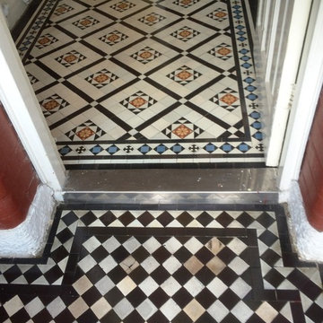
Recently I travelled down to the village of Prestwood in the Chiltern Hills of southern Buckinghamshire, to work on a Victorian tiled porch and hallway. Victorian tiles are commonly found in the entrance areas of older houses and unfortunately in this case the tiles had become heavily ingrained with dirt over time, and had suffered from additional paint and plaster spillages. The result was an unsightly mess; my client was considering covering the floor with lino after several unsuccessful attempts at cleaning it. I was called upon to provide a professional clean and seal, restoring these great Victorian tiles back to looking their best again.
On my first day at the house, I mixed up a solution of 50 per cent Tile Doctor Pro-Clean, a high alkaline cleaner, and NanoTech HBU (formerly known as Ultra Clean), which is a cleaning product that contains nano-sized abrasive particles that penetrate deep into the stone to lift ingrained dirt to the surface. This solution was worked into the tiles using abrasive scrubbing pads fitted to one of my commercial rotary machines.
The cleaning process left over a slurry of residue which I rinsed away with clean water and extracted with a wet vacuum. I was still left with the issue of stubborn paint spillages, so I applied a layer of Tile Doctor Remove & Go, a stripper with cleaning properties which is very effective at breaking down paint and adhesive stains.
Once the paint spillages had been dealt with I gave the area another rinse with clean water. I then left the house, allowing the floor enough time to dry overnight.
Upon my return the day I set about sealing the newly cleaned Victorian tiles. Before starting the sealing process I inspected the floor to check for any dampness, knowing that any excess moisture could potentially damage the performance of the sealer.
When I was satisfied that the tiles were fully dried, I applied Tile Doctor Seal & Go, a sealer which offers durable surface protection, along with an aesthetically pleasing, low-sheen finish which brings out the colour in the stone. This product can be used to seal internal, porous surfaces including Victorian, Slate, textured Quarry and Sandstone tiles.
The process made an amazing difference to the floor as you can see from the photographs; additionally the restoration of such an original feature adds a lot of value and looks so much better than lino!
Colin Ford
South Buckinghamshire Tile Doctor
 Tile Doctor Ltd
This property was situated in the tiny, yet picturesque village of Grafton Underwood in Kettering, Northamptonshire. The village has only a population numbering a few hundred and, interestingly enough, is the childhood home of the famous ‘Bridget Jones’ character. I have previously worked on a number of floors in Grafton Underwood, and on this particular occasion I was called to complete the job through a recommendation – which is always welcome!
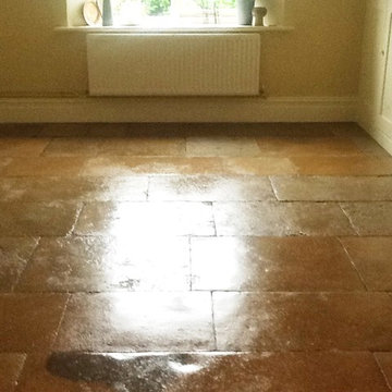
This particular customer had two floors that needed re-finishing; the first was a polished Limestone tiled conservatory (which I will cover in a separate post as the process was different) and the second a Flagstone tiled living room; so on a rather dull day in November, I began my work.
The sealer on the Flagstone tiled living room had failed in certain places, resulting in the floor becoming difficult to clean due to dirt becoming ingrained in the stone. The decline in the sealer is not uncommon, as they do wear down over time – especially in an area of high traffic like a living room. To resolve this issue, the old surface seal needed to be stripped back and re-sealed.
To remove what was left of the old sealer, I applied a dilution of Tile Doctor Remove and Go and scrubbed it into the floor using a rotary machine fitted with black stripping pads. I then gave the floor an initial rinse, before paying special attention to scrubbing the stubborn spots, making sure all of the sealer was removed.
I then gave the floor an acid wash using Tile Doctor Grout Clean-Up in order to remove grout haze and other mineral deposits which were evident. Due to its acidic properties, you have to be very careful with this product on any type of stone, so I didn’t let it dwell for too long and made sure the floor was thoroughly rinsed down afterwards, with all solutions extracted using a wet-vac machine.
The floor was left to dry for more than 24 hours, before I returned to re-seal it using Tile Doctor Seal & Go. This product provides both a stain resistant surface seal and the durable low-sheen finish requested by my client. Seal & Go is suitable for use on internal unsealed, porous surfaces.
I guess the photographs don’t really do the transformation justice however the freshly re-sealed Flagstone living room certainly brightened up what was a very dreary autumn day!
Phil Vissian
Northamptonshire Tile Doctor
 Milgard Windows & Doors
The Kiguchi family moved into their Austin, Texas home in 1994. Built in the 1980’s as part of a neighborhood development, they happily raised their family here but longed for something more contemporary. Once they became empty nesters, they decided it was time for a major remodel. After spending many years visiting Austin AIA Home Tours that highlight contemporary residential architecture, they had a lot of ideas and in 2013 were ready to interview architects and get their renovation underway.
The project turned into a major remodel due to an unstable foundation. Architects Ben Arbib and Ed Hughey, of Arbib Hughey Design were hired to solve the structural issue and look for inspiration in the bones of the house, which sat on top of a hillside and was surrounded by great views.
Unfortunately, with the old floor plan, the beautiful views were hidden by small windows that were poorly placed. In order to bring more natural light into the house the window sizes and configurations had to be addressed, all while keeping in mind the homeowners desire for a modern look and feel.
To achieve a more contemporary and sophisticated front of house, a new entry was designed that included removing a two-story bay window and porch. The entrance of the home also became more integrated with the landscape creating a template for new foliage to be planted. Older exterior materials were updated to incorporate a more muted palette of colors with a metal roof, dark grey siding in the back and white stucco in the front. Deep eaves were added over many of the new large windows for clean lines and sun protection.
“Inside it was about opening up the floor plan, expanding the views throughout the house, and updating the material palette to get a modern look that was also warm and inviting,” said Ben from Arbib Hughey Design. “Prior to the remodel, the house had the typical separation of rooms. We removed the walls between them and changed all of the windows to Milgard Thermally Improved Aluminum to connect the inside with the outside. No matter where you are you get nice views and natural light.”
The architects wanted to create some drama, which they accomplished with the window placement and opening up the interior floor plan to an open concept approach. Cabinetry was used to help delineate intimate spaces. To add warmth to an all-white living room, white-washed oak wood floors were installed and pine planks were used around the fireplace. The large windows served as artwork bringing the color of nature into the space.
An octagon shaped, elevated dining room, (named “the turret”), had a big impact on the design of the house. They architects rounded the corners and added larger window openings overlooking a new sunken garden. The great room was also softened by rounding out the corners and that circular theme continued throughout the house, being picked up in skylight wells and kitchen cabinetry. A staircase leading to a catwalk was added and the result was a two-story window wall that flooded the home with natural light.
When asked why Milgard® Thermally Improved Aluminum windows were selected, the architectural team listed many reasons:
1) Aesthetics: “We liked the slim profiles and narrow sightlines. The window frames never get in the way of the view and that was important to us. They also have a very contemporary look that went well with our design.”
2) Options: “We liked that we could get large sliding doors that matched the windows, giving us a very cohesive look and feel throughout the project.”
3) Cost Effective: “Milgard windows are affordable. You get a good product at a good price.”
4) Custom Sizes: “Milgard windows are customizable, which allowed us to get the right window for each location.”
Ready to take on your own traditional to modern home remodeling project? Arbib Hughey Design advises, “Work with a good architect. That means picking a team that is creative, communicative, listens well and is responsive. We think it’s important for an architect to listen to their clients and give them something they want, not something the architect thinks they should have. At the same time you want an architect who is willing and able to think outside the box and offer up design options that you may not have considered. Design is about a lot of back and forth, trying out ideas, getting feedback and trying again.”
The home was completely transformed into a unique, contemporary house perfectly integrated with its site. Internally the home has a natural flow for the occupants and externally it is integrated with the surroundings taking advantage of great natural light. As a side note, it was highly praised as part of the Austin AIA homes tour.
 Milgard Windows & Doors
The Kiguchi family moved into their Austin, Texas home in 1994. Built in the 1980’s as part of a neighborhood development, they happily raised their family here but longed for something more contemporary. Once they became empty nesters, they decided it was time for a major remodel. After spending many years visiting Austin AIA Home Tours that highlight contemporary residential architecture, they had a lot of ideas and in 2013 were ready to interview architects and get their renovation underway.
The project turned into a major remodel due to an unstable foundation. Architects Ben Arbib and Ed Hughey, of Arbib Hughey Design were hired to solve the structural issue and look for inspiration in the bones of the house, which sat on top of a hillside and was surrounded by great views.
Unfortunately, with the old floor plan, the beautiful views were hidden by small windows that were poorly placed. In order to bring more natural light into the house the window sizes and configurations had to be addressed, all while keeping in mind the homeowners desire for a modern look and feel.
To achieve a more contemporary and sophisticated front of house, a new entry was designed that included removing a two-story bay window and porch. The entrance of the home also became more integrated with the landscape creating a template for new foliage to be planted. Older exterior materials were updated to incorporate a more muted palette of colors with a metal roof, dark grey siding in the back and white stucco in the front. Deep eaves were added over many of the new large windows for clean lines and sun protection.
“Inside it was about opening up the floor plan, expanding the views throughout the house, and updating the material palette to get a modern look that was also warm and inviting,” said Ben from Arbib Hughey Design. “Prior to the remodel, the house had the typical separation of rooms. We removed the walls between them and changed all of the windows to Milgard Thermally Improved Aluminum to connect the inside with the outside. No matter where you are you get nice views and natural light.”
The architects wanted to create some drama, which they accomplished with the window placement and opening up the interior floor plan to an open concept approach. Cabinetry was used to help delineate intimate spaces. To add warmth to an all-white living room, white-washed oak wood floors were installed and pine planks were used around the fireplace. The large windows served as artwork bringing the color of nature into the space.
An octagon shaped, elevated dining room, (named “the turret”), had a big impact on the design of the house. They architects rounded the corners and added larger window openings overlooking a new sunken garden. The great room was also softened by rounding out the corners and that circular theme continued throughout the house, being picked up in skylight wells and kitchen cabinetry. A staircase leading to a catwalk was added and the result was a two-story window wall that flooded the home with natural light.
When asked why Milgard® Thermally Improved Aluminum windows were selected, the architectural team listed many reasons:
1) Aesthetics: “We liked the slim profiles and narrow sightlines. The window frames never get in the way of the view and that was important to us. They also have a very contemporary look that went well with our design.”
2) Options: “We liked that we could get large sliding doors that matched the windows, giving us a very cohesive look and feel throughout the project.”
3) Cost Effective: “Milgard windows are affordable. You get a good product at a good price.”
4) Custom Sizes: “Milgard windows are customizable, which allowed us to get the right window for each location.”
Ready to take on your own traditional to modern home remodeling project? Arbib Hughey Design advises, “Work with a good architect. That means picking a team that is creative, communicative, listens well and is responsive. We think it’s important for an architect to listen to their clients and give them something they want, not something the architect thinks they should have. At the same time you want an architect who is willing and able to think outside the box and offer up design options that you may not have considered. Design is about a lot of back and forth, trying out ideas, getting feedback and trying again.”
The home was completely transformed into a unique, contemporary house perfectly integrated with its site. Internally the home has a natural flow for the occupants and externally it is integrated with the surroundings taking advantage of great natural light. As a side note, it was highly praised as part of the Austin AIA homes tour.
 VISTA TILES
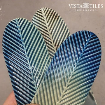
There are 97 leaf tile tiles in 1 m2.
The product size is 9cmx15 cmx 1cm. The back side is matt-based and serrated, the front side is glazed and glossy polished.
Leaf Çini ceramic tile features are a dimension that expresses the structure as a multi-colored color with the tile tiles decorations.
- Material made of ceramic material. Tiles are converted into water and cleaning materials.
- Decorating the leaf tile tile for many years. Color and pattern do not exist.
- Water and moisture clean thanks to the glossy glazed polished.
- It does not form mold.
- In places where Leaf Tile tiles are used, we breathe cool and warm in summer.
- Figure the days of sound waves taking advantage of the reflective feature of the days in the regions caused by Leafy Tiles.
- Kütahya tiles are against the sun, wind and exterior.
- Leaf Tiles and easy to use.
- Kütahya and Iznik patterned shaped tile tile models and prices are the most suitable examples.
It is used between countertops in kitchens.
Ceramic-based hexagons are suitable for use as wall tiles in bathrooms.
Production is made in pools, flooring, pool interior flooring, design design and design.
For floor tiles, it can be designed to be comprehensive in detail to floor tiles.
Leaf Tile Tile Application
First of all, the area to be applied should be flat, if not, it should be corrected. Thin plaster should be applied to the area. Cement-based adhesive mortar should be used as adhesive mortar. The adhesive mortar is applied to the surface to be applied regularly and evenly with a fine notched trowel. Kütahya and İznik patterned tile tiles are placed on the surface to be laid. For non-slip and a flat application, you can press on it using a spirit level or wedge. It is an important issue that the Kütahya and Iznik tiles with Ottoman and Seljuk motifs complement each other.
After bonding the tile tiles to the surface, the grouting is ready for application. Normally, tiles are laid without joints. After the grouting material is prepared in accordance with the instructions, it is applied on the tile tiles. We recommend that you prefer antibacterial grouts, especially for patterned tile ceramic tiles that you will apply in your kitchens and bathrooms. After the joint application, the excess joints remaining on the tiles whose flooring has been completed are removed by wiping them with a wet sponge.
Please note that international buyers are responsible for any duties/customs charges and import taxes associated with shipping to their respective countries. These fees are calculated and imposed by your country when the item arrives in the country.
 VISTA TILES
There are 97 leaf tile tiles in 1 m2.
The product size is 9cmx15 cmx 1cm. The back side is matt-based and serrated, the front side is glazed and glossy polished.
Leaf Çini ceramic tile features are a dimension that expresses the structure as a multi-colored color with the tile tiles decorations.
- Material made of ceramic material. Tiles are converted into water and cleaning materials.
- Decorating the leaf tile tile for many years. Color and pattern do not exist.
- Water and moisture clean thanks to the glossy glazed polished.
- It does not form mold.
- In places where Leaf Tile tiles are used, we breathe cool and warm in summer.
- Figure the days of sound waves taking advantage of the reflective feature of the days in the regions caused by Leafy Tiles.
- Kütahya tiles are against the sun, wind and exterior.
- Leaf Tiles and easy to use.
- Kütahya and Iznik patterned shaped tile tile models and prices are the most suitable examples.
It is used between countertops in kitchens.
Ceramic-based hexagons are suitable for use as wall tiles in bathrooms.
Production is made in pools, flooring, pool interior flooring, design design and design.
For floor tiles, it can be designed to be comprehensive in detail to floor tiles.
Leaf Tile Tile Application
First of all, the area to be applied should be flat, if not, it should be corrected. Thin plaster should be applied to the area. Cement-based adhesive mortar should be used as adhesive mortar. The adhesive mortar is applied to the surface to be applied regularly and evenly with a fine notched trowel. Kütahya and İznik patterned tile tiles are placed on the surface to be laid. For non-slip and a flat application, you can press on it using a spirit level or wedge. It is an important issue that the Kütahya and Iznik tiles with Ottoman and Seljuk motifs complement each other.
After bonding the tile tiles to the surface, the grouting is ready for application. Normally, tiles are laid without joints. After the grouting material is prepared in accordance with the instructions, it is applied on the tile tiles. We recommend that you prefer antibacterial grouts, especially for patterned tile ceramic tiles that you will apply in your kitchens and bathrooms. After the joint application, the excess joints remaining on the tiles whose flooring has been completed are removed by wiping them with a wet sponge.
Please note that international buyers are responsible for any duties/customs charges and import taxes associated with shipping to their respective countries. These fees are calculated and imposed by your country when the item arrives in the country.
4