
Search results for "Lacks ample" in Home Design Ideas
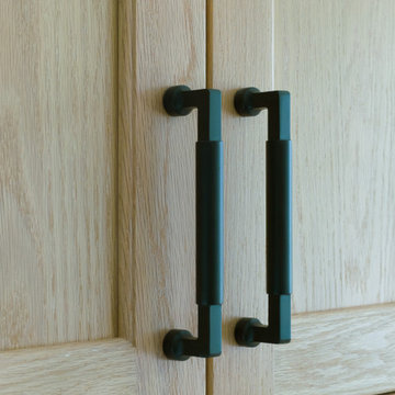
 Drury Design
The Setup:
After purchasing this home, the homeowners faced a unique opportunity to reimagine their kitchen and nearby spaces. Water damage from a burst pipe had left much of the home’s interior in need of repair, and while the existing kitchen was functional and in relatively good shape, it didn’t align with the family’s vision for their new home. The layout included a peninsula that wasn’t ideal, and there were some druthers with the nearby pantry.
Since the space needed to be rebuilt anyway, the homeowners saw this as a chance to create a kitchen that was both highly functional for their four young children and timeless in its design. The project also included a refresh of the adjacent message center and dining room — spaces that play key roles in the family’s daily life. The goal was to create a cohesive flow between these areas, balancing modern functionality with the craftsman-inspired character of the rest of the home.
Design Objectives:
- Replace the outdated peninsula with a large island to maximize counter space and create new seating options.
- Open up the space visually by removing soffits and rethinking the cabinetry layout.
Incorporate concealed refrigeration and freezer units to provide significant storage for the family while maintaining a streamlined aesthetic.
- Integrate black cabinetry into the design without making the space feel harsh or heavy.
- Ensure the lighting plan balances functional task lighting with ambient accent lighting.
- Avoid visual clutter in the cabinetry design while still giving a nod to the craftsman aesthetic.
- Incorporate a slab backsplash as a key design feature.
Design Challenges:
- The outdated peninsula left dead space in the kitchen and lacked sufficient seating for the family.
- The cooktop wall was cramped, with small cabinets flanking the hood, limited storage, and soffits that made the space feel closed-in.
- The family needed significant refrigeration space (two refrigerators and a freezer) but wanted to avoid a cluttered look with visible stainless steel appliances.
- Adding black cabinetry risked making the space feel too dark or heavy.
- The original lighting plan was insufficient, particularly over the dining table where a decorative fixture proved too dim.
- The family wanted shaker-style drawer fronts to match the home’s arts-and-crafts design but worried that too much shaker cabinetry might look overly busy.
- Prioritizing a slab backsplash in the wish list priority planning.
The Renewed Space
Design Solutions:
- A functional island: The peninsula was replaced with a large island that provides continuous countertop space for prepping and serving. The island also features seating for four people, creating a central hub for informal meals and activities.
- Streamlined cooktop wall: The soffits were removed, and the upper cabinets on the cooktop wall were eliminated to create a more open, streamlined design. A custom oversized hood became the focal point of the wall, with the blower unit offset inside it to align with the cooktop while maintaining exterior visual symmetry.
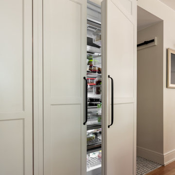
- Concealed refrigeration: Two column refrigerators and one freezer were integrated into the cabinetry, concealing them behind wood paneling that blends seamlessly with the overall design.
- Warm black cabinetry: The black cabinetry was crafted from hickory with a visible grain, softening its appearance and adding warmth. The grain detail gives the cabinetry a rich, textured look that avoids feeling stark or overpowering.
- Additional lighting: In the dining area, recessed can lights were added during an additional installation phase to supplement the gorgeous decorative fixture’s dim output. The new lighting plan creates a layered effect, combining functional task lighting with softer ambient lighting.
- Simplified cabinetry details: Slab drawer fronts were used on the upper drawers, while five-piece shaker fronts (with slightly less prominent rail and stile pieces) were reserved for the middle and lower drawers. This approach simplified the overall look while maintaining the craftsman-inspired aesthetic.
- Slab backsplash priority: The slab backsplash was prioritized by making thoughtful adjustments elsewhere, like opting not to extend cabinetry to the ceiling, which also helped visually prioritize the gorgeous slab backsplash. This decision also enhanced the kitchen’s furniture-like feel, aligning with the home’s craftsman character.
- This kitchen perfectly balances practicality with timeless style. By addressing the family’s functional needs — ample seating, smart storage, and effective lighting — while incorporating thoughtful design elements like warm black cabinetry and a striking slab backsplash, Alicia created a space that works beautifully for a busy household. The result is a cohesive, inviting kitchen that honors the home’s craftsman roots and will serve the family well for years to come.
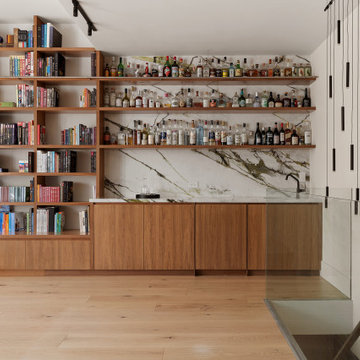
 kimberly peck architect
For this project we were hired by a young couple to convert a dated duplex apartment into a modern loft-like space for their growing family. The apartment occupied the first and second floor of a building that originally was a series of row houses. The row houses had been combined to create a large apartment complex. the individual units lacked flow and were composed of many small rooms. The main stair connecting the two levels of the apartment was directly inside the entry. Because the stair could not be relocated we decided to make it a focal point. We removed the original stair and replaced it with a sculptural open oak stair with a glass guardrail. Beneath the stair we created an oak cabinet that acts as a landing spot for belongings upon entering the apartment. This foyer space created by this stair entity is separated from the kitchen/dining area by a floating wall. This was done to keep the space visually open when you enter the apartment and to create better flow. The wall shared with the stair acts as the rear wall of the kitchen which is completed by an island. The space segues into a dining area. One of the selling points of the apartment was an under utilized private patio space. The space was previously accessed by sliding glass doors in multiple rooms. By opening up the entire space, the kitchen dining area now has a strong connection to the outdoors and the renovated patio feels like part of the apartment’s floor area. The rest of the first floor is a large primary suite. The suite was designed with ample walk in closets, a small room for a baby’s crib and a large primary bath. The primary bath features a custom stone sink and shower bench. The second floor of the apartment features two bedrooms, a bathroom and a spacious living room with double height ceilings. By using a limited palette of materials and customized builtins we were able to create multiple uses in the existing living room while keeping a cohesive overall look. Walnut cabinetry paired with “Calcutta green" porcelain and black accents were used for the fireplace feature, large media/book shelf, and the wet bar.
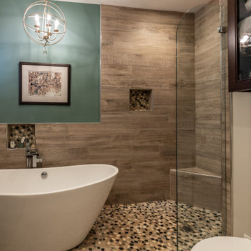
 Michael Nash Design, Build & Homes
This four-story townhome in the heart of old town Alexandria, was recently purchased by a family of four.
The outdated galley kitchen with confined spaces, lack of powder room on main level, dropped down ceiling, partition walls, small bathrooms, and the main level laundry were a few of the deficiencies this family wanted to resolve before moving in.
Starting with the top floor, we converted a small bedroom into a master suite, which has an outdoor deck with beautiful view of old town. We reconfigured the space to create a walk-in closet and another separate closet.
We took some space from the old closet and enlarged the master bath to include a bathtub and a walk-in shower. Double floating vanities and hidden toilet space were also added.
The addition of lighting and glass transoms allows light into staircase leading to the lower level.
On the third level is the perfect space for a girl’s bedroom. A new bathroom with walk-in shower and added space from hallway makes it possible to share this bathroom.
A stackable laundry space was added to the hallway, a few steps away from a new study with built in bookcase, French doors, and matching hardwood floors.
The main level was totally revamped. The walls were taken down, floors got built up to add extra insulation, new wide plank hardwood installed throughout, ceiling raised, and a new HVAC was added for three levels.
The storage closet under the steps was converted to a main level powder room, by relocating the electrical panel.
The new kitchen includes a large island with new plumbing for sink, dishwasher, and lots of storage placed in the center of this open kitchen. The south wall is complete with floor to ceiling cabinetry including a home for a new cooktop and stainless-steel range hood, covered with glass tile backsplash.
The dining room wall was taken down to combine the adjacent area with kitchen. The kitchen includes butler style cabinetry, wine fridge and glass cabinets for display. The old living room fireplace was torn down and revamped with a gas fireplace wrapped in stone.
Built-ins added on both ends of the living room gives floor to ceiling space provides ample display space for art. Plenty of lighting fixtures such as led lights, sconces and ceiling fans make this an immaculate remodel.
We added brick veneer on east wall to replicate the historic old character of old town homes.
The open floor plan with seamless wood floor and central kitchen has added warmth and with a desirable entertaining space.
Find the right local pro for your project
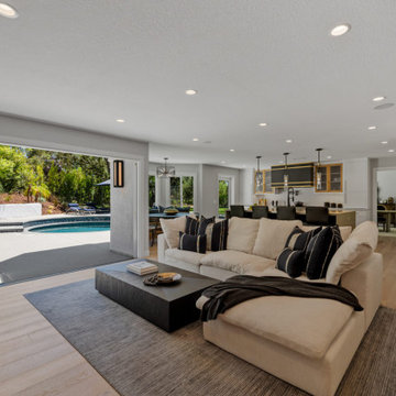
 JRP Design & Remodel
This home is a bachelor’s dream, but it didn’t start that way. It began with a young man purchasing his first single-family home in Westlake Village. The house was dated from the late 1980s, dark, and closed off. In other words, it felt like a man cave — not a home. It needed a masculine makeover.
He turned to his friend, who spoke highly of their experience with us. We had remodeled and designed their home, now known as the “Oak Park Soiree.” The result of this home’s new, open floorplan assured him we could provide the same flow and functionality to his own home. He put his trust in our hands, and the construction began.
The entry of our client’s original home had no “wow factor.” As you walked in, you noticed a staircase enclosed by a wall, making the space feel bulky and uninviting. Our team elevated the entry by designing a new modern staircase with a see-through railing. We even took advantage of the area under the stairs by building a wine cellar underneath it… because wine not?
Down the hall, the kitchen and family room used to be separated by a wall. The kitchen lacked countertop and storage space, and the family room had a high ceiling open to the second floor. This floorplan didn’t function well with our client’s lifestyle. He wanted one large space that allowed him to entertain family and friends while at the same time, not having to worry about noise traveling upstairs. Our architects crafted a new floorplan to make the kitchen, breakfast nook, and family room flow together as a great room. We removed the obstructing wall and enclosed the high ceiling above the family room by building a new loft space above.
The kitchen area of the great room is now the heart of the home! Our client and his guests have plenty of space to gather around the oversized island with additional seating. The walls are surrounded by custom Crystal cabinetry, and the countertops glisten with Vadara quartz, providing ample cooking and storage space. To top it all off, we installed several new appliances, including a built-in fridge and coffee machine, a Miele 48-inch range, and a beautifully designed boxed ventilation hood with brass strapping and contrasting color.
There is now an effortless transition from the kitchen to the family room, where your eyes are drawn to the newly centered, linear fireplace surrounded by floating shelves. Its backlighting spotlights the purposefully placed symmetrical décor inside it. Next to this focal point lies a LaCantina bi-fold door leading to the backyard’s sparkling new pool and additional outdoor living space. Not only does the wide door create a seamless transition to the outside, but it also brings an abundance of natural light into the home.
Once in need of a masculine makeover, this home’s sexy black and gold finishes paired with additional space for wine and guests to have a good time make it a bachelor’s dream.
Photographer: Andrew Orozco
 Nathan Taylor for Obelisk Home
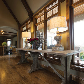
Before the transformation this home was heavy traditional with a prolific use of European antiques. The furniture and art in the ample living room were under-scaled and lacking in cohesion.
Clean lines and a neutral palette were introduced. Obelisk Home outfitted the entire living room with large comfortable furnishings in soothing grays, creams and reclaimed woods. A large library cabinet balanced the fireplace and was filled with antique books and the client’s aviary collectibles. A long reclaimed pine console was placed in front of a bank of windows drawing attention to the beautiful patio. The client’s antique breakfast table used as an end table was the pivot point between the two styles. Original art with pastoral themes breathed much needed color and energy into the space.
Photos by Randy Colwell
 S Squared Design, LLC
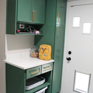
This remodel was one worth waiting for! Clients had a need for more storage, more counter and more room for entertaining friends and family. They love color and low maintenance materials so we went with a lovely happy green cabinet color, quartz counters, fun large hex porcelain floor tile and easy to clean backsplash. The original kitchen was lacking good flow, ample storage for this family.
We started in the laundry room but re configuring the layout so now the W/D and fridge could be on one wall which opened up space for a drop area. We removed the old small closet that was the pantry and replaced the old water heater with a tank-less one to allow more place where they needed it the most. Drop area has outlets for charging and one in the broom cabinet as well. We removed the door to allow for us to relocate the garage entry door which now sits in the mud room instead of right in the middle of the kitchen. We added an actual walk in pantry which is equipped with drawers and plenty of shelf storage, we put the small appliances in here to allow for more counter space in the kitchen. To access the kitchen is now through a pocket door which is a big space saver and allows a more open feel.
Let's get to this kitchen design! This was a odd layout before, now we have the fridge tucked away in it's proper home instead of sticking out. We relocated the garage entry door to the mud room to allow for this 36" range in its place featuring a pot filler as well. To maximize the kitchen footprint we closed up the door that went to the office and now we have a full L corner with plenty of storage and added some wood shelves for a sense of warmth and displace space in a beverage bar area, which also features an under-counter beverage fridge. Under-cabinet lighting, island fixture , a pendant above the sink and relocated the recessed lights to work better with the new kitchen layout. The island was a new addition which replaced the peninsula that used to cut off the kitchen from the rest of the home. We also removed a built in bookshelf and relocated the return air to the ceiling to free up even more floor space to truly transform this kitchen into the heart of the home.
 Bennett Design Co.
We were thrilled when our former clients called about their primary bathroom remodel. They were so unhappy with the space that they'd resorted to using it as a storage area, and the entire family shared the hallway bathroom.
Some of the most notable complaints were that the vanity and closet area had no privacy from the primary bedroom, making the space difficult to use while someone was sleeping. The oversized mirrored closet doors had settled and could hardly be opened and closed. More minor complaints included the lack of double sinks, limited vanity storage, nowhere for dirty laundry, a small shower, and poor lighting overall.
We also had a few architectural limitations. The windows in the home had recently been replaced, so we needed to retain their existing locations. Similarly, the toilet line location was very limited in this second-story room, so we needed to work around the current spot.
Our final design included a frosted glass door separating the bedroom and bathroom. This allowed for privacy but retained the natural light provided by the windows in both rooms. We also removed the wall separating the shower and toilet area from the vanity; this made both areas feel larger and more cohesive. The closet doors were replaced with new gliding doors that provide easy access to the entire closet.
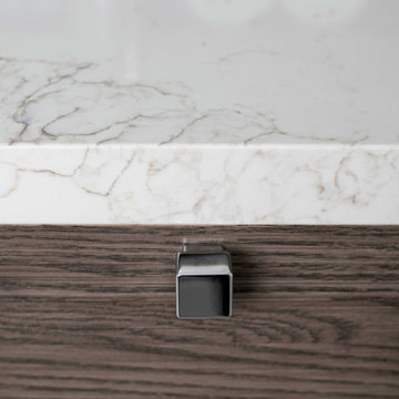
The updated vanity area includes ample drawer storage and a large recessed medicine cabinet. The cabinets are stained oak, providing a warm natural texture to balance the cool-toned manufactured tiles. The inky-blue glass wall tile is a focal point and adds a burst of color to the room. Between the new vanity and shower area is an open storage system for baskets, towel storage, and a laundry hamper.
We reconfigured a small closet in the bedroom to create an inviting and large shower. We opted for a full-width shampoo niche along the rear wall with the same accent tile we incorporated into the vanity area. We added a linear shower drain along the same wall to mirror the elongated niche
detail. 'Clear hardware' by-pass shower doors that allow the user to reach the shower controls before stepping in.
Overall, the space is bright and calm, with just the right amount of bold color and natural textures. We will soon begin remodeling the hallway bath because the entire family is now using this new space!
 Seattle Cabinets
Modern kitchen cabinets are a popular and stylish choice for contemporary kitchen designs.
Here’s a description of such a kitchen setup:
Cabinet Colors:
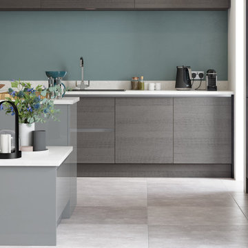
The kitchen features a sleek and sophisticated color scheme. The base and upper cabinets are finished in a soft, neutral cashmere texture, creating a warm and inviting atmosphere. These cabinets have a tactile quality, with a slightly textured surface that adds depth and character to the design.
Island:
The centerpiece of the kitchen is the island, which is finished in a high gloss gray. This glossy finish not only adds a touch of luxury but also contrasts beautifully with the cashmere cabinets, creating a striking focal point in the room.
Cabinet Design:
The cabinet doors are flat and handleless, contributing to the kitchen’s clean and minimalistic look. The lack of visible handles maintains a smooth, uninterrupted appearance, emphasizing the modern design.
Drawer and Door Design:
The wide drawers and doors enhance both the functionality and aesthetics of the kitchen. They offer ample storage space for your kitchen essentials while maintaining a clean and uncluttered look. The flat doors and drawers maintain a sense of simplicity and contemporary elegance.
Hardware:
Instead of traditional handles or knobs, the cabinets are equipped with aluminum channels. These channels are discreet and minimalist in design, providing a convenient grip for opening and closing the cabinets and drawers. The aluminum finish complements the overall color scheme, adding a touch of modernity to the cabinetry.
Overall, this kitchen exudes a contemporary, clean, and sophisticated style with its combination of high gloss gray, cashmere texture, handleless design, and sleek aluminum channel hardware. It’s a design that combines functionality with a visually pleasing aesthetic, making it a perfect choice for a modern home.#seattlecabinets #moderncabinets #contemporary #flatpanelcabinets #slabdoor #customcabinets #customcabinetry #graycabinets #glossy
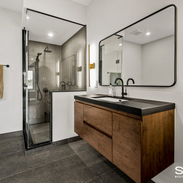
 Sosna Inc
The client, a single man in his thirties, was unhappy with his dark, closed-off home. He wanted a space for entertaining but lacked a functional kitchen and dining area. The master bathroom also felt cramped and outdated.
To address these issues, we focused on creating an open-concept kitchen with a dedicated entertainment zone and a multifunctional island. We also updated the master bathroom with a walk-in shower and floating vanity. Additionally, we modernized the front entrance and mudroom with improved storage solutions.
Key features of the renovation include:
Open-concept kitchen: Removed the wall between the kitchen and dining room to create a more spacious and inviting area.
Entertainment zone: Added a stylish bar area and a space for a large TV to create a dedicated space for socializing and watching TV.
Multifunctional island: Designed a large island that can be used for food preparation, casual dining, and socializing.
Ample storage: Incorporated custom cabinets and drawers to keep the kitchen organized and clutter-free.
Master bathroom renovation: Installed a spacious walk-in shower and a floating vanity to create a more modern and spa-like feel.
Front entrance and mudroom update: Modernized the entrance with updated fixtures and added clever storage solutions.
The final result is a stylish and functional home that perfectly reflects the client's personality and lifestyle.
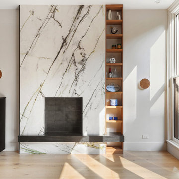 kimberly peck architect
For this project we were hired by a young couple to convert a dated duplex apartment into a modern loft-like space for their growing family. The apartment occupied the first and second floor of a building that originally was a series of row houses. The row houses had been combined to create a large apartment complex. the individual units lacked flow and were composed of many small rooms. The main stair connecting the two levels of the apartment was directly inside the entry. Because the stair could not be relocated we decided to make it a focal point. We removed the original stair and replaced it with a sculptural open oak stair with a glass guardrail. Beneath the stair we created an oak cabinet that acts as a landing spot for belongings upon entering the apartment. This foyer space created by this stair entity is separated from the kitchen/dining area by a floating wall. This was done to keep the space visually open when you enter the apartment and to create better flow. The wall shared with the stair acts as the rear wall of the kitchen which is completed by an island. The space segues into a dining area. One of the selling points of the apartment was an under utilized private patio space. The space was previously accessed by sliding glass doors in multiple rooms. By opening up the entire space, the kitchen dining area now has a strong connection to the outdoors and the renovated patio feels like part of the apartment’s floor area. The rest of the first floor is a large primary suite. The suite was designed with ample walk in closets, a small room for a baby’s crib and a large primary bath. The primary bath features a custom stone sink and shower bench. The second floor of the apartment features two bedrooms, a bathroom and a spacious living room with double height ceilings. By using a limited palette of materials and customized builtins we were able to create multiple uses in the existing living room while keeping a cohesive overall look. Walnut cabinetry paired with “Calcutta green" porcelain and black accents were used for the fireplace feature, large media/book shelf, and the wet bar.

 Native Edge Landscape
After their brand new construction was completed, this family had a beautiful and comfortable home that truly fit their needs. However, this new construction lacked an outdoor living space, which left the backyard feeling stark and bare. With this blank slate, we were able to create a relaxing environment for this family to enjoy.
Faced with the challenge of using every square-inch of this small space, Native Edge was able to design a landscape that left this family worry-free. We incorporated a low maintenance composite decking system, modern raised metal planters, and a bubbling urn water feature to tie this peaceful landscape together. The poor drainage of the lot gave us the opportunity to create a striking cat walk and drainage feature, which left ample room for their vegetable and herb garden hobby. There is even a nook for the family dog to enjoy!
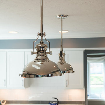
 Worthington Design & Remodeling
Pendant lights over kitchen islands can be the jewelry of the kitchen. Because this room already had ample pot lights, but lacked the necessary task lighting for working spaces, our designers were able to bring some creative dazzle into this space.
Photo Credit: Chris Whonsetler
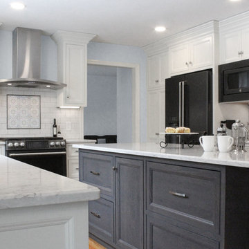
 Renovisions
This client requested that we design her new kitchen space to look and function with her and her family’s usage in mind. She was not happy with her existing kitchen due to builder-grade ceramic flooring, lack of countertop space, poor lighting, inadequate and unorganized storage and the closed off feel of the area. Renovisions resolved all of these issues by designing and building an impressive, transitional styled kitchen; delivering a beautifully well thought-out space that provides a multi-functional approach and meets the needs of this busy and dynamic household.
Typically, we encounter challenges in every project, and this was no different. The upstairs bathroom plumbing ran across the entire length of the kitchen sink wall and it was necessary to work with it by moving the plumbing as far up as possible and then building a soffit to hide it.
Creating a space that has a more open feel was top of mind for our client. Installing a new wood floor that matched the existing dining room floor helped with this and in addition, warmed up the room. By relocating the refrigerator to the opposite wall and adding a bar area at the end toward the family room, the flow of traffic for family members and guests became more managed.
The open floor plan allowed for additional island cabinets to accommodate smart storage and better functionality when prepping meals, sitting to eat or gathering with friends and family. We believe having ample countertop surface space is a critical improvement in any renovation and this particular project now boasts a large countertop area with a stunning wide vein pattern that accentuates the design instead of overpowering it. The soft look of the Blanco Arabescato quartz enhances the space and looks lovely with the white inset styled cabinetry.
Beauty and function go hand-in-hand in this kitchen with several exceptional elements such as under-cabinet lighting with dimmers to control the mood light. Glass doors were added to the wall cabinets which flank the wine rack for displaying their decorative glassware and a beverage cooler below provided added convenience and access to cold beverages. The GE Café line of appliances in ‘Slate’ and ‘Stainless Steel’ finishes are a stunning contrast here.
The sensational looking decorative marble 6”x6” backsplash tile over the gas range and in the bar area creates nice focal points by creating a unique look for her that family and guests love.
Convenient and functional elements were added such as a blind corner pull-out for easier pot/pan storage, a sweep-o-vac under cabinet vacuum system for those constant quick clean-ups, a pull-out caddy under the sink base for storage of cleaning products and a protective mat to collect potential spills.
Our client let us know it was time for a change and we listened. She shared a few pictures she loved from a home magazine, we shared our insight and then designed/built the kitchen of her dreams! … A fabulous and functional space.
 Verce Design
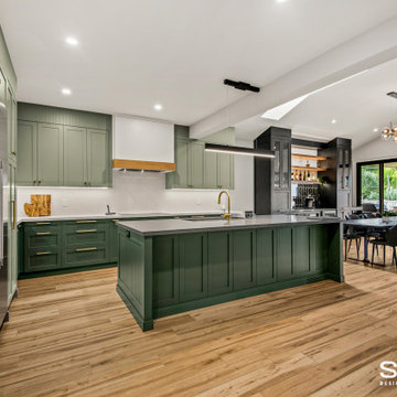
This expansive first floor takes luxury to the next level. A once dreary and dark kitchen, lacking in function, takes on a new look. Natural light floods through the kitchen with wall-to-wall windows, highlighting the gorgeous wood texture from the rift sawn white oak and walnut inset cabinets. A french La Corneau range provides a beautiful focal point, paired with layered designer lighting and various stones.
A host’s dream space for entertaining with a hidden pantry, fully stocked with a chefs sink, dishwasher, and wall oven with ample storage for dry goods and small appliances.
A morning brew or 5'oclock cocktail can be found in the fully loaded wet bar stocked with an integrated espresso maker, ice maker, refrigerator, freezer, wine cooler, and spirits collected from traveling the globe. Cheers!
 Sosna Inc
The client, a single man in his thirties, was unhappy with his dark, closed-off home. He wanted a space for entertaining but lacked a functional kitchen and dining area. The master bathroom also felt cramped and outdated.
To address these issues, we focused on creating an open-concept kitchen with a dedicated entertainment zone and a multifunctional island. We also updated the master bathroom with a walk-in shower and floating vanity. Additionally, we modernized the front entrance and mudroom with improved storage solutions.
Key features of the renovation include:
Open-concept kitchen: Removed the wall between the kitchen and dining room to create a more spacious and inviting area.
Entertainment zone: Added a stylish bar area and a space for a large TV to create a dedicated space for socializing and watching TV.
Multifunctional island: Designed a large island that can be used for food preparation, casual dining, and socializing.
Ample storage: Incorporated custom cabinets and drawers to keep the kitchen organized and clutter-free.
Master bathroom renovation: Installed a spacious walk-in shower and a floating vanity to create a more modern and spa-like feel.
Front entrance and mudroom update: Modernized the entrance with updated fixtures and added clever storage solutions.
The final result is a stylish and functional home that perfectly reflects the client's personality and lifestyle.
 Barrel & Board Design
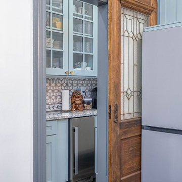
The butler's pantry was a necessity with the lack of upper storage space in the main kitchen. This compact space makes up for it all in spades! Glass uppers with under cabinet lighting, a bar sink, ice maker, and storage drawers below provide ample storage for dishes and pantry items.
 Aardvark Architecture
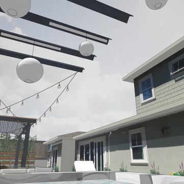
Caroline and Rich's backyard was lacking any clearly defined spaces for their many expected outdoor activities.
Their new hot tub deck and surrounding built in seating create a space to soak in the their new hot tub and for friends and family to gather around the soakers without getting wet themselves. Space to heat up after a dip when in their windy backyard was necessary too, thus the space for a firetable and added seating flank a large deck-topped boulder feature.
The family's new outdoor dining pavillion has ample space for large group get together, as well as serving for everyday lunches without having to shift any of the outdoor office setup. A built in grill and bench create an ideal stopping point for this structure, which is built right up to a rear utility easement. Fortunately only a bit of upligthing is needed to perfect a grove of existing bamboo that fills the space between this backstop and their back fence!
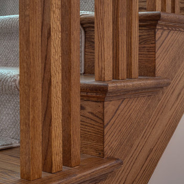 Drury Design
The Setup:
After purchasing this home, the homeowners faced a unique opportunity to reimagine their kitchen and nearby spaces. Water damage from a burst pipe had left much of the home’s interior in need of repair, and while the existing kitchen was functional and in relatively good shape, it didn’t align with the family’s vision for their new home. The layout included a peninsula that wasn’t ideal, and there were some druthers with the nearby pantry.
Since the space needed to be rebuilt anyway, the homeowners saw this as a chance to create a kitchen that was both highly functional for their four young children and timeless in its design. The project also included a refresh of the adjacent message center and dining room — spaces that play key roles in the family’s daily life. The goal was to create a cohesive flow between these areas, balancing modern functionality with the craftsman-inspired character of the rest of the home.
Design Objectives:
- Replace the outdated peninsula with a large island to maximize counter space and create new seating options.
- Open up the space visually by removing soffits and rethinking the cabinetry layout.
Incorporate concealed refrigeration and freezer units to provide significant storage for the family while maintaining a streamlined aesthetic.
- Integrate black cabinetry into the design without making the space feel harsh or heavy.
- Ensure the lighting plan balances functional task lighting with ambient accent lighting.
- Avoid visual clutter in the cabinetry design while still giving a nod to the craftsman aesthetic.
- Incorporate a slab backsplash as a key design feature.
Design Challenges:
- The outdated peninsula left dead space in the kitchen and lacked sufficient seating for the family.
- The cooktop wall was cramped, with small cabinets flanking the hood, limited storage, and soffits that made the space feel closed-in.
- The family needed significant refrigeration space (two refrigerators and a freezer) but wanted to avoid a cluttered look with visible stainless steel appliances.
- Adding black cabinetry risked making the space feel too dark or heavy.
- The original lighting plan was insufficient, particularly over the dining table where a decorative fixture proved too dim.
- The family wanted shaker-style drawer fronts to match the home’s arts-and-crafts design but worried that too much shaker cabinetry might look overly busy.
- Prioritizing a slab backsplash in the wish list priority planning.
The Renewed Space
Design Solutions:
- A functional island: The peninsula was replaced with a large island that provides continuous countertop space for prepping and serving. The island also features seating for four people, creating a central hub for informal meals and activities.
- Streamlined cooktop wall: The soffits were removed, and the upper cabinets on the cooktop wall were eliminated to create a more open, streamlined design. A custom oversized hood became the focal point of the wall, with the blower unit offset inside it to align with the cooktop while maintaining exterior visual symmetry.
- Concealed refrigeration: Two column refrigerators and one freezer were integrated into the cabinetry, concealing them behind wood paneling that blends seamlessly with the overall design.
- Warm black cabinetry: The black cabinetry was crafted from hickory with a visible grain, softening its appearance and adding warmth. The grain detail gives the cabinetry a rich, textured look that avoids feeling stark or overpowering.
- Additional lighting: In the dining area, recessed can lights were added during an additional installation phase to supplement the gorgeous decorative fixture’s dim output. The new lighting plan creates a layered effect, combining functional task lighting with softer ambient lighting.
- Simplified cabinetry details: Slab drawer fronts were used on the upper drawers, while five-piece shaker fronts (with slightly less prominent rail and stile pieces) were reserved for the middle and lower drawers. This approach simplified the overall look while maintaining the craftsman-inspired aesthetic.
- Slab backsplash priority: The slab backsplash was prioritized by making thoughtful adjustments elsewhere, like opting not to extend cabinetry to the ceiling, which also helped visually prioritize the gorgeous slab backsplash. This decision also enhanced the kitchen’s furniture-like feel, aligning with the home’s craftsman character.
- This kitchen perfectly balances practicality with timeless style. By addressing the family’s functional needs — ample seating, smart storage, and effective lighting — while incorporating thoughtful design elements like warm black cabinetry and a striking slab backsplash, Alicia created a space that works beautifully for a busy household. The result is a cohesive, inviting kitchen that honors the home’s craftsman roots and will serve the family well for years to come.
 Renovisions
This client requested that we design her new kitchen space to look and function with her and her family’s usage in mind. She was not happy with her existing kitchen due to builder-grade ceramic flooring, lack of countertop space, poor lighting, inadequate and unorganized storage and the closed off feel of the area. Renovisions resolved all of these issues by designing and building an impressive, transitional styled kitchen; delivering a beautifully well thought-out space that provides a multi-functional approach and meets the needs of this busy and dynamic household.
Typically, we encounter challenges in every project, and this was no different. The upstairs bathroom plumbing ran across the entire length of the kitchen sink wall and it was necessary to work with it by moving the plumbing as far up as possible and then building a soffit to hide it.
Creating a space that has a more open feel was top of mind for our client. Installing a new wood floor that matched the existing dining room floor helped with this and in addition, warmed up the room. By relocating the refrigerator to the opposite wall and adding a bar area at the end toward the family room, the flow of traffic for family members and guests became more managed.
The open floor plan allowed for additional island cabinets to accommodate smart storage and better functionality when prepping meals, sitting to eat or gathering with friends and family. We believe having ample countertop surface space is a critical improvement in any renovation and this particular project now boasts a large countertop area with a stunning wide vein pattern that accentuates the design instead of overpowering it. The soft look of the Blanco Arabescato quartz enhances the space and looks lovely with the white inset styled cabinetry.
Beauty and function go hand-in-hand in this kitchen with several exceptional elements such as under-cabinet lighting with dimmers to control the mood light. Glass doors were added to the wall cabinets which flank the wine rack for displaying their decorative glassware and a beverage cooler below provided added convenience and access to cold beverages. The GE Café line of appliances in ‘Slate’ and ‘Stainless Steel’ finishes are a stunning contrast here.
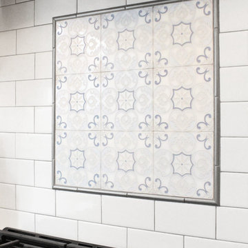
The sensational looking decorative marble 6”x6” backsplash tile over the gas range and in the bar area creates nice focal points by creating a unique look for her that family and guests love.
Convenient and functional elements were added such as a blind corner pull-out for easier pot/pan storage, a sweep-o-vac under cabinet vacuum system for those constant quick clean-ups, a pull-out caddy under the sink base for storage of cleaning products and a protective mat to collect potential spills.
Our client let us know it was time for a change and we listened. She shared a few pictures she loved from a home magazine, we shared our insight and then designed/built the kitchen of her dreams! … A fabulous and functional space.
 Michael Nash Design, Build & Homes
This four-story townhome in the heart of old town Alexandria, was recently purchased by a family of four.
The outdated galley kitchen with confined spaces, lack of powder room on main level, dropped down ceiling, partition walls, small bathrooms, and the main level laundry were a few of the deficiencies this family wanted to resolve before moving in.
Starting with the top floor, we converted a small bedroom into a master suite, which has an outdoor deck with beautiful view of old town. We reconfigured the space to create a walk-in closet and another separate closet.
We took some space from the old closet and enlarged the master bath to include a bathtub and a walk-in shower. Double floating vanities and hidden toilet space were also added.
The addition of lighting and glass transoms allows light into staircase leading to the lower level.
On the third level is the perfect space for a girl’s bedroom. A new bathroom with walk-in shower and added space from hallway makes it possible to share this bathroom.
A stackable laundry space was added to the hallway, a few steps away from a new study with built in bookcase, French doors, and matching hardwood floors.
The main level was totally revamped. The walls were taken down, floors got built up to add extra insulation, new wide plank hardwood installed throughout, ceiling raised, and a new HVAC was added for three levels.
The storage closet under the steps was converted to a main level powder room, by relocating the electrical panel.
The new kitchen includes a large island with new plumbing for sink, dishwasher, and lots of storage placed in the center of this open kitchen. The south wall is complete with floor to ceiling cabinetry including a home for a new cooktop and stainless-steel range hood, covered with glass tile backsplash.
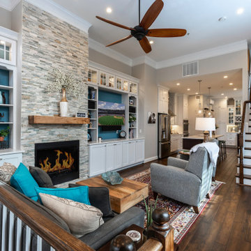
The dining room wall was taken down to combine the adjacent area with kitchen. The kitchen includes butler style cabinetry, wine fridge and glass cabinets for display. The old living room fireplace was torn down and revamped with a gas fireplace wrapped in stone.
Built-ins added on both ends of the living room gives floor to ceiling space provides ample display space for art. Plenty of lighting fixtures such as led lights, sconces and ceiling fans make this an immaculate remodel.
We added brick veneer on east wall to replicate the historic old character of old town homes.
The open floor plan with seamless wood floor and central kitchen has added warmth and with a desirable entertaining space.
24